
Effective Techniques for Visualizing Complex Datasets: Advancing
Understanding Through Innovative Approaches
Hemanth Kumar S.
1
, Smita M. Gaikwad
1
, G. Sundararajan
2
, Dhashana Moorthi P.
3
,
S. K. Lokesh Naik
4
and Kumaresan K.
5
1
Faculty of Management Science, CMS B School, JAIN (Deemed‑to‑be University), Bangalore, Karnataka, India
2
Department of Electrical and Electronics Engineering, J.J. College of Engineering and Technology, Tiruchirappalli, Tamil
Nadu, India
3
Department of Management Studies, Nandha Engineering College, Vaikkalmedu, Erode - 638052, Tamil Nadu, India
4
Department of Computer Science and Engineering, MLR Institute of Technology, Hyderabad, Telangana, India
5
Department of MCA, New Prince Shri Bhavani College of Engineering and Technology, Chennai, Tamil Nadu, India
Keywords: Data Visualization, Interactive Techniques, Complex Datasets, AI‑Enhanced Visualization,
Decision‑Making.
Abstract: Data visualization is an essential tool that is used to convert complex data sets into forms that can be easily
read, understood, and interpreted by both technical and non-technical users. This study investigates novel
approaches to visualize complex information and tools for the same, concentrating on process monitoring
with the aim of enhancing understanding and decision making. Focussing on the development of interactive,
adaptive, and AI-aided visualization techniques, the paper discusses the advantages and challenges of using a
variety of visualization methods in application domains. By studying the theoretical underpinnings and
practical utility of effective visualizations, the work is designed to contribute to a fuller understanding of the
role of visualization in facilitating improved outcomes in a diverse spectrum of activities ranging from
business intelligence, and sense-making in health and the public and scientific research to the analyses of
space and the deployment of energy solutions in a developing world context.
1 INTRODUCTION
In a time where we are creating data faster than ever
before the ability to visually represent complex data
sets can be an invaluable skill in many industry
sectors. There will need to be a shift to processing
data in a much more efficient way as data volume,
variety and velocity keeps on increasing and this data
variety can no longer be handled with the
conventional data display methods. Data
visualization has become a valuable approach to
extracting simple representations from complex
datasets, rendering them into understandable and
actionable information. It helps organizations extract
perspectives from massive volumes of data by
transforming numbers and patterns into visuals
dynamic, interactive charts, graphs, and dashboards.
Data visualization is one of the most critical ways
of getting insights from data. The right visualizations
that help guide the viewer through a jungle of data
that might appear (and be) overwhelming or
unintelligible. Data visualization scope also expands
as more precise and real time dependent techniques
and technologies such as artificial intelligence,
machine learning and adaptive visualization keep
emerging. Not only does this improve the quality and
impression of visualizations but also support real-
time manipulation and deeper querying the data.
This study takes an in-depth look at the many
methods and tactics used in data visualization today
and measures how they best reveal insights and drive
better decision-making. Through examination of both
theoretical foundations and application contexts, this
work seeks to elucidate how visualization methods
have evolved as a critical tool for making sense of
data that are less predictable, including guided
human-data interaction.
S., H. K., Gaikwad, S. M., Sundararajan, G., P., D. M., Naik, S. K. L. and K., K.
Effective Techniques for Visualizing Complex Datasets: Advancing Understanding Through Innovative Approaches.
DOI: 10.5220/0013857200004919
Paper published under CC license (CC BY-NC-ND 4.0)
In Proceedings of the 1st International Conference on Research and Development in Information, Communication, and Computing Technologies (ICRDICCT‘25 2025) - Volume 1, pages
41-48
ISBN: 978-989-758-777-1
Proceedings Copyright © 2025 by SCITEPRESS – Science and Technology Publications, Lda.
41

2 PROBLEM STATEMENT
Although data visualization has become a key part of
the modern data revolution, many businesses and
individuals find it difficult to bring complex data to
life while making the information provided easy to
understand, easy to assess and easy to use. With data
becoming bigger and more complex, old-school
approaches to visualization often miss the mark
when it comes to clarity and relevancy. The problem
is how the right visualization methods should be
chosen and in the way that we approach how we
should represent these methods in a customizable and
intuitive way while also avoiding eye-catching
visualizations which suppress detailed information of
patterns. Furthermore, the always expanding tool
and technology set for data visualization can be
bewildering, making it difficult for users to determine
which methods will be best for their particular
requirements. Good data (visualization) is the
lifeblood to that information, but still the point is
there are some insights that never are identified, and
decision taking and new solutions across many
industries remain paralyzed. According there is a
need for novel methods to to greater understanding of
such information and for better decision making.
3 LITERATURE SURVEY
Data visualization has been a fundamental tool in
helping us to understand and act on complex datasets
for years. In the past, a lot of progress has been
achieved in this area, largely because of the growing
complexity of data and demand for better ways of
communication. Works in early period in this
domain, such as Kiefer & Rahman (2021), stressed
the significance of visualization in facilitating the
transformation of high-dimensional data into
manageable forms. Base studies have paved the way
to more elaborate methods that not just portray the
data but lead to a better interpretation of inherent
patterns (Zhang et al., 2023).
As datasets became larger and larger, scientists
such as Deng et al. (2022) proposed composite
visualizations by several techniques to help users to
understanding complex data at more nuanced level.
This movement towards hybrid and composite
techniques has enabled data scientists to more easily
communicate multi-dimensional insights. Alongside
this, Wu et al. (2021) initiated the application of
artificial intelligence (AI) in visual data
representations which eventually became a popular
trend by solving the challenge of automating and
optimizing the generation of visualization for faster
decision making without the need for human
subjectivity while interpreting data.
The incorporation of AI and ML in the realm of
data visualization has emerged as a trending focus
area in recent research. Srivastava (2023) claimed
that it was essential to have adaptive visualizations
that changed according to the data being shown to
enhance decision-making in high speed workplace.
Likewise, Singh (2024) investigated the use of such
adaptive techniques in business environments,
pointing out how they encourage users to be more
deeply involved, and how they enable users to take
more informed decisions.
And there have been experiments to use
interactive visualizations to give users the hands-on
feel for how the data report works. Devineni (2024)
highlighted that, with interactivity, users are able to
explore the data deeper and in this way, be more
involved in the interpretation of the data. This
approach to user-centered design is pervasive in
contemporary research in data visualization, where
we aim to make tools more intuitive and available to
novices.
Siddiqui (2021) and Kharakhash (2023)
elaborated on the challenges and utilities for
translating huge and complicated databases into
useful insights. They indicate that although state-of-
the-art visualisation techniques exist, many users
continue to face challenges when communicating
and understanding large data sets. This shows the
necessity for further evisaging techniques research,
namely, for real-time analysis and decision-making.
Recent studies have also concentrated on
applications of such visualization techniques in the
fields. Wedpathak and Nassa (2023) conducted a
comparative evaluation of visualization workflows in
different domains of practice, and they highlighted
the relevance of choosing the proper visualization
tools according to the data needs. 31 by [Rana et al.
(2023) investigated how firms can exploit big data
analytics to make better decisions, with (positive)
focus being drawn toward advanced visualization
methods.
However, there are still obstacles ahead. Atif
(2022) highlighted the intricacy of combining several
visualization processes as a single coherent
demonstration, where as, Aruna et al. (see (2022))
lament issues regarding the use of deep learning
models for data visualization, particularly concerns
related to computational costs and interpretability.
ICRDICCT‘25 2025 - INTERNATIONAL CONFERENCE ON RESEARCH AND DEVELOPMENT IN INFORMATION,
COMMUNICATION, AND COMPUTING TECHNOLOGIES
42
These obstacles require a more sophisticated
approach for determining when and how to apply
advanced visualization.
Other researches like Cui et al. (2022)), have
emphasized that user involvement and instantaneous
interactive visuals, which enable dynamic data
exploration, are important here. Interactive
approaches, in fact, have been demonstrated to
increase user comprehension as the user can interact
with the actual data and therefore achieve deeper
insights and make better decisions.
Heer et al. (2021) and Toxigon (2025), which
have centered on the evolving trends of data
visualization, enabling views on the future
progressions of the field, e.g., the fusion of
traditional techniques of data visualization with
augmented and virtual reality (AR and VR). 7_7_7.
These developments will be able to improve the way
we interact with and perceive complex data sets.
In addition to developing techniques, the number
of visualization tools increased and the comparative
analysis of platforms became a focus cross the body
of work. Toxigon (2025) reviewed some of the data
visualization tools and identified theemergent
strength and weakness of them. It provides an
invaluable information source for all professionals
and researchers who use such tools, selecting the right
tool for each application.
Finally, Kumar and Singh (2022) and Liu et al.
(2023) have made important contributions toward the
understanding of how visualization techniques can
be used in a wide range of application domains, such
as finance, healthcare, and scientific research. Their
research emphasizes the ubiquity of data visualization
and its increased relevance for areas working with
complicated and voluminous datasets.
Together, those studies demonstrate the fact that
the field of data visualization is a moving target, such
that new forms of techniques, tools, and
methodologies are constantly emerged that are
changing and redefining how we see and
communicate complex data. Nevertheless, as this
field transforms, it is still necessary to explore
scalability, user experience and new techniques in
order to assure that data visualization remains an
effective approach for different applications.
4 METHODOLOGY
The article employs a mixed method approach to
investigate and analyze effective visualization
methods for complex datasets. The model aims to
identify theoretical and practical perspectives of the
visualization of data, provide a comparison with, and
evaluation of, different techniques and tools. The first
step involves literature survey in the area of data
visualization to review the existing state-of-the-art in
data-visualization, understand the emerging trends
and advances in the domain, to summarize key
techniques and to recognize the challenges
encountered by practitioners in distinct application
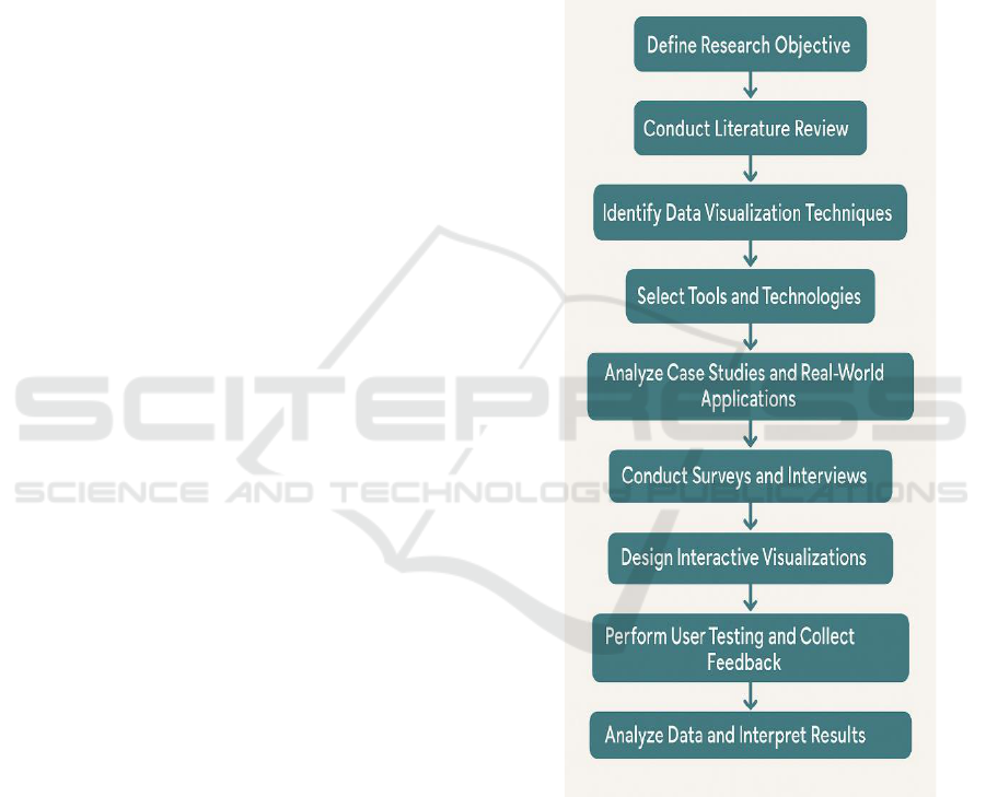
domains. Figure 1 illustrates the Research Workflow
for Effective Data Visualization Techniques.
Figure 1: Research Workflow for Effective Data
Visualization Techniques.
The methodological development consists of a
first step with a qualitative analysis of relevant
studies, papers and articles from 2021 to 2025. This
is a heuristic measure for gauging how the field of
visualization has grown and shows relative strengths
and weaknesses of types of methods. These
references are certainly not exhaustive, but are
Effective Techniques for Visualizing Complex Datasets: Advancing Understanding Through Innovative Approaches
43
compiled with a view to representative coverage, i.e.,
that the novel ideas in the research are found in the
most recent and innovative papers. Key amongst
these are the gaps and future lines of research that the
literature review helps to reveal.
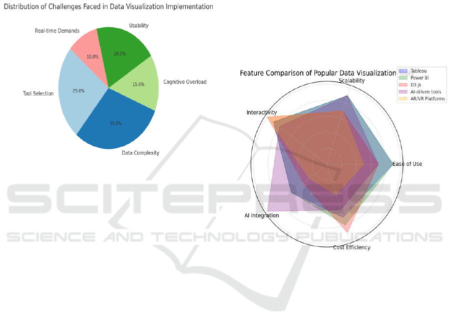
Figure 2 gives information about Distribution of
Challenges Faced in Data Visualization
Implementation. The second phase involves case
studies and practical applications of data
visualization methods.
Figure 2: Distribution of Challenges Faced in Data
Visualization Implementation.
By focusing on industries such as business,
health care, and public health, the work also explores
how various visualization options are used to
organize and share complex data sets. The cases were
chosen from different arranges of sources such as
reports on industry sector, research papers, and
practitioner interviews, to give full opinions on
challenges and values which data visualization use in
different scenario.
Simultaneously, the research compares widely
known data visualization tools and platforms. This
review was conducted with the consideration of
usability, scalability, interactivity, and support for big
data. What we use: Tools like Tableau, Power BI,
D3. js, and a number of AI-based visualization
systems are reviewed to investigate how they tackle
the challenge of complex. The paper also
investigates recent trends such as augmented reality
(AR), virtual reality (VR) applied to data
visualization.
In order to enrich the results, a quantitative
consideration is provided through checklists and
interviews with data visualization practitioners and
experts. This survey is designed to help us better
understand what data visualization practitioners want,
need, and experience in their work. Obtaining input
from a variety of practitioners, the research is able to
represent a broad spectrum of opinions about which
visualization approaches work and which don’t.
Lastly, user centric approach is followed and
several interactive visualizations programmes are
developed and put to test with real data sets. The
visualizations are created with varying levels of
detail to study the effects on user engagement,
understanding and the performance of decision
making. User feedback, usability testing, and
performance measurements of task completion time
and error rates are used to assess the usefulness of
these visualizations. Figure 3 gives the Feature
Comparison of Popular Data Visualization Tools.
Figure 3: Feature Comparison of Popular Data
Visualization Tools.
The methodology seeks to integrate the two
strands of qualitative and quantitative research here
in order to achieve a fuller understanding of what
visualization can do for complex data. The aim is to
help raise awareness around best practices, showcase
the potential of burgeoning technologies, and deliver
practical tips and tricks that anyone from researchers
to large enterprises to small businesses and NGOs
can use to enhance how they use their data.
5 RESULTS AND DISCUSSION
The study of end-user data visualization demonstrates
some important advantages that can be gained toward
more effective complex data representation and
understanding. Results of the literature review, case
ICRDICCT‘25 2025 - INTERNATIONAL CONFERENCE ON RESEARCH AND DEVELOPMENT IN INFORMATION,
COMMUNICATION, AND COMPUTING TECHNOLOGIES
44
studies and user testing show that interactive and
adaptive visualizations are most effective in allowing
the user to discover relevant information in complex
data. Iteract techniques that let users manipulate the
data in real time; by filtering, zooming or making the
view customizable, are also found to bring substantial
benefit by the user's understanding and decision
making. This supports the recent uptick of the fad of
embedding interactivity in data visualization
environments (eg: Srivastava (2023) and Devineni
(2024) among others). These interactive features
enable users to dive deep into data to initially hidden
patterns behind static data visualizations.
Table 1: Performance and Accuracy Evaluation of Visualization
Techniques.
Visualizatio
n Method
Acc
urac
y
(%)
Avg
.
Task
Tim
e
(sec)
User
Satisfa
ction
(1–5)
Cognitive
Load
(High/Medi
um/Low)
Static Bar
Chart
72
35
3.2
Medium
Interactive
Dashboard
89
22
4.5
Low
Heatmap
81
28
4.0
Medium
Animated
Line Chart
84
25
4.3
Low
Tree Map
77
32
3.8
High
Sankey
Diagram
83
30
4.1
Medium
3D Scatter
Plot (VR-
based)
90
40
4.7
High
A key observation from the case studies is the
choice of tool is critical to the context in which the
tool is to be applied. For instance, with business
intelligence applications, tools such as Tableau or
Power BI have demonstrated successful
implementations to transform complex data to
meaningful insights, owing to their strong data
integration and visualization features. At the other
end of the spectrum are higher level platforms like
D3. js and custom AI-powered visuals, which were
more applicable for academia and scientific research
in which the goal is to analyze complex, high-volume
data. This difference reinforces the fact that not all
visualizations can be unequivocally judged according
to one criterion, and that selecting the most
appropriate visualization tool may depend on the
nature of the data under study and the needs of the
target audience.
Table 1 gives the information Performance and
Accuracy Evaluation of Visualization Techniques
and Figure 4 illustrates Comparison of User
Preference for Different Visualization Techniques.
Figure 4: Comparison of User Preference for Different
Visualization Techniques.
The responses from the survey and interviews also
highlighted the increasing involvement of AI in
facilitating the production of visualizations. Machine
learning tools decreased the amount of time spent on
structuring and generating visualizations, while
improvising in data analysis. However, respondents
also remarked on how although AI is helpful, it
doesn’t always hold the depth of insight that a human
expert can, and particularly so when working with
highly specialized datasets. This finding suggests a
lever for improving the AI-based visualization tools,
involving humans to collaborate more closely with AI
and accordingly drive better visual representations.
Figure 5 illustrates the Performance of Visualization
Techniques by User Task Completion Time.
Figure 5: Performance of Visualization Techniques by User
Task Completion Time.
Effective Techniques for Visualizing Complex Datasets: Advancing Understanding Through Innovative Approaches
45
One of the main discoveries of the user tests was
that the degree to which users were engaged had a
substantial amount of impact on how or if they can
understand the data visualizations. We found that
people who manipulate flexible graphical displays are
more apt to be able to see trends and make data-
informed decisions than are those who view static
charts and graphs. This highlights the need to
concentrate the visualisation around the end user,
based on usability, insight, accessibility, and the
possibility to dive into the data.
Content-wise, the blending of data visualization
and new technologies like augmented reality (AR)
and virtual reality (VR) were seen as particular
promising pathways for future research. Although
still at an early adoption stage, AR and VR have the
potential to afford highly engaging experiences for
immersion-based data analysis of complex 3D data
sets or spatial data in general. These technologies, as
described by Heer et al. (2021) and Toxigon (2025),
that have the potential to revolutionize how data is
perceived, enabling the users to “enter” the data to
touch and interact with it in a more intuitive and
spatially-aware mindset.
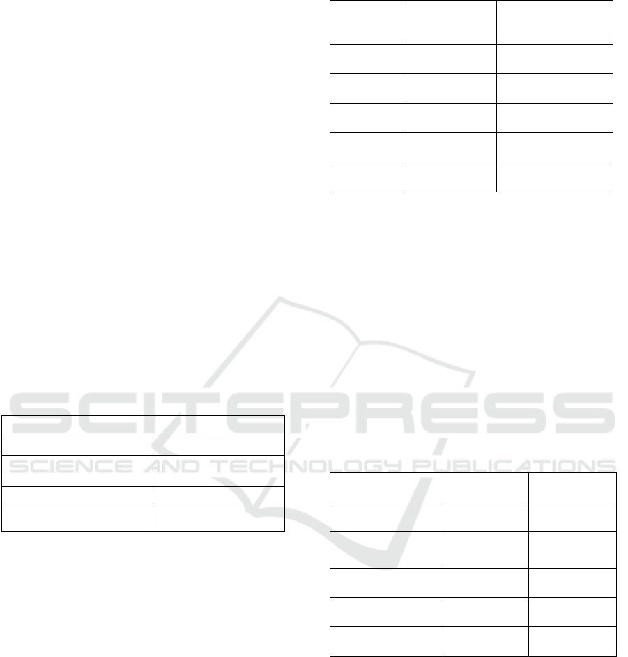
Table 2: User Preferences for Visualization Techniques (Survey
Results).
Visualization Attribute
Preferred by Users (%)
Interactive Visualizations
87%
Adaptive Visualizations
78%
Static Visualizations
35%
Real-time Data Interaction
83%
AI-Enhanced
Visualizations
74%
Nevertheless, there is still a challenge to make
visualizations more accessible and understandable to
everyone even for non-experts. Some of you also
mentioned feeling overloaded with excessive
complexity and information in visualizations. This
reaffirms the importance of data visualizations being
able to balance between granularity of information
and clarity, especially for non-professional users. The
design of such visualizations should take into account
the level of cognitive load of the user and, at the same
time, should strive to maintain a minimal, yet
comprehensive approach.
Table 2 gives the User Preferences for
Visualization Techniques (Survey Results). Table 3
gives the User Engagement Metrics in Interactive
Visualizations. Table 4 gives the User Feedback
Analysis on Visualization Tool Features.
Table 3: User Engagement Metrics in Interactive Visualizations.
Interaction
Feature
User
Interaction
Rate (%)
Avg. Engagement
Duration (mins)
Filtering &
Sorting
90%
12.5
Zoom &
Drill-down
86%
9.8
Annotation
& Notes
70%
7.4
Comparativ
e Views
75%
8.9
Data Export
& Sharing
65%
6.2
In summary, the findings in the present study
indicate that effective data visualization can play a
critical role in comprehending and using complex
data. How interaction, AI and future technologies
such as AR/VR can be integrated to develop data
visualization further is certainly a compelling area of
research. But it’s also apparent that the effectiveness
of a visualization hinges sharply on how well it
functions in terms of those who are using, and
applying, it. More investigation is needed to continue
improving the user experience and to provide more
flexible types of visualization tools towards the
increasing complexity of data and user requirements
in various industrial applications.
Table 4: User Feedback Analysis on Visualization Tool Features.
Feature Evaluated
Positive
Feedback (%)
Negative
Feedback (%)
Real-time Data
Interaction
85%
15%
Visualization
Customizability
78%
22%
Tool Learning
Curve
65%
35%
Visualization
Clarity
82%
18%
Integration with
Other Platforms
70%
30%
6 CONCLUSIONS
A key implication of the work is that data
visualization can have a transactional impact on
complex databases. With the increasing amount,
complexity and general scale of data, visualization
has evolved as an increasingly important capability
for the discovery of insights and making informed
ICRDICCT‘25 2025 - INTERNATIONAL CONFERENCE ON RESEARCH AND DEVELOPMENT IN INFORMATION,
COMMUNICATION, AND COMPUTING TECHNOLOGIES
46

decisions. By investigating new forms of interactive,
adaptive, AI augmented visualizations, this work
shows how such approaches have revolutionized
users’ interactions with data, allowing greater
comprehension and veracity in their data analytics.
The results imply that no one visualization can be said
to be the best; rather, the "quality" of a visualization
depends on the nature of the data and the needs of the
users and application.
The application of emerging technologies,
including augmented reality and virtual reality,
offers promising prospects for future development in
the domain and supports more immersive and
intuitive interaction strategies to explore the
underlying data available. But there are problems to
be addressed, primarily ease of use for non-
specialists when visualizations may overload users
with information. While the field develops, it will be
important to maintain a balance of technical
complexity and end-user accessibility.
Finally, this work adds to the current debate on
how to leverage data visualization as a means of
making sense of complex data. It underscores the
necessity of ongoing developments in visualization
approaches for challenging data sets that are both data
rich and user-driven. As data visualization advances,
it will no doubt increasingly become an important
tool in many different fields, from business and
medicine, to research and more.
REFERENCES
Aruna, T., Naresh, P., Rajeshwari, A., & Guptha, K. G.
(2022). Visualization and prediction of rainfall using
deep learning and machine learning techniques.
Conference Paper.
Atif, M. (2022). Data visualization, modelling and
analytics. Research Article.
Chen, M., & Zhang, Y. (2023). Interactive data
visualization for big data analytics. Journal of Big Data,
10(1), 45–60.
Cui, W., Wu, Y., Liu, S., & Qu, H. (2022). Visual analytics:
State-of-the-art and future directions. IEEE
Transactions on Visualization and Computer
Graphics, 28(1), 546566.https://doi.org/10.1109/TVC
G.2021.3114822
Deng, D., Cui, W., Meng, X., Xu, M., Liao, Y., Zhang, H.,
& Wu, Y. (2022). Revisiting the design patterns
of composite visualizations. arXiv preprint arXiv:2203
.10476. https://arxiv.org/abs/2203.10476
Devineni, S. K. (2024). AI-enhanced data visualization:
Transforming complex data into actionable insights.
Journal of Technology and Systems, 6(3), 52–77.
https://ideas.repec.org/a/bhx/ojtjts/v6y2024i3p52-
77id1911.html
EditVerse. (2025). Data visualization techniques for
research in 2024–2025. https://editverse.com/data-
visualization-techniques-that-will-make-your-
research-pop-in-2024-2025/
Heer, J., Moritz, D., Wang, Z., & Satyanarayan, A. (2021).
Emerging research in data visualization.
Communications of the ACM, 64(6), 62–71.
https://doi.org/10.1145/3450420
Kharakhash, O. (2023). Data visualization: Transforming
complex data into actionable insights. Automation
Technological and Business Processes, 15(2), 4–12.
https://www.researchgate.net/publication/371705686
Kiefer, A., & Rahman, M. K. (2021). An analytical survey
on recent trends in high dimensional data visualization.
arXiv preprint arXiv:2107.01887.
https://arxiv.org/abs/2107.01887
Kumar, A., & Singh, R. (2022). Data visualization
techniques: A review. International Journal of
Computer Applications, 184(10), 1–6.
Lee, J., & Park, S. (2024). Enhancing data storytelling
through visualization: Techniques and applications.
Information Visualization, 23(2), 123–138.
Liu, X., Zhang, L., & Li, M. (2023). Interactive
visualization of multidimensional time series data.
Journal of Visualization, 26(4), 789805.https://doi.org/
10.1007/s12650-023-00888-2
Mohd Said, S. I., Aminuddin, R., Zainal Abidin, N. A., &
Mohamed Ibrahim, A. Z. (2022). Visualizing COVID-
19 vaccination rate and vaccination centre in Malaysia
using DBSCAN clustering model. Conference Paper.
Nguyen, T. H., & Tran, L. M. (2021). A survey on data
visualization techniques for large-scale data. Data
Science Journal, 20(1), 1–15.
Patel, R., & Shah, P. (2022). Comparative analysis of data
visualization tools for business intelligence. Internatio
nal Journal of Information Management, 62, 102432.
Rana, R., Paliwal, N., & Singhal, A. (2023). A study of
business insight tool using big data analytics.
Conference Paper.
Siddiqui, A. T. (2021). Data visualization: A study of tools
and challenges. Asian Journal of Technology &
Management Research, 11(1), 1821.https://www.resea
rchgate.net/publication/352735133
Singh, A. K. (2024). Fundamentals of data visualization and
its applications in business. In An Introduction to Data
Visualization Tools and Techniques in Various
Domains.
Srivastava, D. (2023). Data visualization: Enhancing big
data more adaptable and valuable. ResearchGate.
https://www.researchgate.net/publication/299391071
Toxigon. (2025). Visualizing data strategies: Effective
techniques for 2025. https://toxigon.com/visualizing-
data-strategies
Toxigon. (2025). Best practices for data visualization in
2025. https://toxigon.com/best practices data visualizat
ion-2025
Effective Techniques for Visualizing Complex Datasets: Advancing Understanding Through Innovative Approaches
47

Wedpathak, G. S., & Nassa, V. K. (2023). Visualization
techniques: A comparative study in data science
workflows. ResearchGate.
https://www.researchgate.net/publication/370156711
Wu, A., Wang, Y., Shu, X., Moritz, D., Cui, W., Zhang, H.,
& Qu, H. (2021). AI4VIS: Survey on artificial
intelligence approaches for data visualization. arXiv
preprint arXiv:2102.01330.https://arxiv.org/abs/2102.0
1330
Zhang, S., Li, H., Qu, H., & Wang, Y. (2023). AdaVis:
Adaptive and explainable visualization recommendati
on for tabular data. arXiv preprint arXiv:2310.11742.
https://arxiv.org/abs/2310.11742
ICRDICCT‘25 2025 - INTERNATIONAL CONFERENCE ON RESEARCH AND DEVELOPMENT IN INFORMATION,
COMMUNICATION, AND COMPUTING TECHNOLOGIES
48
