
Hayshark: A Web-Based System for Remote Visualization of
Network Traffic
Antero Taivalsaari
a
Nokia Technologies & Tampere University, Tampere, Finland
fi
Keywords:
Networking, Data Visualization, Streaming Data, Stream Analysis, Network Data Analysis, Web Systems.
Abstract:
Any computer or device connected to the Internet today will be exposed to a significant amount of network
traffic from potentially thousands of different IP addresses. The vast majority of this traffic is entirely invisible
to ordinary users. In this paper we introduce a system called Hayshark that can be used for visualizing and
analyzing network traffic on a multitude of computing devices in a quick ”at-a-glance” fashion. The Hayshark
system constructs and dynamically maintains a live 3D graph representation of all incoming network traffic,
and presents the data streams in a visual web-based user interface with force-directed graph layout. The user
interface includes detailed message statistics and the ability to quickly dive deeper into individual streams if
any anomalies are detected in their behavior.
1 INTRODUCTION
Any computer or device connected to the Internet to-
day will be exposed to a significant amount of net-
work traffic. A lot of this traffic typically comes from
reasonably well-known sources such as those servers
that provision content when the user is browsing the
internet or using applications that depend on various
cloud backend services. Some of the traffic comes
from network trackers and port scanners that analyze
servers in the internet, e.g., for the purposes of statis-
tics collection and vulnerability detection. Many of
those scanning services are legitimate, while other
services are deliberately looking for security holes
that could be used for malicious purposes. Over time,
a typical computer will receive network traffic from
thousands of different IP addresses. The vast major-
ity of this traffic is entirely invisible to ordinary users.
In this paper we introduce a system called
Hayshark that can be used for visualizing and ana-
lyzing incoming network traffic on a computing de-
vice in a quick ”at-a-glance” fashion. The Hayshark
system constructs and dynamically maintains a live
3D graph representation of all the network traffic on a
computing device or server, and presents the streams
in an interactive graphical Web UI with force-directed
layout. The user interface includes detailed message
statistics and the ability to quickly dive deeper into
a
https://orcid.org/0000-0002-7769-2880
individual streams if any anomalies are detected.
The Hayshark system was originally created for
RTP media content analysis and packet loss detection
in the context of a commercial 360° live video stream-
ing platform for our industrial customers. However,
the Hayshark tool itself is generic and can be used for
various other purposes as well. Unlike other popu-
lar network traffic analysis tools such as Wireshark,
Tshark or iPerf, the Hayshark environment puts focus
specifically on being able to provide a ”big picture”
view of all the network traffic on a server. Further-
more, we wanted to create a system that would make
it possible to view network traffic on a multitude of
servers from a single web-based user interface – with-
out having to launch the user interface specifically
on different target machines. At the implementation
level, the Hayshark system relies on the same libpcap
network packet capture library that is used underneath
the Wireshark system as well.
The user interface of the Hayshark system is de-
rived from an earlier Haywire Stream Analyzer tool
that we had developed for analyzing streaming data
in the context of industrial IoT systems and popular
message broker solutions (Taivalsaari, 2024).
The structure of this paper is as follows. To set the
stage, we provide an overview of the Hayshark user
interface in Section 2, including an overview of the
key concepts and features. Section 3 dives deeper into
more advanced system features. Section 4 provides
an overview of the implementation architecture, in-
Taivalsaari, A.
Hayshark: A Web-Based System for Remote Visualization of Network Traffic.
DOI: 10.5220/0013662200003985
Paper published under CC license (CC BY-NC-ND 4.0)
In Proceedings of the 21st International Conference on Web Information Systems and Technologies (WEBIST 2025), pages 523-532
ISBN: 978-989-758-772-6; ISSN: 2184-3252
Proceedings Copyright © 2025 by SCITEPRESS – Science and Technology Publications, Lda.
523

cluding the backend components needed for support-
ing the Hayshark user interface. Section 5 discusses
related work. In Section 6 we summarize our expe-
riences and planned future work, followed by some
concluding remarks in Section 7.
2 OVERVIEW OF THE
HAYSHARK WEB UI
The Hayshark system provides a Web UI that can be
used in any modern web browser (see Figure 1). In
this section we provide an overview of the key fea-
tures of the system from the user’s perspective.
Interactive Force-Directed 3D Graph Repre-
sentation of IPv4 Address Space. The centerpiece
of the Hayshark user interface is an interactive force-
directed three-dimensional graph representation of
the IPv4 namespace (see Figure 1). This graph dis-
plays a visual representation of all the IPv4 addresses
from which the server has received traffic since the
Hayshark system backend was launched. By default,
the graph is organized as a Directed Acyclic Graph
(DAG) structure in which the larger yellow node rep-
resents the server itself (Figure 1).
The IPv4 address space is structured underneath
the central yellow node hierarchically with four levels
of nodes so that actual IP addresses are at the leaf
nodes four edges away from the yellow node that
represents the server itself. For instance, an IPv4
address ”192.168.1.101” would be represented within
the tree structure as follows:
Server → 192 → 192.168 → 192.168.1 →
192.168.1.101
New nodes will be added to the DAG structure dy-
namically in this fashion each time traffic from a new
IPv4 address is received.
Colors. The Hayshark user interface utilizes dif-
ferent colors in nodes for indicating, e.g., the role of
the node, the online/offline status as well as any pos-
sible errors or alerts/warnings that require further at-
tention.
• Yellow large node represents the server, i.e., the
machine whose network traffic is being analyzed.
Note that there can be multiple yellow nodes (and
multiple graphs on the display) if the user inter-
face communicates with several servers.
• Green color indicates an IPv4 address data stream
that has been active recently – typically signaling
that the stream has received messages in the past
fifteen minutes.
• Gray color represents IPv4 addresses / data
streams that are currently offline, i.e., have not re-
cently received any traffic.
• Orange and red colors are reserved for highlight-
ing streams that have associated warnings or er-
rors, e.g., if they are currently experiencing tech-
nical problems such as packet order mismatches,
packet loss, significant delivery latencies, or in-
valid message payloads.
We additionally use some other colors for high-
lighting specific stream content types. For instance,
when analyzing RTP media traffic (which was the
original use case for the Hayshark system), we use
a much darker green color for highlighting those
streams that are currently receiving RTP content.
Node Sizes. The Hayshark user interface utilizes
node sizes to indicate relative data volumes of each
IPv4 address data stream relative to total current in-
coming data volume on the server. Larger nodes rep-
resent streams with larger amount of incoming data,
while smaller nodes represent streams with smaller
data volumes.
Since the vast majority of streams typically re-
ceive a relatively small percentage of the total data
volume on a server, a nine-level exponentially grow-
ing scale is used in the visualizations. This scale can
visibly differentiate even relatively small percentage
level variations, e.g., to visually distinguish streams
with data volume percentages such as less than 0.5%,
1%, 2%, 3% and 5% out of total incoming data vol-
ume on the server. In contrast, those streams that
are currently receiving exceptionally large amounts of
data – such as over 10%, 25% or 50% out of total in-
coming data volume – are drawn with dramatically
larger node sizes. If necessary, stream data volume
highlighting can be turned off or back on from the top
toolbar using the ”Heatmap” checkbox.
Zooming. The Hayshark user interface is fully
interactive and zoomable, meaning that the user can
zoom the display in and out with the mousewheel or
by pinch-zooming the UI on touch displays or tablets.
This makes it easy to view and analyze the IPv4 ad-
dress space in the graph structure in more detail.
Hover/Touch Support. Upon touching or hov-
ering on top of the nodes representing a specific IPv4
address or the server itself, all the other features of the
display – including the node labels and side displays
that provide more details (see below) – are updated
instantly to reflect the state of the currently selected
stream. This hovering feature makes it quick to view
data related to a large number of different streams
simply by moving the mouse or by touching different
nodes on the display.
WEBIST 2025 - 21st International Conference on Web Information Systems and Technologies
524
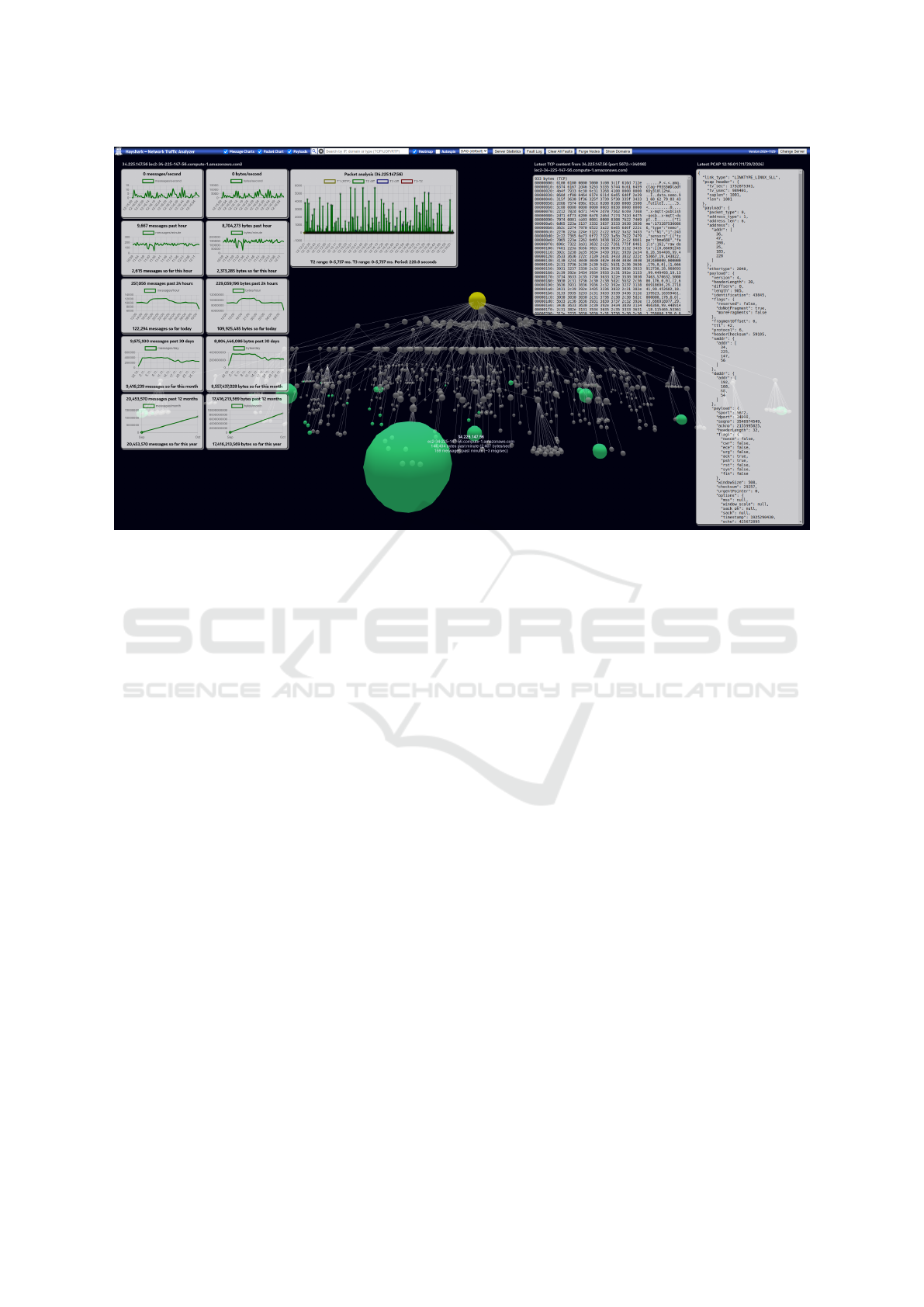
Figure 1: Hayshark Web User Interface. Directed Acyclic Graph in the display represents the hierarchy of IPv4 addresses
from which network traffic has been received. The display is fully interactive and zoomable. Yellow node represents the server
whose network traffic is being analyzed. Green and gray nodes in the graph represent incoming IPv4 data streams that are
online and offline, respectively. Relative size of nodes reflects the current amount of traffic in each stream. Panel on the left
displays historical statistics for the currently selected node. Panels on the right display either summary statistics for the entire
server, or the latest PCAP payload as well as a hexadecimal view (hexdump) of the latest message in the currently selected
node. Panel above the graph displays packet analysis details that vary depending on the type of payload. Hovering over
individual nodes changes the currently displayed information in the surrounding panels.
Node Labels. The amount of displayed details
in the user interface is varied dynamically in order
to avoid cluttering the screen unnecessarily. Among
other things, this means that textual labels next to
nodes/streams are typically displayed only when hov-
ering above the nodes. Upon hovering on a node, at
the very minimum the IPv4 address and the domain
name of the stream (if available) is displayed next
to the node, along with a numeric summary of cur-
rent data volume in terms of messages per minute and
bytes per minute. Additional information will be dis-
played next to the node automatically if the stream
starts experiencing technical problems such as packet
loss or RTP packet sequence order mismatches.
Side Displays/Panels. By default, three different
side displays (panels) are shown in the Hayshark user
interface.
• Message Charts panel on the left provides an
overview of message statistics in terms of mes-
sages and bytes received past minute, past hour,
past day, past month and past year. Charts are up-
dated automatically based on the node in the user
interface that the user is currently hovering on.
• Payload panel on the right displays the very lat-
est packet capture (PCAP) message payload of the
currently selected node – this is basically the full
TCP or UDP header structure in IETF PCAP for-
mat (Harris and Richardson, 2024) displayed as a
readable JSON object.
A hexdump view is displayed alongside the pay-
load view to show the actual latest message pay-
load content in printable, readable form.
Note that payloads are visible only when hov-
ering over those nodes that represent IPv4 ad-
dresses. Alternatively, when hovering over the
server node, server statistics for the entire system
are displayed. The server-specific view also in-
cludes an additional chart that displays the num-
ber of active (online) streams and the total number
of streams in the past 24 hours.
For convenience, the top toolbar includes a but-
ton that can be pressed to go quickly back to the
server-specific view without having to locate the
yellow icon representing the server.
• Packet Analysis panel at the top of the display
shows a summary of packet timestamp analysis
Hayshark: A Web-Based System for Remote Visualization of Network Traffic
525

for the currently selected node. This panel is
intended primarily for analyzing RTP and other
message payloads that provide additional times-
tamps and/or packet sequence data at the header
of the received message payload.
Each of these three different panels can be tog-
gled on or off individual from the top toolbar if more
screen space is needed for viewing the graph.
3 MORE ADVANCED FEATURES
The Hayshark system includes a number of more ad-
vanced features. Many of these features are avail-
able from the top toolbar or from context menus that
can be opened by right-clicking or long-pressing the
nodes on the screen. These context menus can be cus-
tomized programmatically to provide stream-specific
functionality.
Free-Text Search with Pulsating Search Result
Visualization. A search mechanism is available in
the top toolbar that makes it possible to perform free-
text searches across all the streams in the server. By
default, searching is performed over IPv4 addresses
and the domain names and/or domain owners of each
stream. In the user interface, matching search re-
sults are highlighted by pulsating (incrementally en-
larging and shrinking the size of) the nodes represent-
ing the individual streams. These animated, pulsat-
ing nodes make it easy to see quickly how many of
the streams in the entire system match the provided
search term. After a successful search, a transient
non-modal dialog window is also shown briefly to in-
dicate how many matching search results were found.
Data related to each pulsating node (e.g., recent mes-
sage statistics and payloads) can be viewed quickly
by hovering or touching each node.
Searching by Stream Content Type
(TCP/UDP/RTP/QUIC.) In addition to free-
text search, a number of alternative, more structured
search features are provided. In particular, we sup-
port searching by stream type – or more specifically
by network protocol, i.e., whether the incoming
content in each stream represents TCP or UDP traffic.
Support for automatic detection and highlighting of
streams that are currently receiving RTP (Schulzrinne
et al., 2003) or QUIC (Iyengar and Thomson, 2021)
content is also provided.
Ability to Narrow Down the Presented Graph
by Time Parameters. An additional search-related
function in the Hayshark system is the ability to nar-
row down (limit) the number of presented nodes by
time frames. For this purpose, the Hayshark UI in-
cludes a selector that makes it possible to limit the
Figure 2: Detailed View from the Hayshark Web UI when
streaming video content. The node drawn in orange color
has some faults associated with it. Large node size indi-
cates that the stream is currently receiving a large volume
of message traffic in relation to the total incoming data vol-
ume in the system.
number of nodes presented in the user interface only
to those that have received data in the past hour, past
three hours, past six hours, past twelve hours, past 24
hours, and past 48 hours. In principle, historical/past
timeframes could be supported as well, but in our pri-
mary use cases we have been interested mainly in cur-
rently incoming network traffic.
Automatic Domain Name and WHOIS Domain
Owner Lookup. For end-user convenience, the sys-
tem performs a domain name lookup for every IPv4
address detected by the system. If a domain name
is unavailable, the system will additionally perform a
WHOIS lookup for the given IPv4 address in order to
obtain information about the domain owner. Domain
name and owner information are then made available
in various locations in the user interface, e.g., in node
labels and side display panel headers. Furthermore,
as already mentioned above, domain information can
be used in the free-text search function so that the user
can easily locate all streams belonging to a certain do-
main or domain owner.
Fault Detection and Fault Log. The Hayshark
system includes features for analyzing error condi-
tions in the underlying message traffic. In particu-
lar, the system has been designed to perform anomaly
detection in those streams that deliver RTP media
content. As summarized in the RTP Specification
(Schulzrinne et al., 2003), RTP packets include packet
sequence numbers and timestamps that can be used
for detecting packet loss and/or packet delivery order
mismatches. The Hayshark system tracks these val-
ues, and reports any detected abnormalities as faults
(see Figure 2). The system maintains an internal fault
log that contains the number of faults detected in each
stream. The top toolbar of the Web UI has a button for
opening and viewing the fault log. When opening the
WEBIST 2025 - 21st International Conference on Web Information Systems and Technologies
526
fault log, the system will also automatically highlight
all those streams that have associated faults with the
pulsating search function mentioned above.
Programmable Alerts. We have recently added
mechanisms for defining programmatic alerts on a
number of conditions in the system. Among other
things, it is possible to define rules that allow the user
to be notified automatically when a specific IPv4 ad-
dress or wildcard-based IPv4 address range starts re-
ceiving content. Rules can also be added per content
type, i.e., for automatic notifications when new RTP
data streams are detected. We support both interac-
tive alerts in the Web UI as well as notifications that
are sent to external systems such as predefined Slack
accounts/channels. Notifications related to detected
faults (see above) can also be forwarded to external
systems if so requested in the system settings.
Automated Decay and Manual Purging of Ob-
solete Streams. Over time, graphs representing all in-
coming network traffic have a tendency to grow very
large. While modern web browsers can relatively eas-
ily render graphs consisting of thousands of nodes,
such large graphs tend to be too cluttered for practical
use. For this reason, we provide support for manually
purging selected nodes or groups of nodes that have
not received any traffic for the past N hours (where
number N can be specified by the user). It is also pos-
sible to specify automated decay of streams so that the
system will automatically delete all those nodes that
have not received traffic, e.g., in the past week or so.
Figure 3: Another Detailed View Using Flat Rendering
Mode.
Alternative Rendering Modes (3D and Flat.)
The Hayshark Web UI supports two alternative lay-
out/rendering modes in addition to the default Di-
rected Acyclic Graph (DAG) rendering mode.
In the 3D mode, the system renders nodes using a
classic gravity simulation model in which the central
yellow node representing the server is in the middle,
and all the other nodes are then drawn around the cen-
tral node spherically in a 3D space at increasing dis-
tances based on their role in the IPv4 address space.
In this arrangement, nodes representing full IPv4 ad-
dresses (”x.x.x.x”) are drawn farthest away from the
central node. Just like with the DAG mode, this struc-
ture can be rotated, panned, zoomed and generally
viewed from any angle.
In the flat mode (also informally known as the
”pizza mode”), the system renders the entire IPv4
namespace on a flat plane in the 3D space (Figure 3).
Basically, all the nodes (streams) are drawn in a circu-
lar, flat layout. Since rendering is performed in the 3D
space, the resulting ”pizza” can be viewed from top,
bottom or generally from any angle. The user can also
pick up nodes and ”elevate” those nodes away from
the default plane in order to inspect specific streams in
more detail. More broadly, graphs in both 3D and flat
rendering modes are still force-directed, i.e., graphs
are still fully editable and controlled by the gravity
simulation.
Given the inherently hierarchical four-level struc-
ture of IPv4 addresses, we have observed that the
DAG rendering mode is generally best and most prac-
tical for viewing network traffic. Therefore, we rarely
use the alternative rendering modes ourselves, but
some of our users have found them useful.
Ability to View Data from Different Servers
Remotely. Last but not least, a central feature of the
Hayshark system is the ability to view network traf-
fic data from a multitude of different servers remotely.
At the implementation level, the Hayshark frontend
(Web UI) and backend components (i.e., those com-
ponents that perform the actual network traffic analy-
sis) are entirely separate. By deploying the backend
on multiple computers and by configuring the fron-
tend to be aware of those backend instances, the same
Hayshark Web UI can be used for interactively view-
ing accumulated network data from any number of
servers/machines.
We have experimented with an approach in which
the graphs representing network traffic on different
servers are drawn in the same user interface view, i.e.,
multiple directed acyclic graphs were drawn in the
same web browser window. However, because of the
potentially very large number of nodes in such views
(tens of thousands of nodes), this approach turned out
to be too cluttered and thus less practical from the
user’s perspective than we initially expected. There-
fore, we typically render data from just one server at
each time, and provide functionality in the Web UI to
easily switch the server whose data is to be viewed.
Hayshark: A Web-Based System for Remote Visualization of Network Traffic
527
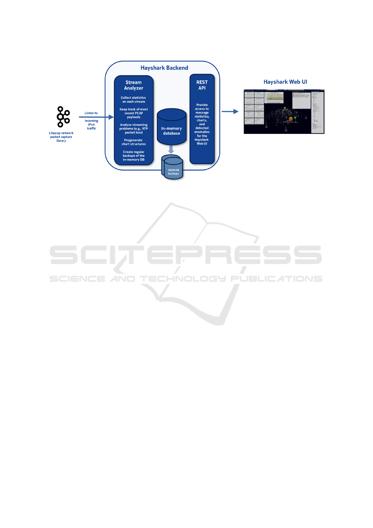
Figure 4: Overview of the Hayshark System End-to-End Architecture. Hayshark backend will listen to all the incoming
network traffic on the target server, and then collect statistics and analyze anomalies in each and every IPv4 address from
which traffic is received. Collected data are made available to Hayshark Web UI (frontend) instances via a REST API. Note
that backend(s) and frontend(s) can be running on different machines, and thus each Web UI frontend can be configured to
simultaneously listen to multiple backends/servers remotely.
4 IMPLEMENTATION
ARCHITECTURE
At the implementation level, the Hayshark system is
built upon an end-to-end architecture that consists of
separate backend and frontend components. Network
data collection is performed by a lightweight backend
that is running on each machine whose network traf-
fic is being analyzed. Data visualization is performed
by a web client frontend that is implemented as a pure
client-side web application. The frontend communi-
cates with the backend(s) via a REST API provided
by the backend. There can be any number of backend
and frontend instances depending on how the system
is configured. An overview of the Hayshark system
end-to-end architecture is shown in Figure 4.
Hayshark Backend. In order to speed up the
overall rendering process, network data collection and
pregeneration of the graph structures are performed
on the backend. Basically, the backend listens to all
the network traffic on the server utilizing the same un-
derlying libpcap network packet capture library that is
used by Wireshark and other popular network analy-
sis tools. The backend then maintains an in-memory
database that accumulates information on each and
every stream in the system, collects statistics and
other information on recent message payloads and
anomalies, and offers the collected information to
clients via a web server and a set of REST APIs.
Data are collected both at the level of individual
streams (for each and every IPv4 address from which
network traffic is received) and at the level of the
entire server (cumulatively summarizing all network
traffic on the server). Statistics are collected and sum-
mary charts are pregenerated for different timeframes,
including 1) past 60 seconds, 2) past 60 minutes, 3)
past 24 hours, 4) past 30 days and 5) past 12 months.
It should be noted that although we currently listen
to incoming network traffic only, there is no funda-
mental reason why the same data collection practices
could not be applied also to outbound network traf-
fic. The decision to focus on incoming network traffic
arose simply from our original use cases.
In addition, the backend analyzes and tracks pos-
sible anomalies in stream behavior such additional
latencies, packet loss, packets arriving in wrong or-
der and invalid message payloads. All the detected
anomalies are collected in a fault log maintained by
the backend. Anomaly detection capabilities are cus-
tomizable and they include the means to generate
alerts upon predefined conditions such as packet loss
or significant streaming latencies.
Hayshark Frontend. All the computation-
intensive rendering in the Hayshark system is per-
formed on the client side using a force-directed
3D graph library that leverages the GPU-accelerated
WebGL (https://get.webgl.org/) rendering capabilities
that are available in all major web browsers nowa-
days. Given the availability of modern GPU acceler-
ated graphics, WebGL provides remarkable rendering
WEBIST 2025 - 21st International Conference on Web Information Systems and Technologies
528

performance in a web browser even with large graphs
that consist of thousands of nodes and edges. An ad-
ditional benefit of this approach is that it scales well to
any number of viewers without dramatically increas-
ing the load on the backend(s). By performing data
collection in the cloud, the Hayshark clients (user in-
terfaces running in a web browser) do not have to
directly listen to data on the servers (a web browser
client would not be able to do so in the first place be-
cause of sandbox restrictions).
Notes on the Communication Architecture. By
using the REST APIs offered by the Hayshark back-
end, clients can request and receive ready-made JSON
data structures that are nearly immediately ready for
rendering in the Hayshark Web UI or other client en-
vironments so that hardly any additional processing is
required on the client side. This speeds up the over-
all rendering process considerably, since no other pro-
cessing is required on the client side than the render-
ing of the force-directed graph.
In order to avoid interfering with the network traf-
fic that is being inspected on the backend server, we
use a two-tiered data update approach between the
backend and the client(s). Basically, clients request
and receive only a very small data update related to
the stream whose data is currently being displayed in
the UI panels. By default, these smaller updates are
performed every two seconds. More significant data
updates (impacting the entire directed acyclic graph)
are usually performed once a minute.
In general, we have put a lot of focus on avoiding
”Heisenberg effect” in which the measurement and
data collection process would interfere substantially
with the measurement results. This is partly why we
decided to separate the rendering parts from the back-
end entirely and use an in-memory database on the
backend instead of a conventional database solution.
(Note: backend and frontend components can be run
on the same computer, but that is not our typical de-
ployment model.)
Persistent Storage. Although the Hayshark back-
end maintains its data structures primarily in central
memory (in an in-memory database) for performance
reasons, the system creates periodic backups of the
entire in-memory database to ensure that collected
data can be restored from backups if necessary. To
support backup/restore functionality, the in-memory
database structure has been designed as a large JSON
structure that can be dumped easily into any JSON-
compatible database systems such as JsonDB (https:
//jsondb.io/) or simply as a large text file. During
the development of the Hayshark system, the inter-
nal data structures have been optimized considerably,
e.g., to reduce the amount of data that needs to be
delivered over the network between the web clients
and the backend, and generally to improve the overall
scalability of the system.
Containerization. For ease of deployment, we
provide a containerized/dockerized version of the
Hayshark system in which the backend and frontend
components can be built and deployed onto a single
computer simply by running a ”DOCKER COMPOSE
UP” command. Configuration files are provided for
customizing this basic setup to support multiple back-
ends that can be viewed from a single Web UI.
5 RELATED WORK
The work presented in this paper is related primarily
to network traffic analysis and specifically to visual-
ization and analysis of streaming TCP/UDP network
data. There are various existing systems in this area
that can be divided broadly into two categories: (1)
those that are available for free and (2) those that re-
quire a commercial license. In addition, many of the
commercial tools offer a free version that is either a
subset of all the functionality provided by the full ver-
sion, or a time-restricted trial version that requires a
commercial license after the free trial period ends.
Freely Available Tools. The best known freely
available network analysis tools include Wireshark,
TShark, tcpdump, iPerf and ntop. Out of these tools,
Wireshark (https://www.wireshark.org/) is by far the
most widely known and very well established. Wire-
shark is commonly regarded as an industry standard;
its history goes back to late 1990s, and it is still be-
ing developed very actively. In fact, the most recent
Wireshark version 4.4.6 was released just as we were
writing this paper. Wireshark provides a graphical
user interface, and it offers a nearly endless amount
of customization options.
In contrast, TShark, tcpdump and iPerf are lower-
level tools that that can be used for packet capture
analysis and network performance measurement from
the command line. Just like Wireshark, these tools
provide a rich set of options, and they generally re-
quire a lot of technical expertise before they can be
used in a productive manner.
Out of the freely available tools with a graphical
interface, ntop (https://www.ntop.org/) and its recent
variant ntopng offer an intuitive graphical user inter-
face that presents that total volume of network traffic
on a machine as a combination of traditional charts
and Sankey flow diagrams (Schmidt, 2008) in which
currently active data flows between hosts are repre-
sented as colored bars depicting network traffic flows
between a client (on the left edge of the bar) and a
Hayshark: A Web-Based System for Remote Visualization of Network Traffic
529

Figure 5: Sankey flow diagram in ntopng user interface.
server (on the right edge of each bar). Bar width is
proportional to the amount of traffic exchanged (over-
all current data volume); the wider the bar, the higher
the traffic exchanged between the corresponding pair
of hosts. An example of such a Sankey flow diagram
is shown in Figure 5.
Commercial Tools. There are a large number
of commercially available tools and environments for
network analysis and visualization. Well-known com-
mercial tools include the following:
• Auvik Network Management
• Azure Network Watcher
• Broadcom DX NetOps
• Cisco Network Analysis Module
• Dynatrace Network Monitoring
• Icinga Cloud Monitoring
• Kentik Network Observability Platform
• Nagios Network Analyzer
• Netreo Traffic Monitor
• Noction Flow Analyzer
• Plixer Scrutinizer
• ProgressFlowmon
• SolarWinds Netflow Traffic Analyzer
• Splunk Network Traffic
• Zabbix Network Monitoring
(Web sites/links for these commercial tools can
be found relatively easily by performing internet
searches. We decided not to include the links here,
since the URLs tend to be very lengthy.)
The scope and intended usage of these tools varies
considerably. While the majority of tools put a lot
of focus on network throughput optimization, some
of the tools are geared more towards corporate net-
work monitoring or private network deployments, i.e.,
monitoring entire network deployments instead of just
individual computers. Furthermore, some of the tools
are more security-oriented and focused on network
security threat detection. The majority of the tools
offer a suite of graphical visualization tools and dash-
boards that can be customized for different use cases
and network deployments.
Given the diversity and the proprietary nature of
many of the aforementioned tools, it is difficult to
perform any kind of truly objective comparison be-
tween them. Furthermore, it should be noted that our
Hayshark system was originally built for a consid-
erably narrower use case – basically, Hayshark was
conceived as a practical visualization tool that could
provide an at-a-glance view of all the network traffic
on a machine, with the added requirement to report
streaming issues related to RTP media (video and au-
dio) content. From that perspective, our system was
never intended to compete with the more established
commercial systems.
In practice, many of our users are frequently using
the Hayshark system together with Wireshark. Ba-
sically, Hayshark can provide a visual ”big picture”
and first indications and alerts on possible error con-
ditions as they emerge; users can then deep dive into
those conditions using Wireshark that provides far
more detailed analysis and reporting capabilities that
have been developed over the past two decades.
Architecturally, all of these systems are rather
similar in the sense that they utilize the packet cap-
ture libraries available in modern operating systems.
However, the visualization features of these sys-
tems vary considerably. From the usability view-
point, Wireshark can hardly be described as very user
friendly – indeed, the complexity of its use is prob-
ably one of the key reasons that has given rise to so
many other network traffic visualization tools.
Given the importance of the overall topic, there
are obviously plenty of existing academic publica-
tions in the network traffic analysis area as well
specifically in analyzing media streaming. Examples
of good survey articles include, e.g., (Zhang et al.,
2009), (McCreary and Claffy, 2000), (Chesire et al.,
2001), (Sripanidkulchai et al., 2004).
Data Visualization. In the general data visualiza-
tion area, there are survey papers that provide com-
prehensive surveys of nearly all imaginable visualiza-
tion techniques and strategies for visualizing complex
graphs and tree structures. For instance, Schulz et al.
provide an excellent survey of the design space of im-
plicit hierarchy visualization techniques in their 2011
journal paper (Schulz et al., 2011) as a follow-up to
their earlier 2006 survey paper on tree visualization
(Schulz and Schumann, 2006). Schulz has also cre-
ated an online tool called Treevis (https://treevis.net/)
that provides interactive illustrations of over 330 dif-
ferent visualization techniques, including references
to the original inventors/authors of those techniques
WEBIST 2025 - 21st International Conference on Web Information Systems and Technologies
530

(Schulz, 2011). An early annotated bibliography of
graph drawing algorithms is available from Battista et
al. (Battista et al., 1994).
As mentioned earlier in the paper, the user inter-
face of the Hayshark system is derived from a Hay-
wire Stream Analyzer tool that we had previously de-
veloped for analyzing streaming data in the context
of IoT systems (Taivalsaari, 2024). The earlier Hay-
wire system used a zoomable force-oriented gravity
simulation 3D tree layout as the primary visualization
technique.
The basics of such force-directed gravity visual-
ization algorithms have been presented in the 1980s
and 1990 by Eades and Fruchterman (Eades, 1984),
(Fruchterman and Reingold, 1991). However, when
we shifted our focus to visualizing IPv4 address
spaces, we quickly noticed that unconstrained 3D tree
layouts had a tendency to become very messy as the
number of nodes/addresses in the graph grew larger.
Therefore, we migrated to use more structured di-
rected acyclic graph (DAG) structures as the primary
visualization technique in Hayshark, while the under-
lying gravity simulation principles remain the same.
Related to the creation of zooming user interfaces,
we have a long history in researching and implement-
ing such zooming UI systems ourselves (Smith and
Taivalsaari, 1999), (Taivalsaari, 2008). Based on our
observations, the zooming capabilities can help con-
siderably in investigating the visualized IPv4 address
space at varying levels of detail by making it possible
for the user to interactively ”fly inside” the complex
DAG structure that is rendered dynamically in a 3D
space.
All in all, while none of the individual concepts
behind the Hayshark system are truly novel, the over-
all combination of the features is unique and – more
importantly – very practical.
6 EXPERIENCES AND FUTURE
WORK
As stated earlier in the paper, the Hayshark system
was developed as a ”byproduct” to facilitate the de-
velopment of a commercial 360° live video stream-
ing platform targeting industrial customers. Typical
use cases for that platform include, e.g., remote mon-
itoring and operations in industrial facilities such as
mines, factories and warehouses. It was never our in-
tention to set out and build a tool explicitly for net-
work analysis. However, since we had already ear-
lier built a similar visualization system for analyzing
streaming data in the context of end-to-end IoT sys-
tems, we were aware of the potential of such ”at-a-
glance” visualization tools and realized that the same
principles and practices could be adapted relatively
easily also to network traffic visualization.
At this point, we have not conducted any signifi-
cant user studies with the Hayshark system. As noted
above, our users are commonly utilizing and prefer-
ring it as an ”early notifier” tool that can save efforts
before they start investing a lot of time into more
detailed problem analysis with Wireshark and other
tools. The Hayshark system can also effortlessly pro-
vide information on all the domains from which traf-
fic has been received, and display faults and gener-
ate alerts on various conditions, e.g., related to RTP
streaming issues, sudden spikes in data volumes, and
so on. While none of those features are truly new as
such, together these features serve as a practical com-
bination for various use cases and purposes.
Future work on the Hayshark system will include
more formal user studies as well as various techni-
cal improvements. In the latter area, there are plenty
of low hanging fruit left above and beyond our orig-
inal use cases, including support for visualizing IPv6
traffic as well as visualizing statistics at the more de-
tailed level for particular sender/receiver port combi-
nations. Basically, PCAP packet capture data includes
information from which port on the sender side and
to which port on the receiver side each packet is be-
ing sent; such data could be added as an additional
level/layer in our graph structures. Support for visu-
alizing outbound message traffic could be added as
well. All of these features would be rather trivial to
implement, but so far they have not been high pri-
orities to us since those features were not relevant
in the context of our original target system require-
ments. However, features that are relevant in the con-
text of media streaming systems include support for
analyzing and detecting problems in additional media
streaming protocols. So far, we have been adding new
protocol support on a ”as needed” basis.
We are also looking into additional performance
optimizations on the backend side, since message fre-
quencies and data volumes (both in terms of messages
per second and bytes per second) in media streaming
systems can sometimes be truly massive. This is pre-
cisely why Wireshark and many other tools provide
offline analysis capabilities in which message capture
and analysis can be performed separately instead of
(or in addition to) live analysis. Since the Hayshark
system focuses on interactive network traffic visual-
ization, it is very much in our interest to be able to per-
form live analysis also when receiving tens of thou-
sands of messages per second.
Hayshark: A Web-Based System for Remote Visualization of Network Traffic
531

7 CONCLUSION
In this paper we have presented a system called
Hayshark that can be used for providing a live, vi-
sual ”at-a-glance” overview of all the incoming net-
work traffic on a computing device. We started the
paper with an overview of the Hayshark system from
the end user’s perspective, followed by a summary of
more advanced system features. We then focused on
the implementation architecture that consists of sepa-
rate backend and frontend components. In the rest of
the paper, we discussed related work and provided a
summary of experiences and plans for future work.
While the Hayshark system is by no means a silver
bullet or a universal solution for all problems in the
realm of network data visualization, it has turned out
to be a practical, purpose-built and convenient tool
that can complement the use of other network analysis
tools – and more generally provide a big picture of all
the network traffic on a variety of computing devices
and servers.
REFERENCES
Battista, G. D., Eades, P., Tamassia, R., and Tollis, I. G.
(1994). Algorithms for drawing graphs: an annotated
bibliography. Computational Geometry, 4(5):235–
282.
Chesire, M., Wolman, A., Voelker, G. M., and Levy, H. M.
(2001). Measurement and analysis of a streaming me-
dia workload. In 3rd USENIX Symposium on Internet
Technologies and Systems (USITS 01), San Francisco,
CA. USENIX Association.
Eades, P. (1984). A heuristic for graph drawing. Congressus
Numerantium, 42:149–160.
Fruchterman, T. M. J. and Reingold, E. M. (1991). Graph
drawing by force-directed placement. Software –
Practice and Experience, 21(11):1129–1164.
Harris, G. and Richardson, M. (2024). Pcap capture file for-
mat, ietf specification draft 04, 2024-08-04. retrieved
2024-12-10.
Iyengar, J. and Thomson, M. (2021). Quic: A udp-based
multiplexed and secure transport, ietf specification
draft rfc9000. retrieved 2024-12-10.
McCreary, S. and Claffy, K. (2000). Trends in wide area ip
traffic patterns - a view from ames internet exchange.
Proceedings of 13th ITC Specialist Seminar on Inter-
net Traffic Measurement and Modeling, Monterey, CA.
Schmidt, M. (2008). The sankey diagram in energy and ma-
terial flow management. Journal of Industrial Ecol-
ogy, 12(1):82–94.
Schulz, H.-J. (2011). Treevis.net: A tree visualization ref-
erence. IEEE Computer Graphics and Applications,
31(6):11–15.
Schulz, H.-J., Hadlak, S., and Schumann, H. (2011). The
design space of implicit hierarchy visualization: A
survey. IEEE Transactions on Visualization and Com-
puter Graphics, 17(4):393–411.
Schulz, H.-J. and Schumann, H. (2006). Visualizing graphs
– a generalized view. In Proceedings of the Interna-
tional Conference on Information Visualisation, vol-
ume 9, pages 166–173.
Schulzrinne, H., Casner, S., Frederick, R., and Jacobson, V.
(2003). Rtp: A transport protocol for real-time appli-
cations, ietf specification rfc3550. retrieved 2024-12-
10.
Smith, R. and Taivalsaari, A. (1999). Generalized and
stationary scrolling. In Proceedings of the 12th An-
nual ACM Symposium on User Interface Software and
Technology (UIST’99), pages 1–9.
Sripanidkulchai, K., Maggs, B., and Zhang, H. (2004). An
analysis of live streaming workloads on the internet.
pages 41–54.
Taivalsaari, A. (2008). Radial scrolling revisited.
Sun Microsystems Laboratories Technical Report
SMLI TR-2008-176, June 2008. Available online:
https://dl.acm.org/doi/pdf/10.5555/1698209.
Taivalsaari, A. (2024). Haywire: A system for visualiz-
ing and analyzing streaming iot data. In 9th Inter-
national Conference on Fog and Mobile Edge Com-
puting (FMEC’2024, Malm
¨
o, Sweden. September 2-5,
2024), pages 22–29. IEEE.
Zhang, M., Dusi, M., John, W., and Chen, C. (2009). Analy-
sis of udp traffic usage on internet backbone links. In
2009 Ninth Annual International Symposium on Ap-
plications and the Internet, pages 280–281.
WEBIST 2025 - 21st International Conference on Web Information Systems and Technologies
532
