
Effect of Data Visualization on Users’ Running Performance on
Treadmill
Thanaphon Amattayakul
a
and Puripant Ruchikachorn
b
Faculty of Commerce and Accountancy, Chulalongkorn University, Phayathai Road, Bangkok, Thailand
Keywords: Data Visualization, Data Representation, Data Perception, User Experience, Health, Running Activity, Time
to Exhaustion, Motivation, Behavior.
Abstract: This paper examined how real-time data visualization influences treadmill users’ performance and experience.
Traditional treadmill displays are often represented with texts, limiting user engagement and motivation. By
applying visualization techniques that align with human cognitive processing, such as line charts and progress
indicators, we proposed data visualization designs to represent running performance metrics more
meaningfully. The study applied 3 display conditions: traditional and two improved visualization displays.
Through a within-subjects experiment with 18 participants, metrics such as time to exhaustion, heart rate,
distance, and calorie expended were collected along with subjective feedback. Statistical analysis showed that
both visualization displays significantly improved running performance and satisfaction. Results showed that
real-time feedback with data visualization design can positively influence users’ understanding and
psychological connection to their fitness data. These findings highlight the potential of data visualization to
perceive and elevate user experience in exercise interfaces.
1 INTRODUCTION
In today’s data-driven era, data visualization plays a
crucial role in transforming information into insights,
influencing decision-making and behaviors. This is
particularly relevant in exercise contexts, where
treadmill users often rely on feedback to monitor their
performance. However, traditional treadmill displays
typically present data in simple text formats. Prior
studies have demonstrated the potential of data
visualizations to support engagement and behavioral
change. Stusak et al. (2014) explored how
personalized physical visualizations —such as 3D-
printed sculptures of running data could positively
affect runners’ performance, motivation, and social
interactions. Their work showed that physical
visualization feedback not only served as passive
information but also sparked competition,
conversation, and deeper personal engagement,
highlighting the importance of meaningful and
embodied data representation.
Similarly, Coenen and Vande Moere (2021)
examined how situated public visualizations of
a
https://orcid.org/0009-0004-3454-7298
b
https://orcid.org/0000-0002-2721-6915
running statistics on displays in public spaces
encouraged social reflection and community
dialogue. Their findings emphasized that accessible,
interactive visualizations could stimulate casual users
to compare, interpret, and discuss their performance
with others. Additionally, Kashanj et al. (2024)
demonstrated that runners responded more quickly
and preferred glanceable visualizations over text
when using smartwatches during running, due to the
ease of real-time interpretation and enhanced
situational awareness.
Building on these insights, this study investigates
the transformative potential of well-designed, real-
time visualizations embedded within treadmill
interfaces to enhance motivation, self-reflection, and
exercise performance. While prior research has
explored physical, public, and wearable displays that
apply to data visualization, a gap remains in
understanding the impact of dynamic, on-screen
visual feedback during treadmill workouts.
This research aims to bridge that gap through
experimental studies. To guide this experimental
investigation, we set two research questions:
Amattayakul, T., Ruchikachorn and P.
Effect of Data Visualization on Users’ Running Performance on Treadmill.
DOI: 10.5220/0013644700003967
In Proceedings of the 14th International Conference on Data Science, Technology and Applications (DATA 2025), pages 669-676
ISBN: 978-989-758-758-0; ISSN: 2184-285X
Copyright © 2025 by Paper published under CC license (CC BY-NC-ND 4.0)
669

1. How does real-time visual presentation of
exercise data affect user’s running
performance?
2. Can improved display with visualization
designs lead to increased satisfaction and
motivation compared to traditional treadmill
displays?
In response to these questions, we apply
enhanced real-time data visualization techniques to
treadmill exercise interface, focusing on presenting
user’s activity performance with perceptual clarity,
goal motivation, and real-time feedback, which have
not been fully explored in previous treadmill
visualization studies.
2 RELATED WORKS
This section reviews related works in three areas:
exercise performance and feedback indicators,
visualization design principles, and the visual
feedback in physical activity. These topics provide a
foundation for understanding how visualization can
support user engagement and satisfaction. A review
of these areas also helps identify existing gaps and
challenges in designing effective feedback systems.
The insights drawn from prior studies inform the
development of the visualization strategies proposed
in this study.
2.1 Running Performance and User
Feedback Indicators
Running performance metrics that are frequently used
in previous related studies, Passafiume et al. (2022)
examined how visual feedback influences breathing
efficiency and time to exhaustion. Schiewe et al.
(2020) evaluated smartwatches displaying distance
and speed. To assess endurance and performance,
time to exhaustion, heart rate, distance covered, and
energy expended are frequently used (Nicolò et al.,
2019; Walsh et al., 2010). In terms of subjective
experience, perceived exertion has been defined as
the sense of effort during physical activity by Borg
(1982). For clarity and user familiarity, Helms et al.
(2016) proposed the revised scale to be a 0-10 scale.
User satisfaction is measured via questionnaires, as
proven in studies by Cawthon and Moere (2007),
Michelle et al. (2013), and Saket et al. (2019), who
evaluated visualization effectiveness using both
aesthetic and performance-based questions. Yang et
al. (2014), Alves et al. (2020), and Carvalho and
Chaves (2013) applied user preferences to study how
different visualization styles relate to user insights
and needs.
These metrics, both objective and subjective,
provide a framework for evaluating running
performance and user experience, enabling an
understanding of how data visualization can influence
physical outcomes and motivational responses.
2.2 Visualization Design
To find out how visualization should be designed,
Wills Graham (2011) mentioned that line charts and
scatterplots are effective options when both variables
measure continuous values, especially when one
variable is time. Areas may also be used, depending
on the quantity being displayed on the y dimension.
Myers (1985) suggested that users perceive systems
with progress indicators as faster and more satisfying.
Harrison et al. (2007) explained how progress bars
represent task progress and are usually applied to
modern interfaces. Yentes et al. (2012) surveyed that
progress bars can improve user enjoyment. This is
aligned with the “goal gradient effect” (Hull, 1932),
which suggested that effort increases as one
approaches a goal. Kivetz et al. (2006) found that this
effect also affects consumer behavior. Becker and
Pligt (2016) found that people put in more effort
toward the end of a goal.
Together, these insights showed that visualization
should also be thoughtfully designed to align with
human perception and motivation. By leveraging
visual elements such as progress indicators or goal-
oriented designs, visualizations can enhance user
satisfaction and drive toward action.
2.3 Visualization in Physical Activity
Table 1 compares studies that influence physiological
performance or user motivation. Ali-Hasan et al.
(2006) examined the concept of social data
visualization, which helps users to track their fitness
data and compare it with other users. Fister was
focused on post-session visualization, not real-time
feedback. The shift toward real-time visualization for
performance enhancement was marked by Crowell et
al. (2010), who examined real-time treadmill-based
visualization using waveform line chart visual
feedback. This approach helped reduce users’ impact
loading and supported learning and maintaining
proper running form technique. The coming of
wearable technology expanded real-time feedback
beyond treadmills and gym environments. Passafiume
et al. (2022) evaluated how real-time animated
breathing
feedback affected endurance. Unlike
DATA 2025 - 14th International Conference on Data Science, Technology and Applications
670
Table 1: Comparative Review of Visualization Techniques in Physical Activity. A check mark (✓) indicates the presence of
the corresponding characteristic in each study.
Moving
viewer +
Stationary
visualization
Display
on
treadmill
Real-time
feedback
Visual
activity
performance
Data visualization design
usage
Evaluate
with activity
performance
Evaluate
with
subjective
feedback
Line chart or
Bar chart
Progress
chart
Ali-Hasan et al. (2006)
✔ ✔
Nadalutti and Chittaro (2007)
✔ ✔
✔ ✔
Crowell et al. (2010)
✔ ✔ ✔
✔
Stusak et al. (2014)
✔
✔
Eikey et al. (2015)
✔
✔
✔
Lucas-Cuevas et al. (2018)
✔ ✔
Zhi et al. (2019)
✔
✔
✔
Schiewe et al. (2020)
✔
✔
Coenen and Vande Moere (2021)
✔
✔ ✔
✔
Passafiume et al. (2022)
✔ ✔ ✔
✔
Kashanj et al. (2024)
✔ ✔ ✔ ✔
✔
Present study (2025)
✔ ✔ ✔ ✔ ✔ ✔ ✔ ✔
distance- or pace-based visualizations, this study
showed that breathing synchronization with
animation can improve running efficiency, though it
did not significantly extend users’ time to exhaustion.
While various studies highlight the motivational
potential of visualization feedback, their findings are
inconsistent, particularly regarding which techniques
are most effective across different contexts. However,
few have explored how real-time visualizations can
be applied to support continuous performance and
motivation during treadmill running.
To address this
gap, this study experimentally investigates the impact
of goal-oriented real-time visualizations on users’
physical performance and motivation.
3 METHODS
This section outlines the methods used to investigate
the impact of visualization during treadmill running.
It includes experimental design and the development
of the display.
3.1 Experiment Design
Eighteen participants (10 females, 8 males) aged 20
to 26 with prior treadmill experience (minimum 3
hours total usage and regular weekly exercise) were
recruited. Each participants attend four treadmill
running session over four weeks, with different
treatment order to minimize bias. Sessions were
spaced approximately one week apart. All
participants experienced all conditions.
- T0: Baseline (no display)
- TT: Traditional Display
- T1: Improved Display 1 (line chart and circular
progress chart)
- T2: Improved Display 2 (line chart, circular
progress chart, and average indicator)
We collected objective and subjective measurement
metrics to analyze the difference between treatment
in each user.
- Objective measurements: Time to exhaustion,
heart rate, distance, calories expended.
- Subjective measurements: Perceived exertion
(10-level Borg scale), satisfaction (1-5 scale),
use preference.
After each session, participants rated their effort
using the 10-level Borg scale and completed a user
satisfaction survey. This feedback provided
additional insights into their perceptions of the
visualization designs.
3.2 Display Design
Line charts were used for speed and heart rate, as
related studies supported their use for time-series data
(Tufte, 1983; Munzner, 2014). For cumulative data
like distance and energy, use half-ring charts to
display progress in distance and energy metrics,
aligning with the goal-gradient theory (Kivetz et al.,
2006). Both Improved display 1 and 2 incorporate a
line chart and a half-ring progress chart. Display 2,
however, enhances analytical depth by including
average heart rate, average speed, and rate indicators
for calories and distance
In designing real-time visual feedback for users,
we prioritized clarity and minimized cognitive load.
We chose a line chart over a bar chart or a scatter plot
to represent the trend of speed and heart rate due to
Effect of Data Visualization on Users’ Running Performance on Treadmill
671
its superior performance in communicating
continuous data. A line chart allows users to quickly
notice and interpret changes over time. Previous
studies have shown that line charts outperform bar
charts and scatter plots in tasks involving time-series
interpretation and correlation detection (Saket et al.,
2018). For visualizations that reflect users’
progression, we selected a half-ring shape over a bar
format. Ohtsubo and Yoshida (2014) found that users
perceived faster progress with a circular design, and
a half-ring resulted in faster evaluation times
compared to a full-ring shape.
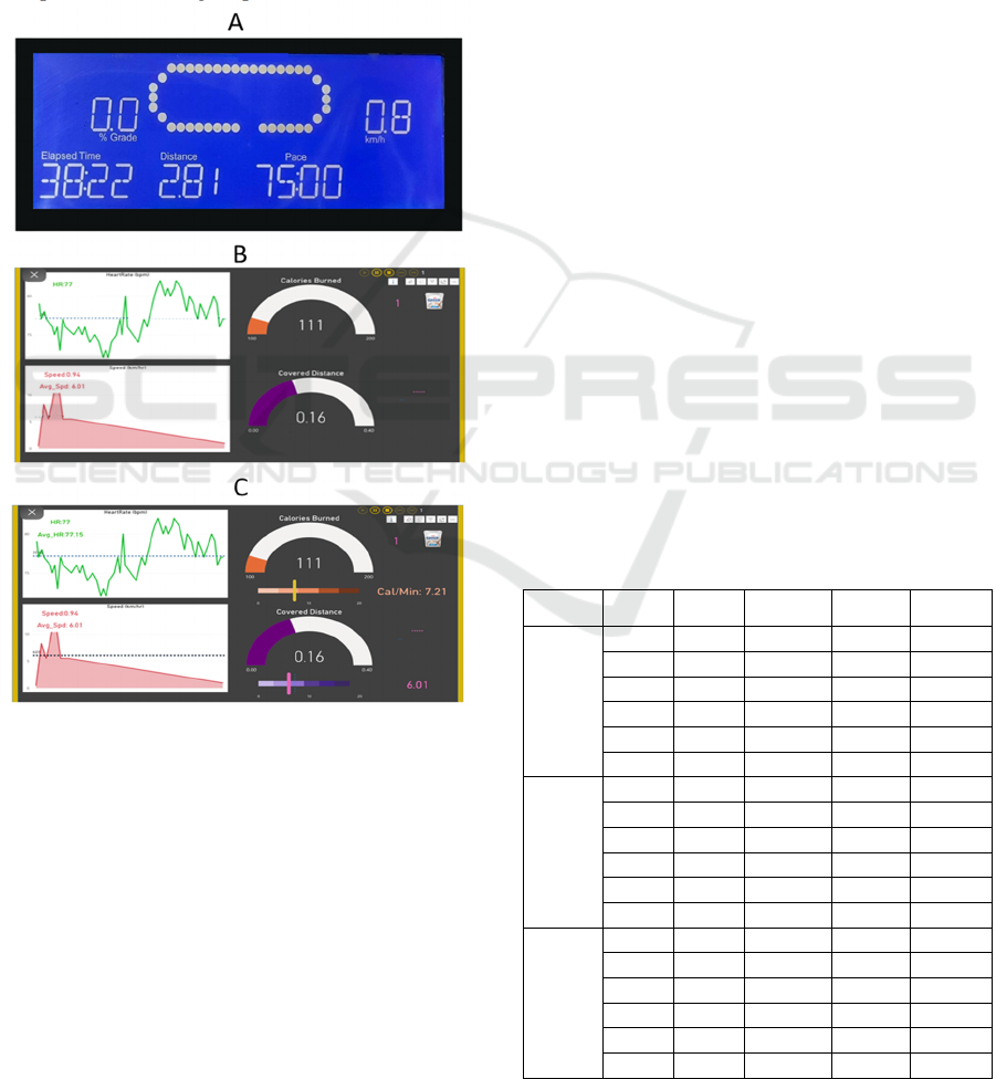
Figure 1: Display format. (A) Traditional treadmill display
presents basic metrics such as distance, pace, and speed in
text. (B) Improved Display 1 introduces dynamic elements
including a line chart of heart rate and a bar chart for speed
distribution, along with half-circle progress indicators for
calories burned and covered distance. (C) Improved
Display 2 builds upon Display 1 by integrating average
heart rate, average speed, and additional rate indicators for
calories and distance progress.
4 RESULTS
This section presents the experimental results,
focusing
on
two
main
areas:
the
analysis
of
running
performance data during the treadmill experiment and
the analysis of participant responses from the post-run
survey. Collected data were analyzed using both
parametric and non-parametric statistical tests to
examine potential differences in performance,
perceived exertion, satisfaction, and user preference
across different display conditions to examine
potential differences between treatments.
4.1 Running Performance Analysis
A repeated measure ANOVA was conducted to
analyze the differences across treatment groups for
the following metrics: duration, distance covered,
calories expended, average heart rate, maximum heart
rate, average speed, and maximum speed. The
analysis identified statistically significant differences
among groups for duration, distance covered, and
calories expended. To determine the most effective
treatment for running performances, a post-hoc
Bonferroni test was further performed to compare
treatments. The results are as follows:
- Improved Display 2 (T2) and Improved display
1 (T1) have significantly higher duration, and
calories expended compared to running without
a display (T0) and Traditional Display (TT).
- Improved Display 2 (T2) has significantly higher
distance covered compared to running without a
display (T0) and Traditional Display (TT).
- No significant difference was found between
Improved Display 2 and Improved Display 1.
Table 2: Performance Pairwise Comparison. Statistical
significance levels between treatments are indicated as
follows: p < 0.05 (*), p < 0.01 (**), p < 0.001 (***).
Metrics Group1 Group2 t-statistic
Raw
p
-value
Adjusted
p
-value
Duration
T0 TT -1.370 0.188 1.000
T0 T1 -5.114 0.000 0.000***
T0 T2 -4.697 0.000 0.001***
TT T1 -3.097 0.006 0.039*
TT T2 -4.107 0.001 0.004**
T1 T2 -1.583 0.131 0.790
Distance
Covered
T0 TT -2.296 0.035 0.208
T0 T1 -3.326 0.004 0.024*
T0 T2 -4.951 0.000 0.000***
TT T1 -1.609 0.126 0.755
TT T2 -3.763 0.002 0.009**
T1 T2 -2.324 0.033 0.196
Calories
Expended
T0 TT -0.956 0.352 1.000
T0 T1 -3.639 0.002 0.012*
T0 T2 -4.184 0.001 0.004**
TT T1 -3.083 0.007 0.040*
TT T2 -4.028 0.001 0.005**
T1 T2 -1.574 0.134 0.804
DATA 2025 - 14th International Conference on Data Science, Technology and Applications
672
4.2 Survey Response Analysis
For perceived exertion level, to find the difference
across treatments for exertion levels, we conducted a
Friedman test, a non-parametric alternative to
repeated measures ANOVA for within-subject
design, as the normality assumption was violated in
at least one treatment group. We calculated actual
exertion levels for each participant using their
maximum heart rate (Max HR = 220 - Age) and then
determined the percentage of maximum heart rate for
each participant during treatments. To compare actual
exertion with perceived exertion, we mapped each
participant’s percentage of maximum heart rate to the
10-level Borg scale, where lower values represent
lower exertion and higher values indicate near-
maximal effort. By comparing actual exertion and
perceived exertion values, we analyzed the extent to
which treatments influenced users' perception of
effort relative to their actual physiological exertion
level. A Friedman test revealed no statistically
significant difference in exertion levels across
treatments (p = 0.404). This suggests that no single
treatment was significantly more or less demanding
than the other in terms of actual and perceived
exertion difference. Additionally, we conducted a
post-hoc pairwise comparison using the Wilcoxon
signed-rank test to further explore potential
differences between individual treatments. However,
no significant differences were found as well,
indicating that Improved Display treatment with real-
time data visualization feedback doesn’t influence
users to experience less perceived exertion level.
To analyze user satisfaction, a Friedman test
was performed to evaluate user satisfaction across
different treatments for the following metrics: overall
satisfaction, clarity of information, relevance of
information, aesthetic appeal, ease of use, motivation
level, and perceived utility. The analysis result
showed that it was significantly different among
groups for overall satisfaction, aesthetic appeal,
motivation level, and perceived utility.
After that we use Dunn’s test to compare between
treatment groups:
- Improved Display 2 (T2) has a significantly
higher score for overall satisfaction and
aesthetic appeal compared to Traditional
Display (TT).
- Both Improved Displays scored significantly
higher in motivation level and perceived
utility compared to Traditional Display (TT).
Table 3: User Satisfaction Pairwise Comparison. Statistical
significance levels between treatments are indicated as
follows: p < 0.05 (*), p < 0.01 (**), p < 0.001 (***).
Metric Grou
p
1 Grou
p
2
p
-value
Overall Satisfaction
T2 T1 1.000
TT T1 0.107
TT T2 0.034*
Aesthetic Appeal
T2 T1 0.893
TT T1 0.061
TT T2 0.002**
Motivation Level
T2 T1 1.000
TT T1 0.014*
TT T2 0.003**
Perceived Utility
T2 T1 1.000
TT T1 0.005**
TT T2 0.001***
After completing the experiment, participants
indicated their preferred treatment: 9 preferred
Improved Display 2, 6 chose Improved Display 1, and
3 favored the Traditional Display.
5 DISCUSSIONS
This section outlines the discussion of key findings
from the experimental results, linking them with prior
research and relevant theoretical perspectives. It
examines how data visualization influences user
performance, perceptions of exertion, and
satisfaction. In addition, the discussion highlights the
study’s limitations and suggests directions for future
work.
5.1 Running Performance
The experimental analysis results showed that
Improved Display 2 and Improved Display 1
significantly improved running performance for
running duration, covered distance, and calories
burned compared to running without display and
Traditional Displays that provide feedback to users in
the form of text. The findings align with several
previous studies that highlight the benefits of real-
time or physical representations of performance data
in enhancing exercise outcomes. For example, both
Concon et al. (2024) and Stusak et al. (2014)
demonstrated significant improvements in exercise
performance. A key similarity between their studies
and our study is the use of visualization-based
feedback that fosters a sense of achievement and
personal progress, which in turn motivates users to
exercise with greater effort and consistency. In
contrast, the study by Nadalutti & Chittaro, which
used the MOPET Analyzer, provided interactive
charts and spatial maps to visualize running patterns,
but did not offer real-time feedback during exercise.
Effect of Data Visualization on Users’ Running Performance on Treadmill
673

Likewise, the study by Passafiume et al. (2022),
which used only breathing animation without any
performance-related visual feedback, did not result in
significant performance improvements. One possible
explanation is that the breathing animation alone may
not be directly related to users’ perception of their
performance during exercise. Without performance-
related cues, users may lack the feedback needed to
maintain motivation, making the visual feedback less
effective in supporting running performance.
5.2 Perceived Exertion
An observation from the study revealed that
Improved Display 1 and Improved Display 2 showed
no significant difference from other treatments in
reducing perceived exertion, even though their
running performance results were significantly better
than Traditional Display. This suggests that effort
perception level can be influenced by other factors
than the way data is represented to users. Marcora et
al. (2009) found that perceived exertion does not
always correlate with actual physical effort,
suggesting that cognitive load of participants can
increase perceived exertion independently of
physiological effort levels. Stewart et al. (2022)
examined the difference between actual exertion and
perceived exertion in a VR games exercise
experiment. Their findings showed that participants
consistently reported lower perceived exertion
compared to actual exertion levels. The study
suggests that enjoyment of the VR game and the
environment (labs and gyms setting) influenced
perceived effort, leading users to experience less
perceived exertion level. These findings reinforce the
idea that perceived exertion is shaped by multiple
psychological and contextual factors, such as
cognitive load, emotional engagement, and
environmental immersion, which helps explain why
enhanced visual displays in our study did not reduce
perceived effort. It suggests that the user’s internal
state and environment may play a more significant
role in effort perception than the format of data
perception.
5.3 User Satisfaction
User satisfaction responses indicate that Improved
Display 2 received the highest scores in overall
satisfaction and aesthetic appeal. Both Improved
Display 1 and Improved Display 2 also scored higher
in motivation levels and perceived utility, while the
Traditional Display received the lowest scores across
all categories. Studies by Zhi et al. (2019) and
Kashanj et al. (2024) demonstrated that interactive or
real-time visualizations, such as linked layouts or
smartwatch gauges, not only improve task
performance but also enhance user enjoyment and
engagement. Similarly, Coenen and Vande Moere’s
(2021) study found that situating data visualizations
in public spaces fosters emotional and social
engagement. These studies, like our Improved
Displays, share key characteristics: relevance of data
to the user, ease of interpretation under physical or
cognitive load, and interactive or dynamic feedback
that reinforces self-awareness and motivation. In
contrast, a study by Eikey et al. (2015), which
manipulated basic visual elements such as the static
color of a progress bar chart, found no significant
impact on user self-efficacy. The use of color alone
lacked meaningful relevance to user progress and did
not offer personalization. making it less engaging,
especially for long-term goals like 10,000 steps.
While our study also used static color, it was applied
within a half-ring progress chart and involved a
shorter goal (1 km, approximately 1,200 - 1,500
steps). This smaller goal scale may have made
progress changes easier to perceive, helping
participants feel more motivated to complete the goal.
According to survey feedback, Improved
Display 2 was the most preferred, and Traditional
Display has the lowest score and is the least preferred.
Hildon et al. (2012) review examining found that
users often prefer bar charts, despite tables and
pictographs being generally better understood. Luera
et al. (2024) research shows that users generally
prefer visual representations (such as tables and
charts) over text-based information due to their
efficiency in interpreting trends and comparisons
insight. These findings show that users prefer
visualization feedback over the Traditional Display
that generally represents data in text format.
5.4 Limitations and Future Work
Although the result supports the benefits of real-time
data visualization, the study has some limitations that
should be addressed in future studies. The sample size
of 18 participants may have limited the statistical
power of the study. With a larger number of
participants, the results might have been more robust
and generalizable. However, recruiting participants
proved to be challenging due to constraints such as
time limitations, specific eligibility requirements, and
the intensive nature of the experiment.
A smaller
sample size increases variability and reduces the
generalizability of the study compared to a larger
population. Future research should consider using a
DATA 2025 - 14th International Conference on Data Science, Technology and Applications
674

larger sample to increase confidence in the findings.
A future study could examine whether users maintain
their exercise engagement and motivation over time
with visualization design. The study used a specific
type of visualization, but different designs may lead
to different results. Future studies should compare
different visual elements to determine effective
design for boosting performance. The study involved
a sample size in a controlled experimental setting,
which may not fully generalize to real-world
behavior. Future studies may investigate the
experiment to test visualization impact in real-world
settings, such as gyms or sports grounds.
6 CONCLUSIONS
This study shows the significant impact of real-time
data visualization in improving running performance
and user satisfaction. In terms of running
performance, both Improved Display 1 and Improved
Display 2 led to better outcomes in running duration,
distance covered, and calories burned compared to
the Traditional Display and the control condition.
Regarding user satisfaction, Improved Display 2
received the highest ratings in overall satisfaction and
aesthetic appeal. In terms of user preference, survey
responses confirmed that users favored Improved
Display 2, while the Traditional Display was the least
preferred. However, perceived exertion did not
significantly differ across display types, suggesting
that the format of data representation alone may not
reduce perceived effort, which could instead be
influenced by other cognitive or emotional factors.
These insights can inform the design of data and
represent interface improvements to foster better user
experience and user engagement.
ACKNOWLEDGEMENTS
The authors thank the participants for their valuable
contributions, Chulalongkorn University for research
support, and Assoc. Prof. Ronnapee Chaichaowarat,
Ph.D., for providing the venue and treadmill used in
this study. Additional thanks are extended to the
advisor for suggestions throughout the project.
REFERENCES
Ali-Hasan, N., Gavales, D., Peterson, A., & Raw, M. (2006,
April). Fitster: social fitness information visualizer. In
CHI'06 Extended Abstracts on Human Factors in
Computing Systems (pp. 1795-1800).
Alves, T., Ramalho, B., Goncalves, D., Gama, S., &
Henriques-Calado, J. (2020). Exploring How
Personality Models Information Visualization
Preferences. IEEE Visualization Conference (VIS), 31,
201-205.
https://doi.org/10.1109/vis47514.2020.00047
Becker, D., & van der Pligt, J. (2016). Forcing your luck:
Goal-striving behavior in chance situations. Motivation
and Emotion, 40(2), 203-211. https://doi.org/10.1007/
s11031-015-9527-5
Borg, G. A. (1982). Psychophysical bases of perceived
exertion. Medicine and Science in Sports and Exercise,
14(5), 377-381.
Carvalho, E. S., & Chaves, M. S. (2013). New Findings on
the User’s Preferences about Data Visualization of
Online Reviews. International Journal of Information,
7(11).
Cawthon, N., & Moere, A. V. (2007, July). The effect of
aesthetic on the usability of data visualization. In 2007
11th International Conference Information
Visualization (IV'07) (pp. 637-648). IEEE.
Chang, C. K., Yang, Y. F., & Tsai, Y. T. (2017). Exploring
the engagement effects of visual programming
language for data structure courses. Education for
Information, 33(3), 187-200.
Crowell, H. P., Milner, C. E., Hamill, J., & Davis, I. S.
(2010). Reducing impact loading during running with
the use of real-time visual feedback. journal of
orthopaedic & sports physical therapy, 40(4), 206-213.
Coenen, J., & Moere, A. V. (2021, June). Public data
visualization: Analyzing local running statistics on
situated displays. In Computer Graphics Forum (Vol.
40, No. 3, pp. 159-171).
Concon, V., Kobal, R., Carvalho, L., Crivoi do Carmo, E.,
Coimbra, D., & Barroso, R. (2025). The effect of real-
time visual feedback and verbal encouragement on
repetition velocity of squat, bench press and deadlift
exercises in competitive powerlifters. International
Journal of Sports Science & Coaching, 1747954
1241298189.
Eikey, E., Poole, E., & Reddy, M. (2015). Information
presentation in health apps and devices: the effect of
color, distance to goal, weight perception, and interest
on users' self-efficacy for accomplishing
goals. iConference 2015 Proceedings.
Eston, R. (2012). Use of ratings of perceived exertion in
sports. International journal of sports physiology and
performance, 7(2), 175-182.
Harrison, C., Amento, B., Kuznetsov, S., & Bell, R. (2007,
October). Rethinking the progress bar. In Proceedings
of the 20th annual ACM symposium on User interface
software and technology
(pp. 115-118).
Helms, E. R., Cronin, J., Storey, A., & Zourdos, M. C.
(2016). Application of the repetitions in reserve-based
rating of perceived exertion scale for resistance
training. Strength & Conditioning Journal, 38(4), 42-
49.
Effect of Data Visualization on Users’ Running Performance on Treadmill
675

Hildon, Z., Allwood, D., & Black, N. (2012). Impact of
format and content of visual display of data on
comprehension, choice and preference: a systematic
review. International Journal for Quality in Health
Care, 24(1), 55-64.
Hull, C. L. (1932). The goal-gradient hypothesis and maze
learning. Psychological review, 39(1), 25.
Kashanj, S., Wang, X., & Perin, C. (2024, October).
Visualizations on Smart Watches while Running: It
Actually Helps!. In 2024 IEEE Visualization and
Visual Analytics (VIS) (pp. 41-45). IEEE.
Kivetz, R., Urminsky, O., & Zheng, Y. (2006). The goal-
gradient hypothesis resurrected: Purchase acceleration,
illusionary goal progress, and customer
retention. Journal of marketing research, 43(1), 39-58.
Li, Y., Liu, C., Ji, M., & You, X. (2021). Shape of progress
bar effect on subjective evaluation, duration perception
and physiological reaction. International Journal of
Industrial Ergonomics, 81, 103031.
Lucas-Cuevas, Á. G., Quesada, J. I. P., Gooding, J., Lewis,
M. G., Encarnación-Martínez, A., & Perez-Soriano, P.
(2018). The effect of visual focus on spatio-temporal
and kinematic parameters of treadmill running. Gait &
posture, 59, 292-297.
Luera, R., Rossi, R., Dernoncourt, F., Siu, A., Kim, S., Yu,
T., ... & Lee, T. Y. (2024). Optimizing Data Delivery:
Insights from User Preferences on Visuals, Tables, and
Text. arXiv preprint arXiv:2411.07451.
Marcora, S. M., Staiano, W., & Manning, V. (2009). Mental
fatigue impairs physical performance in
humans. Journal of applied physiology.
Munzner, T. (2014). Visualization analysis and design.
CRC press.
Myers, B. A. (1985). The importance of percent-done
progress indicators for computer-human
interfaces. ACM SIGCHI Bulletin, 16(4), 11-17.
Nadalutti, D., & Chittaro, L. (2007). Visual analysis of
users’ performance data in fitness activities. Computers
& Graphics, 31(3), 429-439.
Nicolò, A., Sacchetti, M., Girardi, M., McCormick, A.,
Angius, L., Bazzucchi, I., & Marcora, S. M. (2019). A
comparison of different methods to analyse data
collected during time-to-exhaustion tests. Sport
Sciences for Health, 15, 667-679.
Ohtsubo, M., & Yoshida, K. (2014, September). How does
shape of progress bar effect on time evaluation. In 2014
International Conference on Intelligent Networking
and Collaborative Systems
(pp. 316-319). IEEE.
Passafiume, J. A., Glover, N. A., Crecelius, A. R., &
Chaudhari, A. M. (2022). The influence of receiving
real-time visual feedback on breathing during treadmill
running to exhaustion. Plos one, 17(7), e0270335.
Saket, B., Endert, A., & Demiralp, Ç. (2018). Task-based
effectiveness of basic visualizations. IEEE transactions
on visualization and computer graphics, 25(7), 2505-
2512.
Schiewe, A., Krekhov, A., Kerber, F., Daiber, F., & Krüger,
J. (2020, November). A study on real-time
visualizations during sports activities on smartwatches.
In Proceedings of the 19th International Conference on
Mobile and Ubiquitous Multimedia (pp. 18-31).
Stewart, T. H., Villaneuva, K., Hahn, A., Ortiz-Delatorre,
J., Wolf, C., Nguyen, R., ... & Bagley, J. R. (2022).
Actual vs. perceived exertion during active virtual
reality game exercise. Frontiers in Rehabilitation
Sciences, 3, 887740
Stusak, S., Tabard, A., Sauka, F., Khot, R. A., & Butz, A.
(2014). Activity sculptures: Exploring the impact of
physical visualizations on running activity. IEEE
transactions on visualization and computer
graphics, 20(12), 2201-2210.
Tufte, E. R., & Graves-Morris, P. R. (1983). The visual
display of quantitative information (Vol. 2, No. 9).
Cheshire, CT: Graphics press.
Walsh, A. L., Gonzalez, A. M., Ratamess, N. A., Kang, J.,
& Hoffman, J. R. (2010). Improved time to exhaustion
following ingestion of the energy drink Amino
Impact™. Journal of the international society of sports
nutrition, 7, 1-6.
Wills, G. (2011). Visualizing time: Designing graphical
representations for statistical data. Springer Science &
Business Media.
Yang, H., Li, Y., & Zhou, M. X. (2014). Understand users’
comprehension and preferences for composing
information visualizations. ACM Transactions on
Computer-Human Interaction (TOCHI), 21(1), 1-30.
Yentes, R. D., Toaddy, S. R., Thompson, L. F., Gissel, A.
L., & Stoughton, J. W. (2012). Effects of survey
progress bars on data quality and
enjoyment. PsycEXTRA Dataset, 10.
Zhi, Q., Ottley, A., & Metoyer, R. (2019, June). Linking
and layout: Exploring the integration of text and
visualization in storytelling. In Computer Graphics
Forum (Vol. 38, No. 3, pp. 675-685).
DATA 2025 - 14th International Conference on Data Science, Technology and Applications
676
