
DataPulse: An Interactive Dashboard for Statistical and Exploratory
Analysis of Multimodal Healthcare Data in Shiny
Adam Urban
1
, James Connolly
1
, Gauri Vaidya
1 a
, Krishn Kumar Gupt
2 b
and
Meghana Kshirsagar
1 c
1
Department of Computer Science and Information Systems, University of Limerick, Ireland
2
Systems Biology Ireland, School of Medicine, University College Dublin, Ireland
Keywords:
Shiny, R Programming, Bioconductor, Exploratory Data Analysis, Visualization, Medical Datasets,
Bioinformatics, Data Science.
Abstract:
The extraction of actionable insights from data-driven analyses is crucial for efficiently profiling, analyz-
ing, and visualizing intricate medical datasets. A robust, generic data profiling tool is essential to uncover
and understand relationships within medical data. In this context, building Shiny app can lead to numerous
advantages—providing interactive, user-friendly, and dynamic dashboards, and the capacity to deploy scal-
able, web-based solutions. In this article, we introduce DataPulse, a versatile data profiling tool designed to
analyze multimodal healthcare data. By leveraging advanced statistical methodologies, DataPulse uncovers
complex relationships in the data and displays them through comprehensive dashboards. For instance, in ra-
diogenomics, sequential imaging visualizations can highlight dynamic changes in disease progression over
time. The article discusses two usecases of DataPulse: one focusing on the analysis of hip fracture patient
pathways in the emergency department, and the other offering a detailed exploration of cancer disease through
multimodal datasets to derive insights on drug outcomes and disease progression over time. In conclusion,
DataPulse exemplifies how robust, interactive data profiling can transform complex medical data into action-
able insights.
1 INTRODUCTION
Shiny is an R package that is used for creating in-
teractive web applications for data visualization. It is
divided into User Interface (UI) and server sections.
The user interface is easily customizable using Hyper
Text Markup Language (HTML) and Cascading Style
Sheets (CSS), enabling professional design tailored to
user needs (Posit, 2024).
R was developed in 1993 and has grown signifi-
cantly in recent years. With its extensive capabilities
covered by user-made packages, it is especially pop-
ular choice in research. Comprehensive R Archive
Network was introduced later to accommodate user-
made packages. These packages contributed to R be-
ing one of the best choices for data science. The
most widely used data science packages for data sci-
ence are ggplot2, plotly for data visualization and
a
https://orcid.org/0000-0002-9699-522X
b
https://orcid.org/0000-0002-1612-5102
c
https://orcid.org/0000-0002-8182-2465
dplyr, tidyr, readr for data manipulation, which
are also often referred to as the Tidyverse (R Core
Team, 2024).
Shiny was introduced in 2012 and since its ini-
tial development it experienced a great growth. In-
tegrating support for HTML, CSS, and JavaScript it
provides an easily modifiable interface for the app.
Later, Shiny Server was launched to allow users to
deploy their Shiny web applications using cloud host-
ing. Over the last few years Shiny has proved efficient
and gained significant popularity in data intensive re-
search domains such as healthcare (Kasprzak et al.,
2021).
One of R’s standout features is the Shiny frame-
work, which enables developers to create interac-
tive, web-based applications with minimal effort. Al-
though many Shiny applications serve generic data
visualization and dashboards, DataPulse is specifi-
cally designed to derive crucial insights from a va-
riety of healthcare datasets such as patient tracking
databases, biomedical and pan-cancer datasets. Our
goal is to offer meaningful contributions to the global
Urban, A., Connolly, J., Vaidya, G., Gupt, K. K., Kshirsagar and M.
DataPulse: An Interactive Dashboard for Statistical and Exploratory Analysis of Multimodal Healthcare Data in Shiny.
DOI: 10.5220/0013523500003967
In Proceedings of the 14th International Conference on Data Science, Technology and Applications (DATA 2025), pages 447-454
ISBN: 978-989-758-758-0; ISSN: 2184-285X
Copyright © 2025 by Paper published under CC license (CC BY-NC-ND 4.0)
447

effort against cancer disease by enhancing our collec-
tive understanding. This tool targets a niche audience
of researchers and clinicians working with complex
datasets in the hopes of helping them better under-
stand and gain crucial insights into datasets they may
be working with.
2 MOTIVATION
To effectively analyze and interpret large-scale med-
ical datasets, gaining clear and actionable insights
is crucial. A framework that supports multimodal
data analysis offers a distinct advantage to simplify
the analysis of complex datasets while maintaining
user-friendliness, making it easier to uncover pat-
terns, trends, and potential biases. By leveraging the
Shiny package, we demonstrate the equitable acces-
sibility of DataPulse to users with varying levels of
programming expertise, broadening its usability and
appeal. DataPulse’s interactive and intuitive inter-
face ensures that even non-technical users can engage
with the data. We demonstrate how our tool can be
harnessed to extract meaningful insights from multi-
modal datasets for lung cancer: tabular, genomic and
image and MIMIC-IV database consisting of multiple
comma separated variables.
2.1 Use Case I: Hip Fracture
Prolonged patient wait times in emergency depart-
ments (EDs) are a critical barrier to effective health-
care delivery, impacting clinical outcomes and strain-
ing hospital resources. Older adults (aged ≥ 65 years)
are disproportionately affected by ED delays due to
their complex medical needs and higher likelihood
of comorbidities (Walsh et al., 2021; European Com-
mission, 2019). Among this demographic, hip frac-
ture patients represent a particularly vulnerable sub-
group requiring urgent care. Timely interventions for
hip fracture patients are essential to improving out-
comes and alleviating systemic pressures on EDs (Ka-
nis et al., 2021; Kelly et al., 2022).
To address these challenges, this use case inte-
grates demographic and admission data to provide ac-
tionable insights for optimizing resource allocation
and improving patient flow. Health-care providers
can use DataPulse to understand both patient pathway
journey and demographics.
2.2 Use Case II: Lung Cancer
Cancer biomarkers are crucial in early detection,
diagnosis, and especially individualized treatment
strategies (Purkayastha et al., 2023). Therefore, find-
ing pan-cancer biomarkers has become an important
focus in cancer research. Each year, an estimated
42,000 people in Ireland are diagnosed with cancer,
including both invasive and non-invasive tumors (Na-
tional Cancer Registry Ireland, 2023). Recent re-
search indicates over 24,000 invasive cases annually,
with 13,075 in men and 11,349 in women were re-
ported during 2019-2021, among which lung can-
cer was the third most common cancer in males and
the second most common in females (National Can-
cer Registry Ireland, 2023). Lung cancer, in par-
ticular, is the most deadly in Ireland, making it the
leading cause of cancer fatalities for both sexes (Na-
tional Cancer Registry Ireland, 2023). The future
presents an even more alarming picture, with projec-
tions indicating a rapid increase in lung cancer inci-
dence, especially among women, with rates expected
to rise by 105% between 2015 and 2045, by 131%
in men, and by 119% combined (Irish Cancer Soci-
ety, 2019). In light of these statistics, our research fo-
cuses on extracting vital information from Lung ade-
nocarcinoma (LUAD) data, the most prevalent type
of primary lung cancer within the non-small cell lung
cancer (NSCLC) category. The end users for this
use case are researchers within medical community.
Cancer researchers can use this app to analyze ge-
nomic datasets, possibly helpful in identifying novel
biomarkers in terms of radiation and drug-sensitivity.
3 DATASET MODALITIES
This study leverages medical data sets that encom-
pass three primary modalities, viz., tabular, imag-
ing, and genomic data. Tabular data, consisting of
structured patient information, such as demographics,
treatment histories, and clinical outcomes, are essen-
tial to identify statistical trends and perform stratified
analyzes. This modality provides a foundation for un-
derstanding patterns in cancer progression and treat-
ment efficacy. Genomic data, facilitating radiation
and drug sensitivity charts and Ribonucleic acid ex-
pression levels, enable the identification of molecular
biomarkers and facilitate a deeper understanding of
cancer heterogeneity. Imaging data, in this case com-
puted tomography scans of patients in Digital Imag-
ing and Communications in Medicine (DICOM) im-
age format, offer insights into physical characteristics
and progression markers in various types of cancer.
Together, these modalities provide a holistic view of
patient health, enabling the correlation of clinical, vi-
sual, and molecular factors to uncover actionable in-
sights for personalized treatment strategies.
DATA 2025 - 14th International Conference on Data Science, Technology and Applications
448
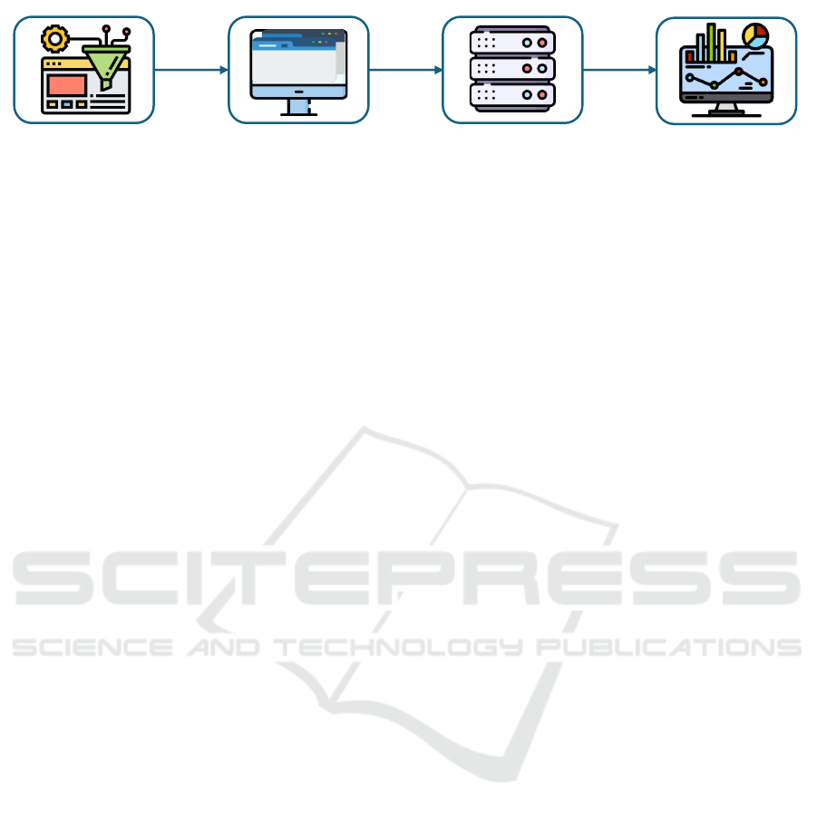
Data preparation UI Layout
Server Logic
Web Deployment
Figure 1: Pipeline of DataPulse Framework.
3.1 Tabular Data
The tabular data in this study includes tables provid-
ing an overview and a summary of the dataset, strati-
fied analysis tables that segment data by specific vari-
ables, correlation matrices, and reactive plots. The
overview tables serve as essential tools for organizing
and analyzing complex clinical information. Strat-
ified analysis tables break down the data into sub-
groups, allowing for a deeper understanding of rela-
tionships within specific patient populations. Correla-
tion matrices, derived from the tabular data, are used
to identify and quantify the relationships between dif-
ferent variables, such as age and smoking history. The
plots were created from the provided datasets, offer-
ing an interactive way to visualize and analyze key
characteristics such as age, sex, race, and ethnicity.
These plots facilitate the identification of patterns and
trends, providing insights into the distribution and re-
lationships between patient demographics and clinical
outcomes.
3.2 Genomic Data
The genomic data in this study are used in the radio-
genomic analysis, and the pharmacogenomic analy-
sis. Radiogenomic analysis uses genomic data to de-
termine cell lines responses to radiation. It also allows
generating the radiation sensitivity signatures. Phar-
macogenomic analysis, on the other hand, focuses on
the relationship between cell lines and certain drugs.
It also allows generating the drug sensitivity signa-
tures.
3.3 Image Data
The image data in this study are the CT scans of Non-
small cell lung cancer (NSCLC) patients in the DI-
COM format. DICOM offer crucial visual insights
into the progression of lung cancer in patients over
time. In our app we included four randomly selected
samples. These images provide valuable visual rep-
resentations of tumor development and response to
treatment, enabling clinicians and researchers to ob-
serve changes over time. The DICOM images offer
a comprehensive view of visual data, enhancing the
depth of the analysis and enabling a more thorough
understanding of disease progression.
3.4 Workflow of Development
Figure 1 outlines the workflow for developing a web
application using Shiny, which includes the follow-
ing key stages: Data Preparation, Structuring the UI
Layout, Developing the Server Logic, and Web De-
ployment via Shiny hosting services.
In the data preparation phase, we imported the
datasets into RStudio as data frames.
4 SOFTWARE DESCRIPTION
This section details the overview of our ShinyApp and
the features of the dashboard.
4.1 Overview of UI
The chosen layout for the Shiny app interface is
fluidPage, enabling it to automatically adjust to dif-
ferent screen sizes. The color theme is set to yeti
from the shinythemes package, providing a modern
appearance to the app. Furthermore, CSS styling was
applied to enhance the design of containers and other
elements. A navigation bar with eight tabs was in-
corporated to efficiently organize the app’s features.
Within these tabs, we used conditional panels to dy-
namically display content based on the user’s selec-
tions.
4.2 Features of DataPulse
• Flexible Data Input: DataPulse supports a wide
range of data formats including Excel, CSV, TSV,
and JSON. This ensures compatibility with di-
verse data sources commonly used in clinical re-
search.
• Dynamic UI Elements: The interface adapts
based on the uploaded dataset, allowing users to
DataPulse: An Interactive Dashboard for Statistical and Exploratory Analysis of Multimodal Healthcare Data in Shiny
449
customize input fields dynamically for a more tai-
lored and intuitive data exploration experience.
• Multiple Data Visualization Options: The tool
offers various visualization techniques such as
histograms, scatter plots, boxplots, and bar charts,
enabling comprehensive graphical representations
of complex medical data.
• Summary Statistics: It provides key summary
statistics, including correlation heatmaps and
stratified analyses, which facilitate a deeper un-
derstanding of data relationships and underlying
trends.
4.3 Reusability of DataPulse
• Modularized Code: The underlying code is
structured in a modular fashion, promoting
reusability and ease of maintenance, which is crit-
ical for iterative development.
• Multiple Dataset Handling: End users can up-
load and manipulate several datasets concurrently.
• Download Functionalities: The app includes
features to download generated plots and analyti-
cal results, supporting reproducibility.
• Scalable Deployment: DataPulse is deployed on
shinyapps.io, ensuring that the tool can be eas-
ily accessed.
4.4 Tabular Modality Features
The first few tabs of the app are dedicated to the tabu-
lar modality. These tabs use data from the LUAD clin-
ical datasets and the GDSC drug response datasets.
The first tab allows users to select the dataset they
want to explore, offering an overview and a statistical
summary of the data.This is facilitated by using the
expression renderDataTable() to show the data in
an interactive table, allowing searchability throughout
the dataset and renderPrint() to show the output of
the summary() function.
4.5 Data Summary
The first two tabs allows users to upload and work
with different file formats and summarise the data.
4.6 Stratified Analysis
The tab provides stratified analysis using the table1
package (Rich, 2023). This lets the user choose a
specific dataset, and a specific grouping variable they
want to stratify the data. The selected and filtered data
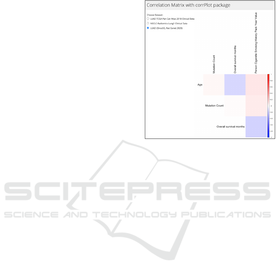
Figure 2: Correlation matrix depicting patient’s smoking
history, mutation count, age on overall survival months.
on the server logic side are updated through reactive
expressions, allowing seamless output change when
necessary. Unique columns, like the patient ID, were
filtered out from the list of variables as those are unfit
for stratified analysis. The renderTable() function
was used to print out the resulting table.
4.7 Plots
This tab shows plots provides insights through vi-
sualizations for preliminary exploratory data analy-
sis. These data visualizations were created with the
Plotly package, which allows interactive actions,
like zooming, panning or providing information on
hovering over data bins or categories (Sievert, 2020).
There are four demographics charts that were created
for the datasets: the distribution of age, sex, race and
ethnicity among the patients. The age distribution plot
is initially created with the ggplot2 package, how-
ever it is then converted to a plotly graph using the
renderPlotly() function to leverage the interactive
features of plotly (Wickham, 2016). Null-value data
rows are filtered out and the number of total samples
and filtered samples is provided under the plots. Pa-
rameter settings to the plots were changed extensively
to ensure high quality design. This involved provid-
ing a title, subtitles for axis, changing the colors used,
and the font sizes and margins. Reactive expressions
were used to filter selected data, ensuring that only
necessary computation are being executed.
DATA 2025 - 14th International Conference on Data Science, Technology and Applications
450
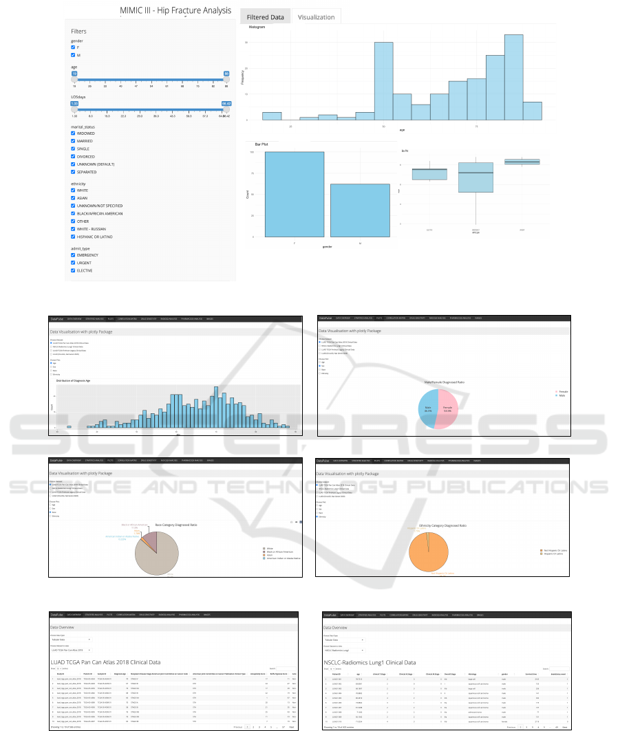
DataPulse
(a)
(b)
(c)
Figure 3: Overview of dashboard. (a) Dashboard for use case 1, illustrating critical insights with respect to hip fracture
occurrences: histogram plot is used to depict the occurrence of hip fracture events amongst different age groups, bar plot
illustrates its occurrence with respect to male and female population, while box plot illustrates the mode of arrival of patients
in emergency departments; (b) Dashboard for use case 2 showcasing information about the distribution of age in the lung
cancer dataset while pie-charts are used to illustrate the proportion of people afflicted with lung cancer disease with respect to
population demographics which includes age,race and ethnicity; (c) Dashboard for displaying the preview of the contents for
both LUAD TCGA dataset and Radiogenomics dataset.
DataPulse: An Interactive Dashboard for Statistical and Exploratory Analysis of Multimodal Healthcare Data in Shiny
451
4.8 Correlation Matrix
This tab illustrates correlation matrix displayed using
the Corrplot package, which is useful when deter-
mining relations between variables. For instance, in
Figure 2, we can spot a correlation between patient’s
smoking history and mutation count. We can also no-
tice the negative correlation between age and over-
all survival months, indicating that younger people
have greater chance of surviving lung cancer. Reac-
tive expression numeric data() is used to filter data
as the correlation matrix only works with numeric val-
ues. The matrix is in upper triangular form, omitting
unnecessary data duplicates and designed with cus-
tom colors making it easily understandable (Wei and
Simko, 2017).
4.9 Drug Sensitivity
This discusses Drug Sensitivity T-test analysis. For
this, we utilized R’s built-in t.test() function to
compare IC50 values, a measure of drug sensitiv-
ity, across different drugs, cell lines, or tissue types.
Specifically, we used the genomic datasets GDSC1
and GDSC2, focusing on the LUAD tissue. This anal-
ysis can help selecting the right personalized treat-
ment decisions, possibly revealing drug resistance or
sensitivity in a particular cell line or tissue type.
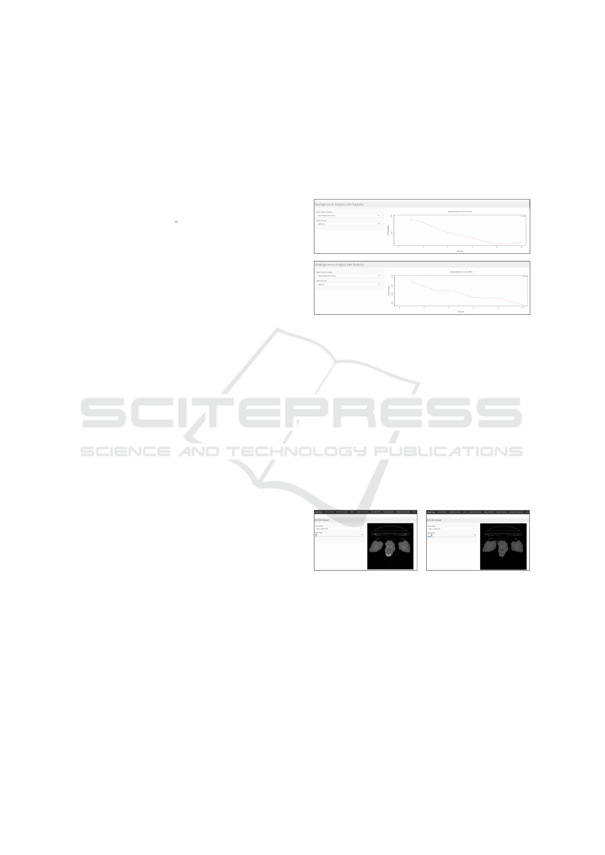
4.10 Radiogx Analysis
This tab is dedicated for a radiogenomic analysis. The
RadioGx package from BioConductor allows us to get
insights into how different cell lines respond to radia-
tion. Dose response metrics are computed within a re-
active expression. Linear Quadratic model is used to
describe the relationship between radiation dose and
cell survival and the user can select to view this in
the form of a survival fraction after a 2 Gy dose of
radiation, computed using computeSF2(), a dose for
10% survival computed using computeD10(), or the
the dose-response curve. These metrics ensure bet-
ter understanding of the data and determining the cor-
rect radiation dosage for the patient as we have to bal-
ance eliminating cancer cells with trying not to dam-
age too many healthy cells. Another important fea-
ture of this tab is the option to generate radiation sen-
sitivity signatures, which was implemented using the
radSensitivitySig() function on the clevelandS-
mall dataset.
4.11 Pharmacogx Analysis
This tab of our app showcases pharmacogenomic
analysis, utilizing the PharmacoGx package from Bio-
Conductor. This package provides a comprehensive
framework for exploring the relationships between
drug sensitivity and molecular features as seen in Fig-
ure 4.
Figure 4: Line graphs that measures the outcome of drug
administered with respect to cell lines and prescribed dose.
Our app uses this package to offer drug sensi-
tivity metrics, providing insights into the effectiv-
ness of a certain drug on chosen cell line, dose re-
sponse curve visualization, showing the relationship
between drug concentration and cell viability, and
lastly the drug sensitivity signatures that can help
identify genes linked to drug sensitivity, possibly dis-
covering novel biomarkers of drug sensitivity. The
drugSensitivitySig() function was used on the
CCLESmall dataset to provide the signatures.
4.12 Imaging Modality Features
Figure 5: DICOM viewer for displaying the sequence of ra-
diogenomics images useful for understanding disease pro-
gression.
This tab provides a DICOM viewer feature as illus-
trated in Figure 5. DICOM is an image format used
in medical imaging that holds not only the image data
but also the essential metadata, containing informa-
tion about the patient in the same file. These images
are not directly viewable using the standard image
viewers. For that reason, we have integrated a DI-
COM Viewer on the last feature tab of our app, facil-
itating an easy way to view DICOM images in their
designated sequences.
DATA 2025 - 14th International Conference on Data Science, Technology and Applications
452

4.13 Hip Fracture Analysis
This tab provides an interactive exploration of hip
fracture patient pathways using MIMIC-III data. It
enables users to analyze critical factors influencing
the length of hospital stays during high-priority events
in older patients.
5 DASHBOARD DESIGN
To build the interactive dashboards for our use
cases as seen in Figure 3, we utilize the MIMIC-III
database, a publicly available, de-identified patient
tracking dataset. For the hip fracture study, the dataset
was filtered to include only hip fracture patients ad-
mitted through the ED. This focused approach en-
sures the analysis aligns with our use case for hip frac-
ture patients with the objective of improving patient
flow and outcome for this category of patients.
Similarly, for lung cancer study, we employed
multimodal datasets such as Genomics of Drug Sen-
sitivity in Cancer (GDSC1) and GDSC2 (Yang et al.,
2012), LUAD TCGA Pan Cancer Atlas 2019 (Cerami
et al., 2012; Gao et al., 2013; de Bruijn et al., 2023;
Heath et al., 2021), NSCLC-Radiomics (Aerts et al.,
2019; Manem et al., 2023). Key features of the dash-
board include:
• Dynamic Filtering: Users can filter data by de-
mographic attributes (e.g., age, gender, ethnicity)
and admission characteristics (e.g., mode of ad-
mission, ED wait times,and length of stay).
• Interactive Visualizations: The dashboard pro-
vides a range of graphical tools for data explo-
ration, including:
– Bar Charts: Highlight demographic distribu-
tions, admission trends, and length of stay.
– Pie Charts: Pie charts display the proportion of
people affected with the disease.
– Scatter Plots: Correlate variables such as age
versus wait times or mode of admission versus
length of stay.
– Histograms: Display the distribution of key
variables such as patient age, wait times, and
length of stay.
– Box Plots: Summarize variability and detect
outliers in variables such as wait times or time-
to-surgery.
– DICOM Viewer: To display the DICOM im-
ages using CT scans of non-small cell lung
cancer patients from the NSCLC-Radiomics
dataset. The app converts the file from DICOM
to PNG, ensures proper scaling and other errors
like missing file or directory and then shows
the images in succession. A scroll bar was im-
plemented to allow proper viewing of an image
dataset.
– Drug Response Plots: The line plots displays
the radiation response curves with respect to
both cell lines and administered dosage.
– Correlation Plots: Correlation plots displays
the impact of features such as age, smoking and
mutation count on overall survival.
6 CONCLUSIONS
This study provides a data profiling framework for an-
alyzing big medical datasets, and provide real-time
visualizations through interactive dashboards. Al-
though this study is based on a small sample size, the
methodologies developed can be easily adapted and
applied to larger datasets, enabling other researchers
to gain similar insights. By incorporating multimodal
data analysis, DataPulse holds the potential for ad-
vanced data analytics within healthcare ecosystem.
The immediate scope of this study will focus on inte-
grating various healthcare datasets for diverse disease
categories.
7 DATA AVAILABILITY
The data that support the findings of this study is
available at adamurban.shinyapps.io/OncoEx/.
ACKNOWLEDGEMENTS
This project is funded under the National Challenge
Fund which was established under the government’s
National Recovery and Resilience Plan (NRRP),
funded by the EU’s Recovery and Resilience Facility.
The fund is coordinated and administered by Taighde
´
Eireann – Research Ireland grant 22/NCF/DR/11289.
REFERENCES
Aerts, H. J. W. L., Wee, L., Rios Velazquez, E., Leije-
naar, R. T. H., Parmar, C., Grossmann, P., Carvalho,
S., Bussink, J., Monshouwer, R., Haibe-Kains, B., Ri-
etveld, D., Hoebers, F., Rietbergen, M. M., Leemans,
C. R., Dekker, A., Quackenbush, J., Gillies, R. J., and
Lambin, P. (2019). Data from nsclc-radiomics.
DataPulse: An Interactive Dashboard for Statistical and Exploratory Analysis of Multimodal Healthcare Data in Shiny
453

Cerami, E., Gao, J., Dogrusoz, U., Gross, B. E., Sumer,
S. O., Aksoy, B. A., Jacobsen, A., Byrne, C. J., Heuer,
M. L., Larsson, E., Antipin, Y., Reva, B., Goldberg,
A. P., Sander, C., and Schultz, N. (2012). The cbio
cancer genomics portal: An open platform for explor-
ing multidimensional cancer genomics data. Cancer
Discovery, 2(5):401–404.
de Bruijn, I., Kundra, R., Mastrogiacomo, B., Tran, T. N.,
Sikina, L., Mazor, T., Li, X., Ochoa, A., Zhao, G.,
Lai, B., Abeshouse, A., Baiceanu, D., Ciftci, E.,
Dogrusoz, U., Dufilie, A., Erkoc, Z., Garcia Lara,
E., Fu, Z., Gross, B., Haynes, C., Heath, A., Hig-
gins, D., Jagannathan, P., Kalletla, K., Kumari, P.,
Lindsay, J., Lisman, A., Leenknegt, B., Lukasse,
P., Madela, D., Madupuri, R., van Nierop, P., Plan-
talech, O., Quach, J., Resnick, A. C., Rodenburg,
S. Y., Satravada, B. A., Schaeffer, F., Sheridan, R.,
Singh, J., Sirohi, R., Sumer, S. O., van Hagen, S.,
Wang, A., Wilson, M., Zhang, H., Zhu, K., Rusk, N.,
Brown, S., Lavery, J. A., Panageas, K. S., Rudolph,
J. E., LeNoue-Newton, M. L., Warner, J. L., Guo, X.,
Hunter-Zinck, H., Yu, T. V., Pilai, S., Nichols, C., Gar-
dos, S. M., Philip, J., Kehl, K. L., Riely, G. J., Schrag,
D., Lee, J., Fiandalo, M. V., Sweeney, S. M., Pugh,
T. J., Sander, C., Cerami, E., Gao, J., and Schultz,
N. (2023). Analysis and visualization of longitudi-
nal genomic and clinical data from the aacr project
genie biopharma collaborative in cbioportal. Cancer
Research, 83(23):3861–3867.
European Commission (2019). Ageing Europe: looking at
the lives of older people in the EU : 2019 edition. Pub-
lications Office, LU.
Gao, J., Aksoy, B. A., Dogrusoz, U., Dresdner, G., Gross,
B., Sumer, S. O., Sun, Y., Jacobsen, A., Sinha, R.,
Larsson, E., Cerami, E., Sander, C., and Schultz, N.
(2013). Integrative analysis of complex cancer ge-
nomics and clinical profiles using the cbioportal. Sci-
ence Signaling, 6(269).
Heath, A. P., Ferretti, V., Agrawal, S., An, M., Angelakos,
J. C., Arya, R., Bajari, R., Baqar, B., Barnowski, J.
H. B., Burt, J., Catton, A., Chan, B. F., Chu, F., Cul-
lion, K., Davidsen, T., Do, P.-M., Dompierre, C., Fer-
guson, M. L., Fitzsimons, M. S., Ford, M., Fukuma,
M., Gaheen, S., Ganji, G. L., Garcia, T. I., George,
S. S., Gerhard, D. S., Gerthoffert, F., Gomez, F., Han,
K., Hernandez, K. M., Issac, B., Jackson, R., Jensen,
M. A., Joshi, S., Kadam, A., Khurana, A., Kim, K.
M. J., Kraft, V. E., Li, S., Lichtenberg, T. M., Lodato,
J., Lolla, L., Martinov, P., Mazzone, J. A., Miller,
D. P., Miller, I., Miller, J. S., Miyauchi, K., Murphy,
M. W., Nullet, T., Ogwara, R. O., Ortu
˜
no, F. M., Pe-
drosa, J., Pham, P. L., Popov, M. Y., Porter, J. J., Pow-
ell, R., Rademacher, K., Reid, C. P., Rich, S., Rogel,
B., Sahni, H., Savage, J. H., Schmitt, K. A., Simmons,
T. J., Sislow, J., Spring, J., Stein, L., Sullivan, S.,
Tang, Y., Thiagarajan, M., Troyer, H. D., Wang, C.,
Wang, Z., West, B. L., Wilmer, A., Wilson, S., Wu,
K., Wysocki, W. P., Xiang, L., Yamada, J. T., Yang,
L., Yu, C., Yung, C. K., Zenklusen, J. C., Zhang, J.,
Zhang, Z., Zhao, Y., Zubair, A., Staudt, L. M., and
Grossman, R. L. (2021). The nci genomic data com-
mons. Nature Genetics, 53(3):257–262.
Irish Cancer Society (2019). Lung action plan 2019. [Ac-
cessed: 2024-05-28].
Kanis, J. A., Norton, N., Harvey, N. C., Jacobson, T.,
Johansson, H., Lorentzon, M., McCloskey, E. V.,
Willers, C., and Borgstr
¨
om, F. (2021). SCOPE 2021:
A new scorecard for osteoporosis in Europe. 16(1):82.
Kasprzak, P., Mitchell, L., Kravchuk, O., and Timmins, A.
(2021). Six years of shiny in research - collabora-
tive development of web tools in r. The R Journal,
13(1):1–14.
Kelly, P., Horan, B., Murphy, T., Ahern, E., Brent, L., Kelly,
F., Lodola, C., Connolly, A., and O’Shea Clarke, A.
(2022). Irish Hip Fracture Database National Report
2022.
Manem, V. S. K., Smirnov, P., Smith, I., Lambie, M., Ee-
les, C., Bratman, S., and Haibe-Kains, B. (2023). Ra-
dioGx: Analysis of Large-Scale Radio-Genomic Data.
Bioconductor.
National Cancer Registry Ireland (2023). Cancer in ireland
1994-2021: Annual statistical report of the national
cancer registry. [Accessed: 2024-05-28].
Posit (2024). Shiny: Web application framework for r.
Purkayastha, K., Dhar, R., Pethusamy, K., Srivastava, T.,
Shankar, A., Rath, G. K., and Karmakar, S. (2023).
The issues and challenges with cancer biomark-
ers. Journal of Cancer Research and Therapeutics,
19(Suppl 1):S20–S35.
R Core Team (2024). The comprehensive r archive network.
Rich, B. (2023). table1: Tables of Descriptive Statistics in
HTML.
Sievert, C. (2020). Interactive Web-Based Data Visu-
alization with R, plotly, and shiny. Chapman and
Hall/CRC.
Walsh, B., Keegan, C., Brick, A., Connolly, S., Bergin, A.,
Wren, M.-A., Lyons, S., Hill, L., and Smith, S. (2021).
Projections of expenditure for primary, community
and long-term care in Ireland, 2019-2035, based on
the Hippocrates model.
Wei, T. and Simko, V. (2017). R package ”corrplot”: Vi-
sualization of a correlation matrix. R package version
0.84.
Wickham, H. (2016). ggplot2: Elegant Graphics for Data
Analysis. Springer-Verlag New York.
Yang, W., Soares, J., Greninger, P., Edelman, E. J., Light-
foot, H., Forbes, S., Bindal, N., Beare, D., Smith,
J. A., Thompson, I. R., Ramaswamy, S., Futreal, P. A.,
Haber, D. A., Stratton, M. R., Benes, C., McDermott,
U., and Garnett, M. J. (2012). Genomics of drug sen-
sitivity in cancer (gdsc): a resource for therapeutic
biomarker discovery in cancer cells. Nucleic Acids
Research, 41(D1):D955–D961.
DATA 2025 - 14th International Conference on Data Science, Technology and Applications
454
