
Visual Methods for Network Analytics of Echo Chamber: A Case Study
of Thailand’s General Election 2023
Isariyaporn Sukcharoenchaikul and Puripant Ruchikachorn
Chulalongkorn University, Thailand
Keywords:
Echo Chamber, Visualization, Visualization Techniques, Network Analytics, Network Graph Analysis,
Political Discussions, Social Media Analysis.
Abstract:
This research develops visual methods to study the echo chamber effect through a case study on Thai-
land’s 2023 General Election. Using visualization techniques like node-link diagrams, t-SNE projections,
and heatmaps, it examines homophilic relationships, clustering, and polarization in online communities. To
minimize inaccuracies and biases, network graphs are created from contextual analysis of user-generated con-
tent, rather than relying on predefined relationships like friendships or followers. The study applies the Echo
Chamber Score (ECS) with visualizations to explore variations in analytical methods and how they capture
different aspects of echo chambers. Additionally, it illustrates how political events shape online discourse and
community dynamics by linking ECS with key political milestones.
1 INTRODUCTION
The rise of social media has intensified echo cham-
bers, where selective exposure reinforces pre-existing
beliefs, promoting polarization, misinformation, and
conspiracy theories. Platforms like Twitter, Face-
book, and Pantip amplify these effects, particularly
during events like Thailand’s 2023 General Election
(Vicario et al., 2016)(Unerman, 2020).
This study employs network-based analytical
methods to examine echo chamber formation. It con-
structs network graphs based on user-generated con-
tent, semantic similarity, and shared opinions, utiliz-
ing visualization techniques such as node-link dia-
grams, t-SNE projections, and heatmaps, alongside
the EchoGAE model (Alatawi et al., 2023).
By analyzing graph construction methodologies
and external influences, this research integrates com-
putational social science with visual analytics to pro-
vide insights into selective exposure and polarization.
The findings offer a structured approach to under-
standing echo chambers and their societal impact.
2 RELATED WORK
This section discusses key studies in network graph
analysis, homophilic interactions, and echo chambers,
focusing on methods used to study ideological polar-
ization in political discussions.
2.1 Echo Chamber
An echo chamber is an environment where selective
exposure reinforces beliefs, limiting diverse perspec-
tives and amplifying confirmation bias (Cinelli et al.,
2021)(Jiang et al., 2021). Social media exacerbates
this effect by directing users to supportive content (Vi-
cario et al., 2016). Events like the 2016 USA elec-
tion demonstrated how echo chambers distort percep-
tions (Guo et al., 2018), though awareness of the is-
sue slightly reduced their effect by 2020 (Yang et al.,
2020)
Traditional approaches to quantifying echo cham-
bers rely on modularity analysis, random walkers,
and opinion-spreading models (Markgraf and Schoch,
2019)(Cota et al., 2019), but these often require ex-
tensive ideological labeling. EchoGAE, a Graph
Autoencoder-based model, overcomes this limita-
tion by generating embeddings that integrate content-
based similarity with network structure, allowing
for scalable analysis of polarization (Alatawi et al.,
2023). Another approach to studying echo cham-
bers is through signals like polarization, which leads
to ideologically segregated communities. These can
be detected using methods such as the Louvain algo-
rithm and visualized with density plots and clustering
374
Sukcharoenchaikul, I., Ruchikachorn and P.
Visual Methods for Network Analytics of Echo Chamber: A Case Study of Thailand’s General Election 2023.
DOI: 10.5220/0013508900003967
In Proceedings of the 14th International Conference on Data Science, Technology and Applications (DATA 2025), pages 374-381
ISBN: 978-989-758-758-0; ISSN: 2184-285X
Copyright © 2025 by Paper published under CC license (CC BY-NC-ND 4.0)

techniques (Conover et al., 2011)(Botte et al., 2022),
which are often more interpretable compared to ma-
chine learning methods like EchoGAE. This study
builds on previous work by combining network anal-
ysis to interpret echo chamber signals and employing
EchoGAE to analyze clustering, homophilic interac-
tions, and ideological segregation
2.2 Network Graph Construction
Earlier social network research focused on prede-
fined relationships (Goodreau et al., 2009), but recent
work emphasizes contextual interactions (Mcpherson
et al., 2001)(Goel et al., 2019). Textual analysis
methods like LDA and k-means clustering reveal pat-
terns in user interactions (Hoque and Carenini, 2014).
While deep learning models like Sentence-BERT of-
fer precise insights (Reimers and Gurevych, 2019),
this study balances efficiency and interpretability by
using LDA and k-means to explore thematic cluster-
ing.
2.3 Visualization for Echo Chamber
Analysis
Visualization reveals patterns in complex network
data. Node-link diagrams, force-directed layouts, and
hybrid techniques like Nodetrix (Henry et al., 2007)
highlight community structures. Visual analytics in-
tegrates computational methods with interactive visu-
alization (Thomas and Cook, 2005). Tools like So-
cialOcean facilitate interaction analysis(Diehl et al.,
2018), while t-SNE visualizations highlight ideolog-
ical clustering and polarization(van der Maaten and
Hinton, 2008). This study uses basic visualization
techniques to analyze network graphs, support echo
chamber exploration, and incorporate EchoGAE into
visual analytics to examine polarization and varia-
tions in graph construction.
3 DESIGN REQUIREMENT
ANALYSIS
This study designs visual methods for echo chamber
analysis. The visualizations should provide insights
based on the following requirements.
Network Graph Characteristics. The goal of this
visualization design is to explore the structure of net-
work graphs and address key questions, such as: What
does the network graph look like? Are there observ-
able patterns indicative of echo chamber effects? To
capture echo chambers effectively, network graphs
must reflect homophilic interactions—users interact-
ing with others who share similar attributes, such as
ideologies or opinions. This tendency, known as ho-
mophily, is central to echo chamber dynamics, as
users reinforce each other’s views and isolate dissent-
ing opinions (Mcpherson et al., 2001). Differences
in construction methods reveal unique characteristics,
aiding method selection.
Echo Chamber Effect. Building on the exploration
of echo chamber signals in network graphs, the next
question is: How do user attributes influence the abil-
ity to capture echo chambers? To answer this, the
EchoGAE embedding model is employed. Visualiz-
ing user embeddings enhances understanding of the
network while incorporating user attributes. The vi-
sualizations should enable researchers to explore how
network characteristics, such as homophily, and em-
bedded node attributes contribute to echo chamber
formation. Success will be measured by how clearly
the visualizations reveal clustering patterns and inter-
actions aligned with echo chamber phenomena.
News Influence on Echo Chamber Formation.
This research also examines how factors, particularly
news events, affect echo chamber formation. Al-
though algorithms are not considered here, it is as-
sumed that echo chambers are more likely to form
when discussions attract significant attention, beyond
just topic categorization (e.g., controversial vs. non-
polarized topics) (Alatawi et al., 2023). This sec-
tion focuses on how key news events, varying in at-
tention and impact, influence echo chamber develop-
ment. The visualizations will demonstrate how news
events contribute to the formation and intensity of
echo chambers by tracking monthly events and quan-
tifying their effects.
4 VISUALIZATION
This section details the visual methods applied to net-
work structures, following the design framework.
4.1 Network Graph Structure Overview
Network graphs are powerful tools for studying the
structural patterns and dynamics of social interac-
tions, offering insights into user behaviors, commu-
nity formations, and the prevalence of homophilic
relationships. By visualizing these interactions, re-
searchers can uncover the underlying structure of so-
cial networks and examine how connections between
Visual Methods for Network Analytics of Echo Chamber: A Case Study of Thailand’s General Election 2023
375

individuals shape broader patterns of discourse and
group behavior.
Network Graph Structure. Node-link diagrams
reveal network patterns. In Figure 1, nodes repre-
sent users, and edges indicate homophilic interac-
tions. Densely connected clusters suggest stronger
echo chambers.
Community Structure This visualization is intro-
duced to examine community structure patterns. The
Louvain algorithm identifies communities (Figure 3),
with nodes representing groups, edges showing inter-
community interactions and nodes colors indicate the
number of users in group. This highlights ideological
clustering and reveals how different methods capture
network structures.
Method Comparison. Comparing network graph
construction methods ensures accurate homophilic re-
lationship representation. A sequence of visualiza-
tions examines structural differences, accompanied
by a bar chart quantifying unique and common edges.
Figure 4.
4.2 Echo Chamber Effect View
For echo chamber exploration, the EchoGAE model
is utilized to embed user attributes into node rep-
resentations. A t-SNE plot is employed to project
high-dimensional user interaction data into a two-
dimensional space (Figure 5), facilitating the visual-
ization of clustering patterns associated with the echo
chamber effect. Each point in the plot represents a
user, with spatial proximity indicating similarity in in-
teractions or opinions. Users who cluster closely to-
gether are likely to share similar viewpoints or engage
frequently, potentially forming echo chambers.
This visualization is adapted from (Alatawi et al.,
2023), where the t-SNE method was applied to il-
lustrate clustering patterns after embedding node at-
tributes using EchoGAE. The results reveal cluster-
ing tendencies, where dense, isolated clusters suggest
strong echo chambers, while overlapping or loosely
connected clusters may indicate weaker echo cham-
bers or more diverse interactions.
4.3 News Influence on the Formation of
Echo Chambers
The visualizations discussed thus far focus on iden-
tifying echo chamber signals and analyzing network
graph characteristics to support method selection. In
contrast, this visualization examines factors related to
echo chambers using the Echo Chamber Score (ECS),
with a focus on news and events. A heatmap (Fig-
ure 6) is used to compare the engagement levels of key
events with the ECS over time, exploring the potential
impact of news events on echo chamber formation.
5 EVALUATION
In this section, the effectiveness and usability of the
visual methods are demonstrated through case stud-
ies, using Thailand’s 2023 General Election discus-
sion data from Pantip. This dataset was selected
as it provides real-world discourse on a widely dis-
cussed event. While political events often involve
diverse perspectives and varying degrees of polariza-
tion, the analysis in this study remains methodologi-
cally driven, focusing on the structural and behavioral
patterns within the data rather than making norma-
tive judgments. The use of real-world data highlights
the practical applicability of the proposed methods in
examining online discourse dynamics in an empirical
context.
5.1 Political Polarization and
Ideological Echo Chambers
The case study examines ideological polarization in
the Rajdumnern forum discussions during the elec-
tion. The dataset includes 10,771 posts and 150,487
comments, embedded using WangchanBERTa (Low-
phansirikul et al., 2021) to capture semantic meaning.
A network graph was constructed with nodes as users
and edges indicating agreement or alignment, repre-
senting homophilic interactions.
Two techniques, k-means and Latent Dirichlet Al-
location (LDA), were applied to group users based on
semantic similarity. Networks were then created from
two distinct relationship definitions, each designed to
capture homophilic interactions:
Semantic Agreement Connectivity(SAC): An
edge is established if a user’s comment belongs to the
same cluster as the original post, indicating direct se-
mantic agreement on political content. This approach
assumes that homophilic interactions arise from users
responding to posts.
Interactive Alignment Connectivity(IAC): Based
on web forum behavior, an edge is formed if two users
comment on the same post and their comments clus-
ter together. This treats comments as content nodes,
capturing indirect alignment among commenters.
By combining these two clustering techniques
with the two relationship definitions, four distinct net-
DATA 2025 - 14th International Conference on Data Science, Technology and Applications
376
work graphs were generated, each providing a unique
perspective on user alignment. This approach enables
a comprehensive comparison of how different clus-
tering methods and relationship definitions influence
network construction, offering nuanced insights into
ideological polarization.
5.1.1 Identifying Ideological Polarization
Through Network Structure
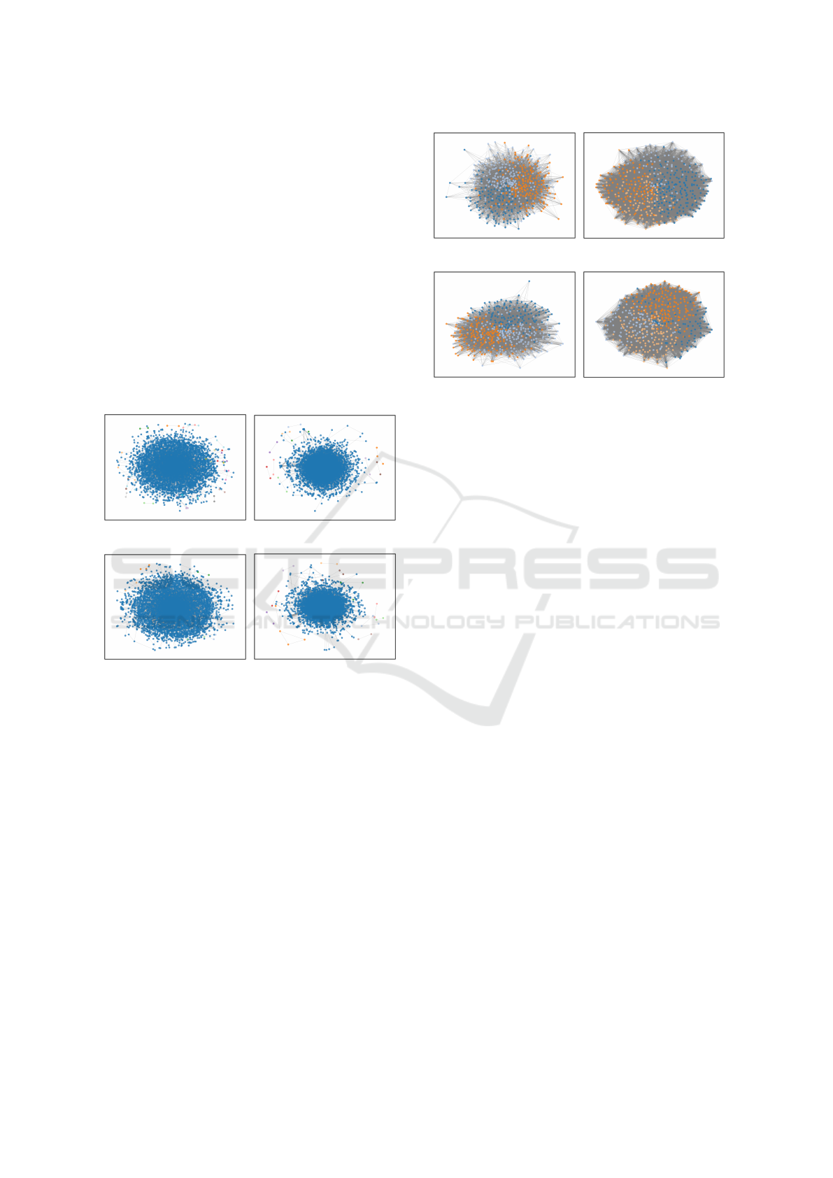
The node-link diagram in Figure 1 illustrates the
network structure, where nodes represent users and
edges indicate homophilic interactions based on po-
litical opinion alignment. A central cluster domi-
nates all graphs, reflecting a high concentration of
users with similar viewpoints and reinforcing the echo
chamber effect.
(a) k-means-SAC (b) k-means-IAC
(c) LDA-SAC (d) LDA-IAC
Figure 1: Comparison of Network Graphs Using Four Dif-
ferent Methods.This figure presents network graphs con-
structed using two clustering methods (k-means and LDA)
and two relationship definitions (SAC and IAC). The colors
represent the network group to which each node belongs
based on its connections.
Graphs from SAC further highlight this trend,
showing users gravitating toward shared content,
which aligns with selective exposure issues reported
in prior research (Barber
´
a et al., 2015). Smaller, iso-
lated groups at the edges likely represent users with
differing opinions or less frequent interactions, while
the dense center indicates high engagement among
like-minded users.
To analyze ideological polarization, the Louvain
algorithm was applied for community detection, vi-
sualized in Figure 1. Given the complexity of large
networks, only the top 500 highest-degree nodes were
selected to improve readability and interpretability.
The Louvain algorithm revealed multiple commu-
(a) k-means-SAC (b) k-means-IAC
(c) LDA-SAC (d) LDA-IAC
Figure 2: Network Community Structure Focusing on
High-Degree Nodes. This figure displays subgraphs con-
sisting of the top 500 high-degree nodes from the network.
The nodes are colored based on the community they belong
to, as detected using the Louvain algorithm.
nities within the assumed central cluster, weakening
its cohesion Figure 2. It is suggests a fluid network
structure rather than strongly separated ideological
groups. High-centrality nodes act as bridges, indicat-
ing that echo chambers may form through informa-
tion flow rather than strict divisions. These findings
challenge the assumption that a dense central cluster
represents an echo chamber, highlighting the role of
selective engagement and issue-based agreement in
shaping ideological divisions.
Real data analysis reinforces these findings, show-
ing that ideological divisions are complex and issue-
based rather than strictly partisan. While LDA-SAC
highlights community separation, engagement pat-
terns suggest political alignment is fluid, with users
selectively agreeing on policies rather than adhering
strictly to party lines. This leads to overlapping com-
munities rather than entirely isolated ideological clus-
ters.
Overall, these visualization meets the key require-
ments and provides a comprehensive view of the data.
However, it lacks clear differentiation when compar-
ing the various methods. Additionally, handling large
datasets presents a challenge, and the visualization
could be further enhanced to address this limitation,
ultimately improving its effectiveness and scalabil-
ity(von Landesberger et al., 2011).
To confirm ideological polarization and explore
signs of the echo chamber effect, the Community
Structure visualization was applied to visualize con-
nections between communities, and the number of
users within each community (Figure 3).
Visual Methods for Network Analytics of Echo Chamber: A Case Study of Thailand’s General Election 2023
377
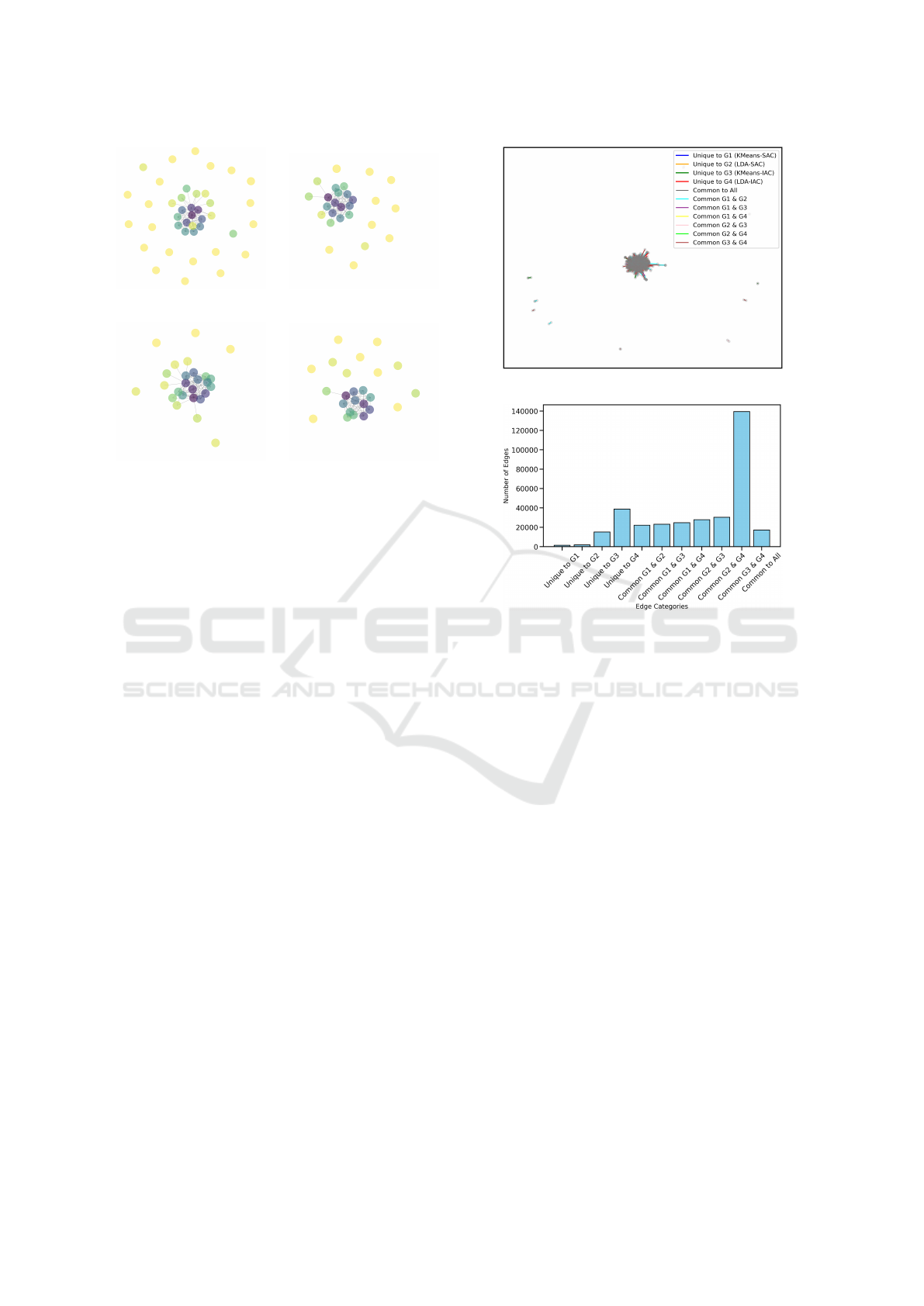
(a) k-means-SAC (b) k-means-IAC
(c) LDA-SAC (d) LDA-IAC
Figure 3: Visualization of Community Relationship in
Network Graphs. This figure presents an interactive net-
work graph, showing cluster relationships for each con-
struction method. Nodes represent communities identified
by the Louvain algorithm, with colors indicating commu-
nity size. Edges represent homophilic interactions between
users from different communities.
The colors in the visualization represent cluster
sizes, with a gradient from purple for the largest clus-
ters to green and yellow for smaller ones. Nodes col-
ored in purple indicate the largest, most central clus-
ters, suggesting they represent the most active groups
in the network.
Across methods, k-means-SAC (Figure 3a) shows
a hierarchical structure with isolated groups, LDA-
SAC (Figure 3c) reveals stronger interconnections, k-
means-IAC (Figure 3b) highlights denser core struc-
tures, and LDA-IAC (Figure 3d) balances central den-
sity and decentralization. Sparse inter-group links
across all methods indicate polarization-driven echo
chambers.
Network structures reflect issue-based homophily
rather than strict political divisions. LDA-SAC, cap-
turing ideological clustering through semantic agree-
ment, shows that echo chambers emerge from the-
matic alignment rather than absolute polarization.
5.1.2 Comparing Structural Patterns Across
Methods
Graphs were plotted to compare relationships across
the four methods (Figure 4), with edge colors dis-
tinguishing unique and shared relationships across
11 characteristics. The bar chart illustrates the dis-
tribution of unique and common edges across G1
(k-means-SAC), G2 (LDA-SAC), G3 (k-means-IAC),
(a) Comparison of Relationship across Four Methods
(b) Edges Counts: Unique and Common Edges Across
Graphs
Figure 4: Comparison of Relationships Across Four Meth-
ods This figure compares relationships in four network
graphs constructed using k-means and LDA clustering un-
der SAC and IAC. The node-link diagram (top) shows the
network structure, and the bar chart (bottom) quantifies the
distribution of unique and common edges.
and G4 (LDA-IAC), revealing structural complexity.
The graph in Figure 4 highlights unique relation-
ships across the four methods, revealing structural
complexity. The bar chart displays the number of
edges unique to each method (k-means-SAC, LDA-
SAC, k-means-IAC, LDA-IAC) and shared edges, of-
fering a clear breakdown of edge distributions.
LDA-IAC captures the most nuanced relation-
ships, as shown by its higher number of unique edges
(Figure 4b). The high common-edge count in IAC-
based methods (G3, G4) highlights their sensitivity to
subtle homophilic connections.
Selecting LDA-SAC balances content-driven co-
herence with network clarity, effectively capturing
semantic-based homophily while maintaining inter-
pretability in network structure.
DATA 2025 - 14th International Conference on Data Science, Technology and Applications
378
5.1.3 Exploring Ideological Alignment Using
User Embeddings
The Echo Chamber Effect is measured using the
EchoGAE model, which requires the network graph
(see Section 5.1) and user embeddings, created by av-
eraging 20 posts or comments per user with normal-
ized missing data. These inputs allow the model to
assess interactions, with ECS derived from the silhou-
ette score to measure cohesion and separation.
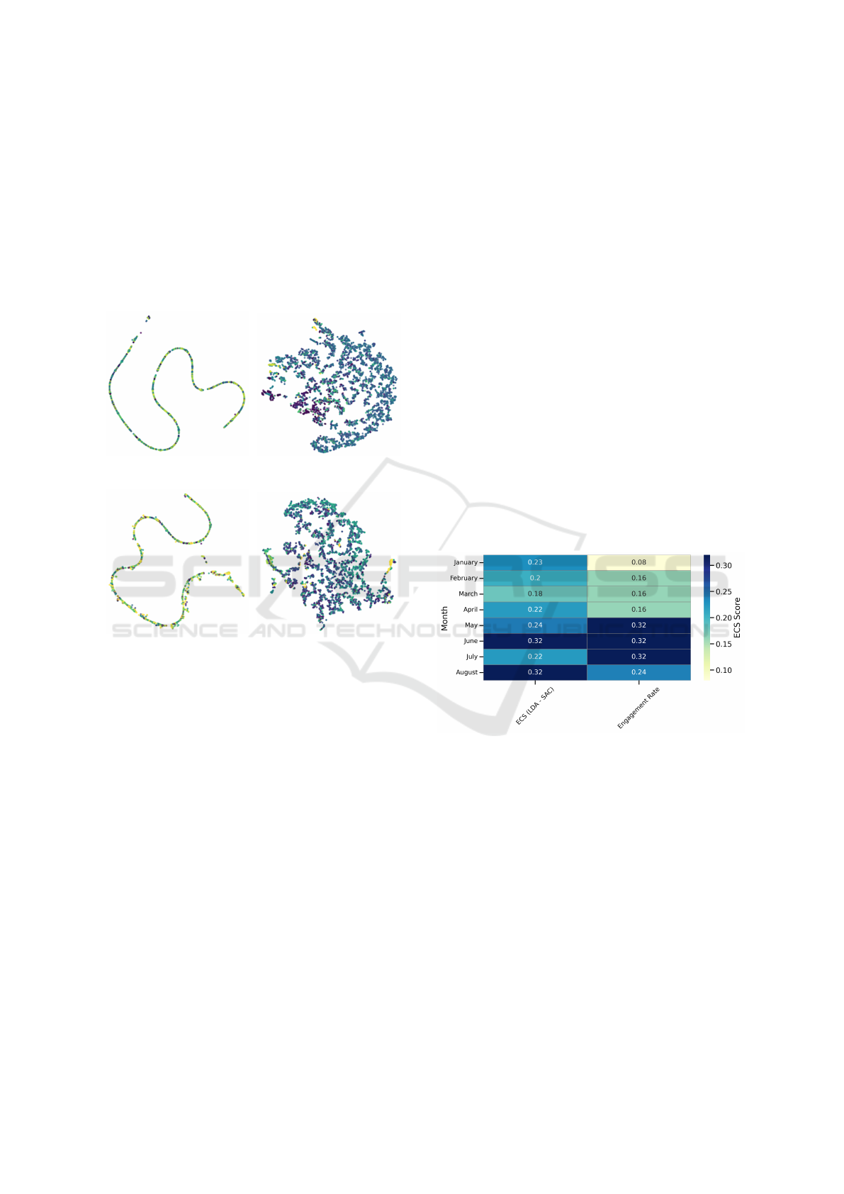
(a) k-means-SAC (b) k-means-IAC
(c) LDA-SAC (d) LDA-IAC
Figure 5: 2D Projections of User Embeddings Across Four
Network Graphs. This figure presents the 2D projections
(using the t-SNE algorithm (van der Maaten and Hinton,
2008)) of user embeddings from four different network
graphs after embedding using EchoGAE algorithm. Col-
ors represent distinct communities.
The analysis of political conversations during
Thailand’s 2023 general election reveals that SAC-
based methods yield lower ECS, with LDA (0.240)
forming more homogeneous communities and k-
means (0.213) capturing diverse groups. IAC-based
methods produce higher ECS, particularly k-means
(0.415), indicating stronger polarization, while LDA
(0.315) shows moderate polarization. These results
highlight how clustering methods shape the echo
chamber effect.
The t-SNE visualization (Figure 5a, Figure 5c)
shows ideological alignment through a curve-like pro-
jection, indicating shared opinions drive user cluster-
ing, but ideological alignment is localized around spe-
cific topics.
Despite its lower ECS, LDA-SAC was selected for
its interpretable structure, capturing issue-based ho-
mophily. This choice aligns with prior polarization
findings but reveals discrepancies, suggesting that ex-
cluding node attributes may have contributed to the
inconsistency, requiring further exploration.
5.2 Temporal Analysis of Echo
Chamber Dynamics During Key
Election Events
Data on key events from January to August 2023 was
collected from news articles and social media, focus-
ing on Thailand’s general election. Engagement rates
were estimated using YouTube view counts from 30
relevant videos, retrieved via the YouTube API with
keywords such as ”Thailand Election 2023”, ”Thai-
land General Election”.
Engagement levels—Very High, High, Moder-
ate, and Low—were based on log-transformed view
counts, with quartiles defining the categories. These
classifications reflect public interest and media atten-
tion, with major events like the election labeled as
Very High engagement, and routine updates as Mod-
erate or Low.
Figure 6: Heatmap of ECS by Month, Showing Engage-
ment Rate Levels Estimated Based on the Importance of
Key Events in Thailand’s 2023 General Election.
The heatmap (Figure 6) shows ECS by month
from the LDA-SAC method, alongside engagement
rate levels, which are set as a proportion of the max-
imum ECS. Four engagement levels—Low, Moder-
ate, High, and Very High—correspond to 25%, 50%,
75%, and 100% of the maximum ECS value.
Despite high engagement during key political
events, ECS does not consistently align with engage-
ment levels, suggesting that high engagement does
not always lead to stronger ideological polarization.
Major events may involve diverse discussions, dilut-
ing ideological boundaries. For example, the higher
ECS in June and July, despite varying engagement,
indicates that specific issues drove stronger align-
Visual Methods for Network Analytics of Echo Chamber: A Case Study of Thailand’s General Election 2023
379

ment, even though they were not discussed uniformly
throughout the year.
This highlights how LDA-SAC captures cluster-
ing around polarized issues, which may not always
correlate with engagement levels. The discrepancy
between ECS and engagement suggests that polariza-
tion is driven more by discourse focus than by in-
teraction volume. In some cases, lower engagement
with focused discussions leads to stronger alignment,
while high engagement with diverse topics weakens
clustering.
LDA-SAC reflects issue-based homophily, despite
fluctuating engagement, justifies its use for analyzing
political discourse during Thailand’s 2023 election.
Its focus on issue-driven discussions makes it a valu-
able tool for understanding ideological polarization in
political events.
6 DISCUSSIONS AND FUTURE
WORK
This research demonstrates the value of visual meth-
ods in examining echo chambers in online political
discussions, though several limitations exist. The use
of predefined clustering techniques and network con-
struction methods may influence the detected struc-
tures, potentially missing alternative patterns of ideo-
logical alignment.
Methodological Implications and Limitations.
There are potential biases in network construction
and clustering parameters. The reliance on Pantip
data limits the generalizability of the findings,
highlighting the need for future research to validate
these methods across diverse platforms. Scalability
and interpretability remain key challenges, as large
networks can lead to visual clutter, and community
detection outcomes may vary depending on algorithm
selection. Future studies should incorporate weighted
edges to account for interaction strength and explore
methodologies to enhance both scalability and
interpretability.
This study does not make normative judgments on
political alignment but employs visual methods to an-
alyze structural patterns. Future research should re-
fine the understanding of echo chamber dynamics by
examining peripheral communities and the evolution
of online discourse.
Expanding Visual Analysis Techniques. Future
work could incorporate advanced dimensionality re-
duction techniques, such as UMAP, for better user
clustering and high-dimensional structure preserva-
tion. Dynamic visualizations tracking changes in
echo chamber intensity over time would enable re-
searchers to observe how polarization evolves during
major political events or shifts in user interactions.
Exploring Platform Influence and User Behavior.
Echo chambers tend to intensify during political
events due to increased engagement. Future studies
should examine the influence of platform algorithms,
such as recommendation systems, on exposure to di-
verse viewpoints. Testing algorithm changes could
help reduce polarization while maintaining user en-
gagement.
Enhancing Echo Chamber Metrics and Applica-
tions. While the visual methods provided valuable
insights, developing new metrics could capture sub-
tler aspects of echo chambers, such as exposure to
contrasting opinions or content-based polarization.
These metrics could be used in cross-platform stud-
ies or to evaluate interventions aimed at reducing po-
larization.These metrics could be applied in cross-
platform studies or used to evaluate interventions
aimed at reducing polarization. Real-time social me-
dia monitoring could also help identify emerging echo
chambers and enable timely interventions to promote
balanced discourse.
Future work should incorporate quantitative met-
rics, such as clustering quality, modularity, and corre-
lation with expert classifications, to objectively assess
how different methods capture echo chamber phe-
nomena. A comparative table or performance evalua-
tion would enhance transparency and provide clearer
guidance on method selection.
7 CONCLUSION
This study developed visual methods for Network An-
alytics of Echo Chambers, with a specific case study
on Thailand’s General Election 2023. By constructing
network graphs using various clustering techniques
and relationship definitions, the research explored the
formation and dynamics of echo chambers in politi-
cal conversations. The ECS was employed to quantify
polarization within online communities, revealing the
influence of both method choice and political events
on user behavior and discourse.
The findings highlighted the varying levels of po-
larization across different methods, particularly not-
ing the stronger echo chamber effects observed un-
der the k-means clustering method. Additionally, the
research illustrated how significant political events,
DATA 2025 - 14th International Conference on Data Science, Technology and Applications
380

such as news cycles and electoral milestones, played
a key role in amplifying echo chamber dynamics.
Overall, the visual methods developed in this
study offer visual methods for understanding the com-
plexities of online political discussions and the for-
mation of echo chambers. The case study provides
important insights into the impact of the 2023 gen-
eral election in Thailand on online community dy-
namics. This work lays the foundation for future re-
search and applications in visualizing and analyzing
network-based social phenomena in the context of po-
litical communication.
REFERENCES
Alatawi, F., Sheth, P., and Liu, H. (2023). Quantifying the
echo chamber effect: An embedding distance-based
approach.
Barber
´
a, P., Jost, J. T., Nagler, J., Tucker, J. A., and Bon-
neau, R. (2015). Tweeting from left to right. Psycho-
logical Science, 26:1531 – 1542.
Botte, N., Ryckebusch, J., and Rocha, L. E. (2022). Cluster-
ing and stubbornness regulate the formation of echo
chambers in personalised opinion dynamics. Phys-
ica A: Statistical Mechanics and its Applications,
599:127423.
Cinelli, M., Morales, G. D. F., Galeazzi, A., Quattrocioc-
chi, W., and Starnini, M. (2021). The echo chamber
effect on social media. Proceedings of the National
Academy of Sciences, 118(9):e2023301118.
Conover, M., Ratkiewicz, J., Francisco, M., Gonc¸alves, B.,
Menczer, F., and Flammini, A. (2011). Political polar-
ization on twitter.
Cota, W., Ferreira, S., Pastor-Satorras, R., and Starnini, M.
(2019). Quantifying echo chamber effects in infor-
mation spreading over political communication net-
works.
Diehl, A., Hundt, M., Haussler, J., Seebacher, D., Chen,
S., Cilasun, N., Keim, D., and Shreck, T. (2018). So-
cialocean: Visual analysis and characterization of so-
cial media bubbles. pages 1–11.
Goel, A., Ma, K. T., and Tan, C. (2019). An end-to-end net-
work for generating social relationship graphs. 2019
IEEE/CVF Conference on Computer Vision and Pat-
tern Recognition (CVPR), pages 11178–11187.
Goodreau, S. M., Kitts, J. A., and Morris, M. M. (2009).
Birds of a feather, or friend of a friend? using expo-
nential random graph models to investigate adolescent
social networks*. Demography, 46:103–125.
Guo, L., Rohde, J. A., and Wu, H. D. (2018). Who is re-
sponsible for twitter’s echo chamber problem? evi-
dence from 2016 u.s. election networks. Information,
Communication & Society, 23:234 – 251.
Henry, N., Fekete, J.-D., and McGuffin, M. J. (2007). Node-
trix: a hybrid visualization of social networks. IEEE
Transactions on Visualization and Computer Graph-
ics, 13(6):1302–1309.
Hoque, E. and Carenini, G. (2014). Convis: A visual
text analytic system for exploring blog conversations.
Computer Graphics Forum, 33(3):221–230.
Jiang, B., Karami, M., Cheng, L., Black, T., and Liu, H.
(2021). Mechanisms and attributes of echo chambers
in social media.
Lowphansirikul, L., Polpanumas, C., Jantrakulchai, N.,
and Nutanong, S. (2021). Wangchanberta: Pretrain-
ing transformer-based thai language models. ArXiv,
abs/2101.09635.
Markgraf, M. and Schoch, M. (2019). Quantification of
echo chambers: a methodological framework consid-
ering multi-party systems. In European Conference
on Information Systems.
Mcpherson, M., Smith-Lovin, L., and Cook, J. (2001).
Birds of a feather: Homophily in social networks. An-
nual Review of Sociology, 27:415–.
Reimers, N. and Gurevych, I. (2019). Sentence-bert: Sen-
tence embeddings using siamese bert-networks. In
Conference on Empirical Methods in Natural Lan-
guage Processing.
Thomas, J. J. and Cook, K. A. (2005). Illuminating the
path: The research and development agenda for visual
analytics.
Unerman, J. (2020). Risks from self-referential peer review
echo chambers developing in research fields: 2018
keynote address presented at the british accounting re-
view 50th anniversary celebrations, british account-
ing and finance association annual conference, lon-
don. The British Accounting Review, 52(5):100910.
van der Maaten, L. and Hinton, G. (2008). Viualizing data
using t-sne. Journal of Machine Learning Research,
9:2579–2605.
Vicario, M. D., Bessi, A., Zollo, F., Petroni, F., Scala,
A., Caldarelli, G., Stanley, H. E., and Quattrocioc-
chi, W. (2016). The spreading of misinformation on-
line. Proceedings of the National Academy of Sci-
ences, 113(3):554–559.
von Landesberger, T., Kuijper, A., Schreck, T., Kohlham-
mer, J., van Wijk, J., Fekete, J.-D., and Fellner, D.
(2011). Visual analysis of large graphs: State-of-the-
art and future research challenges. Computer Graph-
ics Forum, 30(6):1719–1749.
Yang, T., Maj
´
o-V
´
azquez, S., Nielsen, R. K., and Gonz
´
alez-
Bail
´
on, S. (2020). Exposure to news grows less
fragmented with an increase in mobile access. Pro-
ceedings of the National Academy of Sciences,
117(46):28678–28683.
Visual Methods for Network Analytics of Echo Chamber: A Case Study of Thailand’s General Election 2023
381
