
Applying Checklist and Design Patterns for Evaluating and Redesigning
a Dashboard Interface of a Decision Support Information System
Kennedy Nunes
1,2 a
, Arthur Passos
1,2 b
, Matheus Menezes
3 c
, Felipe Feyh
3 d
, Carlos Moura
3 e
,
Lucas Pinheiro
3 f
, Auriane Santos
3 g
, Aristofanes Silva
1,2 h
,Jo
˜
ao Dallyson
1,2 i
,
Italo Francyles
1,2 j
and Luis Rivero
1,2 k
1
Programa de P
´
os-Graduac¸
˜
ao em Ci
ˆ
encia da Computac¸
˜
ao (PPGCC), Federal University of Maranh
˜
ao (UFMA), S
˜
ao Lu
´
ıs,
MA, Brazil
2
N
´
ucleo de Computac¸
˜
ao Aplicada (NCA), Federal University of Maranh
˜
ao (UFMA), S
˜
ao Lu
´
ıs, MA, Brazil
3
Instituto de Ci
ˆ
encia e Tecnologia Grupo Equatorial, S
˜
ao Lu
´
ıs, MA, Brazil
Keywords:
Dashboards, Design Patterns, Checklist, User Experience, Usability.
Abstract:
Well-designed dashboards synthesize complex data, allowing users to quickly identify trends and patterns.
To achieve their goals, these dashboards should be easy to use, improving the users’ ability to understand,
interact with, and derive insights from the presented data. This paper highlights the importance of dashboards
in supporting decision-making, emphasizing the crucial role of UX and usability in the effectiveness of these
systems. The main goal of the paper is to propose quality attributes related to usability and user experience that
can be incorporated during the development process of dashboards. Following a literature review on the quality
attributes of dashboards, a checklist was developed to evaluate the usability aspects of these systems. The
checklist facilitates the structured and easy identification of usability issues, even by inexperienced users, while
being a robust evaluation tool built on validated quality attributes from prior literature. Also, an aggregated set
of Design Patterns was identified and paired with the verification items of the checklist. Both the inspection
checklist and the design patterns were applied for the evaluation and redesign of Dashboards proposed within
an information system for Decision Making purposes at the Equatorial Energia Multinational Power Company.
The results from this experience suggests the feasibility of considering these quality attributes for improving
the ease of use of Dashboards.
1 INTRODUCTION
Dashboards are visual representations of data, typi-
cally in the form of graphs, tables, gauges, and other
graphical elements, that provide summarized, real-
a
https://orcid.org/0000-0003-0826-8207
b
https://orcid.org/0000-0002-2823-3645
c
https://orcid.org/0000-0001-8676-1131
d
https://orcid.org/0009-0008-3593-9225
e
https://orcid.org/0009-0005-8552-6136
f
https://orcid.org/0000-0002-4641-3703
g
https://orcid.org/0009-0003-3873-4990
h
https://orcid.org/0000-0003-0423-2514
i
https://orcid.org/0000-0001-7013-9700
j
https://orcid.org/0000-0002-2041-7538
k
https://orcid.org/0000-0001-6008-6537
time information about the performance of a sys-
tem, process, project, or organization (Cahyadi and
Prananto, 2015). The importance of dashboards lies
in the fact that they simplify the interpretation and
communication of complex data, allowing people to
easily understand essential information and identify
relevant trends, patterns, or anomalies (Costa, 2018).
The use of dashboards has grown significantly in
recent years (Praharaj et al., 2022), as companies,
colleges, and government agencies recognize the im-
portance of data and visual information for decision-
making and tracking the performance of their opera-
tions (V
´
azquez-Ingelmo et al., 2019). However, it is
equally important to establish ease of use, or usabil-
ity, of these dashboards (Richter Lagha et al., 2020).
According to (Enache, 2021), usability is a crucial
factor in the use of dashboards, as it directly affects
494
Nunes, K., Passos, A., Menezes, M., Feyh, F., Moura, C., Pinheiro, L., Santos, A., Silva, A., Dallyson, J., Francyles, I. and Rivero, L.
Applying Checklist and Design Patterns for Evaluating and Redesigning a Dashboard Interface of a Decision Support Information System.
DOI: 10.5220/0013480800003929
In Proceedings of the 27th International Conference on Enterprise Information Systems (ICEIS 2025) - Volume 2, pages 494-505
ISBN: 978-989-758-749-8; ISSN: 2184-4992
Copyright © 2025 by Paper published under CC license (CC BY-NC-ND 4.0)

users’ ability to understand, interact with, and derive
insights from the presented data. Therefore, dash-
boards should be clear, simple, and present informa-
tion concisely (Bach et al., 2022). Usability is consid-
ered an indicator of a system’s efficiency and effec-
tiveness, assessing its ease of use and the user’s abil-
ity to successfully complete tasks (Best and Smyth,
2011). User experience, on the other hand, encom-
passes all aspects related to people’s interaction with
a product, including the user’s perception of how they
feel when using it, their understanding of how the sys-
tem works, and the product’s suitability for the con-
text in which it is used (Maia et al., 2020).
Although there are related works on the develop-
ment of dashboards and User Experience (UX), the
number of methods specifically focused on evaluating
user experience (Almasi et al., 2023) and usability is
still low (Silva et al., 2018). Both usability and UX
are considered key factors for the success of a system
(Hassan and Galal-Edeen, 2017). However, it is no-
ticeable that there is still a lack of technologies that
support dashboard design, integrating the concepts of
usability and UX, and that have been applied for val-
idation and evaluation.
This paper aims to contribute to the process eval-
uating and redesigning dashboards, proposing a more
appropriate interface that can help improve the qual-
ity of these tools from the perspective of end users.
The idea is to offer a set of artifacts that contribute to
the development of dashboard interfaces. Initially, we
propose the creation of a checklist, which will sup-
port and guide developers in evaluating dashboards,
ensuring that usability and user experience guidelines
are being met. Then, we suggest applying design pat-
terns to help meet the quality attributes regarding us-
ability and UX, by providing solutions and examples.
Doing so, we intend to reduce rework and avoiding
potential ambiguities in identifying system errors and
solutions.
The remainder of the paper is organized as fol-
lows. Section 2 presents a review of related works in
this area. Section 3 identifies attributes from a liter-
ature review and proposes a checklist for evaluating
dashboards. Section 4 presents the project context in
which the checklist was applied, while also present-
ing suggestions for correcting the identified problems.
Section 5 concludes the paper and outlines future per-
spectives for this research.
2 RELATED WORK
There is a growing concern in designing high-quality
systems that present information effectively and ob-
jectively to users (Praharaj et al., 2022). In this con-
text, several studies have highlighted the development
of information systems and dashboards aimed at sup-
porting decision-making processes, while focusing on
their ease of use (Almasi et al., 2023) (Maceli and Yu,
2020) (Smuts et al., 2015). Below, we present some
of these studies and their contribution to the field.
In their research, Almasi et al. (2023) reviewed
existing questionnaires used to assess the usability of
dashboards and suggested some criteria for this eval-
uation. The criteria include utility, operability, ease
of learning, customized questionnaire, improved sit-
uational awareness, user satisfaction, user interface,
content, and system capabilities. The authors empha-
size that when selecting criteria to evaluate the usabil-
ity of dashboards, it is essential to consider the study’s
objectives, the characteristics and capabilities of the
panels, and the context of use.
The research by Enache (2021) involved the de-
sign and analysis of a dashboard for runners, with the
goal of preventing injuries. The evaluation of users of
the interactive running dashboard was conducted us-
ing the SUS (System Usability Scale) to measure the
score and develop a dashboard.
In another study by Maceli et al. (2020), the au-
thors aimed at exploring the design and evaluation of
the dashboard through usability testing and heuristic
evaluation of an open-source data dashboard interface
for archivists. An heuristic evaluation of the environ-
mental monitoring dashboard was conducted, evaluat-
ing the interface against Nielsen’s ten usability heuris-
tics.
Similarly, Smuts et al. (2015) aimed to investigate
the usability of Business Intelligence (BI) tools that
support the development of dashboards, with a spe-
cific focus on novice users. The main research prob-
lem addressed in this paper is the complexity in the
development process of dashboards in traditional BI
tools.
Sarikaya et al. (2018) aimed at discovering and
identifying different types of dashboard designs. To
achieve this, they conducted a multidisciplinary liter-
ature review to understand practices surrounding the
use of dashboards. The review allowed them to build
a characterization of the uses and domains of dash-
boards and identify issues that the literature consid-
ers urgent. Later, Bach et al. (2022) described the
process of creating design patterns for dashboards,
which involved a systematic literature review on dash-
boards and data visualization. A total of 144 dash-
boards were collected considering an initial selec-
tion of 83 dashboards gathered by (Sarikaya et al.,
2018). The authors provided insights into the design
of dashboards, offering applicable design knowledge
Applying Checklist and Design Patterns for Evaluating and Redesigning a Dashboard Interface of a Decision Support Information System
495

that could inform and inspire the creation of future
dashboards and creation tools.
The analysis of related works on dashboard eval-
uation, reviews, and design patterns reveals gaps in
terms of the robustness and comprehensiveness of the
approaches employed. Although these studies of-
ten address aspects of usability and user experience,
most works rely predominantly on Nielsen’s Heuris-
tics, and the System Usability Scale (SUS). While
these approaches are widely used, they may overlook
specific and relevant quality attributes.
Regarding works that deal with design patterns, in
general, these studies do not present a structure that
encompasses necessary elements for defining inter-
face design patterns, as highlighted by (Vora, 2009):
the identified problem, the proposed solution, and
the detailed explanation of how to implement the
problem. Instead, such approaches tend to describe
only recurring aspects observed in the analyzed dash-
boards, restricting themselves to the solution dimen-
sion.
In response to this gaps, this paper proposes to
gather and integrate various quality attributes, orga-
nizing them into a consolidated list and transform-
ing them into items for a checklist. This checklist
has been applied to evaluate a system from an energy
company, focusing on decision-making related to ir-
regularities among its customers. Also, regarding de-
sign patterns for dashboards’ user interfaces, this pa-
per does not aim to propose new design patterns, but
employ the design patterns already available in the lit-
erature, integrating them with the identified quality at-
tributes. This integration will ensure that certain items
of the checklist are associated with existing patterns,
providing a solid foundation for the suggested im-
provements. Therefore, in this paper we intend to not
only enhance the evaluation of dashboards but also
to provide guidance for implementing more effective
and consistent solutions, to the identified problems.
In the next sections, we present how we developed
the checklist that encompasses both usability and user
experience in the evaluation of dashboards. Further-
more, we show how we integrated this checklist with
design patterns found in the literature.
3 RESEARCH METHODOLOGY
3.1 Developing Evaluation and Design
Artifacts
To develop and artifact that provides verification
items and also suggestions for the correction of the
identified problems, we followed the following re-
search methodology:
1. Identification of quality attributes for dash-
boards, carried out through an informal ex-
ploratory review of the literature;
2. Systematic mapping of the literature, aimed at
identifying design patterns related to usability and
user experience (UX) in dashboards;
3. Analysis of attributes and development of the
inspection checklist, culminating in the presen-
tation of the integrated artifact; and
4. Application of the artifact in the development of
dashboards from an information system.
The three following subsections describe the
stages for proposing the artifacts in detail, while the
application of the artifact will be described in Section
4.2.
3.2 Exploratory Analysis of Usability
Attributes in Dashboards
The development process of the proposed checklist
began with a literature review aimed at identifying
relevant studies addressing important quality in the
development and creation of a dashboard. To con-
duct this review, search criteria were defined, such as
searching for papers published in the last 10 years in
English. Papers that did not meet these criteria, as
well as duplicated ones or those unavailable for paid
access, were excluded, using an automated search
strategy in digital libraries.
The search terms used included keywords such as
”Control Panel” or ”Dashboard”, ”Design Patterns”,
”Quality Attributes”, ”User Experience”, ”User Inter-
face”, ”Usability”. Several libraries and search tools
were used, including IEEE, Scopus, ACM Digital Li-
brary, SpringerLink, and Google Scholar. After the
initial selection of papers, the inclusion of each was
assessed based on the title and abstract. When it was
not possible to make a decision based on this infor-
mation, the paper was included for full reading. In
this second selection process, the paper was consid-
ered if it described quality attributes related to us-
ability or user experience in dashboards, and if it met
the previously established criteria. A total of 10 pa-
pers were selected, which reported relevant quality at-
tributes for dashboard development: A001 - (Maceli
and Yu, 2020); A002 - (Almasi et al., 2023); A003
- (Smuts et al., 2015); A004 - (Enache, 2021); A005
- (Raza et al., 2019); A006 - (Shakeel et al., 2022);
A007 - (Rahman et al., 2016); A008 - (Bera, 2016);
A009 - (Silva-Rodr
´
ıguez et al., 2022); and A010 -
(Peters et al., 2019).
ICEIS 2025 - 27th International Conference on Enterprise Information Systems
496

Initially, 165 attributes were identified. These at-
tributes were listed into a document. If an attribute
was similar among others, these were grouped and
then transformed into a single attribute, in the form
of a requirement that should be evaluated in the dash-
board (e.g. a verification item). These requirements
would then form the checklist when aggregated. For
example, the verification item FU I17 (”The dash-
board should include data dimension selection and vi-
sualization, offering flexibility to users with options
for drilling down, searching, and customizing lay-
outs.”) was formed by three quality attributes found
in papers from the review:
1. (A005 A17) It is easy to find the necessary infor-
mation on the dashboard;
2. (A004 A6) Recognition rather than recall: Infor-
mation, options, and actions should be visible
or easily retrievable, reducing the user’s need to
memorize or recall specific details;
3. (A008 A16) The dashboard has intuitive inter-
faces and menus for easy use. Does the dash-
board have intuitive interfaces and menus, making
it easy to find the necessary information?.
During the grouping process, we ensured that
the most comprehensive attribute was selected and/or
complemented with details from the other attributes.
After grouping the similar identified attributes, we
identified 54 distinct ones. These attributes were or-
ganized into several categories, covering crucial as-
pects for dashboards evaluation. The categories in-
clude Task Adequacy (TA), Learning (LE), System
Capabilities (SC), Content (CT), Error Control and
Utility (EC), Aesthetic and Minimalist Design (AM),
Ease of Use (EU), Flexibility (FL), User Interface
(UI), Improvement of Situational Awareness (IS),
Operability (OP), Goal Orientation GO, Satisfaction
(SA), Page Navigation (PN), Utility (UT), Visibility
(VI) and Notes and Highlights (NH). This categoriza-
tion was drawn from the identified papers, providing
a comprehensive view of the essential requirements
identified in the context of the analysis.
Table 1 presents a selection of the first 5 (five) re-
quirements extracted from the papers. The complete
Table 1, with the 54 requirements from the first re-
view, can be consulted in another Report
1
, which also
shows the relationship between the requirements and
the papers in which they were found.
1
To access the full Table 1, click here.
3.3 Design Patterns for Usability and
UX in Dashboards
Based on the first literature review, the presence of
design patterns that offer practical enhancement was
identified. These patterns demonstrate how specific
elements can be implemented, presenting contextual-
ized examples for implementing usability and UX re-
quirements. Thus, a Systematic Mapping Study was
conducted with the aim of identifying works that pre-
sented design patterns capable of enhancing usabil-
ity, and user experience in dashboards. We carried
out this literature review using the suggestions by
Kitchenham (2004). In this section, the planning and
execution of the review, providing all the necessary
information to understand the subsequent results.
In accordance with the guidelines by Kitchenham
(2004), the protocol will describe the main research
question and its secondary questions, the search terms
used to uncover the state of the art, the sources for
searching papers, and the applied selection criteria.
The goal of this review is to examine the current state
of the art in dashboard development, focusing on im-
proving usability and UX. As a result, this review
aimed at answering the following research question:
• RQ - ”What are the existing design patterns that
consider user experience and usability in the de-
velopment of dashboards?”
After formulating the central research question,
we developed a search string that allowed the iden-
tification of relevant scientific publications to an-
swer these questions. The search string would be
applied to identifying studies that address attributes
Table 1: Requirements and Base Papers of Origin.
ID Requirements
UT I01 The dashboard should identify goals
that provide specific information, mak-
ing task execution more effective.
TA I02 The dashboard should help achieve
goals and complete tasks.
UT I03 The dashboard should improve perfor-
mance by providing greater control over
activities.
UT I04 The dashboard should allow tasks that
would normally take more time to be
completed faster when used.
UT I05 The dashboard should provide more so-
phisticated metrics and representations
to express the nuances of solving com-
plex problems.
Applying Checklist and Design Patterns for Evaluating and Redesigning a Dashboard Interface of a Decision Support Information System
497
related to usability and user experience in dash-
boards. To achieve this goal, synonyms and key
terms were extracted from the analyses conducted by
(de C
´
assio Lemes et al., 2023), (Gomes et al., 2021),
(Guerino and Valentim, 2020), and (Cabrejos et al.,
2018). Additionally, tests were conducted to validate
the String in relation to the main research question,
ensuring its effectiveness in retrieving the greatest
possible number of relevant publications for this liter-
ature review. As a result, Table 3 presents the selected
keywords along with their respective synonyms.
Table 2: Terms applied to the construction of the Search
String.
Keywords Synonyms
Design Patterns ”Design Patterns” OR ”De-
sign Templates”
Dashboard ”Data Panel” OR ”Indica-
tors Panel”
Usability; User
Experience and
User Interface
”UX” OR ”UI”
Based on the search terms, the resulting search
string was: ((”Dashboard” OR ”Data Panel” OR ”In-
dicators Panel”) AND (”Design Patterns” OR ”De-
sign Templates”) AND (”User eXperience” OR ”User
Interface” OR ”Usability” OR ”UX” OR ”UI”)). This
String was executed in the Scopus Digital Library
database.
The publications analyzed were extracted from
the Scopus Digital Library, chosen for being a broad
and reliable scientific database, recognized as one of
the largest sources of abstracts and citations of peer-
reviewed literature in the fields of technology and sci-
ence, as highlighted by (Codina, 2005). Scopus also
stands out for indexing publications from other major
libraries such as ACM Digital Library, Springer Link
Digital Library, Science Direct Digital Library, and
IEEE Xplore Digital Library.
The analyzed studies in this literature review cor-
respond to publications submitted to peer review and
published in scientific journals or events. To ensure
the selection of the most relevant publications to an-
swer the research question of this review, specific in-
clusion and exclusion criteria were established. It is
important to highlight that for a publication to be ac-
cepted, all inclusion criteria must be met. On the other
hand, if any of the exclusion criteria were met, the
publication was automatically discarded.
Therefore, the Inclusion Criteria (IC) defined
were:
• IC1: The publication describes design patterns for
usability and UX in dashboards;
The Exclusion Criteria (EC) were:
• EC1 - The publication does not address design
patterns for usability and UX in dashboards;
• EC2 - The publication is not written in English;
• EC3 - The publication is not available for reading,
downloading, and data collection;
• EC4 - The publication is not a scientific paper, but
rather an abstract, or incomplete text, or not a peer
reviewed paper;
• EC5 - The publication is duplicated.
In order to optimize the execution of the review, a
data extraction form was created, as presented in Ta-
ble 3, which assisted in conducting and organizing the
selection of relevant papers for the research. The form
fields and their respective descriptions were defined
based on the guidelines recommended by Kitchenham
and Charters (2007). This form allowed for a struc-
tured analysis of the information extracted from the
publications, which was considered in the final results
of the review
1
.
Table 3: Attribute Extraction Form.
Publication ID: A001
Full Reference of
the Publication:
What are the de-
sign patterns?
The design patterns identi-
fied in the publication were
Design patterns
in their respective
categories:
Detail the categories men-
tioned in the publication
What is the the-
oretical foundation
of the proposed de-
sign patterns?
Explain the theoretical or
conceptual basis used in the
publication to propose the
standards
The research was conducted using the string that
was defined in the search mechanisms of the Scopus
digital library, from August to December 2024. The
execution of the String resulted in 209 publications.
In the first filter, titles and abstracts were analyzed to
discard publications that were not related to the re-
search question of the review. This process resulted in
69 publications that passed to the second filter, where
they were read in full and evaluated according to the
established inclusion and exclusion criteria. As a re-
sult, 3 publications were considered suitable for ex-
tracting the necessary information. Table 4 summa-
rizes the results after each applied filter.
1
Data Extraction Form:(click here)
ICEIS 2025 - 27th International Conference on Enterprise Information Systems
498
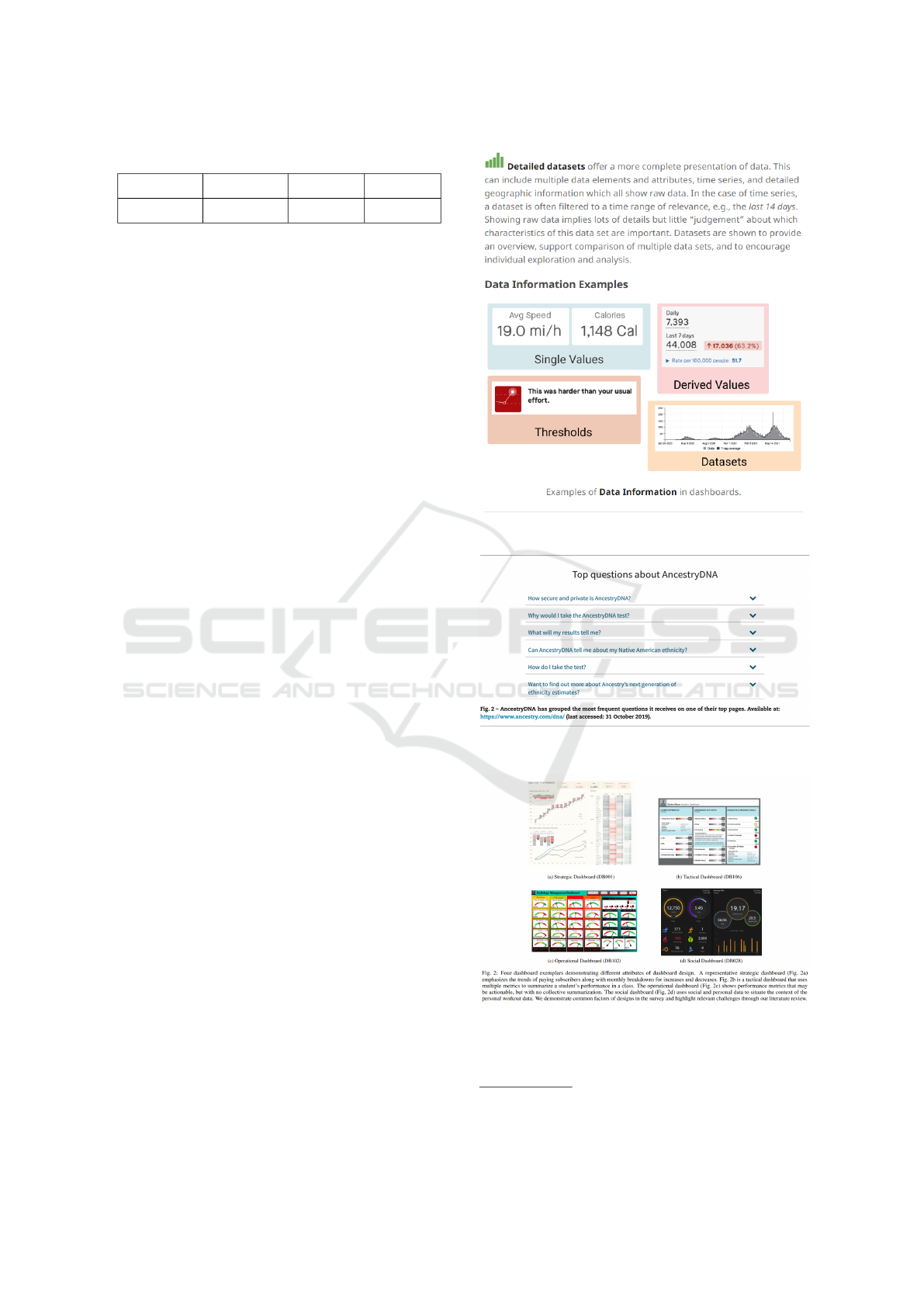
Table 4: Summary of the number of analyzed papers.
Library Total Filter 1 Filter 2
Scopus 209 69 3
The papers that presented design patterns in this
review were: A001 - (Bach et al., 2022), A002 -
(Rossi and Lenzini, 2020), and A003 - (Sarikaya
et al., 2018). However, only the study by (Rossi and
Lenzini, 2020) structured its design suggestions based
on the work of (Haapio and Passera, 2017). To de-
velop the documentation of the patterns, basic ele-
ments were used with the same items suggested by
(Vora, 2009), resulting in patterns that include the fol-
lowing components: (a) Code: Identification code of
the pattern, categorized according to its application;
(b) Pattern Name: A short title that describes the main
objective of the pattern; (c) Problem: A brief defi-
nition of the problem that the pattern aims to solve;
(d) Solution: A proposal based on the identified qual-
ity attributes; (e) How: Detailed instructions for best
practices and possible variations; (f) Example: An
image or representation illustrating the application of
the pattern in real interfaces.
By analyzing the selected papers, we identified
that the study by Bach et al. (2022) highlighted how
certain design items appeared more frequently in an-
alyzed dashboards, providing a complementary web-
site with suggestions organized by categories to assist
in dashboard development. On the other hand, the
study by Sarikaya et al. (2018) conducted a multi-
domain review, analyzing 83 dashboards, and offered
insights into how certain elements are implemented,
contributing to the improvement of patterns. For in-
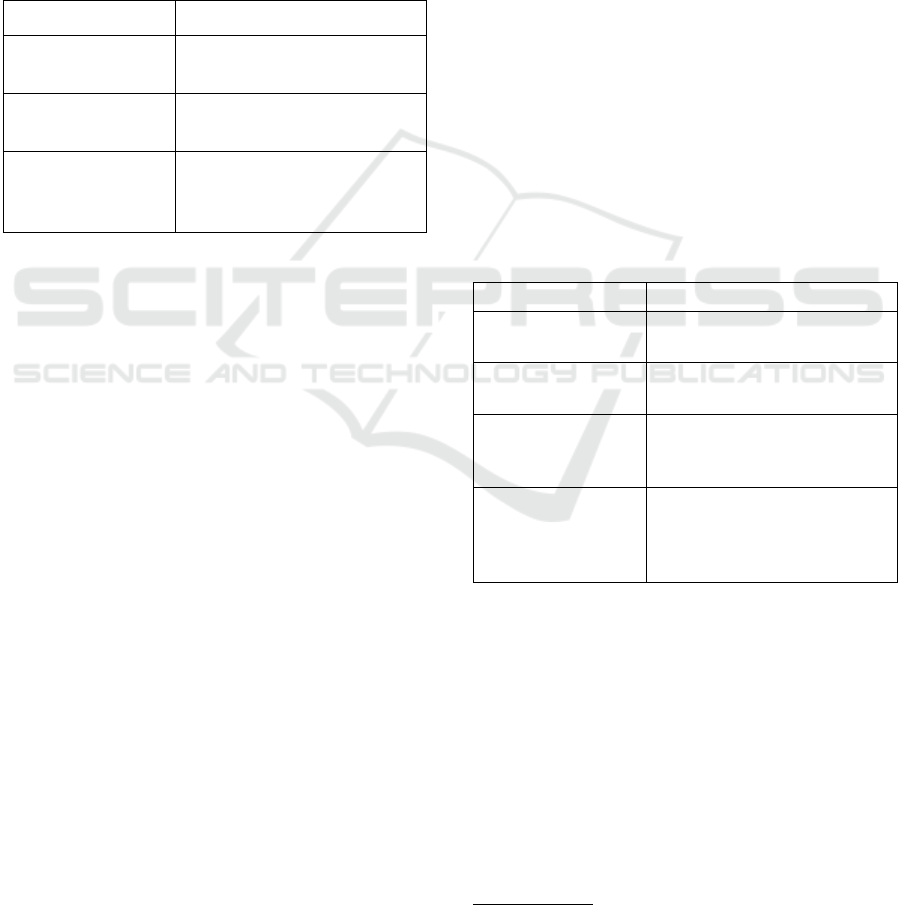
stance, Figure 1 presents a pattern described by Bach
et al. (2022). The author provides an explanation and
examples of how this pattern is implemented in prac-
tice, highlighting its application in dashboard design.
In Figure 2, we provide an example of the design
pattern proposed by Rossi et al. (2020). In this pat-
tern, the authors discuss that Effective FAQs provide
clear, concise answers tailored to the audience, ad-
dressing common questions logically and accessibly.
They complement, but do not replace, direct contact
or detailed documents. FAQs are ideal for explaining
processes (e.g., data protection) and offering simple
instructions (e.g., account deletion).
Finally, Figure 3 illustrates a pattern identified in
the study by Sarikaya et al. (2018). In this pattern,
the authors indicate that Dashboards use benchmarks,
like gauges, arrows, status lights, or labels, to show
when thresholds are met or exceeded. These visual
cues help users quickly assess data against perfor-
mance targets. The attributes that were extracted from
the three selected papers can be found in the Foot-
Figure 1: Design Pattern presented by (Bach et al., 2022).
Figure 2: Design Pattern presented by (Rossi and Lenzini,
2020).
Figure 3: Design Pattern presented by (Sarikaya et al.,
2018).
note
2
.
2
Design Patterns extracted from the selected papers.
(click here)
Applying Checklist and Design Patterns for Evaluating and Redesigning a Dashboard Interface of a Decision Support Information System
499

Each selected publication presented a different
study, with its own set of design patterns and different
types of methodologies to support the work. Table 5
shows the theoretical foundation used by each paper
for creating its patterns.
Table 5: Data Extraction Form.
ID Theoretical Foundation
A001 The paper was based on a systematic anal-
ysis of examples and documentation on the
use of dashboards. Additionally, it utilized
a literature review on the use of dashboards
to construct a design space, identify the
main types of dashboards, and character-
ize their design goals, levels of interaction,
and associated practices.
A002 The theoretical foundation was based on
the work of (Haapio and Passera, 2017),
which explores fundamental changes in the
world of contracts, including the impact of
technology.
A003 This paper presents a multi-domain litera-
ture review on dashboard practices, analyz-
ing examples and related documentation. It
defines a design space characterizing dash-
boards by design goals, interaction levels,
and associated practices.
Regarding the categorization of the patterns, only
one study described categories for the proposed de-
sign patterns (Bach et al., 2022). Bach et al. (2022)
presented the following categories for its patterns:
Data Information Patterns, Meta Information Pat-
terns, Visual Representation Patterns, Page Layout
Patterns, Screenspace Patterns, Structure Patterns, In-
teraction Patterns, and Color Patterns. These cate-
gories will be used as the basis for proposing the
checklist in Section 3.4
3.4 Analysis of Attributes and
Development of the Inspection
Checklist
Based on the literature reviews, which addressed both
the attributes and design standards, the development
of an inspection checklist was proposed to assess and
identify defects in dashboards in decision-support in-
formation systems. To this end, the following steps
were considered:
1. Identification of quality attributes for dashboards
related to Usability and User Experience (User
Experience), based on scientific literature, as de-
scribed in Section 3.2. In this step, we decided
to integrate the design standards found in the lit-
erature into the attributes, allowing each checklist
item to present not only an inspection criterion but
also examples of improvements and practical im-
plementation guidelines.
2. Conducting a detailed analysis of the quality at-
tributes, grouping similar attributes, transforming
them into system requirements, and organizing all
identified items into an inspection checklist.
The steps for the development of the checklist
were based on the methodology used by Fraz
˜
ao et
al. (2021)(Fraz
˜
ao et al., 2021), who also developed
a checklist based on a literature review. Table 6 con-
tains the items of the inspection checklist. The ta-
ble also indicates the origin of each item, as follows:
(R1) an attribute that was described in Subsection 3.2;
and (R2) An attribute that was described in a Design
Pattern and may also contain an example of how to
implement it if this was described within the design
pattern.
4 APLICATION
4.1 Project Context
The irregular consumption of electricity, often asso-
ciated with areas without formal contracts with dis-
tributors, represents a significant challenge for the en-
ergy sector. These areas, although connected to the
electrical grid, operate unofficially, resulting in con-
siderable financial losses for companies, as well as
potential health and safety risks for users. These in-
stallations, often outside the required technical stan-
dards, are more susceptible to failures and accidents,
creating negative operational and social impacts.
The electric sector, essential for the operation of
public and private services, faces the urgent need to
address problems that affect the quality and sustain-
ability of energy supply. Identifying and regularizing
unmapped areas represents one of the greatest chal-
lenges, as these practices compromise operational ef-
ficiency, increase costs, and elevate risks associated
with supply. To address these challenges, a prioriti-
zation system is being developed to support compa-
nies in regularizing areas with non-formalized access
to the electrical grid. The solution combines techni-
cal and financial data analysis to generate a prioritized
list of areas to be regularized, using criteria such as
cost, financial return potential, and strategic factors.
The main goal of the information system is to pro-
vide decision-making support, allowing a structured
ICEIS 2025 - 27th International Conference on Enterprise Information Systems
500
Table 6: Proposed Checklist for Evaluating the Usability and UX of Dashboards Design.
ID Questions R1 R2 Yes No Does
Not
Apply
AD I01 Does the dashboard allow users to highlight and annotate specific visualizations, with persistent changes? X X X
AP I01 Is the dashboard easy to learn? X X
AP I02 Do users learn how to use the dashboard quickly? X X
AP I03 Does the dashboard provide clear and accessible help documentation, but is intuitive enough to be used without
much dependence on it?
X X X
AP I04 Is the dashboard understandable and does it use language, concepts, and conventions familiar to the users? X X X
AT I01 Does the dashboard help achieve goals and complete tasks? X X
AT I02 Does the dashboard support the daily activities of users? X X
AT I03 Does the dashboard content fit perfectly on the screen, without the need for unnecessary scrolling or tooltips? X X X
AT I04 Are the dashboard functions displayed in an organized and clean manner? X X
AT I05 Does the dashboard allow configuration of report output display according to user tasks? X X
CE I01 Does the dashboard recommend graphs that are most useful for visualizing specific data? X X
CE I02 Does the dashboard provide explanations about the types of graphs? X X
CE I03 Does the dashboard offer effective assistance to connect to data sources, including support for SQLview, facil-
itating integration?
X X
CS I01 Does the dashboard undergo regular updates, resulting in automatic data updates? X X X
CS I02 Does the dashboard have all the functions and features expected by users? X X
CS I03 Does the dashboard respond to requests at an adequate speed? X X
CS I04 Does the dashboard integrate its functions in a cohesive and effective manner? X X
CS I05 Does the dashboard have its functions well-integrated? X X
CT I01 Does the dashboard limit the amount of information provided to avoid overload? X X
CT I02 Does the dashboard present an appropriate amount of information, focusing on meaningful data and clear
metrics?
X X X
CT I03 Does the dashboard ensure the quality of the information, including metadata and accountability? X X X
DM I01 Does the dashboard avoid unnecessary elements or information that could confuse or overwhelm users? X X
FL I01 Does the dashboard adequately represent variability? X X
FL I02 Does the dashboard allow users to reset and reconfigure displayed information based on their preferences and
task needs?
X X X
FL I03 Is the dashboard easy to customize and manipulate its appearance? X X
FU I01 Is the dashboard easy to use for task execution, with helpful explanations of its features? X X X
FU I02 Is the dashboard so easy to use that it doesn’t require external help or guidance? X X
FU I03 Does the dashboard have intuitive interfaces and menus, making it easy to find the necessary information? X X
FU I04 Does the dashboard adequately represent complexity? X X
IU I01 Does the dashboard use pre-attentive attributes like shape, color, spatial position, and movement appropriately? X X X
IU I02 Does the dashboard support different types of data visualization, such as histograms, pie charts, bar graphs,
maps, etc.?
X X X
IU I03 Does the dashboard provide interaction with visualizations, such as zoom, filters, details on demand, drill-up,
and drill-down?
X X X
MC I01 Does the dashboard support excitement? X X
MC I02 Does the dashboard support concentration? X X
MC I03 Does the dashboard support available mental capacity? X X
MC I04 Does the dashboard support attention division? X X
NP I01 Does the multi-tab dashboard allow users to switch between pages related to different aspects of decision-
making or providing necessary context?
X X X
OO I01 Does the dashboard help users understand the relationships between parts of the data, providing benchmarks
for when limits are exceeded?
X X X
OP I01 Does the dashboard display data details according to a hierarchical structure, allowing access to different levels
of granularity as needed?
X X X
OP I02 Does the dashboard include selection and visualization of data dimensions, offering options for drilling down,
searching, and customizing the layout?
X X X
OP I03 Does the dashboard present data accessible at different levels of aggregation, with filters and a hierarchical
map for granularity?
X X X
OP I04 When errors occur, does the dashboard provide clear and constructive error messages with guidance for recov-
ery?
X X
OP I05 Does the dashboard allow users to undo actions or exit undesirable states simply, providing continuous control? X X
OP I06 Does the dashboard follow consistent conventions and standards? X X
OP I07 Does the dashboard allow writing back to the underlying database or control external elements in the real
world?
X X
OP I08 Does the dashboard identify anomalies and call attention to them with alert features? X X
SA I01 Is the dashboard satisfying to use? X X
SA I02 Is the dashboard comfortable to use? X X
SA I03 Is the dashboard interface satisfying? X X
SA I04 Are the dashboard features and capabilities satisfactory? X X
UT I01 Does the dashboard identify goals that present specific information, making task execution more effective? X X X
UT I02 Does the dashboard improve work performance by providing greater control over activities? X X
UT I03 Does the dashboard allow tasks that would take longer to be executed more quickly and easily when used? X X
UT I04 Does the dashboard provide sophisticated metrics and representations to express the nuances of solving com-
plex problems?
X X
UT I05 Does the dashboard adequately represent instability? X X
VI I01 Does the dashboard provide adequate feedback on actions within a reasonable time? X X
Applying Checklist and Design Patterns for Evaluating and Redesigning a Dashboard Interface of a Decision Support Information System
501
and efficient approach to address the issue.
The system also integrates advanced features for
visualization and management reporting, allowing
operational teams to quickly identify high-impact ar-
eas and plan corrective actions based on concrete data.
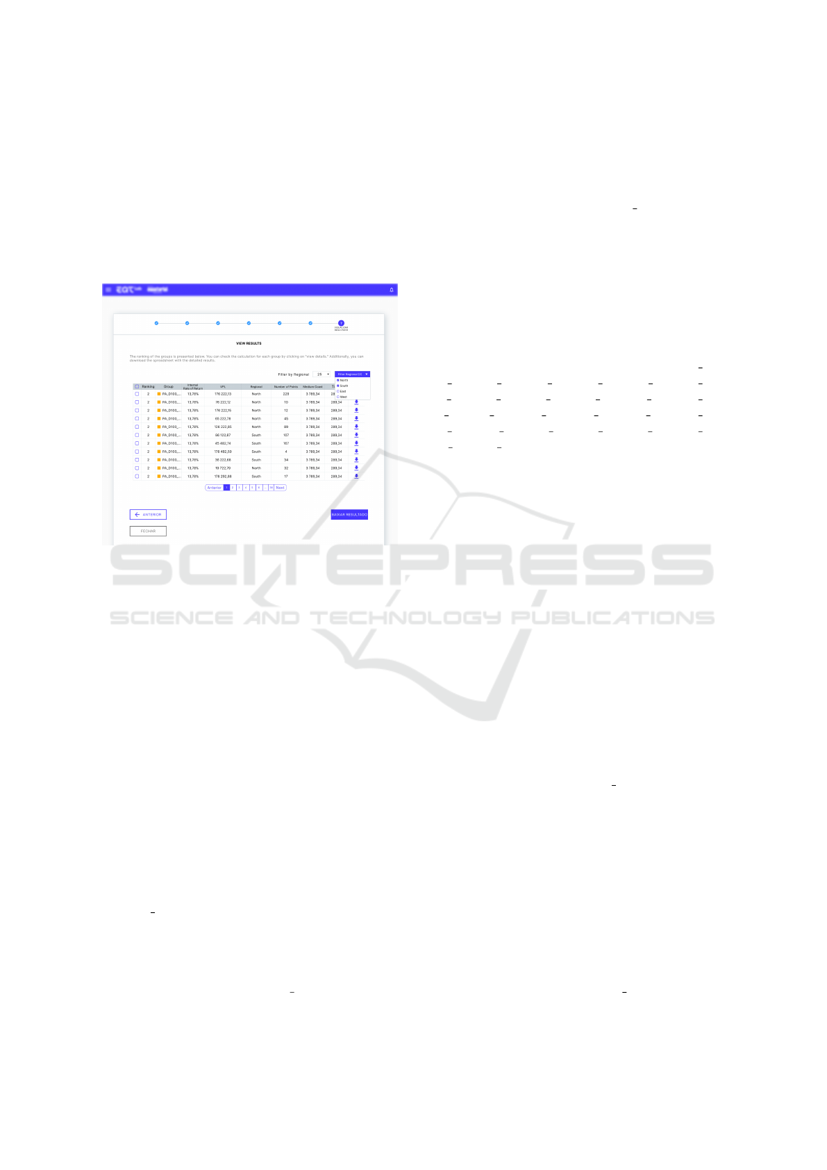
Figure 4 shows the version of the system in which the
inspection checklist was applied. Details of the ap-
plication and the results obtained will be discussed in
Section 4.2.
Figure 4: Prioritization system for decision-making sup-
port.
4.2 Checklist Application
To evaluate the prioritization system for decision-
making support, an analysis was conducted using the
proposed checklist composed of 56 items. The eval-
uation was carried out by two software engineering
specialists, each with more than 5 years of experi-
ence in the field. After the individual analysis, the
results were discussed jointly to reach a consensus
on the evaluation. The process consisted of verifying
whether each verification item was fully met by the
system, with the results recorded in Table 6 (columns
Yes, No, Does not Apply), presented above.
The dashboard achieved a total of 47.27% com-
pleteness of the evaluated standards, with 26 items
met, 29 items not met, and 1 item classified as ”Does
Not Apply.” Despite having some implemented fea-
tures, there are critical gaps that directly impact the
user experience and satisfaction. For example, the
item OP I03 (”Does the dashboard present data ac-
cessible at different levels of aggregation, with fil-
ters and a hierarchical map for granularity?”) was
not met, which hinders detailed analysis of informa-
tion and limits the users’ ability to explore data in
depth. Additionally, the item OP I04 (”When errors
occur, does the dashboard provide clear and construc-
tive error messages with guidance for recovery?”) was
also not implemented, which compromises usability
and increases user frustration when dealing with sys-
tem failures. Finally, the item IU I02 (”Does the
dashboard support different types of data visualiza-
tion, such as histograms, pie charts, bar graphs, maps,
etc.?”) was another unmet aspect, reducing the flex-
ibility and effectiveness of the dashboard in present-
ing information intuitively. The absence of these es-
sential attributes negatively impacts the usability and
efficiency of the dashboard, highlighting the need for
improvements to meet user expectations.
However, several items presented associated de-
sign standards that were not met, including: AD I01,
AP I04, AT I03, CE I01, CE I02, CE I03, CS I01,
CS I02, FL I01, FL I02, FL I03, FU I02, FU I04,
IU I02, IU I03, MC I01, MC I02, MC I03, MC I04,
NP I01, OO I01, OP I01, OP I02, OP I03, UT I01,
UT I04, UT I05. To improve the dashboard, a refine-
ment process was carried out, including specific im-
provement suggestions for each unmet item, based on
the related design standards. The goal of this process
is to provide a more efficient, intuitive, and satisfy-
ing experience for users. A detailed description of the
actions taken, as well as the results achieved, will be
presented in the next subsection.
4.3 Interface Refinement
After identifying the unmet checklist items, the in-
spectors proposed a new interface that would incor-
porate the implementation of these items. This pro-
cess was guided by the design patterns found during
the second literature review, which included design
suggestions and examples that directed the proposed
improvements. The proposed new interface was de-
signed considering attributes such as granularity, in-
formation hierarchy, visual representations of tabu-
lar data, data manipulation, and data customization.
One example of this is item ”UT 01 - Does the dash-
board identify targets that present specific informa-
tion, making task execution more effective?”, which
highlights the absence of specific metrics to achieve
the system’s overall goal, which aims to identify the
areas most likely to require intervention by the elec-
tric utility company. In response to this problem, sev-
eral changes were proposed, such as adding targets re-
lated to the average ticket, the average cost of works
in the identified areas, and the desired return rate, in
order to provide greater clarity on which objectives
should be achieved, as shown in Figure 5.
Figure 5 illustrates a structure that effectively
meets the requirements of item OP I07, providing ef-
ICEIS 2025 - 27th International Conference on Enterprise Information Systems
502
ficient search and filtering functionality. Item AP I04
is addressed by using clear and accessible language,
complemented by the strategic use of icons that fa-
cilitate the identification of actions to be taken. Re-
garding item AT I03, the structure is appropriately
sized, allowing all necessary content for visualization
to be displayed in an organized manner on the screen
without the need for scrolling. Additionally, the pres-
ence of multiple tabs and flexibility in presenting data
in different forms and charts robustly addresses item
NP I01.
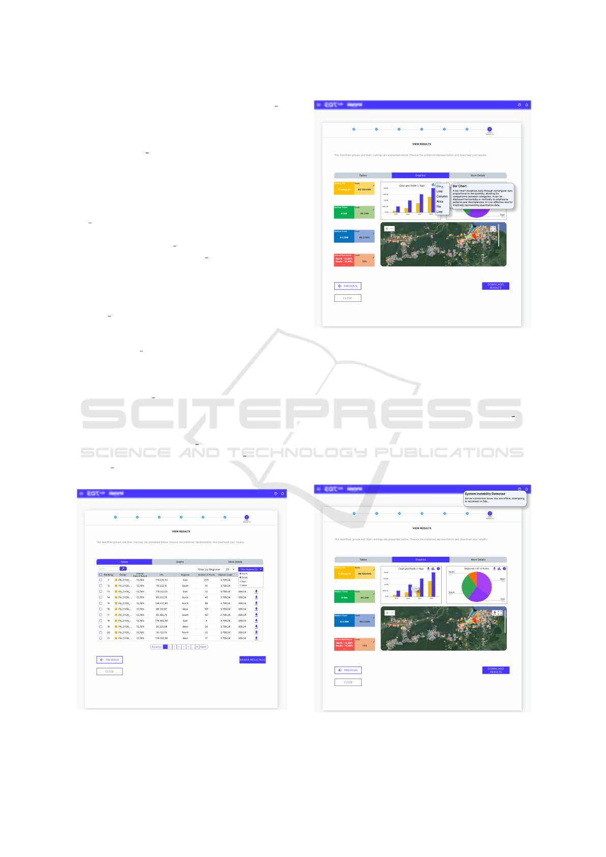
Figure 6 demonstrates compliance with several
items, starting with OP I01, which ensures detailed
data display. According to OP I03, data is accessi-
ble at different levels of aggregation, supported by
filters and a hierarchical map that allows adjustment
of the granularity of the visualization. This level
of interactivity is complemented by compliance with
item IU I02, as the dashboard offers different types
of visualizations, including pie charts, bar graphs, and
maps, providing a comprehensive data analysis. Re-
garding item IU I03, the dashboard allows interaction
with visualizations, enabling filtering and on-demand
display of details when clicking on specific parts of
the chart. Furthermore, the ability to edit goals, as re-
quired by item AD I01, is incorporated into the inter-
face, allowing the user to adjust parameters as needed.
The dashboard also offers a compact data view, pre-
senting rankings and comparisons with defined goals,
in accordance with item OO I01. The goal editing
functionality, in turn, addresses item FL I02. How-
ever, OP I07 is only partially met, as, although it al-
lows the user to change goals and objectives, exposing
Figure 5: Improvements in the Design of the Information
System - Screen 1.
Figure 6: Improvements in the Design of the Information
System - Screen 2.
this sensitive data to be edited by any user could com-
promise the integrity of the information. This vul-
nerability prevents full compliance with this require-
ment.
Figure 7 reflects compliance with item OP I08,
which refers to anomaly identification and the use of
alert resources. As shown in the figure, the dash-
board incorporates an alert system through notifica-
tions, drawing the user’s attention to any inconsisten-
cies or irregularities detected in the data.
Figure 7: Improvements in the Design of the Information
System - Screen 3.
Applying Checklist and Design Patterns for Evaluating and Redesigning a Dashboard Interface of a Decision Support Information System
503

5 CONCLUSIONS AND FUTURE
PERSPECTIVES
Developing interfaces for dashboards is a significant
challenge for software professionals, especially when
it comes to educational monitoring. This work pre-
sented a checklist for presenting inspection items but
also providing examples of how these items can be
implemented, especially in cases where a design pat-
tern is associated. The artifact was derived from a
thorough analysis of quality attributes extracted from
research that highlights the relevance of usability and
user experience in this context.
This effort resulted in a comprehensive guide,
with examples that offer valuable insights into com-
mon challenges, recommended solutions, and best
practices to be followed in the development process of
decision-support dashboards. The implementation of
well-structured standards, guided by the users’ needs,
plays a crucial role in ensuring the dashboard’s qual-
ity, improving the user experience, and increasing its
market acceptance. Furthermore, we showed how to
apply this standards in the evaluation and redesign of
the dashboards of a real decision making information
system for a multinational power company. We were
able to make improvement suggestions in the design
of the system, which will be ultimately evaluated by
the clients of the information system.
As future work, we intend to evaluate to what ex-
tent the redesign version improved the usability and
user experience of the evaluated information system.
Also, we intend to apply this new interface to the sys-
tem under development, assisting developers in build-
ing more robust versions of data visualization, aligned
with UX and usability principles. Additionally, a
more in-depth literature review on decision-support
dashboards will be conducted to strengthen the list
of standards and meet a broader range of require-
ments. New standards will also be proposed, based on
users’ perspectives in real-world use scenarios, com-
plementing the existing examples.
ACKNOWLEDGEMENTS
This work was supported by the Instituto de Ci
ˆ
encia
e Tecnologia Grupo Equatorial and Grupo Equato-
rial through the PDI ANEEL program under grant
PD-00037-0047/2022. The authors also acknowledge
the Coordenac¸
˜
ao de Aperfeic¸oamento de Pessoal de
N
´
ıvel Superior (CAPES), Brazil - Finance Code 001,
Conselho Nacional de Desenvolvimento Cient
´
ıfico e
Tecnol
´
ogico (CNPq), Brazil, and Fundac¸
˜
ao de Am-
paro
`
a Pesquisa Desenvolvimento Cient
´
ıfico e Tec-
nol
´
ogico do Maranh
˜
ao (FAPEMA) (Brazil) for the fi-
nancial support.
REFERENCES
Almasi, S., Bahaadinbeigy, K., Ahmadi, H., Sohrabei, S.,
Rabiei, R., et al. (2023). Usability evaluation of
dashboards: A systematic literature review of tools.
BioMed Research International, 2023.
Bach, B., Freeman, E., Abdul-Rahman, A., Turkay, C.,
Khan, S., Fan, Y., and Chen, M. (2022). Dashboard
design patterns. IEEE Transactions on Visualization
and Computer Graphics, 29(1):342–352.
Bera, P. (2016). How colors in business dashboards affect
users’ decision making. Communications of the ACM,
59(4):50–57.
Best, M. L. and Smyth, T. N. (2011). Global/Local Usabil-
ity: Locally Contextualized Usability in the Global
South, pages 9–22. Springer London, London.
Cabrejos, L. J. E. R., Viana, D., and dos Santos,
R. P. (2018). Planejamento e execuc¸ao de estu-
dos secund
´
arios em inform
´
atica na educac¸ao: Um
guia pr
´
atico baseado em experi
ˆ
encias. Jornada de
Atualizac¸
˜
ao em Inform
´
atica na Educac¸
˜
ao, 7(1):21–
52.
Cahyadi, A. and Prananto, A. (2015). Reflecting design
thinking: A case study of the process of designing
dashboards. Journal of Systems and Information Tech-
nology, 17(3):286–306.
Codina, L. (2005). Scopus: el mayor navegador cient
´
ıfico
de la web. El profesional de la informaci
´
on, 14(1):44–
49.
Costa, J. F. P. d. (2018). Indicadores de Desempenho para a
Gest
˜
ao de Projetos de Sistemas de Informac¸
˜
ao. PhD
thesis.
de C
´
assio Lemes, T., de Souza Dias, M. O., and de Oliveira,
T. (2023). An
´
alise do uso de dashboard como ferra-
menta de apoio a tomada de decis
˜
ao em instituic¸
˜
oes de
ensino: uma revis
˜
ao sistem
´
atica da literatura. Revista
Novas Tecnologias na Educac¸
˜
ao, 21(1):281–290.
Enache, A. (2021). Ui/ux analysis and design of running
dashboard for injury prevention. B.S. thesis, Univer-
sity of Twente.
Fraz
˜
ao, K. A. et al. (2021). Ic-meg: Um checklist es-
pec
´
ıfico para avaliac¸
˜
ao de jogos educacionais digitais
em plataformas m
´
oveis.
Gomes, D., Pinto, N., Melo, A., Maia, I., Paiva, A., Bar-
reto, R., Viana, D., and Rivero, L. (2021). Developing
a set of design patterns specific for the design of user
interfaces for autistic users. In Proceedings of the XX
Brazilian Symposium on Human Factors in Comput-
ing Systems, pages 1–7.
Guerino, G. C. and Valentim, N. M. C. (2020). Usability
and user experience evaluation of conversational sys-
tems: A systematic mapping study. In Proceedings of
the 34th Brazilian Symposium on Software Engineer-
ing, pages 427–436.
ICEIS 2025 - 27th International Conference on Enterprise Information Systems
504

Haapio, H. and Passera, S. (2017). Contracts as interfaces:
exploring visual representation patterns in contract de-
sign. Legal Informatics, Cambridge, UK: Cambridge
University Press. Published ahead of print as part of
doctoral dissertation, 37.
Hassan, H. M. and Galal-Edeen, G. H. (2017). From us-
ability to user experience. In 2017 International Con-
ference on Intelligent Informatics and Biomedical Sci-
ences (ICIIBMS), pages 216–222. IEEE.
Kitchenham, B. (2004). Procedures for performing sys-
tematic reviews. Keele, UK, Keele University,
33(2004):1–26.
Kitchenham, B. and Charters, S. (2007). Guidelines for per-
forming systematic literature reviews in software en-
gineering.
Maceli, M. G. and Yu, K. (2020). Usability evaluation of
an open-source environmental monitoring data dash-
board for archivists. Archival Science, 20:347–360.
Maia, M. A. Q., Barbosa, R. R., and Williams, P. (2020).
Usabilidade e experi
ˆ
encia do usu
´
ario de sistemas de
informac¸
˜
ao: em busca de limites e relac¸
˜
oes. Ci
ˆ
encia
da Informac¸
˜
ao em Revista, 6(3):34–48.
Peters, R., Oleari, E., Sardu, F., and Neerincx, M. A. (2019).
Usability of the pal objectives dashboard for chil-
dren’s diabetes self-management education. In Pro-
ceedings of the 5th International Conference on e-
Society, e-Learning and e-Technologies, pages 22–28.
Praharaj, S., Solis, P., and Wentz, E. A. (2022). Deploying
geospatial visualization dashboards to combat the so-
cioeconomic impacts of covid-19. Environment and
Planning B: Urban Analytics and City Science, page
23998083221142863.
Rahman, M., Wadhwa, B., Kankanhalli, A., Hua, Y. C., Kei,
C. K., Hoon, L. J., Jayakkumar, S., and Lin, C. C.
(2016). Gear analytics: A clinician dashboard for a
mobile game assisted rehabilitation system. In 2016
4th International Conference on User Science and En-
gineering (i-USEr), pages 193–198. IEEE.
Raza, M., Faria, J. P., and Salazar, R. (2019). Assisting
software engineering students in analyzing their per-
formance in software development. Software Quality
Journal, 27:1209–1237.
Richter Lagha, R., Burningham, Z., Sauer, B. C., Leng, J.,
Peters, C., Huynh, T., Patel, S., Halwani, A. S., and
Kramer, B. J. (2020). Usability testing a potentially
inappropriate medication dashboard: a core compo-
nent of the dashboard development process. Applied
clinical informatics, 11(04):528–534.
Rossi, A. and Lenzini, G. (2020). Transparency by design in
data-informed research: A collection of information
design patterns. Computer Law & Security Review,
37:105402.
Sarikaya, A., Correll, M., Bartram, L., Tory, M., and Fisher,
D. (2018). What do we talk about when we talk about
dashboards? IEEE transactions on visualization and
computer graphics, 25(1):682–692.
Shakeel, H. M., Iram, S., Al-Aqrabi, H., Alsboui, T., and
Hill, R. (2022). A comprehensive state-of-the-art sur-
vey on data visualization tools: Research develop-
ments, challenges and future domain specific visual-
ization framework. IEEE Access, 10:96581–96601.
Silva, J. C. S., Rodrigues, R. L., Ramos, J. L. C., de Gou-
veia Zambom, E., and de Souza, F. d. F. (2018). Us-
abilidade de um dashboard destinado
`
a autorregulac¸
˜
ao
de estudantes em sala de aula invertida. RENOTE,
16(2):372–381.
Silva-Rodr
´
ıguez, V., Nava-Mu
˜
noz, S. E., Castro, L. A.,
Mart
´
ınez-P
´
erez, F. E., P
´
erez-Gonz
´
alez, H. G., and
Torres-Reyes, F. (2022). Predicting interaction design
patterns for designing explicit interactions in ambient
intelligence systems: a case study. Personal and Ubiq-
uitous Computing, pages 1–12.
Smuts, M., Scholtz, B., and Calitz, A. (2015). Design
guidelines for business intelligence tools for novice
users. In Proceedings of the 2015 Annual Research
Conference on South African Institute of Computer
Scientists and Information Technologists, pages 1–15.
V
´
azquez-Ingelmo, A., Garc
´
ıa-Pe
˜
nalvo, F. J., and Ther
´
on,
R. (2019). Tailored information dashboards: A sys-
tematic mapping of the literature. In Proceedings of
the XX international conference on human computer
interaction, pages 1–8.
Vora, P. (2009). Web application design patterns. Morgan
Kaufmann.
Applying Checklist and Design Patterns for Evaluating and Redesigning a Dashboard Interface of a Decision Support Information System
505
