
PyNarrative: A Python Library for Data Storytelling
Angelica Lo Duca
1a
and Roberto Olinto Barsotti
2
1
Institute of Informatics and Telematics of the National Research Council, via G. Moruzzi 1, Pisa, Italy
2
University of Pisa, Pisa, Italy
Keywords: Data Storytelling, Data Visualization, Python, Data Narrative.
Abstract: Data storytelling is an emerging approach combining data visualization with narrative techniques to enhance
data insights’ interpretability and emotional impact. Traditional Python libraries for data visualization, such
as Matplotlib, Seaborn, and Plotly, offer powerful tools for creating static and interactive graphs. However,
they lack specialized features that allow users to effectively structure and convey data-driven narratives. This
paper introduces PyNarrative, an innovative Python library designed to fill this gap by integrating storytelling
elements—such as annotations, context, and next steps boxes—into data visualizations. PyNarrative enables
users to craft data stories that are informative but also engaging and memorable, making complex data
accessible to a broader audience. This paper details the design and functionality of PyNarrative and shows a
practical use case. Through PyNarrative, we aim to empower developers and data storytellers to transform
raw data into meaningful narratives, advancing the field of data storytelling and contributing to more effective
data communication.
1 INTRODUCTION
Data visualization involves creating graphical
representations of data to facilitate understanding and
insights. While numerous Python libraries, such as
Matplotlib, Seaborn, and Altair, offer robust tools for
data visualization, they lack specialized methods for
data storytelling (Belorkar, 2020).
Data storytelling organizes data insights into a
cohesive narrative, enhancing understanding and
retention through a structured story (Dykes, 2019).
Segel and Heer refer to data storytelling as a form of
narrative visualization (Segel and Heer, 2010).
Unlike traditional data visualization, which focuses
primarily on displaying data points, data storytelling
integrates narrative elements—such as a plot,
characters (data entities), and context—that guide the
audience through the data’s implications and
significance (Lo Duca, 2025). Compared to data
visualization, data storytelling aims to make data
more relatable, memorable, and actionable, turning
raw data into insights that resonate emotionally and
intellectually (Garretón, 2024).
This paper presents PyNarrative, a Python library
for data storytelling. This innovative library provides
a
https://orcid.org/0000-0002-5252-6966
tailored functionalities that enable users to craft
engaging and informative data stories, enhancing the
impact and accessibility of their data presentations.
Unlike existing data visualization libraries, which
primarily focus on generating static or interactive
charts, PyNarrative aims to integrate storytelling
elements that enhance the comprehension and
emotional engagement of the audience, such as
annotations, context, images, and so on. PyNarrative
aims to help developers craft more meaningful data
stories by combining visualization with narrative
structure.
Traditionally, developers possess extensive
technical expertise; however, effectively
communicating data through data storytelling
necessitates communication skills not typically
within a developer’s skill set. PyNarrative seeks to
bridge this gap between technical proficiency and
communication capability by reducing the learning
curve associated with effective data communication
for developers. Through a communication-focused
Python library, developers are empowered to
efficiently and expediently construct coherent,
engaging narratives from data, facilitating the
922
Lo Duca, A. and Barsotti, R. O.
PyNarrative: A Python Library for Data Storytelling.
DOI: 10.5220/0013259900003912
Paper published under CC license (CC BY-NC-ND 4.0)
In Proceedings of the 20th International Joint Conference on Computer Vision, Imaging and Computer Graphics Theory and Applications (VISIGRAPP 2025) - Volume 1: GRAPP, HUCAPP
and IVAPP, pages 922-929
ISBN: 978-989-758-728-3; ISSN: 2184-4321
Proceedings Copyright © 2025 by SCITEPRESS – Science and Technology Publications, Lda.

transformation of complex information into
accessible insights.
PyNarrative is released as an open-source project
on GitHub to maximize its reach and utility,
encouraging community contributions and
collaboration
1
. It can be installed through the standard
Python library manager, ensuring easy access and
integration. Additionally, PyNarrative provides
detailed documentation to help users of all skill levels
leverage its capabilities
2
.
The remainder of this paper is organized as
follows. Section 2 reviews related data visualization
and storytelling work. Section 3 defines the concept
of a visual data story and its main components.
Section 4 provides a detailed overview of
PyNarrative, including its architecture, core features,
and critical functionalities for integrating storytelling
elements into data visualizations. Section 5 presents a
use case demonstrating PyNarrative’s capabilities in
a real-world scenario, highlighting its advantages
over traditional data visualization libraries. Section 6
discusses a comparison between PyNarrative and
Altair. Finally, Section 7 discusses conclusions and
future directions for expanding PyNarrative and
building a community around data storytelling in
Python.
2 RELATED WORK
The literature about data visualization is rich in
principles, techniques, and tools for building
appealing data visualization graphs (Qin 2020). Over
the years, research in data visualization has focused
on the design aspects (Borner 2015), cognition
process (Ware 2013), and technical aspects
(Wilkinson 1999). However, Tong et al. identify
critical gaps in data visualization tools, such as
limited narrative integration, high cognitive load,
insufficient interactivity, inadequate storytelling
effectiveness evaluation, and lack of domain-specific
adaptability (Tong et al., 2018). Current data
1
https://github.com/pynarrative/pynarrative
2
https://pynarrative.github.io/doc/pynarrative.html
3
https://matplotlib.org/
4
https://seaborn.pydata.org/
5
https://plotly.com/python/
6
https://bokeh.org/
7
https://altair-viz.github.io/
8
https://pyviz.org/
9
https://github.com/yhat/ggpy
10
https://www.pygal.org/en/stable/
11
https://github.com/vizzuhq/ipyvizzu-story
12
https://ggplot2.tidyverse.org/
visualization tools predominantly focus on creating
graphs, whereas storytelling remains a separate
process that depends on the designer’s experience.
Many popular open-source libraries for data
visualization exist across several programming
languages, including Python, JavaScript, R, and
MATLAB. In Python, the most significant libraries
include Matplotlib
3
, Seaborn
4
, built on Matplotlib,
Plotly for Python
5
, Bokeh
6
, Altair
7
, a declarative
library based on Vega and Vega-Lite, PyViz
8
, an
ecosystem of Python libraries for data visualization,
including HoloViews, GeoViews, Datashader, and
Panel, ggplot
9
, which brings the popular ggplot2
syntax from R into Python, and Pygal
10
, a library for
creating SVG graphs. To our knowledge, the only
Python library for data storytelling is ipyvizzu-
story
11
, which enables users to create and present
interactive data presentations. Compared to this
library, PyNarrative provides mechanisms for
enriching charts with context and next steps.
ggplot2
12
is the reference library for data
visualization in R, based on the “grammar of
graphics.” Plotly for R
13
is the R version of the
interactive Plotly library. In Javascript, the most
popular libraries for visualization are D3.js
14
,
Chart.js
15
, Highcharts
16
. JFreeChart
17
is a Java library
that creates many professional charts. Qt Charts
18
is a
Qt module for creating interactive and static charts in
C++. Plots. jl
19
is a powerful interface for
visualization in Julia that is compatible with multiple
backends. MATLAB Graphics
20
is an integrated
Matlab scientific and engineering visualization tool
suite. Vegas
21
is a library for data visualization in
Scala inspired by ggplot2. Plotters
22
is a native data
visualization library for Rust. Each described library
is suited to different use cases, from quick exploratory
plots to complex, interactive data applications.
Compared to the existing libraries for data
visualization, PyNarrative is designed explicitly for
data storytelling, thus incorporating specific
components, such as annotations, context boxes, and
so on.
13
https://plotly.com/r/
14
https://d3js.org/
15
https://www.chartjs.org/
16
https://www.highcharts.com/
17
https://www.jfree.org/jfreechart/
18
https://doc.qt.io/qt-6/qtcharts-index.html
19
https://docs.juliaplots.org/stable/
20
https://www.mathworks.com/products/matlab/plot-
gallery.html
21
https://github.com/vegas-viz/Vegas
22
https://github.com/plotters-rs/plotters
PyNarrative: A Python Library for Data Storytelling
923
The literature about data storytelling is varied and
covers different aspects, such as the role of rhetoric in
building narratives (Hullman 2011, Hullman 2013),
approaches to building stories in the media and news
field (Segel 2010), critical evaluation of the
effectiveness of the built stories (Kosara 2013), the
extraction of characters and plot from data (Dasu et al.,
2023).
Significant research for building interactive
narratives and data-driven web pages has focused on
making interactive storytelling more accessible and
efficient. Idyll (Conlen and Heer, 2018) introduces a
markup language for creating interactive web articles
that reduce technical complexity through a component-
based architecture and simplified Markdown-derived
syntax. Building on this work, Idyll Studio (Conlen et
al., 2021) implements an interface that further
simplifies interactive content creation. Taking a
different approach, VizFlow (Sultanum et al., 2021)
develops a structured editor that simplifies the creation
of data-driven articles through an innovative text-chart
linking approach. Other tools include Tangle (Bret,
2011), Tableau Stories (Ryan, 2018), and GeoTime
(Eccles et al., 2008). In addition to these tools, some
important newspapers have created and used internal
tools to make data-driven stories, such as kyt
23
,
developed by the New York Times, and WPDS's UI
Kit
24
, produced by The Washington Post. All these
tools for interactive storytelling assist non-developers
in building data-driven articles. In contrast,
PyNarrative aims to assist developers in
communicating insights extracted from data.
In addition to the specific data visualization and
storytelling libraries, many other tools exist to build
data-driven stories, including Tableau
25
,
Datawrapper
26
, and Flourish
27
. However, these often
require transitioning between platforms, such as
analyzing data in Python and visualizing it elsewhere.
PyNarrative simplifies this by providing an integrated
solution where developers perform analysis, create
visualizations, and craft stories within a single Python
framework, enhancing efficiency and consistency in
data-driven storytelling.
3 THE STRUCTURE OF A
VISUAL DATA STORY
A story is defined by characters and a plot, which
specifies the sequence of actions within the story
23
https://github.com/NYTimes/kyt
24
https://github.com/washingtonpost/wpds-ui-kit
25
https://www.tableau.com/
(Rayfield 1972). Simplifying as much as possible, a
plot contains three main parts: beginning, middle, and
end. Each of these parts serves a distinct purpose: the
beginning establishes the context and sets the stage,
orienting the audience to the core theme or problem
around which the story revolves; the middle contains
the heart of the story, where the main events and
critical messages unfold; and the end provides
closure, often guiding the audience on next steps or
conclusions, whether that involves reflection, action,
or deeper inquiry into the topic (Lo Duca, 2025).
A visual data story is a form of storytelling that
represents information visually, often through a graph
or a series of visual elements. In a visual data story,
the plot structure adapts to spatial elements on the
screen or page, with each section of the story
occupying specific visual spaces (Lo Duca, 2024).
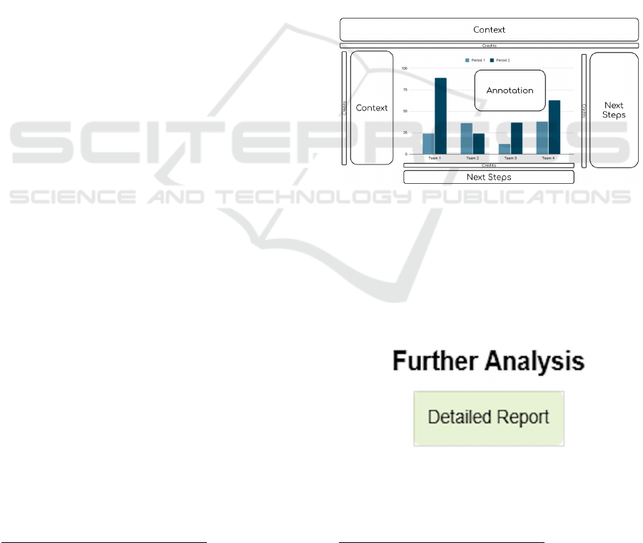
Figure 1 shows how to strategically place the
elements of a story visually for the Western culture.
Figure 1: How to strategically place the elements of a story
visually.
Typically, the middle of the story—the primary
data or insights—is represented by the graph, which
occupies the central area of the layout. This graph is
the focal point, drawing the viewer’s attention to the
main message and illustrating the most important data
points or trends.
Figure 2: An example of a button created as a next step in
PyNarrative.
26
https://www.datawrapper.de/
27
https://flourish.studio/
IVAPP 2025 - 16th International Conference on Information Visualization Theory and Applications
924

The beginning, or context, is essential in visual
data storytelling as it grounds the audience in the
relevance of the data, providing background and
framing (Hullman and Diakopoulos, 2011). This
context can be communicated through brief text
directly under the title or positioned to the left of the
graph. Sometimes, the context is embedded directly
in the visualization through the strategic use of
annotations (Ren et al., 2017; Lee et al., 2015).
Annotations may include symbols, arrows, labels, or
concise explanatory text that helps clarify certain
aspects of the data, guiding the viewer’s
interpretation and enhancing their understanding of
the story (Rahman et al., 2024).
The end of the story, often positioned to the right
or below the main graph, represents what follows the
narrative—the intended takeaway or call to action.
This might include recommendations, further
questions, or steps the audience is encouraged to take,
thereby providing a sense of closure or direction (Lo
Duca, 2024).
Credits and references to the data source also play
a crucial role in establishing credibility and
transparency in a data story. These references are
typically placed in a way that is focused on the main
narrative, such as at the bottom, on the right or left
margins, or immediately below the title (Lo Duca,
2024). By acknowledging the data sources, credits
reinforce the story’s authenticity and allow the
audience to verify the origin of the data, enhancing
trust and engagement.
4 PyNarrative
PyNarrative provides functions to implement the
three parts of a data-driven story. PyNarrative is built
on top of the Altair library, inheriting its features and
functions. At the core of PyNarrative is a base class
called Story, which serves as the starting point for
creating narrative visualizations. This foundational
class allows developers to structure data storytelling
workflows, integrating data transformation and
visualization into a cohesive narrative framework.
The following snippet of pseudo-code shows the
basic structure of the Story class.
class Story:
def add_context(text,
position,
color)
def add_annotation(text,
position,
color)
def add_next_steps(text,
position,
mode)
def add_source(text,
position)
def add_title(title, subtitle)
def add_line(value, orientation)
def configure_view(**kwargs)
def render():
add_context() enriches the visualization with
contextual text, offering flexibility in positioning and
coloring. add_next_steps() implements
interactive elements to guide the user through the
narrative. This method supports different display
modes, from simple clickable buttons to more
complex sequences of linear and scaled steps.
add_source() allows users to insert references to
the data with horizontal and vertical positioning
options. add_annotation() creates annotations
such as arrows and text to highlight particular points
on the graph. The render() method combines all the
narrative elements added into a single coherent entry
and automatically manages the positioning of the
various layers. add_title() implements the
visualization’s main heading and optional subtitle,
controlling font sizes, colors, and positioning to
establish the narrative’s primary message and
context. add_line() enables the addition of
reference lines to the visualization, either horizontal
or vertical, and helps highlight thresholds, averages,
or other significant values that support the narrative.
Finally, configure_view() allows customization
of the visualization’s appearance through Altair’s
view configuration options, helping maintain visual
consistency by controlling aspects like background
color, borders, and spacing.
The class also includes auxiliary methods such as
em_to_px() for converting measurement units and
_get_position() for precisely calculating the
coordinates of text elements. These auxiliary methods
ensure the correct arrangement of elements and visual
coherence of the entire visualization.
There are three types of next steps: buttons for
interactive links (Figure 2), line_steps for linear
sequences of steps (Figure 3), and stair_steps for
hierarchical sequences (Figure 4). Each type can be
customized through specific parameters, always
maintaining visual coherence with the rest of the
visualization. This modular structure allows
flexibility in creating interactive elements and
adapting to the different narrative needs of data
visualization.
PyNarrative: A Python Library for Data Storytelling
925
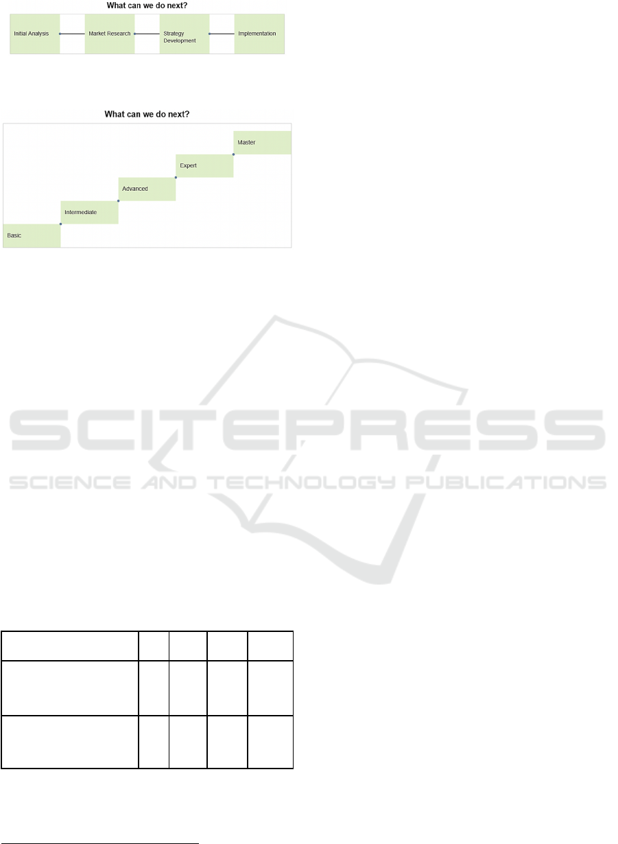
Figure 3: An example of a line step created as a next step in
PyNarrative.
Figure 4: An example of a stair step created as a next step
in PyNarrative.
5 USE CASE
This section examines a simple use case that
showcases the PyNarrative library’s core
functionalities and practical applications. To ensure
clarity and facilitate understanding, the use case
presented here is deliberately kept simple, allowing
users to quickly learn how to utilize the core
components and functionalities of PyNarrative. The
case study focuses on salmon aquaculture in the U.S.
We use the aquaculture dataset provided by the US
Department of Agriculture, Economic Research
Service, under the CC-0 license
28
. This dataset
describes the exported KG and the dollars earned over
time for each fish category. Table 1 shows an extract
of some fields contained in the dataset.
Table 1: A snapshot of the main fields in the aquaculture
dataset.
Category Unit Year Month Amount
TROUT (SALMO TRUTTA,
S. CLARKI ETC) FRESH,
CHILLED
KG 1989 2 17.183
SALMON, WHOLE/PIECES,
IN OIL IN AIRTIGHT
CONTAINER
U.S.$ 1989 2 4.329
The dataset contains the following columns:
● Category - the description of the
commodity
28
https://data.world/agriculture/aquaculture-data
● Unit - The unit of measurement, either KG,
or U.S. $
● Year - The year of the data
● Month - The month of the data
● Amount: The value of the data.
To test PyNarrative, we want to build the following
story:
● Beginning: Explain aquaculture. We add the
following context on the left: “Aquaculture
involves cultivating aquatic animals and
plants in controlled environments for some
or all of their life cycles. The chart compares
the trends in sales for salmon aquaculture
with those of other aquacultures”.
● Middle: Show a chart with the data. An
annotation shows the points where salmon
sales suddenly flop.
● End: Show which next steps could be
followed to avoid a new flop in sales.
We start implementing the middle of the story
with the main chart, as shown in the following piece
of pseudo-code:
chart = pn.Story(data)
.mark_line()
.encode(
x='YYYY',
y='Amount',
color='Category'
)
We also add two annotation points, one
corresponding to the first flop in sales and the second
to the second flop:
chart = chart.add_annotation(
x_point=px,
y_point=py,
annotation_text="export flop",
arrow_direction='up',
arrow_color='red',
arrow_dy=23,
label_dy=20,
label_dx=10,
label_color='red',
show_point=True,
point_color='red',
point_size=100)
px and px represent the point where the flop occurs.
IVAPP 2025 - 16th International Conference on Information Visualization Theory and Applications
926
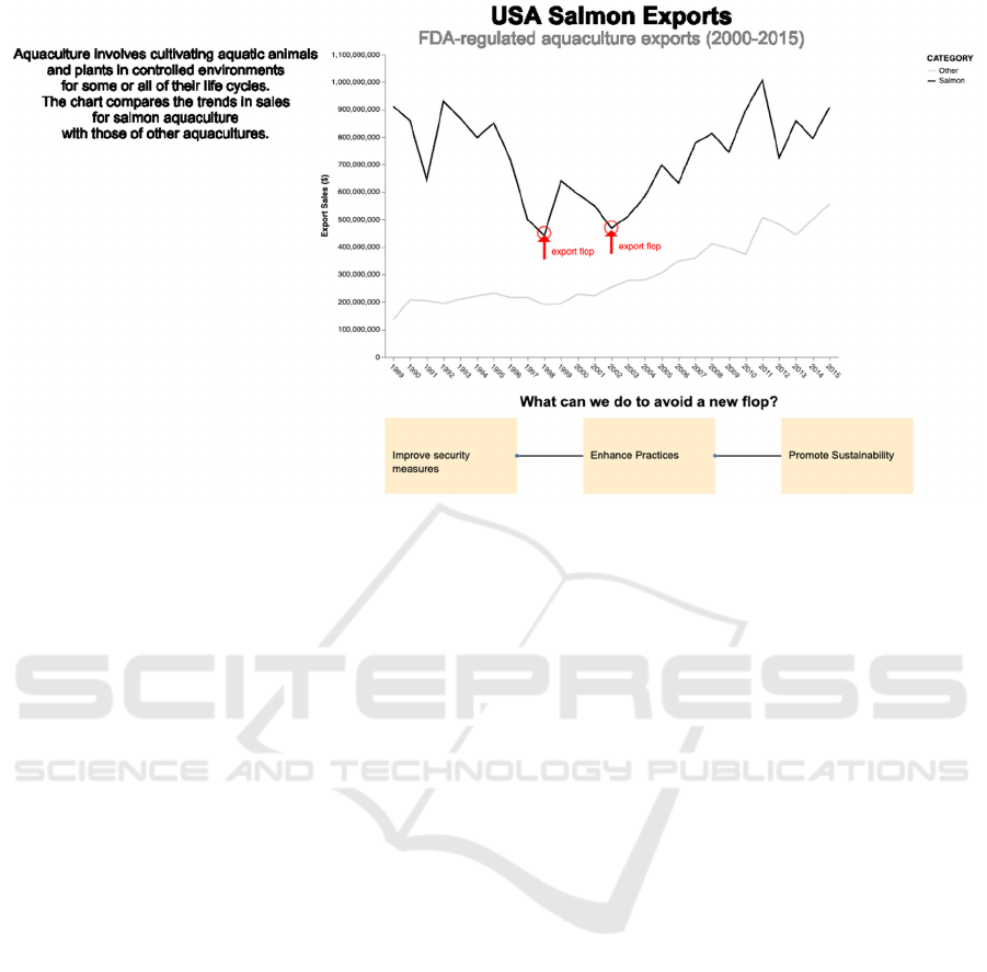
Figure 5: The rendered use case in PyNarrative.
Next, we integrate contextual information on the left,
as shown in the following snippet of pseudo-code:
chart = chart.add_context(
text="Aquaculture involves cultivating…",
position="left",
color="orange"
)
Next, we implement the end of the story using a line
step, as shown in the following snippet of pseudo-
code:
chart = chart.add_next_steps(
type='line_steps',
texts=[
["Improve security measures",
"Enhance Practices",
"Promote Sustainability"
],
title="Next Steps"
)
Finally, we render the chart:
chart = chart.render()
Figure 5 shows the final chart.
6 DISCUSSION
Implementing the entire story using PyNarrative
requires less than 20 lines of code. It follows a natural
construction logic: we start from the data, add the
basic graph, enrich it with narrative elements (title,
context, annotations), and conclude with suggestions
for future actions. Each step is intuitive and requires
easily understandable parameters without manually
managing entire layouts, positioning, or complex
styles. If some elements need to be modified, such as
the positioning of arrows or changing colors, the
developer can adjust them with a few steps without
distorting the rest of the graph.
To estimate PyNarrative’s effectiveness, we
implemented the same story using Altair, from which
PyNarrative is derived. Unlike PyNarrative,
implementing only Altair requires detailed
management of every visualization aspect. The code
involves different technical steps. For the main chart,
the developer must manually manage the
configuration of annotations and axes. Each
annotation element requires the creation of a separate
chart with its specific configurations.
The most complex part concerns implementing
the next steps, where the developer must manually
manage the calculation of the positions, the creation
of multiple data structures, and the detailed
configuration of each visual element. The developer
must manually define the rectangles’ dimensions,
calculate the elements’ positions, and manage their
connections through separate lines.
The final composition requires a thorough
understanding of Altair’s chaining system and layout
management. The result is code that is well over 100
lines, significantly longer and more complex than the
equivalent implementation in PyNarrative.
PyNarrative: A Python Library for Data Storytelling
927

This difference in implementation complexity
underlines the added value of PyNarrative, which
abstracts many of these technical details, allowing the
user to focus on narrating the data rather than on the
detailed management of visual elements.
The advantage of the PyNarrative library is that
the user reduces implementation time. Table 3
summarizes the comparison between PyNarrative and
Altair. The calculations were made by measuring the
time that an expert programmer of both PyNarrative
and Altair takes to develop the story illustrated in the
case study using the two different libraries. This
preliminary comparison involves only one tester,
which, however, gives an indicative idea of
programming times.
Table 3: An empirical comparison between PyNarrative
and Altair.
P
y
Narrative Altai
r
Time spent
building the
history of
aquaculture
10-15 min 70-100+ min
Number of
written lines of
code
< 20 >100
This disparity in implementation time stems from
several factors: PyNarrative’s declarative syntax
eliminates the need for manual layout management
and auxiliary dataset creation. At the same time, its
predefined methods for annotations and narrative
elements significantly reduce the complexity of
visualization construction. The significant time
savings and reduced technical overhead make
PyNarrative particularly valuable in professional
contexts where rapid development and iteration of
data visualizations are essential.
7 CONCLUSIONS AND FUTURE
WORK
PyNarrative represents an initial step toward
integrating data storytelling capabilities into Python’s
data visualization ecosystem. By focusing on
narrative structure, PyNarrative facilitates the
creation of data stories that go beyond traditional
visualizations, making data more accessible and
impactful for diverse audiences.
Future development will focus on conducting
empirical studies and user evaluations to
quantitatively assess how PyNarrative improves data
storytelling's interpretability and emotional impact
compared to traditional visualization tools, such as
Matplotlib and Seaborn. Additionally, usability
testing with developers will be conducted to measure
development time, ease of use, and perceived
advantages, providing insights to refine the library.
Expanding the documentation and examples with
detailed, real-world scenarios will further
demonstrate PyNarrative’s versatility across diverse
domains. To enhance user engagement, efforts will
also include integrating interactive features, such as
dynamic annotations, draggable elements, and
customizable storytelling templates. A more precise
roadmap will be defined to make the tool’s vision
more concrete, explicitly addressing the needs of
diverse user groups, including developers, data
scientists, and educators. Furthermore, providing
comprehensive documentation on PyNarrative’s
technical architecture will enhance transparency,
attract contributors from the open-source community,
and continually foster collaboration to improve its
core functionalities. These directions aim to ensure
that PyNarrative evolves into a robust and versatile
tool for data storytelling.
REFERENCES
Belorkar, A., Guntuku, S. C., Hora, S., & Kumar, A. (2020).
Interactive Data Visualization with Python: Present
your data as an effective and compelling story. Packt
Publishing.
Borner, K. (2015). Atlas of knowledge: Anyone can map.
The MIT Press: Cambridge, MA, USA.
Bret, V. (2011). Tangle: a JavaScript library for reactive
documents. Retrieved December 21, 2024 from
http://worrydream.com/Tangle/
Conlen, M., & Heer, J. (2018). Idyll: A markup language
for authoring and publishing interactive articles on the
web. In Proceedings of the 31st Annual ACM
Symposium on User Interface Software and
Technology (pp. 977-989).
Conlen, M., Vo, M., Tan, A., & Heer, J. (2021, October).
Idyll studio: A structured editor for authoring
interactive & data-driven articles. In The 34th Annual
ACM Symposium on User Interface Software and
Technology (pp. 1-12).
Dasu, K., Kuo, Y. H., & Ma, K. L. (2023). Character-
oriented design for visual data storytelling. IEEE
Transactions on Visualization and Computer Graphics,
29(7), 3021-3034.
IVAPP 2025 - 16th International Conference on Information Visualization Theory and Applications
928

Dykes, B. (2019). Effective Data Storytelling: How to drive
change with data, narrative, and visuals. John Wiley &
Sons.
Eccles, R., Kapler, T., Harper, R., & Wright, W. (2008).
Stories in geotime. Information Visualization, 7(1), 3-
17.
Garretón, M., Morini, F., Celhay, P., Dörk, M., & Parra, D.
(2024). Attitudinal effects of data visualizations and
illustrations in data stories. IEEE Transactions on
Visualization and Computer Graphics, 30(7), 4039–
4054. https://doi.org/10.1109/TVCG.2023.3248319
Hullman, J., & Diakopoulos, N. (2011). Visualization
rhetoric: Framing effects in narrative visualization.
IEEE transactions on visualization and computer
graphics, 17(12), 2231-2240.
Hullman, J., & Diakopoulos, N. (2011). Visualization
rhetoric: Framing effects in narrative visualization.
IEEE transactions on visualization and computer
graphics, 17(12), 2231-2240.
Hullman, J., Drucker, S., Riche, N. H., Lee, B., Fisher, D.,
& Adar, E. (2013). A deeper understanding of sequence
in narrative visualization. IEEE Transactions on
visualization and computer graphics, 19(12), 2406-
2415.
Kosara, R., & Mackinlay, J. (2013). Storytelling: The next
step for visualization. Computer, 46(5), 44-50.
Lee, B., Riche, N. H., Isenberg, P., & Carpendale, S.
(2015). More than telling a story: Transforming data
into visually shared stories. IEEE Computer Graphics
and Applications, 35(5), 84–90. https://doi.org/
10.1109/MCG.2015.99
Lo Duca, A. (2024). Data Storytelling with Altair and AI.
Manning Publications.
Lo Duca, A. (2025). Become a Great Data Storyteller.
Learn How You Can Drive Change with Data. John
Wiley & Sons.
Qin, X., Luo, Y., Tang, N., & Li, G. (2020). Making data
visualization more efficient and effective: a survey. The
VLDB Journal, 29, 93-117.
Rahman, M. D., Doppalapudi, B., Quadri, G. J., & Rosen,
P. (2024). A Survey on Annotations in Information
Visualization: Empirical Insights, Applications, and
Challenges. arXiv preprint arXiv:2410.05579.
Ryan, L. (2018). Visual data storytelling with Tableau.
Addison-Wesley Professional.
Rayfield, J. R. (1972). What Is a Story?: American
Anthropologist. American Anthropologist, 74(5),
1085–1106.
Ren, D., Brehmer, M., Lee, B., Höllerer, T., & Choe, E. K.
(2017). ChartAccent: Annotation for data-driven
storytelling. 2017 IEEE Pacific Visualization
Symposium (PacificVis), 230–239. https://doi.org/
10.1109/PACIFICVIS.2017.8031599
Segel, E., & Heer, J. (2010). Narrative visualization:
Telling stories with data. IEEE transactions on
visualization and computer graphics, 16(6), 1139-1148.
Sultanum, N., Chevalier, F., Bylinskii, Z., & Liu, Z. (2021).
Leveraging text-chart links to support authoring of
data-driven articles with VizFlow. In Proceedings of
the 2021 CHI Conference on Human Factors in
Computing Systems (pp. 1-17).
Tong, C., Roberts, R. C., & Laramee, R. S. (2018).
Storytelling and visualization: A survey. Proceedings of
the 13th International Joint Conference on Computer
Vision, Imaging and Computer Graphics Theory and
Applications.
Ware, C. (2013) Information Visualization: Perception for
Design; Elsevier: Amsterdam, The Netherlands;
Morgan Kaufman: Boston, MA, USA.
Wilkinson, L. (1999) The Grammar of Graphics; Springer:
New York, NY, USA.
PyNarrative: A Python Library for Data Storytelling
929
