
Designing Explainable and Counterfactual-Based AI Interfaces for
Operators in Process Industries
Yanqing Zhang
1 a
, Leila Methnani
2 b
, Emmanuel Brorsson
1 c
, Elmira Zohrevandi
3 d
,
Andreas Darnell
4
and Kostiantyn Kucher
3 e
1
User Experience Team - Automation Technologies Department, ABB AB Corporate Research, V
¨
aster
˚
as, Sweden
2
Department of Computing Science, Ume
˚
a University, Ume
˚
a, Sweden
3
Department of Science and Technology, Link
¨
oping University, Norrk
¨
oping, Sweden
4
S
¨
odra Cell, Varberg, Sweden
Keywords:
Explainable AI (XAI), Human-Centered AI, Counterfactual Explanations, Feature Importance, Visualization,
Process Industry, User-Centered Design.
Abstract:
Industrial applications of Artificial Intelligence (AI) can be hindered by the issues of explainability and trust
from end users. Human-computer interaction and eXplainable AI (XAI) concerns become imperative in such
scenarios. However, the prior evidence of applying more general principles and techniques in specialized
industrial scenarios is often limited. In this case study, we focus on designing interactive interfaces of XAI
solutions for operators in the pulp and paper industry. The explanation techniques supported and compared
include counterfactual and feature importance explanations. We applied the user-centered design methodol-
ogy, including the analysis of requirements elicited from operators during site visits and interactive interface
prototype evaluation eventually conducted on site with five operators. Our results indicate that the operators
preferred the combination of counterfactual and feature importance explanations. The study also provides
lessons learned for researchers and practitioners.
1 INTRODUCTION
In the process industries, Artificial Intelligence
(AI) holds strong potential to strengthen operators’
decision-making process and enhance their opera-
tional performance. Inaccurate predictions and ac-
tions in these industries may have detrimental effects
on the process, leading to economic loss. EXplainable
AI (XAI) has been recognized as essential for indus-
trial applications (Warren et al., 2023; Wang et al.,
2024). However, the research on what explanation
mechanisms to provide to end users in these industries
and how to design for XAI is still underexplored.
This work investigates the design of explanations
in AI applications to help operators in process in-
dustries better understand the AI predictions that aim
to facilitate daily tasks in their work. In particular,
we consider the design of counterfactual examples,
which depict necessary changes to the input in or-
a
https://orcid.org/0000-0001-9645-6990
b
https://orcid.org/0000-0002-9808-2037
c
https://orcid.org/0000-0003-4238-5976
d
https://orcid.org/0000-0001-6741-4337
e
https://orcid.org/0000-0002-1907-7820
der to produce an alternative prediction output. We
focus on designing an interface tailored for the pa-
per manufacturing industry’s pulp process, as demon-
strated in Figure 1. Our overall research question
is: how should explainable and counterfactual-based
dashboards be designed to support data exploration
tasks of operators in process industries?
The selected use case involves delignification,
a critical stage in pulp and paper production pro-
cesses where the Kappa value, indicative of remain-
ing lignin, serves as the Key Process Variable (KPV).
The overarching goals of operators in this process
are to achieve a close kappa-value for the pulp while
keeping the process stable where the output pulp
amounts match the capabilities of the rest of the plant.
This case study has been performed as part of
a larger collaboration between academic researchers,
industrial researchers, and industrial stakeholders,
thus providing us with access to the domain exper-
tise from industrial data scientists as well as control
room process operators who were the main target au-
dience of the intended XAI techniques. Building on
the findings from interviews and observations of ten
control room operators during physical visits at two
Zhang, Y., Methnani, L., Brorsson, E., Zohrevandi, E., Darnell, A. and Kucher, K.
Designing Explainable and Counterfactual-Based AI Interfaces for Operators in Process Industries.
DOI: 10.5220/0013107700003912
Paper published under CC license (CC BY-NC-ND 4.0)
In Proceedings of the 20th International Joint Conference on Computer Vision, Imaging and Computer Graphics Theory and Applications (VISIGRAPP 2025) - Volume 1: GRAPP, HUCAPP
and IVAPP, pages 831-842
ISBN: 978-989-758-728-3; ISSN: 2184-4321
Proceedings Copyright © 2025 by SCITEPRESS – Science and Technology Publications, Lda.
831

Figure 1: Overview of the methodology and key contributions of this study, including design, prototype implementation, and
evaluation of counterfactual explanations for time series forecasting aimed at process operators in the paper and pulp industry.
pulp and paper plants in Sweden, we have designed
and created a working prototype combining both fea-
ture importance and counterfactual explanations. We
have conducted initial user evaluations with five op-
erators working in the industry through surveys and
interviews.
1
The results show that 1) combining both
counterfactual and feature importance explanations
seems to provide more value for end users and helps
them understand why the model has made certain pre-
dictions; 2) allowing users to compare historical sam-
ples or data was highly appreciated, as this aligns with
their current problem-solving strategies; 3) users ex-
pect more contextual information, as they struggle to
understand how similar the prediction is to the histor-
ical sample; 4) future improvements are possible for
detailed interface and interaction design.
The contributions of this study are threefold: first,
we present how a prototype demonstrating counter-
factual explanations applied to a real-world scenario
is designed for the paper and pulp industry. The proto-
type uses a model that has been trained on real-world
historical data of a digester reactor in the paper and
pulp production. Second, we present the design of an-
interactive dashboard that combines two explanation
methods: counterfactual examples and feature impor-
tance. Lastly, by reflecting on the lessons learned, we
present insights on how counterfactual explanations
should be developed in process industries to enhance
the explainability of the deployed AI algorithms.
This paper is organized as follows: in Section 2,
we describe the background of this study with a focus
on XAI for process industries. Section 3 summarizes
the methodology of this case study (cf. Figure 1),
while Section 4 presents the data collection proce-
dures and analysis of user needs from ten process op-
erators. Section 5 presents the design and implemen-
tation of both computational and interactive visual
components of our prototype for explaining key pro-
cess variable forecasts with counterfactuals and fea-
1
See the appendix for supplementary materials.
ture importance. In Section 6, we present the protocol
and results of prototype evaluation with five process
operators. Section 7 presents the discussion of the
outcomes, implications, limitations, and future work,
while Section 8 concludes this paper.
2 BACKGROUND AND RELATED
WORK
In this section, we discuss the prior work relevant to
XAI applications in the process industries, with a par-
ticular focus on counterfactual explanation methods
and the respective visualization approaches.
2.1 XAI for Process Industries
In recent years, Machine Learning (ML) models
have achieved impressive performance. The lack
of explainability remains a key challenge, since the
opacity of most ML models prevents their use in
high-stake applications that require interpretable de-
cisions (Theissler et al., 2022). This has driven ad-
vancements in XAI research to address adoption chal-
lenges and provide model insights. The interest for
both computational and human-centered aspects of
this challenge has emerged across disciplines (Shnei-
derman, 2020; Liao et al., 2020): for example, recent
studies explore data scientists’ mental models of fea-
ture importance explanations (Collaris et al., 2022)
and human-centered AI design practices among the
practitioners, including balancing explainability with
complexity for end users (Hartikainen et al., 2022).
Much of XAI research has focused on tabular
and image data, while time series data has received
less attention (Saeed and Omlin, 2023), despite their
ubiquity and relevance to many industrial applica-
tions. Developing XAI techniques for time series
could therefore expand ML’s applicability in areas
IVAPP 2025 - 16th International Conference on Information Visualization Theory and Applications
832

like process industries (Theissler et al., 2022). Exist-
ing methods face challenges in interpretability, leav-
ing significant room for research. (Rojat et al., 2021).
Interpretability is needed not only for ML model
developers, but also for diverse stakeholders in pro-
cess industries (Kotriwala et al., 2021), including op-
erators, who rely on AI for monitoring, predictive
maintenance, and decision-making.
Current XAI methods often cater to technical
users, neglecting the needs of domain experts work-
ing on the production floor (Miller et al., 2017).
These industries prioritize safety (De Rade-
maeker et al., 2014); opaque AI models may intro-
duce risks or potentially undermine operator confi-
dence (Manca and Fay, 2023; Kotriwala et al., 2021;
Forbes et al., 2015). To address this, researchers
advocate for local explanations—focused on specific
predictions—over global ones that depict the model’s
overall behavior, as they better meet users’ needs
for understanding and validating targeted AI out-
puts (Ribera and Lapedriza, 2019). Therefore, the ex-
plainability goals for domain experts focus on learn-
ing and adoption (Ribera and Lapedriza, 2019). In-
teractive explanations, which dynamically align with
operational demands and user expertise, are also seen
as promising for fostering trust and enhancing usabil-
ity (Kotriwala et al., 2021). By meeting these needs,
XAI can drive adoption, improve decision-making,
and ensure safety in critical applications.
2.2 Counterfactual Explanations
Counterfactuals are used to help explain an individ-
ual outcome by describing the necessary changes for
an alternative, desirable, outcome to occur (Wachter
et al., 2017). It involves constructing hypothetical
scenarios and making inferences about what would
happen under different conditions (Wang et al., 2024).
Counterfactuals are example-based and are often used
as local explanation methods.
While there is much research available on the sub-
ject of counterfactual explanations, those applied to
multi-horizon forecasting problems using multivari-
ate time series data are, to the best of our knowl-
edge, under-studied compared to other ML problems.
Existing counterfactual methods for time series in-
clude CoMTE for multivariate time series (Ates et al.,
2021), and ForecastCF for multi-horizon forecasting
problems (Wang et al., 2023). Technical implementa-
tions of several novel methods for generating counter-
factual examples are evaluated against common ML
metrics—subsequent user studies are not always pri-
oritized, however.
In their extensive review of the literature on coun-
terfactuals, Keane et al. identified key defects (Keane
et al., 2021). Many user studies test the use of coun-
terfactuals as explanations relative to no-explanation
controls, rather than testing the specific methods. En-
hancing the understandings of users’ needs and con-
ducting proper user testing are key steps towards en-
suring the practicality of XAI for its users, which war-
rants more involvement of the Human-Computer In-
teraction (HCI) community.
2.3 Counterfactual Explanation
Visualization
Increasingly, the visualization research community
has been actively focusing on the problems of sup-
porting interpretability, explainability, and trustwor-
thiness in AI solutions (Chatzimparmpas et al., 2020;
El-Assady and Moruzzi, 2022; Subramonyam and
Hullman, 2024). Specifically, some progress has been
reported in the literature on visualizing counterfactual
explanations, however, a number of open challenges
remain while only few proposals focus on counterfac-
tuals as the primary approach (La Rosa et al., 2023;
Chatzimparmpas et al., 2024).
Research on counterfactual visualizations relevant
to ML and AI has centered on enhancing explana-
tions and interpretability of ML models. For instance,
the What-If Tool (Wexler et al., 2020) offers a rudi-
mentary display of the nearest counterfactual point
to the target data point, enabling users to grasp how
minor alterations impact the model’s output. Addi-
tionally, INTERACT (Ciorna et al., 2024) enables
what-if analysis to enhance model explainability and
prototyping within industrial settings. Recently, ex-
tensions of such approaches to complement feature
attribution with full-fledged counterfactual explana-
tions were proposed (Schlegel et al., 2023). Similarly,
ViCE (Gomez et al., 2020) utilizes counterfactuals to
showcase the minimal adjustments necessary to alter
the output of the visualized model. AdViCE (Gomez
et al., 2021) extends this to support representation and
comparison of multiple explanations with model de-
velopers as the target user audience. DECE (Cheng
et al., 2021) facilitates the visualization of counter-
factual examples from diverse data subsets to aid
in decision-making processes. CoFFi (COunterFac-
tualFInder) (Sohns et al., 2023) combines counter-
factual explanations with a 2D spatialization of the
model decision boundaries for classification tasks.
While these studies demonstrate advanced interactive
visual approaches, their primary emphasis lies in elu-
cidating ML models rather than providing insights for
general-purpose data visualizations.
In sum, more research is needed on visualizing
Designing Explainable and Counterfactual-Based AI Interfaces for Operators in Process Industries
833

counterfactual explanations, combining explanation
methods for non-image data like time series, and
user evaluation on model-based counterfactuals in
real scenarios. Our study addresses these gaps.
3 METHODOLOGY:
USER-CENTERED DESIGN
We applied a user-centered design approach to de-
velop XAI solutions for our case study, as demon-
strated in Figure 1. Following the contextual inquiry
framework (Duda et al., 2020), we questioned and
observed users in their natural work environments to
deeply understand their processes, needs, and pain
points. Field visits allowed us to gather rich insights
from process operators. We synthesized these in-
sights into initial user requirements for the XAI so-
lutions. Then a multidisciplinary team collaborated
to build a functional prototype comprising 1) an ex-
plainable time series forecasting model providing two
types of explanations and 2) a dashboard connected to
the model’s output, applicable to our specific use case.
Since this case study is part of a larger project involv-
ing both academic and industrial partners in several
disciplines, the valuable input of industrial data sci-
entists complemented the discussions of user require-
ments collected from the intended end users (i.e. pro-
cess operators). We evaluated the dashboard and its
explainability features on site with five end users. The
following sections will present user research, proto-
type design, and initial user studies.
4 USER NEEDS ANALYSIS
During the fall of 2022 and spring of 2023, ten con-
trol room operators from two Swedish pulp and paper
plants participated in a study. Using a contextual in-
quiry approach (Duda et al., 2020), semi-structured
interviews and observations were conducted in their
natural work environments. Each hour-long session,
held during active shifts in the control room, involved
a facilitator, a note-taking assistant, and an operator,
with video and audio recordings.
To analyze the material, the contents were tran-
scribed, coded and sorted into themes in a thematic
analysis (Braun and Clarke, 2012). Key findings from
this study guided our choice of a counterfactual ex-
planation method to explore historical data. Opera-
tors focus on assessing strategies when process vari-
ables deviate from optimal levels, which are set to en-
sure stability and desired output quality. Based on
discussions with domain experts, a common situation
is that the ideal value for the Key Process Variable
(KPV)—in this case, Kappa—is 30, with some tol-
erance. However,two major challenges arise for op-
erators during process instability. First, predicting
whether the Key Performance Variable (KPV) will re-
main within desired levels. Second, if the KPV is pre-
dicted to deviate, determining the necessary process
adjustments to restore it to the desired levels. During
such situations, operators invest significant effort in
exploring the relationships between process variables
contributing to the observed deviation. These rela-
tionships determine which variables operators plot in
their current systems during exploration. They use a
single graph to enable direct comparisons of current
and historical values across multiple variables.
The exploration strategies of operators can be di-
vided into two phases. First, operators plot related
variables and look at the patterns in recent times,
which can be up to 8 hours back. If any obvious de-
viations in related variables can be identified, it can
likely be attributed as the culprit. For example, ex-
ploring strategies for reducing deviations in Variable
E, variables A, B, C, D and E are plotted, and those
variables with direct impacts on Variable E are ana-
lyzed up to 8 hours back. As a second step, if the
resolution is not obvious, operators use the same plot-
ted variables to go back to a historical situation to ex-
plore possible strategies that have worked previously.
This second step is also a common way of exploring
strategies when optimizing the process beyond devi-
ating variables. Relying on the used example, opera-
tors could at this step go back weeks, months or even
a year to find similar historical behavior in variables
A, B, C, D, and E. In a sense, the historical situations
become snapshots of actions that lead to some sort
of observable result, and thus operators use them to
guide their decisions in times where the optimal ac-
tion is not immediately obvious.
Finally, the experience of ML and AI differed
largely between operators, the majority having no pre-
vious knowledge regarding how models work at their
core or how they might calculate their output. This
puts forward a challenge for XAI in domains such
as the process industry which is focused on in this
study. For guiding developers of XAI, Ribera et al.
present different explanation techniques depending
on the role and familiarity with AI, arguing that coun-
terfactuals are suitable methods for users who have
limited experience with the technology (Ribera and
Lapedriza, 2019).
To summarize, the field study allowed us to iden-
tify key user requirements that are listed in Table 1.
IVAPP 2025 - 16th International Conference on Information Visualization Theory and Applications
834

Table 1: Design features corresponding to user requirements collected in field study.
User requirement Design feature
The overarching goal of operators is to maintain a
stable KPV around the goal value they are currently
aiming for
1. Counterfactual zone where users can set the target range
Operators browse historical snapshots of variable
values that might be similar to the current process
2. Show 5 nearest neighbor samples trained from historical data,
which provide accessible examples of multiple historical situations to
support their search in finding close matches to the current situation
As part of their exploration strategies, operators plot
multiple variables of various types in a single chart
for assessing direct and indirect relationships
3. Ability to plot multiple variables in one single chart
4. Provide an overview of all sensors that the model accounts for
5 PROTOTYPE DESIGN
In this section, we will describe the prototype devel-
oped during winter 2023 to 2024. It consists of a com-
putational explainer component for an ML model,
which was trained using real historical data from the
use case provider, and a front-end interface that dis-
plays the output (cf. Figure 1).
5.1 Counterfactual Techniques
To build a prototype, we first required a method
for generating counterfactual examples suited to our
multi-horizon forecasting problem using multivariate
time series data. We look to the CoMTE method
that is applied to multivariate time series (Ates et al.,
2021), and ForecastCF that handles the multi-horizon
forecasting case (Wang et al., 2023). We based
our method on certain aspects of both techniques;
namely, the search for distractors in training data from
CoMTE, and the formulation of a counterfactual out-
come for multi-horizon forecasting from ForecastCF.
The historical search used in CoMTE is of interest
to our use case due to insights from previously con-
ducted interviews with the operators; the interviews
revealed that operators often consider similar situa-
tions that occurred in the past to inform their current
actions. To follow, we describe the relevant compo-
nents of each method in more detail.
CoMTE is a counterfactual explanation method
for multivariate time series data applied to classifi-
cation tasks such as anomaly detection (Ates et al.,
2021). The technique searches the training data for
examples—called distractors—that produce the coun-
terfactual class outcome. The search for distractors is
performed using k-d trees (Friedman et al., 1977). A
k-d tree is a data structure that efficiently partitions
points in k-dimensional space and is widely used for
nearest-neighbor search. A distractor x
dist
found as a
nearest neighbor from the tree is then used to perform
modifications to the test instance x
test
. Each sample
has features consisting of values measured over time.
The method greedily substitutes features from x
dist
to
x
test
until the class flips to the counterfactual case.
The features that led to this class change (the coun-
terfactual case) are presented as the explanation.
In contrast to CoMTE, ForecastCF does not use
distractors for the generation of a counterfactual ex-
ample. Instead, the method takes a gradient-based
perturbation approach to explaining univariate time
series data (Wang et al., 2023). In the problem for-
mulation, a counterfactual is defined by polynomial
order upper and lower bounds that form the region of
interest for the alternative outcome. We adopt a sim-
plification of this formulation in our prototype and re-
fer to it as the counterfactual zone.
To simplify, we define a constant (polynomial or-
der 0) upper and lower bound that constrains the
counterfactual zone of interest. Based on discussions
with domain experts, we are aware that the ideal value
for Kappa is 30, with some tolerance. We therefore
set our counterfactual forecasting zone to be bounded
by 27 and 32. This serves as an example of what
might be an alternative outcome that an explainee
would like to compare a test sample to. Like CoMTE,
we use the scikit-learn (Pedregosa et al., 2011) im-
plementation of k-d trees (KDTree) to obtain coun-
terfactual examples from the training data. We select
five distractors and present them as nearest neighbors,
making clear that they are historical samples. These
historical samples serve as our counterfactual expla-
nations in this first prototype.
The data and trained model were re-used from a
previous project deliverable that focused on the di-
gester use case within the same project. The model
was previously trained using the PyTorch implemen-
tation of a Temporal Fusion Transformer (TFT) (Lim
et al., 2021). This model is reported to be inter-
pretable due to its provision of attention scores over
time and feature importance scores at the time of pre-
diction. We utilize the importance scores that the
model computes for the sample to explain as well as
Designing Explainable and Counterfactual-Based AI Interfaces for Operators in Process Industries
835
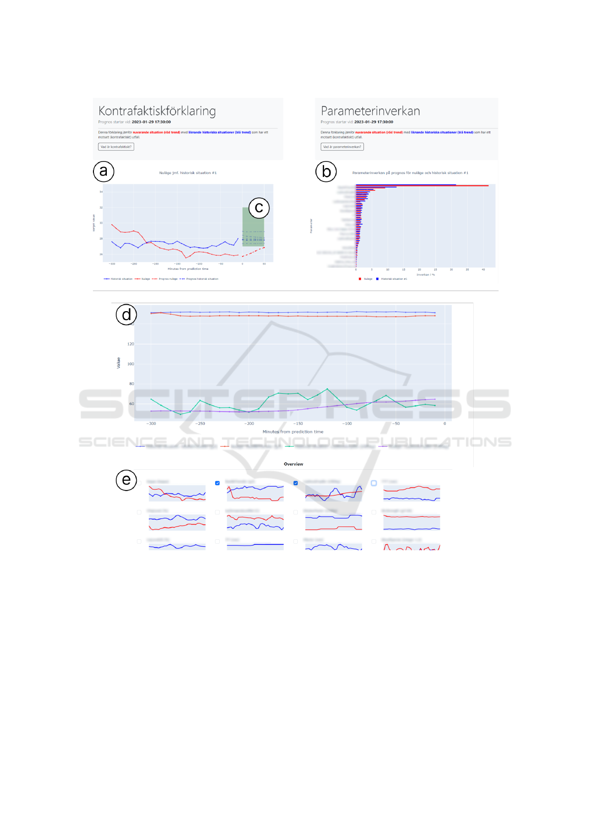
Figure 2: Overview of the interface of the evaluated prototype. The counterfactual component (a) that houses a counterfactual
zone (c) defined by the user to produce nearest neighbors that fall inside the chosen range. The feature importance component
(b) uses a bar chart to list all features (sensors) considered by the model, together with accompanying feature importance
values. In the comparison panel (d), users can plot a range of sensors (e) to assess how current readings compare to those
from the selected nearest neighbor (historical sample). All sensors names are masked due to confidentiality.
all historical samples presented as counterfactual ex-
amples. This additional explanation is meant to sup-
plement the counterfactual example so that we can in-
vestigate how they are each treated when presented
side by side on the dashboard. The web-based dash-
board was developed entirely in Python using Plotly
Dash (Plotly Technologies Inc., 2024). The prototype
was bundled into an executable file for ease of use
while conducting remote user studies.
5.2 User Interface and Interaction
In this section, we describe the interface and its inter-
activity. This interface shows the TFT model output
with explanations from both a counterfactual compo-
nent and a feature importance component. For design-
ing the interface, four core features were considered
based on findings from the field studies, as presented
in Table 1.
IVAPP 2025 - 16th International Conference on Information Visualization Theory and Applications
836

The overview of the interface we developed and
tested is presented in Figure 2. Most of the instruc-
tions and actual data contents available in the pro-
totype are in Swedish due to the context of our in-
dustrial case study. The team of co-authors iter-
atively discussed design choices for visuals, inter-
actions, and the interface, considering prior recom-
mendations and the concerns for complexity / cogni-
tive load for users (Russell, 2016; Hartikainen et al.,
2022). One particular design choice, for instance,
concerned the selection of categorical colors (Zhou
and Hansen, 2016) to be used across several views:
the standard qualitative/categorical color scheme pro-
vided by Plotly Dash can be compared to the “Set1”
color map from ColorBrewer (Harrower and Brewer,
2003). We used Coblis (Fl
¨
uck, 2024) in order to test
the selected color scheme for several potential color
deficiency issues.
Figure 2(A) shows the counterfactual component.
The red line is the sample to explain, indicating a tar-
geted value which can be customized by users theo-
retically. The green zone represents the ideal range
which the user would like the forecast to fall into.
This is what we call “counterfactual zone” (see Fig-
ure 2(C)). In this case, we used the Kappa value as the
targeted value, the ideal range is set between 27 and
32. In the counterfactual zone, we present five nearest
neighbors. The x-axis shows time, which is how many
minutes from the prediction time, while the y-axis is
the value of the targeted value (Kappa).
Figure 2(B) shows the feature importance com-
ponent. The values are listed in decreasing order of
importance, as determined by the TFT model where
these importance values are computed and stored. For
each feature (sensor), the corresponding values for
both “sample to explain” and “historical sample” are
presented in horizontal bars together. The x-axis is the
importance (in percent), which conveys the extent to
which the model takes each feature’s value into con-
sideration in the particular forecast.
Figure 2(D) presents a comparison panel. Here,
users can compare data values over time in a single
chart. It also displays both the historical sample and
the sample to explain for one selected feature value.
The value trends of selected features match the se-
lected line in the counterfactual chart. One could do
multiple selection and compare them in this panel.
One could also select the target value (which is also
one of the values/sensors) and show its actual value
trend in this view as well.
Figure 2(E) shows an overview of all sensor val-
ues. The order is horizontally listed according to the
ranking of the feature importance explanations.
Interaction
We have used the following interaction methods iden-
tified from the recent study (Bertrand et al., 2023).
Clarify. This interaction subset enables users
to summon information on demand, either
through clicking or brushing explanation com-
ponents (Bertrand et al., 2023). In this approach,
users actively seek answers, controlling which expla-
nations appear and when. One of the key methods
is that displaying explanations after a user clicks on
a link. In our prototype, brief descriptions of two
explanations are provided in natural language. Upon
clicking a button, these descriptions are revealed to
users. Initially, detailed numbers of the lines or bars
in the charts are concealed, but as users navigate
along the line or the bar, the information dynamically
unfolds upon mouse movement. The information
for the lines in counterfactual chart include the time
step, specific number for that time step, and two key
features operators often check for this specific use
case. When one line within the counterfactual zone
is clicked on, the feature importance in Figure 2(B)
will adapt to it automatically, with updated feature
importance. The information for the bar on the
feature importance chart include the name and the
detailed number of the value.
Overall, “clarify” interactions mitigate initial in-
terface overwhelm by progressively revealing expla-
nations. This adaptive, on-demand disclosure can
adapt to diverse user reactions and expectations.
Compare. This category gathers interaction tech-
niques that are used to compare either explanations
for different inputs or explanations for different pre-
dictions. For the former, users can select the in-
puts to compare so as to analyse differences in the
explanation. Connections, similarities and differ-
ences between the selected inputs or outcomes can be
highlighted in the comparative explanations (Bertrand
et al., 2023). In our case, users can compare values
across time steps in a single chart, helping operators
explore factors that may have caused the model pre-
diction to fall outside the ideal range.
6 INITIAL USER EVALUATION
We installed the prototype on one computer on site
and invited five operators from a pulp and paper man-
ufacturer to evaluate it in February 2024. The pur-
pose was to collect initial feedback on explanations
Designing Explainable and Counterfactual-Based AI Interfaces for Operators in Process Industries
837

that could help operators understand model predic-
tions and support decision-making. While the number
of participants was small due to their limited avail-
ability (the respective sessions as well as the efforts
described in Section 4 had to be carefully planned
and negotiated ahead of time), their specialized skills
and experience allowed us to treat them as domain
experts. This approach aligns with practices for de-
signing intelligent systems and human-computer in-
teraction applications with limited expert availabil-
ity (Crispen and Hoffman, 2016; Ribes, 2019).
6.1 Method
The main methods used for this evaluation were semi-
structured interviews and a subjective satisfaction
questionnaire based on prior work (Silva et al., 2023),
using the developed prototype as a “boundary” ob-
ject (Brandt et al., 2012, p. 149) for participants to
interact with during the evaluation.
Each evaluation session consisted of three blocks:
1. Understanding Explanation Methods: first,
participants were introduced to the interface, in-
cluding both explanation methods, and explored
it independently for a few minutes. They then
answered five objective questions with facilitator
support to assess their understanding of the expla-
nations. This process helped identify areas of clar-
ity and confusion. For example, participants an-
swered questions like: “Q1: In the sample data,
during which time range the target value is min-
imum? In the historical data, during which time
range the target value is maximum?”
2. Problem Solving and Open Questions: the sec-
ond part looked into the sample to explain in the
prototype.The participants were asked to investi-
gate what was happening and describe the poten-
tial causes. At this stage, we tried to understand
the features they used to explore, their investiga-
tion strategies, and the information needed to in-
terpret the issue. They were also asked what ac-
tions they would take to prevent similar problems.
3. Satisfactory Surveys: In the end, participants
completed a survey to rate the usefulness and
clarity of the explanations, adapted from Silva et
al.’s 30-question framework (Silva et al., 2023).
We first selected some questions relevant to our
case and focused on understandability. Next,
we revised them to fit our counterfactual con-
cept. For example,“I understood the counterfac-
tuals within the context of the question.” and “I
understood the feature importance within the con-
text of the question.” Participants rated questions
on a seven-point scale and compared the useful-
ness of counterfactuals and feature importance in
understanding model predictions and supporting
decision-making. For instance, “Which explana-
tions helped me increased my understanding of
why the model produced its predictions.” Then,
the participant needs to select from five answers:
counterfactual; feature importance; both counter-
factual and feature importance; neither counter-
factual nor feature importance; others.
6.2 Results
Participants generally grasped the concepts of coun-
terfactual and feature importance explanations, as in-
dicated by survey responses. Four out of five rated six
in the survey statement “I understood the counterfac-
tual explanations within the context of the question”,
while all rated six for “I understood the Feature im-
portance within the context of the question”. During
interviews, participants demonstrated an understand-
ing of the highlighted green zone as a target or optimal
range, a notion clarified by the facilitator. Integrat-
ing both counterfactual and feature importance expla-
nations appeared valuable, enhancing users’ under-
standing of prediction rationale. Subjective surveys
showed a preference for the combined explanations,
with four out of five participants selecting this option
for improving comprehension. However, interview
observations revealed that some users primarily relied
on historical comparisons. Further exploration and
validation using a more advanced prototype reflecting
real-world scenarios are crucial to assess the true util-
ity of both explanatory methods. Counterfactual ex-
planations, in particular, showed promise in support-
ing users with decision-making in AI-assisted prob-
lem solving. Three out of five participants specifically
chose counterfactual explanations for the question of
“Which explanations helped me find out what adjust-
ment to make in the context of questions” whereas one
participant chose that both explanations helped.
Participants highly valued the ability to compare
current situations with historical data, aligning with
their existing problem-solving strategies. Nearly all
participants extensively used the comparison panel
during the evaluations. However, some expressed dis-
satisfaction if historical data failed to align precisely
with current sensor readings. Participants emphasized
the importance of accessing similar historical situa-
tions to support effective decision-making. They also
expressed a need for additional contextual informa-
tion from historical samples to accurately assess the
similarity between current predictions and past sce-
narios. In real-world settings, sensor data alone may
IVAPP 2025 - 16th International Conference on Information Visualization Theory and Applications
838

not capture all relevant factors, as external influences
often impact processes. Therefore, historical samples
would benefit from supplementary contextual details,
such as timestamps, data sources (e.g., process sen-
sors or laboratory data), and any relevant external fac-
tors affecting the specific situation.
The results also highlight areas for improvement
in the interface and interaction design, such as man-
aging multiple variables with different units plotted
on the same chart (see Figure 2(D)). Plotting multiple
variables requires careful attention to color choices to
ensure high readability and accessibility. Future work
should explore additional visual encodings (La Rosa
et al., 2023; Chatzimparmpas et al., 2024) to facili-
tate easier comparison of multiple variables. To min-
imize the effort of switching between individual vari-
able plots, users should be able to hover over variables
in the overview (see Figure 2(E)) to instantly view the
sensor value corresponding to the cursor position.
Overall, this study highlights the potential of ex-
planatory methods in enhancing operators’ under-
standing of model predictions and aiding in decision-
making processes. However, further refinement and
validation, alongside the incorporation of additional
contextual information, are essential to maximize the
utility of these methods in real-world applications.
7 DISCUSSION
In this section, we reflect on the learnings and impli-
cations for future work.
7.1 Human-Centered XAI for
Counterfactuals
In this study, human-centered XAI takes center stage.
Aligning with other HCI researchers who emphasize
the significance of investigating the needs of human
users (Liao et al., 2020; Shneiderman, 2020; Liao and
Varshney, 2021; Hartikainen et al., 2022), we advo-
cate the design and research of human-centered prac-
tices in XAI. We gathered and analyzed user needs
from field visits and interviews with real domain ex-
perts in industry. The user needs collected and an-
alyzed are overall in line with the arguments from
both social science (Miller, 2019) and XAI (Shnei-
derman, 2020; Liao et al., 2020) research. Further-
more, these needs provide valuable insights for de-
signing and presenting explanations to stakeholders
in real-world scenarios, e.g., in the pulp and paper in-
dustry. From the HCI perspective, Hartikainen et al.
previously mentioned the lack of end-user viewpoint
in the early design-related activities as one of the chal-
lenges for industrial applications of Human-Centered
AI (HCAI) (Hartikainen et al., 2022).
Our case study addresses this gap by incorpo-
rating end-user perspectives from industries into the
design process. To meet the users needs, our pro-
totype was designed with broader perspectives, ex-
tending beyond counterfactual explanations. It com-
prises multiple parts that go beyond typical coun-
terfactual explanations (see Figure 2). The result-
ing interface aligns with prior visualization research
that combines counterfactuals with other explanation
types (La Rosa et al., 2023; Schlegel et al., 2023),
while also addressing the challenge of balancing ex-
plainability and complexity for end users in industrial
applications (Hartikainen et al., 2022).
7.2 Design Implications
Previous studies such as (Wang et al., 2024) high-
light the need for interactive counterfactual visual-
izations enabling dynamic data exploration. Simi-
larly, research on human-centered AI design in prac-
tice (Hartikainen et al., 2022) emphasizes the explain-
ability/complexity trade-offs in achieving AI trans-
parency. Our interface demonstrates how to design
such visualizations for domain experts with minimal
knowledge of the underlying ML model.
Our study presents several key design considera-
tions for counterfactual visualizations:
1. Consider displaying multiple dimensions which
are more than just numeric values for nearest
neighbor counterfactual visualizations. Previous
studies identify challenges of counterfactual visu-
alizations, which include the risks of leading to
longer response time and potential confusion if
the additional information is difficult to reconcile
with users’ prior assumptions (Wang et al., 2024).
In our case study, we provide nearest neighbor
samples trained from historical data for operators
to experiment with similar cases in history. To
identify similar cases, operators need much more
dimensions than just the value numbers, to evalu-
ate if the samples are really similar. Without that
additional information (which is a part of their re-
spective mental models), it may still be difficult to
bring the most value to decision making support.
2. Integrate contextual information that is both
aligned with operators’ mental models, and fit for
the specific situations. Contextual information
regarding historical samples and variable names
should align with mental models of operators to
assist their understanding of what situation the
historical sample is based on and what sensors
Designing Explainable and Counterfactual-Based AI Interfaces for Operators in Process Industries
839

the model is considering. To improve decision-
making for operators (at least in the context of in-
dustrial equipment monitoring and control), it is
important for XAI systems to integrate contextual
information needed for specific situations, while
not overloading users with too much information.
This makes interface design critical for successful
XAI, as it directly impacts the depth and clarity of
explanations provided. Our study underscores this
pivotal design trade-off, prompting a deeper ex-
ploration of human-computer interaction and vi-
sualization aspects within the area of XAI besides
the algorithmic explainability concerns (Shneider-
man, 2020; La Rosa et al., 2023).
3. Our initial user evaluations suggest that designing
XAI solutions for time series data in the use case
studied here should consider combining counter-
factual explanations and feature importance.
As our study shows, methods that communicate
how various sensors are weighted according to
the model are valuable complements to counter-
factual explanations and should be provided for
an extra layer of analysis. Explanations of such
could also bridge the gap between the model de-
velopers and operators. Making AI application
more understandable for end users such as opera-
tors in the process industries, will encourage them
to give feedback to the model development with
their strong domain knowledge and experience in
the future which may improve the model develop-
ment in the long run.
These design considerations, based on our user eval-
uations and prior studies, highlight the importance
of creating counterfactual visualizations that are both
informative and intuitive for domain experts, while
carefully managing the trade-offs between complex-
ity and transparency.
7.3 Limitations and Future Work
There are several limitations of this study: firstly, the
counterfactual explanations in our prototype rely on
the nearest neighboring samples from historical data
that fall within the user-defined counterfactual target
zone. This approach is simplistic and does not iden-
tify the minimal set of feature changes required in
the test input to achieve the desired result, as is typi-
cal in counterfactual explanations (Liao and Varshney,
2021). Future work should explore alternative coun-
terfactual methods and evaluate the technical feasibil-
ity and user experience of providing minimal feature
changes for time series data.
Secondly, the prototype contained errors in sen-
sor names, with incorrect mappings of sensor IDs
and descriptions both in the model and on the in-
terface. These issues, discovered too late for reso-
lution before testing, may have influenced user test
results. Although participants were informed of the
issue and instructed to treat the prototype as an inter-
active mock-up, some may have struggled to answer
problem-solving questions without accurate informa-
tion. This underscores the importance of reliable data
sources and collaboration between stakeholders, in-
cluding ensuring accurate data input during the early
prototyping phase.
Lastly, the evaluation involved only five partici-
pants from a single plant, raising concerns about the
generalizability of the findings. While prior work
supports the inclusion of domain experts with lim-
ited availability in requirement engineering and eval-
uation (Crispen and Hoffman, 2016; Ribes, 2019), in-
cluding industrial XAI application contexts (Grandi
et al., 2024), a small sample size may not capture the
variability and nuances across different plants or in-
dustrial settings. Future studies should involve larger,
more diverse, and representative samples to improve
the external validity of the findings.Additionally, fu-
ture work could explore enhanced evaluation meth-
ods and test designs tailored to counterfactual expla-
nations, ensuring more robust and reliable results.
8 CONCLUSIONS
This work focuses on counterfactual explanations to
clarify AI predictions, particularly within the paper
manufacturing industry’s pulping process. The main
research question revolves around designing coun-
terfactual explanations for multi-horizon forecasting
problems using multivariate time series data in pro-
cess industries.
Through interviews and observations of control
room operators, a prototype combining feature impor-
tance explanations and counterfactual explanations
was developed. This prototype incorporates a desig-
nated counterfactual zone to visualize alternative out-
comes, aiding operators’ understanding of model pre-
dictions. Initial user evaluations with industry oper-
ators highlighted the value of combining both expla-
nation methods, facilitating a deeper comprehension
of model predictions. Users appreciated the ability to
compare historical data, aligning with their problem-
solving strategies, but desired more contextual infor-
mation for better understanding.
Overall, this study presents a practical design case
of counterfactual explanations tailored to the process
industry, introduces a novel interface that combines
two explanation methods, and provides design impli-
IVAPP 2025 - 16th International Conference on Information Visualization Theory and Applications
840

cations to advance XAI in industrial settings. It aims
to support practitioners and designers in developing
human-centered XAI for industrial applications.
ACKNOWLEDGMENTS
The present study is funded by VINNOVA Swe-
den (2021-04336), Bundesministerium f
¨
ur Bildung
und Forschung (BMBF; 01IS22030), and Rijksdienst
voor Ondernemend Nederland (AI2212001) under the
project Explanatory Artificial Interactive Intelligence
for Industry (EXPLAIN)
2
. We would like to thank
S
¨
odra Skogs
¨
agarna Ekonomisk F
¨
orening to support
the prototype development and user evaluation. We
also want to thank all user study participants.
REFERENCES
Ates, E., Aksar, B., Leung, V. J., and Coskun, A. K. (2021).
Counterfactual explanations for multivariate time se-
ries. In Proc. of ICAPAI, pages 1–8. IEEE.
Bertrand, A., Viard, T., Belloum, R., Eagan, J. R., and
Maxwell, W. (2023). On selective, mutable and dia-
logic XAI: A review of what users say about different
types of interactive explanations. In Proc. of CHI ’23.
ACM.
Brandt, E., Binder, T., and Sanders, E. B.-N. (2012). Tools
and techniques: Ways to engage telling, making and
enacting. In Routledge International Handbook of
Participatory Design, pages 145–181. Routledge.
Braun, V. and Clarke, V. (2012). Thematic analysis. In
APA Handbook of Research Methods in Psychology,
volume 2, pages 57–71. APA.
Chatzimparmpas, A., Kucher, K., and Kerren, A. (2024).
Visualization for trust in machine learning revisited:
The state of the field in 2023. IEEE CG&A, 44(3):99–
113.
Chatzimparmpas, A., Martins, R. M., Jusufi, I., Kucher,
K., Rossi, F., and Kerren, A. (2020). The state of
the art in enhancing trust in machine learning models
with the use of visualizations. Comp. Graph. Forum,
39(3):713–756.
Cheng, F., Ming, Y., and Qu, H. (2021). DECE: Decision
explorer with counterfactual explanations for machine
learning models. IEEE TVCG, 27(2):1438–1447.
Ciorna, V., Melanc¸on, G., Petry, F., and Ghoniem, M.
(2024). Interact: A visual what-if analysis tool for
virtual product design. Inf. Vis., 23(2):123–141.
Collaris, D., Weerts, H. J., Miedema, D., van Wijk, J. J.,
and Pechenizkiy, M. (2022). Characterizing data sci-
entists’ mental models of local feature importance. In
Proc. of NordiCHI. ACM.
2
https://explain-project.eu/ (last accessed: December 6,
2024)
Crispen, P. and Hoffman, R. R. (2016). How many experts?
IEEE Intell. Syst., 31(6):56–62.
De Rademaeker, E., Suter, G., Pasman, H. J., and Fabiano,
B. (2014). A review of the past, present and future
of the European loss prevention and safety promotion
in the process industries. Process Saf. Environ. Prot.,
92(4):280–291.
Duda, S., Warburton, C., and Black, N. (2020). Contextual
research: Why we need to research in context to de-
liver great products. In Human-Computer Interaction.
Design and User Experience, pages 33–49. Springer.
El-Assady, M. and Moruzzi, C. (2022). Which biases and
reasoning pitfalls do explanations trigger? Decom-
posing communication processes in human–AI inter-
action. IEEE CG&A, 42(6):11–23.
Fl
¨
uck, D. (2024). Coblis — Color blindness sim-
ulator. https://www.color-blindness.com/
coblis-color-blindness-simulator/. Last accessed:
September 5, 2024.
Forbes, M. G., Patwardhan, R. S., Hamadah, H., and
Gopaluni, R. B. (2015). Model predictive control
in industry: Challenges and opportunities. IFAC-
PapersOnLine, 48(8):531–538.
Friedman, J. H., Bentley, J. L., and Finkel, R. A. (1977).
An algorithm for finding best matches in logarithmic
expected time. ACM TOMS, 3(3):209–226.
Gomez, O., Holter, S., Yuan, J., and Bertini, E. (2020).
ViCE: Visual counterfactual explanations for machine
learning models. In Proc. of IUI, pages 531–535.
ACM.
Gomez, O., Holter, S., Yuan, J., and Bertini, E. (2021). Ad-
ViCE: Aggregated visual counterfactual explanations
for machine learning model validation. In Proc. of
VIS, pages 31–35. IEEE.
Grandi, F., Zanatto, D., Capaccioli, A., Napoletano, L.,
Cavallaro, S., and Peruzzini, M. (2024). A method-
ology to guide companies in using Explainable AI-
driven interfaces in manufacturing contexts. Procedia
Computer Science, 232:3112–3120.
Harrower, M. and Brewer, C. A. (2003). ColorBrewer.org:
An online tool for selecting colour schemes for maps.
Cartogr. J., 40(1):27–37.
Hartikainen, M., V
¨
a
¨
an
¨
anen, K., Lehti
¨
o, A., Ala-Luopa, S.,
and Olsson, T. (2022). Human-centered AI design in
reality: A study of developer companies’ practices. In
Proc. of NordiCHI. ACM.
Keane, M. T., Kenny, E. M., Delaney, E., and Smyth, B.
(2021). If only we had better counterfactual expla-
nations: Five key deficits to rectify in the evaluation
of counterfactual XAI techniques. In Proc. of IJCAI,
pages 4466–4474. IJCAI Organization.
Kotriwala, A., Kl
¨
opper, B., Dix, M., Gopalakrishnan, G.,
Ziobro, D., and Potschka, A. (2021). XAI for opera-
tions in the process industry — Applications, theses,
and research directions. In Proc. of AAAI-MAKE ’21.
CEUR Workshop Proceedings.
La Rosa, B., Blasilli, G., Bourqui, R., Auber, D., Santucci,
G., Capobianco, R., Bertini, E., Giot, R., and An-
gelini, M. (2023). State of the art of visual analytics
Designing Explainable and Counterfactual-Based AI Interfaces for Operators in Process Industries
841

for eXplainable deep learning. Comp. Graph. Forum,
42(1):319–355.
Liao, Q. V., Gruen, D., and Miller, S. (2020). Questioning
the AI: Informing design practices for explainable AI
user experiences. In Proc. of CHI, pages 1–15. ACM.
Liao, Q. V. and Varshney, K. R. (2021). Human-centered
explainable AI (XAI): From algorithms to user expe-
riences. arXiv preprint arXiv:2110.10790.
Lim, B., Arık, S.
¨
O., Loeff, N., and Pfister, T. (2021).
Temporal fusion transformers for interpretable multi-
horizon time series forecasting. Int. J. Forecast.,
37(4):1748–1764.
Manca, G. and Fay, A. (2023). Explainable AI for indus-
trial alarm flood classification using counterfactuals.
In Proc. of IECON. IEEE.
Miller, T. (2019). Explanation in artificial intelligence: In-
sights from the social sciences. Artif. Intell., 267:1–
38.
Miller, T., Howe, P., and Sonenberg, L. (2017). Explainable
AI: Beware of inmates running the asylum or: How
I learnt to stop worrying and love the social and be-
havioural sciences. arXiv preprint arXiv:1712.00547.
Pedregosa, F., Varoquaux, G., Gramfort, A., Michel, V.,
Thirion, B., Grisel, O., Blondel, M., Prettenhofer, P.,
Weiss, R., Dubourg, V., Vanderplas, J., Passos, A.,
Cournapeau, D., Brucher, M., Perrot, M., and Duch-
esnay, E. (2011). Scikit-learn: Machine learning in
Python. J. Mach. Learn. Res., 12:2825–2830.
Plotly Technologies Inc. (2024). Dash Python user guide.
https://dash.plotly.com/. Last accessed: September 5,
2024.
Ribera, M. and Lapedriza, A. (2019). Can we do better ex-
planations? A proposal of user-centered explainable
AI. In Joint Proc. of ACM IUI Workshops. CEUR
Workshop Proceedings.
Ribes, D. (2019). How I learned what a domain was. Proc.
ACM Hum.-Comput. Interact., 3(CSCW).
Rojat, T., Puget, R., Filliat, D., Del Ser, J., Gelin, R., and
D
´
ıaz-Rodr
´
ıguez, N. (2021). Explainable artificial in-
telligence (XAI) on timeseries data: A survey. arXiv
preprint arXiv:2104.00950.
Russell, D. M. (2016). Simple is good: Observations of
visualization use amongst the Big Data digerati. In
Proc. of AVI, pages 7–12. ACM.
Saeed, W. and Omlin, C. (2023). Explainable AI (XAI): A
systematic meta-survey of current challenges and fu-
ture opportunities. Knowl.-Based Syst., 263:110273.
Schlegel, U., Oelke, D., Keim, D. A., and El-Assady, M.
(2023). Visual explanations with attributions and
counterfactuals on time series classification. arXiv
preprint arXiv:2307.08494.
Shneiderman, B. (2020). Human-centered artificial intel-
ligence: Reliable, safe & trustworthy. Int. J. Hum.-
Comput. Interact., 36(6):495–504.
Silva, A., Schrum, M., Hedlund-Botti, E., Gopalan, N.,
and Gombolay, M. (2023). Explainable artificial in-
telligence: Evaluating the objective and subjective
impacts of XAI on human-agent interaction. Int. J.
Hum.-Comput. Interact., 39(7):1390–1404.
Sohns, J.-T., Garth, C., and Leitte, H. (2023). Decision
boundary visualization for counterfactual reasoning.
Comput. Graph. Forum, 42(1):7–20.
Subramonyam, H. and Hullman, J. (2024). Are we closing
the loop yet? Gaps in the generalizability of VIS4ML
research. IEEE TVCG, 30(1):672–682.
Theissler, A., Spinnato, F., Schlegel, U., and Guidotti, R.
(2022). Explainable AI for time series classification:
A review, taxonomy and research directions. IEEE
Access, 10:100700–100724.
Wachter, S., Mittelstadt, B., and Russell, C. (2017). Coun-
terfactual explanations without opening the black box:
Automated decisions and the gdpr. Harv. JL & Tech.,
31:841.
Wang, A. Z., Borland, D., and Gotz, D. (2024). An em-
pirical study of counterfactual visualization to support
visual causal inference. Inf. Vis., 23(2):197–214.
Wang, Z., Miliou, I., Samsten, I., and Papapetrou, P. (2023).
Counterfactual explanations for time series forecast-
ing. In Proc. of ICDM, pages 1391–1396. IEEE.
Warren, G., Byrne, R. M. J., and Keane, M. T. (2023). Cat-
egorical and continuous features in counterfactual ex-
planations of AI systems. In Proc. of IUI, pages 171–
187. ACM.
Wexler, J., Pushkarna, M., Bolukbasi, T., Wattenberg, M.,
Vi
´
egas, F., and Wilson, J. (2020). The What-If Tool:
Interactive probing of machine learning models. IEEE
TVCG, 26(1):56–65.
Zhou, L. and Hansen, C. D. (2016). A survey of colormaps
in visualization. IEEE TVCG, 22(8):2051–2069.
APPENDIX
The supplementary materials for this paper, includ-
ing a prototype demo video and user study mate-
rials, are available at https://ivis.itn.liu.se/pubs/data/
ivapp25-zhang/
IVAPP 2025 - 16th International Conference on Information Visualization Theory and Applications
842
