
Visualization of Swedish News Articles: A Design Study
Kostiantyn Kucher
1 a
, Nellie Engstr
¨
om
1
, Wilma Axelsson
1
, Berkant Savas
1,2 b
and Andreas Kerren
1,3 c
1
Department of Science and Technology, Link
¨
oping University, Norrk
¨
oping, Sweden
2
iMatrics AB, Link
¨
oping, Sweden
3
Department of Computer Science and Media Technology, Linnaeus University, V
¨
axj
¨
o, Sweden
Keywords:
Information Visualization, Text Visualization, Natural Language Processing, News, Editorial Media, Swedish
Language, Journalism.
Abstract:
The amount of available text data has increased rapidly in the past years, making it difficult for many users
to find relevant information. To solve this, natural language processing (NLP) and text visualization methods
have been developed, however, they typically focus on English texts only, while the support for low-resource
languages is limited. The aim of this design study was to implement a visualization prototype for exploring
a large number of Swedish news articles (made available by industrial collaborators), including the temporal
and relational data aspects. Sketches of three visual representations were designed and evaluated through user
tests involving both our collaborators and end-users (journalists). Next, an NLP pipeline was designed in
order to support dynamic and hierarchical topic modeling. The final part of the study resulted in an interactive
visualization prototype that uses a variation of area charts to represent topic evolution. The prototype was
evaluated through an internal case study and user tests with two groups of participants with the background in
journalism and NLP. The evaluation results reveal the participants’ preference for the representation focusing
on top topics rather than the topic hierarchy, while suggestions for future work relevant for Swedish text data
visualization are also provided.
1 INTRODUCTION
In the modern digitised society, a large amount of text
data is generated daily for different areas of applica-
tions such as product reviews, posts on social media,
research papers and news articles. With such large-
scale data come many challenges for the reader when
exploring the underlying data at scale, such as finding
and extracting relevant information, gaining insights,
getting an overview, grasping the overall meaning of
the data, as well as getting details on demand. To han-
dle the large digitized text corpora, methods which
involve Natural Language Processing (NLP) / Text
Mining, and further Artificial Intelligence (AI), have
been developed to extract valuable information auto-
matically. The areas of Visual Analytics (VA) and Vi-
sual Text Analytics (VTA) have also grown larger in
interest as Information Visualization (InfoVis), text
a
https://orcid.org/0000-0002-1907-7820
b
https://orcid.org/0000-0002-1542-2690
c
https://orcid.org/0000-0002-0519-2537
visualization, and text analysis methods have been
documented in an increasing number of papers over
the years (Kucher and Kerren, 2015; Liu et al., 2019;
Alharbi and Laramee, 2019). However, the major-
ity of these papers have been based on English texts,
and the research field of using NLP and visualiza-
tion techniques for lower-resourced languages, such
as Swedish, remains less explored, presenting chal-
lenges and opportunities for both academic research
and industrial applications (for instance, the average
word length in Swedish is greater than in English, af-
fecting designs that rely heavily on text labels).
In this paper
1
, we contribute to the less explored
area of VTA for Swedish text data (more specifically,
news articles as well as associated metadata) based on
the data provided by our collaborators from iMatrics,
a company located in Link
¨
oping, Sweden. As they
explore the opportunities of using visualization for in-
ternal use as well as for products available for their
clients (often with non-technical background, for in-
1
Based on a thesis project (Axelsson and Engstr
¨
om,
2023).
670
Kucher, K., Engström, N., Axelsson, W., Savas, B. and Kerren, A.
Visualization of Swedish News Ar ticles: A Design Study.
DOI: 10.5220/0012398600003660
Paper published under CC license (CC BY-NC-ND 4.0)
In Proceedings of the 19th International Joint Conference on Computer Vision, Imaging and Computer Graphics Theory and Applications (VISIGRAPP 2024) - Volume 1: GRAPP, HUCAPP
and IVAPP, pages 670-677
ISBN: 978-989-758-679-8; ISSN: 2184-4321
Proceedings Copyright © 2024 by SCITEPRESS – Science and Technology Publications, Lda.

stance, journalists), the design of our proposed solu-
tion takes the respective constraints and requirements
into account. Our design study generally focuses on
the challenges and necessary trade-offs of designing
a temporal visualization, showing the relations be-
tween the topics of a large-scale text corpus, that is
simple enough for a non-technical user to understand,
while also considering the text genre aspect (e.g., ar-
ticles focused on a specific story/event or a specific
place/region) and target audience (e.g., the value of
the interactive visualization prototype as perceived by
the users with non-technical vs NLP background).
The rest of this paper is organized as follows: we
discuss the related work as well as the methodology
of this study in Sections 2 and 3. The first iteration
of the study involving sketches and user feedback is
described in Section 4. The backend and the frontend
of our prototype are presented in Sections 5 and 6, re-
spectively. Evaluation of the resulting prototype then
follows in Section 7, and the discussion and conclu-
sions are provided in Sections 8 and 9.
2 RELATED WORK
Both computational and visual/interactive perspec-
tives are relevant to this study.
2.1 Natural Language Processing
NLP is a field that focuses on various text analysis
techniques and methods used, among other tasks, to
extract useful information such as keywords or top-
ics (Chowdhary, 2020). Topic modeling is an un-
supervised method used to uncover underlying top-
ics, or themes, in a large collection of documents and
group the documents according to these different top-
ics (Tolegen et al., 2022). This is typically a soft clus-
tering method, where each document belongs to each
topic with a certain probability (Aggarwal and Zhai,
2012). Some of the more used topic modeling meth-
ods are Latent Dirichlet Allocation (LDA) and Non-
Negative Matrix Factorization (NMF), for instance.
There are also different extensions and applications of
topic modeling, for example, Dynamic Topic Model-
ing (DTM) and Hierarchical Topic Modeling (HTM).
DTM is a topic modeling approach which models the
evolution of topics over time, with the ability to cre-
ate a temporal overview of a large collection of doc-
uments (Blei and Lafferty, 2006). HTM focuses on
hierarchical clustering/grouping of topics, including
such methods as hierarchical Latent Dirichlet Alloca-
tion (hLDA) and Pachinko Allocation Model (PAM),
for instance (Liu et al., 2016).
2.2 Visualization
InfoVis focuses on gaining insights of the (abstract)
data with the use of various (interactive) visualiza-
tion techniques (Spence, 2014). The prior works have
established the basic stages of creating a visualiza-
tion (Ware, 2021) as well as workflows for support-
ing user tasks from overview to details (Shneiderman,
1996) and design study methodology (Sedlmair et al.,
2012). Visual Analytics is a related field, wherein in-
teractive visualizations are designed based on compu-
tational data analysis methods, with the aim to explore
and understand especially large and complex data sets
(Keim et al., 2010), including the concerns such as the
data characteristics, the users, and their tasks (Miksch
and Aigner, 2014) into account.
Regarding the special data types that have strong
implications for the visualization design process, text
is one prominent example (Cao and Cui, 2016). As of
today, there are many respective techniques to choose
from, depending on the specific data and task at hand
(Kucher and Kerren, 2015; Liu et al., 2019; Alharbi
and Laramee, 2019). When designing a visualiza-
tion for temporal data, multiple design choices must
also be made. A type of stacked graph, named a
Streamgraph, has been a prominent example of a vi-
sual representation for time series (Byron and Watten-
berg, 2008). This graph comprises individual layers,
stacked upon each other, with different colours and
labels to reflect separate data series. The thickness of
the stack is then set to represent the total sum of the
layers’ corresponding time series. Furthermore, there
can be a need of visualizing data which contains many
different distributions at once. A few viable options
for this are ridgeline plots, violin plots, and boxplots
(Wilke, 2019). For example, the ridgeline plot is es-
pecially useful when visualizing overall trends in dis-
tributions. Each distribution in the ridgeline plot is
displayed in the form of an area chart, where the area
chart is represented through a density estimate.
There have been many previous implementations
of VA tools that include visualizations of topics over
time, or relationships between topics, based on re-
sults from topic modeling. For example, ThemeRiver
is a visualization using the river-based-flow / stacked
graph metaphor to present, e.g., themes and patterns
of a large document corpus over time (Havre et al.,
2002). Visual Backchannel is a multi-faceted inter-
face that visualizes events over time through pro-
viding the user with three types of visualizations: a
stacked graph, a spiral, and an image cloud (D
¨
ork
et al., 2010). StoryFlow is a storyline visualization
system developed for visualizing the evolution of sto-
ries over time and hierarchical relationships between
Visualization of Swedish News Articles: A Design Study
671
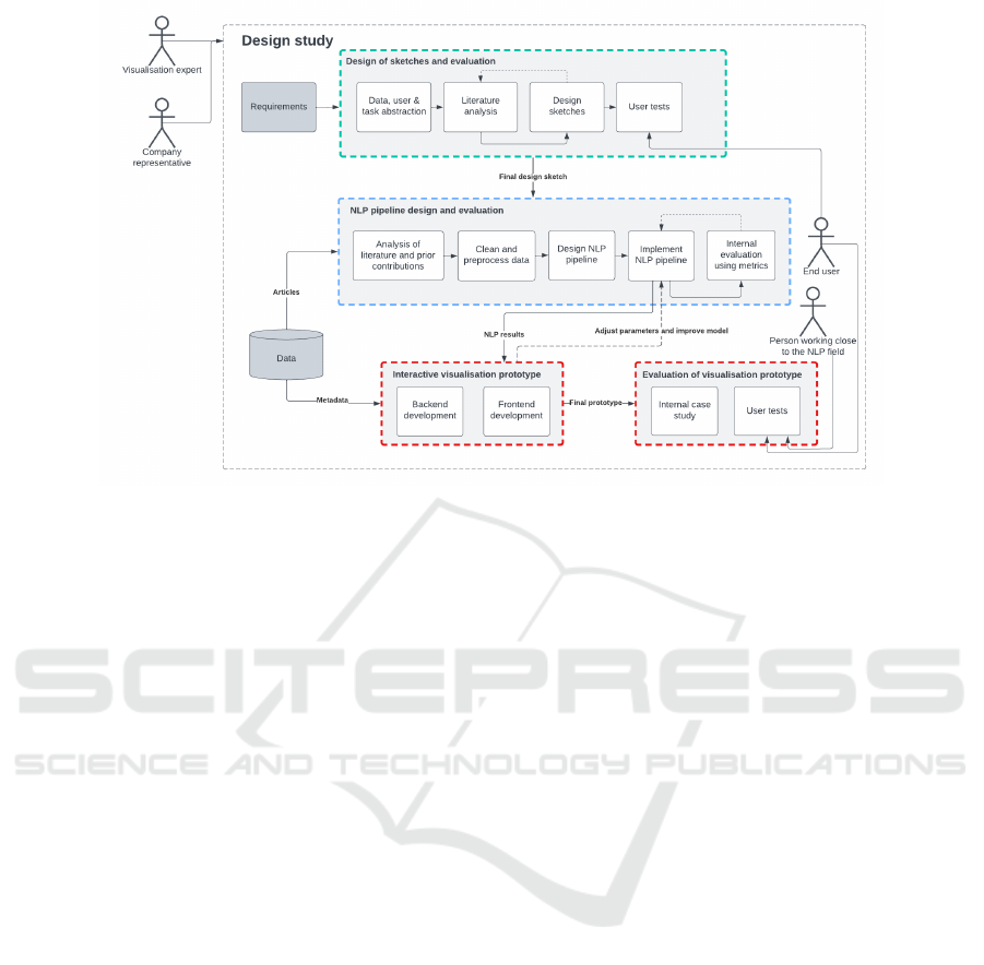
Figure 1: Workflow explaining the different parts and actors of the study and how these relate to each other.
a large set of entities (Liu et al., 2013). It should
be mentioned that evaluation of such approaches is
considered a difficult challenge (Lam et al., 2012;
Elmqvist and Yi, 2015). This is due to visualizations
being designed to solve activity tasks, such as gain-
ing insights or making conclusions from the data vi-
sualized, which are generally complex and context-
dependent tasks, also often limited to a particular tar-
get user audience. There are also several challenges
with evaluating VTAs specifically, due to their com-
plexity of combining NLP and visualization, which
themselves can consist of systems that are not per-
fect (Kucher et al., 2022). Still, the methods such as
semi-structured interviews as well as heuristic evalu-
ation (Stasko, 2014) can be applied to get a glimpse,
if not conclusive evidence, about the validity of the
proposed approach and potential improvements.
3 DESIGN STUDY
METHODOLOGY
The main steps and actors of this study are presented
in Figure 1. During the initial phase, the general
requirements were discussed with the collaborating
company representative, namely, developing a visu-
alization prototype for the tasks of representing and
exploring interesting data aspects (including temporal
and relational) from a large number of news articles
in Swedish. The end-users were not strictly defined,
however, as such a prototype could be interesting for
various audiences, including non-technical ones.
The first major step consisted of a visualization
sketch design and evaluation process (the green block
in Figure 1). Here, it was important to consider the
requirements mentioned in the earlier stage, which
was partially done by defining the data, users, and
tasks (Miksch and Aigner, 2014) in the abstraction
step. Besides the preliminary exploration of the avail-
able data and review of the prior work, sketches of the
entire visualization prototype were prepared and eval-
uated through user tests using the think-aloud method,
in order to gain feedback from possible end-users and
decide on which design should be further developed.
The second major step (the blue block in Figure 1)
was to design and implement the NLP pipeline, while
internally evaluating it. The next steps (the two red
blocks) were to implement the visualization prototype
and evaluate it. The visualization front-end was de-
veloped in an iterative manner along with the NLP
pipeline. Evaluations were then performed on the vi-
sualization prototype, which would test how the par-
ticipants perceived the final visualization, while tak-
ing their background (non-technical vs NLP) into ac-
count. Additionally, a smaller case study was per-
formed by visualizing two use cases through the pro-
totype and comparing these to see if there were any
noticeable visual differences for articles of different
types, e.g., articles related to a certain place or event.
The data used in this project was based on a
larger collection of news articles from the years 2019–
2022—in total, ≈200,000 articles. However, due
to the performance concerns, each year was initially
handled separately and only the articles and features
interesting for the scope of this design study were ex-
tracted, including the headline, text, timestamps, and
IVAPP 2024 - 15th International Conference on Information Visualization Theory and Applications
672

(a) (b) (c)
Figure 2: The initial visualization interface sketches: (a) the streamgraph sketch with glyphs, keywords, and an info box
shown; (b) the network graph sketch with an info box for an edge shown; and (c) the storyline sketch with an info box
describing the similarities between two topics.
article tags. The tags had been automatically gen-
erated by iMatrics and manually approved by their
clients, i.e., journalists. All of the data described
above was cleaned and preprocessed, with only arti-
cles containing texts in Swedish kept for further anal-
yses. In order to extract two use cases for the case
study performed later and to reduce the computation
time, two smaller (sub)sets of data were extracted.
These two data sets, one with the story tag “COVID-
19” and another with the city tag “Kalmar”, contained
around 10,000 and 38,000 articles, respectively.
4 INITIAL DESIGN
Based on the initial analyses and discussions, three
concepts were chosen as the basis for interactive
sketches created with Figma
2
in order to make the
user tests more time efficient and provide the partici-
pants with interactions (such as hovering and clicking
for details on demand) to test as well.
4.1 Initial Sketches Design
The decision was made to explore the visualization
possibilities (and to get the initial user feedback)
before implementing any NLP methods, since the
choice of visual representations and interactions—
and the required underlying information—highly af-
fects the NLP pipeline design. Thus, the initial
sketches relied on a combination of data from two
fixed time intervals with more general mock-up topics
such as “Crime” or “Politics”, while the participants
were instead asked to imagine that the visualization
prototype could eventually display both general and
more specific news topics. Overview of the resulting
interactive Figma sketches is provided in Figure 2.
2
https://www.figma.com/
4.2 Initial Sketches Evaluation
To evaluate the sketches, user tests were performed
with a focus on how easy or difficult the sketches were
to interpret, the usefulness of the proposed representa-
tions/interfaces, and what information the participants
were interested in seeing in such a potential future
tool. Each participant of the user test was tested in-
dividually, in person at their respective workplaces,
and each user test took around 40–60 minutes.
The user test was performed with two different
groups of participants: one group consisted of three
journalists (two investigative reporters with 8 and
14 years of experience + a journalist/photographer
with 27 years of experience), while the other group
consisted of two iMatrics staff members (one en-
trepreneur with around 6–7 years of experience + a
head of marketing with around half a year of experi-
ence in that role). This group included two investiga-
tive reporters had worked as reporters for 8 and 14
years, respectively, while the third participant, a jour-
nalist/photographer, had worked for 27 years. The
journalists all confirmed being in general used to vi-
sualizations such as line graphs and pie charts; and
the staff members also come in contact with visualiza-
tions often or daily, while their attitude towards using
technical aids was either neutral or positive.
To summarize the outcomes briefly, the network
graph was considered as the best alternative with
respect to simplicity and representation of relations
(but not over time)—however, it was also consid-
ered the worst in showing valuable information, and
it lacked the support for temporal aspects. The sto-
ryline graph was overall considered quite simple to
understand and the most useful on average, while be-
ing the best in showing relations over time. However,
it was considered difficult to interpret by the partici-
pants. The streamgraph was overall considered valu-
able, yet difficult to understand at a first glance; how-
ever, one participant commented that the difficulty
may be caused by the lack of familiarity.
Visualization of Swedish News Articles: A Design Study
673

As the result, we made the decision to focus on
a streamgraph for the rest of this design study, how-
ever, several changes would be made in order to sim-
plify the visualization (e.g., the participants had a hard
time understanding what the streamgraph “branches”
represented) and to better match the expected NLP
pipeline results. Overall, features such as visualiz-
ing coverage of topics, details in the form of access
to original articles, and more visual clarity of the re-
lations between topics were considered important to
support, as well as the scalability.
5 NLP PIPELINE
Based on the chosen streamgraph sketch, the NLP
pipeline and eventually the visualization frontend
could then be designed. In order to analyze and rep-
resent the evolution of topics, we intended to ap-
ply Dynamic Topic Modeling; to address the rela-
tions between topics, while being able to scale to
a larger number of topics, we also decided to sup-
port Hierarchical Topic Modeling, as inspired by the
HierarchicalTopics tool (Dou et al., 2013), for in-
stance. Due to the performance, but also support
for HTM and flexibility in customization, we chose
BERTopic
3
(Grootendorst, 2022) for our implementa-
tion. To set the different parameters or model options
used by BERTopic, e.g., the sentence transformer
used to generate document representations (embed-
dings), evaluations were carried out to compare dif-
ferent choices. For these comparisons, the COVID-
19 use case data was used. The metric used to eval-
uate the results from the NLP pipeline in an unsuper-
vised fashion was the silhouette score (Rousseeuw,
1987). For this project, two different sentence trans-
formers were tested: a multilingual one
4
(Reimers
and Gurevych, 2019) and a Swedish sentence trans-
former
5
from KB Lab (Rekathati, 2021). When us-
ing the former, the training of the model took 8 min-
utes and 54 seconds and 131 topics were generated.
Meanwhile, the latter took 63 minutes and 182 top-
ics were generated. The generated silhouette score
for the multilingual sentence transformer was around
0.565, while the Swedish sentence transformer re-
ceived a slightly higher silhouette score of 0.648.
Based on these results, we can see that the multilin-
gual transformer was considerably faster, but it also
gave slightly worse clustering results. Other than the
3
https://maartengr.github.io/BERTopic/
4
https://huggingface.co/sentence-transformers/
paraphrase-multilingual-MiniLM-L12-v2
5
https://huggingface.co/KBLab/
sentence-bert-swedish-cased
time and the silhouette scores, a third important aspect
to take in regard was the more subjective quality of the
topics. The quality was investigated for topics from
both transformers, and one typical example is how the
multilingual sentence transformer produced a topic
with representative words chosen such as “worst”,
“increases”, and “most”, while the Swedish sentence
transformer led a topic with more descriptive words
such as “elderly homes” or “the public health author-
ity”
6
. Based on all of these results, it was decided
that the Swedish sentence transformer would be used
for the final pipeline and any further evaluations.
6 VISUALIZATION PROTOTYPE
The resulting interactive visualization prototype is
implemented using D3.js
7
. As Figure 3 demonstrates,
the main visual representation is a stack of area charts
resembling a ridgeline plot, which typically visualizes
the distribution of multiple groups over time or space
(however, we avoid the overdrawing applied in typi-
cal ridgeline plots for vertical space compression and
specific aesthetics, even though this design decision
leads to increased vertical space usage and vertical
scrolling within the user interface). This representa-
tion was deemed to contain multiple similarities with
the Figma sketch, e.g., in the forms of visualizing dis-
tribution of each topic over time and showing multiple
topics at once, while avoiding the issues related to in-
terpretation of streamgraph “branches”, as reported in
Section 4.2. The height scale is the same for all topics
and is determined by the topic with the highest fre-
quency peak (i.e., the values are normalized against
the global maximum count). Each graph also uses a
separate categorical color for a more distinct repre-
sentation and supports a magic lens for exploring the
topical keywords over time, as well as an additional
pop-up dialog with details on demand. The user can
adjust the displayed time range by using a range slider
at the bottom of the interface (divided into 15 tempo-
ral bins as a trade-off between a cluttered x-axis and
an overly coarse level of detail). Furthermore, the user
can toggle the representation of locally- (as opposed
to globally-) normalized topic counts over time (as a
dotted outline) in order to observe trends easier, es-
pecially for less prominent topics. The prototype is
showcased through two different views/perspectives
(chosen by the user): a top 10 topics view (based on
DTM only) and a hierarchical topics view (with an
option to navigate to the nested child topics).
6
These examples are translated from Swedish.
7
https://d3js.org/
IVAPP 2024 - 15th International Conference on Information Visualization Theory and Applications
674
Figure 3: The resulting visualization prototype showing the top topics for the COVID-19 use case.
7 EVALUATION
Finally, with the implementation complete, a smaller
case study and user tests were performed.
7.1 Case Study
The case study consisted of visualizing and analyz-
ing the two use cases defined earlier, i.e., articles
tagged with either a story tag “COVID-19” or a place
tag “Kalmar”. These two data sets were both sepa-
rately processed through the NLP pipeline with the
same parameters. The prototype was used internally
with the available data, leading to some interesting
observations: for example, some of the hierarchical
topic groups were quite peculiar, such as one group
for the COVID-19 data that was described by the top
keywords “rehabilitation”, “funerals”, “fever”, “pa-
tients”, and “long-term covid”—by drilling down into
the details, we found out that this group contained a
mixture of topics related to both COVID-19-related
aspects and crime. The use cases were then compared
in order to discover if there are any visual differences,
with only the top 10 topics compared. As demon-
strated in Figure 4, there were more visible changes
in the COVID-19 use case, i.e., there were clear ups
and downs regarding how much each topic had been
written about (further details in Figure 3), including
the “School” and “Vaccinations” topics, for instance,
while the Kalmar use case demonstrated more stable
behavior. There was also a smaller difference regard-
ing the time periods of the use cases, as the Kalmar
data stretched over a wider period (2019–2022) than
the COVID-19 use case data (2020–2022).
7.2 User Tests
The user tests were performed to evaluate the pro-
totype in its final state. Each user test took in total
around 40–60 minutes and consisted of an introduc-
tion, demo, two introductory mini tasks (identifying
peaks and navigating & exploring the respective top-
ical keywords), and multiple interview questions fo-
cusing on the users’ interpretation of the prototype,
which were inspired by ICE-T questions (Stasko,
2014; Wall et al., 2019). Similar to the sketch eval-
uation sessions described in Section 4.2, the user tests
were divided into two groups of participants (and the
questions adapted accordingly): (1) participants with
journalistic experience (conducted remotely due to
different locations; four participants in total with 7,
20, 35, and 14 years of journalistic work experience,
respectively, and weekly exposure to visualizations),
and (2) participants with technical roles/experience
(conducted in person; five participants in total with
2, 28, and between 2–5 years of experience with NLP,
and daily or weekly exposure to visualizations). To
summarize the outcomes of these evaluation sessions
briefly, both groups were able to succeed in the mini
tasks with ease. Both groups were interested in in-
Visualization of Swedish News Articles: A Design Study
675

(a) (b)
Figure 4: Topic trend differences from (a) the COVID-19 use case and (b) the Kalmar use case.
vestigating somewhat similar questions regarding the
data set of articles, such as the topic evolution over
time; and both groups mentioned that the prototype
supports this task, which in itself fulfills one of the
main purposes of the prototype. The visualisation was
stated to convey a visual overview of the articles writ-
ten, compared to the archive search otherwise used.
The prototype could also be useful in some other con-
texts, e.g., making sure to not miss follow-ups from
previous years. Regarding the hierarchical topic view,
the results were considered somewhat confusing by
both groups, and thus the value of this functionality
considered lower than the top 10 topics view.
8 DISCUSSION
One of the interesting observations related to the ini-
tial sketches’ evaluation is that the streamgraph was
considered difficult to understand, e.g., through the
branches showcasing the relations, but it was also
found most useful by a majority of the participants.
An impression was also that the same participants
took a longer time to investigate the sketch and that
resulted in a deeper discussion, e.g., regarding the
graph’s potential and improvement possibilities; how-
ever, raising the level of complexity of the solution too
high also has a risk of discouraging the users.
With respect to the final prototype, the results of
the evaluation show that the prototype is promising in
its current state, as it provides the user with insights
through, e.g., showing trends and helping the user to
draw conclusions from a larger set of articles over a
longer period of time. There were, however, many im-
provements mentioned by the user participants such
as including: real-time data, the articles’ full text, a
search function, a map showing the extent of the top-
ics, etc., some of which are beyond the scope of a
prototype as opposed to a full-fledged tool/product.
The overall feedback of the participants was positive
with respect to the top 10 topics view—the partici-
pants from the field of journalism mentioned that it
could, with some improvements, aid them in their
work. The hierarchical topics view had, however, in
general lower value and quality for both groups, while
the group of people working closely to NLP under-
stood why some unexpected hierarchical topics ap-
peared. This shows that including hierarchies of top-
ics can be difficult for an end-user to perceive.
While the design space of all possible representa-
tions, interactions, and NLP methods potentially ap-
plicable for news articles data is enormous, only a
part of that design space was considered due to the
limited scope of this project; thus, this study cannot
claim to provide definitive answers and design guide-
lines, but rather contribute to the existing body of
knowledge, especially with respect to the user feed-
back for various visual representations that can be
considered well-known and trivial within the visual-
ization research community, while being unfamiliar
to the end-users. Additionally, some questions about
the scalability of the approach as well as its generaliz-
ability towards other languages could be part of future
work. Finally, the number of participants involved in
evaluations was limited and some additional concerns
could be considered (e.g., remote vs on-site partici-
pation), which could be addressed to some extent by
further evaluation efforts.
9 CONCLUSIONS
The aim to develop a web-based visualization pro-
totype, which can be used to explore a large set
of Swedish news articles, was fulfilled through this
project. In this project, it was of interest to include
both temporal and relational data, which challenged
the design and choice of visual representations, es-
pecially when considering non-technical end-users.
Therefore, there is a challenge in trying to adapt the
visualizations, yet include as much valuable informa-
tion as possible while still not overwhelming the user.
Secondly, an important trade-off when designing a vi-
sualization for a large-scale text corpus is that it is not
possible to show all of the data at once, yet the data vi-
sualized should fulfill the user’s needs. The end-users
saw value in the prototype as it gave a visual aspect
of the articles and could be helpful when, e.g., do-
ing research or writing follow-up stories. Meanwhile,
people working closely to the NLP field did perceive
IVAPP 2024 - 15th International Conference on Information Visualization Theory and Applications
676

some value in the features of the prototype, but did
not relate it as clearly to areas of application.
To develop a visualization prototype for low-
resource language such as Swedish (in comparison to
English) can be considered a positive contribution as
it makes such tools accessible to further audiences.
Thus, the lessons learned from this design study as
well as its limitations and identified suggestions for
improvements could lead to the future work in that
direction from the perspective of visual text analytics,
within and beyond the academic community.
ACKNOWLEDGEMENTS
This work was partially supported through (1) the EL-
LIIT environment for strategic research in Sweden
and (2) the Wallenberg AI, Autonomous Systems and
Software Program (WASP) funded by the Knut and
Alice Wallenberg Foundation. We are also thankful
to all user test participants.
REFERENCES
Aggarwal, C. C. and Zhai, C. (2012). An introduction to text
mining. In Mining Text Data, pages 1–10. Springer.
Alharbi, M. and Laramee, R. (2019). SoS TextVis: An ex-
tended survey of surveys on text visualization. Com-
puters, 8(1).
Axelsson, W. and Engstr
¨
om, N. (2023). Large-scale
exploratory text visualisation. Master’s thesis,
Link
¨
oping University.
Blei, D. M. and Lafferty, J. D. (2006). Dynamic topic mod-
els. In Proc. of ICML, pages 113–120. ACM.
Byron, L. and Wattenberg, M. (2008). Stacked graphs —
Geometry & aesthetics. IEEE TVCG, 14(6):1245–
1252.
Cao, N. and Cui, W. (2016). Introduction to Text Visualiza-
tion. Atlantis Press.
Chowdhary, K. R. (2020). Natural language processing.
In Fundamentals of Artificial Intelligence, pages 603–
649. Springer.
Dou, W., Yu, L., Wang, X., Ma, Z., and Ribarsky, W.
(2013). HierarchicalTopics: Visually exploring large
text collections using topic hierarchies. IEEE TVCG,
19(12):2002–2011.
D
¨
ork, M., Gruen, D., Williamson, C., and Carpendale, S.
(2010). A visual backchannel for large-scale events.
IEEE TVCG, 16(6):1129–1138.
Elmqvist, N. and Yi, J. S. (2015). Patterns for visualization
evaluation. Information Visualization, 14(3):250–269.
Grootendorst, M. (2022). BERTopic: Neural topic mod-
eling with a class-based TF-IDF procedure. arXiV
Preprints, arXiv:2203.05794.
Havre, S., Hetzler, E., Whitney, P., and Nowell, L. (2002).
ThemeRiver: Visualizing thematic changes in large
document collections. IEEE TVCG, 8(1):9–20.
Keim, D., Kohlhammer, J., Ellis, G., and Mansmann, F.
(2010). Mastering the Information Age: Solving Prob-
lems with Visual Analytics. Eurographics.
Kucher, K. and Kerren, A. (2015). Text visualization tech-
niques: Taxonomy, visual survey, and community in-
sights. In Proc. of PacificVis, pages 117–121. IEEE.
Kucher, K., Sultanum, N., Daza, A., Simaki, V., Skeppstedt,
M., Plank, B., Fekete, J.-D., and Mahyar, N. (2022).
An interdisciplinary perspective on evaluation and ex-
perimental design for visual text analytics: Position
paper. In Proc. of BELIV. IEEE.
Lam, H., Bertini, E., Isenberg, P., Plaisant, C., and Carpen-
dale, S. (2012). Empirical studies in information visu-
alization: Seven scenarios. IEEE TVCG, 18(9):1520–
1536.
Liu, L., Tang, L., He, L., Zhou, W., and Yao, S. (2016). An
overview of hierarchical topic modeling. In Proc. of
IHMSC, pages 391–394. IEEE.
Liu, S., Wang, X., Collins, C., Dou, W., Ouyang, F., El-
Assady, M., Jiang, L., and Keim, D. A. (2019). Bridg-
ing text visualization and mining: A task-driven sur-
vey. IEEE TVCG, 25(7):2482–2504.
Liu, S., Wu, Y., Wei, E., Liu, M., and Liu, Y. (2013).
StoryFlow: Tracking the evolution of stories. IEEE
TVCG, 19(12):2436–2445.
Miksch, S. and Aigner, W. (2014). A matter of time: Ap-
plying a data–users–tasks design triangle to visual an-
alytics of time-oriented data. Comput. & Graphics,
38:286–290.
Reimers, N. and Gurevych, I. (2019). Sentence-BERT: Sen-
tence embeddings using Siamese BERT-networks. In
Proc. of EMNLP-IJCNLP, pages 3982–3992. ACL.
Rekathati, F. (2021). The KBLab blog: Introducing a
Swedish sentence transformer. Online resource.
Rousseeuw, P. (1987). Silhouettes: A graphical aid to the in-
terpretation and validation of cluster analysis. J. Com-
put. Appl. Math., 20:53–65.
Sedlmair, M., Meyer, M., and Munzner, T. (2012). Design
study methodology: Reflections from the trenches and
the stacks. IEEE TVCG, 18(12):2431–2440.
Shneiderman, B. (1996). The eyes have it: A task by
data type taxonomy for information visualizations. In
Proc. of VL, pages 336–343. IEEE.
Spence, R. (2014). Information Visualization: An Introduc-
tion. Springer.
Stasko, J. (2014). Value-driven evaluation of visualizations.
In Proc. of BELIV, pages 46–53. ACM.
Tolegen, G., Toleu, A., Mussabayev, R., and Krassovitskiy,
A. (2022). A clustering-based approach for topic mod-
eling via word network analysis. In Proc. of UBMK,
pages 192–197. IEEE.
Wall, E., Agnihotri, M., Matzen, L., Divis, L., Haass, M.,
Endert, A., and Stasko, J. (2019). A heuristic approach
to value-driven evaluation of visualizations. IEEE
TVCG, 25(1):491–500.
Ware, C. (2021). Information Visualization: Perception for
Design. Morgan Kaufmann, 4th edition.
Wilke, C. (2019). Fundamentals of Data Visualization: A
Primer on Making Informative and Compelling Fig-
ures. O’Reilly Media.
Visualization of Swedish News Articles: A Design Study
677
