
Dashboard Design: Interactive and Visual Exploration of Spotify Songs
Sarah Clavadetscher, Michael Schlotter, Nadine Christen, Juliane Streitberg
and Michael Burch
University of Applied Sciences, Chur, Switzerland
Keywords:
Dashboard Design, Visualization Tool, Interactive Information Visualization, Spotify.
Abstract:
In this paper we describe an approach to create interactive visualization tools for simple datasets that exist
in various application domains which many people are familiar with and interested in, like sports, entertain-
ment, traffic, or health care. Such data problems require a simple but elegant visual solution to support the
non-experts in information visualization at their tasks at hand, supported by easy-to-understand interaction
techniques. We start our approach with the design phase in which a hand-drawn mockup is created and based
on this, an interactive dashboard in Dash, Plotly, and Python is built. The design of the tool is guided by user
feedback of 23 participants in qualitative interviews taking into account eight relevant criteria before starting
the design of a visualization tool. We illustrate the usefulness of the tool by applying it to a dataset focusing
on songs from the music streaming platform Spotify while we integrate several diagrams in a multiple and
coordinated views manner to visually explore a given dataset based on several visual perspectives. With the
combination of the many diagrams we can find insights in the mood categories of the songs and several other
attributes, hence allowing visual analyses and explorations. Finally, we discuss limitations and scalability is-
sues of the approach.
1 INTRODUCTION
Designing dashboards for a given dataset scenario is
a challenging task, in particular if the dashboard has
to include various user interface components such as
sliders, menus, buttons, and so on, as well as visual
components that are based on a mixture of visual
variables to build interactive diagrams with which
users can explore their datasets (Ware, 2004; Ware,
2008). The design phase is typically guided by hy-
potheses about unknown data and involved tasks that
have to be answered by means of interactive visual-
izations (Burch, 2022) in a multiple and coordinated
views manner (Roberts, 2003).
In this paper we focus on the creation of such an
interactive tool in form of a dashboard implemented
in Dash, Plotly, and Python, demonstrating how easy
it is to come up with an appropriate solution based
on a hand-drawn mockup (see Figure 1). We start by
understanding the data structure and format, which in-
sights it might contain, and a possible design solution
based on the information pieces we have in the begin-
ning. Since there are various parameters in the begin-
ning to adapt we start by designing a dashboard on
high-level design decisions and are still able to adapt
the design after further iterations.
To get a better understanding for the most relevant
points before starting the design and implementation
phase we conducted user interviews to collect qual-
itative feedback about the relevance of the points to
be included. This evaluation is important since we
cannot include all of the points equally in the design
since they stand in some kind of trade-off behavior.
Hence, some kind of priority list would be beneficial
based on the feedback of several users. However, in-
dependent from the users, we have to walk through a
series of ideas, concepts, and technologies in the de-
sign process, always keeping in mind that the created
and implemented tool has to be used by non-expert
users in general which was also the major point on
the participants’ priority list.
We illustrate the usefulness of the designed and
implemented tool by applying it to data from the mu-
sic streaming platform Spotify and the stored meta
data. Our goal was to allow users to easily explore
the data for correlations and dependencies (Heinrich
et al., 2011) in the data attributes, possibly letting
them find their desired songs, based on a variety of at-
tributes. Moreover, we discuss scalability issues and
limitations of the visualization approach.
Clavadetscher, S., Schlotter, M., Christen, N., Streitberg, J. and Burch, M.
Dashboard Design: Interactive and Visual Exploration of Spotify Songs.
DOI: 10.5220/0012359100003660
Paper published under CC license (CC BY-NC-ND 4.0)
In Proceedings of the 19th International Joint Conference on Computer Vision, Imaging and Computer Graphics Theory and Applications (VISIGRAPP 2024) - Volume 1: GRAPP, HUCAPP
and IVAPP, pages 653-660
ISBN: 978-989-758-679-8; ISSN: 2184-4321
Proceedings Copyright © 2024 by SCITEPRESS – Science and Technology Publications, Lda.
653
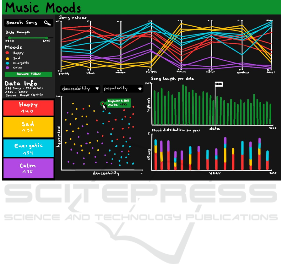
Figure 1: A hand-drawn mockup of the dashboard: The left part of the user interface contains the parameter panel while the
rest of the user interface is used for the multiple and coordinated views on the data (here Spotify data). The currently visible
diagrams are a parallel coordinates plot (PCP), a scatterplot, and two bar charts (the upper one only using the visual variable
length and the bottom one using a stacked variant of the standard bar chart).
2 RELATED WORK
Dashboards (Bach et al., 2023) get more and more in
focus in the field of information visualization (Burch
and Schmid, 2024) since they provide easy-to-create
and easy-to-implement solutions to data problems at
hand. However, the most important aspect in dash-
board design is the phase before starting the im-
plementation in the form of producing source code.
We need some knowledge about the data format and
structure, the hypotheses and research questions as
well as the users of the final tool with their tasks-at-
hand (van Wijk, 2005) to create a successful solution
for data analysis and exploration.
Designing a dashboard combines at least two ma-
jor design problems which come in the form of the
user interface design as well as the design of the dia-
grams (Rosenholtz et al., 2005; Tufte, 1992) with all
of the included visual variables that build a mixture of
parameters with options for changes and adaptations.
But also the interaction techniques (Yi et al., 2007)
and the algorithmic concepts that we typically do not
see in the user interface are of importance to get the
best out of it. To guarantee a suitable outcome for
data analysis and exploration tasks we have to follow
design rules, also focusing on aesthetic criteria (Bar
and Neta, 2006).
We can find lots of dashboard examples, in par-
ticular for applications in information visualization,
however, not many of the designs try to integrate de-
sign rules following interface, visualization, interac-
tion, and algorithmic concepts at the same time. For
example, FitYou (Zacheo et al., 2023) focuses on
health data but it is unclear which of the four afore-
mentioned components the tool focuses on the most.
Another one (Shan, 2023) focuses on health security
attacks without explicitly discussing the data in use
and which algorithms are linked to which interaction
techniques. Soccer athlete data is visually represented
in a dashboard (Boeker and Midoglu, 2023) but the
design and linking of the visualizations and the inter-
actions is not described in much detail.
Apart from dashboards we can find a really long
list of visualization tools, most of them equipped with
complex visualization techniques only understand-
able by expert users, for example in the domain of
IVAPP 2024 - 15th International Conference on Information Visualization Theory and Applications
654

eye tracking (Kurzhals et al., 2017), software visual-
ization (Burch et al., 2017b), or graph and network
visualization (Burch et al., 2017a). There are various
examples in recent years with more and more follow-
ing in the future, but still the design phase is under-
represented, in particular if the focus is on easy-to-
understand visualizations.
3 QUALITATIVE USER
FEEDBACK
We recruited participants working in the field of vi-
sualization to provide qualitative feedback based on
a list of criteria that we took into account when de-
signing a dashboard for data visualization. Since each
user might have a different opinion on the criteria we
averaged the results to get a general impression about
the most relevant criteria before starting a dashboard
design for a visualization tool.
3.1 Hypotheses and Research Questions
The research question in this work focuses on a list of
aspects when developing a visualization tool in form
of a dashboard and asks whether there is a clear or-
der among eight important criteria for such a visual-
ization tool: Easy to understand, application indepen-
dency, interaction techniques, easy to install, comfort-
able data upload, several data perspectives, low costs,
and easy to extend.
Before inviting people to give qualitative feedback
we discussed about hypotheses that describe the out-
come of the summarized qualitative feedback. Based
on that we developed a list of three hypotheses:
• Hypothesis H1. The feedback of the recruited
participants will clearly state that the major point
when developing a visualization tool for their data
is the easy-to-understand character.
• Hypothesis H2. The costs of the developed data
visualization tool will only play a minor role dur-
ing the development and when the tool is finally
used.
• Hypothesis H3. There is a clear order among the
points in the criteria list, that is, not all of the cri-
teria are more or less equally ranked.
3.2 Participants
23 participants took part in the qualitative feedback
experiment. We recruited them by sending emails
containing clear instructions and asking for an order
of the aforementioned criteria. The participants sent
back their impressions as textual feedback that we had
to summarize in numbers and facts. All of the partic-
ipants were aged between 23 and 46 years at an aver-
age of 31.3 years while 9 were female and 14 male.
3.3 Questionnaire, Tasks, and Feedback
We asked the participants to state their age, gender,
and experience in their favorite research field.
The task for them was to return the criteria in de-
creasing order starting with the most relevant one for
a visualization tool focusing an data aspects. More-
over, they were asked to mention additional criteria
that they also identify as relevant and that were not in
the list.
3.4 Results
When evaluating the feedback we mostly focus on the
hypotheses and the research question. We compute a
priority list from the returned order given by the par-
ticipants. To reach this goal we compute the average
place on which a criterion is set in the priority list.
This means the lower the average place of a criterion
is the more it was suggested as being important, that
means it was rated with a higher priority (see Table 1).
Table 1: From the qualitative feedback we created a priority
list for all the eight criteria. The priorities were based on
the average ratings of the participants, hence no individual
opinions are taken into account in this summary.
Criterion Average rating
Easy to understand 2.1
Application independency 3.9
Interaction techniques 4.6
Easy to install 4.9
Comfortable data upload 4.9
Several data perspectives 5.0
Low costs 5.2
Easy to extend 5.3
We see a clear tendency to the criterion that the
tool should be easy to understand which is inline with
hypothesis H1. Also hypothesis H2 can be confirmed
stating that the low costs of the tool are not playing
the biggest role. However, hypothesis H3 must be
rejected. There is no clear order among the criteria.
Only the easy to understand criterion stands out fol-
lowed by the application independency.
The participants also mention that it might be im-
portant in which context the tool is used. For exam-
ple, in an industry context, money does not matter
for the user because the tool’s costs are covered by
the company, however, in a student’s context it might
Dashboard Design: Interactive and Visual Exploration of Spotify Songs
655

be important to get cheap tools since the university is
typically not offering any desired tool for free.
4 DATA AND
TRANSFORMATIONS
The data under investigation in our application exam-
ple contains a list of songs from the platform kag-
gle.com (Musicblogger, 2020) which is freely acces-
sible. The data consists of a mixture of data attributes
in various scale levels with nominal attributes, e.g.
song titles, artists, ids, and mood categories which can
be happy, sad, energetic, and calm.
The major part of the attributes is based on
metrically scalable attributes like popularity, length,
danceability, acousticness, energy, instrumentalness,
liveness, valence, loudness, speechiness, and tempo.
Those describe the measurable musicalic properties
of the songs. Two more ordinal attributes can be
found like key and time signature, as well as the re-
lease date.
In total, the dataset contains 686 lines, i.e. dif-
ferent songs. This number is only a small portion of
the actually existing songs on Spotify since we used
it only for testing purposes. The songs stem from 540
different artists and have been produced in the time
period from 1963 to 2020.
To get the data in the required format for the inter-
active tool we applied some simple algorithmic trans-
formations to it like sorting, data splitting, and catego-
rization, just to mention a few from a long list worth
integrating. Since the focus is on easy to understand
concepts integrated in a dashboard we also take into
account algorithms that are powerful but still useful
by the non-expert users.
5 USER-CENTERED DESIGN
As already described earlier we focus the implemen-
tation on the result of a design phase that ends up in
a hand-drawn mockup of the user interface including
interactive diagrams. Moreover, tasks and hypotheses
play a crucial role when developing the interactive vi-
sualization tool.
5.1 Tasks
We integrate some functionality for at least four major
tasks.
• Mood correlations: We search for a list of songs
with high values for the attributes danceability
and popularity.
• Song lengths: We search for implications that the
average song length decreases during the stream-
ing age (Kopf, 2019).
• Attributes: We search for songs that follow a cer-
tain attribute correlation pattern (tempo, energy
etc.) as well as the different mood categories they
belong to.
• Mood distribution: We are interested in the num-
ber of songs per mood category and what a com-
parison between them will tell us.
5.2 Data Hypotheses
For the analysis of the data we come up with several
hypotheses. Firstly, those are used to guide the dash-
board design. Secondly, they are used to test whether
the tool can be applied to the Spotify data in order to
confirm or reject hypotheses (Keim, 2012).
• Hypothesis 1: Songs in the mood category calm
have been mostly created in the second half of the
time period.
• Hypothesis 2: The analyzed songs get shorter and
shorter in length during the explored time period.
• Hypothesis 3: Songs in the mood category calm
have a large value for the attribute instrumental-
ness compared to songs in the mood category en-
ergetic.
6 DASHBOARD CREATION
To test the earlier mentioned hypotheses, an interac-
tive dashboard was designed (see Figure 1). This con-
tains different diagrams as visualization elements.
The created visualization elements (see Figure 2)
are summarized in a dashboard equipped with several
filter functions. At the top left, moods that can be
selected will be displayed. There is also a button that
can be used to cancel this selection. Directly below
is a date picker with which the displayed songs can
be narrowed down by release date. Below that, basic
information about the data set can be found, such as
the number of songs and artists.
At the bottom of the left hand side is a simple
treemap (Shneiderman, 1996) visualization that per-
forms two tasks in one. On the one hand, the total
number of songs per mood is displayed through four
colored fields. The size of the field indicates the distri-
bution of songs per mood. The exact number of songs
corresponding to this category is displayed by hover-
ing the mouse over a category. On the other hand,
IVAPP 2024 - 15th International Conference on Information Visualization Theory and Applications
656
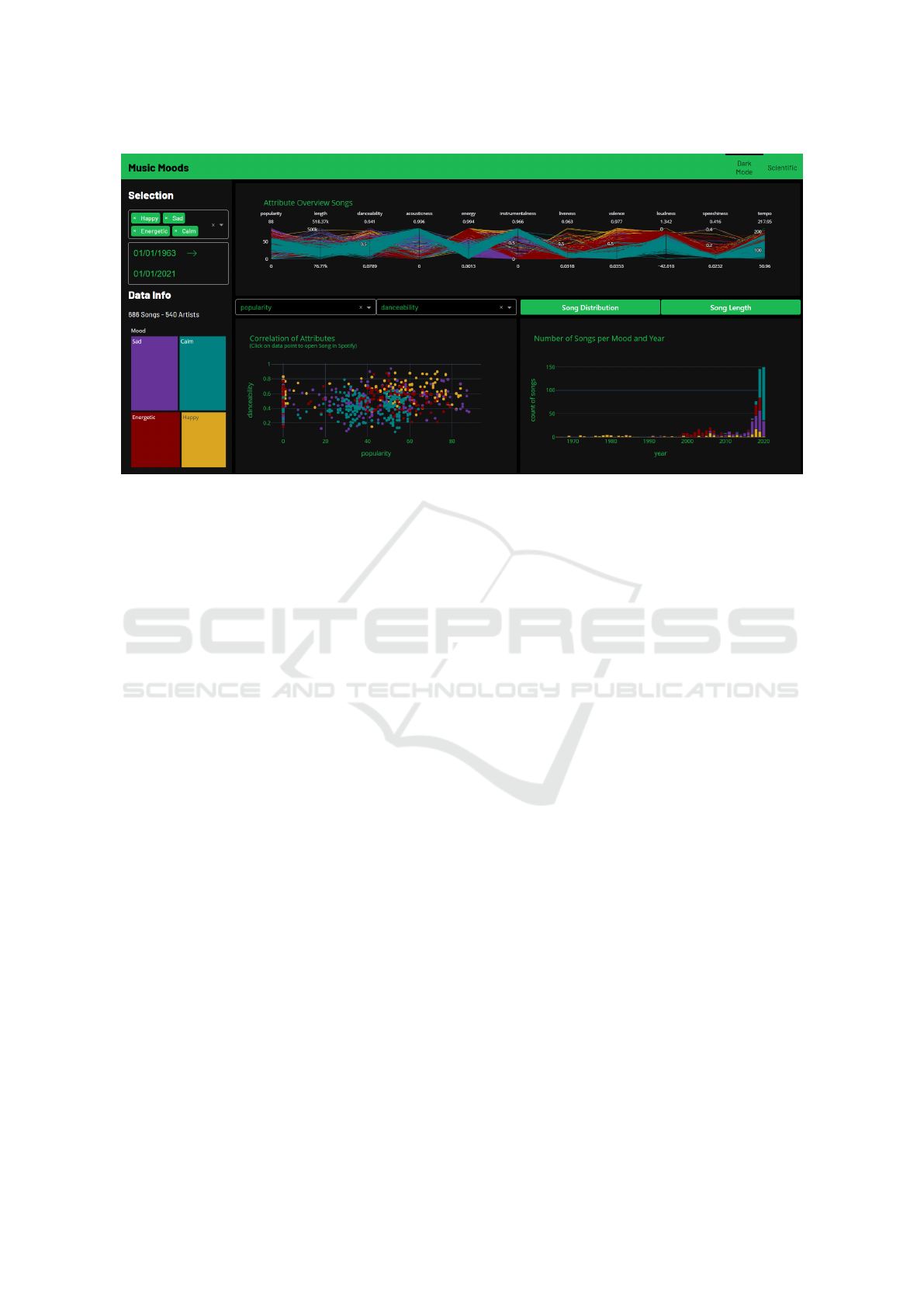
Figure 2: The implemented dashboard based on the design in form of a hand-drawn mockup: We can see that the standard bar
chart as designed in the mockup phase in Figure 1 has been removed and only the stacked bar chart variant is displayed.
the visualization also serves as a legend so that the
mood categories can be identified in the other visual-
izations. This is because the color assignment of the
moods runs through the entire dashboard. The col-
ors of the moods were selected based on color the-
ory (Lundberg, 2022). Accordingly, the color assign-
ment is as follows: happy: yellow, sad: purple, en-
ergetic: red, and calm: green. Shaded colors were
used rather than primary colors for a visually appeal-
ing look.
The core of the dashboard consists of the follow-
ing charts:
• Attribute Overview Songs. This shows which
songs have which attributes and which strengths.
The attributes are lined up one after the other on
several y-axes as parallel coordinates. The advan-
tage of this is that attributes with different value
ranges can be mapped simultaneously. Each song
gets its own polyline. In order to be able to rec-
ognize commonalities of the songs based on their
mood, the songs are color coded, as mentioned
above (Hypothesis 3).
• Correlation of Attributes. At the bottom left,
songs can be displayed and compared in a scat-
ter plot by selecting two categories. On the one
hand, correlations between the two selected at-
tributes can be identified. On the other hand, the
tough color assignment also makes any clusters of
the moods visible.
• Song Distribution. The stacked bar chart shows
how many songs per year of a mood are in the
dataset. This indicates how the moods are dis-
tributed over the individual years. Moreover, it
becomes easy to see if certain moods were more
prevalent than others at a particular time point
(Hypothesis 1).
• Song Length. The bar chart shows the average
song length (y-axis) by release year (x-axis). This
allows us to illustrate the evolution of song lengths
per mood or across all moods over the years (Hy-
pothesis 2).
Switching between the song length diagram and
the song distribution diagram is possible using a but-
ton. This ensured that all visualizations were large
enough and remained legible. The dashboard is based
on Spotify’s corporate design and was therefore de-
signed in the so-called dark mode. However, switch-
ing between dark mode and scientific mode in the
header at the top right is possible if this is appropriate
and user-desired. The latter contains the same func-
tions and color schemes as the dark mode but on a
white background (see Figure 3).
7 INTERACTION TECHNIQUES
The planned functions mentioned above could be im-
plemented in an operational dashboard. In addition to
the functionality of the visualizations, emphasis was
also given to interaction. The color coding of the
moods mentioned above ensures that they can be as-
signed to each other throughout the entire dashboard
and that a uniform image is created.
Parts of the dashboard are designed to be interac-
Dashboard Design: Interactive and Visual Exploration of Spotify Songs
657
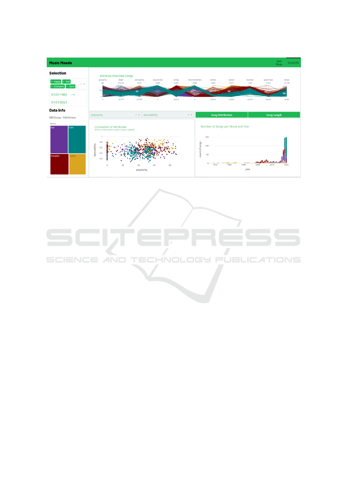
Figure 3: The dashboard in scientific mode, for example by using a different background color
tive to enable individual exploration of the data in the
dataset.
• Mood Filter. At the top left of the diagram, as
already mentioned, individual moods can be se-
lected or deselected. The dashboard will then only
show the songs of the selected moods. At least
one mood must be selected.
• Year Filter. The period to be displayed can be
specified below. This filter also applies to the en-
tire dashboard.
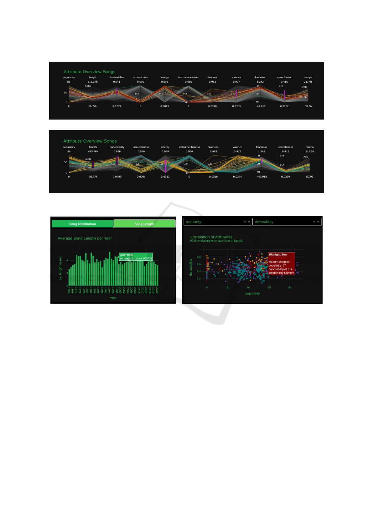
• Manual Adjustments Attributes Overview
Songs. Using the mouse, a range of values of a
desired attribute can be selected. The songs which
are in this range will then be highlighted. Further,
the attributes can be arranged in the desired order
using drag and drop (see Figure 4).
• Further Information on Song Length. Hover-
ing over individual bars displays the year with the
average song length in minutes (see Figure 5 (a)).
• Display Correlation of Attributes. The moods
and periods displayed here can be adjusted using
the filter functions on the left side of the dash-
board. Above the chart, two drop-down menus
can also be used to select the song attributes to be
compared. If a specific value space is to be dis-
played, it can be selected manually by moving the
horizontal or vertical lines. By mouseover over
a displayed point, the values of the attributes, the
song title, and the artist are indicated (see Figure 5
(b)). The user gets a helpful additional feature if
the dashboard is started locally via a Python de-
velopment environment. The corresponding song
is opened in Spotify’s web application by clicking
on a point in the scatter plot. This allows the user
to compare the songs visually and acoustically.
8 ANALYSIS OF PERFORMANCE
Since the data basis for the visualizations is relatively
tiny and the algorithms used belong to the simpler
ones, the response time of the dashboard shows an
expected fast value of 271ms at a maximum. Many
users abort the loading process after waiting for about
two seconds (Guelle, 2022). Therefore, long load-
ing times should be avoided at all costs, suppose too
long loading times still occur when expanding the
database. In that case, they can be reduced by per-
forming the calculations already at the data set level
instead of loading the visualizations, as constructed
for this dashboard.
The dashboard is ideally used on a screen that
measures 15 inches or more. Since there is no re-
sponsive design, not all representations are displayed
as intended on smaller screens. Viewing with mobile
devices such as smartphones is, therefore, only some-
times possible.
9 CONCLUSION AND FUTURE
WORK
In this paper we have shown an approach to create in-
teractive visualization tools in form of dashboards by
using Dash, Plotly, and Python. We start with a de-
sign phase, taking into account tasks and hypotheses,
IVAPP 2024 - 15th International Conference on Information Visualization Theory and Applications
658
(a)
(b)
Figure 4: Manually setting filters in combination with selected moods.
(a) (b)
Figure 5: Two visual insights into the dataset: (a) The average song length when hovering over. (b) Mouseover in a manually
adjusted scatter plot.
and based on that design we start implementing an
interactive visualization tool. The designed and im-
plemented dashboard provides some opportunities to
explore an existing dataset interactively, however, the
visualizations are by no means complete and could
be further expanded. Since the dashboard was devel-
oped for a specific dataset, care should be taken when
extending it to use the same attributes for additional
songs, or even more, for other datasets in the same
data format.
The search for a song is not included in the dash-
board by means of a search window, which is recog-
nizable in the draft. This was omitted because the
dashboard is more about the attributes and moods of
the songs and not necessarily about the ability to find
a specific song.
The selection at the date picker needs to be more
practical due to the default functionalities of Plotly.
The goal would be to set the period via the displayed
windows. However, if data from 2000 to 2010 is to
be displayed, all previous years and months must first
be clicked through. The alternative is to edit the data
directly by typing in the desired span. In this case,
however, the displayed windows are again disturbing.
If there is a possibility to improve this with reason-
able effort in the future, this should be implemented
to increase the usability of the dashboard.
As mentioned, the presented dashboard is only us-
able well over specific screens. Therefore, the dash-
board still needs to be extended with a responsive de-
sign so that the application is possible without prob-
lems with smaller screens and mobile devices.
Dashboard Design: Interactive and Visual Exploration of Spotify Songs
659

To further improve the user experience, imple-
menting an additional feature to listen to songs on
Spotify would be recommended. Moreover, we plan
to evaluate the created dashboard in a user study,
also with eye tracking (Duchowski, 2003; Holmqvist
et al., 2011). Finally, the dashboard should be ex-
tended in a way to make it easy to extend to other
dataset scenarios, i.e. the dashboard might be able to
detect the data types in the dataset and the data for-
mat and based on this, can start with a desired user
interface and visual components.
REFERENCES
Bach, B., Freeman, E., Abdul-Rahman, A., Turkay, C.,
Khan, S., Fan, Y., and Chen, M. (2023). Dashboard
design patterns. IEEE Transactions on Visualization
and Computer Graphics, 29(1):342–352.
Bar, M. and Neta, M. (2006). Humans prefer curved visual
objects. Psychological Science, 17(8):645–648.
Boeker, M. and Midoglu, C. (2023). Soccer athlete data
visualization and analysis with an interactive dash-
board. In Dang-Nguyen, D., Gurrin, C., Larson,
M. A., Smeaton, A. F., Rudinac, S., Dao, M., Trattner,
C., and Chen, P., editors, Proceedings of the Interna-
tional Conference on MultiMedia Modeling, MMM,
volume 13833 of Lecture Notes in Computer Science,
pages 565–576. Springer.
Burch, M. (2022). How students design visual interfaces for
information visualization tools. In Burch, M., Wall-
ner, G., and Limberger, D., editors, Proceedings of the
15th International Symposium on Visual Information
Communication and Interaction, VINCI, pages 1:1–
1:8. ACM.
Burch, M., Hlawatsch, M., and Weiskopf, D. (2017a). Vi-
sualizing a sequence of a thousand graphs (or even
more). Computer Graphics Forum, 36(3):261–271.
Burch, M., Raschke, M., Zeyfang, A., and Weiskopf, D.
(2017b). A scalable visualization for dynamic data in
software system hierarchies. In Proceedings of IEEE
Working Conference on Software Visualization, VIS-
SOFT, pages 85–93.
Burch, M. and Schmid, M. (2024). Dashboard Design.
River Publishers.
Duchowski, A. T. (2003). Eye Tracking Methodology - The-
ory and Practice. Springer.
Guelle, R. (2022). Pagespeed optimierung: Wie kann ich
meine website ladezeit verbessern? https://de.ryte.co
m/magazine/pagespeed-optimierung-wie-kann-ich
-die-ladezeit-meiner-webseite-verbessern Accessed:
December, 2022.
Heinrich, J., Seifert, R., Burch, M., and Weiskopf, D.
(2011). Bicluster viewer: A visualization tool for an-
alyzing gene expression data. In Proceedings of Ad-
vances in Visual Computing - 7th International Sym-
posium, ISVC, pages 641–652.
Holmqvist, K., Nystr
¨
om, M., Andersson, R., Dewhurst, R.,
Jarodzka, H., and van de Weijer, J. (2011). Eye Track-
ing: A Comprehensive Guide to Methods and Mea-
sures. Oxford University Press.
Keim, D. A. (2012). Solving problems with visual ana-
lytics: Challenges and applications. In Proceedings
of Machine Learning and Knowledge Discovery in
Databases - European Conference, pages 5–6.
Kopf, D. (2019). The economics of streaming is making
songs shorter. https://qz.com/1519823/is-spotify-mak
ing-songs-shorter Accessed: November, 2022.
Kurzhals, K., Burch, M., Blascheck, T., Andrienko, G., An-
drienko, N., and Weiskopf, D. (2017). A task-based
view on the visual analysis of eye tracking data. In
Burch, M., Chuang, L., Fisher, B., Schmidt, A., and
Weiskopf, D., editors, Eye Tracking and Visualization,
pages 3–22. Springer.
Lundberg, A. (2022). Die bedeutung der farben und die
kunst, farbsymbolik anzuwenden. https://99design
s.de/blog/design-tipps/bedeutung- der- farben/#red
Accessed: December, 2022.
Musicblogger (2020). Spotify music data to identify the
moods. https://www.kaggle.com/datasets/musicb
logger/spotify- music-data-to- identify-the-moods
Accessed: November, 2022.
Roberts, J. C. (2003). Guest editor’s introduction: spe-
cial issue on coordinated and multiple views in ex-
ploratory visualization. Information Visualization,
2(4):199–200.
Rosenholtz, R., Li, Y., Mansfield, J., and Jin, Z. (2005).
Feature congestion: A measure of display clutter. In
Proceedings of the SIGCHI Conference on Human
Factors in Computing Systems, pages 761–770. ACM.
Shan, M. (2023). Real-time monitoring of health security
attacks with r-based data visualization dashboard. In
Wang, M. D. and Yoon, B., editors, Proceedings of the
14th ACM International Conference on Bioinformat-
ics, Computational Biology, and Health Informatics,
BCB, page 89:1. ACM.
Shneiderman, B. (1996). The eyes have it: A task by
data type taxonomy for information visualizations. In
Proceedings of the IEEE Symposium on Visual Lan-
guages, pages 336–343.
Tufte, E. R. (1992). The Visual Display of Quantitative In-
formation. Graphics Press.
van Wijk, J. J. (2005). The value of visualization. In Pro-
ceedings of the 16th IEEE Visualization Conference,
IEEE VIS, pages 79–86. IEEE Computer Society.
Ware, C. (2004). Information Visualization: Perception for
Design. Morgan Kaufmann.
Ware, C. (2008). Visual Thinking: for Design. Morgan
Kaufmann Series in Interactive Technologies, Paper-
back.
Yi, J. S., ah Kang, Y., Stasko, J. T., and Jacko, J. A.
(2007). Toward a deeper understanding of the role
of interaction in information visualization. IEEE
Transactions on Visualization and Computer Graph-
ics, 13(6):1224–1231.
Zacheo, G., Buzimkic, A., Roi, A. L., van Schie, A., Staudt,
Y., and Burch, M. (2023). FitYou: A personalized
dashboard for health data. In Malina, R., Zhang, K.,
Zeng, W., and Wallner, G., editors, Proceedings of the
16th International Symposium on Visual Information
Communication and Interaction, VINCI, pages 4:1–
4:5. ACM.
IVAPP 2024 - 15th International Conference on Information Visualization Theory and Applications
660
