
Spatial-Temporal Visualization Tool for Hospital Support for Infection
Spread and Outbreaks
Denisse Kim
1 a
, Manuel Campos
1,2 b
, Bernardo Canovas-Segura
1 c
and Jose M. Juarez
1 d
1
Med AI Lab, University of Murcia, Campus Espinardo, Murcia, 30100, Spain
2
Murcian Bio-Health Institute (IMIB-Arrixaca), El Palmar, Murcia, 30120, Spain
Keywords:
Visualization Application, Infection Control, Outbreak, Health, Hospital-Acquired Infection.
Abstract:
Hospital-acquired infections (HAIs) are a major concern today, especially when related to multidrug-resistant
bacteria, as they are associated with increases in healthcare costs, prolonged length of stay, and attributable
mortality. Tracking the presence of these infections requires interweaving spatial-temporal information from
patients and microbiological laboratory results. However, this is normally a manual process and the big
amounts of daily clinical data makes it error-prone and time-consuming. In these processes, the temporal
dimension is usually taken into account, but not the topology and spatial distribution of patients within a hos-
pital building. Interactive Information Visualization can be used to bring together information from various
data sources and to make these spatial-temporal relationships understandable to the human eye. We propose a
new interactive visual tool for the exploration of infection spreads within hospitals. The tool presents several
connected views to help analyze the epidemic situation of a hospital over time and understand the information
contained in the epidemiological indicators.
1 INTRODUCTION
Multidrug-resistant microorganisms are a growing
challenge for public health since their treatment is
a complex process. These types of microorganisms
have also a high impact on hospital-acquired infec-
tions (HAIs) (Cassini et al., 2019), as infections
caused by these pathogens are associated with in-
creases in healthcare costs, prolonged length of stay
and attributable mortality (Serra-Burriel et al., 2020).
In a healthcare setting, pathogens can be transmit-
ted from contact with an infected patient, a health-
care worker, or a contaminated environment (Mone-
gro et al., 2023). Tracking the presence of these in-
fections requires interweaving spatial-temporal infor-
mation about the patients and microbiological labora-
tory results. However, the large amounts of clinical
data that are captured daily pose some challenges and
make the process error-prone and time-consuming to
clinicians in the task of combining this information
to make any inference, and to hospital administrators
a
https://orcid.org/0000-0002-1790-372X
b
https://orcid.org/0000-0002-5233-3769
c
https://orcid.org/0000-0002-0777-0441
d
https://orcid.org/0000-0003-1776-1992
in their decision-making processes (Caban and Gotz,
2015).
The development of interactive Information Visu-
alization can help overcome this information overload
(Rind et al., 2010) and discover new knowledge, such
as patterns in the clustering of the pathogen and the
transmission among patients. However, current ap-
proaches tend to study diseases at the population level
in geographic areas, rather than local spatial-temporal
studies at the building level.
We introduce a new interactive visual tool for the
exploration of infection spreads inside hospitals. The
tool presents several connected views to help analyze
the epidemic situation of a hospital through time and
understand the information contained in epidemiolog-
ical indicators. In this paper, we describe the tasks
and requirements defined with experts in epidemiol-
ogy and hospital management, and we present the
views developed to perform these tasks as well as the
interactions between them and with the user.
2 RELATED WORK
The development of visualization tools for epidemi-
ologists and policy-makers has focused mainly on
308
Kim, D., Campos, M., Canovas-Segura, B. and Juarez, J.
Spatial-Temporal Visualization Tool for Hospital Support for Infection Spread and Outbreaks.
DOI: 10.5220/0012312600003657
Paper published under CC license (CC BY-NC-ND 4.0)
In Proceedings of the 17th International Joint Conference on Biomedical Engineering Systems and Technologies (BIOSTEC 2024) - Volume 2, pages 308-314
ISBN: 978-989-758-688-0; ISSN: 2184-4305
Proceedings Copyright © 2024 by SCITEPRESS – Science and Technology Publications, Lda.

the task of disease surveillance over a population.
In these developments, the spatial-temporal informa-
tion of a disease normally describes the evolution and
spread at the population level for a post-analysis of
what happened usually in a geographic area (Chori-
anopoulos and Talvis, 2016; Sakai et al., 2004; Su
et al., 2021). However, despite the increasing ac-
knowledgment of the importance of tracing people
for the study of the spread of infections in recent
years, very little has been done on the analysis of con-
tacts and spread of diseases at the individual level and
taking into account the spatial characteristics of the
building they are in over time (Oppermann and Mun-
zner, 2020), especially in hospital environments.
Regarding the representation of the spatial topol-
ogy and data in buildings, Opperman and Munzner
(Oppermann and Munzner, 2020) presented a set of
visual decision-support tools centered around occu-
pancy data for management and planning in buildings.
However, their goal is to visualize non-trajectory
spatial-temporal data relating to large-scale indoor en-
vironments. Another example is the one presented by
K
¨
onig et al. (K
¨
onig et al., 2021), which is an interac-
tive visualization system that uses a 3D representation
of building interiors for a unified sensor data display
(e.g. temperature or humidity).
Regarding the development of visual analytics for
contact tracing and epidemiological studies, Baum-
gartl et al. (Baumgartl et al., 2021) presented a visual
analytics approach to support the analysis and recon-
struction of transmission pathways, patient contacts,
and the progression of an outbreak at the patient level.
They designed multiple specialized views and high-
lighted their adaptation of the storyline visualization
for contact tracing. Their views include an epidemic
curve, a contact network, a timeline, and a storyline-
like view. M
¨
uller et al. (M
¨
uller et al., 2020) applied
an RNN model for the detection of potential infec-
tions, transmissions, and infection factors, and they
proposed a visual interface to explore the model re-
sults. Sondag et al. (Sondag et al., 2022) presented
a visual analytics approach for the inspection of in-
fection maps in an evolving emergency response sit-
uation. They introduce the concept of representative
trees to visualize a time-varying infection map of dis-
ease spread, and interactive visualization techniques
for the assessment of different control policies.
3 METHODS
3.1 Data
To carry out the study of the spread of a disease and
the presence of infectious outbreaks in hospitalized
patients, it is necessary to intertwine microbiologi-
cal reports with the spatial and temporal localization
of patients. This consists of a complex and time-
consuming process that is not usually found in real
open datasets, both due to the challenge of recording
it and the privacy problems it can involve.
To assess the tool, we study the spread of the
Clostridioides Difficile (CD) pathogen in a hospital
setting. The CD is the main cause of infectious diar-
rhea in hospitalized patients, with increasing rates of
mortality, incidence, and hospitalizations (Hota et al.,
2012). The choice of the best method for its treatment
continues to be a topic of debate today, while its inci-
dence increases, reaching values of 92 per 100,000 in-
habitants in North America and Europe (Lital Meyer
et al., 2014).
To represent the transmission of this pathogen at
a high level of detail, we use a realistic generated
dataset of patients with their information (i.e. demo-
graphic data, length of stay, admission day, and in-
formation about their treatment, among others). In
each moment, these patients are in a bed of a ser-
vice (this service can be a Ward, the ICU, the ER,
a Radiology Room or an Operating room) and have
a state of health. This state takes its values from the
SEIRD (Susceptible, Exposed, Infected, Recovered,
Dead) epidemiological model (Brauer, 2008), which
we adapted to the infection we are dealing with. In
this case, we included the NS (non-susceptible) state
for those that have immunity, and the possibility of
being already colonized in newly admitted patients.
We generated this dataset with a simulation model,
that combines an agent-based model with an adapta-
tion of the SEIRD epidemiological model(Kim et al.,
2023).
In our simulation, time is discrete, divided into
steps or periods. During each step, patients can move
from one room to another, their states of health can
change, and places can be infected or decontaminated.
Steps are tuned to 8 hours, representing usual work
shifts. For each step, information about the patients
and places is saved: whether there are newly admitted
or discharged patients, what movements took place,
which places were contaminated or cleaned, and in
what state of health each patient is. For further de-
tails, we refer the reader to (Kim et al., 2023).
Spatial-Temporal Visualization Tool for Hospital Support for Infection Spread and Outbreaks
309

3.2 User Tasks
With the help of epidemiologists, we have defined a
series of tasks that they need to perform in order to de-
tect when and where the infection transmissions take
place and how infectious outbreaks originate. To be
able to understand the final action that experts must
carry out to complete each task, we applied the frame-
work defined by Munzner (Munzner, 2009), which
is useful for describing the reason why each visual-
ization is necessary, thus it helps differ between the
many goals the tool will have. With this framework,
we transformed the description of each task from a
domain-specific language to a more abstract form,
thus we could see similarities and differences between
them. In this way, we avoid redundancies and over-
lapped tasks. The resulting tasks are presented below,
an example of this process is presented in T1:
T1. Analysis of the situation of the infection in
diverse places in the hospital over time. To identify
and compare the epidemic state of the hospital
between different places and over time using several
epidemiological indicators, which were discussed
and chosen with the experts. These are mortality
rate, incidence, incidence density, period prevalence,
and point prevalence (e.g. when are there more
deceased? Which service presents more incidence?).
Application of Munzner’s framework:
• High level of abstraction: to discover new infor-
mation and generate or verify a hypothesis.
• Mid level of abstraction: to locate cases in the
hospital, the targets are known, but not the loca-
tions.
• Low level of abstraction: to summarize cases and
show an overview of all possible targets.
T2. Detection of sources of infection in a period of
time. To discover when and where the first concen-
trations of cases occurred, this is, to locate the focal
point of the infection.
T3. Detection of sources of infection in a point of
time. To trace and identify when and where the first
case of infection occurred and how the spread took
place from there by locating the first patient that
appears infected.
T4. Study of potential outbreaks. To discover whether
or not an outbreak occurred in those concentrations
of cases. The definition of infectious outbreak de-
pends on the pathogen that is being studied: in the
case of the CD, an outbreak is defined as three or
more epidemiologically linked cases within a period
of seven days or fewer (West Virginia Bureau for Pub-
lic Health, 2013).
3.3 Tools
We developed the visual tool in the game engine
Unity 3D with C#. This allowed us to create a 3D
representation of a hospital and to show from dif-
ferent perspectives the topology and the interactions
between patients at a low level of abstraction, which
would ease the tracing of the disease. We modeled the
different parts of the hospital and beds with Blender,
and we used PostgreSQL for data persistence. This
way, we could study diverse scenarios and make sev-
eral tests by running the simulator and saving the
newly generated datasets in a database automatically.
4 PROPOSED DESIGN
Based on the defined tasks, we present an interac-
tive visual tool that has three main views (Figure 1):
the Hospital view, which shows information about
the spread of the disease in a spatial and temporal
plane; the Epi view, which shows temporal informa-
tion regarding calculated epidemiological indicators;
and the Tabular view, which shows the values of said
epidemiological indicators of the hospital in a tabular
format sorted by location and time. Next, we are go-
ing to analyze each one in detail and, afterwards, to
list the interactions that the user can perform with the
visual tool.
4.1 Hospital View
The Hospital view shows the patients’ movements at a
low level of abstraction, as well as the evolution of the
endemic situation of the places on a 3D representation
of the hospital (Tasks 1-3). This view is composed of
the visualization of the hospital and a toolbar, which
allows the user to perform certain actions (Figure 1a).
The 3D hospital allows to analyze the spatial distri-
bution of patients at each moment, study where in-
fected patients are located at an individual level, what
contacts occur (i.e. when do they share a room), and
where a greater number of patients are concentrated
in different ranges of time.
Patients can be in one state of health at a time,
which is color-coded: green represents susceptible
patients, yellow exposed patients, red infected pa-
tients, purple recovered patients, black deceased pa-
tients, and blue non-susceptible patients. Through
user-controlled animations, we can identify which
HEALTHINF 2024 - 17th International Conference on Health Informatics
310
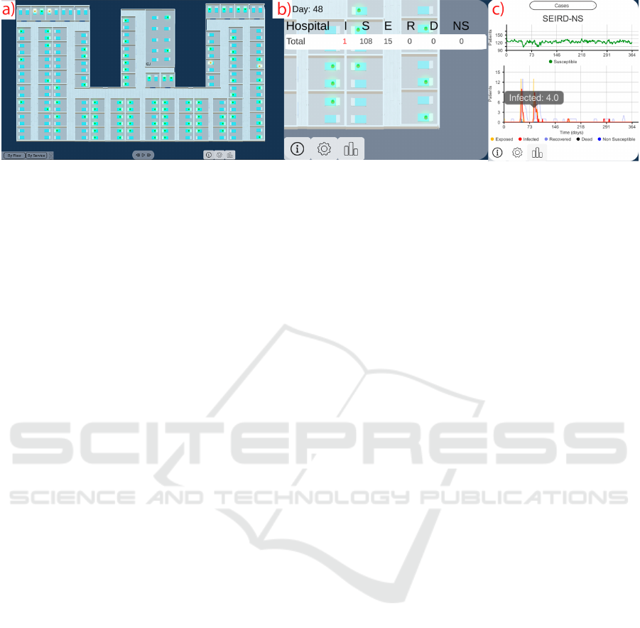
Figure 1: The interactive visual interface. (a) The Hospital view shows the spread of the disease in a 3D spatial-temporal
representation. (b) The Tabular view shows the information of the other views in a tabular format. (c) The Epi view shows the
epidemiological indicator selected by the user.
rooms and services the patients went to and how the
infection evolved.
4.2 Epi View
The Epi view helps to study the evolution of the dis-
ease (Tasks 1, 4). In this view, the user can analyze
several epidemiological indicators using line charts
(Figure 1c): on the one hand, cases and point preva-
lence, that are displayed by day; on the other hand,
incidence, period prevalence, mortality rate and in-
cidence density, which are calculated by week. We
present the cases in the SEIRD-NS format, which
means, showing the number of patients in each state
of health by day. Thus, it is possible to have a general
view of the situation throughout the entire simulation,
and then focus on a period of time by means of se-
mantic zooming (Figure 2). Besides this, by hovering
at each point we are able to see detailed information
at each moment of time.
4.3 Tabular View
The Tabular view allows an analysis of the disease
present in the hospital with daily aggregated informa-
tion in space (Tasks 1, 2). In this view (Figure 3),
the user can choose to see an epidemiological indi-
cator (i.e. cases, mortality rate, incidence, incidence
density, period prevalence, and point prevalence) cal-
culated over the entire hospital or grouped by floor or
service (Figure 3). In the case of the latter, the differ-
ent services are color-coded in coordination with the
Hospital view, thus making it easier to locate them on
the map.
4.4 Interactions
In this section, we describe the interactions between
the user and the tool, as well as between the visual
components. The tasks that epidemiologists and hos-
pital administrators have to carry out are complex in
themselves, and searching for a case of infection in
a hospital with 200 or more beds can be a long and
consuming process. To assist in this work, we have
applied a segmented color scale to easily identify the
different states of health of each patient as indicated
by Aigner et al. (Aigner et al., 2011). In this way,
it is possible to see when transmissions happen – i.e.
when a patient is red (infected) and a roommate turns
yellow (exposed or incubating) –, and which patients
might be future cases (those in yellow) that could sup-
port the spread. This also connects with the Epi view,
in which we use the SEIRD-NS model obtained from
the input data to represent the evolution of cases. In
this model, we encode each state of health with the
same color as in the Hospital view.
The Hospital view gives the user an overview of
the space and allows them to interact with the cam-
era by movements to go to one area or another, zoom
in and out, or rotate to see from another angle. It
is well known that the use of 3D representations can
lead to problems of occlusion, perspective distortions,
and shadows, among others (Munzner, 2015). In or-
der to avoid these problems, we have implemented an
orthographic camera, thus objects are rendered uni-
formly, without a sense of perspective.
In this view, the user can also perform other inter-
actions, such as changing between the hospital floors
to see one or another; advance, go back, pause, or re-
sume the animation of the simulation; and advance
or go back step by step in the simulation without the
need for animation.
The user can also filter out the information that
does not interest them at that moment (Shneiderman,
1996). This is possible by means of a toolbar, in
which they can filter the patients by a range of age,
gender, and state of health. The filtering is applied
to the 3 views. Besides this, users can also perform
zoom actions as defined by Shneiderman (Shneider-
man, 1996) to focus on subsets of patients, by being
able to distinguish patients’ transitions between dif-
Spatial-Temporal Visualization Tool for Hospital Support for Infection Spread and Outbreaks
311
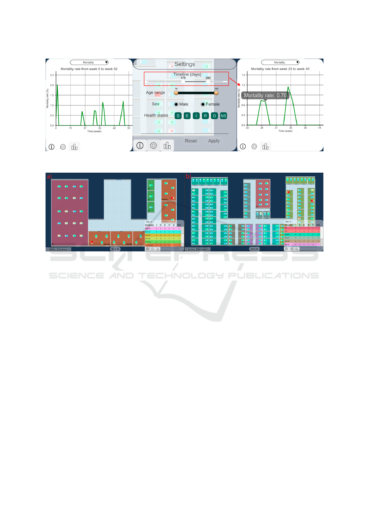
Figure 2: Semantic zooming process. At first, the user will see the epidemiological indicator for the whole period of time.
Through a timeline, they can choose the range of time they want to study, and this will be applied to the Epi view.
Figure 3: Tabular view shown with the Hospital view with several infected patients zooming by service. (a) First floor
containing the remaining services (ER, Radiology and Surgery). (b) Second floor containing the Wards and the ICU.
ferent categories. This is done by highlighting infor-
mation by floor or service to see changes in specific
different areas (Figure 3).
5 DISCUSSION
We have developed an interactive visual tool for the
analysis of the spread of a disease by multidrug-
resistant bacteria, and the investigation of infectious
outbreaks inside hospitals. This tool focuses on the
spatial and temporal dimensions of the movements of
hospitalized patients, as well as on the information
provided by calculated epidemiological indicators.
When developing a medical visual tool, one of the
main risks is the treatment of real clinical data. This
can lead to problems regarding data quality, bias, or
patient privacy, among others (WHO, 2023). By us-
ing realistic data generated with a simulation model
(Kim et al., 2023), we have avoided these problems
associated with handling sensitive and sometimes in-
complete data. Through the use of synthetic data, we
can know exactly where the patients were when their
states of health changed. Regarding applying the tool
to real data, there would be no differences between
a simulated and a real environment in which the data
was obtained with the same precision. Although we
built the tool with simulated data, the current imple-
mentation provides the integration of data from log
files and relational databases, allowing the integration
from both simulated data and real health information
systems.
The use of Unity for the development involved
both advantages and limitations. Unity is a platform
prepared for developing a 3D tool, so it offers a wide
variety of libraries and great efficiency in its compi-
lation time. However, it is not intended for data visu-
alization, and so the asset store does not count with a
great range of chart packages.
Furthermore, the scalability in the hospital mod-
eling entails a challenge and a possible limitation of
this tool. Nevertheless, we are working on an autom-
atization of the creation of hospital floors with their
rooms with beds in the necessary arrangements (i.e.
orientation and position). The hospital presented in
Figure 3 was created in this way.
This visual tool can have applications in health
and in education: it can be used by epidemiolo-
HEALTHINF 2024 - 17th International Conference on Health Informatics
312

gists and administrators in hospitals in their decision-
making process (e.g. better admission control in the
ER, more isolation of infected patients, or greater care
in the movement of at-risk patients). It can also be ap-
plied, for example, in the Objective Structured Clin-
ical Examination (OSCE), where the skills acquired
by students upon completing their medical degree are
evaluated. In these tests, they create simulated sce-
narios and students must make a series of decisions
as doctors.
Our following step is to validate the visual tool
by means of qualitative evaluations with specialized
users to ensure its usability and usefulness.
6 CONCLUSIONS
In this paper, we propose a decision-support visual
tool to help intertwine the spatial-temporal locations
of hospitalized patients with information about their
health conditions during the spread of an infection
by multidrug-resistant bacteria. To do this, the tool
combines several views which include a 3D visualiza-
tion of a hospital, a 2D visualization of the temporal
progression of the disease, and a tabular visualization
to detail the information depicted in the other views.
The interactivity of the created 3D model allows for
a faithful representation of the movements and the in-
fection processes, while the use of widespread charts
can help understand the temporal progress through
epidemiological indicators. The tasks were defined
together with epidemiologists from hospitals from
Murcia, and we consider that this tool is going to be of
utility in different areas (infection control, decisions
in a hospital, teaching). Our next step is to validate
the usefulness and usability of the tool with said users.
ACKNOWLEDGEMENTS
This work was partially funded by the CON-
FAINCE project (Ref: PID2021-122194OB-I00) by
MCIN/AEI/10.13039/501100011033 and by ”ERDF
A way of making Europe”, by the ”European
Union” or by the ”European Union NextGenera-
tionEU/PRTR”. This research is also partially funded
by the FPI program grant (Ref: PRE2019-089806).
REFERENCES
Aigner, W., Miksch, S., Schumann, H., and Tominski, C.
(2011). Visualization of Time-Oriented Data. Human-
Computer Interaction Series. Springer, London.
Baumgartl, T., Petzold, M., Wunderlich, M., H
¨
ohn, M.,
Archambault, D., Lieser, M., Dalpke, A., Schei-
thauer, S., Marschollek, M., Eichel, V. M., Mut-
ters, N. T., Consortium, H., and von Landesberger, T.
(2021). In Search of Patient Zero: Visual Analytics of
Pathogen Transmission Pathways in Hospitals. IEEE
Transactions on Visualization and Computer Graph-
ics, 27(2):711–721.
Brauer, F. (2008). Compartmental Models in Epidemiology.
Mathematical Epidemiology, 1945:19–79.
Caban, J. J. and Gotz, D. (2015). Visual analytics in health-
care – opportunities and research challenges. Jour-
nal of the American Medical Informatics Association,
22(2):260–262.
Cassini, A., H
¨
ogberg, L. D., Plachouras, D., Quattrocchi,
A., Hoxha, A., Simonsen, G. S., Colomb-Cotinat,
M., Kretzschmar, M. E., Devleesschauwer, B., Cec-
chini, M., Ouakrim, D. A., Oliveira, T. C., Strue-
lens, M. J., Suetens, C., and Monnet, D. L. (2019).
Attributable deaths and disability-adjusted life-years
caused by infections with antibiotic-resistant bacteria
in the EU and the European Economic Area in 2015:
a population-level modelling analysis. The Lancet. In-
fectious Diseases, 19(1):56–66.
Chorianopoulos, K. and Talvis, K. (2016). Flutrack.org:
Open-source and linked data for epidemiology. Health
informatics journal, 22(4):962–974.
Hota, S. S., Achonu, C., Crowcroft, N. S., Harvey, B. J.,
Lauwers, A., and Gardam, M. A. (2012). Determining
Mortality Rates Attributable to Clostridium difficile
Infection. Emerging Infectious Diseases, 18(2):305–
307.
Kim, D., Canovas-Segura, B., Jimeno-Almaz
´
an, A., Cam-
pos, M., and Juarez, J. M. (2023). Spatial-temporal
simulation for hospital infection spread and outbreaks
of Clostridioides difficile. Scientific Reports, 13(1).
Number: 1 Publisher: Nature Publishing Group.
K
¨
onig, B., Limberger, D., Klimke, J., Hagedorn, B., and
D
¨
ollner, J. (2021). RoomCanvas: A Visualization Sys-
tem for Spatiotemporal Temperature Data in Smart
Homes. The Eurographics Association.
Lital Meyer, S., Ricardo Espinoza, A., and Rodrigo Quera,
P. (2014). Infecci
´
on por clostridium difficile: epidemi-
olog
´
ıa, diagn
´
ostico y estrategias terap
´
euticas. Revista
M
´
edica Cl
´
ınica Las Condes, 25(3):473–484. Pub-
lisher: Elsevier.
Monegro, A. F., Muppidi, V., and Regunath, H. (2023).
Hospital-Acquired Infections. In StatPearls. Stat-
Pearls Publishing, Treasure Island (FL).
Munzner, T. (2009). A Nested Model for Visualization De-
sign and Validation. IEEE Transactions on Visualiza-
tion and Computer Graphics, 15(6):921–928.
Munzner, T. (2015). Visualization Analysis and Design. A
K Peters/CRC Press.
M
¨
uller, M., Petzold, M., Wunderlich, M., Baumgartl, T.,
H
¨
ohn, M., Eichel, V., Mutters, N. T., Scheithauer, S.,
Marschollek, M., and Landesberger, T. v. (2020). Vi-
sual Analysis for Hospital Infection Control using a
RNN Model. The Eurographics Association.
Spatial-Temporal Visualization Tool for Hospital Support for Infection Spread and Outbreaks
313

Oppermann, M. and Munzner, T. (2020). Ocupado: Vi-
sualizing Location-Based Counts Over Time Across
Buildings. Computer Graphics Forum, 39(3):127–
138.
Rind, A., Miksch, S., Aigner, W., Turic, T., and Pohl, M.
(2010). Visuexplore: Gaining new medical insights
from visual exploration. pages 149–152.
Sakai, T., Suzuki, H., Sasaki, A., Saito, R., Tanabe, N., and
Taniguchi, K. (2004). Geographic and temporal trends
in influenzalike illness, Japan, 1992-1999. Emerging
infectious diseases, 10(10):1822–1826.
Serra-Burriel, M., Keys, M., Campillo-Artero, C., Agodi,
A., Barchitta, M., Gikas, A., Palos, C., and L
´
opez-
Casasnovas, G. (2020). Impact of multi-drug re-
sistant bacteria on economic and clinical outcomes
of healthcare-associated infections in adults: Sys-
tematic review and meta-analysis. PLoS ONE,
15(1):e0227139.
Shneiderman, B. (1996). The eyes have it: A task by data
type taxonomy for information visualizations. In Pro-
ceedings 1996 IEEE symposium on visual languages,
pages 336–343. IEEE.
Sondag, M., Turkay, C., Xu, K., Matthews, L., Mohr, S.,
and Archambault, D. (2022). Visual Analytics of Con-
tact Tracing Policy Simulations During an Emergency
Response. Computer Graphics Forum, 41(3):29–41.
Su, W., Fu, W., Kato, K., and Wong, Z. S.-Y. (2021). Japan
LIVE Dashboard for COVID-19: A Scalable Solution
to Monitor Real-Time and Regional-Level Epidemic
Case Data. Studies in health technology and infor-
matics, 286:21–25. Place: Netherlands.
West Virginia Bureau for Public Health (2013). Guidelines
for Clostridium difficile (C. diff) Outbreaks in Long-
Term Care Facilities (LTCFs). (Last access Sep 26,
2023).
WHO (2023). Ethics and governance of artificial intelli-
gence for health.
HEALTHINF 2024 - 17th International Conference on Health Informatics
314
