
Flowstrates++: An Approach to Visualize Multi-Dimensional OD Data
Nicolas Fuchs, Pierre Vanhulst
a
, Rapha
¨
el Tuor
b
and Denis Lalanne
c
Human-IST Institute, Universit
´
e of Fribourg, Boulevard de P
´
erolles 90, Fribourg, Switzerland
Keywords:
Human-Centered Computing, Visualization Design And Techniques, Evaluation Methods.
Abstract:
Is it possible to visualize complex Origin-Destination (OD) data along with relevant spatio-temporal data?
In this paper, we tackle this issue by presenting Flowstrates++, an augmented version of Flowstrates which
aims to visualize additional time-series datasets linked with OD data. On top of Flowstrates’ heatmap, we
designed a second heatmap for spatio-temporal data, synchronized on the temporal axis, as well as other
dataset comparison features. Two versions of Flowstrates++ have been designed and implemented: Switch,
that displays one external dataset at a time, and Combi (for ”combined”), that displays two external datasets
at the same time. We aimed to assess to which extent both variants spur users into making multidimensional
findings. To achieve this goal, we evaluated both variants with ninety participants: ten were pilot users in
live remote sessions, and eighty were provided by Prolific.co, a crowd-sourcing platform. In a within-groups
study, these participants were asked to take relevant annotations about the data on both variants, and to evaluate
them through a survey. We then classified the annotations using a framework whose validity was evaluated
with an Intercoder Agreement and Fleiss’ Kappa. We found that the Combi variant yielded consistently better
results, both in terms of number of produced multidimensional annotations, and in terms of appreciation of the
participants. Yet regardless of the variant, our solution allows users to highlight potential correlations between
time-series data and temporal OD data.
1 INTRODUCTION
For several decades, the domain of Origin-
Destination (OD) Data has seen the rise of various
visualization paradigms that allow one to process
and understand large flows of data across time.
Researchers using these visualizations would usually
formulate hypotheses that require confirmations
through external sources of knowledge: for in-
stance, one could correlate a reduction in outbound
migration from a given country with the political
response of its government after a given climatic
disaster. This study aimed to enhance the afore-
mentioned visualization paradigms, so that they
would display such information directly. But what
would be the impact of this additional information
on the user engagement? Would it be considered
too cumbersome and cluttered? And to what extent
would this ”augmented” visualization actually foster
multi-dimensional observations?
a
https://orcid.org/0000-0001-5176-8579
b
https://orcid.org/0000-0002-5276-2459
c
https://orcid.org/0000-0001-7834-0417
We aim to explore these questions with this arti-
cle. The present paper comprises a literature review,
first describing some of the many existing methods for
visualizing flow data, then compiling a list of eval-
uation systems that can be used to assess, as objec-
tively as possible, the relevance of a new visualiza-
tion paradigm. The second section is dedicated to our
proposal, Flowstrates++ (Fuchs, 2022). It comprises
a presentation of its design rationale followed by the
presentation of the program interaction capabilities.
The third section describes the user study that was
carried out in order to validate our hypotheses. We
break down this extensive section in three: first, we
detail the environment and settings of the experiment.
Then, we describe our evaluation method based on
Fleiss’ Kappa (Fleiss, 1971). Finally, we present our
results. The last section of this paper opens up a dis-
cussion based on our results, highlighting new venues
for further improvements of Flowstrates++.
Fuchs, N., Vanhulst, P., Tuor, R. and Lalanne, D.
Flowstrates++: An Approach to Visualize Multi-Dimensional OD Data.
DOI: 10.5220/0012252300003660
Paper published under CC license (CC BY-NC-ND 4.0)
In Proceedings of the 19th International Joint Conference on Computer Vision, Imaging and Computer Graphics Theory and Applications (VISIGRAPP 2024) - Volume 1: GRAPP, HUCAPP
and IVAPP, pages 625-636
ISBN: 978-989-758-679-8; ISSN: 2184-4321
Proceedings Copyright © 2024 by SCITEPRESS – Science and Technology Publications, Lda.
625

2 LITERATURE REVIEW
2.1 Visualization Methods
Dynamic geospatial network representation is a sub-
category of network representation. Such a network
consists of nodes with a position in a given space, and
links between them. Because a network is dynamic,
links and nodes are time-evolving: they may, or not,
exist at some point in time. Links themselves can be
binary or weighted.
The visualization of dynamic geospatial network
data poses several challenges, and literature reports
that no visualization method is satisfactory to repre-
sent both the spatial and temporal dimensions (An-
drienko et al., 2017). Three main techniques al-
low one to represent dynamic geospatial network
data (Kjellin et al., 2008): 2D map projections, an-
imations, and space-time cubes. In this section, we
give an overview of related work in the area of vi-
sualization methods for dynamic geospatial network
visualization. Based on the authors’ tool descriptions
and our practical evaluation of the tools (when possi-
ble), we highlight their key features using four design
space dimensions defined by Sch
¨
ottler et al. (Sch
¨
ottler
et al., 2021):
• GEO: at which level is the geographic information
displayed explicitly?
• NET: at which level is the network information
(nodes and links) displayed explicitly?
• COMP: how are geographic and network informa-
tion visually laid out on the screen?
• INTERACT: to what extent does the visualization
method requires the user to interact with it in order
to extract information?
On top of these key features, we also assessed the
ability of each tool to integrate time-series with dy-
namic geospatial network data, in order to evaluate
their suitability for our study.
2.1.1 2D Map Projection
Flowstrates (Boyandin et al., 2011) (Figure 4) imple-
ments the OD flow map technique: it displays the
same geographical information twice, by placing ori-
gin nodes on the left map, and destination nodes on
the right map, with no distortion or loss of geographic
information (GEO: mapped, NET: explicit, COMP:
superimposed and juxtaposed, INTERACT: not re-
quired). It uses juxtaposition: a central heat map
connects the OD links and displays the evolution of
each flow on the horizontal axis. This central heat
map allows one to visually assess the way the links
evolve over time, and avoids the clutter by displaying
the links in a vertical list. Interaction allows the user
to filter the data and visualize only the relevant nodes
and flows.
More flow types can be added in the central heat
map by splitting it into two categories, one for each
flow. The advantage with this method is that the read-
ability of each flow at a given time step remains high
even in this complex dataset.
FlowMapper.org (Koylu et al., 2022; Tobler,
1987) (Figure 1) is another example of implemen-
tation of the flow map technique (GEO: mapped,
NET: explicit, COMP: superimposed, INTERACT:
required). FlowMapper.org allows users to upload
their own data as CSV files to create customized flow
maps. It also supports the customization of the flow
symbols, such as curved flow lines, which allows
users to optimize map readability. Despite its abil-
ity to add supplementary layers to help bring context
to the flow patterns (node symbols, choropleth maps,
base maps), it does not allow the user to add more than
one external dataset. Overall, this technique focuses
on providing users with elegant static and interactive
maps, but does not allow exploration of the tempo-
ral dimension as it only displays one time frame at
a time. Without edge bundling, FlowMapper is sub-
ject to visual clutter problems when displaying sev-
eral origins and destinations at the same time, and this
problem would be exacerbated when coupling addi-
tional flows.
EvoFlows (Cuenca et al., 2019) (see Figure 2) jux-
taposes two complementary views: the MultiStream
view shows the evolution of inflows and outflows over
time, and a spatial view using Flow Maps displays ge-
ographic locations and directions of flows for a given
time interval (GEO: mapped and abstract, NET: ex-
plicit, COMP: superimposed and juxtaposed, INTER-
ACT: required). This method is well adapted to add
more flows to the temporal view. It is however sub-
ject to scalability issues (Cuenca et al., 2019), linked
to the height of the screen: each added flow will result
in a reduced ability to assess its evolution over time,
as its value at each time step is encoded on a vertical
axis. Another drawback of this tool is that it does not
allow the user to add any external time-series dataset.
MapTrix (Yang et al., 2016) has been proposed as
a way to visualize many-to-many flows by connect-
ing origin and destination maps with an OD matrix
(GEO: mapped and abstract, NET: explicit, COMP:
juxtaposed, INTERACT: not required). Their user
study showed the advantage of both MapTrix and OD
Maps compared to the Bundled Flow Map in lookup,
comparison and flow distribution analysis tasks. The
main design difference between MapTrix and Flow-
IVAPP 2024 - 15th International Conference on Information Visualization Theory and Applications
626
strates is that the former does not allow one to visual-
ize the temporal evolution of flows: each matrix cell
in MapTrix corresponds to a single flow, in a single
time frame.
MobilityGraphs (Von Landesberger et al., 2015)
provides a way to explore time-varying flow data with
a large count of time steps and OD flows (GEO:
mapped, NET: explicit, COMP: superimposed, IN-
TERACT: not required). By performing spatial and
temporal clustering, it reveals movement patterns that
would be occluded in flow maps. This approach ap-
pears to be well-suited for the identification of spatial
patterns that define the underlying spatial structure of
mobility.
DOSA (van den Elzen and van Wijk, 2014) (GEO:
mapped and abstract, NET: explicit, COMP: superim-
posed and juxtaposed, INTERACT: not required) de-
veloped a solution to analyze the structure and multi-
ple variables of a data network using the DOSA sys-
tem (from Detail to Overview via Selections and Ag-
gregations). The user can create a selection of interest
using manual interactions or an automatic filter, and
DOSA produces a high-level map intended mainly
for non-expert users. To support their study, the au-
thors presented several real-world datasets to express
the effectiveness of their method. Evaluations with
actual users were not reported. Their solution demon-
strates how we can integrate multiple variables along
with flow data. These variables can be expressed in
the form of external datasets. Authors report that this
system is subject to clutter when performing several
selections.
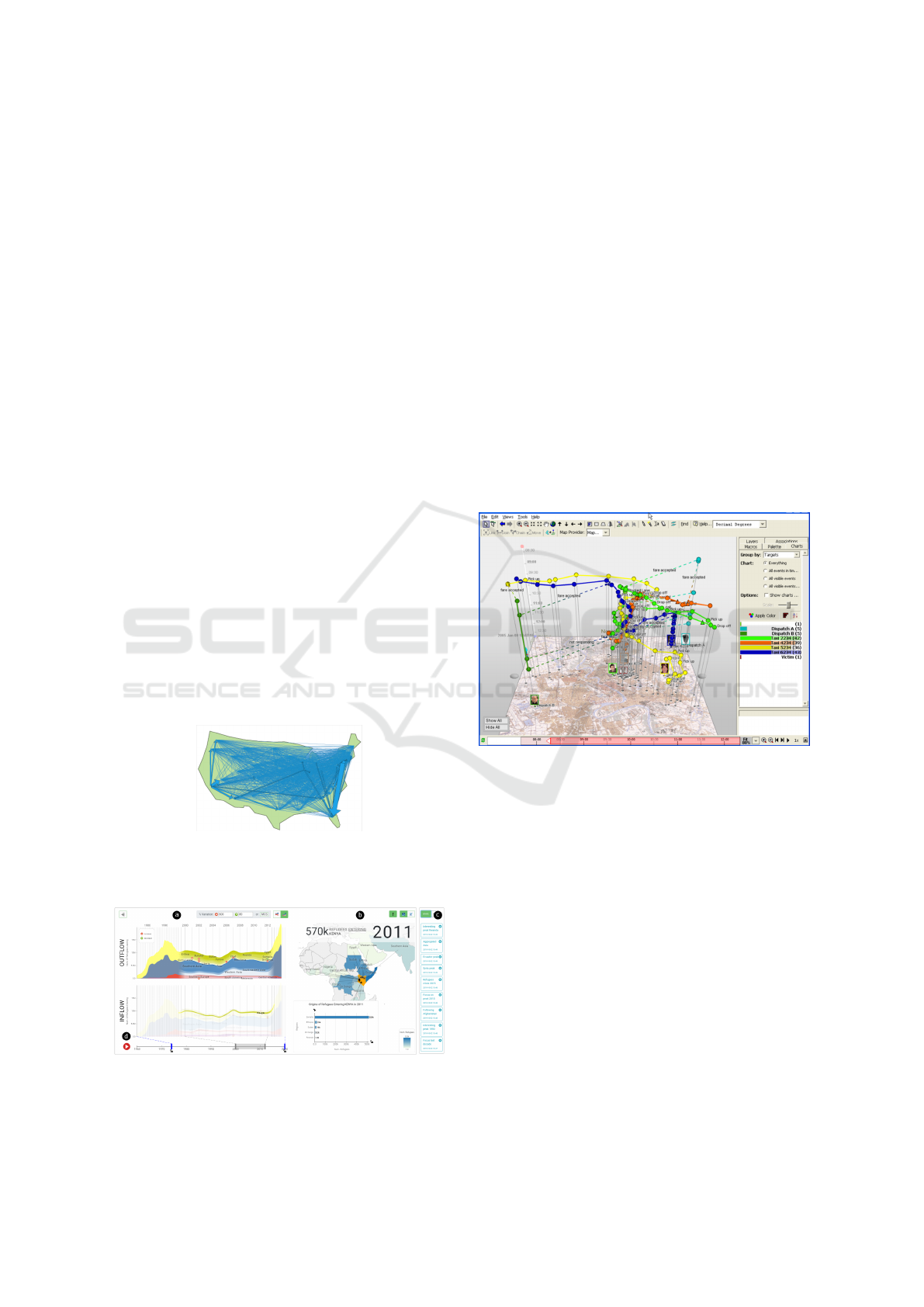
Figure 1: FlowMapper, an implementation of the flow map
technique by Tobler (Tobler, 1987). The display of several
OD flows generates heavy clutter.
Figure 2: Screenshot of EvoFlows, a combination of a tem-
poral and a spatial view to display refugee flows (Cuenca
et al., 2019).
2.1.2 Space-Time Cube
This method (Kapler and Wright, 2005), which can
be seen in Figure 3, makes use of the third dimen-
sion to represent the evolution of a given attribute
over time (GEO: mapped, NET: explicit, COMP: su-
perimposed, INTERACT: required). The first issue
with this method lies in its composition and the re-
quirement for the user to interact: the superimposition
of both time and geographic information implies that
both nodes and OD links are visually overlaid, gen-
erating visual clutter. This forces the user to interact
in order to get a clearer overview of the full dataset.
The second issue lies in its three-dimensionality: pro-
jecting three dimensions on a 2D display generates an
ambiguity in the perception of distances and slopes,
and thus altering or preventing the gathering of in-
sights. Adding an extra flow on this type of visual-
ization method is likely to cause even more clutter, as
the flows are superimposed on the geography.
Figure 3: Implementation by Eccles et al. (Eccles et al.,
2007) of the GeoTime space-time cube designed by Kapler
and Wright (Kapler and Wright, 2005). Multiple paths are
displayed to show the movements of individuals over time.
2.1.3 Map Animation
This type of visualization method involves the an-
imation of a map over time to reflect changes
(GEO: mapped, NET: explicit, COMP: composi-
tion, INTERACT: required). Animated choropleth
maps (Fish et al., 2011) are an example of its imple-
mentation. The facility of use heavily depends on the
users’ level of change blindness, that is, their ability
to get an overview of the evolution of OD links at
multiple locations over time. Pe
˜
na et al. (Pe
˜
na-Araya
et al., 2020) focused on propagation visualization and
compared the effectiveness of an animated map, small
multiple maps, and a single map with glyphs for dif-
ferent types of tasks. They found out that animated
maps do not perform better than the two alternatives
Flowstrates++: An Approach to Visualize Multi-Dimensional OD Data
627
for the comparison of consecutive time-steps. They
outperform the two alternatives regarding propagation
direction tasks. Regarding the search in large time
intervals and detection of peaks over the whole time
interval, animated maps performed worst. This find-
ing is further supported by Boyandin et al. (Boyandin
et al., 2012).
In summary, our literature review has revealed that
a variety of tools allows one to visualize dynamic net-
work and multivariate data. However, none of these
systems allows the analysis of multidimensional time-
evolving networks coupled with additional geospatial
temporal data, while avoiding visual clutter and over-
lap. These features are the foundation of the design
of Flowstrates++. We decided to use a 2D projection,
and to display geographic and network information
explicitly (GEO and NET: explicit) for the OD-data
to decrease the user’s cognitive load. We also chose
to juxtapose external temporal datasets in a dedicated
heat map at the center of the display to avoid clut-
ter problems (COMP: superimposed and juxtaposed).
Reviewed work (Boyandin et al., 2012; Pe
˜
na-Araya
et al., 2020) indicates that animated maps are not op-
timal for analysis tasks in large time intervals, and re-
quire the user to interact with the tool in order to ex-
plore the data. Since we wanted to foster the creation
of time-related insights related to multiple datasets,
we choose to use a static map, and to display the tem-
poral axis on a horizontal scale in the central heat map
(INTERACT: not required).
2.2 Evaluation Methods
Scientific literature provides an abundance of papers
describing how necessary, yet how difficult it is to
assess a visualization system thoroughly (Isenberg
et al., 2013; Lam et al., 2012). For this study, we se-
lected a few papers that drove our initial research. Al-
though it focuses mostly on software visualizations,
the study of Merino et al. (Merino et al., 2018) pro-
vides a state-of-the-art overview of existing evalua-
tion methods, and claims that more than half of the
papers reviewed in the domain lack thorough evalu-
ations. The authors further provide a comprehensive
definition of evaluation strategies, may they be theo-
retical (as evidenced by Munzner’s work (Munzner,
2014)), or empirical, relying on different strategies to
gather, then statistically analyze data. The study of
Merino et al. provided the initial basis of our eval-
uation protocol, described in section 4. Of the two
dependent variables used to assess a visualization sys-
tem, user performance is divided into two categories,
one being the time needed to produce an annotation
and the other being the correctness of the observation.
While interesting, these criteria can hardly be gener-
alized to many cases including ours, as they require
answers whose validity can be objectively demon-
strated. As an exploratory information visualization,
Flowstrates++ does not aim to foster insights that fit
into this category.
To overcome this limitation, we searched for ways
to qualify the observations fostered by Flowstrates++
without relying on their perceived correctness. Two
prior research projects (Boyandin, 2013; Vanhulst
et al., 2019) allowed us to build the core of our evalua-
tion protocol. Boyandin et al. (Boyandin, 2013) qual-
ified 285 annotations produced on the original Flow-
strates by 16 users, using 4 dimensions: geospatial
scope, temporal scope, validity, and reasoning. The
last two dimensions were binary, limiting as much as
possible the risk of disagreement. As most annota-
tions provided by participants were trivial, the validity
turned out to be easy to assess. Vanhulst et al. (Van-
hulst et al., 2019) qualified the types of 302 annota-
tions produced by 16 participants on 4 visualizations,
and provided a classification framework, validated by
an Intercoder Agreement and a Fleiss’ kappa. This
classification framework is meant to be as general as
possible, but the study only proposes toy examples.
In further studies, the authors highlighted how diffi-
cult it is to assess annotations with multiple obser-
vations (Vanhulst et al., 2019), and proposed Colvis,
an interface to classify them automatically (Vanhulst
et al., 2021). Our evaluation protocol is thus rooted in
the original Flowstrates’ evaluation protocol, and was
enriched by the research led on Colvis.
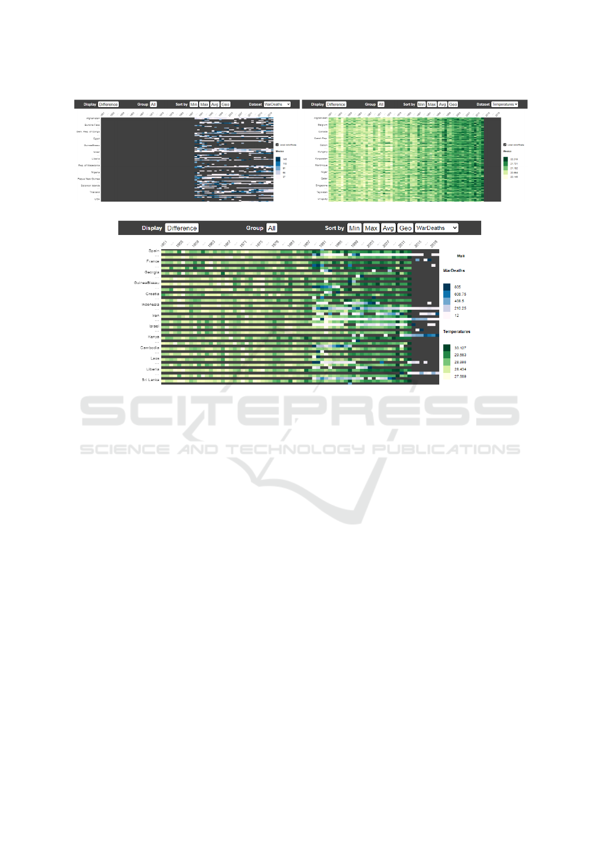
3 DESIGN RATIONALE
Figure 4: The original Java program, Flowstrates (Boyandin
et al., 2011).
IVAPP 2024 - 15th International Conference on Information Visualization Theory and Applications
628

3.1 The Concept of Flowstrates
Flowstrates tackles the challenge of visualization of
temporal origin-destination data. It differs from a
standard directional flow map as the goal is to dis-
play flow magnitudes over time. These aims lead to a
visualization where origins are located on a map (left-
hand side) and destinations are located on a separated
map (right-hand side) (see Figure 4). The flow mag-
nitudes are encoded with a heatmap located between
the two distinct maps. Each row represents an origin-
destination pair, and each column represents a times-
tamp. Heatmap rows are then linked to the maps (both
origin and destination) using straight non-directional
colored lines. This allows users to analyse evolution
over time without resorting to animation. Origin and
destination entities are indeed preserved geographi-
cally, but distance between them is however not pre-
served due to the heatmap display.
As datasets can have a huge number of data en-
tries, it is essential for the system to be fitted with
interaction capabilities. Each map can be individu-
ally navigated via zoom and pan behavior. Geograph-
ical entities can be separately selected through direct
selection in combination with an optional key for ag-
gregation mode. The lasso mode is available, to select
several geographical entities by drawing a freehand
line around areas of interest. It can also be used in
combination with aggregation mode. When selected
origins or destinations are updated, the heatmap is
automatically synchronized. Heatmap rows can also
be sorted and/or aggregated by using option buttons.
The difference option allows the user to display the
relative difference of magnitude between consecutive
time values. It is in this case easier to see increasing
(red color) and decreasing (blue color) tendencies.
3.2 Flowstrates++
Flowstrates++ has essentially the same interaction ca-
pabilities as Flowstrates and has been developed with
web technologies. However, an extra heatmap is dis-
played at the top of the already existing centered
flow magnitudes heatmap. It allows one or two other
datasets (geographical temporal data) to be displayed
with the goal to be able to make multi-datasets ob-
servations. A juxtaposition heatmap (see Figure 7)
has been inserted between the top and bottom cen-
tered heatmaps to be able to directly compare two
rows from different datasets. Graphs on the centered
area can also be panned and zoomed independently
on the x and y axes. The bottom and top graphs are
synchronized. The colored lines linking the spatial
entities and their magnitudes is only available for the
OD data, not for the external datasets due to data clut-
ter.
We ensured that the system would work with any
arbitrary objects whose position is defined by geo-
graphical coordinates. These objects are represented
by regular geometric marks (i.e. circles, rectangles,
etc). For example, Figure 6 shows a fictional use
case where the arbitrary objects are the Swiss train
stations.
3.3 Design Discussion
Some questions came to our mind while analyzing
Flowstrates: how could it be enhanced in a way that it
retains the same capabilities to foster insights, while
optimizing its space usage as to add external spatio-
temporal data? How could it be modified to be-
come a multi-dimensional data visualization tool? As
mentioned in introduction, the ability to compare di-
rectly two or more datasets - one comprising OD data
and several others consisting of spatio-temporal data
- would offer a clear advantage to the analysts. To
maximize Flowstrates’ space usage, we chose to keep
its concept of ”data in the middle” and decided to
split this middle part into two parts: the new, upper
one would display the external data and the bottom
one would display the flow data. As to allow com-
parisons, both parts are synchronized on the tempo-
ral axis. While we considered trying alternatives to
heatmaps for either parts (such as a trellis area chart),
we decided against it: distinguishing the impact of
a new visualization paradigm for the middle part of
Flowstrates is outside of the scope of this study.
Another requirement was to support two external
datasets, rather than just one. This led us to consider
two different interfaces: the Switch version displays
only one external dataset at a time, requiring the user
to manually switch between the available datasets.
Conversely, the Combi version displays two external
datasets simultaneously on the same graph. We chose
to display both datasets intertwined rather than in two
separate heatmaps to keep them as dense as possible.
With these two variants of the interface (see Figure 5),
we formulated the following hypotheses.
• H0: Combi version fosters more multi-dataset
findings as the users can see both spatio-temporal
datasets at once.
• H1: Combi version is harder to apprehend due to
visual cluttering.
• H2: Both versions foster significant insights that
involve two or three datasets.
These hypotheses are verified by a pilot study (Fuchs,
2022) followed by our experiment.
Flowstrates++: An Approach to Visualize Multi-Dimensional OD Data
629
(a)
(b)
Figure 5: Flowstrates++ versions. (a) Switch version, (b) Combi version.
4 USER STUDY
In relation to H0, we aimed to assess the affordance
of both variations (Combi and Switch) - in our case,
that is how easily they spur users into analyzing mul-
tiple dimensions of the visualization. We evaluated
H1 based on the subjective appreciation of the par-
ticipants through a qualitative questionnaire, as well
as the analysis of the annotations that they produced.
This analysis would also provide statistics regarding
how many annotations speak of several datasets, thus
verifying H2. These aims informed our decision to
use a short controlled experiment with a wide range of
unguided beginner users, as opposed to a longitudinal
study involving a limited set of participants benefiting
from a strong learning effect.
4.1 Environment and Settings
Our protocol required participants to make relevant
observations about the data, as if they were data sci-
entists working on the datasets. We purposely gave
no example of annotations, as to avoid any kind of
influence. Every user was given ten minutes on each
version, before finishing with a qualitative question-
naire unrestricted in time, comprising binary choice
questions, Likert scales questions and a free comment
section. A summary of the study setting is presented
in Table 1, while the qualitative questionnaire is pre-
sented in Table 2. We used a within-group user set-
ting to counterbalance any learning effect. Half of the
users started with the Switch version and ended with
the Combi version, whereas the other half of the users
completed the study the other way around. The terms
”Step 1” and ”Step 2” found on legend of graphs in
subsection 4.4 refer to the versions order.
The protocol was refined through a pilot study
with ten graduate students in computer science in a
remote setting. Eighty paid participants then took
part in our experiment on Prolific, a crowd-sourcing
platform. They were native English speakers with a
level of education of at least High School or techni-
cal/community college.
4.2 Classification Framework
As mentioned in subsection 2.2, we built a classifi-
cation framework on top of the works of Boyandin et
IVAPP 2024 - 15th International Conference on Information Visualization Theory and Applications
630
Figure 6: Use case of Flowstrates++ for the representation of train stations flows.
Figure 7: Interface of Flowstrates++ displaying the juxtaposition graph.
Table 1: Study characteristics.
Part
Group 1 Group 2
Time limit
Part 1
Version Switch Version Combi 10 minutes
Part 2
Version Combi Version Switch 10 minutes
Part 3
Qualitative questionnaire
no limit
Table 2: Qualitative questionnaire.
Q#
Question
Version Switch or Combi
Q1
Which version is the most intuitive?
Q2
Which version did you find the most interesting findings
with?
Q3
Which version is easier to work with?
Version Switch and Combi (1 = very bad, 5 = very good)
Q4
Useful to discover large-grained findings (e.g. general
tendencies)
Q5
Useful to discover fine-grained findings (e.g. detailed
observations)
Q6
Useful to compare between datasets
al. (Boyandin et al., 2011) and of Vanhulst et al. (Van-
hulst et al., 2019). Our aim was to keep it as simple as
possible, as to maximize Intercoder Agreement, while
making the richest statements possible about the an-
notations. We used a four-dimensions classification
framework, whose dimensions and possible values are
described in Table 3. Examples for each value by di-
mension can be found in Table 4, Table 5 and Table 6,
with the exception of the ”datasets” dimension whose
values are self-explanatory (R = Refugee, T = Tem-
perature, W = War deaths, and other values are com-
binations of two or all of these values).
Table 3: Dimensions and their values.
Dimension
Values
Interpretation
visual | data | meaning/correlation
Spatial
country | region | country-country | country-region |
region-region | global
Temporal
one year | year-year | until/since | interval | all time
Datasets
R | T | W | R+T | R+W | T+W | R+T+W
4.3 Evaluation of the Classification
Framework
Three coders, among the authors of this paper, used
the classification framework to qualify the annota-
tions without being influenced by the others. Once
Flowstrates++: An Approach to Visualize Multi-Dimensional OD Data
631
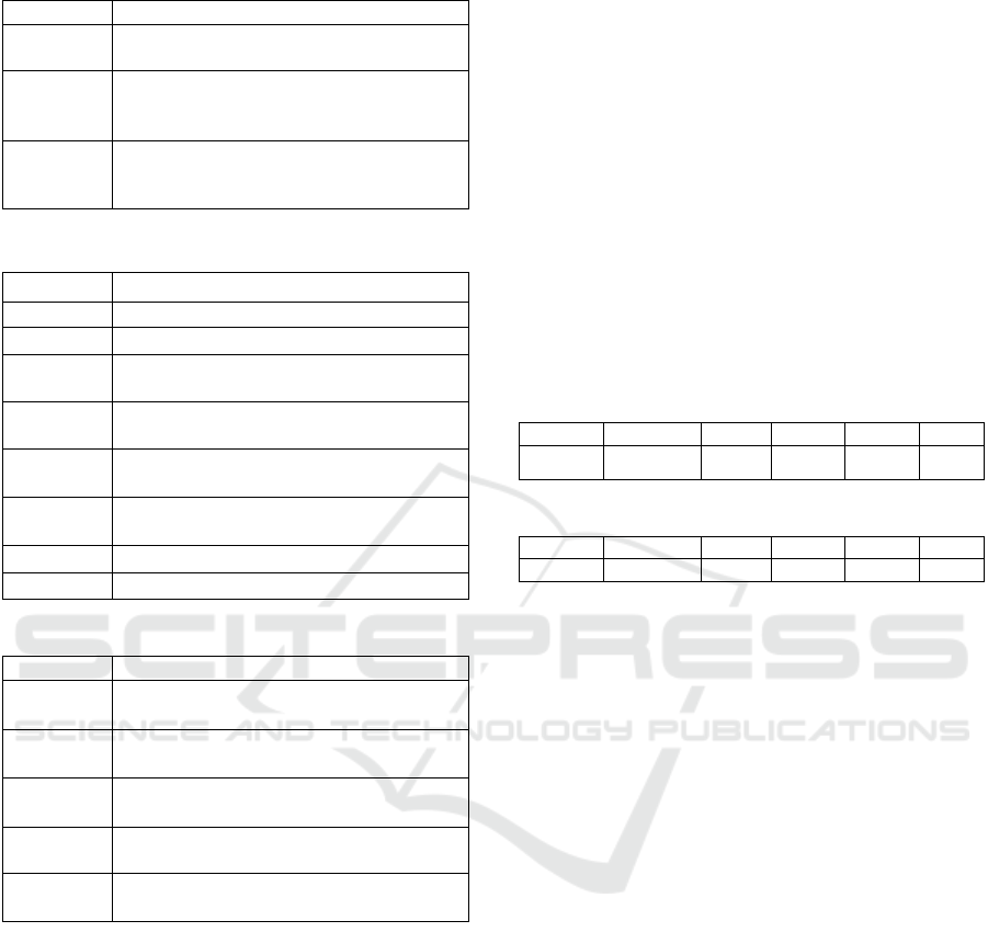
Table 4: Interpretation dimension.
Value
Example
Visual
For the flows originating from USA, there is much
more red colors towards the last decade.
Data
Between 1990 and 1998, there is a high peak of mi-
grations originating from Russia going from 117736
and 172724 refugees.
Meaning/
correlation
Since 2016, there is a very low number of refugees
coming from USA. It may be explained by the presi-
dential election.
Table 5: Spatial dimension.
Value
Example
country
There is a lot of war deaths in Brazil in 1985.
region Europe is getting hotter each year.
country-
country
There is a peak in refugees from USA to France in
2003.
country-
region
Refugees coming from Canada migrate mainly to
Spain, France and Portugal.
country-
global
Switzerland is the preferred destination for refugees.
region-
region
North American refugees don’t migrate much to Asia.
region-global The top migration destinations are in western Europe.
global Temperatures are rising all around the world.
Table 6: Temporal dimension.
Value
Example
one year
In 1968 there is a huge negative peak of refugees com-
ing from China.
year-year
Concerning the flows of refugees from Venezuela to
UK, the years 1992 and 2004 are quite similar.
until/since
In the temperatures dataset, we can observe a serious
increase during the last decade.
interval
In Africa from 1990 to 2000 there are few registered
war deaths.
all time
We can see that as time passes, there are more and
more refugees.
the classification process was done, the results of the
three coders were compared, and all disagreements
were discussed. On top of the calculation of an Inter-
coder Agreement, we also decided to further reinforce
our results by using a Kappa, as to take into account
chance-agreement. Cohen’s Kappa and Scott’s Pi be-
ing limited to only two coders, we relied on Fleiss’
Kappa to this end. Note that while our dimensions
can be considered ordinal, as there is a progressive
increase in the scale of their values, we did not deem
necessary to use Kendall’s tau in our approach: mis-
taking a ”country” for a ”region” in the geospatial di-
mension is not necessarily more erroneous than mis-
taking it for a ”country-country”.
Disagreements were of various natures: some
turned out to be simple misreadings, in which case
they were directly corrected. Some others were due
to the lack of domain-knowledge from the coders: a
few dozen of annotations mention start and end dates
of the datasets, for instance, and could thus be classi-
fied as both ”all-time” or ”interval” depending on the
interpretation of the coder. These were also agreed
upon and corrected directly, as they do not question
the classification framework itself. There were some
disagreements, however, that proved to be more fun-
damental. In these cases, the coders would consider
the disagreement as ”real” and report it, although they
would also agree on a corrected value to derive statis-
tics for the study’s results presented in subsection 4.4.
At the end of the process, we obtained both percent-
age agreements and kappas for each classification di-
mension concerning all findings.
Table 7: Intercoder Agreement.
Dimension
Interpretation Spatial Temporal
Datasets
Full
IA
Value
97.22% 94.91% 93.21% 99.23%
77.67%
Table 8: Fleiss’ Kappa.
Dimension
Interpretation Spatial Temporal
Datasets
Full
Fleiss κ
85.89% 93.22% 90.92% 97.66%
71.10%
When comparing the Intercoder Agreement and
Fleiss’ Kappa results in Table 7 and Table 8, we ob-
serve that all scores are above 70%. For both sta-
tistical methods, the most agreed upon dimension is
Datasets. It is an expected result as dimension val-
ues contain binary components: a finding may speak
of a certain dataset or not. The difference of order
between the three remaining dimensions are due to
the fact that the Fleiss’ Kappa takes the number of
classifiers as well as the number of dimensions val-
ues into account. The ”Full dimension” of the Inter-
coder Agreement is computed as follows: if a dis-
agreement is found in one of the four dimensions,
the ”Full dimension” is considered as a disagreement.
Conversely, the ”Full dimension” of Fleiss’ Kappa is
computed by multiplying each dimension score. The
most time-consuming dimensions to classify were the
Spatial and Temporal ones, although the Interpreta-
tion dimension suffers from a larger discrepancy be-
tween the percent agreement and the Kappa. The
most critical disagreements are discussed in section 5.
4.4 Study Results
The participants of the main study produced a to-
tal of 647 annotations. Figure 8 clearly shows that
the majority of the users tend to make observations
concerning only one single dataset. Among these,
the same order of datasets is preserved between both
IVAPP 2024 - 15th International Conference on Information Visualization Theory and Applications
632
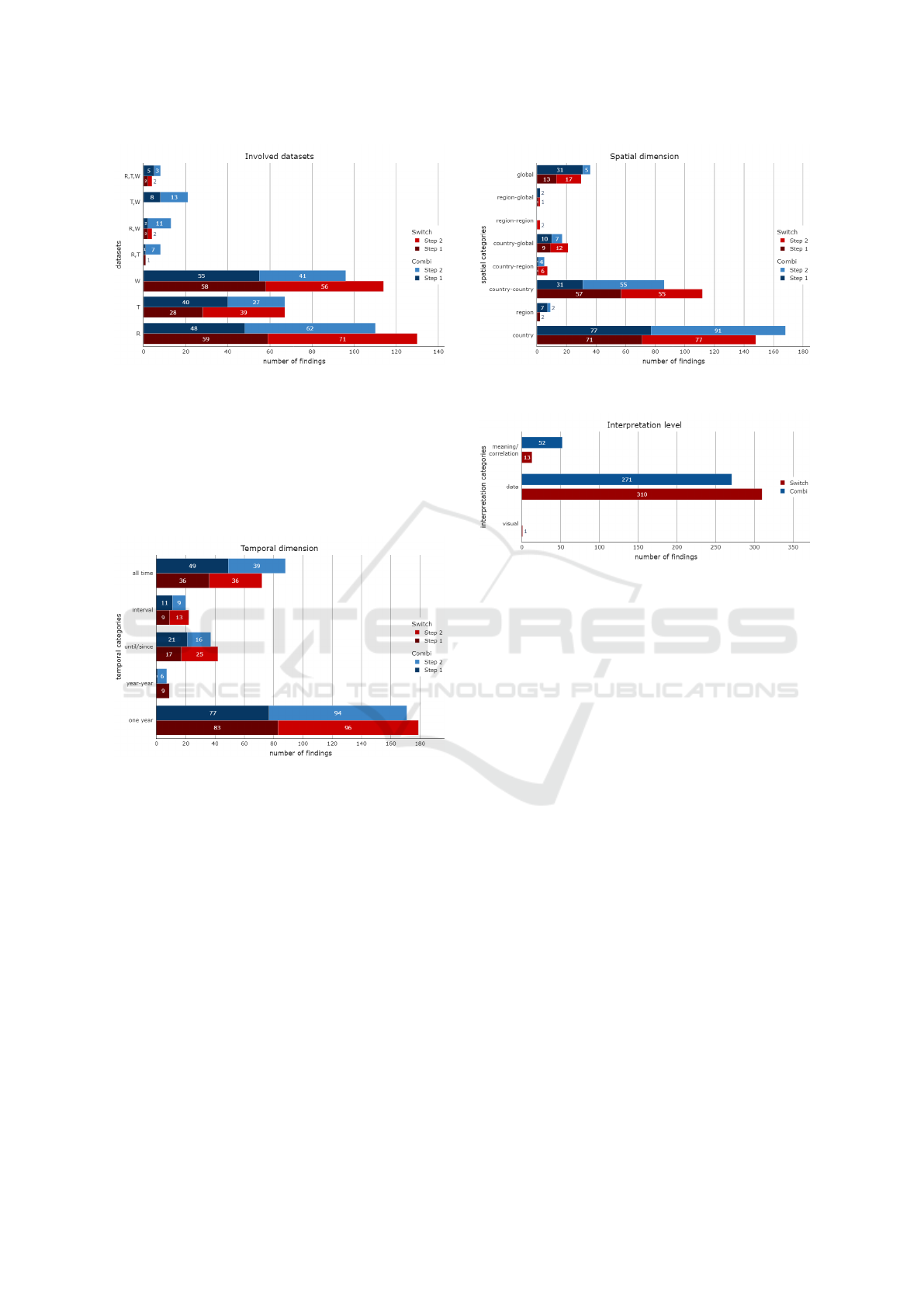
Figure 8: Datasets involved in the findings.
Combi and Switch versions: observations are firstly
made on refugees, then war deaths and finally tem-
peratures. There are consistently more multi-dataset
observations for Combi version than Switch version.
The difference is the most significant with the ”T, W”
class. This result was expected as Combi version dis-
plays both datasets on the same graph.
Figure 9: Total number of findings made during the experi-
ment, grouped by temporal dimension.
Figure 9 gives some interesting information on the
temporal dimension. The graph concludes that most
findings are related to a specific year. The second
most used temporal dimension value is ”all time”.
There is not much difference between the last three
values. Both Combi and Switch versions have a simi-
lar pattern.
Figure 10 presents the spatial information of ob-
servations. The Switch version seems more likely
to draw attention to OD spatial values (country-
country, country-global, etc), whereas the Combi ver-
sion seems to encourage more findings on single spa-
tial values (country, global, and region). We surmise
that the combined dimensions of the upper matrix of
the Combi version attracts more attention. Since the
upper matrix does not display OD data, it seems log-
ical that the users focused on single spatial values in-
Figure 10: Total number of findings made during the exper-
iment, grouped by spatial dimension
Figure 11: Total number of findings made during the exper-
iment, grouped by level of interpretation
stead.
Figure 11 represents the level of interpretation.
”Visual” category is almost empty, which is what we
expected. Indeed users were asked to make some ob-
servations about the data. Concerning the two other
categories, there is a huge difference between data
and meaning/correlation, which was also expected.
About the last category, Combi version seems to be
more appropriate to make some more elaborated ob-
servations, either with a given context explaining the
data or with the correlation between several datasets.
This figure also shows that the Combi version fostered
over three times more ”meaning/correlation” observa-
tions: Users tended to bridge the datasets and make
sense of data more easily when seeing them both, de-
spite a potential visual clutter.
Figure 12 represents the number of findings in-
volving several datasets and having the value mean-
ing/correlation as interpretation. Firstly, we can log-
ically observe that there are way more findings in-
volving two datasets than three. There is also a huge
difference between Switch and Combi versions, inde-
pendently of the steps order. The difference is lower
for the findings involving three datasets.
Figure 13 displays the number of votes for the
first three questions, binary choices between Switch
and Combi versions. We systematically observe that
Combi version is easily the preferred choice for all
Flowstrates++: An Approach to Visualize Multi-Dimensional OD Data
633
Figure 12: Total number of findings involving more than one dataset made during the experiment.
Figure 13: Results for the first three questions of the quali-
tative questionnaire (Switch or Combi version):
Q1 - Which version is the most intuitive?
Q2 - Which version did you find the most interesting find-
ings with?
Q3 - Which version is easier to work with?
Order Switch->Combi Order Combi->Switch
1
2
3
4
5
Ratings (1-5)
1
2
3
4
5
Ratings (1-5)
Q4 Q5 Q6
Q4 Q5 Q6
Switch
Combi
Version
Q4 / Q5 / Q6
Figure 14: Results for the last three questions of the quali-
tative questionnaire (1-5 Likert scales):
Q4 - Useful to discover large-grained findings (e.g. general
tendencies).
Q5 - Useful to discover fine-grained findings (e.g. detailed
observations).
Q6 - Useful to compare between datasets.
three questions. It should be noted that there is close
to no evidence that the users chose the second step of
their experiment. In that sense, users did not seem to
be affected by a supposed learning effect.
Figure 14 displays the median ratings for the last
three questions, Likert scales from one to five. We
can observe that participants who started with order
Combi to Switch significantly preferred the whole ex-
periment, including the second part with the Switch
version, whereas those who started with order Switch
to Combi had a more mixed appreciation. Overall,
however, we see that the Combi version is just as pop-
ular as the Switch version, which came as a surprise.
We expected a much bigger difference for the very
last question in favor of the Switch version, thanks to
it being less visually cluttered.
Figure 15: Flowstrates++ learning curve
Figure 15 shows the number of findings accord-
ing to the step order and the version of the program.
Firstly we observe that the total number of findings
between step 1 and step 2 is very similar. If we sum up
the number of findings according to the order of ver-
sions, we obtain 329 findings for Combi -> Switch
and 318 for Switch -> Combi. The progression or
learning curve is close.
5 DISCUSSION
Flowstrates++ currently features up to two external
datasets, mostly because of the Combi version where
both datasets are displayed at the same time. Since
our results seem to indicate that the Combi ver-
sion is significantly more appreciated, further stud-
ies should investigate how we could display more
than two datasets simultaneously without confusing
the users. In this regard, Edge bundling (Bourqui
et al., 2016; Phan et al., 2005) could be a useful ad-
dition to Flowstrates++, in order to lower edge clut-
ter that appears when a large number of nodes is se-
lected. Using bigger bins (e.g. grouping by decade)
IVAPP 2024 - 15th International Conference on Information Visualization Theory and Applications
634

for the matrices could also alleviate the visual load of
the users, although our results show that the most clut-
tered version of our interface (Combi) was preferred
over Switch.
In regard to our hypotheses, H0 has been clearly
demonstrated, as can be seen by Figure 12. Display-
ing both spatio-temporal datasets at the same time al-
lowed users to reflect on both at once, thus resulting in
a fairly high number of ”T,W” annotations, as seen in
Figure 8. Similarly, ”R,T,W” annotations were also
notably more numerous with the Combi version, as
all three datasets could be analyzed simultaneously.
However, the reasons why users provided more ”R,T”
and ”R,W” annotations as well are yet to be explored
in further studies. H1 was however contradicted by
our results, as participants show no evidence of pre-
ferring the Switch version over the Combi version.
Figure 13 and Figure 14 instead show a clear prefer-
ence towards the Combi version. Further qualitative
evaluations could explain this surprising result.
H2 was the main point of the design of Flow-
strates++, and our study shows that approximately
10% of the annotations that our participants provided
(63 out of 647) involved two or more datasets. Keep-
ing in mind that the participants were purposely not
required to make any multi-datasets observations, this
score proves that the interface still manages to foster
insights that leverage more than a single dataset. We
also believe that this score might change in further
studies, involving longer tasks and field experts.
During the evaluation of Flowstrates++, we fo-
cused on gathering as many annotations as possible,
and thus enlisted a much larger group of participants
than most similar studies (Merino et al., 2018). These
participants were not actual data visualization experts,
nor users of Flowstrates++ or equivalent solutions,
and this might have impacted the nature of the anno-
tations they captured. Moreover, the limited amount
of time spent on each version of Flowstrates++ could
have had a similar impact, although our data shows
no significant learning effect. Finally, our study con-
ducted on Prolific yielded a very high return rate
(69.69%), signaling that the tasks that we submitted
were probably too unusual and time-consuming com-
pared to the average tasks proposed on this platform.
One learning of this study is that crowd-sourcing plat-
forms are thus not particularly fitted to host com-
plex analysis tasks like ours. We would thus need
to conduct studies with actual domain experts to fur-
ther assess the benefits of Flowstrates++ more effi-
ciently (Yalc¸ın et al., 2018).
The classification framework that we used also
raised several challenges. While it worked well for
the original Flowstrates, the four-dimensions classi-
fication framework lacked the necessary abstraction
to handle datasets of different natures. Notably, the
values of the geospatial dimension would have dif-
ferent meaning depending on whether the mentioned
datasets were only of spatio-temporal nature, or if
they included the OD flow. A ”country-country”
value in a spatio-temporal dataset would mean ”a
comparison between two countries” or, simply put,
a comparison between two single ”data units”. On
the contrary, a similar value on the OD dataset would
rather indicate a flow between two countries - and
flows are the ”single data units” of the dataset. The
two patterns are contradictory: in the first case, the
user actively compares two units together, while the
latter case simply asks the user to qualify a single unit.
We argue that our evaluation approach would work
best with a more abstract classification framework,
similar to Vanhulst et al’s (Vanhulst et al., 2019), de-
spite its high level of complexity. Another recurrent
limitation of analyzing annotations is the presence of
annotations with multiple observations. Our attempt
at keeping the classification framework as simple as
possible backfired when we refused to split anno-
tations into several observations, then proceed with
the classification of these observations. The prob-
lem remains to decide objectively when an annotation
should be split or not.
6 CONCLUSION
Our work is based on an existing application called
Flowstrates, that presented a novel technique to dis-
play temporal OD data. We augmented Flowstrates
by adding up to two external spatio-temporal datasets.
This enabled analysts to find potential correlations be-
tween datasets, something that was not possible with
the original Flowstrates. We designed and imple-
mented the program with web technologies, making
it easier to deploy and reach a larger target audience.
We came up with two versions of the program: one
where the user has to manually switch between ex-
ternal datasets (Switch) and one where both datasets
are displayed on the same graph (Combi). We led a
prior pilot study with ten students. To reinforce our
results, we then extended that study to eighty users,
gathered via a crowd-sourcing platform. This latter
study asked participants to take unguided annotations
that were recorded and analyzed according to a clas-
sification framework built on top of prior studies.
Our results show that the Combi version per-
formed significantly better both in terms of annota-
tions production and in terms of satisfaction, confirm-
ing H0, while invalidating H1. Regarding H2, our
Flowstrates++: An Approach to Visualize Multi-Dimensional OD Data
635

non-expert users managed to produce annotations of
which 10% referred to more than a single dataset.
With this study, we managed to design, implement
and evaluate a novel visualization system to com-
pare complex temporal OD data and arbitrary spatio-
temporal datasets.
REFERENCES
Andrienko, G., Andrienko, N., Chen, W., Maciejewski, R.,
and Zhao, Y. (2017). Visual analytics of mobility and
transportation: State of the art and further research
directions. IEEE Transactions on Intelligent Trans-
portation Systems, 18(8):2232–2249.
Bourqui, R., Ienco, D., Sallaberry, A., and Poncelet, P.
(2016). Multilayer graph edge bundling. In 2016
IEEE Pacific Visualization Symposium (PacificVis),
pages 184–188. IEEE.
Boyandin, I. (2013). Visualization of temporal origin-
destination data.
Boyandin, I., Bertini, E., Bak, P., and Lalanne, D. (2011).
Flowstrates: An approach for visual exploration of
temporal origin-destination data. Comput. Graph. Fo-
rum, 30:971–980.
Boyandin, I., Bertini, E., and Lalanne, D. (2012). A qual-
itative study on the exploration of temporal changes
in flow maps with animation and small-multiples. In
Computer Graphics Forum, volume 31, pages 1005–
1014. Wiley Online Library.
Cuenca, E., UCLouvain, Docquier, F., Nijssen, S., and
Schaus, P. (2019). Evoflows: an interactive approach
for visualizing spatial and temporal trends in origin-
destination data.
Eccles, R., Kapler, T., Harper, R., and Wright, W. (2007).
Stories in geotime. In 2007 IEEE Symposium on Vi-
sual Analytics Science and Technology, pages 19–26.
Fish, C., Goldsberry, K. P., and Battersby, S. (2011).
Change blindness in animated choropleth maps: An
empirical study. Cartography and Geographic Infor-
mation Science, 38(4):350–362.
Fleiss, J. (1971). Measuring nominal scale agree-
ment among many raters. Psychological bulletin,
76(5):378—382.
Fuchs, N. (2022). Flowstrates++: a visualization tool for
multi-dimensional temporal origin-destination data.
Isenberg, T., Isenberg, P., Chen, J., Sedlmair, M., and
M
¨
oller, T. (2013). A Systematic Review on the
Practice of Evaluating Visualization. IEEE Trans-
actions on Visualization and Computer Graphics,
19(12):2818–2827.
Kapler, T. and Wright, W. (2005). Geo time information vi-
sualization. Information Visualization, 4(2):136–146.
Kjellin, A., Pettersson, L. W., Seipel, S., and Lind, M.
(2008). Evaluating 2d and 3d visualizations of spa-
tiotemporal information. ACM Trans. Appl. Percept.,
7(3).
Koylu, C., Tian, G., and Windsor, M. (2022). Flowmapper.
org: a web-based framework for designing origin–
destination flow maps. Journal of Maps, pages 1–9.
Lam, H., Bertini, E., Isenberg, P., Plaisant, C., and Carpen-
dale, S. (2012). Empirical studies in information vi-
sualization: Seven scenarios. IEEE Transactions on
Visualization and Computer Graphics, 18(9):1520–
1536.
Merino, L., Ghafari, M., Anslow, C., and Nierstrasz, O.
(2018). A systematic literature review of software vi-
sualization evaluation. Journal of Systems and Soft-
ware, 144:165–180.
Munzner, T. (2014). Visualization analysis and design.
CRC press.
Pe
˜
na-Araya, V., Bezerianos, A., and Pietriga, E. (2020).
A comparison of geographical propagation visualiza-
tions. In Proceedings of the 2020 CHI Conference on
Human Factors in Computing Systems, pages 1–14.
Phan, D., Xiao, L., Yeh, R., and Hanrahan, P. (2005). Flow
map layout. In IEEE Symposium on Information Visu-
alization, 2005. INFOVIS 2005., pages 219–224.
Sch
¨
ottler, S., Yang, Y., Pfister, H., and Bach, B. (2021).
Visualizing and interacting with geospatial networks:
A survey and design space. In Computer Graphics
Forum, volume 40, pages 5–33. Wiley Online Library.
Tobler, W. R. (1987). Experiments in migration mapping by
computer. The American Cartographer, 14(2):155–
163.
van den Elzen, S. and van Wijk, J. J. (2014). Multivari-
ate network exploration and presentation: From de-
tail to overview via selections and aggregations. IEEE
Transactions on Visualization and Computer Graph-
ics, 20(12):2310–2319.
Vanhulst, P., Evequoz, F., Tuor, R., and Lalanne, D. (2019).
A descriptive attribute-based framework for annota-
tions in data visualization. In Bechmann, D., Chessa,
M., Cl
´
audio, A. P., Imai, F., Kerren, A., Richard, P.,
Telea, A., and Tremeau, A., editors, Computer Vision,
Imaging and Computer Graphics Theory and Appli-
cations, pages 143–166, Cham. Springer International
Publishing.
Vanhulst, P., Tuor, R.,
´
Ev
´
equoz, F., and Lalanne, D. (2021).
Colvis—a structured annotation acquisition system
for data visualization. Information, 12(4).
Von Landesberger, T., Brodkorb, F., Roskosch, P., An-
drienko, N., Andrienko, G., and Kerren, A. (2015).
Mobilitygraphs: Visual analysis of mass mobility
dynamics via spatio-temporal graphs and clustering.
IEEE transactions on visualization and computer
graphics, 22(1):11–20.
Yalc¸ın, M. A., Elmqvist, N., and Bederson, B. B. (2018).
Keshif: Rapid and expressive tabular data exploration
for novices. IEEE Transactions on Visualization and
Computer Graphics, 24(8):2339–2352.
Yang, Y., Dwyer, T., Goodwin, S., and Marriott, K. (2016).
Many-to-many geographically-embedded flow visual-
isation: An evaluation. IEEE transactions on visual-
ization and computer graphics, 23(1):411–420.
IVAPP 2024 - 15th International Conference on Information Visualization Theory and Applications
636
