
Visual Analysis of Multi-Labelled Temporal Noise Data from Multiple
Sensors
Juan Jos
´
e Franco
a
and Pere-Pau V
´
azquez
b
ViRVIG Group, UPC Barcelona, Barcelona, Spain
Keywords:
Human-Centered Computing visual Analytics, Human-Centered Computing information Visualization.
Abstract:
Environmental noise pollution is a problem for cities’ inhabitants, that can be especially severe in large cities.
To implement measures that can alleviate this problem, it is necessary to understand the extent and impact of
different noise sources. Although gathering data is relatively cheap, processing and analyzing the data is still
complex. Besides the lack of an automatic method for labelling city sounds, maybe more important is the fact
that there is not a tool that allows domain experts to analytically explore data that has been manually labelled.
To solve this problem, we have created a visual analytics application that facilitates the exploration of multiple-
labelled temporal data captured at four different corners of a crossing in a populated area of Barcelona, the
Eixample neighborhood. Our tool consists of a series of linked interactive views that facilitate top-down (from
noise events to labels) and bottom-up (from labels to time slots) exploration of the captured data.
1 INTRODUCTION
Cities with a high concentration of urban areas have
to control environmental noise pollution because it of-
ten represents a relevant problem for their inhabitants.
Noise environmental pollution analysis can help take
preventive or corrective measures (i.e., reducing ve-
hicular transit areas or allowing them only in one lane
or at a particular time of the day on specific days) to
help diminish this harmful aspect of everyday social
life that occurs most frequently in large cities.
To be able to decide what preventive or corrective
actions should be taken to improve the conditions of
habitability, it is necessary to have in-depth knowl-
edge of the situations that arise in everyday life (Mo-
rillas et al., 2018). Nowadays, data can be collected
through microphones or sensors at different points in
the cities. The information obtained consists of ana-
logue recordings that must be annotated to analyze
them. Unfortunately, analyzing city noise is challeng-
ing. Two major factors that complicate this process
are: First, it is difficult to know how many sensors
(and where to place them) are enough to capture the
noise in a certain neighborhood. Second, since at any
given time, multiple sources of noise can be present,
it is difficult to get an idea of how variable the differ-
a
https://orcid.org/0000-0003-4647-233X
b
https://orcid.org/ 0000-0003-4638-4065
ent noise sources are, and how they appear along the
time. Even after manual labelling (which implies lis-
tening the whole recording, typically more than once,
and labelling noise subsequences in slots of a number
of seconds), being able to identify the main sources of
peak noises or how the racket affects a neighborhood
is complicated.
In this project, we work with urban environmen-
tal noise collected simultaneously by four sensors,
placed in four converging street corners at the Eix-
ample district in the city of Barcelona. The team in
charge of collecting the data decided to listen to the
audio recordings and manually label the noises per-
ceived at four-second intervals with labels that give
an idea of the type of noise or its origin. The final
objective was to analyze the labelled data obtained to
identify similar sounds and noise levels over time at
the four corners. Moreover, for future planning, it was
desired to know what types of noise occurred at each
moment and, especially, to discover which noise la-
bels are captured by all or part of the sensors at the
same time interval.
To help with these goals, we propose an appli-
cation that enables the exploration of multi-labeled
temporal data sequences through the use of a web de-
sign that uses multiple coordinated views (see Figure
1). We provide both noise levels, which are the most
common feature experts need, and details on the la-
bels at each time slot. The advantages of our system
256
Franco, J. and Vázquez, P.
Visual Analysis of Multi-Labelled Temporal Noise Data from Multiple Sensors.
DOI: 10.5220/0011895300003417
In Proceedings of the 18th International Joint Conference on Computer Vision, Imaging and Computer Graphics Theory and Applications (VISIGRAPP 2023) - Volume 3: IVAPP, pages
256-267
ISBN: 978-989-758-634-7; ISSN: 2184-4321
Copyright
c
2023 by SCITEPRESS – Science and Technology Publications, Lda. Under CC license (CC BY-NC-ND 4.0)
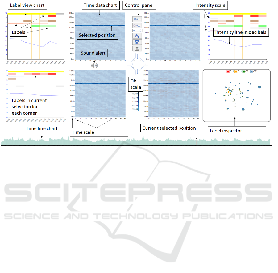
Figure 1: Our multi-label temporal data inspection application provides several ways of inspecting noise data from four
sensors at the same time. Time data (center) provides an overview of the noise levels during the recorded period. Fine-grain
labels inspection (e.g., top-left) allows the user to see the common and different labels at the measured points, and the Label
Inspector (bottom-right), which appears on demand, lets the user search for points with common noise types. The bottom area
is dedicated to an interactive timeline to illustrate when the pointed event occurs.
are therefore:
• It enables quick identification of the moments
with higher levels of noise.
• It illustrates the multiple labels identified at a cer-
tain time, as well as its context.
• A label-inspector tool facilitates the search of
samples that share a common set of labels.
Besides, to further analyze the data, the tool can
also reproduce the captured sounds. Our interactive
multi-view application, illustrated in Figure 1 repre-
sents a significant change of paradigm to analyze this
multi-value type of data. Besides showing the noise
levels (center), which is the common information han-
dled by any sound processing system, we provide a
type of view that shows the multiple labels that hap-
pen at each point in context (the corner views). Addi-
tionally, we have also created a new way to explore la-
bels by laying each of the sampled points in a 2D scat-
terplot, whose positions are determined using a pro-
jection calculated with a dimensionality reduction al-
gorithm. This way, the sampled points that have sim-
ilar labels appear close. This opens a new way of ex-
ploring the data, instead of going from the timeline to
the labels, now users can go from the labels to the mo-
ments where they appeared. We have evaluated our
application with domain experts, which found it very
useful to solve the aforementioned problems. The fol-
lowing link shows a descriptive video of the appli-
cation: https://www.dropbox.com/s/8pinp4fzluixdkb/
IVAAP2023 2r.mov?dl=0
The rest of the paper is organized as follows. Next,
we describe the previous work. Section 3 describes
the data acquisition and processing. In Section 4 we
provide an overview of our application. Then, Sec-
tion 5 shows how our application can be used to solve
analysis problems. We give an idea on how experts
see our application in Section 6 and finally, the paper
concludes with a discussion and pointing some direc-
tions for future research in Section 7.
2 RELATED WORK
The high levels of noise in large cities, have turned
it as one of the most relevant nuisances for citizens.
According to the World Health Organization, levels
exceeding 30 A-weighted decibels (dB(A)) at night
prevent quality sleep, and above 35 dB(A) will gener-
ate adverse teaching conditions. There is a high num-
ber of citizens who are exposed to noise levels that
are much higher than the recommendation. For ex-
ample, 40% of the citizens are exposed to road traf-
fic noise exceeding 55 dB(A), 20% of the population
is exposed to levels exceeding 65 dB(A) during the
Visual Analysis of Multi-Labelled Temporal Noise Data from Multiple Sensors
257

daytime, and more than 30% is exposed to levels ex-
ceeding 55 dB(A) at night (Organization et al., 2011).
As a result, many studies have addressed this problem
under different approaches. Numerous documented
risks that are related to excessive levels of noise in
urban environments. Cardiovascular diseases, cogni-
tive impairment in children, tinnitus, or sleep distur-
bance are just few examples one can find in literature
(Neitzel et al., 2012; Hammer et al., 2014; Organi-
zation et al., 2011). But studying noise levels and,
especially, its roots, is not easy. The noise sources
must be determined and analyzed, and this requires
both gathering and labelling data, and then, analyzing
these data.
Data Gathering and Classification. Classifica-
tions usually range from the manual method (listen-
ing and assigning labels) (Vida
˜
na-Vila et al., 2021)
to deep learning and machine learning algorithms
(Cramer et al., 2019; Fonseca et al., 2021; Koutini
et al., 2019). However, currently, no automatic algo-
rithm can reach the quality of the human labelling, es-
pecially if we want multiple labels per time segment
(Vida
˜
na-Vila et al., 2021). For simpler classifications,
such as when the noise is clearly dominated by a sin-
gle class, such as traffic, classifiers have demonstrated
successful (Socor
´
o et al., 2017). But the scenario we
address is more complex, and thus, we have to rely on
human labelling.
Once the data has been labeled, its analysis is not
easy. Visualization tools can be used to improve and
accelerate the understanding of noise sources. How-
ever, not many of these tools are available. In the fol-
lowing section, we summarize some approaches we
can find in the literature.
Visualization-Based Noise Analysis. Tools for au-
dio processing typically show the noise levels in dB
as a line chart. Though this could be useful to iden-
tify periods of excessive noise in a city, it falls short
if we need to understand the sources or places where
noise is high, so that policymakers can take informed
decisions. Therefore, noise information has been pre-
sented in the context of the urban layout using maps.
Geographic maps with thermal densities are the most
frequently used approaches to visualize noise data in
urban areas (Cao et al., 2020; Bocher et al., 2019;
Mooney et al., 2017).
But since noise is a phenomenon that varies over
time, it is useful to analyze with time as a varying
parameter. Park et al. (Park et al., 2014) present
Citygram, a system that allows the exploration of
time-varying noise. Like in the previous approaches,
these consist on heatmaps on a city. The paper con-
centrates mostly on the data gathering and serving
blocks. Maisonneuve et al. (Maisonneuve et al.,
2009) crowdsource gathering noise data using mo-
bile phones. They can show the real-time exposure
of noise over a map in the form of vertical 3D cylin-
ders, and they also show the noise as heatmaps. While
there are many approaches to visualization related to
geolocation or map imitation (Hogr
¨
afer et al., 2020),
we have only considered it important for our research
to exemplify the symbolic distance between the sen-
sors since the visualization aims to show data in par-
allel and could be applied to any geographical area.
Early approaches dealing with the complexity of
visualizing time-oriented data have shown the impor-
tance of selecting and parameterizing the visualiza-
tion technique according to the data set’s characteris-
tics to avoid inefficient results and data mispercep-
tions, especially in multi-variable data-sets (Aigner
et al., 2011). In addition, criteria for user interest
in visual representations suggest the use of ordered
linear time for all datasets, and then time intervals
(Aigner et al., 2008). Our framework attempts to
follow a previously designed approach by consider-
ing three major factors (data, tasks, and users) as a
triangle to effectively design time-oriented visualiza-
tions (Miksch and Aigner, 2014). In New York City,
a large project named SONYC, intended to create a
soundscape of the city, has been carried out in the
last years. Within the project, Miranda et al. (Mi-
randa et al., 2018) have created an exploratory tool
that enables the comparison of the noise gathered in
different points. However, they do not address la-
bel comparison. A follow-up, by Rulff et al. (Rulff
et al., 2022) provides a method for crowdsourcing
noise labels. Unfortunately, the number of sequences
that are labelled are relatively small. They also cre-
ated a visualization tool that converts time samples in
points and through an UMAP projection ((McInnes
et al., 2018)), they can find points with similar noise
profiles. In our case, which was developed indepen-
dently and in parallel, we generate a similar chart, but
with the labels instead of the noise signal. Therefore,
we enable the exploration of the data starting from
the labelling. Finally, Franco et al. (Franco-Moreno
et al., 2022) created a visualization application for
the exploration of noise patterns in three sites of a
small city: one with heavy traffic, a second one with
light traffic, and a third one in a pedestrian’s place.
Their purpose was understanding how the soundscape
changes in the three sites, and whether the types of
noise change along the day. However, their dataset
is only labelled with a single tag for each time event.
Therefore, no comparative visualization of multiple
IVAPP 2023 - 14th International Conference on Information Visualization Theory and Applications
258

tags is available. Moreover, the exploratory analysis
is mostly timeline-based.
3 DATA ACQUISITION
3.1 Gathering and Processing
As mentioned earlier, we work with data gathered in
a crossing of Eixample neighborhood, in Barcelona.
We used the data gathered by Vida
˜
na-Vila et al.
(Vida
˜
na-Vila et al., 2021). These consist of 4 se-
quences of 150 minutes each, recorded using simul-
taneously during spring 2021 from 15:30 to 18:00 at
four converging street corners. Data was captured us-
ing four Zoom H5 recorders. From the 4 sequences,
a full sequence, and a portion of another, were man-
ually labelled. The process followed the next steps:
First, the sequence was divided in fragments of 4 sec-
onds. Then, a domain expert listened to each frag-
ment and identified the different sources of noise, and
wrote them in a file. The result is a CSV file with
all the noise sequences having one or multiple labels,
together with the noise level in dBs.
Since the sequences were not completely labelled,
we completed the classification in a simple way. After
checking different alternatives, we simply calculated
the Euclidean distance of each unlabeled sequence re-
garding the labelled ones using librosa and Music-
tag for the labelling ((McFee et al., 2015; Maynard
Kristof, 2021)). Due to the amount of data, and the
fact that we used a brute-force approach, the process
lasted for 24 days running on a single machine. The
result is a set of four files that store information of
time intervals of 4 seconds. For each time slot, we
have the ID value that will be used for visualization
purposes and the identified noise labels’ description.
This information is stored for each of the four cor-
ners and aligned with sound intensity data provided in
separate files. The first data set corresponding to the
upper left quadrant was completely labeled manually
by those responsible for the investigation, the second
upper right quadrant was labeled less than half, so the
remaining part and the third and fourth data sets were
automatically tagged. Albeit a simple approach, the
automatic labelling exhibit very robust results for our
purposes. This is evident when searching for signif-
icant but infrequent values, using the Labels Inspec-
tor chart, like church bells or a dog barking, selecting
and playing the sounds on the different heatmaps, and
comparing the results.
3.2 Data Derivation
The previous data can be directly visualized by our
tool. However, when confronted with questions like
“Are dog barks common in the sequence?”, or “Do
noise labels distribute uniformly or with any pattern?”
we need another exploration method. Since timeline
exploration would be very time-consuming to solve
those questions. We need a label-to-time exploratory
approach that starts from points with similar labelling,
and let the user see when those were produced, and in
which sensors.
Therefore, we created an analysis view that joins
all the samples in a 2D layout. For this layout, we
define a space that depends on the present and miss-
ing labels of each sample. To achieve this, we used a
dimensionality reduction algorithm. In this case, we
use UMAP (McInnes et al., 2018). To create the mul-
tidimensional array, instead of using the sound level,
we use the set of labels that appear at each sample.
This is realized by creating, for each sample, a bi-
nary array where a bit of 1 indicates whether the cor-
responding label is present and a 0 indicates that it is
not. Running UMAP on this dataset produces a set of
2D points whose coordinates are similar if the labels
are similar. This opens the possibility of exploring the
time slots based on their labels.
4 APPLICATION OVERVIEW
4.1 Requirements
To define the application, we first analyzed a set
of requirements, together with the domain experts.
Domain experts are interested in getting insights of
whether the same noise happens in all sensors si-
multaneously, or, on the contrary, certain labels are
present only in a subsample of sensors. This can help
them decide, for future campaigns, whether some sen-
sors are not necessary. As a result of our discussions,
we defined a set of requirements:
• R1: Visualizing the noise levels.
• R2: Identifying maxima (we also provide min-
ima, though they are much less relevant).
• R3: Fine grained inspection of labels.
• R4: Easy identification of repeated (and non-
repeated) labels in the sensors.
• R5: Listening time intervals’ recordings.
To fulfill these requirements, we defined a multi-
view application. For this application, we have
used as a basis a set of well-known charts, such as
Visual Analysis of Multi-Labelled Temporal Noise Data from Multiple Sensors
259

heatmaps, Priestley timelines and a scatterplot. First
we consider using circular charts systems, with time-
lines, or linear charts, but we wanted to represent
the correlation of the corners, not to mention that the
length of 2250 elements forces us to use a tiny scale
for each element, so we decided to implement the
mentioned techniques and take advantage of two di-
mensions. However, these are customized to support
the analysis of our data, as explained later.
4.2 Application Design
Our application consists of three types of compo-
nents:
• Noise level views: Their goal is to facilitate
an easy understanding on how the noise levels
change over time. These consist of four heatmaps,
placed analogous to the capturing point, around a
background map of a crossing.
• Label views: They show the labels of a certain
captured instant, together with some time slots
before and after, to provide context. These four
charts, placed around the heatmaps, are similar
to Priestley timelines (Rosenberg and Grafton,
2013), with several add-ons and modifications.
• Label inspector: It shows all the samples in a sin-
gle chart as a 2D scatterplot. Through zoom, fil-
ter, and selection, we can see where a subset of
samples happened (time and sensor where they
appear).
To give a way to relate the different views, we
draw in the background the typical shape of a crossing
in Eixample neighborhood. Then, charts are placed
around it. In the following, we describe the different
components and the design decisions behind them.
Noise Levels. Typically, noise levels are shown in
literature as line charts. However, line charts only of-
fer one dimension to lay out the data. Our data consist
of around 9000 seconds for each capture. Given that
we group the data in four seconds slots, we have a to-
tal of 2,250 samples per sensor. Using a line chart
would not allow us to put a single sample for the
whole screen since most of the screens today measure
up to 2000 pixels in the horizontal direction. Using
a 2D layout helps us to show all this information at
the same time with a single chart. Those heat maps
are designed to have 50 units on the horizontal axis,
and 45 in the vertical direction (see Figure 2). This is
enough to show the whole data, and this design solves
our first requirement, R1. To provide details on the
labels that happen at each point, we implemented a
hover operation with the mouse that updates the other
charts in our application (see Figure 3), as will be ex-
plained later.
Label Views. The heatmaps are not enough for an-
alysts, who need to see the different types of sounds
that do or do not occur at each interval. To solve this,
we provide a modified version of Priestley timelines.
In this case, our sequences have the same length. And
we modify the design by changing the opacity of the
labels according to the number of sensors where the
same label appears at the same time. Therefore, al-
though we provide the four views corresponding to
the four sensors at the same time, the user can get
an idea of how often the same level appears by just
checking the opacity of the label in a single chart.
This facilitates an in-situ inspection of the data (see
Figure 3).
In these views, the X axis identifies time, and it is
labelled in seconds, so that users can get a sense of
which part of the sequence they are exploring. How-
ever, in contrast to Priestley timelines, we only pro-
vide a few samples, that change interactively. Tags
are placed on the Y axis. By analyzing the dataset,
we found that there were at most 21 different levels.
This gives us plenty of space, in the vertical direction,
so that we can show all the labels at once if it were
necessary, with some space between them to avoid
cluttering. The Y axis is used twice. In the back-
ground, we add a second data, with a thin blue line,
that encodes the noise level in dBs for the analyzed
time segment. Its design is thin enough to avoid vi-
sual interference with the rest of the chart, but dark
enough to be perfectly visible. This is an important
feature because domain experts always inspect noise
events in relation to the overall noise.
These label views are created on demand, when
the user points to one of the cells in any of the heat
maps. The position of the labels in the chart is not
random. We placed on top the labels that appear in
most samples, and the rest of the labels are placed in
the bottom proportional (in decreasing order) to the
frequency they appear in the samples. By fixing the
vertical position of the labels, it is much easier for the
users to relate to previous inspections of other sample
points. This solves our requirement R3.
The colors, used to identify the label, have been
generated using the Colorgorical-Source software
(Gramazio et al., 2017). Black and white colors
have been added for two specific values that deserve
special treatment (black for cmplx and white with a
border for one that never occurs during the current
recordings drill).
An important difference to classical Priestley
timelines is that, in our case, visual elements are de-
IVAPP 2023 - 14th International Conference on Information Visualization Theory and Applications
260
signed as glyphs, that have a different opacity depend-
ing on the number of sensors the label has been de-
tected into. This way, besides providing information
on the concrete sensor, we provide in-situ informa-
tion on the other detections. This design decision was
chosen to help analysts detecting redundancies in the
detection.
Label Inspector. To provide another way to inspect
the data, we created a new chart, the Label Inspector.
The goal here was to provide a way to facilitate the
exploration of points that have similar tags. The num-
ber of combinations can be very high because, as we
have 21 potential different labels, which are consid-
ered as independent event, the combinations we may
have here is a factorial number, given by:
n
r
=
n
C
r
=
n!
r!(n − r)!
, (1)
where C is the number of possible combinations, n
is the total number of labels, and r is the number of
labels that occur on each time slot. We decided to
consider any possible scenario, not excluding the cm-
plx label, which is assigned when it is not possible to
identify anything considered within its categories (see
Figure 4).
As described earlier, this view is essentially, from
the perspective of the design, a scatterplot of the 9000
datapoints. The 2D coordinates of the samples have
been calculated using UMAP (McInnes et al., 2018)
using as data, a binary sequence that encodes the pres-
ence of the different labels. The scatterplot also shows
the sensor originating the sample by applying differ-
ent color for each sensor. The sensors are named ac-
cording to the corner they occupy in the main view,
and are colored as follows: Red for the top-left cor-
ner C11, orange for the top-right corner C12, green
for the bottom left C21, and blue for the bottom right
C22. The legend can be used to toggle on or off the
whole set of samples of each sensor. As explained
later, upon selection, the cells corresponding to the
selected points are highlighted on the heatmaps. This
design solves requirement R4.
4.3 Interactions
Additional functionalities have been added to enhance
the visual analysis. In the following, we describe how
to interact with any of the charts, as well as the linked
interactions that have been designed.
Heatmap Exploration. As already mentioned,
heatmaps show the noise levels. But they also pro-
vide a set of widgets for further analysis. The cen-
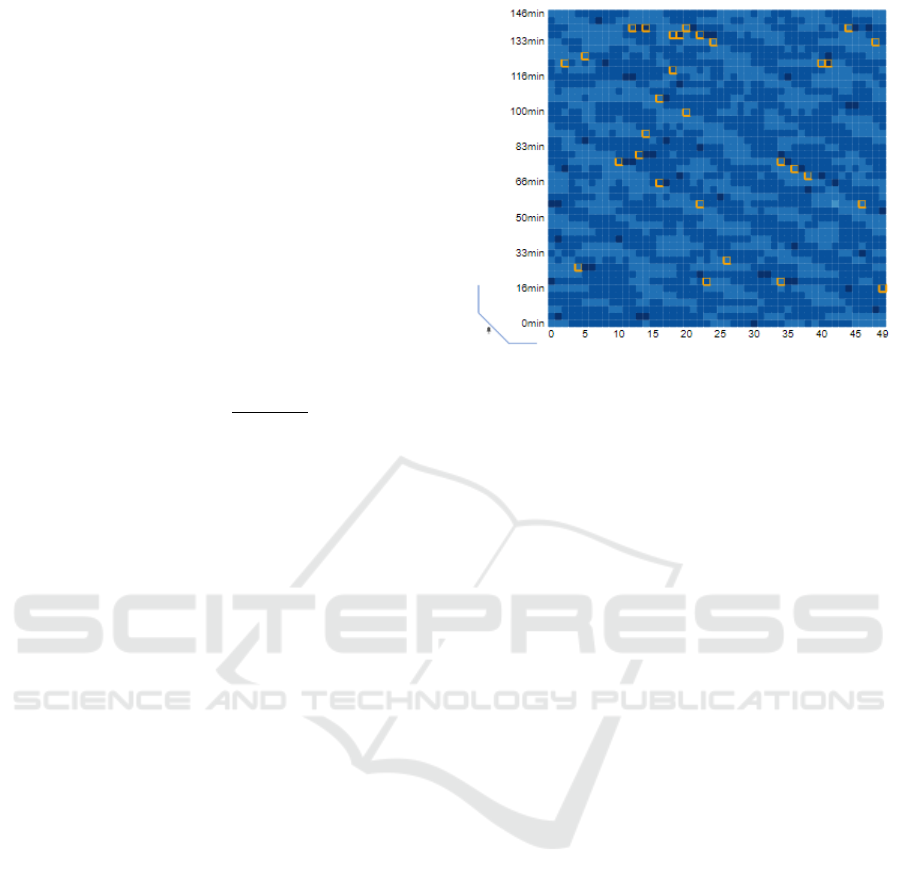
Figure 2: The heatmap lets us explore the local peaks of
noise intensity of a decided range change. Identified cells
are highlighted for easy selection.
tral buttons enable different highlights. The first two
highlight the maxima and minima in all the charts.
Domain experts suggested us to consider high values
the ones with value over 70 dB, and minimum values,
the ones below 40, as indicated by the labels of the
buttons. This solves our requirement R2.
The next two widgets, the dropdown menu, and
the peak button are designed to identify local maxima
quickly. These local maxima are cell values that are
above a certain range (decided by the user using the
dropdown) of their neighbors (see Figure 2). This can
be used to search for anomalous events. The last two
buttons reset the heatmap view and toggle on and off
the Label Inspector, respectively.
Besides those interactions, that happen within the
chart, we also provide a number of other linked ac-
tions. Using these views, we can hover over a cell
and several things are modified: First, the whole row
is highlighted by de-emphasizing the rest of the rows
of the charts, to ease time inspection. Second, the cell
under the mouse, as well as its neighbors, are rendered
in the label views, for all the sensors. The central part
of the label view contains the information (the tags) of
the selected cell, and the ones on the left represent the
sequences before, and the ones on the right represent
the sequences after. This way we can see, not only
whether a certain tag is present in all the sensors, but
also if it will appear immediately later (or had hap-
pened just before). An additional functionality has
been incorporated in the selection of both lower and
upper limits and peaks, which consists of indicating
the closest point to the cursor to facilitate the selec-
tion.
Finally, by clicking the cell, the corresponding
sound sequence is reproduced. This also generates a
Visual Analysis of Multi-Labelled Temporal Noise Data from Multiple Sensors
261
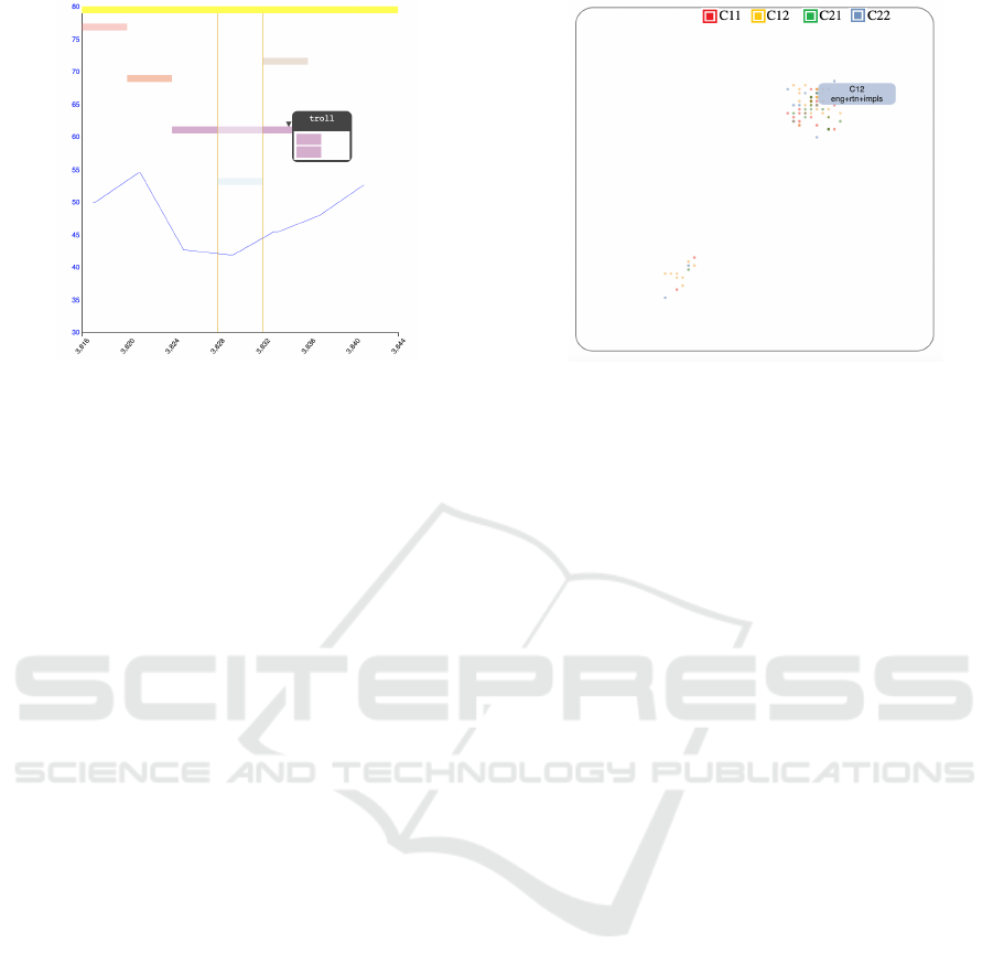
Figure 3: The Label View shows the labels that appear in
a sequence of time (identified by the central lines) and its
immediate neighborhood in time. Upon hovering, we can
see the sensors in which a certain label appears.
visual feedback in the form of a speaker icon to notify
that sound can be listened to. This solves the require-
ment R5.
Label View Inspection. The label view also pro-
vides a hover operation that highlights the concrete
sensors where a certain label appears. This is im-
plemented through a popup that shows four rectan-
gles, representing the four sensors at their positions,
as shown in Figure 3 Besides the hovering, a second
effect is also applied upon hovering: the charts where
the tag is not present, are de-emphasized by reducing
the transparency.
Label Inspector. The tool for exploring groupings
of labels can be explored in several ways: First, the
legend, that indicates the sensors, is also interactive.
And it allows toggling on and off the sensors by click-
ing on the names. The initial view is an overview of
the whole set of samples. To get closer to a certain
group of interest, to analyze it, the user can dynami-
cally zoom in using the mouse wheel. Hovering over
a sample will show the different labels that appear, as
shown in Figure 4. Finally, the user can select a sub-
region by dragging a rectangle. This has two effects.
First, it zooms on the selected region. And second,
more importantly, it selects the samples inside the se-
lected box. These are highlighted in the heatmaps for
further analysis.
5 USE CASES
To show the utility of our interactive multi-view appli-
cation, we present three different use cases: a) Iden-
Figure 4: The Label Inspector groups all the samples of the
four sensors in a single chart. Their positions depend on the
labels present. Therefore, groups of points represent time
samples where similar subsets of tags were identified. The
user can filter with the sensor names, zoom with the mouse,
or drag to select a region..
tification of noisy time ranges, b) Common and un-
common noise sources, and c) searching for periods
of a certain labels’ combination.
Use Case 1: Identifying Most Noisy Time Ranges.
One of the objectives of the application is to find the
time spots with the highest amount of noise. To do
this with the current data, we just have to select the
maxima button ( ≥70) and the heatmaps will add a
border to those cells where the intensity of noise ex-
ceeds or matches the 70 decibels.
The noises with the highest intensity occur on
C22, and thus, from now on, we focus the analysis on
this sensor. After selecting the maxima values, and by
visual inspection, we can clearly identify some spots,
as shown in Figure 5.
First, by visual inspection, it is possible to notice
that those darker cells have a more intense color as
seen in the Figure 5 at the top left (where we zoomed
in for demonstration purposes). After selecting the
maximum button, the border is added to those cells
that comply with the rule. If we visit the cell indicated
with a slightly green frame (marked for demonstration
purposes), we can see its values in the Label View, as
shown on the top-right image. If we click to focus the
analysis we can hear the sound that was recorded for
that time slot (this one specifically sounds like motors
and something more acute similar to a vehicle brak-
ing). We can see the noise intensity depicted with the
background blue line. Note that it barely exceeds 70
decibels. By checking the top label of the view, we
can see that it is identified as rtn, which means road
traffic noise. Notice that this noise is being detected
by all sensors at the same time, as it can be seen when
IVAPP 2023 - 14th International Conference on Information Visualization Theory and Applications
262

Figure 5: Use case 1: This succession of graphs for demon-
strative purposes represents how the user analyzes the dif-
ferent tags appearing on a certain spot to search for the
causes of the maximum levels of noise measurements. Af-
ter searching for slots of greater intensity (zoomed-in in the
top of image 1 for illustrative purposes), and selecting high
values with the > 70 button, we can see that a number of
them are identified in the bottom-right sensor (2). Labels
inspection is then used to explore the different tags (3-6)
and looking for frequent ones. These are identified them
as road traffic (rtn) (4) (top tag), motorcycle (5) (motorc)
(second most frequent), and finally brakes (6) (brak). All of
them are present in the noisiest slots.
we hover over it (bottom-left). The second most fre-
quent label is immediately below, and has as a code
motorc (shown in the bottom center image), which
represents motorcycle noise. We can see that, in this
case, the motorcycle is only detected by two sensors,
and it was only detected by a single one in the follow-
ing time slot (see how the color gets more transparent
in the top-right image). Finally, we can check what
is the third most frequent label, which also appears in
this time slot. By hovering on the label line (bottom
right), we can see that it is identified as brak (grey la-
bel). It is the noise of a vehicle braking. In this case,
it occurs at three corners at the same time.
Use Case 2: Common and Uncommon Noise
Sources. One of the big problems domain experts
were concerned about, in this scenario with 4 sen-
sors in the same crossing, is the identification of noise
sources that appeared in all sensors. Conversely, they
were also overly interested in the noise sources that
did not appear in all the sensors at the same time.
To this end, we designed the Label View. To deter-
mine which noises are repeated more often than oth-
ers throughout the recordings, the order in which tags
appear is in descending order: The first position is oc-
cupied by the vehicle engine (rtn) or the complex tag
(cmplx designed for when no identification was possi-
ble), as it only appears when not even road traffic can
be identified.
In this example, we concentrate on a noise that can
be heard in situations when the overall noise is not so
Figure 6: Use case 2: By exploring various time slots within
the heatmaps and looking at the results in the Label View, it
is possible to determine which labels occur more frequently
than others by their position, with the most frequent being
higher and the less frequent lower. The tag explorer tooltip
shows the name of each label.
high, the singing of a bird. By hovering over a sensor
heatmap, we can scroll until we see a bird label (or we
can look for any other label). And, by moving back
and forth, we see that in numerous instances, these are
not audible by all the sensors at once.
In Figure 6 we concentrate on one of those points.
We can see how this noise, that is not as frequent as
cars, it is quite common (it is placed on the top part
of the chart, that indicates more frequent tags). It is
less prevalent than the road traffic noise and thus, we
can find it in moments where the overall noise level is
not too high (here we can see that it is around 45-50
dB). We can clearly see that the noise was detected
by the sensor, for 5 time slots. Moreover, we can also
see that it was captured by the other sensors, but not
during all the time. It appears that the bird has flown
close to the center of the crossing and then left. Of
course, many other reasons could be the cause, such
as different birds making noise close to the different
sensors. In any case, getting these insights regarding
different types of noise is of high value to the domain
experts.
Use Case 3: Investigating the Distribution of
Groups of Labels. If, instead of willing to explore
the data based on time, we are eager to explore it
from the semantics, we can turn to the Label Inspec-
tor view. It can be activated with the last button of
the widgets area. As already mentioned, most of the
samples have road traffic as one of the associated la-
bels. If we want to check how often motorcycles and
brakes are recognized (that is rtn+motorc+brak tags),
we can start hovering over the samples to see the la-
bels, that appear as a pop-up. By iteratively selecting
and zooming the bottom-left group, we can see that in
numerous instances, these three elements appear to-
Visual Analysis of Multi-Labelled Temporal Noise Data from Multiple Sensors
263
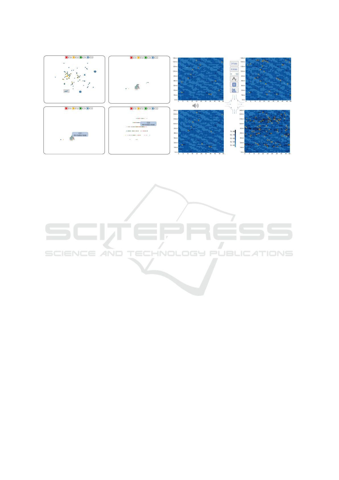
Figure 7: Use case 3: We progressively select a certain subarea in the Labels Inspector (left) and search for the interesting
region by further zooming. Selected samples are highlighted with orange borders on the heatmaps (as shown in the right
part, where we represent only the heatmaps), thus communicating their distribution in the timeline. These points can then be
listened to by clicking over them, to assess the labels found.
gether (without other tags). And we can see how they
are distributed in time, looking back at the heatmaps.
Since the selection will highlight the cells, the distri-
bution of these phenomena along the sequence can be
clearly identified. Then, these can be further analyzed
by hovering the heatmaps and checking the results in
the Label Views, as can be seen in Figure 7.
6 EVALUATION
The current work has been developed together with
domain experts, but they did not participate in the de-
sign of the application. The process went as follows:
A set of initial meetings provided information on the
problems and the available data. The two major con-
cerns were: getting an understanding on how the dif-
ferent tags appear along the time, and which labels are
present in more than one sensor.
Once we got the data, we worked independently.
At a couple of meetings, we showed them two differ-
ent versions of the visual design to get a sense of how
the data was being understood. In the final stages of
the project, we had another meeting, where some fi-
nal small changes to the views were suggested (such
as the labels of some buttons).
6.1 Experiment Design
After the development, we carried out a simple eval-
uation using the final version of the application. The
evaluation had the following steps:
1. The system was introduced through a video
demonstration and a written minimal tutorial.
2. Domain experts were asked to get familiar with
the tool for some minutes.
3. Participants were asked to complete a series of
tasks described below.
4. After those tasks were completed, they were asked
to complete a questionnaire.
We recruited 3 experts, two of them female, re-
searchers in sound analysis engineering. They have
an expertise of 4, 16, and more than 20 years of ex-
pertise in the field. The tasks domain experts were
asked to complete were:
• Identify the maxima slots. Try to see if they are
common to all sensors.
• Select a point and play the sound (it plays upon
click on a cell).
• See if you can see how the different labels change
over time by hovering over a row and checking the
labels on the external charts.
• See if you can see how these different labels re-
peat (or not) at the different corner by hovering
over a row and checking the labels on the external
charts.
• Change the local maxima value and check other
local maxima.
We also gave them a more guided task that con-
sisted on activating the bottom right scatterplot, hov-
ering over the samples to inspect the labels, and asked
them to analyze the labels and see whether they made
sense. Afterward, they were asked to zoom and select
IVAPP 2023 - 14th International Conference on Information Visualization Theory and Applications
264

using a rectangular region and inspect the results on
the heatmap.
This way, we ensured that they tested all the im-
portant features in case the initial exploration had not
covered them. And we knew they were ready to an-
swer the questions.
Although we were mostly interested in under-
standing how well the application was able to solve
their main problems, we created a broad questionnaire
to get more insights on their experience. It consisted
of 15 questions:
• Q1: Is possible to easily identify the moments
where the noise is the most intense.
• Q2: Is easy to navigate the time slots and look for
specific labels.
• Q3: Is easy to identify the noise labels and follow
them.
• Q4: The feature that lets users listen to the noise
at a time slot is useful.
• Q5: The application helps me understand what
types of noise appear at all 4 corners.
• Q6: The local maxima feature is useful to under-
stand the urban soundscape.
• Q7: The central charts allow me to understand
how the noise changes along the sampled time.
• Q8: The multi-labels inspector helps me under-
stand how the types of noises group.
• Q9: The selection of a region in the multi-labels
inspector helps me see how the different noise
types appear in each sensor.
• Q10: By toggling on and off the different sensors,
I can get a good understanding on how the differ-
ent noise types appear in each sensor.
• Q11: The application can help me decide on how
many sensors are necessary for the Eixample dis-
trict crossing.
• Q12: This application lets me understand cap-
tured noise information in a better way than other
software packages I know/use.
• Q13: The application is easy to use.
• Q14: The application is easy to learn.
• Q15: I would use such an application for explor-
ing labelled data in my work.
Most of the questions are intended to gather in-
formation on how the use of the application may or
may not help the domain experts in their daily work.
But we also added some questions regarding usabil-
ity (Q12-Q14). Users had to answer those questions
using a 1-7 Likert scale, where 1 means strongly dis-
agree, and 7 strongly agree.
6.2 Analysis of Results
The results were satisfactory in general. However,
one of the experts (Expert 3 in Figure 8) had some
issues with two features. First, the local maxima tool,
and second, the navigation in the Labels Inspector
was found cumbersome. This is reflected in the an-
swers to questions 6 (the local maxima), and 8-10
(Label Inspector). For the rest of the questions, and
the other two experts, we always had satisfactory re-
sults, that were between 5 and 7 in the Likert scale.
All the answers to the questions are shown in Fig-
ure 8. Experts also completed two open questions in-
tended to get additional information on desired extra
features.
Regarding the requirements, we can see that R1
is satisfied, since the users declared they were able
to understand the noise changes over time (Q7, aver-
age value of 6 out of 7). Requirement R2 is related
to identifying maximum values in the sequence (min-
ima are mostly irrelevant to them). The answer to Q1
shows that it has also been satisfied (average 6.33).
The third requirement (R3) was the possibility of a
fine grain inspection of labels. This is captured by
Q3, and the result was also positive, with an aver-
age value of 5.33 out of 7. Requirement R4, which
has to do with the identification of repeated and non-
repeated labels in the sensors, was analyzed through
Q5. Again, participants seemed satisfied with the re-
sults, ranking Q5 with a 5.33 out of 7. The last re-
quirement, R5 refers to the ability to inspect the real
noise that was captured. This was visited in Q4, and
the results indicate that all experts found the feature
as highly useful, with a 7 out of 7.
We also analyzed other aspects, such as the per-
ceived usefulness of the application, to determine the
number of sensors that were necessary to understand
the soundscape of a region in the city (Q11). In this
case, the opinions were divided, with two experts say-
ing yes (5 out of 7) and another expert saying it was
not useful (2 out of 7). However, in this case, the ex-
pert indicated in the comments that the information
displayed could be used to discard sensors (since re-
dundant labels could be detected). But detecting the
necessity of additional sensors was not possible.
The Labels Inspector for different tasks (analyzed
in Q8-Q10) was found very useful by two experts, but
the third expert, as noted, had problems with the navi-
gation and thus ranked it poorly. All the experts, even
the most critical ones, think that such an application
could help them in their daily work to explore labelled
data (Q15).
We tried to design the application with usability
in mind. The background sketch of the crossing, to-
Visual Analysis of Multi-Labelled Temporal Noise Data from Multiple Sensors
265

Figure 8: The answers to the questions by the domain experts. Note that, except for the features that were problematic for one
expert, all the elements in our visual design received positive values by the domain experts.
gether with the distribution of the charts, was care-
fully thought to facilitate the understanding. The an-
swers to the usability questions (Q12-Q14) show that
this was positively received by the experts, with aver-
age values of 6.33, 5.33, and 5.66, respectively.
The open questions offered the possibility to the
experts to criticize and demand for new features. We
received two kinds of suggestions: related to the user
interface and proposal of new features. Considering
the user interface, one expert asked for explicit units
on the axes of the graphs, and popups of the button
meaning before clicking (upon mouse hovering over
the button). In the features side, one expert suggested
providing some method for displaying the sound us-
ing some sort of timeline, besides the matrix repre-
sentation. A search function, that allows the user to
find labels, was also suggested.
7 CONCLUSIONS
Getting insights on time-oriented large-scale multi-
labelled data presents a challenge for domain experts
when trying to generate analysis results and compar-
isons. Our proposal provides means to highly reduce
its complexity, by generating interactive tools adapted
to the specific needs of multi-labelled urban environ-
mental noise recordings. Our Application also serves
as an evaluation tool for automatic labelling systems
of multi-label values to compare if their approxima-
tions and calculations are correct. Whereas without a
proper visualization tool evaluation would require lis-
tening to the audio recordings one by one and compar-
ing if the self-assigned labels correspond to the real-
life values, this work does not seem very efficient in
terms of human resources. Our tool will help ana-
lysts and experts in decision-making related to poli-
cies that improve the living conditions of inhabited
neighborhoods. The exploratory analysis will pro-
vide significant information on the spread of noise
and how to mitigate it. Traditionally, domain experts
use a non-fitted public software to fulfil their research.
Since those packages are intended to deal with the
sound differently, it is almost impossible to use them
to make assumptions about overall noise behavior, or
to evaluate specific time event aspects. In this sense,
our application fills this gap.
Although our empirical approach is based on spe-
cific environmental noise recordings data, we believe
that it is not limited to it, and it can be applied to sev-
eral large-dimensional data-sets, especially those with
several values contained for each time interval.
After the evaluation, we discovered that it was im-
portant for the users of the application to have a posi-
tion reference while inspecting the Noise levels chart,
for them, an interactive timeline was incorporated that
will change their position according to the cell that
was pointed to, as well some users mentioned not be-
ing able to hide or show data in the Label Inspector
chart, so we replaced the dots with colored check-
boxes, to make it more intuitive. In the future, we plan
to add some additional features identified by the do-
main experts, such as high levels of zoom for the time-
line explorer, to get details. The search for a certain
label is also an interesting add-on that will be studied.
Besides those, an interesting functionality that could
be added to the application would be the possibility
of editing the labels within the multi-label explorer.
Since the sound is allowed to be heard for each time
slot, users could refine the assigned labels. This way
the tool will also serve to generate labels besides the
analysis and comparison. Since it works in a web en-
vironment, it could be done by several users in a very
short time. The following link shows a descriptive
video of the application: https://www.dropbox.com/s/
8pinp4fzluixdkb/IVAAP2023 2r.mov?dl=0
ACKNOWLEDGMENTS
This project has been supported by grants TIN2017-
88515-C2-1-R (GEN3DLIVE) from the Spanish Min-
IVAPP 2023 - 14th International Conference on Information Visualization Theory and Applications
266

isterio de Econom
´
ıa y Competitividad, by 839
FEDER (EU) funds, and PID2021-122136OB-C21
from MCIN/AEI/10.13039/501100011033/FEDER,
EU.
REFERENCES
Aigner, W., Miksch, S., M
¨
uller, W., Schumann, H., and
Tominski, C. (2008). Visual methods for analyzing
time-oriented data. IEEE Transactions on Visualiza-
tion and Computer Graphics, 14:47–60.
Aigner, W., Miksch, S., M
¨
uller, W., Schumann, H., and
Tominski, C. (2011). Visualizing time-oriented data-
a systematic view. Computers and Graphics (Perga-
mon), 31:401–409.
Bocher, E., Guillaume, G., Picaut, J., Petit, G., and Fortin,
N. (2019). Noisemodelling: An open source gis based
tool to produce environmental noise maps. Isprs in-
ternational journal of geo-information, 8(3):130.
Cao, X., Wang, M., and Liu, X. (2020). Application of big
data visualization in urban planning. In IOP Confer-
ence Series: Earth and Environmental Science, vol-
ume 440, page 042066. IOP Publishing.
Cramer, J., Wu, H.-H., Salamon, J., and Bello, J. P. (2019).
Look, listen, and learn more: Design choices for deep
audio embeddings. In ICASSP 2019-2019 IEEE Inter-
national Conference on Acoustics, Speech and Signal
Processing (ICASSP), pages 3852–3856. IEEE.
Fonseca, E., Ortego, D., McGuinness, K., O’Connor, N. E.,
and Serra, X. (2021). Unsupervised contrastive learn-
ing of sound event representations. In ICASSP 2021-
2021 IEEE International Conference on Acoustics,
Speech and Signal Processing (ICASSP), pages 371–
375. IEEE.
Franco-Moreno, J. J., Alsina-Pages, R. M., and V
´
azquez,
P. P. (2022). Visual analysis of environmental noise
data. In 16th International Conference on Computer
Graphics, Visualization, Computer Vision and Image
Processing (CGVCVIP 2022), pages 45–53.
Gramazio, C. C., Laidlaw, D. H., and Schloss, K. B. (2017).
Colorgorical: Creating discriminable and preferable
color palettes for information visualization. IEEE
Transactions on Visualization and Computer Graph-
ics, 23:521–530.
Hammer, M. S., Swinburn, T. K., and Neitzel, R. L. (2014).
Environmental noise pollution in the united states: de-
veloping an effective public health response. Environ-
mental health perspectives, 122(2):115–119.
Hogr
¨
afer, M., Heitzler, M., and Schulz, H.-J. (2020). The
state of the art in map-like visualization. In Computer
Graphics Forum, volume 39, pages 647–674. Wiley
Online Library.
Koutini, K., Eghbal-zadeh, H., and Widmer, G.
(2019). Receptive-field-regularized cnn variants
for acoustic scene classification. arXiv preprint
arXiv:1909.02859.
Maisonneuve, N., Stevens, M., Niessen, M. E., and Steels,
L. (2009). Noisetube: Measuring and mapping noise
pollution with mobile phones. In Information tech-
nologies in environmental engineering, pages 215–
228. Springer.
Maynard Kristof (2021). Music-tag library, 0.4.3.
https://pypi.org/project/music-tag/. checked Dec
2022.
McFee, B., Raffel, C., Liang, D., Ellis, D., McVicar, M.,
Battenberg, E., and Nieto, O. (2015). librosa: Audio
and music signal analysis in python. Proceedings of
the 14th Python in Science Conference, pages 18–24.
McInnes, L., Healy, J., and Melville, J. (2018). Umap: Uni-
form manifold approximation and projection for di-
mension reduction.
Miksch, S. and Aigner, W. (2014). A matter of time: Ap-
plying a data–users–tasks design triangle to visual an-
alytics of time-oriented data. Computers & Graphics,
38:286–290.
Miranda, F., Lage, M., Doraiswamy, H., Mydlarz, C., Sala-
mon, J., Lockerman, Y., Freire, J., and Silva, C. T.
(2018). Time lattice: A data structure for the interac-
tive visual analysis of large time series. In Computer
Graphics Forum, volume 37, pages 23–35. Wiley On-
line Library.
Mooney, P., Minghini, M., et al. (2017). A review of open-
streetmap data.
Morillas, J. M. B., Gozalo, G. R., Gonz
´
alez, D. M., Mor-
aga, P. A., and V
´
ılchez-G
´
omez, R. (2018). Noise pol-
lution and urban planning. Current Pollution Reports,
4:208–219.
Neitzel, R. L., Gershon, R. R., McAlexander, T. P., Magda,
L. A., and Pearson, J. M. (2012). Exposures to
transit and other sources of noise among new york
city residents. Environmental science & technology,
46(1):500–508.
Organization, W. H. et al. (2011). Burden of disease from
environmental noise: Quantification of healthy life
years lost in Europe. World Health Organization. Re-
gional Office for Europe.
Park, T. H., Turner, J., Musick, M., Lee, J. H., Jacoby, C.,
Mydlarz, C., and Salamon, J. (2014). Sensing urban
soundscapes. In EDBT/ICDT Workshops, pages 375–
382.
Rosenberg, D. and Grafton, A. (2013). Cartographies of
time: A history of the timeline. Princeton Architectural
Press.
Rulff, J., Miranda, F., Hosseini, M., Lage, M., Cartwright,
M., Dove, G., Bello, J., and Silva, C. T. (2022). Urban
rhapsody: Large-scale exploration of urban sound-
scapes. arXiv preprint arXiv:2205.13064.
Socor
´
o, J. C., Al
´
ıas, F., and Alsina-Pag
`
es, R. M. (2017).
An anomalous noise events detector for dynamic road
traffic noise mapping in real-life urban and suburban
environments. Sensors, 17(10):2323.
Vida
˜
na-Vila, E., Stowell, D., Navarro, J., and Alsina-Pag
`
es,
R. M. (2021). Multilabel acoustic event classification
for urban sound monitoring at a traffic intersection.
Visual Analysis of Multi-Labelled Temporal Noise Data from Multiple Sensors
267
