
Supporting University Research and Administration via
Interactive Visual Exploration of Bibliographic Data
Kostiantyn Kucher
1 a
and Andreas Kerren
1,2 b
1
Department of Science and Technology, Link
¨
oping University, Norrk
¨
oping, Sweden
2
Department of Computer Science and Media Technology, Linnaeus University, V
¨
axj
¨
o, Sweden
Keywords:
Bibliographic Data, Bibliometric Analysis, Data Curation, Co-Authorship Networks, Library and Information
Science, Publication Data Visualization, Scholarly Data Visualization, Information Visualization.
Abstract:
Bibliographic data and bibliometric analyses play an important role in the professional life of academic re-
searchers, and the quality of the respective publication records is essential for establishing the big picture of
the relationships between particular publications, their authors and affiliations, or further data facets associated
with publications. In this paper, we report on the design and outcomes of an interactive visual data exploration
project conducted within the scope of a university with the goal of gaining overview of the university publi-
cation data. The project has been carried out by information visualization researchers in collaboration with
several groups of stakeholders, including the university library and administration staff. We describe the de-
sign considerations, the resulting interactive visual interface, and the feedback received from the stakeholders
with respect to the tool functionality and the insights discovered in the bibliographic data.
1 INTRODUCTION
Scientific publications constitute an important part of
the research output produced by the majority of aca-
demic researchers. While the views and policies re-
garding the publishing forms and bibliometric mod-
els may differ across individual researchers and in-
stitutions, the importance of the bibliographic data
quality would arguably be accepted by most. Reli-
able publication data provides a rich source of infor-
mation not only on the particular publications them-
selves, but also various derived data such as the pub-
lication statistics for individual researchers or groups,
co-authorship networks and collaborations at various
levels, and many more. The respective insights might
be sought after with manual exploration of biblio-
graphic data, bibliometric and scientometric analy-
ses (Small, 2006), and interactive visual approaches
(Federico et al., 2017; Liu et al., 2018).
While the related work includes impressive ex-
amples of advanced computational and interactive
analyses—and furthermore, some commercial solu-
tions are available—application of such approaches
is not always feasible or does not always address the
needs and preferences of particular stakeholders. This
a
https://orcid.org/0000-0002-1907-7820
b
https://orcid.org/0000-0002-0519-2537
leaves room for design and implementation of custom
solutions tailored for particular data, users, and tasks.
In this paper, we report on the design/application
study initiated by the university library and university
administration staff and resulting in an interactive vi-
sualization tool for publication data available within
our home university (see Figure 1). The contributions
of this paper are the following:
• domain task characterization for several groups of
stakeholders;
• analysis of the data-centric and user-centric de-
sign requirements;
• proposed design of the backend and interactive
visual interface for publication data exploration
from the perspectives of data hierarchy, heteroge-
neous network, and further facets; and
• discussion of the feedback from two groups of
stakeholders, namely, the university library and
university administration staff.
Section 2 provides an overview of the related work
in library and information science as well as the in-
teractive approaches developed mainly within the vi-
sualization research community. Then we focus on
the analysis of stakeholders and their requirements for
the planned approach in Section 3. Since the chal-
lenges to be addressed can be roughly divided into
248
Kucher, K. and Kerren, A.
Supporting University Research and Administration via Interactive Visual Exploration of Bibliographic Data.
DOI: 10.5220/0011806900003417
In Proceedings of the 18th International Joint Conference on Computer Vision, Imaging and Computer Graphics Theory and Applications (VISIGRAPP 2023) - Volume 3: IVAPP, pages
248-255
ISBN: 978-989-758-634-7; ISSN: 2184-4321
Copyright
c
2023 by SCITEPRESS – Science and Technology Publications, Lda. Under CC license (CC BY-NC-ND 4.0)
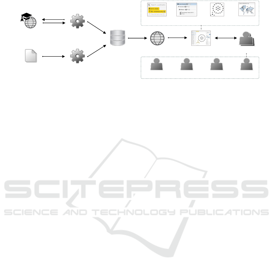
University
Bibliographic Data
Management Platform
DB
Supplementary
Publication Venue
Rankings
Data Retrieval and
Processing Module
Supplementary Data
Importing Module
Web Application Interactive Visual
Interface
Users
University
Librarian
University
Manager
University
Researcher
External
User
Publication
Search/Filtering
Hierarchy
View
Network
View
Data Facet
Views
Figure 1: Overview of our proposed interactive visual approach for bibliographic data exploration.
two groups, we first discuss the data-related concerns
in Section 4 and then the interactive visual interface
design in Section 5. We report on the stakeholders’
feedback and discuss further concerns in Section 6,
and conclude this paper with Section 7.
2 RELATED WORK
Application of computational methods involving sta-
tistical, temporal, and graph/network-based models
has a long history in bibliometrics and scientomet-
rics. The researchers in library and information sci-
ence also make use of visualization, especially for
graphs/networks constructed from publication data.
For example, Small describes computational and vi-
sual approaches for (co-)citation networks, which can
be eventually applied to predict emerging areas of
growth across scientific disciplines and fields (Small,
1999; Small, 2006). While such studies, conducted
and published primarily by library and information
science researchers, mainly make use of traditional
statistical charts and static node-link diagram rep-
resentations, Salaba and Mer
ˇ
cun report the results
of an interesting user study that compares a tradi-
tional faceted user interface for bibliographic data ex-
ploration with several interactive visualization tech-
niques less widely used in the community, such as
a sunburst diagram (Salaba and Mer
ˇ
cun, 2020), with
encouraging results for particular user tasks.
Within the visualization community, bibliographic
data and bibliometric analyses have also attracted the
researchers’ attention for years. The variety of stud-
ies focusing on publication data are discussed in sev-
eral existing surveys (Federico et al., 2017; Liu et al.,
2018), for instance, the CiteSpace tool (Chen, 2006).
Some of the noteworthy recent contributions in this
field include, among others, GRAM by Burd et al., an
approach that generates interactive map-like represen-
tations of aggregated research topic data (Burd et al.,
2018). GRAM does not directly rely on bibliographic
records, though, as it uses self-reported research top-
ics from Google Scholar profiles. One of the goals of
the approach by Burd et al. is to facilitate the univer-
sity administration policy-making regarding research
strategies and resources. This is related to the goals
of our project, too; however, the data sources and user
tasks are quite different, leading to different design
choices for the visual representations and interactions.
With respect to the focus on the network data ex-
traction and representation for scientific publications,
OLGAVis (Jo et al., 2021) provides OLAP function-
ality and node-link visual representation. Some of
the other existing approaches focus on the temporal
perspective, typically with the goal of representing
the publication data from a particular conference over
time, e.g., CiteRivers (Heimerl et al., 2016) or VIS-
tory (Zeng et al., 2021). VisualBib (Dattolo and Cor-
batto, 2022) provides a rich set of bibliography man-
agement functionality in addition to exploration capa-
bilities. In contrast to these approaches, ReviewerNet
(Salinas et al., 2020) shifts the focus to individual re-
searchers rather than venues or publication records.
The study by Rosenthal et al. (Rosenthal et al., 2019)
is one of the most relevant to our work with respect to
the underlying motivation and stakeholders, although
their focus is entirely on the temporal perspective.
3 DESIGN REQUIREMENTS
The overall process of design and realization of
this project fits the general framework of de-
sign/application studies as discussed by the visual-
ization community (Sedlmair et al., 2012). The re-
quirements for this work were motivated and com-
municated by the representatives of several groups of
stakeholders within the university over the course of
months via email and in-person meetings. Table 1
provides an overview of the main groups of stakehold-
ers. The representatives of the first two groups were
directly involved in the discussions regarding the de-
Supporting University Research and Administration via Interactive Visual Exploration of Bibliographic Data
249
Table 1: The main groups of stakeholders involved or considered in our project, and their respective needs.
Stakeholder group Needs to be addressed by the interactive tool
University librarians (1) Gain overview of university-wide bibliometric results; (2) identify issues with bibliographic
data
University administration (1) Gain overview of university-wide or more detailed bibliometric results; (2) assess and compare
the publication output at various levels within the university; (3) identify productive existing and
potential collaborations at the internal, national, and international levels
University researchers (1) Gain overview of university-wide or more detailed bibliometric results; (2) identify potential
collaborations and research opportunities at various levels
Potential external users (1) Gain overview of university-wide bibliometric results; (2) identify particular publications, re-
searchers, groups, or projects at the university for potential collaborations, supervision, expert
duties, outreach activities, etc.
Table 2: The main design requirements established for our project.
R1 The interactive tool shall retrieve and use the publication data from the existing bibliographic data management platform
DiVA (M
¨
uller et al., 2003) used at the university
R2 The interactive tool should support data augmentation with respect to the publication venue ranking according to the
specific ranking data used at the university and available at the national level
R3 The interactive tool should allow for the potential quality issues in the existing publication data, such as missing or mis-
spelled affiliation titles, for instance
R4 The interactive tool shall be available as a web-based application (and it will be primarily used from desktop/laptop
computers rather than other device classes)
R5 The interactive tool shall provide the bibliometric information based on the existing publication data, including the tempo-
ral overview, top publication venues, research subjects and disciplines, keywords, and external collaborations mentioned
within the publication metadata entries
R6 The interactive tool shall support browsing, search, and filtering across the publication data with respect to the affiliations
mentioned within the publication metadata entries, including the support for affiliation hierarchies, when possible
R7 The interactive tool should support the exploration of relationships between publication entries, authors/editors, and affili-
ations based on the existing publication data
R8 The interactive tool should provide its functionality to the users with limited training/instruction required (and the docu-
mentation on the main modules, representations, and interactions should be provided within the tool)
sign and implementation of the proposed approach,
and the authors of this work represent the third group
themselves. The fourth group represents further po-
tential end-users, such as students or external actors.
Based on these considerations, the main design re-
quirements listed in Table 2 could be established for
our project. We should mention that the stakehold-
ers (besides ourselves as the authors of the tool) did
not initially provide any hard requirements with re-
spect to the visual representations or interactions to
be included/excluded from the user interface, but the
last requirement on the list captures the expectation
for techniques that would not be overwhelming for
the users without extensive training or background in
information visualization (B
¨
orner et al., 2016; Rus-
sell, 2016). Later during the project development, the
stakeholders actually expressed a requirement for one
particular visualization technique to be added—this
will be discussed below in Section 5.3.
4 DATA-RELATED CONCERNS
As described above, a considerable number of re-
quirements and constraints for the interactive tool
concern the data retrieval, storage, and processing
functionality, since the project aims to make use of
the existing bibliographic data management platform
DiVA (M
¨
uller et al., 2003) used at our university. The
respective platform has been in active use for many
years, which explains the peculiarities and quirks of
the data schema and export formats provided by it.
As presented in Figure 1, the backend consists of
several components, starting with the database client
module. The modules for retrieving and importing
the main publication data sets as well as publication
venue rankings are designed to be either launched as
one-off scripts, or set up to be launched periodically.
In order to accommodate the design requirements
discussed above, the publication entries are not suffi-
cient on their own. The backend module thus extracts
the information about the authors of the publications,
the editors (in case at least one of them is detected to
be the staff member at our university), and the respec-
tive affiliations. Furthermore, the information about
publication venues (and their rankings, if available),
publishers, funders, keywords, research subjects, and
disciplines is extracted from the bibliographic records
and stored in the DB to be used by the frontend.
IVAPP 2023 - 14th International Conference on Information Visualization Theory and Applications
250

We should note that even when dealing with the
data within a single university, our tool had to ad-
dress the challenges of matching and disambiguating
author/editor entries, inconsistent affiliation records,
and further data quality issues. While the platform
used by our university encourages the researchers to
specify their local account details within the publi-
cation records, it does not enforce a consistent way
to specify the external collaborators and their affili-
ations. This is beneficial in some cases (too much
validation and restriction would probably be cumber-
some and inflexible in some scenarios), but for the
purposes of data extraction, analysis, and visual ex-
ploration, this results in additional challenges. For
example, to make use of the external collaborations
data, the external affiliation strings are parsed by our
backend using the coco (country converter) library
(Stadler, 2017) and additional heuristics.
Finally, on importing and processing the publica-
tion data sets nightly, the backend prepares and caches
the JSON representation of the processed data set to
be used by the Flask web application and served to
the interactive visual interface, as discussed next.
5 VISUAL INTERFACE
The frontend of our tool is implemented in JavaScript
using D3 and further libraries mentioned below to
provide a rich custom user interface (see Figure 2)
with multiple coordinated views (Roberts, 2007).
The top panel includes the text search and the filter
controls (cf. Figure 2(a)). The search query is com-
pared to multiple text-based fields in the data entries,
e.g., publication venues or affiliation titles. Some
of the filters can be adjusted only (e.g., the tempo-
ral filter) or completely removed (e.g., the filters as-
sociated with a particular author, etc.). The motiva-
tion for including the permanent, non-removable fil-
ters and for their default values lies with the sugges-
tions and requirements expressed by our stakehold-
ers: for instance, the optional filter for selecting only
the publications with explicit funding notes was re-
quested by the university administration in order to
focus on the respective data. The filtering eventually
affects the underlying set of the currently displayed
publication entries (as the rest of information such as
authors and affiliations is linked to particular publica-
tions) and thus triggers the updates of the other views
discussed below.
5.1 Hierarchical Data View
The left panel displayed in Figure 2(b) represents
the hierarchical data extracted from the publications:
publication entries are nested under persons (au-
thors/editors), persons are nested under affiliations
(institutions/departments or external affiliations), and
affiliations are nested under aggregate affiliations
(e.g., external affiliations are grouped into countries
and world regions). Thus, a single publication record
from the DiVA platform might be represented by sev-
eral entries in the hierarchy view, being nested under
several co-authors or co-editors, for instance.
Color coding is used sparingly in this part of the
GUI, with blue color used to indicate the entries re-
lated to the expanded network view nodes (see be-
low), and gray color used to indicate the publication
entries with editor rather than author contributions
from the respective persons. The person entries re-
lated to the home university are additionally marked.
Clicking on a panel header in the hierarchy
view (e.g., for the aggregate entries “Home univer-
sity” and “External collaborations” visible by de-
fault) folds/unfolds the corresponding nested hierar-
chy data, thus allowing the user to dive deeper into
details, if desired. Hovering over an icon prepended
to each hierarchy entry title reveals a tooltip with ad-
ditional details. The details are also displayed when
hovering over a badge label appended to the title. The
respective numerical label represents the number of
non-filtered children nodes for the respective hierar-
chy node, such as the number of persons for an affil-
iation. The next control element included in the hier-
archy entry node is a filter button (e.g., to only display
publications with a specific author or affiliation). Ad-
ditionally, clicking on a button with four arrows will
trigger a node expansion + highlighting update in the
network view (see the next subsection).
For publication entries in particular, a link to the
respective page in the DiVA platform is displayed as
well as the publication venue ranking, if available (cf.
R2 in Section 3). Finally, full details about a publica-
tion are presented in a dialog window when clicking
on a button with an information icon.
5.2 Network Data View
The central panel displayed in Figure 2(c) provides
a heterogeneous network view comprising node rep-
resentations of publications, persons, affiliations, and
aggregate affiliations. The person and affiliation
nodes related to the home university are additionally
marked. In contrast to the hierarchy view, the data
used for the network does not include duplicate nested
Supporting University Research and Administration via Interactive Visual Exploration of Bibliographic Data
251
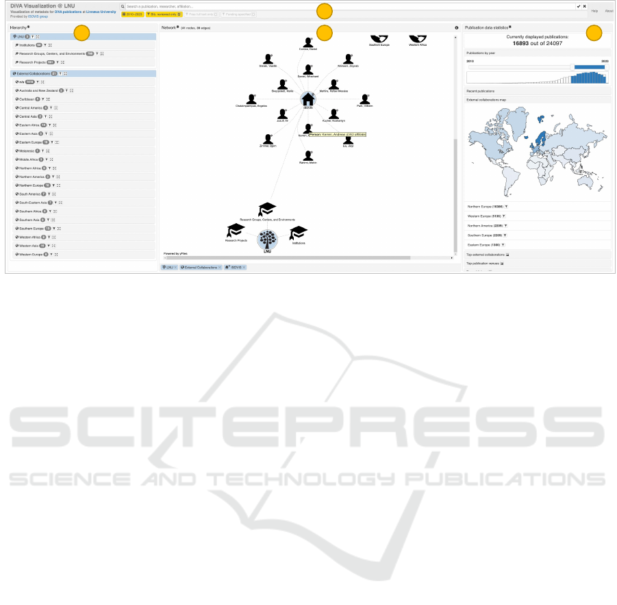
a
b c d
Figure 2: The interactive visual interface of our bibliographic data exploration tool: (a) the search and filter controls; (b) the
hierarchical data view; (c) the network view; and (d) the data facet views. Here, in addition to the filters applied by default
(which affect all of the views), the user has expanded the network node corresponding to the ISOVIS research group, and
hovered the mouse pointer over the node corresponding to Kerren, Andreas in the network view, triggering the tooltip.
entries—instead, the relationships between various
nodes are represented by edges (lines), e.g., a sin-
gle publication node can be connected to several co-
authors or co-editors. Most of the contents of the net-
work are folded (hidden) initially and can be revealed
through interactions. This decision was inspired by
the egocentric network exploration approach (Fisher,
2005) in order to allow the users focus on the parts of
the network most relevant to their current focus; fur-
thermore, representing the complete network of thou-
sands of nodes (publications, authors, etc.) and edges
is not always feasible with a node-link diagram.
The network view is implemented using the yFiles
for HTML library (Wiese et al., 2004), which supports
a number of layout algorithms and interactions while
providing a high degree of customizability and perfor-
mance. The choice of the layout currently used in our
tool was driven by the underlying data and expected
interactions: while the set of nodes and edges visi-
ble on accessing the tool initially is quite predictable
(top-level aggregate nodes), an arbitrary subset of the
nodes and edges might eventually be displayed, based
on the user’s actions. Currently, the organic layout ap-
proach is used with yFiles, with further enhancements
regarding the identification and radial layout for star
substructures, as well as organic edge routing.
The network view supports panning, zooming,
node tooltips on hover, and node highlight on click-
ing: the node itself is highlighted with orange-red,
and its currently visible network connections (edges
and nodes) are highlighted in yellow. This function-
ality is useful to trace particular relations at a glance.
Furthermore, right-clicking a node creates a new pub-
lication filter (e.g., an affiliation filter in case of an
affiliation node).
Finally, double-clicking on a network node will
expand it. This action will reveal the edges and nodes
connected to the double-clicked node, if they are not
displayed already. For example, double-clicking on
a publication node will reveal the related persons as
well as affiliations. The network layout will adapt ac-
cordingly. Expanded nodes are highlighted in blue,
and they are not affected by filtering applied in the
user interface, effectively “pinning” them (not with
respect to the spatial position, though). To keep track
of the currently expanded nodes, the corresponding
labels are displayed below the central panel.
Further examples of the outcomes of network
view interactions are demonstrated in Figure 3. Here,
the user has identified a publication of interest (e.g.,
via the hierarchy or data facet views) and chosen
to expand and highlight the respective node (Chatz-
imparmpas et al., 2020). The adjacent nodes are
then displayed in the network view, meaning au-
thors/editors for the respective publication. The user
decides to focus on one of the persons not affiliated
with the home university, Rossi, Fabrice, and expands
the respective network node. This leads to the ap-
pearance of the adjacent nodes, i.e., publications and
affiliations for the respective person. No further pub-
lication nodes appear, though, indicating that the re-
spective external collaborator has not contributed to
any other publication in the current data set (given
the current set of filters); however, an additional ex-
IVAPP 2023 - 14th International Conference on Information Visualization Theory and Applications
252
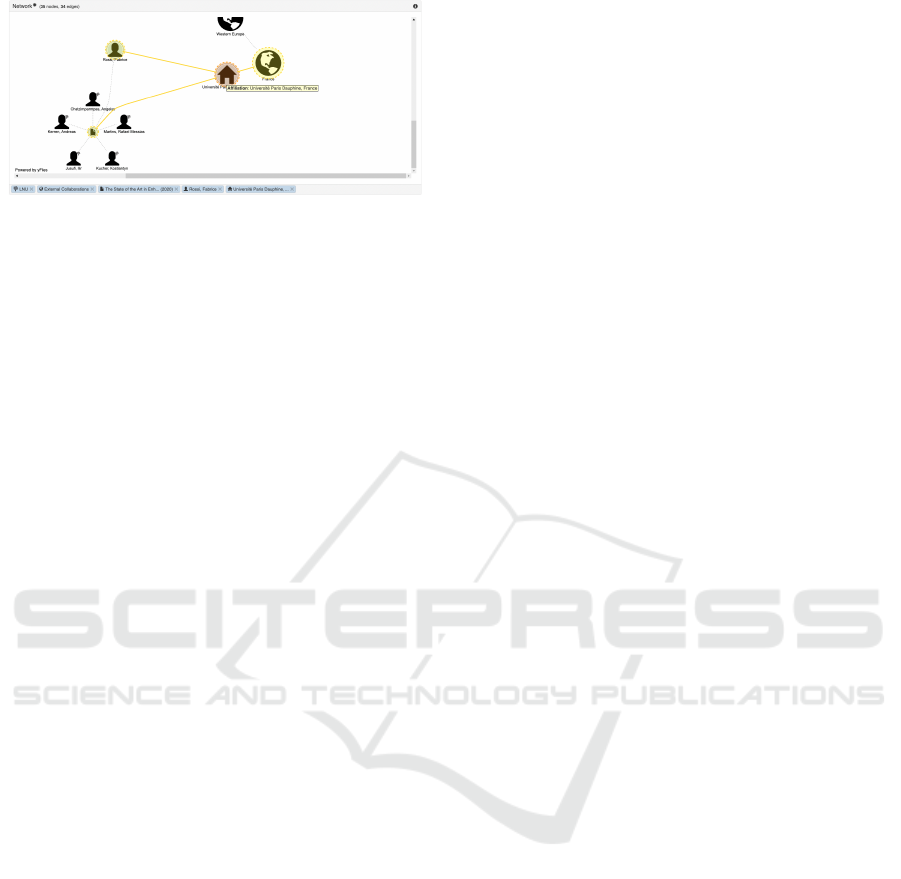
Figure 3: Example of interactions within the network view.
ternal affiliation node appears. The user decides to
expand and highlight the respective node Universit
´
e
Paris Dauphine, France. The results of this interac-
tion are demonstrated in Figure 3: the adjacent aggre-
gate affiliation node France appears in the network,
and the layout is automatically adjusted to accommo-
date the edges between the affiliation, aggregate node
(country), aggregate node (region), and top-level ag-
gregate node for external collaborations.
5.3 Data Facet Views
The right panel displayed in Figure 2(d) comprises
several views related to specific aspects or attributes
in the publication metadata, most of which are folded
by default to save space and avoid overwhelming the
user. Hovering over most of the elements in the right
panel will reveal a tooltip with additional details, and
buttons are also available to create corresponding fil-
ters (e.g., to only display publications with a specific
keyword or research subject).
The temporal view provides a slider for filtering
the visible data based on the publication year. It also
includes a bar chart representing the total number and
the currently displayed number (affected by the cur-
rently applied filters) of publications by year.
The list of recent publications is located below to
provide the user with a simple way to browse the lat-
est publications within the currently displayed data
subset without the need to navigate through the af-
filiations or authors.
The map view provides a simple choropleth rep-
resentation based on the world region data extracted
from the external affiliations listed for the publication
records. The intensity of the color used for each world
region is proportional to the number of the currently
visible publications (affected by the applied filters).
Under the map view, the corresponding information
about world regions is additionally represented with a
list ordered by the respective numerical value.
The rest of the views in the right panel represent
sorted lists of external affiliations, publication key-
words and venues, etc., based on the number of the
currently visible publications (affected by the applied
filters). These lists allow the user to quickly browse
through the top publication venues, for instance.
The headers for these lists also include buttons
for an additional functionality that was explicitly re-
quested by our collaborators from the university ad-
ministration. They asked for the option to generate a
word cloud (Vi
´
egas and Wattenberg, 2008) for the re-
spective set of weighted labels representing top publi-
cation venues, funders, etc. for the currently displayed
subset of publications. The motivation for this request
was related to the need to export their findings from
the exploration or specific analyses within the tool in a
form that would be suitable for further dissemination
and presentation purposes, e.g., as a figure included
in presentation slides for the use within or outside of
the university. While we mentioned the existing con-
cerns raised within the visualization community in re-
lation to word clouds (Vi
´
egas and Wattenberg, 2008;
Felix et al., 2018), our collaborators saw this tech-
nique as familiar, suitable for their needs, and aes-
thetically pleasing. Thus, we implemented this tech-
nique, while limiting the max number of entries for
each respective list, allowing for horizontal and ver-
tical alignment only, and providing a dialog with the
options to exclude the particular elements and to edit
the respective text labels. The latter functionality was
motivated by the nature of the underlying data, which
might result in very long titles of journals or funding
agencies, for instance, and result in deteriorated qual-
ity of the layout.
6 DISCUSSION
In this section, we report on the feedback received
from several groups of stakeholders throughout the
project, as well as lessons learned, limitations, and
considerations for future work.
6.1 Feedback from Stakeholders
As part of our communication with the colleagues
from the university library, early on we managed to
find common ground and the understanding that the
interactive visual tool would be complementary and
would not be designed to replace the existing bib-
liographic data management platform DiVA (M
¨
uller
et al., 2003) used at our university, which was ben-
eficial for the project. The librarians were also very
helpful with respect to clarifying the particular data
format peculiarities found in DiVA, and were eager to
investigate the bibliographic data quality issues iden-
tified with both the backend processing and interac-
tive exploration within our tool.
Supporting University Research and Administration via Interactive Visual Exploration of Bibliographic Data
253

One interesting example was related to a biblio-
graphic entry that posed issues for the CSV parser:
on closer inspection, we discovered that the respective
publication author managed to use the rich text editor
within DiVA to upload a screenshot of their paper’s ti-
tle page instead of providing the abstract as text. The
colleagues from the university library also used our
tool to identify inconsistent spellings and typos even
for internal affiliations and authors/editors, especially
for older publication entries, which is facilitated by
browsing the hierarchical data view.
One particular suggestion that we received (and
implemented) from the librarians was related to the
network exploration: while navigating through the
network and hierarchy views, they discovered that it
could become cumbersome to look up the network
nodes to fold within the network view; thus, the con-
trols for folding the nodes directly from the labels sit-
uated below the network view were added.
Our colleagues from the university administration
also demonstrated interest and provided encouraging
feedback for the design and functionality offered by
our tool. Some particular adjustments or interactions
that they requested during the project included, for in-
stance, the search by research subject; representation
of local research groups and projects as affiliations
within the hierarchy and network views; filtering the
publications by the explicit funding status; and also
the word cloud functionality, with the ability to ex-
clude or adjust the particular items that could be con-
sidered noise.
Some of the interesting findings discovered by us-
ing our tool were related to the role of particular re-
search funding agencies in the available publication
data for our university. Further comments made by
the university administration representatives included
the notes about the inconsistently specified affiliation
titles/abbreviations (as specified by the respective au-
thors) and the potential way to address this issue by
integrating our tool further with the internal univer-
sity administration IT systems, e.g., in order to re-
trieve more accurate data about the ongoing projects,
groups, etc. and the respective staff allocation.
6.2 Limitations and Future Work
From the point of view of the data availability and
backend aspects of our project, we should mention
the potential inaccuracies occurring with respect to
the inconsistent or incomplete data—for instance, our
approach essentially tries to “guess” the country for
external affiliations by using text parsing and heuris-
tics, however, the results are not always perfect. We
acknowledge this issue within the tool documentation
and instruct the users to refer to the underlying publi-
cation records, for instance.
With respect to the interactive visual interface, we
acknowledge the potential issues with the network
view, such as the exact layout reproducibility con-
cerns after a series of interactions, or the classic trade-
offs between the aesthetic criteria (Purchase, 2002)
such as edge crossings vs. edge length. Given the dy-
namic nature of exploration and the dense relation-
ships between the network nodes, an ideal solution
is most likely not achievable here, but further efforts
should still be made, accompanied with user stud-
ies (Lam et al., 2012; Purchase, 2012) to evaluate
and compare the resulting design alternatives, for in-
stance. Future work for the interactive visual interface
also includes further support for temporal analyses of
data subsets. Finally, we see opportunities for apply-
ing text mining and visual text analytics (Kucher and
Kerren, 2015; Alharbi and Laramee, 2019) for publi-
cation abstracts or full texts as part of our future work.
7 CONCLUSIONS
In this paper, we present a project in supporting uni-
versity research and administration via interactive vi-
sual exploration of bibliographic data. We describe
the stakeholders and design requirements for this
work, including the constraints related to the use of
the existing publication data available from the biblio-
graphic data management platform DiVA established
at our university. The implemented tool addresses
the respective data peculiarities and provides multi-
ple perspectives and interactions for exploring and
investigating the publication data, the respective au-
thors/editors, their affiliations, and a variety of addi-
tional data facets. The tool has been used by the uni-
versity library staff to identify data quality issues with
the publication data, and by the university administra-
tion to gain understanding of the research output of
particular local research groups and environments as
well as their collaborations outside of the university,
among other application scenarios.
ACKNOWLEDGEMENTS
This research was partially supported by Linnaeus
University. The authors would like to thank Gunn
Jensen, Ida Ahlstr
¨
om, Solbritt Andersson, and Ted
Gunnarsson for their input and support in this project.
The authors would also like to thank yWorks GmbH
for the academic license support for yFiles for HTML.
IVAPP 2023 - 14th International Conference on Information Visualization Theory and Applications
254

REFERENCES
Alharbi, M. and Laramee, R. S. (2019). SoS TextVis:
An extended survey of surveys on text visualization.
Computers, 8(1).
B
¨
orner, K., Maltese, A., Balliet, R. N., and Heimlich, J.
(2016). Investigating aspects of data visualization
literacy using 20 information visualizations and 273
science museum visitors. Information Visualization,
15(3):198–213.
Burd, R., Espy, K. A., Hossain, M. I., Kobourov, S., Mer-
chant, N., and Purchase, H. (2018). GRAM: Global
research activity map. In Proceedings of the 2018
International Conference on Advanced Visual Inter-
faces, AVI ’18. ACM.
Chatzimparmpas, A., Martins, R. M., Jusufi, I., Kucher, K.,
Rossi, F., and Kerren, A. (2020). The state of the art
in enhancing trust in machine learning models with
the use of visualizations. Computer Graphics Forum,
39(3):713–756.
Chen, C. (2006). CiteSpace II: Detecting and visualizing
emerging trends and transient patterns in scientific lit-
erature. Journal of the American Society for Informa-
tion Science and Technology, 57(3):359–377.
Dattolo, A. and Corbatto, M. (2022). Assisting researchers
in bibliographic tasks: A new usable, real-time tool
for analyzing bibliographies. Journal of the As-
sociation for Information Science and Technology,
73(6):757–776.
Federico, P., Heimerl, F., Koch, S., and Miksch, S. (2017).
A survey on visual approaches for analyzing scientific
literature and patents. IEEE Transactions on Visual-
ization and Computer Graphics, 23(9):2179–2198.
Felix, C., Franconeri, S., and Bertini, E. (2018). Tak-
ing word clouds apart: An empirical investigation
of the design space for keyword summaries. IEEE
Transactions on Visualization and Computer Graph-
ics, 24(1):657–666.
Fisher, D. (2005). Using egocentric networks to understand
communication. IEEE Internet Computing, 9(5):20–
28.
Heimerl, F., Han, Q., Koch, S., and Ertl, T. (2016). Ci-
teRivers: Visual analytics of citation patterns. IEEE
Transactions on Visualization and Computer Graph-
ics, 22(1):190–199.
Jo, S., Park, B., Lee, S., and Kim, J. (2021). OLGAVis: On-
line graph analysis and visualization for bibliographic
information network. Applied Sciences, 11(9).
Kucher, K. and Kerren, A. (2015). Text visualization tech-
niques: Taxonomy, visual survey, and community in-
sights. In Proceedings of the IEEE Pacific Visual-
ization Symposium, PacificVis ’15, pages 117–121.
IEEE.
Lam, H., Bertini, E., Isenberg, P., Plaisant, C., and Carpen-
dale, S. (2012). Empirical studies in information vi-
sualization: Seven scenarios. IEEE Transactions on
Visualization and Computer Graphics, 18(9):1520–
1536.
Liu, J., Tang, T., Wang, W., Xu, B., Kong, X., and Xia, F.
(2018). A survey of scholarly data visualization. IEEE
Access, 6:19205–19221.
M
¨
uller, E., Klosa, U., Andersson, S., and Hansson, P.
(2003). The DiVA project: Development of an elec-
tronic publishing system. D-Lib Magazine, 9(11).
Purchase, H. C. (2002). Metrics for graph drawing aes-
thetics. Journal of Visual Languages & Computing,
13(5):501–516.
Purchase, H. C. (2012). Experimental Human-Computer
Interaction: A Practical Guide with Visual Examples.
Cambridge University Press.
Roberts, J. C. (2007). State of the art: Coordinated & mul-
tiple views in exploratory visualization. In Proceed-
ings of the Fifth International Conference on Coor-
dinated and Multiple Views in Exploratory Visualiza-
tion, CMV 2007, pages 61–71. IEEE.
Rosenthal, P., M
¨
uller, N., and Bolte, F. (2019). Visual an-
alytics of bibliographical data for strategic decision
support of university leaders: A design study. In Pro-
ceedings of the 14th International Joint Conference
on Computer Vision, Imaging and Computer Graphics
Theory and Applications—Volume 3: IVAPP, pages
297–305. SciTePress.
Russell, D. M. (2016). Simple is good: Observations of
visualization use amongst the Big Data digerati. In
Proceedings of the International Working Conference
on Advanced Visual Interfaces, AVI ’16, pages 7–12.
ACM.
Salaba, A. and Mer
ˇ
cun, T. (2020). Visualizations of biblio-
graphic information: A user experience study. Journal
of Librarianship and Information Science, 52(1):271–
287.
Salinas, M., Giorgi, D., Ponchio, F., and Cignoni, P. (2020).
ReviewerNet: A visualization platform for the selec-
tion of academic reviewers. Computers & Graphics,
89:77–87.
Sedlmair, M., Meyer, M., and Munzner, T. (2012). Design
study methodology: Reflections from the trenches and
the stacks. IEEE Transactions on Visualization and
Computer Graphics, 18(12):2431–2440.
Small, H. (1999). Visualizing science by citation mapping.
Journal of the American Society for Information Sci-
ence, 50(9):799–813.
Small, H. (2006). Tracking and predicting growth areas in
science. Scientometrics, 68(3):595–610.
Stadler, K. (2017). The country converter coco — A Python
package for converting country names between differ-
ent classification schemes. Journal of Open Source
Software, 2(16):332.
Vi
´
egas, F. B. and Wattenberg, M. (2008). Tag clouds and
the case for vernacular visualization. Interactions,
15(4):49–52.
Wiese, R., Eiglsperger, M., and Kaufmann, M. (2004).
yFiles—Visualization and automatic layout of
graphs. In Graph Drawing Software, pages 173–191.
Springer.
Zeng, W., Dong, A., Chen, X., and Cheng, Z.-l. (2021).
VIStory: Interactive storyboard for exploring visual
information in scientific publications. Journal of Vi-
sualization, 24(1):69–84.
Supporting University Research and Administration via Interactive Visual Exploration of Bibliographic Data
255
