
XAIVIER the Savior: A Web Application for Interactive Explainable AI
in Time Series Data
Ilija
ˇ
Simi
´
c, Christian Partl and Vedran Sabol
Know-Center GmbH, Graz, Austria
Keywords:
Explainable AI, Interactive Systems, Deep Learning, Attribution Methods, Visualization, Time Series,
Recommender.
Abstract:
The rising popularity of black-box deep learning models directly lead to an increased interest in eXplainable
AI - a field concerned with methods that explain the behavior of machine learning models. However, different
types of stakeholders interact with XAI, all of which have different requirements and expectations of XAI
systems. Moreover, XAI methods and tools are mostly developed for image, text, and tabular data, while
explainability methods and tools for time series data - which is abundant in high-stakes domains - are in
comparison fairly neglected. In this paper, we first contribute with a set of XAI user requirements for the
most prominent XAI stakeholders, the machine learning experts. We also contribute with a set of functional
requirements, which should be fulfilled by an XAI tool to address the derived user requirements. Based on
the functional requirements, we have designed and developed XAIVIER, the eXplainable AI VIsual Explorer
and Recommender, a web application for interactive XAI in time series data. XAIVIER stands out with its
explainer recommender that advises users which explanation method they should use for their dataset and
model, and which ones to avoid. We have evaluated XAIVIER and its explainer recommender in a usability
study, and demonstrate its usage and benefits in a detailed user scenario.
1 INTRODUCTION
The remarkable results of deep learning (DL) mod-
els resulted in an increased interest in these models
coming from high-stakes domains, such as industry,
medicine, or finance. However, due to the severe im-
pact that a model’s predictions may have in such set-
tings, it is essential that each model prediction can be
justified as well.
The demand for explainable models contributed to
the increased attention in eXplainable AI (XAI) - a
field that revolves around methods for explaining the
behavior of machine learning models. The number of
XAI methods is vast and in this paper we focus on XAI
methods that explain model predictions by assigning
a relevance to the input features, so-called attribu-
tion methods (Sundararajan et al., 2017). Attribution
methods are particularly relevant for tasks where the
understanding of specific predictions is of great im-
portance. Given that in this paper we focus solely
on attribution methods, we imply attribution methods
when we refer to explainers.
Many attribution methods have been recently in-
troduced, which rely on different approaches for pro-
ducing explanations. As shown in Figure 1, these dif-
ferent approaches can, and often do, lead to different
explanations for the same model and sample. Given
that the selection of a bad attribution method may
lead to no, or even wrong insights, a major obstacle
is the selection of an attribution method that faithfully
shows what aspects of the input were truly relevant
for a model to make its prediction.
Due to the increased attention to XAI, different
types of user groups (stakeholders) get in touch with
XAI. However, the different user groups also have
different background knowledge and requirements for
XAI. Thus, when developing XAI tools, the require-
ments and needs of the target user must be taken into
consideration. With this paper, we aim to support the
largest XAI user group - the machine learning experts
- with a visual tool tailored to their requirements.
Additionally, XAI methods are mostly developed
and evaluated with image, text or tabular data as high-
lighted by Guidotti et al. (Guidotti et al., 2018) and
supported by additional XAI literature reviews, which
simply omit XAI methods for time series data (Adadi
and Berrada, 2018; Hohman et al., 2018). While time
series data is abundant and important in high-stakes
166
Šimi
´
c, I., Partl, C. and Sabol, V.
XAIVIER the Savior: A Web Application for Interactive Explainable AI in Time Series Data.
DOI: 10.5220/0011684800003417
In Proceedings of the 18th International Joint Conference on Computer Vision, Imaging and Computer Graphics Theory and Applications (VISIGRAPP 2023) - Volume 3: IVAPP, pages
166-178
ISBN: 978-989-758-634-7; ISSN: 2184-4321
Copyright
c
2023 by SCITEPRESS – Science and Technology Publications, Lda. Under CC license (CC BY-NC-ND 4.0)

Figure 1: XAIVIER’s explanation comparison - Two ex-
plainers identifying different time steps of the same time
series as important (red), provided the same model predic-
tion. The explanation on top was created using DeepLIFT,
and the one on the bottom using Guided Backpropagation.
domains, it did not receive as much attention when
compared to XAI for other data types, and explain-
ability for time series classification models consists
mostly in the application of XAI methods developed
for other data types (
ˇ
Simi
´
c et al., 2021; Rojat et al.,
2021). Most importantly, the are few works which in-
vestigate how well existing XAI methods work with
time series data (Schlegel et al., 2019; Ismail et al.,
2020), and it has been shown that existing evaluations
are flawed (
ˇ
Simi
´
c et al., 2022).
Therefore, our visual XAI tool focuses on time se-
ries data with an included explainer recommender as,
to our best knowledge, such a tool is not available yet.
Contributions: The scientific contributions of
this paper are three-fold:
1. We provide a summary on user requirements to
support machine learning experts to understand
and improve their machine learning models. The
requirements were collected through a literature
survey on XAI requirements and were reinforced
by our own user survey.
2. We employ state of the art metrics for evaluat-
ing faithfulness (Selvaraju et al., 2017) of XAI
methods on time series data (
ˇ
Simi
´
c et al., 2022),
to deliver a explainer recommender, which, given
a specific data set and model, suggests the most
faithful explainers.
3. Based on collected user requirements and the ex-
planation recommender, we design and evaluate a
novel tool. XAIVIER, the eXplainable AI VIsual
Explorer and Recommender, is a web application
for interactive XAI in time series data for machine
learning experts.
Due to the lack of time series XAI UIs, we de-
veloped XAIVIER primarily with this data type in
mind. XAIVIER supports exploration of time series
datasets, as well as inspection of their corresponding
models. It also allows users to explain a model’s pre-
dictions with many prominent explainers. XAIVIER
also contributes with the inclusion of an explainer
recommender, which advises users which explainer
they should use, and which ones they should avoid.
Of course, our intention for the future is to extend
XAIVIER to other relevant data types as well.
2 RELATED WORK
Depending on the scope of the explanation, XAI
methods (or simply explainers) can be divided into
global or local explainers (Guidotti et al., 2018).
While global explainers try to clarify a model’s be-
havior as a whole, local explainers provide informa-
tion about why a model made a specific prediction
for a single sample. Attribution methods (Sundarara-
jan et al., 2017) are the most popular type of local
explainers, which explain a model’s prediction by as-
signing a relevance to each individual input feature,
representing how much it contributed to the model’s
prediction.
A multitude of attribution methods have been re-
cently introduced, which utilize different approaches
to compute the relevances. For example, attribu-
tion methods can rely on gradients (Simonyan et al.,
2014), relevance backpropagation (Bach et al., 2015),
feature occlusion (Zeiler and Fergus, 2014), or surro-
gate models (Ribeiro et al., 2016).
Feature attributions are typically visualized as bar
charts (Ribeiro et al., 2016; Lundberg and Lee, 2017)
(for tabular data), heat maps (Selvaraju et al., 2017;
Sundararajan et al., 2017) (for image, text and time
series data) or line charts (Goodfellow et al., 2018)
(time series specific). In XAIVIER, we opted for
the heat map representation, as it is a more com-
pact visual representation of feature relevance than
line charts, and more commonly used as shown in re-
cent visual analytics for XAI reviews (Hohman et al.,
2018; Alicioglu and Sun, 2022).
Many libraries (Alber et al., 2019; Kokhlikyan
et al., 2020; Klaise et al., 2021; Arya et al., 2019),
SDKs (Wexler et al., 2019) (e.g, Vertex Explain-
able AI
1
), and command line tools (e.g., Modelstu-
dio
2
) offer implementations of prominent explainers.
These tools are a great starting point for advanced
users to apply different explainers on their own mod-
els. However, even though some of these tools may
generate interactive user interfaces (UIs) to simplify
analysis, all of them require programming knowledge
1
https://github.com/GoogleCloudPlatform/
explainable ai sdk
2
https://github.com/ModelOriented/modelStudio
XAIVIER the Savior: A Web Application for Interactive Explainable AI in Time Series Data
167

and strong familiarity with the specific framework the
models were developed with. This makes them not
suitable for a broader audience. Even for experienced
users, having to sift through the documentation and to
set up an appropriate environment just to simply gen-
erate a few explanations poses a great entry barrier.
Fiddler.ai
3
is a model monitoring application that
offers also model explainability support. However,
explanations are only supported for models trained
on tabular and natural language data. Fiddler.ai also
supports only three explainers without any indication
how well they are suited for the used dataset and
model. However, the explanations are generated not
by using the original model, but a surrogate model,
which approximates the original model. This in itself
can be a problem, since it cannot be guaranteed that
the surrogate model relies on the exact same features
to make its prediction as the original model.
Superwise.ai
4
, another model monitoring applica-
tion also offers model explainability. However, they
do not support local explanation methods, but offer
model explainability through various model monitor-
ing metrics. Additionally, they only support tabular
datasets and are not suited for time series data.
H2O Driverless AI
5
, an automated machine learn-
ing platform, offers interpretability functionalities
and supports time series data. However, time series
models can only be trained for forecasting and not for
classification. Additionally, even though they offer a
variety of models, they do not support deep learning
models for time series data. Moreover, the feature im-
portance that is computed for individual predictions is
based on automatically extracted features of the orig-
inal time series, since the model is not trained on the
raw data in an end-to-end fashion.
Given that these tools are designed for automated
model training, or model monitoring through various
metrics, it is not surprising that they do not provide
XAI as a core functionality that targets the require-
ments of machine learning experts as XAI practition-
ers. This is also reflected in the fact that none of the
tools offer the option to explore explanations of mul-
tiple samples at once, or to compare explanations of
different explainers for one sample.
Moreover, they either leave the crucial task of ex-
plainer selection completely to the user, or do not of-
fer any information about the quality of the explana-
tions. This is especially problematic, given the poten-
tial disagreement between explainers on what features
are actually important. Some well-performing ex-
plainers may be also limited to specific model types,
3
https://www.fiddler.ai/
4
https://www.superwise.ai/
5
https://h2o.ai/h2o-driverless-ai
requiring the selection of an alternative explainer.
While various visual analytics solutions for XAI
have also been proposed in the literature (Spinner
et al., 2019; Li et al., 2020; Krause et al., 2017;
Collaris and van Wijk, 2020), none provide an ex-
plainer recommender that identifies the most faithful
explainer, nor have they been developed for time se-
ries data.
With XAIVIER, we aimed to design and develop
a tool that is tailored to the requirements of machine
learning experts as XAI practitioners, specifically for
explaining the predictions of time series classifiers.
XAIVIER allows its users to rapidly explore and an-
alyze the explanations of many time series samples
at once, as well as to compare the explanations gen-
erated by a multitude of explainers. Additionally,
XAIVIER provides an explainer recommender that
pre-selects the best explainer for the provided dataset
and model and provides information why an explainer
is recommended or to be avoided.
The problem of recommending appropriate visual
representations for specific data has been thoroughly
explored (Mutlu et al., 2016; Zhu et al., 2020). In
contrast to these visualization recommendations our
proposed explainer recommender does not provide a
ranking for different visual data representations. In-
stead, it validates the correctness of different XAI al-
gorithms and ranks them depending on how faithfully
the explanations capture what was actually important
to a model to make its predictions. The visual repre-
sentation of the explanation, a heat map, is the same
for all XAI methods.
3 XAI REQUIREMENTS
ANALYSIS
We derived the user requirements for the main user
group of XAI by two means. First, we conducted
a literature review to identify XAI stakeholders and
their user requirements. Second, based on the results
from this review, we focused on the main XAI user
group and performed our own survey to confirm and
complement user requirements found in the literature.
In the following, we summarize the results of the lit-
erature review and our own survey, and describe the
derived user requirements.
3.1 Literature Review
Different overlapping XAI stakeholder categoriza-
tions have been proposed. For example, Preece et
al. (Preece et al., 2018), differentiates between: i)
IVAPP 2023 - 14th International Conference on Information Visualization Theory and Applications
168

developers - who are concerned with building AI ap-
plications, ii) theorists - who want to understand and
advance AI theory, iii) ethicists - who are concerned
with fairness accountability and transparency of AI
systems, and iv) users - people who use AI systems.
A more commonly used XAI stakeholder catego-
rization was proposed by Arrieta et al. (Arrieta et al.,
2020), who identifies the following stakeholders: i)
model users - make decisions based on model output,
ii) regulatory entities - regulate the process of using
AI systems, iii) managers - decide where to employ
AI, iv) developers - build, train and optimize models,
and v) affected users - people in the scope of an AI
decision.
Bhatt et al. (Bhatt et al., 2020) interviewed em-
ployees from companies that employ XAI to identify
the main user groups relying on explainability and
how they are using it. They concluded that in prac-
tice the most common explanation consumers were
machine learning engineers (including data scientists
and researchers), which corresponds to the developer
stakeholder according to Arrieta et al. They utilized
explanations to identify prediction relevant aspects
of the input, debug and improve faulty models, and
to verify the predictions before deployment. Over-
whelmingly, the most common type of employed XAI
method were local explainability methods such as at-
tribution methods. Moreover, they also interviewed
data scientists who are currently not using any XAI
tools to understand their expectations of XAI. The
majority of them wanted to employ XAI methods to
debug and monitor (verify) machine learning models.
Langer et al. (Langer et al., 2021) identified
XAI stakeholders’ main desiderata regarding XAI,
and used the stakeholder categorization as defined
by Arrieta et al. (Arrieta et al., 2020). The main
desiderata identified by Langer et al. for the devel-
opers were verification and performance. Verification
entails checking if the model functions as intended,
while performance implies the ability to increase the
model’s accuracy, e.g., identifying underrepresented
training data with the help of explainable methods.
This is also supported by other important desiderata
for this stakeholder class, such as debuggability (abil-
ity to debug a model using XAI), effectiveness (ability
to produce the desired result) and efficiency (reduce
effort with the help of XAI).
Moreover, when originally introducing the devel-
oper stakeholder, Arrieta et al. included that XAI
methods have to be informative to developers, and
that they have to feel confident when relying on the
employed methods.
Throughout the rest of this paper, we will use the
term machine learning experts to refer to the devel-
oper stakeholder of Arrieta et al. and the machine
learning engineer stakeholder of Bhatt et al. The ma-
chine learning experts are stakeholders who are pro-
ficient in training, developing and maintaining of ma-
chine learning models.
3.2 User Requirements Survey
To validate the machine learning experts’ XAI re-
quirements from the literature, we have performed a
survey as part of an XAI workshop with 20 partici-
pants of the target group from an AI research insti-
tute. In the survey, the machine learning experts were
asked to provide requirements and desiderata that they
want or expect from XAI. Most requirements were in
agreement with the previously proposed ones, espe-
cially regarding debugging and verification. The most
important additional requirements were related to ex-
plainer faithfulness (Selvaraju et al., 2017), where the
experts were interested in reliable and repeatable ex-
planations that they can trust. This is in agreement
with the confidence requirement proposed by Arrieta
et al. Moreover, the participants deemed it important
that the explanations are easily understandable and
interpretable, and that they can have a comparable
overview of the explanations. Also, the participants
deemed it important that the explanations can be com-
puted fast (related to efficiency), as well as applicabil-
ity of XAI methods to any model.
3.3 User Requirements
It is evident that currently XAI is mainly employed
by machine learning experts. By combining the re-
quirements identified in the literature review with the
feedback from machine learning experts in our sur-
vey, we have derived the following machine learning
expert user requirements for an XAI tool:
UR1: Model Improvement. An XAI tool has to
support the user in improving a model, i.e, by support-
ing the user in debugging a faulty model or further in-
creasing the performance of an already good model.
(Bhatt et al., 2020; Langer et al., 2021)
UR2: Model Verification. An XAI tool has to
support the user in verifying a model’s predictions.
This may be by confirming that the model relies on
input characteristics that align with human expecta-
tions, or are plausible to humans. (Bhatt et al., 2020;
Langer et al., 2021)
UR3: Effectiveness & Efficiency. An XAI tool
should make the user more effective and efficient.
The user should be able to produce the desired result
with reduced effort. (Langer et al., 2021)
XAIVIER the Savior: A Web Application for Interactive Explainable AI in Time Series Data
169

Table 1: Mapping of functional requirements to user re-
quirements.
UR1 UR2 UR3 UR4 UR5
FR1 • • •
FR2 • • • •
FR3 • • •
FR4 • •
FR5 • •
FR6 • • •
FR7 • •
UR4: Informativeness & Understandability.
An XAI tool should provide understandable and con-
cise explanations without being overwhelming. (Ar-
rieta et al., 2020)
UR5: Faithfulness. Users should be confident
that the employed XAI methods work reliably and ex-
planations are trustworthy. (Arrieta et al., 2020)
All of the listed user requirements have also been
confirmed through our own user requirements survey.
4 XAIVIER
Starting from the user requirements described in the
previous section, we translated them into concrete
functional requirements for an interactive XAI tool.
These functional requirements served as basis for the
design and development of XAIVIER. In the follow-
ing, we will first introduce the functional require-
ments and subsequently elaborate on the design and
development process of XAIVIER. Finally, we will
provide details about the implementation.
4.1 Functional Requirements
With XAIVIER we aimed to develop an XAI tool tai-
lored to the user requirements of machine learning
experts. With this goal in mind, we defined a set of
functional requirements that address the user require-
ments. Table 1 provides an overview about the map-
ping of functional requirements to user requirements.
FR1: Dataset and Model Selection. The first
step in understanding a model trained on a dataset is
the selection of the dataset and model itself. The se-
lection and loading of the dataset and model should
be unmistakably easy. (UR1, UR2, UR3)
FR2: Dataset Inspection. Users should be
enabled to interactively explore datasets and exam-
ine groups of samples or individual samples in detail.
(UR1, UR2, UR3, UR4)
FR3: Model Quality Estimation. Users should
be able to easily judge the performance of the whole
model, as well as easily identify problematic samples.
(UR1, UR2, UR3)
FR4: Explainer Recommendation. Given that
users cannot know which explainer works best for
their dataset and model, they have to be supported in
their explainer choice. Therefore, explainers suitable
for a given model and dataset should be suggested and
pre-selected for the user. (UR3, UR5)
FR5: Recommendation Transparency. Ex-
plainer recommendations should not be a black-box
themselves. Users should be supported in getting an
understanding on why some explainers are recom-
mended while others are not. (UR4, UR5)
FR6: Model Understanding. The system
should support users in gaining an understanding of
model predictions and behavior. Explanations to indi-
vidual predictions should be presented in a clear and
easy to understand way. (UR1, UR2, UR4)
FR7: Explanation Comparison. The sys-
tem should provide facilities to compare explanations
from different explainers in order to enable users to
judge differences in explanation quality themselves.
Since well-performing explainers should be recom-
mended, a comparison of explanations can help to
build trust in the recommendations. (UR4, UR5)
4.2 Application Design
For the development of XAIVIER, we focused our at-
tention on supporting XAI for univariate time series
classification, due to the abundance of this data type in
high-stakes domains, and omission of tools support-
ing this data type for the classification task. Specifi-
cally, due to the fact that most XAI methods were not
originally developed with time series data in mind, we
considered that a tool that can help the user in select-
ing the best XAI method for this data type would be
highly beneficial. Especially, when considering that
evaluation of XAI methods for time series was not ad-
equately supported until recently (
ˇ
Simi
´
c et al., 2022).
We started by designing the initial UI mock-ups
based on the functional requirements. Iterative im-
provements were made on the mock-ups after mul-
tiple discussions among machine learning experts in
regards to the expected interaction path that machine
learning experts would prefer in such an application.
It was clear that FR1 had to be addressed first,
since the selection of a dataset and model precedes
all other FRs. Therefore, we decided to dedicate the
whole landing page (Figure 2) solely to the selection
of the dataset and to its corresponding model. After
loading the data, the user would be presented with a
data analysis page, which addresses all other FRs.
We decided to separate the data analysis page
IVAPP 2023 - 14th International Conference on Information Visualization Theory and Applications
170

(Figure 3) into two core functionalities: model inves-
tigation and explainer recommendation. Each core
functionality is accessible through a corresponding
tab in the page’s navigation bar (Figure 3 (a)).
The model investigation tab is designed to allow
users to interactively explore and analyze data sam-
ples (FR2), model predictions (FR3), and prediction
explanations (FR6). All samples of the time series
data set are shown in the result view located in the
center of the page (Figure 3 (b)). In addition to plot-
ting the data in a line chart, we show relevant meta-
data per sample, including the sample id, the sample’s
ground truth, the model prediction, and the prediction
confidence. The samples may be sorted according to
any of these properties.
In order to enable users to identify relevant sam-
ples quickly, we added a filtering pane (Figure 3
(d)), which contains two complementary filtering in-
terfaces. A list-based interface is provided at the
top, which allows users to include or exclude sam-
ples based on their ground truth and model prediction
classes by checking the corresponding list entries, re-
spectively. A confusion matrix is also provided at the
bottom, which gives a compact overview about the
performance of the model (FR3). The matrix can also
be directly used to filter the data by selecting individ-
ual cells, rows, or columns.
To address FR6, we allow users to choose from a
range of attribution methods as explainers in the con-
figuration interface shown in Figure 3 (c). To address
FR4, XAIVIER can benchmark the available explain-
ers on the selected dataset and model. In the case that
the benchmark has been already completed, the best
explainer will be pre-selected (Figure 3 c)).
Every explainer assigns a score to each time point,
which is indicated by the background color at the cor-
responding positions in the line charts of each time
series sample. Depending on the explainer, the score
either represents the relevance of a time point for the
predicted class, or, whether the time point confirms
the prediction or conflicts with it. If an explainer pro-
duces only positive scores, it implies that the score
shows how relevant a feature was for the model’s pre-
diction. A score of 0 means the feature was irrelevant
and is indicated by a white color, while a score of 1
means the feature was relevant and is indicated with
a red color. If an explainer assigns both positive and
negative scores to the features, it implies that the fea-
ture was confirming the prediction (score = 1, red), or
conflicting it (score = -1, blue). A score of 0 (white)
in this case would mean that the feature had no im-
portance for the prediction.
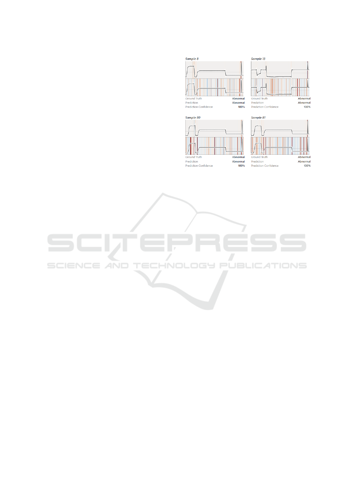
To allow for easy comparison between explana-
tions (FR7), a secondary explainer can be selected on
Figure 2: Landing page - Consists of: dataset selection
dropdown (left), and model selection dropdown (right).
demand. As shown in Figure 1, this causes a copy of
the line chart to be displayed below the original.
Given the limited display space, samples may only
be investigated on a rather coarse level of detail in the
results view. For further detail, single selected sam-
ples and their attributions can be shown in an enlarged
detail view, as illustrated in Figure 4 (FR2 and FR6).
In the detail view’s line plot, users can zoom along the
time axis and read the exact data values and catego-
rization of the explainer per time point. Below the line
plot, a list of heatmap previews provides an overview
of all available explanations for that sample and al-
lows for comparison (FR7). To quickly switch what
explanation is shown, we allow the active explainer to
be selected directly from this list.
The explainer recommendation tab is designed to
advise users, which of the supported explainers to
use for a given dataset and model, and which ones to
avoid. It additionally provides more detailed informa-
tion about the explainer evaluation and their results to
make the explainer recommendation more transparent
(FR5). As shown in Figure 5, we provide a recom-
mendation summary, which includes a recommended
explainer (highest score in evaluation), as well as rec-
ommendations for explainers to avoid (scores close to
0). This summary is followed by a grouped bar chart,
which shows the scores of all explainers. For each
explainer we display the total score, by which the ex-
plainers are ranked, as well as the individual metric
scores that are used to compute the total score. A de-
tailed description of the used metrics is provided in
Section 4.3. Right below the chart, we provide further
information in textual form about how to interpret the
results and how the score is computed.
XAIVIER the Savior: A Web Application for Interactive Explainable AI in Time Series Data
171
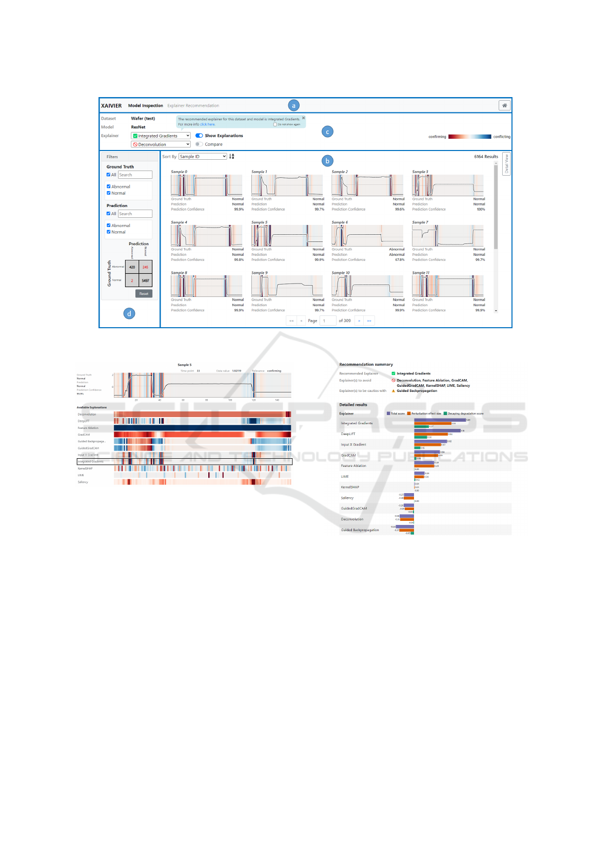
Figure 3: Model investigation UI - Consists of: a) navigation bar, b) results view, c) configuration interface, and d) filtering
pane.
Figure 4: Detail view - Sample with explanation of the ac-
tive explainer DeepLIFT (top). Preview of all explanations
(bottom).
4.3 Explainer Recommendation
As shown in Figure 1 different explainers can produce
explanations that are not in agreement, which in turn
raises the question as to which explainer can correctly
identify the most important aspects of the input. To
find the answer, it is necessary to estimate the qual-
ity of the generated explanations, depending on how
well they identify the features that were truly relevant
for a model to make its prediction, also referred to as
faithfulness (Selvaraju et al., 2017).
One of the most prominent approaches for mea-
suring the quality of explainers is region perturba-
tion (Samek et al., 2016), which progressively per-
turbs the input features according to their estimated
relevance, either in the most relevant (MoRF) or
least relevant first (LeRF) order. After each pertur-
bation, the model makes a prediction for the per-
Figure 5: Main components of the Explainer Recommenda-
tion UI: recommendation summary and detailed results.
turbed sample. Plotting the change in predictions
produces a perturbation curve. Perturbing truly rele-
vant features should degrade the model’s performance
quickly, causing a small Area Under the Perturbation
Curve (AUPC
MoRF
), while perturbing the least rele-
vant features should barely affect the model, causing
a large AU PC
LeRF
.
However,
ˇ
Simi
´
c et al. (
ˇ
Simi
´
c et al., 2022)
have shown that relying exclusively on either the
AUPC
MoRF
or AUPC
LeRF
is unreliable for time se-
ries data. Consequently, they introduced two metrics,
namely the Perturbation Effect Size (PES) and the De-
caying Degradation Score (DDS). Both the PES and
DDS utilize the AUPC
MoRF
and AUPC
LeRF
together
IVAPP 2023 - 14th International Conference on Information Visualization Theory and Applications
172

to compute how consistently an explainer can separate
relevant from irrelevant features (PES), and to what
extent (DDS). Above all,
ˇ
Simi
´
c et al. have shown that
these two metrics work well with time series data.
XAIVIER estimates the faithfulness of an ex-
plainer by combining both PES and DDS into a sin-
gle total score, which is the sum of the PES and DDS,
on which the recommendations are based. The total
score produces a value in the range [−2, 2], where a
high score indicates that the explainer separates im-
portant features most consistently and to the greatest
extent. On the other hand, any explainer for which ei-
ther PES or DDS is close to zero should be avoided.
Moreover, caution is advised to using explainers with
a high negative score, since they systematically mis-
take relevant and irrelevant features.
4.4 Implementation Details
XAIVIER consists of a separate frontend web inter-
face and a backend service. The backend is imple-
mented in Python and serves the frontend with re-
quested information such as datasets, models, pre-
dictions, and explanations. This information is pro-
vided via REST API, which is implemented using the
FastAPI
6
framework and hosted by the Uvicorn
7
web
server. New datasets and trained models can be in-
tegrated in the backend by providing data and model
files, and some meta-data that describes which model
to use for which dataset. Currently, only PyTorch
8
models are supported. For explaining the model pre-
dictions, XAIVIER provides the following explain-
ers: Saliency (Simonyan et al., 2014), DeepLIFT
(Shrikumar et al., 2017), Guided Backpropagation
(Springenberg et al., 2014), InputXGradient (Shriku-
mar et al., 2016), IntegratedGradients (Sundarara-
jan et al., 2017), KernelSHAP (Lundberg and Lee,
2017), LIME (Ribeiro et al., 2016), GradCAM (Sel-
varaju et al., 2017), Feature Ablation
9
, GuidedGrad-
CAM (Selvaraju et al., 2017) and Deconvolution
(Zeiler and Fergus, 2014). All explainers are pro-
vided by Captum
10
except GradCAM for which we
use our own implementation. As previously men-
tioned, the combined scores for explainer faithfulness
estimation proposed by
ˇ
Simi
´
c et al. (
ˇ
Simi
´
c et al.,
2022) are used to calculate the explainer recommen-
dations. Once computed, model predictions, explana-
tions and explainer recommendations are stored in an
6
https://fastapi.tiangolo.com/
7
https://www.uvicorn.org/
8
https://pytorch.org/
9
https://captum.ai/api/feature ablation.html
10
https://captum.ai/
ArangoDB
11
database for quick retrieval.
The frontend is implemented in Angular
12
using
HTML, CSS and Typescript.
5 USER SCENARIO
To highlight the usefulness of XAIVIER, we will de-
scribe a user scenario that involves debugging a neural
time series classification model using XAI. Moreover,
this user scenario will showcase the importance of all
introduced user requirements.
Problem Setting: Martin, a data scientist, re-
ceived an assignment from a semiconductor company
to detect if an error occurred during the production
of individual wafers. The company only recently
equipped a machine with a sensor to perform mea-
surements during the production. Soon, the company
created a dataset that consisted of imbalanced univari-
ate time series data, where each sample should be
classified as either normal or abnormal. Easier than
expected, Martin managed to train a deep learning
model which achieved 100% accuracy on the training
and validation data. Meanwhile, the company cre-
ated an additional dataset to validate the model, on
which the model performed very badly. Many abnor-
mal samples were not correctly classified. To find the
issue, Martin is confronted with two common prob-
lems in model debugging with XAI: i) explainer se-
lection, and ii) problem identification and correction.
Scenario: Using XAIVIER, Martin wants to con-
firm first that the data on which the company tested
the model indeed performs as bad as they claim.
Therefore, Martin first loads the company’s test
dataset and his model into XAIVIER using the land-
ing page (Figure 2) and then proceeds to the model
inspection page (Figure 3). By looking at the confu-
sion matrix (Figure 3 d) - bottom), Martin is able to
quickly confirm that indeed the model mistakes many
of the abnormal samples as normal (UR2, UR3).
Clearly, the model has not learned the right charac-
teristics of abnormal samples. Therefore, Martin has
to identify the data characteristics in the training data
that the model deems important when it classifies a
sample as abnormal, and verify that these characteris-
tics are sensible.
To switch to the training dataset, Martin clicks on
the home button in the top-right corner of the model
inspection page, which redirects him back to the land-
ing page. Here, he can choose the training dataset
and the problematic model. When he arrives at the
11
https://www.arangodb.com/
12
https://angular.io/
XAIVIER the Savior: A Web Application for Interactive Explainable AI in Time Series Data
173
model inspection page, he can see again in the confu-
sion matrix, that on the training data the model per-
forms perfectly. Since Martin is interested only in the
abnormal samples, he applies a filter by selecting the
top-left cell in the confusion matrix. To be able to
reason about the data characteristics that lead to the
prediction as abnormal in these samples, Martin has
to select an explainer. Luckily, the explainers have
been evaluated, which is why IntegratedGradients is
already pre-selected. Martin is informed via a pop-up,
that this is the best explainer for his data and model.
Martin is not yet sure if he should trust the ex-
plainer recommendation, since he is unfamiliar with
this method and he has already heard about Ker-
nelSHAP and its good performance on tabular data.
Therefore, Martin wants to see how IntegratedGradi-
ents compares to KernelSHAP in the explainer rec-
ommendation page, which he can access by clicking
on the link in the pop-up or on the respective tab
(Figure 3 c)). In the detailed results (Figure 5) it is
evident that IntegratedGradients performs most con-
sistently and separates most relevant features from
least relevant features to the greatest extent, while
KernelSHAP performs rather poorly. To be 100%
sure, he switches back to the model inspection tab
and compares the explanations of IntegratedGradients
and KernelSHAP visually. He enables the display of
explanations via the ”show explanation“ toggle, se-
lects KernelSHAP as secondary explainer, and en-
ables comparison. Martin can now see that Integrat-
edGradients provides clear and precise explanations
of what time points were crucial to the prediction,
while KernelSHAP provides very noisy explanations
(Figure 6). After seeing this, Martin decides to trust
the explainer recommendations and use the explainer
that is pre-selected for his further analysis (UR5).
Now Martin inspects the explanations produced
with IntegratedGradients in further detail to see what
the model is ”looking for” when identifying abnormal
samples. By looking at the time steps highlighted in
the heatmaps (UR4), he realizes that the model is al-
ways reacting on a sharp spike at the end of the time
series to detect an anomaly (UR1), as seen in Figure 6.
However, after consulting with an expert, Martin un-
derstood that anomalous patterns occur earlier in the
time series, and that these sharp spikes at the end are
actually an artifact in the data. Besides, sharp spikes
can also occur throughout normal time series.
To fix the issue, Martin decides to remove the
last few time points from the training data outside of
XAIVIER and to re-train the model. The new model
also achieved an accuracy of 100% on the training
and validation data. However, this time, Martin veri-
fied with XAIVIER that the explanations seem sensi-
Figure 6: Comparison of explanations for multiple ab-
normal samples generated with IntegratedGradients (pre-
cise upper explanation per sample) and KernelSHAP (noisy
lower explanation per sample).
ble to him, since the model considers various aspects
of the input and not only sharp spikes. Before send-
ing the model to the customer, Martin also tested the
new model on the company’s test data, on which it
fortunately also performed well.
6 USER STUDY
To evaluate the usability of XAIVIER and investigate
if the target group, the machine learning experts, are
using XAIVIER as it was intended, an initial thinking
aloud study was performed. During the study, the par-
ticipants were given a number of tasks, which encour-
aged them to explore all functionalities of XAIVIER.
6.1 Study Design
Two machine learning experts from an AI research
institution were hand-picked for the study. The pre-
requisites for participating in the study were that the
participants had to have experience in applying ma-
chine learning, that they previously worked with time
series data, and that they never used XAIVIER before.
Protocol: First, the participants received an expla-
nation about the study procedure and were informed
that during the study the contents of the screen and
the audio will be recorded. Following, they had to
sign a consent form, after which they received de-
tailed instructions about how to participate and be-
have in a thinking aloud study. Before starting with
the actual tasks, the participants performed a warm-
up task, where they were instructed to mentally per-
IVAPP 2023 - 14th International Conference on Information Visualization Theory and Applications
174

form a 2-digit multiplication and think aloud. Prior to
starting with the tasks, we enabled the screen and au-
dio recording. The participants were then given five
tasks to solve using XAIVIER. After completing all
tasks, the participants had to answer a set of prepared
questions regarding their thoughts and applicability of
XAIVIER, as well as provide any additional feedback
regarding the application.
Task Design: We designed five tasks (T1-T5) in a
way to encourage the participants to utilize all avail-
able functionalities of XAIVIER in order to get feed-
back regarding the usability of the whole application.
T1: The participants were first instructed to load
a time series dataset and classification model. After
that, they could freely explore the user interface, with
the goal to collect first impressions of the UI.
T2: The participants were asked to use the recom-
mended explainer and to identify the characteristics
that the model is looking for to identify a sample as
abnormal. Here we wanted to understand if the par-
ticipants are able to navigate the UI with a concrete
goal in mind, and most importantly, if they are able to
interpret the explanations.
T3: To evaluate the comprehensibility of the Ex-
plainer Recommendation page, the participants were
asked to explain why an explainer was recommended
to them. Also, the participants had to point out which
explainers should be avoided and why.
T4: In this task, the participants had to utilize
the explainer comparison functionality to compare
the recommended explainer with ones that should be
avoided. After comparing the explainers, the partici-
pants were asked if they could trust the recommender.
T5: In the final task, the participants were asked
to identify the exact time points which were relevant
for the prediction, which is only possible in the Detail
View. They were also asked to look at the preview of
all explanations, and were again asked if they agree
with the recommendations.
6.2 Results and Discussion
During the free exploration phase (T1) both partici-
pants - individually referred to as P1 and P2 - eas-
ily selected and loaded the dataset and model. More-
over, both participants explored all functionalities that
XAIVIER has to offer. They also immediately under-
stood the filtering and sorting mechanics, as well as
that a recommended explainer is pre-selected. Also,
both participants interpreted the sample metadata cor-
rectly. However, it was also evident that while P2 was
able to immediately understand the explanations after
turning them on, P1 understood them only during T2.
It was also noteworthy that P1 almost overlooked the
existence of the sample detail view.
During T2, both participants managed to easily se-
lect the best (recommended) explainer, and to identify
the characteristic that the model is looking for to iden-
tify samples as abnormal. P1 relied on the list-based
filtering to view only the abnormal samples, while P2
used the confusion matrix filter. Also, both partici-
pants relied on the detail view to solve the task, and
hovered over the time series to inspect the relevance
of the individual time points.
Both participants managed to easily identify the
best explainer in T3. They relied both on the short
summary and the detailed results. However, both par-
ticipants assumed that the explainer with the lowest
(negative) score was the worst, while it was actually
the ones closest to zero, even though they read how to
interpret the results. The participants also stated that
the metrics description should be more visible.
During T4 there were substantial differences be-
tween the participants. P1 used first the compare ex-
plainer functionality and performed pairwise compar-
isons of the recommended explainer with the ones to
be avoided. Following that, P1 opened the detail view
and compared multiple explanations at once. P1 de-
cided to trust the recommender, mainly since the ex-
plainers that are closer ranked to each other produce
clear, more similar explanations, and because the not
recommended explainers produce explanations that
diverge from each other, appear noisier, and were
therefore found to be harder to interpret. P2 on the
other hand did not complete this task, due to a misun-
derstanding of the task’s objective.
Both participants solved T5 smoothly. They fil-
tered for the abnormal samples and purposefully
opened the detail view and examined the highlighted
time points. Both participants also used other explain-
ers to see if there are any differences, and both of them
stated that the explanations provided by the explain-
ers which should be avoided are difficult to interpret.
P1 also remarked that the explanation of the explainer
that was labeled as to be cautious looks somewhat
like the recommended explainers (due to inverted rel-
evances). However, P1 assumed that it is intended
that these explanations can be partly relied on, since
the explainer is labeled as to be cautious with and not
to be avoided. Moreover, after additionally observing
the bad explanations of the explainers that should be
avoided, P2 stated to be confident that the explainer
recommender works correctly.
Summary: Through the thinking aloud study we
could verify that all of the user requirements were ad-
dressed with XAIVIER. Both participants managed to
interpret and understand the heat map explanations in-
tuitively, and correctly solved the tasks without assis-
XAIVIER the Savior: A Web Application for Interactive Explainable AI in Time Series Data
175

tance (UR4). However, one of the participants needed
some time to understand the heat map visualization
correctly. Thus, we believe that additional support
for understanding the explanations (e.g., textual de-
scription, visual cues) would be beneficial when heat
maps are used to indicate feature relevance. Both
participants managed to identify the flaw in the data
quite rapidly (UR3), demonstrating the usefulness for
both debugging (UR1) and verification (UR2) pur-
poses, which was also stated by both participants as
additional feedback after they completed all tasks.
The participants stated that they trusted the explainer
recommender more, given that they could verify by
comparison that the explanations of recommended
explainers were more precise. Therefore, we con-
clude that explanation comparison can help to build
trust in explanations and in explainer recommenda-
tions (UR5).
7 CONCLUSION AND FUTURE
WORK
In this paper, we introduced a set of user requirements
for the main user group of XAI, the machine learning
experts. Following, we derived a set of functional re-
quirements, which should be fulfilled by an XAI ap-
plication to address the user requirements. Based on
these functional requirements we designed and devel-
oped XAIVIER, a web application for interactive XAI
focused on univariate time series classifiers, which
stands out through its explainer recommender. Fi-
nally, we evaluated the usability of XAIVIER and its
explainer recommender with the target group.
Through the evaluation, we could confirm that
all user requirements were addressed with XAIVIER.
Moreover, XAIVIER left a positive impression on the
target group users, especially regarding the clean user
interface and that all functionalities are easy to find
and access. Additionally, we could observe that the
participants tend to trust the explainer recommender,
especially if they can also compare the explanations
of the different explainers by themselves.
In the future, we plan to improve upon the defi-
ciencies of XAIVIER that have been identified through
the thinking aloud test, as well as add support for
other data types, i.e., multivariate time series and im-
ages. After that, we intend to perform extended com-
parative experiments under controlled conditions to
quantify the benefits delivered by XAIVIER, such as
reduced time and effort for obtaining explanations,
the delivery of faithful explanations by the explainer
recommender independently of the dataset and model,
and its contribution to user trust.
Finally, we plan to investigate the user require-
ments for non machine learning expert users such as
domain experts, another important XAI stakeholder,
and examine how XAIVIER can be adapted to support
both, machine learning-, and domain experts. We ex-
pect that the group-specific adaptions to XAIVIER will
involve both the visual presentation of explanations as
well as the way the explanations are generated.
ACKNOWLEDGEMENTS
This work was supported by the ”DDAI” COMET
Module within the COMET – Competence Centers
for Excellent Technologies Programme, funded by
the Austrian Federal Ministry for Transport, Innova-
tion and Technology (bmvit), the Austrian Federal
Ministry for Digital and Economic Affairs (bmdw),
the Austrian Research Promotion Agency (FFG), the
province of Styria (SFG) and partners from industry
and academia. The COMET Programme is managed
by FFG.
REFERENCES
Adadi, A. and Berrada, M. (2018). Peeking inside the black-
box: A survey on explainable artificial intelligence
(xai). IEEE Access, 6:52138–52160.
Alber, M., Lapuschkin, S., Seegerer, P., H
¨
agele, M., Sch
¨
utt,
K. T., Montavon, G., Samek, W., M
¨
uller, K.-R.,
D
¨
ahne, S., and Kindermans, P.-J. (2019). innvestigate
neural networks! Journal of Machine Learning Re-
search, 20(93):1–8.
Alicioglu, G. and Sun, B. (2022). A survey of visual an-
alytics for explainable artificial intelligence methods.
Computers & Graphics, 102:502–520.
Arrieta, A. B., D
´
ıaz-Rodr
´
ıguez, N., Del Ser, J., Bennetot,
A., Tabik, S., Barbado, A., Garc
´
ıa, S., Gil-L
´
opez, S.,
Molina, D., Benjamins, R., et al. (2020). Explainable
artificial intelligence (xai): Concepts, taxonomies, op-
portunities and challenges toward responsible ai. In-
formation fusion, 58:82–115.
Arya, V., Bellamy, R. K. E., Chen, P.-Y., Dhurandhar, A.,
Hind, M., Hoffman, S. C., Houde, S., Liao, Q. V.,
Luss, R., Mojsilovi
´
c, A., Mourad, S., Pedemonte,
P., Raghavendra, R., Richards, J., Sattigeri, P., Shan-
mugam, K., Singh, M., Varshney, K. R., Wei, D., and
Zhang, Y. (2019). One explanation does not fit all: A
toolkit and taxonomy of ai explainability techniques.
Bach, S., Binder, A., Montavon, G., Klauschen, F., M
¨
uller,
K.-R., and Samek, W. (2015). On pixel-wise explana-
tions for non-linear classifier decisions by layer-wise
relevance propagation. PloS one, 10(7):e0130140.
Bhatt, U., Xiang, A., Sharma, S., Weller, A., Taly, A., Jia,
Y., Ghosh, J., Puri, R., Moura, J. M., and Eckersley, P.
(2020). Explainable machine learning in deployment.
IVAPP 2023 - 14th International Conference on Information Visualization Theory and Applications
176

In Proceedings of the 2020 conference on fairness, ac-
countability, and transparency, pages 648–657.
Collaris, D. and van Wijk, J. J. (2020). Explainexplore:
Visual exploration of machine learning explanations.
In 2020 IEEE Pacific Visualization Symposium (Paci-
ficVis), pages 26–35. IEEE.
Goodfellow, S. D., Goodwin, A., Greer, R., Laussen, P. C.,
Mazwi, M., and Eytan, D. (2018). Towards under-
standing ecg rhythm classification using convolutional
neural networks and attention mappings. In Machine
learning for healthcare conference, pages 83–101.
PMLR.
Guidotti, R., Monreale, A., Ruggieri, S., Turini, F., Gian-
notti, F., and Pedreschi, D. (2018). A survey of meth-
ods for explaining black box models. ACM computing
surveys (CSUR), 51(5):1–42.
Hohman, F., Kahng, M., Pienta, R., and Chau, D. H. (2018).
Visual analytics in deep learning: An interrogative
survey for the next frontiers. IEEE transactions on vi-
sualization and computer graphics, 25(8):2674–2693.
Ismail, A. A., Gunady, M., Corrada Bravo, H., and Feizi, S.
(2020). Benchmarking Deep Learning Interpretability
in Time Series Predictions. In Larochelle, H., Ran-
zato, M., Hadsell, R., Balcan, M. F., and Lin, H.,
editors, Advances in Neural Information Processing
Systems, volume 33, pages 6441–6452. Curran Asso-
ciates, Inc.
Klaise, J., Looveren, A. V., Vacanti, G., and Coca, A.
(2021). Alibi explain: Algorithms for explaining ma-
chine learning models. Journal of Machine Learning
Research, 22(181):1–7.
Kokhlikyan, N., Miglani, V., Martin, M., Wang, E., Alsal-
lakh, B., Reynolds, J., Melnikov, A., Kliushkina, N.,
Araya, C., Yan, S., and Reblitz-Richardson, O. (2020).
Captum: A unified and generic model interpretability
library for pytorch.
Krause, J., Dasgupta, A., Swartz, J., Aphinyanaphongs, Y.,
and Bertini, E. (2017). A workflow for visual diag-
nostics of binary classifiers using instance-level expla-
nations. In 2017 IEEE Conference on Visual Analyt-
ics Science and Technology (VAST), pages 162–172.
IEEE.
Langer, M., Oster, D., Speith, T., Hermanns, H., K
¨
astner,
L., Schmidt, E., Sesing, A., and Baum, K. (2021).
What do we want from explainable artificial intel-
ligence (xai)?–a stakeholder perspective on xai and
a conceptual model guiding interdisciplinary xai re-
search. Artificial Intelligence, 296:103473.
Li, Y., Fujiwara, T., Choi, Y. K., Kim, K. K., and Ma, K.-
L. (2020). A visual analytics system for multi-model
comparison on clinical data predictions. Visual Infor-
matics, 4(2):122–131.
Lundberg, S. M. and Lee, S.-I. (2017). A Unified Approach
to Interpreting Model Predictions. Advances in Neural
Information Processing Systems, 30:4765–4774.
Mutlu, B., Veas, E., and Trattner, C. (2016). Vizrec:
Recommending personalized visualizations. ACM
Transactions on Interactive Intelligent Systems (TiiS),
6(4):1–39.
Preece, A., Harborne, D., Braines, D., Tomsett, R., and
Chakraborty, S. (2018). Stakeholders in explainable
AI. arXiv preprint arXiv:1810.00184.
Ribeiro, M. T., Singh, S., and Guestrin, C. (2016). ” Why
should i trust you?” Explaining the predictions of any
classifier. In Proceedings of the 22nd ACM SIGKDD
international conference on knowledge discovery and
data mining, pages 1135–1144.
Rojat, T., Puget, R., Filliat, D., Del Ser, J., Gelin, R., and
D
´
ıaz-Rodr
´
ıguez, N. (2021). Explainable artificial in-
telligence (xai) on timeseries data: A survey. arXiv
preprint arXiv:2104.00950.
Samek, W., Binder, A., Montavon, G., Lapuschkin, S., and
M
¨
uller, K.-R. (2016). Evaluating the visualization
of what a deep neural network has learned. IEEE
transactions on neural networks and learning systems,
28(11):2660–2673.
Schlegel, U., Arnout, H., El-Assady, M., Oelke, D., and
Keim, D. (2019). Towards A Rigorous Evaluation Of
XAI Methods On Time Series. 2019 IEEE/CVF In-
ternational Conference on Computer Vision Workshop
(ICCVW), pages 4197–4201.
Selvaraju, R. R., Cogswell, M., Das, A., Vedantam, R.,
Parikh, D., and Batra, D. (2017). Grad-CAM: Vi-
sual Explanations From Deep Networks via Gradient-
Based Localization. In Proceedings of the IEEE Inter-
national Conference on Computer Vision (ICCV).
Shrikumar, A., Greenside, P., and Kundaje, A. (2017).
Learning important features through propagating ac-
tivation differences. In International Conference on
Machine Learning, pages 3145–3153. PMLR.
Shrikumar, A., Greenside, P., Shcherbina, A., and Kundaje,
A. (2016). Not Just a Black Box: Learning Important
Features Through Propagating Activation Differences.
CoRR, abs/1605.0.
Simonyan, K., Vedaldi, A., and Zisserman, A. (2014).
Deep Inside Convolutional Networks: Visualising Im-
age Classification Models and Saliency Maps. CoRR,
abs/1312.6.
Spinner, T., Schlegel, U., Sch
¨
afer, H., and El-Assady, M.
(2019). explainer: A visual analytics framework for
interactive and explainable machine learning. IEEE
transactions on visualization and computer graphics,
26(1):1064–1074.
Springenberg, J. T., Dosovitskiy, A., Brox, T., and Ried-
miller, M. (2014). Striving for simplicity: The all con-
volutional net. arXiv preprint arXiv:1412.6806.
Sundararajan, M., Taly, A., and Yan, Q. (2017). Axiomatic
attribution for deep networks. In International Confer-
ence on Machine Learning, pages 3319–3328. PMLR.
ˇ
Simi
´
c, I., Sabol, V., and Veas, E. (2022). Perturbation effect:
A metric to counter misleading validation of feature
attribution. In Proceedings of the 31st ACM Interna-
tional Conference on Information & Knowledge Man-
agement, CIKM ’22, page 1798–1807, New York, NY,
USA. Association for Computing Machinery.
Wexler, J., Pushkarna, M., Bolukbasi, T., Wattenberg, M.,
Vi
´
egas, F., and Wilson, J. (2019). The what-if tool:
Interactive probing of machine learning models. IEEE
XAIVIER the Savior: A Web Application for Interactive Explainable AI in Time Series Data
177

transactions on visualization and computer graphics,
26(1):56–65.
Zeiler, M. D. and Fergus, R. (2014). Visualizing and under-
standing convolutional networks. In European confer-
ence on computer vision, pages 818–833. Springer.
Zhu, S., Sun, G., Jiang, Q., Zha, M., and Liang, R. (2020).
A survey on automatic infographics and visualization
recommendations. Visual Informatics, 4(3):24–40.
ˇ
Simi
´
c, I., Sabol, V., and Veas, E. (2021). Xai methods for
neural time series classification: A brief review.
IVAPP 2023 - 14th International Conference on Information Visualization Theory and Applications
178
