
Heart Rate Visualizations on a Virtual Smartwatch to Monitor Physical
Activity Intensity
Fairouz Grioui
a
and Tanja Blascheck
b
Institute for Visualization and Interactive Systems, University of Stuttgart, Germany
Keywords:
Micro Visualization, Virtual Smartwatch, Heart Rate Visualization, Fitness Data, Empirical Study, Virtual
Reality.
Abstract:
We investigate three visualizations showing heart rate (HR) and HR zones (HRZ) data collected over time
and displayed on a virtual smartwatch, to monitor physical activity intensity. To understand exercise behavior,
we first conducted a survey with 57 participants and found that most of them track their activities (66%)
using wrist wearable devices (i. e., smartwatches or fitness bands) and that during the course of the exercise
data is primarily represented as text or a combination of text and icon. To support reaching a specific fitness
goal, we designed a bar chart visualization combining both current and historical HR and HRZ data. Among
the three visualizations, two present an additional chart (i. e., a horizontal and radial bar chart summary),
showing the amount of time spent per HRZ (i. e., low, moderate, and high intensity). In a controlled study
performed in virtual reality, we compared participants’ performance with each visualization asking participants
to make a quick and accurate decision while exercising (i. e., playing a tennis-like game). Results from the
study show evidence of a difference in task performance between visualizations with and without a summary
chart—visualizations showing a summary chart performed better than the version without. Finally, based on
our study results we present lessons learned.
1 INTRODUCTION
Wrist wearable devices (e. g., smartwatches and fitness
bands) are now more affordable and people increas-
ingly use them to track their fitness data. According to
a survey conducted with 4,272 American adults (Pew
Research Center, 2022), 21% of them wore a fitness
tracker on a regular basis. By supporting automated
personal data collection and providing their wearers
with instantaneous feedback on their progress, these
modern fitness trackers foster data exploration on the
go; giving the opportunity to real-time physical perfor-
mance regulation to meet a pre-set fitness goal.
When people look at the data during the course
of an activity, usually they consume the information
in short time-lapses—through individual glances of
5 seconds or less (Blascheck et al., 2021). Due to
this consumption of the data as a secondary task, the
presented information has to be informative and al-
low reflection in a short time frame. Visualizing the
data can help to convey this information; however, one
of the challenges of designing visualizations for such
a usage scenario is that the provided data should be
a
https://orcid.org/0000-0002-3927-4821
b
https://orcid.org/0000-0003-4002-4499
concise to reduce interruption from the primary activ-
ity (Amini et al., 2017).
People using wrist wearable devices when exer-
cising are interested in learning more about their per-
formance and pushing their limits to reach a fitness
goal (Amini et al., 2017). Therefore, we conducted
a survey to understand which types of data facilitate
people to monitor their fitness data while and after
exercising, how their device represents the data, and
what motivates them to track and analyze their data.
Our survey, but also previous work (Amini et al.,
2017; Islam et al., 2020; Neshati et al., 2019a), shows
that heart rate (HR) is one of the most common types
of data people collect with wrist wearable devices. In
the context of fitness data tracking, monitoring HR
data is an efficient indicator to control physical perfor-
mance (Ketcheson et al., 2015; Navarro et al., 2013)
(i. e., to foster exertion or vice versa) and gauge phys-
ical activity intensity (She et al., 2020) (e. g., HIIT
training). This monitoring of HR while performing
an exercise lends itself to designing appropriate HR
visualizations.
To support in-situ health and fitness data explo-
ration on small wearable devices used on the go, we
need to consider different design recommendations
Grioui, F. and Blascheck, T.
Heart Rate Visualizations on a Virtual Smartwatch to Monitor Physical Activity Intensity.
DOI: 10.5220/0011665500003417
In Proceedings of the 18th International Joint Conference on Computer Vision, Imaging and Computer Graphics Theory and Applications (VISIGRAPP 2023) - Volume 3: IVAPP, pages
101-114
ISBN: 978-989-758-634-7; ISSN: 2184-4321
Copyright
c
2023 by SCITEPRESS – Science and Technology Publications, Lda. Under CC license (CC BY-NC-ND 4.0)
101

when creating visualizations (Amini et al., 2017; Is-
lam et al., 2020; Neshati et al., 2019a). Therefore,
we leverage the following two considerations in our
visualizations design. First, because the provided rep-
resentations on these small devices often consist of
raw textual information—without contextual historical
data—issues related to misinterpretation of the data
and delayed reactions are susceptible to happen. For
this reason, the use of standard and familiar visual-
ization techniques (e. g., bar, donut, and line charts)
is encouraged to support activities that require reflec-
tion (Amini et al., 2017; Neshati et al., 2019a; Choe
et al., 2017). Second, research recommends to com-
bine multiple inter-correlated types of data to easily
estimate the distance to the goal (Amini et al., 2017).
Hence, minimizing the mental load or the necessity to
recourse to external tools. Accordingly, we designed
three HR visualizations using a vertical bar chart (Fig-
ure 6) to show current and historical HR and HR zone
(HRZ) data, as well as a summary of the amount of
time a person spent in each HRZ (i. e., low, moderate,
and high intensity). The latter was 1) encoded using
colors of the vertical bar chart for one of the visual-
izations, and represented as 2) a separate horizontal or
radial bar chart summary for the two other designs.
During the Covid-19 pandemic, it has become
more common to exercise in a virtual environment at
home (Siani and Marley, 2021). In addition, a virtual
environment has ample opportunities to conduct a con-
trolled lab study and to simulate performing a primary
(i. e., exercising) and secondary task (i. e., monitoring
the physical activity intensity), to test the effectiveness
of the three HR visualizations.
Through this research project, we aim to answer
the following research questions:
•
RQ1: Can micro-visualizations on smartwatches
support decision making and reflection tasks on
the go?
•
RQ2: How fast and accurately can people explore
complex visualizations (i.e., combining multiple
data types) on small screens as a secondary task?
•
RQ3: How do different representations and data
aggregation techniques influence data reading and
interpretation?
•
RQ4: To which extent can virtual reality support
simulating real world exercising and a smartwatch
visualization task?
To summarize, our contributions are threefold.
First, we describe our survey’s findings on fitness data
tracking using wrist wearable devices. Second, we
present three HR visualizations, that we implemented
based on design recommendations from the literature
and existing examples, then empirically assessed their
effectiveness in a self-monitoring task in a VR study.
Finally, we reflect on the findings and our study results
and discuss their implications.
2 RELATED WORK
In the following, we discuss the work related to our
research including micro-visualizations, data explo-
ration in motion, fitness data tracking on wearables
and fitness trackers and health data monitoring in VR.
2.1 Micro-Visualization in Research
Wrist wearable devices are attracting more attention
from different research communities due to their ubiq-
uity in different aspects of our daily activities (e. g.,
monitoring health, fitness or sleep data). While
some research in human-computer interaction ex-
plored novel interaction techniques (e. g., to overcome
the fat finger problem (Neshati et al., 2021b)), our own
work and a number of previous studies in the domain
of visualization are interested in investigating data
representations adapted to the configuration of these
devices (e. g., small screens (Chen, 2017; Neshati et al.,
2019b, 2021a; Suciu and Larsen, 2018)) and to their
usage context (e. g., visualization in motion (Yao et al.,
2020), glanceable visualization (Blascheck et al., 2019;
Islam et al., 2022)).
Few empirical studies related to visualization have
been conducted to understand representations of micro
visualizations—adjusted data representations visual-
ized on small screens of a few square centimeters.
Blascheck et al. (2019) evaluated participants’ time
threshold using three visualizations (i. e., bar, donut,
and radial bar chart) in a data comparison task. Bar and
donut charts resulted in faster responses. The authors
followed up with a replication study (Blascheck and
Isenberg, 2021) to compare whether the same results
from the smartwatch study could be obtained when
displaying the stimuli on a larger screen (i. e., a lap-
top screen). The authors tested both smartwatch-sized
(320
×
320 px) and larger visualizations (1280
×
1280
px) on a laptop screen. The overall results showed no
difference between stimuli sizes. Neshati et al. (2019b)
introduced a novel visualization technique named G-
Sparks—inspired by sparklines (Tufte, 2001)—to in-
vestigate the effect of compression of a line chart (on
the x-, y-, or xy-axis) on task performance. Accord-
ing to the completion time, accuracy and interaction
count, results were in favor of the x-axis compression
technique. Islam et al. (2022) contributed three studies
about sleep data visualizations (i. e., floating bar chart
and hypnogram) when displayed with three different
IVAPP 2023 - 14th International Conference on Information Visualization Theory and Applications
102

form factors (i. e., Square, Wide, and Tall) simulating
different small devices (i. e., smartwatch and fitness
band). Results showed that the suitable form factor de-
pends on the task. In general, both tested visualizations
were glanceable (i. e., readable in
<
5 s). Following
these previous works, we contribute a study in the
realm of micro visualizations, with focus on fitness
data exploration.
2.2 Data Exploration in Motion
Despite their omnipresence in the activities of their
wearers (e. g., working, training, cooking), most of
the previous studies involving visualizations on small
devices (Blascheck et al., 2019; Islam et al., 2022;
Neshati et al., 2019b, 2021a) were conducted in a sta-
tionary pose. For example, Blascheck et al. (2019)
fixed a smartwatch on an adjustable stand simulat-
ing the viewing angle and distance at which a smart-
watch is usually held while reading information. In
contrast, the number of studies that explored visual-
izations on small wearable devices while in motion
is limited. Schiewe et al. (2020) evaluated the per-
formance of two graph-based visualizations showing
two foot strike types (i. e., heel and forefoot strikes)
in comparison to textual feedback of the current fore-
foot strike rate on a smartwatch while walking on a
treadmill. They found that the real-time graph-based
visualizations were preferred over textual data repre-
sentations. Similarly, Neshati et al. (2021b) explored
two interaction techniques with graphs on a smart-
watch while walking on a treadmill and when having
a standing posture. Yao et al. (2020) defined a first de-
sign space of visualizations used while in motion. The
dimensions of the design space include the entity in
motion, characteristics in motion, as well as the motion
relationship between viewer and visualization. In our
study, we investigate fitness data exploration—as a sec-
ondary task—while playing a tennis-like game in VR.
The player is in a high active mode—displacement of
the arm to the right and left side to catch balls—before
we display the visualization. When the participant
is observing the data, they are in a standing posture
and a minimum degree of movement is expected. The
motion in our case concerns mainly the arm twist and
elevation when looking at the (virtual) smartwatch.
2.3 Fitness Data Tracking on Wearables
In their survey, Islam et al. (2020) found that wear-
ers of smartwatches are mostly interested in tracking
their fitness and health data. However, due to the lack
of knowledge regarding the challenges of data con-
sumption on the small screens of smartwatches, as
well as to identify the specific needs of people dur-
ing and after a physical activity, previous work also
performed user-centered research to understand the
needs of smartwatch wearers. Amini et al. (2017)
conducted interviews with people who tracked their
fitness data on a regular basis and found that partici-
pants have different needs when the data is explored
on the go (i. e., exploring one or multiple values, es-
timating the progress towards a goal, comparing one
or multiple measures with other people’s and stay-
ing motivated). The authors converted these tasks
into data exploration scenarios and invited nine profes-
sional designers to prototype visualizations—adapted
to the small screen of a smartwatch—that would sup-
port in-situ data exploration during a fitness activity.
For the goal-based category, most sketches were us-
ing visualizations (e. g., donut and pie charts or space
filling shapes such as a single bar or icon) instead of
text. In addition, in relation to personal data collection,
Choe et al. (2017) organized discussion sessions with a
group of Quantified Selfers to understand the practices
and techniques they employed to collect and explore
outcomes from their personal data. Based on the gath-
ered feedback, they generalized the reported problems
into three pitfalls (i. e., tracking too many things, not
tracking triggers and context,as well as insufficient sci-
entific rigor). In an attempt to summarize limitations
related to the exploration and the design of visualiza-
tions on smartwatches, Neshati et al. (2019a) report
a set of challenges related to the hardware (e. g., lack
of memory, limited processing power, limited battery
life) and related to the data representation (e. g., lack
of guidelines for complex data representation on small
screens). They specified that visualization techniques
should be applied to represented HR data for an in-situ
exploration. These prior studies contributed in build-
ing a better understanding of people’s behavior when
tracking their fitness data. In addition, they informed
a set of general design considerations of in-situ visual-
ization that support reflection on the go. We apply two
of the aforementioned design considerations (i. e., pro-
mote visualizations over textual representations and
combine interrelated types of data) to visualize HR
data over time. In addition, we test our three HR visu-
alizations to foster data exploration on the go during
the course of a fitness activity and to convey meaning-
ful information to reach a predefined goal.
HR data is widely used for health and fitness appli-
cations. For example, Albaghli and Anderson (2016)
explored data from the embedded smartwatch sensors
to keep chronic patients aware of their health state and
to facilitate the identification of anomalies by means of
visualizations. Also, Muangsrinoon and Boonbrahm
(2017) visualized real-time HR and HRZ data on a
Heart Rate Visualizations on a Virtual Smartwatch to Monitor Physical Activity Intensity
103

Figure 1: Counts regarding the fitness data (i. e., step count, speed, heart rate, elevation, duration, distance, calories, and blood
pressure) that participants reported to check, while exercising (left) and after the exercise (right).
smartwatch, to monitor the physical activity intensity
of a cyclist (on a stationary bicycle). The authors
found that real-time HR monitoring can help exer-
cising within a desired target HRZ. Likewise, in our
study, we explore visualizations of HR and HRZ data
to monitor a fitness activity in a goal oriented task.
2.4 Fitness Trackers and Health Data
Monitoring in VR
HR data was investigated in VR and by means of ex-
ergames to monitor physical activity intensity and to
raise player’s awareness about their exertion rate (e. g.,
to foster exertion (Ketcheson et al., 2015) or to avoid
over exercising (She et al., 2020; Yoo et al., 2018)).
Moreover, wearables are emerging in VR in different
ways. A new concept to explore fitness and game data
in VR is a virtual smartwatch (YUR.Watch, 2020).
The design mimics a real smartwatch with an exten-
sion sleeve. Only information about burned calories
is displayed as text on the watch face. The rest of the
tracked data (e. g., number of squats and current heart
rate) is represented with text and icons and displayed
on the watch sleeve. More recently Queck et al. (2022)
introduced SpiderClip, a system that enables the ex-
ploration of simulated wearables in VR. SpiderClip
consists of hardware and software components, allow-
ing the real-time collection and monitoring of spatial
and physiological data in VR. The authors validated
their design with a proof-of-concept study in which
they tested HR data measurements and visualizations
during a fitness exercise. The authors visualized the
HR data in two different ways: (1) by showing the cur-
rent HR value on the smartwatch display and on an HR
gauge on a separate sleeve, as well as (2) showing the
same data on a heads-up display-like representation.
We also leverage the VR environment to implement
a tennis-like game, in which we can control and as-
sess participants actions while playing the game (e. g.,
count the scored balls) and behavior after visualizing
the data (i. e., measure response time, record answers).
To simulate a real-world experience, we display the
HR visualizations on a virtual smartwatch.
3 SURVEY
We decided to approach people who track their fitness
data through a survey to learn about their tracking
techniques and behaviors while and after exercising to
understand 1) the device they rely on and that support
their activity tracking, 2) the data they frequently col-
lect and how their device presents it, 3) their motives
for self-tracking their exercise behavior, and 4) poten-
tial use of fitness data tracking in VR. We summarize
insights from the gathered data to design a visualiza-
tion based on the needs of people.
3.1 Survey Design
We conducted an anonymous online survey with SoSci
Survey (SosciSurvey, 2022) and advertised it on dif-
ferent social media and professional platforms (e. g.,
Facebook groups, Twitter, LinkedIn, and mailing lists).
We structured the survey into five sections, which con-
sists primarily of close-ended questions. Our supple-
mental material (OSF, 2022) contains a detailed list of
these questions together with the results of the survey.
The first section was concerned with getting con-
sent and ensuring participants were old enough to par-
ticipate. Because we are interested to learn how people
exercise and track their fitness data, an initial question
asked about regular exercise and tracking of data.
Next, we collected general information about the
physical activity and the frequency of data tracking.
We asked participants if they track all their sport ac-
tivities using a fitness tracker, how often they exercise
per week, where they usually practice this activity and
how often they track their individual sport activities.
With the main part of the survey, we intended to
learn about participant’s primary sport activity. Here
we asked what the primary sport activity is, how they
IVAPP 2023 - 14th International Conference on Information Visualization Theory and Applications
104

Figure 2: Number of data collect during an activity.
track their fitness data and when they check their fit-
ness data. We were also interested to learn if there is
a difference in when participants check their fitness
data—while exercising and after the exercise. There-
fore, we asked how the used fitness device represents
this data during and after the exercise. To learn about
reasons why participants track their fitness data, we
also asked them what their primary motivation is to
check their fitness data during and after the exercise.
In case participants tracked more than one physical
activity, we gave them the opportunity to report about
their secondary activity using the same questions as
for the primary activity.
Last, we asked participants if they also exercise in
a VR environment. Those participants who answered
the question with yes were asked when they check
their fitness data when exercising in VR and how their
fitness data is represented. Those participants who do
not track their fitness data in VR, were asked if they
would be interested to do so and how they would like
to represent their fitness data in VR.
3.2 Participants
We recruited in total 57 participants; 16 of them were
excluded at the beginning of the survey: 4 participants
do not practice any sport activity, 11 do not track their
fitness data and one participant was younger than 18
years. The remaining 41 participants confirmed that
they exercise on a regular basis: 24 practice their pri-
mary sport activity up to 2 or 3 times a week, 7 of
them 4 or 5 times a week, 6 once a week, 2 exercise
every day, 1 once every two weeks, and 1 participant
2 or 3 times a week. The majority of the participants
track their fitness data frequently: 27 always track their
physical activity, 13 do it sometimes, and 1 rarely.
3.3 Results
Participants reported a total of 65 sport activities: 41
primary activities and 24 secondary activities. Partici-
pants mostly perform their tracked activities outdoors
(40 of 65), and the most common types of activities
participants perform are running (23) and cycling (17).
3.3.1 Fitness Data Tracking Devices
Participants reported that they track their fitness data
on wearable devices for 43 sport activities: for 31
activities they use a smartwatch and for 12 they use
a fitness band for tracking. In addition, participants
use their smartphone to track 22 activities, 6 activities
were not tracked (e. g., swimming) and one participant
mentioned using a golf-tracking system (i. e., Track-
man Range). This question was designed as a multiple
choice question and 5 participants selected more than
one device for a single activity: 2 used smartwatch and
smartphone, 2 used smartwatch and fitness band and 1
reported to use all three devices.
3.3.2 Data Type and Representation
By comparing the fitness data participants track during
and after their sport activity, we found that duration
(i. e., 56 answers during the activity and 60 after the
activity) and distance (i. e., 56 answers during the ac-
tivity and 56 after the activity) are the top two tracked
types of data (Figure 1). Then come in order: speed,
calories, and heart rate as the data types tracked during
the activity. After the activity, participants reported
that they track calories, step count, and their speed.
Participants tend to track multiple types of fitness
data (i. e., 2 to 8 data types) during the activity (Fig-
ure 2).
Figure 1 reveals that most of the data tracked dur-
ing the course of the physical activity are represented
using either “text” or a combination of “text and icon.”
In contrast, for the data tracked after the activity, par-
ticipants use more “graphs/charts” as well as “graph
and text” representations.
3.3.3 Motivation to Track Fitness Data
Participants rated Checking a fitness goal highly
for both activities (i. e., second reason after “check
progress” with 35 answers while exercising and as
a primary reason with 47 answers after exercising).
Some participants gave examples to explain the fitness
goals they target during the exercise, for example: “I
usually run with my heart rate being between 140 and
155 bpm. This helps to check if I am overdoing things
and if I will be able to finish what I was planning to
do—running 1h 45?”
3.3.4 Exercising in Virtual Reality
Only 6 participants exercise in VR. Two participants
reported that they do not collect data when exercising
in VR, four check their data after exercising (i. e., 2
on a smartwatch or smartphone and 2 in VR). Asked
if they would like to see their fitness data in VR, 2
Heart Rate Visualizations on a Virtual Smartwatch to Monitor Physical Activity Intensity
105
participants chose to visualize the data on a virtual
smartwatch, the rest of the answers were distributed
based on the different options (i. e., 2 preferred a small
panel to the side, 2 chose to visualize the data on a
larger panel in front of them, 1 chose a small panel in
front of them, and 1 a larger panel to the side).
3.4 Summary
We summarize and categorize the survey’s findings:
Data Tracking while Exercising. Results show that
for 66.1% of the reported activities, fitness data was
tracked on wrist wearable devices. Despite their re-
stricted display area, participants mostly track 6 differ-
ent types of fitness data during the course of an activity.
This is in line with previous research on watch face
design (Islam et al., 2020).
Data Representation while Exercising. While ex-
ercising (Figure 1, left), participants represent their
fitness data primarily as “text” and “text and icon” com-
binations, not using charts or graphs. The results also
show that participants’ ultimate motivation for tracking
their data is to monitor their fitness progress or goal.
This is in accordance to previous research (Amini et al.,
2017) and could stem from smartwatch manufactur-
ers not providing such charts and graphs, even though
visualization research has shown that participants are
able to read charts and graphs quickly (Blascheck et al.,
2019; Islam et al., 2022; Neshati et al., 2019a).
As a consequence of this survey, in the following
study, we explore visualizations to represent fitness
data (i. e., HR data), then assess their efficiency to
monitor a fitness goal while exercising.
4 IN-LAB STUDY
In this section we describe our visualization design
choice. Then, present the study we ran in VR, followed
by an overview on quantitative and qualitative results.
4.1 Visualization Design
We start by explaining the correlation between HR
data and fitness activity monitoring. Then, present a
sample of existing HR data visualizations and explain
how they inspired our visualization design choice.
4.1.1
Heart Rate Zones to Monitor Sport Activity
During the course of a physical activity and depending
on the physical effort put into the exercise, the HR can
be in a specific zone. For example, during warm-up
or cool-down exercises, the HR is relatively low, and
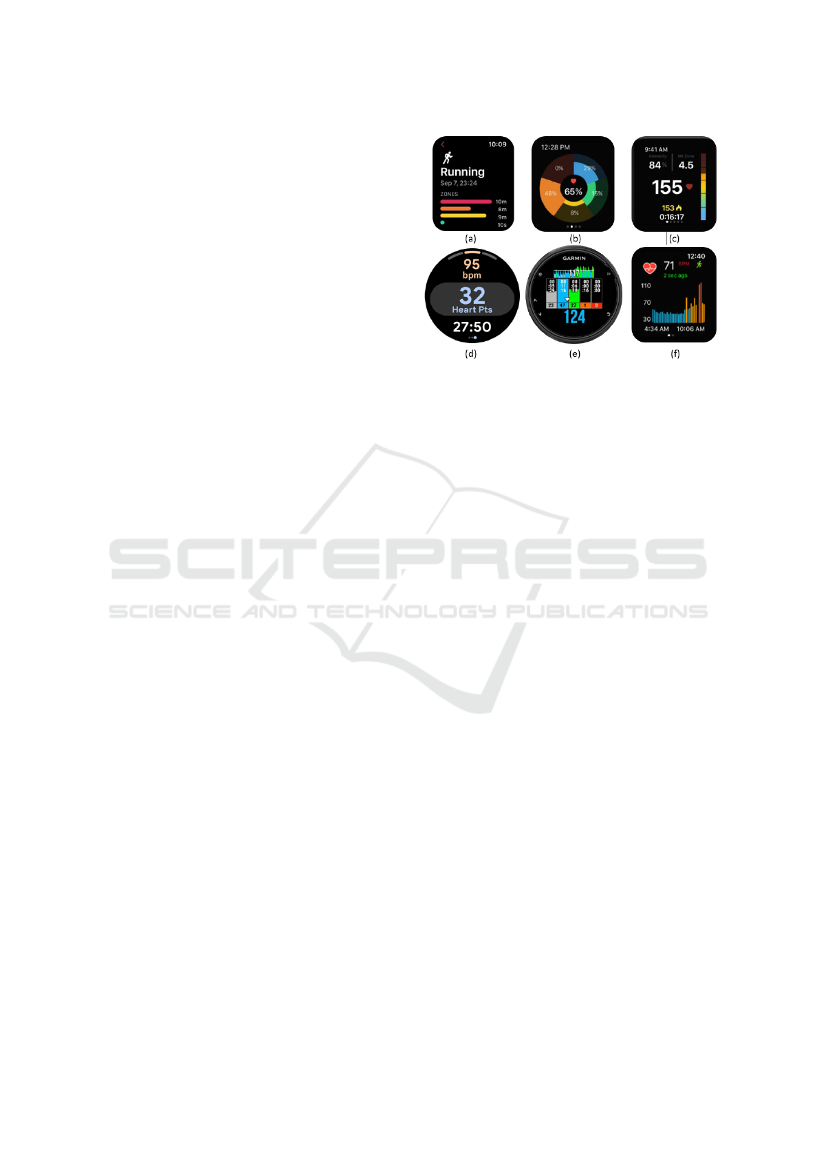
Figure 3: HRZ representations from third-party applica-
tions: (a) horizontal progress bar from the Zones for Train-
ing app (Flask, 2018), (b) radial progress bar chart, and
(c) vertical gauge from the FITIV Pulse Heart Rate Mon-
itor app (FITIV, 2021), (d) radial gauge from the Google
Fit app (GoogleFit, 2020), and representations combining
HR and HRZ data in the same view from (e) the HRZMon+
app (MakkasCIQ, 2017): with a vertical and a progress bar
chart, and (f) the Cardiogram app (Cardiogram, 2017): show-
ing a bar chart encoding both data.
therefore, in the low intensity zone. A person’s range
of HRZs is based on the percentage of their maximum
HR, which is calculated based on the person’s age:
max HR = 220
−
age (American Heart Association,
2022) or = 205.8
−
0.685
∗
age (Friel, 2006) for more
accuracy. The number of HRZs can vary from three
(e. g., Google Fit and Cardiogram apps (Figure 3, d
and f)) up to seven zones (i. e., zone 5 is divided into
3 sub-zones w.r.t. the Lactate threshold, e. g. Heart
Rate Zones app (HC Studios, 2022)). For simplifi-
cation purposes, we chose that our experiment’s HR
visualizations show only three HRZs. According to
the American Heart Association American Heart Asso-
ciation (2022), the three HRZ are defined as low: HR
values
≤
50% of max HR, moderate: HR values are
50-85% of max HR, and high: HR values are
≥
85%
of max HR.
4.1.2 Existing Heart Rate and Heart Rate Zones
Visualizations
According to the answers that we gathered from the
survey participants on how they display their HR data
on their tracking devices during the course of an ex-
ercise, only eight reported visualizing “graphs/charts”
and “graph and text” representations. Among them,
three were using Garmin watches (1 Instinct and
2 Fenix 6X), two used Apple devices (Watch3 and
iPhone X), two had a Huawei Band 2 pro, and one an
AKWLOVY smartwatch. By investigating the visual-
IVAPP 2023 - 14th International Conference on Information Visualization Theory and Applications
106

Figure 4: Examples of HR visualizations that participants
reported to use during their exercise: (a) line chart visualiza-
tion on the Garmin Instinct smartwatch (Garmin, 2022), (b)
vertical bar chart visualization on the Garmin Fenix 6X (DC
RAINMAKER, 2019), and (c) vertical range chart on the
Apple Watch 3 (Apple, 2022).
izations provided by the in-house HR applications on
the aforementioned smartwatch models and other pop-
ular brands on the smartwatch market (statista, 2021)
(e. g., Samsung, Fitbit), we could identify three dis-
tinct types of HR visualizations, namely, line chart,
vertical bar chart, and vertical range chart (Figure 4).
These visualizations are often accompanied by textual
information on the minimum, maximum, average, or
resting HR values. Whereas information on the HRZs
is not by default available in all HR tracking applica-
tions. Therefore, to track the exercise time distribution
over HRZs in real time, smartwatch wearers use third-
party applications. We explored some of these ap-
plications and grouped the most commonly provided
visualizations into five types (i. e., linear and radial
progress bar, linear and radial gauge, and combined
visualizations (Figure 3)). Progress bar visualizations
(Figure 3, a and b) give details about the degree of
progress achieved per individual HRZ (i. e., in percent-
age, or seconds/minutes/hours). In contrast, Gauge
visualizations only indicate the current HR value and
highlight the current HRZ by fading out the unreached
or the rest of the HRZs (Figure 3, c and d). We noticed
that only two applications show visualizations of both
data simultaneously—allowing direct access to the in-
formation (i. e., the wearer does not have to navigate
between views or apps).
The HRZMon+ app (Figure 3, e) provides HR and
HRZ data using a bar chart and vertical progress bar,
respectively. Also, similar to the visualization given
by the Garmin Fenix 6X (Figure 4, middle), the Car-
diogram app by Apple watch (Figure 3, f), combines
the HR measurements over time—shown as a vertical
bar chart—to the HRZ information—represented by
the color of the bars.
Existing examples and recommendations from the
literature inspired the design choice of our HR visual-
izations. First, our goal was to test how well complex
visualizations (i. e., visualizations showing interrelated
data) can fit the small screen of a smartwatch. Then, to
empirically assess them, by the means of an analytic
task: how fast these visualizations can convey precise
information to help a person meet a preset goal by
adjusting their performance in real-time.
4.1.3 Visualizations Design Choice
We created three visualizations showing the same in-
formation, (i. e., current and historical—since the be-
ginning of the exercise—HR, and HRZ data), yet with
distinct representations. The visualization choice was
mainly guided by the two design considerations from
the literature. First, all HR representations must be
charts. Then, convey information about interrelated
data (i. e., HR measures over time and time spent per
HRZ) to help prompt reflection and decision making
on the go. Therefore, the first criterion that we want to
explore is whether combining the data into a single vi-
sualization (1) or showing them separately in the same
view (2) influences participants’ performance. Hence,
we opted for a bar chart visualization—rather than a
line or range chart—to depict HR data for two main
reasons. First, bar charts have the privilege of visually
encoding both the HR measures and zones simultane-
ously. For each HR measure the bar length depicts
the average HR value per minute and the color-coding
refers to the HRZ, to which the HR value belongs: yel-
low for low HRZ, orange for moderate HRZ, and red
for high HRZ (Figure 6). Second, with an overview
of the historical data, one can quantify and proportion-
ally estimate the time (in minutes) spent per HRZ, by
counting or visually grouping bars of the same color.
This makes the bar chart visualization an adequate
candidate for visualization category (1).
Accordingly, all three visualizations show as the
main chart a vertical bar chart of HR measures over
time. The current HR value is shown both as the most
right bar of the bar chart and as a text value displayed
at the top-center of the screen (Figure 6). Micro vi-
sualizations are characterized by an absence or a lim-
ited set of reference structures (i. e., labels, data axes).
Therefore, our HR visualizations show no x- or y-axis.
However, the x-axis shows the duration of the activity—
a maximum of 21 minutes—and the y-axis represents
the HR values in a range of 50–190 BPM.
For the visualization category (2), we display the
amount of time—in percentage—spent in each of the
three HRZ with a separate summary chart. We propose
two distinct representations for the summary chart
(i. e., horizontal and radial bar chart summaries, respec-
tively; Figure 6 (b) and Figure 6 (c)). The summary
chart is divided into three equal parts for low, moder-
ate, and high-intensity HRZ, filled with yellow, orange,
and red colors respectively, to indicate the percentage
of progress on each HRZ toward a pre-set goal. The
gray area depicts the remaining percentage to achieve
Heart Rate Visualizations on a Virtual Smartwatch to Monitor Physical Activity Intensity
107
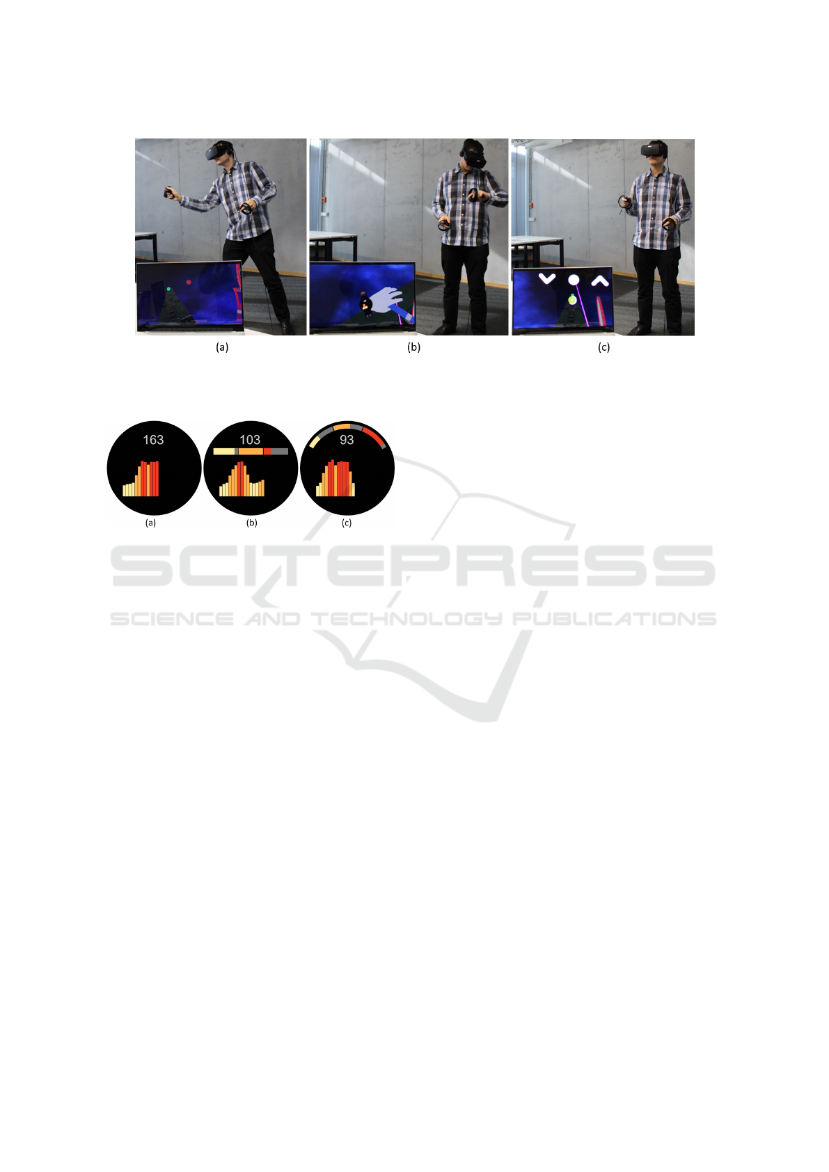
Figure 5: A participant performing the study task: (a) the participant catches the virtual balls, (b) the participant looks at
the visualized HR data on the virtual smartwatch, (c) the participant validates his decision regarding the exercise pace (i. e.,
decrease: down-arrow, continue: circle, increase: up-arrow).
Figure 6: Examples of the HR visualizations from our study:
HR visualization—represented by a vertical bar chart show-
ing current and previous HR values—(a) without summary
chart, (b) HR visualization with horizontal bar chart sum-
mary, and (c) HR visualization with radial bar chart summary.
The horizontal and radial bar chart summary describes the
amount of time spent in each HRZ: low intensity: yellow,
moderate intensity: orange, high intensity: red.
during the exercise. When designing the summary
charts, we ensured that both the horizontal bar and
radial bar occupy the same amount of pixels on the
watch face. The horizontal summary chart mimics a
stacked bar chart, whereas the radial chart summary
better fits the screen of the round (virtual) smartwatch.
For the sake of the study and to have an evenly
distributed dataset, we generated 27 unique stimuli
and used them for all three visualizations. We gener-
ated groups of nine datasets, which all had the same
current HRZ (i. e., 9 datasets for which the current
HRZ was in the low zone, 9 with a current moderate
HRZ, and 9 with a current high HRZ). For each group,
we sub-grouped the datasets to have a different HRZ
containing the minimum percentage of time spent in it
(i. e., an equal number of stimuli, in which the progress
of the current HRZ is the lowest or the highest). For
these three stimuli, we generated two datasets, which
represent a more difficult decision and one dataset that
was an easier decision. The difficult decision dataset
had a difference in number of bars of 1-2 between
the two HRZs with the least progress. Whereas the
easier decision dataset had a larger difference gap of
4-5 bars–which makes it easier to detect. For example,
Figure 6 (a), and Figure 6 (c) show a difficult decision,
Figure 6 (b) shows an easy decision.
4.2 Study Task
Fitness Goal. We defined a fitness goal and informed
the participants about it before starting the game. The
goal was as follows: during an exercise session of 21
minutes in total, they have to try to be in each HRZ
equally—optimally 7 minutes per HRZ. To make a
decision, participants had to determine from the dis-
played visualization the HRZ during which they had
spent the least amount of time during the activity so
far. This can be concluded in two different ways: in
the summary chart finding the HRZ with the smallest
colored bar or by counting and comparing the bars of
each HRZ of the HR visualization. Then, they had to
identify the current HRZ, which can be determined by
the most right bar in the bar chart. Knowing their cur-
rent HRZ and the HRZ with the least global progress,
the participant should decide whether to decrease, con-
tinue with or increase the activity pace. For example,
the stimuli without summary chart (Figure 6 (a)) has
the high HRZ as the current HRZ and the least time
was spent in the moderate HRZ. Therefore, to balance
the distribution of time for each HRZ the decision in
this case would be to decrease the exercise intensity.
The decision for the stimuli with bar chart summary
(Figure 6 (b)) is to increase the intensity and for the
stimuli with radial bar chart summary (Figure 6 (c))
the decision is to continue with the intensity.
Primary and Secondary Task. During the study, par-
ticipants are constantly switching between two tasks.
The first task involves action and movement. In this
IVAPP 2023 - 14th International Conference on Information Visualization Theory and Applications
108

primary task, the participant plays a tennis-like game
in VR by catching balls from both the left and right
side using virtual rackets (Figure 5 (a)). The secondary
task requires more reflection and concentration. The
secondary task consist of viewing the HR visualization
displayed on the virtual smartwatch (Figure 5 (b)), re-
flecting on the decision to make to reach the preset goal
and finally validating their answer by selecting one of
the three buttons (i. e., down-arrow for decrease, circle
for continue, and up-arrow for increase; Figure 5 (c)).
Participants were given 10 seconds to make a deci-
sion. If no answer was selected within this period, the
answer was counted as incorrect.
4.3 Study Design and Apparatus
We conducted a within-subject study varying the type
of visualization shown to participants. Overall, we
had three conditions and one task resulting in a 3
×
1 study design. Each participant performed all three
conditions of the study. To prevent an ordering effect,
we used a 3
×
3 Latin Square to counterbalance the
conditions between participants.
We implemented a tennis-like game in VR using
the Unity3D game engine. We ran the VR game on a
Razer-Blade-15-Studio computer (i. e., CPU 8-Core In-
tel Core i7, GPU Quadro RTX™ 5000) and an Oculus
Rift VR headset. We cleared a space of approx. 1.5 m
×
3 m in the study room, so participants could move
freely when playing the game. To minimize the risk
of bumping into an object (i. e., walls, tables), we set
up the room boundary in VR (i. e., displaying a virtual
wired wall when getting too close to a real wall).
4.4 Study Procedure
We provided participants with a printed version of the
consent form. After signing the consent form, we
introduced them to the task via a short presentation.
Then, we showed participants an example of each of
the HR visualizations and asked them questions to
test their understanding of the task. Once explaining
the theoretical part was done, we asked participants
to wear the VR headset and to adjust it to their head.
Then, to find the corresponding lens distance to their
inter-pupillary distance (IPD), they had to move the
IPD slider until the visuals looked clear.
Each condition was composed of two sessions: first
the training session to get familiar with the VR envi-
ronment and visualizations, then the actual sessions.
Participants were exposed to 3 training stimuli and 27
visualization stimuli during each session. In total, each
participant performed 90 trials (i. e., 3
×
30), only 81
trials (i. e., 3
×
27) are considered for data analysis.
Between conditions, participants could take breaks.
Each session started when the participant pressed
the “start” button. A number of balls are shot toward
the player from both the left and right side randomly.
We asked participants to catch as many balls as pos-
sible using two rackets attached to each virtual hand
(Figure 5 (a)). To make the switch between the pri-
mary and the secondary tasks unpredictable for the
participants (i. e., checking data on the fitness tracker
does not have to happen on a regular basis), the ball
stream stopped after a random number of balls was
shot (i. e., 2-7 balls). Then a question appeared in front
of the player asking “What would be your decision?”
Participants had to look at the virtual smartwatch (Fig-
ure 5 (b)), find the answer from the HR visualization
displayed on the watch and validate their answer by
selecting one of the buttons shown below the question
(i. e., decrease: down-arrow, continue: circle, increase:
up-arrow; Figure 5 (c)). From the moment the question
appeared until participants pressed the answer button
a 10 seconds time loader kept counting down. If no
button was selected within the 10 seconds the answer
was considered as incorrect.
After participants preformed all 90 trials, we asked
them to fill out a questionnaire to evaluate the three
HR visualizations. Participants who completed the
study received
e
10 or chocolate for their participation
if they were a university employee.
4.5 Participants
We recruited participants via the university’s internal
mailing list and student forums. In total, we recruited
24 participants: 20 students and 4 researchers of the
university, including 11 females and 13 males. All par-
ticipants were 18 years old or older. They confirmed
that they have good eyesight (i. e., their vision is good
without requiring an optical aid or is sufficiently cor-
rected by means of an optical aid) and that they do
not have a physical injury that constrains them from
moving their arms freely.
4.6 Results
We recorded data logs from participants with measures
on their performance for each condition, as well as
subjective feedback at the end of the study. In this
section, we report quantitative and qualitative results.
4.6.1 Quantitative Results
We analyze the mean response time and the mean
accuracy per condition (i. e., 648 trials (27 trials
×
24
participants) per condition) using confidence interval
Heart Rate Visualizations on a Virtual Smartwatch to Monitor Physical Activity Intensity
109
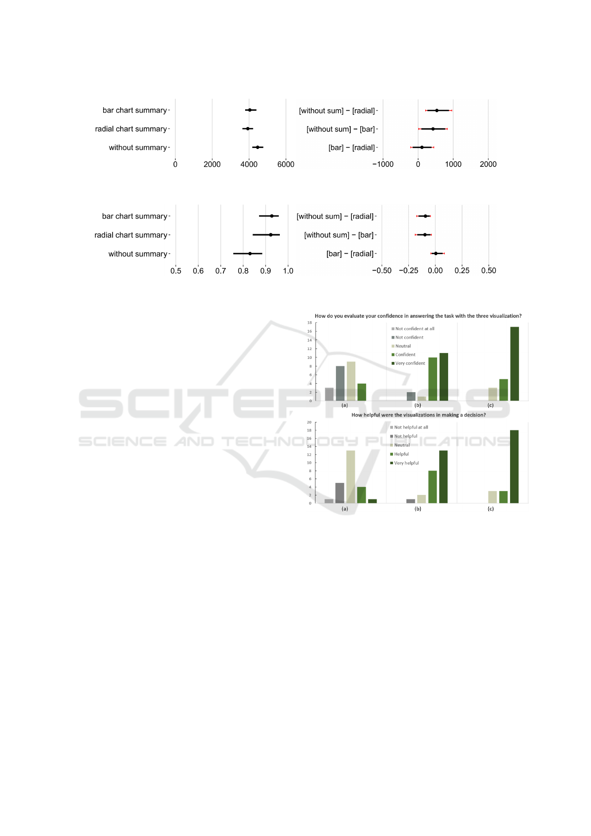
Figure 7: Mean completion time (left) and difference between mean completion times (right) of the three HR visualizations
using 95% CIs and Bonferroni corrections.
Figure 8: Mean accuracy (left) and difference between mean accuracy (right) of the three HR visualizations using 95% CIs and
Bonferroni corrections.
(CI) estimation (Besan
c¸
on and Dragicevic, 2017, 2019;
Cockburn et al., 2020; Cumming, 2013; Dragicevic,
2016). We report the sample means of the completion
time and accuracy together with the 95% CI using
BCa bootstrapping (10,000 bootstrap iterations). In
addition, we report the differences between means to
compare the three conditions. We adjusted the CIs
of mean differences for multiple comparisons with
Bonferroni corrections (Higgins, 2004).
On average, participants were faster with the radial
bar chart summary (3929 ms [3637 ms, 4211 ms]) than
with the other conditions (horizontal bar chart sum-
mary: 4038 ms [3786 ms, 4389 ms], without summary
chart: 4462 ms [4173 ms, 4763 ms]) (Figure 7 left).
The results show evidence of a difference in terms of
completion time (Figure 7 right), for the radial bar
chart summary and the without summary chart (CI
does not touch zero: 532 ms [263 ms, 874 ms]) and a
trend for a difference between the horizontal bar chart
summary in comparison to the without summary chart
(CI is close to zero: 423 ms [91 ms, 767 ms]). There
is no difference in mean completion time between the
radial and horizontal bar chart summary (CI crosses
over zero: 109 ms [-155 ms, 380 ms]).
Mean accuracy results show that participants’
made more accurate decisions with the horizontal bar
chart summary (92.7% [87%, 95.8%), than the radial
bar chart summary (92.3% [84.2%, 96.2%) and the
without summary chart (83.0% [75.6%, 88.4%) (Fig-
ure 8 left). There is evidence of a difference for both
the radial and horizontal bar chart summary to the
without summary chart (-9.2% [-15.7%, -5.2%]) and (-
9.7% [-16.8%, -4.6%]); Figure 8 right). There is no ev-
idence of a trend between the radial and the horizontal
chart summary (0.4% [-3.3%, 6.7%]); Figure 8 right).
Figure 9: Participants’ self-assessment about their confi-
dence (top) and how helpful the three visualizations were
(bottom), in answering the task. (a) without summary, (b)
with bar chart summary, (c) with radial chart summary.
4.6.2 Qualitative Results
After performing the study with all three visualizations,
we asked participants to answer three questions to
evaluate their satisfaction with each visualization.
1) How Do You Evaluate Your Confidence in An-
swering the Task with the Three Visualization?
Results in Figure 9 (top) depict participants’ self-
assessment of the degree of confidence in their an-
swers with each visualization. For the visualization
not containing a summary, three participants stated
that they were not confident at all about their answers
IVAPP 2023 - 14th International Conference on Information Visualization Theory and Applications
110

—which no participant reported for the two other visu-
alizations showing a summary chart. In addition, only
four participants found that they were confident in
their answers using the visualization without summary
chart compared to 21 participants (i. e., 10 confident
and 11 very confident) for the visualization with bar
chart summary and 22 participants (i. e., 5 confident
and 17 very confident) for the visualization with radial
chart summary.
Some participants explained this gap in the results
by the fact that when the visualization does not show
a summary they had to calculate and visually compare
the number of bars in each HRZ—which was tedious
and time-consuming. For example, one participant
stated: “The summary makes me feel more confident
about my choice given that I didn’t take a lot of time
to think about it.”
2) How Helpful Were the Visualizations in Making
a Decision? Only five participants found the visual-
ization without summary helpful for the task (Figure 9,
bottom). In contrast, 21 participants agreed that the
bar chart summary (i. e., 8 helpful and 13 very helpful)
and radial chart summary (i. e., 3 helpful and 18 very
helpful) were beneficial to solve the task.
3) Which Visualization Did You Prefer the Most?
Finally, we asked participants to choose the visual-
ization they preferred the most based on aesthetics,
efficiency and confidence. The majority of the par-
ticipants (83%) preferred the visualization with the
radial chart summary, 17% opted for the visualization
with the bar chart summary, and none voted for the
visualization without summary.
5 DISCUSSION
In general, participants could accomplish the task suc-
cessfully with the three visualizations by providing
quick responses (i. e.,
<
5 s) and with most of the an-
swers being correct (83%-92.7% on average). How-
ever, when interrelated HR data was depicted using
two visualizations (i. e., the vertical bar chart and the
summary chart), participants’ performance increased.
A particular preference was accorded to the visualiza-
tion with the radial chart summary (w.r.t. aesthetics,
efficiency, and confidence in the provided answers).
In this last section, we discuss our findings and
highlight some advantages and limitations that we
identified from our results or participants’ feedback.
5.1 Exploring Visualizations on Small
Screens While Exercising (RQ1)
Smartwatches are usually underestimated for the
amount and quality of information they can provide
because of their restricted display area. Previous
work (Islam et al., 2020) and our own survey show
that most data is shown as text, icon or as a combi-
nation of text and icon on the smartwatch. However,
representing raw textual information does not allow
for deeper reflection when exercising (Amini et al.,
2017; Neshati et al., 2019a). Therefore, visualizing the
data can overcome this challenge, but requires careful
design of these visualizations to fit the small screen.
By following design recommendations from previous
works (Amini et al., 2017; Neshati et al., 2019a; Choe
et al., 2017), we opted for the use of simple and fa-
miliar visualizations (e. g., bar and radial charts) as a
replacement for raw textual data, to support reflection
in a goal-oriented task.
Our final results showed that the small screen of a
(virtual) smartwatch can convey informative feedback
with minimum interruption from the principal activ-
ity in a short amount of time (
<
5s), which is in line
with previous studies (Blascheck et al., 2019; Neshati
et al., 2021a, 2019b). This is even true, when people
perform a primary task (playing a tennis-like game).
The recourse to simple visualizations on smartwatch
screens has a positive impact on the reflection time
and outcome in general, especially for tasks performed
while in motion or that involve task switching.
5.2 Multiple Visualizations to Support
Complex Data Interpretation (RQ2
& RQ3)
According to our survey and other previous works (Is-
lam et al., 2020; Choe et al., 2017), people tend to
track multiple types of data at the same time during
their activities. However, if no clear relation exists
between the data, combining multiple data types—
especially if using different visualization techniques—
simultaneously can make data interpretation a complex
process (Neshati et al., 2019a; Choe et al., 2017). In
this study, we focused on visualizing interrelated data
types to serve answering a common question, namely,
HR measures over time and the total amount of time
per HRZ. All three of our visualizations showed the
same information but differently. In the visualization
without a summary, it was possible to estimate the total
amount of time per HRZ by summing bars with the
same color. However, this was time consuming and led
to more errors of interpretation. Furthermore, many
Heart Rate Visualizations on a Virtual Smartwatch to Monitor Physical Activity Intensity
111

participants reported that the task was mentally tiring
and they felt uncertain about their answer. For exam-
ple, one participant mentioned: “In the visualization
without summary I always was not sure if I have not
missed anything” another stated that “it was difficult
to solve the task without the summary.” Accordingly,
we assume that the task would be harder to handle for
a longer exercise period (i. e., >21 minutes).
Our results show that providing the total amount
of time per HRZ using a separate visualization (i. e.,
by adding a horizontal or radial summary chart) made
the data processing and the interpretation of the data
easier and more efficient (e. g., “having a summary is
a nice extra feature that is definitely helpful”). This
opens up new research questions on the impact of data
aggregation on different tasks that require reflection
and with different data granularity (i. e., more than
two data). Also, the maximum number of visualiza-
tions a smartwatch can display simultaneously and
still convey meaningful and clear information could
be inspected.
5.3 Monitoring a Physical Activity in
Virtual Reality (RQ4)
This study had the ultimate goal of simulating multi-
ple tasks (i. e., primary and secondary task) with the
secondary task requiring a participant to read data on
a virtual smartwatch. For this, we designed visualiza-
tions and displayed them on the virtual smartwatch
simulating the size of a standard real watch. In the
following, we discuss how a virtual smartwatch can
simulate a real watch to study micro visualizations.
Rendering Quality. In general participants found the
visualizations’ rendering clear enough (i. e., partici-
pants were able to extract the necessary information
without problems). Some participants mentioned that
“the rendering quality seemed to be equally good” or
“was good, easy to read” when we asked them to evalu-
ate the rendering clarity. However, some reported that
the text value indicating the current HR measure was
blurry, which made it hard to read. For the proposed
task, this information was not crucial to answering
the question. We suggest that future works involving
micro visualizations in VR do not or only sparsely in-
clude text-based representation on the watch to avoid
alteration of the texts’ quality.
Visual Jitter. Although, when retrieving information
from the visualization on the smartwatch, participants
were not moving, they performed a quick arm-twist
to look at the virtual smartwatch. One participant re-
ported that the speed at which his arm moved affected
the clarity of the visualizations for a short time (i. e.,
the faster, the more blurred the representation). We
do not consider this effect as a problem. First because
it is brief; second, because it simulates the effect of
jitter that can also occur when visualizing data on a
real smartwatch.
Restricted Displacement. On the one hand, running
the study in a controlled VR environment helped us
to quantify participants reactions (i. e., response time
and accuracy). On the other hand, it was limiting par-
ticipants in terms of displacement space. We could
not risk participants’ safety by testing our study setup
with exercise activities that involve high motion in a
real environment (e. g., walking or running) or contin-
uous displacement (i. e., in the room or on a treadmill).
Therefore, the VR environment was a good trade-off
between realism and safety of participants.
6 CONCLUSION
In this paper, we report the results and findings from
our survey and VR study. We created three HR visual-
izations guided by our survey’s findings and by design
considerations from the literature that support visual
data processing and reflection on the go. Through a
study, we demonstrated the efficiency of the three vi-
sualizations displayed on small wearable devices in
guiding a person to make decisions about their exercise
pace. We also found that data aggregation impacted
the performance of the participants. The HR visual-
izations showing a summary of the total time spent
in each HRZ represented with a separate radial and
horizontal bar chart summary were more helpful to per-
form the task. Participants preferred the visualization
with radial bar chart summary the most.
Overall, the obtained results are promising and en-
courage us to further explore in-situ visualizations
in situations that require quick reflection in gen-
eral, and in the context of fitness data tracking more
specifically—whether by means of a real or a virtual
smartwatch. A combination of both modalities can be
considered using Augmented Reality.
A possible extension of this work would be to test
the same or similar visualizations with different data
granularities. In addition, testing the HR visualizations
with real HR data would further show how usable the
visualizations are in a real-world context and in situ-
ations where the attention is split between a primary
and a secondary tasks.
ACKNOWLEDGEMENTS
We thank all the participants who took part in our
study. This project is funded under DFG grant
IVAPP 2023 - 14th International Conference on Information Visualization Theory and Applications
112

DFG ER 272-14 and by the Deutsche Forschungs-
gemeinschaft (DFG, German Research Foundation)
under Germany’s Excellence Strategy – EXC 2075
– 390740016. Tanja Blascheck is funded by the Eu-
ropean Social Fund and the Ministry of Science, Re-
search and Arts Baden-W
¨
urttemberg.
REFERENCES
Albaghli, R. and Anderson, K. (2016). A vision for heart
rate health through wearables. In Proceedings of the
ACM International Joint Conference on Pervasive and
Ubiquitous Computing: Adjunct, pages 1101–1105.
ACM.
American Heart Association (2022). Target heart rates
chart. https://www.heart.org/en/healthy-living/fitness/
fitness-basics/target-heart-rates. Last visited: October,
2022.
Amini, F., Hasan, K., Bunt, A., and Irani, P. (2017). Data
representations for in-situ exploration of health and
fitness data. In Proceedings of the EAI International
Conference on Pervasive Computing Technologies for
Healthcare, pages 163–172. ACM.
Apple (2022). Check your heart rate on apple
watch. https://support.apple.com/guide/watch/
heart-rate-apda88aefe4c/watchos. Last visited:
October, 2022.
Besan
c¸
on, L. and Dragicevic, P. (2017). The significant
difference between p-values and confidence intervals.
In Proceedings of the Conference on l’Interaction
Homme-Machine, pages 53–62.
Besan
c¸
on, L. and Dragicevic, P. (2019). The continued
prevalence of dichotomous inferences at CHI. In Ex-
tended Abstracts of the SIGCHI Conference on Human
Factors in Computing Systems, pages 1–11. ACM.
Blascheck, T., Bentley, F., Choe, E. K., Horak, T., and Isen-
berg, P. (2021). Characterizing glanceable visualiza-
tions: from perception to behavior change. In Lee, B.,
Dachselt, R., Isenberg, P., and Choe, E. K., editors,
Mobile Data Visualization, chapter 5, pages 151–176.
Chapman and Hall/CRC.
Blascheck, T., Besan
c¸
on, L., Bezerianos, A., Lee, B., and
Isenberg, P. (2019). Glanceable visualization: stud-
ies of data comparison performance on smartwatches.
IEEE Transactions on Visualization and Computer
Graphics, 25(1):630–640.
Blascheck, T. and Isenberg, P. (2021). A replication study on
glanceable visualizations: Comparing different stimu-
lus sizes on a laptop computer. In VISIGRAPP.
Cardiogram, H. R. M. (2017). https://apps.apple.com/
app/cardiogram-heart-rate-monitor/id1000017994?
platform=appleWatch. Last visited: October, 2022.
Chen, Y. (2017). Visualizing large time-series data on very
small screens. In Short Papers of the European Confer-
ence on Visualization, pages 37–41. The Eurographics
Association.
Choe, E. K., Lee, B., Zhu, H., Riche, N. H., and Baur, D.
(2017). Understanding self-reflection: how people
reflect on personal data through visual data exploration.
In Proceedings of the EAI International Conference
on Pervasive Computing Technologies for Healthcare,
pages 173–182. ACM.
Cockburn, A., Dragicevic, P., Besan
c¸
on, L., and Gutwin,
C. (2020). Threats of a replication crisis in empiri-
cal computer science. Communications of the ACM,
63(8):70–79.
Cumming, G. (2013). Understanding the new statistics:
effect sizes, confidence intervals, and meta-analysis.
Routledge.
DC RAINMAKER (2019). Garmin fenix 6 series in-
depth review. https://www.dcrainmaker.com/2019/
08/garmin-fenix6-pro-solar-series-review.html/
comment-page-2. Last visited: October, 2022.
Dragicevic, P. (2016). Fair statistical communication in HCI.
In Robertson, J. and Kaptein, M., editors, Modern
Statistical Methods for HCI, chapter 13, pages 291–
330. Springer.
FITIV, M. F. I. (2021). Pulse heart rate monitor. https:
//fitiv.com/. Last visited: October, 2022.
Flask, L. (2018). Zones for training. https:
//apps.apple.com/us/app/zones-for-training/
id1139688415?platform=appleWatch. Last vis-
ited: October, 2022.
Friel, J. (2006). Total Heart Rate Training. Ulysses Press.
Garmin (2022). Garmin instinct heart
rate widget. https://www8.garmin.
com/manuals/webhelp/instinct/EN-US/
GUID-EB942FCB-6DA6-4082-9ED3-0DE51CB79E74.
html. Last visited: October, 2022.
GoogleFit (2020). Updates to google fit on wear os.
https://support.google.com/wearos/thread/84883193/
updates-to-google-fit-on-wear-os?hl=en. Last visited:
October, 2022.
HC Studios (2022). Heart rate zones app.
https://play.google.com/store/apps/details?id=
com.hcstudios.heartratezonecalculator. Last visited:
October, 2022.
Higgins, J. (2004). Introduction to Modern Nonparametric
Statistics. Thomson Learning.
Islam, A., Aravind, R., Blascheck, T., Bezerianos, A., and
Isenberg, P. (2022). Preferences and effectiveness of
sleep data visualizations for smartwatches and fitness
bands. In Proceedings of the SIGCHI Conference on
Human Factors in Computing Systems, pages 1–17.
ACM.
Islam, A., Bezerianos, A., Lee, B., Blascheck, T., and Isen-
berg, P. (2020). Visualizing information on watch faces:
a survey with smartwatch users. In Short Papers of the
IEEE Visualization Conference, pages 156–160. IEEE
Computer Society Press.
Ketcheson, M., Ye, Z., and Graham, N. (2015). Designing for
exertion: how heart-rate power-ups increase physical
activity in exergames. In Proceedings of the Annual
Symposium on Computer-Human Interaction in Play,
pages 79–89. ACM.
MakkasCIQ (2017). Hrzmon+, heart rate zone
monitor+. https://apps.garmin.com/en-US/apps/
Heart Rate Visualizations on a Virtual Smartwatch to Monitor Physical Activity Intensity
113

79d55484-c0d2-4047-b7ee-72d051d86e14. Last vis-
ited: October, 2022.
Muangsrinoon, S. and Boonbrahm, P. (2017). Burn in zone:
real time heart rate monitoring for physical activity. In
International Joint Conference on Computer Science
and Software Engineering, pages 1–6. IEEE Computer
Society Press.
Navarro, P., Johns, M. L., Lu, T.-H., Martin, H., Poduval,
V., Robinson, M., Roxby, A., and Christel, M. (2013).
Webz of war: a cooperative exergame driven by the
heart. In IEEE International Games Innovation Confer-
ence, pages 187–190. IEEE Computer Society Press.
Neshati, A., Alallah, F., Rey, B., Sakamoto, Y., Serrano,
M., and Irani, P. (2021a). SF-LG: space-filling line
graphs for visualizing interrelated time-series data on
smartwatches. In ACM MobileHCI, pages 1–13. ACM.
Neshati, A., Rey, B., Mohommed Faleel, A. S., Bardot, S.,
Latulipe, C., and Irani, P. (2021b). BezelGlide: interact-
ing with graphs on smartwatches with minimal screen
occlusion. In Proceedings of the SIGCHI Conference
on Human Factors in Computing Systems, pages 1–13.
ACM.
Neshati, A., Sakamoto, Y., and Irani, P. (2019a). Challenges
in displaying health data on small smartwatch screens.
In Lau, F., Bartle-Clar, J., Bliss, G., Borycki, E., Court-
ney, K., Kuo, A. M.-H., Kushniruk, A., Monkman, H.,
and Roudsari, A., editors, Improving Usability, Safety
and Patient Outcomes with Health Information Tech-
nology, pages 325–332. IOS Press.
Neshati, A., Sakamoto, Y., Leboe-McGowan, L., Leboe-
McGowan, J., Serrano, M., and Irani, P. (2019b). G-
Sparks: glanceable sparklines on smartwatches. In Pro-
ceedings of the Graphics Interface Conference, pages
1–9. Canadian Human-Computer Communications So-
ciety.
OSF (2022). Study supplemental mate-
rial. https://osf.io/rbg64/?view only=
1dce5b18784b432ba1557d7e5a04e81d. Last
visited: December, 2022.
Pew Research Center (2022). About one-in-five
americans use a smart watch or fitness tracker.
https://www.pewresearch.org/fact-tank/2020/01/09/
about-one-in-five-americans-use-a-smart-watch-or-fitness-tracker/.
Last visited: October, 2022.
Queck, D., Albert, I., Burkard, N., Zimmer, P., Volkmar, G.,
D
¨
anekas, B., Malaka, R., and Herrlich, M. (2022). Spi-
derclip: towards an open source system for wearable
device simulation in virtual reality. In Extended Ab-
stracts of the SIGCHI Conference on Human Factors
in Computing Systems, pages 1–7. ACM.
Schiewe, A., Krekhov, A., Kerber, F., Daiber, F., and Kr
¨
uger,
J. (2020). A study on real-time visualizations during
sports activities on smartwatches. In International Con-
ference on Mobile and Ubiquitous Multimedia, pages
18–31. ACM.
She, H., Young, J., Wittenberg, O., Poole, P., Mercer, A.,
Shaw, A., and W
¨
unsche, B. (2020). HIITCopter: anal-
ysis of the suitability of VR exergaming for high-
intensity interval training. In Australian Conference on
Human-Computer Interaction, pages 293–302. ACM.
Siani, A. and Marley, S. (2021). Impact of the recreational
use of virtual reality on physical and mental wellbeing
during the covid-19 lockdown. Health and Technology,
11(2):425–435.
SosciSurvey (2022). Online survey tool. https://www.
soscisurvey.de. Last visited: October, 2022.
statista (2021). Market share of smartwatch between 2014-
2021, by vendor. https://www.statista.com/statistics/
524830/global-smartwatch-vendors-market-share/.
Last visited: October, 2022.
Suciu, A. and Larsen, J. (2018). Active self-tracking and
visualization of subjective experience using VAS and
time spirals on a smartwatch. In Workshop on Data
Visualization on Mobile Devices held at ACM CHI.
Tufte, E. (2001). The Visual Display of Quantitative Infor-
mation. Graphics Press.
Yao, L., Bezerianos, A., and Isenberg, P. (2020). Situated
visualization in motion. In Posters of the IEEE Visual-
ization Conference.
Yoo, S., Parker, C., and Kay, J. (2018). Adapting data
from physical activity sensors for visualising exertion
in virtual reality games. In Proceedings of the ACM
International Joint Conference and International Sym-
posium on Pervasive and Ubiquitous Computing and
Wearable Computers, pages 307–310. ACM.
YUR.Watch (2020). Yur.watch. https://www.yur.energy/
#virtual-watch. Last visited: October, 2022.
IVAPP 2023 - 14th International Conference on Information Visualization Theory and Applications
114
