
Using Well-Known Techniques to Visualize Characteristics of
Data Quality
Roy A. Ruddle
a
School of Computing and Leeds Institute for Data Analytics, University of Leeds, Leeds, U.K.
Keywords:
Visualization, Data Quality, Data Science, Empirical Study.
Abstract:
Previous work has identified more than 100 distinct characteristics of data quality, most of which are aspects
of completeness, accuracy and consistency. Other work has developed new techniques for visualizing data
quality, but there is a lack of research into how users visualize data quality issues with existing, well-known
techniques. We investigated how 166 participants identified and illustrated data quality issues that occurred
in a 54-file, longitudinal collection of open data. The issues that participants identified spanned 27 different
characteristics, nine of which do not appear in existing data quality taxonomies. Participants adopted nine
visualization and tabular methods to illustrate the issues, using the methods in five ways (quantify; alert;
examples; serendipitous discovery; explain). The variety of serendipitous discoveries was noteworthy, as was
how rarely participants used visualization to illustrate completeness and consistency, compared with accuracy.
We conclude by presenting a 106-item data quality taxonomy that combines seven previous works with our
findings.
1 INTRODUCTION
Investigating data quality is a key part of preparing
data for analysis or modeling (Wirth and Hipp, 2000).
Both descriptive statistics and visualizations have
distinct benefits for such investigations (Anscombe,
1973). Our interest is in the visual approach, where
previous research has primarily focused on develop-
ing new techniques for visualizing data quality (e.g.,
for missing values (Fernstad, 2019) or outliers (Pham
and Dang, 2019)).
That research often includes user studies to eval-
uate the new techniques. However, there is a notable
lack of research that investigated how users find and
illustrate data quality issues with existing visualiza-
tion techniques. We addressed that gap by conducting
a study in which 166 data science Masters students in-
vestigated the quality of a large dataset of longitudinal
open data.
The paper makes three main contributions. First,
we identify five ways (quantify; alert; examples;
serendipitous discovery; explain) in which visualiza-
tion and table-based methods help users to find and il-
lustrate data quality issues. Second, we provide guid-
ance about methods to use for different issues, tak-
a
https://orcid.org/0000-0001-8662-8103
ing account of scalability and visual attributes such as
pop out (Spence, 2001). Third, we document char-
acteristics of completeness and accuracy that are not
in previous data quality taxonomies. We readily ac-
knowledge that being missing from those taxonomies
does not mean that the characteristics are completely
unknown to practicing data scientists, but it does in-
dicate that they only tend to reside tacit knowledge.
2 RELATED WORK
The ISO/IEC 25012:2008 international standard di-
vides data quality into 15 types (completeness, accu-
racy, consistency, etc.). Previous research gathered
information first-hand about data quality (Dungey
et al., 2014; Wang and Strong, 1996) or reviewed
characteristics of data quality that were reported else-
where (Gschwandtner et al., 2014; Kandel et al.,
2012; Laranjeiro et al., 2015; Weiskopf and Weng,
2013). Even though those papers and their source ma-
terial only represent a subset of the full body of pre-
vious work on data quality, they identify more than
100 distinct data quality characteristics. Most of them
are characteristics of completeness (missing data, its
opposite duplicates, and coverage), accuracy (syntax
and semantics) or consistency (within individual enti-
Ruddle, R.
Using Well-Known Techniques to Visualize Characteristics of Data Quality.
DOI: 10.5220/0011664300003417
In Proceedings of the 18th International Joint Conference on Computer Vision, Imaging and Computer Graphics Theory and Applications (VISIGRAPP 2023) - Volume 3: IVAPP, pages
89-100
ISBN: 978-989-758-634-7; ISSN: 2184-4321
Copyright
c
2023 by SCITEPRESS – Science and Technology Publications, Lda. Under CC license (CC BY-NC-ND 4.0)
89

ties and between comparable entities).
Visualizations may be presented using a wide va-
riety of chart types (Munzner, 2014)). Tables are gen-
erally left out from research about visualization, but
are commonly used by analysts to “eyeball” data to
confirm it meets expectations (Bartram et al., 2022).
Each visualization technique is appropriate for
certain types of data. E.g., bar charts are appropriate
for showing numerical variables against a categorical
variable or a discrete numerical variable such as the
day of the week, whereas scatter plots are appropriate
for showing pairs of continuous numerical variables
(Andrienko and Andrienko, 2006). Data quality vi-
sualizations adhere to the same rules, with bar charts
appropriate for visualizing any scalar (e.g., the num-
ber of missing values in each variable), box plots for
visualizing the distribution of numerical values, line
charts for visualizing temporal data, and pie charts for
showing proportions (e.g., value counts).
Visualizations work by showing people graphi-
cal patterns from which features either “pop out” or
can be found by inspecting the patterns (i.e., “visual
search”) (Spence, 2001). Pop out occurs when peo-
ple notice a pattern instantaneously, irrespective of
the complexity of the visualization, and takes place
when a small number of items differ from others in
terms of visual channels such as color, shape or ori-
entation (Maguire et al., 2012). By contrast, visual
search takes longer as a visualization contains more
information or becomes more complex. Thus, visual-
ization involves a trade-off between simplicity which
facilitates pop out vs. complexity that displays richer
information. Placing that in the context of data qual-
ity, outliers pop out on a box plot because they are dis-
played using a different shape (e.g., dots) to the box
and whiskers that is used for the other data. Pop out
occurs in a bar chart if a bar’s length is substantially
different to the others, but visual search is needed if
they are similar. The same is true for other visual-
ization techniques – whether or not pop out occurs
depends on the type of pattern that is portrayed.
The encoding channel affects the saliency of pat-
terns in a visualization. E.g., length is a more accurate
than colour for encoding numerical data (Mackinlay,
1986), which is why a bar chart is more effective than
a heat map for visualizing the number of missing val-
ues in different variables. As the scale or complex-
ity of data increases, additional aspects of good prac-
tice need to be considered. Perceptual discontinuity
may be needed to ensure that users can distinguish
small numbers from zero values (e.g., inserting a dis-
crete step between 0 and 1 in a color map (Kandel
et al., 2012) or giving bars a minimum length (Ruddle
and Hall, 2019)). When small multiples, sparklines
(Tufte, 2006) or a trellis of visualizations (Stolte et al.,
2002) are used then the spatial arrangement (e.g., a
data- vs. variable-centric layout (Ruddle and Hall,
2019)) affects the saliency of any patterns.
Interaction often makes it easier for users to find
patterns. E.g., filtering reduces the quantity of data
that is shown (Monroe et al., 2013) and ordering mul-
tiple attributes reduces the complexity of a visual-
ization (Gratzl et al., 2013). Visualizations may be
panned or scrolled if all of the detail cannot be seen
at once on a computer display, but that increases the
time that users take to analyze the data and makes it
more likely that they completely fail to see some of
the patterns (Ruddle et al., 2013). Alternatively, mul-
tiple views can simultaneously show overviews and
fine-grained details (Shneiderman, 2003).
3 METHOD
The research was conducted by analyzing submis-
sions about a data quality assignment made by Mas-
ters students. Each student’s task was to identify, de-
scribe and illustrate five of the wide variety of data
quality issues that occurred in a specific dataset. They
were instructed to illustrate each data quality issue us-
ing a method such as “descriptive statistics output, ex-
ample values or visualization.”
3.1 Participants
A total of 166 Masters students participated. They
came from 12 countries in three continents (Africa,
Asia and Europe), had variety of academic back-
grounds (including computer science, mathematics,
engineering, science and business) and at the time
were studying for degrees in the departments of com-
puting (116 participants), mathematics (47 partici-
pants) and geography (3 participants). The students
completed the assignment in the 5th week of an
11-week course, having already covered topics on
business understanding, data understanding and data
preparation.
The data preparation topic included an overview
of data profiling and data quality. The students had
also been given practical training about data visual-
ization, using “getting started” material from Tableau,
and then a custom-written 24-page tutorial and eight
data analysis challenges. Although the students were
at the very beginning of their career as data scien-
tists, they did have the benefit of some formal edu-
cation about both data quality and visualization, un-
like many more experienced data scientists who only
acquire such knowledge during “on the job” training.
IVAPP 2023 - 14th International Conference on Information Visualization Theory and Applications
90

Table 1: Description of the variables in the dataset (* indi-
cates variable was not documented on the dataset website).
Variable Description
PCN Unique identifier for each Parking Charge Notice
Issued* The date a fine was issued (subdivided into Issue
Date and Issue Time in some files)
Location* The name of the car park (called Parking Location
in some files)
Contravention* The type of parking offence (called Description of
Offence in some files)
Charge Level* H or L
Fine The amount of the fine (called Fine (£) or Full Fine
£ in some files)
Discount £ The amount of the fine if it is paid within 14 days
Last Pay Date* The date on which a payment was paid for the fine
Total Paid* The total amount that has been paid for a fine
(called Paid in £ or Total Paid (£) in some files)
Balance The outstanding amount of a fine (called Balance
(£) in some files)
3.2 Dataset
The dataset (https://datamillnorth.org/dataset/off-
street-parking-fines; see Table 1) is open data and
contained information about every parking ticket
issued for vehicles in car parks over seven years
(April 2013 – September 2020) in a city of 800,000
people. The dataset comprised 54 CSV and Excel
files (20 MB and 230,038 rows in total).
Like many longitudinal datasets, the columns
changed over time, as did the names of variables
and even the number of files per quarter (one file for
each of the first 6 quarters, but separate fines issued
and fines paid files for the subsequent quarters). As
well as data quality issues caused by those deliber-
ate changes, others concerned clear-cut omissions or
errors, and some arose from the dataset’s documenta-
tion which was correct for the most recent years but
not for earlier years.
3.3 Data Analysis
Two participants only submitted four rather than five
issues, and another two participants each appeared to
be confused by the data for one of their issues. From
the illustration and free text description that the partic-
ipants provided, two researchers used emergent cod-
ing to classify the remaining 826 submissions, using
different codes if they involved the same data quality
characteristic but different variable. E.g., there were
separate codes for missing values in the Balance, Is-
sued, Location and PCN variables.
The researchers performed the classification sepa-
rately, apart from liaising to ensure that they under-
stood all the codes. The inter-rater agreement was
79% (Cohen’s Kappa = 0.77, indicating substantial
agreement). The differences were resolved as fol-
lows. First, the researchers discussed the relevant
codes’ descriptions. Then the researchers worked
asynchronously to review each issue where there was
disagreement and decide which of the two codes was
appropriate. Finally, the researchers met online to dis-
cuss the five issues where disagreement remained and
agree the final code for each.
One of the researchers then grouped the issues ac-
cording to the data quality characteristics, and we also
recorded the type of illustration that was used for each
submission.
4 RESULTS
Collectively the participants identified 79 different is-
sues. One concerned accessibility (illustrated with a
table). The other 78 issues spanned 11 characteristics
of completeness, 12 of accuracy and three of consis-
tency. The rest of this section focuses on those com-
pleteness, accuracy and consistency characteristics.
The majority are included in existing taxonomies of
data quality but nine are not (see Appendix for details
of every issue and our combined 106-item taxonomy).
Participants used seven visualization techniques
(bar chart, box plot, bubble plot, heat map, line chart,
radial bar chart, scatter plot) and two types of table
(summary and data extract) to illustrate the charac-
teristics. A summary table was one in which partic-
ipants presented aggregated output (see Table 3). A
data extract table showed raw data for a subset of the
rows/columns in a data file. Table 2 summarizes the
number times the each technique was used.
Issues typically pop out in a summary table, al-
though it does little to help a user understand why the
issue actually occurred. By contrast, a data extract
table shows raw data, which may aid users’ under-
standing of remedies, but makes an issue less salient
because a user has to inspect the table, and is less scal-
able because only a tiny proportion of the data can be
shown even if the dataset is small (e.g., 1000 records).
The remainder of this section starts by reporting
the results for completeness because that is the start-
ing point for a rigorous investigation of data quality.
Next we report the results for accuracy, and then con-
sistency because that concerns the accuracy of multi-
ple data values that each appear to be accurate when
considered by themselves. Each part describes the us-
age of the visualization techniques and tables, com-
menting about their strengths and weaknesses under
various circumstances.
The figures are based on participants’ submis-
sions, but redrawn to improve the images, and some-
Using Well-Known Techniques to Visualize Characteristics of Data Quality
91

Table 2: The number of times each method of illustration was used for each data quality characteristic.
Data quality Bar Box Bubble Heat Line Radial Scatter Summary Data
Type Characteristic chart plot plot map chart bar plot table extract
chart table
Accessibility Interpretability 1 1
Accuracy Data format 2 1 9
Accuracy Domain violation 1 1 2
Accuracy Validity 1
Accuracy Wrong data type 4 3
Accuracy Extreme: Numeric outliers 31 9 6 1 6 5 2
Accuracy Extreme: Special value 6
Accuracy Extreme: Time-series outliers 20 2 62 10 1
Accuracy Extreme: Unusual category name 2 8
Accuracy Implausible range 10 1 15 1 1 18
Accuracy Pattern of value is unusual 7 1 1 1 1 15
Accuracy Same value for too many records 1
Accuracy Unexpected low/high values 13 7 1 1 19
Completeness Coverage 16 3 32 2 4
Completeness Duplicates: Duplicate header 2 3 60
Completeness Duplicates: Exact duplicates 1 34
Completeness Duplicates: Uniqueness violation 3 1 93
Completeness Empty column 1 1 1 1 82
Completeness Completely missing column 1 22
Completeness Missing column name 2
Completeness Completely missing header 47
Completeness Missing record 10
Completeness Missing value 6 2 1 1 6
Completeness Zero value 1 2 5
Consistency Inconsistent duplicates 1 1
Consistency Violation of functional dependency 9 4 4 1 40
Consistency Different data formats 1 1 7
Table 3: A summary table used to report a missing column
name (“Unnamed: 5”). The “Number of missing values”
also pops out because it has four digits.
Variable Data type Number of missing values
PCN object 0
ISSUED object 0
LOCATION object 0
CONTRAVENTION object 0
FINE object 0
Unnamed: 5 float64 1798
times simplified to better illustrate the pros and cons
of different visualization techniques. Overall, the il-
lustration methods were used in five ways:
• Quantify (e.g., the number of missing values).
• Alert (e.g., warning message about null values, in-
dicating how many values could not be plotted,
but not stating which variable).
• Examples (identify records that exhibit an issue).
• Serendipitous discovery (found by accident with
a visualization created to analyze other aspects of
the data, e.g., noticing an axis label called “null”).
• Explain (characterize issue’s nature, e.g., in terms
of the number of records vs. distinct values).
4.1 Completeness
Participants primarily used tables, with visualizations
only comprising 16% of the illustrations. Missing
records and a completely missing header were only
illustrated with a data extract table, and a missing col-
umn name only with a summary table (see Table 3).
Missing values were presented in a variety of
ways, including conventional ones (a data extract ta-
ble showing null values, or a summary table showing
counts of the number of missing values in each vari-
able). Some visualizations had alerted participants to
the existence of null values (see Figure 1a) when they
were analysing other aspects of the data. Participants
also noticed “null” (or similar text) appearing in axis
labels (see Figure 1b), thereby serendipitously discov-
ering missing values.
An empty column is one in which all of the val-
ues are missing. Participants primarily illustrated that
with a data extract table. One participant used the
quality map approach (Ward et al., 2011) (see Fig-
ure 1c). Other participants found the same empty col-
umn issue after seeing an N nulls alert in a line chart
or noticing a null X-axis label on a bar chart. Columns
that were present in some data files but completely
IVAPP 2023 - 14th International Conference on Information Visualization Theory and Applications
92
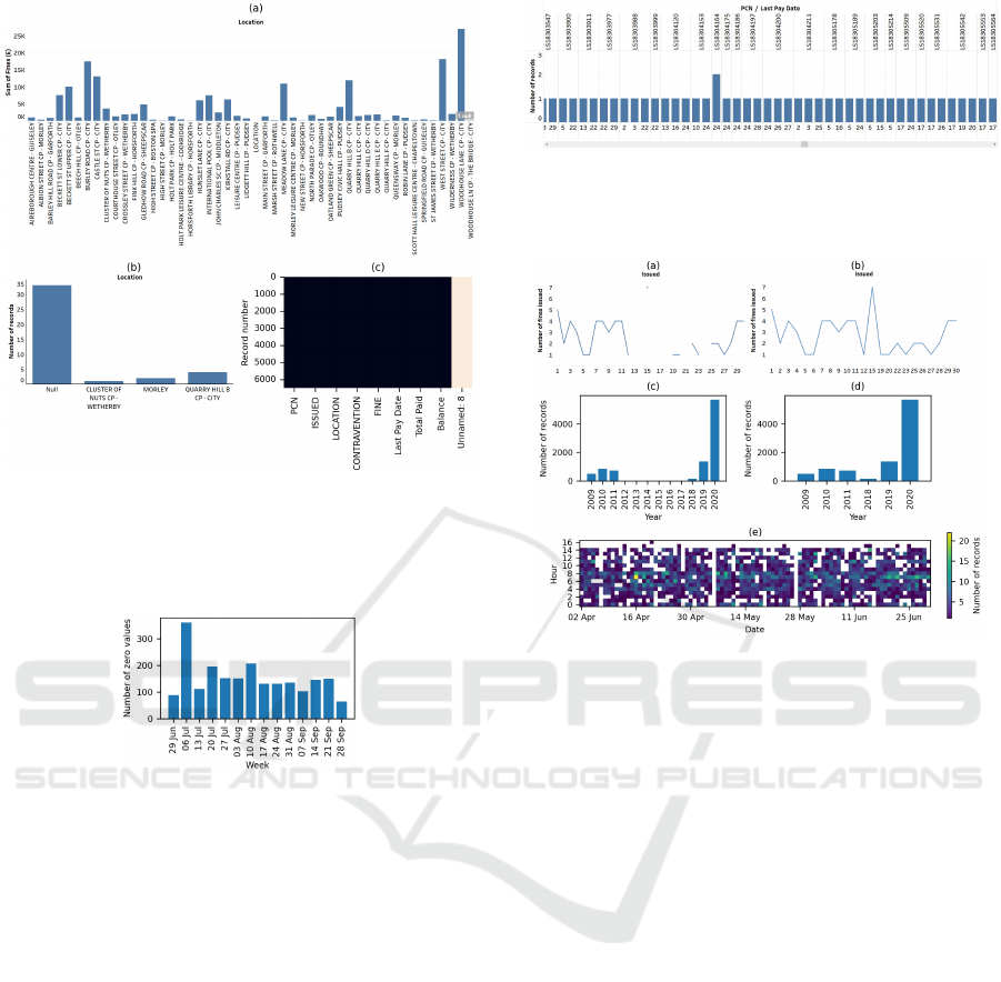
Figure 1: Missing values: (a) alert (“1 null”) provided by
the visualization software, (b) serendipitous discovery (the
participant noticed a label called Null on the X axis), or
(c) heat map showing an empty column (the light color for
“Unnamed: 8”).
Figure 2: A bar chart that quantifies the number of zero
values that occurred for “Total Paid” each week.
missing from others were primarily illustrated with a
data extract table, but one participant discovered the
missing column after noticing an unexpected “null”
in a bar chart X axis label.
As analysts know, some data sources set numeri-
cal data equal to zero if it is missing. Some partic-
ipants illustrated that with a data extract table. One
participant provided a summary table together with
the analysis code that they had used to create the ta-
ble, which is an unambiguous way of showing exactly
how they identified the issue although, clearly, that is
only appropriate for certain audiences. Another par-
ticipant used a bar chart to quantify how often zero
values occurred for each date (see Figure 2).
Participants primarily used a data extract table to
illustrate duplicates, but visualization was also some-
times effective. Two participants serendipitously dis-
covered that a data file contained records that were
actually duplicates of the header row, by noticing a
variable name appearing as an axis label, although the
name only stood out because it much shorter than the
Figure 3: A bar chart in which one combination of PCN/day
pops out as occurring twice (as the scroll bar indicates, only
a few of the 5883 PCNs can be shown at once). In fact pay-
ments had been made on the 24th of two different months.
Figure 4: Coverage: (a) line charts plotting the number of
records vs. day of a month, with gaps popping out, (b) the
same data using a line chart that interpolates across days
with no records (the gaps are hidden, so the software has
misled users by implying that those days did have fines),
(c) bar charts with a continuous X axis that labels each year
so the gap pops out, (d) the same data with a discrete X
axis, which omits years with no data so participants had to
inspect the labels to notice the gaps, (e) heat map showing
there is no data for the 6th and 27th May.
valid location names (see the X-axis label “LOCA-
TION” in Figure 1a). Some of the exact duplicates
issues that participants identified were genuine, but
others were not (see Figure 3).
The coverage issues all involved time and were
the only aspect of completeness for which visual-
ization was dominant. Participants most often used
a line chart, which contained gaps when there were
time gaps in the data and applied semantic encoding
(Ruddle and Hall, 2019) by using a different mark
type (a point) if a date was isolated (see Figure 4a).
That was a benefit of creating the visualizations with
Tableau, because the gaps and different mark types
made the coverage issues pop out. By contrast, some
visualization software interpolates across missing val-
ues, which hides coverage issues from users (see Fig-
ure 4b).
The effectiveness of bar charts for presenting tem-
porally based coverage depended on whether missing
dates were included or excluded. When they were in-
Using Well-Known Techniques to Visualize Characteristics of Data Quality
93
cluded then a coverage issue popped out because of
the gap on the time axis (see Figure 4c), but if miss-
ing dates were excluded then participants needed to
carefully read the date axis labels to notice that some
were missing (i.e., the years 2012–2017 in Figure 4d).
Participants also used data extract tables, scatter
plots and heat maps to illustrate temporally based cov-
erage issues. A data extract table is not effective be-
cause it necessitates that a person carefully reads the
table to notice that some dates are missing. A heat
map is superior, provided that adjacent cells abut so
that gaps are clear (see Figure 4e). However, some
software inserts gaps between heat map cells and scat-
terplot markers produce a similarly problem.
4.2 Accuracy
Data formats can be incorrect a multitude of ways and
one that occurred in the present study was a location
that ended with many trailing spaces, which partici-
pants discovered serendipitously from the labels of a
bar chart where that location appeared to be left justi-
fied text unlike all the others.
Data type and other data format issues were only
illustrated with tables.
The domain violation issues always concerned
fines. Some participants presented that using sum-
mary table, which listed the number of times each
distinct value of Fine occurred. The rarity of £60
popped out (it occurred 1000 times less often than
the other two values), leading participants to com-
ment that £60 was not one of the values that were
listed in the dataset’s documentation. Other partic-
ipants used a bar chart or a scatterplot to present the
fine for each PCN, from which a fine that summed to a
total of £250 popped out because it was much greater
than the others, leading to another comment about the
discrepancy between the data and the documentation.
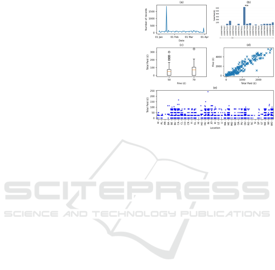
Time-series and numeric outliers were most often
illustrated with line and bar charts, which are de facto
methods of presenting numerical and time data when
the reference is continuous (see Figure 5a) or discrete
(see Figure 5b). However, some bar charts contained
the same perceptual distortion as in Figure 4d so out-
liers did not pop out. Box plots are also purpose-
designed to ensure that outliers pop out, because they
they are displayed using a different shape to the rest of
the plot (see Figure 5c). Scatter plots were also used
effectively for showing outliers. Sometimes that was
for values that were only outlying from a bivariate
perspective (see Figure 5d). Another example showed
univariate outliers, and is notable because the X and
Y axes are for discrete variables so the participant had
to use jittering to avoid overplotting (see Figure 5e).
Figure 5: Time-series and numeric outliers: (a) line chart
with an obvious peak for one date, (b) bar chart showing
that the Total Paid was much greater for one PCN than any
others, (c) box plot showing outlying values of the Total
Paid for the two different values of Fine, (d) scatter plot
revealing a bivariate outlier (a day on which fines totalling
£1100 had been issued but the Total Paid was £1894), and
(e) scatter plot where an outlier (Total Paid = £241) pops
out because of its Y-axis position.
Participants also reported extreme values for both
categorical and date variables. They found categorical
extremes serendipitously, by noticing that one con-
travention in bar chart labels or a data extract table
had the textual value “QTR”, whereas all the others
had names such as “83 WITHOUT DISPLAYING A
VALID TICKET”. The date extreme concerned PCNs
that had a plausible issue date (in the year 2014) but a
special value (1899/12/30) for the Issue Time, exam-
ples of which were presented in a data extract table.
Participants reported two issues with implausible
values. One was negative balances, which were il-
lustrated using five methods. A line chart and scatter
plot were best because they were capable of show-
ing every record in a data file while still allowing the
implausible values to pop out (see Figure 6a and 6c).
Another was exemplary use of a trellis of bar charts to
question the plausiblity of some contraventions only
having one value of fine and another set of contraven-
tions having another fine (see Figure 6b).
Of the other plausibility characteristics, the most
common was where there was an unexpectedly long
interval between a fine being issued and paid. Par-
ticipants illustrated that by annotating a data extract
table to highlight examples of the values, showing the
number of fines for each year of issue in a bar chart,
generating a summary table that showed similar in-
IVAPP 2023 - 14th International Conference on Information Visualization Theory and Applications
94
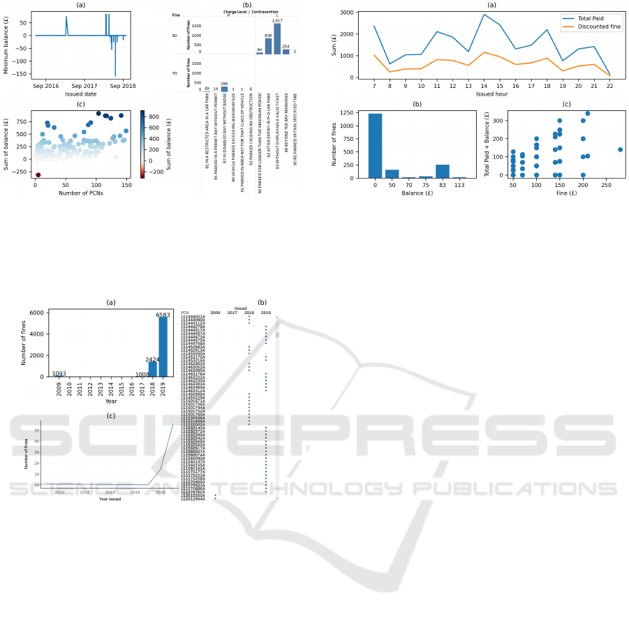
Figure 6: Implausible values: (a) downwards pointing spike
causing negative balances to pop out from a line chart, (b)
trellis of bar charts that groups contraventions into two lev-
els of fine (£50 and £70) so they pop out, and (c) diverging
color map causing a negative balance to pop out from a scat-
ter plot.
Figure 7: Implausible range for fines issued vs. paid: (a) bar
chart, (b) scatter plot, and (c) line chart. Each has strengths
and weaknesses. The bar chart is compact, but the 2009
and 2017 bars are not visible because there are so few fines
(that is why the values are labelled). The scatter plot mark-
ers are equally salient for all years, but users need to read
the X axis labels to notice that there is no data for 2010–
2016, and it lacks scalability because it only shows a small
number of the 3941 PCNs. The line chart is compact, but
users may misunderstand the line from 2009 to 2017, which
the software automatically interpolated, and think there was
data for the intervening years.
formation, serendipitously noticing an old year in the
axis labels of a heat map, and creating scatter plots
or line charts. The strengths and weaknesses of the
bar chart, scatter plot and line chart are illustrated in
Figure 7.
Some values for the Balance or Total Paid were
considered implausible because the pattern of the
value was unusual (most were integers, but a few were
pounds and pence, i.e., decimals). Those decimal val-
ues were sometimes found serendipitously, when par-
ticipants noticed the unusual value amongst the axis
labels or legend items of a visualization, or the text
Figure 8: Violation of functional dependency: (a) aggre-
gated line chart showing that, after accounting for the dis-
count that was stated in the data file for every record, the
total paid was greater than the fine, (b) bar chart created for
records with Total Paid = 0 and showing that about 1200 of
those records also had a Balance = 0, which should clearly
be impossible, (c) scatter plot from the same data file, show-
ing that the Total Paid + Balance = 0 rule was broken for
different fines, but overplotting hides the number of PCNs
that were involved for each point in the plot.
in a summary table. Other participants annotated data
extract tables to highlight examples of the values. The
other plausibility issue and the validity issue were
both only illustrated with a data extract table.
4.3 Consistency
Unlike accuracy, for consistency issues participants
only used visualizations a third of the time. The most
common inconsistency occurred when values violated
a functional dependency, and those issues involved
two (e.g., Balance and Fine), three (e.g., Fine, Dis-
count and Total Paid) or four variables (e.g., Fine,
Discount, Total Paid and Issued date). Participants
typically illustrated the issues with a data extract ta-
ble, indicating example records. Visualizations were
used occasionally, but with good effect for several
purposes. One was providing clues that data may be
inconsistent by plotting an aggregated summary (see
Figure 8a), after which individual records could be
checked. Other visualizations quantified the number
of PCNs that broke a certain rule (see Figure 8b) or
provided a pointer to the PCNs that did so (see Fig-
ure 8c).
The other characteristics of consistency were only
reported a few times by participants. Different data
formats were usually illustrated with a data extract ta-
ble, but one participant provided a data summary table
in which the inconsistently formatted values popped
out, and another participant serendipitously discov-
ered the issue from the labels of a bar chart. Inconsis-
tent duplicates involved the values of fines and were
Using Well-Known Techniques to Visualize Characteristics of Data Quality
95

reported by two participants, using a data extract ta-
ble and a bubble chart. The latter showed the distinct
values of Fine in two data files, so the presence in one
file of a small number of £60 Fine records popped out.
5 DISCUSSION
This research helps to improve our understanding of
the methods (with an emphasis on visualization) that
are effective for identifying and illustrating data qual-
ity issues. There is a considerably body of previous
work that has developed visualization tools or tech-
niques for data quality investigation (e.g., (Kandel
et al., 2012; Fernstad, 2019; Pham and Dang, 2019)),
but that research has tended to take a tool developer’s
perspective and provide the visualization technique
that the developer thinks is most suitable for each
given aspect of data quality, rather than taking a data-
driven approach (i.e., the visualizations and tables that
our participants created) to investigate the pros and
cons of a broad range of visualization techniques, and
how each can provide “eureka moment” insights.
The research also identified six important, charac-
teristics of completeness, (concerning duplicates, and
missing values, columns & headers) and three of ac-
curacy (concerning extreme values and plausibility)
that are absent from previous data quality taxonomies.
Of course, and has already been noted, those charac-
teristics are known to some data scientists. However,
by documenting the characteristics we make it more
likely that they will be treated equally with the other
characteristics of data quality, and not overlooked by
researchers, educators and practitioners.
5.1 Five Uses of Visualization and
Tables
Our results highlighted five ways in which partici-
pants used the visualization and tabular illustration
methods. Quantifying an issue is a mainstream part
of tools and libraries that are designed for data qual-
ity investigations, through bar and line charts, and the
output of textual information as descriptive statistics
and in summary tables. However, more of those tools
should support perceptual discontinuity (Ruddle and
Hall, 2019) so that bars do not become invisible when
small quantities are being displayed.
Alerts are an integral part of the visualization
functionality of some tools (e.g., Tableau) but not oth-
ers (e.g., Excel), which hide data quality issues from
users when visualizations are created. The provision
of alerts should be encouraged as standard function-
ality in all visualization software.
Data extract tables were often used to provide ex-
amples of a given issue. A guideline for that is to
annotate the extract to draw users’ attention to the rel-
evant values/records/columns, as some of our partici-
pants did exhibiting good practice.
Serendipitous discovery and explaining the nature
of an issue are synonymous with the core capabilities
of data visualization because, as the famous statisti-
cian John Tukey said, “the greatest value of a picture
is when it forces us to notice what we never expected
to see” (Tukey, 1977). Examples of serendipitous dis-
covery included participants noticing outlying graph-
ical elements (e.g., peaks in a line chart or points on a
scatter plot) or unexpected text (e.g., “null” or a vari-
able’s name), formatting or values in the tick labels
of charts. Therefore, another guideline is for users to
always take the time to inspect every label in a visu-
alization – you never know what you will find out!
Examples of participants using visualizations to ex-
plain an issue included records that were thought to
be duplicates and inconsistencies in the amount of a
fine, the total paid and the balance.
Serendipitous discovery, and to a lesser extent
explanatory visualizations, depend on patterns pop-
ping out to users so the unexpected becomes obvious.
Classically, pop out occurs in a visualization when
one graphical entity stands out from the others be-
cause of its difference in length, shape, position or
color. However, as our results show, pop out also of-
ten occurred in the axis and legend labels of visualiza-
tions, which led to participants discovering data qual-
ity issues such as missing values, an empty column, a
missing column, a duplicate header, an incorrect data
format, an unusual category name, an implausible pat-
tern of a value, or different data formats. Previous
research has noted that tables are an important visual-
ization idiom in their own right (Bartram et al., 2022),
and our results provided examples where issues such
as a missing variable name, domain violation or dif-
ferent data formats popped out from summary tables.
5.2 Scalability
The ever-increasing size of data (e.g., in terms of
the number of records, variables and distinct values
in variables) presents data scientists with challenges.
Line charts, box plots and scatter plots often scale
well, because the visual properties that cause a graph-
ical entity to pop out still work well if a dataset con-
tains (say) 1000 times more records (e.g., the distinc-
tive peaks in Figure 5a would still appear).
Bar charts and heat maps do not scale very well,
because each bar or heat map cell is discrete, so as
they get more numerous the width of each bar or size
IVAPP 2023 - 14th International Conference on Information Visualization Theory and Applications
96

of each cell gets smaller, until they become difficult
to see. Some software avoids that problem by impos-
ing a minimum size for each discrete interval, but that
introduces a new problem which is that users have to
perform many scrolling actions to see all of the data
(e.g., Figure 5b only shows a few of the 5883 PCNs;
they span a 32,000 pixel wide visualization so a user
would have to scroll hundreds of times to see them
all). One approach for partially dealing with the scal-
ability problem is to sort the data. Another is to create
a scatter plot with software that, instead of forcing the
user to scroll, fits all of the data within the plot area
(e.g., Excel or Matplotlib). That causes a lot of over-
plotting for low values, but is effective for discovering
extreme numerical values. A third and more sophisti-
cated approach is for users to interact and create a set
of visualizations that show different levels of detail.
5.3 Greater Adoption of Visualization
One striking finding was the rarity with which partic-
ipants used visualizations for consistency and com-
pleteness issues (28% and 16% of illustrations, re-
spectively) when compared with accuracy (68%), al-
though there was considerable variation within each
of those types of data quality (see Table 2). Coverage
issues, numeric outliers and time-series outliers only
become apparent if users look at details in context
(e.g., individual values against all of the data), which
plays to a general strength of visualization that most
participants exploited. The same is arguably true for
an implausible range and unexpected low/high values,
which were also characteristics of data quality that
participants illustrated more often with a visualization
than a table. The only other characteristic for which
participants used visualization on the majority of oc-
casions was missing values. On six occasions partic-
ipants serendipitously discovered the missing values
from axis labels, and on the other three the visualiza-
tion software provided a null values alert.
So why was visualization not used more often for
the other 21 characteristics. Of course some char-
acteristics are inherently well-suited to tables (e.g.,
wrong data type and completely missing header), but
how to encourage greater adoption of visualization?
One approach is providing exemplars of more sophis-
ticated visualizations. Some from our results show
the benefits of dimensional stacking (the number of
records for each combination of PCN and day, to
try to identify exact duplicates; Figure 3), trellis lay-
outs (causing an unexpected pattern in the number of
records across three variables to pop out; Figure 6b),
determining specific criteria to interactively filter data
prior to creating a visualization (to show a functional
dependency violation where both the Total Paid and
Balance equalled zero; Figure 8b), or interactively
calculating a new combined variable (Total Paid +
Balance) to simplify a three-variable functional de-
pendency violation so that it could be visualized with
an ordinary scatter plot (see Figure 8c).
Finally, the following strengths and weaknesses
should be borne in mind. Although the research only
used one dataset, it was real-world data, used “as is”
rather than modified in any way, and also comprised
of many data files to cover the seven-year period. As
such, the data was typical of the uncurated open data
that is often used in data science projects. Our par-
ticipants were diverse in terms of their academic and
cultural backgrounds, but at the same time were all
students at the beginning of their careers in data sci-
ence rather than having extended experience.
6 CONCLUSIONS
This research investigated the visualization and tab-
ular methods that participants used to illustrate data
quality issues, distinguishing between five broad
ways in which the methods were used, which range
from those that are central to the mainstream func-
tionality of data quality tools/libraries to serendipi-
tous discovery. We also identified nine characteristics
of data quality that are not included in existing data
quality taxonomies.
Our findings point the way to areas where fur-
ther work is needed. One is to encourage the wider
implementation of certain functionality in data qual-
ity visualization software, including alerts, annotation
at the click of a button, semantic encoding (to help
users differentiate between values that are semanti-
cally distinct but numerically similar) and perceptual
discontinuity (to prevent graphical features from be-
ing hidden). The second concerns professional prac-
tice, training and educating data scientists so they are
aware of data quality’s very diverse characteristics
and better equipped to rigorously investigate them.
Finally, further research is required to: (a) run con-
trolled user studies that compare different visualiza-
tion techniques for a suite of benchmark data quality
issues, and (b) investigate effective ways of visualiz-
ing complex data quality issues in large datasets, par-
ticularly for issues that involve multiple variables.
ACKNOWLEDGEMENTS
This research was supported by the Alan Turing Insti-
tute.
Using Well-Known Techniques to Visualize Characteristics of Data Quality
97

REFERENCES
Andrienko, N. and Andrienko, G. (2006). Exploratory anal-
ysis of spatial and temporal data: a systematic ap-
proach. Springer Science & Business Media.
Anscombe, F. J. (1973). Graphs in statistical analysis. The
American Statistician, 27(1):17–21.
Bartram, L., Correll, M., and Tory, M. (2022). Untidy
data: The unreasonable effectiveness of tables. IEEE
Transactions on Visualization & Computer Graphics,
28(01):686–696.
Dungey, S., Beloff, N., Puri, S., Boggon, R., Williams, T.,
and Tate, A. R. (2014). A pragmatic approach for
measuring data quality in primary care databases. In
IEEE-EMBS International Conference on Biomedical
and Health Informatics (BHI), pages 797–800. IEEE.
Fernstad, S. J. (2019). To identify what is not there: A
definition of missingness patterns and evaluation of
missing value visualization. Information Visualiza-
tion, 18(2):230–250.
Gratzl, S., Lex, A., Gehlenborg, N., Pfister, H., and Streit,
M. (2013). Lineup: Visual analysis of multi-attribute
rankings. IEEE Transactions on Visualization and
Computer Graphics, 19(12):2277–2286.
Gschwandtner, T., Aigner, W., Miksch, S., G
¨
artner, J.,
Kriglstein, S., Pohl, M., and Suchy, N. (2014). Time-
Cleanser: A visual analytics approach for data cleans-
ing of time-oriented data. In Proc. 14th Int. Conf.
Knowledge Technologies and Data-driven Business,
page 18. ACM.
Kandel, S., Parikh, R., Paepcke, A., Hellerstein, J. M., and
Heer, J. (2012). Profiler: Integrated statistical analy-
sis and visualization for data quality assessment. In
Proceedings of the working conference on Advanced
visual interfaces, pages 547–554. ACM.
Laranjeiro, N., Soydemir, S. N., and Bernardino, J. (2015).
A survey on data quality: classifying poor data. In
2015 IEEE 21st Pacific rim international symposium
on dependable computing (PRDC), pages 179–188.
IEEE.
Mackinlay, J. (1986). Automating the design of graphical
presentations of relational information. ACM Trans-
actions on Graphics (TOG), 5(2):110–141.
Maguire, E., Rocca-Serra, P., Sansone, S.-A., Davies, J.,
and Chen, M. (2012). Taxonomy-based glyph de-
sign—with a case study on visualizing workflows of
biological experiments. IEEE Transactions on Visual-
ization and Computer Graphics, 18(12):2603–2612.
Monroe, M., Lan, R., Lee, H., Plaisant, C., and Shneider-
man, B. (2013). Temporal event sequence simplifica-
tion. IEEE Transactions on Visualization and Com-
puter Graphics, 19(12):2227–2236.
Munzner, T. (2014). Visualization analysis and design.
CRC press.
Pham, V. and Dang, T. (2019). Outliagnostics: Visualizing
temporal discrepancy in outlying signatures of data
entries. In 2019 IEEE Visualization in Data Science
(VDS), pages 29–37. IEEE.
Ruddle, R. A., Fateen, W., Treanor, D., Sondergeld, P.,
and Ouirke, P. (2013). Leveraging wall-sized high-
resolution displays for comparative genomics analy-
ses of copy number variation. In 2013 IEEE Sympo-
sium on Biological Data Visualization (BioVis), pages
89–96. IEEE.
Ruddle, R. A. and Hall, M. (2019). Using miniature vi-
sualizations of descriptive statistics to investigate the
quality of electronic health records. In Proceedings of
the 12th International Joint Conference on Biomedi-
cal Engineering Systems and Technologies-Volume 5:
HEALTHINF, pages 230–238. SciTePress.
Shneiderman, B. (2003). The eyes have it: A task by data
type taxonomy for information visualizations. In The
craft of information visualization, pages 364–371. El-
sevier.
Spence, R. (2001). Information visualization, volume 1.
Springer.
Stolte, C., Tang, D., and Hanrahan, P. (2002). Polaris: A
system for query, analysis, and visualization of multi-
dimensional relational databases. IEEE Transactions
on Visualization and Computer Graphics, 8(1):52–65.
Tufte, E. R. (2006). Beautiful evidence. Graphics Press.
Tukey, J. W. (1977). Exploratory data analysis. Addison-
Wesley Series in Behavioral Science: Quantitative
Methods.
Wang, R. Y. and Strong, D. M. (1996). Beyond accuracy:
What data quality means to data consumers. Journal
of management information systems, 12(4):5–33.
Ward, M., Xie, Z., Yang, D., and Rundensteiner, E. (2011).
Quality-aware visual data analysis. Computational
Statistics, 26(4):567–584.
Weiskopf, N. G. and Weng, C. (2013). Methods and di-
mensions of electronic health record data quality as-
sessment: Enabling reuse for clinical research. Jour-
nal of the American Medical Informatics Association,
20(1):144–151.
Wirth, R. and Hipp, J. (2000). CRISP-DM: Towards a stan-
dard process model for data mining. In Proceedings of
the 4th International Conference on the Practical Ap-
plications of Knowledge Discovery and Data mining,
volume 1, pages 29–40. Manchester.
APPENDIX
The table below lists the 79 data quality issues and
number of participants who identified each issue.
The last page combines the data quality taxonomies
from seven previous works: a (ISO/IEC 25012:2008),
b (Dungey et al., 2014), c (Gschwandtner et al., 2014),
d (Kandel et al., 2012), e (Laranjeiro et al., 2015),
f (Wang and Strong, 1996), g (Weiskopf and Weng,
2013). An “*” indicates characteristics that were
identified in the present research but do not appear
in any of those taxonomies.
IVAPP 2023 - 14th International Conference on Information Visualization Theory and Applications
98
ACCESSIBILITY: Intrepretability
Variable’s name is not included in the dataset’s documentation. 2
COMPLETENESS: Coverage
No rows for certain combinations of Location and Issued value 14
No rows for certain Issued values 43
COMPLETENESS: Duplicate header*
Value is the same as the field name (e.g., “LOCATION”) 2
Column names are repeated as rows 63
COMPLETENESS: Exact duplicates
Row is an exact duplicate 35
COMPLETENESS: Uniqueness violation
Uniqueness violation in the PCN field 97
COMPLETENESS: Empty column*
Column in data file does not contain any values 1
Unnamed column in data file with no values 85
COMPLETENESS: Completely missing variable*
Missing a variable that is in other data files 23
COMPLETENESS: Missing column name*
Column in data file does not have a name 2
COMPLETENESS: Completely missing header*
First row of the data file is used as the column names 12
Data file has no column names 35
COMPLETENESS: Missing record
Data file has fewer records than expected 3
Record does not contain any values 7
COMPLETENESS: Missing value
Missing values in the Location field 3
Missing values in the Issued field 7
Missing values in the Balance field 5
Missing values in the PCN field 1
COMPLETENESS: Zero value*
Values of zero in the Paid in £ field 2
Values of zero in the Total Paid field 5
Values of zero in the Balance field 1
ACCURACY: Numeric outliers
Sum of Fine is much larger/smaller for one Location 18
A Contravention has a much larger/smaller number of records 11
A Location has a much larger/smaller number of records 14
A value of Total Paid is much larger/smaller 3
The value of Total Paid is much larger for one PCN than the others 1
Sum of Fine is much larger/smaller for one Contravention 6
A value of Balance is much larger/smaller than others 1
Sum of Fine is much larger/smaller for one Location for a specific
Issued year
2
Value of Fine occurs rarely, so may be incorrect 2
A value of Total Paid is much larger/smaller than others for the
same value of Fine
1
Values of Balance and Total Paid are much larger/smaller 1
ACCURACY: Time-series outliers
Sum of Fine is much larger/smaller for one Issued date 25
A Last Pay Date occurs a much larger/smaller number of times 4
Average of Balance is much larger/smaller for one Issued date 4
Sum of Total Paid is much larger/smaller for one Issue Date 2
An Issue Date has a much larger/smaller number of records 2
An Issue Date has a much larger/smaller number of fines issued 54
Sum of Total Paid is outlier for sum of Fine for one Issued date 1
On a particular day of the week, one Contravention was issued a
notably different number of times
2
A value of Total Paid is much larger/smaller on one date 1
ACCURACY: Special value*
Issued year is 1899 6
ACCURACY: Unusual category name*
Name of a Contravention is much shorter and looks different to
others
10
ACCURACY: Domain violation
Fine has a value that, after taking possible discount into account,
is different to those specified in the documentation
1
Fine has a value that is diffierent to those specified in the docu-
mentation
3
ACCURACY: Validity
Invalid value for Issued date (’R’) 1
ACCURACY: Implausible range
Very long time between date Issued and when fine was paid 45
Last Pay Date is years after fine was issued 1
ACCURACY: Pattern of value is unusual*
Unusual that Total Paid is a decimal value 21
Unusual that Balance is a decimal value 2
Value for Total Paid is decimal and occurs rarely 3
ACCURACY: Same value for too many records
Old fines all have the same recent Last Paid Date 1
ACCURACY: Unexpected low/high values
The Balance is negative 40
Unexpected relationship between Contraventions and values of
Fines
1
ACCURACY: Data format
Fine values contain currency (£) sign 8
Some Location values have trailing spaces 2
Value has wrong number of decimal places for a Fine 2
ACCURACY: Wrong data type
Fine has wrong data type 5
Fine and Issued have wrong data type 1
Fine, Total Paid and Balance have wrong data type 1
CONSISTENCY: Inconsistent duplicates
Different values of Fine for the same Contravention 1
One data file contains a fine with a value that doesn’t appear in
another data file but is not mathematically an outlier.
1
CONSISTENCY: Violation of functional dependency
The Balance is greater than the Fine 6
Sum of Total Paid is greater than the sum of Fine in some Loca-
tions
2
Total Paid equals Fine, but Discount is non-zero 1
Sum of Fine is similar across Issue Date but sum of Total Paid is
not
1
Balance does not equal Fine - Total Paid 20
Step-change in pattern for Fine vs. Total Paid from one year to
another
4
Last Pay Date is earlier than Issued 2
The Total Paid is greater than the Fine (after accounting for Dis-
count).
1
Sums of Fine and Total Paid do not match across time 1
Total Paid and Balance both are both zero 16
The Total Paid is greater than the Fine, taking Issued date and
Discount into account
4
CONSISTENCY: Different data formats
The date format of Issued is not consistent in the file. 4
Total Paid values have different number of decimal places 2
Fine has different number of decimal places in different data files 1
PCN contains an alphabetical character (’A’ not just digits) 1
Total Paid has different formats (and data types) 1
Using Well-Known Techniques to Visualize Characteristics of Data Quality
99

TAXONOMY OF DATA QUALITY TYPES AND CHARACTERISTICS (Level 1–3)
Type Level 1 Level 2 Level 3
Accessibility [a,e,f,g] Interpretability [f]
Completeness [a,b,e,f,g] Missing data [c,d,e] Missing record [d] (also termed: Missing
(also termed: Missingness [g], tuple [c], Unit non-response [b])
Omission [g], Presence [g], Missing value [c,d] Dummy entry [c]
Sensitivity [g]) Item non-response [b]
Semi-empty tuple [c]
Zero value*
Missing variable* Completely missing variable*
Empty column*
Missing header* Completely missing header*
Missing column name*
Duplicates [c,e] Exact duplicates [c]
Uniqueness violation [c,e]
Duplicate header*
Coverage [b] Appropriate amount of data [f] Rate of recording [g]
Concise representation [f]
Relevance [b,f] Coding specificity [b]
Relevant time intervals [b]
Accuracy [a,b,e,f,g] Ambiguous data [c,e] Abbreviations or imprecise/unusual coding [c]
(also termed: Corrections Extreme [d] Numeric outliers [d]
made [g], Correctness [g], Time-series outliers [d]
Errors [g], Incorrect [d], Unusual category name*
Positive predictive value [g]) Special value*
Incorrect value [c,e] Coded wrongly or not conform to real entity [c]
(also termed: Wrong data [c]) Domain violation [c,e]
Embedded values [c]
Erroneous entry [d]
Extraneous data [d,e]
Incorrect derived values [c]
Measurement or recording error [b]
Misfielded [c,d,e]
Misspelling [c,e]
Recording accuracy [b]
Validity [b,g] Invalid substring [c]
Misleading [g] Objectivity [f]
Plausibility [g] Implausible range [c]
(also termed: Unexpected low/high values [c]
Believability [f,g], Same value for too many records [c]
Implausible values [c], Implausible changes of values over time [c]
Trustworthiness [g]) Pattern of value is unusual*
Syntax violation [c] Data format [c]
Wrong data type [c,d,e]
Consistency [a,b,d,e,g] Heterogeneity of semantics [c] Heterogeneity of aggregation/abstraction [c,e]
(also termed: Agreement [g], (also termed: Representational Heterogeneity of measure units [c,d,e]
Concordance [g], Heterogeneity consistency [f]) Inconsistent duplicates [c] Approximate duplicates [c]
of representations [c, d, e], Inconsistent spatial data [c]
Reliability [b, g], Variation [g]) Information refers to different points in time [c,e]
Misspelling (inconsistent) [d]
Naming conflicts [c] Synonym/Homonym [c,e]
Ordering [d]
Violation of functional dependency [c,e]
Heterogeneity of syntaxes [c] Different data formats [c]
Different encoding formats [c,e]
Different table structure [c]
Different word orderings [c,e]
Special characters [c,d,e]
References [c] Referential integrity violation [c,e]
Incorrect reference [c,e]
Primary key violation [d]
Circularity among tuples in a self-relationship [c]
IVAPP 2023 - 14th International Conference on Information Visualization Theory and Applications
100
