
Viewpoint-Based Quality for Analyzing and Exploring 3D
Multidimensional Projections
Wouter Castelein
a
, Zonglin Tian
b
, Tamara Mchedlidze
c
and Alexandru Telea
d
Department of Information and Computing Science, Utrecht University, Netherlands
Keywords:
Multidimensional Projections, Visual Quality Metrics, Perception, User Studies.
Abstract:
While 2D projections are established tools for exploring high-dimensional data, the effectiveness of their 3D
counterparts is still a matter of debate. In this work, we address this from a multifaceted quality perspective.
We first propose a viewpoint-dependent definition of 3D projection quality and show how this captures the
visual variability in 3D projections much better than aggregated, single-value, quality metrics. Next, we
propose an interactive exploration tool for finding high-quality viewpoints for 3D projections. We use our
tool in an user evaluation to gauge how our quality metric correlates with user-perceived quality for a cluster
identification task. Our results show that our metric can predict well viewpoints deemed good by users and
that our tool increases the users’ preference for 3D projections as compared to classical 2D projections.
1 INTRODUCTION
Dimensionality reduction (DR), also called projec-
tion, is a popular technique for visualizing high-
dimensional datasets by low-dimensional scatterplots.
Tens of different DR techniques (Espadoto et al.,
2019) have been designed to address the several re-
quirements one has for this class of methods, such
as computational scalability, ease of use, robustness
to noise or small data changes, projecting additional
points along those existing in an original dataset (out-
of-sample ability), and visual quality.
Visual quality is a key requirement for DR meth-
ods. Globally put, a good projection scatterplot cap-
tures well the so-called data structure present in the
original high-dimensional data in terms of point clus-
ters, outliers, and correlations (Nonato and Aupetit,
2018; Espadoto et al., 2019; Lespinats and Aupetit,
2011). As such, high-quality projections are essential
to allow users to reason about the data structure by
exploring the visual structure of the scatterplot.
Projection techniques used for visualization pur-
poses can typically create 2D or 3D scatterplots
equally easily. For brevity, we call such scatterplots
2D and 3D projections respectively. In contrast to
2D projections, 3D projections have one extra dimen-
a
https://orcid.org/0000-0002-4964-4670
b
https://orcid.org/0000-0001-5626-402X
c
https://orcid.org/0000-0001-6249-3419
d
https://orcid.org/0000-0003-0750-0502
sion to project the data (thus, can in principle achieve
higher quality). However, the user must choose a suit-
able viewpoint for analysis. Hence, to assess 3D pro-
jection quality, we cannot simply reuse the viewpoint-
independent metrics used for 2D projections, but must
also consider the viewpoint information.
Relatively few works studied 3D projections and
mainly by comparing their ease of interpretation and
use for selected tasks by means of user studies. In this
paper, we aim to extend such insights by answering
the following questions:
Q1: How can we measure the quality of 3D projec-
tions by means of quantitative metrics?
Q2: How do 3D projections compare with their 2D
counterparts (generated on the same datasets by the
same projection technique) from the perspective of
these metrics?
Q3: How do our proposed quality metrics correlate
with quality as perceived by actual users?
We answer these questions as follows. We mea-
sure 3D projection quality by a function (rather than
a single value) that evaluates existing 2D quality met-
rics over a large set of 2D viewpoints of the 3D pro-
jection (Q1). Next, we quantitatively analyze 30 3D
projections (five techniques run on six datasets) and
find that most views of a 3D projection are of rela-
tively high quality, with only a few poor views, and
that these good views can have higher quality than a
2D projection made with the same technique for the
same dataset (Q2). We propose an interactive tool for
Castelein, W., Tian, Z., Mchedlidze, T. and Telea, A.
Viewpoint-Based Quality for Analyzing and Exploring 3D Multidimensional Projections.
DOI: 10.5220/0011652800003417
In Proceedings of the 18th International Joint Conference on Computer Vision, Imaging and Computer Graphics Theory and Applications (VISIGRAPP 2023) - Volume 3: IVAPP, pages 65-76
ISBN: 978-989-758-634-7; ISSN: 2184-4321
Copyright
c
2023 by SCITEPRESS – Science and Technology Publications, Lda. Under CC license (CC BY-NC-ND 4.0)
65

exploring the viewpoint-based quality. We perform a
user study to test which viewpoints users perceive to
be good for a cluster separation task and if these have
high quality values as measured by our metric (Q3).
We find a correlation of perceived vs computed qual-
ity, which suggests that the latter can be used to pre-
dict the former. When showing users the computed
quality as they search for good viewpoints, we found
out that users tend to select even higher-quality views.
Our study shows that users preferred in most cases the
3D projections (with their own selected viewpoints)
to the static 2D projections, and that, in these cases,
the computed quality of the selected views was at the
high end of the spectrum of qualities reachable by
viewpoints of a 3D projection, and comparable to the
quality of corresponding 2D projections.
2 RELATED WORK
We start by listing some notations. Let D = {x
i
} be a
dataset of n-dimensional samples or points x
i
∈ R
n
. A
projection P maps D to P(D) = {y
i
}, where y
i
∈ R
q
is the projection of x
i
. Typically q ≪ n, yielding 2D
projections (q = 2) and 3D projections (q = 3) that are
used to visualize D by depicting the respective scat-
terplots. We next use P
2
to denote a technique P that
creates 2D projections (q = 2); P
3
for 3D projections
(q = 2); and P when the dimension q is not important.
A quality metric is a function M(D, P(D)) → R
+
that tells how well the scatterplot P(D) captures as-
pects of the dataset D. We next discuss metrics for 2D
projections (Sec. 2.1) and 3D projections (Sec. 2.2).
2.1 Measuring 2D Projection Quality
Measuring 2D projection quality is a well-established
field which can be split into three types of methods.
Quantitative Metrics: M is computed by directly an-
alyzing D and P(D). Examples of M are listed below.
Trustworthiness T measures the fraction of points
in D that are also close in P(D) (Venna and Kaski,
2006). In T ’s definition (Tab. 1), U
(K)
i
are the K near-
est neighbors of y
i
which are not among the K nearest
neighbors of x
i
; and r(i, j) is the rank of y
j
in the
ordered-set of nearest neighbors of y
i
. High trust-
worthiness implies that visual patterns in P(D) rep-
resent actual patterns in D, i.e., the projection has few
so-called false neighbors (Martins et al., 2014). Con-
tinuity C, a related metric, measures the fraction of
points in P(D) that are also close in D (Venna and
Kaski, 2006). In C’s definition (Tab. 1), V
(K)
i
is the
set of points that are among the K nearest neighbors
of x
i
but not among the K nearest neighbors of y
i
;
and ˆr(i, j) is the rank of y
j
in the ordered-set of near-
est neighbors of x
i
. High continuity implies that data
patterns in D are captured by P(D), i.e., the projection
has few so-called missing neighbors (Martins et al.,
2014).
Normalized stress N measures how well inter-
point distances in P(D) reflect the same inter-point
distances in D, i.e., how well users can retrieve dis-
tance information from the projection (Joia et al.,
2011). Different distance metrics ∆
n
for D, and ∆
q
for P(D) respectively can be used (Tab. 1), the most
typical being the L
2
metric. Distance preservation
can also be measured by the Shepard diagram (Joia
et al., 2011), a scatterplot of the pairwise L
2
distances
between all points in P(D) vs the corresponding dis-
tances in D. Points close to the main diagonal show
a good distance preservation. The diagram can be re-
duced to a single metric value by computing its Spear-
man rank correlation S, where S = 1 denotes a perfect
(positive) correlation of distances in D and P(D).
Many other quantitative metrics exist for 2D pro-
jection, e.g., the neighborhood hit (NH) that cap-
tures how well P(D) captures same-label clusters in
D (Paulovich et al., 2008; Rauber et al., 2017; Au-
petit, 2014); Distance Consistency (DSC) (Sips et al.,
2009) or Class Consistency Measure (CCM) (Tatu
et al., 2010; Sedlmair and Aupetit, 2015)), which
tell how well P(D) is separated into visually dis-
tinct, same-label, clusters. Additional visual separa-
tion metrics are given by (Albuquerque et al., 2011;
Sedlmair et al., 2013; Motta et al., 2015). We do not
use these metrics since they either need labeled data
and/or do not measure how well P(D) preserves as-
pects of D but rather how well humans separate P(D)
into visual clusters, which is a different task than ours.
Error Views: In contrast to quantitative metrics
which produce a single scalar value M ∈ R
+
, error
views produce a set of values, typically one per pro-
jection point y
i
. These include the projection preci-
sion score (Schreck et al., 2010), which captures the
aggregated difference between the distances of a point
in P (D) to its K nearest neighbors in D, respectively
P(D); stretching and compression (Aupetit, 2007;
Lespinats and Aupetit, 2011), which measure the in-
crease (stretching), respectively decrease (compres-
sion) of distances of a point to all other points in P(D)
vs the corresponding distances in D; and the aver-
age local error (Martins et al., 2014), which aggre-
gates stretching and compression. Error views give
fine-grained insight on where in a projection distance-
preservation errors occur. Such views are mainly in-
tended for human analysis, i.e., they cannot be easily
used to automatically compare many projection in-
stances, which is our goal.
User Studies: Both quantitative metrics and error
IVAPP 2023 - 14th International Conference on Information Visualization Theory and Applications
66

Table 1: Projection quality metrics used in this paper. All metrics range in [0 = worst, 1 = best].
Metric Definition (taken from (Espadoto et al., 2019))
Trustworthiness (T ) 1 −
2
NK(2N−3K−1)
∑
N
i=1
∑
j∈U
(K)
i
(r(i, j) − K)
Continuity (C) 1 −
2
NK(2N−3K−1)
∑
N
i=1
∑
j∈V
(K)
i
(ˆr(i, j) − K)
Normalized stress (N)
∑
i j
(∆
n
(x
i
,x
j
)−∆
q
(P(x
i
),P(x
j
)))
2
∑
i j
∆
n
(x
i
,x
j
)
2
Shepard goodness (S) Spearman rank correlation of scatterplot (∥x
i
− x
j
∥, ∥P(x
i
) − P(x
j
)∥), 1 ≤ i ≤ N, i ̸= j
views do not directly gauge the usefulness of a pro-
jection. (Nonato and Aupetit, 2018) discuss this in
detail and provide a taxonomy of tasks for projec-
tions and evaluation methods for these, mainly based
on user studies. (Espadoto et al., 2019) acknowledge
that task-based evaluations provide insight in the ap-
plication value of projections but argue that evalu-
ating metrics over large dataset collections and pro-
jection hyperparameter settings provides complemen-
tary insight in the projections’ technical quality and is
much easier to automate than user studies. Quantita-
tive metrics are a first, necessary, step to assess pro-
jections, to be followed by more specific task-based
user studies – an approach that we follow in our work.
2.2 Measuring 3D Projection Quality
All abovementioned 2D projection quality metrics
can be easily computed for 3D projections. Recently,
(Tian et al., 2021b) compared 29 projection tech-
niques across 8 datasets using the T , C, and S met-
rics mentioned above, computed following their defi-
nitions in Tab. 1 for the 2D, respectively 3D, scatter-
plots P(D). They found a small increase of quality
metrics (on average, 3%) for the 3D vs the 2D pro-
jections. They also qualitatively (as opposed to our
quantitative measurements) studied how users per-
ceive projections and found that, for tasks involving
explaining groups of close points by similar values of
dimensions, 3D projections can show more insights
than their 2D counterparts.
Simply transposing 2D quality metrics to 3D has
a major issue. Even if such metrics score highly on a
3D projection, this does not mean that that projection
shows data patterns to users well. Indeed, the met-
rics ‘see’ P(D) in three dimensions; users see only
2D views of P(D) from chosen viewpoints. Informa-
tion encoded along the viewing direction is thus used
by the metrics but is not seen by the user. This can
e.g. artificially make the metrics indicate higher qual-
ity which the user actually does not see.
Apart from the above, and in line with the obser-
vations in (Nonato and Aupetit, 2018) for 2D projec-
tions, 3D projections can actually bring added value
which cannot be easily captured by automatically-
computed metrics. As such, 3D projections have been
mainly assessed in the literature by user studies. Sev-
eral such examples follow.
(Poco et al., 2011) compare 2D vs 3D projections
and show that 3D scores better than 2D for the NH
and C metrics. They refine this insight by a user study
where 12 participants were asked to count clusters,
order clusters by density, list all pairwise cluster over-
laps, detect an object within a cluster, find the clus-
ter closest to a given point (all operations involve vi-
sual clusters shown by P(D)). Users were better able
to provide the correct answer for these tasks in 3D
(74.4%) than in 2D (64.3%). Yet, the only statisti-
cally significant improvement was found for the last
task. Also, users needed around 50% more time for
these tasks in 3D. Overall the work suggests a slight
improvement when using 3D, but it lacks certainty.
(Sedlmair et al., 2013) asked two experienced
coders to rate how well classes of 75 labeled datasets
were separable in a 2D projection, an interactive 3D
projection, and a scatterplot matrix. They found that
the 2D projection was often good enough to visual-
ize separate classes and was also the fastest method
to use. The interactive 3D projection scored better
than the 2D one and the scatterplot matrix only for
highly synthetic (abstract) datasets. A limitation of
this study is that it involved only two users. In con-
trast, our evaluations for a similar task described in
this paper involve 22 participants.
Several works compared 2D with 3D scatterplots
and argued for the latter as better in capturing sample
density variations (Sanftmann and Weiskopf, 2009;
Sanftmann and Weiskopf, 2012) and having less in-
formation loss (Chan et al., 2014). However, it is im-
portant to note that interpreting 3D scatterplots whose
axes directly encode data dimensions is very different
from interpreting 3D projections where the three axes
often have no meaning.
3 VIEWPOINT-DEPENDENT 3D
PROJECTION QUALITY
A first conclusion from Sec. 2 is that (a) quantitative
metrics are an useful, scalable, generic, and accepted
first step for evaluating 2D projections but (b) we lack
such metrics for the 3D case.
Metric Design: We construct such 3D projection
Viewpoint-Based Quality for Analyzing and Exploring 3D Multidimensional Projections
67
metrics based on the well-known and accepted 2D
projection metrics (Sec. 2.1) as follows. Take a 3D
projection P
3
(D) which is explored from multiple
viewpoints using a virtual trackball metaphor. Let
p ∈ R
3
be a viewing direction pointing to the center
of P
3
(D). Let Q(p, P
3
(D)) be the view of P
3
(D) from
direction d, i.e., the 2D scatterplot of the orthographic
projection of P
3
(D) on a plane orthogonal to p.
Q(p, P
3
(D)) is a 2D scatteplot, so we can measure
its quality by directly applying all metrics in Tab. 1,
or any other quality metric M for 2D projections, on
it. Hence, we can describe the quality of P
3
(D) by a
function M(D, Q(p, P
3
(D)) of the viewpoint p. Note
that we can ignore in-plane (around p) rotations since
these do not change the inter-point distances in the 2D
scatterplot Q(p, P
3
(D)) that all metrics in Tab. 1 use.
To analyze M, we sample it over a set of view-
points V = {p
i
|1 ≤ i ≤ s} uniformly distributed over
a sphere using the spherical Fibonacci lattice algo-
rithm (Gonzalez, 2010) with s = 1000. Other sam-
pling methods can be readily used, e.g. (Camahort
et al., 1998; Levoy, 2006). Sampling yields a dataset
e
M = {M(D, Q(p, P
3
(D))|p ∈ V } which is our replace-
ment of the scalar metric M to evaluate 3D projection
quality.
As mentioned in Sec. 2.2, users do not see any
information along the viewing direction p. Hence,
views Q have occluded points (along p) which our
metric M(D, Q(p, P
3
(D)) does not account for. We
do not handle occlusions when computing
e
M since all
uses we know of quality metrics M for 2D projections
in the literature have exactly the same accepted prob-
lem, albeit for a different reason, i.e. overdraw due to
not-ideal T values.
Visual Exploration Tool: We implemented an inter-
active tool for exploring and comparing the 3D and
2D projections P
3
(D) and P
2
(D) and their computed
quality metrics. We next describe this tool, which is
key to our user evaluation (see next Sec. 5).
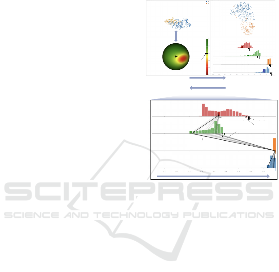
Figure 1 shows our tool’s four views. Views (a)
and (b) show the 3D projection P
3
(D), respectively
the corresponding 2D projection P
2
(D), of a dataset
D. Views (c,d) allow comparing P
2
and P
3
to decide
which is better for the task at hand, as follows.
Quality Distribution: View (c) renders
e
M (for a
user-chosen M ∈ {N, S,C, T }) over all directions V
by color-coding points p on a sphere via an ordinal
(red-yellow-green) colormap. For example, red points
show viewing directions p from which
e
M is low. The
current viewpoint used in view (a) is always at the
center of the sphere, see black cross in (b). Rotating
either the 3D projection (a) or the sphere (b) updates
the other view: Rotating the sphere allows users to
find viewpoints of high quality
e
M and see how the 3D
projection looks from them. Rotating the 3D projec-
Shepard correlation S
Continuity C
Trustworthiness T
Normalized stress N
dark line:
current viewpoint
thin lines:
all views in hovered bin
hovered bin (d)
3D Projection
P
3
2D Projection
P
2
Quality M
high M
~
~
N
S
C
T
current
viewpoint
rotate (a) and
(c) in sync
a)
b)
c) d)
rotate sphere, update (d)
hover in (d), update (c) + (a)
low M
~
Quality distribution
N(D, P
2
(D)) (e)
N(D, P
3
(D)) (f)
0.0 1.0
metric value
low
high
Figure 1: Tool for exploring 2D/3D projection quality.
tion allows users to find interesting patterns and see if
they can trust them, i.e., if
e
M is high for those view-
points. Our viewpoint exploration by sphere rotation
is conceptually related to the mechanism in (Coimbra
et al., 2016). However, the latter encodes explana-
tions of the different viewpoints of a 3D projection,
whereas we encode projection quality.
View (d) shows all the quality metrics N, S, C, and
T for both P
3
(D) and P
2
(D) using one annotated his-
togram per metric, as follows (see also inset in Fig. 1
bottom for details). The histogram shows the number
of views in V that have quality values
e
M falling in a
given bin; the range [0, 1] of
e
M is uniformly divided
in 40 such bins. Hence, long bars indicate
e
M val-
ues reached by many viewpoints; short bars indicate
e
M values that only few viewpoints have. Histograms
shifted to the right tell that the 3D projection has high
quality from most viewpoints, as is the case for the
C and T metrics in Fig. 1 (inset); histograms shifted
to the left tell that the 3D projection has poor quality
from most viewpoints, as is the case of the S metric
in Fig. 1 (inset). Disagreement of the four histograms
tells that it is hard to find views deemed good from
the perspective of all four quality metrics.
Single-value Metrics: A small, respective large, tick
shown under the histogram tells the value of the qual-
IVAPP 2023 - 14th International Conference on Information Visualization Theory and Applications
68

ity metric for the 2D projection, i.e., M(D, P
2
(D)),
and respectively the value of M computed directly on
the 3D projection, i.e., M(D, P
2
(D)). Seeing where
the small tick falls within the histogram range tells
how easy is to find viewpoints from which the 3D
projection has a better quality than the single-view 2D
projection. For example, Fig. 1 (inset) shows that the
small-tick for N is very close to the right end of the re-
spective histogram. There are only two, shallow, bars
to the right of this tick. So, it is quite hard to find
viewpoints in which the 3D projection has a higher
N than the 2D projection. The large tick shows why
computing a single value for M in 3D is not insight-
ful. For example, in Fig. 1 (inset), the large tick for
N indicates a very high quality, larger than almost all
the per-viewpoint N values for the 3D projection and
also larger than the N of the 2D projection. However,
as we argued in Sec. 2.2, users do not inherently ‘see’
the 3D projection but only a 2D orthographic view
thereof. As such, the quality value M(D, P
3
(D)) indi-
cated by the long tick can never be reached in practice.
Visiting Viewpoints in Quality Order: We further
link views (c) and (d) by interaction. When the user
rotates the viewpoint sphere in (c), the bins of the
four histograms in (d) in which the currently selected
viewpoint (crosshair in (c)) falls are rendered in a
darker hue. This helps the user to see all four qual-
ity metrics for the respective viewpoint. Conversely,
when the user moves the mouse over a bar in (d), the
sphere and 3D projection rotate to a viewpoint that
has a quality value within the bar’s interval. Moving
the mouse inside the bar from bottom to top selects
views with quality values increasing from the lower
end to the higher end of the interval. This allows one
to quickly scan, in increasing order, all 3D projection
viewpoints with quality values in a given interval.
Using all Four Quality Metrics: When hovering
over a histogram bar, we also draw a Parallel Coor-
dinates Plot (PCP) from the hovered bar to the other
three histograms. If V
0
is the number of viewpoints
in the hovered bar, the PCP will contain V
0
poly-
lines (rendered half-transparent to reduce visual clut-
ter), each showing the four quality values for the V
0
viewpoints. A thicker, more opaque, polyline shows
the quality of the currently selected viewpoint. The
PCP plot shows how, for a selected range of one qual-
ity metric (hovered bar), the quality of the other three
metrics varies. For example, the PCP in Fig. 1 (inset)
shows that all viewpoints with a N value around 0.53
(red hovered bar) have S values that cover almost the
entire spectrum of S (since PCP lines fan out from the
red bar to almost all green bars except the two right-
most ones), and very similar C and T values (since
the lines fan in when reaching the orange and blue
histograms respectively). Moving the mouse over the
PCP plot selects the closest polyline and makes it the
current viewpoint. This allows users to effectively ex-
plore the viewpoint space V using all four metric val-
ues to e.g. choose a viewpoint where one, or several,
metrics have high values (if such a viewpoint exists).
4 QUANTITATIVE COMPARISON
We use the tool described in Sec. 3 to study how
the viewpoint-dependent quality of 3D projections
compares among several datasets and projection tech-
niques and also how it compares with the quality of
corresponding 2D projections, thereby answering Q1.
4.1 Datasets and Techniques
We used 6 different real-world datasets and 5 projec-
tion techniques, so a total of 30 2D and 3D projection-
pairs to explore. Datasets were selected from the
benchmark in (Espadoto et al., 2019) and have vary-
ing numbers of samples and dimensions; have cate-
gorical, ordinal, or no labels; and come from differ-
ent application areas (Tab. 2). Projection techniques
were selected from the same benchmark and include
global-vs-local, linear-vs-nonlinear, approaches, us-
ing both samples and sample-pair distances as inputs.
Table 2: Datasets and techniques used to compare 2D and
3D projections.
Dataset Samples Dims Labels Domain
AirQuality (Vito et al., 2008) 9357 13 - physics
Concrete (Yeh, 2021) 1030 8 ordinal chemistry
Reuters (Lewis and Shoemaker, 2021) 8432 1000 categories text
Software (Meirelles et al., 2010) 6773 12 ordinal software
Wine (Cortez et al., 2009) 6497 11 ordinal chemistry
WBC (Dua and Graff, 2017) 569 30 categories medicine
Technique Linearity Input Locality
Autoencoders (AE) (Bank et al., 2020) nonlinear samples global
MDS (Tenenbaum et al., 2000) nonlinear distances global
PCA (Jolliffe, 2002) linear samples global
t-SNE (van der Maaten and Hinton, 2008) nonlinear distances local
UMAP (McInnes et al., 2018) nonlinear distances local
For each technique-dataset combination (P, D),
we computed the 2D and 3D projections P
2
(D) and
P
3
(D) and next measured the single-value metrics
(M(D, P
2
(D)) and M(D, P
3
(D))) and the viewpoint-
dependent
e
M for the four metrics in Tab. 1. We com-
pute T and C with K = 7 neighbors as in (van der
Maaten and Postma, 2009; Martins et al., 2015; Es-
padoto et al., 2019). Our results, and our tool’s source
code, are publicly available (The Authors, 2022).
Viewpoint-Based Quality for Analyzing and Exploring 3D Multidimensional Projections
69

4.2 Viewpoint-Dependent Metrics
Given our new way to evaluate quality as a viewpoint
function
e
M (Sec. 3), it makes sense to start explor-
ing how
e
M varies over all evaluated combinations of
datasets, projection techniques, and quality metrics.
Figure 2 shows a table, with a row per projection,
ordered first by dataset and next by projection tech-
nique. Each row shows two snapshots of the quality
sphere (as in Fig. 2c) for each quality metric, taken
from two opposite viewpoints (chosen arbitrarily), so
that one can see nearly the whole sphere. As we have
four quality metrics, there is a total of 8 such sphere
snapshots. Figure 2 further shows the four metric his-
tograms (as in Fig. 1d).
Figure 2 leads us to the following insights.
Metric Ranges: An immediate observation is that T
and especially C have a (very) narrow range which is
also close to 1 (maximal quality), i.e., C and T have
very high values regardless of the viewpoint. In con-
trast, S and N vary much more over all viewpoints V .
We also see this in the C and T spheres which almost
fully green, whereas the S and N spheres show much
more color variation. It seems, thus, that C and T
cannot really indicate good viewpoint quality since,
according to them, nearly all viewpoints are good.
However, changes within the very small range of
C and T could be just as significant as larger changes
for the other, larger-range, metrics S and N. To test
this, we visually compare viewpoints with highest, re-
spectively lowest, T and C values, for two datasets
and projection techniques (Fig. 3). We found similar
results for all other projection-dataset combinations
(see supplementary material). We see that viewpoints
with maximum metrics show high point spread, thus
allow understanding the projected data well; view-
points with minimum metrics show far less structure
(due to overlap of points). This is so even though the
ranges of these metrics is quite small – C for AirQual-
ity only differs by 0.02 between the best and worst
values; and T for WBC only differs by 0.22 for WBC.
Metric Distributions: A second finding from Fig. 2
is that we see no clear correlation of quality with
datasets but rather with projection techniques. Given
the above two observations, we recreate Fig. 3 by
using the actual ranges of the metric histograms to
yield Fig. 4. Also, we group projections by technique
rather than dataset, to study how techniques affect
quality metrics. We now cannot any longer compare
the actual x positions of different metric histograms.
However, we now can (a) see much better how views
get distributed to metric values and thus interpret the
shapes of these distributions; and (b) how quality met-
rics correlate with projection techniques.
Figure 4 tells us several insights. First, we see
how important is to use viewpoint dependent met-
rics: Viewpoints are non-uniformly spread over the
(wide or narrow) ranges of the metrics; and our pre-
vious analysis (Fig. 3 and related text) showed that
small metric values can correspond to big visual dif-
ferences. Hence, these small metric value changes are
important predictors of visual quality.
Secondly, we see that, in most cases, the his-
tograms for T, C, and S have their mass skewed
to their right, i.e., have their most and longest bars
for the higher metric values, with only a few excep-
tions (N, Airquality MDS; S, Software AE). Hence, in
most cases, users should not have a problem in find-
ing high-quality-metric viewpoints in 3D projections,
which partially counters the argument in previous pa-
pers that viewpoint selection is a problem for 3D pro-
jections (Poco et al., 2011). We further test whether
such high-quality-metric viewpoints are indeed seen
as high-quality by users themselves in Sec. 5.
Thirdly, if our four metrics inherently capture
‘quality’, their shapes should be similar (at least for
the same dataset-technique combination). Figure 4
shows that this so in most cases for the T , C, and S
metrics. In contrast, the N metric has quite differ-
ent histogram shapes in most cases, tending to show
a preference for lower quality values. This actually
correlates with qualitative observations in earlier pa-
pers (Espadoto et al., 2019; Joia et al., 2011) that N is
not a good way to assess the quality of multidimen-
sional projections. We further explore how this cor-
relates with the actual quality perception of users in
Sec. 5.
Finally, let us interpret Fig. 4 from the perspec-
tive of projection techniques. We see that UMAP has
more ‘peaked’ histograms, with mass shifted to the
right, than the other four techniques – also seen in
the amount of green in its sphere snapshots. Hence,
if we want to use a 3D projection, UMAP generates
many viewpoints of similar, consistent, quality, so
picking a viewpoint with UMAP is easier than for the
other techniques. Along this, Fig. 2 shows tha UMAP
yields higher quality metrics than the other techniques
from nearly all perspectives (datasets, metrics). Con-
cluding, UMAP is the best technique to use for 3D
projections from the perspective of our four quality
metrics. Interestingly, Figs. 3 and 4 show that t-
SNE does not yield higher quality values (spread over
all viewpoints), nor a majority of views with consis-
tent high quality values. This is in line with earlier
findings (Tian et al., 2021b; Tian et al., 2021a) that
showed that t-SNE generates ‘organic’, round, clus-
ters which tend to fill in the projection space. In 3D,
this small separation space between clusters means
these clusters will overlap in most 2D views of the 3D
projection, i.e., poor values for the four quality met-
IVAPP 2023 - 14th International Conference on Information Visualization Theory and Applications
70
opposite views for T
Figure 2: Exploration of viewpoint-dependent metrics (Sec. 4.2).
WBC (t-SNE)AirQuality (PCA)
best
best
best
best
worst
worst
worst
worst
Figure 3: Comparison of best-vs-worst viewpoints of 3D
projections from the perspective of T and C (Sec. 4.2).
rics computed for such views. Simply put: t-SNE may
be best-quality for 2D projections (Espadoto et al.,
2019) but not for 3D ones.
Comparing 2D and 3D Projections: All above com-
pare different viewpoints of 3D projections. Figure 5
next compares the quality of our 3D projections P
3
with their 2D counterparts P
2
. The top table shows the
single-value metrics for the 2D and 3D projections,
i.e., M(D, P
2
(D)) and M(D, P
3
(D)), averaged over all
tested datasets and projection methods. Like (Tian
et al., 2021b), we see that the 3D metrics (table sec-
ond row) are slightly higher than the 2D ones (table
first row). As argued earlier, this is not relevant, since
users do not ‘see’ 3D projections but only 2D ortho-
graphic views thereof. The stacked barchart shows,
for each dataset, projection technique, and metric, the
fraction of viewpoints, of the total s that were com-
puted, where 3D metrics exceeded the quality of the
2D projection. Note that, since we stack the bars of 5
projection techniques atop each other, 20% in the fig-
ure corresponds to all views V of a single technique-
dataset pair.
Figure 5 gives several insights. For T , viewpoints
of 3D projections outperform 2D projections only in
a few cases. For all other metrics, many viewpoints
do this: For N on AirQuality, over 50% of the 3D
projection viewpoints have higher quality than the
2D projection. For all datasets and all metrics ex-
cept T , we see multiple, differently colored, non-zero-
height, stacked bars atop each other. So, many tech-
niques create 3D projections having viewpoints that
score better than their 2D counterparts. Hence, as our
tool (Sec. 3) helps users in finding high-quality view-
points, 3D projections can effectively provide higher-
quality results than their 2D counterparts. We further
analyze this in Sec. 5 from a user perspective.
On no dataset do all techniques score consistently
better in 3D – that would be a dataset whose bar, in
the plot, has five stacked fragments, each larger than
12.5% (since a 20% length bar indicates that all views
of a technique-dataset pair score better in 3D than
2D). Yet, some techniques score consistently better in
3D for some metrics: For all but one of the AE pro-
jections (blue bars), almost all viewpoints (20%) have
better N than the 2D projection – so, if we trust N, 3D
AE projections are better. For PCA and t-SNE (green
and red), we see far fewer viewpoints with better N
Viewpoint-Based Quality for Analyzing and Exploring 3D Multidimensional Projections
71
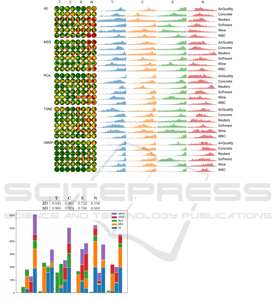
Figure 4: Refinement of Fig. 2 with metrics capped to their actual ranges and projections grouped per technique (Sec. 4.2).
Fraction of 3D viewpoints scoring higher than a 2D projection
AirQuality Concrete Reuters Software Wine WBC
T C S N
T C S N
T C S N T C S N
T C S N T C S N
Figure 5: Comparison of quality metrics of 2D vs 3D pro-
jections over 6 datasets, 5 projection techniques (Sec. 4.2).
than the 2D projection. Also, UMAP (purple bars) is
better in 3D only in terms of S or N, but rarely for C
and never for T . For MDS (orange bars), 3D view-
points outperform 2D projections mostly in C .
Summarizing, we conclude that (a) 3D projections
offer viewpoints with higher quality than correspond-
ing 2D projections; (b) such viewpoints are not dom-
inant for all studied quality metrics and datasets; (c)
our exploration tool helps finding such viewpoints.
5 USER STUDY
Our quantitative evaluation shows that even small
changes of quality metrics can strongly influence how
a 3D projection looks from a certain viewpoint (Fig. 3
and related text). We further analyze the power of
our proposed metrics for predicting good views of 3D
projections by conducting a user study.
Projections and Datasets: To make the study dura-
tion manageable (roughly 10-15 minutes), we picked
a subset of the 30 (D, P) pairs used in our quantitative
evaluation. The subset contains projections which (1)
have discernible structure in terms of separated point-
groups with similar coloring based on class labels;
(2) finding a good viewpoint, showing strong visual
cluster separation for the 3D projection, is not triv-
ial. (3) the datasets have at least 1000 samples, so
the space added by the third dimension (in 3D projec-
tions) has value. Our subset contains six pairs: (Wine,
t-SNE); (Wine, PCA); (Concrete, t-SNE); (Reuters,
AE); (Reuters, t-SNE); and (Software, t-SNE). Each
pair contains the 3D projection and the corresponding
2D projection. Note that UMAP is not in this sub-
set since UMAP projections tend to have a very high
visual separation between clusters.
Study Design: We aim to discover how users reason
about the quality of views of a 3D projection in com-
IVAPP 2023 - 14th International Conference on Information Visualization Theory and Applications
72

parison to a 2D projection, and how their reasoning
correlates to our metric values and findings discussed
in Sec. 4. The full study set-up, including training and
tasks, is detailed in the supplementary material.
First, we explained our tool (Fig. 1) to users. We
kept the explanation of quality metrics simple since
deep understanding of the metric definitions (Tab. 1)
was not needed for our study’s tasks. Specifically, we
told users that T and C measure the quality of neigh-
borhood preservation; that N and S measure how dis-
tances in the projection reflect data distances; and that
all metrics range between 0 (worst) and 1 (best).
We further explained users that they should search
for ‘good’ viewpoints in 3D projections. We defined
a good viewpoint as being one which showed the data
as well-separated point groups that have similar col-
ors (labels). In other words, users were implicitly
tasked with finding views that have minimal overlap
for different clusters and show most of the data struc-
ture in terms of class separation.
Usage of Metrics: To study how metrics correlate
with the users’ choices of good viewpoints, we split
the study into two parts. For the first three projec-
tions, further called the blind (B) set, users had to
go through the first three (of the six) projection-pairs
and select, for each pair, 3 different viewpoints of the
3D projection that they deemed good, without seeing
the tool’s metric widgets – that is, using only views
(a) and (b) in Fig. 1. For the remaining three pro-
jections, further called the guided (G) set, we posed
the same questions, but also showed the metric views
(Fig. 1c,d) to the users. We explicitly stressed that one
should use the metric values just as suggestions for
finding interesting viewpoints to further search from,
as these metrics do not measure class and cluster sep-
aration (which the task aims to maximize) but only
local structure preservation. We randomized the order
in which users saw the projections so that the projec-
tions in the B and G sets differed for each user.
For each viewpoint users picked, we also asked
whether they preferred it to the 2D projection. Finally,
we asked users to give their agreement on a 7-point
Likert scale with the following statement: “A 3D pro-
jection, examined from various viewpoints, better dis-
plays data structure than a 2D projection.” We ex-
plained the users that ‘data structure’ in this context
means the ability to see reasonably-well separated
clusters of points (which we know to exist in the stud-
ied datasets) and that, in general, a good projection
scores high values of the quality metrics displayed in
the visual exploration tool.
5.1 Study Results
We invited around 50 people to our study. Twenty-
two downloaded our tool and performed the study. At
the end of the study, our tool saved the projections se-
lected by the users as ‘good’ (a total of 66 per projec-
tion) and also the corresponding viewpoint-dependent
quality metrics. These metrics were, as explained, not
seen by users in the blind experiment, and respec-
tively shown in the guided experiment. These data
were anonymously sent by the participants back to us.
We next analyze these data to study how user pref-
erences correlate with the computed quality metrics.
Do Users Prefer Viewpoints with High Metric Val-
ues? Figure 6 shows the histograms of each metric
and projection-pair in the evaluation set. Three box
plots show the distributions of quality values in the
actual histogram (H), for viewpoints in the blind set
(B), and for viewpoints in the guided set (G). Com-
paring the histograms H and B, we see that, in almost
all cases, users choose good viewpoints that have high
values (for all metrics) even when not seeing any
quality metrics. This is a first sign that quality metrics
do correlate with what users see as good viewpoints.
If we compare the histograms H and G, we see
that users ‘zoomed in’ and selected good viewpoints
with, in most cases, even higher quality values than in
the first case. This finding has to be interpreted with
care. On the one hand, users could have been biased
by the quality metrics displayed during the guided ex-
periment. On the other hand, as explained earlier, we
explicitly stressed that these metrics are only guide-
lines for finding interesting viewpoints and explicitly
told users that, if they find other viewpoints as being
better, they should ultimately go by their own prefer-
ence. As such, the H-G comparison suggests us that
quality metrics are useful predictors of users’ pref-
erences of good viewpoints. As such, showing the
metric widgets during actual exploration of 3D pro-
jections can be useful since it helps users find high-
quality viewpoints (G boxplots show clearly that users
selected the high-end of the quality ranges) and users
find high-quality viewpoints to be good (correlation
of H and B boxplots). Yet, the strength of this corre-
lation is not equal for all (dataset, projection) pairs.
Table 3 refines these insights by showing the p-
values of a T-test (equal variance, one tail) for each
projection, all four metrics. The test checks whether
the average metrics for the B, G, and combined (B+G)
conditions are significantly higher than the average
metrics over all viewpoints V . We see that, for nearly
all cases, this is so for the guided set G. For the com-
bined set B+G, this is slightly less often so.
Do Users Prefer 3D or 2D Projections? Figure 7
shows the percentage of 3D viewpoints that users pre-
Viewpoint-Based Quality for Analyzing and Exploring 3D Multidimensional Projections
73
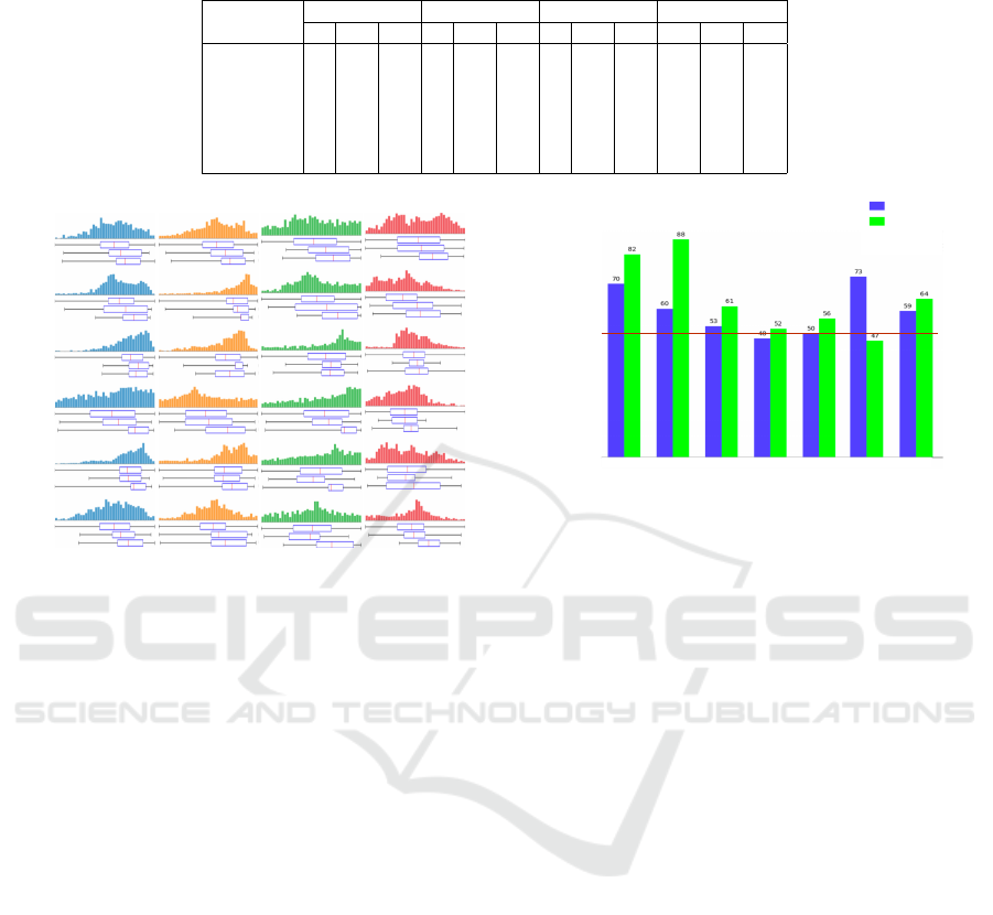
Table 3: p values of t-testing whether the average metrics for user-selected viewpoints in the blind (B), guided (G), and both
(B+G) sets are significantly higher than average values for all viewpoints V . Significant values (p < 0.05) are in bold.
T C S N
B G B+G B G B+G B G B+G B G B+G
Wine t-SNE .029 .001 <.001 .01 <.001 <.001 .005 <.001 <.001 .24 .001 .003
Wine PCA .015 <.001 <.001 .121 .041 .025 .003 <.001 <.001 <.001 <.001 <.001
Concrete t-SNE .003 .035 .001 .004 .111 .004 .159 .156 .08 .148 .049 .029
Reuters AE .087 <.001 <.001 .232 <.001 <.001 .214 <.001 <.001 .448 .025 .071
Reuters t-SNE .418 .025 .059 .595 .029 .111 .935 .009 .23 .679 .056 .197
Software t-SNE .04 <.001 <.001 .088 <.001 <.001 .689 <.001 .002 .279 <.001 <.001
T C S N
Wine
t-SNE
Wine
PCA
Concrete
t-SNE
Reuters
t-SNE
Reuters
AE
Software
t-SNE
H
B
G
H
B
G
H
B
G
H
B
G
H
B
G
H
B
G
Figure 6: Distribution of metric values for all viewpoints
(histograms and boxplots H), viewpoints in the blind set
(boxplots B), and viewpoints in the guided set (boxplots G).
ferred over the 2D projection of the same dataset for
both the B and G conditions. Overall, in the G con-
dition, users preferred the 3D projection over the 2D
projection, and did so more than in the B condition.
This, and the findings in Fig. 6 showing that users
tend to pick high-quality views in the G condition, tell
us that the metric widgets add to the user-perceived
value of 3D projections. The 3D-vs-2D preference in
the G condition was the strongest for the Wine dataset.
Interestingly, for this dataset, we found the strongest
correlation between metric values and user perceived
quality (Tab. 3). For Reuters and Software, we see a
much smaller 3D-vs-2D preference in the G condition
in Fig. 7 and also little or no correlation between met-
ric values and user-perceived quality (Tab. 3). This
further reinforces our claim that, when metrics cap-
ture well user preference, displaying them only in-
creases the perceived added-value of 3D projections.
For Software, we see that 3D was preferred much less
than 2D. Looking at Fig. 6, we see that this is the only
case of the six (P, D) combinations in our study where
all four quality metrics have a shallow tail to the right,
i.e., have only few 3D viewpoints in which any, let
alone all, metrics is/are high. In other words, for such
datasets where 3D quality metrics are more spread-
out, it is hard to argue for the added-value of 3D pro-
jections vs their 2D counterparts. For Reuters, the ob-
percentage (%)
blind set
guided set
Concrete
t-SNE
Wine
t-SNE
Wine
PCA
Reuters
AE
Reuters
t-SNE
Software
t-SNE
Total
Above red line:
users preferred the
3D projection over
the 2D projection
50
Figure 7: Percentage of cases where users preferred view-
points of 3D projections vs 2D projections.
tained results also correlate with the fact that this is a
much higher-dimensional dataset than all other stud-
ied ones (1000 vs a few tens of dimensions). This may
indicate that the added-value of 3D projections poten-
tially decreases for very high-dimensional datasets –
a hypothesis we aim to explore in future work.
Finally, we consider the last question we asked our
participants – whether, all taken into account, they
preferred a 3D interactive projection to a static 2D
projection for the task of assessing the data structure.
All 22 participants responded with a value on the pos-
itive side of the scale (4 or higher), with an average
of 5.94. This is additional evidence that, when aided
by interaction, and by tools that help the selection of
interesting viewpoints (like our quality metrics), 3D
projections are an important alternative to be consid-
ered to classical, static, 2D projections.
6 DISCUSSION
Our results answers our questions Q1-Q3 as follows:
Q1: Simply reusing 2D projection quality metrics
for 3D projections is misleading. These metrics will
score higher values than their 2D counterparts but
the respective 3D projections can appear massively
different from different viewpoints. To address this,
we need viewpoint-dependent quality metrics. Us-
ing such viewpoint-dependent quality metrics, as pro-
posed in this paper, helps assessing the quality of 3D
IVAPP 2023 - 14th International Conference on Information Visualization Theory and Applications
74

projections as these show significant variations be-
tween viewpoints of different projection techniques
for different datasets. Such metrics are as simple and
fast to compute as their 2D counterparts.
Q2: Viewpoint-dependent quality metrics can reach
higher values than their 2D counterparts, albeit for
a small number of viewpoints. Such viewpoints can
be easily found using the interactive visual metric-
and-projection exploration tool we proposed. Hence,
3D projections can generate 2D images which are of
higher quality than the static 2D projections typically
used in DR, all other things equally considered, and
generating such images (finding such viewpoints) is
not hard if assisted by suitable interactive tooling.
Q3: Users’ definition of “good viewpoints” (for the
task of separating a 3D projection into distinct same-
label clusters) correlates well with high values of our
viewpoint-based quality metrics. This correlation is
little influenced by the projection technique but more
so by the dataset being explored. Separately, enabling
visual exploration of the quality metrics increases the
users’ preference for a 3D projection vs a 2D one for
performing the same task. Summarizing the above,
using our quality metrics during the visual exploration
helps using 3D projections in multiple ways.
Limitations: Computing quality metrics (Tab. 1) is
linear in the number of viewpoints s and dataset points
N. For s = 1000 and our studied datasets (N in the
thousands), this takes a few minutes. This is not an
issue for our study goal as we can precompute all the
metric values for all tested datasets prior to the ac-
tual study. Using our metric-based exploration tool
(Fig. 1) at interactive rates on unseen datasets would
require faster metric computation – which can be triv-
ially implemented by e.g. GPU parallelization.
Our findings are restricted to the sample of 6
datasets and 22 users who evaluated only 6 of the
30 dataset-projection combinations. It is possible
that the correlation of user preference with viewpoint-
dependent metrics, thus the predictive power of the
latter for choosing good viewpoints, is different for
datasets with other traits (intrinsic dimensionality,
sparsity, and cluster structure). Using more datasets
to study this correlation can bring valuable insights
and be used to improve our visual tool to recommend
good viewpoints as a function on these traits. Also,
using more quantitative tasks to gauge how users se-
lect suitable 3D viewpoints (and measuring the time
needed for this) is an important direction for future
work. Similarly, our findings are restricted to the five
projection techniques we studied. However, as (Es-
padoto et al., 2019), average quality metrics evaluated
on a total of 45 projection techniques show quite sim-
ilar values. As such, we believe that our findings –
and the added-value of our proposed visual tool for
choosing good viewpoints for 3D projections – will
hold for most, if not all, such techniques.
7 CONCLUSIONS
We have presented a novel approach to measuring
the quality of 3D multidimensional projections and
using this quality to drive projection exploration.
We defined (and measured) quality as a viewpoint-
dependent distribution based on accepted quality met-
rics for 2D projections. We showed that viewpoint-
dependent metrics capture the visual variability in
3D projections much better than aggregated, single-
value, quality metrics. We further proposed a visual
interactive tool for finding high-quality viewpoints.
Finally, we conducted an user experiment showing
that our proposed viewpoint-dependent quality met-
rics correlate well with user-perceived good view-
points and, also, that our viewpoint-exploration tool
increases the preference of users for 3D projections
as compared to classical, static, 2D projections.
We next aim to extend our evaluation with more
datasets, tasks, and projections find even more ac-
curately when, and how much, 3D projections can
bring added value atop their 2D counterparts. In par-
ticular, we aim to study LAMP (Joia et al., 2011)
which scales well with the number of points and
dimensions. We also aim to extend our evalua-
tion to involve more sophisticated visualizations of
high-dimensional data using pre-conditioned 3D pro-
jections that display data using density estimation
rather than raw scatterplots such as the Viz3D sys-
tem (Artero and de Oliveira, 2004). Since Viz3D
takes several measure to reduce limitations of raw 3D
projections (and scatterplots), using our viewpoint-
selection assistance tools may further increase the
added-value of 3D projection visualizations as op-
posed to classical 2D ones.
REFERENCES
Albuquerque, G., Eisemann, M., and Magnor, M. (2011).
Perception-based visual quality measures. In Proc.
IEEE VAST, pages 11–18.
Artero, A. O. and de Oliveira, M. C. F. (2004). Viz3D: Ef-
fective exploratory visualization of large multidimen-
sional data sets. In Proc. SIBGRAPI.
Aupetit, M. (2007). Visualizing distortions and recovering
topology in continuous projection techniques. Neuro-
computing, 10(7–9):1304–1330.
Aupetit, M. (2014). Sanity check for class-coloring-based
evaluation of dimension reduction techniques. In
Proc. BELIV, pages 134–141. ACM.
Viewpoint-Based Quality for Analyzing and Exploring 3D Multidimensional Projections
75

Bank, D., Koenigstein, N., and Giryes, R. (2020). Autoen-
coders. arXiv:2003.05991 [cs.LG].
Camahort, E., Lerios, A., and Fussell, D. (1998). Uniformly
sampled light fields. In Proc. EGSR, pages 117–130.
Chan, Y., Correa, C., and Ma, K. L. (2014). Regression
cube: a technique for multidimensional visual explo-
ration and interactive pattern finding. ACM TIS, 4(1).
Coimbra, D., Martins, R., Neves, T., Telea, A., and
Paulovich, F. (2016). Explaining three-dimensional
dimensionality reduction plots. Inf Vis, 15(2):154–
172.
Cortez, P., Cerdeira, A., Almeida, F., Matos, T., and Reis,
J. (2009). Modeling wine preferences by data min-
ing from physicochemical properties. Decision Sup-
port Systems, 47(4):547–553. https://archive.ics.uci.
edu/ml/datasets/wine+quality.
Dua, D. and Graff, C. (2017). Wisconsin breast can-
cer dataset. https://archive.ics.uci.edu/ml/datasets/
Breast+Cancer+Wisconsin+(Diagnostic).
Espadoto, M., Martins, R., Kerren, A., Hirata, N., and
Telea, A. (2019). Toward a quantitative survey
of dimension reduction techniques. IEEE TVCG,
27(3):2153–2173.
Gonzalez, A. (2010). Measurement of areas on a sphere us-
ing Fibonacci and latitude–longitude lattices. Mathe-
matical Geosciences, 42(1):49–64.
Joia, P., Coimbra, D., Cuminato, J. A., Paulovich, F. V., and
Nonato, L. G. (2011). Local affine multidimensional
projection. IEEE TVCG, 17(12):2563–2571.
Jolliffe, I. (2002). Principal Component Analysis. Springer.
Lespinats, S. and Aupetit, M. (2011). CheckViz: Sanity
check and topological clues for linear and nonlinear
mappings. CGF, 30(1):113–125.
Levoy, M. (2006). Light fields and computational imaging.
Computer, 39(8):46–55.
Lewis, D. and Shoemaker, P. (2021). Reuters dataset. https:
//keras.io/api/datasets/reuters.
Martins, R., Coimbra, D., Minghim, R., and Telea, A. C.
(2014). Visual analysis of dimensionality reduction
quality for parameterized projections. Computers &
Graphics, 41:26–42.
Martins, R., Minghim, R., and Telea, A. C. (2015). Explain-
ing neighborhood preservation for multidimensional
projections. In Proc. CGVC, pages 121–128.
McInnes, L., Healy, J., and Melville, J. (2018). UMAP:
Uniform manifold approximation and projection for
dimension reduction. arXiv:1802.03426v2 [stat.ML].
Meirelles, P., Santos, C., Miranda, J., Kon, F., Terceiro, A.,
and Chavez, C. (2010). A study of the relationships
between source code metrics and attractiveness in free
software projects. In Proc. SBES, pages 11–20.
Motta, R., Minghim, R., Lopes, A., and Oliveira, M.
(2015). Graph-based measures to assist user assess-
ment of multidimensional projections. Neurocomput-
ing, 150:583–598.
Nonato, L. and Aupetit, M. (2018). Multidimensional
projection for visual analytics: Linking techniques
with distortions, tasks, and layout enrichment. IEEE
TVCG.
Paulovich, F. V., Nonato, L. G., Minghim, R., and Lev-
kowitz, H. (2008). Least square projection: A fast
high-precision multidimensional projection technique
and its application to document mapping. IEEE
TVCG, 14(3):564–575.
Poco, J., Etemadpour, R., Paulovich, F. V., Long, T., Rosen-
thal, P., Oliveira, M. C. F., Linsen, L., and Minghim,
R. (2011). A framework for exploring multidimen-
sional data with 3D projections. CGF, 30(3):1111–
1120.
Rauber, P. E., Falc
˜
ao, A. X., and Telea, A. C. (2017). Pro-
jections as visual aids for classification system design.
Inf Vis, 17(4):282–305.
Sanftmann, H. and Weiskopf, D. (2009). Illuminated 3D
scatterplots. CGF, 28(3):642–651.
Sanftmann, H. and Weiskopf, D. (2012). 3D scatterplot nav-
igation. IEEE TVCG, 18(11):1969–1978.
Schreck, T., von Landesberger, T., and Bremm, S. (2010).
Techniques for precision-based visual analysis of pro-
jected data. Inf Vis, 9(3):181–193.
Sedlmair, M. and Aupetit, M. (2015). Data-driven evalua-
tion of visual quality measures. CGF, 34(3):545–559.
Sedlmair, M., Munzner, T., and Tory, M. (2013). Empir-
ical guidance on scatterplot and dimension reduction
technique choices. IEEE TVCG, pages 2634–2643.
Sips, M., Neubert, B., Lewis, J., and Hanrahan, P. (2009).
Selecting good views of high-dimensional data using
class consistency. CGF, 28(3):831–838.
Tatu, A., Bak, P., Bertini, E., Keim, D., and Schneidewind,
J. (2010). Visual quality metrics and human percep-
tion: An initial study on 2D projections of large mul-
tidimensional data. In Proc. AVI, pages 49–56. ACM.
Tenenbaum, J. B., De Silva, V., and Langford, J. C. (2000).
A global geometric framework for nonlinear dimen-
sionality reduction. Science, 290(5500):2319–2323.
The Authors (2022). Viewpoint-based comparison of 2D
and 3D projections – datasets, software, and results.
https://github.com/WouterCastelein/Proj3D
views.
Tian, Z., Zhai, X., van Driel, D., van Steenpaal, G., Es-
padoto, M., and Telea, A. (2021a). Using multiple
attribute-based explanations of multidimensional pro-
jections to explore high-dimensional data. Computers
& Graphics, 98(C):93–104.
Tian, Z., Zhai, X., van Steenpaal, G., Yu, L., Dimara, E., Es-
padoto, M., and Telea, A. (2021b). Quantitative and
qualitative comparison of 2D and 3D projection tech-
niques for high-dimensional data. Information, 12(6).
van der Maaten, L. and Hinton, G. E. (2008). Visualizing
data using t-sne. JMLR, 9:2579–2605.
van der Maaten, L. and Postma, E. (2009). Dimensionality
reduction: A comparative review. Technical report,
Tilburg Univ., Netherlands. Tech. rep. TiCC 2009-
005.
Venna, J. and Kaski, S. (2006). Visualizing gene interaction
graphs with local multidimensional scaling. In Proc.
ESANN, pages 557–562.
Vito, S., Massera, E., Piga, M., Martinotto, L., and Francia,
G. (2008). On field calibration of an electronic nose
for benzene estimation in an urban pollution monitor-
ing scenario. Sensors & Actuators B, 129(2):750–757.
https://archive.ics.uci.edu/ml/datasets/Air+Quality.
Yeh, I.-C. (2021). Concrete compressive strength dataset.
https://archive.ics.uci.edu/ml/datasets/concrete+
compressive+strength.
IVAPP 2023 - 14th International Conference on Information Visualization Theory and Applications
76
