
Visual Document Exploration with Adaptive Level of Detail: Design,
Implementation and Evaluation in the Health Information Domain
L. Shao
1,2
, S. Lengauer
1
, H. Miri
3
, M. A. Bedek
4
, B. Kubicek
4
, C. Kupfer
4
, M. Zangl
4
,
B. C. Dienstbier
5
, K. Jeitler
5
, C. Krenn
5
, T. Semlitsch
5
, C. Zipp
5
, D. Albert
4
, A. Siebenhofer
5,6
and T. Schreck
1
1
Institute of Computer Graphics and Knowledge Visualization, Graz University of Technology, Austria
2
Fraunhofer Austria Center for Data Driven Design, Austria
3
Carnegie Mellon - KMITL (CMKL University), Thailand
4
Institute of Psychology, University of Graz, Austria
5
Institute of General Practice and Evidence-based Health Services Research, Medical University of Graz, Austria
6
Goethe University Frankfurt, Germany
Keywords:
Information Visualization, Document Exploration, Topic Modeling, Interactive Retrieval, Close-Distant
Reading.
Abstract:
Documents typically show a linear structure in which the content can be accessed. However, linear reading is not
always desired by users, nor is it the best presentation way, as information needs may be developing or changing
over time, and users would thus want to extract the relevant information by navigation and search. Therefore,
reading with adaptive focus and level of detail is needed. This is of utmost importance in the health information
domain where patient conditions and resulting information needs may evolve in different directions over time.
We report on the development of a visual document exploration system which supports navigating a document
at different levels of aggregation, from topic overview (high-level) to keyword occurrences (mid-level) to full
text (low-level). Our design smoothly integrates the different levels of detail from which the users can choose.
The system is designed to track explored topics and use this information to suggest additional content. We
evaluated the design and its corresponding web-based implementation through a formative user-study in the
domain of diabetes health information. The evaluation confirmed that our design and implementation can raise
interest and curiosity, and also allow users to efficiently navigate content of interest.
1 INTRODUCTION
Nowadays, Consumer Health Information Systems
(CHIS) are indispensable in modern healthcare and
fulfil a myriad of functions. CHIS offer consumers a
comprehensive overview of a disease, and particularly
address general knowledge of health-related topics,
their effects and courses, as well as interventions to
maintain or restore health. They also enable the early
detection, diagnosis, treatment, palliation, rehabilita-
tion and follow-up care of diseases and associated
medical decisions, care and coping as well as daily life
with the diseases (Arbeitsgruppe GPGI, 2016). Usu-
ally, CHIS are provided statically and linearly, i.e., the
same medical content is presented to everyone with
the same structure. However, patients vary regard-
ing previous knowledge, information needs and health
treatment situations, e.g., depending on gender, age,
personality, perception, etc., and thus a linear reading
may not be the best solution for extracting relevant
information for everyone (Bunge et al., 2010). There-
fore, an adaptive and interactive visual CHIS is needed
that supports document exploration with adaptive fo-
cus and level of detail views.
Our main research objective in this work is to de-
velop novel concepts for advanced, interactive, adap-
tive, and visual CHIS (called A+CHIS). We are focus-
ing our research on the case of Type 2 Diabetes Mel-
litus (T2DM) because the disease is complex, highly
relevant to public health, and its topicality of con-
tents is changing over time, as a result of new groups
of drugs, availability of expertise, flexibility in treat-
ment, improved patient education, as well as sustained
follow-up practices and screening for its complica-
Shao, L., Lengauer, S., Miri, H., Bedek, M., Kubicek, B., Kupfer, C., Zangl, M., Dienstbier, B., Jeitler, K., Krenn, C., Semlitsch, T., Zipp, C., Albert, D., Siebenhofer, A. and Schreck, T.
Visual Document Exploration with Adaptive Level of Detail: Design, Implementation and Evaluation in the Health Information Domain.
DOI: 10.5220/0011621800003417
In Proceedings of the 18th International Joint Conference on Computer Vision, Imaging and Computer Graphics Theory and Applications (VISIGRAPP 2023) - Volume 3: IVAPP, pages
133-141
ISBN: 978-989-758-634-7; ISSN: 2184-4321
Copyright
c
2023 by SCITEPRESS – Science and Technology Publications, Lda. Under CC license (CC BY-NC-ND 4.0)
133

tions. However, managing T2DM is still a difficult and
time-consuming task, as it is common, serious, and
under-treated. Therefore, it is considered a major chal-
lenge to healthcare services and requires adaption of
patients and therapies, hence the affected groups have
a constant need for information (Standl et al., 2019).
In this work, we introduce a visual document explo-
ration system, including multi-dimensional adaptivity
for health information consumers, aiming for a better
understanding of the medical content by combining
close and distant reading approaches. To this end, we
propose a multi-level text aggregation approach, which
supports document navigation from a high-level (topic
overview) to a mid-level (topic/keyword occurrence)
and a low-level (full text and keyword highlighting).
Our idea is that a flexible system allows the user to
efficiently navigate a document, overview the content,
find specifics of interest, and hence follow an effi-
cient information perception. In our design, we set
out to make use of well-known document visualiza-
tion approaches which are tailored and integrated in
an efficient system.
To visualize the high-level structure of a document,
a dynamic table-of-contents is employed that repre-
sents sub-chapters by means of a Word Cloud con-
taining keywords that are pre-generated by a topic-
modeling approach. We use a visual navigator based
on tile-bars to link high-level structures with mid-level
document information. The visual navigator shows
topic occurrences within the underlying document and
allows users to quickly explore the content by text snip-
pets. We conducted a user study to characterize the
usage behavior of health information seekers adopting
our approach. We show the usability of our system
by comparing linear reading with our multi-level ap-
proach.
The main contributions of our work include: (i) a
visual document exploration system for health infor-
mation on T2DM, (ii) a multi-level text aggregation
approach, including three levels of aggregation, and
(iii) a holistic formative evaluation of our interactive
system with a user group.
2 RELATED WORK
Our work mainly relates to the field of document and
health visualization.
2.1 Document Visualization Techniques
One popular and widely-used visualization technique
for text data is the Word Cloud representation (also
known as Tag Cloud). This visualization technique is a
distant-reading technique (Moretti, 2005) that presents
a visual overview of text collections by using different
type sizes for frequent, or otherwise deemed impor-
tant, words (Heimerl et al., 2014). Distant-reading
techniques for textual data allow users to approach
literature in a completely new way. Instead of read-
ing texts in the traditional way, i.e., linear reading or
so-called close-reading, the focus of distant reading
approaches is to count, to graph, and to map textual
data by a visual representation (J
¨
anicke et al., 2015).
Over the last years, much research has been con-
ducted on Word Cloud visualizations. For instance,
WordBridge by (Kim et al., 2011), utilizes graph-based
visualization techniques to connect several groups
within a Word Cloud with information-rich edges.
Moreover, other Word Cloud extensions exist that fo-
cus on semantic contour lines (Wu et al., 2011) and
images (Gu et al., 2017). In our work, we rely on tra-
ditional Word Clouds to foster distant-reading within
single documents.
For larger document collections, explorative sys-
tems such as (G
¨
org et al., 2013) and (Isenberg et al.,
2017) can be used, which consider further document
features (e.g., metadata information or co-authorship).
Another interesting approach to visualizing large doc-
ument collections is the Document Cards concept by
(Strobelt et al., 2009), which represents the document’s
key semantics by using a mixture of images and impor-
tant keywords. In order to visualize explicit term dis-
tribution within a document, Tile Bars (Hearst, 1995;
Keim and Oelke, 2007) may also be used. Tile Bars is
a compact pixel-based visualization technique which
simultaneously reveals the relative length of a doc-
ument, the relative frequency of one or more query
terms, and their distributional properties with respect
to the document. In this work, we utilize a Tile Bars
representation to display the relative frequency and
distribution of terms from a Word Cloud.
2.2 Data Visualization in Health Care
Data visualizations are becoming increasingly impor-
tant for medical applications, e.g., information on med-
ical diagnostics, treatments, and health. Electronic
health records enable novel visualization applications
for patient data (Rind et al., 2013). In the current
survey of (Wang and Laramee, 2022), more than 40
papers in the core of visualization of electronic health
record data are identified. For example, the LifeLine
system was among the first to visually represent pa-
tient treatment histories and support interactive ex-
ploration (Plaisant et al., 1998). For instance, (Cao
et al., 2010) used linked Word Clouds to support multi-
faceted data analysis of diseases such as diabetes. By
IVAPP 2023 - 14th International Conference on Information Visualization Theory and Applications
134
using linked Word Clouds, they visualized cluster con-
nections between T1Dm and T2DM. Furthermore, So-
larMap (Cao et al., 2011) is a visual analytic technique
for visually exploring topics in multi-relational data. It
combines a labeled contour-based cluster visualization
with a radially-oriented tag cloud.
2.3 CHIS
Within the scope of this work, we performed an explo-
rative search on currently available CHIS on T2DM in
different media sources (websites, digital documents,
print media, apps, videos) and focused on existing ele-
ments by which users can adapt the presentation and
their use. We found that the possibility to do adap-
tations in currently available CHIS is only used to a
limited extent. We could not identify any adaptive
elements in print media, digital documents or videos.
Adaptations were only provided on websites and in
apps, and mainly concerning the type of presentation,
such as adjusting the font size and font color. In some
CHIS, it was also possible to select different languages
or a read-aloud function for the text (Government of
Canada, 2022), (Bundesministerium f
¨
ur Gesundheit,
2022). In addition to these more general adaptive ca-
pabilities, only a few CHIS provided adaptations of
personalized and relevant medical information. The
adaptation mechanisms pre-filtered medical informa-
tion or specific chapters based on a previously gen-
erated user profile representing the current diabetes
related situation (British Diabetic Association, 2022).
Most CHIS provided a usual table of contents with
or without hyperlinks to corresponding chapters. Ad-
ditionally, some CHIS used links in the text or cross-
references to other text passages or chapters. No CHIS
in our sample of T2DM used a visual document ex-
ploration system with multi-dimensional adaptivity for
health information consumers.
3 NEED FOR A+CHIS
As mentioned in the previous section, only a few CHIS
on T2DM are either interactive, adaptive and/or per-
sonalized. The wide range of information sources
(brochures, websites, medical doctors, etc.) and the di-
versity of topics (such as symptoms, treatments, nutri-
tion, etc.) might be overwhelming for medical layper-
sons. The knowledge domain of T2DM is complex
and comprehensive, and thus, characterized by high
intrinsic cognitive load (Sweller, 2005). Information
seekers tend to apply heuristics and cognitive biases at
every stage of information processing when confronted
with such complex situations. Cognitive biases, mis-
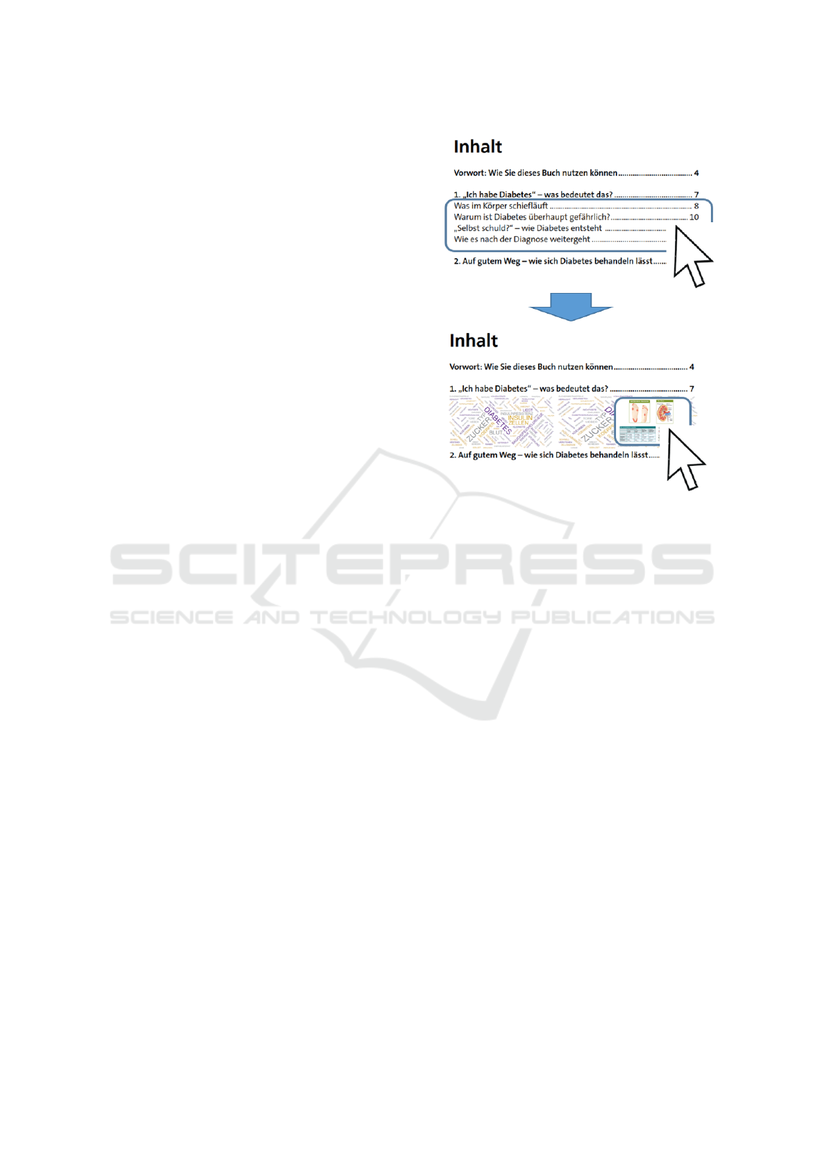
Figure 1: Our design concept allows to smoothly switch
from the Table of Contents as the highest level of abstraction,
to the subsections (top) to the content aggregation (bottom)
using word clouds and images.
conceptions and believing in myths about T2DM may
have severe health-related consequences. An inter-
active CHIS has the potential to (i) track behavioral
patterns and explicit feedback of consumers, (ii) in-
terpret these indicators in terms of certain cognitive
biases (e.g., the confirmation bias), and (iii) intervene
if necessary (e.g., by suggesting other pieces or sources
of information). An adaptive CHIS can ensure that the
consumer is neither too bored nor too overwhelmed.
Providing information units for which the consumer
is just ready to read, understand and learn, reduces
the current intrinsic cognitive load to a medium level.
A personalized CHIS has the potential to increase a
consumers’ personal commitment and thus, help to
close the ‘intention-behaviour gap’ (Schwarzer, 2008),
considered as the ultimate goal of a CHIS. To ensure
that consumers appreciate to engage with our advanced
CHIS, a set of added values compared to more ‘tradi-
tional’ digital CHIS (e.g., a brochure in PDF format or
plain webpage), need to be fulfilled: the guarantee of
high quality and evidence-based medical information,
the reduction of complexity to a medium level, and
recommending information units that fit a consumers’
information needs. Also, tools and functionalities that
help the consumer to get an overview of the knowledge
domain, to efficiently answer certain questions, and to
easily navigate through different sub-topics should be
Visual Document Exploration with Adaptive Level of Detail: Design, Implementation and Evaluation in the Health Information Domain
135

provided. Formative evaluation activities (Section 5)
ensure that such performance goals will be fulfilled.
4 ADAPTIVE DOCUMENT
EXPLORATION DESIGN
Our proposed document exploration concept supports
various degrees of visual granularity, ranging from
rough abstraction of the document as a whole, to sec-
tion and sub-section headings, to word clouds, topic
models, and down the original full text content (Fig-
ure 1 and 2). To this end, we designed a set of inter-
linked sub-systems addressing different levels of detail.
These components are interconnected via user interac-
tion, allowing for an unintermitted exploration process.
In the background, we track user interactions to de-
termine which parts of the content have already been
visited and consumed by the user. This information is
also displayed to the user in order to indicate which
information has not yet been scrutinized.
The components as well as their relations are illus-
trated in Figure 2. Next, we provide in-depth details
on how they are implemented in our prototype.
Table of Contents. For the outermost level of visual
granularity (document level) we provide an interactive
abstraction of a document’s Table of Contents. To this
end, we present the user with a view showing the main
section headers (Figure 1 and 2
1
⃝
). Upon clicking
such a header, the respective section is expanded, illus-
trating the section’s content with an abstraction loosely
following the document card design concept (Strobelt
et al., 2009) i.e., different visualization techniques are
used to display the textual and visual contents.
For the former, we use a Word Cloud visualization –
an established visualization method for encompassing
texts – while an Image Slider is used for the latter. On
the very left-hand side of a section container, we addi-
tionally display the section’s subsections as a further
hint on the content. On the right-hand side, the already
inspected content is indicated with a ‘history’ version
of the Word Cloud and the Image Slider. Specifically,
terms and images are added to these components af-
ter they have been reviewed (clicked on) by the user.
This history cloud keeps the context of the exploration
for the user. Alternatively, it can be used to display
non-clicked terms as to suggest content to the user.
Word Cloud. To generate the word clouds, natu-
ral language processing is used to extract ‘significant’
terms from each chapter. In this pre-processing step, an
input text is initially separated into individual parts (to-
kenization) and irrelevant words are filtered out (stop-
word removal). In the following, the set of remaining
words is transformed to its canonical form or dictio-
nary form (lemmatization) and grammatically tagged
(part-of-speech tagging). Finally, the Latent Dirich-
let Allocation (Blei et al., 2003) approach is used to
generate topic models on all nouns. For each chap-
ter, we define 6 topic models that are comprised to
different extents (term frequency) by a subset of the
chapter’s terms. This information is used as a basis for
content visualization in the form of a Word Cloud as
depicted in Figure 2
2
⃝
. The terms are arranged using
the Wordle word cloud algorithm (Steele and Iliinsky,
2010). The terms are not exclusive for a topic, but
topics can exhibit overlapping term compositions. In
the Word Cloud, the individual terms are uniquely dis-
played for the topic they have the most influence on.
A ‘toggle-able’ legend (Topicbar) at the bottom of the
word cloud allows the user to influence the selection of
the displayed topics. Upon changing this selection, the
word cloud is re-computed and re-drawn. Hovering
over a term toggles the Tilebar for the respective term
above it while clicking it initiates the Snippets view.
To this end, we track the interactions – how often the
user has clicked a certain term – with the word cloud.
These click counts are the basis for the so-called His-
tory Word Cloud on the right-hand side of a chapter
visualization where the count determines the size of
a term in the cloud. The same hover-and-click inter-
actions as with the ‘regular’ word cloud are possible
with the History Word Cloud.
Tilebar. Upon hovering over a term in the word
cloud, a Tilebar component is displayed above it which
allows the user to efficiently grasp the term’s occur-
rences over the whole document. This visualization
is inspired by the literature fingerprinting concept by
Keim and Oelke (Keim and Oelke, 2007) which shows
various document properties in a drilled-down manner.
To this end, those real-valued properties are computed
for equal-sized text chunks and visualized through an
intensity map following the linear structure of the doc-
ument, i.e., from top to bottom and from left to right.
In our case, we show the term frequency for which we
use a black-to-white color coding, where white indi-
cates that the term does not appear in the respective
chunk, and black for the document-wide maximum
occurrence of the term. The Tilebar component can
be seen in Figure 2
3
⃝
. The individual blocks stand for
the book chapters and the red border indicates from
which document chapter the word cloud is. Note that
the chapters are arranged from left to right instead of
top to bottom since the aspect ratio of this layout is
more appropriate for the display above the term. The
IVAPP 2023 - 14th International Conference on Information Visualization Theory and Applications
136
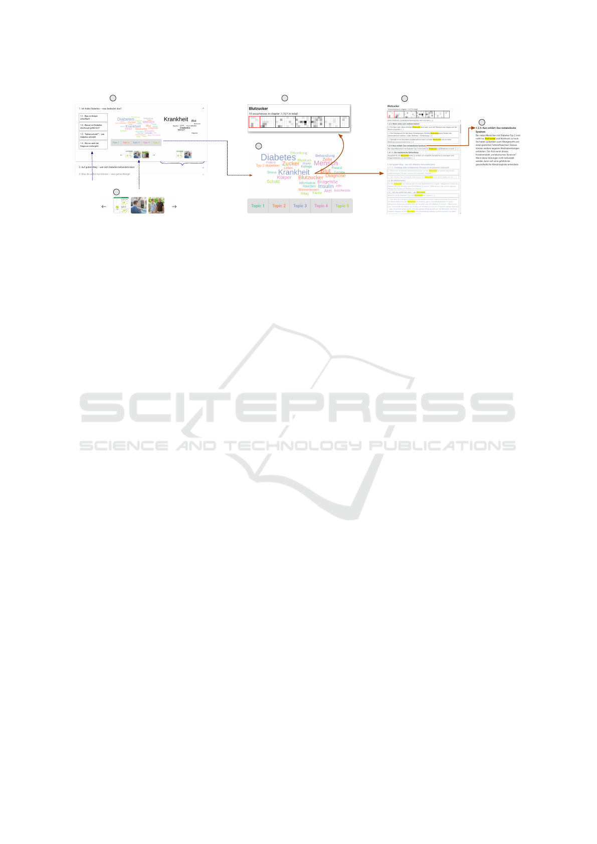
Image Slider
Table of Contents
Snippets
Tilebar
Full Text
Word Cloud with Topicsbar
Subsections
History Word Cloud/
History Image Slider
(hover)
(click)
(click)
1
5
6
4
2
3
Figure 2: The main components of the interactive visual document system for exploring a German diabetes health brochure (c.f.
Section 5).
1
⃝
Table of Contents,
2
⃝
Word Cloud,
3
⃝
Tilebar,
4
⃝
Snippets,
5
⃝
Full Text and
6
⃝
Image Slider. Different interactions
(illustrated as orange arrows) allow a user to navigate from one view to another.
Tilebar allows a user to quickly answer such questions
as “does another chapter also cover this topic?” and
how frequently is it mentioned.
Snippets/Full Text. Upon clicking a term in the
word cloud, a Snippets view expands on the right-hand
side of the interface (Figure 2
4
⃝
). Within this view,
all sentences containing the clicked term are displayed
with a highlighting of the term. Handles at the be-
ginning and the end of a sentence allow to reveal the
preceding and succeeding sentence. Those could be
clicked iteratively to display larger parts of the docu-
ment before and after the found position. Alternatively,
the section headers, which are also shown in the snip-
pets view, can be clicked to display a section’s whole
content immediately (Figure 2
5
⃝
).
Image Slider. An off-the-shelf Image Slider compo-
nent is used to display chapters’ images (Figure 2
6
⃝
).
Since we only show three images at a time, we aim
to determine an image’s relevance in order to sort the
list of images, resulting in the most relevant images
being shown initially. To this end, we make two as-
sumptions. Firstly, we assume that images without a
caption (e.g., scenic backgrounds at the beginning of
a chapter) are rather unimportant. Secondly, we split
the set of images with captions into two tiers with the
first tier being comprised of images showing tables,
diagrams, flow charts or convey any sort of structured
information, while all the others belong to the second
tier. The information whether or not an image has a
caption results from the extraction process. We pro-
vide an additional image slider to the bottom of the
History Word Cloud, showing exclusively the chap-
ter’s images which have already been clicked (and thus
‘consumed’) by the user.
Implementation. For the implementation of the pro-
totype, we chose a web stack with a backend written
in Python with the Flask web framework. The back-
end is responsible for data management as well as all
the text processing tasks, such as the weights compu-
tation for the word clouds. The section-wise topics
are pre-computed and cached. For the frontend, we
chose the React web framework as well as the D3.js
visualization library which offers an implementation
of the Wordle word cloud algorithm. The system is
available online allowing an easy access for evaluation
participants.
5 FORMATIVE EVALUATION
The goal of our formative study was to (a) investi-
gate how the system’s design and its components are
perceived by information seekers, (b) compare it to a
linear and static CHIS in document (PDF) format, (c)
identify potentials for improvement, and (d) identify
future research questions.
As data basis, we used a T2DM information
brochure of the German health insurance AOK (Baum-
gart et al., 2021). The text document is stored in
PDF format and contains extensive health informa-
tion of over 130 pages, including figures, tables and
info-graphics. To extract the underlying health infor-
mation, we utilized the Adobe PDFBox library for full
texts and extracted images manually. In a further pre-
processing step, we assigned sub-sections and images
to the main chapters.
5.1 Participants
A total of 12 participants (four females) representing
different potential users, took part in the study. Par-
ticipants were between 26 and 62 years of age (M =
40 yrs., SD = 14 yrs.). They were asked to self-assess
their prior knowledge about T2DM (M = 1.00, SD =
1.21), computer and software skills (M = 2.25, SD =
.97) as well as previous experiences with visualiza-
Visual Document Exploration with Adaptive Level of Detail: Design, Implementation and Evaluation in the Health Information Domain
137
tions (M = 2.58, SD = 1.24) on a 5-point rating scale
(from 0 - very low to 4 - very high).
5.2 Procedure
The content of the brochure (Baumgart et al., 2021)
was displayed as PDF in Adobe Acrobat Reader and in
A+CHIS. A short explanation of basic Adobe Acrobat
Reader and A+CHIS functions, such as search func-
tions, was provided to ensure a fair starting point for all
participants regardless of their prior experiences. The
audio and on-screen activities were recorded. Over-
all, the study lasted between 60 and 90 minutes per
participant.
Cognitive Walk Through (CWT). Participants
started with a CWT (Hollingsed and Novick, 2007)
in which they were given pre-defined tasks (e.g., ‘In
which chapter would you most likely start if you
wanted to find out more about blood pressure?’) and
used them to explore the A+CHIS. This method was
used to assess the intuitiveness of the system and how
quickly the content can be grasped. Participants were
asked to express their thoughts during the tasks (i.e.,
think-aloud). Two parallel versions of 11 CWT tasks
were created to compare the information seeking in
Adobe Acrobat Reader and A+CHIS. Each participant
completed all 22 tasks in a within-subject design, with
balanced conditions in terms of system/component
order, and parallel versions of tasks.
Forced Choice. The forced choice required the
participants to make choices between the PDF and
A+CHIS regarding performance goals of system use.
These comparisons were introduced by the statement
’Would you rather use Adobe Acrobat Reader or the
A+CHIS to ...’, successively followed by the nine per-
formance goals to (a) get an overview of the domain,
(b) develop a general understanding on T2DM, (c)
search for specific keywords, (d) capture the main con-
tent, (e) search for specific images, (f) get an overview
of the most important images, (g) efficiently navigate
through different topics of the content, (h) get answers
to questions you might have in mind, and finally, (i)
trace past searches.
Semi-Structured Interviews. Last, semi-structured
interviews enabled targeted inquiries about users’ opin-
ions of the system, such as usefulness or appeal. Ex-
amples include ‘How helpful do you find the various
components?’ and ‘How much does this interactive
system encourage you to explore further content?’
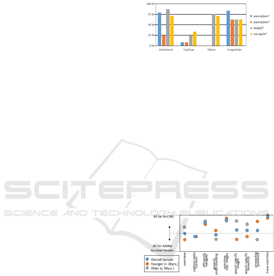
Figure 3: The global evaluation.
5.3 Results and Discussion
Global Evaluation. In the course of the semi-
structured interviews, participants were asked if they
had already seen or used a (i) Word Cloud, (ii) Topic
Bar, (iii) Tile Bar, or (iv) Image Slider prior to the ses-
sion. In addition, they were asked if the components
were considered as helpful and if they would like to
use them again. A ’yes-answer’ has been coded as ’1’,
a ’no-answer’ as ’0’, and indifference as ’0.5’.
As indicated in Figure 3, around 3 out of 4 par-
ticipants have seen a Word Cloud or an Image Slider
before, no participant has seen a Tile Bar and only one
a Topic Bar. The Image Slider has been used most
often before (ca. 63%). More than half of the par-
ticipants found the Word Cloud, the Tile Bar and the
Image Slider helpful and would consider using them
again. Only around 1 out of 4 found the Topic Bar (in
its current form) helpful and would consider using it
again.
Figure 4: The forced choice results with respect to perfor-
mance goals.
Performance Goals. The results of the forced
choices are shown in Figure 4. The potential per-
formance goals in information processing have been
sorted from left (more abstract) to right (more specific).
A ’+1’ was added if a participant chose A+CHIS, a ’-1’
in case of the Adobe Acrobat Reader and ’0’ for an
indecisive choice. Thus, the ordinate ranges from -12
(all participants chose the Adobe Acrobat Reader) to
12 (all chose A+CHIS). Figure 4 shows the values for
the whole sample (blue circles), for older participants
(n = 6,
≥
38 yrs., grey circles) and for younger ones (n
IVAPP 2023 - 14th International Conference on Information Visualization Theory and Applications
138

= 6,
<
38 yrs., orange circles). Taking into account that
A+CHIS ’competed against’ the well-known Adobe
Acrobat Reader, the overall results of the forced choice
are promising. The differences between the two age
groups should not be over-interpreted due to the small
sample size and should rather be considered an avenue
for future research. The resulting overall values for
the nine performance goals are either close to the hor-
izontal ’middle-line’ (indicating that participants are
equally inclined towards A+CHIS and Adobe Acrobat
Reader and/or are indifferent) or clearly above, such
as for efficiently navigating through different topics of
the content, getting an overview on the most important
images, or tracing searches.
Non-Linear Content Exploration. Think aloud and
interview data revealed that the system arouses cu-
riosity and invites to further exploration of system
features and contents. The main reasons given were
the aesthetic color design and the efficient and enjoy-
able search in the system. Several participants particu-
larly emphasized that the Word Cloud, in contrast to a
non-interactive system, motivates to engage with the
content further via making interesting terms visible.
However, some participants did not yet feel they had
sufficiently figured out how the system works to effec-
tively explore the content. In particular, the lack of
a familiar linear structure made it difficult for some
participants to maintain an overview of the content.
While these participants were generally open to explor-
ing the content, they may have needed more support
for using the current A+CHIS.
6 OVERALL DISCUSSION AND
CONCLUSION
Our design allows users to seamlessly navigate the
content of a document and change the visual repre-
sentation and level of detail on the fly. Our approach
makes use of well-known visual analysis techniques
(word clouds, topic models, tile bars, and keyword
search). It is useful for users who would either pre-
fer to follow a traditional linear document navigation
and also move non-linearly between content and detail.
To the best of our knowledge, there are few empiri-
cal studies comparing the cognitive and motivational
aspects of using document visualizations such as tile
bars and word clouds, with those of linear document
readers like Adobe PDF viewer. Our evaluation is a
first step that confirmed our concept could heighten
interest and raise curiosity, which also allows users
to more efficiently navigate content of interest by a
distant-reading approach.
Our design allows following both the edited con-
tent of a given document (supervised structure) as well
as an automatically computed topic models (unsuper-
vised structure). In our study, users did not seem to
make great use of the topic model structure. This may
be in part due to them not being familiar with topic
models, but also difficulties to make sense of topics
comprised by lists of keywords. Recent studies have
investigated the impact of word clouds for topic under-
standing (Smith et al., 2017) and keyword summaries
(Felix et al., 2018). It turned out that the main advan-
tages of word clouds lie in speed (e.g., recognizing
most frequent terms) while disadvantages may arise in
numeric encoding and for larger sets of keywords.
A second main element of our design is its observ-
ing of the users document exploration. Specifically,
we track which keywords have been hovered and se-
lected. This is considered important information prove-
nance data, which, in our system, can be used in two
ways. First, a history word cloud shows which topics
have been already explored. Second, a word cloud of
under-explored keywords can be created to motivate
the user to explore unseen content. The latter is an
important functionality for content recommendation,
and possibly mitigation of cognitive biases or harmful
pre-conceptions. Our evaluation is a first step in this
regard. Future work should look for the specific ad-
vantages which aggregated document representations
can offer, but also possible misunderstandings which
can occur due to the highly aggregated nature of some
of the content presentations.
Document visualization techniques provide an am-
plitude of opportunities for improved support of in-
formation seeking tasks. We presented a document
exploration design, based on the idea of allowing users
to seamlessly navigate document content at different
levels of visual abstraction and detail. We made use
of established document visualization techniques and
applied our design to the T2DM information use-case.
We evaluated our implemented system by performing
comparison against a traditional document reader. The
results are promising in showing that our approach
motivates content exploration and is easy to learn. We
also presented a concept for possible automatic adapta-
tion of main display parameters, which could provide
opportunities to support specific information needs
and visualizations as well as reading preferences. In
future work, we intend to research automatic recom-
mendation and develop adaptation methods based on
the current system.
Visual Document Exploration with Adaptive Level of Detail: Design, Implementation and Evaluation in the Health Information Domain
139

ACKNOWLEDGEMENTS
This work was funded by the Austrian Science Fund
(FWF) as part of the project ’Human-Centered Inter-
active Adaptive Visual Approaches in High-Quality
Health Information’ (A+CHIS; Grant No. FG 11-B).
REFERENCES
Arbeitsgruppe GPGI (2016). Gute praxis gesundheitsin-
formation. Zeitschrift f
¨
ur Evidenz, Fortbildung und
Qualit
¨
at im Gesundheitswesen, 110-111:85–92.
Baumgart, J., Viegener, U., and Pohl, C. (2021). Den
diabetes im griff: Ein handbuch f
¨
ur patientinnen
und patienten mit diabetes mellitus typ 2. AOK-
Bundesverband, Berlin.
Blei, D. M., Ng, A. Y., and Jordan, M. I. (2003). Latent
dirichlet allocation. Journal of machine Learning re-
search, 3:993–1022.
British Diabetic Association (2022). Diabetes UK - Know
diabetes. Fight diabetes. (accessed on 2022-06-27).
Bundesministerium f
¨
ur Gesundheit (2022). Verl
¨
assliche
Informationen f
¨
ur Ihre Gesundheit. (accessed on 2022-
06-27).
Bunge, M., Muhlhauser, I., and Steckelberg, A. (2010).
What constitutes evidence-based patient information?
Overview of discussed criteria. Patient Educ Couns,
78(3):316–28.
Cao, N., Gotz, D., Sun, J., Lin, Y.-R., and Qu, H. (2011).
Solarmap: Multifaceted visual analytics for topic ex-
ploration. In 2011 IEEE 11th International Conference
on Data Mining, pages 101–110.
Cao, N., Sun, J., Lin, Y.-R., Gotz, D., Liu, S., and Qu, H.
(2010). Facetatlas: Multifaceted visualization for rich
text corpora. IEEE Transactions on Visualization and
Computer Graphics, 16(6):1172–1181.
Felix, C., Franconeri, S., and Bertini, E. (2018). Taking word
clouds apart: An empirical investigation of the design
space for keyword summaries. IEEE Transactions on
Visualization and Computer Graphics, 24(1):657–666.
Government of Canada (2022). Health Canada. (accessed
on 2022-06-27).
Gu, Y., Wang, C., Ma, J., Nemiroff, R. J., Kao, D. L., and
Parra, D. (2017). Visualization and recommendation of
large image collections toward effective sensemaking.
Information Visualization, 16(1):21–47.
G
¨
org, C., Liu, Z., Kihm, J., Choo, J., Park, H., and Stasko,
J. (2013). Combining computational analyses and in-
teractive visualization for document exploration and
sensemaking in jigsaw. IEEE Transactions on Visual-
ization and Computer Graphics, 19(10):1646–1663.
Hearst, M. A. (1995). Tilebars: Visualization of term dis-
tribution information in full text information access.
In Proceedings of the SIGCHI conference on Human
factors in computing systems, pages 59–66.
Heimerl, F., Lohmann, S., Lange, S., and Ertl, T. (2014).
Word cloud explorer: Text analytics based on word
clouds. In 2014 47th Hawaii International Conference
on System Sciences, pages 1833–1842.
Hollingsed, T. and Novick, D. G. (2007). Usability inspec-
tion methods after 15 years of research and practice.
In Proceedings of the 25th annual ACM international
conference on Design of communication.
Isenberg, P., Heimerl, F., Koch, S., Isenberg, T., Xu, P.,
Stolper, C. D., Sedlmair, M., Chen, J., M
¨
oller, T., and
Stasko, J. (2017). Vispubdata.org: A metadata collec-
tion about ieee visualization (vis) publications. IEEE
Trans. Vis. Comput. Graph., 23(9):2199–2206.
J
¨
anicke, S., Franzini, G., Cheema, M. F., and Scheuermann,
G. (2015). On close and distant reading in digital
humanities: A survey and future challenges. In EuroVis
(STARs), pages 83–103.
Keim, D. A. and Oelke, D. (2007). Literature fingerprint-
ing: A new method for visual literary analysis. In
2007 IEEE Symposium on Visual Analytics Science
and Technology, pages 115–122. IEEE.
Kim, K., Ko, S., Elmqvist, N., and Ebert, D. S. (2011).
Wordbridge: Using composite tag clouds in node-link
diagrams for visualizing content and relations in text
corpora. In 2011 44th Hawaii International Conference
on System Sciences, pages 1–8.
Moretti, F. (2005). Graphs, maps, trees: abstract models for
a literary history. Verso.
Plaisant, C., Heller, D., Li, J., Shneiderman, B., Mushlin, R.,
and Karat, J. (1998). Visualizing medical records with
lifelines. In Conference Summary on Human Factors in
Computing Systems, CHI ’98, page 28–29. Association
for Computing Machinery.
Rind, A., Wang, T. D., Aigner, W., Miksch, S., Wongsupha-
sawat, K., Plaisant, C., and Shneiderman, B. (2013). In-
teractive information visualization to explore and query
electronic health records. Foundations and Trends® in
Human–Computer Interaction, 5(3):207–298.
Schwarzer, R. (2008). Modeling health behavior change:
How to predict and modify the adoption and mainte-
nance of health behaviors. Applied psychology, 57(1).
Smith, A., Lee, T. Y., Poursabzi-Sangdeh, F., Boyd-Graber,
J., Elmqvist, N., and Findlater, L. (2017). Evaluating
Visual Representations for Topic Understanding and
Their Effects on Manually Generated Topic Labels.
Transactions of the Association for Computational Lin-
guistics, 5:1–16.
Standl, E., Khunti, K., Hansen, T. B., and Schnell, O. (2019).
The global epidemics of diabetes in the 21st century:
Current situation and perspectives. Eur J Prev Cardiol,
26(2 suppl):7–14.
Steele, J. and Iliinsky, N. (2010). Beautiful visualization:
Looking at data through the eyes of experts. ” O’Reilly
Media, Inc.”.
Strobelt, H., Oelke, D., Rohrdantz, C., Stoffel, A., Keim,
D. A., and Deussen, O. (2009). Document cards: A
top trumps visualization for documents. IEEE Trans.
Vis. Comput. Graph., 15(6):1145–1152.
Sweller, J. (2005). Implications of cognitive load theory
for multimedia learning. The Cambridge handbook of
multimedia learning, 3(2):19–30.
IVAPP 2023 - 14th International Conference on Information Visualization Theory and Applications
140

Wang, Q. and Laramee, R. S. (2022). EHR STAR: the state-
of-the-art in interactive EHR visualization. Comput.
Graph. Forum, 41(1):69–105.
Wu, Y., Provan, T., Wei, F., Liu, S., and Ma, K.-L. (2011).
Semantic-preserving word clouds by seam carving.
Computer Graphics Forum, 30(3):741–750.
Visual Document Exploration with Adaptive Level of Detail: Design, Implementation and Evaluation in the Health Information Domain
141
