
Contrast Driven Color-Group Assignment in Categorical Data
Visualization
´
Eric Languenou
a
LS2N, Nantes Universit
´
e, 2, Rue de la Houssini
`
ere BP 92208 44322 Nantes Cedex 03, France
Keywords:
Categorical Data Visualization, Class Color Assignment, Color Contrast, Streamgraph, Chord Diagram.
Abstract:
Ubiquitous digital technology has facilitated the collect of multi-dimensional numerical data that are analyzed
by specialists. Their need to explore and to explain this data to non-specialists is important. With categorical
data, we construct various diagrams on a color-coded paradigm associating colors with data classes. Depend-
ing on the number of classes or the geometry of diagrams, the class-color assignment choice can become a
complicated task, with the number of permutations growing in a factorial way with the number of categories.
The goal of this research is to develop an algorithm aiming at assigning the best color, among a user given
color palette, for each class of objects of a categorical data visualization. We optimize the ability, for a viewer,
to distinguish classes’ geometrical objects one from another using a concept of contrast importance factors
expressing the need to get for a pair of objects classes a high color contrast. The method relies on a fitness
function separation between palette color distances and geometrical contrast need. We indicate applications of
the concept to two kinds of categorical visualizations: streamgraphs and chord diagrams for which optimized
color assignment has never been published so far.
1 INTRODUCTION
The current pandemic has increased the data visual-
ization presence in the public everyday world. Up-
dated time series are often depicted on various me-
dia, sometimes demonstrating general audience lesser
comprehensible visualization types, like heat maps.
The goal of the presented research is, for a user set
categorical colormap and a categorical visualization
diagram of which the number of categories is equal
to the number of colors of the colormap, to aim at
obtaining the best color-class assignment while op-
timizing the ability to distinguish class depicted ob-
jects one from another. Obviously, this assignment
can be set manually by data scientists with data con-
taining a few categories and when the neighboring of
graphical metaphors is simple enough. We can also
choose a colormap with a large hue interval, easing
therefore legibility, but degrading the visualization di-
agram aesthetic.
In the presented method, we estimate the distin-
guishability between two categories using color dis-
tance and graphical properties. In fact, color distance
formulas have been continually improved to evaluate
a
https://orcid.org/0000-0003-2327-5464
human perception of color difference and similarity.
The recent developments have come with validity for
the whole cube of colors and the last DE2000 (Luo
et al., 2001) possesses almost all the mathematical
properties of a mathematical distance, though being
not exactly symmetrical.
To optimize category legibility while assigning
colors to categories, we express an overall fitness
function using for each category pair a contrast need
function providing a scalar value, which represents,
given the class object geometries, the need to assign
to class objects a large color difference to distinguish
one from the other. We denote this value in the fol-
lowing contrast importance factor or in a shorter way
importance coefficient. Such contrast need functions
are enumerated in the chapter 6 for streamgraphs and
for chord-diagram visualizations.
As detailed in the following, the final fitness scalar
for a given color assignment is expressed using a
contrast importance matrix, containing the contrast
importance coefficients, and a color distance matrix,
containing the color distance between colors of the
colormap.
The paper is organized as follows. After a review
of published methods about class-color assignment in
case of categorical visualization, we explain the pro-
Languenou, É.
Contrast Driven Color-Group Assignment in Categorical Data Visualization.
DOI: 10.5220/0011615000003417
In Proceedings of the 18th International Joint Conference on Computer Vision, Imaging and Computer Graphics Theor y and Applications (VISIGRAPP 2023) - Volume 3: IVAPP, pages 53-64
ISBN: 978-989-758-634-7; ISSN: 2184-4321
Copyright
c
2023 by SCITEPRESS – Science and Technology Publications, Lda. Under CC license (CC BY-NC-ND 4.0)
53
The Naked and the Famous
Foals
M83
The Postal Service
Frankmusik
Ellie Goulding
Metronomy
The xx
Empire of the Sun
MGMT
Mr. Oizo
Phoenix
Justice
Junior Senior
Foster the People
Is Tropical
Ratatat
Metric
Air
Fever Ray
Pation Pit
hour
8
10
12 14
16
18
20
22
0
10
20
30
Number of tracks played by hour grouped by artist (21)
The Naked and the Famous
Foals
M83
The Postal Service
Frankmusik
Ellie Goulding
Metronomy
The xx
Empire of the Sun
MGMT
Mr. Oizo
Phoenix
Justice
Junior Senior
Foster the People
Is Tropical
Ratatat
Metric
Air
Fever Ray
Pation Pit
hour
8
10
12 14
16
18
20
22
0
10
20
30
Random Assignment
Optimized Assignment
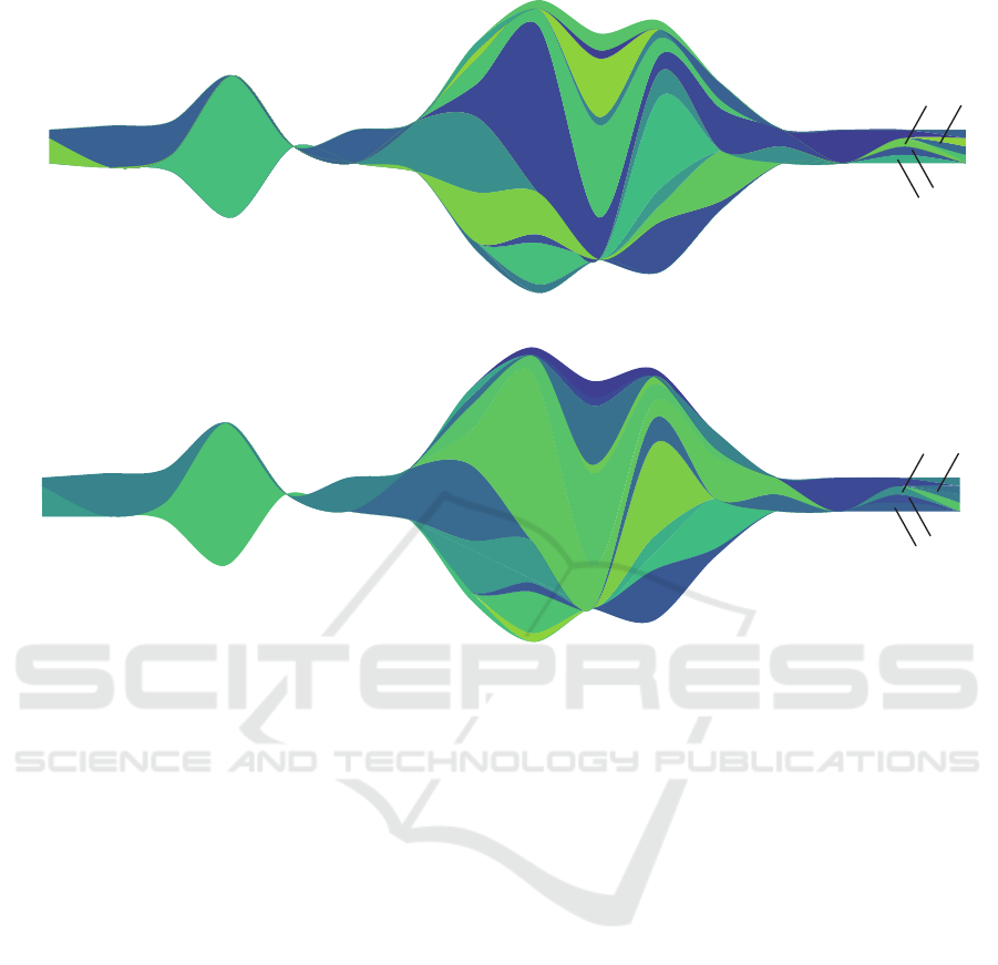
Figure 1: Streamgraph: optimized (top) and randomized (bottom) color-layer assignment (Viridis reduced colormap).
posed approach. Then, two applications of the con-
cept, to streamgraph and to chord diagram, are de-
tailed. A discussion chapter follows before a conclu-
sion and future work section, which completes the pa-
per.
2 RELATED WORKS
In image understanding, Bertin (Bertin, 1983) wrote
that color is associative, selective and ordered. Var-
ious works in psychology explore color human re-
sponse, especially that color precedes size, shape and
orientation. From empirical studies in visualization to
crowd sourced color aesthetics experiments and dis-
tance perception between visual objects, color human
reception has been explored.
2.1 Colormap Choice and Color
Assignment
Research papers provide guidance on colormap de-
sign (Ware, 2012) and emphasis on optimizing for
color harmony and aesthetics (Wang et al., 2008)
while others propose an interactive tool (Meier et al.,
2004) to mix, organize colors and explore color com-
binations. Zhou and Hansen have published a sur-
vey on colormap design in 2016 (Zhou and Hansen,
2016).
Tasks that could be performed about visualization
have been systematically studied (Brehmer and Mun-
zner, 2013). Given a dataset, a kind of visualization
diagram and a task, there is a lot of research about
defining rules to determine which colormaps should
be applied (Mittelstadt et al., 2015). In practice, an
appropriate color mapping scheme is often obtained
by a two-step procedure, selecting a categorical color
palette (Harrower and Brewer, 2003; Gramazio et al.,
2017), assigning colors to the classes through a trial-
and-error process.
Aupetit et al. (Aupetit and Sedlmair, 2016) pub-
lished in 2016 a state-of-the-art on visual class sepa-
ration measures, applied mostly to scatterplots. Sedl-
mair et al. (Sedlmair et al., 2012) developed a tax-
onomy of factors that influences the human percep-
tion of visual class separation on scatterplots, where
most factors are derived from the positions of the data
points. Researches are also concerned with factors
like scatterplots class visibility (Lee et al., 2013), and
IVAPP 2023 - 14th International Conference on Information Visualization Theory and Applications
54

perceptual distance. Fang et al.(Fang et al., 2016)
proposed, for scatterplots, to maximize the percep-
tual distance among a set of given colors while in-
corporating a set of user-defined constraints. They
further compared three optimization algorithms solv-
ing this problem and found that a Genetic Algorithm
(GA) can ease the effect of sticking to a local maxi-
mum. Wang et al.(Wang et al., 2018) also developed
an approach in class-color assignment to optimize vi-
sual class separability in scatterplot diagrams. Based
on forms, distinctness and contrast with background,
it considers user colormap and optimizes through ge-
netic algorithm. They provide a parameter study with
numerical measure.
Line colors assignment is explored by Hurter et al.
(Hurter et al., 2010) who proposed an optimization
method to choose lines colors in a metro map, assign-
ing close routes with the most distinguishable colors.
Kim et al. (Kim et al., 2014) proposed a perception-
driven color assignment method for assigning colors
to segmented image, emphasizing on color aesthetics
and where contrast is incorporated.
2.2 Various Approaches
Some categorical visualization researches use data
graphical properties to optimize color assignment, in
which some are pixel-based (Lee et al., 2013; Zeng
et al., 2019) and others are segmented-based or else
mark-based (Fang et al., 2016; Hurter et al., 2010;
Lu et al., 2021; Kim et al., 2014; Wang et al., 2018).
To optimize color assignment, researchers estimated
various factors like aesthetics, harmony, class visi-
bility, legibility, color distance, semantics, density,
overlapping or fidelity to user preferences. Factors
are summed using weights to get an energy formula.
Among the encountered optimization methods, au-
thors take advantage of simulated annealing, genetic
algorithm, stochastic or gradient-based optimization.
We can find another partition among these works.
Some are optimizing for both colormap and color
assignment (Fang et al., 2016; Hurter et al., 2010;
Zeng et al., 2019) and others are based on a user
set colormap (Lu et al., 2021; Wang et al., 2018).
Wang et al. present a general view of existing tech-
niques and introduced their approach using point dis-
tinctness, non-separability, and genetic algorithm to
optimize scatterplots diagrams. In 2021(Lu et al.,
2021), the algorithm was extended to line and bar
charts. Another paper (Hurter et al., 2010) close to
our approach is about air-traffic and metro map dia-
grams optimization. Their method, besides creating
a colormap, and changing the diagram object’s lo-
cation, computes distances between lines to optimize
color differences through a result quality estimation.
Lee et al. (Lee et al., 2013) introduced the concept
of class visibility and a color optimization algorithm
based on their class visibility metric. Via color sat-
uration, their pixel-based algorithm tries to increase
the saturation difference for small regions. The class
visibility factor is calculated through integrating point
saliency, which measures how much a particular point
color differs from its surrounding color.
Our method includes neither semantic color pref-
erences nor object geometry modifications. The pa-
per contribution is twofold, first, introducing a con-
trast oriented general class-color assignment frame-
work using a user set colormap, demonstrating its ver-
satility and opening the way to express visualization
type specialized contrast importance matrix calcula-
tions and second, detailing novel assignment color to
stacked-graphs/streamgraph and chord diagrams, by
applying the previous concept. The author has al-
ready developed concept applications to line charts
and polygon-based map (Languenou, 2022). It can be
noted that some notions, expressed in the above men-
tioned papers, like point distinctness, point saliency
and class visibility, could be integrated into our con-
trast importance matrix by re-organizing the corre-
sponding mathematical expressions.
3 THE APPROACH
This section explicates the principles of the energy ex-
pression necessary in our class-color assignment op-
timization process. Let us remind that our contrast
importance concept relies on an energy function sep-
arated in two parts, a color part, independent of the
data and a geometrical one, depending only on the vi-
sualization type and the data.
Let us consider a categorical visualization display-
ing n categories/groups/classes G = {g
1
,...,g
n
}.
Visualization specialists have colormap prefer-
ences which leads the author to choose an approach
allowing the user to select a colormap, say C =
{C
1
,...,C
n
}. The optimization process tries to com-
pute the best assignment between n object classes and
n color samples to maximize contrast while preserv-
ing distinguishability.
The expression of a fitness function, which sep-
arates color distance values from the need to get a
color contrast between categories, gives the flexibility
to adapt the calculation of this ”contrast need” factor
calculation to multiple categorical visualization dia-
grams. In the following, we denote this contrast need
evaluation factor as ”importance factor”.
Contrast Driven Color-Group Assignment in Categorical Data Visualization
55

3.1 Importance Matrix and Color
Matrix
The optimization fitness function taking as input a
color-class association (i.e. a permutation) is based
on two symmetrical matrices:
• D is the color matrix, made of n×n elements, that
contains D(i, j) the color distance between col-
ormap samples C
i
and C
j
. We use, for this ma-
trix D, the most recent color distance DE2000 (or
CIEDE2000) formula (Luo et al., 2001).
• M, which we call importance matrix, also made of
n × n elements, that codes M(i, j) the need to as-
sign a high color contrast between classes g
i
and
g
j
. The associated calculations involve graphical
object’s size, neighborhood, frontier, distance be-
tween objects and therefore depend on depicted
data and diagram type. We display, in figure 2,
a representation of the importance matrix corre-
sponding to the streamgraph examples in figure 1
displayed using viridis colormap
1
.
The importance matrix, as we define it, is sym-
metrical and possesses null diagonal values.
Depending on the diagram kind, we may associate
a null importance value to a class pair that does not
share a frontier. This shortcut is, for example, used in
our streamgraph importance matrix calculus. We pro-
pose several diagram type specialized importance ma-
trix evaluation formulas in section 6, naming stream-
graphs and chord diagrams.
Once the user has chosen the colormap, the color
distance matrix remains constant, and for a visualiza-
tion type displaying some given data, the importance
matrix is constant as well. We then express the fitness
function for a color permutation p using an inner ma-
trix product of the two matrices D and M where we
permute D using the permutation p. The next section
details this energy function.
3.2 Energy Evaluation
If we assume that the adequacy A(i → k, j → l) of a
single assignment of two color samples C
i
,C
j
to two
data classes g
k
,g
l
is given by the product of the inter-
color distance D(i, j) and the class pair importance
value M(k, l), then the overall adequacy for a permu-
tation p represented by (p
1
,.., p
n
) can be expressed
by the sum of the individual products, where the color
distance is taken from D(p
i
, p
j
) to handle the color
permutation:
1
Nathaniel Smith and St
´
efan van der Walt, 2015
Air
Ellie_Goulding
Empire_of_the_Sun
Fever_Ray
Foals
Foster_the_People
Frankmusik
Is_Tropical
Junior_Senior
Justice
M83
MGMT
Metric
Metronomy
Mr_Oizo
Passion_Pit
Phoenix
Ratatat
The_Naked_and_Famous
The_Postal_Service
The_xx
Air
Ellie_Goulding
Empire_of_the_Sun
Fever_Ray
Foals
Foster_the_People
Frankmusik
Is_Tropical
Junior_Senior
Justice
M83
MGMT
Metric
Metronomy
Mr_Oizo
Passion_Pit
Phoenix
Ratatat
The_Naked_and_Famous
The_Postal_Service
The_xx
interval:[0,400]
0.00
0.25
0.50
0.75
1.00
Figure 2: Streamgraph: contrast importance matrix coeffi-
cients.
A(p
1
,.., p
n
) =
n
∑
i=1
n
∑
j=1
(D(p
i
, p
j
) × M(i, j)) (1)
Using matrix notation, we express the fitness func-
tion A(p), for a class-color association p, by a simple
matrix inner product
2
(denoted < A, B > ) of the two
matrices where the color matrix D is permuted using
P
p
, the square matrix coding the permutation p map-
ping.
A(p) =< P
p
.D.P
T
p
,M > (2)
Because the matrices are symmetrical and the el-
ements i = j are of no importance, the complexity
of the fitness function evaluation is then reduced to
n re-directions (via the permutation), n(n − 1)/2 mul-
tiplications, (n(n− 1)/2)−1 additions, where n is the
number of classes.
4 SOLVING FOR
PERMUTATIONS
Once we have computed the two matrices, trying to
get the best permutation is performed by optimiza-
tion. The class-color assignment optimization can
be a complicated problem (known as a NP-Complete
problem) when data visualization is complex and the
number of classes high. Let us remind that the cardi-
nal of permutations for n classes is equal to n factorial,
thus growing drastically fast with n.
Luckily, for a number of classes n, say n ≤ 8, the
number of permutations (≤ 40,320) is low enough to
perform an exhaustive evaluation in a reasonable time
and keep the best permutations. So far in our lan-
guage R implementation, the exhaustive evaluation is
2
also called Frobenius product
IVAPP 2023 - 14th International Conference on Information Visualization Theory and Applications
56

automatically performed for n ≤ 8, but as the fitness
formula is only expressed in term of the permutation
values, the contrast importance matrix and the color
distance matrix, the evaluation could be calculated in
an implementation that could take advantage of cur-
rently available multi-core processors. This would al-
low the exhaustive search to be performed up to 12
or 13 categories. A comparison between the assign-
ments obtained by exhaustive search (top) and genetic
algorithm (bottom) is displayed in figure 3. Even if
the results are different, the two assignments can be
evaluated as contrasted.
It appears that the splitting in two matrices of
the energy expression proposed here before for color
assignment problem has already been published in
economics field (Beckman and Koopmans, 1957).
Known as the Quadratic Assignment Problem (QAP),
it aims at achieving an economic objective of as-
signing facilities to locations to minimize the over-
all transport cost. Surveys (Zaied et al., 2015; Loiola
et al., 2007; Burkard et al., 1998) discuss QAP reso-
lution methods like dynamic programming, enumer-
ation, local search algorithms, metaheuristics, simu-
lated annealing, ant colony optimization, neural net-
works and markov chains, tabu search, greedy ran-
domized adaptive search procedure, variable neigh-
borhood search, evolutionary algorithms or else trans-
genetic heuristics.
4.1 Genetic Algorithm Optimization for
Permutation
To get an assignment in a reasonable amount of time,
heuristic approaches may be exploited. In the Data
Visualization literature, various methods, simulated
annealing, genetic, non-linear gradient and greedy,
has been experimented, but when the number of
quite satisfying solutions is high enough, genetic ap-
proaches gives an advantage as various solutions may
be obtained when conducting several optimizations
or keeping the best results among which the user
may choose. In case of permutation search, the clas-
sic genetic optimizer has to be adapted. Chromo-
somes are specifically coded using the bijection from
initial colors to the categories, which can be repre-
sented as (p
1
, p
2
,..., p
n
) where p
i
∈ [1,n] and p
i
̸=
p
j
∀i ̸= j. Here, crossover methods, inheriting from
two chromosomes, have to generate valid permuta-
tions and many crossover techniques have been devel-
oped for permutation specialized chromosomes (Um-
barkar and Sheth, 2015). Mutation must be adapted as
well by performing a simple swap between two ran-
dom indexes.
5 VISUAL PROPERTIES AND
COLOR SEPARATION
Our contrast importance factor is designed to in-
crease the visual discriminability of the classes com-
posing the categorical diagram. Identification capa-
bility is let to the user colormap choice, or made pos-
sible by labeling the graphical objects. The visual
solid angle should be used to express the ability of
the viewer to separate visually one object from an-
other, but so far, we calculate the importance factors
through object size ratio, therefore the result is inde-
pendent of the future context of viewing (viewing dis-
tance and diagram display size).
Many graphical objects may compose the cate-
gory, and they have to be incorporated into the calcu-
lus. The eye ability to visually ”follow” a continuous
graphical object (a line, a layer, a thick arrow, etc.)
fosters the class visual separability. But the layers of
a streamgraph can be either continuous along the time
interval, or appearing only on a part of the diagram,
or else be somewhere reduced to a null thickness and
visible again later.
The object visual separation is critical for adja-
cent objects to avoid spreading (the visual grouping
of close objects caused by too much similar colors).
In consequence, identifying the frontier along adja-
cent objects is an important aspect.
In fact, to fit in our framework, as the need for
contrast for each category pair is expressed through a
single scalar, i.e. an element of the importance matrix,
there must be a synthesis of the many local needs for
contrast, corresponding to various parts of the graphi-
cal metaphors. This aspect is detailed in the next sec-
tion.
5.1 Elementary Importance Coefficients
Visualizations diagrams are usually composed of sev-
eral marks (scatterplots, bar-charts) or composed of
curves or polygons (stacked-graphs, streamgraphs,
polygon maps, chord diagrams). For example, in
scatterplots diagram, numerous discs may represent
a class, but in streamgraph visualization, a category
layer may be a single object. In this later case, we
decompose the layer into smaller parts to evaluate
local discriminability on parts of the class graphical
metaphor. Let us denote these local evaluations, ele-
mentary importance factors (or in a shorter way: ele-
mentary importances).
In the section 6, where we explain the impor-
tance matrix calculation, the diagram specific expres-
sions used to compile/synthesize the elementary im-
portance factors into a single factor will be detailed.
Contrast Driven Color-Group Assignment in Categorical Data Visualization
57

In case of adjacent class objects visualization, be-
sides the importance of the width and area of the
colored region, and when objects discrimination is
needed, Newhall (Newhall, 1955) noticed that the
length of the frontier does not affect the discriminabil-
ity. The perpendicular distance from the interface
frontier to the other side of the region (a perpendicular
thickness) seems to represent a better criterion. The
thinner the region, the higher the risk of spreading
(region visual aggregation) when using similar colors.
To the knowledge of the author, there are no published
formula, in term of color distance and mutual thick-
ness (or visual angle) that evaluate this risk.
The object’s visual angle is the main property to
be considered, but usually there is no information
on the final display size or knowledge on the dis-
tance from the screen (or paper) to the viewer’s eye.
Though, there are published researches about discrim-
inability in visualization. For example, Healey and
Sawant published a paper (Healey and Sawant, 2012)
about the limits of pixel-based visualizations and vi-
sual angles while Maureen Stone examined the size
consequences on spreading effect and distinctness
when generating colormap in the software “tableau”
(Stone, 2012). To explore colors which are subjec-
tively considered as the same, the concept of Just No-
ticeable Difference (JND) has been expressed as well.
Unfortunately, no result of the previous publications
applies directly to our cases.
6 APPLICATIONS
This section details two segmented-based categorical
visualization applications of the presented concept:
streamgraph and chord diagram for which we propose
expressions to evaluate the need for color contrast cal-
culation (i.e. the importance matrix specialized calcu-
lations).
6.1 Streamgraphs and Stacked Graphs
Classical stacked-graphs displays polylines stacked
vertically on top of the horizontal axis. In a New York
Times article (Byron and Wattenberg, 2008), Lee By-
ron and Martin Wattenberg popularized streamgraph
diagrams (see figure 1) which were published before
by Havre et al. (Havre et al., 2002).
Since the first scientific publication many im-
provements have been added, by categories aggrega-
tion, by optimizing the layer order, to correct the layer
thickness in case of significant slope and developing
multi-resolution streamgraphs (Cuenca et al., 2018).
6.1.1 Visualization Principles and Graphical
Rules
Usually chosen to depict time varying categories,
streamgraph layers height is related to a specific di-
mension value. The category layers are stacked on y,
while respecting a constant y order along x axis (vari-
ous constant orders can be chosen, depending on pref-
erences or data criteria) but layers can present a null
thickness for some time intervals. Therefore, layers
may share a frontier with many other layers and may
be thin on a part of the diagram and thick on another
part. The number of layers, depending on the data,
can be large, causing complicated legibility and pre-
venting any category identification by color. Interac-
tive diagrams or labeling the layers are then manda-
tory.
6.1.2 Graphical Criteria for Color Assignment
The main visual criterion is concerned with a visual
separation between layers, therefore, effortless detec-
tion of layer borders by the viewer is an important
property. As some layer parts may be thin, it is im-
portant that layers’ color choice demonstrates enough
color contrast to satisfy legibility. Therefore, in our
case, where colormap is provided by the user, a trade-
off has to be found to optimize legibility.
6.1.3 Importance Computation
Consequently, given a layer ordering and depicted
data, we must identify the frontier sharing between
layers and calculate corresponding contrast impor-
tance factors that rely on mutual layers thickness to
prevent from visual ”spreading”.
6.1.4 Elementary Importance Computation
As layer thickness and frontiers with other layers
evolve along the time dimension, evaluating elemen-
tary importance factors which code the local need to
have a large color contrast for two adjacent layers is
a first step, before compiling a global importance fac-
tor along horizontal dimension interval. Let us denote
T the set of time samples t used to display a stream-
graph composed of n layers for which h
i
t
is the height
of layer i for time value t.
Let us also define γ
i, j
t
a neighborhood descriptor
which codes the fact that layers i and j share a frontier
on time sample t. This descriptor is a function of data
values and of layers chosen order and γ
i, j
t
is equal to
1 if the two layers share a frontier and 0 otherwise. If
we assume that the thinner the layer, the less visible
the layer frontier is, therefore a decreasing function
IVAPP 2023 - 14th International Conference on Information Visualization Theory and Applications
58

could be a starting point to get the desired behavior.
We consider in this research that the need to assign
high contrasted colors to the layer couple depends on
the minimum of the two layers thickness (which can
be discussed). In absence of knowledge on the human
response in such geometrical cases, we can evaluate
the i, j inter-layer elementary importance factor δ
i, j
t
,
for time t, using the inverse of layers height:
δ
i, j
t
= γ
i, j
t
∗ max(1/h
i
t
,1/h
j
t
) (3)
Then, the expression for the whole interval T of t
values for layers i and j gives an array δ
i, j
which has
to be reduced to a single factor M(i, j), the importance
factor for the couple of layers i, j. So far, we do not
calculate the visual thickness as a layer perpendicular
thickness, but we use directly the data value corre-
sponding to y size, with the consequence of an under-
valuation of elementary importance with layer having
large slopes. This could be enhanced by generating
streamgraphs with a more correct thickness (Bu et al.,
2021).
6.1.5 Synthesizing to Obtain an Importance
Factor
We must, thus, compile the elementary importance
factor array values δ
i, j
to get M(i, j) the global (i, j)
inter-layers importance factor. We experimented the
synthesis process via several functions:
• maximum value
M(i, j) = max
t∈T
δ
i, j
t
(4)
• average value
M(i, j) =
1
card(T )
×
∑
t∈T
δ
i, j
t
(5)
The risk of averaging while synthesizing leads
in compensation would sometimes cancel problems.
Using maximum formula could, for some data, re-
sult in stating that all couples of layers share the
same importance value. Examining the data proper-
ties which make a specific synthesis more appropriate
would need further researches. Maximum synthesis
is applied in the top part of figure 1 and in figure 3.
6.1.6 Discontinuous Layers
The presented method aims to increase the contrast
between categories in which graphical metaphors are
neighboring. The diagram legibility and the category
identification depend on the chosen colormap. Us-
ing a narrow hue range color palette involves category
identification difficulties, which could sometimes be
solved by labeling graphic objects.
In streamgraph diagrams, a layer can be made of
a single thick curve or composed of several discon-
nected thick curves when streams become null and
expand later (called discontinuous layers in the fol-
lowing). In this case, they must be assigned with
colors that must be contrasted with potential other
layer colors. As our vision can follow a continuous
layer, only the category layers which are stacked on
the part of the diagram where a discontinuous layer is
re-appearing may be excluded from the need for con-
trast. Therefore, all the other layers must show a color
contrasted with the discontinuous layer color.
The corresponding contrast importance matrix
values could be increased to handle the special con-
trast need between these categories.
8 10 12 14 16 18 20 22
0
5
10
15
20
25
8 10 12 14 16 18 20 22
0
5
10
15
20
25
11 layers
39,916,800 permutations
Genetic Optimization
Using R GA: 3.6 secs
Exhaustive search
Using R: 24 mins
700 generations
100 individuals
Figure 3: Streamgraph showing 11 layers, with reduced
viridis colormap. Top: exhaustive search assignment, bot-
tom: genetic search assignment.
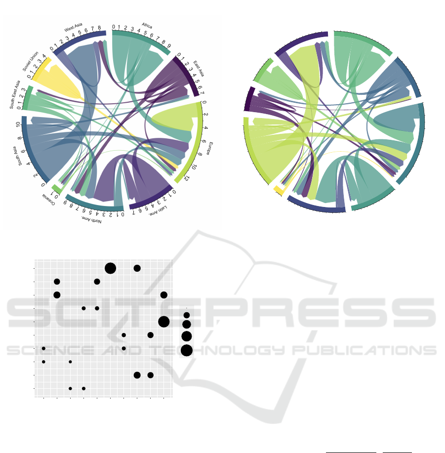
6.2 Chord Diagram
Martin Krzywinski proposed chord diagrams in a
2007 New York Times article called ”Close-ups of the
Genome, Spieces by Spieces by Spieces”. Chord dia-
grams depict fluxes (directional type) and weighted
relationships between entities (un-directional type).
The left part of the figure 4 depicts
3
a directional
chord diagram (using simple direct viridis colormap
color assignment) which is visible on the data-to-viz
website
4
which presents migration between world re-
gions, using data provided by Abel (Abel, 2018).
The same chord diagram is displayed in the right
3
with permission
4
www.data-to-viz.com/graph/chord.html
Contrast Driven Color-Group Assignment in Categorical Data Visualization
59

part of figure 4 for which the assignment has been op-
timized using our method. The improvement is, for
example, noticeable in the lower left part of the dia-
gram (Oceania) where the very narrow arrows present
contrasting colors and are therefore more visually rec-
ognizable.
6.2.1 Visualization Graphical Rules
In a chord diagram, we display the n categories along
a circle perimeter with grouped arrows (fluxes) ar-
riving on or starting from each category. Moreover,
arrows of the chord-diagram depict non-null fluxes
F(i, j) coming from group i and arriving on group j
and the scale factor used to calculate each arrow width
is constant and depends only on the data.
There are various options while displaying chords
diagrams and the type examined here after depicts
arrows filled using the starting flux category color.
Therefore, all the fluxes starting from a group are
filled using the same color. For each group, incoming
arrows are located after outgoing arrows. Last rule
states that for a group, incoming fluxes are displayed
in decreasing order. Therefore, within each group, the
neighboring of arriving arrows involves various col-
ors and various thicknesses depending on the depicted
data.
6.2.2 Graphical Criteria for Color Assignment
In every group, to allow the user to interpret the di-
agram, the arrows must be visually distinct one from
another. We then focus the importance factor calcu-
lation on the arrows neighborhood and on their visual
width. As, along the circle perimeter, a margin sep-
arates each category from its two neighboring cate-
gories, there is no need to insure inter-group visual
separability at this level.
On the contrary, the center of the chord diagram
can be visually confusing, and trying to optimize the
legibility of the center part of the diagram could also
be an objective which is not addressed here. But in
term of data flux understanding, the thickness and the
depicted order of the arrows on each group are essen-
tial.
6.2.3 Aspects of Importance Computation
To get contrast need factors, several important aspects
have therefore to be computed for a group i which can
be expressed by the following interrogations:
• What are the incoming groups of the arrows arriv-
ing on group i?
• In which order are they depicted? What are these
arrows neighborhood?
• What are their thicknesses?
• What is the width of the grouped outgoing arrows
of group i?
6.2.4 Notation
To evaluate geometrical properties of the arrows, let
us first denote O
i
as the decreasing ordered list of
the group indexes of incoming arrows/fluxes for the
group i and nb
i
in
as the number of incoming fluxes for
the group i.
O
i
= {x
i
k
} with:
• x
i
k
is the element at index k in O
i
• k ∈ [1,nb
i
in
],
• x
i
k
∈ [1,n]
As O
i
is ordered in decreasing order, we have
F(x
i
k
,i) ≥ F(x
i
k+1
,i) for k ∈ [1,nb
i
in
− 1].
To ease expression writing, let us call:
• o
i
p
the index of group p in O
i
.
6.2.5 Flux Neighborhood
Using previous notations, let us define γ
i
q,r
a direc-
tional chord diagram neighborhood descriptor which
codes the fact that the fluxes coming from the groups
p and q share a frontier on the arrival part of group i.
γ
i
q,r
is equal to 1 if the index of p and q are succes-
sors in O
i
.
γ
i
q,r
=
(
1 if p ∈ O
i
and q ∈ O
i
and |o
i
q
− o
i
r
| = 1
0 otherwise
(6)
6.2.6 Elementary Importance Matrices
As there are n parts on the circle perimeter corre-
sponding to the n categories in the chord diagram,
group arrows may be neighbors in each of these n
parts. Therefore, for each category i, we construct a
local importance matrix that codes the need to assign
color contrast between (arriving and outgoing) arrows
on a single group i visual part.
We denote these n matrices as elementary impor-
tance matrices and the calculation of their elements
involves the frontier descriptor γ
i
q,r
and the flux values
F(i, j). If a category possesses no incoming flux from
other groups, we fill its elementary importance matrix
with 0 values, as there are no neighboring groups to
be considered. We depict the elementary importance
matrix for the Europe category in figure 5.
Let M
i
be the elementary importance matrix for
group i, and m
i
(q,r) its elements. M
i
is a square
IVAPP 2023 - 14th International Conference on Information Visualization Theory and Applications
60
A
f
r
i
c
a
0
1
2
3
4
5
6
7
8
9
E
a
s
t
A
s
i
a
0
1
2
3
4
5
6
7
E
u
r
o
p
e
0
2
4
6
8
10
12
L
a
t
i
n
A
m
e
.
0
1
2
3
4
5
6
7
N
o
r
t
h
A
m
e
.
0
1
2
3
4
5
6
7
8
9
O
c
e
a
n
i
a
0
1
S
o
u
t
h
A
s
i
a
0
2
4
6
8
10
S
o
u
t
h
E
a
s
t
A
s
i
a
0
1
2
3
S
o
v
i
e
t
U
n
i
o
n
0
1
2
3
4
W
e
s
t
.
A
s
i
a
0
1
2
3
4
5
6
7
8
Same Colormap with Optimized Assignment
Viridis Colormap (data-to-viz)
Migration between
World Regions (Abel, 2018)
Figure 4: Chord Diagram: left: without optimization and right: optimized category-color assignment.
Africa
East Asia
Europe
Latin Ame.
North Ame.
Oceania
South Asia
South East Asia
Soviet Union
West.Asia
Africa
East Asia
Europe
Latin Ame.
North Ame.
Oceania
South Asia
South East Asia
Soviet Union
West.Asia
interval:[0,453]
0.00
0.25
0.50
0.75
1.00
Figure 5: Chord Diagram: Elementary importance matrix
for Europe group.
matrix containing n × n elements, like the chord di-
agram’s final importance matrix.
We chose to relate the importance factor, as in
streamgraph diagram, on the width (i.e. thickness)
of arrows. Therefore, it is based on the inverse of
arrow width, which is related to the corresponding
fluxes values. Considering neighboring information,
the contrast importance value associated with two in-
coming fluxes groups (including flux from the same
group i) is estimated using the maximum of the in-
verse fluxes. As the scale used to depict arrows is
constant, we can omit it.
m
i
(q,r) = γ
i
q,r
× max(1/F(q,i), 1/F(r,i)) (7)
6.2.7 Final Frontier
A remaining neighboring possibility has to be consid-
ered, which corresponds to the frontier for a group i
between the overall outgoing arrows and the first in-
coming arrow. This case can be observed on the right
part of figure 4, on West Asia group, purple outgoing
arrow is neighboring an arriving green arrow. The in-
dex of the first incoming flux is given by x
i
1
which is
also the greatest incoming flux for group i.
The size of grouped outgoing fluxes is expressed
by
∑
u∈[1,n]
F(i, u). Its neighboring flux, i.e. the in-
coming greatest flux, is provided by F(x
i
1
,i) (if x
i
1
ex-
ists and x
i
1
̸= i).
The corresponding in/out frontier importance, if
x
i
1
exists and x
i
1
̸= i, is given by:
m
i
(i,x
i
1
) = max(
1
∑
u∈O
i
F(i, u)
,
1
F(x
i
1
,i)
) (8)
Finally, we update the element m
i
(i,x
i
1
) of the group
i elementary importance matrix by getting the maxi-
mum of the importance calculated on the frontier by
equation 8 and the previous corresponding m
i
(i,x
i
1
)
about incoming flux (see equation 7). Note that if
x
i
1
= i the formula has to be slightly adjusted as the
arriving flux is adjoining the outgoing flux increasing
thus the corresponding shape width.
6.2.8 Resulting Importance Matrix
To be used by the class-color assignment optimiza-
tion, we must produce a single importance matrix.
Synthesizing the n elementary matrices M
i
in a chord
Contrast Driven Color-Group Assignment in Categorical Data Visualization
61
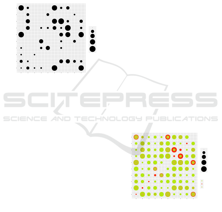
diagram importance matrix M containing n × n el-
ements, is performed by getting, for each element
M(l,m), the maximum of the corresponding elements
m
i
(l, m) of the n elementary importance matrices.
M(l,m) = max
i∈[1,n]
(m
i
(l, m)) (9)
The synthesized importance matrix for the migra-
tion data chord diagram (figure 6.2) is depicted in fig-
ure 6.
Africa
East Asia
Europe
Latin Ame.
North Ame.
Oceania
South Asia
South East Asia
Soviet Union
West.Asia
Africa
East Asia
Europe
Latin Ame.
North Ame.
Oceania
South Asia
South East Asia
Soviet Union
West.Asia
interval:[0,532]
0.00
0.25
0.50
0.75
1.00
Figure 6: Chord Diagram: Synthesized importance matrix.
6.3 Multiple Diagrams
To compare data, we often create multiples figures.
Therefore, the color-category assignment must be the
same for the figures. Some categories may appear in
one figure and not be present in some other diagrams.
The method described in section 6.2.8 to syn-
thesize importance matrices for the chord-diagram is
used to get the color assignment for the multiple di-
agrams case. Therefore, an elementary contrast im-
portance matrix is generated for each diagram. We
construct then the synthetic category set as the union
of the categories appearing in the elementary contrast
matrices. Finally, the aggregated contrast matrix is
calculated by taking for every category pair the maxi-
mum value encountered in the elementary matrices. If
a category pair does not appear in any of the elemen-
tary matrices, the corresponding importance value is
set to zero.
Solving for the synthetic matrix and a colormap,
of size equal to the cardinal of the synthetic category
set, provides with a color-category assignment trade-
off.
7 EVALUATION
As, to the knowledge of the author, there is no previ-
ous work on class-color assignment algorithm about
streamgraph or chord diagram, a comparison with ex-
isting color-category assignment work is impossible.
Though, a controlled-user study is mandatory to
evaluate the proposed method. Even if random as-
signments examples are presented here before, com-
parison with random assignment would not be real-
istic as data scientists manually modify the color as-
signment and test various colormaps to achieve leg-
ibility. The main goal of the presented work lies
in the possibility to improve visualization aesthetic
(by avoiding rainbow colormap, when possible) while
maintaining legibility. Therefore, it would be possible
to ask specialists to create diagrams which would be
compared to contrast-driven assignment visualization
for aesthetic and ability to perform some given data
tasks in a user-controlled experiment.
However, we present dedicated diagrams showing
adequacy between color distances and contrast impor-
tance values in the case of the migration chord dia-
gram using viridis colormap in figures 7, 8 and 9. We
depict the color distances as green discs and the con-
trast importance values as red discs, discs for which
diameters are scaled to a same max value. The more
red in the figure, the less the assignment corresponds
to contrast asked values. These visualizations only
prove that the optimization process converges using
our fitness function and does not prove the adequacy
between the legibility goal and our fitness function.
Africa
East Asia
Europe
Latin Ame.
North Ame.
Oceania
South Asia
South East Asia
Soviet Union
West.Asia
Africa
East Asia
Europe
Latin Ame.
North Ame.
Oceania
South Asia
South East Asia
Soviet Union
West.Asia
imp[0.00,532.46]
colDist[0.00,100.63]
0.00
0.25
0.50
0.75
1.00
type
colorDist
importance
zinter
Figure 7: Chord Diagram: comparison : contrast driven
optimized assign.
IVAPP 2023 - 14th International Conference on Information Visualization Theory and Applications
62
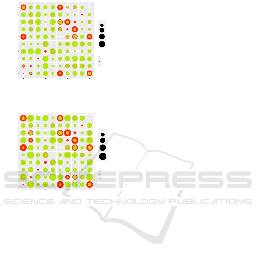
Africa
East Asia
Europe
Latin Ame.
North Ame.
Oceania
South Asia
South East Asia
Soviet Union
West.Asia
Africa
East Asia
Europe
Latin Ame.
North Ame.
Oceania
South Asia
South East Asia
Soviet Union
West.Asia
imp[0.00,532.46]
colDist[0.00,100.63]
0.00
0.25
0.50
0.75
1.00
type
colorDist
importance
zinter
Figure 8: Chord Diagram: comparison : colormap sample
order assign.
Africa
East Asia
Europe
Latin Ame.
North Ame.
Oceania
South Asia
South East Asia
Soviet Union
West.Asia
Africa
East Asia
Europe
Latin Ame.
North Ame.
Oceania
South Asia
South East Asia
Soviet Union
West.Asia
imp[0.00,532.46]
colDist[0.00,100.63]
0.00
0.25
0.50
0.75
1.00
type
colorDist
importance
zinter
Figure 9: Chord Diagram: comparison : random assign.
8 DISCUSSION
The selection of a user color palette and the sepa-
ration within the fitness function between geometric
aspects on the one hand, and palette color distances
on the other hand, reduces the cost of evaluating as-
signments. Even if the proposed diagram dedicated
functions (streamgraph and chord-diagram), calculat-
ing the category pair contrast need, have to be dis-
cussed and improved, the framework seems extensi-
ble to other diagram types like scatterplots for exam-
ple.
Though, the results highly depend on the user cho-
sen colormap. Thus a trial-error process remains to
get a trade-off between aesthetic (through a reduced
hue interval) and legibility. Another drawback lies in
the fact that the method does not warn the user about
a possible lack of contrast within the diagram using
the resulting color permutation.
9 CONCLUSION AND FUTURE
WORK
The article proposes a framework that calculates a
color category assignment in the case of categori-
cal visualization. It focuses on class color contrast
needs, using a user-selected color palette and sepa-
ration between diagram geometric information (con-
trast importance matrix) and color palette sample dis-
tances (color distance matrix using DE2000). Op-
timization is then reduced to the choice of a good
color permutation which is carried out using a genetic
algorithm. Two diagram-type applications, stream-
graph and chord-diagram, are detailed. The method
has been implemented in Java (streamgraph) and in
R language (streamgraph, chord-diagram) for which
a package will be available.
A full evaluation of the results, in term of legibil-
ity, aesthetic and tasks, via user-controlled testing will
have to be conducted.
More importantly, to improve the quality of color
category assignment, a perceptual model must be
carefully designed for both printed and on-screen vi-
sualizations. Therefore, since the current expression
of the need for contrast is based on the size ratio of
displayed graphic objects, which does not correspond
to the way the human eye reacts, the visual angle of
the objects (actual diagram size, distance visualiza-
tion) should be taken into account.
ACKNOWLEDGEMENTS
The author thanks Pascale Kuntz, Kadi Bouatouch
for their support, Yan Stoltz for the chord diagram R
source and the reviewers for their constructive advice.
REFERENCES
Abel, G. J. (2018). Estimates of global bilateral migration
flows by gender between 1960 and 2015. Interna-
tional Migration Review, 52(3):809–852.
Aupetit, M. and Sedlmair, M. (2016). Sepme: 2002 new
visual separation measures. In Hansen, C., Viola, I.,
and Yuan, X., editors, 2016 IEEE Pacific Visualization
Symposium, PacificVis 2016, Taipei, Taiwan, April 19-
22, 2016, pages 1–8. IEEE Computer Society.
Beckman, M. and Koopmans, T. (1957). Assignment prob-
lems and the location of economic activities. Econo-
metrica, 25:53–76.
Bertin, J. (1983). Semiology of Graphics. University of
Wisconsin Press.
Brehmer, M. and Munzner, T. (2013). A multi-level typol-
ogy of abstract visualization tasks. IEEE Transactions
Contrast Driven Color-Group Assignment in Categorical Data Visualization
63

on Visualization and Computer Graphics, 19:2376–
85.
Bu, C., Zhang, Q., Wang, Q., Zhang, J., Sedlmair, M.,
Deussen, O., and Wang, Y. (2021). Sinestream: Im-
proving the readability of streamgraphs by minimiz-
ing sine illusion effects. IEEE Transactions on Visu-
alization and Computer Graphics, 27(2):1634–1643.
Burkard, R., C¸ ela, E., Pardalos, P., and Pitsoulis, L. (1998).
The quadratic assignment problem, volume 2, pages
241–337. Kluwer Academic Publishers, Netherlands.
Byron, L. and Wattenberg, M. (2008). Stacked graphs -
geometry & aesthetics. IEEE Transactions on Visual-
ization and Computer Graphics, 14:1245–1252.
Cuenca, E., Sallaberry, A., Wang, F. Y., and Poncelet, P.
(2018). Multistream: A multiresolution streamgraph
approach to explore hierarchical time series. IEEE
Transactions on Visualization and Computer Graph-
ics, 24(12):3160–3173.
Fang, H., Walton, S., Delahaye, E., Harris, J., Storchak, D.,
and Chen, M. (2016). Categorical colormap optimiza-
tion with visualization case studies. IEEE Transac-
tions on Visualization & Computer Graphics, 23:1–1.
Gramazio, C., Laidlaw, D. H., and Schloss, K. B. (2017).
Colorgorical: Creating discriminable and preferable
color palettes for information visualization. IEEE
Trans. Vis. Comput. Graph., 23(1):521–530.
Harrower, M. and Brewer, C. (2003). Colorbrewer.org:
An online tool for selecting colour schemes for maps.
Cartographic Journal The, 40:27–37.
Havre, S., G., H., Whitney, P., and T., N. (2002). The-
meriver: Visualizing thematic changes in large docu-
ment collections. Visualization and Computer Graph-
ics, IEEE Transactions on, 8:9–20.
Healey, C. G. and Sawant, A. P. (2012). On the limits of res-
olution and visual angle in visualization. ACM Trans.
Appl. Percept., 9(4).
Hurter, C., Serrurier, M., Alonso, R., Tabart, G., and Vinot,
J. (2010). An automatic generation of schematic maps
to display flight routes for air traffic controllers: struc-
ture and color optimization. In Santucci, G., editor,
Proceedings of the International Conference on Ad-
vanced Visual Interfaces, AVI 2010, Roma, Italy, May
26-28, 2010, pages 233–240. ACM Press.
Kim, H., Yoo, M., Kang, H., and Lee, I. (2014).
Perceptually-based color assignment. Comput. Graph.
Forum, 33(7):309–318.
Languenou, E. (2022). Importance Driven Color Assign-
ment. Research report, Nantes Universit
´
e, LS2N,
UMR 6004, F-44000 Nantes, France.
Lee, S., Sips, M., and Seidel, H.-P. (2013). Perceptually
driven visibility optimization for categorical data vi-
sualization. IEEE transactions on visualization and
computer graphics, 19:1746–57.
Loiola, E. M., de Abreu, N. M. M., Boaventura-Netto, P. O.,
Hahn, P., and Querido, T. (2007). A survey for the
quadratic assignment problem. European Journal of
Operational Research, 176(2):657–690.
Lu, K., Feng, M., Chen, X., Sedlmair, M., Deussen, O.,
Lischinski, D., Cheng, Z., and Wang, Y. (2021).
Palettailor: Discriminable colorization for categorical
data. IEEE transactions on visualization and com-
puter graphics, 27(2):475—484.
Luo, M. R., Cui, G., and Rigg, B. (2001). The development
of the cie 2000 colour-difference formula: Ciede2000.
Color Research and Application, 26(5):340–350.
Meier, B., Spalter, A., and Karelitz, D. (2004). Interactive
color palette tools. IEEE computer graphics and ap-
plications, 24:64–72.
Mittelstadt, S., Jackle, D., Stoffel, F., and Keim, D. A.
(2015). ColorCAT: Guided Design of Colormaps for
Combined Analysis Tasks. In Bertini, E., Kennedy,
J., and Puppo, E., editors, Eurographics Conference
on Visualization (EuroVis) - Short Papers. The Euro-
graphics Association.
Newhall, S. M. (1955). Width and area thresholds of dis-
crimination of two colors. Journal of General Psy-
chology, 52:247.
Sedlmair, M., Tatu, A., Munzner, T., and Tory, M. (2012).
A taxonomy of visual cluster separation factors. Com-
put. Graph. Forum, 31(3):1335–1344.
Stone, M. (2012). In color perception, size matters. IEEE
Computer Graphics and Applications, 32(2):8 – 13.
Umbarkar, D. A. and Sheth, P. (2015). Crossover operators
in genetic algorithms: A review. ICTACT Journal on
Soft Computing ( Volume: 6 , Issue: 1 ), 6.
Wang, L., Giesen, J., McDonnell, K., Zolliker, P., and
Mueller, K. (2008). Color design for illustrative vi-
sualization. Visualization and Computer Graphics,
IEEE Transactions on, 14(6):1739–1754.
Wang, Y., Chen, X., Ge, T., Bao, C., Sedlmair, M., Fu, C.-
W., Deussen, O., and Chen, B. (2018). Optimizing
color assignment for perception of class separability
in multiclass scatterplots. IEEE Transactions on Visu-
alization and Computer Graphics, PP:1–1.
Ware, C. (2012). Information Visualization: Perception for
Design. Morgan Kaufmann Publishers Inc., San Fran-
cisco, CA, USA, 3 edition.
Zaied, A. N., Metwally, M., and Abd El-Fatah, L. (2015).
Quadratic assignment problem: A survey and applica-
tions. International Journal of Digital Content Tech-
nology and its Applications, 9:90.
Zeng, Q., Wang, Y., Zhang, J., Zhang, W., Tu, C., Viola,
I., and Wang, Y. (2019). Data-driven colormap op-
timization for 2d scalar field visualization. In 2019
IEEE Visualization Conference (VIS), pages 266–270.
Zhou, L. and Hansen, C. D. (2016). A survey of colormaps
in visualization. IEEE Trans. Vis. Comput. Graph.,
22(8):2051–2069.
IVAPP 2023 - 14th International Conference on Information Visualization Theory and Applications
64
