
Damast: A Visual Analysis Approach for Religious History Research
Max Franke
a
and Steffen Koch
b
University of Stuttgart, Germany
{first.last}@vis.uni-stuttgart.de
Keywords:
Digital Humanities, Visual Analytics, Reproducibility, Provenance, Interactive Filtering, Confidence.
Abstract:
Digital humanities (DH) combines research objectives in the humanities with digital data acquisition, process-
ing, and presentation methods. This work describes the development of a visualization approach in the field of
DH to analyze the coexistence of institutionalized religious communities in Middle Eastern cities during the
medieval period. Our approach aims to support the entire process of data acquisition, storage, analysis, and
publication with interactive visualization. The support of the whole process enables a consistent concept for
the representation of confidence, the collection of provenance information, and the implicit storage of gained
knowledge. Our concept empowers scholars to trace obtained results up to the verifiability of details in the
corresponding sources, facilitates collaborative analyses, and allows for the serialization of results and use in
corresponding publications. We also reflect on the benefits, limitations, and lessons learned when applying
interactive visualization to the concrete tasks and with respect to data collection and publication of findings.
1 INTRODUCTION
In digital humanities (DH) projects data collection,
analysis, and publication of results are often consid-
ered separately. However, the data life cycle is rarely
a one-way trip: often, inconsistencies in the data are
only found during analysis. In such cases, considering
the data curation and its analysis as separate processes
can hinder the improvement of the data. Rather, for-
aging and sensemaking loops (Pirolli and Card, 2005)
should be supported in one place. Currently, first ap-
proaches (Bors et al., 2019; Freire et al., 2008; Ra-
gan et al., 2016) try to make results more traceable
with the help of analysis provenance. Especially in
DH projects dealing with historical data, individual
sources only yield an incomplete perspective on his-
torical actualities. Here; considering multiple sources
is paramount to seeing the larger picture; where indi-
vidual biases of omission, exaggeration, and insincer-
ity can be identified and compensated for. A consis-
tent data schema, and the collection of historical and
analytical provenance data and confidence measures
on individual pieces of historical evidence, are neces-
sary to support distant reading (J
¨
anicke et al., 2015;
Moretti, 2005) on such collections.
We describe the outcome of a collaboration with
historians studying the peaceful coexistence of non-
a
https://orcid.org/0000-0002-4244-6276
b
https://orcid.org/0000-0002-8123-8330
Muslim religious groups under Muslim rule in the
medieval Middle East. In this collaboration, the histo-
rians collected evidence of the presence of individual
religious groups from textual sources. Their objective
was to collect and consider material from many differ-
ent sources to balance out the biased and incomplete
perspectives of individual historical sources.
Our contributions are the following: (1) With
Damast, we describe an interactive visual ap-
proach (Fig. 1) which supports our collaborators’
workflows from data entry over visual analysis to pub-
lication. By covering the whole workflow, results be-
come transparently reproducible and traceable on dif-
ferent levels: Filters that were defined during visual
analysis can be revisited. Every visual mark in the vi-
sualization can be traced back to the source where his-
torians learned about it. Historians’ confidence in the
finding and even the text passage where it originated
from are accessible in an interactive way. (2) We re-
flect on feedback and results, and on the applicability
of our approach to other research questions and areas.
We discuss challenges arising from introducing repro-
ducibility into interactive analyses in DH projects. We
propose general visual and interactive workflows and
strategies that address those challenges.
40
Franke, M. and Koch, S.
Damast: A Visual Analysis Approach for Religious History Research.
DOI: 10.5220/0011609700003417
In Proceedings of the 18th International Joint Conference on Computer Vision, Imaging and Computer Graphics Theory and Applications (VISIGRAPP 2023) - Volume 3: IVAPP, pages 40-52
ISBN: 978-989-758-634-7; ISSN: 2184-4321
Copyright
c
2023 by SCITEPRESS – Science and Technology Publications, Lda. Under CC license (CC BY-NC-ND 4.0)

a
b
c
d
e
f
g
Figure 1: The visual analysis component of Damast consists of multiple, resizable and rearrangeable, coordinated views.
Visible here are the (a) religion view, (b) map view, (c) location list, (d) timeline, (e) confidence, and (f) sources view. The
tags and undated data views, as well as the settings pane, are stacked behind visible views and can be accessed on demand.
More information about the data represented under the mouse cursor is shown in (g) tooltips. A step of the example analysis
from Section 6.1 is shown: The advanced religion filter permits only evidence from places where at least two of the three
religious groups Church of the East, Syriac-Orthodox Church, and Armenian Church are present. The timeline filter limits
evidence to that present in the 8
th
century.
2 RELATED WORK
DH is a broad field with a multitude of data ecosys-
tems, workflows, tasks, and requirements. We hence
limit our related work discussion to DH approaches
making use of data visualization techniques related to
the contributions we make. We also discuss visualiza-
tion approaches outside of the DH that share similar
tasks or design choices. Our work is related to pub-
lications on reproducibility and persistent storage of
results in visual data analysis, as well as tracking of
data provenance, which we also briefly discuss.
Visualization and Uncertainty in the DH. Rees
et al. (2018) collect historical evidence about Jewish
communities in the Byzantine empire. They employ
comparable data collection strategies and encounter
similar issues with data interpretation and the rep-
resentation of historical vagueness as we do. The
challenge of uncertainty in the context of historical is
considered in multiple other works: Windhager et al.
(2018, 2019) discuss uncertainty in cultural heritage
collections, and Panagiotidou et al. (2021) talk about
implicit error in archaeological data. Martin-Rodilla
and Gonzalez-Perez (2019) suggest ways to represent
qualitative vagueness in DH data. Sacha et al. (2015)
highlight how dealing with uncertainties in an open
way in visual analytics fosters trust in the visualiza-
tion and the results. Similarly to these works, we have
found uncertainty in DH data to be multifaceted, tied
to provenance and interpretation, and hard to quan-
tify (Franke et al., 2019). We employ a strategy in-
volving six different, qualitative aspects of historical
confidence that the historians apply to the data. We
bind confidence tightly to the data and include it in
visual analyses as filtering criteria.
Ther
´
on S
´
anchez et al. (2019) reflect on existing
taxonomies on uncertainty, and how to apply them to
the DH. They discuss how uncertainty and meaning
can change in the course of analysis, which, along-
side the unique combinations of data quality and vol-
ume in DH data discussed by Sch
¨
och (2013), are find-
ings we also observed in our collaboration. Lamqad-
dam et al. (2021) highlight unique challenges in how
data is viewed in the humanities, emphasize the near-
constant presence of uncertainty, and suggest guide-
lines for a closer cooperation between DH and visu-
alization. We experienced similar challenges, and can
confirm the fruitfulness of a close collaboration.
Text analysis and visualization (Liu et al., 2019)
are part of many DH projects. Similar techniques are
used here, but source texts—like in our case—are of-
ten challenging (J
¨
anicke et al., 2017) since they are
multi-lingual, diachronic, and heterogenous regarding
document type. We hence take a pragmatic approach
to automated text analysis by offering suggestions for
terms that have previously been annotated. We use
annotation to support data entry and for linking back
to the passages from visual representations.
Interactive Visualization. Our visual analysis ap-
proach is a multiple coordinated view (MCV) sys-
tem (Roberts, 2007; Wang Baldonado et al., 2000)
that facilitates brushing and linking (Becker and
Cleveland, 1987; Ward, 1994) as well as filtering.
MCVs are a common choice when analyzing multi-
Damast: A Visual Analysis Approach for Religious History Research
41

variate data visually, but there are different ways to
realize interactive filtering. A common approach is
to use Boolean or set-based operators to let analysts
filter the multivariate data, either by defining valid at-
tribute values or by selecting concrete entries from the
visual representation. The constraint-based solution,
which we apply in our approach as well, comes in two
common variations depending on how expressive the
filtering should be: Some approaches allow to cre-
ate an explicit filter representation that can be very
powerful in terms of combining filters. Examples for
this strategy are filter/flow representations (Young and
Shneiderman, 1993), DataMeadows (Elmqvist et al.,
2008), and PatViz (Koch et al., 2011). Implicit ap-
proaches, such as FacetLens (Lee et al., 2009), often
use faceted approaches with a convention-based fil-
ter combination. Our own solution falls into the im-
plicit category. Filtering operations formalize impor-
tant analysis steps, which can be stored to make them
traceable and reuse them for reporting.
The MCV visualization of our analysis ap-
proach (see Section 5.2) comprises a geographical
view, a timeline view, a hierarchical view depicting
religions and denominations, a source and tag view,
and one for depicting the confidence of data aspects.
Geographical analysis plays a major role when ad-
dressing DH questions and especially in investigating
historical data. Visualizing data on maps presents sev-
eral challenges such as accurate placement and over-
drawing. Different strategies including aggregation
and placement strategies are typically combined to
alleviate these problems for automatic map creation,
unfortunately reducing the accuracy at the same time.
Many approaches deal with these problems. Closely
related to our tasks are the works by Castermans et al.
(2016) and J
¨
anicke et al. (2013), which address these
challenges through aggregation and highlight the im-
portance of interactivity. We use cluster-based aggre-
gation and details on demand (Shneiderman, 1996),
but also offer a mode without aggregation for smaller
subsets of data. Liem et al. (2018) suggest a geospa-
tial visualization of uncertain data using GeoBlobs.
We offer the possibility to encode uncertainty by color
and to filter by it, and further address spatial and tem-
poral uncertainty explicitly in separate views.
Besides geographical aspects, time is an inher-
ently important aspect for historical observations.
Many visual approaches to represent temporal in-
formation exist (Aigner et al., 2011). We apply a
straightforward approach using stacked histograms in
a timeline to represent this dimension. Often space
and time are analyzed together (Andrienko and An-
drienko, 2006; J
¨
anicke et al., 2013; Mayr and Wind-
hager, 2018) and our approach is no exception to this.
For depicting religious groups we use an indented
tree plot—visualization research offers many options
here (Schulz, 2011). The text sources our collabora-
tors study can contain many valuable data entities. To
depict these quantities and to make filtering and se-
lection possible within them, we used stacked bars to
realize scented widgets (Willett et al., 2007). These
are used as part of interactive filtering and selection.
Reproducible and Sustainable Visual Analysis.
Provenance (Xu et al., 2020) and reproducibility are
relevant for many domains. Liu et al. (2017) and
Beals and Mero
˜
no-Pe
˜
nuela (2020) discuss prove-
nance and shareable workflows in the DH. Ragan
et al. (2016) classify provenance in visual analytics
by type and by purpose. In their framework; our ap-
proach covers the Data, Visualization, and Interaction
types of provenance information; as well as Insight to
a degree. Our approach also covers four of the six
purposes they list: Replication, Collaborative com-
munication, Presentation, and Meta-analysis. Action
recovery is also considered in the sense that we sup-
port recovery and history of visual analysis states.
This is similar to the bookmarking of visualization
state discussed by Heer and Shneiderman (2012) and
Park et al. (2021), or to the playback mentioned by
Vi
´
egas and Wattenberg (2006). Other work includes
explicit provenance graphs (Corv
`
o et al., 2021; Groth
and Streefkerk, 2006; Stitz et al., 2016) or uses in-
teraction logging (Bors et al., 2019; Guo et al., 2016;
Stitz et al., 2019). In our approach, data provenance
is considered part of the data, and reproducibility and
strong backwards connections through the data acqui-
sition and analysis workflows are supported, enabling
both close and distant reading (J
¨
anicke et al., 2015;
Moretti, 2005). We employ a MCV approach and
record applied selections and filtering constraints to
make these operations traceable. Our approach can
also export analysis results as a textual report, which
is similar to the documents with embedded visualiza-
tions presented by Latif et al. (2018), although our
approach focuses more on the serialized data itself.
3 BACKGROUND
The visualization approach described in this work is
the outcome of a joint DH project involving histori-
ans and computer scientists. The concrete Dhimmis
& Muslims project (Weltecke et al., 2022b) had the
goal to help investigate the coexistence of institution-
alized religious groups in the Middle East of the Mid-
dle Ages. At that time, other religious groups, such
as Christians and Jews, were allowed to peacefully
IVAPP 2023 - 14th International Conference on Information Visualization Theory and Applications
42

coexist under Muslim rule. In their research, our col-
laborators work mainly with printed or hand-written
texts. These sources are both primary sources from
the time period of interest, and literature that sum-
marizes, discusses, and evaluates historical findings
at a later date. This source material originates from
many different languages, authors, and writing sys-
tems, which makes digitization via optical character
recognition (OCR) difficult. The heterogeneity of the
source material further prohibits the extensive com-
putational support of the historians’ workflows.
One challenge the historians faced from the start
was that contemporary sources of this time did
not portray coexistence of religious communities
objectively, but rather focused on and even over-
embellished the role of the religious group they them-
selves were part of. So, a Muslim scholar reporting
about their travels might omit seeing a Christian con-
gregation in a city they visited; or, a Christian list of
bishops might claim a bishopric in a city to keep their
political foothold in that region, although there would
be no bishop there. The truth content of individual
statements from these sources must be evaluated by
domain experts in the face of context knowledge and
permanently recorded. As such, it can also be valu-
able to record historical findings that are evidently
false, appropriately labeled, to get the whole picture.
The historians wanted to collect data from many
different sources to support analysis of the coexis-
tence of religious groups. The main data entity they
collected was the historical evidence. Each piece of
historical evidence ties together a religious group, a
place, and a time span. It also contains additional in-
formation such as different aspects of confidence (i.e.,
how trustworthy the information is), which source it
came from, and comments by the historian collect-
ing it. Our collaborators aimed to analyze evidence
from different sources collectively, considering the
truth content of each piece of evidence to get insights
on the presence and absence of religious groups in
different regions during different time periods.
4 REQUIREMENTS
In regular meetings with the historians throughout the
collaboration, we got an insight into their domain
and their usual, analog workflows. The historians,
in turn, learned about information visualization op-
tions and their respective possibilities and limitations.
We formulated and iteratively refined requirements
for Damast to augment their existing workflows.
Unified Dataset (R1). To support their main re-
search question—coexistence of religious groups—
an overview on the source material is necessary. Dis-
tant reading (J
¨
anicke et al., 2015; Moretti, 2005) of
multiple sources is key to getting a more complete,
unbiased picture. The historians hence required a
dataset into which they could collect historical pieces
of evidence from many different sources, with a
flexible data model to align evidence from different
sources in a common, well-defined structure.
Interactive Visual Analysis (R2). The historians
wanted to explore the data and test hypotheses. Such
analyses needed to be interactive and happen in a top-
down fashion. Different aspects of the data, such
as the geographical and temporal aspect, religious
group, but also the confidence, should be visualized
in a way that allowed to understand relationships be-
tween the different aspects. Further, the visualization
should support filtering on these aspects, which can
be combined to allow for specific, powerful queries
to support a multitude of research questions.
Data and Analysis Provenance (R3). Being able
to understand, at all times, where data comes from and
how much it can be trusted is of great importance for
our collaborators. Recording the historical sources of
entered data, as well as data editing history and anal-
ysis steps for later reproducibility, in the dataset (R1)
was therefore necessary. Historical data also includes
uncertainty, and domain and context knowledge come
into play when interpreting historical sources. The
historians required to record aspects of confidence, as
well as free-text metadata, with the data to aid later
interpretation (Franke et al., 2019).
Publication of Results (R4). For publication of
findings within their field, the historians required a
way to persist analysis results. Screenshots of the
visualization, limited in resolution and lacking in-
teractive means to supplement the overview-first ap-
proach, could not feasibly convey the needed infor-
mation. Rather, they desired a textual representation
of the subset of data, listing all details and the prove-
nance (R3) of the historical information without need-
ing interactivity and suitable for supplemental mate-
rial in a publication. The historians also wanted to be
able to reproduce and share the state of an analysis.
Integrated, Interlinked System (R5). Damast
consists of multiple components with different roles,
chiefly interfaces for data entry and edit (R1) and for
visual analysis (R2). These components should be
Damast: A Visual Analysis Approach for Religious History Research
43

available in one place, and be connected; for instance,
newly entered data should appear in the visual anal-
ysis component immediately. Damast should support
navigation to relevant data in the data entry interface
or the visualization analysis component to understand
connections (R3) or to correct issues in the data.
Geographical Aggregation (R6). Many of the his-
torians’ research questions relate to geographical dis-
tribution and co-location. Hence, accurate geograph-
ical representation was an important requirement.
They were used to working with large, printed maps,
such as that by Pirker and Timm (1993) showing
Christian communities in the medieval Middle East.
We deemed an extension of such a representation to
more religious groups, and to updating data (R5), not
scalable especially considering overdrawing and la-
bel placement. Hence, the geographical representa-
tion would need to aggregate, and to use interactiv-
ity (R2) to provide more details for a smaller subset
of data. However, the aggregation should neither give
false impressions of variety nor uniformity.
5 APPROACH
We implemented Damast as a web-based approach
to support scholars in their data entry, editing, anal-
ysis, and publishing efforts. This facilitates naviga-
tion between components, improves consistency, and
reduces setup and configuration efforts by the histo-
rians. Damast consists of multiple, interlinked (R3,
R5) components with specific functions. The main
components are the visual analysis component (R2)
for exploration and analysis of the data (Section 5.2),
the GeoDB-Editor for tabular data entry and geoloca-
tion of places, the annotator for data entry on digitized
documents (Section 5.3), and reports representing an
analysis result (R4) in textual form (Section 5.4).
5.1 Data Model
A task that plays an important role in many research
questions of the historians is to study when and where
which religious groups coexisted. Therefore, the re-
lational data model (R1) revolves around the central
entity of the historical evidence (see Section 3). A
piece of evidence ties together a place and a religious
group, but usually also a temporal component and one
or more historical sources. Additional tables exist to
store alternative toponyms for the places, and to link
places and persons to their representations in other
historical databases. The database also contains tables
used for grouping evidences (such as: “is evidence of
a monastery,” or “needs review”), and tables to sup-
port document annotation. Additional tables are used
to record editing events on evidences for provenance.
Besides the historical data itself, a focus in our
project has been to record data quality and provenance
metadata that the historians ascribe to the data (R3)
when entering it into the database. This includes in-
formation about each datum such as its trustworthy-
ness, the reasons for recording it in a particular way,
or context knowledge necessary to interpret it. To do
so, we added extra data fields to all tables, following a
strategy of treating the historical confidence as part of
the data (Franke et al., 2019). This includes a free-text
comment field for each data entity to record any addi-
tional information. We also introduced a measure of
confidence with five distinct levels: false, uncertain,
contested, probable, and certain. The historians then
assign these levels of confidence to the geographical
placement of each place; the confidence in the attri-
bution of an evidence to a place, person, religion, and
precision of a time span; and the trustworthyness of
sources and interpretation of evidences. With confi-
dence as part of the data, historians can now also vi-
sualize this aspect, and use it in a filter criterion, for
a more reflected visual representation of the histori-
cal data. Not only can every visual mark in the views
of our approach be traced back to its source interac-
tively, but the confidence and remarks of the scholars
who interpreted the source can be revisited as well.
5.2 Visual Analysis Component
Figure 1 shows a screenshot of the visual analy-
sis component of Damast, which we realized with a
MCV visualization (Roberts, 2007; Wang Baldonado
et al., 2000). Each view shows a different aspect of
the data and can be interacted with separately (R2).
The views support brushing and linking (Becker and
Cleveland, 1987; Ward, 1994), meaning that selecting
a visual element in one view will highlight elements
representing the same data in all views.
The visualization also implements multi-faceted
filtering (Hearst, 2006; Weaver, 2004). In the map
view, the data can be filtered by defining regions of
interest. Filtering in the timeline constrains the data
according to time, filtering in the religion view with
respect to religious group, and accordingly for the
other aspects such as confidence and sources. Fil-
ters within the same view lead to a union operation,
joining both sets that fulfill the constraints. Filters be-
tween different views intersect the set of sets adhering
to the constraints. With this very simple strategy, very
powerful analyses can already be made; for instance:
“Show me all pieces of evidence in the region around
IVAPP 2023 - 14th International Conference on Information Visualization Theory and Applications
44

today’s Damascus in a time range between 750 and
850 CE, where entries have the confidence level ‘con-
tested’ or ‘uncertain’ with respect to religious attribu-
tion.” There are deviations from this default strategy
allowing for even more sophisticated filters that were
requested by our partners, such as the advanced reli-
gion filter described below. To further support explo-
ration, each filter step is stored as an individual action
to a history tree, and users can undo and redo steps.
The religious groups in the database are hier-
archically organized and visualized as an indented
tree visualization (Burch et al., 2010) in the religion
view (Fig. 1a). Checkboxes are used to filter by re-
ligious group, with the possibility of either a simple
union filter (any of the selected groups), or a more
complex union of intersections. The latter allows to
define a filter that only applies to a city (and that city’s
evidences) if all religious groups in one of the sets
appear in that city. This facilitates complex queries
of coexistence of religious groups, such as that de-
scribed in Section 6.1. A main factor for using the
indented tree was its compactness, allowing our col-
laborators to allocate as much space as possible in the
MCV layout for the map view. The uniform nodes of
the indented tree also support labeling and color cod-
ing, making it easy to pick them for selection and fil-
tering. At the same time we do not overemphasize one
religious group over the others. With the large num-
ber of religious groups, adequate representation was
also a challenge. Despite the drawbacks, we settled on
color, with the rationale that it is an often-used encod-
ing in our collaborators’ maps, which they were used
to interpret and distinguish. Using color also allowed
us to encode religious denomination consistently in
all views. We store the color for each religious group
as part of the data. This ensures consistency over time
and across media. For a better distinction, Damast
also offers a false-color mode, which spreads out the
color coding as much as possible based on the set of
religious groups visible (Fig. 2d). This mode is espe-
cially helpful with a small set of religious groups with
very similar colors, such as in the example analysis
described in Section 6.1, but lacks the consistency.
The map view (Fig. 1b) shows the geospatial as-
pect of the data. It takes a central place in the visu-
alization to support the map-based working method
of the historians. We decided aggregation would be
necessary, but iterated over the strength and strategy
of aggregation multiple times to ensure truthful, non-
misleading representation (R6). The final design con-
sists of complex glyphs representing clusters of cities
in the map, where the clusters are constructed in a way
that ensures glyphs will not overlap. These represent
the religious groups in up to four pie charts (Figs. 2a
a
b
c
d
Figure 2: The map glyph design for the aggregation level
of religious groups (a) and for a smaller subset of data with
lower aggregation (b). The unclustered mode of the map (c
and d) uses smaller glyphs and is appropriate for analyses
of smaller subsets of the data, such as with the three groups
shown here. A false-color mode (d) can be used for color-
coding instead of using the colors stored in the database.
and 2b) representing the religious groups within by
colored slices. The slices are too small to convey
exact quantities, but help to understand the hetero-
geneity within glyphs. The religious groups are ag-
gregated by the hierarchy used in the religion view
as well. The depth level in the hierarchy chosen for
aggregation is the deepest one possible such that no
more than four aggregation groups remain. In most
cases, this results in the four top-level groups in the
hierarchy (Christianity, Islam, Judaism, and “Other
religions”) to be used (Fig. 2a), but for smaller sub-
sets of the data, aggregation might be on a lower hi-
erarchy level (Fig. 2b). The level of aggregation is
chosen globally for all glyphs. This ensures a rep-
resentation that does not suggest higher diversity in
less dense areas, where less aggregation would be re-
quired (R6). Damast also has an option to disable
the clustering, instead showing smaller glyphs with
each religious group represented by a small colored
circle, with one glyph for each place (Figs. 2c and 2d).
This option is more useful to view smaller subsets of
the data, at higher map zoom levels, because over-
laps are possible here. Still, it is a beneficial addi-
tion for tasks where visual estimation of the number
of cities matching certain criteria, and their geospa-
tial extent, are of interest. For specific analyses by
the historians, the map also provides additional layers
visualizing religious diversity, or a density estimation
of evidences. Scholars can filter by geospatial loca-
tion by specifying one or more polygons in the map.
The cities visualized are also listed separately in the
location list view (Fig. 1c), where scholars can also
search for cities, or filter for a set of cities.
The timeline view (Fig. 1d) shows a timeline of
evidences, aggregated by religious group. To sup-
port the historians’ main research question of coex-
istence, the timeline is shown qualitatively, meaning
that it only shows whether there is evidence for the
religious group at each point in time, or not. Al-
Damast: A Visual Analysis Approach for Religious History Research
45

Figure 3: The qualitative (left) and quantitative (right)
modes of the timeline. In the qualitative mode, only the
presence or absence of a religious group is shown. In the
quantitative mode, a stacked histogram shows the number of
evidences for each religious group over time. An overview
timeline at the bottom can be used to zoom and pan.
ternatively, a quantitative stacked histogram of num-
bers of evidence per religious group per year can be
shown (Fig. 3 left). A smaller overview is shown
at the bottom, so that scholars can also zoom into a
smaller time span. Evidence can be filtered by time
by selecting a time interval in the timeline itself.
Missing and incomplete data is a phenomenon fre-
quently occurring during data entry, when not all data
has been entered into the system yet. But, for histor-
ical data in particular, often data is still missing after
data entry is complete. Still, incomplete data entries
can be helpful in showing a better picture to schol-
ars (Eaton et al., 2003; Franke et al., 2019; Song and
Albers Szafir, 2018). Therefore, we decided to make
missing data explicit in our visualization for the ge-
ographical location, and for missing temporal infor-
mation of partial historical evidence. Thus, places in
the database for which we do not know their loca-
tion are listed separately in the location list, and the
undated data view visualizes the count of evidences
without temporal information separately as a stacked
bar chart, grouped by main religious group.
The confidence view (Fig. 1e) shows a matrix of
checkboxes, one row for each level of confidence, and
one column for each aspect of confidence. Next to
each checkbox, the evidence count for this combina-
tion of aspect and level is shown. This view is itself
a multi-faceted filter, where each column shows a dif-
ferent aspect of the data. The color mapping in the en-
tire visualization, which by default encodes religious
affiliation, can be switched to encode level of confi-
dence (Fig. 4). The aspect of confidence used in this
mode can be selected in the confidence view.
The source view (Fig. 1f) lists the historical
sources the visualized evidence was extracted from.
The distribution of religious groups per source is vi-
sualized as a horizontal, normalized stacked bar chart;
and overall distribution of evidences on the sources
by a separate horizontal bar chart. This represen-
tation fits the compact, row-based list of sources
well. A similar tag view shows tags available in
the database, and both views can be filtered by using
Figure 4: The visual analysis component in confidence
mode, where coloring and aggregation do not depend on
religious affiliation, but on an aspect of confidence.
checkboxes. With the source view, users can quickly
get an overview of the sources used for the creation of
the evidence, or on how complete they are with regard
to the current state of knowledge in the field. This
information is necessary to understand whether state-
ments can be made at all about certain time periods
and regions. The integration of sources allows their
sequential comparison to understand which author re-
ports on which religious groups and to what extent
such reports differ in terms of contained evidence.
Tooltips provide additional information about the
data represented by visual elements in all views. For
instance, hovering over a place name in the loca-
tion list shows the place’s geographical information,
location confidence, comment, names in other lan-
guages, and references in other databases such as
Syriaca.org (Vanderbilt University et al., 2014) and
DARE (Ahlfeldt, 2015). Or, when hovering over a
map glyph, the evidences represented in that glyph is
shown (Fig. 1g) in a level of detail depending on the
number of evidences and the available space.
The visual analysis component can be switched
between showing filtered data (the default) and all
data, where evidence that does not fit the current fil-
ters is included, but represented darker and less satu-
rated in color. Damast further offers controls to store
and load a visualization state, including filters and
view configurations, to the file system. Storing a re-
producible state of the visual analysis allows to share
findings with colleagues (R4), to pause and resume or
branch an analysis session, or to see data entry evolu-
tion for a specific analysis scenario at a later date.
5.3 Data Entry
Damast provides two core facilities for adding and
editing historical data. The first is a table-based
editor, the second an annotation interface for work
in digitized and OCRed historical source material.
The data entry facilities also provide a convenient
place to intercept data edits and record the appropri-
ate provenance data (R3). Both facilities offer vi-
sual support to data entry: The map in the GeoDB-
Editor (Fig. 5 right) shows the geographical location
of entered places and makes inconsistencies apparent
IVAPP 2023 - 14th International Conference on Information Visualization Theory and Applications
46
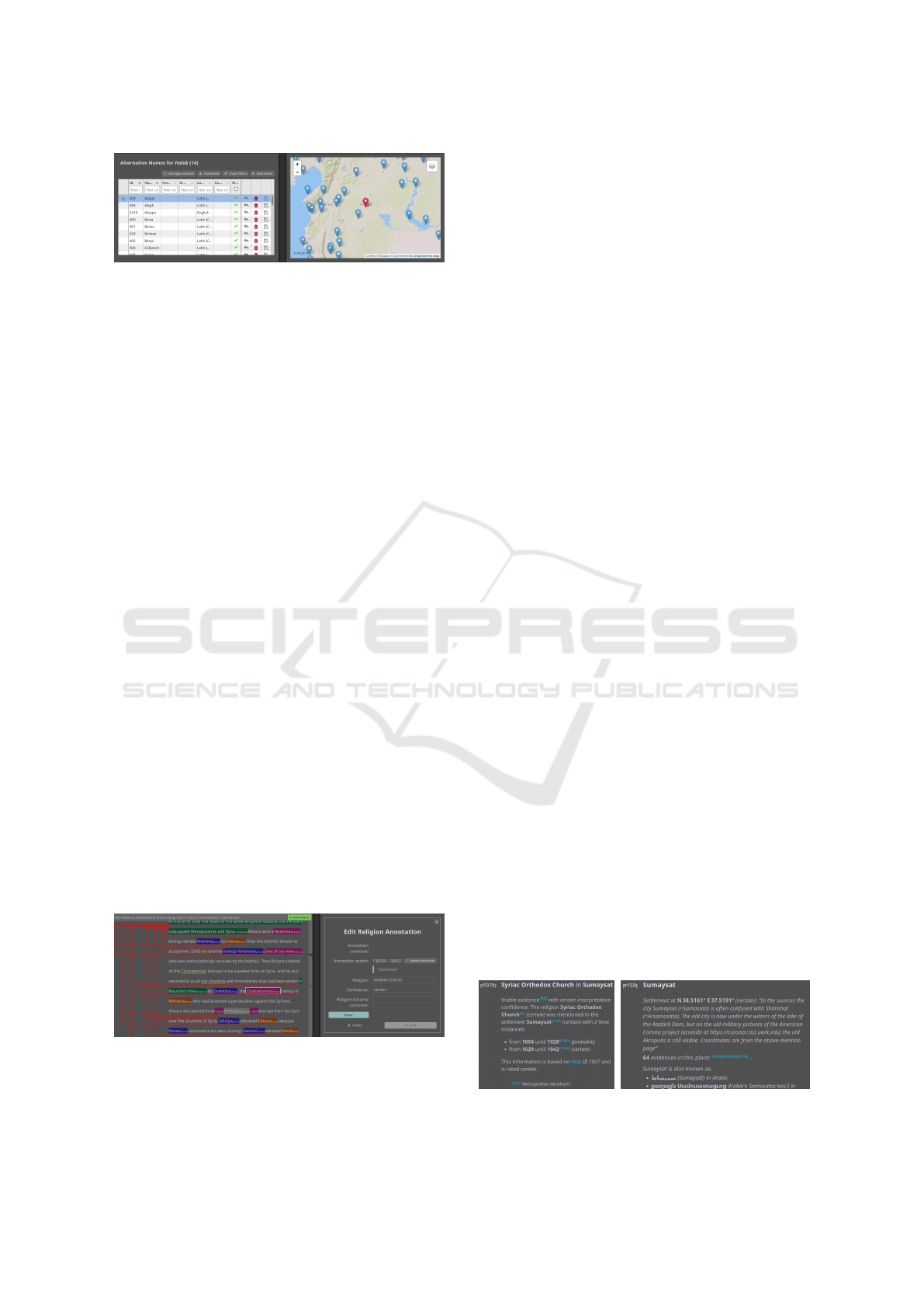
Figure 5: A table and the map of the GeoDB-Editor. Se-
lecting a row in a table will show related information in
dependent tables. Entries can be added, deleted, and edited.
Here, information about Halab, today’s Aleppo, is shown.
to domain experts. By utilizing satellite imagery as
map material, historians could also in some cases find
and verify the location of ruins of historical settle-
ments. In the annotator, data entry and the represen-
tation of evidences (red links in Fig. 6) are visually
represented too. Additionally, entered data is imme-
diately visible (R5) in the visual analysis component,
so historians can use the components in tandem to vi-
sually verify entered data and identify missing data.
GeoDB-Editor. The main facility for the historians
to enter data is the GeoDB-Editor (Fig. 5). Here,
entries can be added, deleted, and edited in tabular
form. The geographical location of places can also be
viewed and edited directly in a map. Tables that are
referenced from others show entries relating to the se-
lected row in the former table. For example, after se-
lecting the place Aleppo, evidence tuples for Aleppo
are shown in the evidence table, and a new evidence
entry would be associated to the place Aleppo. This
ties well into the historians’ workflow, as they often
enter multiple entries relating to the same place, or
multiple time spans for the same evidence. Drop-
down menus with possible entities’ names improve
usability and reduces mistakes during data entry.
Annotator. The annotator (Fig. 6) works on digi-
tized and OCRed historical text sources. Scholars an-
notate entities in the text, and associate them to either
a place, a religious group, a person, or some tempo-
ral information in the database. The annotations can
Figure 6: The annotator shows the document on the left
and the annotation editor on the right. Text passages can
be annotated and linked to entities; namely places, persons,
religious groups, or time spans. These representations are
then grouped to form evidences, visualized as red links.
then be linked together to form evidences (Fig. 6 left).
Suggestions for annotations are also calculated auto-
matically from existing place, religious group, and
person names in the database; and from existing an-
notations in the same document. For example, the En-
glish term “maphrian” used in some sources refers to
a rank of church official that only exists in the Syriac-
Orthodox Church. After annotating this text passage
once with that religious group, other occurrences of
“maphrian” will be suggested as potential candidates
for new annotations referring to the Syriac-Orthodox
Church, and can simply be selected to create the anno-
tation. Entering evidence into the database using the
annotator means that scholars can go back to relevant
text passages when inspecting a visual representation
of it in the visual analysis component (R3, R5).
5.4 Persisting Analysis Results
Exploratory analysis in Damast usually involves
drilling down into subsets of the data relevant to the
current research question. Damast supports sharing
such results between scholars as well as revisiting of
an analysis at a later time (R4). For one, the state of
the visual analysis component (i.e., the current set of
filters, the viewpoint of the map component and some
settings) can be downloaded at any time. Such a state
file can then be loaded into the visual analysis com-
ponent, recreating the respective state.
The historians required a way to persist analysis
findings in a print-friendly format, containing all data
and provenance in a static, non-interactive way (R4).
Damast therefore offers to produce a textual report on
a specific subset of data. A report includes metadata
stating the report’s source, the filters used to generate
it, and summary information about its contents. The
metadata also references the DOI for the version of
the dataset used to generate it, as well as the version
of Damast. This ensures that the same report—and
the visualization state it stemmed from—can be re-
produced later on. The report lists the pieces of ev-
idence individually; as well as the places, religious
groups, and persons referenced in these evidences.
The historical sources the evidences were obtained
from are listed (R3). All references to other entities
within reports are cross-referenced; for instance, in
Figure 7: An evidence (left) and place entry (right) in the
HTML report. Entities in the report are cross-referenced.
Damast: A Visual Analysis Approach for Religious History Research
47

an evidence in place Sumaysat (Fig. 7 left), the place
is linked and referenced, and likewise the evidence is
linked in the place summary (Fig. 7 right). Reports
can be viewed directly in Damast as a web page, or as
a PDF version that can be included as an appendix in a
publication. Each report gets a unique identifier under
which the report can be retrieved indefinitely. Using
the identifier, it is also possible to go directly to the
visual analysis component in that state (R5, R3).
5.5 Workflows
The historians explore and restrict a multitude of data
facets in their analysis tasks. Damast supports this
with interlinked visual components (R2, R5) repre-
senting these facets. A number of frequent workflows
fit into the foraging and sensemaking loops presented
by Pirolli and Card (2005). The historians enter data
from hard-copy source material using the GeoDB-
Editor, and from digitized source material using the
annotator (Section 5.3). These workflows fit into the
read & abstract and schematize processes of the for-
aging loop. Using the powerful filters of the visual
analysis component (Section 5.2), the historians ex-
plore the available data, and might notice patterns or
irregularities from which they form hypotheses. Sim-
ilarly, the visual analysis component can be used to
quickly check hypotheses the historians have already
formed. These workflows fit into the build case and
search for support processes in the sensemaking loop.
The historians might then want to share their findings
with peers, and create a report (Section 5.4) to persist
their analysis steps and the resulting data. This can be
seen as presentation, fitting into the tell story process.
Damast supports the top-down processes pre-
sented by Pirolli and Card through its emphasis on
data and analysis provenance (R3) and facilitates the
retracing of steps via closely linked components (R5).
One workflow fitting into the larger reality/policy
loop is the detection of missing or incorrect data dur-
ing exploratory visual analysis. The historians can
then re-trace the visualized data to the database, and
even back to the original sources, and subsequently
fix and improve the data. Another top-down work-
flow is to revisit an earlier analysis after more data
had been entered into the database.
6 USE CASE AND FEEDBACK
We worked in close collaboration with historians for
more than three years. During this time, both the data
entered and the functionalities of Damast evolved
and improved incrementally to support the scholars
in their research. In this section, we showcase an ex-
ample analysis that was made possible by this work,
describe our collaborative efforts, and highlight anec-
dotal success stories and feedback.
6.1 Example Analysis
One specific research question by our collaborators
is how the coexistence of three Christian groups—
the Church of the East, the Syriac Orthodox Church,
and the Armenian Church—evolved from the 7
th
to
the 12
th
century. Specifically, they are interested in
which cities more than one of these groups could be
found during this time. To filter for cities with at least
two of the groups present, they use the advanced fil-
ter of the religion view with three sets (see Fig. 1a).
In the timeline (Fig. 1d), they then filter for a time
span, here the 8
th
century. The map (Fig. 1b) and lo-
cation list (Fig. 1c) show them the cities relevant to
their research question. Using the unclustered map
mode (see Figs. 2c and 2d) and moving the time-
line filter forwards in small increments, they can also
see the evolution of the coexistence over time. For
example, they see that coexistence is at its highest
around 1000 CE, and that the set of cities where those
religious groups coexisted slowly moves east over
time. Using the tooltips and the links back to the
data and sources, they can also retrieve more infor-
mation. With the confidence view scholars can check
whether disputed evidences need to be considered,
while the source view indicates where the data was
retrieved from. Through reports, the findings can be
transparently shared with colleagues. This shows just
one exemplary analysis session. Depending on the
task and research question at hand, our collaborators
would use a different subset of the functionalities.
6.2 Observations and Feedback
The database grew from a few hundred pieces of his-
torical evidence in 2017 to over 10 000 in late 2022.
Our collaborators consider the data collection itself a
valuable outcome of the project. The historians used
lower levels of confidence for data that needed review
by a peer and increased the levels after review. This il-
lustrates their collaborative workflow, which we could
support with possibilities for powerful filtering (R2),
tracking confidence and provenance (R3), and linking
data exploration and editing facilities (R5).
Feedback from the historians revealed many sit-
uations in which the interactive visualization and its
powerful filters (R2), as well as the integration and
linking with data entry (R5), helped them improve
their data. For instance, they found cases of dupli-
IVAPP 2023 - 14th International Conference on Information Visualization Theory and Applications
48

cate data entry visually, could retrace those to the rel-
evant entries in the GeoDB-Editor, and correct them.
In other cases, they noticed mis-entered data, such as
the wrong time span for an evidence, or a copy-paste
error in the coordinate for a place, visually and could
quickly amend the entries. We also received positive
feedback for the speed and comfort of data entry re-
garding the sanity checks and automatic suggestions
and completions in the GeoDB-Editor.
A challenge in our collaboration was to properly
support very specific research questions and work-
flows by individual historians. In our regular meet-
ings, we discussed such issues and observed our col-
laborators’ workflow. We were often able to find sit-
uations where tedious or error-prone tasks could be
greatly improved by visual interactive support. Other
specific research questions required complex logical
filters to facilitate analyses like that described in Sec-
tion 6.1. We extended the filtering possibilities pro-
vided by Damast accordingly. We found that adding
such specialized features posed a risk of making the
approach too complex to learn and to use, or too in-
consistent in its behavior. Damast aims to counteract
that risk by defining a behavioral archetype regarding
brushing and linking, and the multifaceted filtering,
that all new features needed to adhere to; and by mak-
ing specialized features opt-in. Extensive documenta-
tion of behavior and features helped here as well, both
as a reference and to on-board new collaborators.
The historians stressed that they have already got-
ten various new insights, and also were looking for-
ward to incorporating and analyzing even more data
with Damast. One example insight concerns the plu-
rality of religious groups in cities of the medieval
Middle East. Previously, our collaborators’ consen-
sus had been that this plurality was always given. But
now, they could see that there were indeed highs and
lows in plurality and coexistence. Another hypothesis
they had already formed, but were not able to confirm
previously, was that the bishopric seats of Christian
groups migrated from more rural areas into the cap-
itals in the 10
th
century. Previously, testing this hy-
pothesis would have required close reading of multi-
ple historical sources, and collection and organization
of partial findings. With the unified dataset contain-
ing evidences from many sources (R1), distant read-
ing with powerful filtering (R2)—in this case the re-
ligion and timeline filter, alongside the tag filter for
the Bishopric tag—meant they could now confirm the
hypothesis quickly and visually. A presentation of
Damast at the 53
rd
Deutscher Historikertag in 2021
also received a large audience and positive resonance
including requests to use and adapt Damast for other
datasets and respective research questions.
7 DISCUSSION
We believe that Damast produced valuable outcomes
on different levels. During the collaboration, we faced
some challenges and limitations with our approach.
In the following, we discuss the lessons learned and
how our approach could be applied in other contexts.
7.1 Results and Limitations
The success of our approach can be ascribed, in part,
to the previous work of our collaborators, who had al-
ready put thought into what data to collect, and how
to formalize it. They were also already working vi-
sually, mostly with printed maps, and so the use of
interactive visual analysis was easy to introduce. Our
success was also facilitated by the nature and volume
of the data relevant for our collaborators’ research
questions: The complete dataset size is about 50 MB,
which still permits transfer of the entire dataset to the
visual analysis component, and hence to do a top-
down analysis with multi-faceted filtering. For larger
datasets that could no longer be fully loaded in such
a way, the order in which filters were applied would
become essential for the reproduction of analysis re-
sults. In such a case, interaction logging, as proposed
by KnowledgePearls (Stitz et al., 2019) and Story-
Facets (Park et al., 2021), would become necessary.
To support the specific research questions of our
collaborators, we also had to find bespoke visual so-
lutions. Consequently, we sacrificed some intuitive-
ness and ease of use in exchange for more expressive
visual querying. This also lead to a multitude of func-
tionalities, which individual workflows only utilize a
subset of. Damast now requires some practice to use,
and we had to write extensive documentation to sup-
port new users. For any sufficiently complex area of
research, visual support facilities will have their own
complexity. Damast in its current form is restricted
to the analysis of textual evidences for religious com-
munities, but we argue that the general concepts and
strategies applied in our approach are still extendable
to other areas of research that rely on historical find-
ings in source texts. We also had to find compro-
mises between best practices in visual analysis, and
the workflows and technologies familiar to the histo-
rians, for example when deciding on color hue as an
encoding for religious affiliation (see Section 5.2).
While we increased the transparency and trace-
ability of analysis results, additional aspects need to
be considered for complete reproducibility. To as-
sess the results, it is necessary to understand on which
information the findings are based. To achieve this
transparency, we published the dataset to a long-
Damast: A Visual Analysis Approach for Religious History Research
49

term data repository (Weltecke et al., 2022a) and en-
sured that the used sources are made transparent in
our analysis environment. We published the code of
Damast (Franke and GitHub contributors, 2022) to
ensure that interested researchers can assess the visu-
alizations themselves, and to make the code available
for reuse. In generated reports, we specify the ver-
sion of the software and the version of the data from
the long-term repository. Coupled with the linking
between results, visual analysis, and data in our ap-
proach (R5) this means that not only the same report
and analysis results can be reproduced, other scholars
can even go back to the source references. With that,
even the interpretation of the source material can later
be reproduced and understood by other scholars (R4).
7.2 Applicability Beyond the Use Case
Since data creation was an inherent part of the project,
our collaborators were aware that mistakes in this step
would reflect in the visual analysis. Hence, they had
a critical stance to what was visualized, which moti-
vated the support of tracking back visual artifacts to
the data and the sources to help verify all data aspects
depicted in the visual representations (R3). Further,
the historians in our project work with textual source,
some of which were even available as digitized texts.
These circumstances facilitated the collaboration and
contributed significantly to the project outcome.
Despite these project specifics, we believe that
some of the lessons learned, approaches used, and
workflows developed can be transferred to other DH
projects concerned with the spatio-temporal aspects
of entities described in textual sources. Confidence
and incomplete or biased data sources are typical
traits of historical data and are relevant in many DH
research endeavors to improve the visual analysis.
Projects working with appropriately formalizable data
could achieve a similar coupling of sources, data,
and its evaluation and correction based on exploratory
analyses. One collaborator already proposed to use
Damast for the spatio-temporal analysis of monastic
orders in medieval Europe. With similar high-level
research questions and data schemas, Damast could
be reused here virtually unchanged.
7.3 Lessons Learned
A repeating point of discussion in our collaboration
was the level of abstraction and aggregation used in
interactive visualization. We initially underestimated
the information density possible on printed, semi-
automatically created maps, which our collaborators
were familiar working with (see R6). The use of in-
teractive visualization and an overview-first approach
to support the lower resolution of computer screens
was, therefore, unusual to them. Over time, we found
good compromises in our approach that could sup-
port both historians more comfortable with traditional
workflows, and those wishing to double down on the
gains of interactive visual analysis. The difference in
resolution also became a driving force in the develop-
ment of the reporting functionality and the publication
of analysis results (R4) in a static, serialized and non-
aggregated manner. A core objective of our approach
is to unite the entire data life cycle in one place. We
could observe the benefits that arose from visually ac-
companying data entry: Outliers or errors could be
noticed earlier, and the overall iterative improvement
of the data situation was accelerated. Repeated feed-
back from the historians indicates that seeing the data
quality and quantity improve in real time motivated
them and gave them a sense of accomplishment.
We also found that the historians used the facili-
ties to annotate data with free-text comments exten-
sively. They entered additional information about the
entity, how they interpreted it, why they included it,
and more. This metadata gives a deeper insight into
the data and provides an additional way to identify
data that needs to be reviewed. Other approaches pro-
vide facilities for dataset annotations (Shrinivasan and
van Wijk, 2008), but our pragmatic approach already
offers many benefits with little setup cost.
The close collaboration in our design study was a
driving factor in its success, which matches the find-
ings of Bradley et al. (2018). Regular meetings and
workshops helped convey domain knowledge in both
directions and accelerated the iterative development.
8 SUMMARY AND OUTLOOK
Damast enables historians to explore and analyze the
coexistence of religious groups in cities of the me-
dieval Middle East. Our approach covers the interac-
tive visual analysis as well as the manual formaliza-
tion and assessment of such data and its relation to the
sources it was retrieved from. By storing these rela-
tions and keeping track of analysis steps; Damast fa-
cilitates collaboration, makes findings traceable, and
supports scholars in publishing findings with serial-
ized textual reports. With the linked components
we contribute to a better reproducibility of insights
gained with the help of DH methods that we believe
is applicable beyond our concrete design study.
Future work could consider situations where
overview-first approaches are prohibitive due to data
size and offer more sophisticated analysis opera-
IVAPP 2023 - 14th International Conference on Information Visualization Theory and Applications
50

tions including advanced support for data compari-
son. Other backends including knowledge graphs and
additional data acquisition procedures could also be
incorporated into our approach.
ACKNOWLEDGMENTS
This work has been funded and supported by the
Volkswagen Foundation as part of the Mixed Meth-
ods project “Dhimmis & Muslims”.
REFERENCES
Ahlfeldt, J. (2015). Digital atlas of the roman em-
pire (DARE). https://imperium.ahlfeldt.se/ [Accessed:
2022-12-19].
Aigner, W., Miksch, S., Schumann, H., and Tominski, C.
(2011). Visualization of Time-oriented Data. Springer,
London, UK.
Andrienko, N. and Andrienko, G. (2006). Exploratory anal-
ysis of spatial and temporal data: A systematic ap-
proach. Springer, Berlin, Germany.
Beals, M. and Mero
˜
no-Pe
˜
nuela, A. (2020). Reproducible
humanities research: Developing extensible databases
for recording ”messy” categorisation, annotation and
provenance data. In Proc. DH Abstracts.
Becker, R. A. and Cleveland, W. S. (1987). Brushing scat-
terplots. Technometrics, 29(2):127–142.
Bors, C., Attfield, S., Battle, L., Dowling, M., Endert, A.,
Koch, S., Kulyk, O., Laramee, R., Troy, M., and Wen-
skovitch, J. (2019). A novel approach to task abstrac-
tion to make better sense of provenance data. Dagstuhl
Seminar 18462: Provenance and Logging for Sense
Making, 8(11):46–50.
Bradley, A. J., El-Assady, M., Coles, K., Alexander, E.,
Chen, M., Collins, C., J
¨
anicke, S., and Wrisley, D. J.
(2018). Visualization and the Digital Humanities:
Moving toward stronger collaborations. Computer
Graphics and Applications, 38(6):26–38.
Burch, M., Raschke, M., and Weiskopf, D. (2010). Indented
pixel tree plots. In Advances in Visual Computing,
pages 338–349. Springer Berlin Heidelberg.
Castermans, T., Speckmann, B., Verbeek, K., Westen-
berg, M. A., Betti, A., and van den Berg, H. (2016).
GlamMap: Geovisualization for E-Humanities. Proc.
VIS4DH Workshop.
Corv
`
o, A., Garcia Caballero, H. S., Westenberg, M. A., van
Driel, M. A., and van Wijk, J. J. (2021). Visual analyt-
ics for hypothesis-driven exploration in computational
pathology. IEEE TVCG, 27(10):3851–3866.
Eaton, C., Plaisant, C., and Drizd, T. (2003). The challenge
of missing and uncertain data. In Proc. VIS, pages
100–101. IEEE.
Elmqvist, N., Stasko, J., and Tsigas, P. (2008).
DataMeadow: A visual canvas for analysis of large-
scale multivariate data. Information Visualization,
7(1):18–33.
Franke, M., Barczok, R., Koch, S., and Weltecke, D. (2019).
Confidence as first-class attribute in digital humanities
data. Proc. VIS4DH Workshop.
Franke, M. and GitHub contributors (2022).
Damast GitHub repository. https://github.com/
UniStuttgart-VISUS/damast [Accessed: 2022-12-12].
Freire, J., Koop, D., Santos, E., and Silva, C. T. (2008).
Provenance for computational tasks: A survey. Com-
puting in Science & Engineering, 10(3):11–21.
Groth, D. P. and Streefkerk, K. (2006). Provenance and an-
notation for visual exploration systems. IEEE TVCG,
12(6):1500–1510.
Guo, H., Gomez, S. R., Ziemkiewicz, C., and Laidlaw,
D. H. (2016). A case study using visualization in-
teraction logs and insight metrics to understand how
analysts arrive at insights. IEEE TVCG, 22(1):51–60.
Hearst, M. A. (2006). Design recommendations for hierar-
chical faceted search interfaces. In Proc. SIGIR Work-
shop on Faceted Search, pages 1–5.
Heer, J. and Shneiderman, B. (2012). Interactive dynam-
ics for visual analysis. Communications of the ACM,
55(4):45–54.
J
¨
anicke, S., Franzini, G., Cheema, M. F., and Scheuermann,
G. (2015). On close and distant reading in digital hu-
manities: A survey and future challenges. In Proc.
EuroVis STARs, pages 83–103. Eurographics Associ-
ation.
J
¨
anicke, S., Franzini, G., Cheema, M. F., and Scheuermann,
G. (2017). Visual text analysis in digital humanities.
Computer Graphics Forum, 36(6):226–250.
J
¨
anicke, S., Heine, C., and Scheuermann, G. (2013).
GeoTemCo: Comparative visualization of geospatial-
temporal data with clutter removal based on dynamic
delaunay triangulations. In Proc. VISIGRAPP, pages
160–175. Springer.
Koch, S., Bosch, H., Giereth, M., and Ertl, T. (2011). It-
erative integration of visual insights during scalable
patent search and analysis. IEEE TVCG, 17(5):557–
569.
Lamqaddam, H., Moere, A. V., Abeele, V. V., Brosens, K.,
and Verbert, K. (2021). Introducing layers of mean-
ing (LoM): A framework to reduce semantic distance
of visualization in humanistic research. IEEE TVCG,
27(2):1084–1094.
Latif, S., Liu, D., and Beck, F. (2018). Exploring interac-
tive linking between text and visualization. In Proc.
EuroVis Short Papers, pages 91–94. Eurographics As-
sociation.
Lee, B., Smith, G., Robertson, G. G., Czerwinski, M., and
Tan, D. S. (2009). FacetLens: Exposing trends and
relationships to support sensemaking within faceted
datasets. In Proc. CHI. ACM.
Liem, J., Goudarouli, E., Hirschorn, S., Wood, J., and Perin,
C. (2018). Conveying uncertainty in archived war di-
aries with GeoBlobs. In Proc. VIS. IEEE. Poster.
Liu, A., Champagne, A., Douglass, J., Kleinman, S., Rus-
sell, J., and Thomas, L. (2017). Open, shareable,
reproducible workflows for the Digital Humanities:
The case of the 4Humanities.org ”WhatEvery1Says”
project. In Proc. DH Abstracts. ADHO.
Damast: A Visual Analysis Approach for Religious History Research
51

Liu, S., Wang, X., Collins, C., Dou, W., Ouyang, F., El-
Assady, M., Jiang, L., and Keim, D. A. (2019). Bridg-
ing text visualization and mining: A task-driven sur-
vey. IEEE TVCG, 25(7):2482–2504.
Martin-Rodilla, P. and Gonzalez-Perez, C. (2019). Concep-
tualization and non-relational implementation of on-
tological and epistemic vagueness of information in
Digital Humanities. Informatics, 6(2):20.
Mayr, E. and Windhager, F. (2018). Once upon a space-
time: Visual storytelling in cognitive and geotemporal
information spaces. ISPRS International Journal of
Geo-Information, 7(3):96.
Moretti, F. (2005). Graphs, maps, trees: Abstract models
for literary history. Verso.
Panagiotidou, G., Vandam, R., Poblome, J., and Moere,
A. V. (2021). Implicit error, uncertainty and confi-
dence in visualization: an archaeological case study.
IEEE TVCG, pages 1–14.
Park, D., Suhail, M., Zheng, M., Dunne, C., Ragan, E., and
Elmqvist, N. (2021). StoryFacets: A design study on
storytelling with visualizations for collaborative data
analysis. Information Visualization, pages 1–14.
Pirker, S. and Timm, S. (1993). Middle East. Christianity
from the 8th to the 14th century. In T
¨
ubinger Atlas des
Vorderen Orients, page B VIII 2. Dr. Ludwig Reichert
Verlag, Wiesbaden.
Pirolli, P. and Card, S. (2005). The sensemaking process
and leverage points for analyst technology as identi-
fied through cognitive task analysis. In Proc. Interna-
tional Conference on Intelligence Analysis, volume 5,
pages 2–7, McLean, VA, USA.
Ragan, E. D., Endert, A., Sanyal, J., and Chen, J. (2016).
Characterizing provenance in visualization and data
analysis: An organizational framework of provenance
types and purposes. IEEE TVCG, 22(1):31–40.
Rees, G., de Lange, N., and Panayotov, A. (2018). Map-
ping the Jewish communities of the Byzantine empire
using GIS. In Migration and Migrant Identities in the
Near East from Antiquity to the Middle Ages, chap-
ter 6, pages 104–121. Routledge, London, 1 edition.
Roberts, J. C. (2007). State of the art: Coordinated & multi-
ple views in exploratory visualization. In Proc. CMV,
pages 61–71. IEEE.
Sacha, D., Senaratne, H., Kwon, B. C., Ellis, G., and Keim,
D. A. (2015). The role of uncertainty, awareness, and
trust in visual analytics. IEEE TVCG, 22(1):240–249.
Schulz, H.-J. (2011). Treevis.net: A tree visualization
reference. Computer Graphics and Applications,
31(6):11–15.
Sch
¨
och, C. (2013). Big? Smart? Clean? Messy? Data in the
Humanities. Journal of Digital Humanities, 2(3):2–
13.
Shneiderman, B. (1996). The eyes have it: A task by
data type taxonomy for information visualizations. In
Proc. VL, pages 336–343. IEEE.
Shrinivasan, Y. B. and van Wijk, J. J. (2008). Supporting
the analytical reasoning process in information visu-
alization. In Proc. CHI. ACM Press.
Song, H. and Albers Szafir, D. (2018). Where’s my data?
Evaluating visualizations with missing data. IEEE
TVCG, 25(1):914–924.
Stitz, H., Gratzl, S., Piringer, H., Zichner, T., and Streit, M.
(2019). KnowledgePearls: Provenance-based visual-
ization retrieval. IEEE TVCG, 25(1):120–130.
Stitz, H., Luger, S., Streit, M., and Gehlenborg, N.
(2016). AVOCADO: Visualization of workflow-
derived data provenance for reproducible biomedical
research. Computer Graphics Forum, 35(3):481–490.
Ther
´
on S
´
anchez, R., Benito Santos, A., Santamar
´
ıa Vi-
cente, R., and Losada G
´
omez, A. (2019). Towards an
uncertainty-aware visualization in the digital humani-
ties. Informatics, 6(3):31.
Vanderbilt University, Princeton University, and contribu-
tors (2014). Syriaca.org: The Syriac reference portal.
https://www.syriaca.org/ [Accessed: 2022-12-19].
Vi
´
egas, F. B. and Wattenberg, M. (2006). Communication-
minded visualization: A call to action. IBM Systems
Journal, 45(4):801–812.
Wang Baldonado, M. Q., Woodruff, A., and Kuchinsky, A.
(2000). Guidelines for using multiple views in infor-
mation visualization. In Proc. AVI, pages 110–119.
ACM.
Ward, M. O. (1994). XmdvTool: Integrating multiple meth-
ods for visualizing multivariate data. In Proc. VIS.
IEEE.
Weaver, C. (2004). Building highly-coordinated visualiza-
tions in Improvise. In Proc. InfoVis, pages 159–166.
IEEE.
Weltecke, D., Koch, S., Barczok, R., Franke, M., and
Vest, B. A. (2022a). Data Collected During the
Digital Humanities Project ’Dhimmis & Muslims
- Analysing Multireligious Spaces in the Medieval
Muslim World’. DaRUS, V1. DOI: 10.18419/darus-
2318.
Weltecke, D., Koch, S., Barczok, R., Franke, M. F., J
¨
ackel,
F., and Vest, B. A. (2022b). Damast—A research sys-
tem to analyze multi-religious constellations in the is-
lamicate world. https://damast.geschichte.hu-berlin.
de/ [Accessed: 2022-12-19].
Willett, W., Heer, J., and Agrawala, M. (2007). Scented
widgets: Improving navigation cues with embedded
visualizations. IEEE TVCG, 13(6):1129–1136.
Windhager, F., Filipov, V. A., Salisu, S., and Mayr, E.
(2018). Visualizing uncertainty in cultural heritage
collections. In Proc. EuroRV
3
, pages 7–11. Euro-
graphics Association.
Windhager, F., Salisu, S., and Mayr, E. (2019). Exhibit-
ing uncertainty: Visualizing data quality indicators for
cultural collections. Informatics, 6(3):29.
Xu, K., Ottley, A., Walchshofer, C., Streit, M., Chang, R.,
and Wenskovitch, J. (2020). Survey on the analysis of
user interactions and visualization provenance. Com-
puter Graphics Forum, 39(3):757–783.
Young, D. and Shneiderman, B. (1993). A graphical fil-
ter/flow representation of Boolean queries: A proto-
type implementation and evaluation. Journal of the
American Society for Information Science, 44(6):327–
339.
IVAPP 2023 - 14th International Conference on Information Visualization Theory and Applications
52
