
ANTENNA: A Tool for Visual Analysis of Urban Mobility based on Cell
Phone Data
Pedro Silva
a
, Catarina Mac¸
˜
as
b
, Jo
˜
ao Correia
c
, Penousal Machado
d
and Evgheni Polisciuc
e
CISUC, Department of Informatics Engineering, University of Coimbra, Coimbra, Portugal
Keywords:
Urban Mobility, Flow Visualization, Visual Analytics, Spatio-temporal Data, Information Visualization.
Abstract:
Nowadays, the collection of data from ubiquitous urban sensors, such as smartphones, can be used to analyse,
understand, and profile urban mobility. This analysis requires dynamic, autonomous, and effective ways to
parse, reduce and retrieve mobility patterns from large heterogeneous datasets. In this design study, we present
ANTENNA, a visual analysis tool that allows the identification and analysis of urban mobility patterns based
on mobile cell phone data. In particular, we present a visualization that is prepared for multiple scenarios of
analysis, providing specific visualization approaches for different sets of tasks. We developed diverse visu-
alization models to characterise inter- and intra-urban mobility. To validate ANTENNA, we conducted user
tests with experts of different domains. The results suggest the appropriateness and usefulness of ANTENNA
for each of the presented usage scenarios.
1 INTRODUCTION
Profiling of urban movements has traditionally relied
on the knowledge of land use patterns, but, while land
use and transportation infrastructures tend to remain
the same for a long time, movement patterns, on the
other hand, often change. Transport planning input
data mostly comes from expensive traditional survey
methods, time-consuming and often result in a lim-
ited view of what is happening. In contrast, pervasive
computing devices and call detail records (e.g., tele-
phone calls, text messages, internet access) provide
unprecedented digital footprints, telling where and
when people are, often in real-time. Large volumes
of human mobility data are generated every second
through ubiquitous systems, such as mobile technolo-
gies and wireless networks (Krings et al., 2009). All
these mobility data, together with modern techniques
for geoprocessing, data fusion and visualization of-
fer new possibilities for deriving activity patterns and
enabling dynamic mobility profiling (Lin and Hsu,
2014) for predicting future movements or destina-
tions (Calabrese et al., 2013), traffic forecast (Krings
et al., 2009) or city planning (Makse et al., 1995).
a
https://orcid.org/0000-0002-7885-5768
b
https://orcid.org/0000-0002-4511-5763
c
https://orcid.org/0000-0001-5562-1996
d
https://orcid.org/0000-0002-6308-6484
e
https://orcid.org/0000-0001-9044-2707
However, the inconsistency and incompleteness of
the retrieved data may lead to various challenges in
finding mobility patterns exclusively through modern
practices that rely solely on data mining (Krings et al.,
2009; Makse et al., 1995).
To address these challenges, we developed AN-
TENNA, a visual analytics tool for movement data,
the project which departs from cooperation with Al-
tice Labs – a multinational telecommunication com-
pany. The main goal of this project is to identify
and analyse mobility patterns to promote the use of
measures for sustainable urban mobility. The mo-
bile phone records, which consists of cell connec-
tions, allowed us to create a visualization tool that
provides the means to (i) identify the most com-
mon trajectories; (ii) perceive how many people move
from/towards a specified reference location; (iii) iden-
tify how many people do the same trajectory, or have
the same origin/destination points; (iv) derive and
categorise different geographic locations of interest;
and (v) identify areas of greater affluence throughout
time. Before delving into technical details, we sug-
gest to watch the demonstration of the tool on this
link https://bit.ly/3CT16Vu.
Our approach tackles several challenges of trans-
forming raw cell phone data into analyzable and
explorable representations. Namely, the difficulties
range from cleaning the cell phone data records to
extracting sequential events (Vajakas et al., 2015),
88
Silva, P., Maçãs, C., Correia, J., Machado, P. and Polisciuc, E.
ANTENNA: A Tool for Visual Analysis of Urban Mobility based on Cell Phone Data.
DOI: 10.5220/0010902200003124
In Proceedings of the 17th International Joint Conference on Computer Vision, Imaging and Computer Graphics Theory and Applications (VISIGRAPP 2022) - Volume 3: IVAPP, pages
88-100
ISBN: 978-989-758-555-5; ISSN: 2184-4321
Copyright
c
2022 by SCITEPRESS – Science and Technology Publications, Lda. All rights reserved

from converting these events into sequences of trips
and activity locations (Zheng et al., 2009) to match-
ing these trips and activity locations to the geographic
map (Quddus et al., 2007). At the visualization end,
it is still not trivial to represent massive amounts of
mobility flow in a clutter-free display (Von Landes-
berger et al., 2015). Each of the challenges individu-
ally has already been addressed by the research com-
munity. However, integrating all the involving stages
into a single analytic pipeline is demanding: either it
is computationally costly to process the data on the
fly, or the trajectory reconstruction lacks precision, or
the visualization is slow to render a high number of
trajectories, or the visualization technique fails in re-
vealing needed patterns.
In summary, the contributions of this paper are
the following: (i) the characterization of the analyt-
ical problem (Section 4); (ii) the reporting on the ar-
chitecture (Section 3) and design of the ANTENNA
tool (Section 5); and (iii) the evaluation (Section 7).
Concerning the contributions to visual analytics and
visualization, we emphasise the combination of exist-
ing visualization techniques, such as hexagonal grids
and the usage of gradient/thickness of a line to rep-
resent directionality, applied to high-density urban
mobility data in visual analytics context. Further-
more, our architecture enables data transformation
(i.e., from raw data to visual representation) to exe-
cute in useful times. Another important contribution
of the presented work is the design of glyphs and their
use for higher-level readings. The glyphs allow the
user to retrieve important insights about multiple as-
pects of mobility, such as the ratio between pass-by
and stay points, the geographic zone-associated be-
haviours, and the indication of the start and end of
aggregated trajectories. Finally, we highlight the in-
teraction method for constructing visual queries.
2 VISUAL ANALYTICS OF
MOVEMENT
The visual analytics of movement has its own state-
of-the-art techniques, which are well-established ap-
proaches concerning visual analysis of movement
data (Andrienko and Andrienko, 2013). Andrienko
and Andrienko identified four directions of visual
analysis: (i) looking at trajectories, (ii) looking in-
side trajectories, (iii) bird’s-eye view on movement,
and (iv) investigating movement in context.
The first category, looking at trajectories, is char-
acterized by the strong focus on trajectories of mov-
ing objects analyzed as a whole. The visualization
methods within this category support exploration of
the spatial and temporal properties through different
graphical means. Representing trajectories with lin-
ear symbols (lines) in static and animated maps (An-
drienko et al., 2000; Enguehard et al., 2013; Kr
¨
uger
et al., 2013) and space-time cubes (STC) (Kraak,
2003; Kapler and Wright, 2005) is the most common
technique. Besides, arcs can be used instead of lin-
ear symbols to show flow (Chua et al., 2014; Polis-
ciuc et al., 2015). The most obvious drawback of
these methods is that the display may suffer from vi-
sual occlusions and clutter (Bach et al., 2017). Clus-
tering trajectories, more known as progressive clus-
tering method, is another popular technique to deal
with large amounts of data (Rinzivillo et al., 2008;
Andrienko et al., 2007) and to reduce visual clut-
ter (Chua et al., 2016). As such, ANTENNA takes
the advantage of aggregation techniques while using
linear symbols to represent trajectories.
Concerning the variation of movement character-
istics along the trajectory, the methods from the sec-
ond category, looking inside trajectories, are used to
support the detection and localization of segments
with specific movement characteristics. Attribute
values can be represented by colouring or shad-
ing (Tominski et al., 2012; Spretke et al., 2011), as
well as placing glyphs onto the segments (Ware et al.,
2006). Furthermore, a trajectory can be considered as
a sequence of spatial events (Andrienko et al., 2011a),
and techniques such as presented in (Andrienko et al.,
2011b) can be used to extract and cluster movement
data, revealing spatial dynamics. We apply variable
colouring and shading in ANTENNA to distinguish
sections of trajectories with major activity influx.
The techniques under bird’s-eye view on move-
ment mainly focus on providing an overview of
the distribution of movement in space and time
through the means of generalization and aggrega-
tion. The most known techniques fall under the flow
maps (Dent, 1999), thematic maps that are used to
represent aggregated flow without neglecting the ex-
act trajectory (Wood et al., 2011; Cornel et al., 2016;
Polisciuc et al., 2016a). Origin-destination (OD) ma-
trix can also be used to represent the flow of mov-
ing objects (Guo, 2007). Small multiple maps is an-
other technique to show flows from/to one location by
colouring the other locations (Guo et al., 2006; Wood
et al., 2010). The work of (Lu et al., 2015) uses OD
clustering along with circular glyph that provides a
cluster-wise visual analysis of OD patterns. Further-
more, the movement can be aggregated by territory
divisions and represented on a flow map without in-
tersections by linking adjacent territories with a half-
arrow symbol (Chua et al., 2016). Apart from clus-
tering techniques, kernel density estimation method
ANTENNA: A Tool for Visual Analysis of Urban Mobility based on Cell Phone Data
89

can be applied on trajectories to display density fields
on a map by using colour or shading (Polisciuc et al.,
2016a) and an illumination model (Scheepens et al.,
2011). In ANTENNA we implemented an aggrega-
tion method that is based on a hexagonal grid, which
subdivides into hexagonal areas that are served as ag-
gregation bins. The aggregated information is then
shown using circular glyphs.
Movement data can also be analyzed within the
context (e.g., spatial or temporal), focusing on the
relations and interaction between moving objects
and the environment (Tomaszewski and MacEachren,
2010). Interaction techniques, for instance “staining”
(i.e., the user marks a certain area of the context and
relationships with moving objects emerge) (Bouvier
and Oates, 2008) or by computing distances of mov-
ing objects to a selected element and visualizing the
result on a timeline (Orellana et al., 2009), can be em-
ployed to explore movement in context. Similar ideas
are presented in (Andrienko et al., 2011a), which con-
sist of computing spatial and temporal distances from
moving objects to items in the environment and rep-
resenting them as attributes linked to trajectory posi-
tions. ANTENNA provides the user with a function-
ality that consists of updating the map according to
the hovered bar on the timeline, which in turn is a
representation of aggregated data shown on the map.
3 DATA AND SYSTEM
OVERVIEW
In this section, we present details about the dataset
and pre-processing steps carried out to prepare the
data. We provide an overview of the underlying sys-
tem and its architecture. Also, we briefly describe the
data transformation pipeline and the stages involved.
3.1 Data
The dataset was provided by the Altice telecommu-
nication operator, containing per-user sequences of
cell connection events. The overall timespan of the
data ranges from December 27 of 2018 to January 3
of 2019, and geographically covers the entire area of
Aveiro city in Portugal. Each event indicates the be-
ginning and the end of the connection to a cell tower.
The data entries have an average interval of 10 min-
utes between them. In some cases, simultaneous con-
nections to two cell towers can appear. This result in
an added temporal uncertainty associated to user po-
sitioning in space-time. Further, the cell towers are
characterised by their GPS location, and the sector of
coverage (angle and radius), measuring 0
◦
from the
REST API
Worker
Visualization
Filter and clean
Database
Trajectory extractor
Mapmatching
Client Server
Data
Processed
Data
Raw
Data
Data to Visualize
Process
Launcher
Query
Data
Figure 1: Representation of the ANTENNA architecture.
The important modules are visualization, REST API, the
datasource, and the worker.
north in the clock wise direction. Multiple towers can
appear within the range of other towers, which fur-
ther decrease the positioning accuracy. The dataset is
comprised of 20Gb of information, making real-time
processing challenging. We address these problems
with our system design in the following section 3.2.
3.2 System Overview
The ANTENNA was implemented using modern
technologies for distributed data storage and process-
ing, following a three-tier architecture: presentation
tier (frontend), application tier (backend), and data-
source tier. The visualization pipeline can be de-
scribed as follows: (i) the user defines the visual query
using a graphical user interface; (ii) the visual query is
submitted to the Backend; (iii) the received request is
processed and passed to a worker unit that is executed
asynchronously; (iv) the worker processes the data in
a constant communication with the datasources, also
in a distributed fashion; and (vi) the result is returned
to the frontend where it is visualized in an interactive
web page (Figure 1). The rationale behind our design
is to allow the system to be able to process multiple
simultaneous requests in a parallel and scalable way
and to read from dynamic distributed data sources.
Backend. Regarding the application tier, it is re-
sponsible for data cleaning, trajectory extraction, map
matching, and geographic location labeling. The
main heavy processes occur in the worker modules,
which are executed by the Apache Spark engine on
a computer cluster. Each worker performs temporal
and spatial aggregations based on the query parame-
ters (detailed in Section 5.1) and the available data. In
short, temporal aggregation consists of transforming
temporal events into sequential time intervals, from
which trips can be derived. The method employs sev-
eral techniques for noise reduction (e.g., ping-pong
removal, aggregation of the concurrent events).
As for the spatial aggregation, we defined two
types, which to some extent are related to the scale of
geographic generalization: (i) road level; (ii) cells of
IVAPP 2022 - 13th International Conference on Information Visualization Theory and Applications
90

a hexagonal grid. On the road level, we map-matched
the extracted sequences of the trips and locations and
transformed them into the arrays of vertices that con-
stitute road segments. For the spatial aggregation of
the second type, we employ the method of the hierar-
chical hexagonal grid that constructs cells of variable
granularity depending on the spatial distribution of
data points (Polisciuc et al., 2016b). Having the grid
computed, we aggregate all the data points by each
cell of the grid, derive corresponding statistics and ar-
range them in time-series. Furthermore, we store all
the information in a graph structure, such that each
node is centered in its respective cell, and each edge
represents the mobility flow (see Section 5.3.1).
Finally, we try to deduce the usage of each geo-
graphic location in terms of pass-by and stay points.
Furthermore, the stay points are further labelled as
arrival or departure locations. In simple terms, the
method is based on the stay duration at a certain lo-
cation. The stay is considered when a user remains at
the same location (i.e., within the range of each tower
cell) for a period greater than 30 minutes, the duration
that is discussed in (Widhalm et al., 2015). Further-
more, the stay points are further classified as arrival
or departure, depending on the trip direction (i.e., in-
bound or outbound). Any other location is considered
a pass-by point. It is important to mention that our
approach does not considers modes of transportation
either the types of activities performed at each loca-
tion, which can influence the results.
Frontend. The presentation tier, which is the focus
of this article, is divided into two pages: the query
management page and the visualization page. In the
former, the user can create, delete, and select previ-
ously submitted queries. In the latter, the user can
visualise the query’s results (see Section 5).
4 TASKS AND DESIGN
REQUIREMENTS
The collaboration with the analysts at Altice Labs.
helped us to derive a set of tasks that will support
them in achieving their goals. The main goal is to
understand the amount of people which, at any given
time, move from location A to location B. The result-
ing tasks, which will be used as primary guidelines
for designing ANTENNA, are the following:
T1 Identify the Traffic Flow within a City. Iden-
tification of the most likely roads used within a
city. For this task, a higher level of detail was
achieved by projecting sequences of trips onto the
Portuguese roads. The road segments are selected
depending on their proximity to the connection
between locations A and B;
T2 Identify Periods of Time with Different Traf-
fic Volumes. Identification of important periods
of time according to the traffic activity. To facili-
tate this task, all trips were aggregated by different
time periods and represented in a timeline with the
aid of bar charts;
T3 Analyse the Trips between Larger Geographic
Areas. Identification of the trips between differ-
ent cities. This task requires a higher aggrega-
tion of locations, as its main goal is to give an
overview of the trajectories. To aggregate the dif-
ferent locations, a dynamic hexagonal grid was
implemented that, depending on the zoom level,
can have more or less granularity (Polisciuc et al.,
2016b);
T4 Analyse the Trips from, to, or between Specific
Areas. This task refers to the aggregation and vi-
sualization of all trajectories depending on their
departing, arriving, or both points. This task is
defined in the visual query page and visualized in
the visualization page;
T5 Distinguish Urban Locations. Characterisation
of the different locations depending on the tra-
jectory’s characteristics if the users only pass by,
stay, or leave certain cell towers.
From these tasks, it was possible to determine the
visualization design requirements:
DR1 Enable the User to Zoom and Pan the Map. To
have different levels of detail, the user should be
able to pan the map and zoom in areas with higher
densities of transitions;
DR2 Enable the Interaction with the Timeline. To
analyze the differences in traffic flow according to
time, the visualization should provide the means
to select different periods of time and to visualise
them on the map;
DR3 Distinguish the Directionality of the Trajecto-
ries. To comprehend how people move, a visual
cue should be given so it is possible to distinguish
different directions;
DR4 Visualise the Mobility between Cities. The
user should be able to perceive the movements
between locations, being these aggregated at a
higher level (hexagonal grid) or a lower level
(road map);
DR5 Characterise the Geographic Areas According
to Their Mobility Impact. Visual cues should
be given so the user can understand the type of
mobility in different locations.
ANTENNA: A Tool for Visual Analysis of Urban Mobility based on Cell Phone Data
91

Figure 2: Two timeline designs: (A) represent the distribution of activities aggregate per time intervals; (B) shows the distri-
bution of trips made as a group, also aggregated by temporal blocks.
5 THE ANTENNA
At a higher level, our visualization tool provides dif-
ferent ways of interacting with the data. As already
described in Section 3, the starting point is the defini-
tion of the visual query and submission to the query
queue. After the completion, the backend returns the
processed data, as described in Section 3.2. These
can be represented based on two different methods
of aggregation on an interactive map (DR1). Along
with the aggregation mode, a glyph symbol is applied
to characterise different urban areas. Furthermore, a
panel placed on the left of the screen is provided to
display a legend and the query details. Finally, a time-
line, placed at the bottom of the screen, provides the
means to analyse specific periods of time in greater
detail. All these stages in the analytical pipeline are
described in detail in the following subsections.
5.1 Visual Query
The query is defined by graphical means and con-
tains the following parameters: (i) time range, more
specifically start and end date and time; (ii) aggre-
gation time intervals; (iii) spatial aggregation for
trajectories—by hexagonal grid or road network; (iv)
origin/destination (OD) selection; and (v) group ag-
gregation mode; among other parameters that can be
consulted in Figure 3. The user can also define other
spatial filters by choosing to aggregate the data into
groups and show those groups activities instead. For
the same time interval, a group is considered as such
when the number of performed individual activities
between location A and location B is greater than a
predefined group threshold number.
Finally, the administrative units are used as ori-
gin/destination filters to visualise only the activities
that start at the origin and/or end at destination areas.
There are three levels of administrative units: (i) dis-
tricts, (ii) municipalities, and (iii) civil parishes. Fur-
thermore, we implemented circular OD filters, which
act as selectors of the origin and destination areas.
The user can specify the location and radius of the
circle by clicking and dragging the mouse, when the
Free option is selected (Figure 3).
5.2 Interactive Timeline
A timeline is made available to navigate through the
query’s time interval, enabling the visualization of
different periods of time (DR2). This way, the users
can get a more comprehensive understanding of the
trajectories’ geographical flow through time. The
timeline is constructed based on the specified aggre-
gation mode: (i) a total number of activities (trips);
(ii) a total number of activities as a group. We con-
sider group trips the trips that are taken by a group of
four and more people (e.g., bus rides). The timeline is
defined by several blocks that divide the time range in
a set of time intervals, the duration of which is speci-
fied in the visual query (e.g., 15min, 30min, 1h) (Fig-
ure 2). The width of each block varies in proportion to
Figure 3: The query management page. The user defines
query parameters using the panel on the left and the inter-
active map.
IVAPP 2022 - 13th International Conference on Information Visualization Theory and Applications
92
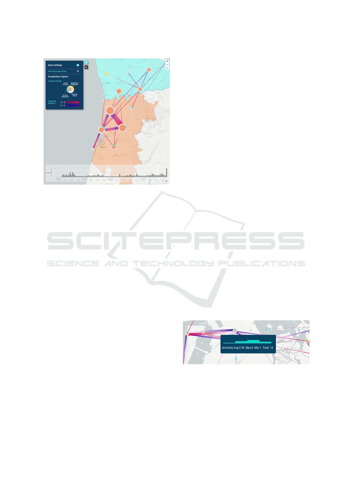
Figure 4: Grid aggregation mode. Aggregated activities are
encoded with lines and the characteristics of the geographic
locations are summarised by the glyph nodes. At the bot-
tom, the timeline shows the temporal distribution of activi-
ties.
available horizontal space on the screen and the num-
ber of the bars within the queried time range (i.e., the
user indicates the beginning and end date and time
in the Time Selection section ( Figure 3)). When the
first aggregation mode is selected, the height of each
block is defined by the number of activities within
each respective time interval (Figure 2 (A)). When vi-
sualising the data with the group mode selected, the
timeline blocks are subdivided into two parts: (i) one
top grey block, representing the average number of
users per group; and (ii) one bottom cyan block, rep-
resenting the number of groups for that time interval
(Figure 2 (B)). Finally, the map updates as the user
interacts with a time block, leaving only the trips that
where made during the selected time interval.
5.3 Trajectory Visualization
As mentioned in Section 3.2, the pipeline of data
transformation includes a map matching stage, where
all the individual trips are projected either onto the
road map or a hexagonal grid, depending on the
queried aggregation mode. The retrieved data was de-
picted using different visualization techniques.
5.3.1 Grid Aggregation
For this spatial aggregation, we employed the method
of the hierarchical hexagonal grid (Polisciuc et al.,
2016b). This method of hexagonal binning constructs
cells of variable granularity depending on the spatial
distribution of data points. This is important, since
the density and distribution of data points may vary
within urban areas (e.g., downtown vs. periphery of
a city). Having the grid computed, we aggregate all
the data points by each cell of the grid, which will be
used as the nodes of the final bi-directed graph. The
edges in the graph represent aggregated trips neglect-
ing the exact route taken. Each edge is constituted by
a time-series which includes computed statistics with
respect to query parameters.
In the grid aggregation mode, the locations of the
cell towers are projected onto an invisible hexagonal
grid, and new locations are derived (i.e., centres of
the grid cells). Therefore, the centre of each hexago-
nal cell can represent one or more cell towers that are
placed within the grid. This strategy was defined to
reduce visual clutter as this hexagonal grid can pro-
vide a higher level of analysis of geographical data
(DR4) and enable the overview rather than exact esti-
mation of the data values (Figure 4).
Edges. The individual trips are grouped defining the
edges of the graph. The representation takes the form
of two adjacent straight lines, one for each direction.
The lines are coloured according to their directional-
ity: in red for North-South and in purple for South-
North directions (DR3). This colour palette was cho-
sen according to its contrasting colour combination,
promoting its distinction and consequent reading. We
intensified the directionality perception with an opac-
ity gradient that increases towards its endpoint, the
technique studied in (Holten and Van Wijk, 2009;
Holten et al., 2011). In the case of opposite direction-
ality, the edges are placed side-by-side, an approach
adapted from (Chua et al., 2016). The thickness of
the lines encodes the number of trips made by distinct
users between two nodes—edge activity.
Figure 5: Label displayed by interacting with an edge. It
shows the activities distribution over time and additional
statistical data.
Finally, a dynamic label is provided by interacting
with an edge (Figure 5). The label contains a compact
version of the timeline, as well as additional statistics
such as total, minimum, maximum, and average num-
ber of trips.
ANTENNA: A Tool for Visual Analysis of Urban Mobility based on Cell Phone Data
93

Nodes. To represent different types of activities
(i.e., pass-by or stay), we rendered the nodes as pie
charts (for the sake of simplicity we use the terms pie
chart and glyph interchangeably). The pie chart is di-
vided into three slices, corresponding to three types
of activities (DR5). The angle of each slice encodes
the number of individual trips that contributed to the
corresponding type of activity. The colours represent
the following: grey for pass-by points, cyan for ar-
rival stay point (inbound trips), and yellow for depar-
ture stay points (outbound trips). Recall that an arrival
stay point implies that the person arrived at a location
and stayed for a duration longer than 30 minutes. The
inverse happens for the departure stay points. Any
other locations are marked as pass-by locations.
In addition to the pie chart, a central orange circle
is used to depict local activities. Local activity is con-
sidered when a trip is made within the grid cell. Re-
call that each grid cell can embrace large geographic
regions, depending on the zoom level. The radius of
the circle is defined according to its ratio of activities
within each cell, i.e., the number of local activities
divided by the total amount of activities at the node.
This is done so the size of the orange circle scales
proportionally with the size of the pie chart.
Finally, the radius of the pie chart is defined by the
total number of activities, including the local ones.
The glyphs sizes were globally normalised to avoid
overlapping and readability issues (Figure 6).
Figure 6: Glyph design. The cyan, yellow, and grey colours
encode arrival, departure, and pass-by locations, respec-
tively. The orange represent local activities.
In some cases, the glyphs may not contain all
types of activities described. Thus, different higher-
level readings and geographic location characteriza-
tion can be achieved by looking at the glyphs (Fig-
ure 7). By representing these patterns, we seek to un-
veil urban characteristics, such as its inhabitant’s type
of movements and region topologies (e.g., housing,
commercial, leisure) (Zeng et al., 2016).
5.3.2 Road Aggregation
To enable a more detailed analysis of the most used
roads (DR4), we perform aggregation of the trips at
the road level. For that, we project the extracted
trajectories onto the Portuguese road network, us-
ing a distance based map matching approach (Qud-
dus et al., 2007). The geometry data was retrieved
Figure 7: Example of different glyphs representing geo-
graphic areas with different types of mobility behaviour:
(from left to right) arrival/departure location with local ac-
tivities, mostly a pass-by location, arrival and pass-by loca-
tion, mixed behaviour with little local activity, arrival only,
and mixed behaviour with some local activities.
Figure 8: Schematic representation of an edge. Line colour
depicts direction, while semi-circles represent the start and
end points. Line width encodes the number of unique trips.
from OpenStreetMap provider and stored in Postgres
database within the datasource tier, such that real-
time processing is possible. The matching road seg-
ments are returned to the presentation tier along with
the attached quantitative information (the number of
distinct trips), and are used as a geometry descriptor
for rendering of the trajectories.
We used red and purple solid colours, for rep-
resenting south-north and north-south directions, re-
spectively. The directionality is dictated by the rel-
ative position of the start and end points. If the end
point of the trajectory is further north than its start-
ing point, the trajectory is coloured in purple, oth-
erwise, it is coloured in red, which is aligned with
(DR3). The line thickness takes the same meaning as
the grid projection, representing the number of unique
trips made in a given direction. Furthermore, we use
transparency to highlight the impact of the most used
roads, i.e., the higher the number of trips, the more
opaque the trajectories will be. We also resorted to
opacity to discriminate possible overlapping trajec-
tory paths (Bach et al., 2018).
As for the start and end points, we represent
them with a semicircle painted with yellow and cyan
colours, respectively. This is done to overpass the
reading issues caused by trajectory overlapping. Our
goal was to facilitate the identification of the start and
end points, as well as the directionality DR5. Fur-
thermore, the semicircles are positioned in such a way
that their combination in the locations that are exclu-
sive for both starting and ending points can form a
full circle (see Figure 8). These circles suggest the
locations of shared activities (arrival/departure) (Fig-
ure 9).
IVAPP 2022 - 13th International Conference on Information Visualization Theory and Applications
94

Figure 9: Schematic representation of an edge. Line colour
depicts direction, while semi-circles represent the start and
end points. Line width encodes the number of unique trips.
6 USAGE SCENARIOS
In this section, we outline three usage scenarios, cov-
ering both aggregation modes, exposing their main
advantages and purposes for high-level analysis to
study inter-urban movements and lower level analy-
sis, focused for more accurate assessments of urban
mobility
1
.
6.1 Scenario 1: Inter-urban Movements
To analyse how people travel from two different cities
known for their New Year’s Eve festivities, we vi-
sualised the trips made from Oporto to Aveiro, in
last 4 days of 2018 (Figure 4). We used the origin-
destination filters during the query creation and set
Oporto as the origin district (Figure 4, cyan area) and
Aveiro as the district of arrival (Figure 4, orange area).
We chose the grid aggregation since the intention
was to understand the flows between the two urban
areas and not the exact roads used (T4). This way we
could reduce the visual clutter by aggregating over-
lapping trajectories into a single edge. The time inter-
val of 1 hour was defined empirically after previous
tests with different time intervals.
By interacting with the timeline, it was possible
to detect daily patterns throughout the first three days
(increased activity at morning hours, lunchtime (12h–
14h), and end of work hours (18h–20h) but also iden-
tify an increase in activity and movement towards
Barra’s beach. Through this interaction, it was pos-
sible to identify different traffic volumes in different
periods of time (T2), understand the transitions be-
tween cities (T3) and detect uncommon behaviours.
1
The demo videos for the three usage scenarios can be
found here https://bit.ly/3BTcoaY
6.2 Scenario 2: Intra-urban Movements
To analyse what are the main exit routes of a certain
city (i.e., Aveiro) (Figure 10), we applied a circular
filter (cyan circle in Figure 10) and defined the geo-
graphical area in which the trips must begin. To have
an overview of the movements between the different
city neighbourhoods, we opted for the grid aggrega-
tion and the minimum time granularity (15 minutes).
By analysing the visualization, we could identify
four main exit areas for the city of Aveiro and its main
origin and arrival regions, trough the glyphs’ compo-
sitions. We can observe an arrival region further north
of the city, where its glyphs are composed mostly by
the cyan slice and a departure region further south,
where its glyphs are composed mostly by a yellow
slice (Figure 6). This may suggest the identification
of working and residential areas, respectively (T5).
Through the timeline, it is possible to verify that,
at dawn, there were no activities within the city cen-
tre. Movements start at 9h, which corresponds to the
time of entry into work. In contrast, we see an activ-
ity reduction during the rest of the morning (working
hours). Near lunchtime (12h), there is an increasing
activity towards the rightmost cell that is placed near
a shopping, which may indicate that people head to
the shopping mall’s restaurants (T2).
6.3 Scenario 3: Group Movements
To make a more detailed analysis and perceive which
roads are the most used (T1) during the hours of en-
try to work, we defined a reduced time interval (8h–
10h) and chose the road aggregation. We selected the
group mode option to view only the shared trajecto-
ries made by distinct users within the same time win-
dow and understand where mass activities happened,
suggesting congested routes (Figure 11).
With the obtained trajectories, we could perceive
homogeneous group activities throughout the city. We
noticed a considerable set of trajectories ending in the
northernmost region of the city centre, indicated by
the major number of arrival activities (Figure 11, cyan
semi-circles), suggesting the existence of a commer-
cial area. Through the transparency of trajectories, we
were able to identify the most used roads at this time
of day, seeing an increase in group activities through-
out the morning and a decrease towards the end of the
morning (working hours).
It was also possible to perceive an interesting ac-
tivity showing the transition from other city, near
a municipal stadium, to the municipal stadium of
Aveiro suggesting the occurrence of a sporting event.
Analysing trajectories starting outside the city of in-
ANTENNA: A Tool for Visual Analysis of Urban Mobility based on Cell Phone Data
95
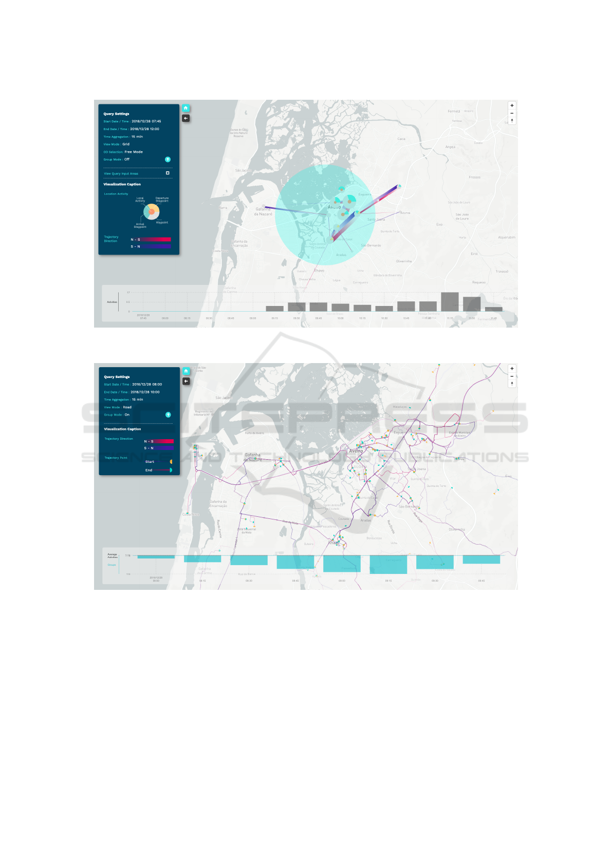
Figure 10: Result of a visual query depicting the trajectories originated within the cyan circular area, located in the centre of
Aveiro district. The query details may be consulted in the side sheet, located at the top-left corner of the screen.
Figure 11: Result of a visual query depicting the trajectories in road mode for the city of Aveiro. The trajectories are
aggregated by grouped activities. The query details can be consulted in the side sheet, located at the top-left corner.
terest may be useful to understand which access roads
may be used to enter the city and thus strategically im-
prove them.
7 USER EVALUATION
In this section, we cover our user evaluation starting
with our methodology followed by the description of
the tasks, and ending with the study of findings.
7.1 Methodology
To evaluate the effectiveness of ANTENNA, we con-
ducted user testing with 20 participants (15 male and
5 female) aged between 21 and 28 years, recruited
from the University of Coimbra, Portugal. The par-
ticipants were students from several fields of data sci-
ence such as Image Processing, Data Visualization,
IVAPP 2022 - 13th International Conference on Information Visualization Theory and Applications
96

Machine Learning but also Biomedical Engineering
and Multimedia Design. The main goal of this test
is to evaluate whether the participants can understand
both aggregation modes and assess correct informa-
tion through their visual elements. The tests are com-
posed of five tasks, which must be completed by in-
teracting with ANTENNA. To understand if the inter-
action techniques influence the use and interpretation
of the visualization, we gathered the participants’ oral
comments during and after the execution of the tasks.
At the beginning of each test, an introduction was
made to contextualise our tool and its main purposes.
Also, a brief explanation of the visual elements for
both aggregation modes was held through screen-
shots. Then, a sheet containing the tasks was given
to the participants. The tasks were performed with
specific queries, defined beforehand. All tests were
performed with the same setup, in which the partici-
pants interacted with the visualization through a 24”
monitor. If a task is composed of two queries, the
queries are presented separately during the test, so the
response to one does not influence the other. All tasks
were executed in the same order. The answers for all
tasks were timed and participants were encouraged to
think out loud, so we could comprehend what they
used to answer each question and to understand their
line of thought.
7.2 Tasks
To evaluate all the visual elements of the visualiza-
tion, we based the test’s tasks on the task abstractions
stipulated in Section 4. The first two tasks focus on
road aggregation. To validate the trajectory represen-
tation, in Task 1, we asked the participants to indi-
cate the most used roads. To validate the timeline
design and functionality, in Task 2, we asked the par-
ticipants to indicate which roads are the most used
in the time interval with more activities. Task 2 was
performed with two queries, one with group aggre-
gation (Task 2-Groups) and the other without (Task
2-No Groups). Task 3 focuses on grid aggregation.
To evaluate its effectiveness for high-level analyses
and validate the edges and nodes representations, we
presented the trajectories between two districts and
asked the participants to indicate main points of ac-
cess for both districts. Task 4 evaluates the usefulness
of the road aggregation over the grid aggregation. For
that purpose, two identical queries were used (Task
4-Grid and Task 4-Road), being their only difference
the type of aggregation. For both queries, we asked
the participants to identify areas with high levels of
movements and compared the results. Task 5 focuses
on the glyph. We used a query that presented various
0 50 100 150 200
Task 1
Execution Time (sec)
Task 2
(No Groups)
Task 2
(Groups)
Task 3
Task 4
(Grid)
Task 4
(Road)
Task.5
Figure 12: Box-plot of the execution times for each task.
types of behaviours. To perceive the glyph’s effective-
ness and whether insights about the urban topology
could be inferred (e.g., residence, commercial, pas-
sage), we asked the participants to identify a specific
glyph fulfilling a set of requirements and to charac-
terise three urban areas with distinct glyph compo-
sitions. The participants answered freely and were
not constrained, allowing us to obtain the most in-
formation possible. To verify the consistency within
the given answers or if a major deviation occurred, a
ground truth answer was defined for each task.
7.3 Findings
The participants provided positive insights about the
aggregation modes and the visual tool itself. In Fig-
ure 12, we can see a positively skewed distribution of
the participants’ execution times since their median is
closer to the bottom of the box, revealing a high con-
centration of results with short execution times. Most
participants revealed no major difficulties in complet-
ing the tasks, however, their learning curve and ex-
ploration times varied to a great extent, originating
outliers (Figure 12). Some participants gave quick an-
swers without exploring the visualization while others
explored it thoroughly before providing their answers.
The learning curve can be analysed by the time taken
in the first three tasks, as their goals were the same
but for different scenarios. Being the first task the par-
ticipants’ first point of contact with the visualization,
it took additional time to interpret it. The execution
times for the following two tasks improved consider-
ably, even presenting more complex scenarios to anal-
yse, corroborating a smooth and fast learning curve.
Task 3 presents higher values of execution times as it
is the most ambiguous question in the test due to the
interpretation of an access point. From Figure 13, we
can see that it is Task 3 that contains the most distinct
number of answers. Concerning the remaining tasks,
the majority of the participants completed them with
no difficulties and in less time, requiring much less
inspection. For all tasks, the majority of the partici-
ANTENNA: A Tool for Visual Analysis of Urban Mobility based on Cell Phone Data
97

15
20
16
18
20
14
19
18
19
4
19
14
1
8
4
10
9
15
14
3
3
0%
25%
50%
75%
100%
Answer Distribution
Task 1 Task 2
(Groups) (Grid) (Road)(No Groups)
Task 2 Task 3 Task 4 Task 4 Task 5
Correct Answers
Figure 13: Answer distribution for each task. Dark grey
bars represent answers within the set of correct answers.
The count value for each answer is inside the bars.
1
20
5
1
2
20
6
12
10
10
18
9
3
6
1
9
4
3
0
5
10
15
20
Task 1 Task 2
(Groups) (Grid) (Road)(No Groups)
Task 2 Task 3 Task 4 Task 4 Task 5
Nº of Answers
Users Distribution per Nº Answers
21 3 4 6
Figure 14: Participants distribution per number of answers
for each task. The number of participants is inside each bar.
pants indicated, at least, one correct answer, with the
exception of task 5, where one participant answered
incorrectly.
In Figure 13 we represent the number of different
answers for each task and we can see that most an-
swers are within the set of correct answers. It is im-
portant to note that the majority of the tasks implied
the ordered listing of the visualization elements (e.g.,
“Identify the most used roads”). For this reason, some
participants continued to point out elements that are
not within the correct answer set even though it is no
longer required. In Figure 14, we can see the partici-
pants distribution per number of given answers. Tasks
1 and 3 have the most distinct number of answers sup-
porting the results retrieved from the distributions for
these tasks (Figure 12). For both queries of Task 4
the majority of participants gave the same number of
answers. Analysing both Figure 13 and Figure 14, we
can see that most participants gave the expected num-
ber of answers, with the exception of Task 1, Task 3,
and Task 4-Grid. Through these results, we can verify
that all participants who provided a fewer number of
answers than the desired one, contained only correct
answers. In general, the participants had no difficulty
in completing the timeline’s tasks.
Most participants found the tool useful for com-
pleting the tasks and its learning curve quite comfort-
able, as they quickly began to interpret the visualiza-
tions correctly. One participant referred that the grid
aggregation was better for a first analysis phase, pro-
viding an overview of the data, and the road aggre-
gation better to conduct a more focused analysis. In
terms of difficulties, all participants stated that the im-
possibility of interacting with the trajectories within
specific periods of time in the timeline complicated
the analysis. Furthermore, they found the timeline
confusing when representing group activities as the
grey bars (depicting the average number of group ele-
ments) were difficult to notice. Concerning the fading
gradient, one participant interpreted their directional-
ity in reverse. The glyphs were the most complex ele-
ments due to the participants’ diverse interpretations.
8 DISCUSSION
In this section, we discuss the usefulness and advan-
tages of both aggregation modes and the effectiveness
of ANTENNA for the scenarios presented. Then, the
results from the user tests are analysed to assess the
users understanding of the application.
Usage Scenarios. Section 6 enabled the under-
standing of real usage scenarios for both aggregation
modes and their combination with other parameters,
such as spatial and temporal aggregation filters. It
is possible to identify different purposes for each ag-
gregation mode. The grid aggregation was found as
more efficient for an overview analysis. Its main ad-
vantages are: (i) the reduction of visual clutter; (ii)
the visual highlight of areas according to the type of
activity (e.g., residential, commercial, passage); and
(iii) the highlight of inter-region flow patterns. Also,
the glyphs provided a quick and general interpretation
of its region behaviours. The road aggregation was
found as more efficient for more detailed and precise
analysis. Its main advantages are: (i) the understand-
ing of road affluence; (ii) the highlight of everyday
movement patterns (i.e., travels to work, recreation);
and (iii) the highlight of intra-region flow patterns.
Also, the representations of the start and end points
of the trips facilitated the reading of directionality.
The timeline enabled a more precise examination
of the trips in time and space. The interactive label
enabled a more thorough analysis and understanding
of affluence patterns.
User Evaluation. Given the success of the user
evaluation and the positive feedback of the partici-
pants, we consider that the visualization presents the
data correctly and that its interaction is intuitive. Both
IVAPP 2022 - 13th International Conference on Information Visualization Theory and Applications
98

aggregation modes were well received and easily in-
terpreted by the participants. The last task revealed
interesting insights about the glyphs due to their var-
ied interpretations. For example, one participant did
not consider the grey area of the glyph as being repre-
sentative of information, as it was too similar to the
map base colour. Also, some participants had dif-
ficulties in characterising the areas according to the
glyphs representation. However, the participants re-
ported that after some adaptation, the glyphs could
characterise different areas, enabling them to distin-
guish residential from work areas.
9 CONCLUSIONS
We have presented a design study of ANTENNA,
a visual analytics tool for urban mobility analysis.
Through the collaboration with a telecommunication
provider, we had access to a dataset concerning cell
phone connections. The main goal of this work is to
summarise and ease the comprehension of the data,
enabling the company’s analysts to understand the
inter- and/or intra-urban mobility. Through our col-
laboration, we were able to define the main tasks and
design requirements for the presented tool. We imple-
mented two aggregation modes to respond to one set
of tasks for higher-level analysis and one for a more
focused and thorough analysis. To demonstrate the
advantages of each aggregation, we provided three us-
age scenarios. We conducted user evaluations with
20 participants to evaluate the effectiveness of our
tool. Finally, a thorough discussion was made over
the results from usage scenarios and user evaluations.
We contributed to the state of the art in urban mo-
bility analysis, by creating a visual analytics tool that
provides two visualization modes suitable for a wide
range of mobility analysis scenarios. As future work,
some visual encodings may be improved, and addi-
tional interaction techniques integrated. For example,
the timeline should provide the ability to lock the vi-
sualization in the selected period of time, enabling the
analysis of the visualization in more detail for the de-
sired time interval.
ACKNOWLEDGEMENTS
The work is supported by the Portuguese Foundation
for Science and Technology (FCT), under the grant
SFRH/8D/144283/2019.
REFERENCES
Andrienko, G., Andrienko, N., and Heurich, M. (2011a).
An event-based conceptual model for context-aware
movement analysis. International Journal of Geo-
graphical Information Science, 25(9):1347–1370.
Andrienko, G., Andrienko, N., Hurter, C., Rinzivillo, S.,
and Wrobel, S. (2011b). From movement tracks
through events to places: Extracting and character-
izing significant places from mobility data. In 2011
IEEE conference on visual analytics science and tech-
nology (VAST), pages 161–170. IEEE.
Andrienko, G., Andrienko, N., and Wrobel, S. (2007). Vi-
sual analytics tools for analysis of movement data.
ACM SIGKDD Explorations Newsletter, 9(2):38–46.
Andrienko, N. and Andrienko, G. (2013). Visual analyt-
ics of movement: An overview of methods, tools and
procedures. Information visualization, 12(1):3–24.
Andrienko, N., Andrienko, G., and Gatalsky, P. (2000).
Supporting visual exploration of object movement. In
Proceedings of the working conference on Advanced
visual interfaces, pages 217–220.
Bach, B., Dragicevic, P., Archambault, D., Hurter, C.,
and Carpendale, S. (2017). A descriptive framework
for temporal data visualizations based on generalized
space-time cubes. In Computer Graphics Forum, vol-
ume 36, pages 36–61. Wiley Online Library.
Bach, B., Perin, C., Ren, Q., and Dragicevic, P. (2018).
Ways of visualizing data on curves.
Bouvier, D. J. and Oates, B. (2008). Evacuation traces mini
challenge award: Innovative trace visualization stain-
ing for information discovery. In 2008 IEEE Sym-
posium on Visual Analytics Science and Technology,
pages 219–220. IEEE.
Calabrese, F., Diao, M., Di Lorenzo, G., Ferreira Jr, J.,
and Ratti, C. (2013). Understanding individual mo-
bility patterns from urban sensing data: A mobile
phone trace example. Transportation research part C:
emerging technologies, 26:301–313.
Chua, A., Marcheggiani, E., Servillo, L., and Moere, A. V.
(2014). Flowsampler: Visual analysis of urban flows
in geolocated social media data. In International Con-
ference on Social Informatics, pages 5–17. Springer.
Chua, A., Servillo, L., Marcheggiani, E., and Moere, A. V.
(2016). Mapping cilento: Using geotagged social me-
dia data to characterize tourist flows in southern italy.
Tourism Management, 57:295–310.
Cornel, D., Konev, A., Sadransky, B., Horv
´
ath, Z., Bram-
billa, A., Viola, I., and Waser, J. (2016). Composite
flow maps. In Computer Graphics Forum, volume 35,
pages 461–470. Wiley Online Library.
Dent, B. (1999). Cartography: Thematic Map Design.
Number v. 1 in Cartography: Thematic Map Design.
WCB/McGraw-Hill.
Enguehard, R. A., Hoeber, O., and Devillers, R. (2013). In-
teractive exploration of movement data: A case study
of geovisual analytics for fishing vessel analysis. In-
formation Visualization, 12(1):65–84.
Guo, D. (2007). Visual analytics of spatial interaction
patterns for pandemic decision support. Interna-
ANTENNA: A Tool for Visual Analysis of Urban Mobility based on Cell Phone Data
99

tional Journal of Geographical Information Science,
21(8):859–877.
Guo, D., Chen, J., MacEachren, A. M., and Liao, K. (2006).
A visualization system for space-time and multivariate
patterns (vis-stamp). IEEE transactions on visualiza-
tion and computer graphics, 12(6):1461–1474.
Holten, D., Isenberg, P., Van Wijk, J. J., and Fekete, J.-D.
(2011). An extended evaluation of the readability of
tapered, animated, and textured directed-edge repre-
sentations in node-link graphs. In 2011 IEEE Pacific
Visualization Symposium, pages 195–202. IEEE.
Holten, D. and Van Wijk, J. J. (2009). A user study on vi-
sualizing directed edges in graphs. In Proceedings of
the SIGCHI conference on human factors in comput-
ing systems, pages 2299–2308. ACM.
Kapler, T. and Wright, W. (2005). Geotime information vi-
sualization. Information visualization, 4(2):136–146.
Kraak, M.-J. (2003). The space-time cube revisited from
a geovisualization perspective. In Proc. 21st Inter-
national Cartographic Conference, pages 1988–1996.
Citeseer.
Krings, G., Calabrese, F., Ratti, C., and Blondel, V. D.
(2009). Urban gravity: a model for inter-city telecom-
munication flows. Journal of Statistical Mechanics:
Theory and Experiment, 2009(07):L07003.
Kr
¨
uger, R., Thom, D., W
¨
orner, M., Bosch, H., and Ertl,
T. (2013). Trajectorylenses–a set-based filtering and
exploration technique for long-term trajectory data. In
Computer Graphics Forum, volume 32, pages 451–
460. Wiley Online Library.
Lin, M. and Hsu, W.-J. (2014). Mining gps data for mobility
patterns: A survey. Pervasive and mobile computing,
12:1–16.
Lu, M., Wang, Z., Liang, J., and Yuan, X. (2015). Od-
wheel: Visual design to explore od patterns of a cen-
tral region. In 2015 IEEE Pacific Visualization Sym-
posium (PacificVis), pages 87–91. IEEE.
Makse, H. A., Havlin, S., and Stanley, H. E. (1995). Mod-
elling urban growth patterns. Nature, 377(6550):608.
Orellana, D., Wachowicz, M., Andrienko, N., and An-
drienko, G. (2009). Uncovering interaction patterns in
mobile outdoor gaming. In 2009 International Con-
ference on Advanced Geographic Information Sys-
tems & Web Services, pages 177–182. IEEE.
Polisciuc, E., Cruz, P., Amaro, H., Mac¸
˜
as, C., Carvalho, T.,
Santos, F., and Machado, P. (2015). Arc and swarm-
based representations of customer’s flows among su-
permarkets. In IVAPP, pages 300–306.
Polisciuc, E., Cruz, P., Amaro, H., Mac¸as, C., and Machado,
P. (2016a). Flow map of products transported among
warehouses and supermarkets. In VISIGRAPP (2:
IVAPP), pages 179–188.
Polisciuc, E., Mac¸
˜
as, C., Assunc¸
˜
ao, F., and Machado, P.
(2016b). Hexagonal gridded maps and information
layers: a novel approach for the exploration and anal-
ysis of retail data. In SIGGRAPH ASIA 2016 Sympo-
sium on Visualization, page 6. ACM.
Quddus, M. A., Ochieng, W. Y., and Noland, R. B. (2007).
Current map-matching algorithms for transport appli-
cations: State-of-the art and future research directions.
Transportation research part c: Emerging technolo-
gies, 15(5):312–328.
Rinzivillo, S., Pedreschi, D., Nanni, M., Giannotti, F., An-
drienko, N., and Andrienko, G. (2008). Visually
driven analysis of movement data by progressive clus-
tering. Information Visualization, 7(3-4):225–239.
Scheepens, R., Willems, N., Van de Wetering, H., An-
drienko, G., Andrienko, N., and Van Wijk, J. J. (2011).
Composite density maps for multivariate trajectories.
IEEE Transactions on Visualization and Computer
Graphics, 17(12):2518–2527.
Spretke, D., Bak, P., Janetzko, H., Kranstauber, B., Mans-
mann, F., and Davidson, S. (2011). Exploration
through enrichment: a visual analytics approach for
animal movement. In Proceedings of the 19th ACM
SIGSPATIAL International Conference on Advances
in Geographic Information Systems, pages 421–424.
Tomaszewski, B. and MacEachren, A. M. (2010). Geo-
historical context support for information foraging
and sensemaking: Conceptual model, implementa-
tion, and assessment. In 2010 IEEE Symposium on
Visual Analytics Science and Technology, pages 139–
146. IEEE.
Tominski, C., Schumann, H., Andrienko, G., and An-
drienko, N. (2012). Stacking-based visualization of
trajectory attribute data. IEEE Transactions on visu-
alization and Computer Graphics, 18(12):2565–2574.
Vajakas, T., Vajakas, J., and Lillemets, R. (2015). Tra-
jectory reconstruction from mobile positioning data
using cell-to-cell travel time information. Interna-
tional Journal of Geographical Information Science,
29(11):1941–1954.
Von Landesberger, T., Brodkorb, F., Roskosch, P., An-
drienko, N., Andrienko, G., and Kerren, A. (2015).
Mobilitygraphs: Visual analysis of mass mobility
dynamics via spatio-temporal graphs and clustering.
IEEE transactions on visualization and computer
graphics, 22(1):11–20.
Ware, C., Arsenault, R., Plumlee, M., and Wiley, D. (2006).
Visualizing the underwater behavior of humpback
whales. IEEE Computer Graphics and Applications,
26(4):14–18.
Widhalm, P., Yang, Y., Ulm, M., Athavale, S., and
Gonz
´
alez, M. C. (2015). Discovering urban ac-
tivity patterns in cell phone data. Transportation,
42(4):597–623.
Wood, J., Dykes, J., and Slingsby, A. (2010). Visualisation
of origins, destinations and flows with od maps. The
Cartographic Journal, 47(2):117–129.
Wood, J., Slingsby, A., and Dykes, J. (2011). Visualizing
the dynamics of london’s bicycle-hire scheme. Carto-
graphica: The International Journal for Geographic
Information and Geovisualization, 46(4):239–251.
Zeng, W., Fu, C.-W., M
¨
uller Arisona, S., Erath, A., and Qu,
H. (2016). Visualizing waypoints-constrained origin-
destination patterns for massive transportation data.
In Computer Graphics Forum, volume 35, pages 95–
107. Wiley Online Library.
Zheng, Y., Zhang, L., Xie, X., and Ma, W.-Y. (2009). Min-
ing interesting locations and travel sequences from
gps trajectories. In Proceedings of the 18th interna-
tional conference on World wide web, pages 791–800.
IVAPP 2022 - 13th International Conference on Information Visualization Theory and Applications
100
