
Probabilistic Envelope based Visualization for Monitoring Drilling Well
Data Logging
Kishansingh Rajput and Guoning Chen
a
University of Houston, Houston, U.S.A.
Keywords:
Drilling Well Logs, Anomaly Detection, Casing Wear, Visual Analysis.
Abstract:
In oil and gas industries, to monitor the drilling well status and take actions when needed to prevent damage,
different logs are recorded and compared with the reference logs of the nearby existing wells. The deviation
of the log of the current well from the majority of the reference logs may indicate potential issues of drilling.
Currently, the standard methods used in the industry are line/scatter plots. Due to limitations such as clutter
and lack of quantitative information, these plots are not effective. In this paper, a probabilistic envelope based
technique is proposed for the visualization and anomaly detection of drilling data. This technique provides
quantitative information, is able to avoid the outliers in the reference data and works well even with a large
number of reference sequences. This technique is applied to the detection of anomalies from drilling well logs
to demonstrate its effectiveness. It is also adapted to the detection of over/under gauge during drilling.
1 INTRODUCTION
In oil and gas industry, well drilling is a process of
cutting through rock (and other) formations. Dur-
ing drilling, many logs (or signals), such as, Rate
of Penetration (ROP), Weight on Bit, Torque, are
recorded and monitored in real-time by engineers dur-
ing drilling to detect potential abnormal behaviors of
the drilling. For example, ROP is the speed at which
a drill bit is proceeding further, normally measured in
feet per minute. ROP depends on the formations, the
drill bit is penetrating through. ROP increases when
it enters the sand formation and decreases in Shale (a
type of rock) formations. Another reason of increase
in ROP could be well kick, a condition in drilling
when the pressure within the drilled rock is more than
the mud pressure acting on the rock face, which forces
the formation fluid to the well-bore (Eren, 2018). In
such situation, well engineers need to stop drilling
and perform bottom-up (i.e., entire mud volume is
pumped to the surface from bottom of a well-bore).
The drilling creates bore-hole. The raw sides of
the bore-hole cannot support themselves. If the drilled
well is to become a production well, engineers put a
casing (tubing) inside the drilled well to protect and
support the well-stream, it is called completion pro-
cess. In the process of casing a well, steel pipes are
a
https://orcid.org/0000-0003-0581-6415
run down the recently drilled bore-hole. This pro-
cess is also called setting pipe. The space between
the raw formation and the casing is filled with cement
to attach the casing and make it stronger. In addi-
tion to providing stability and keeping the sides of the
well from caving in the bore hole, casing protects the
well-stream from outside contaminants, as well as any
other reservoirs from the oil or gas that is being pro-
duced. Casing wear (damage) occurs as a result of the
drill string rubbing against the casing, high pressure,
and temperature conditions. The wear depends upon
the contact forces, the wear track length (distance of
one surface moved across the other), the nature of the
surfaces in contact, the material strength and hard-
ness, and the presence of third bodies or lubricants
between the wearing surfaces. The main generator of
wear track length is drill string rotation. In addition
to this, bore-holes are not always vertical and some-
times they are inclined or even horizontal. In such
wells there is more chance of wear at the bends.
Figure 1 (e) shows a typical example of casing
wear (over/under gauge) in bore-hole. Casing wear is
a critical problem in oil wells. If not treated on time,
it may lead to severe damage and ultimately abandon-
ment of bore hole, causing huge loss. To prevent this
damage, the geometry information of the cross sec-
tion of the well in different depth is measured via the
Caliper log data (Figure 1 (f)).
Rajput, K. and Chen, G.
Probabilistic Envelope based Visualization for Monitor ing Drilling Well Data Logging.
DOI: 10.5220/0010774900003124
In Proceedings of the 17th International Joint Conference on Computer Vision, Imaging and Computer Graphics Theory and Applications (VISIGRAPP 2022) - Volume 3: IVAPP, pages 51-62
ISBN: 978-989-758-555-5; ISSN: 2184-4321
Copyright
c
2022 by SCITEPRESS – Science and Technology Publications, Lda. All rights reserved
51
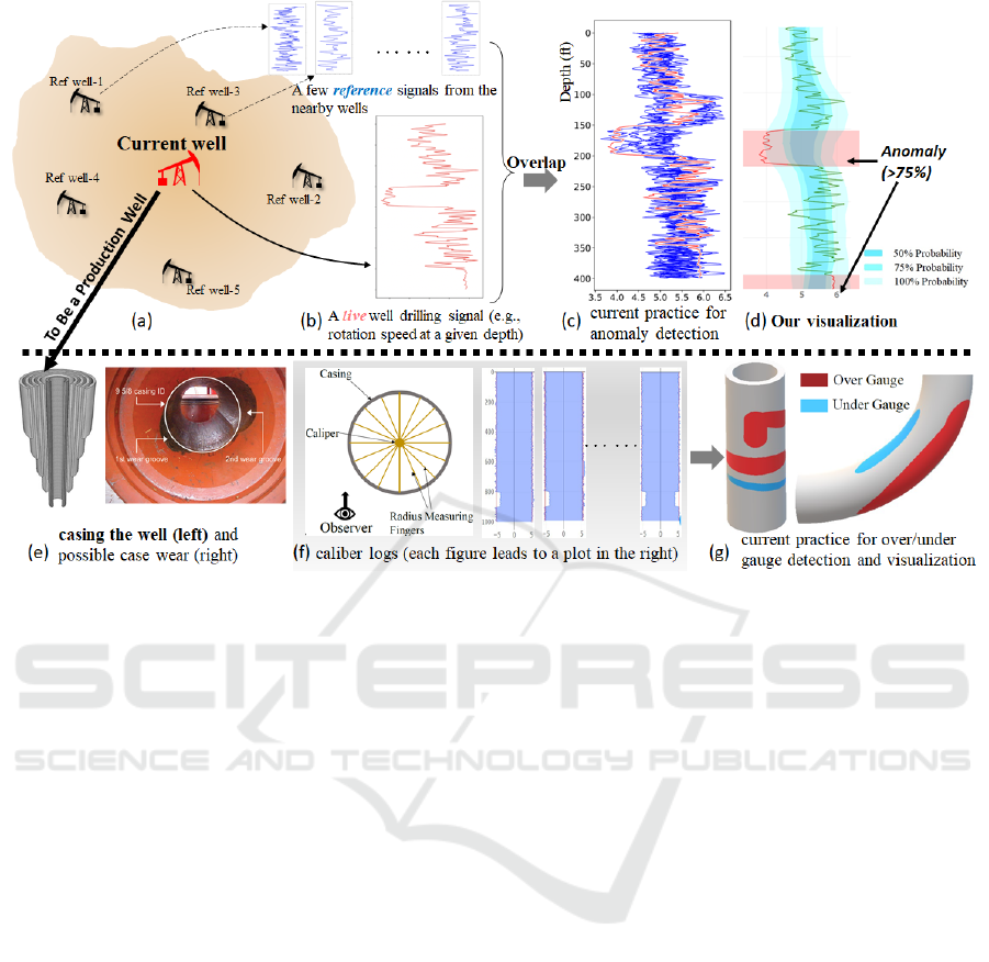
Figure 1: In oil and gas industry (a), well drilling signals (e.g., some 1D signals as shown in (b)) are actively monitored to
identify potential drilling issues. Anomalies in the trend of the live streaming signals when compared with the signals of the
same property of the existing nearby wells (small plots on the top) may be the early sign of some damage. Current practice
(c) overlaps the live signals on top of the reference signals to identify obvious deviation, resulting in clutter. Our probabilistic
envelope representation of the reference signals enables an effective detection of the anomalies with the indication of the
amount of deviation (> 75% of the reference signals) (d). After the drilling is completed and the well becomes a production
well, casing is put to support the bore-hole (e). To detect the potential casing wear, caliber logs are measured and stored
(f). Caliber logs measure the diameter of the casing at a specific depth in a number of pre-defined directions (e.g., 8 in the
illustration). These 1D logs are then used to discover over and under gauge sections along the casing manually. The over and
under gauge sections are usually visualized in the 3D representation of the casing (g). This 3D rendering does not intuitively
show the amount of over and under gauge and their orientation.
Despite measuring different properties, most
drilling and well data are represented as 1D signals.
The Y axis represents the depth of drilling (with 0
in the top) and X axis corresponds to the value of a
specific property (Figure 1 (b)). Because the depth
increases when the drilling time increases, drilling
signals share some similarity with time series data.
Thus, time series data visualization techniques are of-
ten used to show the drilling signals. Among them,
line plots are the most common representation.
To identify the possible anomaly in the live
streaming signal during drilling, current practice of-
ten overlaps it with a few reference signals of the
nearby wells, as shown in Figure 1 (c). This easily
results in cluttering if multiple references are used.
Also, even an anomaly can be spotted, it is hard to
approximate the amount of deviation the live signal is
from the references.
To show casing wear (i.e., over/under gauge), cur-
rent practice uses 3D rendering to visualize the sec-
tions where wear occurs (Figure 1 (g)). This ap-
proach has limitations like obstruction and lack of de-
tails (e.g., amount of wearing and shape of cross sec-
tions at wearing). Although 3D rendering highlights
regions of over/under gauge with colors, user needs to
manually rotate and shift the 3D scene to find out the
interesting sections.
To address the above challenges and improve the
efficiency in processing drilling log data for decision
making, we introduce a probabilistic envelope (PE-)
based visualization technique (Figure 2) adapted from
the curve box plot technique (Mirzargar et al., 2014),
which provides control over different level of details
and focuses on new observations to effectively com-
pare trends of the real time signal with those of multi-
ple reference signals to quickly detect the anomalies.
The envelope like plots are created from the reference
signals with the help of probability theory and the real
time temporal signal is being visualized over the en-
velopes. More importantly, after some modification,
the PE-based visualization technique can be adapted
for the summary visualization of the caliber logs for
IVAPP 2022 - 13th International Conference on Information Visualization Theory and Applications
52

the detection and analysis of casing wear. In sum-
mary, we make the following contribution.
• We introduce a probabilistic envelope (PE-) based
visualization that can provide an adjustable sum-
mary representation of a set of similar drilling log
data (i.e., some 1D data sequences). This PE-
based technique can be applied to both the open-
ended 1D data sequences and sets of closed 1D
data sequences with small modification (e.g., the
circular envelopes).
• Based on the above PE-based summary represen-
tation, we develop two visual analytics systems
for anomaly detection for drilling log monitoring
using nearby reference logs and casing wear visu-
alization and analysis, respectively.
Our PE-based representation is simple to construct
and robust to outliners. It is adjustable by the user
via a couple intuitive parameters. We have applied
the two visual analytics systems developed based on
the PE technique to a number of drilling log data
1
to
demonstrate their effectiveness.
2 RELATED WORK
Time series data visualization is very important in dif-
ferent applications, and it becomes crucial in real time
applications where quick decision making is depen-
dent on the provided data. Our work is closely related
to topics from time series data visualization, trend de-
tection and ensemble time series data visualization.
We provide a brief review of the previous work done
in these topics.
Standard Time Series Data Visualization. Time
primitives, type of data and application specific repre-
sentation need to be considered when visualizing and
interacting with time series data (Aigner et al., 2007;
Aigner et al., 2008). In interactive exploration of tem-
poral data such as time series signals, time mask can
be used to detect one or more disjoint time intervals
in which certain metric is followed by the time series
data (Andrienko et al., 2017). The concept of time
mask and metrics matching is also called rule discov-
ery. Apart from time mask, classification, summariz-
ing and clustering are also widely used techniques in
time series data mining (Fu, 2011).
Temporal trend is important for time series data.
The detection of trends at different granularity level
helps to get an overview of data and its structure (Van
1
To protect the credentials of the data source as required
by the data owner, these data were modified from the origi-
nal data through small perturbation and resampling.
et al., 2017). But when there are multiple overlapping
sub-trends, it is difficult to separate them via simple
visualization techniques. More advanced techniques
such as animation (Robertson et al., 2008) may be em-
ployed to address this challenge. To address visualiz-
ing long time series with screen-size limitations, Sig-
nalLens technique (Kincaid, 2010) is proposed that
utilizes the Focus+Context techniques. Another sim-
ilar lens technique called ChronoLens (Zhao et al.,
2011) presents a more generalized multi-level lensing
technique for visualization and analysis of large time
series data. Timenotes (Walker et al., 2015) intro-
duces an interactive tool for stack zooming and over-
lays for effective visualization of time series data. All
these techniques focus on the effective visualization
of one time series data and/or the comparison of two
time series sequences, which are not sufficient for our
problem that requires to compare one signal with N
( 2) other signals.
Ensemble Time Series Data Visualization. Our
problem of using a set of reference time series data
to help identify the abnormal behaviors in the tar-
get sequence shares some similarity to the ensemble
time series data visualization, in which a concise vi-
sual representation of a large set of data members is
sought to reduce visual clutter. For an ensemble set of
curves, spaghetti plots (Wilks, 2011) are usually used
to provide an overview of the configuration of the en-
semble, which may result in clutter. Generalization
of box plots for ensembles of curves is a recent tech-
nique to visualize and compare different curves us-
ing the concept of data-depth (Mirzargar et al., 2014).
An extension of contour box-plots to 3D is used to
evaluate shape alignments (Raj et al., 2016). A visu-
alization and exploration approach for modeling and
characterizing the relationships and uncertainties in
the context of a multidimensional ensemble dataset is
proposed in (Chen et al., 2015). Hao proposed a new
ensemble visualization approach for network security
analysis (Hao et al., 2015) and a new visualization for
temporal ensembles (Hao et al., 2016). Potter et al.
proposed a framework for statistical visualization of
ensemble data (Potter et al., 2009). A more compre-
hensive review of ensemble visualization techniques
can be found in a recent survey (Wang et al., 2018).
In this work, we seek for a representation that
can convey the probability information of the distri-
bution of the samples on the reference sequences for
anomaly detection with certain quantitative feedback
(e.g., the target sequence is different than 75% of the
reference in a specific time period). To address that,
we introduce a probabilistic envelop technique. In
fact, our technique can be considered a special case
of the curved box plot (Mirzargar et al., 2014) with a
Probabilistic Envelope based Visualization for Monitoring Drilling Well Data Logging
53
(a) (b)
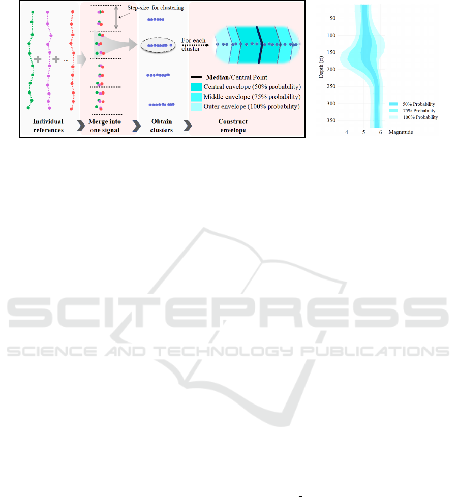
Figure 2: (a) Pipeline to compute the probabilistic envelope boundaries. (b) Illustration of the Probabilistic Envelope based
Visualization technique. Number of layers and probability values assigned to each layer are user controllable.
few major differences. First, our reference signals are
naturally aligned in time axis, enabling a simple and
efficient envelope construction. Second, we construct
our envelope representation enclosing all samples of
the references, while curve box plot need not. Third,
we provide a parameter to the user to control the level
of the detail of the constructed envelope (Figure 4).
3 ENVELOPE-BASED
VISUALIZATION
In this section, we introduce our probability envelope
based (or PE) technique, which constructs a probabil-
ity envelope representation with multiple likelihood
(or probabilistic) layers from a set of reference 1D
signals. The current signal can then be visualized over
the envelope representation to effectively reveal ab-
normal behaviors. The likelihood distribution resem-
bles envelope structure with multiple layers as shown
in Figure 2 (b). The layers (shown with different color
shading) in the envelope structure represents different
likelihood of the reference signals, that is, how likely
a certain percentage of the reference signals falling
within the given layer. In the following, we describe
how to construct the probabilistic envelope with dif-
ferent probability levels.
We estimate the likelihood of a given sample on
a reference falling within a given layer by comput-
ing the proportion of points from the reference signals
falling within the specific layer. The user can decide
these proportions based on the need of their specific
application and tasks.
Input Parameters: List of reference signals, num-
ber of layers (m) along with their probability values.
Step-size for clustering.
Method: Firstly, all the reference signals are merged
into a single signal while preserving their time axis
(Figure 2 (a)). Then, the observations are clustered
using a step-size over time axis. Step-size can either
be provided by the user or a default value can be used.
For each cluster, likelihood of the observations falling
at certain magnitude is computed using the probabil-
ity theory. For each cluster, the algorithm starts from
the central/median point and gradually moves away
in both directions until it encloses the desired number
of points to fulfill the probability constraint. For ex-
ample, if a cluster consists of 20 points and the prob-
ability value for the central envelope, provided by the
user, is 50%, then starting from the central point the
algorithm will keep moving outwards in both direc-
tions until it encloses 10 points (10 is 50% of 20), and
the algorithm will mark the enclosing region as the
central envelope. Similarly, to define other envelope
regions, the algorithm will start from both the bound-
aries of the previous envelope in the opposite direc-
tion and follow the similar procedure. This process
will be repeated until all the envelopes are defined.
Algorithm 1 provides a pseudo-code for the compu-
tation of envelopes. For a likelihood distribution with
m layers, we need 2m boundaries. In the algorithm
we call these boundary arrays as boundary
lower
i
and boundary upper
i
, representing lower and upper
bounds of envelope
i
, respectively.
Like the curve box plot technique (Mirzargar
et al., 2014), we start with the median point (or center
position) to grow the envelope. This is different from
techniques that construct envelope around the average
(or mean) curve (Wang et al., 2018), which may not
have equal number of curves (or samples) on the two
sides of the average curve for the subsequent proba-
bility estimation. Different from the curve box plot,
we provide the user the flexibility to specify different
levels of probability (see Figure 3). More importantly,
IVAPP 2022 - 13th International Conference on Information Visualization Theory and Applications
54
we allow the user to control the level of the details
of the features of the envelope (Figure 4). Finally,
our envelope encloses all reference signals, while the
curve box plot need not, and we apply our envelope
to detect anomalies of the target signal based on the
user-specified probability level (Figure 7).
To visualize the obtained envelopes, darker shades
for the envelopes with high probability values are
used while gradually decreasing the darkness of the
shades for the envelopes with lower probability values
(Figure 2 (b)). In Figure 2 (b), the envelope structures
consist of 3 layers with the probability values of 50%,
75% and 100%, respectively. Intuitively, the most in-
ner (or central) layer of the envelope encloses 50% of
the points/observations from reference signals, mid-
dle envelope layer encloses 75% of the observations
and the outer envelope layer encloses all the observa-
tions in the reference signals.
Algorithm 1: Algorithm to calculate boundaries for en-
velope structure.
1: Initialize P with list of percentage values
P
1
, P
2
, ...P
m
for all the m envelopes and D
0
as step-
size for clustering
2: From all the reference signals group signal points
falling within each D
0
step (based on depth) as a
cluster
3: for each cluster do
4: Put all the points of the cluster to a list L
5: Find Median M of the list L
6: length ← length of L
7: Initialize m temporary empty lists as
t p
1
,t p
2
, ..., t p
m
8: for each P
i
in P do
9: Find number of points N
i
in the envelope i us-
ing N
i
= int(
length×P
i
100
)
10: for j in range 1...N
i
do
11: X ← A point nearest to M in L
12: Add X to t p
i
13: Remove X from L
14: Stop if L is empty
15: Append all the element of t p
i−1
to t p
i
16: for i=1 to len(P) do
17: Add min(t p i) to boundary lower
i
18: Add max(t p i) to boundary upper
i
19: return { boundary lower
1
, boundary upper
1
, ....
boundary
lower
m
, boundary upper
m
}
4 EVALUATION OF PE
REPRESENTATION
In this section, we provide a brief evaluation of the
proposed PE-based visualization technique in terms
of its time complexity, robustness to the outliers in
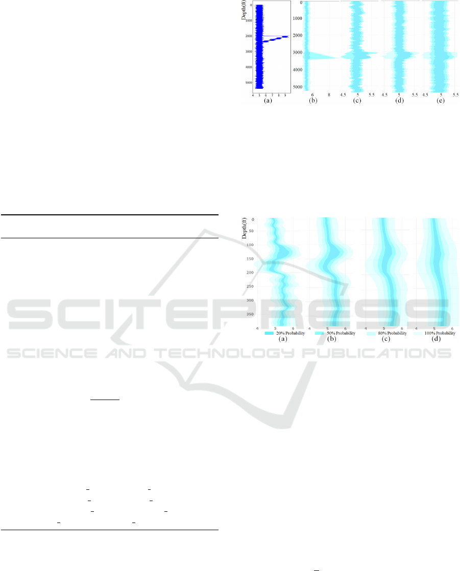
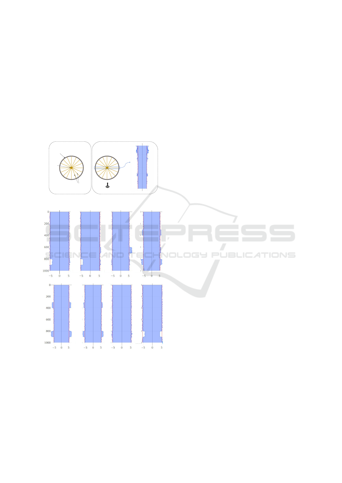
Figure 3: Examples of outlier mitigation. (a) Line plots for
5 references, 2 of which have outliers. Probabilistic En-
velopes: (b) 5 references, 2 with outliers, probability values
used to construct the envelops are 50%,70%, 100%, respec-
tively; (c) References same as (b), two layers with probabil-
ity 40% and 60%; (d) 10 reference signals, 3 with outliers,
probability values for envelop construction are 50%, 60%,
and 70%, respectively; (e) 15 reference signals, 3 with out-
liers, probability values are 50%, 70%, and 90%, respec-
tively.
Figure 4: Effect of step size on envelopes: (a) step-size 5,
(b) step-size 10, (c) step-size 20, (d) step-size 30.
the reference signals, and the effect of the step size
parameter for the control of the level-of-details in the
envelope representation.
Time Complexity. Consider r reference signals each
consisting of n observations (or samples). To compute
the likelihood with m layers, the run-time complexity
of the above described Algorithm 1 is a function of r
and n, i.e., O(A) = O(r × n). Note that the time com-
plexity does not depend on the number of layers or
the probability values assigned to each layer. There-
fore, the time complexity of likelihood computation is
proportional to the number of aggregate data points in
all the references. It is observed that sometimes, time
series data are described in terms of length of time
axis (T ) and length of time step (S) at which obser-
vations are repeated. In this case, the time complexity
is O(A) = O
r ×
T
S
. As the run-time complexity de-
pends on the number of references, the computation
will be slow if the number of references is very large.
As the quality of the envelope structures are enhanced
with increase in number of reference signals, there is
a trade-off between accuracy and speed.
Probabilistic Envelope based Visualization for Monitoring Drilling Well Data Logging
55

Robustness to Outliers. The standard method does
not have significant difference on outlier visualization
with small or large number of references as shown in
Figure 3 (a). In contrast, our PE-technique can miti-
gate the effect of outliers with an appropriate number
of layers and probability values, but this mitigation is
more effective when the number of references is large,
provided the majority of them do not have many out-
liers as shown in Figure 3 (b–e). Reducing the prob-
ability of outermost layer can avoid the outliers, but
with a smaller number of references where the pro-
portion of outliers is large, it needs a large decrease
in probability value which affects the sections with
no outliers. On the other hand, with a large number
of references and less proportion of outliers, it works
well with slight decrease in probability as can be un-
derstood from Figure 3.
Effect of the Step-size for Clustering. The step-size
parameter is used to control the width of the individ-
ual time intervals used to compute the probabilistic
of the observations falling within these intervals. The
smaller the step size the finer (or more detailed) the
temporal trend of the constructed envelopes reveal;
the larger the step size, the smoother the obtained en-
velopes will be. Figure 4 illustrates the effect of dif-
ferent step sizes to the obtained envelope.
5 APPLICATIONS
We apply the envelope based aggregated visualization
technique to two drilling well applications, i.e., the
anomaly detection in drilling logs data based on ref-
erence signals (Section 5.1) and casing wear detection
and visual analysis (Section 5.2).
5.1 Anomaly Detection from Drilling
Well Logs with References
To apply the introduced PE representation for the
anomaly detection in drilling logs, we develop a sim-
ple web-based visualization system based on Dash
and plotly. Figure 5 shows the interface for the PE-
based visualization. We have a control panel with
some parameters along which are set to their default
values based on earlier suggestions from the experts.
Our system allows the user to select a portion of the
signals to have a closer look. The control panel al-
lows the user to specify the step size parameter to con-
trol the detail of the envelop shape and the probability
value for each envelope. The user can also specify
which level of the envelope is used to detect anomaly
(75% is the default threshold). To avoid noise being
Figure 5: Interface of our visualization system. The left
panel shows different control parameters for different visu-
alizations. It currently shows the parameters to set rules to
detect anomaly with the PE technique. The signal shown on
the right plots is the DMSE (downward mechanical specific
energy). 24 references with step-size 10 are used to gener-
ate the envelope. Three probability layers, 50%, 70%, and
100%, are used. The current signal is shown in green. The
red sections indicate places where the signal goes outside
the specified likelihood threshold. Middle envelope with
70% probability is used a threshold for anomaly detection.
detected as anomaly, our approach does not mark the
signal being anomalous until it is out of the threshold
envelope for at least x-feet, where x is Offset Range
for Detection on the control panel. The change in
the envelope structures and step-size have a near real-
time effect on the visualization, hence users have a
flexibility to change the envelope structure and off-
set range on the go. During the drilling process engi-
neers want to focus more on the latest portion of the
incoming signal. To allow the engineers to focus on
the latest portion of the signal, the earlier portion of
the signal will be simplified and faded out.
In some cases, reference signals are not available
or not useful (e.g., the reference wells are too far
away). In such cases, a rigid boundary based anomaly
detection technique can be used. This can be eas-
ily accomplished using simple line plots with bound-
aries that follow certain function enclosing the normal
value range. This function may be according to the
seasonality (if any) or any other factor depending on
the application, generally these boundaries are flat as
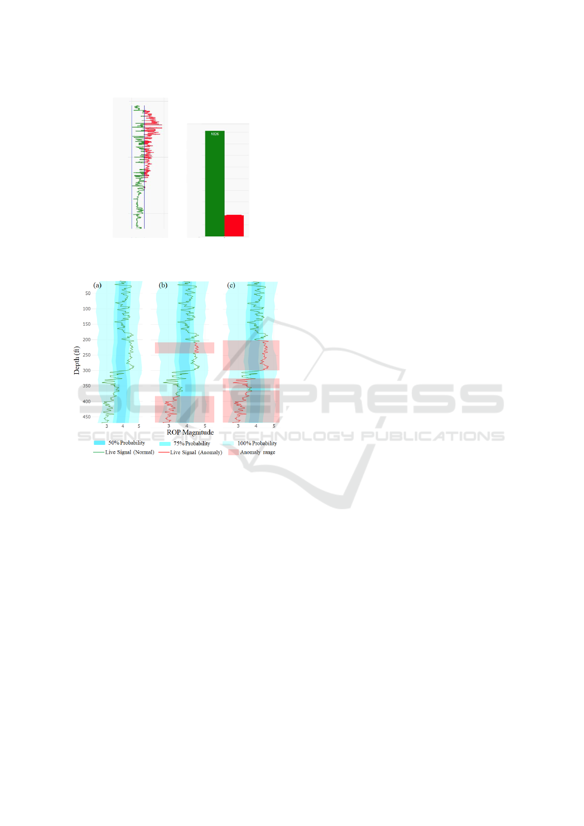
shown in Figure 6 (a) with blue color.
The sections of the signal are marked with red
color which has magnitude outside the boundaries.
To provide the quantitative measure of the consis-
tency of the signal, results shown in Figure 6 (a) are
summarized in Figure 6 (b) in the form of histogram.
Histogram shows the proportion of signal data points
falling inside and outside the boundaries, respectively.
We apply our PE-technique to help detect anoma-
lies from the drilling logs. To do so, the user needs
IVAPP 2022 - 13th International Conference on Information Visualization Theory and Applications
56
(a)
(b)
366
1800
0
200
400
600
800
1000
1200
1400
1600
0
2000
4000
0 5 10
Speed (Rot/sec)
Depth (Feet)
Good
Bad
Number of Observations
Figure 6: Hard boundary based signal monitoring.
Figure 7: PE based visualization (with 15 references and
step-size 6) for drilling signal monitoring. Three probabil-
ity layers, 50%, 75%, and 100%, are used. The current sig-
nal is shown as the green line. The red sections indicate
places where the signal goes outside of the specified likeli-
hood threshold. (a) , (b), and (c) uses the 50%, 75%, and
100% layers as threshold, respectively.
to first mark a layer (based on probability values
given initially for the computation of the envelopes)
as threshold and offset depth. Threshold layer is the
outer most layer enclosing valid magnitude range for
the current signal, and all the observations falling out-
side of this envelope will be considered as anomaly.
Figure 7 shows some representative results of the de-
tected sections with anomalies using different proba-
bility levels on a few synthetic ROP signal logs with
15 references for depth up to 470 feet with ROP ob-
servations taken at each 0.5 feet. The envelopes there
are constructed with step-size 6, offset 20 feet, based
on the 15 reference signals. In Figure 7 (a), the outer-
most layer (with 100% probability) is used, in which
no anomaly is found. For Figure 7 (b) and (c), 75%
and 50% layers are used for anomaly detection, re-
spectively. Specifically, Figure 7 (b) marks ROP as
abnormal in depth interval between 210 feet and 240
feet since the ROP magnitude is higher than its mag-
nitude in at least 75% of the reference logs. Since
the ROP value in this depth range is still very close
to the boundary of 75% layer (i.e., not deviating too
much from the majority), the engineers may consider
its behavior still in the normal range. Our framework
also marks sections between 380 feet and 470 feet be-
cause the ROP magnitude is lower than at least 75%
of the reference logs. The decrease of ROP can indi-
cate the change of the rock formation (e.g., becoming
harder to cut through). In addition, the ROP seems
continuously dropping, even though it remains within
the 100% envelope layer. The engineers will need to
keep a close eye on the behavior of this drill and may
need to stop the drilling if ROP drops out of the out-
ermost layer later.
Figure 5 shows the application of PE-technique
on DMSE logs during drilling. DMSE is amount
of work needed to be done to excavate unit volume
of rock. Drilling through hard rocks require higher
DMSE while sand formations need lower DMSE to
maintain certain ROP. Nearby wells are expected to
have similar surface formations at same depth with
small margin. The envelops shown in Figure 5 are
constructed with 24 reference signals. Both refer-
ences and live signals are for depth 0-7500 feet where
each observation is 0.5 feet apart (total 15000 data
points per signal). Our framework marks live signal
after 7140 feet as abnormal as the observations fall
outside 70% probability range continuously for more
than 20 feet (offset range for detection). The red sec-
tion indicates live DMSE deviates for long duration
from the references. Depending on other logs, this
could indicate a formation transition or a potential
fault in machines (since there are fluctuation in live
signal), well engineers could decide to stop drilling
and perform corrective measures.
Discussion. A popular automatic, machine learn-
ing based technique for time series data is Recurrent
Neural Network (RNN). In some applications one-
dimensional convolutional layers based neural net-
works also perform reasonably well. But these tech-
niques work as a black-box, meaning that the com-
putations behind the inferences (or predictions by the
model) are not intuitive to the end user. In our ap-
plications, the engineers wish to know what leads the
models to classify a time-series as anomalous. On the
other hand, our technique is very intuitive, flexible,
and easy to use. The engineers have complete control
over the parameters, and they have very high confi-
Probabilistic Envelope based Visualization for Monitoring Drilling Well Data Logging
57
dence in what is being done to mark a certain portion
of the signal as anomalous.
5.2 Visual Analysis of Bore-hole Gauge
with Circular Probability Envelop
In this section, we describe how the above PE-based
representation can be adapted to support the visualiza-
tion and detection of casing wear in bore-hole gauge.
First, we briefly describe the current approach to pro-
vide more background about the caliber log data col-
lected for bore-hole gauge monitoring.
Casing
Caliper
Radius Measuring
Fingers
Observer
(a) (b)
4950
5000
5050
5100
5150
5200
5250
0 55
(a)
22.5
𝑜
& 202.5
𝑜
45
𝑜
& 225
𝑜
67.5
𝑜
& 247.5
𝑜
90
𝑜
& 270
𝑜
112.5
𝑜
& 292.5
𝑜
135
𝑜
& 315
𝑜
157.5
𝑜
& 337.5
𝑜
180
𝑜
& 360
𝑜
(b)
Figure 8: (a) Top-down view of casing and demonstration
of Caliper Log data collection (b) Conversion of Caliper log
data to vertical casing view (one plot per diameter). Bottom
row shows the conventional vertical casing views from dif-
ferent directions. Directions are represented in the form of
rotation of the two radii from the reference in degrees.
The current approach to visualize gauge (casing
wear) with caliper log data is to use multiple con-
nected area plots providing vertical casing view from
different angles (directions). This is demonstrated in
Figure 8. Radius measurements in opposite directions
are plotted together as an area plot to create a verti-
cal casing view (Figure 8 (b)). Each plot shows cas-
ing from a particular direction as described in Figure
8. Depth ranges within which over/under gauge ex-
ists can be easily captured with these plots along with
their direction information.
For caliper having many measuring fingers (typi-
cally 20-80 fingers), this approach will generate many
plots. Manually analyzing and establishing correla-
tion between such a large number of plots is labor
intensive. To address that, we devise a visual ana-
lytic strategy based on a circular probabilistic enve-
lope – the extension of the previously introduced PE-
technique described next.
5.2.1 Circular Probabilistic Envelope
The envelope based representation introduced in Sec-
tion 3 can be applied to a set of 1D closed sequences
(e.g., closed curves) that have the same center and
the same number of sample directions (e.g., diame-
ter measures), which leads to the circular probabilis-
tic envelope. Specifically, starting from the center and
along each sample direction, a median point is first
found based on the distributions of the samples from
different sequences in this direction. Then, the inter-
val for 50%, 75%, ..., 100% probability of distribution
can be constructed with the same process as described
in Algorithm 1. Note that different from the original
PE-technique, there is no need to specify a step-size
for the circular envelope computation as the circle is
naturally sub-divided into segments based on the in-
dividual sample directions of the diameter measures.
To apply the circular envelope representation for
the caliper log, we connect the diameter measure-
ments in different directions in order at a given depth
to form a closed curve (illustrated by Figure 9 (a)).
We then construct the circular envelope representa-
tion described above. Figure 9 (b) illustrates a circular
envelope representation, which provides a summary
view and a qualitative evaluation of the well for a spe-
cific depth range. At the center of envelopes an angle
is provided to show the overall orientation of the well
(i.e., the orientation of the summary elliptical shape
of the circular envelope). If all the diameter measure-
ments at different depth are perfect (i.e., identical to
an ideal diameter), there is no orientation information
that can be extracted.
The time complexity of the computation of these
circular envelopes is similar to that discussed in Sec-
tion 4. As explained in Section 4, time-complexity
does not depend on the number of layers or probabil-
IVAPP 2022 - 13th International Conference on Information Visualization Theory and Applications
58
(a) (b)
Well Circumferences
83.68 degrees
All cross sections
All cross sections
75% cross sections
50% cross sections
Figure 9: Summarized visualization using the circular prob-
abilistic envelopes for bore hole cross sections.
Well Circumferences
unwrapped
Circumference measurements
(inches) divided from central axis
Depth (feet)
1000
800
600
400
200
0
0 20
20
10
10
Well
Figure 10: The circumference is computed based on the ra-
dius measurements and is unwound to create a vertical heat-
map. The magnitude of circumference is compared with the
ideal circumference and over gauge segments are marked
with red color. Under gauge are marked with blue color.
ity values assigned to each layer. Nonetheless, there
is a trade-off between speed and accuracy because
the run-time complexity is proportional to the number
of diameter measurements at each observation while
having large number of radius measurements at each
observation also enhances the visualization and accu-
racy of well structure.
5.2.2 Detection of over/under Gauge
To detect over/under gauge, we first compute a new
heat-map based on the circumferences of the individ-
ual cross sections of the well (Figure 10). Specifi-
cally, we unwrapped the well by choosing one par-
ticular direction and compute a vertical discrete heat-
map based on the difference between the circumfer-
ence of each cross section with the circumference of
the specified ideal circle of the well. If the difference
is beyond a threshold, ±ε (also specified by the user),
an over or under gauge event occurs.
(a) (b)
All cross sections
75% cross sections
50% cross sections
Ideal cross sections range
Over gauge
Under gauge
83.68 degrees
Figure 11: Over/Under gauge visualization with the help of
circular envelopes (a) and a summary radial bar chart (b).
The circular envelope indicates the over gauge occurs in
this section of well and it happens in near 90
◦
, which is
supported by the radial bar chart.
Due to measurement error and background noise
during sensing, over/under gauge may occur in a very
short period of time (or in depth) – which is usually
an artifact, as in practice over/under gauge event usu-
ally persists for a longer period in time and depth. To
filter out this artifact, we use a depth range thresh-
old M, similar to the Offset Range described for the
anomaly detection. Specifically, we only consider a
depth range as an over/under gauge portion if it is
larger than M feet. Users have an option to select
the median circumference of the circumferences at all
depths as the ideal circumference instead of specify-
ing one explicitly. Users can also modify the depth
range threshold M. When an over gauge event oc-
curs, the corresponding depth range will be colored
in red in the circumference heat-map. Similar, the
depth range with an under gauge event is colored in
red, while purple indicates both over and under gauge
occur in a depth range (Figure 10).
Note that although in theory an over/under gauge
cross section may have the circumferences identical
to the circumference of the ideal circle, in practice
this rarely occurs. In bare-hole application, if there
is wear it is most likely to have difference in two
semi-circumference because the chances of it form-
ing a symmetric ellipse are low.
Once the heat-map is obtained and the depth
ranges where over/under gauge occurs are detected,
we use the above envelope visualization to plot the
statistics of the circumvents within each of these
depth ranges to represent the amount and orienta-
tion of the over/under gauge in that depth range. To
provide the quantitative evaluation of the over/under
gauge along with directional information, we also
construct a radial bar chart connected to the enve-
lope plot, as shown in Figure 11 (b). The red bars out-
Probabilistic Envelope based Visualization for Monitoring Drilling Well Data Logging
59
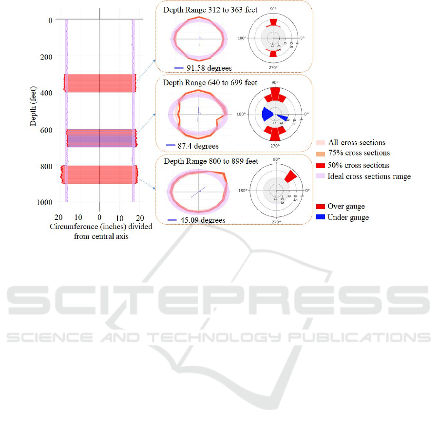
Figure 12: Detection of depth ranges of Over/Under gauges and their detailed evaluation. Detected depth Ranges with
over/under gauge from the heatmap, are all individually plotted with envelope plot for detailed evaluation.
side the casing represents over gauge and the blue bars
inside casing represents under gauge. The lengths of
the bars represent the amount of over/under gauge in
terms of physical length measurement, and the color
shows the amount of observations (i.e., the percent-
age) causing the over/under gauge in that direction.
The more saturated the color, the more observations
with over/under gauge.
5.2.3 Use Cases
We apply the above visualization techniques to help
provide a detailed study of a section of the bore-hole
configuration on caliper log data of a well with depth
of 1000 feet. A caliper with 16 fingers was used,
providing diameter measurements in 8 different direc-
tions, measurements were taken with a fixed interval
of a feet (total 16000 data points), Figure 12 demon-
strates this. In this case, three depth ranges with dif-
ferent over/under gauge configurations are automati-
cally detected with M = 5 f t in the heat-map shown in
the left with ideal radius of 5 ± 0.5 inches. For each
of the detected depth ranges, the corresponding cross
sections of the well are used to construct the circu-
lar envelopes. Here, the envelopes with three differ-
ent probability levels (with probability values 50%,
75%, and 100%) are shown. The summary radial bar
charts are also visualized alongside the circular en-
velopes, facilitating a detailed inspection of the re-
spective over/under gauge configurations.
For the depth range between 312ft to 363ft, over
gauge is detected along the vertical direction (i.e.,
along 91.58
◦
and −91.58
◦
). The configuration of this
over gauge is almost symmetry along the vertical di-
rection as indicated by the radial bar chart. The over-
all deviation of this over gauge is about 1 inch from
the ideal configuration and about 0.5 inch from the
boundary of the ideal margin, indicating small thin-
ning as well as deformation of the casing wall in
the 90
◦
direction. For the depth range from 800ft
to 899ft, another over gauge is detected. Different
from the above over gauge, this over gauge exhibits a
non-symmetry configuration primarily along 45.09
◦
direction. This is clearly indicated in both the circu-
lar envelope representation and the radial bar chart.
The amount of over gauge is about 0.9 inch from the
boundary of the ideal radius margin, suggesting the
wear of the casing wall in the 45
◦
direction. For the
depth range starting 640ft and ending at 699ft, both
over gauge and under gauge are detected within it.
While the over gauge occurs in a much wider angle
range and with a roughly symmetry configuration, the
under gauge occurs in a much narrower angle range
with a non-symmetry configuration. Nonetheless, the
over/under gauge is increasing in this depth, which
may indicate the casing wear is getting worse due to
the rubbing of drillstring against the casing wall be-
comes more severe when drilling down deeper into
the well. The existence of the under gauge also indi-
IVAPP 2022 - 13th International Conference on Information Visualization Theory and Applications
60
(a)
Effect of Number of Radial measurements on Visualization
Entire Bore Hole 0 feet to 1000 feet
(b)
0
2
4
6
2
4
6
83.68
degreesAll cross
sections
75% cross
sections
50% cross sections
Ideal cross sections range
0
2
4
6
2
8
8
4
6
0 2 4
6
2
4
6
0 2 4
6
246
(d)
Bore Hole 800 feet to 899 feet
(c)
All cross sections
75% cross
sections
50% cross sections
Ideal cross sections range
87.5 degrees
0
2
4
6
2
4
6
0
2
4
6
2
8
8
4
6
0 2 4
6
246 0
2
4
6
246
Figure 13: Bore Hole gauge visualization with the help of circular probabilistic envelopes. (a) and (b) show the entire bore
hole, while (c) and (d) show the detected depth range 800 to 899 feet depth where sever wear occurred. (a) and (c) have the
radius measurements in 8 directions whereas (b) and (d) has radius measurements in 16 directions with uniform angle interval,
at each depth level.
cates the casing in this depth is not only worn but may
also be deformed due to higher pressure and tempera-
ture(Lejano et al., 2010), requiring further inspection.
From this example, we show that compared to the
existing practice (Figure 8), our circular envelopes
can help the user intuitively identify the amount of
over/under gauge (based on the distance between the
red circle and the purple/ideal circle) and the orien-
tation of the bore hole gauge. In the meantime, the
radial bar chart provides a concise summary of the
statistics of the over/under gauge configurations.
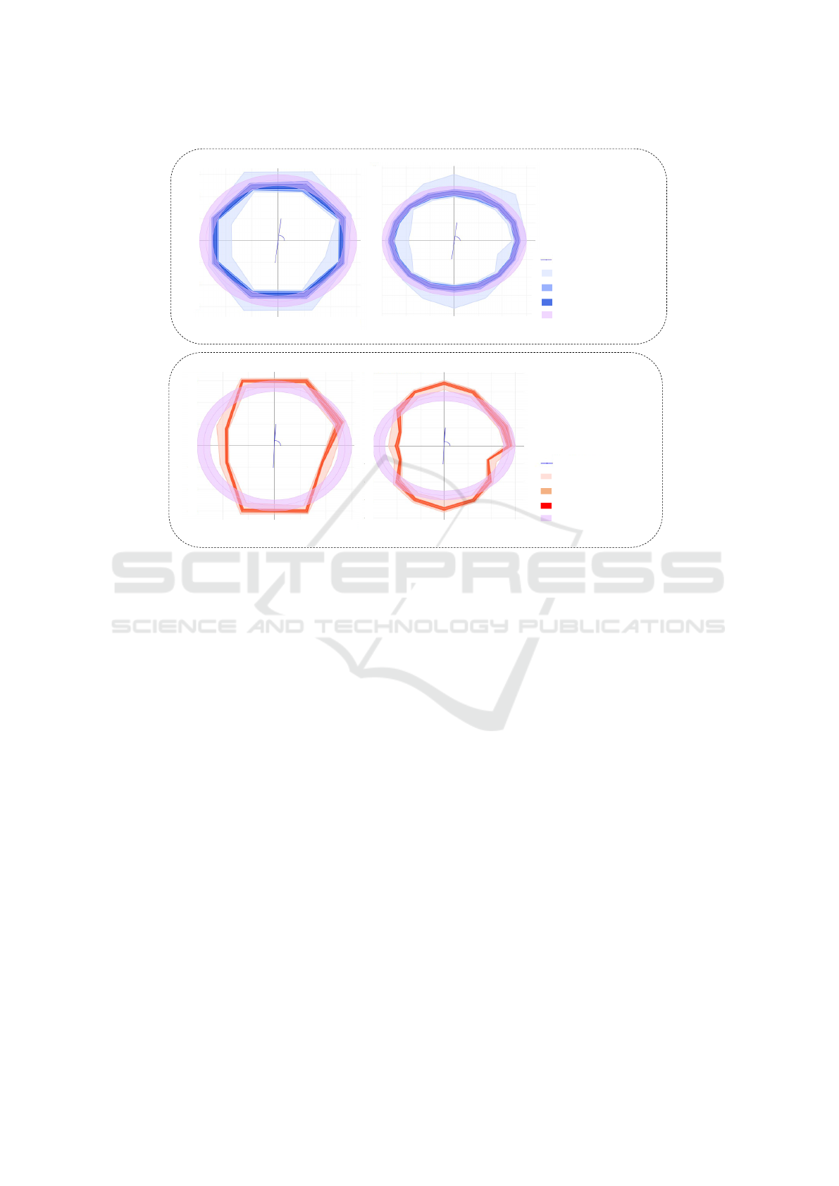
Impact of the Number of Directions (or Fingers) in
the Bore-hole Measures. Figure 13 shows proba-
bilistic envelope plots for the data having radius mea-
surement for 8 and 16 directions at each depth level.
The plots with more radial directions can more accu-
rately represent the actual wear in the casing as shown
in Figure 13 (b)(d) compared to Figure 13 (a)(c).
Nonetheless, with more directions more data need to
be stored and processed. A good trade off needs to be
made to achieve sufficient accuracy in the envelope
representation while having reasonable storage space
and processing time for the data.
Feedback from the Experts. Our visualization sys-
tems have been used by several well engineers in their
daily tasks of monitoring the live drilling of a new
well as well as analyzing a casing wear of a produc-
tion well to decide when to start the repair. Two of
these engineers provide us the feedback on the use of
the systems introduced above. One of them remarks
that “they have very good potential...when properly
used and relevant data are fed to it, can be of great
help to the well engineers and geophysicists”. The
other engineer comments “ in the presence of a caliper
or similar log measuring the internal diameter of a
casing that has been installed in a well, the tool can ef-
fectively reveal casing wear for that casing. ” The tool
can effectively reveal “damage caused to the internal
of casing caused by the drillstring (or other downhole
equipment) rubbing against the casing while drilling
the well”. The summary information conveyed by the
envelope-based representation is “intuitive and thus is
more effective than the custom tools provided by the
service provider (who did the logging work).” The
“utilization of plotly dash makes the tools immensely
interactive...the user does not need to be trained, but
can use the tools easily.” The engineers also sug-
Probabilistic Envelope based Visualization for Monitoring Drilling Well Data Logging
61

gested us “to try to increase the use cases and trials of
the app to better identify any room for improvement.”
6 CONCLUSION
In this work, we have developed a new probability
and envelope (layers) based visualization, called the
probabilistic envelope based (PE-) technique, for the
summary representation and visualization of differ-
ent drilling log data. Our PE-based representation is
easy to construct and support adjustable visualization
to provide quantitative information about the statis-
tics of the data. We have developed two visual anal-
ysis systems based on this representation to support
the anomaly detection from drilling log signals and
the casing wear analysis, both of which are impor-
tant tasks in oil and gas industries. We have applied
our systems to a number of drilling log data sets to
demonstrate their effectiveness.
Even though our results show that the PE-
technique performs much better than the standard
methods in the anomaly detection and provides a con-
cise and effective representation of various casing
wear, it is yet to assess how easily the proposed PE-
technique can be adapted to other more challenging
situations. In addition, the proposed PE-technique is
computed based on the probabilistic information. In
the future, other statistics information can be used to
aid the design of the visualization to address different
needs of specific applications.
REFERENCES
Aigner, W., Miksch, S., M
¨
uller, W., Schumann, H.,
and Tominski, C. (2007). Visualizing time-oriented
data—a systematic view. Computers & Graphics,
31(3):401 – 409.
Aigner, W., Miksch, S., M
¨
uller, W., Schumann, H., and
Tominski, C. (2008). Visual methods for analyzing
time-oriented data. IEEE transactions on visualiza-
tion and computer graphics, 14(1):47–60.
Andrienko, N., Andrienko, G., Camossi, E., Claramunt, C.,
Garcia, J. M. C., Fuchs, G., Hadzagic, M., Jousselme,
A.-L., Ray, C., Scarlatti, D., et al. (2017). Visual ex-
ploration of movement and event data with interactive
time masks. Visual Informatics, 1(1):25–39.
Chen, H., Zhang, S., Chen, W., Mei, H., Zhang, J., Mer-
cer, A., Liang, R., and Qu, H. (2015). Uncertainty-
aware multidimensional ensemble data visualization
and exploration. IEEE Transactions on Visualization
and Computer Graphics, 21(9):1072–1086.
Eren, T. (2018). Kick tolerance calculations for drilling op-
erations. Journal of Petroleum Science and Engineer-
ing, 171:558–569.
Fu, T.-c. (2011). A review on time series data min-
ing. Engineering Applications of Artificial Intelli-
gence, 24(1):164–181.
Hao, L., Healey, C. G., and Bass, S. A. (2016). Effective vi-
sualization of temporal ensembles. IEEE Transactions
on Visualization and Computer Graphics, 22(1):787–
796.
Hao, L., Healey, C. G., and Hutchinson, S. E. (2015). En-
semble visualization for cyber situation awareness of
network security data. In 2015 IEEE Symposium on
Visualization for Cyber Security (VizSec), pages 1–8.
Kincaid, R. (2010). Signallens: Focus+ context applied to
electronic time series. IEEE Transactions on Visual-
ization and Computer Graphics, 16(6):900–907.
Lejano, D., Colina, R., Yglopaz, D., Andrino, R., Malate,
R., and Ana, F. S. (2010). Casing inspection caliper
campaign in the leyte geothermal production field,
philippines. In Thirty-Fifth Workshop on Geothermal
Reservoir Engineering.
Mirzargar, M., Whitaker, R. T., and Kirby, R. M. (2014).
Curve boxplot: Generalization of boxplot for ensem-
bles of curves. IEEE transactions on visualization and
computer graphics, 20(12):2654–2663.
Potter, K., Wilson, A., Bremer, P., Williams, D., Dou-
triaux, C., Pascucci, V., and Johnson, C. R. (2009).
Ensemble-vis: A framework for the statistical visual-
ization of ensemble data. In 2009 IEEE International
Conference on Data Mining Workshops, pages 233–
240.
Raj, M., Mirzargar, M., Preston, J. S., Kirby, R. M., and
Whitaker, R. T. (2016). Evaluating shape alignment
via ensemble visualization. IEEE Computer Graphics
and Applications, 36(3):60–71.
Robertson, G., Fernandez, R., Fisher, D., Lee, B., and
Stasko, J. (2008). Effectiveness of animation in trend
visualization. IEEE transactions on visualization and
computer graphics, 14(6):1325–1332.
Van, G. A., Staals, F., L
¨
offler, M., Dykes, J., and Speck-
mann, B. (2017). Multi-granular trend detection for
time-series analysis. IEEE transactions on visualiza-
tion and computer graphics, 23(1):661–670.
Walker, J., Borgo, R., and Jones, M. W. (2015). Timenotes:
a study on effective chart visualization and interaction
techniques for time-series data. IEEE transactions on
visualization and computer graphics, 22(1):549–558.
Wang, J., Hazarika, S., Li, C., and Shen, H.-W. (2018). Vi-
sualization and visual analysis of ensemble data: A
survey. IEEE transactions on visualization and com-
puter graphics, 25(9):2853–2872.
Wilks, D. S. (2011). Statistical methods in the atmospheric
sciences, volume 100. Academic press.
Zhao, J., Chevalier, F., Pietriga, E., and Balakrishnan,
R. (2011). Exploratory analysis of time-series with
chronolenses. IEEE Transactions on Visualization and
Computer Graphics, 17(12):2422–2431.
IVAPP 2022 - 13th International Conference on Information Visualization Theory and Applications
62
