
A Comparative Study of Visualizations for Multiple Time Series
Max Franke
a
, Moritz Knabben, Julian Lang, Steffen Koch
b
and Tanja Blascheck
c
University of Stuttgart, Germany
Keywords:
Evaluation, Online Study, Time Series Data, Line Charts, Stream Graphs, Aligned Area Charts.
Abstract:
Different visualization techniques are suited for visualizing data of multiple time series. Choosing an appro-
priate visualization technique depends on data characteristics and tasks. Previous work has explored such
combinations of data and visualization techniques in lab-based studies to find the most suited technique for
a task. Using these previous findings, we performed an online study with 51 participants, during which we
compare line charts, stream graphs, and aligned area charts based on completion time and accuracy regarding
three common discrimination tasks. Our online study includes a novel combination of visualization techniques
for time-dependent data and indicates that there are certain differences and trends regarding the suitability of
the visualizations for different tasks. At the same time, we can confirm results presented in previous work.
1 INTRODUCTION
Visualizations can make use of many different tech-
niques for displaying time-dependent data (Aigner
et al., 2011; Brehmer et al., 2017). Analysts must take
space limitations and over-plotting into account when
choosing a technique for visualizing multiple time se-
ries at once. Analysts also need to consider the spe-
cific tasks the visualization should support to select
an appropriate visualization solution. Another trade-
off to bear in mind is that between speed and accuracy
when performing a task: A quick, but approximate re-
trieval of values or trends is more favorable in certain
situations, whereas others require precise retrieval.
We present the results of an online study in which
we compare line charts, stream graphs, and aligned
area charts (multiple area charts with separate verti-
cal axes, but a shared horizontal axis, see Figure 1c)
for the visualization of four and seven time series.
These are common visualization techniques for time-
dependent data; with each having particular strengths
and weaknesses when visualizing multiple time se-
ries: Line charts can suffer from overdrawing, stream
graphs cannot show a zero baseline for each time se-
ries, and aligned area charts’ height decreases with
increasing number of time series. These drawbacks
are more or less severe depending on the task, and
it is important to understand under which circum-
a
https://orcid.org/0000-0002-4244-6276
b
https://orcid.org/0000-0002-8123-8330
c
https://orcid.org/0000-0003-4002-4499
stances each visualization technique is suitable. To
test these circumstances, we consider three discrim-
ination tasks: Identifying the time series with the
largest value at a specific point in time, identifying
which of two points in time has the highest sum of val-
ues over all time series, and identifying the time series
with the highest integrated area between two points in
time. These tasks are partly a reproduction of previ-
ous work (Heer et al., 2009; Javed et al., 2010; Thudt
et al., 2016). We then quantitatively evaluate the re-
sults. We discuss the results in relation to previous
work, which found similar results. We found weak
evidence for stream graphs and aligned area charts
being more suitable for estimating area under a time
series than line charts. We further identified a trend
indicating the superiority of line charts for identify-
ing the highest-valued time series at a specific point in
time. Finally, we found a trend towards the suitability
of stream graphs to compare aggregated values over
all time series across two points in time. Because the
differences between the techniques are small, or not
detectable in many cases, we conclude that analysts
have some flexibility in choosing which visualization
technique to use when addressing similar visual tasks
on time series data. However, they should avoid line
charts when integration of values over time is part of
the analysis, and should consider stream graphs if to-
tals over all time series are of interest.
Franke, M., Knabben, M., Lang, J., Koch, S. and Blascheck, T.
A Comparative Study of Visualizations for Multiple Time Series.
DOI: 10.5220/0010761700003124
In Proceedings of the 17th Inter national Joint Conference on Computer Vision, Imaging and Computer Graphics Theory and Applications (VISIGRAPP 2022) - Volume 3: IVAPP, pages
103-112
ISBN: 978-989-758-555-5; ISSN: 2184-4321
Copyright
c
2022 by SCITEPRESS – Science and Technology Publications, Lda. All rights reserved
103

2 RELATED WORK
Our work is closely related to previous work by Heer
et al. (2009), Javed et al. (2010), and Thudt et al.
(2016). Those publications focus on the comparison
of superimposed and juxtaposed techniques (Gleicher
et al., 2011) for visualizing time series data. A sig-
nificant difference between their work and ours is that
the studies were all performed in person, while we
conducted an online study.
Heer et al. (2009) compared line charts with dif-
ferent variants of horizon graphs. A horizon graph
is a variant of an area chart where the area is layered
into vertical bands, which are then superimposed with
increasing color intensity. The authors explored the
influence of the number of bands in a graph for their
variants on two basic tasks: Discrimination, where
participants were asked which of two graphs had the
larger value at a given point; and estimation, where
participants had to gauge the difference between the
two values at that point. The authors found that the ac-
curacy for the discrimination task was at least 99 %,
and therefore focused their analysis on the estimation
task. Here, error rates were higher for four bands
than for two or three, and answer times increased with
number of bands. In the second experiment, the au-
thors explored readability of different chart heights
and scaling. They found that error rate increased with
decreasing chart height, and that horizon graphs with
one band had lower error rates than line charts of the
same height. Heer et al. concluded that horizon charts
can improve readability for small diagram heights.
Our work differs from theirs insofar as we explore
differences between one superimposed and two jux-
taposed techniques with three tasks; that we look at
more time series at once; and that we do not consider
the horizon graph, but instead the aligned area chart.
Javed et al. (2010) examined both superimposed
and juxtaposed techniques, with the main focus be-
ing whether complex representations have advantages
over simple line charts in certain situations; in par-
ticular restricted vertical space and large number of
time series. Their study compared four visualization
techniques: line charts, braided graphs, small multi-
ples, and horizon graphs. For each, participants had
to solve three tasks: finding the time series with the
largest value at a certain point in time (maximum),
finding the time series with the largest slope within
a certain interval, and deciding which of two time se-
ries A, B has the higher value at two different points in
time t
A
,t
B
(discrimination). The study further consid-
ered three numbers of time series (2, 4, 8) and three
diagram heights (48, 96, and 192 px). The study re-
vealed that the time needed to solve a task did not
change with the available vertical space, but the ac-
curacy of the answer decreased with decreasing ver-
tical space, which Javed et al. describe as “clas-
sic time/accuracy trade-off” (p. 934). Increasing the
number of time series shown resulted in increasing
answer times and decreasing accuracy. For the super-
imposed techniques, increasing the number of time
series increased overlap and disarray, while the jux-
taposed techniques proved more robust. In total, an-
swer times for line charts and small multiples were of-
ten faster than for horizon graphs and braided graphs.
While our work examines one task also examined by
Javed et al., the other tasks we examine differ. We fur-
ther keep diagram sizes constant and examine a visu-
alization with a non-zero baseline, the stream graph.
Thudt et al. (2016) examined the readability of
layered charts. Their focus was on the influence of
static and interactively selectable baselines, symme-
try, and wiggle factor on the extraction and com-
parison of values or aggregations of values, and on
the readability of trends. Their study consisted of
three tasks on four visualization types: stacked area
charts, the ThemeRiver (Havre et al., 2002), stream
graphs (Byron and Wattenberg, 2008), and their own
variant of the ThemeRiver with interactive baseline
correction. These tasks were a direct comparison of
two values from two timelines, where participants had
to decide which value was larger; the identification of
one time series, visualized as an area chart, in a lay-
ered chart; and the comparison of aggregated values
at two points. The authors found that performance
varied greatly, depending on the task at hand, but
that the stream graph performed better for individ-
ual and aggregated comparison than the other static
visualizations. The authors’ own interactive version
of the ThemeRiver performed best when comparing
streams. In contrast to their work, we compare both
superimposed and juxtaposed techniques. However,
we do not include the interactive component, and use
a considerably smaller number of time series at the
same time (4 and 7) than Thudt et al., who used 10,
30, and 300.
SineStream (Bu et al., 2021) enhances stream
graphs by optimizing stream order and the base-
line to reduce sine illusion effects (Day and Stecher,
1991). The authors evaluated the generated vari-
ants by asking participants to gauge stream trend,
individual value retrieval and comparison, and total
value comparison; the latter two tasks being compa-
rable to the tasks we chose. Walker et al. (2016) ro-
pose TimeNotes for the exploration and representa-
tion of high-volume, high-frequency time series data.
Their approach utilizes a hierarchical layout to rep-
resent and compare the time series at different levels
IVAPP 2022 - 13th International Conference on Information Visualization Theory and Applications
104

of granularity. Other works explore the visualization
of one or multiple time series in constrained spaces:
considering color and texture (Jabbari et al., 2018),
compacted horizon graphs (Dahnert et al., 2019), and
density-estimating CloudLines (Krstajic et al., 2011).
3 METHOD
The goal of this work is to compare the readability
of three visualization techniques for temporal data.
These are the line chart (Figure 1a); the stream
graph (Byron and Wattenberg, 2008) (Figure 1b); and
the aligned area chart, a juxtaposed visualization tech-
nique (Figure 1c). We design three discrimination
tasks and perform an online study, during which we
measure completion time and accuracy of the partici-
pants’ answers.
3.1 Tasks
We design the online study in a way that allows us to
investigate the relative readability of the three differ-
ent visualization techniques. The concept of readabil-
ity has been introduced by others already: Javed et al.
(2010) and Thudt et al. (2016) use similar tasks to the
ones we present to explore the readability and efficacy
of different visualization techniques.
Our first task, M AXIMU M , asks participants to decide
which time series has the highest value at a specified
point along the timeline. The second task, SUM, asks
participants to decide for two points in time at which
of these the sum of all time series values is larger.
The third task, AR EA, asks participants to decide which
time series has the largest area between two points in
time. Figure 1 shows example stimuli for all three
visualization techniques for the three tasks. The stim-
uli for the MAXIM UM task contain one marked point in
time, whereas the more complex SUM and AREA tasks
mark two points. We introduce the tasks in ascending
order of complexity here, but randomized their order
for each participant to rule out effects of fatigue.
The MAXIMUM task could be classified as an ele-
mentary task in the definition by Andrienko and An-
drienko (2006). The SUM and AREA tasks show in-
creasing complexity, as more context and a more
holistic view on the data is required to solve them,
and could therefore be classified as a synoptic tasks.
The task typology by Brehmer and Munzner (2013)
deconstructs tasks into why, how, and what; thereby
allowing to classify and compare complex tasks and
break them down into smaller sub-tasks. Our tasks
would fit into the query category of their typology
(“identify, compare, summarize”), and would be use-
ful components of many larger, more abstract data
analysis tasks. Such analyses could concern, for ex-
ample, results of topic modeling or clustering, where
the frequency of different topics over time is of in-
terest for analysis questions such as: “What topics
were most discussed at time X?” (M AXIMU M), “When
were discussions most diverse?” (SUM), or “What top-
ics were most dominant during an interval?” (AREA).
Often, combinations and frequent repetition of these
tasks and questions are required to gain insight on
a higher level, which precludes computational solu-
tions. The choice of visualization to best support ex-
ploratory analysis therefore depends on the relevant
low-level tasks for the data.
3.2 Study Design
We conducted the study in English on the Prolific
platform (Prolific, 2021) with 51 participants, mainly
from English-speaking countries (Prolific, 2014). The
study was designed as within-subjects, such that each
participant solved all three tasks in random order for
all three types of visualization techniques. The par-
ticipants would perform the task and indicate their
answer by selecting a time series using radio buttons
(see Figure 2). As soon as one of these radio buttons
was selected, the answer was transmitted and the re-
sponse time was measured. The time for moving the
mouse cursor was taken into account.
3.2.1 Apparatus
The uniformity of the devices used could not be en-
sured due to the online nature of the study. Partic-
ipants were asked to conduct the study on a device
with a mouse; and to refrain from using mobile de-
vices, such as smartphones or tablets. Because we
did an online study and participants used their own
devices, we could not control the size of the stimuli
directly. Thus, participants had to first complete a
short scaling task. This was done by asking partici-
pants to take a credit card (86 mm × 54 mm) and drag
a displayed rectangle to the size of the card with the
mouse. Then, the experimental setup scaled the visu-
alization techniques such that they had the same size
of 17 cm × 10.5 cm, or 20 cm diagonally, on different
screens. Participants were also required to maintain a
distance from the monitor and were prohibited from
zooming in. Zooming events were recorded and the
corresponding measurement data was discarded.
3.2.2 Data
We created random time series using a modified ran-
dom walk algorithm (see Algorithm 1). To make the
A Comparative Study of Visualizations for Multiple Time Series
105

A
(a) Line chart.
A B
(b) Stream graph.
A
(c) Aligned area chart.
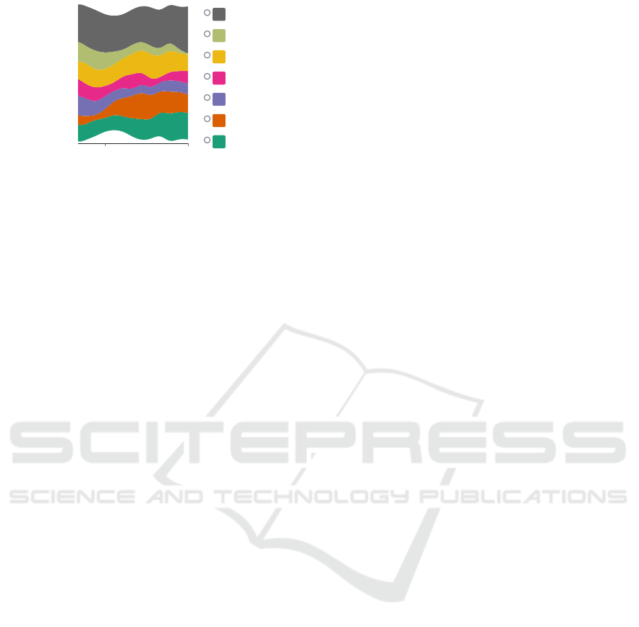
Figure 1: Examples for randomly generated stimuli with the three visualization techniques: (a) Line chart, (b) stream graph,
and (c) aligned area chart. The point at which values should be compared is indicated on the time axis for the MAX IMUM task
(see (a) and (c)). For the SUM and AREA tasks, two points (see (b)) are indicated for comparison.
series more realistic, we ensure non-negative values
and add a random offset to all values. All figures
containing stimuli in this work show examples of this
random walk. For our study, each time series con-
sists of 30 time steps, which is similar to previous
works (Thudt et al., 2016). We generated 60 samples
containing four time series and 60 samples containing
seven time series. We settled on a maximum of seven
time series as that seemed a good upper bound for
the number of topics to analyze at one time (Miller,
1956). We also found it challenging to find an ap-
propriate colorblind-friendly scheme with more col-
ors (see Section 3.2.3). For the ARE A and SUM tasks,
the two points in time were placed randomly, but at
least 5 time steps apart. Samples were chosen com-
pletely at random out of the random walk-generated
time series. There was no guaranteed minimum dif-
ference between the correct answer for a stimulus and
the other shown time series. In cases where two an-
swers would have been correct, both were accepted.
However, the statistical probability of such situations
occurring during the study were negligible.
Algorithm 1: Time series generation using random walk.
The series’ lowest point is between 0 and 5.
function TIMESERIESRANDOMWALK(n)
s
:
= {−5, −4, . . . , 0, . . . , 4, 5} Step set
r
:
= [1, . . . , n] Time series
l
:
= DRAWUNIFORMRANDOM(s) Walker
for i ∈ {1, . . . , n} do
l
:
= l + DRAWUNIFORMRANDOM(s)
r[i]
:
= l
minimum
:
= min(s) Lowest point
offset := DRAWUNIFORMRANDOM({0, . . . , 5})
for i ∈ {1, . . . , n} do
r[i]
:
= r[i] − minimum + offset
return r
3.2.3 Conditions
We designed the within-subject study with the follow-
ing factors: Visualization technique (V): line chart,
stream graph, aligned area chart; tasks (T): MAX IMUM,
ARE A, S U M; and number of time series (N): four or
seven. This created a design with
|
V × T × N
|
= 18
different conditions for all participants. Each condi-
tion was repeated five times to obtain a more precise
and robust result. This resulted in 90 trials per par-
ticipant during the main runs. Including the test runs,
in which each condition was repeated once, the total
number of trials is at least 108, depending on whether
participants decided to repeat test runs. The order of
the tasks was randomized using simple randomiza-
tion, as was the order of visualization types within a
task and the number of time series.
Choosing a color palette was a challenge in
this study. We started with Dark2 from Color-
Brewer2 (Harrower and Brewer, 2013). Javed et al.
(2010) also used this color palette in their study be-
cause of a guarantee of graphical perception of each
time series. During the pre-studies, we realized that
this palette is problematic because of two green-heavy
colors. We adapted our color palette to accommodate
this effect (Figure 2).
3.2.4 Procedure
We asked participants to read the displayed informa-
tion and instructions carefully. To create a consistent
initial state, we asked them not to use external aides
such as pens or their hands, to sit in an upright posi-
tion, and to not move their head closer to the screen.
After reading the instructions, participants filled
out a questionnaire regarding their demographic back-
ground and performed a calibration task for their
screen scaling (see Section 3.2.1). To test for partici-
pants with color blindness, they then had to enter the
number shown on an Ishihara test stimulus.
IVAPP 2022 - 13th International Conference on Information Visualization Theory and Applications
106
A
Figure 2: Example of a stimulus with radio buttons.
Participants then saw the first of three tasks, with
the order of tasks being random for each participant.
For each task, an exemplary scenario was described to
help them understand the task and its motivation. Par-
ticipants were asked to do one test run for each task to
reduce training effects. During the test run, each vi-
sualization type was shown once for each number of
time series, resulting in six stimuli. The first stimulus
was shown after the participant pressed the start but-
ton, and the stimulus was faded out when the partic-
ipant chose their answer using the radio buttons. Af-
ter a two second pause, the next stimulus was shown.
During the test run, participants received feedback on
whether their answers were correct. After the test run,
participants could decide whether they wanted to pro-
ceed with the study or repeat the test run.
The main study was performed analogous to the
test run, but with a larger number of stimuli, and with-
out feedback on the correctness of the answers. Par-
ticipants were shown a progress bar indicating the to-
tal progress through the study. After each task, the
description and exemplary scenario for the next task
was shown. At that point, participants were encour-
aged to take a small break, should they require it. No
breaks were intended during the tasks.
After completing all three tasks, participants were
asked which visualization technique they liked the
most and which the least, with the possibility of in-
dicating no preference. After participants submit-
ted their answers, we thanked them and provided
them the Prolific completion code. They were paid
5.25 GBP each via the Prolific platform.
3.2.5 Pre-studies
To both identify ambiguities and potential problems
and to test the feasibility of the study, we conducted
two pre-studies. Issues found in a pre-study were re-
solved before conducting the next one. In both pre-
studies, a small number of participants completed the
three different tasks of the study, including a short
survey afterwards. Because the purpose of the pre-
studies was to identify problems at an early stage, the
results of the response times and correctness were of
secondary importance. The procedure of both pre-
studies was almost identical to the procedure men-
tioned in Section 3.2.4, but with fewer repetitions. We
estimated an average study duration of 32 min from
the pre-studies, which we used to determine compen-
sation for participants.
The majority of participants in the first pre-study
mentioned the predominant green tone of the colors in
the time series, as well as confusion between an ocher
and orange color. This caused participants to lose
time in selecting the radio button, which skewed the
results. We subsequently updated the color palette.
In the second pre-study, participants again re-
marked on problems with the color palette, which we
subsequently adapted to the final version shown in
Figure 2. Although the newly inserted colors were
colorblind-friendly colors, a distorted perception of
the colors due to color vision impairment could not
be ruled out. Besides the difficulties with the colors,
some participants complained about thin line widths
in the aligned area charts and the line charts, which
we increased as a consequence.
One of the participants stated that they had prob-
lems with the stream graph visualization technique.
Because the time series are arranged around a cen-
tral axis, an empty or white area appears between the
lowest time series and the horizontal axis. The partic-
ipant interpreted this area as a time series during the
exercise, which caused confusion on the part of the
participant. Because this is part of the visualization
technique and was not criticized by anyone else, we
did not apply any changes here.
A small number of participants stated that they
looked at the progress bar more often towards the end.
One of the participants felt that the number of stimuli
was too high. We discussed and rejected the option of
reducing the number of repetitions of each condition,
as a lower number of repetitions could lead to a less
robust result. By randomizing the order of tasks, we
counteracted effects of fatigue in the main study.
4 RESULTS
We had 51 participants in our study; 40 were between
18 and 30, 7 were between 31 and 40, and 4 were be-
tween 41 and 50 years old. Twenty-six (26) held the
equivalent of a high school diploma, 16 had a Bach-
elor’s degree, 7 a Master’s degree, and 2 had a lower
education level. Five (5) of the 51 participants de-
clared that they use reading aids. We did not inquire
about the participants’ gender because we deemed
it irrelevant for the study, and wanted to reduce the
A Comparative Study of Visualizations for Multiple Time Series
107
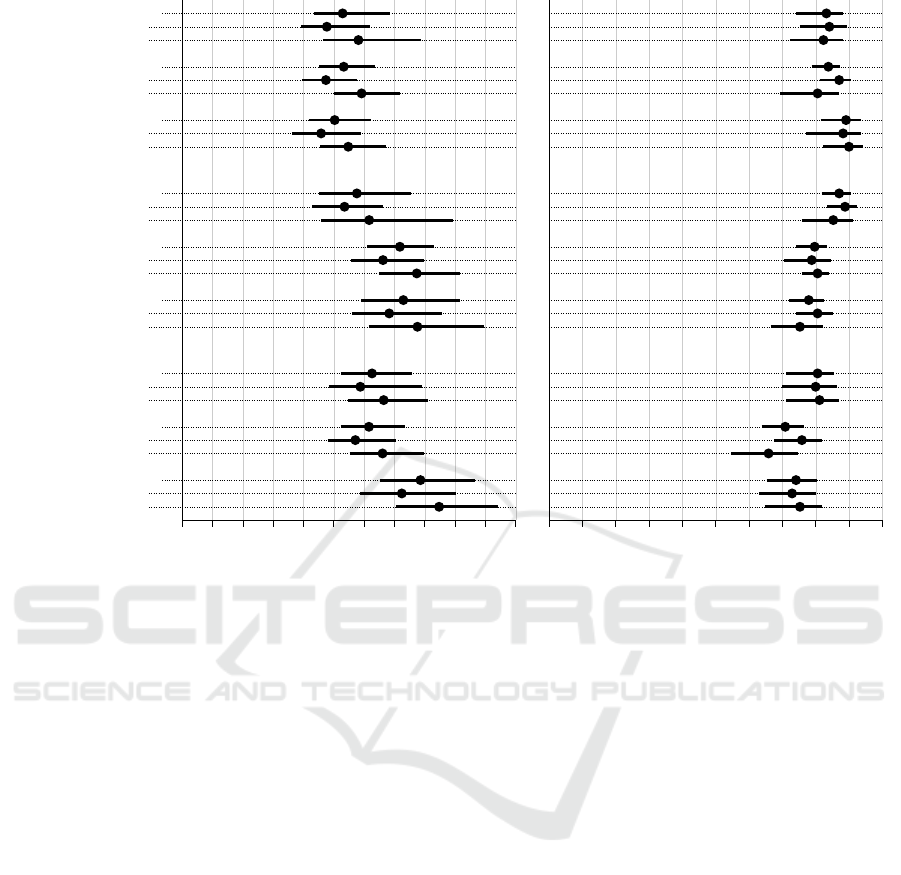
Completion time in s
0 2 4 6 8 10 11
SG
ALL
4
7
AAC
ALL
4
7
LC
ALL
4
7
MAXIMUM
SG
ALL
4
7
AAC
ALL
4
7
LC
ALL
4
7
SUM
SG
ALL
4
7
AAC
ALL
4
7
LC
ALL
4
7
AREA
Accuracy in %
0 20 40 60 80 100
Figure 3: Completion time (left) and accuracy (right) analysis of the study data obtained from 34 participants. We visualize
mean values and confidence intervals (CIs) for all three visualization techniques for all three tasks. We show the comparisons
for all data, the data for four time series, and for seven time series. The error bars represent the 95 % bootstrapped CIs.
Completion times are given in seconds, accuracy in percentage values.
amount of personal data collected.
A disproportionate number (14 out of 51, about
27.5 %) of the participants did not pass the Ishihara
color blindness test done before the start of the study.
Even assuming an all-male participant pool, this num-
ber is over 1.5 times higher than what we expected
from the base rate for this type of color blindness.
Combined with higher error rates and larger spread
in task completion time in that group, we suspect that
some participants either did not understand the task,
or did not invest the required effort to solve it. We
cannot separate such candidates out post-hoc because
of the online nature of the study, so we decided to
omit the data from participants failing the Ishihara test
from the analysis. Three more participants were ex-
cluded because they solved the initial scaling task in
under one second. These participants might also not
have solved the tasks thoroughly, and the stimuli were
not displayed in the appropriate scaling on their mon-
itors. This left us with the data of 34 participants.
The results of the study are task completion time
and accuracy. With those, we carried out a time and
error analysis with the sample mean per participant
and condition. We calculate these sample means us-
ing interval estimation with 95 % confidence inter-
vals, which we adjust for multiple comparisons us-
ing Bonferroni corrections (Higgins, 2004). By using
BCa bootstrapping with 10,000 iterations to construct
the confidence intervals, we can be 95 % certain that
the population mean is within that interval. In addi-
tion to the confidence intervals on the measured data,
we also calculate the pairwise differences between the
three visualization techniques’ results using estima-
tion techniques. We interpret the strength of the ev-
idence as recommended in the literature (Cumming,
2013; Dragicevic, 2016; Besanc¸on and Dragicevic,
2017, 2019; Cockburn et al., 2020): Confidence in-
tervals of mean differences show evidence if they do
not overlap with 0, and the strength of the evidence in-
creases for tighter intervals and intervals farther away
from 0. Equivalent p-values can be calculated using
the method by Krzywinski and Altman (2013).
We have published the study data and analysis
scripts in a data repository (Franke et al., 2021). We
show the calculated results in Figure 3, and the calcu-
lated confidence intervals of mean differences in Fig-
ure 4. Results are grouped by task, then by visual-
ization technique. We further calculate the results on
IVAPP 2022 - 13th International Conference on Information Visualization Theory and Applications
108
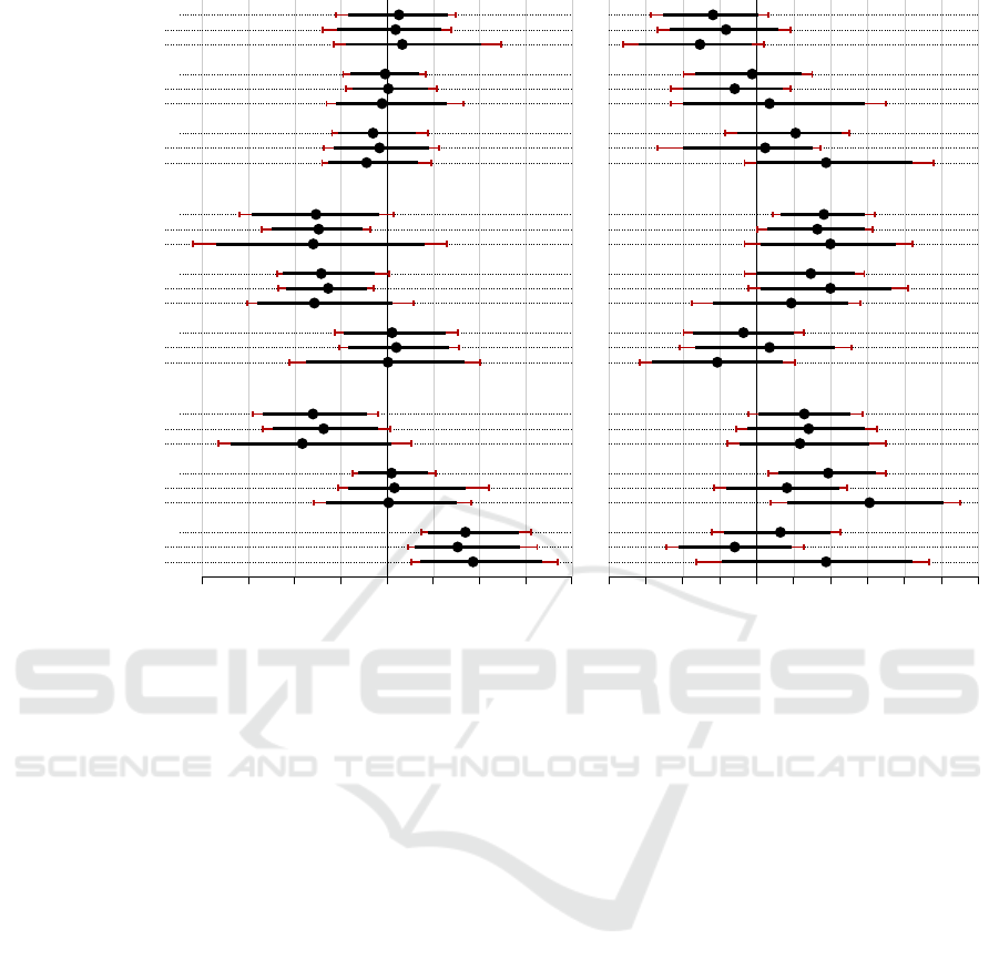
Completion time difference in s
-4 -3 -2 -1 +0 +1 +2 +3 +4
SG - LC
ALL
4
7
SG - AAC
ALL
4
7
LC - AAC
ALL
4
7
MAXIMUM
SG - LC
ALL
4
7
SG - AAC
ALL
4
7
LC - AAC
ALL
4
7
SUM
SG - LC
ALL
4
7
SG - AAC
ALL
4
7
LC - AAC
ALL
4
7
AREA
Accuracy difference in p.p.
-20 -10 +0 +10 +20 +30
Figure 4: Completion time (left) and accuracy (right) analysis of the study data obtained from 34 participants. We visualize
pairwise comparisons between the three visualization techniques for all three tasks. We show the comparisons for all data,
the data for four time series, and for seven time series. The error bars represent the 95 % bootstrapped CIs, adjusted using
Bonferroni correction (red). Time differences are given in seconds, accuracy differences in percentage points (p.p.s).
two levels: once for all data of a condition, regardless
of the number of time series shown, and once for the
stimuli with four and seven time series, respectively.
4.1 MAXIMUM Task
For the MAXIM UM task, participants took an average of
5.22 s, with the line chart being slightly faster with
5.03 s. On the second level, the average times for line
charts and aligned area charts were slightly higher
for seven time series than for four. Regarding ac-
curacy, there were no larger differences, but the line
chart was the most precise with 89.12 %, followed by
the stacked area chart (83.82 %) and the stream graph
(83.24 %). The average accuracy dropped by 2 p.p.s
for seven time series for the stream graph, improved
by 2 p.p.s for the line chart, and dropped by over 6
p.p.s for the aligned area chart.
We found no evidence for better completion times
of any visualization technique, but there is a slight
trend for the line chart being faster (Figure 4 left). The
trend towards the superiority of the line chart for ac-
curacy is stronger, but we find no concrete evidence.
4.2 SUM Task
For the SUM task, participants took an average of
6.75 s; the stream graph took on average 5.76 s, while
the other two took about 7.1 s. On the second level,
times increased by about 1 s from four to seven time
series for all visualizations. Accuracy values ranged
between 77.94 % for the line chart and 87.06 % for the
stream graph. Going from four to seven time series,
accuracy dropped by 3.5 p.p.s for the stream graph,
increased by 1.8 p.p.s for the aligned area chart, and
dropped by 5.3 p.p.s for the line chart.
We found no evidence that any visualization tech-
nique is faster, although Figure 4 reveals a trend to-
wards the stream graph being faster. We found weak
evidence that the stream graph is more accurate than
the line chart for this task, and found a trend that indi-
cates that the stream graph is also more accurate than
the aligned area chart.
4.3 AREA Task
For the AREA task, participants took on average 6.76 s;
however, the line chart took on average 7.86 s, while
A Comparative Study of Visualizations for Multiple Time Series
109

the other two took around 6.2 s. Going from four to
seven time series, times increased by about 0.5 s for
the stream graph and aligned area chart. Times for the
line chart increased most, from 7.25 s to 8.48 s. Ac-
curacy values ranged between 70.88 % for the aligned
area chart and 80.59 % for the stream graph. Going
from four to seven time series, accuracy improved
slightly for the stream graph and the line chart, but
dropped by 10 p.p.s for the aligned area chart.
We found weak evidence that both the stream
graph and the aligned area chart were faster than the
line chart for this task, as shown in Figure 4. We
found weak evidence that the stream graph is more
accurate than the aligned area chart. We further iden-
tified a trend for the stream graph to be more accurate
than the line chart, but no concrete evidence.
4.4 Other Results
For all tasks and visualization techniques, we found
that completion times increased consistently going
from four to seven time series (see Figure 3). On
average, completion times increased by 0.99 s, or
17.15 %. Accuracy dropped noticeably for some
combinations of task and visualization technique, but
not as consistently.
For the participants who failed the Ishihara test
and were therefore not included in the study, accuracy
values were considerably lower; as low as 56.43 % for
the AREA task with the aligned area chart, and never
over 77.14 % (SUM task, stream graph). Average com-
pletion times did not change much, but were more
varied, and their CIs were considerably wider.
Of the 34 participants considered in the evalua-
tion, 18 found the line chart to be their favorite visu-
alization, followed by 13 for the stream graph, 2 for
the aligned area chart, and 1 with no preference. Eigh-
teen (18) participants answered that the aligned area
chart was their least favorite visualization, followed
by the stream graph with 8, the line chart with 7, and
1 participant with no preference.
5 DISCUSSION
In the statistical evaluation of our study data, we did
not find strong evidence for the superiority of any of
the three visualization techniques for the tasks we ex-
amined. However, we obtained some weak evidence,
most prominently in the ARE A task. Here, it is clear
that the completion times are slower for the line chart
than for the other two visualization techniques. One
explanation for this could be that the visual overlap of
lines makes it harder to gauge area, even with a clear
baseline. The stream graph, which does not have the
advantage of a zero baseline, still exhibited weak ev-
idence of being more accurate than the aligned area
chart, and a trend towards being more accurate than
the line chart. In contrast, the aligned area chart,
while being faster than the line chart, showed no ev-
idence for being more accurate. In fact, accuracy is
ever so slightly better for the line chart with seven
time series. The straightforward explanation here is
that the reduced height of the juxtaposed charts makes
exact retrieval of values harder. This effect was also
noted by Javed et al. (2010, p. 934) as the “classic
time/accuracy trade-off.”
We also found a trend indicating the superiority
of the stream graph for the SUM task, both regarding
speed and accuracy. Compared to the line chart, we
even found weak evidence that the stream graph is
more accurate. We ascribe this to the fact that, for
the stream graph, the sum of all values at one point in
time can be found by estimating the thickness of the
graph at that point. This should be faster and more ac-
curate than estimating multiple values and then sum-
ming them up. This result should be kept in mind, es-
pecially when designing visualizations where the re-
lationship of one time series to the whole is of interest.
Finally, we found a trend that for identifying the
time series with the MA XIMUM value at one point, line
charts are most accurate. We found no evidence for
them being faster. Our explanation is that, for line
charts, this task can be solved by comparing positions
at one point, whereas for the aligned area chart, length
needs to be compared across different places. The
stream graph has the additional hurdle of potentially
introducing sine illusions (Day and Stecher, 1991),
which might hinder precise retrieval.
Our study considered visualizations showing four
or seven time series. Real-world data sets often in-
clude larger numbers of time series, but we would
argue that for the tasks we studied, these numbers
were appropriate. Especially for the aligned area
chart, scalability was already becoming a problem.
Arguably, the line chart cannot be used for many
more time series at a time before readability is a
problem (Munzner, 2014). The stream graph, which
is already a visualization technique focused more
on overview, has the potential to scale further. At
that point, however, color scales become problematic,
which inhibits the use of the tasks we studied. In their
study, Thudt et al. (2016) show 30 time series at a
time, but skirt the coloring challenge by only coloring
one or two time series of interest in their stimuli. For
larger numbers of time series, other tasks and strate-
gies emerge, and filtering, aggregation, and interac-
tion become necessary.
IVAPP 2022 - 13th International Conference on Information Visualization Theory and Applications
110

Participants in the preliminary study drew our at-
tention to the risk of confusing the greens as well as
the orange and ocher tones in the used Dark2 color
palette (Harrower and Brewer, 2003). Javed et al.
(2010), who used the same color palette, do not men-
tion any such issues. However, their participant pool
was smaller (16), and might not have included any
colorblind participants. We describe the colors we fi-
nally used in the study material (Franke et al., 2021).
Another point of discussion is how representative
our study is towards the general public, and how ro-
bust the online study results are. By using the Pro-
lific platform, the study was performed with a partic-
ipant pool consisting mainly of US and UK citizens.
The participants did also, on average, have an above-
average education level, which might affect how fa-
miliar they were with the presented visualization tech-
niques. We would argue that our study results are rep-
resentative at least for the demographics that would
come into contact with these visualizations regularly.
Although we made arrangements to get study condi-
tions as uniform as possible, the online nature of the
study reduced our control. For example, even though
we asked them not to, it is possible that some partic-
ipants moved their heads closer to the screen or used
their hands to support them in the tasks. However,
we were able to eliminate obvious outliers from the
data, and other work (e.g., Heer and Bostock, 2010)
indicates that online studies generate results of similar
quality, but with greater reach and cost-effectiveness.
A confounding factor of our study relates to the
within-subject design. We had to limit the number of
stimuli shown per condition to avoid exhausting par-
ticipants. We tested 18 different conditions (see Sec-
tion 3.2.3), and with only five stimuli per condition,
the study already took about 30 min to complete. With
the 34 participants, this means we only collected 170
data points per condition, which limits the robustness
of our results and may be responsible for the moderate
expressiveness of our results. To further reduce load
on the participants, we only let them solve each task
once for four and once for seven time series in the test
runs for each visualization technique. While partici-
pants could choose to repeat the test runs, we did not
force them to do so if their answers were incorrect. It
is therefore possible that some participants might not
have completely understood how some of the visual-
ization techniques are supposed to be read, especially
the less commonly known stream graph and aligned
area chart. We take away that for future studies of
this kind, a between-subject study with more time per
condition would be more reasonable, with the trade-
off of needing more participants.
One final challenge worth discussing is the large
number of colorblind participants we encountered.
We believe that this was a mixture of actual colorblind
people and participants who, willfully or not, did not
answer the questions thoroughly. The fact that, while
the accuracy of the answers of this group decreased,
the completion times as a total did not, implies to
us that the issue was not with colorblindness itself.
We see this as a larger issue with online studies and
take away from this experience that our future online
studies need to include regular attention and sanity
checks. This would make it possible to identify test
subjects answering conscientiously more effectively,
and reduce the loss of valuable study data.
6 CONCLUSION
We have compared three visualization techniques for
depicting multiple time series; line charts, stream
graphs, and aligned area charts; regarding three dis-
crimination tasks with increasing complexity. With
our online study, we found weak evidence for the in-
applicability of line charts for deciding on the time-
line with the highest integrated value between two
points in time. We also found trends indicating the
suitability of line charts for identifying time series
with high values at one point, and the suitability of
stream graphs for gauging the higher of two total val-
ues between two points in time. In other words, we
found that, with some exceptions, there are no larger
differences in the efficacy of the visualization tech-
niques for these tasks. However, we suggest that an-
alysts should not use line charts if integrating values
over time is part of the analysis task, and that they
use stream graphs if comparison of overall values of
all time series is important. Future work could ex-
tend our study to additional visualization techniques
and other data characteristics, such as multivariate or
categorical time-dependent data, as well as to other
tasks, or including interaction.
ACKNOWLEDGMENTS
This work has been funded and supported by the
Volkswagen Foundation as part of the Mixed Meth-
ods project “Dhimmis & Muslims”, and by the DFG
grant ER 272/14-1. Tanja Blascheck is funded by the
European Social Fund and the Ministry of Science,
Research, and Arts Baden-W
¨
urttemberg. We would
also like to again thank all the participants of the pre-
studies and the online study.
A Comparative Study of Visualizations for Multiple Time Series
111

REFERENCES
Aigner, W., Miksch, S., Schumann, H., and Tominski, C.
(2011). Visualization of Time-oriented Data. Springer,
London, UK.
Andrienko, N. and Andrienko, G. (2006). Exploratory anal-
ysis of spatial and temporal data: A systematic ap-
proach. Springer, Berlin, Germany.
Besanc¸on, L. and Dragicevic, P. (2017). The significant dif-
ference between p-values and confidence intervals. In
Proc. IHM, pages 53–62. ACM.
Besanc¸on, L. and Dragicevic, P. (2019). The continued
prevalence of dichotomous inferences at CHI. In Proc.
CHI Extended Abstracts. ACM.
Brehmer, M., Lee, B., Bach, B., Riche, N. H., and Mun-
zner, T. (2017). Timelines revisited: A design space
and considerations for expressive storytelling. IEEE
TVCG, 23(9):2151–2164.
Brehmer, M. and Munzner, T. (2013). A multi-level ty-
pology of abstract visualization tasks. IEEE TVCG,
19(12):2376–2385.
Bu, C., Zhang, Q., Wang, Q., Zhang, J., Sedlmair, M.,
Deussen, O., and Wang, Y. (2021). SineStream: Im-
proving the readability of streamgraphs by minimiz-
ing sine illusion effects. IEEE TVCG, 27(2):1634–
1643.
Byron, L. and Wattenberg, M. (2008). Stacked graphs–
geometry & aesthetics. IEEE TVCG, 14(6):1245–
1252.
Cockburn, A., Dragicevic, P., Besanc¸on, L., and Gutwin,
C. (2020). Threats of a replication crisis in empirical
computer science. Comm. ACM, 63(8):70–79.
Cumming, G. (2013). Understanding the new statistics:
Effect sizes, confidence intervals, and meta-analysis.
Routledge, New York City, NY, USA.
Dahnert, M., Rind, A., Aigner, W., and Kehrer, J. (2019).
Looking beyond the horizon: Evaluation of four com-
pact visualization techniques for time series in a spa-
tial context. arXiv: 1906.07377v1 [cs.HC].
Day, R. H. and Stecher, E. J. (1991). Sine of an illusion.
Perception, 20(1):49–55.
Dragicevic, P. (2016). Fair statistical communication in
HCI. In Modern statistical methods for HCI, pages
291–330. Springer International Publishing.
Franke, M., Knabben, M., Lang, J., Koch, S., and
Blascheck, T. (2021). A comparative study of visu-
alizations for multiple time series: Data repository of
the University of Stuttgart. https://doi.org/10.18419/
darus-2134, DOI: 10.18419/darus-2134. [Online;
accessed 2021-11-26].
Gleicher, M., Albers, D., Walker, R., Jusufi, I., Hansen,
C. D., and Roberts, J. C. (2011). Visual comparison
for information visualization. Information Visualiza-
tion, 10(4):289–309.
Harrower, M. and Brewer, C. A. (2003). Colorbrewer.org:
An online tool for selecting colour schemes for maps.
The Cartographic Journal, 40(1):27–37.
Harrower, M. and Brewer, C. A. (2013). Colorbrewer 2.0.
https://colorbrewer2.org/. [Online; accessed 2021-06-
07].
Havre, S., Hetzler, E., Whitney, P., and Nowell, L. (2002).
ThemeRiver: Visualizing thematic changes in large
document collections. IEEE TVCG, 8(1):9–20.
Heer, J. and Bostock, M. (2010). Crowdsourcing graphical
perception: Using Mechanical Turk to assess visual-
ization design. In Proc. CHI, pages 203–212. ACM
Press.
Heer, J., Kong, N., and Agrawala, M. (2009). Sizing the
horizon: The effects of chart size and layering on the
graphical perception of time series visualizations. In
Proc. CHI, pages 1303–1312. ACM.
Higgins, J. (2004). Introduction to Modern Nonparametric
Statistics. Brooks/Cole, Pacific Grove, CA, USA.
Jabbari, A., Blanch, R., and Dupuy-Chessa, S. (2018). Be-
yond horizon graphs. In Proc. IHM, pages 73–82.
ACM.
Javed, W., McDonnel, B., and Elmqvist, N. (2010). Graph-
ical perception of multiple time series. IEEE TVCG,
16(6):927–934.
Krstajic, M., Bertini, E., and Keim, D. A. (2011). Cloud-
Lines: Compact display of event episodes in multiple
time-series. IEEE TVCG, 17(12):2432–2439.
Krzywinski, M. and Altman, N. (2013). Points of signifi-
cance: Error bars. Nature Methods, 10:921–922.
Miller, G. A. (1956). The magical number seven, plus or
minus two: Some limits on our capacity for processing
information. Psychological Review, 63(2):81–97.
Munzner, T. (2014). Visualization analysis and design.
CRC Press, New York City, NY, USA.
Prolific (2014). Prolific: Demographics. https://app.prolific.
co/demographics. [Online; accessed 2021-05-21].
Prolific (2021). Prolific. https://prolific.co/. [Online; ac-
cessed 2021-06-07].
Thudt, A., Walny, J., Perin, C., Rajabiyazdi, F., MacDonald,
L., Vardeleon, R., Greenberg, S., and Carpendale, S.
(2016). Assessing the readability of stacked graphs.
In Proc. GI, pages 167–174. CHCCS/SCDHM.
Walker, J. S., Borgo, R., and Jones, M. W. (2016).
TimeNotes: A study on effective chart visualization
and interaction techniques for time-series data. IEEE
TVCG, 22(1):549–558.
IVAPP 2022 - 13th International Conference on Information Visualization Theory and Applications
112
