
Cloud Cost City: A Visualization of Cloud Costs using the City Metaphor
Veronika Dashuber
1 a
and Michael Philippsen
2 b
1
QAware GmbH, Aschauer Str. 32, Munich, Germany
2
Programming Systems Group, Friedrich-Alexander University Erlangen-N
¨
urnberg (FAU), Martensstr. 3, Germany
Keywords:
Cloud Infrastructure, Cloud Costs, City Metaphor, Infrastructure Visualization, Cost Visualization.
Abstract:
Many companies are in the process of migrating their entire IT infrastructure into the cloud in order to benefit
from its high elasticity and scalability. While cloud providers offer basic cost visualizations such as line, bar
or pie charts, companies lose track of which part of their infrastructure causes which costs. We adapt the city
metaphor to visualize both the architecture and the costs. We offer a flexible framework to structure and tailor
the visualization as desired. Using the Goal-Question-Metric approach, we identify cost savings potential and
demonstrate for an example cloud infrastructure that the defined metrics are easier to grasp in our visualization
compared to a standard cost dashboard.
1 INTRODUCTION
In the cloud, operational servers, databases, and mid-
dleware components are just a mouse click away.
Compared to conventional IT infrastructure, cloud
infrastructure offers better scalability and elasticity
than conventional IT infrastructure and greatly re-
duces fixed costs and the need to plan ahead. The
commercial success of cloud solutions is testament to
their economic potential. However, the flexibility of
the cloud infrastructure also increases the risk of los-
ing track: which instances are actually running in the
cluster? Which of them are still needed? Most com-
panies only check at the end of the month whether
the accumulated costs are more or less reasonable,
but rarely overlook their infrastructure and the costs
in detail.
Cloud providers offer cost dashboards that show a
summary of costs and, e.g., cost increases compared
to the previous month. These dashboards use sim-
ple two-dimensional graphs such as line, bar and pie
charts to visualize costs. They also provide simple
grouping and filtering options. But all of them only
visualize the costs without connecting them to the in-
frastructure architecture.
This paper presents Cloud Cost City (CCC), a
flexible framework to import, structure, and visual-
ize a cloud infrastructure and its costs using the city
a
https://orcid.org/0000-0001-8577-5646
b
https://orcid.org/0000-0002-3202-2904
metaphor. CCC allows to understand both the costs
and the complete cloud landscape. We argue that the
city metaphor that is already used for visualizing large
software systems (Fittkau et al., 2013; Steinbr
¨
uckner
and Lewerentz, 2010; Wettel and Lanza, 2007) can be
adapted to also visualize large cloud landscapes in an
understandable way, i.e., to visualize both costs and
infrastructure. To make this helpful for cloud cost re-
duction approaches known from literature, we use the
Goal Question Metric method to derive metrics that
are relevant for identifying savings potential. Com-
pared to the cloud providers’ cost dashboards, the fea-
tures of our visualization are more useful. To our
knowledge we are the first to provide a 3D visualiza-
tion of both the cloud infrastructure and its costs.
2 RELATED WORK
2.1 Cost Dashboards
Most cloud providers offer similar cost dashboards.
The Cost Summary of Google Cloud Platform
(GCP) (Google Inc., 2020) displays costs and trends
with tables, (stacked) line, and bar charts. They pro-
vide basic slice-and-dice operations to group and to
drill down on the data w.r.t. team, service type, and
environment. The x-axis of all cost charts is the time
range, with selectable aggregation (month or week)
and cannot be configured. Costs can be filtered both
Dashuber, V. and Philippsen, M.
Cloud Cost City: A Visualization of Cloud Costs using the City Metaphor.
DOI: 10.5220/0010254701730180
In Proceedings of the 16th International Joint Conference on Computer Vision, Imaging and Computer Graphics Theory and Applications (VISIGRAPP 2021) - Volume 3: IVAPP, pages
173-180
ISBN: 978-989-758-488-6
Copyright
c
2021 by SCITEPRESS – Science and Technology Publications, Lda. All rights reserved
173

with predefined filters (such as the last 7 days) and
with custom filters. It is possible to select one group-
ing dimension and an arbitrary number of filters.
Microsoft’s Azure Cost Analysis (Anderson,
2020) uses the same straightforward lines and bars to
visualize costs. In addition, there are pie charts for an
accumulated view over a selected time range. While
filtering is not restricted, grouping is again only pos-
sible for one dimension.
The Cost Explorer of Amazon Web Service
(AWS) (Amazon Web Services Inc., 2020) shows
similar visualization and exploration capabilities.
All these cost dashboards are mere 2D diagrams
and do not offer any possibility to visualize the in-
frastructure architecture together with the costs. Our
3D visualization allows to explore and analyze both.
Since the dashboards are so similar Sec. 5 only
uses GCP for a detailed comparison to our prototype
on an example cost analyzing project.
2.2 Cloud Architecture Visualizations
There are several commercially available tools to vi-
sualize the cloud infrastructure. Compared to them,
our prototype is not yet as closely integrated into
the commercial cloud platforms. None of the tools
we know of can display costs. They also lack op-
tions to customize the visualization while we pro-
vide flexible filtering and grouping options. While
some tools provide a 2D visualization(Cloudviz So-
lutions SIA, 2020; Lucid Software Inc., 2020), iso-
metric 3D representations are also common(Arcentry
Inc., 2020; Cloudcraft Inc., 2020; UMAknow Solu-
tions Inc., 2020) and closer related to our work.
2.3 Colored TreeMaps and Map-like
Visualizations
To our knowledge there is no work in the broad field
of TreeMaps (Schulz et al., 2010) and map-like visu-
alizations (Hogr
¨
afer et al., 2020) that focuses explic-
itly on the visualization of cloud infrastructure and
its costs. Nevertheless, colored TreeMaps might be
useful to visualize cloud infrastructure. E.g., each
cloud resource can be represented by a rectangle and
grouped by a defined hierarchy. The area, color and -
in case of 3D TreeMaps - also the height of the rectan-
gles can visualize additional information such as costs
or usage.
Other visualizations that use the city metaphor
(e.g., source code visualizations (Wettel and Lanza,
2007)) are referred to as 3D TreeMap visualizations
(Schulz et al., 2010). As we also use the city metaphor
in the Cloud Cost City, our approach belongs in this
category as well.
2.4 Reducing Cloud Costs
There is a body of literature on the reduction of
cloud costs. (Beloglazov et al., 2012; Beloglazov
and Buyya, 2010) and (Berl et al., 2010) achieve an
energy-aware resource allocation, (Li et al., 2012;
Shastri and Irwin, 2018) and (Zohar et al., 2011) re-
duce cloud costs by means of resource prediction.
(Fang et al., 2013) and (Vieira et al., 2014) optimize
the utilization of resource units, i.e., the cost-benefit
ratio.
These cost reduction techniques are orthogonal to
our work as they can be applied after our visualization
has been used to identify the main savings potentials.
3 IDENTIFY SAVINGS
POTENTIAL
For the primary goal to identify savings potential in
the cloud infrastructure costs from the point of view of
operations, we examine relevant questions and nec-
essary metrics (according to an adapted Goal Ques-
tion Metric (GQM) approach (Caldiera and Rombach,
1994)). Note that the literature on cloud cost reduc-
tion uses similar questions and metrics.
Sec. 4 later shows how we present the metrics in a
Cloud Cost City. Sec. 5 shows that it is much more
trouble to find the answers with a cloud provider’s
typical cost dashboard.
3.1 Which Resource Units Cost the
Most?
The most expensive resources are apparently also
those with the most potential for savings. Since in
general, several projects are provisioned in one cloud
infrastructure, it is not enough to know which re-
source unit is most expensive, rather it must also be
determined to which project it belongs. Literature on
cloud cost analysis and reduction also suggest to iden-
tify the project that is using the infrastructure (Kondo
et al., 2009; Nanath and Pillai, 2013).
To answer this question, the metrics M1: total cost
of each resource unit by project is required. This met-
rics needs a two-fold grouping, first by project and
then by resource unit.
While it is reasonable to sort the resource units
w.r.t. their costs, sorting the projects w.r.t. the total
cost of all their resource units may or may not be
IVAPP 2021 - 12th International Conference on Information Visualization Theory and Applications
174

reasonable. A large productive project obviously of-
ten has higher costs than a small development project
with more savings potential. Hence, each of the
grouping levels may benefit from a different sorting.
3.2 Which Resource Units Are
Provisioned in Expensive Regions?
Depending on the region a resource is provided in,
the prices differ. At the end of 2020, a specific virtual
CPU located in Europe costs $20.81 per month, while
the same resource unit located in the USA is cheaper
($16.15). Other research also highlights cost differ-
ences between regions (Martens et al., 2012; Shastri
and Irwin, 2018). To optimize costs based on the re-
gion, we must therefore measure which project uses
resources in which region. Since the regional prices
also vary depending on the type of resource, e.g., vir-
tual machines are more expensive than SSD storage,
a breakdown by resource type can also help identify
the highest savings potential.
This results in the necessity of the metrics M2:
total costs of each resource unit per project per/within
a region, that needs a multi grouping on region (first),
project, and resource type (last).
For the region level of the grouping hierarchy it
again is obvious that for finding cost savings poten-
tial, it is more relevant to sort according to where re-
sources are cheap than to where the IT infrastructure
actually spends the money.
3.3 Which Projects Use Too Expensive
Resources for Their Use Case?
For each resource unit providers usually offer differ-
ent flavors that vary w.r.t. their specifications, e.g, re-
garding speed or storage capacity. The premium ver-
sions are more expensive than the basics. When a
project shows a low usage of an expensive resource
this often indicates a savings potential.
This leads to the metrics M3: ratio of cost and
usage of each resource unit per project. Other re-
search on cloud cost reduction also uses the utiliza-
tion of cloud components (Fang et al., 2013; Li et al.,
2012; Vieira et al., 2014; Zohar et al., 2011).
Again, instead of sorting w.r.t. where the money is
spent, it may be better to sort according to the price
tags (premium vs. basic) of resource units, i.e., the
savings potentials.
4 CLOUD COST CITY
Let us describe how we apply the city metaphor,
known from visualizing software systems, and turn it
into a Cloud Cost City that eases answering the above
questions on cost saving potentials.
4.1 3D Visualization
The result of the GQM approach leads to the follow-
ing design requirements in order to provide all metrics
in one visualization: multi grouping, display of costs
and display of usage. The cloud providers’ cost dash-
boards use 2D stacked bar charts, that are not suffi-
cient to meet the design requirements. Even if we as-
sume that the x-axis of these charts can be arbitrarily
chosen, it is impossible with the three degrees of free-
dom (x-, y-axis and color) to group by ≥ 2 properties
as well as to show cost and usage at once. Therefore,
in contrast to our approach, several views are neces-
sary to obtain the metrics.
As we already explained in Sec. 2.3, the Cloud
Cost City can be seen as a 3D TreeMap visualization.
We decided to use a 3D representation to (a) coun-
teract the problem that the flat layout makes it more
difficult to truly understand the hierarchical structure
(Bladh et al., 2004; Long et al., 2017) and (b) support
the understanding by using a well-researched visual-
ization metaphor (Averbukh et al., 2007; Duit, 1991).
In our example analysis, we could not observe the
known weaknesses of 3D visualizations, namely oc-
clusion and the difficulty of performing actions (Tey-
seyre and Campo, 2008), probably because our proto-
type relies on familiar navigation principles from PC
games.
4.2 City Metaphor
The familiar city metaphor is widely used to visualize
and to help in grasping a complex software systems.
Traditionally it is used for code written in object-
orientated languages and represents classes as build-
ings. As classes belong to (sub-)packages, buildings
are placed into districts that represent the correspond-
ing package. Districts can be nested just like pack-
ages. Metrics are incorporated into the visualization
by mapping them to the heights, widths, and depths
of the buildings to provide further information about
them. For instance, the metrics lines of code can be
mapped to the height of a building.
To apply the well-researched city metaphor to vi-
sualize cloud costs instead of software, we use a dif-
ferent mapping to city artefacts. Buildings no longer
represent classes, but resource units (or aggregated
Cloud Cost City: A Visualization of Cloud Costs using the City Metaphor
175
bundles thereof). Instead of source code related met-
rics, we map cost metrics to building properties like
height, width and depth, see Sec. 4.3. Districts no
longer reflect (sub-)package relations, but visualize
hierarchically structured aspects of the resource units,
e.g., the region of the world in which a resource unit
is actually running, see Sec. 4.4. A third major dif-
ference to traditional Software Cities is the layouting
of city artefacts. While traditionally a TreeMap lay-
out is used, Sec. 4.5 shows how we give the possibil-
ity to also use a sorted grid layout to order buildings
and/or districts so that the best cost savings potential
is placed upfront.
4.3 City Properties
As has been discussed in Sec. 3, to identify potential
for cloud cost savings, one needs to know both the
costs per resource unit (metrics M1 and M2) and the
cost-usage ratio per unit (M3).
Hence, the Cloud Cost City maps the cost of a re-
source unit to the height of its building. The tallest
buildings are easy to spot and point out the most
costly resource units. If several resource units are
grouped/bundled together in a building, its height re-
flects the aggregated costs.
The Cloud Cost City does not directly map the
cost-usage ratio to a property of a building. Instead,
it maps the usage of a resource unit (bundle) to the
area of its building. This allows users to easily spot
anomalies/bad cost-usage ratios, because they show
up as tall buildings with a tiny area.
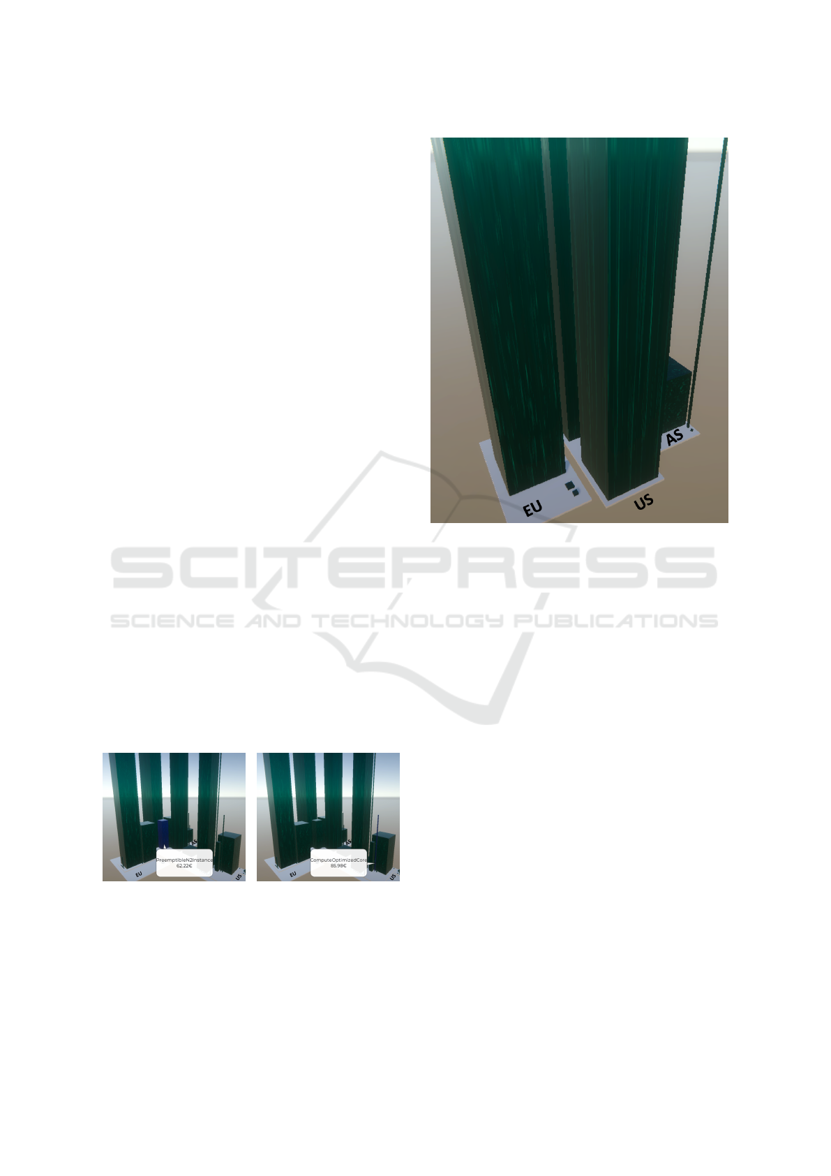
Fig. 1 shows the Cloud Cost City visualization of
a real cloud infrastructure. It is easy to spot the tall
buildings of costly resource units (metrics M1 and
M2). The blue cubic building in Fig.1(a) has a more
reasonable cost-usage ratio (M3) than the thin needle-
style building in Fig. 1(b).
(a) Blue resource unit with a
good cost-usage-ratio.
(b) Blue resource unit with a
bad cost-usage-ratio.
Figure 1: Cloud Cost City visualization of an example IT
infrastructure. Cost of resource units grouped by region and
within a region by project.
Figure 2: Cloud Cost City visualization of the example
from Fig. 1 with project costs aggregated across all resource
types.
4.4 Custom Hierarchies and Aggregates
All the metrics from Sec. 3 needed a grouping either
by different features or a different number of features.
Both metrics M1 and M3 need a first-level grouping
by project, i.e., for each resource type (second level)
the costs are accumulated across all regions. Metrics
M2 uses a grouping according to region → pro ject →
resourceType. Some cloud infrastructures have other
additional custom features, e.g., resource units can
belong to different environments like production, in-
tegration, or development.
CCC uses nested districts to represent grouping.
For full flexibility, in the Cloud Cost City the user can
pick an arbitrary ordered set of n such features, in-
cluding custom ones. The CCC maps the n selected
features to a hierarchy of districts. The costs of all re-
source units that have the same values in the n selected
features are bundled/aggregated in a single building,
regardless of their other features.
For grouping, Fig. 1 uses the feature hierarchy
region → pro ject → resourceType. All buildings in
the district on the right belong to the same region US.
A bit hard to see are the orange lines on the ground
that embrace projects. Fig. 2 uses a more shallow hi-
erarchy and a coarser granularity region → pro ject.
IVAPP 2021 - 12th International Conference on Information Visualization Theory and Applications
176
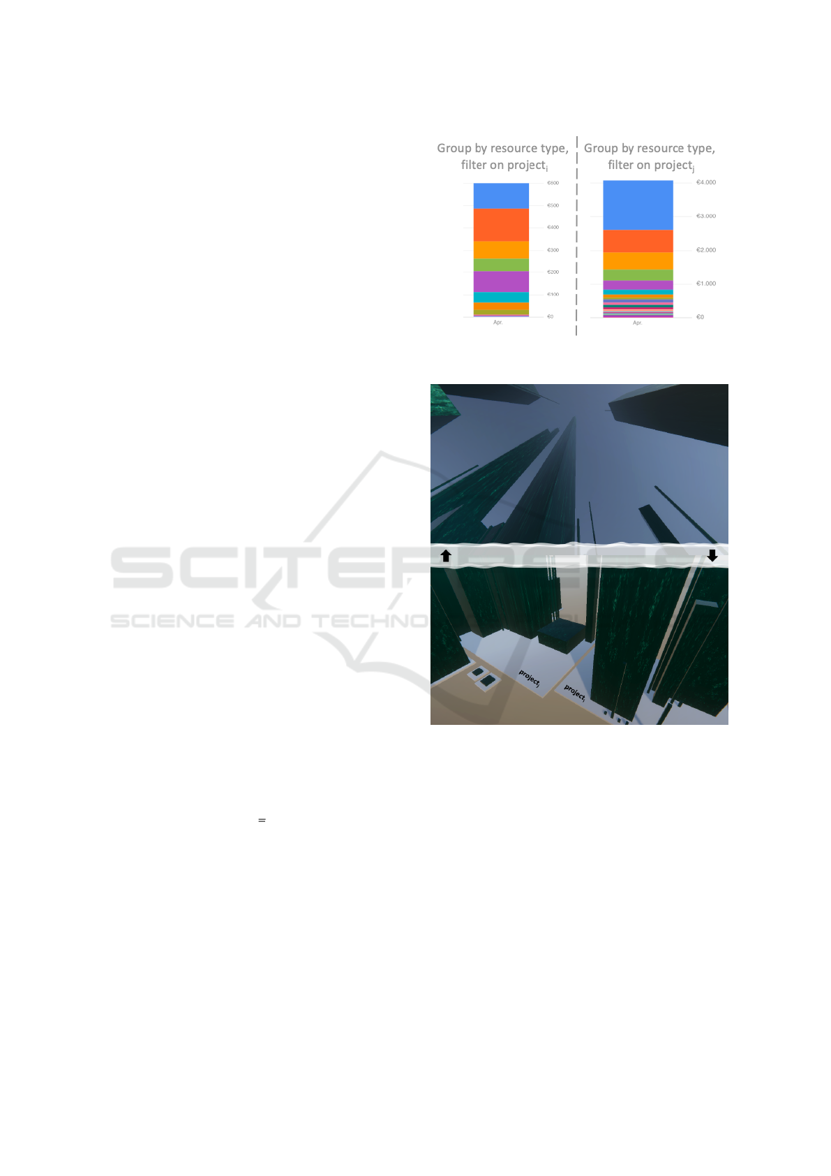
The nested project districts of Fig. 1 vanish, buildings
no longer represent resource units, but aggregate costs
per project across all resource units.
4.5 Custom Sorted Layout
For each of the levels of a grouping hierarchy per de-
fault CCC orders the components according to their
total costs, i.e., buildings line up in a district ac-
cording to their heights; neighboring districts are or-
dered with respect to the sum of the cost of their sub-
districts or buildings. As we already have discussed
in Sec. 3, this sorting order may or may not help in
identifying the highest savings potential.
For instance, recall that prices vary between re-
gions. Sorting the buildings w.r.t. the price niveau
makes it easier to see that projects or resources should
be shifted to cheaper regions, than with the default or-
der that tells the user where the money is spent.
Consider Figs. 1 and 2 again. The former uses
the default ordering for the regions. The latter uses
the ordering w.r.t. the price niveau and makes it a lot
easier to see that it may be a good idea to shift the
costly resources that currently are running in Europe
to the US or even to Asia.
To open up this flexibility to the user, the CCC al-
lows to specify a custom sorting order per dimension
of the hierarchy. The example uses EU U S AS
for the regions in metrics M2. For specifying an or-
der, users can also use wildcards instead of a concrete
feature values like AS.
5 EXAMPLE ANALYSIS
This section reports on a cost saving project for a real
cloud infrastructure that hosts 10 productive projects
that operate autonomously. The projects are of vary-
ing sizes and have different infrastructure require-
ments. In addition, the cloud platform is used for 4
test projects that are started up and shut down within
hours or days and therefore cause low costs. The total
fee in April 2020 was 5.473C.
To gauge the advantages of CCC, we performed
the cost analysis both with the dashboard of the
Google Cloud Platform (GCP), as a representative of
the state-of-the-art, and with our CCC visualization.
5.1 Which Resource Units Cost the
Most?
GCP. Out of the box, the dashboard shows costs per
resource type, but only aggregated over all projects.
Finding the costly resources for each project requires
Figure 3: GCP view for 2 projects: a stacked bar chart
shows the costs per resource type (different color per type).
Figure 4: Cloud Cost City viewed from 2 angles; custom
grouping pro ject → resourceType. Top: Look up to eas-
ily spot tallest towers. Bottom: Look down to identify the
projects to which the tall towers belong.
several manual steps because of two reasons: (a) the
x-dimensions of the dashboard’s line or bar charts al-
ways is the time, either on a daily or monthly basis,
and (b) there are no multi grouping options in GCP.
The manual steps are:
1. Group the costs by resource type.
2. For each of the 10 projects do:
(a) Filter/select the cost data of that project.
(b) Identify the most expensive resource units (the
largest areas in the stacked bar chart) and note
them and their costs.
Cloud Cost City: A Visualization of Cloud Costs using the City Metaphor
177
3. Determine the most expensive resource units
among all projects.
This process is tedious and time consuming. Neither
are the resulting 10 charts (examples in Fig. 3) dis-
played side-by-side in the cost dashboard, nor do they
use the same scaling of the cost-axis. There is no sup-
port to find the most expensive resource types across
the projects. Hence, due to the multiple manual steps
and the necessity to note and compare the costs across
projects, the metrics needed to answer this question is
not easy to obtain.
CCC. The only thing that needs to be done
is to specify the custom hierarchy pro ject →
resourceType. Then CCC automatically maps the
costs of the resource units to the heights of the build-
ings and groups them in a district per project. There
is no need for a custom sorting. Fig. 4 shows the vi-
sualization from two angles. When the user looks up,
it is easy to spot the tallest towers, see Fig. 4(top).
A click on a buildings reveals its actual cost value.
Going down on a tall tower to the floor reveals the
district/project as shown in Fig. 4(bottom).
While GCP requires a filtering step per project,
CCC shows all projects in one view and with a com-
mon scaling. Both the number and cost of resource
types across projects can be grasped at once and with
less manual work than in the GCP dashboard.
5.2 Which Resource Units Are
Provisioned in Expensive Regions?
GCP. To retrieve this metrics also several manual
steps are needed due to the same reasons (fixed x-axis
and lack of multi grouping).
The manual steps are:
1. Set a filter to extract the data of the region with
the highest price niveau and identify the m(≤ 10)
projects running in this region.
2. For each of the m projects do:
(a) Filter/select the cost data to that project.
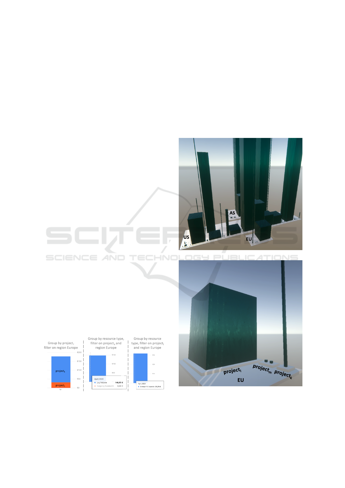
Figure 5: Left: Projects running in the region with the high-
est price niveau (Europe), different color per project. Mid-
dle and right: resource types of two projects from Europe
(same color for different resource types).
(b) Group the costs by resource type.
(c) Identify and note the most expensive resource
units (the largest area in the stacked bar chart).
3. Determine the most expensive resource units
among all projects.
Note that all steps must be repeated to also apply
the analysis to the second most expensive region.
In the example m = 3 projects ran in costly Eu-
rope, see Fig. 5(left). Only 2 of them have noticeable
costs that step 2 of the manual analysis has to look
at (manually one after the other). Again the up to
(a) Overview of all regions.
(b) Zoomed-In view into Europe.
Figure 6: Cloud Cost City visualization with custom hierar-
chy region → pro ject → resourceType and custom sorting
order EU US AS for the region level.
IVAPP 2021 - 12th International Conference on Information Visualization Theory and Applications
178
Table 1: Accessibility of metrics in the visualizations.
Metrics GCP CCC
M1 (3) multiple steps required 3
M2 (3) multiple steps required 3
M3 7 3
m charts are neither displayed side-by-side nor with
the same scale. For project
k
, Fig. 5(middle) reveals
the costs of its resource Log Volume. For project
l
,
Fig. 5(right) shows the costs of its resource Stor-
age PD Capacity. The different scaling between the
project charts make it difficult to visually compare ab-
solute costs and to find global maxima.
CCC. Whereas with the GCP dashboard a user needs
several steps to retrieve the information, in CCC it is
available at a glance.
The following custom hierarchy does the work:
region → pro ject → resourceType. This leads to
project districts that are nested within region districts.
CCC maps the costs of resource types to buildings.
In addition, it is beneficial to use the custom sort
EU U S AS for the first level of the hierarchy.
Fig. 6(a) holds the result. The most expensive region
comes first. In contrast to what GCP can do, cheaper
regions are also visible. Fig. 6(b) zooms into Europe.
The three European projects are clearly visible as dis-
tricts. It is obvious that there is one resource in each
of the projects l and k that causes costs. The heights
of the two buildings use a common scale.
5.3 Which Projects Use Too Expensive
Resources for Their Use Case?
Recall that there are different versions for each re-
source type that vary w.r.t. speed or storage capacity.
Premium variants are more expensive than the basics.
Metrics M3 helps identify bad cost-usage ratios, i.e.,
low usages of expensive variants.
GCP. Since the dashboard does not show the usage
of the resources at all, it is impossible to extract this
metrics from the visualization.
CCC. The usage of the resource units corresponds to
the area of the buildings in CCC. A building with an
extreme shape (needle or sheet) is easy to spot. It indi-
cates a potential misselection of the resource variant,
i.e., a bad cost-usage ratio. Some example anomalies
can be found in Figs. 4 and 6.
5.4 Summary
Table 1 summarizes the questions to be asked for
identifying saving potentials, the metrics needed to
Table 2: Comparison of features.
Feature GCP CCC
Single grouping 3 3
Multi grouping 7 3
Ordering 7 3
Filtering 3 7, use grouping
and navigation
instead
Zooming /
Navigation
7 3
Costs over time 3 7
answer them, and whether they can be found in GCP
and CCC. All in all, it is easier to derive the metrics
in a Cloud Cost City visualization than with the GCP
dashboard. The main reason are differences in the fea-
ture set given in Table 2.
CCC lacks two features of the providers’ dash-
boards. First, there is no way to filter/select parts of
the data. But Fig. 6 has shown that since users can
multi group and order their buildings and then zoom
into the area of the CCC that they need to select.
Second, CCC does not attempt to show the devel-
opment of cost over time. However, this did not hurt
at all in finding potential savings in the current costs.
It is in our future work to let the user work with the
mouse wheel to roll back and forth in time and watch
how the CCC changes over time.
6 CONCLUSION
The Cloud Cost City is a novel visualization that is
based on the city metaphor. We have demonstrated
the framework’s flexibility by using a CCC to identify
savings potential in cloud infrastructure costs. The
key ideas are that users can provide custom hierar-
chies to group and aggregate resource costs w.r.t. their
projects, regions, types, environments, etc. They can
also use custom sorting orders per hierarchy level. By
mapping the cost of resources to the heights of their
buildings and the usage to their area, cost anoma-
lies become obvious. CCC pairs this with both cus-
tom viewing angles in 3D and navigation/zooming to
make answering of cost saving questions easier than
with traditional dashboards. Furthermore, the CCC
provides both, an overview of the infrastructure ar-
chitecture and its costs.
Cloud Cost City: A Visualization of Cloud Costs using the City Metaphor
179

REFERENCES
Amazon Web Services Inc. (2020). AWS Cost Explorer
- Amazon Web Services. https://aws.amazon.com/
aws-cost-management/aws-cost-explorer/. Accessed:
2020-08-27.
Anderson, B. (2020). Quickstart - Explore Azure
costs with cost analysis. https://docs.microsoft.
com/en-us/azure/cost-management-billing/costs/
quick-acm-cost-analysis. Accessed: 2020-08-27.
Arcentry Inc. (2020). Arcentry: Create Interactive Cloud
Diagrams. https://arcentry.com/. Accessed: 2020-08-
27.
Averbukh, V., Bakhterev, M., Baydalin, A., Ismagilov, D.,
and Trushenkova, P. (2007). Interface and visualiza-
tion metaphors. In Proc. 12th Intl. Conf. on Human-
Computer Interaction, pages 13–22, Beijing, China.
Springer.
Beloglazov, A., Abawajy, J., and Buyya, R. (2012). Energy-
aware resource allocation heuristics for efficient man-
agement of data centers for cloud computing. Future
generation computer systems, 28(5):755–768.
Beloglazov, A. and Buyya, R. (2010). Energy efficient al-
location of virtual machines in cloud data centers. In
Proc. 10th IEEE/ACM Intl. Conf. on Cluster, Cloud
and Grid Computing, pages 577–578.
Berl, A., Gelenbe, E., Di Girolamo, M., Giuliani, G.,
De Meer, H., Dang, M. Q., and Pentikousis, K. (2010).
Energy-efficient cloud computing. The Computer
Journal, 53(7):1045–1051.
Bladh, T., Carr, D. A., and Scholl, J. (2004). Extending tree-
maps to three dimensions: A comparative study. In
Proc. Asia-Pacific Conf. on Computer Human Interac-
tion, pages 50–59, Rotorua, New Zealand. Springer.
Caldiera, V. R. B. G. and Rombach, H. D. (1994). The goal
question metric approach. Encyclopedia of software
engineering, pages 528–532. Wiley-Interscience.
Cloudcraft Inc. (2020). Cloudcraft - Draw AWS diagrams.
https://www.cloudcraft.co. Accessed: 2020-08-27.
Cloudviz Solutions SIA (2020). Cloudviz – Automated
AWS Architecture Diagrams & Documentation. https:
//cloudviz.io/. Accessed: 2020-08-27.
Duit, R. (1991). On the role of analogies and metaphors in
learning science. Science education, 75(6):649–672.
Fang, W., Liang, X., Li, S., Chiaraviglio, L., and Xiong,
N. (2013). VMPlanner: Optimizing virtual machine
placement and traffic flow routing to reduce network
power costs in cloud data centers. Computer Net-
works, 57(1):179–196.
Fittkau, F., Waller, J., Wulf, C., and Hasselbring, W. (2013).
Live trace visualization for comprehending large soft-
ware landscapes: The ExplorViz approach. In Proc.
IEEE Working Conf. on Softw. Vis., pages 1–4, Eind-
hoven, The Netherlands.
Google Inc. (2020). Visualize spend over time with Google
Data Studio - Cloud Billing. https://cloud.google.
com/billing/docs/how-to/visualize-data. Accessed:
2020-08-27.
Hogr
¨
afer, M., Heitzler, M., and Schulz, H.-J. (2020). The
state of the art in map-like visualization. Computer
Graphics Forum, 39(3):647–674.
Kondo, D., Javadi, B., Malecot, P., Cappello, F., and An-
derson, D. P. (2009). Cost-benefit analysis of cloud
computing versus desktop grids. In Proc. IEEE Intl.
Symp. on Parallel & Distributed Processing, pages 1–
12, Rome, Italy.
Li, J., Shuang, K., Su, S., Huang, Q., Xu, P., Cheng, X.,
and Wang, J. (2012). Reducing operational costs
through consolidation with resource prediction in the
cloud. In Proc. 12th IEEE/ACM Intl. Symp. on Cluster,
Cloud and Grid Computing, pages 793–798, Ottawa,
Canada.
Long, L. K., Hui, L. C., Fook, G. Y., and Zainon, W. M.
N. W. (2017). A study on the effectiveness of tree-
maps as tree visualization techniques. Procedia Com-
puter Science, 124:108–115.
Lucid Software Inc. (2020). Visualize Your Cloud
Infrastructure. https://www.lucidchart.com/blog/
why-visualize-your-cloud-infrastructure. Accessed:
2020-08-27.
Martens, B., Walterbusch, M., and Teuteberg, F. (2012).
Costing of cloud computing services: A total cost of
ownership approach. In Proc. 45th Hawaii Intl. Conf.
on System Sciences, pages 1563–1572, Maui, HI.
Nanath, K. and Pillai, R. (2013). A model for cost-benefit
analysis of cloud computing. International Technol-
ogy and Information Management, 22(3):93–117.
Schulz, H.-J., Hadlak, S., and Schumann, H. (2010). The
design space of implicit hierarchy visualization: A
survey. IEEE transactions on visualization and com-
puter graphics, 17(4):393–411.
Shastri, S. and Irwin, D. (2018). Cloud index tracking:
Enabling predictable costs in cloud spot markets. In
Proc. ACM Symp. on Cloud Computing, pages 451–
463, Carlsbad, CA.
Steinbr
¨
uckner, F. and Lewerentz, C. (2010). Representing
Development History in Software Cities. In Proc. 5th
Intl. Symp. on Softw. Vis., pages 193–202, Salt Lake
City, UT.
Teyseyre, A. and Campo, M. (2008). An Overview of 3D
Software Visualization. IEEE Trans. Visual. Comput.
Graphics, 15(1):87–105.
UMAknow Solutions Inc. (2020). Cloudockit – Generate
your cloud documentation. https://www.cloudockit.
com/. Accessed: 2020-08-27.
Vieira, C. C., Bittencourt, L. F., and Madeira, E. R. (2014).
Reducing costs in cloud application execution using
redundancy-based scheduling. In Proc. IEEE/ACM
7th Intl. Conf. on Utility and Cloud Computing, pages
117–126, Washington, DC.
Wettel, R. and Lanza, M. (2007). Visualizing software sys-
tems as cities. In Proc. 4th IEEE Intl. Workshop on
Vis. Softw. Understanding Anal., pages 92–99, Banff,
Canada.
Zohar, E., Cidon, I., and Mokryn, O. (2011). The power
of prediction: Cloud bandwidth and cost reduction.
ACM SIGCOMM Computer Communication Review,
41(4):86–97.
IVAPP 2021 - 12th International Conference on Information Visualization Theory and Applications
180
