
A Layered Software City for Dependency Visualization
Veronika Dashuber
1 a
, Michael Philippsen
2 b
and Johannes Weigend
1
1
QAware GmbH, Aschauer Str. 32, Munich, Germany
2
Programming Systems Group, Friedrich-Alexander University Erlangen-N
¨
urnberg (FAU), Martensstr. 3, Germany
Keywords:
Software City, Layouting Algorithm, Layered Graph Drawing, Dependency Analysis, Architecture
Comprehension.
Abstract:
A Software City is a an established way to visualize metrics such as the test coverage or complexity. As current
layouting algorithms are mainly based on the static code structure (e.g., classes and packages), dependencies
that are orthogonal to this structure often clutter the visualization and are hard to grasp. This paper applies
layered graph drawing to layout a Software City in 3D. The proposed layout takes both the dependencies
and the static code structure into account. This minimizes the number of explicitly displayed dependencies.
The resulting lower cognitive load makes the software architecture easier to understand. We evaluate the
advantages of our layout over a classic layouting algorithm in a controlled study on a real world project.
1 INTRODUCTION
While the IT labour market is becoming more and
more flexible and both projects and employees change
frequently, complex software systems with more than
200k lines of code have a long service life and cause
significant efforts for understanding software in de-
velopment projects (Telea, 2008). Hence, visualiza-
tion tools that help developers to sooner have a correct
understanding of the software increase productivity.
Software visualizations can cover the static struc-
ture of the source code, the behaviour (dynamic pro-
cesses during program execution), or the evolution,
i.e., the changes of the structure over time (Weninger
et al., 2020). Regardless of which aspects are visu-
alized, to make the abstract software artefacts more
understandable by humans, they are often mapped
to real-world metaphors to create a familiar context
(Caserta and Zendra, 2011). Several controlled exper-
iments have shown that the metaphor of a city is well
suited (Wettel and Lanza, 2007; Alam and Dugerdil,
2007; Dhambri et al., 2008). It represents compo-
nents (e.g., classes) as buildings and shows contain-
ers of components (e.g., packages or modules) as city
districts. While there are some Software City imple-
mentations that also cover dynamic or evolutionary
aspects, we focus on the static aspects. The general
a
https://orcid.org/0000-0001-8577-5646
b
https://orcid.org/0000-0002-3202-2904
principle of Software Cities is that the hierarchical
structure of the components (e.g., package → sub-
package → class) is used to map artefacts to the floor-
plan of the city. Proximity in the source code results
in proximity in the city, but not the other way round.
Nested TreeMaps and Street Views are well-
known layouting techniques (we discuss them in de-
tail in Sec. 2). Layouts that are purely based on the
source code structure in general do not match an ar-
chitect’s view of the software as they ignore other re-
lationships and dependencies among artefacts.
In the past such relationships have been encoded
with extra visual elements such as color or arcs atop
the city. Such metaphor extensions tend to overload
the user cognitively, as the proximity of components
in the software does not indicate whether these com-
ponents depend on each other or not.
Our contribution is an intuitive layout that is based
on layered graph drawing. The proximity of com-
ponents in our layout correlates with both the de-
pendency structure and the hierarchical source code
structure. By encoding most dependencies in the lay-
ers instead of drawing them as explicit arcs, we sig-
nificantly reduce their numbers and increase the over-
all clarity of the Software City. Arcs that are shown
explicitly, often indicate architecture violations. To
our knowledge we are the first to apply layered graph
drawing ideas to a 3D layouting of a Software City.
Sec. 2 discusses related work. Sec. 3-5 explain our
approach in detail followed by an evaluation in Sec. 6.
Dashuber, V., Philippsen, M. and Weigend, J.
A Layered Software City for Dependency Visualization.
DOI: 10.5220/0010180200150026
In Proceedings of the 16th International Joint Conference on Computer Vision, Imaging and Computer Graphics Theory and Applications (VISIGRAPP 2021) - Volume 3: IVAPP, pages 15-26
ISBN: 978-989-758-488-6
Copyright
c
2021 by SCITEPRESS – Science and Technology Publications, Lda. All rights reserved
15

Future work is covered in Sec. 7 and Sec. 8 concludes
the paper.
2 RELATED WORK
We divide related work in software city layouts and
graph layout techniques on which our approach is
based. We also discuss a tool that incorporates depen-
dencies into the layout as well and look at Reflexion
Models as an orthogonal approach.
2.1 Software City Layouts
The city metaphor maps software artefacts to city
artefacts: components (e.g., classes) are buildings and
containers of components (e.g., packages) are districts
on which these buildings are located.
The TreeMap Layout (Fittkau et al., 2013; Wet-
tel and Lanza, 2007; Vincur et al., 2017; Alam and
Dugerdil, 2007; Dhambri et al., 2008; Caserta et al.,
2011) is the most common layout for Software Cities.
It uses binpacking to place rectangles (i.e., buildings
and districts) into the smallest possible common rect-
angle and sorts them in descending order of their
width, depth, or base area.
This layout only considers the hierarchical code
structure, i.e., contains relations. Typically, exten-
sions visualize other dependencies among the com-
ponents as arcs atop the buildings. This often leads
to dependency arcs that are scattered across the en-
tire visualization, more overwhelming than helping to
understand them. To motivate our layout, Fig. 1(a) vi-
sualizes the ’core’ module of the open source project
(a) TreeMap layout with all dependency arcs.
(b) Our layered layout. Most dependencies encoded in the
layers; only possible architecture violation arcs remain.
Figure 1: Visualization of the SonarQube source code.
SonarQube (https://www.sonarqube.org/) with the
TreeMap layout, drawing all usage/invocation depen-
dencies as arcs atop the buildings. There are far too
many edges to be helpful in understanding the soft-
ware architecture. The visualization of the same soft-
ware with our layout in Fig. 1(b) is much clearer as
it takes both the code structure and the directed de-
pendencies into account. We organize buildings in
layers. Most of the dependencies are implicit from
one layer to the next. We only draw those as explicit
arcs whose orientation is opposing the order of the
layering. These arcs often indicate architecture viola-
tions. Note that for this comparison, both visualiza-
tions use simple buildings of the same sizes and col-
ors. To make architecture violations even more clear,
we also map metrics to building properties, see Sec. 5.
There are other ways to layout a software city,
e.g., the Street Layout (Steinbr
¨
uckner and Lewer-
entz, 2010; Caserta et al., 2011). However, in general
in their pure form they also only consider the hierar-
chical code structure and require extensions that also
show other dependencies as cluttered arcs atop the
city. These layouts also suffer from the visual clut-
ter and the overwhelming number of displayed arcs
that we avoid.
2.2 Graph Layout Techniques
Layered Graph Drawing organizes nodes in layers
with most edges going in the same direction and with
as few crossings and as few edges in the opposite di-
rection. This is the key idea of our layout as well.
Most layered graph drawing algorithms are based on
the work of Sugiyama et al.(Sugiyama et al., 1981) or
its improvements (Dujmovi
´
c, 2001; Eiglsperger et al.,
2004). Since many of its steps are NP-hard (e.g., the
Minimum Feedback Arc Set problem (Karp, 1972)),
heuristics are used in practice.
To our knowledge, we are the first to apply layered
graph drawing to layout software cities. We present
domain specific heuristics that result in few feedback
arcs, i.e., architecture violating dependency edges that
cause cyclic dependencies in software.
Another common approach to make a graph eas-
ier to understand is Edge Bundling of adjacent edges
to reduce visual clutter (Pupyrev et al., 2010; Zhou
et al., 2013; Holten and Van Wijk, 2009; Gansner
et al., 2011). For our layout we do not need Edge
Bundling, as we show most of the dependencies im-
plicitly so that too few arcs remain to justify bundling.
IVAPP 2021 - 12th International Conference on Information Visualization Theory and Applications
16

2.3 Structure101
Structure101 (Headway Software Technologies Ltd,
2019; Muccini and Tekinerdogan, 2012) is a tool
to analyze software architectures. Its so-called Lev-
elized Structure Maps (LSM) displays dependencies
among components in 2D. Similar to our approach,
LSM also organizes the components into a stack of
so-called levels. A component is shown in a level iff
it depends on at least one component in the level di-
rectly below it. Components on the same level have
no dependencies among them. Components transi-
tively depend on others from the highest to the lowest
level. Components on the lowest level do not have any
dependencies. In the LSM representation there is also
no need to use arrows to show dependencies, except
for cyclic ones.
In contrast to our layered 3D city representation,
LSM is restricted because (a) zooming in/out and
moving on the x-/y-axes are the only ways to navi-
gate, while we offer arbitrary angles, (b) LSM nodes
do not carry other information while we map metrics
to the width, height, depth, and color of the city arte-
facts to promote a better understanding of the system.
2.4 Reflexion Models
While we apply heuristics to find out which relation-
ships the developer allegedly wants to have in the soft-
ware and which are unwanted cyclic dependencies,
Reflexion Models (Murphy et al., 2001) let the engi-
neer specify (e.g., at class or module level) what is ex-
pected and how the components should relate to each
other. An analysis of the source code then identifies
conflicting or missing relationships. This is orthogo-
nal to our work as we could use these results to layout
the software city and to draw those arcs.
3 LAYERED SOFTWARE CITY
We propose to not only use the hierarchical contains
relationships among elements of the static source
code to build the layout of the Software City but to or-
ganize the City in levels that also reflect the depends-
on relationships between artefacts. To achieve this,
we propose to arrange the components on levels. As
the components on one level in general depend on
the level below, these dependencies no longer need to
be shown explicitly. Only dependencies in the other
direction form cycles that are often problematic and
should be avoided in well-designed software. To re-
tain the static structure of the source code in the lay-
out, the organization of city artefacts into layers is a
recursive process, starting from the lowest level of de-
tail (for example, class level).
The main steps for constructing a Layered Soft-
ware City are:
1. Import raw contains and depends-on relations
from the static source code.
2. Determine the level of each component and iden-
tify cyclic dependencies, see Sec. 4 for details.
3. Create city artefacts for the components and posi-
tion them based on their levels, see Sec. 5.
4. Draw arcs for identified cyclic dependencies.
4 DETERMINING THE LEVEL
In graph terminology to determine the level of a com-
ponent in our layout, we search for a layered drawing
of a directed graph with two types of directed edges:
structural contains edges and (weighted) depends-on
edges. Let us assume a dependency graph as in
Fig. 2(a) of an example software system with its struc-
ture edges (blue) and its dependency edges (dashed
green with weights). The dependency edges in red
are those we show explicitly in the visualization. Let
us postpone the discussion of how we identify such
cycle-building edges. We omit them when we present
the basic idea of the layering algorithm. The hierar-
chical structure graph (blue edges only) is a rooted
tree. Dependencies only exist between leaf nodes of
the hierarchical structure.
A graph with many dependency edges is cluttered,
confusing, and not very helpful for understanding the
software. In the example, it needs a close look to
see that subpackage2 is providing basic components
(a) Fine-grained graph with cycles.
(b) Coarsened view of the dependencies with cycles.
Figure 2: Example of contains and depends-on relation-
ships with cyclic dependencies.
A Layered Software City for Dependency Visualization
17

to the rest of the system. What a software architect
is mainly interested in when analyzing the code, are
both the dependencies within a (sub)package and also
the dependencies between (sub)packages, i.e., the de-
pendencies per and among levels of abstraction.
4.1 Basic Layering
We construct such a layout recursively. The base case
is the layouting of those leaf nodes of the structural
hierarchy that have a common parent. Here we chose
a layout that is inspired by a topological sort of the
depends-on relations between those leaf nodes. We
discuss the details below.
The recursive case one level up coarsens the graph
as shown in Fig. 2(b), which makes the dependency
structure much clearer for the architect. Dependency
edges between leaf nodes of the structural hierarchy
turn into dependency edges between their respective
parents in the structural tree. Resulting self-loops
from and to the same parent are dropped (3 times for
subpackage1 and two times for subpackage2 in the
example). Parallel dependency edges are fused and
their count is kept as the weight of the fused edge. In
Fig. 2(b) the fused depends-on edge has weight 3. The
weights later become relevant when there are cyclic
dependencies. Since the coarsened graph again has
all its depends-on edges only between its leaves, we
apply the same layouting inspired by topological sort.
The recursion terminates at the root(s).
Let us now discuss the base case. We sort all the
n leaf nodes that have a common parent in the struc-
tural hierarchy in a topological way. For the base case,
only depends-on edges among the set n matter. We
ignore dependency edges that come into this set from
other leaf nodes or that leave the set. Whereas a text-
(a) Abstract view. (b) Full visualization.
Figure 3: Dependencies encoded in the layering.
f u n c t i o n t op o L a y o u t ( no d e s n ) :
d eg r ee [ ] = [ Out d e g r e e s o f n ]
q = { s e t o f a l l d e pend e ncy l e a v e s }
c u r r e n t = 0
w h il e q i s n o t empty :
qNew = {}
f or ea c h node k ∈ q :
k . l a y e r = c u r r e n t
f or ea c h i nco m i ng e d g e s→k :
d eg r ee [ s]−−
i f d e g r e e [ s ] == 0 :
qNew ∪= { s }
q = qNew
c u r r e n t ++
Listing 1: Layouting inspired by topological sort.
book topological sort has room for variation, we de-
termine the unique layer of a node as its maximal path
length from it to the last node among the set n, that
has no more outgoing dependencies. Listing 1 holds
the pseudo code. Its complexity is O(|n| + e) with e
depends-on edges among the nodes in n.
Consider the shaded area in Fig. 2(a). As classC
has no outgoing depends-on edges that stay within the
set n, its layer is 0. There are two paths from classA
to classC. As the longest one has length 2, this is the
layer of classA.
Once the layers of the nodes in n are computed,
we draw them layer-by-layer, leaving out depends-on
edges from layer i to j when i < j. Items on the same
layer are drawn in a random order. In the example, the
three class nodes of the shaded area in Fig. 2(a) turn
into the three layers in the shaded area in Fig. 3(a) (in
2D for simplicity). As the layouting process is recur-
sive, the layers determined for the coarsened graph in
Fig. 2(b) result in the shown layering of the subpack-
ages in Fig. 3(a). In this visualization the architect can
easily identify that items depend on the items below
them. The structural hierarchy is also still present.
Note that while the abstract graph in Fig. 3(a) ignores
the cyclic arcs, they are already present in the full vi-
sualization in Fig. 3(b). We discuss the properties of
buildings in Sec. 5.
4.2 Dealing with Cycles
If there are cyclic dependencies, there are edges
whose directions do not fit the layering and thus
need to be visualized, see the cycle-building arcs in
Fig. 3(b). The fewer arrows a drawing has and the
shorter they are, the easier to understand the visual-
ization is. In the example, it is apparent that the de-
pendency from classB to classA as well as that from
classD to classC need refactoring.
While in general finding this ideal visualization
boils down to the NP-hard Minimum Feedback Arc
IVAPP 2021 - 12th International Conference on Information Visualization Theory and Applications
18

Set problem (Karp, 1972), for software systems we
can give domain specific heuristics that usually work
well. Their underlying assumption is that a software
system is not utterly broken, i.e., that cyclic depen-
dencies are rare as they are architecture violations.
Since it is a common refactoring task to remove them,
the majority of the dependencies fits to the layered
software architecture. In the layered drawing we do
not show dependencies that follow this major direc-
tion. The (feedback) arrows of the few dependencies
that have the opposite direction and that close cycles,
highlight potential architecture problems. If there is
no identifiable flow of dependencies in one major di-
rection, i.e., if there is no class layering of the soft-
ware architecture, a detailed analysis of the source
code must be performed anyway. In such cases it does
not really matter which of the cycle-building edges is
highlighted by means of an explicit arrow.
The remainder of this subsection discusses in de-
tail how we identify the (few) cycle-building edges
that need to be visualized.
As suggested by Sugiyama et al. (Sugiyama et al.,
1981), we remove cycles from the graph in a pre-
processing step. We do so in each of the recursive
steps described before, i.e., we remove depends-on
cycles among the leaf nodes of the structural hierar-
chy that have a common parent. Once a cycle is de-
tected in a depth-first traversal, we immediately re-
move one of the cycle-building edges. The acyclic
rest of the graph can be drawn in layers and without
arrows as before. The removed edge is later added
as an arrow atop those layers. Although conceptu-
ally a depends-on edge may belong to several cycles,
we have not seen such a case in practice. Depen-
dency cycles often seem to be disjunct in real soft-
ware. Even if the cycles are not disjunct, we argue
that the cycles still belong to disjunct use cases. They
have most likely been implemented at different times
and solve different tasks. Thus, from a software ar-
chitect’s point of view, there is no need to find the
absolute global optimum when minimizing the num-
ber of arrows. Hence, it suffices to remove a cycle
instantly as soon as it is found.
We use two heuristics to pick which edge to re-
move. Heuristics 1: If there are two edges in a cycle
and one edge has a higher weight, the heigher weight
indicates the layering that originally was planned for
the software system. Hence, we pick the edge with the
minimal weight for removal. In the cycle in Fig. 2(b)
it is obvious that subpackage1 is meant to depend on
subpackage2 and that the red edge is the dependency
that needs to be refactored, i.e., that should turn into
an explicit arrow in the drawing.
Heuristics 2 comes in if the cycle has more than
f u n c t i o n re m o v eCycle ( ed ge s e ) :
minWeight = MaxInt
re m o valCa n d s1 = {}
/ / h e u r i s t i c s 1
f or ea c h edge k ∈ e :
i f k . w e i g h t < minWeig ht :
minWeight = k . w ei g h t
re m o valCa n d s1 = {k }
e l s i f k . w e i g h t == minWeigh t :
re m o valCa n d s1 ∪= {k }
i f | remo v a lCand s 1 | == 1 :
remove edge ∈ r e moval C a nds1
e l s e :
minWeight = MaxInt
re m o valCa n d s2 = {}
/ / h e u r i s t i c s 2
f or ea c h e = (s
e
→ t
e
) ∈ r emova l Cands1 :
o ut = { s e t o f a l l o u t g o in g
e d ge s o f s
e
}
w e i g h t =
∑
o∈out
o . w e i g h t
i f w e i g h t < minWeight :
minWeight = w ei gh t
re m o valCa n d s2 = { e }
e l s i f w ei gh t == minWeight :
re m o valCa n d s2 ∪= { e }
i f | remo v a lCand s 2 | == 1 :
remove edge ∈ r e moval C a nds2
e l s e :
remove random edge ∈
re m o valCa n d s2
Listing 2: Cycle removal heuristics.
one edge with minimal weight. Let’s call these edges
removal candidates. To motivate the heuristics, con-
sider the shaded area in Fig. 2(a). There are two ways
to resolve the cycle between classA and classB, as the
weight of the edges is the same. Removing the (red)
edge from classB to classA means for the layering that
classA is placed above classB. Removing the (green)
edge from classA to classB results to classB above
classA. Which one is better for the software architect?
A common design principle of software is that the
more complex component uses the less complex one.
Heuristics 2 uses the correlation between complexity
and the number/weight of outgoing dependencies of
a component (Zimmermann, 2009). In Fig. 2(a), the
sum of the weights of the outgoing edges of classA is
3, whereas for classB it is only 2. As classA is more
complex, the software architect expects the visualiza-
tion in Fig. 3.
Hence, heuristics 2 is: if there are two removal
candidate edges (with the same minimal weight) the
one whose source node has a larger total outgoing
weight reflects what was planned to be the node that
makes use of others in the software system, as it rep-
resents the more complex component. So we pick the
candidate edge for removal whose source node has the
minimal total outgoing weight.
A Layered Software City for Dependency Visualization
19

Listing 2 shows the pseudo code of the two-stage
heuristics for removing cycles. It first traverses the
edges e that form a cycle of length |e| to find the
ones with minimal weights. For the cycle in Fig. 2(b)
this traversal finds only one candidate for removal.
Heuristics 2 is not needed. For subpackage1 there
are two candidates of minimal weight 1. In the worst
case all |e| edges have the same minimal weight, i.e.,
the traversal for heuristics 2 takes another O(|e|). Af-
ter removing an edge, |e| − 1 edges remain that may
conceptually be part of other cycles. This leads to a
worst-case complexity of O(|E|
2
).
In practice, however, there are only a few cycles
and in most cases they only have a length of 2. This
reduces the complexity significantly, so that the cycle
removal takes only a few hundred milliseconds even
for large software projects. E.g., it took 90 ms for the
19.732 dependencies of the benchmark project, see
Sec. 6, on an Intel Core i7 laptop.
The layout is stable as long as the cyclic depen-
dencies do not change. If the dependencies in the sys-
tem change, a class may be assigned to a different
level than before. Since such a change probably indi-
cates an unwanted modification of the software archi-
tecture, it is useful to see this in a shift of the layers.
5 CREATING CITY ARTEFACTS
What is left after having determined on which level to
put a component is how to employ other visual prop-
erties of its building or district. We use dependency
metrics for this purpose since we aim at visualizing
dependencies in software.
We set the height of a building based on the
number of incoming dependencies. The square area
(width = depth) reflects the number of outgoing de-
pendencies. This means that tall towers describe
classes that are used a lot, while flat buildings with
a wide footprint visualize classes that use many
other components. The color of a building indicates
whether or not the class belongs to a cyclic depen-
dency. We use a red color to mark cycles on build-
Figure 4: Layered city layout of the Zipkin source code.
ings as well as on the districts. We display the iden-
tified edges of cycle-building dependencies with ex-
plicit arcs between the components. The arcs show
the dependencies that probably representing architec-
tural violations. In addition, when a user clicks on a
component (building or district), we display its name.
Fig. 4 holds a visualization of the source code of
Zipkin (https://zipkin.io/) made with the Unity game
engine (https://unity.com/solutions/game). In contrast
to the simplified visualization in Fig. 1(b) it is more
prominent (red) which classes are part of dependency
cycles and how important the dependency issues are
(tall towers in the back, flat buildings up front).
6 EVALUATION
In order to answer the research question ”Does the
layered layout for Software Cities help to better un-
derstand the architecture of a software project”, we
evaluated our approach in a controlled experiment.
In the study we used a real world software system,
i.e., the latest version 9.0.0 of the open source project
SolrJ (https://lucene.apache.org/solr/), which is the
Java API for Apache Solr, a standalone enterprise
search server for any kind of documents. SolrJ has
177 740 lines of code in 974 classes/interfaces. We
analyzed the dependencies of the SolrJ jar file with the
command line tool jdeps that JavaSE includes by de-
fault since version 8. It analyzes all dependencies be-
tween Java class files. This resulted in 19 732 depen-
dencies. We created the Software City of SolrJ, once
with the most common TreeMap layout (see Fig. 5)
and once with our new layout (see Fig. 6). In the
study, the participants used the Software City visu-
alization to find answers for a set of questions within
a given time limit.
Note that a standard TreeMap Layout would show
all dependencies as illustrated in Fig. 1(a). Fig. 7(a)
shows how the spot in the white circle on the right
of Fig. 5 would have looked like if we would show
all dependency arcs. In a pre-study participants were
overwhelmed with the many dependency arcs and
were unable to answer any questions at all. Therefore
we improved the TreeMap layout – like in our layout
– by only showing the architecture violation arcs plus
the affected classes and with the dependency metrics
used to determine the visual properties of their build-
ings. Fig. 7(b) illustrates the effect: cyclic dependen-
cies and affected classes are easier to see in the en-
hanced TreeMap Layout.
Since the properties of the buildings and districts
(height, width, depth, color) were identical in both the
enhanced TreeMap Layout and in our layered layout
IVAPP 2021 - 12th International Conference on Information Visualization Theory and Applications
20
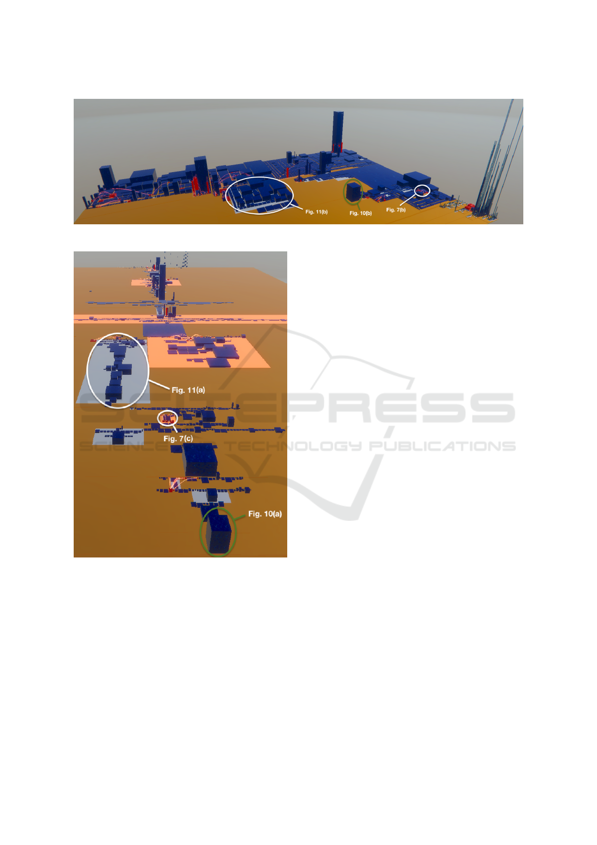
Figure 5: Software City with TreeMap layout of SolrJ.
Figure 6: Layered Software City of SolrJ.
and as also the representation of cyclic dependencies
with arcs was the same for both cities, the only differ-
ence was the layout.
6.1 Participants
A total of 30 professional software engineers of
QAware were able to conduct the study during their
working hours. They all have a computer science
or similar background and are familiar with concepts
such as software architecture, dependencies, and cy-
cles. The company provided the resources because
they are looking for a visualization that their em-
ployees can use to get productive in newly assigned
projects more quickly. The supervisor knew the par-
ticipants from work. The professional experience of
the test persons ranged from 1 month to over 10 years.
The majority of the test persons have a work experi-
ence of 2-5 years (43.3%), see Fig. 8.
We randomly assigned 15 participants to the En-
hanced TreeMap group and 15 to the group that uses
the Layered Software City layout. We had only two
female participants, one in each group. None of the
participants had used a Software City visualization
before. The participants only knew that the purpose of
the study was to pick among two layouts. All partic-
ipants were informed that they would solve tasks and
that both the answers and the response times would
be documented. They were also told that they would
have to fill out a questionnaire afterwards.
6.2 Experiment
The experiment was performed remotely. The partic-
ipants received executable files of the visualizations
in advance. The study itself was then conducted via
video conference and screen sharing. To warm up,
all test persons initially received a playground project,
which was also created with the layout of their respec-
tive group. The participants had five minutes to get
familiar with the navigation. During this time, the su-
pervisor used a script to explain the visual properties
(height, footprint, color) as well as the layout. Partic-
ipants were allowed to ask questions.
After this familiarization phase, the SolrJ study
started. The participants had to solve 7 tasks in which
they had to analyze the software architecture:
1. Which class is the entry point in SolrJ? (2 min)
2. Locate package ’util’. (2 min)
3. Locate package ’impl’. (2 min)
4. Which dependency would you refactor in a 1 to 1
cycle of your choice. (2 min)
A Layered Software City for Dependency Visualization
21
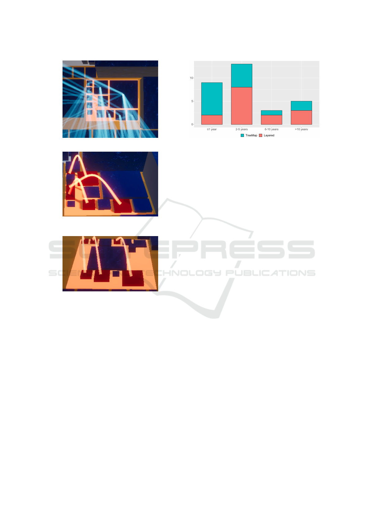
(a) TreeMap layout with all dependencies shown.
(b) Enhanced TreeMap Layout with only cycle-building
edges and our building properties.
(c) Cycles in our layered layout.
Figure 7: Zoomed-in view of a spot in Figs. 5 and 6 that is
relevant for task #4.
5. Find the component in the system that is used
most. (1 min)
6. Find both a package with a deep dependency tree
and one with a flat one. (4 min)
7. Specify how you would refactor all cycles in
package ’noggit’. (4 min)
The tasks were tailored to the software system that
the participants were supposed to analyze. Neverthe-
less, we asked questions aimed at skills that are gen-
erally required for software analysis. Tasks #1 to #3
reveal how well and quickly participants can orien-
tate within the visualization. Tasks #4 and #7 expose
whether the visualization supports refactoring issues.
And tasks #5 and #6 target the question of how well a
layout can give a broad overview of the architecture.
The tasks were posed one after the other. The su-
Figure 8: Years of work experience of the participants for
the TreeMap group in turquoise on top and for the Layered
group in orange below.
pervisor did not give any feedback on the correctness
of the answers and hence on the subject’s comprehen-
sion of the software architecture. The upper part of
Fig. 9 holds the results.
There was a maximal response time per task,
given in parentheses above. Time measurements
started once a task was posed. If no answer was given
within the allotted time, the answer was considered
incorrect and the time limit was noted with an added
fail mark (the red x with the number of failed an-
swers in the lower part of Fig. 9). Otherwise, the time
required was documented. The time limits per task
suited the complexity of the question and were deter-
mined in a small preliminary study. After the 5 min-
utes warmup the maximal duration of the experiment
was 20 minutes. Most participants finished sooner.
After all tasks had been completed, the partici-
pants had to fill out an anonymous questionnaire that
asked for general information such as years of profes-
sional experience or position. In addition, the stan-
dardized NASA Task Load Index (TLX) was used to
make a comparable statement about the effectiveness
of the two visualizations (Hart and Staveland, 1988).
We added this questionnaire to be able to make a more
general statement about the effectiveness of the vi-
sualization besides the specific task solving. In the
same style, participants were asked about how much
the layout helped them in solving the tasks. There was
also a free text field for further comments.
6.3 Results and Discussion
Comprehension. The total results in Fig. 9 (top)
show that the Layered group solved the tasks signifi-
cantly more correctly than the TreeMap group (signif-
icance level α = 0.01% determined by a Chi-squared
test). In total, the Layered group reached a median
correctness of 100% with the first and third quartiles
spreading from 86% to 100% and one outlier outside
IVAPP 2021 - 12th International Conference on Information Visualization Theory and Applications
22
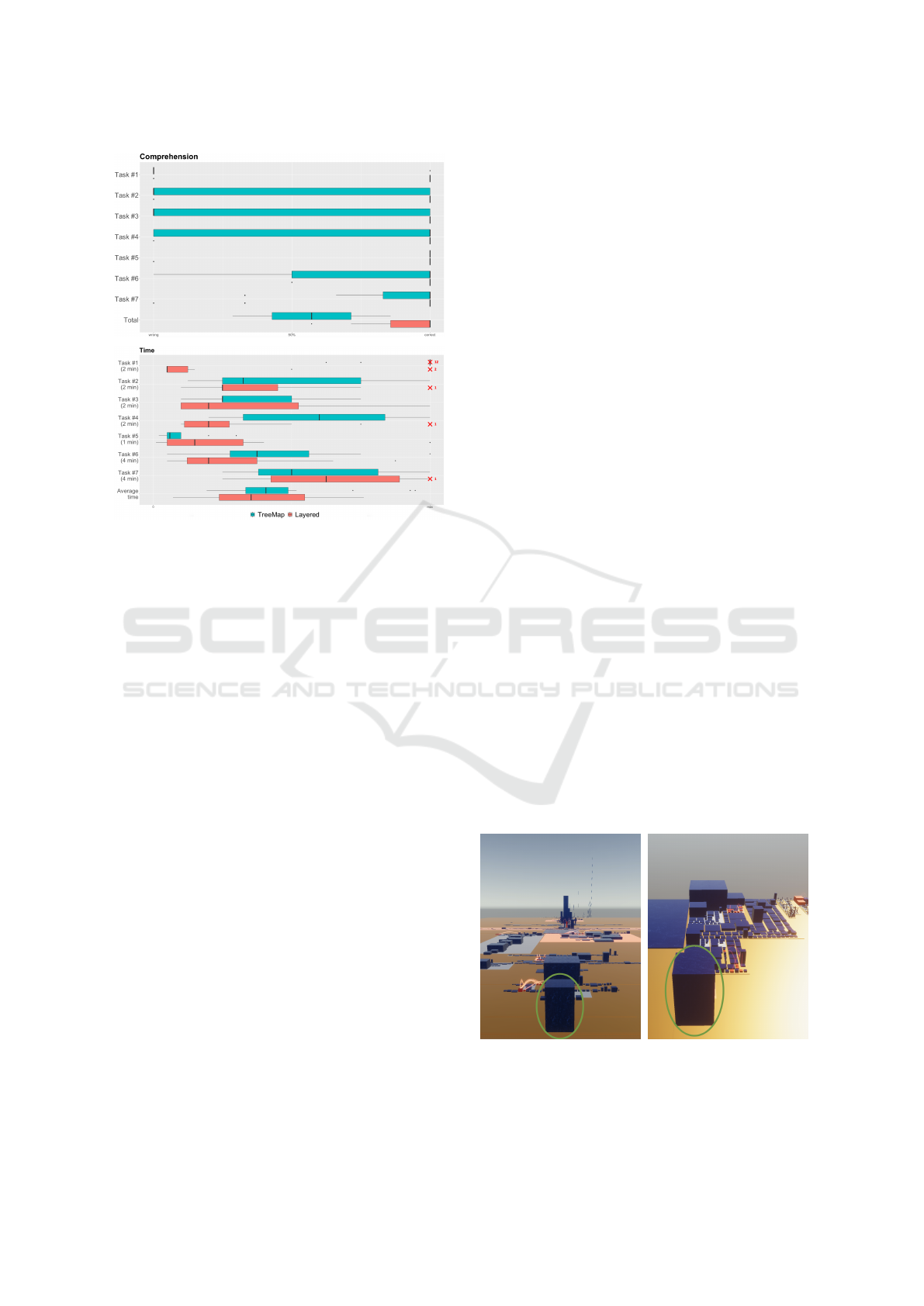
Figure 9: Comprehension (top) and Time (bottom). For
each task, the distribution of answers for the TreeMap group
in turquoise on top and for the Layered group in orange be-
low. Boxes correspond to the first and third quartiles (the
25th and 75th percentiles), whiskers drawn using Tukey
method (1.5 IQR), points are outliers in the data. Failures
to solve a task due to the time limit are shown with a red x
and the number of such failures.
the lower whisker at 56%. In contrast, the TreeMap
group only achieved a median of 57% correct answers
(quartiles spread from 37%–69%).
The detailed results for the seven tasks vary. As
the Layered group was almost always correct, we
show only the medians and outliers (no boxes, no
whiskers).
Task #1 has been solved correctly by 13 partic-
ipants of the Layered group but only by one of the
TreeMap group. The layered layout is ideal for this
task as it arranges the components according to their
dependencies so that the entry point is in the fore-
ground when users view the city with a perspective
from the top layer. We added a green circle to high-
light this in Fig. 10. The TreeMap layout places the
items solely based on their footprint sizes. There is no
way to guess the entry point. Even when we pick the
best possible angle to view the city in Fig. 10(b), this
view still does not reveal the dependencies. Note that
for orientation, the green circles were also present in
Figs. 5 and 6.
For tasks #2 and #3 the Layered group also per-
formed better. In the layered layout the ’util’ package,
which contains all auxiliary classes of SolrJ, is used
by many and is therefore further down in the layering.
The ’impl’ package, which contains the implementa-
tion of business logic and uses many components, is
thus shown further up. This helped the Layered group
in finding the respective packages. There is no such
help in the TreeMap layout.
Only for task #5 (identifying hotspots) both lay-
outs score equally well. The TreeMap group is better
than usual as the layout is very compact and hotspots
can be easily recognized. But it also shows that
hotspots are not less visible with the layered layout,
so the more extensive layout does not have any disad-
vantage there.
Time. We also measured how long it took the partici-
pants to solve the tasks. If they exceeded the maximal
allotted time, the task was also judged non-solved.
Fig. 9 (bottom) shows the results of the time measure-
ments. The time interval is normalized to an interval
from 0 to the time limit. An exceeding of the time
limit is marked as a separate data point to the right of
the maximum.
The average responding time for the TreeMap
group is 40,7% (median) of the time limit while it is
a better 35,4% for the Layered group. We do not con-
sider the correctness of the answers here. Overall, the
Layered group solved the tasks not only qualitatively
better, but also significantly faster (significance level
α = 0.01% determined by a Chi-squared test).
The TreeMap group detected hotspots (#5) faster
since the layout is more compact, as already men-
tioned above. The TreeMap group was also faster
with task #7, but there were also more wrong answers
while the median in the Layered group was correct.
The time difference in task #4 is also worth ex-
plaining. The layered layout arranges buildings in
such a way that architecture violations in cyclic de-
pendencies are displayed as arcs from lower to upper
layers. Fig. 7(c) zooms to such a spot in the SolrJ vi-
sualization in Fig. 6. The Layered group easily spot-
(a) Layered: view from the
top layer.
(b) TreeMap: view from best
corner.
Figure 10: Helpful viewing angles to solve task #1. The
green circles can also be found in Figs. 5 and 6.
A Layered Software City for Dependency Visualization
23
(a) Layered
layout.
(b) TreeMap layout.
Figure 11: Zoomed-in view of a package with a deep tree
of dependencies needed to solve task #6. Same areas as in
Figs. 5 and 6.
ted such patterns. In contrast, the TreeMap group had
to derive the dependencies and the resulting complex-
ity solely based on the building properties (height and
footprint, see Fig. 7(b)) since the arcs do not follow
a pattern, but are irregular. This took longer, even
though we did not present all dependencies which is
the standard in Software Cities with a TreeMap lay-
out (see Fig 7(a)) but used our color encoding of the
affected class buildings and only showed the architec-
ture violating arcs to the TreeMap group.
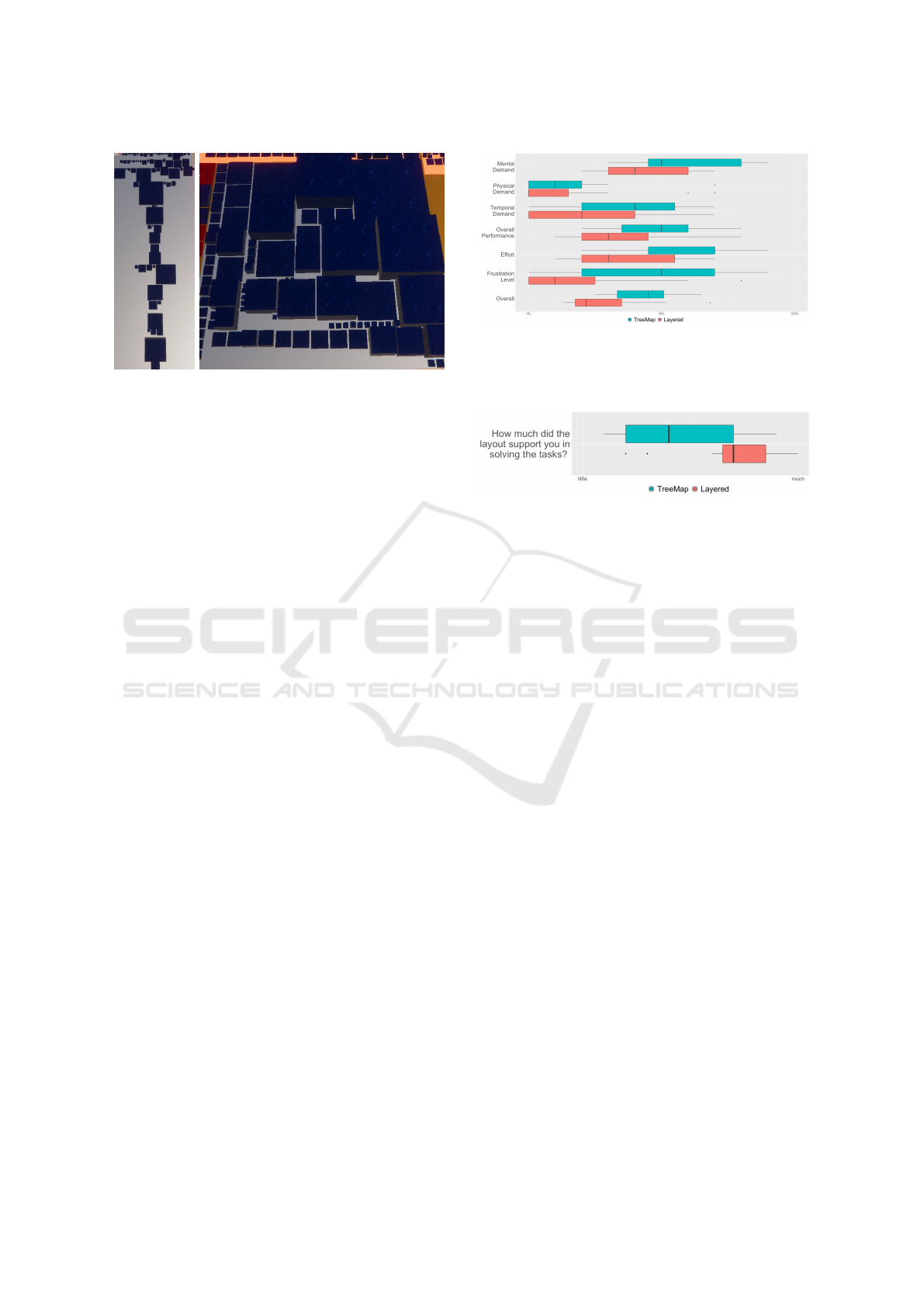
There is a notable time difference for task #6. In a
bird’s eye view, the layered layout instantly reveals
which packages have a deep tree of dependencies.
Fig. 11(a) zooms into one of the packages of the SolrJ
visualization in Fig. 6. A similar view does not help
the TreeMap group at all (Fig. 11(b)).
Questionnaire (NASA-TLX). We also used the
NASA Task Load Index (TLX) questionnaire (Hart
and Staveland, 1988) to measure the effectiveness of
our visualization and to compare it to the TreeMap
layout in a standardized way. As the weighting of the
six dimensions originally proposed by the authors has
been criticized (Hart, 2006), we made an unweighted
evaluation according to the latest recommendations.
Fig. 12 shows both the comparison of the two layouts
in each dimension and the overall Task Load Index. It
is obvious that the cognitive load for solving the tasks
(all but the physical demand dimension) is lower for
the Layered group than for the TreeMap group. The
median of the overall Task Load Index is 45% for the
TreeMap group compared to significantly lower and
better 22% for the Layered group (significance level
α = 0.01% determined by a Chi-squared test). The
participants of the Layered group did not show any
signs of cognitive overload.
Figure 12: Questionnaire (NASA-TLX). Evaluation of the
task load. For each question, the distribution of load for the
TreeMap group in turquoise on top of the Layered group in
orange below.
Figure 13: ”How much did the layout help you in solving
the tasks?”.
We added an extra summary question to the ques-
tionnaire: ”How much did the layout help you in solv-
ing the tasks?” As can be seen in Fig. 13, there is
again a significant difference between the two layouts
(significance level α = 0.01% determined by a Chi-
squared test). The TreeMap group found the layout
in 40% (median) supportive, but 70% of the Layered
group indicated the layout helpful.
We did not explicitly ask about the handling of cy-
cles and can hence only give indirect evidence. Many
participants correctly and more quickly solved the
refactoring tasks that have to do with cycles (#4 and
#7 in Fig. 9). In their answers they often referred
to the arrows (e.g., ”I would refactor the upwards ar-
row”), while the TreeMap group solely used the build-
ing properties and names in their responses.
Also the free text fields varied a lot between the
two layouts. In the questionnaires of the TreeMap
group we encountered word heaps like ”no help”, ”not
intuitive”, ”difficult to find the right conclusions” with
each phrase occurring at least twice. Those word
heaps did not occur in the Layered group. In contrast,
there we found word heaps like ”supported”, ”quick
to recognize”, ”intuitive”, and ”easy to use”.
In conclusion, the study has shown that without
the visual clutter of too many arrows and with the
layering according to the main direction of dependen-
cies, our layout makes it easy to intuitively understand
dependencies between components. The test persons
also appreciated the handling of cycles and consid-
ered the resulting arcs to be helpful in the refactoring
task. The layered layout of the Software City can be
IVAPP 2021 - 12th International Conference on Information Visualization Theory and Applications
24

used to analyze software architecture and for this pur-
pose it outperforms the default TreeMap layout, even
in its enhanced version. The layered layout can also
keep up with the typical use cases of the TreeMap lay-
out like detecting hotspots. Most participants stated
that the layout supported them strongly in solving the
tasks.
6.4 Threats to Validity
We assess the threats to validity of our study as low.
Although we randomly assigned the participants to
one of the two study groups, we only discovered af-
terwards that the Layered group on average had 1.5
years more professional experience, see Fig. 8. This
was caused by the five persons with a work experience
of 6 or more years, while the TreeMap group only had
three senior developers. There is the potential threat
that the fraction of participants with longer work ex-
perience (1/3 vs. 1/5) caused the differences in the re-
sults. To gauge the impact of the fraction of seniors,
we re-ran the analysis with the data only of the less
experienced participants (<6 years). The overall cor-
rectness of solving the tasks for the TreeMap group
got worse (from 57% to 50%), while it remained the
same for the Layered group (100%). This still is sta-
tistically significant despite the smaller group sizes.
Therefore, the Layered group did not perform better
just because of its slightly higher average seniority.
Since our layout is primarily designed for the visu-
alization and analysis of dependencies, we have also
chosen the tasks in the study accordingly. When de-
signing the tasks, however, we made sure that gen-
erally required skills such as orientation, refactoring
and clarity are checked. If the participants had to
solve tasks, such as quickly finding the component
with the largest area, the more compact TreeMap lay-
out would probably score better. For our study, how-
ever, the focus was on the analysis of dependencies,
and for this purpose we set the tasks in such a way
that generally important skills were surveyed.
As male and female participants were equally dis-
tributed in the two groups, there is no threat that gen-
der specifics skewed the results. But one female par-
ticipant per group is far from enough to conclude that
the results hold for all software engineers (instead of
just for males).
Another potential threat is that the participants
knew the supervisor and that they somehow may have
guessed that the layered layout should perform better.
As countermeasures, all participants were encouraged
to solve the tasks as best as possible. Furthermore,
in task #5, the TreeMap group scored better, which
would not have been the case if participants had tried
deliberately to influence the outcome of the study.
We fixed all other parameters of the visualiza-
tion, such as colors, building heights, etc., and only
changed the layout. Hence there is no threat that non-
layout differences influenced the results. We even
highlighted architecture violations and cyclic depen-
dencies to enhance the traditional TreeMap layout and
to help the participants find spots of interests.
7 FUTURE WORK
For some analyses it can be helpful to see all depen-
dencies and not only the cyclic ones. Therefore we
want to enable the user to visualize all dependencies
of a component as arcs. Currently we consider struc-
tural hierarchy and static dependencies. In the future
we also want to highlight dependencies of domain-
specific use cases, e.g., registration of a new user. To
do so, we enrich our visualization with runtime data
like logs and traces.
8 CONCLUSION
To understand the functioning of a software system,
one needs to understand the dependencies among in-
dividual components. Showing all these dependen-
cies explicitly, for example using arrows, leads to
a confusing representation that is difficult to grasp.
Based on ideas from layered graph drawing and using
the well-researched city metaphor, this paper presents
a new layout for visualizing software. By encod-
ing most dependencies in the layering, the proposed
layout avoids all but those arrows that potentially
indicate architecture violations. While minimizing
the number of such so-called feedback arcs is a NP-
hard problem, we present heuristics that work well
for cyclic dependencies in real software systems. In
a controlled experiment we challenged professional
software engineers with comprehension and refactor-
ing tasks. They performed better (43%) and faster
(5,3%) with the layered layout compared to the de-
fault layout of a Software City.
REFERENCES
Alam, S. and Dugerdil, P. (2007). EvoSpaces visualization
tool: Exploring software architecture in 3D. In Proc.
14th Working Conf. on Reverse Eng., pages 269–270,
Vancouver, Canada.
A Layered Software City for Dependency Visualization
25

Caserta, P. and Zendra, O. (2011). Visualization of the static
aspects of software: A survey. IEEE Trans. on Vis. and
Comput. Graph., 17(7):913–933.
Caserta, P., Zendra, O., and Bodenes, D. (2011). 3D Hierar-
chical Edge Bundles to Visualize Relations in a Soft-
ware City Metaphor. In Proc. IEEE Intl. Workshop on
Vis. Softw. for Understanding and Anal., pages 1–8,
Williamsburg, VA.
Dhambri, K., Sahraoui, H., and Poulin, P. (2008). Visual
detection of design anomalies. In Proc. 12th Europ.
Conf. on Softw. Maintenance Reeng., pages 279–283,
Athens, Greece.
Dujmovi
´
c, V. e. a. (2001). On the parameterized complexity
of layered graph drawing. In Proc. Europ. Symp. on
Algorithms, pages 488–499,
˚
Arhus, Denmark.
Eiglsperger, M., Siebenhaller, M., and Kaufmann, M.
(2004). An efficient implementation of Sugiyama’s
algorithm for layered graph drawing. In Proc. Intl.
Symp. on Graph Drawing, pages 155–166, New York,
NY.
Fittkau, F., Waller, J., Wulf, C., and Hasselbring, W. (2013).
Live trace visualization for comprehending large soft-
ware landscapes: The ExplorViz approach. In Proc.
IEEE Working Conf. on Softw. Vis., pages 1–4, Eind-
hoven, The Netherlands.
Gansner, E. R., Hu, Y., North, S., and Scheidegger, C.
(2011). Multilevel agglomerative edge bundling for
visualizing large graphs. In Proc. IEEE Pacific Vis.
Symp., pages 187–194, Hong Kong, China.
Hart, S. G. (2006). NASA-task load index (NASA-TLX);
20 years later. In Proc. Annu. Meeting of Human Fac-
tors and Ergonom. Soc., pages 904–908, Santa Mon-
ica, CA.
Hart, S. G. and Staveland, L. E. (1988). Development of
NASA-TLX (task load index): Results of empirical
and theoretical research. In Human Mental Workload,
pages 139–183. Elsevier, Amsterdam, The Nether-
lands.
Headway Software Technologies Ltd (2019). Levelized
structure map (LSM). https://structure101.com/help/
java/studio/Content/restructure101/lsm.html. Ac-
cessed: Jun. 10, 2020.
Holten, D. and Van Wijk, J. J. (2009). Force-directed edge
bundling for graph visualization. Computer graphics
forum, 28(3):983–990.
Karp, R. M. (1972). Reducibility among combinatorial
problems. In Complexity of computer computations,
pages 85–103. Springer, New York City, NY.
Muccini, H. and Tekinerdogan, B. (2012). Software archi-
tecture tool demonstrations. In Proc. Working IEEE
Conf. on Softw. Arch., pages 84–85, Helsinki, Finland.
Murphy, G., Notkin, D., and Sullivan, K. (2001). Software
reflexion models: bridging the gap between design
and implementation. IEEE Transactions on Software
Engineering, 27:364–380. Conference Name: IEEE
Transactions on Software Engineering.
Pupyrev, S., Nachmanson, L., and Kaufmann, M. (2010).
Improving layered graph layouts with edge bundling.
In Proc. Intl. Symp. on Graph Drawing, pages 329–
340, Konstanz, Germany.
Steinbr
¨
uckner, F. and Lewerentz, C. (2010). Representing
Development History in Software Cities. In Proc. 5th
Intl. Symp. on Softw. Vis., pages 193–202, Salt Lake
City, UT.
Sugiyama, K., Tagawa, S., and Toda, M. (1981). Meth-
ods for visual understanding of hierarchical system
structures. IEEE Trans. on Sys., Man, and Cyber.,
11(2):109–125.
Telea, A. (2008). Data Visualization: Principles and prac-
tice. CRC Press, Boca Raton, FL.
Vincur, J., Navrat, P., and Polasek, I. (2017). VR City:
Software Analysis in Virtual Reality Environment. In
Proc. IEEE Intl. Conf. on Softw. Quality, Reliabil-
ity and Security Companion, pages 509–516, Prague,
Czech Republic.
Weninger, M., Makor, L., and M
¨
ossenb
¨
ock, H. (2020).
Memory cities: Visualizing heap memory evolution
using the software city metaphor. In Proc. 8th IEEE
Working Conf. on Softw. Vis., pages 110–121. IEEE.
Wettel, R. and Lanza, M. (2007). Visualizing software sys-
tems as cities. In Proc. 4th IEEE Intl. Workshop on
Vis. Softw. Understanding Anal., pages 92–99, Banff,
Canada.
Zhou, H., Xu, P., Yuan, X., and Qu, H. (2013). Edge
bundling in information visualization. Tsinghua Sci-
ence and Technology, 18(2):145–156.
Zimmermann, T. (2009). Changes and bugs—mining and
predicting development activities. In Proc. IEEE Intl.
Conf. on Softw. Maintenance, pages 443–446, Edmon-
ton, Canada.
IVAPP 2021 - 12th International Conference on Information Visualization Theory and Applications
26
