
Teaching on the Intersection of Visualization and Digital Humanities
Stefan J
¨
anicke
University of Southern Denmark, Odense, Denmark
Keywords:
Teaching Visualization, Digital Humanities, Journalism.
Abstract:
Visualization as a means to generate hypotheses and to communicate insights on digitized cultural heritage
data sets has become more and more important in the recent years. While many digital humanities researchers
transform their data in order to be processed with ready-to-use tools, others engage in interdisciplinary col-
laborations with visualization scholars aiming to design novel solutions and interactive visual interfaces as
occurring data features are more carefully mapped to visual attributes. Many of those collaborations suffer
from loss of time at the beginning of the project as scholars with diverse research backgrounds require to
understand each others’ mindsets, ways of thinking and research interests. This paper reports on three years
of teaching visualization design for digital humanities projects. It provides an overview of theoretical course
contents, practical training, collaboration setups—involving computer science, digital humanities as well as
humanities students who experienced typical collaboration obstacles—and remarkable project results.
1 INTRODUCTION
For three years, I taught a course on information visu-
alization for the digital humanities equivalent to five
ECTS credits. Due to varying student groups through-
out the years involving Masters students of the sub-
jects computer science, digital humanities, humani-
ties and journalism, the course included a balanced
training of technical, domain-specific and interdisci-
plinary aspects of digital humanities research involv-
ing visualization for hypothesis verification and gen-
eration. In this paper, I want to share my experiences
in teaching theoretical and practical contents of the
course that may serve other teachers as guidelines in
designing related courses on the intersection of visu-
alization and digital humanities.
My course included a theoretical training dis-
cussed in Section 3 in the form of a lecture giving a
broad overview of general visualization aspects, dig-
ital humanities as an interdisciplinary domain, means
to improve close reading in a digital environment as
well as typical distant reading techniques. The the-
oretical training was complemented with a practical
training discussed in Section 4, in which the students
carried out little visualization projects themselves. On
the basis of related research questions and data sets,
the students processed the data according to visual-
ization ideas and developed Web-based applications
used for interactive visual data analyses. The main fo-
cus is that participating students learn the challenges
of interdisciplinary work, and, independent on their
studied subjects, gain an understanding on research-
related topics and strategies how to design and imple-
ment visualizations that appropriately reflect data fea-
tures visually, serving to support related data analysis
tasks.
2 RELATED WORKS
The main goal of my course is to prepare students
for interdisciplinary, research-related project work.
To achieve this goal, the course structure is mainly
inspired by Healey’s research-based teaching ap-
proach (Healey, 2005), who outlines different ways
of connecting research and teaching that are reflected
in different carried out activities in my course. Ac-
cording to Dohn and Bolin (Dohn and Dolin, 2015),
research-based teaching is the best suited approach
as (1) the content and form of teaching is largely
focused on current research endeavors in digital hu-
manities, (2) my own background is on the intersec-
tion of visualization and digital humanities, the course
is designed on the pillars of the visual text analysis
process (J
¨
anicke et al., 2017) and includes my own
research outcomes, and (3) students actively partici-
pate in current research, e.g., by carrying out projects
driven by real-world research inquiries.
100
Jänicke, S.
Teaching on the Intersection of Visualization and Digital Humanities.
DOI: 10.5220/0008987101000109
In Proceedings of the 15th International Joint Conference on Computer Vision, Imaging and Computer Graphics Theory and Applications (VISIGRAPP 2020) - Volume 3: IVAPP, pages
100-109
ISBN: 978-989-758-402-2; ISSN: 2184-4321
Copyright
c
2022 by SCITEPRESS – Science and Technology Publications, Lda. All rights reserved
To serve the students with a fundamental theoret-
ical basis of visualization, I drew suggestions from
related works in the visualization field too (Dykes
et al., 2010). The course structure is in line with Mun-
zner’s subdivions “core readings”—complying to my
theoretical contents section—at the beginning, and
“individual student presentations”—complying to my
practical training section—to the end of the course.
The advantage of students having done “the bulk of
the readings before they must choose project topics”
is especially reflected in the high quality of student
project outcomes. As opposed to preferred litera-
ture (Spence, 2007; Ware, 2012) used by other teach-
ers in the field (Kerren et al., 2008), I assess the rather
application-driven approach to teaching visualization
design principles (Munzner, 2014) as best suited for
my interdisciplinary course.
3 THEORETICAL CONTENTS
The main objective is that students learn all relevant
aspects of interdisciplinary digital humanities projects
that aim to include visual interfaces as valuable in-
struments for humanities scholars to gain insights into
their data, most often being text. Moreover, students
should aquire the capability of implementing digi-
tal humanities projects, and to discuss project direc-
tions with—dependent on their own backgrounds—
humanities or visualization scholars. The contents of
my course are related to the visual text analysis pro-
cess (J
¨
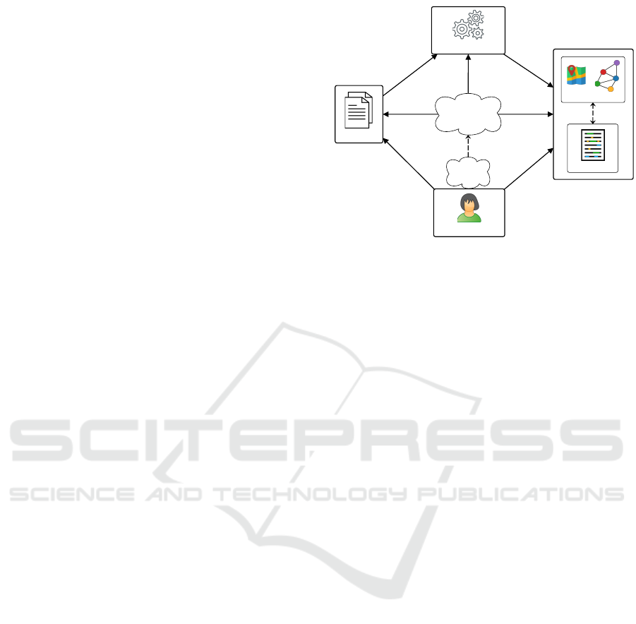
anicke et al., 2017) as illustrated in Figure 1.
Most importantly, projects should start with a central
idea, the text analysis task that influences all further
steps throughout the project. Throughout the course,
most related works were discussed in the context of
the visual text analysis process, but it is important to
note that not all of them were based on raw textual
data, i.e., some projects based their research on re-
lational databases containing structured textual infor-
mation. The text analysis task is typically directed
towards a text source that is of interest for the human-
ities scholar. Data transformation and the developed
visualizations strongly relate to this task and the un-
derlying data. After a broad overview of the visual
text analysis process and exemplary projects, the fol-
lowing contents composed the theoretical training of
the course:
• Visualization Design: First, I gave an overview
of general visualization guidelines based on
Munzner’s book “Visualization Analysis and
Design” (Munzner, 2014). Other visualization
text books can be used as a basis for teaching
related courses, e.g., Colin Ware’s “Information
Visual Text Analysis
close reading
humanities scholar
text analysis
task
text sources
insight
data transformation
distant reading
Figure 1: Visual text analysis process (J
¨
anicke et al., 2017).
Visualization” (Ware, 2012) choosing a rather
theoretical approach or Cao and Cui’s “Intro-
duction to Text Visualization” (Cao and Cui,
2016) for a mere application-driven approach.
However, Munzner’s practical approach of
breaking down the visual design process into
the questions WHAT (data is to be visualized),
WHY (a visualization is necessary, in other
words, what are the user tasks to be supported),
and HOW (data can be visualized to support
the intended user tasks) provides a well-suited,
comprehensive overview of the major aspects
related for the design process of visualizations
in the context of digital humanities projects.
The great opportunity is that students learn,
independent on their academic backgrounds
in computer science, digital humanities, social
science or humanities, the same terminology
for visual design eabling them to purposefully
discuss project ideas. In addition, conveying data
and task abstraction strategies is very important
to shed a light onto particularities and commonal-
ities among the many concrete projects discussed
throughout the course. Finally, one major reason
for teaching on the basis of Munzner’s works
is the nested model (Munzner, 2009). My own
experiences (J
¨
anicke et al., 2016; J
¨
anicke and
Wrisley, 2017; Khulusi et al., 2019) outline that
carrying out digital humanities projects based on
the nested model model significantly increases
the likeliness that the developed tool serves the
intended purpose because domain experts with
their knowledge in the targeted research field are
strongly involved in the development process.
The interdisciplinary exchange necessary for
successful digital humanities research students
experience in the practical training.
Teaching on the Intersection of Visualization and Digital Humanities
101

• Digital Humanities: Now that all students were
supplied with a basic knowledge of visual design,
we discussed the digital humanities as the focused
domain. This included major historical develop-
ments in the field, e.g., Wladimir Jakowlewitsch
Propp’s “Morphology of the Folktale” published
in 1928, in which he offers the first known quan-
titative view on a collection of Russian folk-
tales (Propp, 2010), or Roberto Busa’s “Index
Thomisticus” project that started in 1948 with the
lemmatization of Thomas Aquinas’ works (Busa,
1980). The overview ended with a discus-
sion of recent driving forces including Franco
Moretti’s “Graphs, Maps, Trees” (Moretti, 2005)
who controversially promotes visual representa-
tions for texts, the Culturomics project (Michel
et al., 2011) being one of the first attempts to
quantitatively analyze digitized text collections
in the field, and Matthew Jocker’s “Macroanaly-
sis” (Jockers, 2013) giving an overview of the sta-
tistical fundaments for such analyses.
• Close Reading: Munzner asks for mutual ex-
change of domain knowledge and research ap-
proaches in interdisciplinary projects (Munzner,
2009). As most students of the course are not fa-
miliar with the close reading technique (Burke,
2012; Mesmer and Rose-McCully, 2018) being
a fundamental method in traditional humanities
scholarship, one lecture was dedicated to it, and
the students could perform a close reading them-
selves in order to reflect on the main idea of a text,
to think about narrative style, vocabulary, syntax
and the context in which a text was written. Con-
textualizing our own work (Cheema et al., 2016),
I conveyed the capabilities of how visualization
can support digital close reading (Kehoe and Gee,
2013) ranging from manual annotations to quanti-
tative distant reading statistics.
• Information Seeking Mantra: On the bridge be-
tween close and distant reading, I discussed the
main differences among both techniques using
Shneiderman’s mantra “Overview first, zoom and
filter, details-on-demand” (Shneiderman, 1996).
While distant reading or macroanalysis are the
terms used by digital humanities scholars for
overview, close reading or mircoanalyis relate to
details on demand. For the continuum in between,
zooming and meso reading (J
¨
anicke and Wrisley,
2017) are the established terms. Many visualiza-
tions that have been designed implement the infor-
mation seeking mantra as the humanities scholars
are provided with a distant reading, and means of
interaction lead them to interesting portions of the
underlying data source.
• Distant Reading: Throughout the course,
I discussed the main related distant reading
techniques—heat maps, tag clouds, maps, time-
lines and graphs—with the students both in the-
ory and practice. On the one hand, concep-
tual and technical details are outlined such as for
tag clouds (Sinclair and Cardew-Hall, 2008; Vie-
gas and Wattenberg, 2008) and timelines (Aigner
et al., 2011; Bach et al., 2015; Brehmer et al.,
2017), on the other hand, practical examples
from related works underpin the value of distant
reading techniques for (digital) humanities schol-
ars (J
¨
anicke et al., 2017). Related works were
chosen based on their actual applicability to dig-
ital humanities research. For example, Collins’
Parallel Tag Clouds (Collins et al., 2009) that
have been applied in the Trading Consequences
project (Hinrichs et al., 2015), was discussed.
This way students get to know strategies how
to adapt existing techniques to support research
inquiries in digital humanities. Further, basics
of drawing graphs (Tamassia, 2007)—being the
most frequently occurring data structure in dig-
ital humanities research—were conveyed. My
motivation to stress this topic is the rather low
quality of graph visualization design in related
works. Digital humanities researchers typically
apply ready-to-use tools (Bastian et al., 2009)
to generate visual output quickly, disregarding
means to appropriately map graph-structural to vi-
sual features. The benefits of careful graph de-
sign were dicussed on the basis of our work on
TRAViz (J
¨
anicke et al., 2015), a graph visualiza-
tion reflecting the features of aligned text editions
on sentence level, which was compared to previ-
ous approaches (Haentjens Dekker et al., 2014;
Andrews and Mac
´
e, 2013) using a standard graph
drawing library. Finally, as uncertain information
is often comprised in digital humanities data due
to the long history the data refers to, current re-
search endeavors to tackle this problem (B
¨
orner
et al., 2019) were discussed in the course.
4 PRACTICAL TRAINING
One of the most important driving forces for the
practical training was my own interdisciplinary back-
ground. When I started working in digital humani-
ties projects as a computer scientist (J
¨
anicke, 2016),
me as well as my collaboration partners from the hu-
manities needed to learn speaking the same language
and to understand each others’ research interests and
ways of thinking. I admired that students get this ex-
IVAPP 2020 - 11th International Conference on Information Visualization Theory and Applications
102
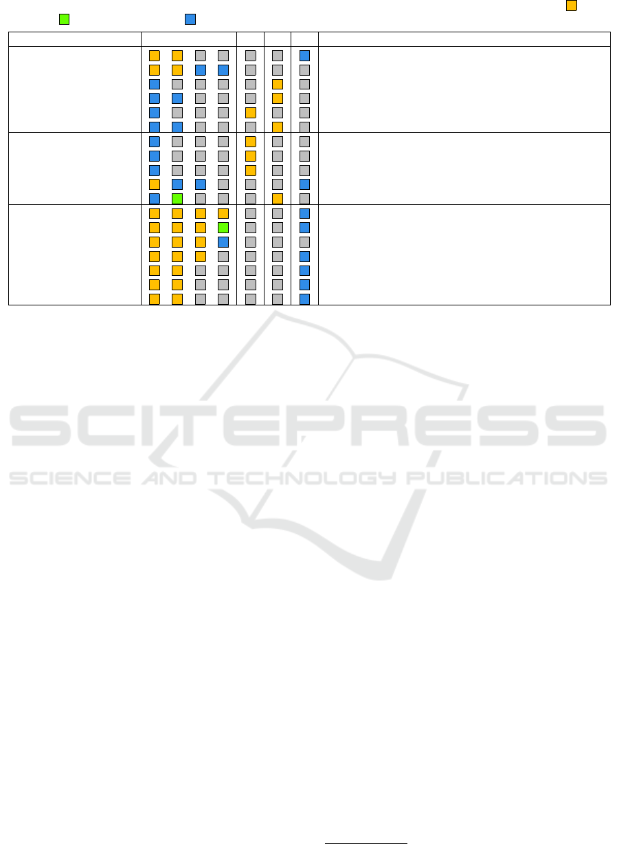
Table 1: Projects carried out in three years involving students and researchers with backgrounds in the humanities , digital
humanities and computer science .
Project Topic Perfect Setup? R F H Major Project Tasks
Merseburg Incantations data retrieval, data modeling, geovisualization
Witchcraft Trials digitization, data modeling, geo-temporal visualization
Movie Relations network visualization, optimization
Actor Biographies interface design, network visualization, statistical charts
Musical Instruments geo-temporal visualization, uncertainty mapping
Letter Exchange text processing/ranking, parallel tag cloud variant
Engineering Subjects interactive tag cloud (to derive meta-subjects)
Musical Genres interactive tag cloud (to guide to close reading)
Instrument Makers repository linking, geo-temporal visualization
Witchcraft Trials II data modeling, geo-temporal visualization
Movie Locations interface design, geo-temporal visualization
Michelin Restaurants data retrieval, geovisualization, uncertainty mapping
Bundestag Politicians data retrieval, parallel coordinates variant
Music Styles data retrieval, geovisualization
Fake News data retrieval, text processing, tag cloud adaption
Hip Hop Musicians data retrieval, data modeling, network graph adaption
Education Spending data retrieval, geovisualization
Solidary Pact data retrieval, geovisualization
perience before they actually commit to join a digital
humanities project.
The theoretical part of the course covered half
of the semester. In order to practically apply the
gained knowledge, students required to implement
small project ideas in groups. I outlined the frame of
the practical training at semester start and asked the
students to think about projects they like to work on.
It was interesting to observe that the more time in the
theoretical section passed, the more precise students
were able to formulate project ideas using the learned
technical terms.
In three years, I faced very different student
groups. In the first two years, only computer science
and a few humanities students were allowed to take
part in the course. In the last year, the ratio completely
switched as the course was offered for the journalism
and digital humanities Masters degrees for the first
time. Thus, in all three years I had to improvise when
setting up interdisciplinary projects involving visual-
ization as well as humanities scholars. An overview
of all projects carried out in three years is provided in
Table 1.
4.1 The Perfect Setup
Only few projects involved students with a computer
science (or digital humanities) and a humanities (or
journalism or digital humanities) background alike.
This way, the whole project was in the students’
hands, and I just joined as a mediator if necessary.
The results of those projects were usually limited as
students faced coordination and communication is-
sues. In one case, humanities students very care-
fully generated a database manually, while, on the
other end, computer science students were waiting
for real world data to start with. Another issue arose
when only one student with a computer science back-
ground joined a group with more than one humanities
scholar—the computer science student was expected
to implement the project.
However, this constellation also brought forth re-
markable results. A project, in which one digital hu-
manities scholar with a decent computer science train-
ing and three journalism students participated, fo-
cused on the biographies of politicians of the German
Bundestag as of June 2019. They were inspired by the
New York Times visualization (NYT, 2019) reporting
on the career paths of politicians in the U.S. congress.
The students took the biographies from the Bundestag
homepage
1
having a far easier understandable visual-
ization as opposed to the New York Times in mind.
They focused on different aspects of a career: political
party, school degree, education degree, former politi-
cal position and former practised profession. In order
to extract those information for 709 politicians, they
implemented rules to parse the crawled biographical
texts accordingly. In order to browse the gained data,
they adapted a parallel coordinates visualization vari-
ant that can be used to interactively search for patterns
in the data. Figure 2 compares members of the SPD
and Die Gr
¨
unen Bundestag factions. One can find out
that all members of Die Gr
¨
unen had a position on fed-
eral or state level before joining the Bundestag. In-
stead, many SPD politicians having a position in the
commune were elected for the Bundestag.
1
https://www.bundestag.de/abgeordnete/biografien
Teaching on the Intersection of Visualization and Digital Humanities
103
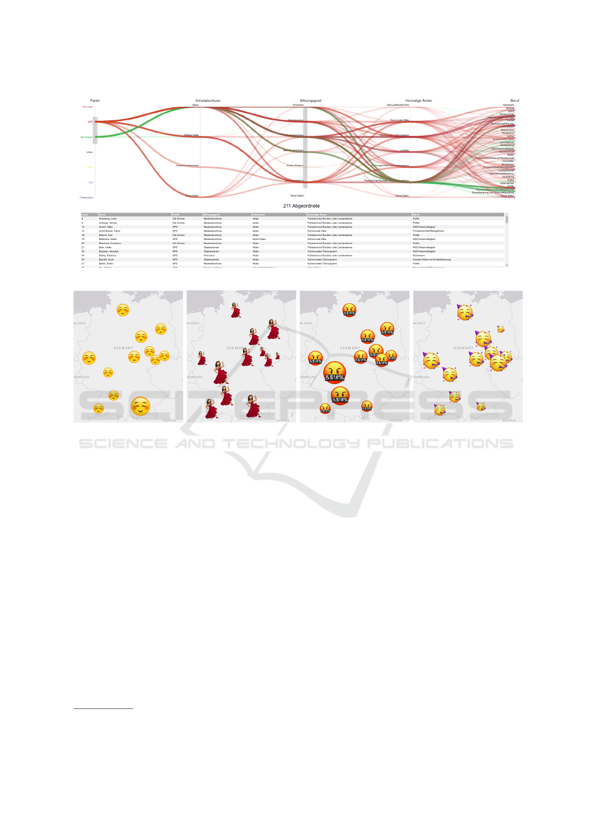
Figure 2: A Perfect Setup project: Analyzing the biographies of 709 politicians of the German Bundestag.
Figure 3: A Perfect Setup project: Favored music styles in 10 German cities regarding the music features happy, dancable,
explicit, and energetic.
Another project group involving one computer
science and three journalism students focused on
the comparison of favored music features in East-
ern vs. Western German cities. Therefore, the Spo-
tify playlists
2
of ten cities were analyzed according
to the music features happy, dancable, explicit and
energetic. The mean value from a city’s playlist for
each of those features is mapped to the range [0, 1]
that is used to scale an emoji icon that reflects the cor-
responding music feature best. The resulting maps
are shown in Figure 3. As the students extracted the
playlists manually, they restricted their observation to
few German cities. They admitted that an appropri-
ate answer to the given comparative analysis interest
is hard to find: the number of chosen cities was sub-
jective, the equal amount of representatives from East
and West did not stand for the population ratio, and
the number of songs in the playlists differed. How-
ever, the maps revealed some interesting information
on city level. Music heard in Frankfurt is typically
dancable and explicit, but less happy and energetic.
2
https://spotifymaps.github.io/musicalcities/
In Saxony, people listen to energetic music that is less
happy, dancable and explicit.
4.2 The Real Humanities Scholar
When too many computer science students partici-
pated in the course, I prepared a number of digi-
tal humanities projects that are usually driven by re-
search interests from humanities scholars. There-
fore, I asked my collaboration partners if they could
come up with a task that fits into the practical train-
ing without overstraining the students. Moreover, I
asked them whether they could serve as collaboration
partners during the practical training to discuss pro-
totypes and results. The projects had a higher suc-
cess rate as opposed to The Perfect Setup as my col-
laboration partners are experienced in participating
digital humanities projects. Very good results were
achieved when a profound research query met an en-
gaged computer science student, also leading to pub-
lishing the outcomes (Meinecke and J
¨
anicke, 2018;
Khulusi et al., 2020).
In two projects, students worked together with a
IVAPP 2020 - 11th International Conference on Information Visualization Theory and Applications
104
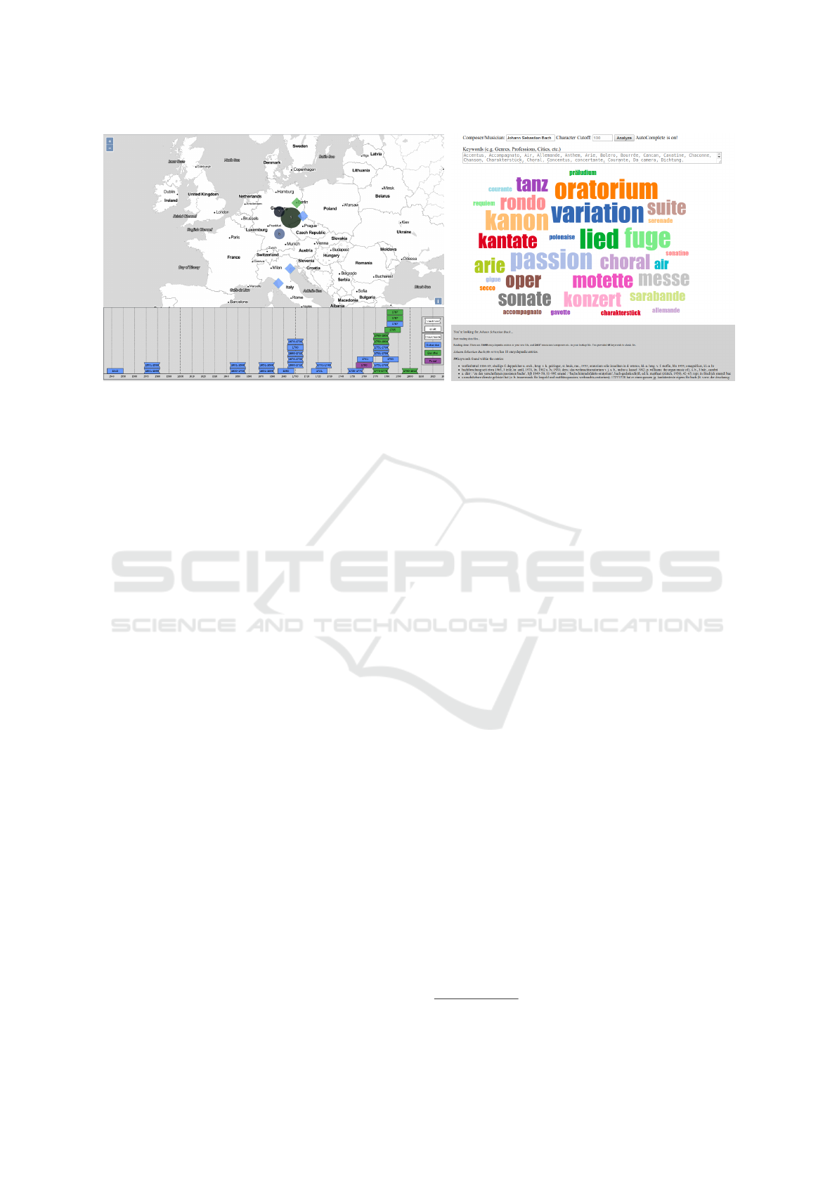
Figure 4: Real Humanities Scholar projects: Comparative visualization of geospatial-temporal metadata of instruments (left),
and tag cloud visualization supporting the interactive exploration of a composer’s music genres (right).
professor from the university’s musicology depart-
ment with whom I cooperate very successful since
2015 in various projects (J
¨
anicke et al., 2016; J
¨
anicke
and Focht, 2017; Khulusi et al., 2019). The first
research interest focused on comparatively explor-
ing geospatial-temporal metadata of clavichord in-
struments in the catalogue of the Musical Instruments
Museum Leipzig. Next to mapping the clavichord
type to color, a visual design to communicate un-
certain datings and different geospatial granularities
was developed (see Figure 4, left). The second re-
search interest was an analysis of music genres of the
works of composers. Based on the musiXplora (Khu-
lusi et al., 2020) containing biographical information
about around 30,000 musicians, fulltext biographies
were scanned for a pre-defined list of genre types
(such as opera, rondo, concert, etc.) and made avail-
able in an interactive tag cloud. Entering the name of
a composer, related genre tags are shown. The Infor-
mation Seeking Mantra is fulfilled as when clicking a
genre tag, the according text fragments can be close
read. An example for genre tags of Johann Sebastian
Bach is shown in Figure 4 (right).
4.3 The Fake Humanities Scholar
As the number of project ideas from my collabora-
tion partners was not exhausive enough, I—being a
computer scientist who worked in interdisciplinary
projects for ten years—acted myself as the humani-
ties scholar of some projects. Therefore, I prepared
project ideas that could generate interesting insights
into popular data sets. The project results in this
category were typically full-scale implementations of
the Information Seeking Mantra (Shneiderman, 1996)
serving undirected exploration purposes rather than
focused research interests.
The IMDb database
3
suited perfectly well in this
constellation as it provides various easily understand-
able information with different types, and only few
sophisticated visualizations (Vlachos and Svonava,
2013; Alam and Jianu, 2016; Auber et al., 2003) have
been proposed to explore film history in the spirit of
the Filmfinder (Ahlberg and Shneiderman, 1994). Re-
lated student projects in my course included develop-
ing visual designs to explore movie relationships, bi-
ographies of persons such as actors or directors, and
film locations. A screenshot of the tool developed to
browse film locations, which had to be geocoded, is
shown in Figure 5. Each circle refers to one or mul-
tiple locations, and when choosing a location, related
movies can be explored. The bar chart encodes genre
with color, and a bar stands for the number of movies
filmed at the chosen location in a certain year.
4.4 The Helper
Especially in the last year with too few computer sci-
ence students in the course, humanities students re-
quired technical support. Many of those were journal-
ism students with only very basic computer science
skills. Partially, I trained them how to apply existing
tools and visualizations to their data. Also, students
took charge of services provided by the university for
computer science students of early semesters. Typical
for those projects was a very high quality of the data
source being composed, and that visualizations were
mostly adapted to fit this data. In one project, the stu-
dents developed a database of German hip hop mu-
sicians, and they generated a list of relations among
3
https://www.imdb.com/interfaces/
Teaching on the Intersection of Visualization and Digital Humanities
105
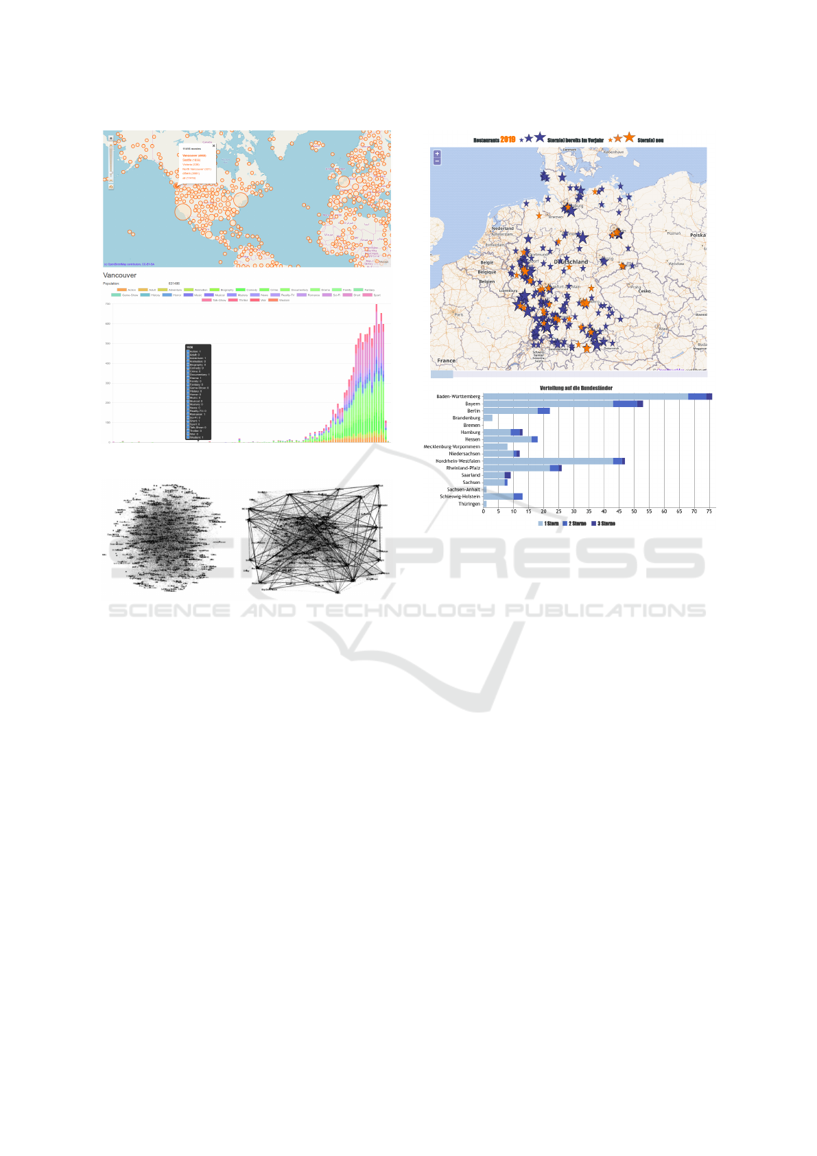
Figure 5: A Fake Humanities Scholar project: Exploring
movie locations.
Figure 6: A Helper project: Social network visualization of
German hip hop musicians visualized with Gephi.
them. A close relation was defined when two musi-
cians were participating the same band, a loose rela-
tion was defined when two musicians having a similar
age were living in the same city. Gephi (Bastian et al.,
2009) was used for visualizing different subsets of the
graph as shown in Figure 6.
Another group focused on the history of German
Michelin restaurants. They were able to generate an
aestehtic visual output in the form of an interactive
map accompanied with a time slider that allows to
explore changes throughout the years (see Figure 7).
The star size encodes the number of Michelin stars
(1, 2, or 3) and a star is highlighted in orange once the
number of stars change. When transforming histori-
cal data that was provided in lists of Michelin restau-
rants per year, the students had to encode uncertain-
ties as some restaurants were already closed leading
to geocoding errors. As the main focus of the project
was comparing the coverage of Michelin restaurants
in Eastern and Western Germany, in such cases, cities
were chosen instead of exact positions keeping global
relationships stable. To support the comparison task,
Figure 7: A Helper project: Geospatial-temporal analysis
of German Michelin restaurants.
numbers of Michelin restaurants could be compared
by state using a horizontal bar chart.
In one case in the first two years, I needed to re-
place the computer science students of a project as
they resigned from the course. The project focused
on how the Merseburg incantations are referred to in
the media. The collected data was very well struc-
tured and together with humanities students this lead
to a poster presentation at the digital humanities con-
ference in 2017 (J
¨
anicke, 2017).
5 REFLECTION
In the three years I used different means to evalu-
ate the course, ranging from standardized to content-
related questionnaires. In addition, I received valu-
able feedback in discussions. Together with my ex-
periences gained, I reflect on important aspects of de-
signing a related course.
Group Heterogeneity. The focus of the theoreti-
cal course contents should be adjusted according to
the needs of the participating students. In the last
year, when the majority of students had a background
IVAPP 2020 - 11th International Conference on Information Visualization Theory and Applications
106

in journalism or digital humanities, I frequently dis-
cussed visualizations published in media. However,
some topics of the course were seen as too deeply
discussed (e.g., close reading, or temporal data visu-
alizations based on space-time cube operations (Bach
et al., 2015)). On the other hand, computer science
students, being the majority in the first two years,
liked the comprehensive overview of related projects
from the digital humanities as an application domain.
Thus, on the one hand, working with a homogeneous
group makes it easier to adapt to the students’ needs,
on the other hand, a heterogeneous group ensures that
students with different backgrounds work together.
Student Projects. Students were seemingly more
engaged when they were able to choose their own
project topics. To longer the course took during the
semester, the more they were able to generate ideas on
their own—especially, journalism students brought
forth projects that were interesting from a technical
data analysis perspective while being relevant to so-
ciety too. I judged if their ideas fit into the course,
and if so, we discussed the extent of the result to be
expected. Adaptions in this regard were made when I
recognized that a group performed better or worse as
expected when working on the projects. As projects
were carried out on the basis of Munzner’s nested
model (Munzner, 2009), which inheres iterative eval-
uation due to the involvement of domain experts in
the visualization design process, the evaluation of vi-
sualizations was not explicitly discussed.
Grading. Projects were not graded, but a successful
project was necessary to join an oral exam. Students
presented their project results in front of the group,
and they were asked to contextualize their project in
related works from visualization and digital human-
ities. I further engaged them to reflect on collabo-
ration experiences gained during their projects. In
three years, a total of four students resigned from the
course. Out of 18 projects, 13 were assessed as suc-
cessful, the students who presented insufficient results
received additional project time. In this second itera-
tion 4 out of 5 projects were assessed as successful.
All students passed the subsequent oral exam.
Data Retrieval and Modeling. Many projects
faced data acquisition problems. On the one hand,
this relates to limited data processing skills, on the
other hand, to the short project durations. While in
one project numbers needed to be manually extracted
from old documents for which OCR failed, other
projects suffered from the long response time of data
deliveries—seemingly all valuable lessons learned for
future projects. Though students who start with al-
ready given data sets overall gained better project re-
sults concerning visualization quality, the challenges
of compiling and modeling a data set for a given re-
search inquiry is a valuable task, especially for (digi-
tal) humanities students. In addition, the exchange on
data modeling supports the interdisciplinary discourse
among students having different backgrounds.
Data Transformation. A broad overview of data
transformation techniques should be provided to con-
vey all aspects of the visual text analysis process suf-
ficiently. This was remarked by students as my lim-
ited lecture time allowed only the discussion of few
related methods such as Named Entity Recognition
(NER). Ideally, students should gain pre-requisites in
text processing before partaking the course.
Hands-on Sessions. Students without a techni-
cal background require practical hands-on sessions
throughout the theoretical part of the course. On
the one hand, they wish to apply existing visualiza-
tion tools to data sets—a common work practice of
digital humanities scholars and journalists—, on the
other hand, the programming of sample snippets was
seen valuable before beginning the practical training
in student projects. For the former, I suggest ses-
sions with standard tools like Voyant
4
, CollateX
5
or
Gephi
6
in order to foster understanding of the un-
derlying research questions and to discuss potential
visualization-related improvements.
Collaboration. Many students described the value
of the project work similar to the following remark:
“The development of visualization has brought me
a lot further, because I can now imagine the imple-
mentation of such projects much more concretely.”
Students with a non-technical background remarked
they would not have been able to design related
visualizations without the knowledge gained in the
course. Most of the students joined an interdisci-
plinary project for the first time, and the course taught
them strategies how to approach them. Some students
valued the relevance of the project work for their fu-
ture, also they saw how the undertaken steps could be
applied to support other data analysis tasks. Lastly,
the exchange with other groups facing similar tasks
was important. On the contrary, students faced typi-
cal callenges of interdisciplinary work, especially in
the perfect setup projects.
4
https://voyant-tools.org/
5
https://collatex.net/
6
https://gephi.org/
Teaching on the Intersection of Visualization and Digital Humanities
107

An Ideal Course. A 5 ECTS course is too short
to teach all aspects of the visual text analysis pro-
cess (J
¨
anicke et al., 2017), especially for students
having a non-technical background. I suggest two 5
ECTS courses in subsequent semesters with the fol-
lowing objectives:
• Semester 1—Contents: visual text analysis
overview, introduction to digital humanities, tra-
ditional vs. digitally supported workflows, text
mining basics, standard data transformation tech-
niques (e.g., tokenization, stemming, named en-
tity recognition, part-of-speech tagging)
• Semester 1—Project: data retrieval and data mo-
deling, preferably driven by an own project idea
• Semester 2—Contents: visualization design,
nested model, Information Seeking Mantra, close
and distant reading visualization techniques
• Semester 2—Project: iterative development of
a tool to support visual text analyses, preferably
based on a data set generated in the first semester
Though the spread throughout two semesters in-
creases the likeliness of project groups breaking apart
or loosing members, this way, students gain more
time to generate data sets according to their own inter-
ests. If the first project does not deliver an appropriate
data set, ready-to-use data sets can be used in the sec-
ond semester. As the course pursues that students ex-
perince interdisciplinary digital humanities projects,
only ”perfect setup” and ”real humanities scholar”
projects should be conducted. To avoid other con-
stellations, the ratios of partaking (digital) humani-
ties and computer science students should both range
around 50%, in case of a lower ratio of humani-
ties students, the number of real humanities scholar
projects should compensate this imbalance.
6 SUMMARY
The results illustrated in the figures are—without
any changes—the visual designs as presented by the
groups on the last course day. Even though most visu-
alizations leave room for improvements due to some
inappropriate design decisions, I was impressed by
the quality of project outcomes considering the fact
that many students had neither computer science nor
visualization skills before joining the course.
When designing a course like this, one needs to be
able to take different roles. For me, it was much easier
to take the helper role as my capabilities as a computer
scientist were requested. But my digital humanities
experience helped me also to join in as a fake human-
ities scholar. Nevertheless, having a series of project
ideas offered by real humanities scholars participating
as partners during the project developments is invalu-
able as it guarantees the steepest learning curve for
students with a computer science background.
REFERENCES
Ahlberg, C. and Shneiderman, B. (1994). Visual informa-
tion seeking using the filmfinder. In Conference com-
panion on Human factors in computing systems, pages
433–434. ACM.
Aigner, W., Miksch, S., Schumann, H., and Tominski, C.
(2011). Visualization of Time-Oriented Data. Springer
Publishing Company, Incorporated, 1st edition.
Alam, S. S. and Jianu, R. (2016). Analyzing eye-tracking
information in visualization and data space: from
where on the screen to what on the screen. IEEE
transactions on visualization and computer graphics,
23(5):1492–1505.
Andrews, T. L. and Mac
´
e, C. (2013). Beyond the tree of
texts: Building an empirical model of scribal variation
through graph analysis of texts and stemmata. Literary
and Linguistic Computing, 28(4):504–521.
Auber, D., Chiricota, Y., Jourdan, F., and Melanc¸on, G.
(2003). Multiscale visualization of small world net-
works. In IEEE Symposium on Information Visualiza-
tion 2003, pages 75–81.
Bach, B., Dragicevic, P., Archambault, D., Hurter, C., and
Carpendale, S. (2015). A Descriptive Framework
for Temporal Data Visualizations Based on General-
ized Space-Time Cubes. Computer Graphics Forum,
36(6):36–61.
Bastian, M., Heymann, S., Jacomy, M., et al. (2009). Gephi:
an open source software for exploring and manipulat-
ing networks. ICWSM, 8:361–362.
B
¨
orner, K., Eide, O., Mchedlidze, T., Rehbein, M., and
Scheuermann, G. (2019). Network Visualization in
the Humanities (Dagstuhl Seminar 18482). Dagstuhl
Reports, 8(11):139–153.
Brehmer, M., Lee, B., Bach, B., Riche, N. H., and Mun-
zner, T. (2017). Timelines Revisited: A Design Space
and Considerations for Expressive Storytelling. IEEE
Transactions on Visualization and Computer Graph-
ics, 23(9):2151–2164.
Burke, B. (2012). A Close Look at Close Reading: Scaf-
folding Students with Complex Texts.
Busa, R. (1980). The Annals of Humanities Computing: The
Index Thomisticus. Raccolta delle opere di Roberto
Busa. North Holland Publishing Company.
Cao, N. and Cui, W. (2016). Introduction to Text Visualiza-
tion. Atlantis briefs in artificial intelligence. Atlantis
Press, Paris.
Cheema, M. F., J
¨
anicke, S., and Scheuermann, G. (2016).
AnnotateVis: Combining Traditional Close Reading
with Visual Text Analysis. In Workshop on Visual-
ization for the Digital Humanities, IEEE VIS 2016,
Baltimore, Maryland, USA.
IVAPP 2020 - 11th International Conference on Information Visualization Theory and Applications
108

Collins, C., Viegas, F. B., and Wattenberg, M. (2009). Paral-
lel tag clouds to explore and analyze faceted text cor-
pora. In 2009 IEEE Symposium on Visual Analytics
Science and Technology, pages 91–98.
Dohn, N. and Dolin, J. (2015). Research-based teaching,
pages 43–63. Samfundslitteratur, 1. edition.
Dykes, J., Keefe, D. F., Kindlmann, G., Munzner, T., and
Joshi, A. (2010). Perspectives on Teaching Data Visu-
alization. IEEE VisWeek 2010.
Haentjens Dekker, R., van Hulle, D., Middell, G., Neyt, V.,
and van Zundert, J. (2014). Computer-supported col-
lation of modern manuscripts: Collatex and the beck-
ett digital manuscript project. Literary and Linguistic
Computing, 30(3):452–470.
Healey, M. (2005). Linking research and teaching explor-
ing disciplinary spaces and the role of inquiry-based
learning. Reshaping the University: New Relation-
ships between Research, Scholarship and Teaching,
pages 67–78.
Hinrichs, U., Alex, B., Clifford, J., Watson, A., Quigley,
A., Klein, E., and Coates, C. M. (2015). Trad-
ing Consequences: A Case Study of Combining Text
Mining and Visualization to Facilitate Document Ex-
ploration. Digital Scholarship in the Humanities,
30(suppl 1):i50–i75.
J
¨
anicke, S. (2016). Valuable Research for Visualization and
Digital Humanities: A Balancing Act. In Workshop
on Visualization for the Digital Humanities, IEEE VIS
2016, Baltimore, Maryland, USA.
J
¨
anicke, S. (2017). On the Impact of the Merseburg Incanta-
tions. In Conference Abstracts of the Digital Human-
ities 2017.
J
¨
anicke, S. and Focht, J. (2017). Untangling the social net-
work of musicians. In Conference Abstracts of the
Digital Humanities 2017.
J
¨
anicke, S., Focht, J., and Scheuermann, G. (2016). Interac-
tive visual profiling of musicians. IEEE transactions
on visualization and computer graphics, 22(1):200–
209.
J
¨
anicke, S., Franzini, G., Cheema, M. F., and Scheuermann,
G. (2017). Visual Text Analysis in Digital Humanities.
Computer Graphics Forum, 36(6):226–250.
J
¨
anicke, S., Geßner, A., Franzini, G., Terras, M., Mahony,
S., and Scheuermann, G. (2015). TRAViz: A Visual-
ization for Variant Graphs. Digital Scholarship in the
Humanities, 30(suppl 1):i83–i99.
J
¨
anicke, S. and Wrisley, D. J. (2017). Interactive Visual
Alignment of Medieval Text Versions. In 2017 IEEE
Conference on Visual Analytics Science and Technol-
ogy (VAST), pages 127–138.
Jockers, M. L. (2013). Macroanalysis: Digital Methods and
Literary History. University of Illinois Press, Cham-
paign, IL, USA, 1st edition.
Kehoe, A. and Gee, M. (2013). eMargin: A Collaborative
Textual Annotation Tool. Ariadne, 71.
Kerren, A., Stasko, J. T., and Dykes, J. (2008). Teaching
Information Visualization. pages 65–91. Springer.
Khulusi, R., J
¨
anicke, S., Kusnick, J., and Focht, J. (2019).
An Interactive Chart of Biography. Pacific Visualiza-
tion Symposium (PacificVis), 2019 IEEE.
Khulusi, R., Kusnick, J., Focht, J., and J
¨
anicke, S. (2020).
musiXplora:Visual Analysis of a Musicological En-
cyclopedia. In Proceedings of the 11th International
Conference on Information Visualization Theory and
Applications (IVAPP).
Meinecke, C. and J
¨
anicke, S. (2018). Visual Analysis of
Engineer’s Biographies and Engineering Branches. In
LEVIA 2018: Leipzig Symposium on Visualization in
Applications.
Mesmer, H. A. and Rose-McCully, M. (2018). A closer look
at close reading: Three under-the-radar skills needed
to comprehend sentences. The Reading Teacher,
71(4):451–461.
Michel, J.-B., Shen, Y. K., Aiden, A. P., Veres, A., Gray,
M. K., , Pickett, J. P., Hoiberg, D., Clancy, D., Norvig,
P., Orwant, J., Pinker, S., Nowak, M. A., and Aiden,
E. L. (2011). Quantitative Analysis of Culture Using
Millions of Digitized Books. 331(6014):176–182.
Moretti, F. (2005). Graphs, Maps, Trees: Abstract Models
for a Literary History. Verso.
Munzner, T. (2009). A nested model for visualization de-
sign and validation. IEEE Transactions on Visualiza-
tion and Computer Graphics, 15(6):921–928.
Munzner, T. (2014). Visualization Analysis and Design.
CRC press.
NYT (2019). New York Times: How Every Member Got
to Congress. https://www.nytimes.com/interactive/
2019/01/26/opinion/sunday/paths-to-congress.html
(Retrieved 2019-07-08).
Propp, V. (2010). Morphology of the Folktale, volume 9.
University of Texas Press.
Shneiderman, B. (1996). The Eyes Have It: A Task by Data
Type Taxonomy for Information Visualizations. In Vi-
sual Languages, Proceedings, pages 336–343.
Sinclair, J. and Cardew-Hall, M. (2008). The folksonomy
tag cloud: when is it useful? Journal of Information
Science, 34(1):15–29.
Spence, R. (2007). Information Visualization: Design for
Interaction. Pearson/Prentice Hall.
Tamassia, R. (2007). Handbook of Graph Drawing and
Visualization (Discrete Mathematics and Its Applica-
tions). Chapman & Hall/CRC.
Viegas, F. and Wattenberg, M. (2008). TIMELINES: Tag
Clouds and the Case for Vernacular Visualization. in-
teractions, 15(4):49–52.
Vlachos, M. and Svonava, D. (2013). Recommendation and
visualization of similar movies using minimum span-
ning dendrograms. Information Visualization, 12:85–
101.
Ware, C. (2012). Information Visualization: Perception for
Design. Elsevier.
Teaching on the Intersection of Visualization and Digital Humanities
109
