
Visual Growing Neural Gas for Exploratory Data Analysis
Elio Ventocilla and Maria Riveiro
School of Informatics, University of Sk
¨
ovde, Sk
¨
ovde, Sweden
Keywords:
Growing Neural Gas, Dimensionality Reduction, Multidimensional Data, Visual Analytics, Exploratory Data
Analysis.
Abstract:
This paper argues for the use of a topology learning algorithm, the Growing Neural Gas (GNG), for provi-
ding an overview of the structure of large and multidimensional datasets that can be used in exploratory data
analysis. We introduce a generic, off-the-shelf library, Visual GNG, developed using the Big Data framework
Apache Spark, which provides an incremental visualization of the GNG training process, and enables user-
in-the-loop interactions where users can pause, resume or steer the computation by changing optimization
parameters. Nine case studies were conducted with domain experts from different areas, each working on
unique real-world datasets. The results show that Visual GNG contributes to understanding the distribution
of multidimensional data; finding which features are relevant in such distribution; estimating the number of k
clusters to be used in traditional clustering algorithms, such as K-means; and finding outliers.
1 INTRODUCTION
Exploratory data analysis (EDA) is “a detective work”
for finding and uncovering patterns (Tukey, 1977).
It is process engaged by users “without heavy de-
pendence on preconceived assumptions and models”
about the data (Goebel and Gruenwald, 1999). Doing
EDA can be as simple as opening and reading a data
file in a text editor, or as complex as running multi-
ple Machine Learning (ML) algorithms over a dataset.
While doing EDA, a data scientist’s first approach to
a dataset may be driven towards having an overview
of the structure of the data. That is, a view on how
data is distributed in the multidimensional space. The
exploratory steps following the overview might then
be driven towards understanding the given structure,
i.e., answering why some data points are close to each
other and why others are far apart.
Traditional visualization techniques such as scat-
ter plots or scatter plot matrices, can provide the de-
sired overview without needing too much data pre-
processing. However, these techniques are, when
used on their own, limited to the size and/or the di-
mensionality of a dataset (Spence, 2007; Munzner,
2014). ML techniques for hierarchical or density ba-
sed clustering, can overcome these dimensionality li-
mitations, while providing means to visualize data
structure using dendograms or reachability plots (RP).
These plots are, nevertheless, limited to the size of the
dataset, since they visually encode every data point.
An example ML method that is capable of compres-
sing large multidimensional datasets into a fixed num-
ber of representative units is the Self-organizing Map,
SOM, (Kohonen, 1997). Through the U-Matrix plots,
it is possible to visualize these units even if they are
in a high-dimensional space. This visual representa-
tion, however, can be argued not to be as intuitive as a
scatter plot for depicting the structure of the data, and
moreover, the dimension of the U-matrix grid needs
to be established beforehand.
An ML technique which provides the compression
benefits of SOMs is the Growing Neural Gas (GNG)
(Fritzke, 1995). GNG is a topology learning algo-
rithm which starts with two representative units and
grows as it builds a topological representation of data.
Its growth can be limited to a given number of units
and the resulting topological network can be plotted
using graphs. In this paper, we argue that GNG can
provide a complementary perspective of the structure
of large multidimensional datasets for EDA, and that
its potential has been somewhat overlooked by the Vi-
sual Analytics (VA) community.
The effective use of GNG can, as it happens with
other ML algorithms, be hindered by the complexity
that it might represent to users in terms of ease and ef-
fective use, as well as outcome interpretation. This is
often referred to as a black-box problem (Bertini and
Lalanne, 2010; van Leeuwen, 2014; Holzinger, 2016;
Ribeiro et al., 2016), where the learning process and
the fitted model do not readily lend themselves to user
58
Ventocilla, E. and Riveiro, M.
Visual Growing Neural Gas for Exploratory Data Analysis.
DOI: 10.5220/0007364000580071
In Proceedings of the 14th International Joint Conference on Computer Vision, Imaging and Computer Graphics Theory and Applications (VISIGRAPP 2019), pages 58-71
ISBN: 978-989-758-354-4
Copyright
c
2019 by SCITEPRESS – Science and Technology Publications, Lda. All rights reserved

view and interpretation. Indeed, model visualization
for exploration, understanding and evaluation is still
an open challenge in many VA applications, see, e.g.,
Andrienko et al. (2018).
In this paper, we introduce a Visual Analytics
(VA) library to support data structure analysis through
the use of GNG. The solution provides a two dimensi-
onal, incremental overview of the GNG training pro-
cess by displaying partial versions of the generated
topology. Force-directed graphs (FDG) are used to
project the topology onto the two-dimensional plane,
while other visual cues such as nodes’ sizes and dis-
tances are applied to facilitate the interpretation of the
distribution and density of the data. The implemen-
tation leverages from the Apache Spark framework
1
for deployment over Big Data. User interaction is
enabled during the GNG training so that the process
can be paused, resumed or steered by changing opti-
mization parameters. Details about the trained GNG
units can be seen in a coordinated Parallel Coordina-
tes (PC) plot view. Our implementation is generic in
the sense that it is not tailored to a specific domain.
The main target users are data scientists as defined by
Kaggle
2
: “someone who uses code to analyze data”.
The library was evaluated in a qualitative manner
through nine case studies with domain users from dif-
ferent academic areas, who fitted well the data scien-
tist profile. Their feedback was mainly positive, with
observations for improvement. To the best of our kno-
wledge, this is the first visually interactive library for
GNG which is not domain-bound, whose visual repre-
sentation gives an overview of data structure regard-
less of its size or dimensionality, and whose format is
aimed at users under the previously given definition.
In summary, our concrete contributions are:
• a set of visual encodings for a two dimensio-
nal representation of the data distribution, density,
and class – in the case of labeled data – using
GNG topologies, which is applicable to any data
set regardless of size and dimensionality.
• a VA library for GNG which integrates with
the Apache Zeppelin environment and the Apa-
che Spark framework, thus enabling its use in Big
Data analysis.
• the results of a usability evaluation through nine
case studies assessing the usability of the VA li-
brary, and its contributions to GNG interpretabi-
lity and insight gain.
Section 2 is dedicated to reviewing related vi-
sual techniques and ML algorithms, as well as rela-
1
https://spark.apache.org [Accessed March 2018]
2
https://www.kaggle.com/surveys/2017 [Accessed Sep-
tember 2018]
ted work. Section 3 describes the GNG algorithm.
We present and justify our design choices for spatial
layout, color, and interaction in terms of known per-
ceptual principles and relevant references in section
4; section 5 describes the Visual GNG library deploy-
ment and usage. Section 6 provides a summary of the
case studies that showcase the use of Visual GNG and
evaluate its usability. Finally, we discuss the results
of the evaluations carried out, and the challenges as-
sociated to the use of Visual GNG in section 7 and we
finish with conclusions.
2 BACKGROUND AND RELATED
WORK
Visual techniques such as scatter plots or scatter plot
matrices can, without much data pre-processing, pro-
vide an overview of a dataset’s structure. Their ef-
fectiveness, however, can be limited by the dimen-
sionality of the data, i.e., the more dimensions, the
higher the user cognitive load (Spence, 2007). Ot-
her techniques such as RadViz (Hoffman et al., 1997),
Star plots (SP) (Kandogan, 2000) and Parallel Coordi-
nates (PC) (Inselberg and Dimsdale, 1990), deal bet-
ter with multidimensional data. Their effectiveness,
nevertheless, can still be limited by data size. The
amount of information conveyed by PC plots, for ex-
ample, depletes when too many data points are plot-
ted (Munzner, 2014).
PC is widely used for analyzing multivariate data
(a book dedicated entirely to this topic is, for instance,
Inselberg (2009)). PC has been applied in multiple
and very disparate application areas for the analysis
of multidimensional data; state-of-the-art reports that
review their usage and related research are, e.g., Das-
gupta et al. (2012); Heinrich and Weiskopf (2013); Jo-
hansson and Forsell (2016). PC has been noted to pro-
vide better support for the visualization of data featu-
res, than that of data points as units (Spence, 2007);
a property which aimed at leveraging in our solution,
as later described.
Machine Learning
ML techniques can generalize the complexity of the
data by means of dimensionality reduction, den-
sity estimation and clustering. Dimensionality re-
duction algorithms such as principle component ana-
lysis (PCA) (Hotelling, 1933) and the t-Distributed
Stochastic Neighbor Embedding (t-SNE) (Maaten
and Hinton, 2008), can project the data from mul-
tiple dimensions to a two dimensional space, hence,
Visual Growing Neural Gas for Exploratory Data Analysis
59
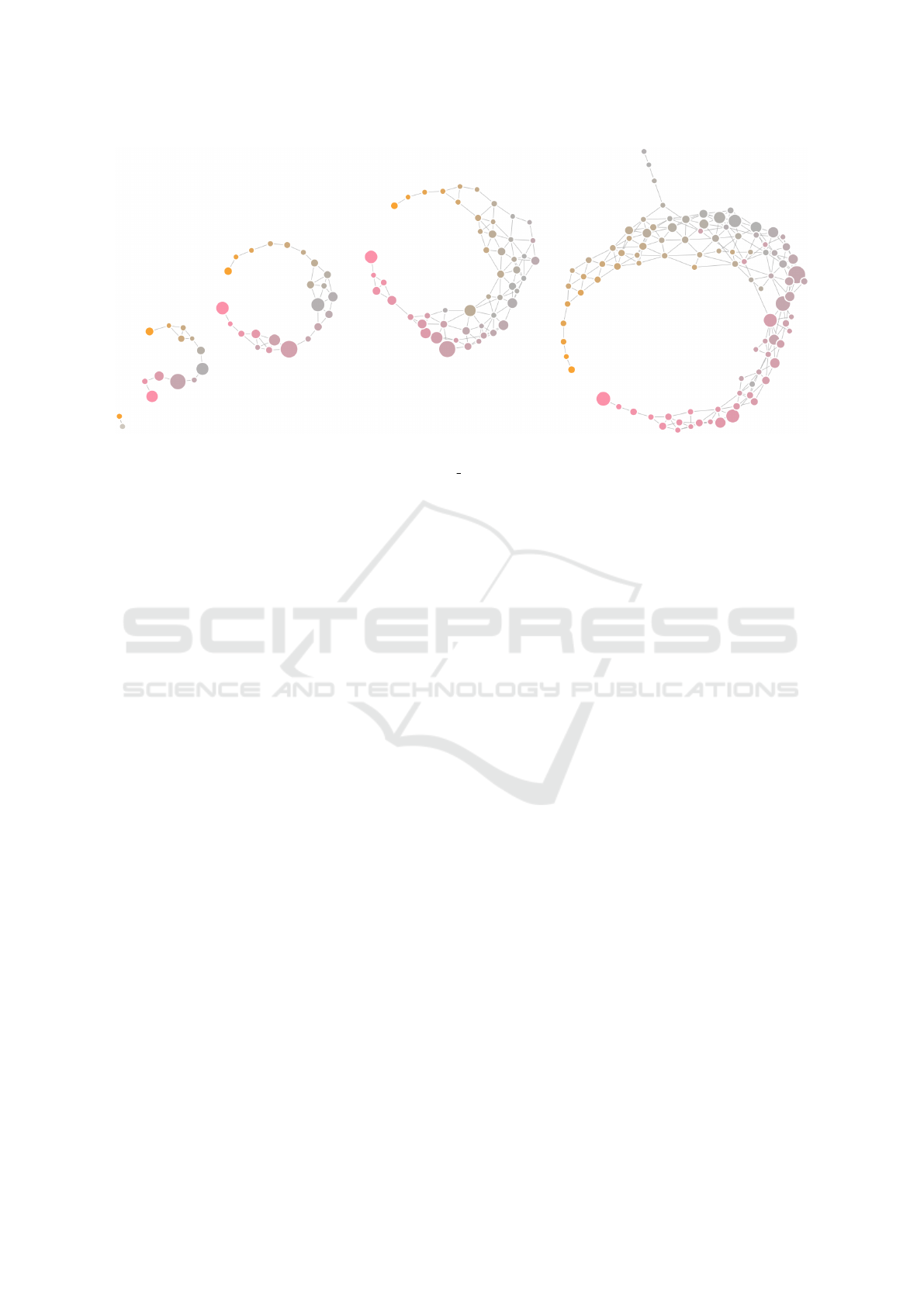
Figure 1: Evolution of a Growing Neural Gas model, fitted to the E-MTAB-5367 (transcriptome dynamics) dataset, over
10000 iterations. Node fill color depicts the value of p15081 CEL, the first feature in the dataset, as given by each prototype.
Pink represent lower values, while orange higher. Node size encodes density, i.e., amount of data points represented by a
unit. Edge length encodes Euclidean distance between prototypes. The final graph on the right represents the structure of the
dataset in terms of data distribution and density, as seen by GNG. The topology suggests incremental changes in the values of
the data points, instead of drastic ones; the antenna-looking nodes on the top suggest the existence of out-of-norm data points.
enabling the use traditional scatter plots even for mul-
tidimensional data. Of these two, t-SNE has proven
to be specially powerful for visualizing the structure
of multidimensional data (Maaten and Hinton, 2008).
The technique, however, can be costly in terms of
time and resources when plotting large datasets. Furt-
hermore, it is non-deterministic, thus, precluding the
replication results.
Other ML techniques that provide means for plot-
ting an overview of data structure are hierarchi-
cal clustering (HC) algorithms, SOMs (Kohonen,
1997) and the density-based clustering algorithm,
OPTICS (Ankerst et al., 1999).
HC algorithms create trees of nested partitions
where the root represents the whole dataset, each leaf
a data point, and each level in between a partition or
cluster. The resulting tree of an HC algorithm can be
plotted using dendograms, a tree-like structure where
the joints of its branches are depicted at different heig-
hts based on a distance measure. The OPTICS algo-
rithm has a similar logic to that of HC algorithms in
the sense that data points are brought together one by
one. A key difference is that OPTICS sorts the data
points in a way that can later be visualized using a re-
achability plot (RP), where valleys can be interpreted
as clusters and hills as outliers. Dendograms and RPs
depict every data point, thus making them susceptible
to the size of a dataset as well.
One of the most widely used neural-based algo-
rithms in visualization applications is the SOM (Ko-
honen, 1997). SOM takes a set of n-dimensional trai-
ning vectors as input and clusters them into a smal-
ler set of n-dimensional nodes, also known as model
vectors. These model vectors tend to move toward
regions with a high training data density, and the fi-
nal nodes are found by minimizing the distance of
the training data from the model vectors. The output
from a SOM can be plotted using a U-Matrix, which
is a two-dimensional arrangement of – commonly –
mono-colored hexabins. The opacity color of each bin
is then varied based on a distance value between mo-
del vectors: the more opaque the higher the distance
and vice versa. SOMs have been used in multiple ap-
plications, e.g., feature learning (Vanetti et al., 2013),
flow mapping (Guo, 2009), trajectory and traffic ana-
lysis (Schreck et al., 2009; Riveiro et al., 2008).
Interpretable and Interactive ML
In the intersection between HCI and ML is found
considerable research where the focus is on user in-
teraction with, and interpretation of, ML techniques
(Amershi et al., 2013). The dialog between user and
algorithm for solving problems is appealing for many
reasons, for instance, to integrate valuable expert kno-
wledge that may be hard to encode directly into com-
putational models, to help resolve existing uncertain-
ties as a result of error that may arise from automa-
tic ML or to build trust by making humans invol-
ved in the modeling or learning processes (Boukhelifa
et al., 2018). Thus, human and machine collaborate
to achieve a task, whether this is to classify objects, to
IVAPP 2019 - 10th International Conference on Information Visualization Theory and Applications
60
Table 1: Summary of visual encodings used in Visual GNG.
ATTRIBUTE ENCODING VALUE GIVEN BY
TASK SUPPORT
Similarity Edge length
Distance (e.g., Euclidean) between
units’ prototypes.
Identification of cluster patterns and
outliers.
Density Node size
Number of times a unit has been
closest to an input signal.
Distribution Node fill color
Prototypes’ value representation for a
given dataset feature.
Identification of informative features.
Class
Node stroke
color
Label value of the last input signal a
unit was closest to.
Identification of class distribution.
find interesting data projections or patterns, or to de-
sign creative artworks (Boukhelifa et al., 2018). Users
can be involved in different phases (Ventocilla et al.,
2018) such as in feature selection, optimization, mo-
del training, output refinement and evaluation.
3 GROWING NEURAL GAS
GNG is described as an incremental neural network
that learns topologies (Fritzke, 1995). It constructs
networks of nodes and edges as a means to des-
cribe the distribution of data points in the multi-
dimensional space. GNG, unlike other clustering al-
gorithms (e.g., K-means, SOM), grows during the le-
arning process and does not require users to define
a number of k centroids. Such a dynamic property
has been noted as advantageous over other clustering
algorithms (Heinke and Hamker, 1998; Prudent and
Ennaji, 2005).
The algorithm starts with two connected neurons
(units), each with a randomly initialized reference
vector (prototype). Samples (signals) from the data
are taken and fed, one by one, to the algorithm. For
each input signal the topology adapts by moving the
unit which is closest, and its direct neighbors, towards
the signal itself. Closeness, in this case, is given by
the Euclidean distance between a unit’s prototype and
the signal. New units are added to the topology every
λ signals, in between the two neighboring units with
the highest accumulated error. A unit’s error cor-
responds the squared distance between its prototype
and previous signals. Edges (i.e., connections bet-
ween units), on the other hand, are added between the
two closest units to an input signal, at every iteration,
and are removed when their age surpasses a threshold.
Edges are aged in a linear manner at every iteration,
and are only reset when they already connect the two
closest units to a signal.
Heinke and Hamker (1998) benchmarked diffe-
rent neural-based algorithms and found GNG having
the best performance. Their comparison criteria were
based on “classification error, the number of training
epochs, and sensitivity toward variation of parame-
ters”. The adaption capabilities of GNG are demon-
strated in Sledge and Keller (2008). Applications
of GNG are found in literature related to clustering
and classification problems, for instance, Daszykow-
ski et al. (2002); Costa and Oliveira (2007); Palomo
and L
´
opez-Rubio (2017).
GNG has not, to the best of our knowledge, been
used for visual exploration of multidimensional data-
sets or used in VA-related research.
4 VISUAL ENCODINGS
The first contribution of this paper is a set of visual en-
codings for a two dimensional representation of data
distribution, density, and class. A summary of the vi-
sual encodings is given in Table 1.
FDGs were used to project GNG topological con-
structions onto a two dimensional plane. An FDG
usually simulates two forces (Munzner, 2014): a re-
pulsion force which pushes nodes away from each
other, and an attraction force which pulls connected
nodes close together. Force-directed placement algo-
rithms usually start with nodes at random positions
and then gradually moves them until an equilibrium
between the forces is reached.
The reasons for using FDGs to visually encode a
GNG topology are (1) the seamless visual mapping it
entails, where GNG units can be represented by nodes
in the graph, and (2) their connections as edges; FDGs
are free from data-bound spatial constraints, i.e., free
from mapping data to x/y coordinates for creating a
layout; attraction forces provide means for depicting
distance relations and, therefore, clusters; and they
can be interacted with without losing structure nor
distances by re-heating the placement algorithm when
nodes are dragged.
Visual Growing Neural Gas for Exploratory Data Analysis
61
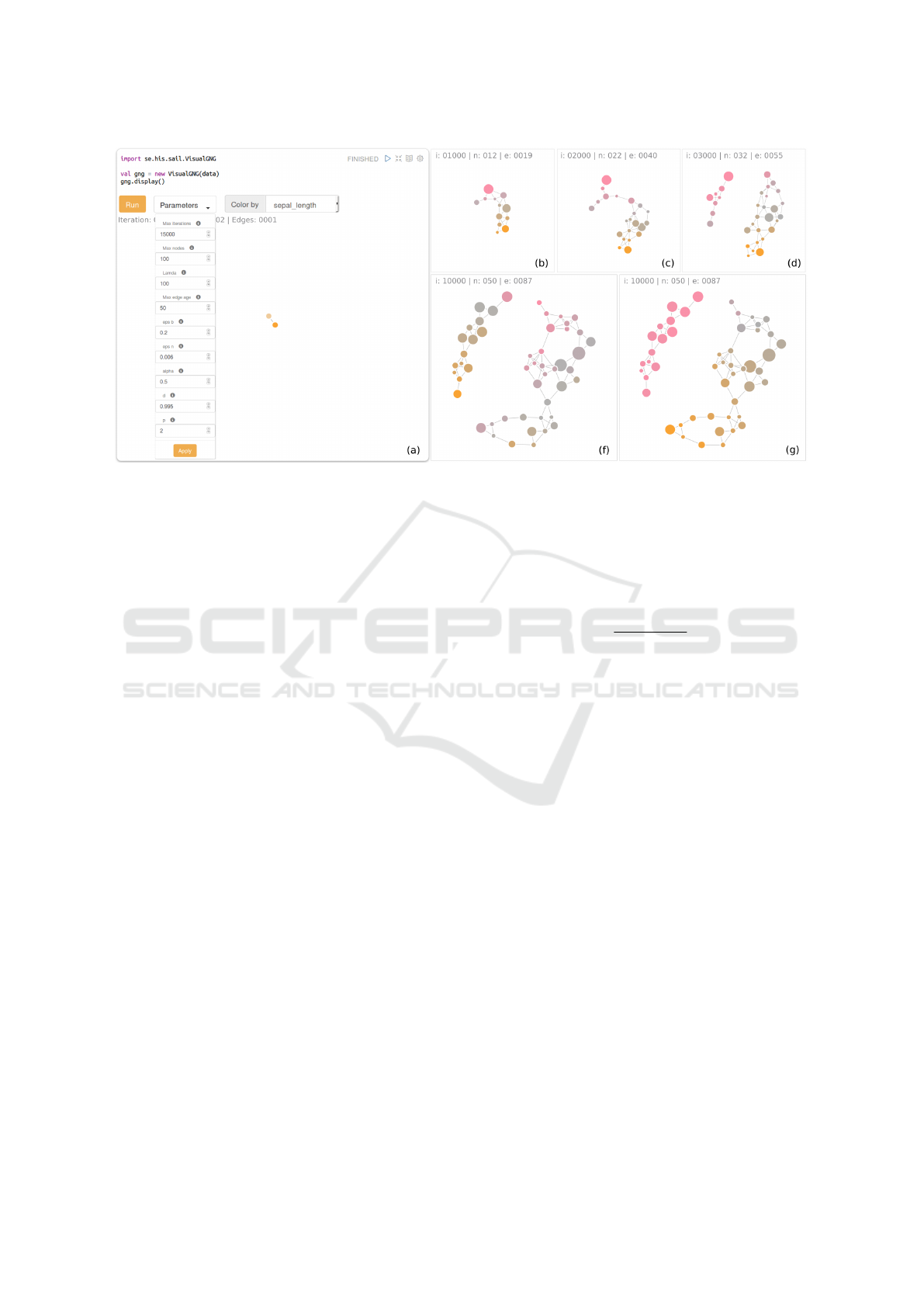
Figure 2: (a) Zeppelin paragraph exemplifying the use of the Visual GNG library; figures (b) to (f) depict a sequence of the
evolution of the GNG model of the Iris dataset; (g) shows the GNG model with nodes colored by prototypes’ values for petal
width. Nodes in (f) are colored by sepal width. Calling the display() method in (a) displays the visual elements for system
feedback and user control of the learning process.
Prototype Similarity
GNG, by definition, connects units which have si-
milar prototypes. With FDGs it is possible to furt-
her highlight similarities between units’ prototypes
by means of attraction. That is, the more similar the
prototypes are, the closer their representative nodes
will be and vice versa. Similarity can be based on a
distance measure between prototypes (e.g., Euclidean
distance).
PC can be used as a detailed view of the prototy-
pes so users can corroborate the similarity between
nodes. By plotting units’ prototypes in PC, and by ha-
ving it as a coordinated juxtaposed view to the FDG,
the user can explore where the similarities – and dis-
similarities – between prototypes exist. Coordination
can be static and/or interactive. Static coordination
can, for example, be based on color, where the color
fill of a node in FDG is also employed for the stroke
color of its corresponding line in PC. Interactive coor-
dination, on the other hand, can be achieved through
linked highlighting, e.g., increasing a line’s width in
PC, when the user hovers over its corresponding node
in the FDG (e.g., Figs. 4 and 3).
Our solution encodes similarity by constraining
attraction of nodes based on the Euclidean distance
of their prototypes. We made use of the D3js force-
directed layout library, which is a Javascript frame-
work for the development data-drive, web-based user
interfaces. A method called linkDistance, which
takes a value in pixels, enables such a distance con-
straint between the nodes when running the placement
algorithm. We scale the Euclidean distance between
units’ prototypes to a defined range of pixels:
dscale(e
g f
) =
e
g f
− E
min
E
max
− E
min
∗ (b − a) + a
Where e
g f
is the Euclidean distance between units
g and f ; variables a and b are the minimum and max-
imum pixel lengths; and E
min
and E
max
the minimum
and maximum Euclidean distances in the topology.
To avoid overlapping nodes we set a = r
g
+ r
f
where
r represents the radius of nodes g and f respectively.
The maximum length, on the other hand, is given by
b = m
2
+ k where m denotes a maximum node radius
and k a constant. The values for these two are arbi-
trary, 15 and 50 pixels respectively.
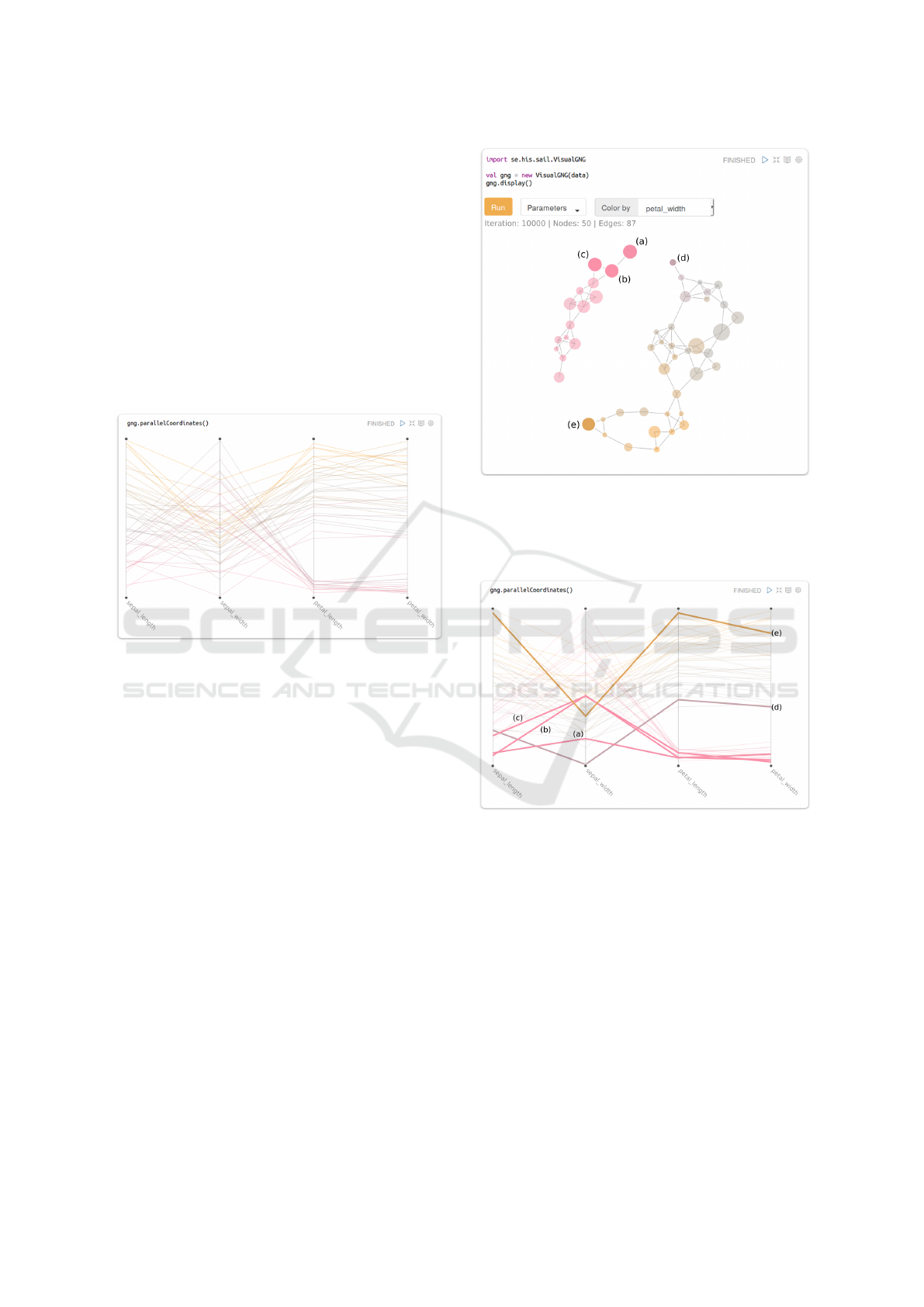
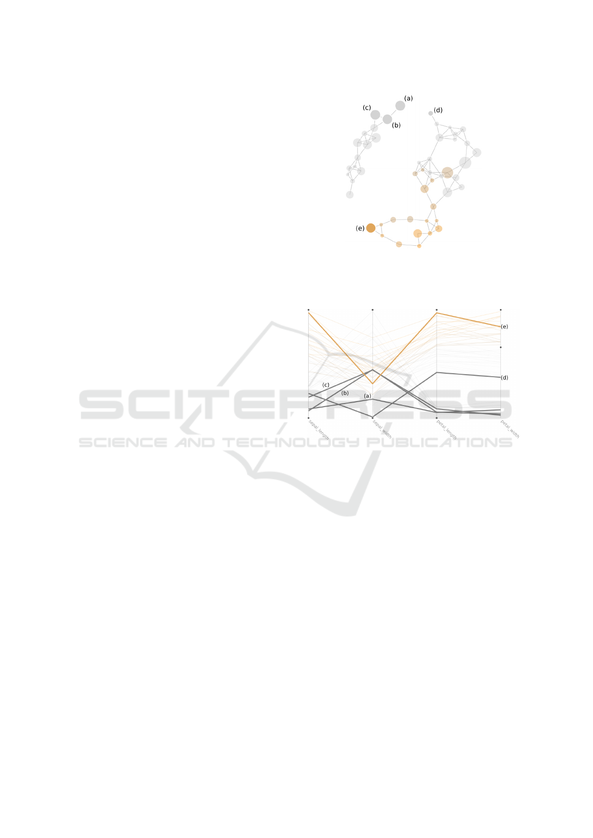
Nodes (a), (b) and (c) in Figure 4 present an ex-
ample of prototypes similarity. The edge connecting
nodes (c) and (b) is shorter compared to the edge bet-
ween nodes (a) and (b). This suggests that prototypes
in (c) and (b) have a smaller Euclidean distance than
that of prototypes in (a) and (b). This can be verified
by looking at their representations in the PC plot in Fi-
gure 5. Highlighted lines in PC correspond to highlig-
hted nodes in the FDG, i.e., line (a) in PC represents
node’s (a) prototype in FDG and so on. Highlighting
in the PC plot is done by increasing line width from
1 pixel to 3, and by demoting other lines by lowering
their opacity from 100% to 25%.
IVAPP 2019 - 10th International Conference on Information Visualization Theory and Applications
62

Data Density
The density of the data in the multi-dimensional space
can be estimated during the execution of the GNG,
and be visually encoded in the size of the nodes.
A way for estimating the density of the data with
GNG is to count the number of times a unit has been
selected as the closest to an input signal. The more
times a unit is closest to a signal, the more data points
it will potentially represent. We say potentially be-
cause a unit might move away from some data points
as it moves towards an input signal; moreover, new
units added to the model might take fractions of regi-
ons that were covered by old units. As a way for im-
proving the density estimation – and the model – we
removed units with low utility (i.e., obsolete units), as
proposed in Fritzke (1995), after a maximum number
of units has been reached. This way, new units are ad-
ded in more representative places in later iterations.
Not doing so will, based on our trails, increase the
chances of having topologies with empty units (i.e.,
prototypes that do not represent any data point).
In our solution nodes vary in size based on how
frequent each has been the closest (the winner) to an
input signal. A node’s size, in this case, is encoded
through radius – which is also pixel-based. The win-
ning frequency is mapped to a radius also linearly:
rscale(c
g
) =
c
g
−C
min
C
max
−C
min
∗ (m − n) + n
Where c
g
is the winning frequency count of unit g;
C
min
and C
max
are the minimum and maximum win-
ning frequencies in the topology, and n is the mini-
mum pixel radius. We give n an arbitrary value of 5
pixels. Taking that the maximum radius is given by
m, then nodes’ radius can vary from 5 pixels to 15.
Looking at Figure 4, it is possible to see that node
(d) has the lowest estimated density of all highlighted
nodes.
Data Distribution
Hints on how the data is distributed in the multi-
dimensional space can be given by encoding how a
prototype represents the value of a dataset’s feature.
More specifically, by mapping the value represented
by each prototype, for a user-selected feature, to the
fill color of its corresponding node. Figures 2 (f) and
(g) represent an example where fill color in (f) is de-
fined by prototypes’ value for ‘sepal length’, whereas
in (g) by prototypes’ value for ‘petal width’. Such an
encoding can help users determine the importance of
a feature on the distribution of the data. The color
scale selected for this purpose should be one which
allows a user to identify where the lowest and highest
values of a given feature are found in the topology.
The selection of a proper color scale could also help
users identify outliers in the data.
In addition to encoding feature values as fill color,
classification values (labels) can be visually represen-
ted in the color stroke of the nodes. This is in the
case of working with labeled data. Assigning a la-
bel to a unit is possible by taking the label of the last
input signal it has been closest to. Having a visual
cue on how classifications are distributed within the
topological model can help users comprehend the dif-
ferences between instances of different classes, and
the similarities between those of the same.
Our solution uses the colors suggested by Spence
and Efendov (2001) to fill the color of the nodes, ba-
sed on prototypes’ values for a given data feature:
pink denotes the lowest values, gray average values
and orange the higher. The intention, as stated Spence
et al., is for the highest and lowest values to “pop out”.
Figures 2 (f) and (g) are examples of two different co-
lor fills. Nodes in (f) are colored based on the values
of sepal width, whereas in (g) colors are based on pe-
tal width. By looking at (f) and (g), it is possible to see
that petal width describes the distribution of the data
better than sepal width. Iris of type Setosa are repre-
sented by all pink nodes in (g), but by a mix of colors
(orange, gray and pink) in (f). Moreover, the color
shift from orange to gray – i.e., a smooth change from
large to average petal width – in the larger network
in (g) corresponds to, on the orange side, iris of type
Virginica and, on the gray side, Versicolor. This color
shift does not occur in (f).
5 VISUAL GNG LIBRARY
The second contribution of this paper is an off-the-
shelf Visual GNG library
3
for Apache Zeppelin
4
, a
web-based notebook system for data-driven program-
ming. Zeppelin enables, among other things, writing
and executing Scala and SQL code, it provides access
to the Apache Spark framework for Big Data analy-
sis and provides built-in charts such as scatter plots,
bar, and line charts. In this section, we explain how to
deploy the library and its interactive capabilities.
The off-the-shelf format of the library requires
that a dependency to the library is added to the Zep-
pelin Spark interpreter as described in Ventocilla and
Riveiro (2017), before it can be deployed. We as-
3
A version can be found here: https://www.his.se/om-
oss/Organisation/Personalsidor/Elio-Ventocilla/
4
https://zeppelin.apache.org [Accessed August 2018]
Visual Growing Neural Gas for Exploratory Data Analysis
63
sume the dependency has been added for the follo-
wing steps.
To deploy Visual GNG the user needs to – in a
Zeppelin notebook – import the library, create an in-
stance of VisualGNG and then call the display()
method (see Figure 2 (a)). Importing the library gi-
ves the user access the VisualGNG class. Creating
an instance of it requires the user to provide the data
that will be used in the learning process (i.e., a Spark
DataFrame). In the example given in Figure 2 (a),
the data is represented by variable data, while the
VisualGNG instance is represented by the variable
gng. We make use of the Iris dataset (Blake and Merz,
1998) in the example.
Figure 3: Parallel coordinates plot of GNG prototypes cor-
responding to nodes in Figure 4 (f). Stroke color is based
on the prototypes’ values for sepal width.
Calling the display() method on the gng varia-
ble shows the following elements: an execution but-
ton for running and pausing the GNG learning pro-
cess; a drop down element Parameters for user access
to optimization parameters; a drop-down list Color by
for selecting the data feature by which the fill of the
nodes are colored; a status text describing the current
state in terms of iterations, number of edges and no-
des; and two connected nodes, as that is the initial
state of the GNG model.
Clicking on the execution button changes its text
to Pause, and starts the learning process in the back-
ground. Updates to the FDG are made every λ num-
ber iterations, i.e., every time a new unit is added to
the model. Figures 2 (b) to (f) show the evolution
of the GNG model at different iterations steps for the
Iris dataset. It is possible to see here how the topo-
logy splits into two networks: a small one represen-
ting one type of iris, and the bigger one representing
the two other types. This is an expected outcome for
the Iris dataset. Two types of iris (Virginica and Versi-
color), with many shared characteristics, became part
of a single network (the big one); whereas the other
Figure 4: Force-directed graph of the GNG model generated
from the Iris dataset. Highlighted nodes correspond to those
selected by the user. The visual encoding for highlighting
nodes is done by demoting non-selected nodes with a lower
opacity.
Figure 5: Parallel coordinates plot of the GNG prototypes
generated from the Iris dataset. Highlighted lines corre-
spond to nodes selected by the user in the FDG (see Figure
4).
type of iris (Setosa), which has more remarkable dif-
ferences from the other two, developed a network of
its own (the small one).
To visualize the resulting prototypes in a PC plot
the user can, in another Zeppelin paragraph, call the
method parallelCoordinates() of the gng varia-
ble (see Figure 3).
User Interactions
Interactive features are described in two parts: those
regarding system feedback and user control on the le-
IVAPP 2019 - 10th International Conference on Information Visualization Theory and Applications
64
arning process, and those regarding user exploration
for interpretation.
Feedback and Control
System feedback and user control features are descri-
bed based on M
¨
uhlbacher et al. (2014) types of user
involvements (TUI): execution feedback, result feed-
back, execution control, and result control.
Execution feedback regards information the sy-
stem gives the user about an ongoing computation.
Visual GNG provides two types of execution feed-
back: aliveness (i.e., whether computations are un-
der progress or something failed) and absolute pro-
gress (i.e., “information about the current execution
phase”). Aliveness is given by the text in the execu-
tion button (Run, Pause and Done). Absolute progress
is given in the status text, through which the user is
informed about the number of iterations executed so
far.
Result feedback regards information the system
gives to the user about intermediate results of an on-
going computation. Visual GNG provides feedback
about structure-preserving intermediate results, i.e.,
partial results that are “structurally equivalent” to the
final result. Such feedback is given by updating the
FDG when units and connections are added to, or re-
moved from, the model. These updates are reflected
by reheating the force-directed placement so that the
FDG layout is recomputed, with model updates taken
account.
Execution control involves user interactions that
have an impact on an ongoing computation. Visual
GNG enables this type of control through the execu-
tion button. By clicking on it, the user can start the
optimization, pause it and resume it. If the user wis-
hes to reset the optimization to zero, it is possible to
do so by rerunning the Zeppelin paragraph. It is also
possible for the user to execute different instances of
VisualGNG in different paragraphs within the same
notebook. This can prove convenient when compa-
ring results for different parameter settings.
Result control defines user interactions that have
an impact on the final result. This type of user invol-
vement is often referred to as steering (Mulder et al.,
1999). In Visual GNG the user can steer the learning
process by changing learning parameters in the Para-
meters drop-down element. Changes to the learning
parameters can be done before and during the lear-
ning process.
Interaction for Interpretation
Other types of interactive features are aimed at hel-
ping the user explore to interpret the fitted – or parti-
Figure 6: Force-directed graph of the GNG model genera-
ted from the Iris dataset. Nodes in gray and lower opacity
correspond to those filtered out in PC (Figure 7). Selected
nodes remain highlighted even when filtered.
Figure 7: Parallel coordinates plot of the GNG prototypes
generated from the Iris dataset. Lines in gray and lower opa-
city correspond to prototypes filtered by the lower boundary
of petal width.
ally fitted – topology. Three types of interactive fea-
tures were implemented for this purpose: linked high-
lighting, filtering and K-Means clustering.
Linked highlighting takes place when the user ho-
vers over a node in the FDG. By doing so, its corre-
sponding prototype in the PC plot is highlighted, i.e.,
the width of the line is increased while the opacity of
other lines is reduced. Hovering out returns the pro-
totype line to its previous visual encoding. Clicking
on the node will make the line to remain highligh-
ted even when hovering out (Figure 3), and will also
demote all other non-selected nodes in the FDG by
decreasing their opacity (Figure 4). This interactive
feature aims at facilitating the interpretation of what
a prototype represents (i.e., the feature values of the
data points it represents), and also how prototypes dif-
ferentiate from each other. More specifically, it faci-
litates answering the question of what is the general
profile of the data points in a given region of the topo-
Visual Growing Neural Gas for Exploratory Data Analysis
65
logy? And, why do they belong to that region and not
to another?
Filtering, on the other hand, is triggered by drag-
ging up and down feature boundaries in the PC plot
(Figure 7). Dragging feature boundaries will cause
prototype lines with values outside the boundaries, as
well as their corresponding nodes in the FDG (Figure
6), to be demoted with gray color and lower opacity.
Filtering allows users to see which areas in the GNG
network have prototypes with a given profile.
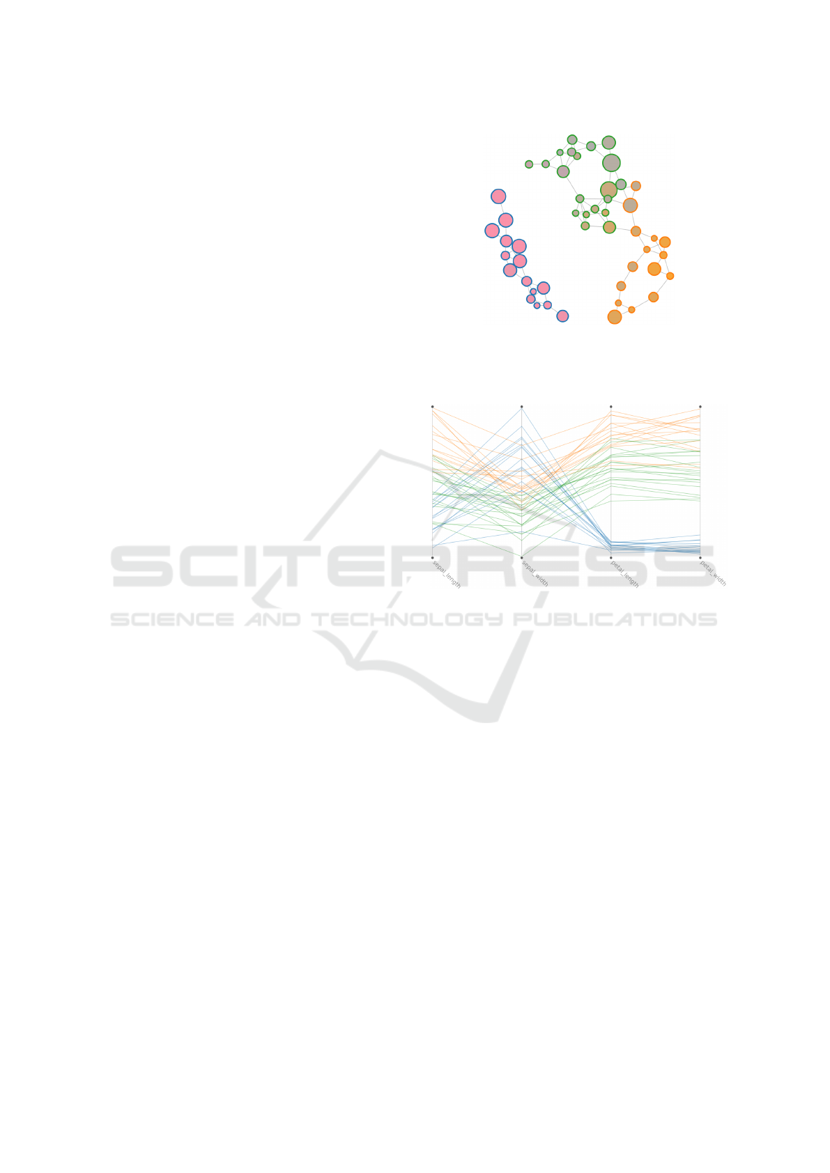
K-Means clustering can be called through the
kmeans(k) method of the gng variable. By provi-
ding a number of k, the system will run K-Means over
the prototypes in the GNG model. In other words, it
will group prototypes into k clusters, as given by K-
Means. The results are then depicted in the FDG by
coloring the stroke of the nodes based on their assig-
ned cluster (Figure 8). Prototypes in PC are also co-
lored based on the corresponding cluster (Figure 9).
Calling kmeans again with another k value will reco-
lor nodes and lines based on the new cluster assign-
ments. This allows fast testing of different k values
with visual feedback on the cluster distributions, re-
gardless of the size and dimensionality of the data.
6 CASE STUDIES
The third contribution is the results of nine case
studies carried to investigate the capabilities of Vi-
sual GNG. The participants of the empirical evaluati-
ons were data scientists from the following academic
areas: three from bioinformatics, one from biomedi-
cine, two from engineering, one from game research,
and two from general data science and machine lear-
ning. One was a master student, one a Ph.D. candi-
date, two were post-docs and five principal investiga-
tors (PI).
Each case study was arranged in four stages: (a)
preliminary questions about user domain, expertise,
type of data and analysis tools employed in their
daily work; (b) familiarization with the technology
using two examples, each with a different dataset; (c)
thinking-aloud user analysis of domain data with Vi-
sual GNG; (d) and, finally, wrap up questions on user
experience during (c). All four stages were carried
individually and followed a semi-structured interview
format (the interview guide was devised according to
descriptions by Patton (2005)), at each participant’s
office, with an approximate duration of one hour. A
Zeppelin server was set up so that users would have
access to it from their own workstations. Three no-
tebooks were created for each study: two for the ex-
amples used in stage (b) and the other for the domain
Figure 8: Force-directed graph of the GNG model genera-
ted from the Iris dataset. Stroke color of the nodes (green,
blue and orange) are based on the classification made by
K-means (for K = 3).
Figure 9: Parallel coordinates plot of the GNG prototypes
generated from the Iris dataset. Stroke color of the lines
(green, blue and orange) is based on a classification made
by K-means (for K = 3).
data of stage (c). Two datasets from the UCI reposi-
tory (Blake and Merz, 1998) were used in the exam-
ples: the Wine Quality dataset and the Breast Cancer
Wisconsin (Diagnostic) dataset.
Each of the notebooks used in stage (b) and (c)
had a predefined layout with seven paragraphs, each
with code for a specific task: (1) load data, (2) view
data, (3) deploy Visual GNG, (4) display PC, (5) run
K-means, (6) compute predictions, and (7) see pre-
dictions. The idea of the predefined notebooks was
to overcome knowledge gaps related to Zeppelin, the
Scala programming language, and Spark. By doing
so, the focus of the case studies was delimited – to
the largest possible extent – to the usability of the Vi-
sual GNG library. Thus, users did not need to write
code during the sessions and only needed to run the
paragraphs. We did, however, intervene in a few ca-
ses to help users remove features used in the training
dataset, or to set a given feature as a label.
To ensure consistency, the first author of this paper
was the administrator of all the case studies with the
IVAPP 2019 - 10th International Conference on Information Visualization Theory and Applications
66
participants. Field notes were taken during the sessi-
ons and all impressions were written on the same day.
Responses from the first stage (a) gave a general
profile of the participants. Their experience in ana-
lyzing data varied from 2 to 10 years. All said to
commonly deal numeric and structured data in CSV
format. Participants from Bioinformatics said to also
have categorical and temporal data, and that their raw
data usually came in a platform-specific format (.CEL
files). Commonly used tools for analysis were R Stu-
dio, MATLAB and Excel. Two participants also men-
tioned the use of Python and two others SPSS. When
asked about what they usually looked for in the data,
five (5) participants responded informative features
(for clustering or classification), five (5) groups or
clusters, two (2) outliers, one (1) anomalies, and four
(4) patterns in time series.
At the beginning of stage (b), users were given
an introduction to the different technologies involved,
i.e., Zeppelin, Scala, Spark and GNG. They were then
briefed on the use of the Visual GNG library by going
through the Wine Quality notebook example. The
briefing took into account: the purpose of each para-
graph, how to execute them, how to run Visual GNG,
the meaning of the visual encodings, and, finally, the
supported user interactions. Once done with the Wine
Quality example, we let the users run the Breast Can-
cer notebook on their own.
Stage (c) was the main part of the study where
users explore their own data with the Visual GNG li-
brary.
Participants from bioinformatics made use of
two publicly available datasets: E-MTAB-5367 on
“Transcriptomics during the differentiation of human
pluripotent stem cells to hepatocyte-like cells”
5
(see
Figure 1), and GSE52404 on “The effects of chronic
cadmium exposure on gene expression in MCF7 bre-
ast cancer cells”
6
. The participant from biomedicine
made use of data from samples taken from patients
with two different conditions. The game researcher
used preprocessed data from heart and video recor-
dings of subjects playing games, which aimed at in-
ducing boredom and stress. An engineer made used
maintenance related data, while the other made use of
data associated with clutches. The two in general data
science and ML used data from measurements in steel
production and results from a topic modeling techni-
que used on telecomunications-related data, respecti-
vely. All datasets came in a CSV format with numeric
values. Some had categorical values which where, ac-
5
https://www.ebi.ac.uk/arrayexpress/experiments/E-
MTAB-5367/ [Accessed September 2018]
6
https://www.ncbi.nlm.nih.gov/geo/query/acc.cgi?acc
=GSE52404 [Accessed September 2018]
cording to the participants, unimportant for clustering
and, therefore, could be dropped. Datasets varied in
size (e.g. 46, 16436, 33297 up to 70523 instances)
and dimensionality (e.g., 7, 58, 758 and above 2000
features).
We asked participants to think aloud as they were
performing their analysis. Some, however, got im-
merse in the process and forgot to explain their acti-
ons, in which case, we asked questions every now and
then following participant observation protocols. Du-
ring their exploratory analysis, most users looked for
clusters, features which were important for a given
classification and outliers. Common interactions with
Visual GNG were hovering and clicking on nodes to
see their centroids in PC, and changing nodes’ color
based on different features. A few of the users would
also try running K-means as well as re-running GNG
with different parameters (e.g., using fewer nodes).
The final stage (d) involved structured interview
questions regarding usability (is the library easy to
use? is it helpful for EDA?), interpretability (is it
helpful for understanding the model / the parameters
/ the learning process?) and insight (were you able
to gain new understanding of the data?). We used a
1 to 5 Likert scale for questions on usability and in-
terpretability, where 1 was a negative perception (i.e.,
not easy, not helpful) and 5 a positive (very easy, very
helpful), and yes or no for insight. Comments were
encouraged for all answers.
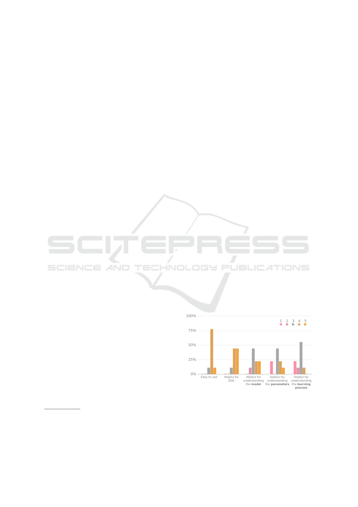
Results on usability and interpretability can be
seen in Figure 10. Feedback related to usability was
mainly positive, with eight out of nine users answe-
ring both questions with rates of either four (4) or five
(5). Interpretability, on the other hand, received more
neutral or negative feedback (i.e., ratings of three or
less): five users did not find the tool very helpful for
Figure 10: Answers from nine participants on a 1 to 5 Li-
kert scale about Visual GNG in terms of usability (Easy to
use, Helpful for EDA) and interpretability (helpful for un-
derstanding the model / the parameters / the learning pro-
cess). One (1) represents a negative user perception (not
easy, not helpful) and five (5) a positive (very easy, very
helpful).
Visual Growing Neural Gas for Exploratory Data Analysis
67

understanding the GNG model, six did not find it very
helpful for understanding the GNG learning parame-
ters, and eight did not find it very helpful for under-
standing the GNG learning process.
Answers on insight had four (4) yes and five (5)
no. Those with a positive answer said to have gained
new insights in the form of: relevant features for pre-
diction and classification, estimated number of clus-
ters, data scatteredness and variations in certain (gene
data) samples. The others who gave a negative ans-
wer made the following comments: three said they
needed more time to analyze the data; one said that
new insight was not gained but that previous findings
were confirmed; one said that the data (results from
a topic modeling technique) were not appropriate for
the clustering made by GNG.
To conclude we asked the users whether they
would consider making use of Visual GNG again and
for which purpose. Eight answered positively stating
that they would use Visual GNG again for clustering,
feature engineering, visualization and/or finding out-
liers.
7 DISCUSSION
In this paper, we argue that GNG can provide ana-
lysts with a useful perspective of the data structure in
spite of its size or dimensionality, and that its effective
use can be facilitated through VA. To sustain our ar-
gument, we developed a proof-of-concept as an off-
the-shelf artifact called Visual GNG, and conducted
nine case studies with real-world datasets to evaluate
its usability and its contribution to GNG interpretation
and insight gain.
Due to the large size of many current datasets, a
common problem with graphs is visual clutter. Node-
link diagrams, like the ones generated by GNG, pro-
vide an intuitive way to represent graphs; neverthe-
less, visual clutter quickly becomes a problem when
graphs comprised of a large number of nodes and
edges (Holten and van Wijk, 2009), which is why,
sometimes, matrix-based representations are used as
alternatives (see Van Ham (2003); Ghoniem et al.
(2004); Holten and van Wijk (2009)). The same clut-
tering problems are seen in PC when a large number
of data points are plotted (Zhou et al., 2008; Mun-
zner, 2014). Visual GNG, however, leverages from
GNGs capability to compress and generalize the data
to a limited number of nodes, thus reducing the risks
of visual clutter in both FDG and PC. This compres-
sion feature is also key for letting users test different k
values for K-Means, while providing fast visual feed-
back on the results. The same concept can be exten-
ded to other clustering techniques, such as, DBSCAN
or to hierarchical clustering methods such as Ward Jr
(1963). This would allow user-driven assessment on
the behavior of different techniques on the same da-
taset. The exploratory process of defining the number
of k could also be complemented with clustering me-
trics such as the Silhouette.
The results from the empirical evaluation show
that Visual GNG has the potential to be used in the
exploration and analysis of large, multidimensional
data through the proposed visual encodings. In most
cases, Visual GNG proved to be useful, and most par-
ticipants agreed that our implementation was easy to
use, was helpful for EDA and that they would use it
again. It is, however, interesting to see that in spite of
this, many did not find it helpful for understanding the
models produced by GNG, the learning parameters,
and/or the GNG learning process. A user commented
in this regard saying that, in order to understand the
model and the learning parameters, it is important to
understand the algorithm itself, and that the animated
growth of the model shown in the FDG did not ex-
plain much about it. This is a reasonable argument
which probably justifies why many users gave low
scores to the understanding of the learning process.
Just visually representing the model in a FDG will
say very little of the learning process itself – which
is composed of several steps and rules. Understan-
ding the learning process, however, might not always
be of interest as it was mentioned by two users. One
of them stated that “what’s happening to my data” is
the main driver in the exploratory analysis process,
and that the learning process itself was not a priority.
This leaves an open question on when it is important
for data scientists to understand the inner workings of
an algorithm (currently, there are a lot of discussions
about this issue in the ML and HCI communities), and
how it can be facilitated through VA. In general, the
challenges associated to model visualization and inte-
raction for validation, refinement and evaluation have
been highlighted by several works, e.g., Andrienko
et al. (2018); Lu et al. (2017); Endert et al. (2017).
During the case studies we ran into an unfores-
een challenge: many participants had preconceived
expectations of what to find. Most had already ana-
lyzed their data with other tools and techniques and,
therefore, had certain expectations on what to look
for and what could be found. In one case a parti-
cipant said to be looking for five clusters previously
seen through other techniques, and was somewhat di-
sappointed for not finding them with Visual GNG. In
another case a participant started to actively look for
outliers that were encountered in previous analyses.
Such cases correspond to confirmatory data analysis
IVAPP 2019 - 10th International Conference on Information Visualization Theory and Applications
68

and not exploratory (Tukey, 1977), and can be linked
as well to negative reasoning enhancement tendencies
(humans have a tendency to seek information which
supports their hypothesis and ignore negative infor-
mation). To avoid these situations, we could present
the participants with unknown or not previously ana-
lyzed data, but that is a challenge of its own. Another
option might also be to use public data from parti-
cipants’ domains but, would their engagement be the
same? Tukey (1977) states that attitude in the analysis
of data is a key factor that defines EDA. The most sen-
sible solution we see, for a strict evaluation of EDA,
are longitudinal studies.
GNG does not come without limitations. One is
that it does not handle discrete variables. GNG re-
lies on the Euclidean distance, a metric that does not
always produce meaningful values for variables such
as, e.g., gender. A solution is to pre-process data
using a one-hot-encoder, where each value of a dis-
crete variable becomes a variable itself, and where the
values each can take are zero (0) or one (1). Another
aspect to take into consideration is that GNG might
overfit if the number of units is close to the number of
data points. Such conditions can result in a GNG mo-
del with many small detached networks, where some
units do not represent any data point. This can be sol-
ved by reducing the maximum number of units crea-
ted in the fitting process.
8 CONCLUSIONS
Exploratory data analysis tasks are usually inte-
ractive, where analysts employ various support met-
hods and tools to fuse, transform visualize and com-
municate findings. Frequently, due to the ill-defined
nature of these tasks, unsupervised ML techniques are
employed for EDA. However, neural-based clustering
techniques, such as the GNG, that learn topologies
from the data providing thus, complementary views
on it, have been overlooked by the VA and HCI com-
munities.
In this paper, we suggested the use of Visual GNG
for EDA, using FDG for representing the topological
models derived by the GNG and PC for showing a
detailed representation of units’ prototypes. Hence,
the major contributions of this paper are (1) a two-
dimensional visual representation of data using GNG
and FDGs, regardless of the dimensionality of the
data, (2) a generic (non-domain bound) off-the-shelf
VA library for GNG, and (3) nine case studies for the
evaluation of the library in regards usability, GNG in-
terpretability and insight gain.
The qualitative feedback from expert data scien-
tists in the case studies carried out indicate that Vi-
sual GNG is easy to use and useful for EDA. Eight
out of nine participants showed interest in using the
library again for the purpose of finding groups and
relevant features. These are subjective results with
limited external validity. Carrying studies on gene-
ral (non-domain specific) EDA, with a larger external
validity, remains a challenge in terms of tasks and me-
trics, and will be considered in future work.
REFERENCES
Amershi, S., Cakmak, M., Knox, W. B., Kulesza, T., and
Lau, T. (2013). IUI workshop on interactive machine
learning. In Proc. Companion Publication Int. Conf.
on Intelligent User Interfaces, pages 121–124. ACM.
Andrienko, N., Lammarsch, T., Andrienko, G., Fuchs, G.,
Keim, D., Miksch, S., and Rind, A. (2018). Vie-
wing visual analytics as model building. In Computer
Graphics Forum. Wiley Online Library.
Ankerst, M., Breunig, M. M., Kriegel, H.-P., and Sander, J.
(1999). Optics: Ordering points to identify the clus-
tering structure. In Proc. of the 1999 ACM SIGMOD
Int. Conf. on Management of Data, pages 49–60, New
York, NY, USA. ACM.
Bertini, E. and Lalanne, D. (2010). Investigating and re-
flecting on the integration of automatic data analysis
and visualization in knowledge discovery. SIGKDD
Explor. Newsl., 11(2):9–18.
Blake, C. and Merz, C. (1998). UCI repository of ma-
chine learning databases. Irvine, CA: University of
California, Department of Information and Computer
Science. https://archive.ics.uci.edu/ml/datasets.html.
Boukhelifa, N., Bezerianos, A., and Lutton, E. (2018). Eva-
luation of interactive machine learning systems. arXiv
preprint arXiv:1801.07964.
Costa, J. A. F. and Oliveira, R. S. (2007). Cluster analy-
sis using growing neural gas and graph partitioning.
In Neural Networks, 2007. IJCNN 2007. International
Joint Conference on, pages 3051–3056. IEEE.
Dasgupta, A., Chen, M., and Kosara, R. (2012). Concep-
tualizing visual uncertainty in parallel coordinates. In
Computer Graphics Forum, volume 31, pages 1015–
1024. Wiley Online Library.
Daszykowski, M., Walczak, B., and Massart, D. L. (2002).
On the optimal partitioning of data with k-means, gro-
wing k-means, neural gas, and growing neural gas.
Journal of chemical information and computer scien-
ces, 42(6):1378–1389.
Endert, A., Ribarsky, W., Turkay, C., Wong, B., Nabney, I.,
Blanco, I. D., and Rossi, F. (2017). The state of the art
in integrating machine learning into visual analytics.
In Computer Graphics Forum, volume 36, pages 458–
486. Wiley Online Library.
Fritzke, B. (1995). A growing neural gas network learns to-
pologies. In Tesauro, G., Touretzky, D. S., and Leen,
T. K., editors, Advances in Neural Information Pro-
cessing Systems 7, pages 625–632. MIT Press.
Visual Growing Neural Gas for Exploratory Data Analysis
69

Ghoniem, M., Fekete, J.-D., and Castagliola, P. (2004). A
comparison of the readability of graphs using node-
link and matrix-based representations. In IEEE Symp.
on Information Visualization, INFOVIS, pages 17–24.
Goebel, M. and Gruenwald, L. (1999). A survey of
data mining and knowledge discovery software tools.
SIGKDD Explor. Newsl., 1(1):20–33.
Guo, D. (2009). Flow mapping and multivariate visualiza-
tion of large spatial interaction data. IEEE Transacti-
ons on Visualization and Computer Graphics, 15(6).
Heinke, D. and Hamker, F. H. (1998). Comparing neural
networks: a benchmark on growing neural gas, gro-
wing cell structures, and fuzzy artmap. IEEE Tran-
sactions on Neural Networks, 9(6):1279–1291.
Heinrich, J. and Weiskopf, D. (2013). State-of-the-art of
parallel coordinates. In Eurographics (STARs), pages
95–116.
Hoffman, P., Grinstein, G., Marx, K., Grosse, I., and Stan-
ley, E. (1997). Dna visual and analytic data mi-
ning. In Proceedings. Visualization ’97 (Cat. No.
97CB36155), pages 437–441.
Holten, D. and van Wijk, J. J. (2009). A user study on visu-
alizing directed edges in graphs. In Proceedings of the
SIGCHI Conference on Human Factors in Computing
Systems, pages 2299–2308. ACM.
Holzinger, A. (2016). Interactive machine learning for he-
alth informatics: when do we need the human-in-the-
loop? Brain Informatics, 3(2):119–131.
Hotelling, H. (1933). Analysis of a complex of statistical
variables into principal components. Journal of edu-
cational psychology, 24(6):417.
Inselberg, A. (2009). Parallel coordinates. In Encyclopedia
of Database Systems, pages 2018–2024. Springer.
Inselberg, A. and Dimsdale, B. (1990). Parallel coordina-
tes: A tool for visualizing multi-dimensional geome-
try. In Proc. of the 1st Conf. on Visualization, pages
361–378, Los Alamitos, CA, USA. IEEE Computer
Society Press.
Johansson, J. and Forsell, C. (2016). Evaluation of parallel
coordinates: Overview, categorization and guidelines
for future research. IEEE Transactions on Visualiza-
tion and Computer Graphics, 22(1):579–588.
Kandogan, E. (2000). Star coordinates: A multi-
dimensional visualization technique with uniform tre-
atment of dimensions. In Proceedings of the IEEE
Information Visualization Symposium, volume 650,
page 22.
Kohonen, T. (1997). Self-Organizing Maps. Springer series
in information sciences. Berlin: Springer, 2 edition.
Lu, Y., Garcia, R., Hansen, B., Gleicher, M., and Maciejew-
ski, R. (2017). The state-of-the-art in predictive visual
analytics. In Computer Graphics Forum, volume 36,
pages 539–562. Wiley Online Library.
Maaten, L. v. d. and Hinton, G. (2008). Visualizing data
using t-sne. Journal of machine learning research,
9(Nov):2579–2605.
M
¨
uhlbacher, T., Piringer, H., Gratzl, S., Sedlmair, M., and
Streit, M. (2014). Opening the black box: Strategies
for increased user involvement in existing algorithm
implementations. IEEE Transactions on Visualization
and Computer Graphics, 20(12):1643–1652.
Mulder, J. D., van Wijk, J. J., and van Liere, R. (1999). A
survey of computational steering environments. Fu-
ture Generation Computer Systems, 15(1):119 – 129.
Munzner, T. (2014). Visualization analysis and design.
CRC Press.
Palomo, E. J. and L
´
opez-Rubio, E. (2017). The gro-
wing hierarchical neural gas self-organizing neural
network. IEEE Transactions on Neural Networks and
Learning Systems, 28(9):2000–2009.
Patton, M. Q. (2005). Qualitative research. Wiley Online
Library.
Prudent, Y. and Ennaji, A. (2005). An incremental growing
neural gas learns topologies. In Proc. IEEE Int. Joint
Conf. on Neural Networks, volume 2, pages 1211–
1216.
Ribeiro, M. T., Singh, S., and Guestrin, C. (2016). ”Why
should i trust you?”: Explaining the predictions of any
classifier. In Proc. of the 22nd ACM SIGKDD Int.
Conf. on Knowledge Discovery and Data Mining, pa-
ges 1135–1144, New York, NY, USA. ACM.
Riveiro, M., Falkman, G., and Ziemke, T. (2008). Impro-
ving maritime anomaly detection and situation awa-
reness through interactive visualization. In 11th Int.
Conf. on Information Fusion, pages 1–8. IEEE.
Schreck, T., Bernard, J., Von Landesberger, T., and Kohl-
hammer, J. (2009). Visual cluster analysis of trajec-
tory data with interactive kohonen maps. Information
Visualization, 8(1):14–29.
Sledge, I. J. and Keller, J. M. (2008). Growing neural gas
for temporal clustering. In Pattern Recognition, 2008.
ICPR 2008. 19th International Conference on, pages
1–4. IEEE.
Spence, I. and Efendov, A. (2001). Target detection in
scientific visualization. Journal of Experimental Psy-
chology: Applied, 7(1):13–26.
Spence, R. (2007). Information Visualization: Design for
Interaction. Pearson/Prentice Hall.
Tukey, J. W. (1977). Exploratory data analysis, volume 2.
Reading, Mass.
Van Ham, F. (2003). Using multilevel call matrices in large
software projects. In IEEE Symposium on Information
Visualization, INFOVIS 2003, pages 227–232. IEEE.
van Leeuwen, M. (2014). Interactive data exploration using
pattern mining, pages 169–182. Springer Berlin Hei-
delberg, Berlin, Heidelberg.
Vanetti, M., Gallo, I., and Nodari, A. (2013). Unsupervi-
sed feature learning using self-organizing maps. In
Proceedings of the International Conference on Com-
puter Vision Theory and Applications - Volume 1: VI-
SAPP, (VISIGRAPP 2013), pages 596–601. INSTICC,
SciTePress.
Ventocilla, E., Helldin, T., Riveiro, M., Bae, J., Boeva, V.,
Falkman, G., and Lavesson, N. (2018). Towards a
taxonomy for interpretable and interactive machine le-
arning. In IJCAI/ECAI. Proc. of the 2nd Workshop
on Explainable Artificial Intelligence (XAI-18), pages
151–157.
IVAPP 2019 - 10th International Conference on Information Visualization Theory and Applications
70

Ventocilla, E. and Riveiro, M. (2017). Visual analytics solu-
tions as ‘off-the-shelf’ libraries. In 21st International
Conference Information Visualisation (IV).
Ward Jr, J. H. (1963). Hierarchical grouping to optimize an
objective function. Journal of the American statistical
association, 58(301):236–244.
Zhou, H., Yuan, X., Qu, H., Cui, W., and Chen, B. (2008).
Visual clustering in parallel coordinates. Computer
Graphics Forum, 27(3):1047–1054.
Visual Growing Neural Gas for Exploratory Data Analysis
71
