
Using Miniature Visualizations of Descriptive Statistics to Investigate
the Quality of Electronic Health Records
Roy A. Ruddle
1
and Marlous S. Hall
2
1
School of Computing, University of Leeds, Leeds, U.K.
2
Leeds Institute of Cardiovascular & Metabolic Medicine, University of Leeds, Leeds, U.K.
Keywords: Data Visualization, Electronic Health Records, Data Quality.
Abstract: Descriptive statistics are typically presented as text, but that quickly becomes overwhelming when datasets
contain many variables or analysts need to compare multiple datasets. Visualization offers a solution, but is
rarely used apart from to show cardinalities (e.g., the % missing values) or distributions of a small set of
variables. This paper describes dataset- and variable-centric designs for visualizing three categories of
descriptive statistic (cardinalities, distributions and patterns), which scale to more than 100 variables, and use
multiple channels to encode important semantic differences (e.g., zero vs. 1+ missing values). We evaluated
our approach using large (multi-million record) primary and secondary care datasets. The miniature
visualizations provided our users with a variety of important insights, including differences in character
patterns that indicate data validation issues, missing values for a variable that should always be complete, and
inconsistent encryption of patient identifiers. Finally, we highlight the need for research into methods of
identifying anomalies in the distributions of dates in health data.
1 INTRODUCTION
Descriptive statistics are used to describe the basic
features of data, and help analysts understand the
quality of that data. For example, counting the
number of values may identify variables that are too
incomplete to be used in analysis, numerical
distributions may identify variables that need to be
transformed, and patterns may identify variables that
need to be reformatted to become consistent.
It is possible to present descriptive statistics either
using statistical graphics or textually in tables, with
the latter becoming very laborious to assimilate as the
number of variables grows. It follows that it is
difficult for analysts to comprehensively investigate
the quality of electronic health records (EHRs), and
the difficulties are compounded for research that is
longitudinal and/or involves multiple cohorts.
The overall goal of our research is to develop
visual analytic methods for investigating data quality.
As steps toward this goal, the present paper makes
three main contributions. First, we describe designs
of miniature visualizations that help users to perform
a suite of important data quality tasks. Those designs
adapt visualization techniques by adding new
methods for encoding important semantic differences
(see §3). Second, in two case studies, we show how
miniature visualizations reveal important insights
about datasets that contain hundreds of variables and
millions of records (see §4). One case study involved
primary care (a dataset with 44 different variables and
a total of 90 million records, in 14 database tables)
and the other involved secondary care (a dataset with
116 variables and a total of 75 million records, from
5 years). Third, we identify research challenges for
visualizing the quality of EHRs (see §5).
2 RELATED WORK
Data quality may be divided into three fundamental
aspects: completeness, correctness and currency
(Weiskopf and Weng, 2013). The present research
focuses on the first two of those. The following
sections describe common tasks that analysts
perform, together with the types of descriptive
statistic that need to be calculated, and then methods
that may be used to visualize those statistics to inform
analysts about the quality of their data.
230
Ruddle, R. and Hall, M.
Using Miniature Visualizations of Descriptive Statistics to Investigate the Quality of Electronic Health Records.
DOI: 10.5220/0007354802300238
In Proceedings of the 12th International Joint Conference on Biomedical Engineering Systems and Technologies (BIOSTEC 2019), pages 230-238
ISBN: 978-989-758-353-7
Copyright
c
2019 by SCITEPRESS – Science and Technology Publications, Lda. All rights reserved

2.1 Data Quality Tasks
For completeness, analysts’ main tasks are to
investigate missing values and records. The former,
involves calculating the number or percentage of
values that are missing for each variable, which is a
scalar quantity that is categorized as a cardinality in
data profiling (Abedjan et al., 2015). Examples
include the absence from GP records of information
about a patient’s smoking habits, alcohol
consumption or occupation (Pringle et al., 1995), and
hospital episode statistics without an NHS Number
for the patient (that affects 30% of accident &
emergency admissions in England & Wales). The
number of missing records is also a cardinality, and
may be estimated by making a comparison with
nationally recorded rates (Iyen-Omofoman et al.,
2011) or previous data where it is submitted regularly
(e.g., monthly episode statistics from an hospital)
(NHS, 2017).
A variety of tasks are needed to investigate
correctness (for a comprehensive review the reader is
referred to (Weiskopf and Weng, 2013)). Four of
those tasks are described here, spanning all three
categories of single-variable data profiling:
cardinalities, distributions and patterns (Abedjan et
al., 2015).
The first task is calculating the number of distinct
values for each variable, which is a scalar. This is
useful for understanding variation in a dataset
(Abedjan et al., 2015), or how records may be
grouped.
The next two tasks involve calculating
distributions. Value lengths are the number of
characters that are in the values of a given variable. If
all of the value lengths are identical then that indicates
consistency. Consistent value lengths are generally an
indicator of high-quality data, but there are
exceptions where the value lengths are expected to
vary (e.g., free text, or where values are chosen from
a drop-down menu).
The other distribution concerns numerical values
(integers, decimals, dates and times). Analysts need
to identify values that are implausible (e.g., an
exceptionally low or high weight (Noël et al., 2010),
or values that are outside the expected range because
the measurement units were wrong (Staes et al.,
2006)), misleading (e.g., use of a system’s default
value (Sparnon, 2013) or special values that have
been used to indicate missing data (NHS, 2017)), or
errors (e.g., a typo such as date digits entered in the
wrong order).
The fourth task concerns patterns, and involves
determining the types of character that are used in a
variable’s values. That affects the design of
algorithms for cleaning those variables (e.g.,
interpreting the variety of wild card characters that
people use when entering ICD-10 codes). Other types
of patterns include the data type of a variable, the
number of decimal places, and the format of values
such as telephone numbers (Abedjan et al., 2015).
2.2 Visualization
Data profiling tools typically display descriptive
statistics both textually and graphically. Textual
statistics are usually presented in a table, with
variables and descriptive statistics in different rows
and columns, respectively. A similar approach is
often taken when descriptive statistics for a dataset
are presented in reports.
Although a tabular approach allows users to read
exact values for each descriptive statistic, there are
two important disadvantages. First, it is harder to spot
trends and anomalies from text than a visualization.
Second, the sheer volume of numbers becomes
overwhelming when datasets contain many variables,
multiple datasets need to be compared, or a suite of
descriptive statistics need to be investigated together.
Those disadvantages may, in principle, be
addressed by providing visualizations. A variety of
tools have been developed for visualizing EHRs
(Rind et al., 2013), but their focus is on detailed
analysis rather than data profiling or investigating
data quality. However, there are some exceptions so
the remainder of this section briefly reviews the types
of visualization that have been used to investigate
data quality in the domain of health and in the field of
visualization as a whole.
First, bar charts may be used to visualize any
scalar. Examples are the number of missing values
(Kandel et al., 2012; Unwin et al., 1996;
Gschwandtner et al., 2014; Arbesser et al., 2017; Xie
et al., 2006; Noselli et al., 2017), and the number of
distinct values (2017).
Distributions stand out as the type of descriptive
statistic for which there is the widest variety of
visualizations. Grouped bars are used to show value
lengths (2017). Histograms (Kandel et al., 2012;
Arbesser et al., 2017; Gratzl et al., 2013; Furmanova
et al., 2017; Gotz and Stavropoulos, 2014; Tennekes
et al., 2011; Zhang et al., 2014) and box plots are de-
facto methods for showing value distributions of
numerical data. Line and area charts are often used for
temporal data (Kandel et al., 2012) and, even though
they are not particularly useful for single variables,
scatterplots are a de facto method of visualizing the
distribution of pairs of numerical variables (Kandel et
Using Miniature Visualizations of Descriptive Statistics to Investigate the Quality of Electronic Health Records
231

al., 2012; Noselli et al., 2017). Other methods that are
used to visualize the distribution of categorical values
are pie charts (Zhang et al., 2014), tree maps
(particularly useful for hierarchical data) (Zhang et
al., 2014; 2018a) and choropleth maps (Kandel et al.,
2012).
For patterns such as the number of decimal places
in a variable’s values or the frequency of different
first digits (2018b), users need to be shown a
distribution and grouped bars are a suitable
visualization technique. Other types of pattern are
categorical (e.g., data types), and may be color-coded.
However a notable omission from previous research
into data quality is methods for visualizing the
character patterns in a variable’s values.
3 DESIGN
The present research aims to design visualizations
that make it easy for users to investigate data quality
in large EHR datasets. For that we need to present a
variety of descriptive statistics with visualizations
that:
Portray important semantic differences
between certain values
Scale to hundreds of variables
Scale to millions of records.
We divide the descriptive statistics that need to be
visualized into three groups: scalars, distributions,
and patterns. For scalars, a single number needs to be
visualized for each variable, and a common example
is the number of missing values. Given that datasets
often contain millions of records, ordinary bar charts
are not suitable because small values are
indistinguishable from zero. That can be addressed by
introducing perceptual discontinuities (e.g., giving
bars a minimum height) (Kandel et al., 2012), but this
does not capture the semantic importance of
distinguishing between a variable that is complete vs.
is missing a few values.
Our bars & dots solution uses two mark types to
make explicit those semantic differences – dots for
values that are equal to the minimum and maximum
of the range (e.g., 0% and 100% missing) and bars for
any intermediate value. The bars are rendered using
perceptual discontinuity, so that the bars have a finite
length (small values are visible) that is less than the
maximum width (see Figure 1).
The quantity of missing values may be normalized
by calculating it as a percentage, so that a variable’s
completeness may be directly compared between
datasets that have different numbers of records (e.g.,
the years of a longitudinal study). However, that is not
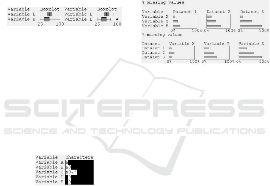
Figure 1: Bars and dots visualization of a scalar. The values
for variables A and E are drawn as dots because they are the
minimum and maximum of the range (0% and 100%
missing, respectively). The bars for variables B and D are
drawn using perceptual discontinuity, because the values
are very small (0.01%) and large (99.99%), respectively.
the case for uniqueness (U) which is typically
(Abedjan et al., 2015) calculated in terms of the
number of distinct values (numDistinct) and number
of rows (numRows) as:
U = numDistinct ÷ numRows
(1)
There are two problems with Equation 1. First, it
is misleading if there are any missing values, and
second the minimum value depends on the number of
rows (e.g., if a variable only had one distinct value
then U = 0.001 if there are 1000 records but 0.000001
if there are 1 million records). We address that by
using the number of non-missing values (numValues)
to calculate a normalized measure of uniqueness:
U = (numDistinct – 1) ÷ (numValues – 1)
(2)
For distributions, the information that analysts
require depends on the data quality task that they are
performing. When investigating the consistency of
value lengths it is sufficient to know the minimum
and maximum for each variable. We use a whiskers
& dots visualization, to preserve the semantically
important difference between value lengths that span
a range vs. are identical (shown as whiskers and dots,
respectively; see Figure 2).
Figure 2: Whiskers and dots visualization of a value length
distribution. Four of the variables have a consistent value
length, but Variable D’s values have 4 – 8 characters.
For numerical distributions, we cater for tasks that
involve the identification of anomalies, be they
implausible values, misleading values or errors (see
§2.1). All of these may be visualized using boxplots,
showing anomalies as outlying points (see Figure 3).
The challenge is not what type of visualization to use,
HEALTHINF 2019 - 12th International Conference on Health Informatics
232
but what criteria to use to define the ends of the box
plot whiskers. Three widely used criteria are the data
minimum/maximum, 1.5 x the inter-quartile range
(IQR), or one standard deviation from the mean.
Although these can identify occasional implausible
values or clear errors, none of those criteria are
suitable for identifying special values because each
such value is likely to occur many times in a given
dataset, and as the number of occurrences increases
then so does the effect on the statistics (mean,
standard deviation, IQR) that are used to define the
criteria in the first place.
Figure 3: Boxplots that use whiskers to show the minimum
and maximum values (left), or show outliers as points
(right).
For patterns we propose a design that shows a
visual summary of the characters that are in a
variable’s values, because that is important for
understanding how data needs to be cleaned. We use
regex expressions to set a Boolean flag for each
character, merging all digits into one flag and all
alphabetical characters into another flag (alternatives
are possible, e.g., distinguishing upper vs. lower case
characters). The visual summary represents each flag
by a character (‘a’ for alphabetical, ‘0’ for digits, and
the character itself (e.g., ‘&’) for punctuation),
vertically aligning the characters so that it is easy to
identify variables that share the same characters or
have unique ones (see Figure 4).
Figure 4: Character patterns visualization, showing that
Variable A’s values only contain alphabetical characters,
Variable B’s values also contain digits, and Variable C’s
values also contain two punctuation characters. Variables D
and E are integers.
An important consideration that applies to all of
the visualization designs is how should they be
arranged to make patterns and anomalies stand out
clearly. This is affected by the types of comparison
that users want to make, the number of variables and
datasets, and the display real estate. Therefore, we
propose two layouts: dataset-centric and variable-
centric.
A dataset-centric layout shows each datasets’
miniature visualizations in one column (see Figure 5).
This makes is easy to see how descriptive statistics
vary because the variables are vertically below each
other in separate rows.
A variable-centric layout shows each variable in a
different column (e.g., see Figure 5), making it easier
to see how that variable’s statistics vary between
datasets (or tables in a relational database). However,
if there are many more variables than datasets then
the dataset-centric layout is likely to be better because
its aspect ratio will be more similar to that of the
display, so less scrolling will be needed.
Figure 5: Two layouts of the same descriptive statistics. The
data-centric layout (top) shows that the trend from Variable
X, Y and Z is the same in all three datasets, but the variable-
centric layout (bottom) shows that Variable X has a
different pattern to the other variables.
4 CASE STUDIES
This section describes two case studies that were used
to evaluate miniature visualizations for five data
quality tasks: missing values, uniqueness, value
lengths, anomalous values and character patterns. For
each case study, the data was processed off-line using
custom-developed Pandas software to output
descriptive statistics. A second piece of custom-
developed Pandas software was used to render
miniature visualizations of those statistics on a 25
megapixel display (six 2560x1600 monitors,
arranged in a 3x2 grid). That display showed all of the
visualizations that were needed for a given task in a
single view (580 miniature visualizations at once for
the missing values, uniqueness and value lengths
tasks in Case Study 1; fewer for the other tasks and
Case Study 2), helping the first author to make
preliminary assessments of the data quality.
Screen-dumps were captured for evaluation with
domain specialists, because that had to take place in
their own departments. Unfortunately, they did not
have Pandas installed and only had ordinary displays
(twin 1920x1080 monitors in Case Study 1; a
1280x1024 projector in Case Study 2). This was far
from ideal because it meant that the evaluations used
Using Miniature Visualizations of Descriptive Statistics to Investigate the Quality of Electronic Health Records
233
static visualizations, which had to be panned
substantially to show all of their detail instead of
being visible in a single view.
4.1 Case Study 1: Longitudinal
Hospital Episode Statistics
This case study was performed with a senior
epidemiologist who is studying long-term outcomes
and hospitalization rates for acute myocardial
infarction (heart attack) patients. The case study used
five anonymized extracts of admitted patient care
(APC) data from hospital episode statistics (HES).
Each extract was from a different year, contained 116
variables that are potentially important for
understanding acute myocardial infarction, and 13-17
million records. Details of the variables are
documented in the APC data dictionary (NHS, 2017).
During the evaluation the epidemiologist looked
at visualizations that used dataset-centric layouts. The
remainder of this section illustrates visualizations and
describes insights that the epidemiologist gained
about missing data, uniqueness, value lengths, value
distributions and character patterns in the data.
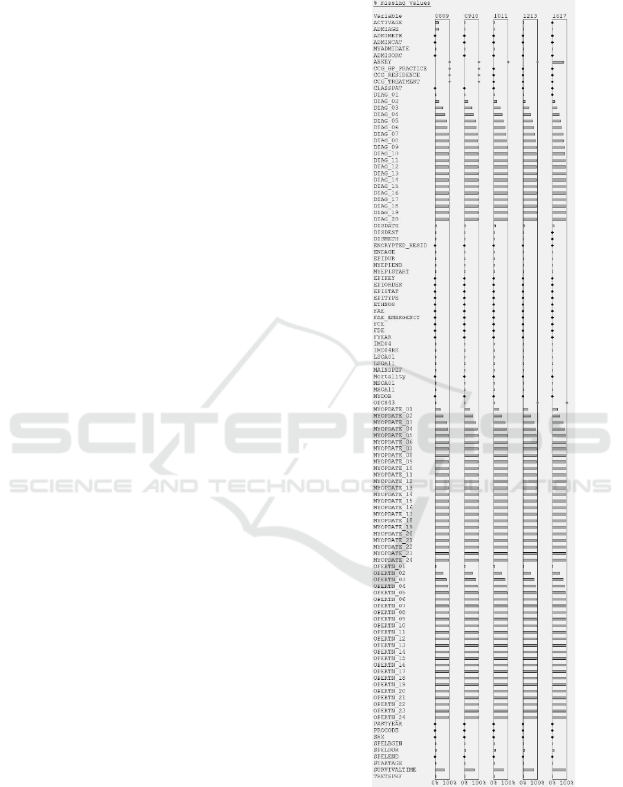
Figure 6 shows a visualization for the missingness
task. It was important to use perceptual adaptation
because, without it, 53 of the variables would have
appeared to have no missing values when in fact they
did. At the glance of an eye, the epidemiologist could
see that the general pattern of missingness was correct
across the 20 x DIAG, 24 x MYOPDATE, and 24 x
OPERTN variables (the number of values reflects the
complexity of a patient’s case). However, contrary to
expectations, the primary diagnosis (DIAG_01) was
sometimes missing in the first four extracts (see
Figure 7), and the small % missingness was
significant in absolute terms (it corresponded to
15,448 – 23,264 records in an extract).
Perceptual adaptation was also important in the
uniqueness task because, without it, 88 of the
variables would have appeared to have only one
distinct value (uniqueness = 0.0). This task produced
two useful insights. In 2016/17 the episode status
(EPISTAT) stood out as having a uniqueness of 0.0.
Further investigation showed that EPISTAT was
always recorded as 'finished', whereas in the other
years it had values of 'finished' and 'unfinished'. This
indicates that the data was not recorded consistently
in all of the years. The other insight was that in
2008/09 OPERTN_13 to OPERTN_24 were much
more unique than in the other years (see Figure 8),
and further investigation revealed two underlying
trends. As the years progressed, more records had
values for a larger number of OPERTN variables (i.e.,
Figure 6: The % missing values for all 116 variables in each
of the 5 data extracts of Case Study 1. Note the DIAG,
MYOPDATE and OPERTN patterns.
HEALTHINF 2019 - 12th International Conference on Health Informatics
234
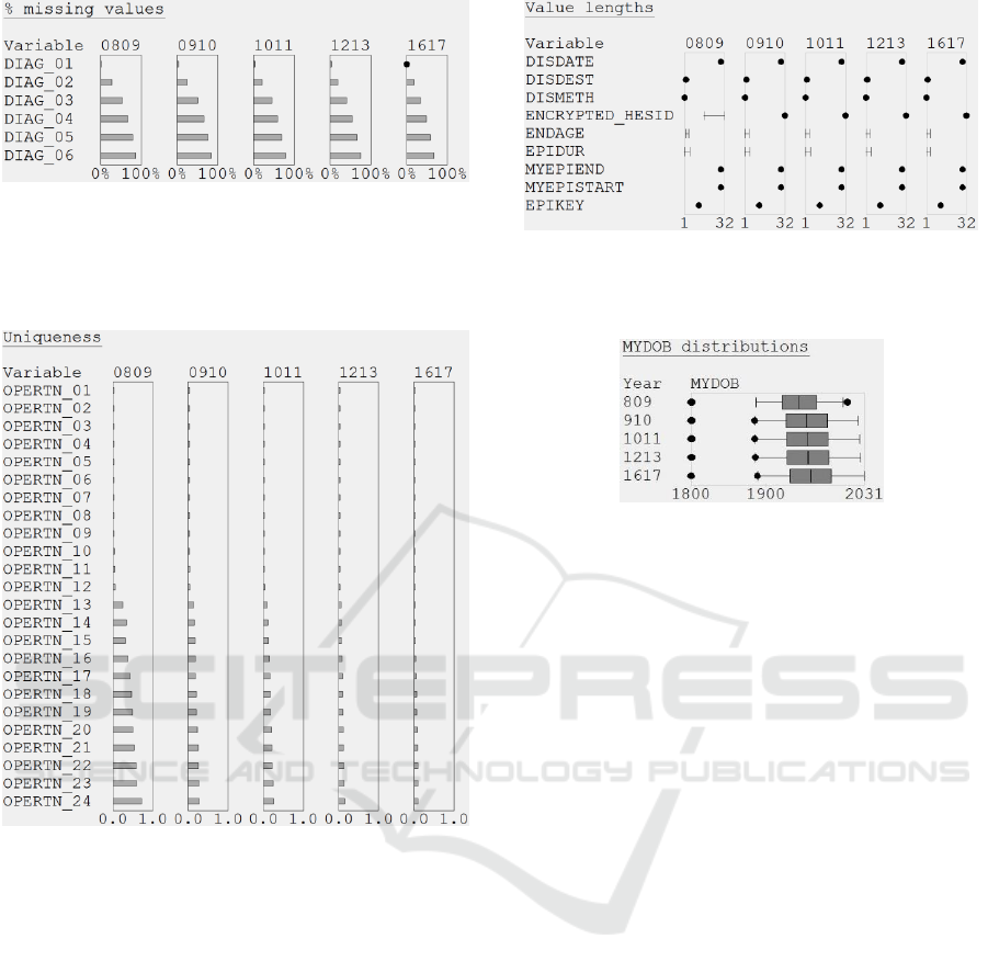
Figure 7: Close-up showing that DIAG_01 unexpectedly
has missing values in 4 extracts of Case Study 1.
an increased coding depth), and the number of
different values increased but proportionally by less.
Figure 8: Uniqueness miniature visualizations for the
OPERTN variables in Case Study 1. Note that the
uniqueness of OPERTN_13 to OPERTN_24 has reduced
since 2008/09.
The value lengths task revealed that some of the
2008/09 pseudonymized patient identifiers
(ENCRYPTED_HESID) were shorter than the other
identifiers in that year and all of the identifiers for the
other years (16 vs. 32 characters; see Figure 9).
Further investigation showed that the NHS
introduced a new method for generating those
identifiers in 2009, and the old and new methods are
not compatible. The consequence is profound – to be
able to link the whole dataset the epidemiologist
needs to request a new 2008/09 extract, which uses
32-character identifiers throughout.
The value distributions task, revealed that there
were errors in the date of birth (MYDOB) field for
four of the extracts, because the maximums
were2014, 2025, 2027 and 2031, respectively (see
Figure 9: Value lengths for some of the Case Study 1
variables. Note the ENCRYPTED_HESID inconsistency in
2008/09.
Figure 10: Boxplots showing the distribution and outliers of
MYDOB values in Case Study 1. The visualizations have
been re-arranged into a variable-centric layout for
presentation in this paper.
Figure 10). The minimum was 01/01/1800 in every
extract, because that special value is used in HES data
if MYDOB is missing.
Finally, in the character patterns task the
epidemiologist noticed that the operative procedure
(OPERTN) variables were much cleaner than the
DIAG variables, which contained 14 punctuation
characters (12 of those appeared in the 0809 extract,
the 0910 extract included a comma, and the 1617
extract included the equals character; see Figure 11).
None of that punctuation is specified in the data
dictionary (2017), which greatly complicates the way
that data cleaning needs to be performed.
4.2 Case Study 2: Primary Care
Cohort Study
This case study was performed with five members of
a team (two professors, two statisticians and a
database manager) who are studying the survival
from melanoma of patients with type 2 diabetes. The
case study used a relational database that comprised
14 tables with a total of 90 million records and 41
different variables.
The evaluation took the form of a 1½ hour session
with the team, during which variable-centric (and to
a lesser extent, dataset-centric) visualizations
triggered a series of discussions about aspects of the
data quality and key issues to investigate next. The
Using Miniature Visualizations of Descriptive Statistics to Investigate the Quality of Electronic Health Records
235
Figure 11: Character patterns for the DIAG and OPERTN
variables in Case Study 1. Note the additional punctuation
characters in the DIAG variables.
underlying descriptive statistics had been provided in
a spreadsheet to the team three months beforehand,
but it was the visualizations that acted as a catalyst for
the discussions. That is testament to the ease with
which people can notice patterns in visualizations,
compared with being overwhelmed by a spreadsheet
of numbers.
The longest part of the discussion was about the
PatientID, which was the only variable that appeared
in all 14 database tables. The visualizations did reveal
two positive aspects of data quality (see Figure 12),
which were that PatientID was: (a) never missing, and
(b) unique for every record in the Patient_Details and
Patient_Link tables. However, the visualizations also
flagged two issues. First, the team were concerned
about the wide range of value lengths. Subsequent
investigation showed that this was because PatientID
is an integer whose 5 – 9-digit value is generated by
some as yet unknown method, rather than an
anonymization method that generates fixed-length
identifiers. The second issue was how are the
PatientIDs distributed between tables (e.g., which
tables contain a clean subset of the PatientIDs in other
tables, and what proportion of PatientIDs are in each
subset)? This requires further investigation.
Character pattern visualizations also revealed two
issues. First, the YearOfBirth variable contained
alphabetical characters and two punctuation
characters (‘#’ and ‘!’), not just digits. Investigation
Figure 12: Variable-centric layout visualization showing
the % missing values, uniqueness and value lengths for the
PatientID variable in Case Study 2.
showed that three of the values were #VALUE! –
presumably caused by a validation error during data
capture or processing at the data provider. Second, in
two tables the clinical codes (CTV3Code) only
contained alphanumeric characters, but in five other
tables the code values also contained a ‘.’ (see Figure
13). Further investigation showed that in those five
tables some codes were actually only 2 – 4 characters
long, but padded out to 5 characters by a ‘.’
characters. In other words, the coding precision was
very inconsistent.
Figure 13: Variable-centric layout visualization showing
the character patterns for the CTV3Code variable in Case
Study 2. Note the absence of a ‘.’ Character in the
Breslow_Codes and Melanoma_Codes files.
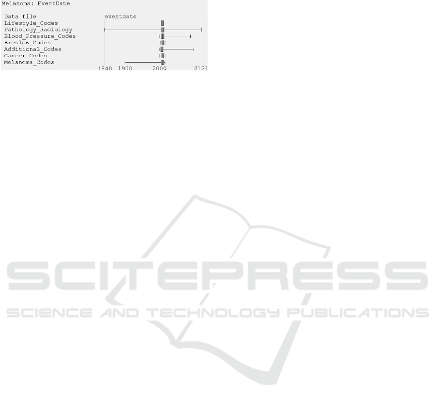
Value distributions showed that most of the date
variables had extreme values, and this was most
prominent for EventDate. Even a boxplot that defined
the whisker ends as the minimum/maximum date (see
Figure 14) led one of the team to comment “oh I really
like this way of looking at data” but, of course, the
visualizations would be more useful if anomalous
values were flagged. However, standard criteria (± 1
standard deviation, and ± 1.5 × IQR) were not
appropriate because they both classified hundreds of
distinct values as outliers, so the development of a
suitable criterion for health data remains an open
research challenge.
Finally, even the normal-looking minimum
EventDate in the Blood_Pressure_Codes table
provoked comment (“not what I expected”), because
the team had anticipated that there would be historical
blood pressure data to provide background
HEALTHINF 2019 - 12th International Conference on Health Informatics
236
information about the patients, but that historical data
was clearly not present.
Figure 14: Variable-centric layout visualization showing
the value distributions for the EventDate variable in Case
Study 2.
5 RESEARCH CHALLENGES
This section describes three research challenges for
visualizing the quality of EHRs. First, the number and
variety of the insights show that the visualization
designs are effective. However, controlled user
studies are needed to compare the designs with
alternatives, particularly for the encoding of semantic
differences (e.g., the bars & dots visualization for
scalars, and whiskers & dots for value lengths). User
studies are also needed to test different types of
distribution visualization for a comprehensive set of
data quality tasks.
Second, the mini visualizations were laid out
using two obvious methods (dataset- and variable-
centric), but the situation is complicated when the
mini visualizations occupy a greater area than the
display’s real estate. This is most likely to occur when
dataset contains many database tables and few of the
variables are shared (e.g., a fully normalized
relational database). Research is needed to develop
and evaluate algorithms that create compact layouts
for such datasets, balancing the sparsity of the mini
visualizations with the area and aspect ratio of the
display.
Third, research is also needed to develop
heuristics for identifying anomalies, which can then
be flagged as outliers in value distributions. As the
case studies show, conventional outlier criteria are
simply not appropriate. Instead, we need criteria that
are tuned to the signatures that anomalies have in
health data, with examples being many occurrences
of a special value (e.g., the default value for dates in
a given system) or one-off values that are separated
from other values but not necessarily in an extreme
manner (e.g., due to a typo). The inclusion of such
criteria into visual analytic tools for investigating data
quality will help users to interactively harness their
domain knowledge to make informed judgments
about anomalous values and, in doing so, improve the
quality of the data they use in analyses.
6 CONCLUSIONS
This paper describes compact designs for visualizing
descriptive statistics. The designs scale to datasets
with hundreds of variables and millions of records.
Primary and secondary care case studies revealed
a variety of important insights about data quality. For
scalar descriptive statistics, our visualizations
combined perceptual adaptation with multiple mark
types to preserve important semantic differences
between the values of the scalars. One insight was
that some hospital episode records were missing a
patient’s primary diagnosis (DIAG_01), which is
clearly an error. By contrast, the miniature
visualizations also showed that the general pattern of
missingness across the other 19 diagnosis variables
(DIAG_02 to DIAG_20) was as expected.
Other insights were revealed by visualizing
distributions with multiple mark types, to distinguish
variables that had a constant value length from those
that had a range of value lengths. That revealed that
the patient identifiers (ENCRYPTED_HESID) in one
data extract were not compatible with those in other
extracts, meaning that the data could not be linked.
Miniature visualizations of the distribution of date
values revealed many clear errors in both case studies
(including dates of birth and event dates that are in the
future), and suspiciously low values that may stem
from use of default values in the system that was used
to record the data.
Finally, some character pattern visualizations
revealed that some variables (e.g., DIAG_01 to
DIAG_20) contained a plethora of superfluous
characters, which complicates data cleaning. Another
visualization revealed differences in the character
patterns for a specific variable (CTVCode) across
seven datasets, and the cause turned out to be that the
coding precision varied from two to five characters.
ACKNOWLEDGEMENTS
The authors acknowledge the financial contribution
of the Engineering and Physical Sciences Research
Council (EP/N013980/1), the British Heart
Foundation (PG/13/81/30474) and Melanoma Focus.
Due to data governance restrictions, the datasets
cannot be made openly available.
Using Miniature Visualizations of Descriptive Statistics to Investigate the Quality of Electronic Health Records
237

REFERENCES
2017. SQL Server [Online]. Available:
http://www.microsoft.com/en-gb/sql-server/sql-server-
2017.
2018a. Dundas BI [Online]. Available:
http://www.dundas.com/.
2018b. Visualize Benford’s law [Online]. Available:
http://onlinehelp.tableau.com/current/pro/desktop/en-
us/benford.html.
Abedjan, Z., Golab, L. & Naumann, F. 2015. Profiling
relational data: A survey. The VLDB Journal—The
International Journal on Very Large Data Bases, 24(4),
pp 557-581.
Arbesser, C., Spechtenhauser, F., Mühlbacher, T. &
Piringer, H. 2017. Visplause: Visual data quality
assessment of many time series using plausibility
checks. IEEE Transactions on Visualization and
Computer Graphics, 23(1), pp 641-650.
Furmanova, K., Gratzl, S., Stitz, H., Zichner, T., Jaresova,
M., Ennemoser, M., Lex, A. & Streit, M. 2017. Taggle:
Scalable visualization of tabular data through
aggregation. arXiv preprint arXiv:1712.05944.
Gotz, D. & Stavropoulos, H. 2014. DecisionFlow: Visual
analytics for high-dimensional temporal event sequence
data. IEEE Transactions on Visualization and
Computer Graphics, 20(12), pp 1783-1792.
Gratzl, S., Lex, A., Gehlenborg, N., Pfister, H. & Streit, M.
2013. Lineup: Visual analysis of multi-attribute
rankings. IEEE Transactions on Visualization and
Computer Graphics, 19(12), pp 2277-2286.
Gschwandtner, T., Aigner, W., Miksch, S., Gärtner, J.,
Kriglstein, S., Pohl, M. & Suchy, N. 2014.
TimeCleanser: A visual analytics approach for data
cleansing of time-oriented data. Proceedings of the 14th
International Conference on Knowledge Technologies
and Data-driven Business. ACM.
Iyen-Omofoman, B., Hubbard, R. B., Smith, C. J., Sparks,
E., Bradley, E., Bourke, A. & Tata, L. J. 2011. The
distribution of lung cancer across sectors of society in
the United Kingdom: a study using national primary
care data. BMC Public Health, 11(1), pp 857.
Kandel, S., Parikh, R., Paepcke, A., Hellerstein, J. M. &
Heer, J. 2012. Profiler: integrated statistical analysis
and visualization for data quality assessment.
Proceedings of the International Working Conference
on Advanced Visual Interfaces. ACM.
NHS. 2017. HES data dictionary: Admitted patient care
[Online]. Available:
http://content.digital.nhs.uk/media/25188/DD-APC-
V10/pdf/DD-APC-V10.pdf.
Noël, P. H., Copeland, L. A., Perrin, R. A., Lancaster, A.
E., Pugh, M. J., Wang, C.-P., Bollinger, M. J. &
Hazuda, H. P. 2010. VHA Corporate Data Warehouse
height and weight data: opportunities and challenges for
health services research. Journal of Rehabilitation
Research & Development, 47(8), pp 739-50.
Noselli, M., Mason, D., Mohammed, M. A. & Ruddle, R.
A. 2017. MonAT: A Visual Web-based Tool to Profile
Health Data Quality. HEALTHINF.
Pringle, M., Ward, P. & Chilvers, C. 1995. Assessment of
the completeness and accuracy of computer medical
records in four practices committed to recording data on
computer. British Journal of General Practice,
45(399), pp 537-541.
Rind, A., Wang, T. D., Wolfgang, A., Miksch, S.,
Wongsuphasawat, K., Plaisant, C. & Shneiderman, B.
2013. Interactive information visualization to explore
and query electronic health records. Foundations and
Trends in Human-Computer Interaction, 5(207-298.
Sparnon, E. 2013. Spotlight on electronic health record
errors: Errors related to the use of default values. PA
Patient Safety Advisory, 10(3), pp 92-95.
Staes, C. J., Bennett, S. T., Evans, R. S., Narus, S. P., Huff,
S. M. & Sorensen, J. B. 2006. A case for manual entry
of structured, coded laboratory data from multiple
sources into an ambulatory electronic health record.
Journal of the American Medical Informatics
Association, 13(1), pp 12-15.
Tennekes, M., de Jonge, E. & Daas, P. 2011. Visual
profiling of large statistical datasets. New Techniques
and Technologies for Statistics conference, Brussels,
Belgium.
Unwin, A., Hawkins, G., Hofmann, H. & Siegl, B. 1996.
Interactive graphics for data sets with missing values—
MANET. Journal of Computational and Graphical
Statistics, 5(2), pp 113-122.
Weiskopf, N. G. & Weng, C. 2013. Methods and
dimensions of electronic health record data quality
assessment: enabling reuse for clinical research.
Journal of the American Medical Informatics
Association, 20(144-151.
Xie, Z., Huang, S., Ward, M. O. & Rundensteiner, E. A.
2006. Exploratory Visualization of Multivariate Data
with Variable Quality. IEEE Symposium on Visual
Analytics Science and Technology (VAST).
Zhang, Z., Gotz, D. & Perer, A. 2014. Iterative cohort
analysis and exploration. Information Visualization,
14(4), pp 289-307.
HEALTHINF 2019 - 12th International Conference on Health Informatics
238
