
The Effectiveness of Social Campaign “Mari Kembali Ke Desa”
towards First Jobbers Who Came from outside Jakarta: A Pre-test
Logo and Advertising
Vashti Trisawati Abhidana
1
, Novi Dila Kana
1
1
Graphic Design & New Media Program, Visual Communication Design Department, Binus Northumbria School of
Design, Bina Nusantara University, Jakarta, Indonesia 11480
Keywords: Social Campaign, Urbanization.
Abstract: Urbanization in Indonesia brings a complex problem in the cities. People from the rural area perceive big
city will bring more prosperity than living in their village. However some young adults who lived in the
rural area before they took a higher education, think about to groom and grow their own village to make the
community alive and make some changes. Therefore through the social campaign “Ayo Kembali ke Desa”
created by one of the graphic design new media students (GDNM), which the content is motivating young
adults to go back to the village. In this paper is conducting a pre-test for campaign logo and promotional
materials that has been created, because in social campaign conducting a pre-test is a mandatory before
launching the campaign. Through qualitative research with focus group discussion the campaign has good
prospect gain the interest of the target audience with several adjustments.
1 INTRODUCTION
Your paper will be part of the conference
proceedings therefore we ask that authors follow the
guidelines explained in this example and in the file
«FormatContentsForAuthors.pdf» also on the zip
file, in order to achieve the highest quality possible
(Smith, 1998).
Based on the Interior Ministry of Indonesia
Regulation no. 56 – Year 2015 the total villages in
Indonesia is 83,184, which divided into 74,754
villages itself and 8,430 districts from Sabang to
Merauke (Lailissaum, 2017), which every single
village has a Local Regulation legal. In Indonesia,
urbanization creates two impacts: (1) Government
didn’t pay good attentions towards the hide
potentials in the villages, (2) Slow development and
isolation in villages. The villagers lack to be
independent in living, and saw more opportunity to
live in the big cities (Gunawan, 2016). Singgih S
Kartono, founder of Spedagi – a handmade bamboo
bicycle – said that villagers move to big cities
because there were “city attraction” (daya tarik kota)
and “village repulsion” (daya tolak desa) in the
villagers mind. Through television program it
creates an illusion and dream that living in a city
will improve villagers. They feel bored, tired and
stagnant, which the uncool and old school
perception occurred. Village or in Indonesia is called
desa, needs to be revitalized and the community
craves to be inspired. Good human resources from
the outside who have the expertise and brilliant ideas
can develop and train this community by also
bringing up some external resources. The
community will stay and have more skills, which
give them a better living and economy (Spedagi,
2011).
With the background of the needs to develop
villages’ potentials, one of the ideas is spread a
social campaign, which motivating target audience
to contribute and give back their knowledge and
skills to the local villagers. Through the “Ayo
Kembali ke Desa” (Let’s go back to the village)
theme a logotype, series of print advertisements and
a TV commercial (see figure 1, figure 2, and figure
3) have been constructed. This social campaign
promotional materials have been created based on
the research results through quantitative and
qualitative research. However all these graphic
design materials have not been tested, which a pre
testing for social campaign to the potential target
Abhidana, V. and Kana, N.
The Effectiveness of Social Campaign “Mari Kembali Ke Desa” towards First Jobbers Who Came from outside Jakarta: A Pre-test Logo and Advertising.
DOI: 10.5220/0010007100002917
In Proceedings of the 3rd International Conference on Social Sciences, Laws, Arts and Humanities (BINUS-JIC 2018), pages 311-316
ISBN: 978-989-758-515-9
Copyright
c
2022 by SCITEPRESS – Science and Technology Publications, Lda. All rights reserved
311
audience is an important element to be fulfilled
before launching the campaign.
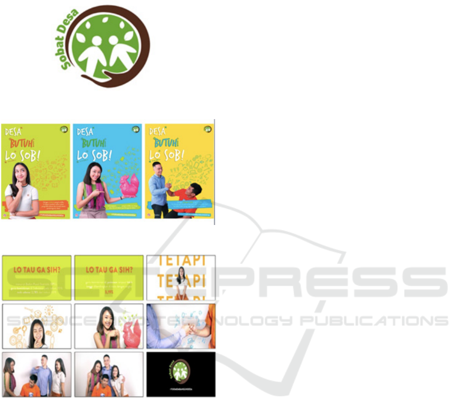
Figure 1: Campaign logo.
Figure 2: Print advertisement series A, B and C.
Figure 3: 60 seconds TV commercial “sobat desa.”
Through a qualitative pre-test research, we can
get more insights from the target audience towards
the design and then review the whole materials to
recreate, revise or just fine-tune it. The purpose is to
make the campaign is effective and achieve the
advertising objective: create awareness. The
message is emphasizing to inspire, motivate or even
change their behaviour that one day they will go
back and build their village after being exposed with
the campaign.
The target audience is bachelor students,
originated from villages or small towns throughout
Indonesia to continue their higher education or work
in big cities. They are first or second jobbers in
various companies or industries, 21-30 years old,
both genders, with their earnings between Rp 5 to 8
million.
2 METHOD
We strongly encourage authors to use this document
for the preparation of the camera-ready. Please
follow the instructions closely in order to make the
volume look as uniform as possible (Moore and
Lopes, 1999).
Researchers conduct qualitative research through
focus group discussion to one group with 4 sources
to get the insights from the target audients towards
the execution of the logo and promotional materials.
Before taking any insights, researchers disseminate a
questionnaire to see the “spontaneous” answers. All
members see the logo for 15 seconds then answer
the questions and give scores. At the end they have
to draw the logo based on their capabilities of their
memory.
2.1 Logo Pre-test
To identify and start a social campaign, usually we
create a logo and will apply in all promotional
materials. The objective is the target audience can
easily recognize the campaign and when they’ve
being exposed several times it might stick into their
mind. A well design logo, connotes a thoughtful and
purposeful enterprise, and mirrors the quality of its
products and services. To pretest the logo, there are
seven steps created by Paul Rand that need to be
checked: (Schools, 2015)
Visible: easily to be seen, the impression,
what is the element that striking
Adaptable: easily been applied to various
promotional materials and application
Uniqueness: the distinctiveness of the logo
compare with others, is it reminding to
other logo?
Timeless: logo will be long lasting, opinion
about the colour, typeface, and symbol
Universal: there’s a consistent meaning
Simple: present a big and small size to see
that the target audience can see it easily, not
over simplified and creates boredom, and
afterwards they asked to redraw it.
Memorable: easy to memorize it, and which
is the strong element to make it memorable.
Researcher add more questions to observe
more thorough of the logo itself are as
follow:
BINUS-JIC 2018 - BINUS Joint International Conference
312

Based on the participant opinions and scoring,
researchers know how to fine-tune the logo that will
acceptable and suit the social campaign theme.
2.2 Print Advertising Pre-testing
Print advertisement is a product or service to be
informed to the target audience through mass media
especially print media, such as newspaper,
magazine, tabloid, and out of home. For pre testing
of print advertisements/posters, there is 10 elements
should be tested: (The Healthen Compass, 2018)
Key appeal: elements that’s stand out or
ordinary, and like/dislike
Comprehension: the target audience
understand the message, and confusing/not
confusing
Acceptability: the element that is
appropriate/inappropriate and how should
be better
Believability: the realistic is the
advertisement, anything that makes it
believable/unbelievable in the message.
Involvement: the target audience of the
advertisement and from which element they
know it (easy to identify it)
Persuasion: the advertisement is convincing
and inspiring and from which element
Call for action: to check if target audience
want to participate or at least interested
with the campaign and want to know
further more.
Uniqueness: give a newness approach or
remind them of something
Memorable: it is easy to memorize it
In this this paper researchers test 3 series of
advertisement and each has different message that
focus on: knowledge, capital and network but under
one big idea theme “Mari Kembali ke Desa”
2.3 Tv Commercial Pre-testing
TV Commercial is about relaying a specific social,
political or sales pitch in a limited amount of time,
broadly ranging in between few seconds to several
minutes. The purpose is to generate demand for a
product, service, idea or cause (Adglitz, 2010). In
TV Commercials there are two elements that relates
with verbal and visual with the duration is 30
seconds or 60 seconds. The elements of pre testing
for TV commercial basically is the same as print
advertisement. Since the TV Commercial has
already been executed, researchers test the final
material and not using the storyboard.
3 RESULT AND DISCUSSION
For the mutual benefit and protection of Authors and
Publishers, it is necessary that Authors provide
formal written Consent to Publish and Transfer of
Copyright before publication of the Book. The
signed Consent ensures that the publisher has the
Author’s authorization to publish the Contribution.
All sources came from various places like North
Sumatra, West Sumatra and South Sulawesi. They
stay in Jakarta because of they got the job or their
first post in Jakarta. Living in Jakarta has lots of
opportunities, entertainments, easy to have friends,
and individualistic life. They tend don’t want to go
back to their homeland because of those reasons.
Some of them still feel the racism in their homeland
especially if you have Chinese descendants. The one
that they miss is the local food that they never get it
the authenticity in Jakarta. The challenge is the bad
traffic jammed and learn to be toughed.
3.1 Logo
Based on the spontaneous variable the logo is an
organization like WWF, UNICEF, something that
concern about the environment, an immigrant
community, helping the villager people who are
unfortunate. The word “Sobat Desa” (Village
Buddies) is quite striking since is directly related to
invite people to develop a better village. The two
people element is quite strong because it can be
identify just for short notice, and it’s a solid
community who help each other. The strong
characters of the logo are: (a) The chocolate hand in
a circle, (b) two people join hands, (c) the village
scenery as the background, (d) two kids and the
green color. The spontaneous score (1 to 10) for the
logo is as follow: 1 = very bad/negative/other
adjective words, 5 = neutral, 10 = very
good/positive/other adjective words. The results are:
Uniqueness (7-8), stand-out compare with others (5-
8), easy to perceive (7-9), visibility (5-9), adaptable
(7-9), memorable (7-9), timeless (5 and 7), and
simplicity (8-10). When sources have to redraw the
logo, basically they can capture the elements of
people, small leaves, green leafs and chocolate wood
colors and the word of “Sobat Desa” even though
there’s an anomaly of yellow color and the
placement of the word of “Sobat Desa”.
In the visible variable, sources have the
impression is an organization or community that
want to develop the village, support each other, or
relates with environment, because of the green and
the chocolate colours. It reminds them very remote
The Effectiveness of Social Campaign “Mari Kembali Ke Desa” towards First Jobbers Who Came from outside Jakarta: A Pre-test Logo and
Advertising
313

villages like in Papua, which are still untouchable.
The word “Sobat Desa” is also a strong element and
readable, which invites people who wander to big
city to go back to their homeland, with the reason to
make a better place and brings an emotional feeling
too. They like the green and chocolate colour, but
they prefer dark green leaves. The illustration of two
people join hands means people in the villages are
not alone, there will be someone help them. The
sources also capture a hand below the green circle. It
enhances the meaning of helping, protecting and
supporting the people through the chocolate hue that
suits well on the illustration as hugging the people
and yet at the same time is like tree branch. Some of
the sources didn’t like the small leaves element that
is too crowded. The adaptable variable; their
response is the logo is easy to adapt in various
promotional items and in many merchandises. It’s
also easy to capture on the street, because of the
colour and the two people inside the green circle. In
uniqueness, the two people, the hand below and the
word of “Sobat Desa” makes the logo distinctive
since it’s uncommon to have a logo with wording.
The logo reminds them with organizations that have
the personality like UNICEF, and yet through the
green colour is like Starbucks. The leaves make
them confuse since it’s depict an environmental
organization. For timeless variable the combination
between green and chocolate colour is acceptable, it
express something about environment. In universal
variable the logo express an organization that
concern helping people in the villages. They
perceive the logo is easy to understand and quite
memorable which answering the simplicity variable.
The memorable aspect of the logo is the word
“Sobat Desa”. Suggestions for better logo is more
integrated between elements as a whole campaign
logo, and take out the leaves. Based on the
suggestions, researcher revise the logo is as follow:
Figure 4: Logo sobat desa revision.
Researchers change the background colour of the
circle into Tosca green and taking out the leaves.
The hand illustration below also changes into dark
chocolate wood. The reason is to lessen the
environment perception yet still have strong village
nuance. It could cater also villages in the coastal
area, since Indonesia also has many fishery villages.
The combination between both colours make the
logo solid, compact and united with the word “Sobat
Desa” part of the hand illustration.
3.2 Print Advertising
Each advertisement using the same headline ‘Desa
Butuh Lo Sob’ (The village needs you bro) with
different strong colours and emphasize one single
message that divided into knowledge, capital/money
and network; and those three aspects can make good
contribution to develop the people and the village
itself. The key appeal for all print advertisements is
the headline, which is expressing the young
generations and the bright colours. The best colour is
the blue one, the lime green and yellow is too strong
and bit irritated for their eyes, yet they still like the
strong colours platform. One of the sources said that
the model with lime green background, need to erase
the brand on the T-shirt, because is stronger that the
logo of the campaign. The 2
nd
advertisement with
blue background, they bit reluctant with the word
‘capital’ that relates with money, because the word
is quite sensitive and people will avoid it. It seems
asking money as a donation. They said people could
contribute anything, not merely money. Nevertheless
the word ‘capital’ is also strong, because there’s
chicken piggybank. The 3
rd
advertisement with
yellow background they perceive the model is one
from the city (wearing a formal shirt) and one from
the village (wearing a T-shirt). It explain that the
urban guy asks the village guy to join “Sobat Desa”.
In comprehension variable which describing the
message, they perceive that when you already
graduated from university just go back to your
homeland to make a better village because villager
needs it. The knowledge that gain from university,
capital or the network they perceive it from the body
language of the models and the various illustration
vectors on the right side. The target audience is
more for youngsters who just graduated from
university. They don’t have a problem with the
Jakarta slang, since some big cities in Indonesia
adopt those slangs and understand it. The strongest
message is related with knowledge/education on the
1
st
print ad body copy, because it tugs directly to the
emotional side and can contribute immediately. In
the acceptability variable, they accept positively
because invites wanderer concerns towards their
homeland, but not directly after graduated. Since
they reluctant with the word of ‘capital’ in the body
copy on the 2
nd
advertisement, it still positive with
BINUS-JIC 2018 - BINUS Joint International Conference
314
the vector illustrations such as money and the
chicken piggybank visual. Seeing the 1
st
print ad
they believe it, even they asked if it’s already in the
Instagram. They want to see more the information;
thus the believability factor is quite strong. In
involvement variable they recognize the target
audience is more for youngsters who just graduated
from university, especially for the people of Jakarta
because the headline is using the Jakarta slang. Even
though the whole design is for graduated students, it
still suitable for mature target audience. In the
persuasion factor, the message is touchy for
wanderer than people who originated live or born in
Jakarta. The ‘Desa Butuh Lo Sob’ headline gives
them a reminder to be more concern towards their
homeland, yet some of them didn’t feel anything
because there’s no big deal to build a better village.
The series of print ads are inviting and they can feel
the call to action factor, especially the
#yukmembangundesa (let’s develop the village) and
the Instagram address. On the uniqueness side, they
said is the headline and the strong colors; and for the
memorable variable is the headline. When all
materials presents side-by-side it’s integrated and
consistent, through the whole design, layout and
headline. The logo itself also fit in well on the print
advertisements. According to the suggestions,
researcher modify one of the print ad as a reference
for others:
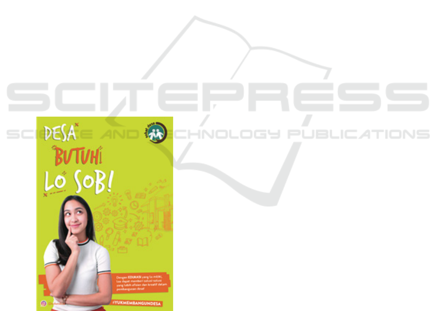
Figure 5: Fine-tune print advertisement as a guideline.
Basically the whole concept is still the same, but
researchers add an architectural vector illustration as
part of the print to give more meaningful that the
knowledge or education can build up something
meaningful to the villagers. Brand logo on model’s
T-Shirt is also has been removed. The word
“education” in body copy also has bigger point and
written in capital letter with the same colour like
others to make it readable yet are highlighted also.
3.3 TV Commercial
In TV Commercial the first reaction is the
‘emotional side’ it doesn’t happen. It’s just sending
information and that’s it. There’s a scene that invite
people to make contribution but what kind of action
people should do doesn’t deliver in the TVC.
Therefore the call to action variable doesn’t show
promptly. The opening scene of the poverty results
with strong colours of green and orange don’t match
as a message. The message is plain and it doesn’t
appealing at all. Therefore the key appeal and
acceptability variables are not as strong as the series
of print advertisement. For them poverty data is not
something new and nevertheless the persuasion
factor is low. They prefer picturing the poverty by
bring it up some visuals about unfortunate kids,
present an underdeveloped rural with people from
big cities give help or donation and sharing
experience. The TVC should have more in the
emotional side, make viewers feel sad and could
inspire and change their mind to do something.
In the involvement variable they still can
identify the TVC is for youngsters-graduated
students from the models and the strong colours
combination. Since they are not as enthusiastic as
the series of print advertisements, the uniqueness
factor does not appear. Although there are more
negative responses to the TVC, they can remember
about the poverty information, which they say it
many times during the discussion and it will be a
good opportunity for the memorable variable. They
also remember the #yukmembangundesa at the
closing, but it doesn’t bring up some interest.
Sources give some suggestions to change the content
of the TVC: (1) Give visuals that depict poverty; (2)
Put celebrity to gain interest, (3) What kind of action
viewers have to do, (3) Change the music to gain
emotional appeal. For this paper purposes,
researchers decide not bring up the fine-tune TV
commercial because it needs to revise the
storyboard, shooting, taking footage, editing, change
the voice over and rerecording it.
4 CONCLUSIONS
The campaign of “Ayo Kembali ke Desa” is an
initiative for wanderers to bring-it-forward what
The Effectiveness of Social Campaign “Mari Kembali Ke Desa” towards First Jobbers Who Came from outside Jakarta: A Pre-test Logo and
Advertising
315

they gain knowledge and experience to develop their
villages. The preliminary campaign materials, which
are logo, series of print advertisements and TV
Commercial has already been acquired and need to
be tested before disseminate to the target audience.
And according to results from the focus group
discussion, the message of the campaign has an
opportunity to get target audience attention,
especially in campaign logo and print advertisement.
The emotional factor needs to be improved in the
TV commercial material.
REFERENCES
Adglitz (2010) Television Advertising: meaning,
definition, Online. Available at: http://adglitz.com.
Gunawan, W. (2016) Membangun Indonesia dari Desa.
Gejayan, Yogyakarta: Media Pressindo.
Lailissaum, A. (2017) Berapa Sih Jumlah Desa di
Indonesia? Available at:
https://www.kompasiana.com/andriyana/593f90c2119
6267cd747ba16/berapa-sih-jumlah-desa-di-
indonesia?page=all.
Schools, D. (2015) The 7 Steps Paul Rand Logo Test,
Online. Available at:
http://entrepreneurshandbook.com.
Spedagi (2011) Sepeda Bambu untuk Revitalisasi Desa,
Online. Available at: http://spedagi.com/about.
The Healthen Compass (2018) How to Conduct Pretest,
Online. Available at: http://thehealthencompass.org.
BINUS-JIC 2018 - BINUS Joint International Conference
316
