
Improving Symbol Salience in Augmented Reality
Maria Beatriz Carmo, Ana Paula Cl
´
audio, Ant
´
onio Ferreira, Ana Paula Afonso and Ra
´
ul Simpl
´
ıcio
Faculty of Sciences, University of Lisbon, Lisbon, Portugal
Keywords:
Augmented Reality, Symbol Adaptation, User Study.
Abstract:
In augmented reality applications, users may experience difficulty in finding virtual symbols placed over
images of the real world whenever the colour of the surrounding background becomes similar to the symbols’
colour. We investigated a set of adaptations to make virtual symbols more salient from the background, while
maintaining the original semantics, and conducted a study to evaluate user preferences about the adaptations,
which revealed that adding a border to the symbols was favoured by the majority of the participants. Next came
colour luminosity adjustment and changing the colour of the letters inside the symbol; however the latter was
only preferred against symbols with no adaptation, that is, it was never chosen when competing with the other
adaptations. Enlarging the symbol was the least selected adaptation, followed by having no adaptation at all.
These results suggest using adaptations based on border addition and colour luminosity adjustments in the
representation of virtual symbols for augmented reality.
1 INTRODUCTION
Augmented Reality (AR) applications place graphical
symbols over images of the real world to provide extra
information to the user. As there is no control over
these images, the virtual symbols may not be detected
by the user because, for instance, their colour is similar
to the background colour. This problem is more acute
in outdoor AR, where visual information and lighting
conditions can change faster (Gabbard et al., 2007).
One solution to this problem is to dynamically,
and continuously, adapt the graphical attributes of the
symbols so that they become more distinguishable
from the real world image. However, these adaptations
should not drastically change the virtual symbols as the
user will most probably get confused and disoriented.
Therefore, the adaptations should make symbols more
conspicuous, maintaining, nevertheless, the original
semantics associated with them.
The literarure proposes several approaches to miti-
gate the problem of legibility of graphical symbols in
AR applications. Kalkofen et al. (2009) proposed tech-
niques based on the use of artificial colouring when
objects have low contrast with their surrounding back-
ground. In Gruber et al. (2010) the colours of both the
virtual objects and the real world images were automat-
ically harmonised based upon aesthetics guidelines.
Besides graphical symbols, text can be used to pro-
vide extra information in AR applications. Gabbard
et al. (2007) investigated the influence of outdoor light-
ing conditions in text readability and tested algorithms
to improve text contrast relative to the background im-
age. Leykin and Tuceryan (2004) focused on pattern
recognition models to identify regions in which labels
should be hard to read due to interference caused by
background textures. They used grey scale images
and computed the contrast between the text and the
surrounding real world image, and ultimately moved
the labels to regions allowing higher readability.
As our aim is to adapt graphical symbols so they
become distinguishable from the real world image,
without moving them to new positions, and without
modifying real world images, it is important to find
out which characteristics are prone to make graphical
symbols more conspicuous.
Wolfe and Horowitz (2004) made a survey of
the attributes that guide visual search and concluded
that colour, motion, orientation, and size undoubtedly
guide human attention. Almost the same attributes
were studied by Paley (2003) to distinguish the text in
a transparent overlay window from the background
text. For example, he suggested drawing outlines
around each letter. Regarding the adaptation of graphi-
cal symbols, Nivala and Sarjakoski (2007) proposed
the drawing of a border around points of interest in
maps.
The goal of this research is to investigate adap-
tations that improve the distinctiveness of graphical
367
Carmo M., Cláudio A., Ferreira A., Afonso A. and Simplício R..
Improving Symbol Salience in Augmented Reality.
DOI: 10.5220/0004298903670372
In Proceedings of the International Conference on Computer Graphics Theory and Applications and International Conference on Information
Visualization Theory and Applications (GRAPP-2013), pages 367-372
ISBN: 978-989-8565-46-4
Copyright
c
2013 SCITEPRESS (Science and Technology Publications, Lda.)
symbols superimposing real world images, while pre-
serving the original semantics. To this end, we propose
a set of adaptations that make controlled adjustments
to the symbols and discuss the results of a study to as-
sess user preferences in scenarios in which the colours
of unadapted symbols and most parts of the real world
image were purposefully very similar.
The paper is organised as follows: in Section 2
we describe the symbol adaptations and how we did
initial tuning; Section 3 is about the user study and in
Sections 4 and 5 we present and discuss the results;
Section 6 is for conclusions and future work.
2 PROPOSED ADAPTATIONS
Our goal is to use a set of symbol adaptations and test
if these ameliorate the detection of graphical symbols
in AR applications, while maintaining the semantics
associated to the symbols.
We considered as base symbol (BA) a square filled
with a uniform colour, containing one or two black
characters (letters or digits). This symbol shape is pop-
ular in applications to find points of interest, as shown
in Nivala and Sarjakoski (2007). Furthermore, this
type of symbol is prone to be difficult to distinguish
with a variety of backgrounds, and, thus, was found
convenient to test the adaptations.
Given this base symbol, we investigated four types
of adaptation (described next), developed a software
prototype built in Java using NyARToolkit (ARTool-
Works, 2012), and conducted an iterative empirical
evaluation with members of the research team to test
and fine-tune the adaptations. To decide if a symbol
should be adapted, the dominant colour (having the
highest frequency) of the symbol is compared with the
dominant colour of a rectangular image region that en-
closes the symbol. If the absolute difference between
each of the three RGB colour components is less than
a threshold, the two colours are considered similar,
and when this happens the symbol is adapted.
The four major types of adaptation were the follow-
ing: adding a border around the symbol (BO), adjust-
ing the colour luminosity (CO), enlarging the symbol
(EN), and changing the colour of the letters or digits
inside the symbol (LE). Figure 1 shows examples of
the adaptations and minor variants.
BA BB BW C1 C2 EN LW
Figure 1: Examples of base and adapted symbols.
As in Nivala and Sarjakoski (2007), we also ap-
plied a border around the symbols to make them more
conspicuous. We considered two neutral colours for
the border, black and white, to avoid misleading in-
terpretations that could be introduced by the use of
colour (Silva et al., 2011). Regarding the border width,
we settled with
1/8
of the size of the base symbol. In
Figure 1 these variants are identified as BB and BW.
As mentioned earlier, changing the colour of a
symbol could be interpreted as a change in its mean-
ing, thus we chose to adjust the colour luminosity of
symbols to enhance the contrast with the background.
Our approach was to draw symbols slightly lighter
when the background is dark, and to draw symbols
a bit darker when the background is light. To adjust
the luminosity of a symbol, the dominant RGB colour
component or the co-dominant components were modi-
fied by adding or subtracting a constant value, ensuring
that a dark symbol became lighter, and vice-versa. For
the CO adaptation, we tested two constant values, 50
and 100 (in a scale from 0 to 255), corresponding to
variants C1 and C2 in Figure 1.
As mentioned previously, Wolfe and Horowitz
(2004) included size as an attribute that undoubtedly
guides human attention. This conclusion is also con-
firmed by our common sense. Therefore, one of our
adaptations is the enlargement of the base symbol, with
a factor of
3/2
relative to the size of the base symbol.
This adaptation is identified as EN in Figure 1.
Finally, to increase the contrast of the letters inside
the symbol, when both the background and the sym-
bol have a dark colour, the letters on the symbol are
depicted in white, shown as LW in Figure 1. Since
the base symbol has black letters, we did not consider
the adaptation that would turn white letters into black
letters on symbols with light colours.
3 USER STUDY
We set up and conducted a user study to empirically
evaluate the adaptations shown in Figure 1, in scenar-
ios in which base symbols had colours similar to the
surrounding real world image. In these circumstances
we assumed that the adaptations would improve sym-
bol salience, and hypothesised that users will prefer
the adapted symbols rather than the base symbols.
A total of 55 participants, 22 men and 33 women,
volunteered to the study. 14 were master or PhD stu-
dents, 22 were undergraduate students, and 19 did not
finish high school. Their ages ranged from 20 to 79
years and the median age was 26. We recruited from
social contacts and offered no monetary reward.
Concerning the apparatus, the study was carried
out indoors to minimise influences in symbol percep-
GRAPP2013-InternationalConferenceonComputerGraphicsTheoryandApplications
368
tion due to strong daylight. A laptop was placed on
a desk in front of the participant and the screen was
positioned to allow a clear view of its contents. A
presentation software was used to show predefined
sequences of images according to specific timings.
Participants were asked to perform counting and
preference tasks. In the first task, a photo of buildings
or trees with scattered symbols overlaid was presented
to a participant for 8 seconds, during which s/he had to
count the symbols. The position of the symbols varied
with the photo to prevent learning effects. When the
photo disappeared the participant reported the number
of symbols found. The preference task immediately
followed the counting task and had no time limit. The
researcher started by showing the same photo that
was used for the counting task and then asked the
participant for the preferred symbol adaptation.
We set up the user study according to a repeated
measures design, that is, in each trial the same par-
ticipant was exposed to different conditions. We ma-
nipulated two independent variables, namely symbol
adaptation and background. We tested all adaptations
proposed in this paper plus the case with a base symbol
(with no adaptation), as shown in Figure 1. Regarding
the background variable, we distinguished between
predominantly dark and light backgrounds over which
the symbols were placed. We used two sets of pho-
tos representative of natural scenes with shadows or
poor illumination versus bright sunlight, respectively.
The positions of the symbols was carefully chosen to
simulate adverse situations in which the colour of a
symbol was purposefully very similar to the colour of
its surrounding area in the background image, as can
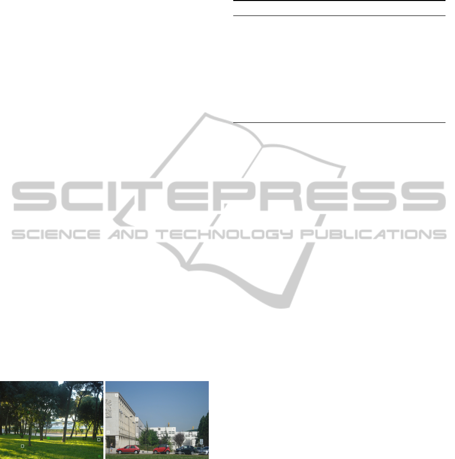
be seen in the examples in Figure 2.
(a) (b)
Figure 2: Dark and light backgrounds with symbols overlaid.
The manipulations of adaptation and background
were organised in five blocks, as shown in Table 1. We
note that the tests range from T01 up to T21 because
we are reporting here part of a larger study. The order
of exposure to blocks A, B, C, and D, was randomised,
and block E was always executed last by participants.
Blocks A, B, C and D were designed to test sep-
arately each of the four major types of adaptations
in Section 2. For instance, in block A, a background
photo was presented first with base symbols overlaid,
Table 1: Tests with dark and light backgrounds.
Block Adapt. Variants Dark Light
A Base BA T01 T03
Border BA,BB,BW T02 T04
B Base BA T07 T09
Enlarge BA,EN T08 T10
C Base BA T12 T14
Colour BA,C1,C2 T13 T15
D Base BA T18 —
Letter BA,LW T19 —
E Mixed BA,C1,C2,EN,BB,BW,LW
∗
T20 T21
∗
The LW adaptation was not tested with light backgrounds.
in test T01, and then, in test T02, with base symbols
mixed with symbols with black or white borders (BB
and BW variants of the border adaptation). In block E,
all symbol adaptations competed for the participants’
attention. The total number of symbols was always 13
and the percent of symbols per adaptation was propor-
tional to the number of adaptations involved.
The dependent variables were symbol count and
preferred symbol adaptation. Measurement of pref-
erences was only carried out for tests that featured
multiple adaptations and we note that the total number
of tests varied with the adaptation type, meaning that
preference results will be expressed as proportions.
Regarding the procedure, a trial started with an
introduction about the research. Next, a questionnaire
was filled out by the researcher according to the an-
swers given by the participant about age, gender, and
academic training. The initial formalities were com-
pleted with the adjustment of the laptop screen position
to the height of the participant.
The core of the study comprised five blocks of
tasks, each taking 4 to 5 minutes to complete. In blocks
A, B, C, and D, the participant was exposed to a dark
background image (see example in Figure 2a) with
only base symbols overlaid, and performed a counting
task. The same image, with symbols scattered in differ-
ent places, was shown to the participant but this time
the symbols were adapted as described in Table 1 and
both counting and preference tasks were carried out
sequentially. Within the same block (except in block
D), a similar procedure was executed for images with
light backgrounds (see Figure 2b). In the final block,
E, counting and preference tasks were carried out for
two images, with dark and light backgrounds.
4 RESULTS
Participants expressed their symbol adaptation prefer-
ences according to the proportions in Figure 3. Each
ImprovingSymbolSalienceinAugmentedReality
369
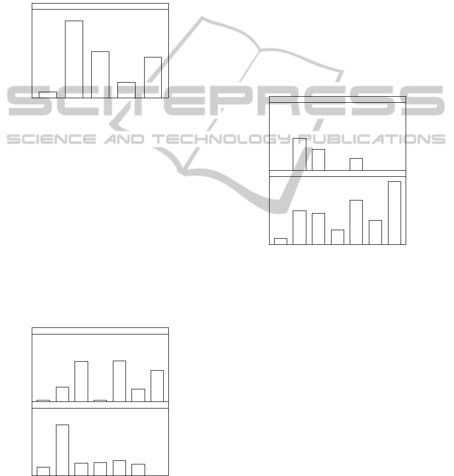
proportion was obtained by dividing the number of
opinions favourable to an adaptation by the total op-
portunities in which participants could have chosen
that adaptation. For instance, in the most popular adap-
tation, BO or border around symbols, there were 4
tests (see BB and BW in tests T02, T04, T20, and T21
in Table 1)
×
55 participants = 220 opportunities, and
in 200 of those (
91%
) participants preferred it, rather
than the base symbol or any other adaptation.
BA BO CO EN LE
48%
19%
55%
91%
7%
ALL TESTS
Figure 3: Preferences by major type of adaptation.
A test of equal proportions showed significant dif-
ferences in the proportions in Figure 3 (
p 0.001
).
Two-sample tests for equality of proportions revealed
differences for all pairs of adaptations (
p 0.001
), ex-
cept for
h
CO,LE
i
. Thus, and given that the proportion
for the BA adaptation was the smallest, we can accept
the hypothesis that the adaptations proposed in this
paper are preferable to symbols with no adaptation.
We applied two-sample tests of equality of pro-
portions to each adaptation variant in the light and
dark background conditions (see Figure 4), which re-
vealed significant differences in preference proportions
(
p 0.001
), except for the EN (enlarge) variant. Thus,
we can conclude that the predominant luminosity of
the background image influences participants’ deci-
sions about the preferred symbol adaptation.
BA BB BW C1 C2 EN LW
18%
24%
20%
19%
78%
13%
1 · LIGHT BACKGROUND
48%
19%
63%
3%
62%
23%
2%
2 · DARK BACKGROUND
Figure 4: Preferences by adaptation variant, per background.
The analysis of Figure 4 further reveals that with
light backgrounds the preferred adaptation was adding
a black border around symbols (
p 0.001
compared
to each of the other adaptations). With dark back-
grounds, both BW and C2 had the highest preference
proportions (
p < 0.015
), but it was not possible to
reject the hypothesis of their equality.
We also analysed adaptation preferences in two
contexts: the first comprises tests in blocks A, B, C,
and D (see Table 1) in which participants were exposed
to base symbols plus one type of adaptation (and its
variants); the second context covers tests in block E, in
which all adaptations competed simultaneously for the
participants’ preferences. Figure 5 shows differences
between the proportions of each adaptation variant
in the two contexts (
p < 0.002
, two-sample tests of
equality of proportions), except for the BB condition,
for which the proportions were likely the same.
BA BB BW C1 C2 EN LW
96%
37%
68%
23%
48%
52%
9%
1 · COMPETING WITH ONE OTHER ADAPTATION
0%0%
18%
0%
33%
49%
0%
2 · COMPETING WITH ALL OTHER ADAPTATIONS
Figure 5: Preferences by adaptation variant, per context.
Curiously, when participants were exposed to all
adaptations at the same time (Figure 5, top) no one
chose BA, C1, EN, or LW, which suggests the other
adaptations were the favourites. Thus, to check if the
order of preferences in this context was BB, then BW,
and lastly C2, we applied two-samples tests of equality
of proportions to
h
BB,BW
i
and
h
BW,C2
i
, which con-
firmed the significant difference in their proportions
(
p = 0.013
in both cases). In the bottom portion of
Figure 5, we note that the proportion of preferences for
the base symbol, which was present in all tests, was
significantly lower than the proportions of the other
adaptations (
p 0.001
), which reinforces the support
for the hypothesis central to this research.
Analysis of the number of symbols counted in each
test was done for the major types of adaptations. This
was because all minor variants of each adaptation were
always tested simultaneously (see Table 1), thus mak-
ing it impossible to drill down to that level of detail.
Figure 6 shows box-plots of symbols counted for
all adaptation types, plus an MX (mixed) pseudo-
GRAPP2013-InternationalConferenceonComputerGraphicsTheoryandApplications
370
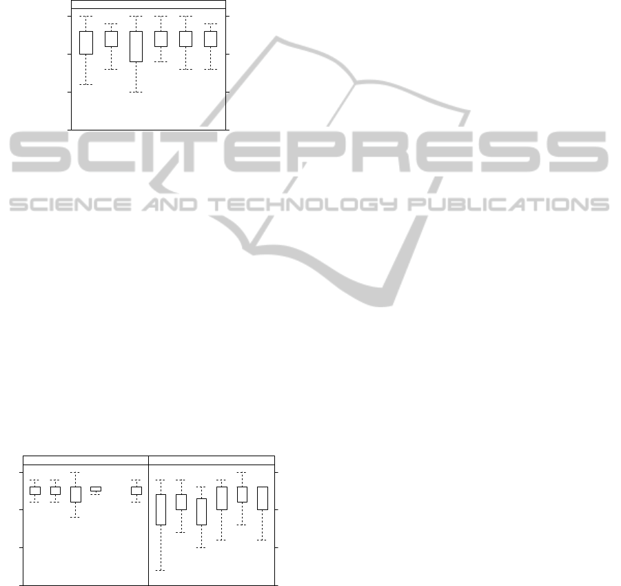
adaptation that represents the scenario in which partic-
ipants were exposed to all adaptations, corresponding
to the two tests in block E. The median number of
symbols counted ranged from 11 to 13, out of a maxi-
mum of 13. Some participants reported more than the
actual number of symbols on the computer screen, but
we decided not to discard data because that happened
irrespectively of the adaptation type.
SYMBOLS COUNTED
5
10
15
BA BO CO EN LE MX
● ●
●
● ● ●
●
●
●
●
●
●
●
●
●
●
●
●
●
●
●
●
●●
●
●
●
●
●
●●
●
●●
●
●
●●
●
●
●●
●
●
●
●
●
●
●
●
●
● ●
●
●
●
●
●
●
●
ALL TESTS
Figure 6: Symbols counted by major type of adaptation.
To check if symbol counts differed between pairs
of adaptations, we first applied a Shapiro-Wilk test,
which revealed that the normality assumption could
not be accepted for any of the data distributions (
p
0.001
). Next, we applied a two-sample Wilcoxon test
to all 15 pairs of adaptation types, and adopted an
α
value of 0.003 to control for family-wise errors.
Results revealed that participants counted less sym-
bols when exposed to the CO adaptation than in the LE
and MX conditions (
p < 0.001
). Thus, even though
Figure 6 suggest higher symbol counts in the EN, LE,
and MX conditions, none of the adaptations differed
significantly from all the others.
Figure 7 shows box-plots of symbol counts in the
light and dark background conditions, with medians
13 and 11, respectively, a difference considered signif-
icant by a two-sample Wilcoxon test (p 0.001).
SYMBOLS COUNTED
5
10
15
BA BO CO EN LE MX
● ● ● ● ●
●
●
●●●●
●
●
●
●
●
●
●
●
●
●●
●
●
●
●●
●
●
●
●
●
●●
●●
●
●
●
●●●●
●
1 · LIGHT BACKGROUND
BA BO CO EN LE MX
● ●
●
●
●
●
●
●●
●●●●●●
●
●
●●
●
●
●
●
●
●
●
●
● ●
2 · DARK BACKGROUND
Figure 7: Symbols counted by adaptation, per background.
Comparing each adaptation individually in the
two background conditions lead to similar outcomes
(
p 0.001
), differing only in the median values. This
suggests participants may have had more difficulty in
finding symbols when the dominant luminosity of the
background photo was dark.
5 DISCUSSION
The results from the user study revealed two main find-
ings: firstly, the proposed symbol adaptations were
preferable to base symbols in scenarios representa-
tive of AR conditions which benefited from improved
symbol salience; and secondly, adding a border and
adjusting the colour luminosity of symbols were the
most popular adaptations. In this section, we examine
the validity of the strategy behind this research, dis-
cuss the preservation of symbol semantics and how we
intend to address it more properly in future work, and,
finally, argue about the applicability of our findings to
AR development.
We evaluated different adaptations using an empiri-
cal user study in controlled settings. Thus, we choose a
research strategy that minimises external influences to
keep the results precise and comparable, at the expense
of realism and generalisability (McGrath, 1995).
Indeed, one limitation is that all tests were con-
ducted indoors, whereas users of mobile AR applica-
tions will likely be outdoors. In this regard, we tried to
increase realism in two ways: firstly, by using photos
of urban landscapes as background images, so that po-
tential effects specific to the overlay of symbols against
common objects such as trees and buildings would be
captured in the study; and secondly, we considered
photos with shadows and poor illumination as well
as photos shot under bright sunlight, to simulate two
natural settings. Other studies in the literature were
also performed indoors, for instance using posters with
high-resolution photos (Gabbard et al., 2007). Another
limitation is that the symbols tested were restricted to
a simple, yet popular, rectangular shape. We did not
explore other symbol designs, such as the cartoon-like
symbols of the Canadian emergency mapping symbol-
ogy (GeoConnections, 2010), to simplify the study.
More work is necessary to increase realism, and our
ongoing studies are being carried out outdoors and we
replaced the laptop for a mobile hand-held device.
Concerning the generalisability of the results to a
variety of populations, one of our goals was to find
participants from both genres covering a wide range of
ages. In this regard, the convenience sample used was
effective in contacting 55 volunteers, with a 40/60 pro-
portion of men and women, from 20 up to 79 years of
age. Nevertheless, we identify two limitations: firstly,
we have not analysed results by age bands, the major
reason being that we did not find a commonly accepted
approach for this, even though additional outcomes
could arise; and secondly, we do not have data for
people below 20 years of age, who will likely play an
increasingly important role in the consumer market,
for instance, as players of mobile AR games (Wetzel
ImprovingSymbolSalienceinAugmentedReality
371

et al., 2008). Future work is needed to address these
limitations, and we note it may be difficult to obtain
parents’ permission to contact young participants.
This research was conducted having in mind the
preservation of symbol semantics. In a way, this is a
case of not only ‘respecting’ the real world images,
as per the definition of AR in Azuma (1997), but also
‘respecting’ the virtual symbols that are overlaid, pro-
viding supplementary data that needs to be correctly
interpreted by the user. In fact, we did not evaluate
semantics, but have made informed efforts to preserve
it. Thus, the colours chosen in some adaptations were
neutral, we adjusted luminosity (not hue or saturation,
which could turn green into red, for instance), and the
increase in symbol size was moderate.
Given the results from this study, in our ongoing
work we are asking users to subjectively evaluate sym-
bol semantics. In addition, we are investigating prefer-
ences regarding adapting only the symbols that might
be confused with the background versus having all
symbols equally adapted for the entire real world im-
age, which could make the symbols (as a group) more
conspicuous and could minimise questions about why
supposedly equivalent symbols look different.
Finally, regarding the applicability in AR, this work
concerns video see-through AR systems, as it requires
image analysis. Actually, this is not a limitation be-
cause these systems are currently available on mobile
phones, allowing a growing number of users to experi-
ence AR. This fosters the development of a wide range
of AR applications, such as the visualisation of points
of interest and scientific data, that could benefit from
the proposed symbol adaptations.
6 CONCLUSIONS
The problem addressed in this paper is that in AR
applications it may be difficult to discern virtual sym-
bols from the surrounding background image if their
colours are similar. Therefore, we proposed a set of
adaptations to make virtual symbols more salient from
the background, while preserving the original seman-
tics. We conducted a study to empirically evaluate the
adaptations, which revealed that adding a border and
adjusting the colour luminosity were the two favourite
adaptations in scenarios in which symbols had colours
purposefully similar to the surrounding image.
Ongoing work explores the use of these two
favourite adaptations on AR applications for mobile
devices in outdoor environments. We are testing if
these adaptations preserve symbol semantics, and also
analysing the minimum variation in luminosity that
makes a symbol distinguishable in both light and dark
backgrounds. Further research could consider, for in-
stance, new adaptations and other types of symbols.
REFERENCES
ARToolWorks (2012). NyARToolkit Project. Retrieved July
2012, from http://nyatla.jp/nyartoolkit/wp/.
Azuma, R. T. (1997). A survey of augmented reality. Pres-
ence: Teleoperators and Virtual Environments, 6(4):355–
385.
Gabbard, J. L., Swan, J. E., Hix, D., Kim, S.-J., and Fitch, G.
(2007). Active text drawing styles for outdoor augmented
reality: A user-based study and design implications. In
VR’07: Proceedings of the IEEE Virtual reality confer-
ence, pages 35–42, Charlotte, NC, USA.
GeoConnections (2010). Emergency mapping symbol-
ogy, version 1.0. Retrieved September 2012, from
http://emsymbology.org/EMS/index.html.
Gruber, L., Kalkofen, D., and Schmalstieg, D. (2010). Color
harmonization for augmented reality. In ISMAR’10: Pro-
ceedings of the 9th IEEE international symposium on
Mixed and augmented reality, pages 227–228, Seoul, Ko-
rea. IEEE Press.
Kalkofen, D., Mendez, E., and Schmalstieg, D. (2009). Com-
prehensible visualization for augmented reality. IEEE
Transactions on Visualization and Computer Graphics,
15(2):193–204.
Leykin, A. and Tuceryan, M. (2004). Automatic determi-
nation of text readability over textured backgrounds for
augmented reality systems. In ISMAR’04: Proceedings
of the 3rd IEEE and ACM international symposium on
Mixed and augmented reality, pages 224–230, Arlington,
VA, USA. IEEE Press.
McGrath, J. E. (1995). Methodology matters: Doing re-
search in the behavioral and social sciences. In Baecker,
R. M., Grudin, J., Buxton, W. A. S., and Greenberg, S.,
editors, Human-computer interaction: Toward the year
2000, pages 152–169. Morgan Kaufmann, San Francisco,
CA, USA.
Nivala, A.-M. and Sarjakoski, T. L. (2007). User aspects of
adaptive visualization for mobile maps. Cartography and
Geographic Information Science, 34(4):275–284.
Paley, W. B. (2003). Designing better transparent overlays
by applying illustration techniques and vision findings. In
UIST’03: Adjunct proceedings of the 16th annual ACM
symposium on User interface software and technology,
pages 57–58, Vancouver, Canada.
Silva, S., Santos, B. S., and Madeira, J. (2011). Using color
in visualization: A survey. Computers and Graphics,
35(2):320–333.
Wetzel, R., McCall, R., Braun, A.-K., and Broll, W. (2008).
Guidelines for designing augmented reality games. In
FP’08: Proceedings of the 2008 conference on Future
play, pages 173–180, Toronto, Canada.
Wolfe, J. M. and Horowitz, T. S. (2004). What attributes
guide the deployment of visual attention and how do they
do it? Nature Reviews Neuroscience, 5(6):495–501.
GRAPP2013-InternationalConferenceonComputerGraphicsTheoryandApplications
372
