
APPLIED VISUAL EXPLORATION ON REAL-TIME NEWS FEEDS
USING POLARITY AND GEO-SPATIAL ANALYSIS
Milo
ˇ
s Krstaji
´
c, Peter Bak, Daniela Oelke, Daniel A. Keim
Department of Computer and Information Science, University of Konstanz, Germany
Martin Atkinson
European Commission’s Joint Research Center, Ispra, Italy
William Ribarsky
UNC Charlotte Visualization Center, Charlotte, U.S.A.
Keywords:
News feed application, Sentiment analysis, Spatiotemporal analysis.
Abstract:
This paper presents a visual analytics approach to explore large news article collections in the domains of
polarity and spatial analysis. The exploration is performed on the data collected with Europe Media Monitor
(EMM), a system which monitors over 2500 online sources and processes 90,000 articles per day. By analyz-
ing the news feeds, we want to find out which topics are important in different countries and what is the general
polarity of the articles within these topics. To assess the polarity of a news article, automatic techniques for
polarity analysis are employed and the results are represented using Literature Fingerprinting for visualization.
In the spatial description of the news feeds, every article can be represented by two geographic attributes, the
news origin and the location of the event itself. In order to assess these spatial properties of news articles, we
conducted our geo-analysis, which is able to cope with the size and spatial distribution of the data. Within this
application framework, we show opportunities how real-time news feed data can be analyzed efficiently.
1 INTRODUCTION
Excess amount of information is generated each day
on the internet, making processing of the content
very difficult for the individual. Global news agen-
cies, such as The Associated Press (AP), Reuters and
Agence France-Presse (AFP), provide media compa-
nies with news reports from all over the world. This
content is then duplicated, enriched with commentary
and opinion. Additionally, news are filtered according
to importance or interest of the editorial team. Be-
sides, local media outlets produce their own local (or
global) content having their own point of view, which
might be specific to the geographic location of the
news source (region, country) or specific to a certain
group of people. Furthermore, blogs allow common
people to become active content creators themselves,
not just passive readers, thus making the analysis of
such amount of information one of today’s greatest
challenges.
The current paper describes an application aiming
to conduct comprehensive analysis of such material.
The paper first describes where the data comes from
and how it is processed for analytic purposes. Second,
opportunities for in-depth analysis are shown, taking
polarity and spatial analytic techniques as examples.
Europe Media Monitor (Atkinson and Van der
Goot, 2009) is a news aggregation system which mon-
itors over 2500 news sources, collecting 80,000 -
100,000 news articles per day in 42 languages. The
goal of EMM is to provide assistance to human me-
dia monitoring, through automatic analysis and cate-
gorization of articles from these sources. In a typical
information gathering scenario, journalists try to give
the answers to the ”Five Ws” questions - ”who, what,
when, where and why”. The EMM system employs
various information extraction, clustering and anal-
ysis techniques to help the user in answering these
questions. The front-end application EMM News-
Brief is available publicly at http://emm.jrc.it/.
Articles are clustered by the EMM system in each
263
KrstajiÄ
˘
G M., Bak P., Oelke D., A. Keim D., Atkinson M. and Ribarsky W.
APPLIED VISUAL EXPLORATION ON REAL-TIME NEWS FEEDS USING POLARITY AND GEO-SPATIAL ANALYSIS.
DOI: 10.5220/0002769102630268
In Proceedings of the 6th International Conference on Web Information Systems and Technology (WEBIST 2010), page
ISBN: 978-989-674-025-2
Copyright
c
2010 by SCITEPRESS – Science and Technology Publications, Lda. All rights reserved
language into stories that report about the same event.
Each article is enriched with various metadata, such
as people, their titles and organizations which are
mentioned in the articles. This data is extracted in
a separate entity recognition process and is available
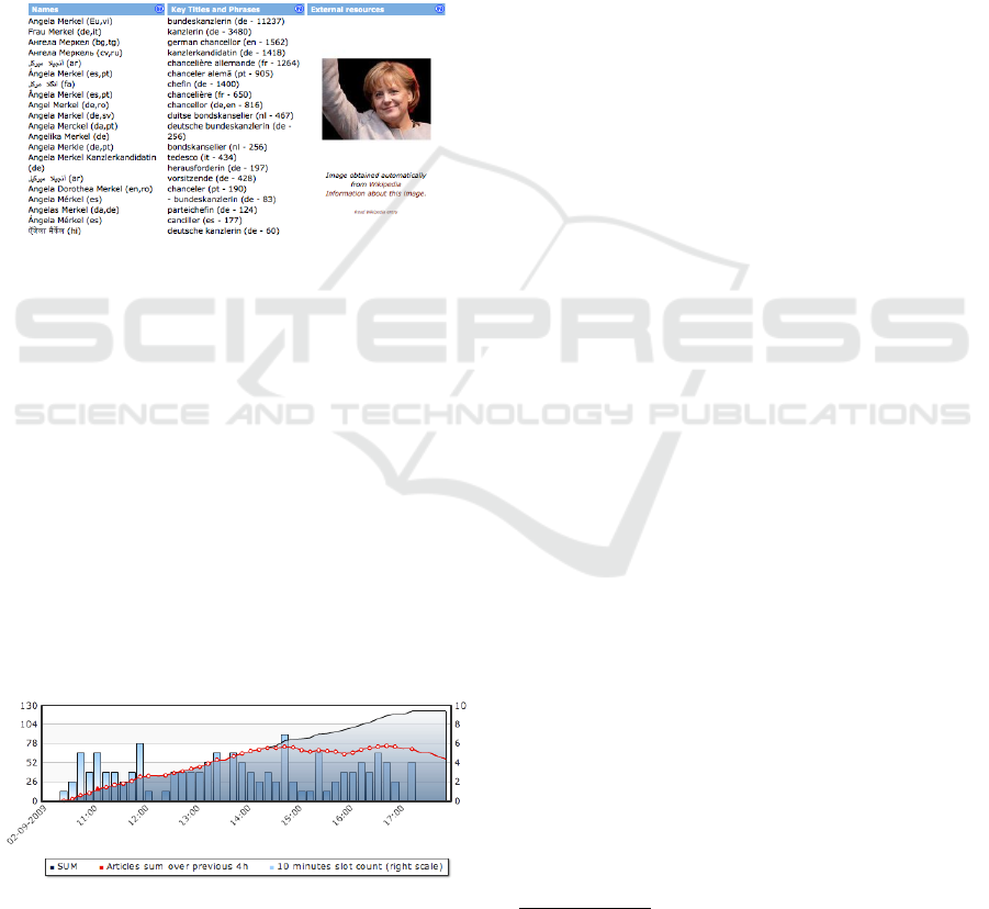
in all languages. Figure 1 shows an example with
German Prime Minister Angela Merkel. In order to
give the answer to the question ”where?” about the
story location, geographical information is also ex-
tracted. The disambiguation module in the system
uses the meta-information of previously recognized
entities, such as names of places, provinces, regions
and countries, in order to perform geo-tagging.
Figure 1: EMM Website Person Page provides data about
people, their titles and quotations in multiple languages.
Descriptive analysis on the temporal development
of topics can be obtained as a part of the website (see
figure 2). Red line chart shows the total number of
articles in a 4 hour time windows, the blue bar chart
shows the number of news articles in 10 minute up-
dates and the blue area shows the cumulative sum of
articles in the story.
The website provides many more features for de-
scriptive analysis of the articles. However, in order to
extract more useful information from the system, in-
depth analysis with more sophisticated analytic meth-
ods is needed. The current paper focuses on two ap-
plication areas, namely in the fields of polarity analy-
sis and spatial-temporal analysis of news feeds.
Figure 2: EMM Website Graph - Single story cluster evolu-
tion over time.
2 POLARITY ANALYSIS
In this section we are going to present a technique for
polarity analysis on news streams. We demonstrate its
usefulness on a sample of about 3 weeks of news data
(approx. 15000 articles).
2.1 Automatic Techniques
To get a polarity score for each article, a basic analy-
sis algorithm was applied. With the help of two lists
with signal words (one containing words with a neg-
ative connotation and the other with positive ones)
1
each word is classified as positive, negative or neu-
tral
2
. We count the number of positive signal words
in an article and subtract the number of negative sig-
nal words from it. To improve the accuracy of the
method, negation is taken into account. This is done
by inverting the value of a word, if in a maximum
distance of X words a negation signal word is found
(such as “no”, “not”, “without”, . . .). In this case, the
parameter X (the maximum distance to the negation
signal word) was set to 3, a value that experimentally
proved as minimizing the failures.
Usually, the above mentioned technique is used
in the context of sentiment analysis. Note that when
we apply it to newspaper articles, we do not measure
the author’s opinion about the topic directly. How-
ever, what we measure is still related to sentiment
in the broadest sense. Words with positive connota-
tions arouse positive feelings about the topic and vice
versa. To account for this difference in the semantics
of the score, we call our analysis “polarity analysis”
although classical sentiment analysis techniques are
used.
In the last years, much research has been con-
ducted in the area of sentiment analysis (see e.g., (Yu
and Hatzivassiloglou, 2003; Wiegand and Klakow,
2008)). For document-level sentiment-analysis,
which is what we do, classification algorithms are of-
ten used (such as Naive Bayes). In case of review
analysis, many algorithms exist that additionally ana-
lyze the text with respect to what has been commented
on (such as (Hu and Liu, 2004; Titov and McDonald,
2008)). So far, only few approaches exist that work
on news articles, as this is a difficult domain. Please
refer to (Pang and Lee, 2008) for a more comprehen-
sive overview of sentiment and opinion analysis algo-
rithms.
1
The lists of signal words are taken from the General
Inquirer Project: http://www.webuse.umd.edu:9090/
2
Note that the list contains signal words of all parts of
speech. That means, not only adjectives, but also nouns,
verbs, etc. (e.g. “catastrophe”, “to like”).
WEBIST 2010 - 6th International Conference on Web Information Systems and Technologies
264

Using this simple algorithm has the advantage that
the automatic analysis can be done fast. In our case,
this is an important property, because we want to work
on a streaming data set. However, note that the al-
gorithm could easily be replaced, if the analysis task
requires more sophisticated ones.
2.2 Visual Representation of the
Polarity Analysis results
In analyzing the news feed, we are interested in the
question how the different groups (e.g. countries) re-
port on different topics. Do they share the same view
on the topic with respect to the polarity of the articles?
Are there clear differences between some countries?
Does it depend on the topic how much they agree with
each other? Which special observations can be made?
What is challenging in this case, is that we cannot say
clearly, what we are looking for. The fact that our
dataset is not static, but that we are working with a
data stream, aggravates the problem. Knowing what
would be interesting to look at today, does not neces-
sarily mean that this would also be a good view for
tomorrow’s news.
A good way to deal with this problem is to use
an expressive visualization technique to represent the
result of the automatic algorithm. Thanks to the
great capabilities of the human visual system, large
amounts of information can be grasped and processed
at once if they are visualized. The automatic algo-
rithms in the background make it possible that the te-
dious work of extracting the polarity of the text is left
to the machine. The more demanding work of de-
tecting patterns and anomalies in the data is done by
the human analyst when interacting with the visual-
ization.
Several visualization techniques for sentiment and
opinion analysis exist. Among them is (Liu et al.,
2005) that represents the result of attribute-based
opinion analysis with bar charts. In (Gamon et al.,
2005) reviews are clustered according to topic and the
average opinion per cluster is visualized in a treemap
representation. Morinaga et al. (Morinaga et al.,
2002) use a 2D scatterplot to display the results of
their automatic algorithm. A visualization technique
that is able to show the temporal aspect of a data set is
introduced in (Wanner et al., 2009). Note, that all ap-
proaches except for the last one are working on prod-
uct reviews and not news.
We decided to apply the Literature Fingerprinting
technique that was introduced in (Keim and Oelke,
2007). The advantage of this pixel-based visualiza-
tion compared to the previously mentioned ones is
that a large amount of values can be shown without
the need of aggregation. Furthermore, the inherent
hierarchy is clearly visible. In this technique, each
score (here the polarity score) is represented by a sin-
gle pixel and its value is mapped to the color of the
pixel. Single pixels are grouped according to a given
hierarchy (e.g. first according to topic and within the
topics according to the location of the news agency).
2.3 Visual Polarity Analysis
Figure 3 shows a Literature Fingerprint for about
three weeks (May 11th - May 28th 2009) of English
news articles from all over the world. In the left col-
umn, each pixel represents the set of news articles for
a single country. A block of pixels contains all the ar-
ticles that belong to a specific topic. (Our topics are
security, sports, and terrorism). Color is mapped to
the average polarity score of the articles that are repre-
sented by the pixel (see color scale at the right). In the
right column, the data are shown on a more detailed
resolution level. In this case, each pixel represents a
single article and the articles are first grouped accord-
ing to the country they belong to, and then according
to the topic they report on. Again, color is mapped to
the polarity score, but this time it represents the score
for a single article.
Looking at the left column of figure 3, it is easy
to see that there are clear differences between the top-
ics with respect to their fundamental tone. While se-
curity and terrorism show a negative trend for most
countries, the opposite is the case for sports.
The advantage of the representation in the right
column is that not only an average score is depicted.
In the higher resolution level it can also be seen how
many articles contributed to the average value and
how homogeneous the reporting is with respect to the
polarity that is expressed.
In the last line of the right column, three kinds
of patterns can be perceived: 1) countries, for which
almost all pixels are colored in shades of red (neg-
ative), 2) countries that are homogeneously shaded
in blue or green, and 3) countries, in which all col-
ors of our color scale occur. Among the ones whose
articles were homogeneously classified as reporting
negatively about terrorism are Australia, Croatia, and
the Cayman Islands (see enlarged depiction at the bot-
tom of the figure). A closer analysis shows that their
articles are primarily about terrorism in other coun-
tries. Countries, in which a concrete danger of terror-
istic acts exists, usually show a multi-colored picture
in our visualization with an overall negative tendency
(see e.g. Great Britain or Israel). The reason for this
is that political speeches or activities related to fight
against terrorism are also included. This also nicely
APPLIED VISUAL EXPLORATION ON REAL-TIME NEWS FEEDS USING POLARITY AND GEO-SPATIAL
ANALYSIS
265

positive
negative
SecuritySportsTerrorism
CroatiaCayman
Islands
SyriaYemenGreat Britain
Israel
Australia
Figure 3: Polarity Analysis on news articles. In the right column, each pixel represents a single article. Its color is mapped to
the polarity score. Articles published in the same country are grouped together into blocks of pixels. In the left column, each
pixel represents the average polarity score for a set of articles of the same country. We display three different news categories.
exemplifies how our algorithm works. The latter ar-
ticles are dominated by security-related terms, mea-
sures against terrorism, and optimistic perspectives
for the future and thus our algorithm classifies them
as positive, because the connotation of those terms is
positive. This means that the used algorithm would
not distinguish between an article that agrees with
those political speeches and another one that cites
them, but afterwards disassociates itself from the mes-
sage. Finally, we were surprised to see that almost all
articles in this category of the Syrian Arab Republic
and Yemen are clearly classified as positive. Read-
ing the articles revealed that in those days the foreign
ministers of the Islamic countries met. Among other
things, they discussed ways to preserve Islamic values
and the Islamic culture, despite of experienced terror-
ist activities. For the participating countries, this was
the major topic in those days and the optimistic tone
of the conference (also praising their own countries’
efforts and perspectives) explains the large amount of
positive reports in the terrorism category.
Finally, we can also analyze the articles across
topics. It is interesting to see that Great Britain has
about twice as many articles in the category sports
than in the category terrorism (see yellow dotted cir-
cles). Opposite to that, Israel has only very few arti-
cles in the sports category compared to the amount of
articles in the categories terrorism and security (see
green circles in figure 3).
3 SPATIAL ANALYSIS
The data provided by EMM can be regarded as an
event-based multidimensional dataset, where each
event represents one news item with a list of at-
tributes. The first geographic attribute, the news ori-
gin, refers to the location of a news agency. Second,
requiring more sophisticated tagging, is the location
of the news’ topics themselves. For the purpose of ge-
ographically tagging the location of a news item, the
full text article is scanned for city, state and country
names. When such a name is found in the document,
its geographic location is automatically acquired from
a look-up table. As a result, one new item could have
more than one location, when more distinct places are
mentioned.
3.1 Application Challenges
The most common approach to visually represent
geographic information on a map is to pinpoint to its
location. However, with large multidimensional data
this task becomes a challenge. Data has to be shown
using single pixels for each event and to map one at-
tribute to the pixels’ color (Keim et al., 2009). Such
pixel-based visualization techniques are scalable but
a well-known problem is that these techniques often
have a high degree of overlap, which may occlude a
significant portion of the data values shown. In ad-
dition, there might be a lack of correlation between
information content and area size.
WEBIST 2010 - 6th International Conference on Web Information Systems and Technologies
266
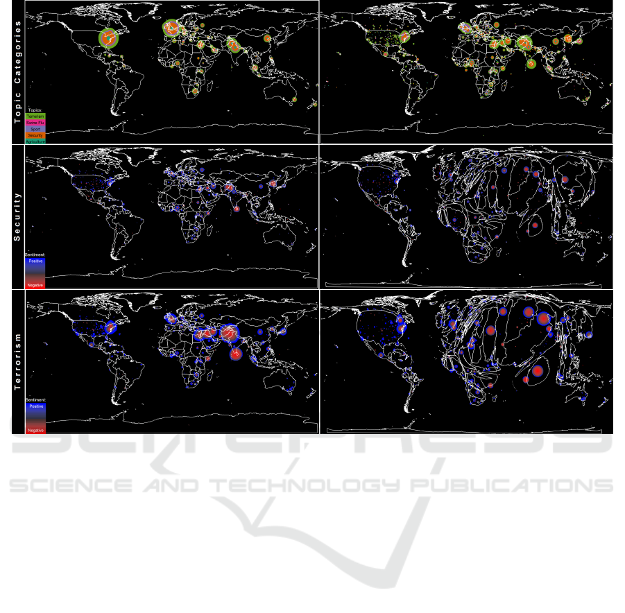
Figure 4: Spatial analysis of news feeds. (Top row) shows the spatial analysis of news feed for the news-origin (left) and
news-location (right) for five selected categories. Topic categories are mapped to color. (Middle) and (Bottom rows) show the
polarity of news on Security (middle row) and Terrorism (bottom row). Polarity levels are mapped to a bidirectional colormap
having red for negative and blue for positive news. The Cartogram representations enhance regions of importance.
3.2 Methods
A number of different pixel-oriented visualization
techniques have been proposed in recent years and
shown to be useful for visually exploring data in many
applications. These techniques differ mainly in their
approach to arrange individual pixels in relation to
each other, and in their choice of shaping the geo-
graphic regions to make maximal use of space.
In order to avoid overlapping pixels, we used in
the current analysis a circular arrangement around the
original location taking a given ordering of the ele-
ments into account (Bak et al., 2009a). The order-
ing usually corresponds to the coloring attribute start-
ing with colors that occur least frequently. With this
arrangement a natural looking visualization without
artifacts is generated. The ordering of elements pre-
vents randomly arranged points which would not ben-
efit the user (Bak et al., 2009a).
Conventional data-plotting obscures data-points
in densely populated areas, while sparsely populated
areas waste space and hide the details of informa-
tion. A way to obtain more space for regions with
a high point density are Cartograms, which distort re-
gions such that their size corresponds to a statistical
attribute (Bak et al., 2009b; Tobler, 2004).
3.3 Analysis Results
The spatial aspect of the news was analyzed using the
EMM data source with the techniques described pre-
viously. The data was obtained in the time period be-
tween May, 11th – June, 7th 2009. Figure 4 represents
spatial analysis of the news feeds.
The top row shows the origin (left, where the news
was published) and location (right, where the news
took place) of news for five selected topics: agri-
culture, security, sport, swine flu and terrorism. The
news originates mainly in Europe and in the US, and
reported on the US, Europe, but also a lot on the Mid-
dle East and Asia. The topics of this time period were
mainly dominated by Security and Terrorism.
The middle row shows the polarity score of news
on security related topics. Polarity scores are mapped
APPLIED VISUAL EXPLORATION ON REAL-TIME NEWS FEEDS USING POLARITY AND GEO-SPATIAL
ANALYSIS
267

to color having red for negative, and blue for positive
news with increasing intensity. The news mainly re-
port on Central Asia and North Korea in the particular
time period. The majority of these news is negative
in their tonality. The Cartogram representation (right
figure) enhances the area of these important locations.
The bottom row shows the polarity score of
news on terrorism related topics. Polarity scores are
mapped to color having red for negative, and blue
for positive news with increasing intensity. The news
mainly report on the Middle East and Central Asia,
especially on the events in Sri-Lanka that occurred
in the particular time period. Although the majority
of the news is negative in its tonality, there are some
positive reports on successes in the fight on terrorism.
The Cartogram representation (right figure) enhances
the area of these important locations.
4 CONCLUSIONS
The current paper describes an application framework
for analyzing and exploring real-time news feed data.
Polarity analysis showed how to assess the ”tonal-
ity” of the published news articles using a technique
called Literature Fingerprinting. The geospatial anal-
ysis demonstrated that many insights can be gained
using pixel-based approaches. The great challenge
for further research is to integrate respective tech-
niques within the EMM-platform, make them scalable
to large datasets, and to cope with real-time require-
ments.
ACKNOWLEDGEMENTS
This material is based upon work supported by the
Science and Technology Directorate of the U.S. De-
partment of Homeland Security under Grant Award
Number 2008-ST-108-000002. The views and con-
clusions contained in this document are those of the
authors and should not be interpreted as necessarily
representing the official policies, either expressed or
implied, of the U.S. Department of Homeland Secu-
rity.
REFERENCES
Atkinson, M. and Van der Goot, E. (2009). Near real time
information mining in mulitlingual news. In WWW
’09: Proc. 18th int. conference on World Wide Web,
pages 1153–1154. ACM.
Bak, P., Keim, D. A., Schaefer, M., Stoffel, A., and Omer, I.
(2009a). Spatiotemporal analysis of sensor logs using
growth ring maps. In IEEE Trans. On Visualization
And Computer Graphics. IEEE Press.
Bak, P., Mansmann, F., Janetzko, H., and Keim, D. A.
(2009b). Density equalizing distrortion of large ge-
ographic point sets. In J. of Cartographic and Geo-
graphic Information Science, volume 36(3).
Gamon, M., Aue, A., Corston-Oliver, S., and Ringger, E.
(2005). Pulse: Mining customer opinions from free
text. In Advances in Intelligent Data Analysis VI,
pages 121–132.
Hu, M. and Liu, B. (2004). Mining and summarizing
customer reviews. In KDD ’04: Proc. 10th ACM
SIGKDD int. conference on Knowledge Discovery
and Data Mining, pages 168–177. ACM.
Keim, D. A., Bak, P., and Schaefer, M. (2009). Dense
pixel displays. In Encyclopedia of Database Systems.
Springer.
Keim, D. A. and Oelke, D. (2007). Literature fingerprint-
ing: A new method for visual literary analysis. In
IEEE Symposium on Visual Analytics and Technology
(VAST 2007), pages 115–122.
Liu, B., Hu, M., and Cheng, J. (2005). Opinion observer:
analyzing and comparing opinions on the web. In
WWW ’05: Proc. 14th int. conference on World Wide
Web, pages 342–351. ACM.
Morinaga, S., Yamanishi, K., Tateishi, K., and Fukushima,
T. (2002). Mining product reputations on the web. In
KDD ’02: Proc. 8th ACM SIGKDD int. conference on
Knowledge Discovery and Data Mining, pages 341–
349. ACM.
Pang, B. and Lee, L. (2008). Opinion mining and sentiment
analysis. Foundations and Trends in Information Re-
trieval, 2(1-2):1–135.
Titov, I. and McDonald, R. (2008). A Joint Model of Text
and Aspect Ratings for Sentiment Summarization. In
Proceedings of ACL-08: HLT, pages 308–316. Assoc.
for Computational Linguistics.
Tobler, W. R. (2004). Thirty five years of computer car-
tograms. In Association of American Geographers,
volume 94(1), pages 58–73.
Wanner, F., Rohrdantz, C., Mansmann, F., Oelke, D., and
Keim, D. A. (2009). Visual sentiment analysis of rss
news feeds featuring the us presidential election in
2008. In Workshop on Visual Interfaces to the Social
and the Semantic Web (VISSW 2009).
Wiegand, M. and Klakow, D. (2008). Optimizing language
models for polarity classification. In Macdonald, C.,
Ounis, I., Plachouras, V., Ruthven, I., and White,
R. W., editors, ECIR, volume 4956 of Lecture Notes
in Computer Science, pages 612–616. Springer.
Yu, H. and Hatzivassiloglou, V. (2003). Towards answer-
ing opinion questions: separating facts from opinions
and identifying the polarity of opinion sentences. In
Proc. 2003 conference on Empirical methods in Natu-
ral Language Processing, pages 129–136. Assoc. for
Computational Linguistics.
WEBIST 2010 - 6th International Conference on Web Information Systems and Technologies
268
