
Exploring Flow Metrics in Dense Geographical Networks
Valentino Di Donato, Maurizio Patrignani and Claudio Squarcella
Department of Engineering, Roma Tre Unviersity, 79 Via della Vasca Navale, Rome, Italy
Keywords:
Geographic Visualization, Flow Visualization, Geographical Networks, Time Series Data.
Abstract:
We present FLOWMATRIX, a system for the interactive exploration of time-labeled multivariate flows be-
tween pairs of geographic locations. FLOWMATRIX offers a coordinated visualization based on the interplay
between a geographic map and a matrix that allow to discover trends tied to specific locations while offering
an overview of metrics of the flows between all pairs of locations. The input data is clustered following a
geographic hierarchy and the user can navigate between different levels of detail. The design of our system
privileges the execution of simple tasks like assessing the volume and features of the flows between pairs of
locations, enumerating destinations with poor performance, and sorting flow streams based on their volume.
1 INTRODUCTION
The research presented in this paper is the result of
a collaboration between a research group focused on
information visualization and a big player in VoIP
telecommunications that needs to assess and moni-
tor the traffic load and the quality of service (QoS)
offered to its customers. In particular, the company
is interested in understanding the relationship among
the volume of traffic, the QoS, and the geolocation of
the components of its infrastructure.
Logs of exchanges of traffic flows are collected in
the order of millions of records per day. Such data
is intended to be used for ex-post analysis, support-
ing different levels of detail, as the company is truly
distributed worldwide. Also, since the data sets are
huge, the user should be able to filter them at least
with respect to the geography, the specific time in-
terval of interest, and the different performance met-
rics available. Finally, since communication flows are
inherently directional, the user should be allowed to
perceive the relationship between the quality of the
communication and its direction.
The main challenges lie in the density of the net-
works under examination, in the need of binding the
information to a geographic map, and in the require-
ment of looking at data at different abstraction levels.
On top of that, the input data becomes more interest-
ing when it is put in a historical perspective and en-
riched with many different facets and key indicators.
In our paper we present a system aimed at fac-
ing the above challenges. It is called FLOWMATRIX
and it is designed for the interactive exploration of
time-labeled multivariate flows between pairs of ge-
ographic locations. FLOWMATRIX offers a coordi-
nated visualization based on the interplay between a
geographic map and a square matrix that allow to dis-
cover trends tied to specific locations while offering a
general overview of metrics of the flows between all
pairs of locations.
The paper is organized as follows. Section 2 con-
tains a detailed analysis of user requirements. In Sec-
tion 3 we describe our contribution and in Section 4
we provide some details on its implementation. We
then proceed to describe our use cases in Section 5,
followed by the results of an evaluation study we con-
ducted with domain experts (Section 6). Section 7 ex-
plores the state of the art and finally, our conclusions
are in Section 8.
2 REQUIREMENT ANALYSIS
Our reference data set is composed of a collection of
data cases, each representing a single message trans-
mission from a source to a destination, that are both
labeled with their geographic location. Such an ex-
change is equipped with a timestamp and a set of
quantitative attributes describing the quality or quan-
tity of exchange (e.g. packet loss, bandwidth).
Several data cases can be grouped together, either
by time or by geography of source and destination,
into a flow where the original quantitative attributes
are naturally aggregated (summed up or averaged de-
pending on the context).
52
Donato, V., Patrignani, M. and Squarcella, C.
Exploring Flow Metrics in Dense Geographical Networks.
DOI: 10.5220/0006548700520061
In Proceedings of the 13th International Joint Conference on Computer Vision, Imaging and Computer Graphics Theory and Applications (VISIGRAPP 2018) - Volume 3: IVAPP, pages 52-61
ISBN: 978-989-758-289-9
Copyright © 2018 by SCITEPRESS – Science and Technology Publications, Lda. All rights reserved
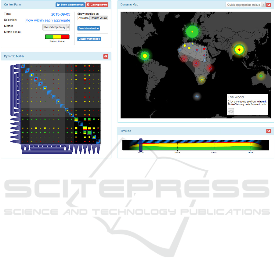
Figure 1: Overview of the interface of FLOWMATRIX.
Informal interviews with the domain experts origi-
nated the following restricted set of requirements, that
were refined through several iterations.
R1: Assessment of quantity and quality of flows.
The interface should convey to the user both the quan-
tity of flows and their quality in terms of performance
indicators. For example, the user may want to imme-
diately discover if a major event, as the deployment
of a software update, impacted the performance of the
infrastructure.
R2: Choice of the aggregation level. Users should
be able to cluster the geographic locations that con-
stitute the domain of the source and destination in
the data cases. Such clustering should be performed
at arbitrary levels of detail, i.e. starting from fine-
grained locations and scaling up to macro-regions of
the world, according to well-known administrative,
political, and geographical boundaries.
R3: Time-oriended exploration. The user should be
allowed to explore the data focusing on the events of
a specific time instant and, hence, assessing the quan-
tity and quality measures for contemporary flows. For
example, that is the case for ad-hoc analysis triggered
by specific events like network failures.
R4: Performance-oriended exploration. The sys-
tem should allow the user to focus on performance
thresholds with the aim of discovering periods when
such thresholds have been violated by some flow.
Also, it should be possible to discover in what time in-
tervals the flows have different qualities with respect
to the average scenario.
3 DESIGN OF THE INTERFACE
In this section we introduce FLOWMATRIX. We first
describe its interface and its interaction primitives
and then we proceed with a discussion of our design
choices.
3.1 Interface and Interaction
The interface of FLOWMATRIX is presented in Fig. 1.
It is split into four main parts: the control panel (up-
per left corner), the timeline (lower right corner), the
dynamic matrix (lower left corner), and the dynamic
map (upper right corner). In the following description
we consider a sample data set with two quantitative at-
tributes, i.e., round-trip delay and packet loss between
pairs of geographic locations, typical of the domain of
computer networks and telecommunications.
The control panel contains basic information on
the current state of the visualization and a small set
of controls to change the selection and representation
of quantitative attributes. From the control panel in
Fig. 1 we can infer that the focus is on a specific
day (5 Sept 2013) and we are looking at the flow
Exploring Flow Metrics in Dense Geographical Networks
53

“within each aggregate”, i.e., having both source and
target locations within any of the geographic clusters
in the current view (e.g. flows within Europe, within
Americas, etc). The selected quantitative attribute is
the round-trip delay measured between pairs of loca-
tions. The three colors used in the other views (green,
yellow, red) identify three different classes of values
for each quantitative attribute, reported in the metric
scale that is visible just below the name of the at-
tribute. In the example in Fig. 1 green means “below
300ms”, yellow means “between 300ms and 550ms”,
and red means “above 550ms”. The right side of
the control panel contains additional buttons. The
user can choose between two different types of repre-
sentation for quantitative attributes: 1. averages, i.e.,
only one average value for each flow between a pair
of geographic clusters; or 2. stacked values, i.e., the
weighted distribution of attribute values in the three
different classes detailed previously, identified with
the corresponding colors. The two threshold values in
the metric scale that give rise to the different classes
of values can be dynamically adjusted by clicking the
appropriate button in the control panel (requirements
R1, R4). Finally, a button allows the user to bring
the visualization back to the original state (before any
interaction).
The timeline contains a graph with aggregate in-
formation for each aggregate value in the time scale
chosen by the user. More specifically, three stacked
ribbons show the volume of flow over time for each
of the three classes of metric values, as defined in the
control panel. When the mouse pointer is placed over
the graph, additional information for the selected time
interval is shown on screen. The user can either drag
the slider or directly click the timeline to change the
time selection. The interface is updated accordingly
to show the corresponding data (requirement R3).
The dynamic matrix shows attribute classes for all
possible pairs of geographic clusters in the current
view, based on the selection on the timeline. More
specifically, it is a square matrix, where rows and
columns respectively represent sources and destina-
tions of flows. Each cell in the matrix represents
the flow between a pair of geographic clusters, with
size logarithmically proportional to the total volume
of flow and colors reflecting the values of the quanti-
tative attribute in the current representation (require-
ment R1). The trapezoids on the left and bottom sides
of the matrix represent the set of visible geographic
clusters and all their ancestors. The cluster hierarchy
is explicitly represented by means of side contact be-
tween parents and children; see Fig. 3 for an exam-
ple where the hierarchy is expanded from the conti-
nent level to the country level (requirement R2). Such
technique is a simple variation of common algorithms
for tree representation (see, e.g., (Schulz, 2011) for a
detailed survey). All matrix elements are left inten-
tionally unlabeled, so that the user can focus on dis-
covering patterns and trends in the data by looking
exclusively at the color and size of each cell. Hov-
ering any element with the mouse reveals aggregate
information for the corresponding entity. In particu-
lar, trapezoids yield information about the geographic
clusters they represent, while cells in the matrix yield
information on the flow between the two involved
clusters.
The dynamic map shows a circle for each geo-
graphic cluster in the current view, positioned at the
centroid of the corresponding locations on the map.
At any time, each of such circles shows the same vol-
ume and metric values as one of the cells in the ma-
trix. The dynamic map, therefore, only shows a linear
subset of the information contained in the dynamic
matrix. Such portion can change based on user in-
teraction. In the initial state circles in the map are in
correspondence with cells on the diagonal of the ma-
trix, i.e., each of them represents the flows for which
source and destination are both within the correspond-
ing geographic cluster. The regions with dashed bor-
ders that enclose groups of circles represent the same
hierarchy of clusters that is pictured with trapezoids in
the dynamic matrix. The information panel at the bot-
tom right corner shows appropriate information de-
pending on user interaction. The user can also hover
individual circles and dashed regions to get the vol-
ume of flow and quantitative information on the se-
lected attribute.
We designed our framework with a focus on in-
teractivity and responsiveness. The main operations
that the user can perform are the following: 1. ge-
ographic view change, i.e., updating the set of visi-
ble geographic clusters, by either exploring the chil-
dren of a geographic cluster or collapsing sibling clus-
ters into their parent cluster (requirement R2); 2. ge-
ographic cluster selection, i.e., narrowing the anal-
ysis to the flow originating from a geographic clus-
ter, targeted at a geographic cluster, or between two
geographic clusters (requirements R2); 3. time selec-
tion, i.e., selecting the appropriate time aggregate on
the timeline to see corresponding values (requirement
R3); and 4. attribute class customization, i.e., tweak-
ing the two threshold values that determine the three
different classes of attributes identified by three col-
ors: green, yellow, and red (requirement R4). The first
two operations can be achieved by interacting indif-
ferently with the dynamic matrix, the dynamic map,
or a combination of both. Upon user interaction, all
the components in the interface are automatically up-
IVAPP 2018 - International Conference on Information Visualization Theory and Applications
54

dated to reflect the new state of the visualization. The
reader can refer to Section 5 for a high-level descrip-
tion of use cases that prove how to exploit our system
in real-world scenarios.
3.2 Discussion of Design Choices
The interface has two main components, i.e., the dy-
namic matrix and the dynamic map. If the user is in-
terested in looking up flows for specific geographic
locations, the dynamic map offers the quickest alter-
native. The search box can be used if the exact loca-
tion of a country is not known in advance. On the
other hand, the dynamic matrix is entirely focused
on the quantitative attributes, and its regular struc-
ture makes it possible to spot events affecting specific
sources or destinations of flow.
Regarding requirements listed in Section 2, we ob-
serve that the interface of FLOWMATRIX addresses
them as follows. An overview of the quantitative at-
tributes in the data set (requirement R1) is offered
by the sizes and colors of cells in the matrix. The
geographic clustering (requirement R2) can be lever-
aged both in the matrix and in the map by means of
intuitive user interaction (i.e. double-click with the
mouse). Filtering the flow based on source and des-
tination or switching between incoming and outgo-
ing flow (requirement R1) can be achieved by click-
ing the appropriate geographic clusters (clicking on
an already selected cluster reverses the direction of
the flow). The timeline allows for a quick selection
of time (requirement R3) by means of simple mouse
clicks, and offers an overview of the historical context
with the stacked ribbons. The performance indicators
can be easily customized by changing the thresholds
through the control panel (requirement R4).
Regarding the absolute scaling of the circles on
the map, we are aware of the potential perceptual
problems described in Flannery’s work (Flannery,
1971). However, we observe that the user tasks typ-
ically involve estimating the maximum and the mini-
mum circle area rather than the ratio between specific
pairs. Also, the contemporary presence of the corre-
sponding stacked bars in the matrix tends to compen-
sate for perception errors.
FLOWMATRIX makes use of animation in two dif-
ferent occasions: 1. in response to user interaction, the
smooth transition to the new state of the interface is
realized with a simple animation; and 2. to represent
the direction of the flow on the map, concentric cir-
cles are pictured as either emanating from or collaps-
ing on the selected circle. We specifically refrained
from using animation to convey crucial information
(e.g. historical trends in the data set), following the
guidelines and caveats found in recent literature (see,
e.g., (Robertson et al., 2008; Di Donato et al., 2016)).
4 IMPLEMENTATION
The algorithmic background of FLOWMATRIX is
pretty straightforward. The drawing of circles in
the dynamic map is achieved with an iterative force-
directed graph layout algorithm (Di Battista et al.,
1999). Each circle is represented with two nodes con-
nected by one edge: the first node is fixed at the ideal
position for the center of the circle, i.e. the centroid of
the corresponding geographic cluster, while the sec-
ond is subject to forces and represents the actual po-
sition of the visualized circle. The edges connect-
ing such pairs of nodes are modeled as zero-length
springs. Since each node is attracted to its ideal po-
sition there is no need to introduce repulsive forces
between nodes. However, in order to avoid overlap
among visualized circles, a simple collision detection
heuristic is introduced that adjusts the relative posi-
tions of two nodes in case a potential overlap is de-
tected. The areas with dashed borders that enclose
circles in the dynamic map are obtained with a state-
of-the-art algorithm (Rappaport, 1992) for the com-
putation of convex hulls of circles. We use the same
algorithm to compute a clipping path for the represen-
tation of flow “waves” between any pair of geographic
clusters (see, e.g., Fig. 2(b)).
FLOWMATRIX is a Web application implemented
in JavaScript, using the popular D3.js framework (Bo-
stock et al., 2011) for the development of highly in-
teractive data-driven visualizations. All the compo-
nents of the interface are coordinated following the
Publish-Subscribe pattern, so that any user interaction
is transformed into an event that triggers appropriate
updates in each component. We made a special effort
to improve the performance of the tool, limiting ani-
mations and redraws where possible. That is crucial
especially in the dynamic matrix, where the number
of cells grows quadratically upon expansion of geo-
graphic clusters.
5 USE CASES
In order to show the effectiveness of our approach, in
this section, by means of four use cases, we describe
how simple and complex tasks can be achieved by
taking advantage of the coordinated view of FLOW-
MATRIX.
Use Case 1: Finding the total volume of flow and
the average round-trip delay from Italy to Russia on
Exploring Flow Metrics in Dense Geographical Networks
55
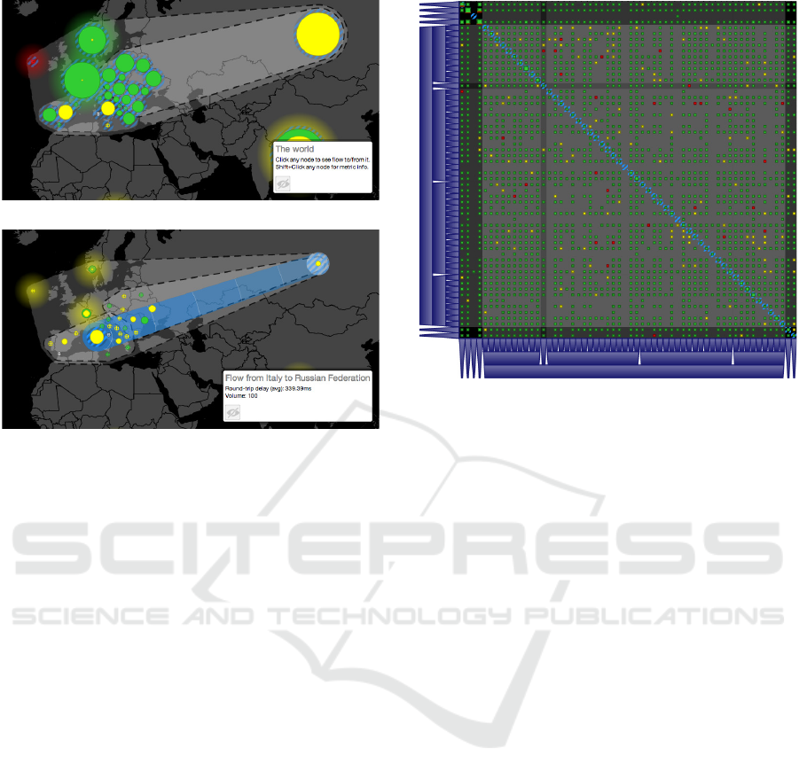
(a)
(b)
Figure 2: Sequence of user interactions needed to study the
flow from Italy to Russia. (a) The dynamic map is zoomed
on Europe, where two sub-regions (Southern and Eastern
Europe) are expanded to reveal their respective countries.
The size of each circle is proportional to the volume of flow
within the corresponding country. (b) The dynamic map is
focused on the flow from Italy to Russia.
8 Sept 2013. First of all, we select the correct date
on the timeline and choose to visualize only average
values for quantitative attributes using the appropri-
ate button on the control panel. We then locate the
circle that represents Europe on the dynamic map and
double-click it. The interaction has the effect of up-
dating the geographic view by adding all the sub-
regions within Europe to the current representation.
The dynamic map and the dynamic matrix are up-
dated accordingly, making room for the new clusters.
We repeat the same step with the two circles repre-
senting Southern Europe and Eastern Europe, with
the effect of enriching the view with all associated
countries, including Russia and Italy. The state of the
map reached after the initial interaction is in Fig. 2(a).
Note that the circles representing European countries
lack the semi-transparent “glow” effect, meaning that
they cannot be further expanded to reveal more de-
tailed information (i.e., we reached leaves in the clus-
ter hierarchy). Note also that the smaller circles are
filled with a grid-like pattern, meaning that their flow
volume would be too small for a proportional repre-
sentation on the map, and therefore their radius is ad-
justed to an acceptable minimum length. We click
the circle representing Italy, triggering the following
Figure 3: Dynamic matrix showing country pairs with aver-
age packet loss greater than 10% in red.
updates: 1. the row representing the flow from Italy
in the dynamic matrix is highlighted; 2. the size and
color of each circle in the dynamic map represents
the flow from Italy to the corresponding geographic
cluster, and the flow itself is pictured with animated
concentric waves emanating from the clicked circle;
3. the stacked ribbons in the timeline show aggregate
data for the flow from Italy to all other destinations.
We can achieve the same result by looking up the se-
lected country in the search box positioned at the up-
per right corner of the dynamic map (visible in Fig. 1).
Finally, we hold the Shift key and click the circle rep-
resenting Russia. New updates are triggered: 1. the
square in the dynamic matrix representing the flow
from Italy to Russia is highlighted; 2. the flow in the
dynamic map is represented with waves from Italy
to Russia, as shown in Fig. 2(b); 3. the stacked rib-
bons in the timeline show aggregate data for the flow
from Italy to Russia. The requested information can
be found in the info panel on the dynamic map.
Use Case 2: Counting how many country pairs in
Europe have average packet loss greater than 10%
on 6 Sept 2013. This task shows the potential of
the dynamic matrix when analyzing a data set which
grows quadratically with respect to the number of ge-
ographic clusters. First of all we focus on the control
panel, choosing the right quantitative attribute and up-
dating the range of values such that flows with packet
loss greater than 10% are identified with the red color.
We select the right date on the timeline and the ap-
propriate metric on the control panel. We then focus
on the dynamic map, first double-clicking the circle
IVAPP 2018 - International Conference on Information Visualization Theory and Applications
56
(a)
(b)
Figure 4: Views showing details for the third use case. (a)
The flow from Spain is pictured with concentric blue circles.
The size of each circle is proportional to the volume of flow
from Spain to the corresponding country. (b) The stacked
graph in the timeline reaches its peak on 6 Sept 2013.
representing Europe and then all the circles represent-
ing sub-regions in Europe, until we reach the country
level. We can finally focus on the dynamic matrix
and simply count all the occurrences of red cells that
fall within the portion of matrix related to European
countries, as visible in Fig. 3. Although small, their
color is enough to get a quick overview and answer
the original question.
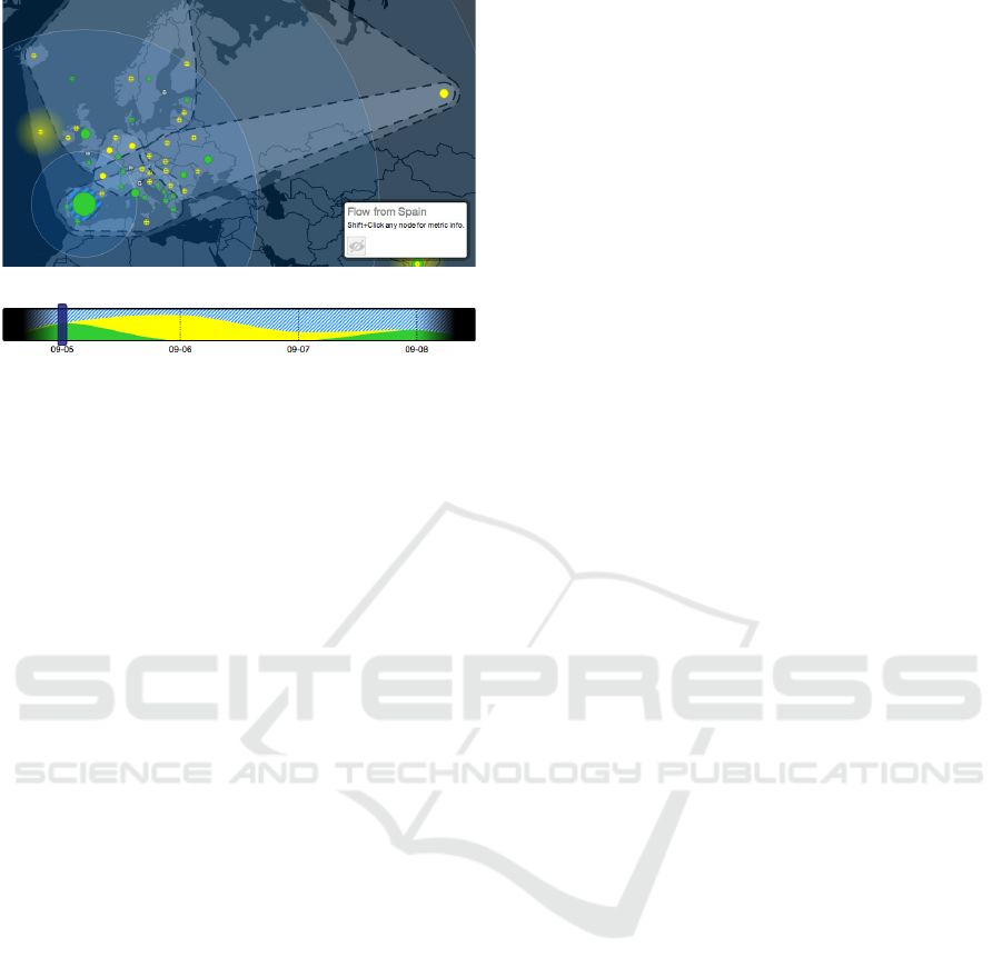
Use Case 3: Finding out what European country re-
ceives the highest volume of flow from Spain on 5 Sept
2013 and which day sees the highest volume of flow
between the same pair of countries. We select the
right date on the timeline. Since we focus on the vol-
ume, the visualized quantitative attribute is irrelevant.
We focus on the dynamic map to show circles for all
European countries and click the circle representing
Spain. Apart from Spain itself, the biggest circle in
Europe is the one representing United Kingdom, as
visible in Fig. 4(a). That is an effective and suffi-
cient visual clue to understand that United Kingdom
receives the highest percentage of flow from Spain.
To answer the second part of the question we hold the
Shift key, click the cluster representing United King-
dom, and focus on the timeline (see Fig. 4(b)). The
day with the highest volume of flow from Spain to
United Kingdom is 6 Sept 2013.
Use Case 4: Studying how a firmware update re-
cently rolled out on the hardware equipment impacted
performance and reliability. Suppose that the de-
ployment involves hundreds of thousands of hardware
components all over the world, and is conducted in-
crementally in one week starting from Asia, contin-
uing with Europe, and ending with the entire globe.
In preparation for the analysis, we compile a data set
based on logs collected by the different components
of the infrastructure. The three numeric attributes
that are included in each data case are the follow-
ing: round-trip delay, packet loss, and the percentage,
called π, of traversed hardware components with the
most recent firmware version. The data is aggregated
on a daily basis and spans the entire week spent in the
deployment of the new firmware.
First of all, we select π as the metric to visualize
from the control panel, and tweaks the thresholds for
the value classes so that transmissions with π = 100%
are green, those with 50% ≤ π < 100% are yellow,
and the remaining are red.
During the first two days in the selected week,
we observe the expected steep increase of green flow
within Asia by clicking and Shift-clicking the related
circle on the map and looking at the colors on the
timeline. We also expect a corresponding increase of
yellow flows between Asia and other continents, in
particular Europe and Oceania, given their geograph-
ical proximity that implies a higher percentage of tra-
versed hardware components residing in Asia. As-
sume that, after clicking the circle representing Asia
on the map, we find out that the circle for Europe,
representing flow from Asia to Europe, stays mostly
red during the two-day interval. To inspect the causes
of this, we move to the dynamic map and expand
both Asia and Europe to reveal the corresponding sub-
regions. Suppose the circle representing flow within
Middle East stands out for its red color. This would
immediately prompt us to click it and see whether out-
going and incoming flows are also mostly red. We
would conclude that the deployment in Middle East
was slower than expected, which probably also im-
pacted the flows between Europe and Asia, given the
strategic location. A further expansion of the Mid-
dle East cluster on the map may confirm that most of
those countries have red values for π.
We can proceed to explore data for the follow-
ing two days to confirm that the flows within Europe
and those between Europe and Asia progressively turn
green, while Europe’s incoming and outgoing flows
turn yellow.
As a next step, we could shift our attention to
the measured performance of flows. We first change
the visualized attribute to round-trip delay, focus on
the same geographic clusters and flows mentioned
above, to observe whether any suspect variation of
performance values occurred during the deployment
phase. Suppose we observe, when switching to the
packet loss attribute, a noticeable degradation of per-
formance (i.e. an increase of average values) that fol-
lows the same temporal and geographic patterns of
Exploring Flow Metrics in Dense Geographical Networks
57

the deployment studied before. We would therefore
be induced to conjecture a suspected correlation and
look for unnoticed bugs in the latest firmware update.
Finally, we can verify if the deployment is com-
plete at the end of the week by selecting the π at-
tribute, clicking the last date on the timeline and fo-
cusing on the dynamic matrix. Suppose two cells in
the matrix are still partially red and that they corre-
spond to the flows in both directions between Africa
and the Americas. We can expand both clusters on
the map and discover, for example, that the problem
can be narrowed to the flows between Northern Africa
and the United States, concluding that there is a spe-
cific portion of the infrastructure, involving only the
two areas, for which the deployment is not yet com-
plete.
6 EVALUATION
FLOWMATRIX was conceived with the goal of allow-
ing users to get quick insights on data sets detailing
flows between geographic regions. Since any inter-
action with the tool can be decomposed into recur-
ring tasks, it becomes crucial to verify that these can
be correctly and quickly accomplished by prospective
users. This section presents the results of the evalua-
tion study we conducted after implementing our pro-
totype.
We initially thought of conducting a comparative
study, where participants would need to solve a list
of tasks both with our framework and with standard
tools (e.g. database queries). However, we quickly
discarded this option because even the expert users we
interacted with did not have experience with a stan-
dard, unified set of tools for the purpose of accessing
and analyzing the same data set. Therefore any com-
parison would have suffered from potential bias, de-
pending on the relative experience of the participant.
We opted instead for a qualitative study, where par-
ticipants were given a set of tasks and feedback was
collected at the end of each task.
6.1 Study Design
In preparation for the study we fed our prototype with
a precomputed data set, structured like the one used
for the figures in Section 3 and containing data for
four days between 5 Sept 2013 and 8 Sept 2013. The
study was conducted with ten participants (nine male,
one female) all aged between 25 and 35 years old.
They are all domain experts with a background in
computer science, statistics, telecommunications, or
electronics. At the time of the study, they were al-
ready familiar with the data collection from which we
derived the data set used as input for the evaluation.
More than half of the participants had worked with the
same data collection before, accessing its content by
means of database queries or simple time series plots.
Each participant was initially tested for color
blindness. A thorough introduction to the framework
followed, with a focus on each of the views and all the
available user interaction. A couple of example tasks
were illustrated step by step. After that, each partici-
pant was asked to solve 15 tasks. The first four were
treated as training tasks, i.e., the participant had the
possibility to ask for help. For each task the examiner
recorded the completion time with a stopwatch, gath-
ered feedback at the end of the execution, and showed
a quicker way to achieve the same result in case the
strategy adopted by the participant was clearly sub-
optimal. General feedback was asked from each par-
ticipant as a final step after the last task. The aver-
age time required by each participant to complete the
study was 50 minutes.
6.2 Results and Discussion
All the participants successfully completed the pro-
posed tasks, adopting different strategies based on the
context. The statistics on task completion times are
reported in Table 1. It is evident that users quickly
learned from mistakes done in previous tasks. For ex-
ample, 60% of participants had an instinctive prefer-
ence for the dynamic matrix when solving Task #13,
i.e., they updated the set of expanded geographic clus-
ters and compared the size of different squares with-
out using the dynamic map. After being shown a
faster solution that makes a better use of the dynamic
map, they quickly changed their strategy and per-
formed much better with Task #14 and Task #15. This
is confirmed by the relatively small standard deviation
for the completion time of both tasks, which suggests
that users knew precisely what steps where needed to
complete them. Note also how the median comple-
tion time is smaller than the average time for most of
the tasks, which suggests that the outliers can be in-
terpreted as occasional difficulties or distractions ex-
perienced by individual users.
The feedback was overall very positive and enthu-
siastic. All participants were particularly impressed
by the possibility to finally “see” the data they had
only been able to access with database queries and
simple two-dimensional charts. They also appreciated
the power of exploring data both on the dynamic map
and the dynamic matrix at the same time, depending
on the specific task. Many important suggestions for
IVAPP 2018 - International Conference on Information Visualization Theory and Applications
58
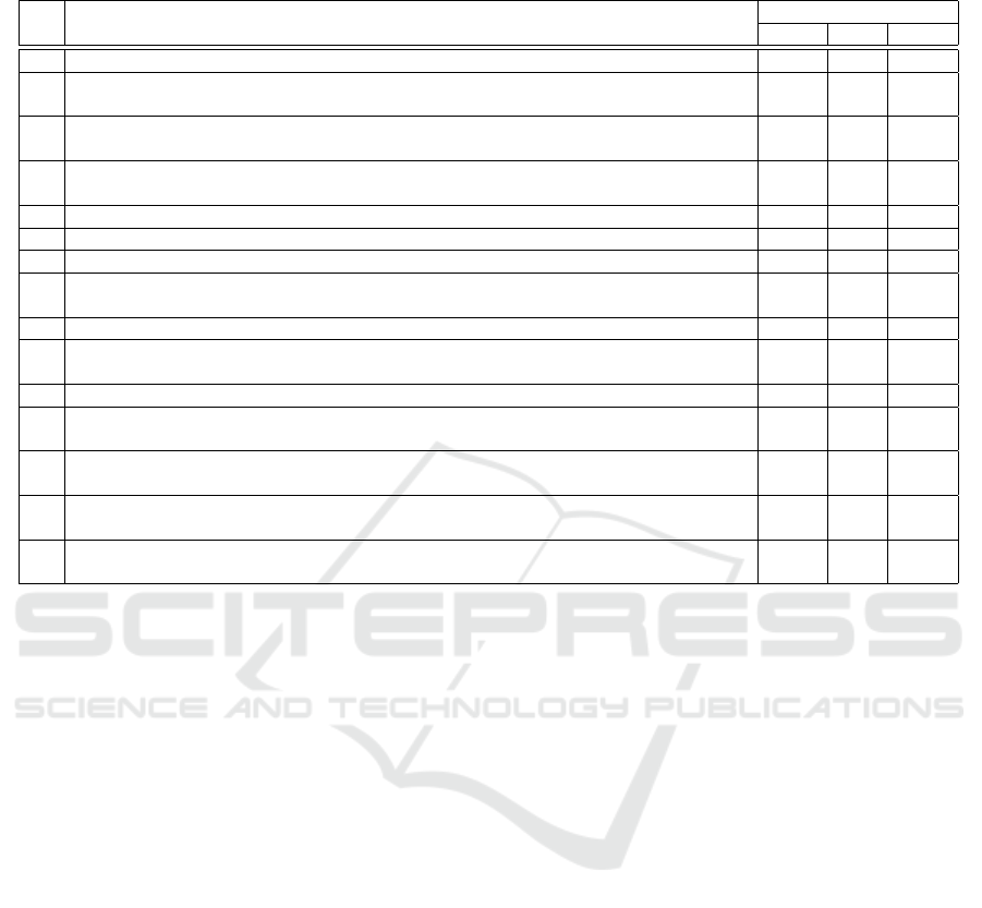
Table 1: List of tasks and results of our qualitative study. For each task the average (avg), median (med) and standard deviation
(stdev) values for completion times are listed.
# Task
Time (s)
avg med stdev
1 Find volume of flow from Africa to Europe on 7 Sept 2013 17.2 15.5 9.13
2 Enumerate regions receiving flow from Africa with average round-trip delay greater
than 550ms on 6 Sept 2013
42.9 41.5 17.06
3 Enumerate pairs of regions that have more than 50% of flow with round-trip delay
greater than 700ms on 6 Sept 2013
90.3 96.5 37.29
4 Enumerate continents that receive flow from Belgium on 5 Sept 2013 with average
packet loss smaller than 1.2%
82.2 72.5 27.52
5 Find volume of flow from Portugal to Spain on 5 Sept 2013 34.2 30 13.25
6 Find average round-trip delay from Portugal to Spain on 7 Sept 2013 39 33.5 20.66
7 Find day with highest volume of flow from Portugal to Spain 27 21 15.23
8 Find which region receiving flow from Americas has highest percentage of flow with
packet loss higher than 2% on 5 Sept 2013
54 52 12.21
9 Find pairs of regions with average round-trip delay greater than 700ms on 5 Sept 2013 35.9 34 13.31
10 Find pairs of regions with more than 50% of flow with round-trip delay greater than
700ms on 5 Sept 2013
26 25.5 7.94
11 Find days in which the average round-trip delay within Italy is greater than 300ms 49.7 45 14.07
12 Find days in which the average round-trip delay from Italy to Russia is between 320ms
and 330ms
58.6 52.5 16.63
13 Find the European country receiving the highest volume of flow from Spain on 6 Sept
2013
124.5 112 45.06
14 Find the European country receiving the highest volume of flow from Northern Africa
on 5 Sept 2013
46.7 50 8.54
15 Find how many European country pairs have average round-trip time greater than 1s
on 5 Sept 2013
59.6 57 14.13
improvement were collected during the study. 80% of
participants found the timeline to be not enough intu-
itive to compare the volume of flow between different
days, and suggested to add an explicit indication of
the total volume of flow. 50% would have appreciated
the possibility to expand geographic clusters straight
to the finest level of aggregation, without intermedi-
ate levels, i.e., sub-regions. 50% had trouble to come
up with the right sequence of interactions to highlight
the flow within a specific geographic clusters on the
dynamic map (i.e., click followed by Shift-click on
the same circle). 50% initially overlooked smaller
squares in the dynamic matrix, while 20% suggested
to add a “full-screen” capability to the dynamic map
and the dynamic matrix as a solution. 50% spent a
non negligible amount of time wondering where to
find the actual answer for some tasks, after complet-
ing all the right interactions. 40% suggested to add
a smarter search box to programmatically specify a
query in the form “flow from A to B”. 40% com-
plained that the size of circles in the dynamic map is
not a sufficient clue to estimate the volume, although
they succeeded in their tasks after comparing the ac-
tual volumes for the bigger circles (in the range of
2 to 4). Further minor observations were related to
the specific data set (e.g. 40% were not sure whether
Russia was to be found under Europe or Asia) and to
the lack of experience with the interface (e.g. 70% of
users needed some time before appreciating the dis-
tinction between average and stacked metric values).
7 RELATED WORK
The solution we propose to explore flows is a coordi-
nated multiple view featuring both a map and a ma-
trix. Hence, we survey the related research areas and
compare with the solutions proposed for similar prob-
lems.
7.1 Thematic Maps
Visualization of abstract data on maps, is a traditional
topic in cartography, where choropleth maps, propor-
tional symbols maps, dotted maps, etc are used to
visualize the distribution of statistical variables. Al-
though the non-geographic data represented in such
thematic maps is usually very simple, in some cases
it may have a more complex structure. Wood et
al. (Wood et al., 2010) divide the geographical space
with a grid and draw in each cell a replica of the orig-
inal map that shows inbound flow from all the other
regions. Their approach is further expanded in (Wood
et al., 2011), where replicas show approximate flow
Exploring Flow Metrics in Dense Geographical Networks
59

patterns by means of time series plots. Enriching the-
matic maps with small multiples, however, can lead to
cluttered views when the input data set grows in size.
7.2 Visualizing Flows and Movement
There is a rich scientific literature about flows in maps
where the trajectory of bodies plays a crucial role. A
limited list of applications include the visualization of
vessel traffic (see, e.g., (Willems et al., 2009; Scheep-
ens et al., 2011; Scheepens et al., 2012)) and the vi-
sualization of aircraft routes (see, e.g., (Hurter et al.,
2009; Bottger et al., 2014)). In our data set, however,
information regarding the trajectories is missing.
Buchin et al. (Buchin et al., 2011) build flow maps
using spiral trees to induce a clustering on the tar-
gets and smoothly bundle lines. In a more recent
work (Nocaj and Brandes, 2013) similar maps are
obtained with a new edge bundling technique that
avoids ambiguous connections between pairs of ver-
tices. Both techniques are visually compelling when
describing the flow from a single source to many tar-
gets, but are not adequate for dense graphs.
Andrienko et al. (Andrienko et al., 2008) present
a taxonomy of the possible approaches available for
the geovisualization of dynamics, movement, and
change. They identify three alternatives: 1. direct de-
piction of data, which can easily lead to clutter and
slow rendering; 2. use of summaries like aggrega-
tion, generalization and sampling; and 3. use of sta-
tistical methods to extract patterns before visualizing
them. Our approach follows the second alternative,
hence addressing requirement R2. Guo (Guo, 2009)
proposes an interface to render large spatial interac-
tion data, consisting of multiple views: a geographical
map with arrows representing flow between regions,
a self-organizing map, and a parallel coordinate plot.
The tool is based on a precomputed hierarchical re-
gionalization based on the volume of flow between
pairs of regions. Although reasonable, such region-
alization does not support the type of clustering im-
posed by requirement R2.
7.3 Matrix-based Coordinated Views
Elmqvist et al. (Elmqvist et al., 2008) present a ma-
trix visualization technique that features fast reorder-
ing of rows and columns, data aggregation with ex-
plicit representation, and GPU acceleration to opti-
mize the rendering on screen. Their approach inspired
part of our work while constructing a dynamic matrix
optimized for pattern recognition. In particular, while
the matrix representation has been effectively coupled
with a node-link representation in (Henry and Fekete,
2006; Henry et al., 2007), we couple it with a geo-
graphic visualization to represent flows among geolo-
cated sites, where the matrix provides an aggregatable
view of all-pairs relationships while the geographic
map shows the sources and destinations of the flows
the user is interested in.
A visualization problem very similar to the one
described in this paper is addressed by Boyandin
et al. (Boyandin et al., 2011), who propose FLOW-
STRATES, a visualization framework in which the ori-
gins and the destinations of the flows are displayed
on two separate maps, and the changes of flow mag-
nitudes over time are represented in a matrix-like
heatmap in the middle. Hence, although FLOW-
STRATES also uses a matrix-based coordinated view,
it devotes the expressiveness of the matrix to the tem-
poral evolution of the flows, using one column for
each period of time. Each row of FLOWSTRATES ma-
trix represents the evolution over time of a specific
flow, the color of each cell being proportional to the
amount of flow. Flows that are (on average) bigger
than others are placed on the top rows. In order to
identify the source and destination of each flow, two
leaders, one exiting the leftmost cell and the other ex-
iting the rightmost one, point to the source and the
destination locations on the maps, respectively.
With respect to our visualization tool, FLOW-
STRATES addresses a simpler visualization problem
where flows do not have performance metrics asso-
ciated with them. Hence, requirements R1 and R4
cannot be met by the proposed techniques. Addition-
ally, FLOWSTRATES’ matrix does not support aggre-
gation or clustering of rows and an overall view of
the whole data set is not possible (requirement R2).
Instead, FLOWSTRATES allows the user to aggregate
sources and destinations on the maps with a lazo se-
lection. Although this proves to be a flexible tool,
well-known geographic aggregations are not immedi-
ate to select and at most one aggregation at a time is
allowed in each map.
8 CONCLUSION
We have presented a framework for the interactive
exploration of the flow between pairs of geographic
locations. It allows researchers, engineers and man-
agers to quickly assess the nature and evolution of
flows between pairs of geographical locations at vari-
ous levels of detail, while keeping an eye on the gen-
eral picture.
In the future we will extend the set of features
of our prototype, overcoming its current limitations.
First of all we will follow the suggestions that came
IVAPP 2018 - International Conference on Information Visualization Theory and Applications
60

out of the qualitative study presented in Section 6.
Further, we will extend the representation of met-
rics, including the display of non-quantitative metrics,
the explicit rendering of the distribution of values for
each metric, and the possibility to filter specific value
ranges for a cleaner visualization. The user will have
the possibility to pick pairs of dates on the timeline,
in order to compare related metric values looking for
potential drops or improvements in performance.
REFERENCES
Andrienko, G., Andrienko, N., Dykes, J., Fabrikant, S. I.,
and Wachowicz, M. (2008). Geovisualization of dy-
namics, movement and change: Key issues and devel-
oping approaches in visualization research. Informa-
tion Visualization, 7(3):173–180.
Bostock, M., Ogievetsky, V., and Heer, J. (2011). D3:
Data-driven documents. IEEE Trans. Visualization &
Comp. Graphics (Proc. InfoVis).
Bottger, J., Schafer, A., Lohmann, G., Villringer, A., and
Margulies, D. S. (2014). Three-dimensional mean-
shift edge bundling for the visualization of functional
connectivity in the brain. Visualization and Computer
Graphics, IEEE Transactions on, 20(3):471–480.
Boyandin, I., Bertini, E., Bak, P., and Lalanne, D. (2011).
Flowstrates: An approach for visual exploration of
temporal origin-destination data. In Proc. of the 13th
Eurographics / IEEE - VGTC Conference on Visu-
alization, EuroVis’11, pages 971–980. Eurographics
Association.
Buchin, K., Speckmann, B., and Verbeek, K. (2011). Flow
map layout via spiral trees. IEEE Transactions on
Visualization and Computer Graphics, 17(12):2536–
2544.
Di Battista, G., Eades, P., Tamassia, R., and Tollis, I. G.
(1999). Graph Drawing. Prentice Hall, Upper Saddle
River, NJ.
Di Donato, V., Patrignani, M., and Squarcella, C. (2016).
Netfork: Mapping time to space in network visualiza-
tion. In Buono, P., Lanzilotti, R., and Matera, M., ed-
itors, International Working Conference on Advanced
User Interfaces (AVI 2016), pages 92–99.
Elmqvist, N., Do, T.-N., Goodell, H., Henry, N., and Fekete,
J. (2008). Zame: Interactive large-scale graph visual-
ization. In Visualization Symposium, 2008. PacificVIS
’08. IEEE Pacific, pages 215–222.
Flannery, J. J. (1971). The relative effectiveness of some
common graduated point symbols in the presentation
of quantitative data. The Canadian Cartographer,
8:96–109.
Guo, D. (2009). Flow mapping and multivariate visu-
alization of large spatial interaction data. IEEE
Transactions on Visualization and Computer Graph-
ics, 15(6):1041–1048.
Henry, N. and Fekete, J. (2006). MatrixExplorer: a dual-
representation system to explore social networks. Vi-
sualization and Computer Graphics, IEEE Transac-
tions on, 12(5):677–684.
Henry, N., Fekete, J.-D., and McGuffin, M. J. (2007). Node-
Trix: A hybrid visualization of social networks. IEEE
Transactions on Visualization and Computer Graph-
ics, 13(6):1302–1309.
Hurter, C., Tissoires, B., and Conversy, S. (2009). From-
dady: Spreading aircraft trajectories across views to
support iterative queries. IEEE Transactions on Visu-
alization and Computer Graphics, 15(6):1017–1024.
Nocaj, A. and Brandes, U. (2013). Stub bundling and con-
fluent spirals for geographic networks. In Wismath, S.
and Wolff, A., editors, Graph Drawing, volume 8242
of Lecture Notes in Computer Science, pages 388–
399. Springer International Publishing.
Rappaport, D. (1992). A convex hull algorithm for discs,
and applications. Computational Geometry, 1(3):171
– 187.
Robertson, G., Fernandez, R., Fisher, D., Lee, B., and
Stasko, J. (2008). Effectiveness of animation in trend
visualization. Visualization and Computer Graphics,
IEEE Transactions on, 14(6):1325–1332.
Scheepens, R., Willems, N., van de Wetering, H., and van
Wijk, J. (2011). Interactive visualization of multivari-
ate trajectory data with density maps. In Pacific Visu-
alization Symposium (PacificVis), 2011 IEEE, pages
147–154.
Scheepens, R., Willems, N., van de Wetering, H., and van
Wijk, J. (2012). Visualization of vessel traffic. In Po-
seidon: Situational Awareness with Systems of Sys-
tems.
Schulz, H. (2011). Treevis.net: A tree visualization ref-
erence. Computer Graphics and Applications, IEEE,
31(6):11–15.
Willems, N., Van De Wetering, H., and Van Wijk, J. J.
(2009). Visualization of vessel movements. Computer
Graphics Forum, 28(3):959–966.
Wood, J., Dykes, J., and Slingsby, A. (2010). Visualisation
of origins, destinations and flows with od maps. The
Cartographic Journal, 47(2):117–129.
Wood, J., Slingsby, A., and Dykes, J. (2011). Visualizing
the dynamics of london’s bicycle-hire scheme. Carto-
graphica, 46(4):239–251.
Exploring Flow Metrics in Dense Geographical Networks
61
