
Evaluating the Memorability and Readability of Micro-filter
Visualisations
Gerwald Tschinkel
1
and Vedran Sabol
1,2
1
Know-Center GmbH, Inffeldgasse 13, Graz, Austria
2
Graz University of Technology, Inffeldgasse 13, Graz, Austria
Keywords:
Reommendation Visualisation, Filtering, Multiple Views, Visual Information Seeking, Evaluation, Cultural
Heritage.
Abstract:
When using classical search engines, researchers are often confronted with a number of results far beyond what
they can realistically manage to read; when this happens, recommender systems can help, by pointing users to
the most valuable sources of information. In the course of a long-term research project, research into one area
can extend over several days, weeks, or even months. Interruptions are unavoidable, and, when multiple team
members have to discuss the status of a project, it’s important to be able to communicate the current research
status easily and accurately. Multiple type-specific interactive views can help users identify the results most
relevant to their focus of interest. Our recommendation dashboard uses micro-filter visualizations intended to
improve the experience of working with multiple active filters, allowing researchers to maintain an overview of
their progress. Within this paper, we carry out an evaluation of whether micro-visualizations help to increase
the memorability and readability of active filters in comparison to textual filters. Five tasks, quantitative and
qualitative questions, and the separate view on the different visualisation types enabled us to gain insights on
how micro-visualisations behave and will be discussed throughout the paper.
1 INTRODUCTION
The goal of the EEXCESS research project
1
(Sei-
fert et al., 2016) is to make educational, scientific,
and cultural heritage content more visible to the ge-
neral public. There are several small and mid-sized
providers of such content, which means that it beco-
mes complicated for interested users to execute search
queries in each of these databases. Thus, the appro-
ach taken in the Project was to bring the content to
the user, rather than the other way around. This was
achieved by implementing a federated recommender
system (Kern et al., 2014) with a pluggable interface,
which makes it easy to add new content providers.
On the users’ side, a Google Chrome browser exten-
sion (Schl
¨
otterer et al., 2014) was developed, which
the user has to install. This extension provides users
with personalised and contextualised recommendati-
ons, injected directly into the web page they are cur-
rently looking at. A little bar appears at the bottom of
the page, and signals whether the recommender has
found any relevant resources.
1
http://www.eexcess.eu
The recommender system provides the user with a
list of recommendation items, and this is where re-
commender systems typically stop; however, that’s
not always a fully satisfying solution. If the recom-
mender suggests too many results, users can soon get
lost just browsing through the list. Within this project,
we researched additional ways the system can assist
the user with refining and organising the recommen-
der results. We implemented the Recommendation
Dashboard (RD), a tool used to visualise recommen-
dations in various forms. Depending on the characte-
ristics of the data dimensions provided, we have im-
plemented several specific interactive visualisations,
with the ability to brush and filter within these dimen-
sions. The resulting filters are each visualized as a
micro-visualisation, which are designed to both opti-
mize space and make use of the type (Tschinkel et al.,
2016). We did this in order to give the user a clear
and easily understandable overview of which filters
are currently active.
To measure the impact of these micro visualisa-
tions (MV) on memorability and readability, we per-
formed an evaluation that measured performance in
comparison to classic, Hearst-style textual filter repre-
186
Tschinkel G. and Sabol V.
Evaluating the Memorability and Readability of Micro-filter Visualisations.
DOI: 10.5220/0006272001860197
In Proceedings of the 12th International Joint Conference on Computer Vision, Imaging and Computer Graphics Theory and Applications (VISIGRAPP 2017), pages 186-197
ISBN: 978-989-758-228-8
Copyright
c
2017 by SCITEPRESS – Science and Technology Publications, Lda. All rights reserved

sentations. We hypothesized that the visual version of
the filter representation would be easier for the user
to memorize for a longer period of time, and that it
should therefore be easier for them to continue with
previous work. We evaluated this assumption with a
field study containing of four parts the user had to ac-
complish. The first part was on-site in a lab, the other
three parts where online questionnaires. We split up
the study, to evaluate how memorability behaves after
different time intervals. Throughout the paper we will
introduce the whole project to give an overview of the
environment. Thereafter we will explain the imple-
mented visualisations more in detail. The evaluation
setup and the presentation of findings will be the main
topic in this paper.
2 RELATED WORK
Recommender results can easily overwhelm the li-
mits of human perception. Reading through dozens
or hundreds of items on a list is an annoying incon-
venience that often results in users only reading the
first few items on the list of results. In order to re-
duce this number to a more manageable amount, it is
a common practice to use the results’ metadata and to
apply filters thereto (also known as a “faceted search”
(English et al., 2002)). The practice of showing mul-
tiple filters is typically implemented alongside a tex-
tual representation. FacetScape provides a visually-
enhanced approach (Seifert et al., 2014), which shows
the available category metadata using Voronoi dia-
grams, to provide tag-cloud-based filtering.
Multiview interactive user interfaces allow the
user to filter the documents using the most appropriate
visual representation. The concept is widely proven,
and especialy helpful, when it comes to heterogene-
ous data sets (Roberts, 2000). Apa Labs (Kienreich
et al., 2008) have implemented several types of me-
tadata specific visualisations. Nevertheless, only one
view and one filter can be active at the same time, but
actively seeing how all of the filters behave, and thus,
how the result set shrinks, plays an important role in
user acceptance (Hearst et al., 2002).
On the other hand, multiple coordinated views
empower the user to rapidly explore complex data-
sets (North and Shneiderman, 1999) because they can
see the impact of each brushing or filtering action on
the results. In these systems, the views typically all
provide interaction mechanisms, and thus have a high
handling complexity. The RD presented in this paper
(Tschinkel et al., 2015) provides multiple interactive
views, but the filter micro visualisations are displayed
at once to show the status of the filters, nevertheless
the do not provide further interaction mechanisms.
There are several ways evaluating which of the
two visualisation approaches better performs (Lam
et al., 2011): the effectiveness and efficiency in using
the system, and evaluating user experience, of which
the latter has recently become very common (Saket
et al., 2016). In addition to the importance of user ex-
perience and efficiency, memorability is an additional
useful aspect of what a visualisation should strive to
achieve. Recent research (Brady et al., 2008; Konkle
et al., 2010) has shown that visual long-term memory
can retain a very high level of detail when the user
needs to discriminate between different states, which
is the case when comparing visual and textual filter
representations. What a visualisation actually makes
more memorable (Borkin et al., 2013) is not neces-
sarily equivalent to what the visualisation improves.
Adding extraordinary elements, such as high contrast,
pictures, etc. to the chart can lead to better memora-
bility, but it does not always lead to more informa-
tive, correct, or meaningful data visualisations (Ed-
ward, 2001).
3 VISUALISING AND FILTERING
RECOMMENDATIONS
As discussed in the introduction, the EEXCESS re-
search project focuses on increasing the visibility of
educational, scientific, and cultural heritage content.
As this content is very specific, and the providers
of the content typically have databases with lots of
meta information, we are able to provide quite a
lot of detail about each result in comparison with
standard search engines. The recommender system
takes advantage of this information before ranking
the results. Furthermore, the meta information that
accompanies the results provides the opportunity to
improve the user interface and help the users decide
which result documents they would like to investigate
further. For this set of features, we implemented the
RD, as seen in Figure 1.
The RD consists of the following parts:
1. List of Results
2. Bookmark Collection Management
3. Main Visualisation Area
4. Control Buttons (e.g. reset, settings)
5. Switching the Main Visualisation
6. Micro Filter Visualisations
The List of Documents (1) contains all of the
items that were recommended to the user, accor-
ding to the user’s context and behavioural patterns.
Each item in the list contains a title, a thumbnail
Evaluating the Memorability and Readability of Micro-filter Visualisations
187
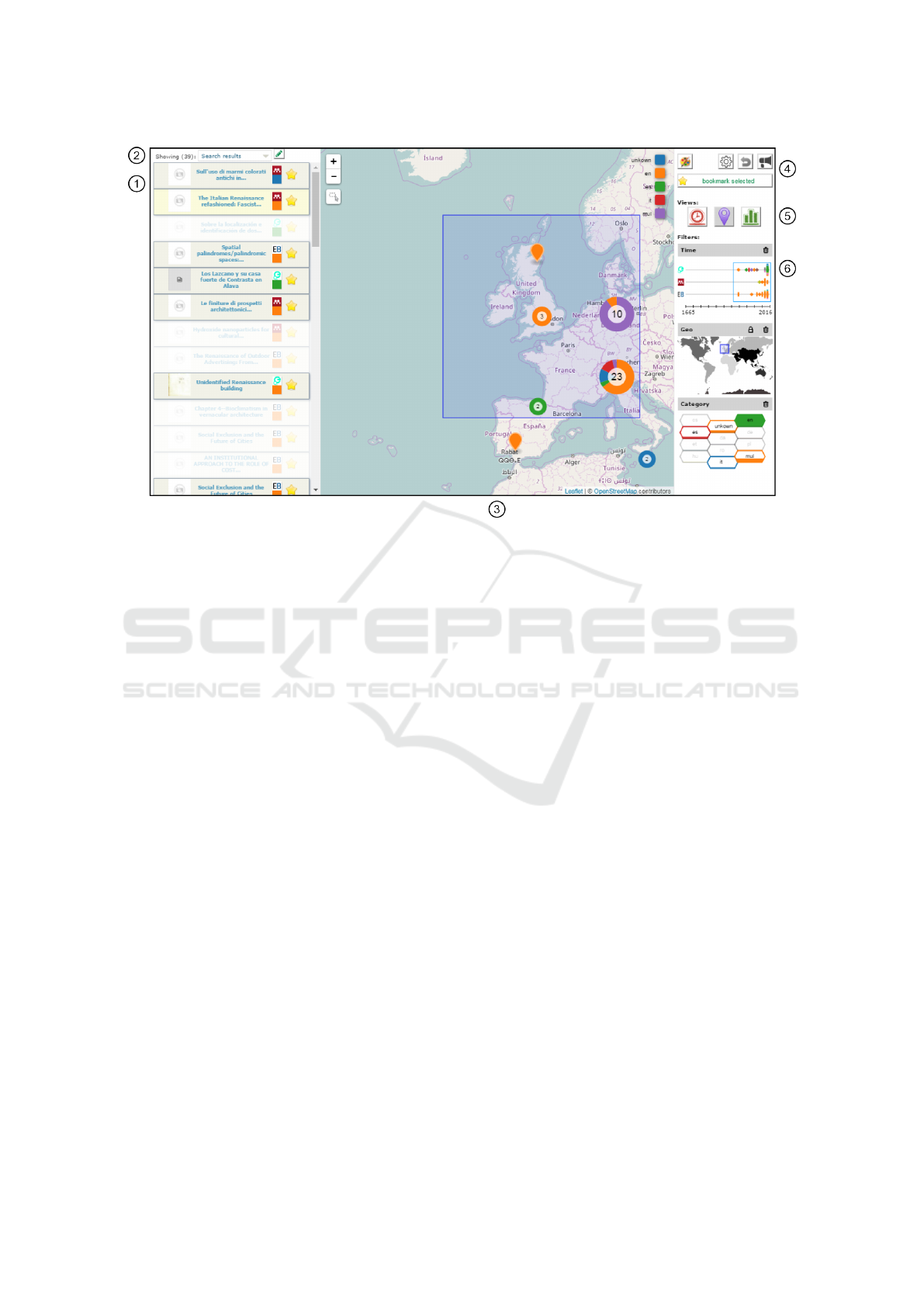
Figure 1: Recommendation Dashboard with three active filters shown in the MV (on right).
image, a small logo indicating content provider, a
colour-encoded reference to the language, and an
icon denoting whether or not it has already been
bookmarked. The list provides two further possibi-
lities for interaction: the users can simply open the
linked document by clicking on the title, or they can
click on the list item, which results in item selection
where other items are faded out, and the selected item
is highlighted.
To enable the user to keep track of their favourite,
most suitable results, or to continue the search
at another time, we implemented a bookmarking
system. With the Managing Bookmark Collection
(2) tools, it is possible to create, update, and delete
collections, or to select one collection as the source
of the overall visualisations and temporarily replace
the recommender results. Collaborative bookmarking
lets the user store bookmark collections on a central
server, making the whole collection available for all
of the RD users.
There are some general configurations available
within the Control Button Area (4) in the top right
corner. The user can adjust the colour mapping (that
is, which data dimension should be encoded with
colours), switch collaborative bookmarking on or off;
adjust some of the chart-specific settings, etc.
The Switching Main Visualisation (5) buttons give
the user the ability to determine which data dimension
should be visualised in the main visualisation area.
3.1 Main Visualisations
We have implemented the following visualisations,
which users can toggle between by means of the afo-
rementioned buttons (5):
3.1.1 Timeline
This main visualisation shows documents on a year-
based timeline, and clusters items that are too close to
each other, depending on the level of zoom (see Fi-
gure 2) , into little donut charts representing the com-
position of the colour-mapped dimension (e.g., lan-
guage). Interaction is possible by selecting single do-
cuments (which highlights them in the document list)
and brushing a time range of interest using the mouse
wheel or the slider at the bottom of the visualization.
3.1.2 Geographic Map
If the results contain geo-spatial information (repre-
sented by WGS 84 coordinates), it is visualized as
pins on a map (see Figure 1). Depending on the le-
vel of zoom, the pins are clustered in overlaid donut
charts, similar to clusters in the timeline.
3.1.3 Bar Chart
The Bar Chart is used to represent categorical attribu-
tes (e.g. language or data provider) on the x-axis and
IVAPP 2017 - International Conference on Information Visualization Theory and Applications
188
a numerical attribute – the recommendation count for
each category – on the y-axis (see Figure 2) . The
same colour coding is employed as in the previous vi-
sualisations in order to make each category easily dis-
tinguishable. The interactive colour legend, as well
as the bars themselves, both support filtering, which
can be applied by selecting them with a single mouse
click.
3.1.4 Other Visualisations
For the evaluation, we included the previously des-
cribed three visualisations (Timeline, Map, and Bar
Chart). Further visualisations are provided by the RD,
but where not part of the evaluation, as they are more
complex in their usage, and don’t have visual repre-
sentation that varies from the textual representation
in a meaningful way. Including all visualisations in
the evaluation could thus have overwhelmed the par-
ticipants and obscured the results. This is why the
buttons to apply them are not visible in Figure 1. For
completeness, the are briefly described below:
uRank. The uRank visualisation shows a tag cloud
of extracted keywords, sorted by the frequency with
which they appear. Depending on the user’s concep-
tual focus, it is possible to weight the importance of
each keyword (di Sciascio et al., 2015).
Landscape. The topical landscape uses a force-
directed placement algorithm to find a spatial posi-
tion depending on the similarity of keywords extrac-
ted from the result item. This results in visual islands,
showing peaks with related topics (Sabol and Scharl,
2008).
History Graph. While the visualisations described
above always show a single set of recommendation
results, the history graph displays a combination of
all result sets by placing multiple collapsed sunburst
diagrams on a circular timeline.
3.2 Micro Filter Visualisations
While the user explores data within the RD, each main
visualisation provides the ability to brush at least one
dimension of data. As soon as the user sets a brush,
a micro visualisation (MV) appears on the right side,
showing the data within the brush. With a click on the
lock-symbol (at the top of the MV), the user can con-
vert the brush to a fixed filter, meaning that all other
items are removed from the list of results in the main
visualisation, the users can now continue their explo-
ration with a clearer view of the remaining items. The
trash button (also on top of the MV) lets the user ea-
sily remove the active brush or fixed filter at any time.
This both removes the MV and reveals the hidden
items in all visualisations.
Figure 2: Main Visualisations Timeline and Bar Chart.
There are three different micro visualisations: one
for each possible data dimension. As mentioned in
Section 3.1, the evaluation only looks at the three
main visualisations, and thus only three MVs. In ad-
dition to the micro visualisations described below, we
have implemented a Tag Cloud MV in order to show
keyword filters, as well as thumbnail visualisation to
show document selections.
For the evaluation, it was necessary to implement
a text based, Hearst-style, filter representation. In the
following sections, all three of the MVs tested are
shown next to their textual representations.
3.2.1 Temporal Filter
The time MV uses coloured squares, rotated by 45 de-
grees, to display single items. If items are too close to
each other, they are clustered and visualised as stac-
ked hexagons and filled with different colours, which
are divided horizontally. The filling level represents
the proportion of articles with the same dimension as
that which is currently mapped to the colour (e.g. lan-
guage). The hexagon shape makes good use of the
available space and still looks like a variation of the
rotated square. In the example in Figure 3, the recom-
mendations originate from three different data provi-
ders - visualised as lanes - and are labeled with their
respective logos. The x-axis is labeled with the start
and end year of the overall range of recommendati-
ons, while the blue rectangle surrounding the squares
and hexagons symbolizes the filter range.
The textual representation of this filter shows the
Evaluating the Memorability and Readability of Micro-filter Visualisations
189
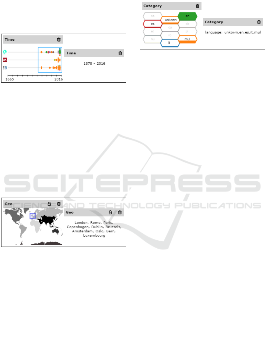
start and end year of the filter range, (see Figure 3)
and thus hiding information the cannot be reasonable
visualised as text, like e.g.: the result distribution on
language.
Figure 3: MV for time series data on the left; textual repre-
sentation on the right.
3.2.2 Geo-spatial Filter
The geo-spatial filter displays a world map, the conti-
nents of which are distinguished by different shades
of gray. The filter area (internally represented by
WGS 84 coordinates) is represented by a colou-
red rectangle. Zooming is implemented by double-
clicking on the area of interest in order to see more
detail when necessary.
The textual version of this filter type shows the
biggest cities within the filter area. The number of
cities is limited to ten, so that the user is not overw-
helmed by text (see Figure 4).
Figure 4: MV of geo-spatial data on the left; textual repre-
sentation on the right.
3.2.3 Categorical Filter
As a visual representation for categorical filters, we
decided to use hexagonal shapes in a honeycomb pat-
tern. Had we used bars in this manner, the visualisa-
tion could easily have been mistaken for a stacked bar
chart. The fill amount visualizes the distribution of
the results, and the label of each category can be seen
in the middle of the shape.
For the textual version, we used the same labels as
in the visual version, separated by a comma, and with
the dimensions’ name in front of the list of labels (see
Figure 5).
Figure 5: MV of categorical data on the left; textual repre-
sentation on the right.
3.3 Implementation Details
All EEXCESS client software is written with web
technologies. The architecture of the RD was desig-
ned in a modular way so as to make it applicable for
use in different scenarios. The first scenario, descri-
bed in the Introduction, sees the user activating the
RD after the Google Chrome Extension suggests new
recommendation items. Another way the RD can be
used is with the EEXCESS Moodle Plugin (imple-
mented by Bitmedia
2
). Using this plugin, authors of
the Moodle system can use the EEXCESS recommen-
der to get documents related to their article in work,
and can embed or link to them using the RD. Thus, the
RD never accesses the recommender directly, but rat-
her waits for injected recommendations through any
of the hosting applications.
The RD module itself consists of several JavaS-
cript services, which handle the interaction between
the visualisations, the recommender, the filters and
the bookmarking system. The visualisations are im-
plemented in SVG, and make much use of the d3.js
library
3
.
4 USAGE SCENARIOS
The primary target group of the RD is made up
of people who want to dig deeper into results re-
commended by the EEXCESS Browser Extension.
Therefore, we defined scientific researchers as our
primary target users as well as the main actors in
the following usage scenarios. The initial situation
for the following scenarios is that the researcher has
already received some recommendations and has
opened the RD.
Scenario 1: Researcher Actively Exploring and
Organising:
If the number of recommendations exceeds an
amount that can be examined individually, the RD
2
http://www.bitmedia.at
3
https://d3js.org
IVAPP 2017 - International Conference on Information Visualization Theory and Applications
190

helps the researcher actively explore and organize
the recommendations. The researcher is able to filter
the results according to various facets, or look into
individual documents by opening them. To pause
the exploration and continue at a later time, the
active filter status can be stored, as can all selected
documents, or just those that need to be investigated
further.
Scenario 2: Researcher Takes Up Earlier Investi-
gation:
When the researcher is able to resume their inves-
tigation after a pause, they can re-open the RD and
continue where they left off. There are two ways
of resuming work: either the researcher opens a
bookmark collection, where specific documents
have been saved, or they open a complete filter
set, including all recommendations. From this point
on, it is possible to continue exploring the documents.
Scenario 3: Multiple Researchers Collaborate in
Exploring and Organising:
It’s often the case researchers do not work alone on
a specific topic, but rather that multiple researchers
work together. To make this easier, the RD provi-
des the option to save bookmark collections globally
and share them with others. Collaborating colleagues
can thus open a shared bookmark collection and ea-
sily continue their research.
5 EVALUATION
The goal of providing the user with micro visualisati-
ons rather than faceted filters is to convey as much
information as possible in very little space, and to
present it aesthetically pleasing. We also believe that
using the MVs results in better performance when it
comes to memorizing the filter choices. The visual
representation of the results should stay in the user’s
mind for a longer period of time. The second assump-
tion we have made is that the filter visualisation, in its
cleaner form, increases the researcher’s reading per-
formance, whether they are seeing the filter for the
first time or for a shorter time period.
5.1 Goal
In this evaluation, we attempted to test whether or not
the micro filter visualisation has advantages for users
in terms of the memorability and readability of the
results, when compared to classic textual filter repre-
sentations.
As part of the general use cases (see Section 4)
the following usage example describes the basic idea
of our evaluation:
A researcher is using EEXCESS to find interes-
ting articles about their topic of interest and uses the
recommendation dashboard to filter these articles
according to different dimensions (time-range, geo-
spatial-area, language). The researcher then goes on
vacation, and, after a couple of days, a colleague who
needs to continue the work calls to ask what area the
researcher had been focusing on.
Due to the memorability of the filters applied,
the researcher is able to tell their colleague what
they had been looking at, even when asked about the
research after some time.
When the researcher has access to a PC, they
can use the Recommendation Dashboard to share
their previously stored bookmark/filter collection.
Thanks to the readability of the filters, the colleague
can see what the researcher has filtered, and thus
easily continue with their work.
5.2 Hypotheses
Based on the scenarios described, we have developed
the following hypotheses:
Hypothesis 0: There is no measurable diffe-
rence in the memorability or readability of the
results when filters are visualised by means of micro
visualisations compared to a textual representation.
Hypothesis 1: When a user sees the immediate
visualisations of filter-sets, it increases the memora-
bility of the filters applied by means of recognizing
screenshots of this filter-sets when appearing to the
user at a later time.
Hypothesis 2: When a user sees visualisations
of somebody else’s past filter-actions, it increases
their readability of the aim of that research, by
correctly reproducing a filter if shown to them.
5.3 Method
At the beginning of the evaluation, we explained that
the study was not about the functionality of the tool,
and thus, that questions from participants were wel-
come during the execution of the task. The first part
of the evaluation was about bringing all participants
to the same level of understanding about the software.
This started with a textual description of the context
Evaluating the Memorability and Readability of Micro-filter Visualisations
191
of the Recommendation Dashboard: since we were
conducting the evaluation on a standalone implemen-
tation, we explained how the user normally gets to
this page as well as how the result-items are normally
recommended. This was followed by an interactive
introduction, where the participants had the opportu-
nity to navigate through the RD with the help of a
wizard, with pop-up annotations describing each im-
portant part of the user interface (UI). The third step
was a short video (2:30) about how to use filters in
each of the main visualisations, and how to lock them
in the filter-area on the right side. We concluded with
some “hands on” experience: the participants were
asked to become familiar with the UI on their own.
To achieve the goal of the evaluation, we com-
pared how well participants were able to remember
MVs versus textual representations of the filters, as
well as whether a resized version of the main visuali-
sation (resized to the same size as the MV, but with a
bigger version shown as soon as the user hovered over
the thumbnail) performed better.
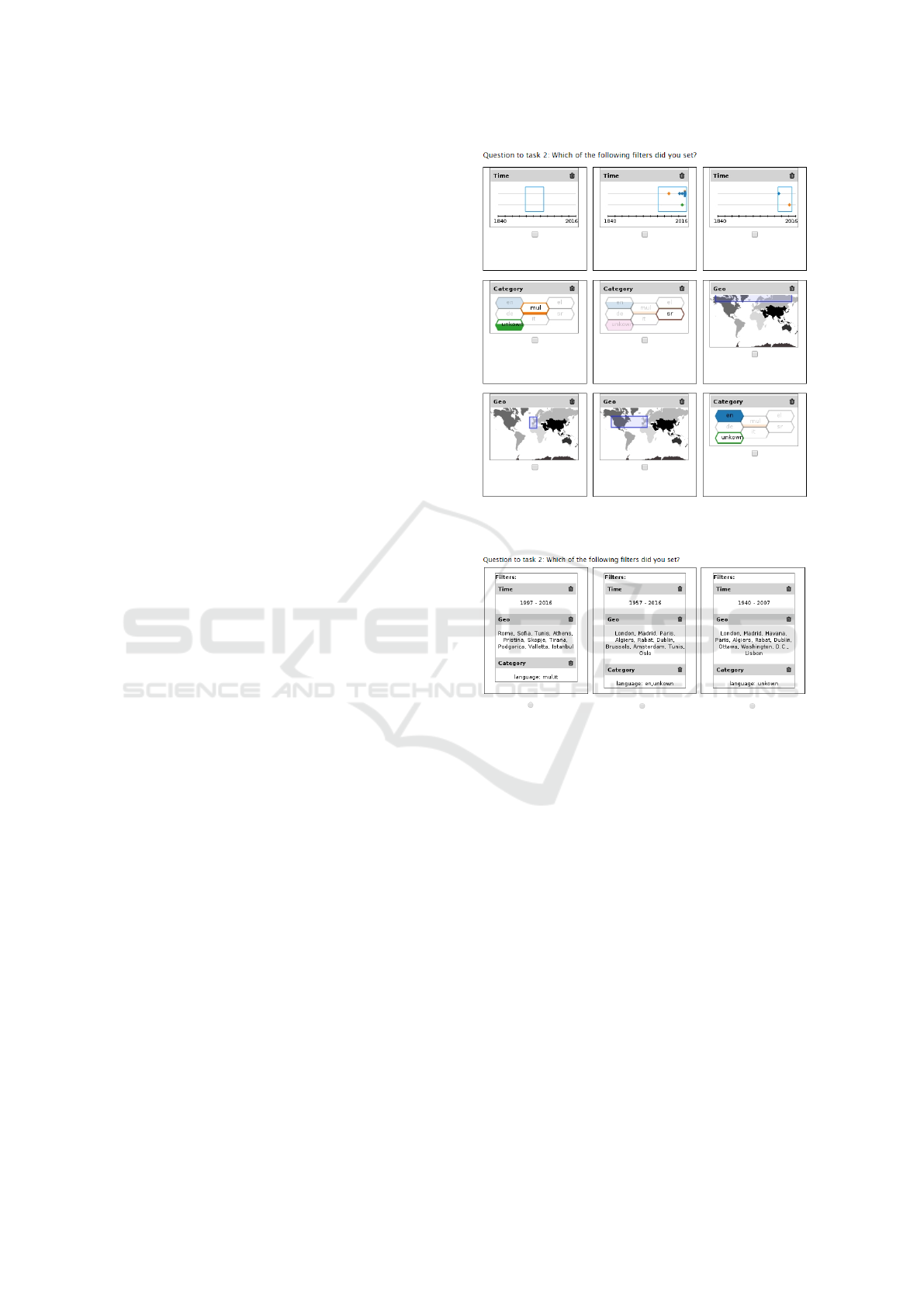
To this end, we created three similar tasks in
which the participants had to use each of the main
visualisations, create a filter with each, and apply this
filter. After each task, we asked the participants if
they could remember which filters they had applied.
For these questions, we developed a testing environ-
ment that automatically took a screen-shot when the
user finished their task. Subsequently, the filter part
of the screen-shot was taken, divided into the three
different parts, and presented to the user in a random
order, along with similar visualisations that did not
originate from their work with the filters. Participants
were then asked to select the filters that they had cre-
ated just before (see Figure 6). On the next page, a
similar question appears, but in that case, the three fa-
cet visualisations were grouped together, and the par-
ticipants were only able to choose one of three sets of
the three visualisations (see Figure 7 - only the textual
version is shown). Both questions, targeting memora-
bility, where asked with the same type of visualisation
(MV, Text, Main) as the task before used to visualize
the filter.
This set of questions was asked for each of the
first three tasks. To evaluate how the results would
vary over time, we repeated the questions three times
with different time interval:
Like described, the first round of questions was asked
directly after the participant had executed the task,
while the second was at the end of the evaluation que-
stionnaire (about 15 minutes after the task). The third
time the question was asked was approximately 24
hours after the task, and the fourth time came 7 days
after executing the task. We achieved this by sending
Figure 6: Example question: the participant has to select
the three visualisations that they created.
Figure 7: Example question about filters: the participant has
to select one of the three sets of filters that they created.
the participants an email asking them to fill out anot-
her short questionnaire with the same set of questions
they had already answered.
The second part of the evaluation was about the
readability of the filter-sets. Tasks four and five sho-
wed a screen-shot of a filter-set, one visual and one
textual. Participants were asked to look at them and
then to answer on the next page what filters had been
shown (see Figure 8).
5.3.1 User Interface Adaptions
Within this evaluation, we wanted to focus the expe-
riment on three of our six main visualisations. Our
aim was to obtain results through which the perfor-
mance of each of the three main visualisations could
be meaningfully compared to their MV and textual
counterparts.
Within the productive version of the RD, there are
two main visualisations available that provide filte-
IVAPP 2017 - International Conference on Information Visualization Theory and Applications
192
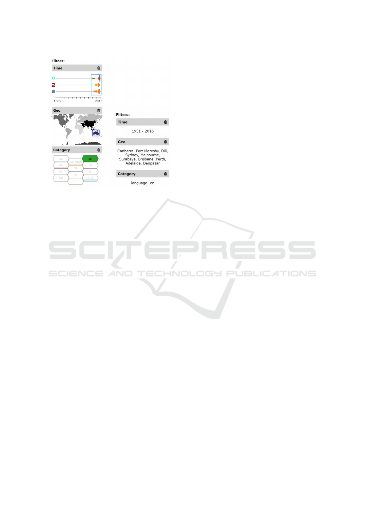
Figure 8: Question about readability.
ring capabilities for keywords, in addition to one ot-
her visualisation where the user can browse through
the history of their queries or bookmark collections.
The keyword-visualisations only have a textual MV
representation, so these were not considered for in-
clusion. The Query History visualisation was also not
included as it is still in an experimental state.
Because these functionalities were not appropriate
for this evaluation, they were removed from the tes-
ting environment. This made it easier for the partici-
pants to get to know the RD, by only allowing filtering
along temporal (timeline), spatial (geo-visualisation)
and categorical (bar chart) metadata dimensions.
5.3.2 Evaluation Setup
Due to the learning curve for similar tasks during an
evaluation, we randomized the order in which parti-
cipants received each type of visualisation. For the
three memorability tasks, the choices were MV, text,
and main visualisation; we used a balanced Latin
square distribution for the order in which the different
three visualisation types appear.
The second part of the evaluation focused on re-
adability, and had two different configurations: text
and MV, resulting in two different sets of orders.
The evaluation was executed on a 13 Apple Ma-
cbook, using the Google Chrome browser in full
screen mode. The participants were videotaped. The
evaluations took between 30 and 60 minutes and par-
ticipants were rewarded with a 5 Euro Amazon vou-
cher and a chocolate.
5.3.3 Participants
There were 27 participants in the evaluation. Two par-
ticipants were used as pilot users, and are therefore
not considered within the results, as minor changes to
the set-up had to be made. Of the remaining 25 parti-
cipants, 10 were female and 15 were male. Their ages
ranged from 21 to 49 years, resulting in a median age
of 29 years (average: 30). For the majority of questi-
ons, we used a Likert scale, from 1 to 7. When asked
about their language skills, the participants answered
with a median of 5, where 7 = Native speaker profi-
ciency. They rated their median IT background as a
5, where 7 = IT professional, and, with regard to their
data visualisation experience, the participants ranked
their knowledge as a median of 4, where 7 = Expert.
5.3.4 Post Evaluation Questionnaire
Shortly after all three parts of the evaluation were
completed, we began the preliminary analysis of the
results. To gain a better understanding of the quanti-
tative results, we set up another online questionnaire
and asked the participants to complete it. This final
online questionnaire consisted of the following que-
stions, which had to be answered on a Likert scale
from 1 to 7. Each question was asked for each type
of visualisation - temporal, geo-spatial, categorical -
MV and Text. From the total of 25 considered parti-
cipants, we got 22 answers on this questionnaire, the
others did not respond after multiple requests.
• I find this filter representation visually appealing
• I could easily remember this visualisation
• I found it easy to relate this visualisation to the
main visualisation (seen on the side)
• I think this visualisation is useful
• I find this visualisation easy to read and under-
stand
At the end of the questionnaire, we asked the users to
choose one type of visualisation, with the following
questions:
• Which of the filter-visualisations do you prefer?
• Which type of visualisation do you think provides
more information?
These questions were asked separately for each type
of visualisation; users were also asked to rate their
confidence in the choice and to fill in a text box to
explaining their choice.
5.3.5 Experiment Summary
To give a better understanding, of how the evaluation
finally looked in the eyes of the participant, a listing
of steps is shown:
Evaluating the Memorability and Readability of Micro-filter Visualisations
193
• Introduction and familiarisation
• Memorability task 1, 2 and 3 (type of filter visua-
lisation sequence by latin squares)
– Executing the task
– Memorability question, randomized filters (see
Figure 6)
– Memorability question, filtersets (see Figure 7)
– NASA-TLX measurement
• General Questions
• Readability Task 4 and 5 (type of filter visualisa-
tion sequence by latin squares)
– Executing the Task
– Questionnaire
– NASA-TLX measurement
• Both memorability questions about tasks 1-3 re-
peated (as it is about 10 minutes after answering
the first time)
• 24 hours later: questionnaire sent by email inclu-
ding both memorability questions about task 1-3
• 6 days later: questionnaire sent by email including
both memorability questions about task 1-3
• Post Evaluation questionnaire sent by email after
about 4 weeks later
5.4 Results
In analyzing the evaluation results, we made some
interesting discoveries, but unfortunately not entirely
the ones we expected.
Memorability of Random Visualisations
At first, we measured and compared the success rate
of correctly chosen filters over time, and looked at
the differences between the visualisation types. The
success rate is calculated by counting how many of
the possible correct answers where chosen by each
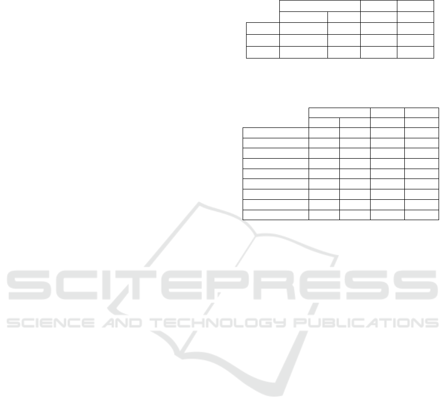
user; The average of these values are shown in Table
1.
In contrast to our hypothesis, the overall success
rate was highest with the textual filter representation.
After further analysis, we recognized that the success
rates for each data-type specific visualisation varied
greatly (see Table 2). When comparing only the tem-
poral filter visualisations, text performed much better
than the MV, which resulted in the main difference.
The other two data-type specific visualisations perfor-
med more or less equally over time. Therefore, one of
the main conclusions that can be drawn from this eva-
luation is that the memorability of information does
depend on the display type of the visualisation (tex-
tual or visual), but in fact depends much more on the
type of information to be memorized. For example,
Table 1: Success rate of correctly memorized filters, Main,
MV and Text compared over time (days / rounds).
Day 1 Day 2 Day 3
Round 1 R 2 R 3 R 4
Main 44 % 60 % 52 % 50 %
MV 48 % 40 % 40 % 42 %
Text 60 % 64 % 56 % 50 %
Table 2: Success rate of correctly memorized filters, MV
and Text compared for each visualisation type over time
(days / rounds).
Day 1 Day 2 Day 3
R 1 R 2 R 3 R 4
Geo MV 76 % 72 % 64 % 75 %
Geo Text 76 % 72 % 68 % 75 %
Geo Main 72 % 84 % 76 % 79 %
Time MV 68 % 48 % 56 % 58 %
Time Text 88 % 88 % 84 % 92 %
Time Main 72 % 76 % 76 % 67 %
Category MV 92 % 88 % 80 % 79 %
Category Text 88 % 84 % 88 % 71 %
Category Main 76 % 92 % 80 % 75 %
temporal filters were represented as year ranges, and
two 4-digit years are much easier to remember than a
visual time range. The same is not true for a list of
city names in comparison to a rectangular selection
on a map.
Memorability of Filter Sets
The question regarding the memorability of the fil-
ter set, i.e., all three of the filters the participant has
applied at one time, was answered for all types of
visualisation and through all question rounds with a
consistently high memorability (around 90%). We
attribute this result to the fact that the memorability
uncertainty decreases with every additional visuali-
sation. The participant only needs to remember one
of three visualisations to have answered the question
correctly. Nevertheless, there is a small, though not
significant, difference, pointing towards the main vi-
sualisation as performing best (93% average success,
compared to 91% for text and 88% for MV).
Readability of Single Filters
When analyzing tasks four and five, which concern
readability (like described, we showed the partici-
pants , the results were similar, but paint a clearer
picture. With regard to the spatial filter, the success
rate was higher when showing the MV; for catego-
rical information, it was exactly the same, while for
the temporal filter, MV performed much worse than
text. When we asked the participants about their own
IVAPP 2017 - International Conference on Information Visualization Theory and Applications
194
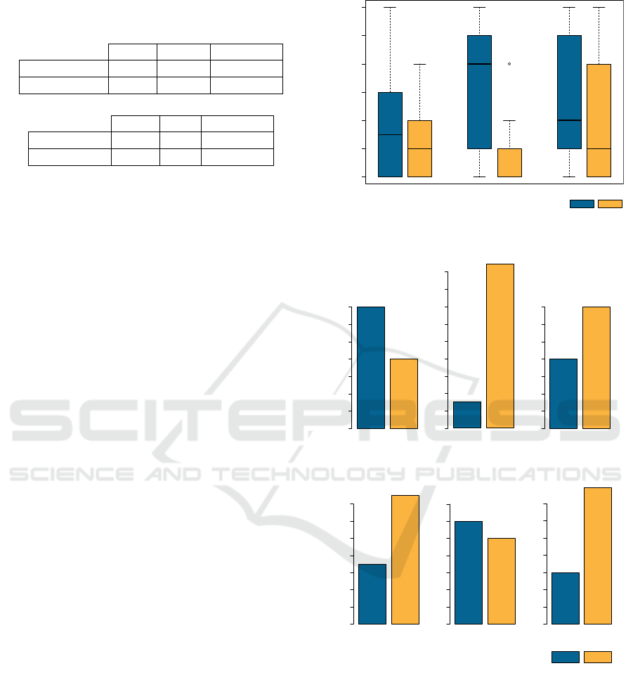
Table 3: Readability success rate of correctly reproduced
filters (up) and subjective rating if the participant thinks
his choice is correct (bellow). Average values, 1 means
“agree”.
Time Geo Category
Success Text 94 % 88 % 96 %
Success MV 40 % 100 % 96 %
Time Geo Category
Rating Text 2.4 2.8 1.6
Rating MV 3.6 1.9 1.6
opinion of the answers’ correctness, a similar picture
emerged (see Table 3).
Task Load
After each of the main tasks in round one of the eva-
luation, we asked the participants to rate how deman-
ding they found the task. To measure this, we used the
NASA Task Load Index questionnaire (Hart and Sta-
veland, 1988) and calculated a single score from the
six answers, with a value range from 0 to 100, where
100 means a high task load, and 0 means a low task
load. In contrast to the success rate of each visualisa-
tion type, the task load of textual filter representations
was significantly higher than that of the MV visuali-
sations (median of 25 compared to 31 and a t-test p
value of 0.16).
Participants’ Ratings
When the participants were asked to give a subjective
estimate of where they performed better, they tend to
be more confident in their performance with the tex-
tual representation (average of 2.6 compared to 2.8,
where 1 means: “I agree that I could remember the
visualisation”), and were even more confident when
it came to the main visualisation (average of 2.0).
When participants were asked which visualisation
they found visually appealing, a quite different result
was noticeable: in answer to this question, the partici-
pants favoured the MV (see Figure 9). The degree of
their preference depends on the type of visualisation;
a very high difference is visible for the geo-spatial fil-
ter MV.
In the last question, we asked participants which
of the visualisations they really preferred (between
the text and MV). As seen in Figure 10, their prefe-
rence once again depended on the filter type. When
asked which type of filter visualisation they prefer-
red, participants chose text over the MV for the tem-
poral filter visualisation only. In answering this que-
stion, participants seem to think that the word “filter-
1
2
3
4
5
6
7
1 = Agre e,
7 = Don't a gre e
time
geo
category
Text MV
I find this filter representation visually appealing
Figure 9: Boxplot containing ratings of design and sub-
jective memorability (where lower is better).
0 2 4 6 8 10 12 14
0 2 4 6 8 10 12 14
0 2 4 6 8 10 12 14
time
geo
category
time
geo
category
Text MV
Which one of the filter-visualisations do you prefer?
Which type of visualisation do you think,
provide more information
0 2 4 6 8 10 12 14
0 2 4 6 8 10 12 14
0 2 4 6 8 10 12 14
16
18
Figure 10: Collection of histograms showing how many
participants prefer Text vs MV.
visualisation” refers only to indicating the filter set-
ting. By asking participants what type of visualisa-
tion provides more information, it has become appa-
rent that, in this case, participants appreciate the den-
ser information of the MV filter version and accept
the lack of exact numbers in the time range filter.
With the geo-spatial filter visualisation, the results
were quite the opposite. In the participants’ view, the
MV provides less information (probably because the
Evaluating the Memorability and Readability of Micro-filter Visualisations
195

text visualisation shows exact city names), but it is
nonetheless preferable when it comes to representing
the filters. In the case of category, the MV is preferred
in both cases. Combined with all other results about
the different chart types, the categorical MV performs
better and was more appreciated by participants than
the textual filter.
Qualitative Feedback
After the participants decided which type of visua-
lisation they prefer, we asked them to explain their
reasons. From this feedback, we were able to gain
much insight, particularly with regard to improving
the visualisations. For the temporal filter, partici-
pants mentioned that the visualisation is missing the
exact year range of the filter, because the exact values
are not readable. On the other hand, they appreciate
the additional information provided, and the visual
appeal of the filter as is. The strength of the textual
version is the clear and easy display of the date range.
People who prefer the textual geo-spatial filter
appreciate being able to read the exact names of what
they’ve selected, which also gives them more infor-
mational content; however, depending on the size of
the selection, not all important cities are listed - inclu-
ding ones the participant doesn’t know. One partici-
pant said that he liked the textual list because he was
able to verify whether or not his geo-spatial selection
included the names he expected. The majority of pe-
ople preferred the visual representation, and mentio-
ned that a visual selection area is both much easier to
remember and to read. It’s also more intuitive and less
likely to induce cognitive overload.
The same is true for the categorical filter, the ma-
jority of participants preferred the visual version, and
stated that it seems to contain more information and
is not missing anything. In addition, the participant is
able to see what other types (i.e., languages) are avai-
lable, but not selected. Participants also mentioned
that they see a connection between the categories and
their corresponding colour - which is the same as the
colour used on the current main visualisation. The
textual version was liked by participants, who said
that just seeing the selected languages is enough in-
formation for a filter visualisation.
6 CONCLUSIONS
As discussed within the Results section of this pa-
per, the memorability of the MV was not, generally
speaking, better than the textual filter representation,
despite the fact that, in some cases, such as geo-spatial
filter visualisation, the MV appeared to perform bet-
ter. In contrast, participants preferred the visual de-
sign of the MV. If we consider that the memorability
of the full visualisation is even better then the memo-
rability of MV, we propose that the similarity between
specialized MVs and the main visualisation should be
maintained as closely as possible. Because we strove
to optimize the visualisation in order to make good
use of the little available space, it is possible that the
connection between the MV and the main visualisa-
tion suffered as a result. In the future, the MV should
be extended with textual information where applica-
ble, e.g., when it comes to specific time ranges, since
the textual version’s performance success is founded
on its two clearly readable numbers.
7 FUTURE WORK
As the MVs utilize the available screen space much
better than the full visualisation, we plan to continue
exploring this approach and will work on improving
the concept further. We plan to put our effort into fin-
ding ways to combine both goals, which should also
lead to adapting the main visualisation. As this eva-
luation implies that visual filter representations and
the main visualisation - where filter actions take place
- should strongly correlate, they must be developed
concurrently. Strongly correlating pairs of visualisa-
tions should be developed, in which each visualisa-
tion benefits from the advantages of its primary usage,
while still appearing as similar to its counterpart as
possible. Adding textual information about the filter
into the MV is a necessary step towards honouring the
evaluation results. This will be done within the time-
line visualisation in particular, but, as a response of
the users’ qualitative feedback, could also be applied
in the map MV (e.g. showing city names within the
filter area). In addition to the improvements discussed
here, as a result of the evaluation feedback, we also
have plans to rework the RD to be usable on mobile
devices, where the efficient allocation of space takes
on even more importance.
ACKNOWLEDGEMENTS
This work was funded by the European Union’s Se-
venth Framework Programme (FP7/2007-2013) un-
der grant agreement Nr 600601. The Know-Center
GmbH is funded within the Austrian COMET Pro-
gram - managed by the Austrian Research Promotion
Agency (FFG).
IVAPP 2017 - International Conference on Information Visualization Theory and Applications
196

REFERENCES
Borkin, M. A., Vo, A. A., Bylinskii, Z., Isola, P., Sunkavalli,
S., Oliva, A., and Pfister, H. (2013). What makes a vi-
sualization memorable? IEEE Transactions on Visua-
lization and Computer Graphics, 19(12):2306–2315.
Brady, T. F., Konkle, T., Alvarez, G. A., and Oliva, A.
(2008). Visual long-term memory has a massive
storage capacity for object details. Proceedings of
the National Academy of Sciences, 105(38):14325–
14329.
di Sciascio, C., Sabol, V., and Veas, E. E. (2015). urank:
Exploring document recommendations through an in-
teractive user-driven approach. In Proceedings of the
Joint Workshop on Interfaces and Human Decision
Making for Recommender Systems, IntRS, pages 29–
36.
Edward, T. (2001). The visual display of quantitative infor-
mation. Graphics Press, Cheshire, USA,, 4(5):6.
English, J., Hearst, M., Sinha, R., Swearingen, K., and Lee,
K. (2002). Flexible search and navigation using face-
ted metadata. Technical report, Technical report, Uni-
versity of Berkeley, School of Information Manage-
ment and Systems, 2003. Submitted for publication.
Hart, S. G. and Staveland, L. E. (1988). Development of
nasa-tlx (task load index): Results of empirical and
theoretical research. Advances in psychology, 52:139–
183.
Hearst, M., Elliott, A., English, J., Sinha, R., Swearingen,
K., and Yee, K.-P. (2002). Finding the flow in web site
search. Communications of the ACM, 45(9):42–49.
Kern, R., Jack, K., and Granitzer, M. (2014). Recommen-
ding scientific literature: Comparing use-cases and al-
gorithms. arXiv preprint arXiv:1409.1357.
Kienreich, W., Lex, E., and Seifert, C. (2008). Apa labs:
an experimental web-based platform for the retrieval
and analysis of news articles. In Applications of Di-
gital Information and Web Technologies, 2008. ICA-
DIWT 2008. First International Conference on the,
pages 58–62. IEEE.
Konkle, T., Brady, T. F., Alvarez, G. A., and Oliva,
A. (2010). Conceptual distinctiveness supports de-
tailed visual long-term memory for real-world ob-
jects. Journal of Experimental Psychology: General,
139(3):558.
Lam, H., Bertini, E., Isenberg, P., Plaisant, C., and Carpen-
dale, S. (2011). Seven guiding scenarios for informa-
tion visualization evaluation.
North, C. and Shneiderman, B. (1999). Snap-together vi-
sualization: Coordinating multiple views to explore
information.
Roberts, J. C. (2000). Multiple view and multiform visuali-
zation. In Electronic Imaging, pages 176–185. Inter-
national Society for Optics and Photonics.
Sabol, V. and Scharl, A. (2008). Visualizing temporal-
semantic relations in dynamic information landsca-
pes. In 11th International Conference on Geographic
Information Science (AGILE-2008), Semantic Web
Meets Geospatial Applications Workshop.
Saket, B., Endert, A., and Stasko, J. (2016). Beyond usa-
bility and performance: A review of user experience-
focused evaluations in visualization. In Proceedings
of the Beyond Time and Errors on Novel Evaluation
Methods for Visualization, pages 133–142. ACM.
Schl
¨
otterer, J., Seifert, C., and Granitzer, M. (2014). Web-
based just-in-time retrieval for cultural content. In PA-
TCH14: Proceedings of the 7th International ACM
Workshop on Personalized Access to Cultural Heri-
tage.
Seifert, C., Bailer, W., Orgel, T., Gantner, L., Kern, R., Ziak,
H., Petit, A., Schltterer, J., Zwicklbauer, S., and Gra-
nitzer, M. (to appear 2016). Ubiquitous access to digi-
tal cultural heritage. Journal on Computing and Cul-
tural Heritage (JOCCH), page to appear.
Seifert, C., Jurgovsky, J., and Granitzer, M. (2014). Facet-
scape: A visualization for exploring the search space.
In 2014 18th International Conference on Information
Visualisation, pages 94–101. IEEE.
Tschinkel, G., Di Sciascio, C., Mutlu, B., and Sabol, V.
(2015). The recommendation dashboard: A system
to visualise and organise recommendations. In 2015
19th International Conference on Information Visua-
lisation, pages 241–244. IEEE.
Tschinkel, G., Hafner, R., Hasitschka, P., and Sabol, V.
(2016). Using micro-visualisations to support faceted
filtering of recommender results. In Information Vi-
sualisation (IV), 2016 20th International Conference,
pages 318–323. IEEE.
Evaluating the Memorability and Readability of Micro-filter Visualisations
197
