
Evaluating Multi-attributes on Cause and Effect Relationship
Visualization
Juhee Bae, Elio Ventocilla, Maria Riveiro, Tove Helldin and Göran Falkman
School of Informatics, University of Skövde, Skövde, Sweden
Keywords:
Cause and Effect, Uncertainty, Evaluation, Graph Visualization.
Abstract:
This paper presents findings about visual representations of cause and effect relationship’s direction, strength,
and uncertainty based on an online user study. While previous researches focus on accuracy and few attributes,
our empirical user study examines accuracy and the subjective ratings on three different attributes of a cause and
effect relationship edge. The cause and effect direction was depicted by arrows and tapered lines; causal strength
by hue, width, and a numeric value; and certainty by granularity, brightness, fuzziness, and a numeric value.
Our findings point out that both arrows and tapered cues work well to represent causal direction. Depictions
with width showed higher conjunct accuracy and were more preferred than that with hue. Depictions with
brightness and fuzziness showed higher accuracy and were marked more understandable than granularity. In
general, depictions with hue and granularity performed less accurately and were not preferred compared to the
ones with numbers or with width and brightness.
1 INTRODUCTION
In data analysis, a fundamental task is to find correla-
tions between attributes. One important correlation is
causality, meaning the cause and effect relationship be-
tween, for example, states or variables. As argued by
Chen et al.
(
2011), the general aim of data analysis and
visualization is to help identify the causes of observed
events. One of the ultimate goals in data analytics is
actually uncovering causal relations among variables
in multivariate datasets
(
Wang & Mueller, 2016). The
cause and effect relationships between variables can-
not always be established, but if possible and with a
sufficient degree of certainty, such information can be
very useful to analysts and decision-makers.
Causality clues can be detected through, for exam-
ple, statistical tests and clustering. Domain experts
can also provide important input in order to establish
cause and effect information such as known relation-
ships in the data and estimations of the data quality
and quantity. However, including the human analyst
in the reasoning process puts great demands on the
actual visualization of the causality clues and their as-
sociated uncertainty. While there are numerous studies
on developing and evaluating techniques for visualiz-
ing uncertainty (see recent review in Bonneau et al.
(2014)), not much has been done to evaluate the best
ways of depicting causality and the associated uncer-
tainty in graph visualizations
(
Guo, Huang, & Laidlaw,
2015).
Even though the need for visualizing uncertainty
is widely accepted in the decision-making research
community
(
Zuk & Carpendale, 2006; Bisantz et al.,
2011), both guidelines and grounded theory with em-
pirical evaluations regarding the effectiveness of the
uncertainty depictions are scarce. Research has mainly
focused on uncertainty visualization techniques, using
different types of visual variables such as size, shape,
color brightness, color hue, fuzziness and transparency
(
see e.g., MacEachren et al., 2012). One fundamental
problem is how to include additional uncertainty infor-
mation into an existing visualization while maintaining
comprehension.
Often, a variety of visual variables is needed to de-
pict different characteristics of the data. In a cause and
effect relationship, a decision-maker might be inter-
ested in not only the uncertainty, but also the strength
and significance of the relationship. Yet how to convey
such information in one and the same visualization
needs to be empirically evaluated in terms of their ef-
fects on decision-makers’ accuracy and certainty when
establishing cause and effect relationships.
The focus of this paper is two-fold: first, a litera-
ture review is presented where previous work within
the area of causality visualization is summarized, and
recommendations for causality visualization are ex-
64
Bae J., Ventocilla E., Riveiro M., Helldin T. and Falkman G.
Evaluating Multi-attributes on Cause and Effect Relationship Visualization.
DOI: 10.5220/0006102300640074
In Proceedings of the 12th International Joint Conference on Computer Vision, Imaging and Computer Graphics Theory and Applications (VISIGRAPP 2017), pages 64-74
ISBN: 978-989-758-228-8
Copyright
c
2017 by SCITEPRESS – Science and Technology Publications, Lda. All rights reserved

tracted. Secondly, based on the techniques found in
the literature, an empirical study is presented on the
effects of the selected cause and effect visualization
techniques on the decision-makers’ task accuracy and
preferences.
The paper is structured as follows: section 2
presents previous work regarding causality visualiza-
tion and extracts recommendations to be used in our
study. Section 3 outlines our goal and motivation, fol-
lowed by section 4 with our study design. Section
5 and 6 describes the results and general discussions
from our study. Finally, section 7 elaborates on what
lessons we have learned from our study and section 8
with conclusions and ideas for future work.
2 RELATED WORK
A graph represents a collection of elements, called
nodes, and the connection between these elements,
called edges. Edges often indicate a weight (such
as the strength or importance of the connection), as
well as the direction of the node relationships, which
can communicate information regarding the causality
between the different nodes.
Causality has been represented both through static
images, with animation as well as through the use of
interaction
(
see e.g., Elmqvist & Tsigas, 2003; Kadaba,
Irani, & Leboe, 2007; Ghoniem, Fekete, & Castagliola,
2004; Wang & Mueller, 2016). In the paper by Kadaba
et al.
(
2007), it was concluded that both static and
animated depictions of causality are informationally
equivalent in terms of how easy it is to understand
causal relationships without training. This is in line
with the research presented in Tversky, Morrison and
Betrancourt
(
2002) and Pane, Corbett and John
(
1996)
where static and animated graphics were evaluated
in terms of how easy they are to comprehend. Here,
no significant effects could be shown as long as both
representations were chosen carefully and represented
the same information.
As stated by Alimadadi Jani (2013), "most com-
mon forms of visualizing the causal relations are still
directed arrows". This includes her work, in which
causality graphs are used for depicting parts of the an-
alytical process managed by CZSaw, an analysis tool.
Edges in these diagrams only encode direction through
the use of static arrows.
A more recent, and closely related work, is that of
Wang and Mueller (2016) in which they developed an
interactive causality visualization tool. Their visual
representation of edges uses arrows and opacity to
convey the value of causal strength. Nevertheless, the
use of arrows and opacity for edge representation was
not compared to other successful alternatives presented
in relevant works, e.g. the use of tapered edges.
Relevant work on user perception of edges has
been done by Holten and van Wijk (2009); Holten,
Isenberg, Van Wijk, and Fekete (2011) and Guo et
al. (2015). Holten and van Wijk (2009) carried out
an evaluation on user perception of different edge-
directed graph representations (by means of measuring
speed and accuracy), in which they found that, for
"high-degree graph vertices", tapered directed edges
perform better than arrows and others. An extended
version of this study was done later on by Holten
et al. (2011), in which the use of tapered edges was
confirmed to outperform other static representations.
Guo et al. (2015), on the other hand, evaluated
user perception of undirected edges which encoded
two variables at the same time: strength and certainty
(i.e. causality was omitted from their study). Different
combinations of visual variables (such as hue, width,
fuzziness, etc.) were assessed for different tasks, and
a list of design tips is concluded based on their results.
These include, for example, the usage of brightness,
fuzziness and grain to depict causality clues, but that
the effects of the combinations of the different visual
variables need to be carefully investigated together
with the task to be conducted. These results are much
in line with the research performed within uncertainty
visualization, i.e. that the perceptual issues of a visual-
ization needs to be considered as well as the task to be
solved by the decision-maker to be able to select the
most optimal uncertainty representation (see for exam-
ple Potter, Rosen and Johnson
(
2012) and MacEachren
et al.
(
2012)). As argued by Potter et al.
(
2012), the
work done on uncertainty visualization to date does
not point out a specific technique that will work in any
situation, but rather it points to the fact that we need to
investigate the technique in relation to the perceptual
issues of the visualization as a whole together with the
problem to be solved.
Based on the previous work on causality graphs
presented above, our conclusion is that no previous
work has conducted a systematic empirical investiga-
tion on the effects of encoding three different visual
variables in one representation, i.e. to depict the causal
direction, the uncertainty as well as the strength of a
cause and effect relationship. To investigate this, we
aim to explore the effects of depicting causal direc-
tions with arrow and tapered based representations (as
suggested by Holten et al.
(
2009)), together with the
strength and certainty cues that were suggested and
performed better than others by Guo et al.
(
2015) (i.e.
hue, width, fuzziness, granularity, and brightness), to
represent the strength and uncertainty of the cause and
effect relationships.
Evaluating Multi-attributes on Cause and Effect Relationship Visualization
65
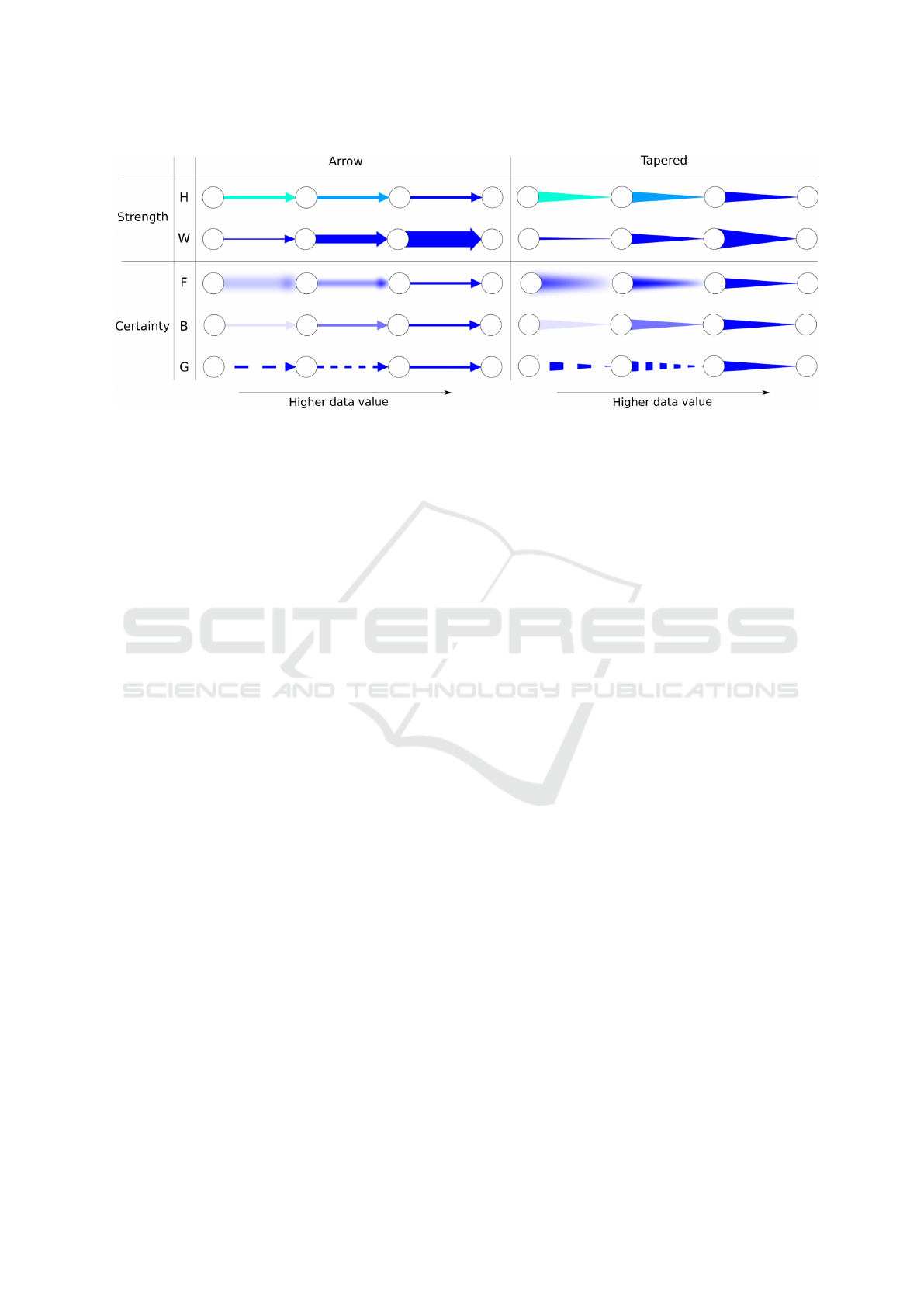
Figure 1: Appearance of the edges depicted in different visual cues. (H = hue, W = width, F = fuzziness, B = brightness, G =
granularity).
Our research differs from previous studies as fol-
lows: we examine the usage of three visual attributes
including the influence direction, strength, and uncer-
tainty of a cause and effect relationship, and measure
both objective and subjective ratings.
3 GOAL AND MOTIVATION
Our study evaluates different cause and effect depic-
tions in order to better understand the effectiveness
of various visual cues that represent direction, uncer-
tainty and strength. Our motivation comes from these
questions:
•
Is there a better way to draw cause and effect rela-
tionships other than the arrow-based depiction?
•
How can we draw strength and certainty influence
levels in a cause and effect relationship?
•
Do people accurately understand a cause and effect
relationship as much as they think they do?
Besides trying to answer these questions, we aim to
provide design recommendations for cause and effect
diagrams.
4 EXPERIMENTAL DESIGN
In order to depict a cause and effect relationship to-
gether with its associated uncertainty, we applied Guo
et al.’s
(
2015) approach to represent strength and cer-
tainty, and Holten et al.’s
(
2011) approach for direc-
tion. Since we already learned from Guo’s results that
brightness does not work well with hue, and that fuzzi-
ness should not be combined with width, we excluded
those pairs from our experiment. We also included
numerical cue as a controlled variable to see if partici-
pants actually understood the relationship. Thus, we
had width-brightness, hue-fuzziness, hue-granularity,
and number-number pairs for strength and certainty
representations. Figure 1 illustrates the appearance of
edges in different visual cues.
Our study used a two-factor 8 depictions
×
2
query types between-subjects design. Depiction,
or the type of edge representation, had eight lev-
els (Figure 2): tapered-width-brightness (TWB),
tapered-hue-fuzziness (THF), tapered-hue-granularity
(THG), tapered-number-number (TNN), arrow-width-
brightness (AWB), arrow-hue-fuzziness (AHF), arrow-
hue-granularity (AHG), and arrow-number-number
(ANN). The first visual cue indicates the cause and
effect direction, the second one represents the strength
cue, and the third, the certainty cue.
Query type, or the type of question we asked, had two
levels: passive type and active type. An example of a
passive question is, "Is D directly influenced by A?"
and an active one is, "Is A directly influencing D?".
4.1 Participants
90 people were recruited through the Amazon Mechan-
ical Turk, but 26 people did not complete the entire
trials and had to be removed. This left us with a total
of 64 people (29 male, 35 female, aged from 18 to 77,
M = 34, SD = 12.44), who participated in the online
experiment with 1
¢
as bonus for every correct answer
(M = 60.8
¢
, SD = 10.2, min = 28
¢
, max = 74
¢
). All
Turkers had normal or corrected-normal vision and
passed a color-blindness test.
IVAPP 2017 - International Conference on Information Visualization Theory and Applications
66
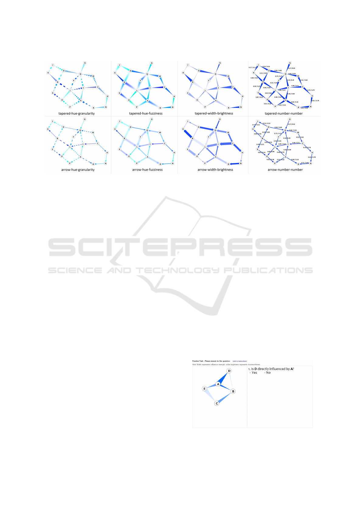
Figure 2: Eight depictions used in the experiment.
4.2 Stimuli and Edge Representations
We used a dataset with 18 nodes and 25 edges to create
eight stimuli. Each edge of the 25 edges represented
one of the combinations of a strength level (1 to 5) and
a certainty level (1 to 5). We applied the algorithm
suggested by Fruchterman and Reingold (1991) to re-
serve a certain distance between the nodes. Each node
was identified with an alphabetical text to indicate an
edge to ask the participant per treatment.
As mentioned earlier, we combined Guo et al.’s
(
2015) and Holten et al.’s
(
2011) approaches to depict
a cause and effect relationship. As such, two visual
cues were used for the edge’s direction: tapered (T)
and arrow (A).
The strength level was depicted by hue (H) and
width (W). Hue valued between 170
◦
and 240
◦
from
the HSB model; 240
◦
(blue) depicts a stronger causal
relation and 170
◦
(cyan) a weak one. Width values
were based on node radius and the edge’s direction
type. The width of tapered edges ranged from
r ∗ 0.2
to
r ∗ 2
, where
r
was the radius of the nodes. With
arrowed edges, width started from 2 pixels to
r ∗ 1.5
.
In both cases, the thicker the edge, the stronger the
causal relation. The value changed linearly for all
visual cues.
The certainty level was depicted by brightness (B),
fuzziness (F), and granularity (G). We defined certainty
as a confidence level – how trustworthy the causal
relationship seems to be. The values of brightness
ranged from 0.0 to 0.9, where 0.0 represented the most
certainty (no brightness), and 0.9 the least. Fuzziness
ranged between 0 and 25 pixels, where 0 indicated
the most (no fuzziness), and 25 the least certainty.
Granularity was depicted through dashes with gaps
between 0 and 40 pixels, again from the most (no
dashes) certainty to the least.
Since we asked the participants how they perceived
the strength and certainty level using a 1 to 5 scale,
we assigned a value that represents each of the five
levels by dividing a 100 linear scale into 5 levels. For
example, a numerical value 0.95 corresponds to level
5, and 0.03 to level 1. The 25 edges were assigned with
one of the 25 strength-certainty level combinations.
The practice tests used a simpler dataset with five
nodes and six edges. Figure 3 illustrates a practice
stimulus where the combination of tapered-width-
brightness was used. For example, the tapered direc-
tion from A to D shows the highest strength (level 5)
and the highest certainty (level 5) by its widest width
and the most bluish color.
4.3 Apparatus
Our online test environment displays a stimulus on the
left, and accuracy and subjective rating questions on
the right (Figure 3). Participants were able to input
the strength and certainty levels they perceived, as
Figure 3: Our online test environment with the stimulus on
the left and the user interface on the right.
Evaluating Multi-attributes on Cause and Effect Relationship Visualization
67

well as their subjective preferences by clicking on one
of the five options in the scale. After each trial, a
pop-up message box allowed the participants to take
a rest if needed. We used a white background color
for each stimulus. Since the participants used their
own equipment, we did not have direct control of their
displays, but we informed them that at least 1280
×
800
pixel resolution of the monitor is required.
4.4 Procedure
As dependent measures, we recorded the participant’s
reply on whether or not there exists a direction be-
tween two objects, perceived strength and certainty
levels, understandability, confidence ratings, and trial
time taken for each question. With our online test
environment, we first obtained an informed consent
from the participants, and they started the experiment
with color-blindness tests, and then read the instruc-
tions. We requested that the participants used at least
1280×800 pixel resolution of the monitor.
We described our goal as to study different types
of diagrams that represent the influence between ob-
jects and the trustworthiness of their relationships. We
then gave an example of a smoking and lung cancer
relationship and explained how the influence edge can
be depicted in different ways to represent strength and
certainty attributes. The tasks were explained along
with how the participants should reply to the questions
using a 1 to 5 Likert scale. In addition, each visual
cue (i.e. arrow, tapered edges, width, color, number,
brightness, granularity, and fuzziness) was explained
in details.
Then, participants performed five practice trials,
with the correct answer being displayed after each trial.
If a participant successfully completed at least two of
these trials, he/she was asked to provide his/her age
and gender. Next, we asked each strength-certainty
level combination depicted on each edge randomly
throughout the trials, and repeated the 8 depictions
three times. With query types, half were active and
half were passive type questions. We had the last
trial to repeat the first trial because of the nature of
having 25 trials. In addition, we learned from our
pilot study that tasks should be challenging enough to
engage participants to our study. Thus, we randomly
located 9 negative trials (there was no direction) added
to the 25 positive trials (there was a direction). Among
the 9 negatives, three asked about opposite directed
edges, three about indirect paths (more than two links
away), and the rest about non-existing edges. In total,
the participants performed 34 main trials without any
feedback.
We first showed the direction question, and only
if participants answered ‘Yes’– one node is influenc-
ing the other node–, we continued with the strength
and certainty rating questions. The strength question
was formed as, “how strongly is A influencing B?”
(from “very weakly” to “very strongly”), and the cer-
tainty question, “how trustworthy is the influence de-
picted by the diagram?” (from “very untrustworthy”
to “very trustworthy”). We always asked ratings of
understandability (from “very difficult” to “very easy”)
and confidence (from “very unsure” to “very sure”) in
every trial. Each answered question was grayed out
and participants had to move on to the next question.
Participants were able to mark "I don’t know" for each
rating question. On average, it took 18 minutes to
complete the experiment, with about 12 minutes dedi-
cated to the 34 main trials. We measured accuracy by
calculating the percentage of correct replies out of the
total replies for each depiction and visual cue. Partici-
pants selected either ‘yes’ or ‘no’ for the direction cue
question, and selected only one option from the 1 to
5 scale for the strength, certainty, understandability,
and confidence question, respectively. The conjunct
accuracy was counted when participant’s replies to all
direction, strength, and certainty cue questions were
correct.
4.5 Hypotheses
Based on prior research results (Holten and van Wijk
(2009); Holten et al. (2011), Guo et al. (2015)), we
expected that our study would indicate the following:
Hypothesis 1: Arrow and tapered directional visual
cues both help decide cause and effect direction.
Hypothesis 2: Width shows higher accuracy, un-
derstandability, and confidence than hue on strength
influence.
Hypothesis 3: Brightness shows higher accuracy,
understandability, and confidence than fuzziness and
granularity on certainty influence.
Hypothesis 4: An active question is more compre-
hensible than a passive one when asking about a causal
direction.
5 RESULTS
The results show that measuring the exact strength
and certainty level was quite a challenging task for
our participants. Thus, we report lenient results in all
our tables by embracing participant replies that differ
by one level (higher and lower). For example, when
the ground truth strength level was 2, we consider
participant replies 1 and 3 to be accurate as well.
IVAPP 2017 - International Conference on Information Visualization Theory and Applications
68
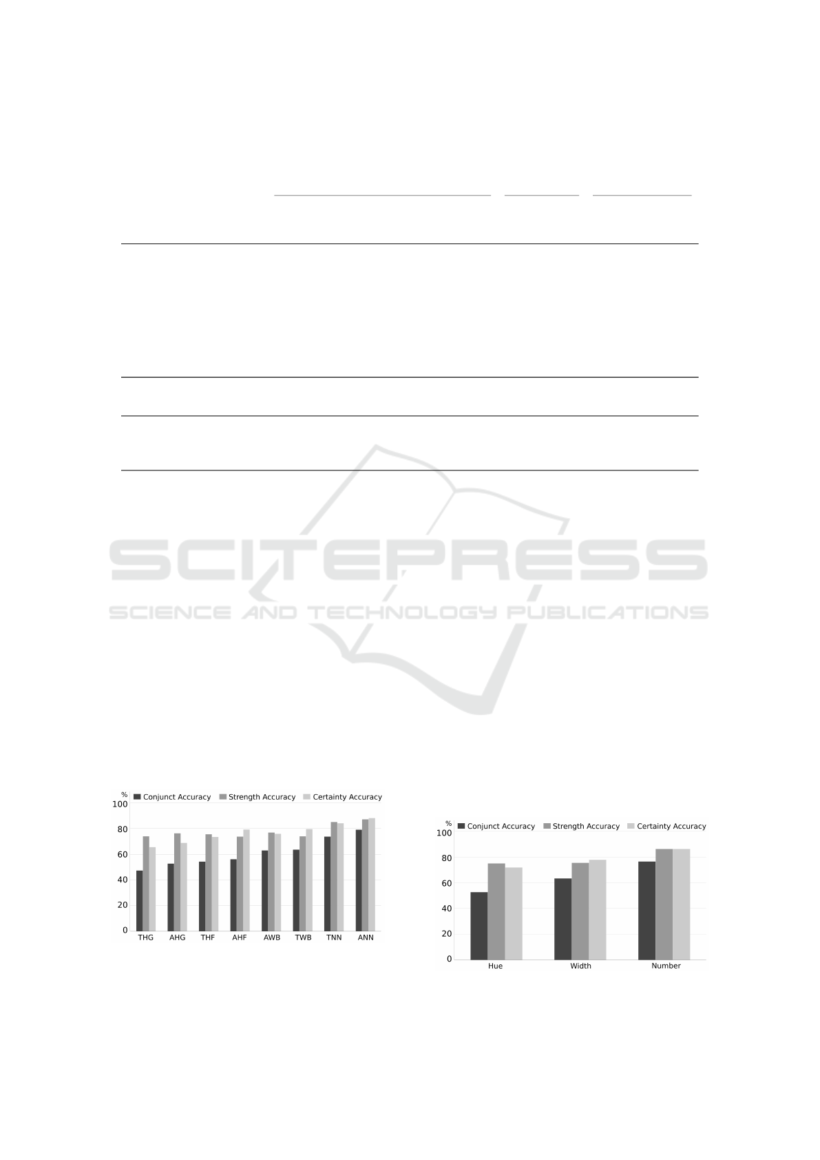
Table 1: Means for each depiction and visual cue in conjunct, direction, strength, certainty accuracies, understandability and
confidence ratings, and distance measures. Italicized measures had a significantly main effect on each independent variable. (A
= Arrow, B = Brightness, F = Fuzziness, G = Granularity, H = Hue, N = Number, T = Tapered, W = Width).
Lenient Accuracy Rating Distance
Independent
Variable
Cue
Conjuct
Accuracy
Direction
Accuracy
Strength
Accuracy
Certainty
Accuracy
Under-
stand-
ability
Confi-
dence
Strength
Distance
Certainty
Distance
Depiction THG 47.4% 93.5% 74.0% 65.5% 3.29 3.48 0.05 -0.04
THF 54.3% 96.9% 75.6% 73.5% 3.56 3.61 -0.05 0.10
TWB 63.6% 94.9% 74.0% 79.7% 3.65 3.74 -0.03 0.22
TNN 73.8% 96.9% 85.1% 84.2% 4.29 4.23 0.15 0.33
AHG 52.7% 92.6% 76.4% 68.9% 3.26 3.45 0.02 -0.16
AHF 56.2% 94.0% 73.7% 79.3% 3.42 3.55 -0.26 -0.26
AWB 63.1% 97.5% 77.0% 76.0% 3.83 3.80 0.25 0.12
ANN 79.2% 98.0% 87.3% 88.3% 4.28 4.30 0.12 0.06
Direction Tapered 59.4% 95.5% 73.4% 72.4% 3.70 3.77 0.03 0.15
Arrow 62.5% 95.5% 75.0% 74.5% 3.70 3.77 0.03 -0.05
Strength Hue 52.7% 94.2% 75.0% 71.9% 3.38 3.52 -0.06 -0.09
Width 63.4% 96.2% 75.5% 77.8% 3.74 3.77 0.10 0.17
Number 76.5% 97.4% 86.3% 86.3% 4.29 4.27 0.13 0.19
Certainty Granularity 50.1% 93.0% 75.2% 67.2% 3.27 3.46 0.04 -0.10
Fuzziness 55.3% 95.4% 74.7% 76.4% 3.49 3.58 -0.16 -0.08
Brightness 63.4% 96.2% 75.5% 77.8% 3.74 3.77 0.10 0.17
Number 76.5% 97.4% 86.3% 86.3% 4.29 4.27 0.13 0.19
As we analyzed the results, we found that 1529
treatments out of 1600 were correct in direction ques-
tions (95.5% on direction accuracy). In addition, 9
strength replies and 6 certainty replies were marked “I
don’t know” which left us with 1520 and 1523 treat-
ments for the strength and certainty analyses, respec-
tively. With conjunct accuracy analysis, we involved
incorrect direction replies in the analysis and marked
them incorrect, but took out “I don’t know” replies
from the strength and certainty cue questions, which
left us with 1587 treatments.
The results are presented in three blocks. The first
one, per depiction cue analysis, treated each depiction
Figure 4: Accuracy per depiction. Bars are or-
dered by ascending conjunct accuracy. (A=Arrow,
B=Brightness, F=Fuzziness, G=Granularity, H=Hue,
N=Number, T=Tapered, W=Width).
as an experimental level. The second, per strength cue,
and third, per certainty cue analyses, treated each of
the visual cue as a level. Since direction cue and query
type had no significant effect on any of the accuracies
and subjective ratings, we do not tackle them in the
following subsections. In addition, we performed a
post-hoc analysis using Bonferroni’s procedure which
indicated statistically significant difference between
groups described in this section.
5.1 Per Depiction Analysis
The accuracy and means on conjunct, direction,
strength, certainty accuracies, understandability, and
confidence ratings for each depiction are shown in Ta-
Figure 5: Accuracy in strength visual cues. Bars are ordered
by ascending conjunct accuracy.
Evaluating Multi-attributes on Cause and Effect Relationship Visualization
69
ble 1. We analyzed the effects of 8 depictions x 2 query
types with a two-factor ANOVA using SAS software
(non-normally distributed data was analyzed using al-
ternative tests). We detail significant main effects on
our measures in Tables 2 and 3.
Depiction had significant main effects on both of
the subjective ratings and all the accuracies except di-
rection accuracy. Depictions with numerical values
(ANN, TNN) significantly helped to increase the accu-
racy rates, understanding, and confidence of a cause
and effect relationship depiction. In conjunct accu-
racy, the depictions with numbers were significantly
higher than all other depictions. However, in strength
accuracy, tapered-number-number depiction was not
significantly different from tapered-width-brightness.
In fact, tapered-width-brightness (TWB) showed sig-
nificantly higher certainty accuracy than the depictions
with both hue and granularity (AHG, THG). Depic-
tions in arrow-hue-fuzziness (AHF) also showed sig-
nificantly higher certainty accuracy than the ones in
tapered-hue-granularity (THG). Especially with un-
derstandability, depictions in width-brightness (TWB,
AWB) were rated more understandable than the ones
in arrow-hue-granularity (AHG).
5.2 Per Strength Cue Analysis
The accuracy and means on conjunct, direction,
strength, certainty accuracies, understandability, and
confidence ratings for each strength cue are presented
in Table 1. Strength cue had significant main effects on
all accuracies and subjective ratings (ANOVA Tables 2
and 3). Overall, numerical cues supported higher accu-
racy than hue in our measures. Width was considered
more understandable and showed higher confidence
than hue. In direction accuracy, hue performed the
worst. In conjunct accuracy and both of the subjective
ratings, numerical cues showed higher accuracy and
preference than width, and the same was observed for
width over hue.
Figure 6: Accuracy in certainty visual cues. Bars are ordered
by ascending conjunct accuracy.
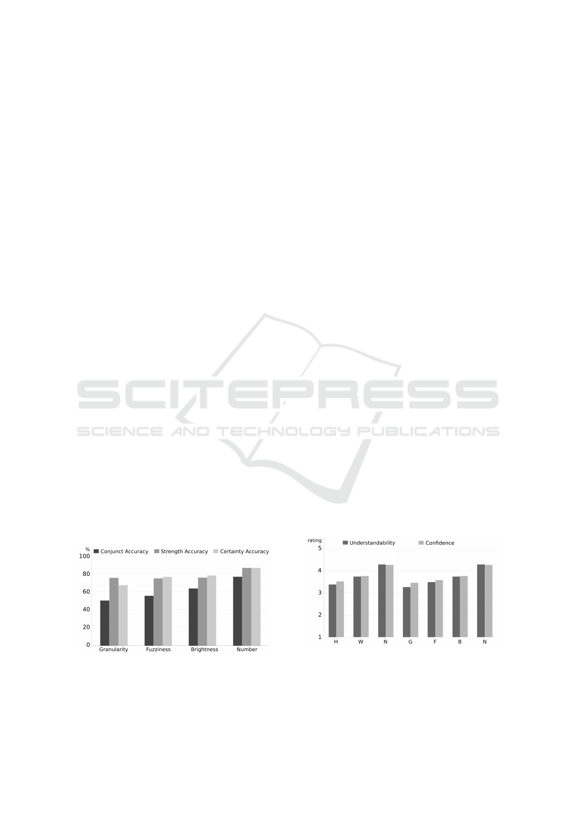
5.3 Per Certainty Cue Analysis
The accuracy and means on all accuracies and subjec-
tive ratings for each certainty cue are in Table 1.
Certainty cue had significant main effects on all ac-
curacies and subjective ratings (ANOVA Tables 2 and
3). In general, numerical cues showed significantly
higher accuracy and preference than others, while gran-
ularity presented the lowest. Moreover, brightness and
fuzziness supported higher accuracy and subjective rat-
ings than granularity. Numerical cues showed higher
accuracy than brightness, and brightness higher than
granularity in conjunct accuracy and confidence rating.
Direction accuracy showed the lowest with the granu-
larity cue. Especially with certainty accuracy, bright-
ness and fuzziness both performed more accurately
than granularity. In both subjective ratings, numerical
cues were rated higher than brightness, and brightness
higher than granularity. Fuzziness performed better
than granularity in certainty accuracy and in under-
standability rating.
5.4 Further Findings
5.4.1 Effects on Distance
Interestingly, as we analyzed our results, we found
some of the depictions and visual cues are significantly
under-estimated (rated lower than its ground truth) or
over-estimated (rated higher than its ground truth).
We name the difference between the participant reply
and ground truth (of strength and certainty’s rating)
as distance in this section (distance 0 means correct,
ranging from -4 to 4). We detail means on strength
distance and certainty distance in Table 1 and main
effects in Table 4. The reduced number of total counts
for both strength and certainty distance comes from
participant replies who marked "I don’t know" when
Figure 7: Average understandability and confidence ratings.
The first three visual cues to the left (H, W, N) correspond to
strength, whereas the last four to the right (G, F, B N) corre-
spond to certainty. Bars are ordered by ascending average
rating. (B=Brightness, F=Fuzziness, G=Granularity, H=Hue,
N=Number, W=Width).
IVAPP 2017 - International Conference on Information Visualization Theory and Applications
70
we asked strength (9 replies) and certainty questions
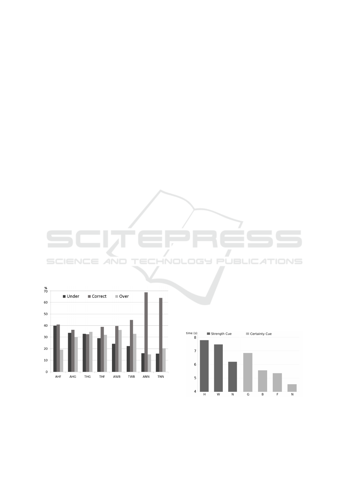
(6 replies). Figure 8 illustrates the under- and over-
estimated responses by depiction.
Depiction, strength cue, and certainty cue had sig-
nificant effects on strength distance. The arrow-width-
brightness (AWB) depiction was significantly over-
estimated compared with arrow-hue-fuzziness (AHF)
which was under-estimated. Depictions with hue were
mostly under-estimated.
Depiction, direction cue, strength cue, and cer-
tainty cue all had significant effects on certainty dis-
tance. Tapered-width-brightness (TWB) was highly
over-estimated compared with arrow-hue-fuzziness
(AHF) which was under-estimated. With direction
cue, depictions with a tapered edge was significantly
over-estimated than that with an arrow. Depictions
with brightness were over-estimated than that with
fuzziness and granularity.
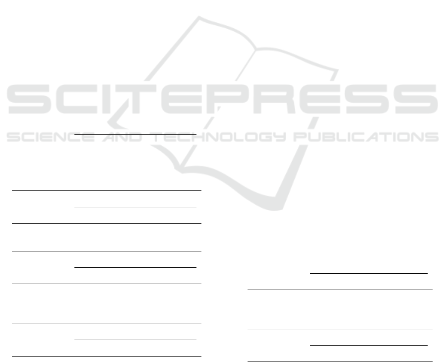
5.4.2 Effects on Trial Time
Strength cue had a significant main effect on trial
time taken for strength questions (
F
2,1528
= 3.45
, p =
0.0321), with means of 6.21s, 7.48s, and 7.85s for the
number, width, and hue visual cues respectively. Pair-
wise comparisons showed that participants took more
time with color than numerical cues on the strength
question. Certainty cue had significant main effect
on trial time for certainty questions (
F
3,1528
= 3.44
,
p = 0.0163), with means of 4.55s, 5.36s, 5.57s, and
6.89s for the number, fuzziness, brightness, and granu-
larity. It took longer time with granularity cues than
numerical cues on the certainty question.
Figure 8: Percentage (%) of under- (left) and over-
(right) estimated answers, and correct answers (mid-
dle) compared to the ground truth, grouped by depic-
tion. Bars are ordered by descending under-estimated.
(A=Arrow, B=Brightness, F=Fuzziness, G=Granularity,
H=Hue, N=Number, T=Tapered, W=Width).
6 DISCUSSION
The results of our user study clearly show that depic-
tions with numbers help understand cause and effect
relationships. Tapered edges perform well in finding
a direction, as previous results have shown for edges
in graphs ( Holten and van Wijk (2009); Holten et
al. (2011)). Comparing all visualizations regarding
accuracy, besides arrow-number-number, we find that
depictions using width and brightness (AWB, TWB)
perform as well as tapered-number-number (TNN) de-
piction, while depictions with hue and granularity are
not very supportive. Although we cannot exactly com-
pare the results from Guo et al. (2015) (since the
tasks were different), we find different results from
the depictions with hue and granularity in our study.
The differences may come not only from the task but
also from what they focus on considering high discrim-
inability in their study.
Moreover, pairwise comparisons show that depic-
tions with width have an advantage over hue in raising
the understandability and confidence ratings, and the
same applies to brightness over granularity in both
accuracy measure and subjective ratings.
We find that differing the scale with width is eas-
ier to distinguish than that of hue. In fact, we are
more used to width, length, height, and area to en-
code intensity than hue. This result supports previous
recommendations given in MacEachren et al. (2012),
where both size and transparency are given as potential
candidates to convey uncertainty associated to static
symbols (as nodes are).
We find brightness to be effective in perceiving un-
certainty in a cause and effect relationship. It showed
higher accuracy and preference. As in Kubí
ˇ
cek and
Šašinka (2011), the majority of the participants pre-
ferred lighter color for more uncertain information.
While brightness keeps the area to depict the different
scale, it may be that wider gaps in granularity hinders
Figure 9: Average time (s) taken for answering each cor-
responding visual cue. Bars are grouped by strength and
certainty cues, and are ordered by descending response
time. (B=Brightness, F=Fuzziness, G=Granularity, H=Hue,
N=Number, W=Width).
Evaluating Multi-attributes on Cause and Effect Relationship Visualization
71
better interpretation of (un)certainty.
In parallel, we found that depictions with hue and
granularity pairs show significantly lower accuracy
and preferences. Both depictions with hue-granularity
pairs (AHG, THG) showed lowest conjunct, strength,
certainty accuracies compared with depictions using
numerical cues (ANN, TNN). Especially in conjunct
accuracy, tapered-hue-granularity performed the worst
and significantly differed from depictions with numeri-
cal cues and in width-brightness pairs. We find that the
granularity cue is the main factor, not the width cue.
Strength cue had a significant difference on strength
accuracy only on numerical cues. On the other hand,
granularity performed the worst in all accuracies and
in both subjective ratings.
We found some gap between how well people per-
form and how much they think they understand the
visualizations and have confidence in their answers.
Given the strength cues, participants thought width
was more understandable and had higher confidence
in their choices than hue. In fact, there was no dif-
ference in strength accuracy between width and hue.
Although people preferred width than hue, both visual
cues worked similarly that coincides with a research
Table 2: Significant main effects on conjunct, direction,
strength, and certainty accuracy measures. (Ind. var. =
Independent variable).
ANOVA of conjunct accuracy
Ind. var. F p
depiction F
7,1586
= 10.28 p < .0001
strength cue F
2,1515
= 33.49 p < .0001
certainty cue F
3,1515
= 23.13 p < .0001
ANOVA of direction accuracy
Ind. var. F p
strength cue F
3,1599
= 3.60 p = 0.0277
certainty cue F
3,1599
= 3.29 p = 0.0201
ANOVA of strength accuracy
Ind. var. F p
depiction F
7,1519
= 3.19 p = 0.0024
strength cue F
2,1519
= 10.53 p < .0001
certainty cue F
3,1519
= 7.02 p = 0.0001
ANOVA of certainty accuracy
Ind. var. F p
depiction F
7,1522
= 6.35 p < .0001
strength cue F
2,1522
= 15.46 p < .0001
certainty cue F
3,1522
= 13.41 p < .0001
in other domain, e.g. Sanyal, Zhang, Bhattacharya,
Amburn, and Moorhead (2009), where size and color-
mapping performed reasonably well.
With the certainty cues, participants marked higher
understandability on brightness than fuzziness. In fact,
brightness and fuzziness showed no significant differ-
ence but only worked better than granularity. Overall,
this matches the general recommendation for maps
by MacEachren et al. (2005), suggesting that trans-
parent objects are better for uncertainty than opaque
objects. The results in Kubí
ˇ
cek and Šašinka (2011)
also showed that participants preferred lighter color
for more uncertain information over maps.
We found strong support for hypothesis 1 about
participants being able to decide causal direction with
both arrow and tapered visual cues. They both had
overall 95.5% of accuracy and had no significant ef-
fect on all accuracies and subjective ratings. We found
partial support for hypothesis 2. Width is more pre-
ferred in understandability and confidence than hue
but not necessarily in accuracy. Only in conjunct ac-
curacy, width outperformed hue. The analysis par-
tially supported hypothesis 3, that said that brightness
shows higher accuracy, understandability and confi-
dence than fuzziness and granularity on certainty influ-
ence. In general, the granularity cue did not perform
well and was not preferred either. When comparing
brightness and fuzziness, fuzziness was only rated
lower than brightness in the understandability measure.
This result seems to coincide with findings described
in MacEachren et al. (2012), where fuzziness worked
particularly well; as well as in bi-variate maps, where
Scholz and Lu (2014) showed that boundary fuzzi-
ness and color lightness were the most preferred visual
variables to represent uncertainty. We did not find any
support for hypothesis 4, i.e. an active question is more
comprehensible than a passive one. Query type had no
Table 3: Significant main effects on understandability and
confidence ratings. (Ind. var. = Independent variable).
ANOVA of understandability
Ind. var. F p
depiction F
7,1599
= 23.11 p < .0001
strength cue F
2,1599
= 75.62 p < .0001
certainty cue F
3,1599
= 52.73 p < .0001
ANOVA of confidence
Ind. var. F p
depiction F
7,1599
= 14.82 p < .0001
strength cue F
2,1599
= 50.63 p < .0001
certainty cue F
3,1599
= 34.39 p < .0001
IVAPP 2017 - International Conference on Information Visualization Theory and Applications
72

significant difference. Passive queries showed a ten-
dency of longer trial time and lower subjective ratings,
but active and passive query types did not affect any
of our measures.
Given the actual strength and certainty level with
numbers, we expected higher accuracy results. How-
ever, it was interesting to see that even when numerical
cues were given (controlled variable), the idea of level
mapping between a 100 scale to a 5 scale was not
well delivered. In future studies, we will carry out
pretests regarding level mapping tasks, to make sure
that participants understand what the numbers mean.
Otherwise, it may be easier to use only one scale to
deliver strength and certainty levels; for example, indi-
cate from 1 to 5 the strength levels that correspond to
a 1 to 5 Likert scale. However, we chose a 100 scales
in the current study, since we wanted to apply what
people usually use to express probability values.
Regarding to the task, we had to balance between
giving clues about the task and not revealing too much
information. We expected that participants can un-
derstand the task and perform accurately. Yet, some
of the accuracy results did not reach our expectations
and it can be improved. We can provide legends in
the stimuli as in other user studies. Otherwise, we
can make the experiment offline and ensure that peo-
ple understand the instructions – with the legends for
each representation. However, it is questionable if we
fully capture pure results on how people perceive the
depictions.
When we draw a cause and effect relationship,
most of us still use arrows, which seems to be very
conventional. According to Holten et al.’s
(
2011) re-
search results and ours, tapered works quite effectively
as well, even if this type of representation is not often
used. There are probably historical and educational
Table 4: Significant main effects on strength and certainty
distances. (Ind. var. = Independent variable).
ANOVA of strength distance
Ind. var. F p
depiction F
7,1519
= 2.50 p = 0.015
strength cue F
2,1519
= 3.48 p = 0.0311
certainty cue F
3,1519
= 3.66 p = 0.012
ANOVA of certainty distance
Ind. var. F p
depiction F
7,1522
= 3.56 p = 0.0008
direction cue F
1,1522
= 8.30 p = 0.004
strength cue F
2,1522
= 7.01 p = 0.0009
certainty cue F
3,1522
= 4.68 p = 0.0029
reasons for using arrows to depict causality, but it
would be interesting to investigate further why arrows
are so successful.
There are also other issues that were not consid-
ered in our study, such as the different equipment that
the participants used, for instance, differences in res-
olution, size or calibration of the screen, etc. But at
the same time, we acknowledge that it is impossible
to have all the devices or even the same device to be
perfectly calibrated in a real world setting. Color and
brightness also differ in terms of individual perception.
In addition, we used only one data set with a certain
number of objects and edges, further investigations
could focus on if these results apply for larger graphs.
7 LESSONS LEARNED FROM
OUR STUDY
Based on our results and discussion, the following de-
sign recommendations for representing causality with
associated strength and certainty can be extracted:
•
Arrows and tapered lines both help people decide
directions.
•
Depictions with brightness and fuzziness showed
higher accuracy and understandability rating than
granularity.
•
It is recommended to reconsider using granularity
since it showed lower accuracy and preference in
a cause and effect relationship.
We would like to highlight some of the results ob-
tained in this study that do not fully coincide with
previous work in this area. For instance, Holten et
al. (2011) showed that tapered edges dominates arrow,
however, our results show that both tapered and arrow
representations show very similar performance. Guo
et al. conclude in their study that hue-granularity and
width-brightness depictions do not have a significant
difference in accuracy which contradicts with our re-
sults. It may be that difference in tasks changes the
results, or that adding direction cue affects the interac-
tion among the visual cues.
8 CONCLUSION AND FUTURE
WORK
The evaluation presented in this paper investigates
which cause and effect relational depiction performs
better to perceive causal direction, strength level, and
certainty level. Even if we build upon previous studies
by Holten et al. (2011) and Guo et al. (2015), to the
Evaluating Multi-attributes on Cause and Effect Relationship Visualization
73

best of our knowledge, this study is unique since we
examine these three different variables.
We learned that tapered edges perform as well as
arrows for causal directions. Depictions with width
are preferred and rated higher than those with hue. De-
pictions with brightness and fuzziness showed higher
accuracy and understandability rating than granularity.
In general, depictions with hue and granularity should
be reconsidered to be used in causal representations.
Future work includes adding context to our de-
pictions and examining them with domain experts in
different application areas. It would be interesting to
see the effects of adding sequence, i.e., cause at the
top, effect at the bottom, and adding animated direc-
tion representations in a cause and effect relationship.
Another line of research is to investigate if the results
here presented are transferable to larger graphs.
ACKNOWLEDGMENTS
This research has been conducted within the "A
Big Data Analytics Framework for a Smart Society
(BIDAF 2014/32)" project, supported by the Swedish
Knowledge Foundation.
REFERENCES
Alimadadi Jani, S. (2013). Propagation of change and
visualization of causality in dependency structures
[Master thesis]. Simon Fraser University. British
Columbia, Canada.
Bisantz, A., Cao, D., Jenkins, M., Pennathur, M., P.and Farry,
Roth, E., Potter, S., & J., P. (2011). Comparing uncer-
tainty visualizations for a dynamic decision-making
task. In Journal of Cognitive Engineering and Deci-
sion Making 5(3) (pp. 277–293).
Bonneau, G.-P., Hege, H.-C., Johnson, C. R., Oliveira,
M. M., Potter, K., Rheingans, P., & Schultz, T. (2014).
Overview and state-of-the-art of uncertainty visual-
ization. In C. D. Hansen, M. Chen, C. R. Johnson,
A. E. Kaufman, & H. Hagen (Eds.), Scientific visu-
alization: Uncertainty, multifield, biomedical, and
scalable visualization (pp. 3–27). London: Springer
London.
Chen, M., Trefethen, A., Bañares Alcántara, R., Jirotka, M.,
Coecke, B., Ertl, T., & Schmidt, A. (2011). From
data analysis and visualization to causality discovery.
In Computer, 44(10) (pp. 84–87).
Elmqvist, N., & Tsigas, P. (2003). Growing squares: Ani-
mated visualization of causal relations. In Proceed-
ings of the 2003 ACM Symposium on Software Visu-
alization (pp. 17–26).
Fruchterman, T. M., & Reingold, E. M. (1991). Graph draw-
ing by force-directed placement. Software: Practice
and Experience, 21(11), 1129–1164.
Ghoniem, M., Fekete, J.-D., & Castagliola, P. (2004). A
comparison of the readability of graphs using node-
link and matrix-based representations. In Proc. of the
4th IEEE Symposium on Information Visualization
(INFOVIS’04) (p. 17-24).
Guo, H., Huang, J., & Laidlaw, D. (2015). Representing un-
certainty in graph edges: An evaluation of paired vi-
sual variables. In IEEE Transactions on Visualization
and Computer Graphics, 21(10) (pp. 1173–1186).
Holten, D., Isenberg, P., Van Wijk, J., & Fekete, J. (2011).
An extended evaluation of the readability of tapered,
animated, and textured directed-edge representations
in node-link graphs. In In 2011 IEEE Pacific Visual-
ization Symposium (pp. 195–202).
Holten, D., & van Wijk, J. (2009). A user study on visualiz-
ing directed edges in graphs. In In Proceedings of the
SIGCHI Conference on Human Factors in Computing
Systems (pp. 2299–2308).
Kadaba, N. R., Irani, P. P., & Leboe, J. (2007). Visualizing
causal semantics using animations. IEEE Transac-
tions on Visualization and Computer Graphics, 13(6),
1254-1261.
Kubí
ˇ
cek, P., & Šašinka,
ˇ
C. (2011). Thematic uncertainty
visualization usability–comparison of basic methods.
Annals of GIS, 17(4), 253–263.
MacEachren, A. M., Robinson, A., Hopper, S., Gardner,
S., Murray, R., Gahegan, M., & Hetzler, E. (2005).
Visualizing geospatial information uncertainty: What
we know and what we need to know. Cartography and
Geographic Information Science, 32(3), 139–160.
MacEachren, A. M., Roth, R. E., O’Brien, J., Li, B., Swing-
ley, D., & Gahegan, M. (2012). Visual semiotics &
uncertainty visualization: An empirical study. IEEE
Transactions on Visualization and Computer Graph-
ics, 18(12), 2496–2505.
Pane, J. F., Corbett, A. T., & John, B. E. (1996). Assessing
dynamics in computer-based instruction. In Proc. of
the SIGCHI Conference on Human Factors in Com-
puting Systems (pp. 197–204).
Potter, K., Rosen, P., & Johnson, C. R. (2012). From quan-
tification to visualization: A taxonomy of uncertainty
visualization approaches. In Uncertainty Quantifica-
tion in Scientific Computing (pp. 226–249). Springer.
Sanyal, J., Zhang, S., Bhattacharya, G., Amburn, P., & Moor-
head, R. (2009). A user study to compare four uncer-
tainty visualization methods for 1D and 2D datasets.
IEEE Trans. on Visualization and Computer Graph-
ics, 15, 1209–1218.
Scholz, R. W., & Lu, Y. (2014). Uncertainty in geographic
data on bivariate maps: An examination of visualiza-
tion preference and decision making. ISPRS Interna-
tional Journal of Geo-Information, 3(4), 1180–1197.
Tversky, B., Morrison, J. B., & Betrancourt, M. (2002).
Animation: can it facilitate? International Journal of
Human-Computer Studies, 57(4), 247–262.
Wang, J., & Mueller, K. (2016). The visual causality ana-
lyst: An interactive interface for causal reasoning. In
IEEE Transactions on Visualization and Computer
Graphics, 22(1) (pp. 230–239).
Zuk, T., & Carpendale, S. (2006). Theoretical analysis
of uncertainty visualizations. In Proceedings of the
SPIE-VDA (Vol. 6060).
IVAPP 2017 - International Conference on Information Visualization Theory and Applications
74
