
Unsupervised Electrodermal Data Analysis Comparison between Biopac
and Empatica E4 Data Collection Platforms
Kassy Raymond and Andrew Hamilton-Wright
a
School of Computer Science, University of Guelph, Guelph, Ontario, Canada
Keywords:
Clustering, Quality Metrics, Biosignal Analysis, Unsupervised Machine-learning, Data Analytics.
Abstract:
Unsupervised learning algorithms are valuable for exploring a variety of data domains. In this paper we
compare the efficacy of the k-means and DBSCAN algorithms in the context of discerning structure in elec-
trodermal data obtained using two different collection modalities for simultaneously collected data: the “gold
standard” Biopac data platform and the wearable Empatica E4. Insights into the structure of the data from
each system are provided, as is an analysis of the performance of each clustering algorithm at identifying
interesting structure within the data.
1 INTRODUCTION
Electrodermal activity (EDA) is a psychophysiologi-
cal index that is used as a measure of arousal in the
sympathetic nervous system and thus as an indicator
of whether an individual is eliciting a physiological
response to stress. In laboratory settings, EDA can
be measured using electrodes adhered to the skin us-
ing isotonic paste, such as those offered by Biopac
(Biopac, 2019) or through a wrist wearable such as
the Empatica E4 (Empatica, 2020). While adhered
electrodes are considered the “gold standard” acqui-
sition device, it is unknown whether similar insights
can be drawn from signals acquired from the E4 using
an unsupervised machine learning approach.
We compare the data available through these two
collection protocols as analyzed through a variety of
sample window lengths, and using two different clus-
tering techniques: k-means and Density-based Spatial
Clustering of Applications with Noise, or DBSCAN
(Ester et al., 1996; Sander et al., 1998). Using these
techniques, we evaluate the ability to discern structure
within a data set collected using the Biopac and E4
modalities at the University of Guelph by Dr. Kristal
Thomassin’s Child Emotion and Mental Health Lab.
When this data was collected, the labels defin-
ing the activity regions were lost, resulting in a prob-
lem of reassigning labels based purely on the struc-
ture found using unsupervised techniques. This work
explores the success of determining structure in this
challenging scenario, and through heatmaps, show-
cases the discovered data structure.
a
https://orcid.org/0000-0002-7459-656X
2 BACKGROUND
Electrodermal Activity (EDA) is a measure of the ac-
tivation of sweat glands through changes in conduc-
tivity of the skin due to variations in sweat secretion,
typically obtained using Ag/AgCl (silver/silver chlo-
ride) electrodes (Cecchi et al., 2020; Posada-Quintero
and Chon, 2020; Lowry, 1977).
Data for this study were simultaneously obtained
using two different collection platforms. The first
is the research industry standard biosignal acquisi-
tion device, Biopac, which uses electrodes attached to
belt-mounted transceivers in order to collect its data.
The second is the Empatica E4, which is a research
grade wrist mounted wearable device, which is both
cheaper and simpler to attach. We will refer to this
device simply as the E4 in this work.
2.1 EDA Data
EDA signals consist of two main components: the
tonic component termed SCL for “Skin Conductance
Level” (SCL) and the phasic component – SCR for
“Skin Conductance Response” (Boucsein, 2012).
The SCL, or tonic component of the signal, is
the low frequency component of the signal, identi-
fied by the “baseline,” or the general shape of the sig-
nal (Boucsein, 2012; Cho et al., 2017). SCL activ-
ity is generally independent of environmental stimuli;
while SCL activity can slowly increase during periods
of emotional arousal, homeostasis and overall mois-
ture content of the skin are the main drivers of SCL
activity (Boucsein, 2012).
The SCR is associated with the activity of the
Raymond, K. and Hamilton-Wright, A.
Unsupervised Electrodermal Data Analysis Comparison between Biopac and Empatica E4 Data Collection Platforms.
DOI: 10.5220/0011271800003269
In Proceedings of the 11th International Conference on Data Science, Technology and Applications (DATA 2022), pages 345-352
ISBN: 978-989-758-583-8; ISSN: 2184-285X
Copyright
c
2022 by SCITEPRESS – Science and Technology Publications, Lda. All rights reserved
345

eccrine sweat glands located in the dermis of the
skin which are stimulated by the sympathetic ner-
vous system via cholinergic neural pathways during
stress or activity (Schmelz et al., 1998; Millington
and Graham-Brown, 2010; Charmandari et al., 2005;
Benedek and Kaernbach, 2010; Chen et al., 2020).
The SCL and SCR traces can be produced us-
ing deconvolution via the cvxEDA algorithm (Greco
et al., 2016), which is implemented and made publicly
available within Neurokit2, an open source Python
package (Makowski et al., 2020). Using these tools in
combination with the pyphysio toolkit (Bizzego et al.,
2019), it is relatively simple to separate EDA data into
source traces and accompanying measures of the am-
plitude and rate of observed pulses within the signal.
It is therefore of interest to characterize the changes
in measured skin response, both SCL and SCR, in or-
der to obtain insight into the level of stress (Boucsein,
2012). We therefore are interested in analytical tools
that examine the structure of such data.
2.2 Analytical Tools
In order to assess the free-form, unlabelled data col-
lected by Dr. Thomassin’s lab, we turn to unsuper-
vised learning (clustering) tools. Our tools of inter-
est here are the well-understood k-means clustering
(MacQueen, 1965), and Density-Based Spatial Clus-
tering of Applications with Noise, or DBSCAN (Ester
et al., 1996; Sander et al., 1998).
The k-means algorithm simply defines a cluster by
the location of its centre, and the data is assumed to
form a “Gaussian ball” radiating symmetrically out
from this point in all directions. The k-means algo-
rithm produces a centroidal Voronoi Tesselation (Du
et al., 1999) in which cluster region boundaries are de-
fined by straight lines or planes of intersection where
the two Gaussian “balls” meet, much like two soap
bubbles that get joined together.
The DBSCAN algorithm, on the other hand, aims
to identify areas of high density that are separated by
areas of low density in a feature space, without mak-
ing any a priori assumptions about the shape of the
cluster or its relative position with respect to other
clusters. DBSCAN is especially effective for feature
spaces with arbitrary and/or asymmetrical shapes as
its definition of the cluster region follows the topol-
ogy of the densest portions of the cluster body.
Because DBSCAN is concerned with density, it
is imperative to be able to quantify and define the pa-
rameters related to density, such as a “dense area,” and
“density at a point” (Ester et al., 1996). “Density at a
point” is defined as the number of points within a cir-
cle of radius ε from a given point, P. A “dense area”
is defined by a minimum number of points (MinPts),
where each P in a cluster must contain MinPts within
its radius ε. MinPts and ε are the only input parame-
ters needed for DBSCAN. Unlike k-means, for which
the number of clusters is a parameter that must be
determined in advance, DBSCAN selects the optimal
number of clusters based on these values.
3 METHODS
EDA data was collected from 43 healthy undergradu-
ate students at the University of Guelph who voluntar-
ily participated in the study. The mean age of the par-
ticipants was 18.87 (SD = 0.88). 15 of the participants
were male, 27 were female and one was non-binary.
The study protocol, which was authorized by the
University of Guelph Research Ethics Board, con-
sisted of: 3 minutes sitting quietly; the Trier Social
Stress Test (Kirschbaum et al., 1993) to elicit stress; 3
minutes to prepare for a mock job interview, followed
by 5 minutes for the interview itself; a 5 minute arith-
metic task involving counting down from 1022 in in-
crements of 13 as quickly as possible; 1 minute for
completion of a PANAS survey (Watson et al., 1988);
a 5 minute recovery period.
This data provides a mixture of high and lower
stress responses obtained from participants wearing
the E4 on their dominant wrist and using a standard
placement for Biopac electrodes on the non-dominant
hand, chest and stomach. Participants placed the elec-
trodes themselves for reasons of privacy.
The data for nine participants was removed from
the study due to recording problems, resulting in 34
collections available for analysis. The remaining data
was then separated into SCL and SCR traces using the
tools described above.
3.1 Windowing
The effect of the size of a windowing protocol on the
ability of the clustering algorithms to extract infor-
mation was studied. In order to evaluate the effect
of window size, each signal for each participant was
separated into overlapping windows with a window
length (WL) of 3, 5, 10, 30, 45, 60, 90 and 120 sec-
onds. The step in the window varied depending on
the length of the window; the overlap was half of the
length of the window in all cases.
Within each window, the following features were
obtained using pyphysio from the phasic EDA sig-
nal:mean, standard deviation, range, peak mean, peak
maximum, peak minimum, number of peaks, dura-
tion mean, slope mean, and area under curve (AUC).
DATA 2022 - 11th International Conference on Data Science, Technology and Applications
346

The “phasic” values were calculated by first identify-
ing each peak (i.e.; each phase) in the signal window,
and then calculating the value over this set of identi-
fied peaks. Area under the curve is the integral of the
signal, calculated by the sum of the absolute values of
each sample (i.e.; the sum of the “rectified signal”).
3.2 Input Data Set Construction
Data was considered in the following groupings:
DS1a: for each window length, data from all partici-
pants by device: this gives 8 window lengths each
for Biopac and E4
DS1b: the same data, but using pooled analysis and
data display: all data combined (across window
length and acquisition devices) — this allow plot-
ting on common axes
DS2a: as in DS1a, however with participant 15 re-
moved (see discussion below)
DS2b: as in DS1b with participant 15 removed
PCA was conducted on all datasets described above.
To determine the optimal number of components, the
explained variance in each of the principal compo-
nents was calculated, and the number of components
required to explain 99% of the variance was used.
PCA is also used to obtain a two-dimensional pro-
jection used in plotting below.
3.3 Clustering
To determine the suitability of clustering algorithms,
DS1a data were clustered with DBSCAN and k-
means for each collection modality and window
length. An “elbow” plot was used to determine the
optimal k for each data set, selecting the point of max-
imum curvature. Silhouette plots were also consid-
ered, however instabilities in the clusters created by
k-means made these unusable—an early tell regard-
ing the limitations of k-means.
To calculate ε, an “elbow” was again used as is
common practice (Ester et al., 1996). MinPts was cal-
culated using the heuristic suggested by (Sander et al.,
1998) where MinPts equals the dimensions of the
dataset multiplied by two. This approach was taken
in attempts to remain consistent across the datasets
for each device and window length.
The cluster assignments were evaluated by plot-
ting the assignments for each datasets with a scatter
plot where the axes represented the principal compo-
nents calculated with DS1b (i.e.; using common co-
ordinates). The plots were visually assessed to deter-
mine which algorithm was most suitable for the data;
this included comparing the structure of the clusters,
identifying logical clusters and discussing the ability
for the algorithms to logically cluster points that ap-
peared sparsely distributed in the feature space (i.e.,
identify noise points).
To determine which participants were expressed
in each cluster, the number of points in each cluster
corresponding to each participant were tallied. This
gives an indication of whether the information con-
tent across all signals from all participants were be-
ing clustered or whether the signals of an entire par-
ticipants were being clustered. While it is expected
that stressful and baseline events should exhibit dif-
ferent patterns in the signals, there could be variation
in whole signals between participants. For all window
lengths and each device, the cluster assignments for
each participant were plotted in a time-series heatmap
to visually interpret which portions of the signal cor-
responded to each cluster.
4 RESULTS AND ANALYSIS
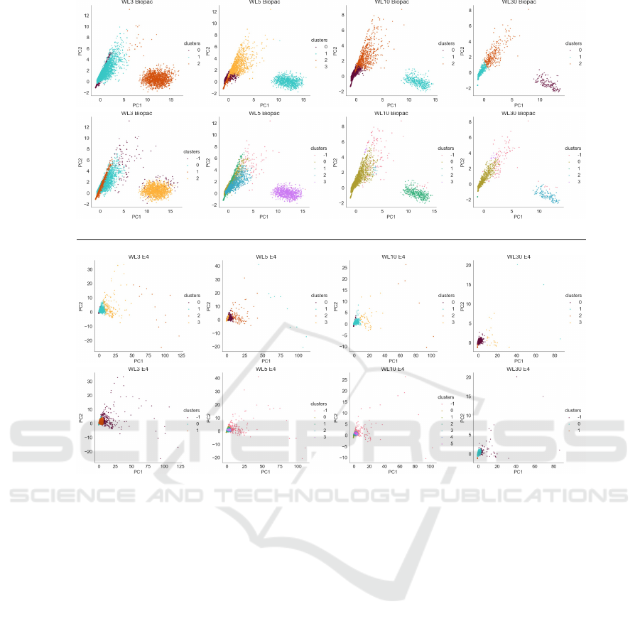
Fig. 1 displays scatter plots of the cluster category la-
bels as shown plotted across the two most principal
axes calculated on a PCA decomposition of data set
DS2b. As both collection modalities are grouped, this
provides common axes for each window.
Immediately apparent in Fig. 1 is that the axes are
stable across windows, as shown by the common lay-
out of the scatter plots. The differing label colours
used are simply a function of which label was as-
signed first in each clustering algorithm, so colour is
independent between plots.
The straight-line divisions shown in the k-means
plots that cut across clouds of data are a limitation of
the k-means algorithm, and the ability of DBSCAN
to extract features such as the line forming a lead-
ing edge of the leftmost spray of points in the Biopac
data is a show of the relative ability of this high-
performing algorithm to extract meaningful structure
based on density.
The similarity of all of the plots within a given col-
lection modality (Biopac, E4) but the distinct struc-
ture between modalities indicates that there are signif-
icant differences between these collection framework
data distributions.
Fig. 2 shows select heatmaps displaying the asso-
ciation of a cluster category in coloured patches ar-
ranged over time (x-axis) for each participant (rows
down the y-axis). Plots are then repeated in columns
for each data modality showing the results for rep-
resentative window length (WL) of {3, 10, 45, 90}.
(Other lengths are similar, and omitted due to space
constraints.)
While these images are tiny, this is only in part
Unsupervised Electrodermal Data Analysis Comparison between Biopac and Empatica E4 Data Collection Platforms
347
Biopac
k-means
DBSCAN
E4
k-means
DBSCAN
WL=3 WL=5 WL=10 WL=30
Figure 1: Scatter plot data for dataset DS2b.
because of the space limitations of the paper, and
is intended to present the user with a “small multi-
ples” presentation of the important data as champi-
oned in Edward Tufte’s famous book (Tufte, 1991,
pp. 67). Using the small multiples technique, com-
monalities among the repeated visual representations
can be comprehended at once, and the signature dif-
ferences between the similar representations become
easily apparent.
Regardless of the small size of the graphic ele-
ments in Fig. 2, the presence of an outlying cluster-
ing categorization is readily visible in the first row
(Biopac data) as a horizontal bar roughly half-way
through the heatmaps that appears as a strikingly dif-
ferently coloured band. This band is the data belong-
ing to participant 15, and it corresponds to the ex-
tremely short band in the E4 data in the second row.
Also of note is participant 12, which appears as a
similarly distinct band in the E4 data—this band is
most notable in WL=10 and WL=90 where it is lighter
coloured than the label chosen for the bulk of the data.
As noted above, colour is related only to the la-
bel within a plot, and colours between plots can be
exchanged without implying anything.
The ability to discern this within this small-
multiples setup shows the strength of this heatmap
based strategy as a means of identifying overall struc-
ture.
The anomalous data associated with problematic
participants 12 and 15 was confirmed in analysis of
PCA based scatter-plotting of DS1b data of Fig. 1
where the signal from participant 15 forms its own
cluster. In Fig. 1 this is the oval cloud shown on the
right of each Biopac plot, which is markedly distinct
from the fan shaped spray describing the data of the
other participants.
The presence of these extreme outlying classes
obfuscates the structure of the bulk of the data, how-
ever, so we continue with participant 15 and 12 omit-
ted. Upon re-clustering the data and replotting, we
obtain the plots shown in Fig. 3.
The heatmaps in both Figs. 2 and 3 show vertical
DATA 2022 - 11th International Conference on Data Science, Technology and Applications
348

WL Biopac E4
3
10
45
90
Figure 2: Heatmap data for dataset DS1a (all participants).
banding through the middle of the maps. This is par-
ticularly visible in the E4 data at WL=5 and 10, and
remains visible up through higher window lengths,
however with less definition. These bands correspond
to the periods in the signal at which the high-stress
activities are present, and indicate that, especially in
the E4 data, these stress measures are structurally dif-
ferent than the non-stress periods.
Note that this vertical banding is not as apparent
in the Biopac data, though it is striking in the E4 data.
4.1 Choice of Clustering Algorithm
Clustering with DBSCAN results in logical clusters
while k-means finds multiple clusters in a single logi-
cal cluster as indicated in Fig. 1 window length 45.
DBSCAN was able to recognize outlying points in
the “right hand cloud”. k-means appears to have sim-
ply “sliced-up” the range in values; it is typical for
k-means to find divisions in data values simply be-
cause that is how the algorithm was designed. This
is trend is apparent in all Biopac scatter plots shown
in Fig. 1; notably in window lengths 30, 45, 60, 90
and 120). The behaviour of k-means isn’t as obvi-
ous in E4 due to the dense structure of the scatter plot
WL Biopac E4
3
10
45
90
Figure 3: Heatmap data for dataset DS2a (participants
12, 15 excluded).
clusters. However, the limitations of k-means are re-
vealed in plots for window lengths 60, 90 and 120.
Again, compared to the clusters identified by DB-
SCAN, k-means provides a less logical cluster struc-
ture. Further, across all window lengths and with E4
and Biopac, DBSCAN successfully identifies noise
points, which are “floating” points that are separate
from the main clusters identified in the space, while k-
means groups these points into pre-existing clusters.
k-means is limited due to the “Gaussian ball” as-
sumption of spherical symmetry. The straight-line di-
visions visible in some of the k-means plots are also a
direct result of the Gaussian ball. Viewed in Fig. 1
these are what cause the straight lines dividing re-
gions, as are seen in where the orange and brown
points are separated by what appears to be a straight
line. The features calculated from this data are subject
to different degrees of variability in noise or outliers.
For example, the number of peaks and the phasic stan-
dard deviation have no a priori reason to vary in the
same way due to noise, which is an assumption in the
Gaussian ball. Determining the k input value for the
k-means algorithm also highlighted the difficulty of
selecting input variables for unsupervised learning al-
Unsupervised Electrodermal Data Analysis Comparison between Biopac and Empatica E4 Data Collection Platforms
349

gorithms.
Visual assessment of the DBSCAN clusters re-
sulted in a logical clustering structure and the ability
to isolate noise, deeming DBSCAN a suitable algo-
rithm for the proceeding experiments conducted. In
spite of the continued popularity of the simpler k-
means algorithm, we recommend DBSCAN for its su-
perior handling of the complexity of the electrodermal
data examined here.
4.2 Structure Revealed
It is through the time series heatmaps and graphs of
cluster assignments that the signals between each ac-
quisition device are compared and that structure in the
data are revealed. Larger window lengths (60, 90 and
120) provide a more concrete basis for understanding
signal-based analyses such as the separation of base-
line and stressful tasks.
When the input data from Biopac and E4 were
clustered together with DBSCAN, the majority of the
data from each acquisition device was clustered to-
gether. This indicates that the regions of the signals
acquired from both Biopac and E4, across all win-
dow lengths, exhibit enough similarly for DBSCAN
to cluster these regions together. Biopac data does
form unique clusters that are not populated any E4
data points when clustered with feature data calcu-
lated with window lengths of 3, 5, 10, 30 and 60.
Although differences in electrodermal activity signals
may exist between Biopac and E4, in machine learn-
ing experiments where the interest is focused around
class identification (such as identifying stressful and
non-stressful tasks), even with differing signals, each
may be able to identify stressful and baseline tasks
just perhaps not in the same ways.
The structures of the cluster scatter plots are visi-
bly different, indicating a differing structure of data
between E4 and Biopac (Fig. 2). However, when
problematic participants were dropped, the structure
of Biopac clusters more closely resembled that of E4
(Fig. 3).
Notably, the absence of the cluster visible on the
right side of the Biopac scatter plots of Fig. 1 indicates
that this cluster was largely populated by the data of
the signals of these participants, and the data is of dif-
ferent structure than the remainder of the signals in
the space. The absence of this cluster in E4 in general
indicates that signals identified in problematic partici-
pants differs from that of Biopac. Identification of this
cluster through this data analysis is therefore valuable
as a means of improving data quality.
The presence of regular and identifiable blocking
of cluster assignments across the signal of each par-
ticipant when clustered with window lengths 60, 90
and 120, as displayed in time-series heatmaps, im-
plies support using clustering techniques as a way of
identifying structure in electrodermal data, even in the
absence of labels.
Clusters -1 and 1 rarely occur during the begin-
ning the signal. Following this period of transition to
cluster -1 is identified which appears in blocks, with
deviations back to Cluster 1 and 0. The periodicity is
not consistent across all participants but can be clearly
identified in participants 2, 5, 8, 10, 16, 17, 18, 23,
28, 29, 31 and 37. In participants displaying the pe-
riodic transitions, the noise cluster is often the cluster
that appears in the middle section of the signal. This
portion is where the stress period is expected. While
DBSCAN identifies this portion as noise, the portion
of the signal may not be noise in the technical sense.
Variations in the degree of stress and physiological
response to stress are expected so these differences
may be identified as “noise” by the algorithm rather
than having unique, dense clusters for stressful events
across all participants.
In spite of these sources of vagueness, the pres-
ence of these regions of signal on the plots do sup-
port the idea that there are observable differences in
the clustering assignment due to stress and non-stress.
Further, the fact that there are similar banding struc-
tures in both Biopac and in E4 data indicate that sim-
ilar structure is present in both experimental modali-
ties, though not manifest in the same way. If anything,
the “banding” effect present in the E4 data presented
in both Figs. 2 and 3 is more visually discernible than
in the Biopac data of the same figures. Contrasting
the plots in Figure 4.6 with their E4 counterparts in
Figure 4.8 shows a clear on/off/on progression in E4
that is evident only as a lead-in period in one class fol-
lowed by relatively unstructured data after the lead-in
point.
This is particular interesting in light of the fact
that Biopac is the gold-standard platform for this type
of data collection. The presence of this more visible
structure using the E4 sensor implies that this attrac-
tive wearable data collection platform contains data
relevant to the stress/non-stress discernment problem.
4.3 Window Length
At a higher window length (WL=60, 90 or 120 sec-
onds), the results suggest that it is possible that unsu-
pervised learning, specifically DBSCAN, may be able
to separate baseline and stressful tasks in spite of the
lack of labels in the source data.
As DBSCAN provides superior clustering per-
formance for this problem, as noted above, we will
DATA 2022 - 11th International Conference on Data Science, Technology and Applications
350

only consider DBSCAN based windowing. Window
length is oftentimes overlooked when designing ex-
periments, however, selecting an appropriate window
length to capture the type of information in a sig-
nal impacts the overall result of the ability to iden-
tify structure, whether it be noise, or stressful versus
baseline periods in the signal.
The cluster structure changes as the window
length is adjusted in both Biopac and E4 data (Figs. 2
and 3). The clusters become more dense as the win-
dow length increases, with fewer noise points pop-
ulating the outer regions of the plots. The change
in dispersion in the layout of the points among the
various window lengths is most pronounced in the
Biopac plots. This change in structure could be due
to the fact that the sample size decreases as the win-
dow length increases. However, the absence of the
green cluster in Biopac plots in window lengths 10
and above indicates that the feature vectors carry dif-
ferent information content at higher window lengths
and that the data from these points have been incorpo-
rated into the longer sequences. Similarly, the struc-
ture of E4 clusters at a window length of 30 and above
is much different than at the lower window lengths;
the smaller clusters are clustered into one. Again, this
indicates that the structure of the data is contingent on
the window length selected. It is quite likely that win-
dow lengths of 3, 5 and 10 are too small to capture
the physiological information provided by the pha-
sic electrodermal response to stress for a signal level
analysis.
Phasic electrodermal activity peaks have the fol-
lowing components: latency, rise time and half recov-
ery time, each which are expected to take 1-3 seconds
(Iveta et al., 2015). Therefore, a window length of 3
or 5 would likely only capture a segment of the full
peak. Event-based signal processing problems would
benefit from a smaller window length as these anal-
yses are concerned with identifying specific points
in the signal. However, whole signal analysis, such
as identifying larger regions of the signal as associ-
ated with a period of physiological arousal, require
a larger window length. The window length must
capture enough of the signal to determine whether re-
gions have enough peaks to differ based on the state
of arousal the participant is in. This idea is exempli-
fied in time-series heatmaps for window lengths 3 and
5 for both Biopac and E4 (Figs. 2 and 3) where the
heatmaps exhibit a “bar coding” visualization effect;
parallel windows are assigned to a different cluster,
rather than to the same cluster. This is particularly
apparent in the middle of the signal where, based on
the experimental protocol, the stress response would
be elicited and phasic peaks would occur. Therefore,
the clustering algorithm is likely clustering the differ-
ent components of the phasic peaks during this period,
clustering the latent and recovery periods with regions
of the signal that are associated with non-stressful or
baseline periods.
The identification of atypical signals is less sensi-
tive to the size of the window length in noisy signals
that exhibit drift and dense phasic peaks throughout
the entire signal. At all window lengths participant 15
from dataset DS1Biopac was visibly different than the
rest of the participants used in the analysis (Fig. 2).
The discussion and findings of the window
length’s effect on the structure of feature data used in
this paper highlights the importance of understanding
the context of data used in machine learning experi-
ments and identifying an appropriate window length
for a signal-based or event-based analysis. Further, an
understanding of the context of the physiological pro-
cess of interest can yield a more interpretable analysis
and thus a greater understanding of the effects of input
parameters on the behaviour of algorithms used.
4.4 Heatmaps for Visualizing DBSCAN
Cluster Assignments in Time Series
The heatmap DBSCAN cluster assignment plots,
plotted as a time-series for each participant were an
effective measure to draw insights about how clus-
ters were being assigned across the signal, for each
participant, for each window length. In future stud-
ies, the visualization strategy of cluster assignments
can be enhanced by used fixed colours between clus-
ter scatter plots and heatmaps in order to more easily
associate the scatter plots to the heatmap assignments.
4.5 Reflection of Datasets Used
The limitations of the dataset used are not an anomaly
in research; data scientists are often provided datasets
that are “messy” or with information missing about
how the data were collected or accessed. However,
this paper demonstrates that valuable insights can be
drawn from data of seemingly low quality. These in-
sights are not limited to the conclusions drawn thus
far; exploratory data analysis can bring to light the
importance of stringent research practices and provide
teams with issues in their practices that may otherwise
have not been apparent to them.
5 CONCLUSION
Unsupervised learning proved to be an effective ap-
proach to understanding the structure of EDA data
Unsupervised Electrodermal Data Analysis Comparison between Biopac and Empatica E4 Data Collection Platforms
351

when coupled with a time-series heatmap visualiza-
tion approach. The structure of the data was investi-
gated through clustering with k means and DBSCAN,
revealing that the structure of the data in both Biopac
and E4 were more suitable for DBSCAN, which is
robust to noise.
This demonstrates the ability of clustering to be
used to discover and characterize data structure even
when labels pertaining to activity descriptions are
missing, as was the case with this data.
Clustering with different sized window lengths
had a stark impact on the structure of 81 the data in
both Biopac and E4; at a higher window length (90
and 120 seconds), the data of two participants was
flagged (the entire signal was clustered in a single
cluster, or was visually very different than the remain-
ing participants) and determined unusable.
ACKNOWLEDGEMENTS
We thank Dr. Kristal Thomassin and her students
for the use of the data from the Child Emotion
and Mental Health Lab at the University of Guelph
(https://www.childemotionlab.ca).
REFERENCES
Benedek, M. and Kaernbach, C. (2010). Decomposition of
skin conductance data by means of nonnegative de-
convolution. Psychophysiology.
Biopac (2019). EDA introductory guide. Technical Report
EDA Guide, Biopac Systems Inc., Goleta, California,
USA.
Bizzego, A., Battisti, A., Gabrieli, G., Esposito, G., and
Furlanello, C. (2019). pyphysio: A physiological sig-
nal processing library for data science approaches in
physiology. SoftwareX, 10:100287.
Boucsein, W. (2012). Electrodermal Activity. Springer Sci-
ence & Business Media.
Cecchi, S., Piersanti, A., Poli, A., and Spinsante, S. (2020).
Physical stimuli and emotions: EDA features analysis
from a wrist-worn measurement sensor. In 25th Int.
Workshop on Computer Aided Modeling and Design
(CAMAD). IEEE.
Charmandari, E., Tsigos, C., and Chrousos, G. (2005). Neu-
roendocrinology of the stress response. Annual Re-
view of Physiology, 67(1):259–284.
Chen, Y.-L., Kuan, W.-H., and Liu, C.-L. (2020). Compar-
ative study of the composition of sweat from eccrine
and apocrine sweat glands during exercise and in heat.
International Journal of Environmental Research and
Public Health, 17(10):3377.
Cho, D., Ham, J., Oh, J., Park, J., Kim, S., Lee, N.-K., and
Lee, B. (2017). Detection of stress levels from biosig-
nals measured in virtual reality environments using
a kernel-based extreme learning machine. Sensors,
17(10):2435.
Du, Q., Faber, V., and Gunzburger, M. (1999). Centroidal
voronoi tessellations: Applications and algorithms.
SIAM Review, 41(4):637–676.
Empatica (2020). E4 wristband: Real-time physiological
signals: Wearable PPG, EDA, temperature, motion
sensors. https://www.empatica.com/research/e4/.
Ester, M., Kriegel, H.-P., Sander, J., Xu, X., et al. (1996).
A density-based algorithm for discovering clusters in
large spatial databases with noise. In KDD-96 Pro-
ceedings, pages 226–231.
Greco, A., Valenza, G., Lanata, A., Scilingo, E., and Citi, L.
(2016). cvxEDA: a convex optimization approach to
electrodermal activity processing. IEEE Transactions
on Biomedical Engineering, pages 1–1.
Iveta, B., Igor, O., Michal, M., and Ingrid, T. (2015). Au-
tonomic nervous system in children with autism spec-
trum disorder. Cognitive Remediation Journal, 4.
Kirschbaum, C., Pirke, K.-M., and Hellhammer, D. H.
(1993). The ‘Trier Social Stress Test’ – a tool for in-
vestigating psychobiological stress responses in a lab-
oratory setting. Neuropsychobiology, 28(1-2):76–81.
Lowry, R. (1977). Active circuits for direct linear measure-
ment of skin resistance and conductance. Psychophys-
iology, 14(3):329–331.
MacQueen, J. (1965). Some methods for classification and
analysis of multivariate observations. In Proceed-
ings of the Fifth Berkeley Symposium on Mathematical
Statistics and Probability, volume 1, pages 281–297.
University of California Press.
Makowski, D., Pham, T., Zen, Brammer, J. C., Le, D., Hung
Pham, Lesspinasse, F., Chuan-Peng Hu, and Sch
¨
olzel,
C. (2020). Neurokit2: A python toolbox for neuro-
physiological signal processing.
Millington, G. W. M. and Graham-Brown, R. A. C. (2010).
Skin and skin disease throughout life. In Rook's Text-
book of Dermatology, pages 1–29. Wiley-Blackwell.
Posada-Quintero, H. F. and Chon, K. H. (2020). Innovations
in electrodermal activity data collection and signal
processing: A systematic review. Sensors, 20(2):479.
Sander, J., Ester, M., Kriegel, H.-P., and Xu, X. (1998).
Density-based clustering in spatial databases: The al-
gorithm gdbscan and its applications. Data Mining
and Knowledge Discovery, 2:169–194.
Schmelz, M., Schmidt, R., Bickel, A., Torebj
¨
ork, H. E., and
Handwerker, H. O. (1998). Innervation territories of
single sympathetic c fibers in human skin. Journal of
Neurophysiology, 79(4):1653–1660.
Tufte, E. R. (1991). Envisioning Information. Graphics
Press, Cheshire, Conneticut.
Watson, D., Clark, L. A., and Tellegen, A. (1988). Develop-
ment and validation of brief measures of positive and
negative affect: the PANAS scales. Journal of person-
ality and social psychology, 54(6):1063.
DATA 2022 - 11th International Conference on Data Science, Technology and Applications
352
