
Developing Accessible eHealth Portals: A Human-centred Approach
Kwangsu Choi
a
, Hourieh Khalajzadeh
b
, Humphrey O. Obie
c
, Jennifer Mcintosh
d
and Zhidian Lin
e
Faculty of Information Technology, Monash University, Clayton, Victoria, Australia
Keywords:
Human-centric eHealth Portal, Usability, Accessibility, Personalisation, Design Prototype, Web Design.
Abstract:
eHealth technology is being developed at a rapid rate in line with advances in Information and Communication
Technology (ICT). As eHealth technology increases, ensuring equitable accessibility and usability for all end-
users is becoming a significant challenge. Considering human factors in the design phase of an application
will help ensure usability and accessibility gaps are addressed. We conducted a survey with a broad range of
users to investigate the relationship between different human factors and design elements that address these
human factors. From the survey results, we developed a high-fidelity design prototype which we validated
with a usability study to enhance the usability and accessibility for diverse end-users.
1 INTRODUCTION
The rapid changes and advances in Information and
Communication Technology (ICT) have had a huge
impact on the modern healthcare system (Demiris
et al., 2008). eHealth services can improve access
to health service providers, thereby improving clin-
ical decision making, diagnostic accuracy and treat-
ment particularly with remote health care (AIHW,
2021). According to the biennial report 2020 by the
Australian Institution of Health and Welfare (AIHW)
(AIHW, 2021), eHealth services have enabled users
to manage their health and well-being through bet-
ter monitoring and communication with health pro-
fessionals. Internationally, the World Health Organ-
isation (WHO, 2015) has reported a steady increase
throughout a broad cross-section of countries; 64.4%
of WHO members are aware of the importance of
eHealth services and 58% of members have initiated
eHealth systems in their countries (WHO, 2016).
Currently, most mobile and web-based eHealth
applications are designed to support people to man-
age their health when it is not necessary for patients
to physically consult with a doctor or visit a hospital,
e.g., self-managing weight loss. People can access
a
https://orcid.org/0000-0001-6005-2863
b
https://orcid.org/0000-0001-9958-0102
c
https://orcid.org/0000-0002-6322-2984
d
https://orcid.org/0000-0002-6655-0940
e
https://orcid.org/0000-0003-3271-8458
many health services using various devices, such as
mobile phones, tablets, and laptops (Kipping et al.,
2016) to receive almost the same level of healthcare
for many conditions using evidence-based internet-
based healthcare services (Das and Svanæs, 2013).
Furthermore, eHealth has been developed to enable
people to make medical appointments, obtain health
information, or order medications, without directly
accessing a health professional, simplifying many of
the processes between patients and health profession-
als (B ˛akała and Korczak, 2010; Sarkar et al., 2011).
Indeed, guidelines or information given in the eHealth
applications are more detailed and provided more fre-
quently (Kipping et al., 2016).
The beneficial aspects of eHealth applications are
not universally available to every user (Sarkar et al.,
2011). eHealth applications are internet-based tech-
nologies, and therefore access to eHealth applications
are dependent on a person’s ability to use the internet
(Zambianchi et al., 2019). This is particularly per-
tinent for elderly users, who have less exposure to
the internet and therefore internet-based eHealth tech-
nology (Report, 2021; Anderson and Perrin, 2017).
As seen in the statistics released by the United Na-
tions (UN, 2017), there is a steady increase in inter-
net usage by the elderly, but the usability and acces-
sibility of eHealth applications have failed to accom-
modate the trend. There may be several reasons for
this gap. One reason is that application developers’
and end-users’ expected outcomes for eHealth appli-
cations vary (Searl et al., 2010). As shown in studies
38
Choi, K., Khalajzadeh, H., Obie, H., Mcintosh, J. and Lin, Z.
Developing Accessible eHealth Portals: A Human-centred Approach.
DOI: 10.5220/0010981400003176
In Proceedings of the 17th International Conference on Evaluation of Novel Approaches to Software Engineering (ENASE 2022), pages 38-49
ISBN: 978-989-758-568-5; ISSN: 2184-4895
Copyright
c
2022 by SCITEPRESS – Science and Technology Publications, Lda. All rights reserved

by Das and Svanæs (2013), the age group of the de-
velopers is generally young, and they focus more on
innovativeness and elegance of the technology con-
tained in the application rather than considering the
characteristics of healthcare providers and users.
The gap between developers and users can be
remedied by conducting a person-centred process to
engage relevant stakeholders in the design and de-
velopment of the eHealth application (Demiris et al.,
2008); guidelines exist that provide methods for de-
veloping person-centred applications (Power et al.,
2012), such as Web Content Accessibility Guidelines
(WCAG) 2.0
1
and WCAG 2.1
2
. However, the fac-
tors that determine the usability of an application can
vary significantly from user to user (Reiners et al.,
2019). Even people with similar accessibility issues
may have other human factors that influence the way
they use eHealth (Ali et al., 2021). In addition, since
eHealth service customers and providers are highly
likely to have different preferences on both the design
and functional features of an application, the evalua-
tion of usability and user experience of the application
can also significantly vary (Tieu et al., 2015).
We aim to identify which human factors to con-
sider in designing an eHealth web portal and to find
appropriate methods to apply them to the design of
the application. This also includes identifying which
patients or user groups are likely to be discriminated
against when using eHealth applications. We con-
ducted a preliminary survey with 145 participants
from various age and language groups to explore the
relationships between human factors and design pref-
erences. We provided participants with qualitative
and quantitative questions to collect data regarding
preferences on the colour tone of the portal, typogra-
phy, navigation style, and icon/image style. Based on
the results, we developed a high-fidelity design pro-
totype for an eHealth web portal for people needing
clinical access to Occupational Therapists (OT). A us-
ability study of the prototype verified the effective-
ness of the design factors. Our methods contribute to
providing the direction of design in the development
of other human-centred eHealth applications.
1
http://www.w3.org/TR/WCAG20/
2
http://www.w3.org/TR/WCAG21/
2 BACKGROUND
2.1 eHealth Portal and Human-centred
Design
For any eHealth application development, identify-
ing the characteristics and requirements of the poten-
tial users or patient groups should be prioritised (Tieu
et al., 2015). In the case of an eHealth portal, it is
vital to use effective and familiar design features for
targeted user groups (Kildea et al., 2019). This is be-
cause the portal is in general used by non-health pro-
fessionals, such as patients or their guardians in con-
junction with their healthcare providers to acquire rel-
evant and accurate health information while building
and maintaining a relationship between clinician and
patient (B ˛akała and Korczak, 2010). Well-designed
eHealth services not only facilitate patient-carer inter-
actions but also enable to ease the digital divide and
to equalise the knowledge balance between them so
that patients can manage their health more effectively
(Kildea et al., 2019).
According to ISO 9241-210 (2019) (ISO 9241-
210:2019, 2019), human-centric design is defined as:
“Human-centred design is an approach to in-
teractive systems development that aims to
make systems usable and useful by focusing on
the users, their needs and requirements, and
by applying human factors/ergonomics, and
usability knowledge and techniques.”
The four design phases for a human-centric design
plan, according to (ISO 9241-210:2019, 2019), are:
• Phase 1: Understanding and specifying the con-
text of use;
• Phase 2: Specifying the user requirements;
• Phase 3: Producing design solutions;
• Phase 4: Evaluating the design
Capturing considerable human factors during the re-
quirements phase (Phase 2) for an eHealth portal
might include basic demographic information as well
as computer competency, internet accessibility, phys-
ical attributes, preferences, and/or habits (Rot et al.,
2017). Not all factors are easy to understand as they
are different depending on individuals’ characteris-
tics (Castilla et al., 2016). It is important to consider
that even if the functional requirements are fully cap-
tured fulfilled, the design elements may adversely af-
fect the evaluation of usability and accessibility of the
application (Boulos, 2003; Holzinger, 2002). There-
fore, the design plan for a human-centred eHealth
Developing Accessible eHealth Portals: A Human-centred Approach
39

portal should be organised according to the correla-
tion between key human factors and design elements
(Kalimullah and Sushmitha, 2017).
2.2 Human Factors
The absence of consideration of human factors, which
may include Age, Gender, Race/Ethnicity, Education
attainment, Disability, Culture/Language, and Emo-
tional state, can have a profound impact on the ac-
cessibility and usability of a web application (Rein-
ers et al., 2019). however, it is difficult to correctly
define and standardise which human factors should
be prioritised given the diversity of human factors in
each individual (Tieu et al., 2015). Human factors
that should be mainly considered for web application
development may change depending on the purpose
of the application and target user group (Das et al.,
2015). In the case of eHealth applications, different
researchers (Goel et al., 2011; Sarkar et al., 2011; Ali
et al., 2021; Reiners et al., 2019; Tieu et al., 2015;
Ancker et al., 2011; Kahn et al., 2009; Shamsujjoha
et al., 2021; Yong et al., 2012) cited human factors as
age, gender, race/ethnicity, education attainment, dis-
ability, culture, language, and emotional state as im-
portant human factors to consider; age and language
being two of the main ones.
Age, as a human factor, has the greatest influence
on physical capability changes and older age is the
biggest risk factor for chronic diseases or disabilities,
and therefore has a significant impact on eHealth ser-
vices (LaMonica et al., 2017). According to a fact
sheet released by Report (2021), more than half of
the elderly (defined as 65 years or older) responded
that they are not able to use new electronic devices or
applications without assistance from others. In Aus-
tralia, 87% of the elderly with disabilities use the In-
ternet, but only 9% of them use eHealth services as
they encounter barriers (Ali et al., 2021). This inter-
generational adoption gap is in part because physi-
cal characteristics of the elderly are not properly or
sufficiently reflected in the development stage, but
also because their non-physical characteristics, such
as preferences, habits, and emotions, are not consid-
ered (Castilla et al., 2016). In the same vein, con-
sidering human factors in design phases of an appli-
cation for people with disability, including for those
with visual impairment, hearing impairment, and cog-
nitive impairment including dementia, may also pos-
itively influence the usability of eHealth application
(Das et al., 2015).
Language is another major factor that adversely
impacts the usability and accessibility of eHealth ap-
plications. People often experience difficulty using
web applications in languages other than their usual
language, or people if they have low health literacy
or low language proficiency. People with language
barriers find sourcing information online difficult and
may be forced to find information only through direct
access with face-to-face health services, limiting their
access to online eHealth options.
2.3 Vulnerable Groups
Vulnerable groups include the elderly, people living
with disabilities and recent immigrants who are likely
to have cognitive, physical, language and cultural bar-
riers, or poor health literacy (LaMonica et al., 2017;
Power et al., 2012; Ferati et al., 2012; Yong et al.,
2012). Although there are guidelines, such as WCAG
2.0 and WCAG 2.1, to improve usability for people
with physical disabilities, developers are often reluc-
tant to comply with them for reasons such as difficul-
ties in identifying human factors precisely, the cost of
implementation, and implementing the corresponding
functionalities practically. Power et al. (2012) demon-
strated that following those guidelines does not al-
ways mean the absolute improvement of usability, but
that websites complying with the guidelines outper-
form in certain areas, such as contents recognition and
contents navigation, for people with disabilities.
3 APPROACH
Our method consists of 5 main stages: (1) Preliminary
survey; (2) Analysis of the participants’ responses; (3)
Development of a high-fidelity design prototype; (4)
User study with a group of participants; (5) Analysis
of user study results. In this section, we discuss our
survey and prototype design.
3.1 Preliminary Survey
The preliminary survey was conducted anonymously
and distributed using Google Form. The participants
we recruited for this survey were from various age
groups (from 18 to 65 and over). As the authors were
fluent in multiple languages, the survey was translated
and distributed in Korean and Chinese as well as En-
glish. The survey included general descriptive char-
acteristics, such as Gender, Age, Current residence,
Nationality and Language, Internet access and us-
age, Education attainment, Occupation, and Income
and also questions to capture the perception and us-
age of eHealth services. In addition, questions were
included to explore the design elements may be influ-
enced by the individual’s human factors to investigate
ENASE 2022 - 17th International Conference on Evaluation of Novel Approaches to Software Engineering
40
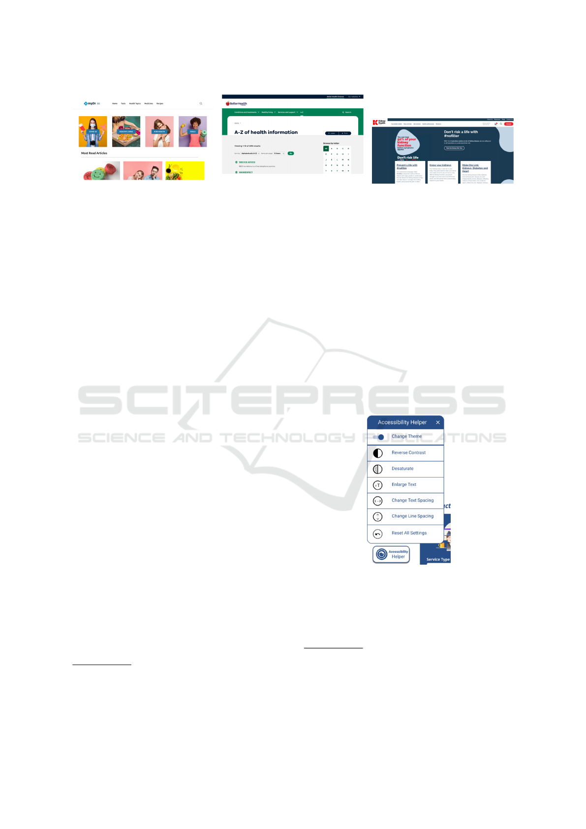
Figure 1: eHealth web application sam-
ple 1 (https:// www.mydr.com.au/ ).
Figure 2: eHealth web application sam-
ple 2 (https:// www.betterhealth.vic.gov
.au/a-z).
Figure 3: eHealth web application sam-
ple 3 (https:// kidney.org.au/).
the design preferences of eHealth applications. For
these design-related questions, sample images were
provided to support uniformity in the interpretation of
questions and the accuracy of the responses. In case
any of the participants with less experience in the use
of eHealth services, we also provided three sample
eHealth websites as shown in Fig. 1-3. Fig. 1 is a
sample representing a web application consisting of
warm colours and images, Fig. 2 cool colours and
text-only icons, and Fig. 3 dark colours and texts.
All the websites had different styles, such as overall
colour tones, functionalities, icon styles, structures,
etc., so that we could identify greater discrimination
between participants’ responses. Using the same ex-
amples, participants were also asked to select specific
design elements that they felt would be suitable for
eHealth applications. The survey questions in Korean
and Chinese and distributed to participants who use
these languages in order to obtain more diverse and
accurate responses.
3.2 High-fidelity Design Prototype
Based on the analysis of the survey data, a high-
fidelity design prototype was created using Figma
3
.
Adee
4
and Able
5
plugins were installed and used to
check the WCAG 2.1 compliance. Interactions were
also created for all the page elements and functional-
ities for the user study. All images used in this pro-
totype, including icons and photographs, were either
self-created, free or open source images from online
image archives
6
and were cross-checked with both
plugins to satisfy AAA grade for the success crite-
ria stated in WCAG 2.1. As shown in the study con-
ducted by Castilla et al. (2016), the preferences on
the navigation styles by age groups are distinctly dif-
ferent. To maximise the usability of the prototype, we
strived to provide as diverse but intuitive and concise
navigation as possible. For instance, when required
3
https://www.figma.com
4
https://www.adeeapp.com
5
https://www.figma.com/community/plugin/73469388
8346260052/Able-
to show the additional contents that are related to the
current page, pop-up windows or notifications were
used to avoid loading a new page. This can mitigate
the of users experiencing confusion or failing to con-
tinue their task due to too frequent navigations from
page to page. One key functionality of this prototype
is that the page is customisable using an Accessibil-
ity Helper. The Accessibility Helper button is pre-
sented at the fixed position, bottom left of all pages
so that the user can access it from anywhere in the
prototype. The available options for this functionality
are depicted in Fig. 4.The functions included in the
Accessibility Helper were designed based on the pre-
liminary survey and reviews of other studies regard-
ing the relationship between design features and us-
ability/accessibility for elderly/disabled people. The
design of this function also follows WCAG 2.1.
Figure 4: Options included in the Accessibility Helper.
3.2.1 Accessibility Helper
Options contained in the Accessibility Helper are:
1. Options for colour.
6
Images are taken from (https://icons8.com/illustratio
ns), (https://www.freepik.com/), and (https://icons8.com/)
6
The prototype is accessible via https://bit.ly/2THOQ
8K, and details of pages, design elements, funcitonalities,
and interactions via https://bit.ly/2W4kJcO
Developing Accessible eHealth Portals: A Human-centred Approach
41
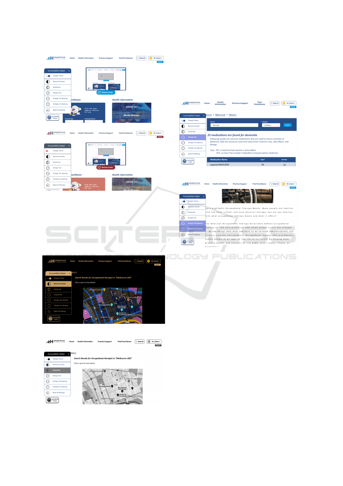
Figure 5: Main page with cool tone (top) and warm tone
(bottom).
– Change Theme (Fig. 5): This enables users to
change colour from a cool tone to a warm tone
or vice versa.
– Reverse Contrast (Fig. 6) & Desaturate (Fig.
7): These options enable users to change the
contrast and saturation of the page.
Figure 6: Option: Reverse Contrast.
Figure 7: Option: Desaturate.
2. Options for text.
– Enlarge Text (Fig. 8): This increases the size of
all texts.
– Change Text Spacing & Line Spacing (Fig. 9):
This resizes spaces between characters.
Figure 8: Option: Enlarge Text.
Figure 9: Option: Change Text Space & Line Space.
3.2.2 Navigation Types
Fig. 10 shows different navigation types used in the
prototype.
1. Primary navigation (top menu) – this is fixed at
the top of the page and enables users to access all
available contents,
2. Side navigation: this enables users to access dif-
ferent pages within the same level,
3. Sub-navigation (Hierarchical navigation): this en-
ables a user to see the paths and to navigate back
to previous paths,
4. Sub-navigation: this enables users to navigate
within a section, and
5. Footer navigation: this presents all accessibility
menus as well as important information.
4 RESULT
This section presents the preliminary survey results.
ENASE 2022 - 17th International Conference on Evaluation of Novel Approaches to Software Engineering
42
Figure 10: Navigation types used in the prototype.
4.1 Demographics
A total of 145 participants participated in this survey;
89 (61%) were female, 55 (38%) were male and 2
(1%) did not disclose their gender. All participants
were categorised into five different age groups. The
distributions of each age group are shown in Fig. 11.
Figure 11: Distribution of age groups.
Among all participants, 32 (21.9%) responded
that they currently suffer from at least one chronic
disease, and 9 (6.2%) participants were unsure about
their chronic conditions. According to the responses,
participants’ education attainment was high with 77
(53%) participants having completed at least a Bach-
elor’s degrees, but only 12 (8.2%) participants did not
have a high school diploma. Only 11 (4.8%) par-
ticipants responded that they spoke English as their
main language and the majority of the participants
133 (91.7%) identified as Asian and spoke Korean,
Chinese, Thai, etc., as their main language. All par-
ticipants except one had access to the Internet, and
131 (89.7%) of people self-evaluated their computer
skills as more than moderate.
4.2 Analysis Methods
Descriptive statistics were used to analyse the data
collected from the survey. A Chi-square test was
conducted to investigate the association between key
sociodemographic factors and design elements. Age
was considered the major sociodemographic factor of
interest, and thus the statistical significances between
age and design elements were mainly investigated.
For the group of participants who had never used an
eHealth application (100 of 145, 68.5%), emotional
states or the first impressions from the given sample
eHealth applications were also investigated using the
Chi-square test. This was conducted to clarify the sig-
nificance of design elements for eHealth applications
from potential users as well as relationships between
users’ emotions and design elements. To determine
the association between more than three variables,
the Multinomial Logistic Regression model was used.
Two sociodemographic factors were selected as inde-
pendent variables to determine the relationships with
design elements and the usage of eHealth applica-
tions. Using the model, we identified the relationships
of design choice with age and gender, the relationship
of colour choice with age and chronic disease, the re-
lationship of eHealth usage with age and gender, and
the relationship of eHealth usage with age and com-
puter skill. The alpha levels for both methods were set
to 0.05. Microsoft 365 Excel was used for all analy-
sis and Real Statistics Add-in (Zaiontz, 2021) was in-
stalled to calculate the Multinomial Logistic Regres-
sion.
4.3 Association between Human Factors
and Design Elements
We determined “Age” as the key human factor as it is
highly related to other factors, such as the likelihood
of having a chronic disease, computer skills, prefer-
ences, etc., and thus it was mainly used to investigate
the association with design elements (Ali et al., 2021;
Reiners et al., 2019; Kalimullah and Sushmitha, 2017;
LaMonica et al., 2017; Schaller et al., 2016).
4.3.1 Design Type vs. Age (+ Gender)
Figure 12: Design types selected by participants by age
groups.
The preference on the design type is clearly distin-
guishable between generations. Younger people were
more likely to choose Material over Flat and Skeuo-
morphism designs while older people were more
likely to prefer Skeuomorphism to other designs as
seen in Fig. 12. According to the Chi-square test, the
associations between Age and design types were sta-
Developing Accessible eHealth Portals: A Human-centred Approach
43
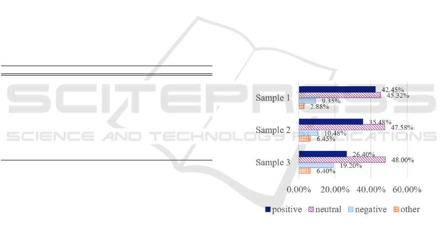
tistically significant with χ
2
of 22.1710 and p-value
of 0.0143 at α = 0.05.
We also tested how participants’ design selections
were associated with age and gender through a Multi-
nomial Logistic Regression model as gender is an-
other human factor that often determines preferences
(Goel et al., 2011; Reiners et al., 2019; Ancker et al.,
2011). The model showed that gender was not a sta-
tistically significant factor that determined a design
type as seen in Table. 1. For any given gender, the
tendency to select the design type was highly depen-
dent on a participant’s age. The model forecasts that
the likelihood of choosing Material design decreases
as age increases: the 45 years and over participants
were 42.43% more likely to choose the Skeuomor-
phism design rather than Material design. However,
the older generations did not show clear design pref-
erences over the younger generation. Less than 23%
of younger people would be more likely to choose
Skeuomorphism design while over 34% of older peo-
ple would be expected to choose Material design.
Table 1: Summary of Associations between design ele-
ments and human factors.
Chi-square p-value Alpha Significance
Design type vs. Age 22.1710 0.0143 0.05 Yes
+ Gender 10.6338 0.1004 0.05 No
Icon types vs. Age 18.9094 0.0414 0.05 Yes
Font size vs. Age 64.4726 5.11E-10 0.05 Yes
Colour vs. Age 10.2934 0.4151 0.05 No
+ Gender 2.9792 0.5613 0.05 No
+ Chronic disease 0.8354 0.9337 0.05 No
Emotional state vs. Age
Sample 1 25.0458 0.0493 0.05 Yes
Sample 2 22.5657 0.0938 0.05 Yes
Sample 3 11.5834 0.7103 0.05 No
4.3.2 Icon Types vs. Age
Participants’ preferences for icon types were highly
tilted towards “Both icon and text”. It was observed
that 80.82% of participants chose icons with both im-
age and text across all age groups. As shown in Table.
1, the result of the Chi-square test showed that age
and icon types were not independent of each other and
the relationship between them was statistically signif-
icant with χ
2
of 18.9094 and a p-value of 0.0414 at
α = 0.05.
4.3.3 Font Size vs. Age
The relationship between age and font size was also
statistically significant with χ
2
of 64.4726 and a very
low p-value of 5.11E-10 at α = 0.05 as shown in Ta-
ble. 1. However, this result may not be accurate be-
cause the image we provided in the Google form au-
tomatically responded to the screen size it was dis-
played on. This might imply that the font sizes shown
in mobile phones and computer monitors would be
different. Therefore, we used this result to investigate
participants’ general preferences for font size rather
than finding out the exact font sizes they preferred.
4.3.4 Colour vs. Age (+ Gender, + Chronic
Disease)
The ‘cool’ tone was preferred over the ‘warm’ tone
(54.8% compared to 37.7% respectively) for eHealth
applications, however, there was no statistically sig-
nificant relationship between colour tone and Age
(χ
2
= 10.2934 and p-value = 0.4151 at α = 0.05).
These results were not changed by applying gender
and chronic disease along with age to the Multino-
mial Logistic Regression model. The model shows
that the relationship of Colour with Age and Gen-
der is not statistically significant (χ
2
is 2.9792 and p-
value is 0.5613 at α = 0.05). With Age and Chronic
disease, there was no statistical significance between
those variables with colours (χ
2
is 0.8354 and p-value
is 0.9337 at α = 0.05).
4.3.5 Emotional State (Sample 1, 2, and 3) vs
Age
Figure 13: Summary of participants’ emotional states.
Participants were asked to choose up to 3 different op-
tions for the first impression on each sample website.
Options given to the participants were joy, trust, sur-
prise, neutral, anticipation, disgust, fear, and sadness.
We recategorised the selections into Positive, Neu-
tral, with Negative: Positive included joy, trust, and
surprise
7
; Neutral included neutral and anticipation
8
;
Negative included disgust, fear, and sadness. The
summary of participants’ emotional states is shown in
Fig. 13. The chart illustrates the summary of partici-
pants’ first impressions and emotions for each sample
website shown in Fig. 1, Fig. 2, and Fig. 3. After cat-
egorising all data, we conducted a Chi-squared test to
find if there was a relationship between age and emo-
tions for each sample website design. As shown in
ENASE 2022 - 17th International Conference on Evaluation of Novel Approaches to Software Engineering
44

Table. 1, the associations between Age and Sample 2
and 3 were not statistically significant. However, our
results showed that the proportion of positive emo-
tions that responded to sample 3 (26.4%) were signif-
icantly lower than those of sample 1 (42.45%) and 2
(35.48%). These results are in line with the partici-
pants’ comments about each sample website. Partic-
ipants mentioned that they feel comfortable with the
bright tone, regardless of colour, and they preferred
a website with sufficient white spaces, to help them
to distinguish contents and functionality more easily.
Participants who left comments on sample 3 said that
they feel uncomfortable because the page was con-
structed with too much text and small font sizes, mak-
ing it stressful to read the content.
5 EVALUATION
We designed the prototype presented in Section 3.2,
according to the survey results. To ensure the us-
ability of the prototype, we conducted a user study
with nine participants. We recruited the participants
among those who answered positively to the survey
question that asks the intention of participating in
the user study. The age distribution of participants
included four people in their 20s, two in their 30s,
and three people in their 60s. Among younger par-
ticipants, no one had chronic diseases or disabilities,
however, two out of three participants aged over 60 re-
ported that they cannot properly read contents in nor-
mal text size, which is generally 16 ft, without mag-
nifying reading glasses due to eyesight impairment.
The first author conducted the user studies as a
mediator. During the user study, the mediator pro-
vided participants with the necessary information and
observed participants’ behaviours. The behaviours
and time spent on each task were recorded as well.
The user study began by providing a brief explanation
about the project and provided instructions to install
and execute the prototype. Each participant was then
given some basic tasks and corresponding question-
naires. Tasks were categorised into two parts. In the
first part, participants were asked to navigate page to
page so that they can understand the structure of the
prototype as well as the design elements used in the
prototype. The second part of the tasks asked par-
ticipants to use the functionalities contained in the
prototypes, which included personalising features of
8
The surprise emotion is in general considered as a pos-
itive emotion and anticipation emotion as a neutral emotion
in Korean and Chinese. As the majority of our participants
are originally from those countries, we classified surprise as
a positive and anticipation as neutral emotion.
“Accessibility Helper”. After finishing each section,
participants also completed the corresponding ques-
tionnaires
9
. Many participants shared their thoughts
regarding the prototype with us and provided invalu-
able feedback as well.
This user study was conducted using Zoom and
held for 30 to 35 minutes on average, including time
for providing instruction and explanation about the
project. All participants were asked to join the user
study using either desktop or laptop. To complete all
the tasks, participants spent approximately 13 to 15
minutes. Overall, participants’ responses to the pro-
totype were significantly positive. Participants scored
4.625 out of 5 for satisfaction on the user interface
(design components), 4.875 for the overall function-
ality, and 4.875 for the overall satisfaction.
We could not observe any significant problem in
using navigation features, however, we were able to
identify how participants varied in the way their nav-
igation between generations. A participant in his
20s, performed almost all navigation-related tasks us-
ing footer navigation, while another participant in her
20s, used side and sub-navigation actively. According
to this participant’s comment on the navigation func-
tionalities, she found that the structure of the proto-
type was very intuitive as it was comfortable to navi-
gate between pages and contents using different navi-
gation options. In contrast to the use of various navi-
gation by young participants, it was observed that par-
ticipants over 60 tried to perform most of the tasks
using only primary navigation. Even when complet-
ing tasks using side navigation, they first looked at
the primary navigation to find the corresponding func-
tionality. For example, although the functionality for
converting displayed information from Map view to
List view was distinctly presented on the side menu,
all participants in their 60s tried to find the relevant
feature from the top menu. A 62-year-old female par-
ticipant commented that she looks habitually at the
top menu first, regardless of tasks. Details of each
navigation type are shown in Fig 10.
By observing participants’ performances for com-
pleting given tasks, we could identify barriers they
encountered. The most crucial factor that adversely
affects the usability and accessibility of the prototype
was linguistic differences. Due to the limitations of
the design prototype, we were not able to provide an
option to change to different languages. The design
prototype that we provided was all in English, thus
participants with low English proficiency had diffi-
culty completing the tasks. This was especially ev-
ident when accessing specific information that con-
9
The details of tasks and questionnaires provided to the
participants can be found at https://bit.ly/36SoQdW.
Developing Accessible eHealth Portals: A Human-centred Approach
45

tained unfamiliar words, such as medical terms as
highlighted by one participant.
"It was difficult for me to access certain in-
formation as I have never heard of such
terms, like dementia and dietetics. But, for
me, even with the same medical terminology,
the one with the picture was easier to find."
[P5/Female/20s]
One of the participants, who was originally Korean, in
his 60s and was not well versed in English, could not
perform the task properly without support due to the
language barrier. The mediator translated both tasks
and contents in the prototype into Korean to help him
process the user study. This barrier was observed not
only in non-English speakers but also in participants
who use English as their second language. When car-
rying out the task of finding specific information con-
taining medical terms, three participants had to spend
more time compared to other participants who speak
English as their main language. The time spent on
each task for all participants is shown in Table 2.
Table 2: User study participants and time spent on each task.
Gender Age Main Language Eng. Prof.
a
T1
b
T2
c
P1 Male 60s Korean VL 4’5” 8’48”
P2 Male 30s Korean H 3’00” 4’3”
P3 Female 30s English VH 3’25” 4’27”
P4 Male 20s Chinese M 4’15” 4’15”
P5 Female 20s Japanese H 4’15” 4’59”
P6 Female 20s English VH 2’35” 3’30”
P7 Female 60s Korean L 7’3” 4’1”
P8 Male 60s Korean M 4’4” 5’36”
P9 Female 20s English, Cantonese VH 3’16” 3’36”
a
Eng. Prof. stands for English proficiency. VH, H, M, L, and VL stand for Very
High, High, Moderate, Low, and Very Low, respectively.
b
T1: Time spent on completing task 1
c
T2: Time spent on completing task 2
Similarly, we could find evidence of how the use of
certain images enhanced accessibility. Another par-
ticipant was not able to understand the purpose of
icons yet he could infer the functions through the
icon’s shape, location, and image. This was consis-
tent with the result of the preliminary survey that we
conducted. According to the survey results, more
than 80% of participants responded that they pre-
ferred icons with both text and image as those icons
are more intuitive and effective to convey meanings.
In this user study, we also received various feed-
back related to the Accessibility Helper. In general,
young participants responded that it was interesting
and new to them, while older participants emphasised
the need for this functionality. A male participant in
his 60s revealed considerable satisfaction in changing
theme colour function. As per his comment:
"If a health-related web application is com-
prised of too many different colours, I feel re-
jected because its atmosphere is too hectic.
Also, in the case that the colour used in such a
web application is too dark, I hesitated to use
it as it gives me some negative feelings. I think
the Accessibility Helper will contribute to util-
ising this application more precisely and fre-
quently because users can choose the colour
to suit their personal taste." [P1/Male/60s]
His comment was also consistent with participants’
responses regarding the colour of the eHealth applica-
tion as a number of participants also pointed out that
the factor that causes the bad first impression is the
colour used in the application. They felt discomfort
if a health application is too colourful or too dark. In
addition, a participant with poor eyesight mentioned
that the function that enabled her to change the font
size and text space was very impressive and helped
her to read and understand contents. She also pro-
vided feedback that such functionalities are essential
for older populations like herself as vision impairment
is one of the most common problems that the elderly
have. A male participant in his 60s emphasised that
the guidelines for the functionalities should be pro-
vided to maximise the usability:
"I have never seen this function, called Ac-
cessibility Helper, before. I think this func-
tion will be very useful for the elderly, those
with disabilities, and even ordinary users. It
can be especially helpful for people with vi-
sion impairment, old people like me. But for
the elderly, it is hard to even know if there is
such function or not unless a clear explana-
tion is given." [P8/Male/60s]
One common feedback received from elderly par-
ticipants was that personalisation features should be
saved individually without having to change them ev-
ery time they access the application. This was an im-
portant point to consider for future work.
6 DISCUSSION
For healthcare-related web applications, it is impor-
tant to precisely consider human factors that have a
significant impact on the usability and accessibility
to design elements because the main stakeholders,
such as the elderly, disabled people, and other pa-
tients, are highly likely to have a different physical
or psychological characteristics. As shown in the re-
sults of our survey responses from 145 diverse par-
ticipants, the preferences for design elements, such
as font sizes and icon types, are distinguishable by
ENASE 2022 - 17th International Conference on Evaluation of Novel Approaches to Software Engineering
46

age groups. Although the relationship between age
and colour of the web application was not statistically
significant, most participants responded that their im-
pressions and emotions towards an application were
determined by the colour and therefore it should be
considered as one of the main design elements.
We developed a Figma-based high-fidelity design
prototype for an eHealth web application. This pro-
totype targets those who regularly seek occupational
therapists due to their physical or mental impair-
ments, or their guardians. To narrow the gaps re-
sulting from the difference in human factors between
our participants, we designed a functionality called
Accessibility Helper. This feature accommodates the
users’ needs by allowing them to change each design
element based on their preferences. Participants who
used this feature in the user study did not reveal any
negative emotions regarding the design elements that
they had from the sample web application we pro-
vided in the survey. Moreover, in the user study, we
found that the usability of web applications for each
participant was exacerbated by different design ele-
ments. We hypothesised that the enhancement of the
usability and accessibility resulting from the modify-
ing design elements is dependent on the distinctive
characteristics people have. This finding was consis-
tent with the evidence we explored initially as shown
in the results of the preliminary survey.
In particular, we were able to clearly see the cor-
relation between people’s characteristics and prefer-
ences on the design elements in the responses pro-
vided by participants aged less than 35 and partici-
pants aged over 55. We found that younger partici-
pants focused on the novelty and rarity of the Accessi-
bility Helper rather than considering the effectiveness
of this function. In other words, we could observe that
they focus heavily on functional factors of the proto-
type when evaluating the usability rather than consid-
ering how the function might be beneficial to them.
This is likely because compared to the older partic-
ipants, younger participants have more opportunities
to use a variety of web applications and have less hes-
itation to adopt new technology [8]. Moreover, an-
other reason why they may prioritise the functional
aspects is that they are less likely to have disabilities
or other physical impairments that hinder them from
accepting design elements consisting of web applica-
tions [23]. Based on the observation from the user
study, the only factor that impressed them was the
“Changing theme” option that affects the overall at-
mosphere of the prototype; the other design options
they stated that it would be useful for those who are
visually impaired or disabled.
In the case of older participants, the deteriora-
tion of usability due to a decline in physical capabil-
ity is a factor that should be considered more impor-
tant than dissatisfaction from the functional aspects
(Kalimullah and Sushmitha, 2017). We found this
from the feedback provided by elderly participants
as well. One common disability or impairment that
elderly participants have is the eyesight impairment
due to ageing (AIHW, 2000). All three participants
in their 60s reported that they are unable to read con-
tent with small-sized texts which significantly affects
usability and accessibility. In the same vein, they em-
phasised that the typography-related functions, such
as changing font size, text spacing, and line spac-
ing, are essential features for them. In addition, the
structure of the application is another significant fac-
tor that should be considered. When designing the
prototype, we assumed that the elderly would have
relatively lower proficiency or frequency of using IT
technology compared to younger people. Therefore,
in line with the research conducted by Castilla et al.
(2016), we designed the structure of the prototype
as intuitive and concise as possible by using pop-up
windows and notifications and by providing various
navigations. What we found from the observation
of the user study was consistent with the assumption
as older participants who are aged over 60 could not
properly perform the tasks that require using different
navigations rather than linearly navigating between
pages. They completed most of the tasks using only
the primary navigation, and in the case of tasks that
could not be performed with the primary navigation,
they tried to find the way from the menu closest to the
contents they have.
Regardless of the age groups, some participants
encountered difficulty in using the prototype due to
linguistic differences. The usability and accessibility
gaps caused by the absence of health literacy or dig-
ital literacy are difficult challenges for developers to
solve as it is least likely to estimate the universal level
of those literacies of their stakeholders (Tieu et al.,
2015). As shown in the work of Holzinger (2002), one
efficient approach to solve these disparities is to attach
appropriate images to the contents that users may not
be able to understand easily. In our user study, we
found that participants tried to perform the tasks by
analogy through images for several tasks containing
medical terminologies. They also commented that
they were able to complete the tasks by assuming
through images shown in the icons and contents even
though they had no idea of the meaning of the words.
This proves that usability and accessibility can be en-
hanced by visualising contents appropriately.
Developing Accessible eHealth Portals: A Human-centred Approach
47

7 LIMITATION
An important limitation of our work is that we did
not have people with substantially severe disabilities
in the participants. Although the Accessibility Helper
contains options to change the contrast and saturation
of the contents, we could not verify their effectiveness
because none of our participants had colour blindness.
However, we verified that all contents used in this pro-
totype are visible for those with colour blindness or
colour deficiencies by cross-checking with the colour
simulator
10
website and Figma plugins.
Secondly, the quantitative results from our work
were likely to have confounding bias. We relied
mainly on univariate statistics and the largest number
of variables included in one relationship was three.
Moreover, the fact that the age distributions of partici-
pants favoured particular groups is likely to lead to an-
other bias. The third limitation is that the sample pop-
ulation for both the preliminary survey and user study
did not include participants aged under 18. According
to a report released by AIHW (2020), approximately
9% to 10% of people who are in general classified
as children and adolescences have disabilities, which
is higher on average than the age group between 20
and 35 who was one of the main participant groups
involved in this work.
Finally, since our work is based on the high-
fidelity design prototype, the usability and accessi-
bility we investigated may differ from actual applica-
tions with practically runnable functionalities. With
the design prototype we have, it is difficult to estimate
the usability changes resulting from the frequency of
the use and the time spent for each functionality.
8 CONCLUSIONS
We identified the correlation between human factors
and design elements through a preliminary survey
and demonstrated the effectiveness of this correlation
through a Figma-based high-fidelity design prototype.
In the user study to investigate the effectiveness of the
prototype, we found barriers that hinder usability. In
addition, by looking at the preference or priority by
age groups, we were able to understand which de-
sign elements should be primarily considered to en-
hance the usability for each age group. This study
contributes in understanding how human factors can
be applied to eHealth applications. In future, we will
aim to focus on implementing this prototype on a web
application by reflecting on findings from this work to
10
Colblinder: https://www.color-blindness.com/coblis-c
olor-blindness-simulator/
enhance the usability and accessibility of the applica-
tion. Moreover, the resulting web application will be
tested and verified by more diverse user groups.
ACKNOWLEDGMENT
Support for this work from ARC Laureate Program
FL190100035 and Discovery Project DP200100020
is gratefully acknowledged.
REFERENCES
AIHW (2000). Disability and ageing: Australian population
patterns and implications. Report, Australian Institute
of Health and Welfare.
AIHW (2020). People with disability in australia. Report,
Australian Institute of Health and Welfare.
AIHW (2021). Digital health. Report, Australian Institute
of Health and Welfare.
Ali, M. A., Alam, K., Taylor, B., and Ashraf, M. (2021).
Examining the determinants of ehealth usage among
elderly people with disability: The moderating role of
behavioural aspects. International Journal of Medical
Informatics, 149:104411.
Ancker, J. S., Barrón, Y., Rockoff, M. L., Hauser, D.,
Pichardo, M., Szerencsy, A., and Calman, N. (2011).
Use of an electronic patient portal among disad-
vantaged populations. Journal of general internal
medicine, 26(10):1117–1123.
Anderson, M. and Perrin, A. (2017). Tech adoption climbs
among older adults. Report, Pew Research Center.
B ˛akała, A. and Korczak, K. (2010). Accessibility of e-
health services for people with disabilities. Infor-
matyka Ekonomiczna, 18.
Boulos, M. N. K. (2003). The use of interactive graphi-
cal maps for browsing medical/health internet infor-
mation resources. International Journal of Health Ge-
ographics, 2(1):1–14.
Castilla, D., Garcia-Palacios, A., Miralles, I., Breton-
Lopez, J., Parra, E., Rodriguez-Berges, S., and
Botella, C. (2016). Effect of web navigation style
in elderly users. Computers in Human Behavior,
55:909–920.
Das, A., Faxvaag, A., and Svanæs, D. (2015). The impact
of an ehealth portal on health care professionals’ in-
teraction with patients: qualitative study. Journal of
medical Internet research, 17(11):e267.
Das, A. and Svanæs, D. (2013). Human-centred methods in
the design of an e-health solution for patients under-
going weight loss treatment. International journal of
medical informatics, 82(11):1075–1091.
Demiris, G., Afrin, L. B., Speedie, S., Courtney, K. L.,
Sondhi, M., Vimarlund, V., Lovis, C., Goossen, W.,
and Lynch, C. (2008). Patient-centered applications:
use of information technology to promote disease
management and wellness. a white paper by the amia
ENASE 2022 - 17th International Conference on Evaluation of Novel Approaches to Software Engineering
48

knowledge in motion working group. Journal of the
American Medical Informatics Association, 15(1):8–
13.
Ferati, M., Vogel, B., Kurti, A., Raufi, B., and Astals, D. S.
(2012). Web accessibility for visually impaired peo-
ple: requirements and design issues, pages 79–96.
Springer.
Goel, M. S., Brown, T. L., Williams, A., Hasnain-Wynia,
R., Thompson, J. A., and Baker, D. W. (2011). Dis-
parities in enrollment and use of an electronic pa-
tient portal. Journal of general internal medicine,
26(10):1112–1116.
Holzinger, A. (2002). User-centered interface design for
disabled and elderly people: First experiences with
designing a patient communication system (pacosy).
In International Conference on Computers for Handi-
capped Persons, pages 33–40. Springer.
ISO 9241-210:2019 (2019). Ergonomics of human-system
interaction — part 210: Human-centred design for in-
teractive systems. Standard.
Kahn, J. S., Aulakh, V., and Bosworth, A. (2009). What
it takes: characteristics of the ideal personal health
record. Health affairs, 28(2):369–376.
Kalimullah, K. and Sushmitha, D. (2017). Influence of de-
sign elements in mobile applications on user experi-
ence of elderly people. Procedia computer science,
113:352–359.
Kildea, J., Battista, J., Cabral, B., Hendren, L., Herrera, D.,
Hijal, T., and Joseph, A. (2019). Design and devel-
opment of a person-centered patient portal using par-
ticipatory stakeholder co-design. Journal of medical
Internet research, 21(2):e11371.
Kipping, S., Stuckey, M. I., Hernandez, A., Nguyen, T., and
Riahi, S. (2016). A web-based patient portal for men-
tal health care: benefits evaluation. Journal of medical
Internet research, 18(11):e294.
LaMonica, H. M., English, A., Hickie, I. B., Ip, J., Ireland,
C., West, S., Shaw, T., Mowszowski, L., Glozier, N.,
and Duffy, S. (2017). Examining internet and ehealth
practices and preferences: survey study of australian
older adults with subjective memory complaints, mild
cognitive impairment, or dementia. Journal of medi-
cal Internet research, 19(10):e358.
Power, C., Freire, A., Petrie, H., and Swallow, D. (2012).
Guidelines are only half of the story: accessibility
problems encountered by blind users on the web. In
Proceedings of the SIGCHI conference on human fac-
tors in computing systems, pages 433–442.
Reiners, F., Sturm, J., Bouw, L. J., and Wouters, E. J.
(2019). Sociodemographic factors influencing the use
of ehealth in people with chronic diseases. Interna-
tional journal of environmental research and public
health, 16(4):645.
Report (2021). Internet/broadband fact sheet. Technical
report, Pew Research Center.
Rot, A., Kutera, R., and Gryncewicz, W. (2017). De-
sign and assessment of user interface optimized for
elderly people. a case study of actgo-gate platform. In
ICT4AgeingWell, pages 157–163.
Sarkar, U., Karter, A. J., Liu, J. Y., Adler, N. E., Nguyen, R.,
López, A., and Schillinger, D. (2011). Social dispari-
ties in internet patient portal use in diabetes: evidence
that the digital divide extends beyond access. Jour-
nal of the American Medical Informatics Association,
18:318–321.
Schaller, S., Marinova-Schmidt, V., Setzer, M., Kondylakis,
H., Griebel, L., Sedlmayr, M., Graessel, E., Maler,
J. M., Kirn, S., and Kolominsky-Rabas, P. L. (2016).
Usefulness of a tailored ehealth service for informal
caregivers and professionals in the dementia treatment
and care setting: the ehealthmonitor dementia portal.
JMIR research protocols, 5(2):e4354.
Searl, M. M., Borgi, L., and Chemali, Z. (2010). It is time
to talk about people: a human-centered healthcare sys-
tem. Health research policy and systems, 8(1):1–7.
Shamsujjoha, M., Grundy, J., Li, L., Khalajzadeh, H., and
Lu, Q. (2021). Human-centric issues in ehealth app
development and usage: A preliminary assessment. In
IEEE International Conference on Software Analysis,
Evolution and Reengineering (SANER), pages 506–
510.
Tieu, L., Sarkar, U., Schillinger, D., Ralston, J. D., Ratana-
wongsa, N., Pasick, R., and Lyles, C. R. (2015). Bar-
riers and facilitators to online portal use among pa-
tients and caregivers in a safety net health care sys-
tem: a qualitative study. Journal of medical Internet
research, 17(12):e4847.
UN (2017). World population ageing 2017 – highlights.
Report, United Nations.
WHO (2016). Global diffusion of ehealth: making universal
health coverage achievable, report of the third global
survey on ehealth. Report, World Health Organiza-
tion.
Yong, J. Y., Stvilia, B., and Mon, L. (2012). Cultural influ-
ences on seeking quality health information: An ex-
ploratory study of the korean community. Library &
Information Science Research, 34(1):45–51.
Zaiontz, C. (2021). Real statistics resource pack for excel.
Zambianchi, M., Rönnlund, M., and Carelli, M. G. (2019).
Attitudes towards and use of information and commu-
nication technologies (icts) among older adults in italy
and sweden: The influence of cultural context, socio-
demographic factors, and time perspective. Journal of
cross-cultural gerontology, 34(3):291–306.
Developing Accessible eHealth Portals: A Human-centred Approach
49
