
Comparative Assessment of Two Data Visualizations to Communicate
Medical Test Results Online
Federico Cabitza, Andrea Campagner and Enrico Conte
Universita degli Studi di Milano-Bicocca, Viale Sarca 336, 20126, Milano, Italy
Keywords:
Data Visualization, Medical Test Results, COVID-19, Uncertainty Communication.
Abstract:
As most countries in the world still struggle to contain the COVID-19 breakout, Data Visualization tools have
become increasingly important to support decision-making under uncertain conditions. One of the challenges
posed by the pandemic is the early diagnosis of COVID-19: To this end, machine learning models capable of
detecting COVID-19 on the basis of hematological values have been developed and validated. This study aims
to evaluate the potential of two Data Visualizations to effectively present the output of a COVID-19 diagnostic
model to render it online. Specifically, we investigated whether any visualization is better than the other in
communicating a COVID-19 test results in an effective and clear manner, both with respect to positivity and
to the reliability of the test itself. The findings suggest that designing a visual tool for the general public in
this application domain can be extremely challenging for the need to render a wide array of outcomes that can
be affected by varying levels of uncertainty.
1 INTRODUCTION
Decision support systems that are developed with ma-
chine learning (ML) techniques and methodologies
are usually seen as computational means that can be
good in classifying instances, that is assigning a case
to a specific class, like positive or negative, healthy or
ill. Although this is a reasonable way to expect sup-
port from a tool denoted with terms like “classifier”
or “decision support”, doing so essentially neglects
the intrinsic (and unavoidable) uncertainty affecting
ML “decisions”, which are given to humans to sup-
port their decision making (Cabitza et al., 2020; Greis
et al., 2018; Kompa et al., 2021).
This phenomenon has a striking manifestation in
regard to diagnostic tests based on biomarkers, that is
measurable indicators of a condition, like the infec-
tion by SARS-CoV-2, causative of COVID-19 (Van-
denberg et al., 2020). Although any diagnostic test,
be it based on imaging, viral load or antigen presence,
is associated with some margin of error (Axell-House
et al., 2020), we tend to consider their responses in
terms of yes/no instead of considering probabilistic
estimates of having (or not having) a specific condi-
tion (Hullman, 2019).
However, in the case of decision aids based on
ML, this probabilistic nature of their response can be
“recovered”, instead of being concealed, for instance
by reporting the probability scores explicitly (Cabitza
et al., 2020; Kompa et al., 2021), or by displaying
these scores in some way that helps users understand
their role in the interpretation of the machine’s out-
put (Hullman, 2019). In doing so, the intrinsic un-
certainty of these models can be valued and leveraged
as an element to factor in when making a decision,
in compliance with the requirements of eXplainable
AI (Holzinger, 2018), for instance to decide whether
to undergo a further examination or to choose what
treatment to undertake.
In this paper, we report the main findings of a user
study that we conceived to choose the best data visu-
alization through which to present users the result of
a hematological test to detect COVID-19 infections
from the Blood Complete Count on the basis of a ML
model. This model was validated in the reference lit-
erature (Cabitza et al., 2021) and then embedded into
a Web-based tool, for which these visualizations had
been commissioned to the authors
1
. To this aim, we
compared two data visualizations that had been pur-
posely designed to maintain a certain amount of un-
derspecification in displaying the result, according to
the tenets of vague visualizations; this is a data visu-
alization framework, first introduced in (Assale et al.,
2020), where uncertain estimates (like confidence in-
tervals or standard errors) are visualized by purposely
1
https://covid-19-blood-ml.herokuapp.com/
Cabitza, F., Campagner, A. and Conte, E.
Comparative Assessment of Two Data Visualizations to Communicate Medical Test Results Online.
DOI: 10.5220/0010968800003124
In Proceedings of the 17th International Joint Conference on Computer Vision, Imaging and Computer Graphics Theory and Applications (VISIGRAPP 2022) - Volume 3: IVAPP, pages
195-202
ISBN: 978-989-758-555-5; ISSN: 2184-4321
Copyright
c
2022 by SCITEPRESS – Science and Technology Publications, Lda. All rights reserved
195

avoiding symbolic representation (i.e., numbers) and
metric rendering, like length extensions and angles.
In vague visualizations, these quantities are rendered
in terms of visual clues that are generally hard to in-
terpret in quantitative terms (see, e.g. (Cleveland and
McGill, 1984)), that is are hard to be mapped into
clear-cut categories of numbers, like color shading
or saturation and brightness gradients. This feature,
which in other contexts could be misinterpreted as a
bug or defect, is purposely intended to convey to the
readers an embodied sense of uncertainty and vague-
ness as a strategy to have readers actually understand
the visualized estimates, such as risks, odds, disper-
sion, not just look at them in abstract terms. For
this reason, vague visualizations require additional
attention (with respect to traditional visualizations)
and must be assessed on the basis of the extent they
suggest correct interpretations without making use of
numbers or visual elements that can be easily con-
verted into numerical values (such as linear exten-
sions or points in Cartesian planes).
2 METHODS
As mentioned above, for this user study we conceived
and designed two data visualizations. These two data
visualizations were conceived during two participa-
tory design sessions that involved the authors of this
article and the clinicians involved in the development
of the statistical model presented in (Cabitza et al.,
2021). Before starting the sessions, the clinicians had
been introduced to the requirements of the vague visu-
alizations framework mentioned above and were in-
vited to co-design a visualization that could better fit
their colleagues, that is experts in interpreting labo-
ratory tests, and a simpler visualization that could be
more familiar to the tested patients.
The resulting visualizations were based on differ-
ent metaphors: one visualization (depicted in Fig-
ure 1) was based on the litmus test, that is a com-
mon test for acidity that is familiar to any chemistry
student, and the bubble level metaphors, which was
chosen to more precisely denote the probabilistic out-
come of the test, while not relying on any number (see
Figures 1 and 2).
The second data visualization (see Figure 3)
adopted the test stick metaphor (see Figures 3 and 4),
widely adopted in, e.g., pregnancy tests, and thus fa-
miliar to the general public.
The user study was then conceived to understand:
1) if the test stick metaphor, as an apparently straight-
forward and common way to present test results, was
adequate in case of a delicate response like the one re-
garding COVID-19 positivity, or, as observed in some
studies (Pike et al., 2013), it would end up by mis-
leading lay people too often. And 2) if a more techni-
cal data visualization, the one designed for healthcare
practitioners, could be understandable also by non-
specialist users.
In the bubble level visualization the test result is
mainly rendered in terms of the position of a circular
bubble within a three-color (litmus alike) bar, that is
in terms of its proximity to one of two bar extremes
to indicate either a COVID-19-positive or a negative
condition (on the leftmost red extreme, and on the
rightmost blue extreme, respectively). Uncertain (i.e.,
low reliability) results are thus indicated in terms of
a substantial equidistance of the bubble from the ex-
tremal anchors, that is when this indicator is in the
middle grey area of the litmus bar. Uncertainty is also
rendered in terms of the size of the bubble, as in a
reinforcing affordance: the bigger the bubble is, the
greater the confidence interval of the probability esti-
mate.
The test stick visualization renders the same in-
formation displayed by the bubble level visualization,
but through different affordances and visual cues. To
this aim, this visualization exploits the visibility of
two red bands: one to indicate the reliability of the re-
sponse and denoted with a capital C (“control”); and
one indicating the result of the test, denoted with a
single plus mark (+). In other words, this visualiza-
tion renders the model output in terms of bar opacity:
so that the more transparent (and less visible) the +
and C bands, the lower the probability that the test
is associated with a positive condition and the over-
all test reliability, respectively (see Figures 3 and 4).
An almost certainly negative test is then rendered by
a stick where only the C bar is clearly visible, while
an invalid test is represented by a stick where no red
bands is visible.
2.1 Visualization Assessment
We assess the above data visualizations in terms of
information effectiveness, that is in terms of their ca-
pability not to mislead the reader, and therefore al-
low them to correctly interpret the displayed informa-
tion, both in regard to the test result and its reliability.
Therefore, we related this dimension to the error rate
detected in a user study where respondents were sup-
posed to read two test results, one associated to high
reliability and a clear response (see Figures 2, 3) and
the other one associated to a border-line case and a
low-reliability test (see Figures 1, 4); and then choose
one answer among several alternatives to report what
they read on the data visualization.
IVAPP 2022 - 13th International Conference on Information Visualization Theory and Applications
196
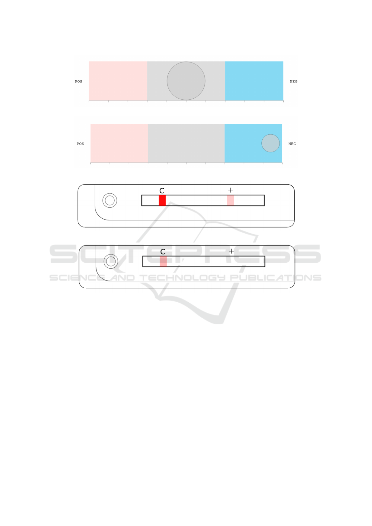
Figure 1: Data visualization of a low-reliability, slightly positive test.
Figure 2: Data visualization of a high-reliability, clearly negative test.
Figure 3: Data visualization of a high-reliability, slightly positive test.
Figure 4: Data visualization of a low-reliability, clearly negative test.
To this aim, we developed an online questionnaire
and invited the respondents to fill in to participate in
what was called “a data visualization usability test”
The respondents were the students of a technology-
oriented master degree class and their acquaintances,
to whom the former ones were invited to spread the
original invitation, also on the social media. Each re-
spondent considered only one type of data visualiza-
tion, on a random basis, so they could interact with
either the bubble level or the stick data visualization,
to avoid order bias and mitigate fatigue.
The questionnaire displayed two test results, in
random order, with no specific explanation or legend:
in one case, the result was slightly positive, that is
associated with a 55% probability score of the ML
model that the right class was the positive one, on the
basis of the CBC test (Low Reliability Tests). In the
other case, the result was clearly negative, that is asso-
ciated with a probability score of 95% for the negative
class (High Reliability Tests).
In both cases, the respondents were supposed to
assess, for each of the two tests presented: 1) on a 5-
value ordinal scale, whether the test result had to be
interpreted as definitely positive, more likely positive,
more likely negative or definitely negative, or whether
this could not be ascertained (the “I don’t know, you
can’t tell” option); and 2) whether the degree of reli-
ability had to be perceived as high, medium, low or
whether this aspect could not be determined.
In order to manage the “I don’t know, you can’t
tell” cases, in particular as regards the Low Reliabil-
ity Tests, we considered two cases: one case – prag-
matical assessment – in which the middle option for
the result interpretability item is considered a right an-
swer for all the uncertain negative results mentioned
above (the interpretation is practically correct, be-
cause the user should beware of the result); and one
case – semantic assessment – in which choosing the
middle option is nevertheless considered a sign of low
interpretability of the data visualization, and hence
Comparative Assessment of Two Data Visualizations to Communicate Medical Test Results Online
197

the related responses are set apart with respect to the
error count, but they are still considered as an answer
in their own.
The survey was anonymous, associated with no
incentives, and we did not send any reminder while
the online questionnaire platform was left open. We
purposely avoided collecting information about gen-
der and age because not relevant with respect to the
effectiveness assessment. For the statistical analysis
of the responses (hypothesis testing and confidence
interval analysis), we adopted a significance level
of 95% (and α of .05). Significance was assessed
through the Fisher Exact Test, and the p-values were
adjusted for multiple comparisons using the Bonfer-
roni correction (VanderWeele and Mathur, 2019).
3 RESULTS
When we closed the questionnaire, we had collected
116 complete responses, 43 for the bubble level vi-
sualization and 73 for the test stick one. The results
of the statistical analysis for High Reliability tests and
Low Reliability tests are reported in Tables 1, 3 and 4.
Moreover, the results for the statistical analysis of the
differences in the proportions of Uncertain answers
for each visualization, is reported in Tables 2 and 5.
A visual representation of the results (in particu-
lar, of the error rates and respective 95% confidence
intervals) is reported in Figures 5, 6 and 7: if the bars
that denote the confidence intervals cross the median
line (at 50%) the difference between the two propor-
tions cannot be considered statistically significant. Fi-
nally in Figure 8 it is possible to see a visual compar-
ison for the proportions of Uncertain answers.
4 DISCUSSION AND
CONCLUSIONS
In this paper we investigated the differences in the
readability of two different data visualizations to un-
derstand what data visualization could be the best one
to propose for a public of non-specialist users of an
online diagnostic tool by which to detect COVID-19
from routine blood tests. This can be generalized to
any medical test results that must be communicated
online and for which the probabilistic outcome (as in
case of machine learning classifications) must be ren-
dered by acknowledging the intrinsic uncertainty of
the response. To this extent, this is the first study, to
our knowledge, to apply the concept of vague visual-
ization to medical test result communication.
While both data visualizations represented the
same information, i.e., both the outcome of the
COVID-19 test and its reliability, we found that the
visualizations were significantly different in terms of
information effectiveness and clarity, that is their ca-
pability to avoid to mislead their readers. In regard to
the high reliability tests, we found no significant dif-
ferences in terms of the respondents’ ability to iden-
tify the correct outcome.
The respondents committed a lower number of er-
rors when reading the bubble level visualization than
when reading the test stick one, but the difference was
not statistically significant (see Table 1): this is not
surprising, as in the case of a high reliability test,
both visualizations provide a clear representation of
the correct outcome. However, we found a statisti-
cally significant difference in regard to the capacity
to convey the reliability level: not only the stick was
found to be adequate, but the bubble was found to be
totally inadequate, as it induced errors in the large ma-
jority of the responses. This could be due to the fact
that the bubble was not totally tangent to the border
of the bar or to the width of the bubble, since users
could only guess what the minimum width was as-
sociated with the highest reliability. In fact, this is-
sue did not occur on low-reliability tests, in which the
bubble width is the same as the height of the bar, thus
clearly denoting minimum reliability.
On the other hand, if we consider the low-
reliability tests we distinguished between a pragmati-
cal and a semantic assessment: in regard to the former
assessment, the bubble level visualization was found
to be significantly more effective than the test stick
one in rendering an outcome affected by predictive
uncertainty (Kompa et al., 2021): indeed, the respon-
dents committed a significantly lower number of in-
terpretation errors in identifying both the correct out-
come (i.e. positive vs negative) and the degree of re-
liability (see Tables 3 and 4). Conversely, the bub-
ble was significantly worse in terms of the number of
cases that were actually understood (see Table 5).
Also when we consider the convinced answers
(semantic assessment) we see that, though both visu-
alizations induce a similar number of errors (no one
is significantly better than the other), the bubble level
visualization is much better in conveying the right re-
liability degree of the test and kept the error rate at an
acceptable level (approximately 5%): the other way
round, and somewhat surprisingly, the stick visual-
ization was terrible at that, because almost every re-
spondent misinterpreted the meaning of a blurred con-
trol bar. This may seem surprising, because this lat-
ter visualization was purposely made similar to real-
world stick tests, where a common convention asso-
IVAPP 2022 - 13th International Conference on Information Visualization Theory and Applications
198

Table 1: Results for High Reliability Tests, both in terms of Outcomes and Perceived reliability. For each visualization, we
report the error rate (in terms of the number of respondents who identified the correct answer), its 95% confidence interval
and the corrected p-value for the comparison between the two visualizations.
Outcomes Perceived reliability
Error Rate Conf. Interval
corrected
p-value
Error Rate Conf. Interval
corrected
p-value
Bubble 2.33% [0 - 6.82] 1 76.7% [64.1 - 89.3] < 0.001
Stick 6.85% [1.06 - 12.6] 6.85% [1.05 - 12.6]
Table 2: Uncertain answers for High Reliabilty Tests, both in terms of Outcomes and Perceived reliability. For each visual-
ization, we report the rate of uncertain answers (in terms of the number of respondents who responded with a middle option),
its 95% confidence interval and the corrected p-value for the comparison between the two visualizations.
Outcomes Perceived reliability
Uncertain
answers
Conf. Interval
corrected
p-value
Uncertain
answers
Conf. Interval
corrected
p-value
Bubble 0% [0] 1 2.33% [0 - 6.83] 1
Stick 4.11% [0 - 8.66] 1.37% [0 - 4]
Table 3: Responses for Low Reliability Tests (Pragmatical Assessment), both in terms of Outcomes and Perceived reliability.
For each visualization, we report the error rate (in terms of the number of respondents who identified the correct answer), its
95% confidence interval, and the corrected p-value for the comparison between the two visualizations.
Outcomes Perceived reliability
Error Rate Conf. Interval
corrected
p-value
Error Rate Conf. Interval
corrected
p-value
Bubble 9.30% [0.62 - 17.9] < 0.001 6.98% [0 - 14.6] < 0.001
Stick 52.1% [40.5 - 63.5] 91.7% [85.4 - 98.1]
Table 4: Responses for Low Reliability Tests (Semantic Assessment), both in terms of Outcomes and Perceived reliability.
For each visualization, we report the error rate (in terms of the number of respondents who identified the correct answer),
its 95% confidence interval, the fraction of uncertain answers and the corrected p-value for the comparison between the two
visualizations.
Outcomes Perceived reliability
Error Rate Conf. Interval
corrected
p-value
Error Rate Conf. Interval
corrected
p-value
Bubble 53.4% [38.6 - 68.4] 1 16.2% [5.24 - 27.3] < 0.001
Stick 57.5% [46.2 - 68.9] 94.5% [89.3 - 99.7]
Table 5: Uncertain answers for Low Reliabilty Tests (Semantic Assessment), both in terms of Outcomes and Perceived relia-
bility. For each visualization, we report the rate of uncertain answers(in terms of the number of respondents who responded
with a middle option), its 95% confidence interval and the corrected p-value for the comparison between the two visualiza-
tions.
Outcomes Perceived reliability
Uncertain
answers
Conf. Interval
corrected
p-value
Uncertain
answers
Conf. Interval
corrected
p-value
Bubble 44.1% [29.3 - 59] < 0.001 9.30% [0.62 - 17.9] 1
Stick 5.48% [0.26 - 10.7] 2.73% [0 - 6.7]
ciates hardly-visible (or even invisible) control bar to
the fact that the test is not reliable and should be dis-
carded. However, it is noteworthy that the usability
of these medical tests has rarely been assessed (Pike
et al., 2013). In a recent study, the agreement among
readers, for different types of commercially available
stick-based pregnancy tests, was found to be as low as
59% (Gnoth and Johnson, 2014): this may provide an
Comparative Assessment of Two Data Visualizations to Communicate Medical Test Results Online
199
Figure 5: Success and error rates for the high reliability tests: outcome (left), confidence (right).
Figure 6: Success and error rates for the Pragmatical assessment for the low reliability tests: outcome (left), confidence (right).
explanation for the observed difficulty of the involved
respondents to correctly identify the correct outcome.
Summing things up: this user study highlights
the complexity of the task to effectively communi-
cate medically relevant information, like COVID-19
positivity, to a general public. Even adopting com-
mon metaphors, like the stick test, does not guaran-
tee good results, that is avoiding interpretation errors,
especially in the cases where misinterpretation could
have poor consequences, that is when the results of
the diagnostic test are not reliable. Furthermore, the
fact that the convenience sample of respondents was
almost totally constituted of young master degree stu-
dents suggests that involving a more heterogeneous
sample could result in even more extreme error rates.
However, we believe that these findings do not im-
ply that the communication of diagnostic test results
should be made just simpler, for instance by limiting
these latter to be represented in terms of few nominal
categories, like “positive” or “negative”, as it is com-
mon practice for the so called “qualitative tests” (or
rapid detection tests). Quite the opposite, this study
suggests the need for further user-centered research
on how to effectively render the result of uncertain di-
agnostic tests (Rosen and Kn
¨
auper, 2009; Greis et al.,
2018), especially when this is associated with a prob-
abilistic estimate of the tests’ reliability.
Since this is often the case for tests whose results
are produced by a ML algorithm (Kompa et al., 2021),
we conclude this article with a final mention to the in-
creasingly wider application of this kind of decision
aid in healthcare (Foster et al., 2014). As already
noted (Cabitza et al., 2016; Vellido, 2019), data vi-
sualization can play an important role in helping both
clinicians and patients to better understand the advice
and predictions supplied by ML systems (McIntyre
et al., 2016), or to facilitate discussion and shared
decision making between them (Rodighiero, 2016;
Garcia-Retamero and Cokely, 2017). As this study
shows, further research is needed to investigate how
to better translate the numeric and probabilistic infor-
mation that ML systems produce, in comprehensible
and effective terms, to the benefit of both the commu-
nity of healthcare practitioners and the larger public.
IVAPP 2022 - 13th International Conference on Information Visualization Theory and Applications
200
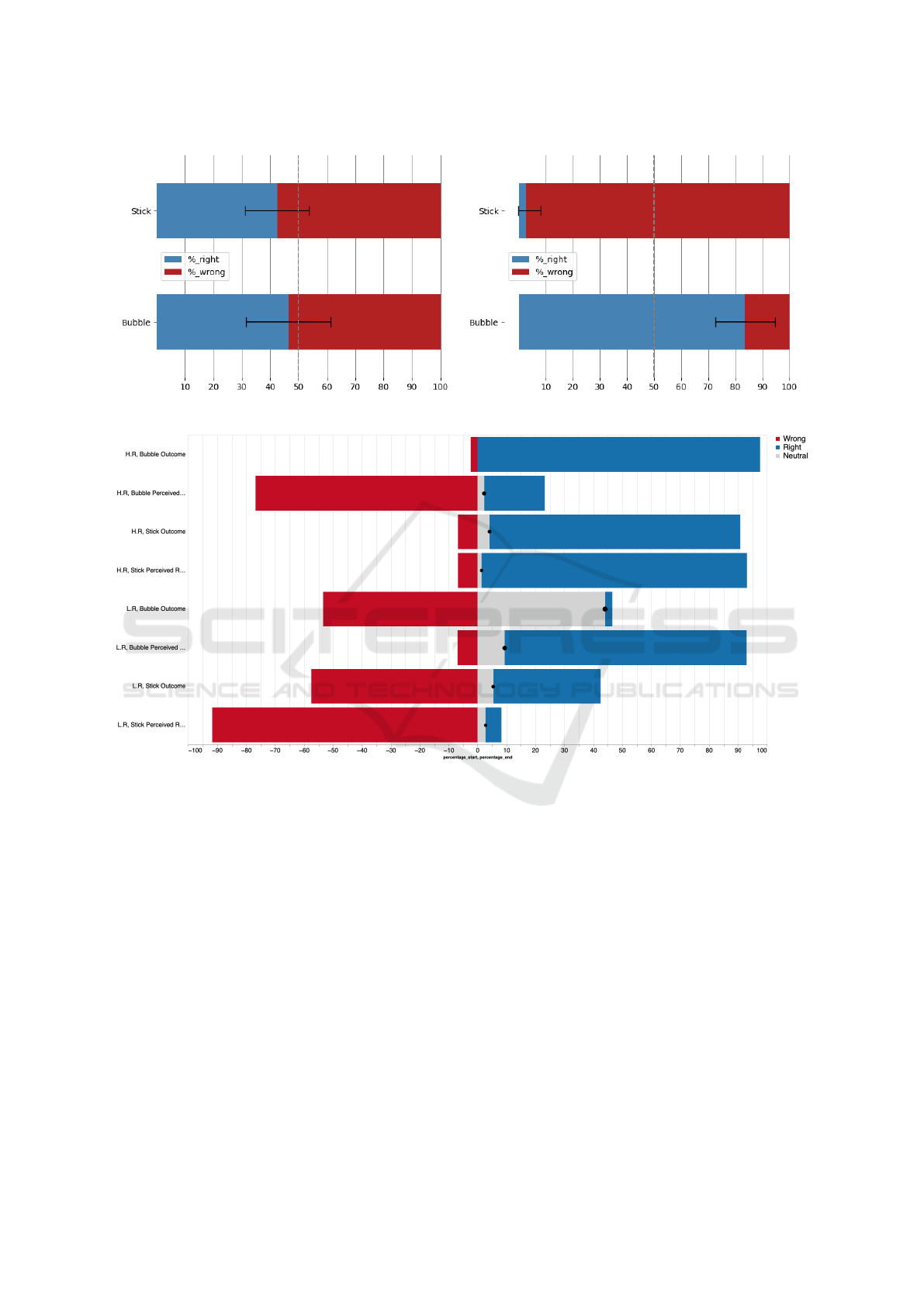
Figure 7: Success and error rates for the Sematical assessment for the low reliability tests: outcome (left), confidence (right).
Figure 8: Comparison of the proportions of Uncertain answers for each visualization.
ACKNOWLEDGMENT
The authors acknowledge the valuable contribution
of Lorenzo Tomasoni, a Computer Science bachelor
degree student who developed the data visualizations
and helped collect some of the user study responses.
REFERENCES
Assale, M., Bordogna, S., and Cabitza, F. (2020). Vague
visualizations to reduce quantification bias in shared
medical decision making. In VISIGRAPP (3: IVAPP),
pages 209–216.
Axell-House, D. B., Lavingia, R., Rafferty, M., Clark, E.,
Amirian, E. S., and Chiao, E. Y. (2020). The estima-
tion of diagnostic accuracy of tests for covid-19: A
scoping review. Journal of Infection.
Cabitza, F., Campagner, A., and Datteri, E. (2020). To err is
(only) human. reflections on how to move from accu-
racy to trust for medical ai. In ITAIS 2020: Proceed-
ings of the XVII Conference of the Italian Chapter of
AIS Organizing in a digitized world: Diversity, Equal-
ity and Inclusion, Pescara, Italy.
Cabitza, F., Campagner, A., Ferrari, D., Di Resta, C., Ce-
riotti, D., Sabetta, E., Colombini, A., De Vecchi, E.,
Banfi, G., Locatelli, M., et al. (2021). Develop-
ment, evaluation, and validation of machine learning
models for covid-19 detection based on routine blood
tests. Clinical Chemistry and Laboratory Medicine
(CCLM), 59(2):421–431.
Cabitza, F., Locoro, A., Fogli, D., and Giacomin, M.
(2016). Valuable visualization of healthcare informa-
tion: From the quantified self data to conversations. In
Proceedings of the International Working Conference
Comparative Assessment of Two Data Visualizations to Communicate Medical Test Results Online
201

on Advanced Visual Interfaces, pages 376–380.
Cleveland, W. S. and McGill, R. (1984). Graphical per-
ception: Theory, experimentation, and application to
the development of graphical methods. Journal of the
American statistical association, 79(387):531–554.
Foster, K. R., Koprowski, R., and Skufca, J. D. (2014). Ma-
chine learning, medical diagnosis, and biomedical en-
gineering research - commentary. BioMedical Engi-
neering OnLine, 13(1):94.
Garcia-Retamero, R. and Cokely, E. T. (2017). Design-
ing visual aids that promote risk literacy: a systematic
review of health research and evidence-based design
heuristics. Human factors, 59(4):582–627.
Gnoth, C. and Johnson, S. (2014). Strips of hope: accu-
racy of home pregnancy tests and new developments.
Geburtshilfe und Frauenheilkunde, 74(7):661.
Greis, M., Joshi, A., Singer, K., Schmidt, A., and Machulla,
T. (2018). Uncertainty visualization influences how
humans aggregate discrepant information. In Pro-
ceedings of the 2018 CHI Conference on Human Fac-
tors in Computing Systems, pages 1–12.
Holzinger, A. (2018). From machine learning to explainable
ai. In 2018 world symposium on digital intelligence
for systems and machines (DISA), pages 55–66. IEEE.
Hullman, J. (2019). Why authors don’t visualize uncer-
tainty. IEEE transactions on visualization and com-
puter graphics, 26(1):130–139.
Kompa, B., Snoek, J., and Beam, A. L. (2021). Second
opinion needed: communicating uncertainty in medi-
cal machine learning. NPJ Digital Medicine, 4(1):1–
6.
McIntyre, S., Eklund, M., and Collins, C. (2016). Using
visual analytics of heart rate variation to aid in diag-
nostics. In CEUR Workshop Proceedings.
Pike, J., Godbert, S., and Johnson, S. (2013). Compar-
ison of volunteers’ experience of using, and accu-
racy of reading, different types of home pregnancy
test formats. Expert opinion on medical diagnostics,
7(5):435–441.
Rodighiero, D. (2016). Reading data together. In VVH
2016-1st International Workshop on” Valuable visu-
alization of healthcare information”: from the quan-
tified self data to conversations., number CONF.
Rosen, N. O. and Kn
¨
auper, B. (2009). A little uncertainty
goes a long way: State and trait differences in uncer-
tainty interact to increase information seeking but also
increase worry. Health communication, 24(3):228–
238.
Vandenberg, O., Martiny, D., Rochas, O., van Belkum, A.,
and Kozlakidis, Z. (2020). Considerations for diag-
nostic covid-19 tests. Nature Reviews Microbiology,
pages 1–13.
VanderWeele, T. J. and Mathur, M. B. (2019). Some de-
sirable properties of the bonferroni correction: is the
bonferroni correction really so bad? American journal
of epidemiology, 188(3):617–618.
Vellido, A. (2019). The importance of interpretability and
visualization in machine learning for applications in
medicine and health care. Neural computing and ap-
plications, pages 1–15.
IVAPP 2022 - 13th International Conference on Information Visualization Theory and Applications
202
