
Dashboard for Machine Learning Models in Health Care
Wejdan Bagais
a
and Janusz Wojtusiak
b
George Mason University, 4400 University Dr, Fairfax, V.A., U.S.A.
Keywords: Machine Learning, Model Evaluation, Model Understanding, Information Visualization, Model Dashboard.
Abstract: To trust and use machine learning (ML) models in health settings, decision-makers need to understand the
model's performance. Yet, there has been little agreement on what information should be visualized to present
models' evaluations. This work presents an approach to construct a dashboard used to visualize supervised
ML models for health care applications. The dashboard shows the models' statistical evaluations, feature
importance, and sensitivity analysis.
1 INTRODUCTION
The use of machine learning (ML) in healthcare
domains has grown massively over the last decade.
To increase the trust of ML models in healthcare, the
decision-makers need to understand if the model
works and why. However, most people treat the
model as a black box and report the performance
without explaining how it works (Fekete, 2013; Liu
et al., 2017). In healthcare, understanding the effect
of the predictors is crucial to trust the model (Apley
& Zhu, 2020). For example, Krause et al. (2016)
explain the experience of a stakeholder who struggled
whether to employ a model that predicted diabetic
risk or not. The model had high accuracy, but the
analysts could not explain how the features impacted
the prediction. In health care, understanding the effect
of the predictors is crucial to trust the model (Apley
& Zhu, 2020). Visualization methods are among the
most useful tools for understanding a ML model
(Alsallakh et al., 2014). Tonekaboni et al. (2019)
emphasize that carefully designed visualizations
increase the clinicians’ understanding.
This paper designed a dashboard that aims to help
decision-makers understand the strength and
weaknesses of the model and uncover the relationship
between features and predictions, which lead to an
increase in the decision-makers’ trust by visualizing
any classification model performance. The dashboard
takes the model and the training and testing data and
displays three main sections: statistical measures,
a
https://orcid.org/0000-0002-8242-803X
b
https://orcid.org/0000-0003-2238-0588
feature importance, and sensitivity analysis. The first
two sections display some well-known measures,
while the third section goes deeper into the
relationship between each attribute and the prediction
to identify any existing pattern.
This paper is taken from my master’s thesis,
"Dashboard for Machine Learning Models in Health
Care," done in Summer 2021 at George Mason
University under the direction of Dr. Janusz
Wojtusiak (Bagais, 2021).
2 RELATED WORKS
While a considerable amount of literature has been
published on explaining the performance of ML
models, most studies focus on one measure, a specific
ML method, or interactive presentation of ML results.
Works on interactive ML are closely related to
aspects of this study. In interactive ML, “the model
gets updated immediately in response to user input”
(Amershi et al., 2014, p. 106). Most model
explanation systems that use interactive ML ask the
user to input a hypothetical scenario and display the
model performance for that scenario. In contrast, this
paper focuses on model global explanation and
features effect rather than the local explanation (per
patient scenario).
Several related visualization and model
explanation systems developed over the past years,
including:
482
Bagais, W. and Wojtusiak, J.
Dashboard for Machine Learning Models in Health Care.
DOI: 10.5220/0010835100003123
In Proceedings of the 15th International Joint Conference on Biomedical Engineering Systems and Technologies (BIOSTEC 2022) - Volume 5: HEALTHINF, pages 482-490
ISBN: 978-989-758-552-4; ISSN: 2184-4305
Copyright
c
2022 by SCITEPRESS – Science and Technology Publications, Lda. All rights reserved

The what-if tool (WIT) is “an open-source
application that allows practitioners to probe,
visualize, and analyze ML systems, with minimal
coding” (Wexler et al., 2020, p. 56). WIT has four
main functions: exploring data using statistics and
distributions of all features; investigating user test
hypotheses shows model performance based on
finding counterfactuals and observing partial
dependence plots; evaluating fairness, analyzing and
compare model performance based on slices of data;
comparing two models, which compares all supported
measures and partial dependence plots between the
two models (Wexler et al., 2020). As the name
suggests, the WIT is an interactive system that shows
the model behavior based on user input scenarios. In
comparison, this paper focuses on displaying the final
model behavior without diving into the local
sensitivity analysis.
Manifold is “a generic environment for
comparing and debugging a broad range of machine
learning models” (Zhang et al., 2019, p. 9). Manifold
compares ML models using two main visuals:
summary statistics at feature level and a comparison
of model pairs (Zhang et al., 2019). Both Manifold
and this paper display the features' distribution per
classification category to explain the relationship
between the prediction and the attributes.
Prospector provides interactive partial
dependence diagnostics to understand the effect of
features on prediction. Prospector visualizes patient
selection (a list of patients based on prediction and
ground truth), Patient inspection (the change of
prediction based on the change of feature values for
the selected patient), and partial dependence plots
(which demonstrate the effect of a feature on the
prediction) (Krause et al., 2016). Both Prospector and
this work include the visualization of partial
dependence plots. However, Prospector focuses more
on patient-level analysis while this work focuses on
the overall feature effect.
Similarly, several systems focus on prediction
explanation as part of decision support. The two most
notable of the systems are:
LIME is “a modular and extensible approach to
faithfully explain the predictions of any model in an
interpretable manner” (Ribeiro et al., 2016, p. 114).
LIME explains the predictors for a specific case,
while this paper focuses on the global explanation for
the model and its features.
SHAP stands for “Shapely Additive explains
Explanations." SHAP explains the output of any ML
model using a game theory approach. SHAP also
focuses on local explanations (Lundberg & Lee,
2017).
Some other papers focus on a specific type of data
or measures. For example, FeatureInsight, which
focuses on defining dictionary features for
classification models (Brooks et al., 2015), Samek et
al. (2017) paper focus on visualizing deep neural
network DNN, Adams & Hand (1999) proposed LC
index as an alternative for the ROC curve.
Additionally, Raymaekers et al. (2020) advised using
a mosaic plot instead of the confusion matrix.
3 METHOD
Presentation of ML models and their results plays an
essential role in analysts' and decision-makers'
understanding and, consequently, trust the models.
This work evaluates any classification supervised ML
model by visualizing the model’s results in one place
using a dashboard represented in a website built using
Flask. The website's inputs are the model and the
attributes for both testing and training sets. The output
is the dashboard which contains the following parts:
statistical measures to provide an overview of the
model performance, features important to show the
strength of the attributes, and features sensitivity to
Identify the relationship between the attribute and the
prediction.
A survey was used to obtain user feedback about
the dashboard. The survey was distributed by email to
faculty members and graduate students in data
analytics, informatics, or health sciences programs at
George Mason University, and 15 people responded
to the survey. The respondents were provided with
three study cases’ dashboards to evaluate the
dashboard’s three sections (the dashboards are
available in the examples section in:
https://students.hi.gmu.edu/~wbagais/dashboard).
First, the survey asked about the position and area of
work. Then the survey asked the user to evaluate the
usefulness of the three sections of the dashboard. The
survey was approved by George Mason University
IRB number 1766037-1.
To demonstrate the use of the dashboard, a
random forest model was built to predict if the patient
has Heart Disease using UCI Machine Learning
Repository (1988) data set. The output attribute is the
status of having heart disease: one if the patient had
heart disease and 0 if the patient did not have heart
disease (UCI, 1988).
3.1 Statistical Measures
This section shows the overall model performance by
visualizing the statistical measures and prediction
Dashboard for Machine Learning Models in Health Care
483
distribution using four visuals: overall model
performance, ROC curve, confusion matrix, and
prediction distribution.
3.1.1 Overall Model Performance
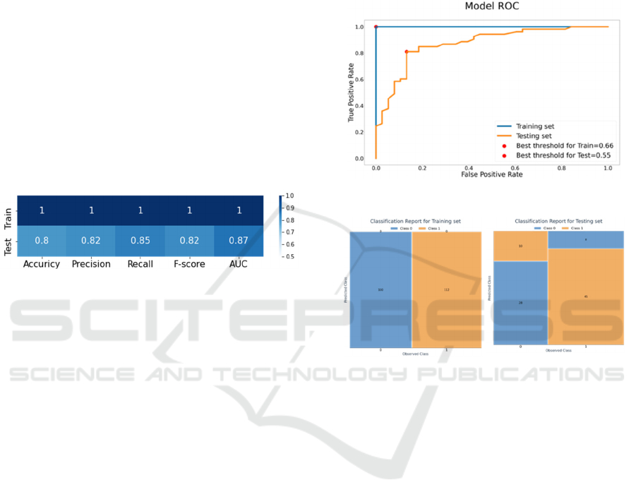
Accuracy, precision, recall, f-score, and AUC
measures are most frequently used to evaluate ML
model performance. This section compares them for
both training and testing data in a heatmap to show
the strength and weaknesses of the model. The
heatmap in figure 1 shows that the heart disease
predicting model has very good performance in all
measures.
The color scales (from white to dark blue) are
mapped to performance measurements scaling from
0.5 to 1. (White for value 0.5 and darkest blue for
value 1). 0.5 is selected as the lowest score since 0.5
is random.
Figure 1: Example of heat map for the statistical measures.
3.1.2 Receiver-Operator Curve (ROC)
The ML model gives a score from 0 to 1 and based on
the selected threshold (the default threshold is 0.5),
the prediction class is assigned. In other words, if the
model prediction score is greater than or equal to 0.5,
the model predicts that the patient has heart disease,
and when the predicted score is less than 0.5, the
model predicts that the patient does not have heart
disease. However, a threshold of 0.5 is not always the
best. The ROC shows all possible values of true
positive rate (recall) and false positive rate as the
classification threshold varies. Figure 2 shows the
curve for the heart disease model; in the curve, the red
points represent the best-selected threshold.
3.1.3 Confusion Matrix
After identifying the best threshold, the confusion
matrix is visualized to show classification
performance. Usually, the confusion matrix is
visualized using a heatmap. Yet, Raymaekers et al.
(2020) suggested using a stacked mosaic plot that
adds the area perspective to show the proportion of
cases in each class. This additional information
indicates if the data is skewed or not. The mosaic plot
shows the actual classes on the horizontal axis and the
predicted classes on the vertical axis. Figure 3shows
an example of a stacked mosaic plot for the confusion
matrix with two classes. As seen below, the data set
has a higher number of heart disease patients than the
number of patients without heart disease. The
accuracy is 100% for the training data, which
indicates that the model overfitted the training data.
Figure 2: Example of ROC curve.
Figure 3: Example of the stacked mosaic plot.
3.1.4 Prediction Distribution
The model level of confidence is shown using the
prediction distribution using a bar chart with color
representing the actual classes. A good model will
have more cases near 0 and 1 and fewer cases in the
middle near the threshold. The larger number of cases
near the threshold means that the model is not
confident about the decision. Figure 4 shows the
prediction distribution for the heart disease prediction
model. The training plot shows that the classes are
split at 0.5. However, there are some overlaps
between 0.4 and 0.6 prediction percentages in the
testing set. Additionally, most patients with heart
disease were predicted correctly as cases between 0.8
and 1 are high.
HEALTHINF 2022 - 15th International Conference on Health Informatics
484
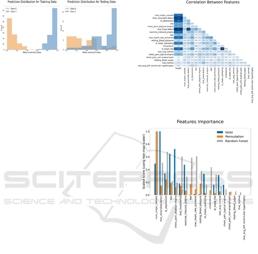
Figure 4: Example of prediction distribution.
3.2 Features’ Importance
Understanding the relationship between the attributes
and the output gives some explanation of the model
decision, which can be compared with our
knowledge. This section visualizes the features’
importance by the following visuals: correlation
heatmap, results of LASSO regression, random
forest, and premutation bar chart, learning curve
based on the number of cases using a line chart, and
learning curve based on the number of features using
a line chart. When the number of attributes used in a
model is large, it is hard to display them all; therefore,
the number of displayed attributes is limited to the top
20 to avoid cluttering. The top 20 attributes were
selected based on the average of LASSO, random
forest, premutation scores after normalizing them
between 0 and 1.
3.2.1 Correlation Plot
The first step is to represent the correlation between
the features to show how they relate to each. Figure 5
shows an example of the correlation graph using a
heatmap. The first column is larger than the others
because the relationship between all independent
attributes and the output attribute is more important
than the relationship between all attributes.
3.2.2 Lasso, Random Forest, and
Premutation
Correlation is based on linear relationships and does
not consider the model; therefore, features selection
techniques are plotted to explain the feature
importance. The selected supervised feature selection
methods are Lasso, random forest (embedded
methods), and permutation (wrapper method). the
scores were displayed using a vertical bar chart to
show the difference between each method judgment.
For example, figure 6 shows that all methods agree
that number of major vessels is the most important
feature. However, the random forest gives a high
score for age compared to the other methods.
Figure 5: Example of correlation between attributes.
Figure 6: Example of feature importance bar chart.
3.2.3 Learning Curve
The two learning curves used here represent the
relationship between the number of cases with the
model AUC and the number of attributes with the
model AUC. Figure 7 shows the first learning curve
for the number of the heart disease model. The testing
score line stops increasing after 90. The second
learning curve (number of attributes curve) is shown
in figure 8. The AUC did not improve after 13
attributes. In the deep learning community, the term
learning curve is also used to visualize convergence
of learning as a neural network is learned. However,
this meaning of the term is not used here.
Dashboard for Machine Learning Models in Health Care
485
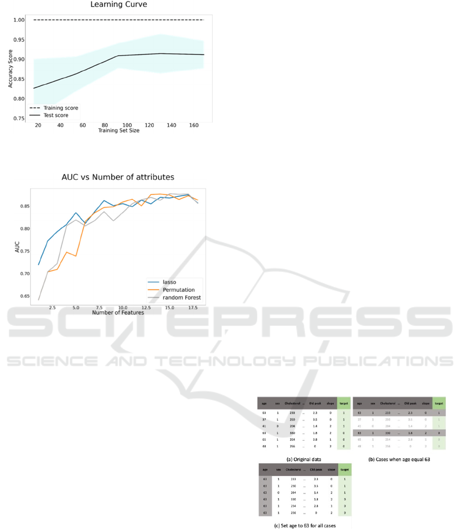
Figure 7: Example of the learning curve for the number of
attributes.
Figure 8: Example of the number of cases learning curve.
3.3 Sensitivity Analysis
The purpose of this section is to identify the
relationship between an attribute and the model
prediction. This analysis is done for the top 20
predictors only. Using a selection button, the
dashboard visualizes the impact of a single input
attribute into the output attribute using sensitivity
measures. The type of plots depends on the data type;
therefore, the first step is to identify the categorical
and numeric attributes using a default threshold of 10.
If the number of unique values for an attribute is less
than 10, then the attribute is identified as categorical.
Otherwise, the attribute is specified as numeric.
After selecting the attribute, four visuals are
displayed: the attribute distribution; the mean
prediction based on the chosen attribute; the mean
prediction when the attribute value is fixed; and the
difference between the original AUC and the AUC
when the selected attribute changes slightly.
A random dataset is needed to check the attribute
behavior regardless of the correlation with other
attributes for some of the visuals. For numeric
attributes, the random data has the same minimum,
maximum, mean, and standard deviation as the
original data. In addition, the random data have the
same probabilities as the original data for the
categorical attributes.
For the third visuals (the mean prediction when
the attribute value is fixed), an edited version of the
partial dependency plots (PDP) is used. Partial
Dependence Plots (PDP) show the marginal effect of
the selected attribute on the prediction. (Jerome H.
Friedman, 2001). The Prospector system uses this
concept to examine the impact of an attribute by
fixing the value of the selected attribute while
keeping all other attributes as they were (Krause et
al., 2016). However, this approach ignores the effect
of the interaction between other attributes. Wojtusiak
et al. paper added the results using randomly
generated data to show the interaction between the
selected attribute and predictions (2018).
The second visual (the mean prediction based on
the selected attribute) shows a similar plot that
visualizes the mean prediction for each selected
attribute value.
For the second plot, for each unique value, i in the
selected attribute X: the first plot selects the cases
with the selected value (where X=i). In the dashboard,
this plot is referred to as "Mean Prediction for X." In
the third plot, all values in the selected attribute
(column) X are set to i. In the dashboard, this plot is
referred to as “Mean prediction based on fixed values
for X.” Figure 9 shows an example when X is age,
and i is 63. Figure 9.a shows the original data, figure
9.b shows the selected cases for Mean prediction for
age, and figure 9.c shows the cases for Mean
prediction based on fixed values for age.
Figure 9: An illustration of how partial dependence is
computed for age 63.
3.3.1 Distribution Plot
The distribution plot provides a general idea about the
attribute trend for testing, training, and random data.
For numerical attributes, the distribution is shown
using a line plot and colored by the data type. Figure
HEALTHINF 2022 - 15th International Conference on Health Informatics
486
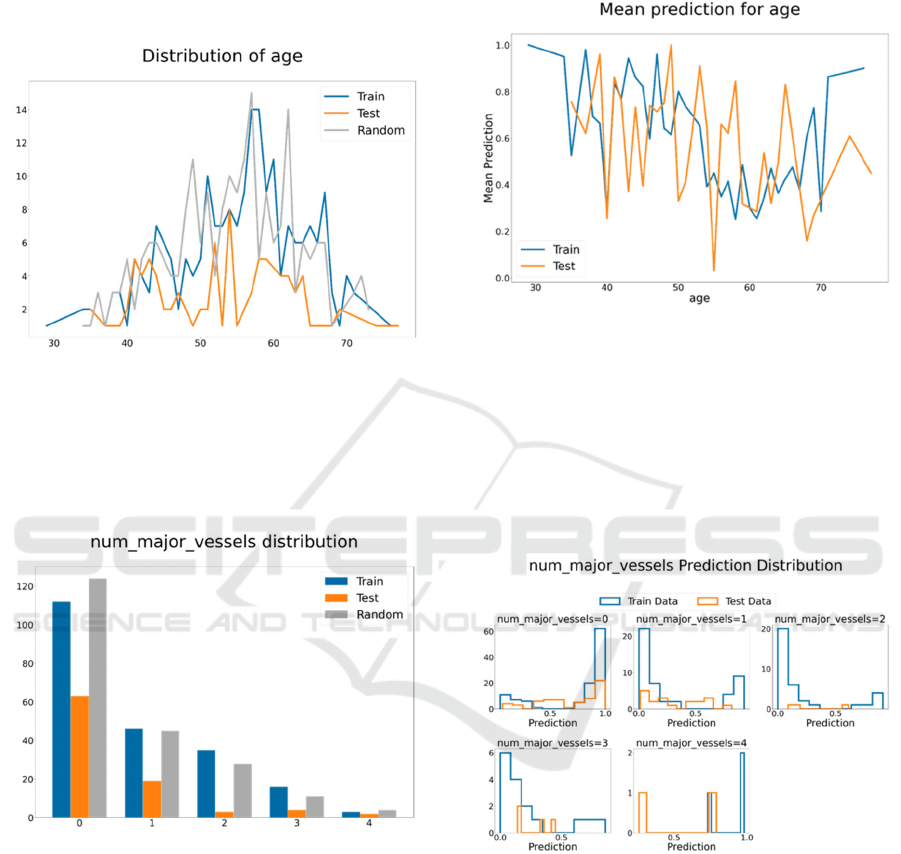
10 shows the distribution of age attribute for the heart
disease data set. Since the data set is small, the testing
data did not follow the training data trend. The peak
number of patients in the training and random data is
in the late 50s.
Figure 10: Example of distribution plot for age.
For categorical attributes, the distribution is
shown using a bar chart. Figure 11 shows the
destruction of the number of major vessels. Most
patients had a value of 0, and a very small number of
patients had a value of 4.
Figure 11: Example of the destruction of the number of
major vessels.
3.3.2 Mean Prediction based on the Selected
Attribute Values
For numerical attributes, the plot shows the
predictions' means per each value of the selected
attribute using training and testing data. The
horizontal axis represents the attribute values, and the
vertical axis represents the predictions' means. The
training and testing trends show the model behavior
for each value in the selected attribute. Figure 12
shows the predictions' means based on age, showing
no clear trend between age and heart disease. The
training and testing data trends show a drop in the
AUC percentage around age 60.
Figure 12: Example of mean prediction based on age.
For categorical variables, the prediction
distribution is visualized for each selected attribute
value. Figure 13 shows the prediction distribution for
the number of major vessels. From the training data,
the number of vessels is positively correlated with
having heart disease when its value is 0 and
negatively correlated with heart disease when its
value is 1, 2, or 3.
Figure 13: Example of prediction distribution for the
number of major vessels.
3.3.3 Mean Prediction based on Fixed
Values
To check the effect of an attribute ignoring the
interaction with other attributes, this work uses the
method introduced by Wojtusiak et al. (2018) when
examining models for predicting 30-day post-
hospitalization mortality. For numeric attributes, the
selected attribute values are set to a fixed value, then
the mean AUC is calculated. This calculation is done
for all unique values of the selected attribute as a fixed
Dashboard for Machine Learning Models in Health Care
487
value. The result of the random dataset shows the
effect of that attribute regardless of all other attributes
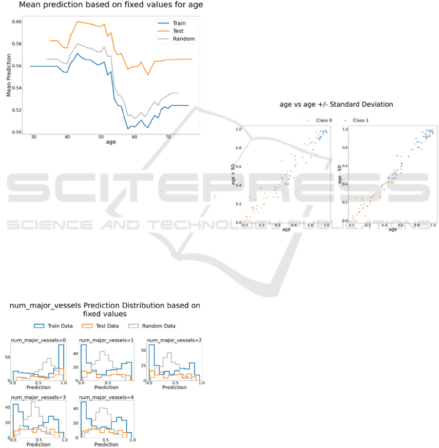
changes (Wojtusiak et al., 2018). Figure 14 shows the
mean prediction when age is fixed for all cases.
Training, testing, and random data have the same
trend. The plot shows a correlation between age and
having heart disease. Patients at age 60 have the
lowest AUC probability of having heart disease.
While this drop needs more investigation, explaining
the trend is beyond the dashboard scope.
Figure 14: Mean prediction when age is fixed for all cases.
For categorical attributes, for each value for the
selected attribute, all data is set to that value, and the
prediction distribution is visualized using a histogram
plot. Figure 15 shows the prediction distribution for
the number of major vessels. When the number of
major vessels is set to 0 for all patients, the data is
skewed to the lift. For the other types, the training
data were skewed, but the random data were
symmetric. Therefore, the trend might be caused by
the correlation between the number of major vessels
and other attributes.
Figure 15: Number of major vessels prediction distribution
based on fixed values.
3.3.4 Original AUC Vs. AUC When the
Selected Attribute Change Slightly
The prediction should not change dramatically when
the attribute value changes slightly. For example, in
the prediction of the heart disease model, if the
patient’s age increases or decreases by two years, the
change percentage of getting heart disease should not
change significantly. To ensure that the model is
stable, the prediction comparison is visualized for
numeric attributes only.
For numeric attributes, the data changed by
adding or subtracting the standard deviation. The
closer the data to the diagonal line, the less sensitive
the model is to the small change. Figure 16 shows the
age AUC vs. Age minus/plus standard deviation
using test data. Most data are around the diagonal
line; therefore, the model is not sensitive to small
changes to age.
Figure 16: Age AUC vs. Age plus/ minus standard
deviation AUC.
4 RESULTS
4.1 Survey Results
Fifteen people evaluated the dashboards. Most people
agreed that the dashboard visuals give a better
understanding of the model behavior than other
methods they have experienced.
The comments were divided into positive, natural,
and negative comments. In general, the positive
comments were related to the comprehensive
understanding of the model and clarity of the graphs.
The negative comments suggested reducing the
number of visuals, and two comments considered that
the dashboard is not useful.
Statistical Measures Section. Most of the comments
agreed that this section is important to understand
HEALTHINF 2022 - 15th International Conference on Health Informatics
488

how the model performs. This section was the most
interesting section for one of the reviewers in terms
of understanding. However, for “Prediction
Distribution and Classification Reports,” one of the
comments suggests that they are unnecessary.
Features’ Importance Section. Several reviews
mentioned that this section is important to give an
idea about the data. The correlation plot got the most
attention; however, the size of the plots was too small
to read.
Sensitivity Analysis Section. Most of the comments
agreed that selecting a variable is very helpful to
understand the performance. However, one of the
comments found it hard to understand the categorical
attributes plots.
Finally, most of the comments were positive.
Comments related to the size of plots, typos, and
rewording were reflected on the dashboard. The other
suggestions would be considered as future work due
to time limitations.
5 CONCLUSION AND
DISCUSSION
The present work was designed to demonstrate an
approach to visualizing classification model
performance in a dashboard with three sections:
statistical measures, which provide an overview of
the model performance; feature importance which
gives an overview of the data; and sensitivity analysis
which identifies the relationship between the attribute
and the prediction. The dashboard adds to a growing
body of literature on understanding and evaluating
classification learning. The advantages of the
dashboard are that it visualizes any classification
model, uses visuals that are simple and easy to
understand, and summarizes all the results in one
place. Yet, unlike interactive dashboards, this
dashboard does not react to user changes.
5.1 Limitation and Future Work
The survey results cannot be generalized due to
sample size limitations. However, the purpose of the
survey was to understand how people interact with
the dashboard, and the most interesting part was the
reviewers’ comments. Second, some design-related
changes like the colors and sizes of the plots are
recommended. For example, when the names of the
columns are long, the size of the figures in the feature
importance section becomes small, which requires
zooming in to read. Third, visualizing the regression
model results and comparing models is considered a
future work.
REFERENCES
Adams, N. M., & Hand, D. J. (1999). Comparing classifiers
when the misallocation costs are uncertain. Pattern
Recognition, 32(7), 1139–1147. https://doi.org/
10.1016/S0031-3203(98)00154-X
Alsallakh, B., Hanbury, A., Hauser, H., Miksch, S., &
Rauber, A. (2014). Visual Methods for Analyzing
Probabilistic Classification Data. IEEE Transactions on
Visualization and Computer Graphics, 20(12), 1703–
1712. https://doi.org/10.1109/TVCG.2014.2346660
Amershi, S., Cakmak, M., Knox, W. B., & Kulesza, T.
(2014). Power to the People: The Role of Humans in
Interactive Machine Learning. AI Magazine, 35(4),
105–120. https://doi.org/10.1609/aimag.v35i4.2513
Apley, D. W., & Zhu, J. (2020). Visualizing the effects of
predictor variables in black box supervised learning
models. Journal of the Royal Statistical Society: Series
B (Statistical Methodology), 82(4), 1059–1086. https://
doi.org/10.1111/rssb.12377
Bagais, W. (2021). Dashboard for Machine Learning
Models in Health Care. George Mason University.
Brooks, M., Amershi, S., Lee, B., Drucker, S. M., Kapoor,
A., & Simard, P. (2015). FeatureInsight: Visual support
for error-driven feature ideation in text classification.
2015 IEEE Conference on Visual Analytics Science and
Technology (VAST), 105–112. https://doi.org/10.1109/
VAST.2015.7347637
Fekete, J.-D. (2013). Visual Analytics Infrastructures: From
Data Management to Exploration. Computer, 46(7),
22–29. https://doi.org/10.1109/MC.2013.120
Jerome H. Friedman. (2001). Greedy function
approximation: A gradient boosting machine. The
Annals of Statistics, 29(5), 1189–1232. https://doi.org/
10.1214/aos/1013203451
Krause, J., Perer, A., & Ng, K. (2016). Interacting with
Predictions: Visual Inspection of Black-Box Machine
Learning Models. In Proceedings of the 2016 CHI
Conference on Human Factors in Computing Systems
(pp. 5686–5697). Association for Computing
Machinery. https://doi.org/10.1145/2858036.2858529
Liu, S., Wang, X., Liu, M., & Zhu, J. (2017). Towards better
analysis of machine learning models: A visual analytics
perspective. Visual Informatics, 1(1), 48–56. https://
doi.org/10.1016/j.visinf.2017.01.006
Lundberg, S. M., & Lee, S.-I. (2017). A Unified Approach
to Interpreting Model Predictions. In I. Guyon, U. V.
Luxburg, S. Bengio, H. Wallach, R. Fergus, S.
Vishwanathan, & R. Garnett (Eds.), Advances in Neural
Information Processing Systems 30 (pp. 4765–4774).
Curran Associates, Inc. http://papers.nips.cc/paper/
7062-a-unified-approach-to-interpreting-model-
predictions.pdf
Dashboard for Machine Learning Models in Health Care
489

Raymaekers, J., Rousseeuw, P. J., & Hubert, M. (2020).
Visualizing classification results. ArXiv:2007.14495
[Cs, Stat]. http://arxiv.org/abs/2007.14495
Ribeiro, M. T., Singh, S., & Guestrin, C. (2016). “Why
Should I Trust You?”: Explaining the Predictions of
Any Classifier. Proceedings of the 22nd ACM SIGKDD
International Conference on Knowledge Discovery and
Data Mining, 1135–1144. https://doi.org/10.1145/
2939672.2939778
Samek, W., Binder, A., Montavon, G., Lapuschkin, S., &
Müller, K.-R. (2017). Evaluating the Visualization of
What a Deep Neural Network Has Learned. IEEE
Transactions on Neural Networks and Learning
Systems, 28(11), 2660–2673. https://doi.org/10.1109/
TNNLS.2016.2599820
Tonekaboni, S., Joshi, S., McCradden, M. D., &
Goldenberg, A. (2019). What Clinicians Want:
Contextualizing Explainable Machine Learning for
Clinical End Use. ArXiv:1905.05134 [Cs, Stat]. http://
arxiv.org/abs/1905.05134
UCI. (1988, July 1). UCI Machine Learning Repository:
Heart Disease Data Set [Education]. UCI Machine
Learning Repository. https://archive.ics.uci.edu/ml/
datasets/Heart+Disease
Wexler, J., Pushkarna, M., Bolukbasi, T., Wattenberg, M.,
Viégas, F., & Wilson, J. (2020). The What-If Tool:
Interactive Probing of Machine Learning Models. IEEE
Transactions on Visualization and Computer Graphics,
26(1), 56–65. https://doi.org/10.1109/
TVCG.2019.2934619
Wojtusiak, J., Elashkar, E., & Mogharab Nia, R. (2018). C-
LACE2: Computational risk assessment tool for 30-day
post hospital discharge mortality. Health and
Technology, 8(5), 341–351. https://doi.org/10.1007/
s12553-018-0263-1
Zhang, J., Wang, Y., Molino, P., Li, L., & Ebert, D. S.
(2019). Manifold: A Model-Agnostic Framework for
Interpretation and Diagnosis of Machine Learning
Models. IEEE Transactions on Visualization and
Computer Graphics, 25(1), 364–373. https://doi.org/
10.1109/TVCG.2018.2864499
HEALTHINF 2022 - 15th International Conference on Health Informatics
490
