
Designing Animated Transitions for Dynamic Streaming Big Data
Jo
˜
ao Moreira
1,3
, Filipa Castanheira
1
, Daniel Mendes
2,4
and Daniel Gonc¸alves
1,3
1
Instituto Superior T
´
ecnico, Lisboa, Portugal
2
Faculdade de Engenharia da Universidade do Porto, Porto, Portugal
3
INESC-ID, Lisboa, Portugal
4
INESC TEC, Porto, Portugal
Keywords:
Information Visualization, Big Data, Streaming, Time-Series, User Study, Animated Transitions.
Abstract:
Visualizations for Streaming Big Data need to handle high volumes of information in real-time, making it
challenging to convey significant data changes without confusing users. A simple first approach would be
switching from the current visual idiom to another, highlighting a significant change. Unfortunately, there are
no guidelines to design effective transitions between two visual idioms in Streaming Big Data. Therefore,
we created a tree of animation concepts to serve as a starting point for designing such animated transitions.
The concepts represent several ways in which a visual idiom can be transformed into another. We chose three
visual idioms to test our idea and arranged several concepts to apply at each possible pairing (six possibilities).
For each pairing, we tested the accuracy of people’s perceptions. Finally, we conducted a user study with 100
participants, where each participant answered various questions about transitions between two visual idioms
shown in several videos. We concluded that to conceive appropriate animated transitions for Streaming Big
Data (which also applies just for Data Streaming) that allow users to understand the changes in incoming data,
varying how the proposed concepts are applied is not enough, highlighting the need for future research to
address this challenge.
1 INTRODUCTION
Nowadays, it is easy to find situations where data is
continuously being generated in large quantities. In
some cases, it may get computationally too demand-
ing to process it and visualize the resulting informa-
tion in real-time. Consequently, traditional visualiza-
tion techniques will not work unless some dimension-
ality reduction technique is made to the data. These
issues are studied in the fields of Big Data and Data
Streaming. Regarding the former, Big Data is defined
as having 5Vs: Huge Volume, High Velocity, High
Variety, Low Veracity, and High-Value (Jin et al.,
2015). Regarding the latter, information is encoded
into one visualization in real-time that may change
using transitions if some significant change occurs in
the data. In the end, merging these two fields leads us
to Streaming Big Data.
However, in light of current research, transitions
for Streaming Big Data have yet to be addressed. In
particular, what design guidelines should be consid-
ered when creating transitions between two differ-
ent states, for example, different times or aggregation
techniques. In our work, we aimed at understand-
ing what makes an effective animated transition in
Streaming Big Data. In particular, we studied verti-
cal transitions, which are applied between two visual
idioms within the same time interval. At first, we cre-
ated a set of animation concepts as a starting point
for creating animations. In particular, animations that
highlight data changes in real-time between two vi-
sual idioms. The concepts represent several ways in
which a visual idiom can be changed into another;
how a line, for example, could be transformed into
a square. Subsequently, we conducted an online user
study with 100 participants to test different combina-
tions of our concept in real-time animated transitions.
We concluded that our concept tree is not enough to
design effective transitions. Then, we inferred that
varying minor details with different sets of concepts
had no significant impact on accuracy. Finally, we ar-
gue that our results also apply to situations without
Big Data, just Data Streaming.
2 RELATED WORK
In Streaming Big Data, time plays a significant role,
with several studies exploring time series visualiza-
tions (McLachlan et al., 2008; Elmqvist et al., 2008;
Moreira, J., Castanheira, F., Mendes, D. and Gonçalves, D.
Designing Animated Transitions for Dynamic Streaming Big Data.
DOI: 10.5220/0010787600003124
In Proceedings of the 17th International Joint Conference on Computer Vision, Imaging and Computer Graphics Theory and Applications (VISIGRAPP 2022) - Volume 3: IVAPP, pages
139-145
ISBN: 978-989-758-555-5; ISSN: 2184-4321
Copyright
c
2022 by SCITEPRESS – Science and Technology Publications, Lda. All rights reserved
139

Pham and Dang, 2018; Hashimoto and Matsushita,
2012; Luo et al., 2018; Traub et al., 2017; Li et al.,
2018; Wu et al., 2018; Stopar et al., 2019; Pires
et al., 2019). In most cases, the retrieved informa-
tion varies according to the current applications and
tasks at hand (Krstajic and Keim, 2013). If there is
too much data, visualizations may then apply some di-
mensionality reduction technique (Traub et al., 2017;
Wu et al., 2018; Stopar et al., 2019; Pires et al., 2019),
or even interactivity (Traub et al., 2017; Wu et al.,
2018; Stopar et al., 2019; Pires et al., 2019). There-
fore, one visualization should be designed to adjust
itself in real-time to fit the data as necessary (Hao
et al., 2008). If changes are carefully planned, peo-
ple may benefit from them (Fischer et al., 2012), for
example, to help make a quick decision without too
much effort. Of course, such significant changes must
not compromise how people understand the visual-
izations, and the changes should only occur because
something about the data varied significantly.
Aggregation, for example, is one standard solu-
tion to simplify large quantities of data. Additionally,
information may also need to be contextualized over
time (Huron et al., 2013). However, traditional visu-
alization techniques assume that the dataset is previ-
ously known (Kobayashi et al., 2013; Elmqvist et al.,
2008; Pham and Dang, 2018), which is not valid in
Streaming Big Data where lots of new information is
continuously being received. Therefore, for one visu-
alization to support changes in Streaming Big Data, it
should adapt over time using transitions between dif-
ferent states. At the same time, it must do it without
making it difficult for people to retrieve information.
There are two ways in which a time-series visual-
ization may change its state. On the one hand, people
may want to see information at a different period—for
example, the last two weeks of data instead of the last
five seconds. On the other, they may want to analyze
specific metrics. For example, the mean of several
data points can be easily seen using a Line chart, but
their flow is seen better using a Heat map. These two
alternatives are called horizontal and vertical transi-
tions.
A horizontal transition may be used to transit be-
tween two visual idioms, each in a different period.
Following the same logic, a vertical transition may
be used to transit between two visual idioms within
the same period. In both cases, an animation may
be used. The purpose of an animated transition is to
transmit a temporary sensation of movement, which
is usually associated with a change over time, to di-
rect people’s attention. Also, through linear interpo-
lations, it is possible to distort the animation timeline
in the animation of transitions, making it easier for
the user to follow it. Still, although animations may
help people understand how information changes (for
example, for trends (Robertson et al., 2008)), they
must be carefully handled. If misused, animations
may distract people from effectively getting informa-
tion. For example, zooming (Shanmugasundaram and
Irani, 2008) may distract people’s perception during
the analysis.
There are several guidelines to design effective an-
imations. One of the most important ones is the Law
of Common Fate, used, for example, by Chabli et al.
(Chalbi et al., 2019) applied for trend analysis in real
dynamic visualization scenarios. Other animation de-
signs were also created to facilitate the identification
of several aggregation operations, such as the mini-
mum, mean, or median (Kim et al., 2019). In any
case, the central goal of animations is to focus on il-
lustrating changes while keeping the context of the
current data. This way, people avoid getting distracted
and lose sight of relevant information. However, these
works are for static data.
3 USER STUDY
The goal of vertical transitions is to change one visual
idiom into another during the same period in real-time
if there is a significant data change. For example, a
line chart could be changed into a heat map if the data
flow changed significantly. Therefore, our first step
was to choose the visual idioms we would use to test
our concepts (Fig. 2).
3.1 Visual Idioms
We decided to choose three visual idioms. The first
was the Line chart, which is suitable for the identi-
fication of trends. In our case, each line represented
the mean of the points in each time interval. The sec-
ond visual idiom was the Heat map, which is suited
for the identification of flow changes. In our case,
each matrix cell encoded the number of points located
in the cell range through luminance; the maximum
luminance corresponded to the maximum quantita-
tive value received until then. Finally, we chose the
Stream graph, which is suitable for the identification
of dispersion changes. In our case, it was made of sev-
eral box plots merged, showing the minimum, maxi-
mum, median, and quartiles. In total, this accounts for
a total of six transitions between all the visual idioms.
IVAPP 2022 - 13th International Conference on Information Visualization Theory and Applications
140

Figure 1: Concept tree used in our user study. It serves as a basis for constructing animated transitions. The top categories are
our main concepts. Each one has two subconcepts, which are the properties that change.
3.2 Concept Tree
We proposed a concept tree to design transitions
based on how one mark can be changed into another.
For example, how a line can become a square. It is
composed of four primary animation constructs, each
with two subconcepts. The first primary concept is
called ’Fade.’ Animations of this category modify ei-
ther the contour or fill of each mark of a visual id-
iom, which will gradually change the opacity of the
elements over time. The second is called ’Shape.’
Animations of this category modify marks using con-
traction or expansion, resulting in the distortion of the
paths that make up a particular shape until they are
morphed into another. The third is called ’Cardinal-
ity.’ Animations of this category either increase or
decrease the current number of marks by dividing or
merging them. The fourth and final one is called ’Po-
sition.’ Animations of this category either translate or
rotate marks.
3.3 Study Design
We carried out a user study to validate the impact spe-
cific animation concepts for vertical transitions have
on people’s accuracy at understanding data changes.
We selected different concepts for each pairing of vi-
sual idioms according to their visual properties, all
chosen according to the possible different ways each
visual idiom could be transformed into another. In
some cases, concepts could not be applied. For exam-
ple, using the Fill concept between the Line Chart and
Heat Map is not possible because the former’s line has
no fill to change.
The next step was to create different animations
using the concepts chosen for each pairing. Besides
knowing if the concepts were beneficial, we wanted to
know if changing minor details in each would make a
difference. Therefore, we decided to design five, dif-
fering in minor details in how the concept was used.
The choices were:
• For the Line Chart to Heap Map pairing, the con-
cepts tested were the Expansion, Division, Junc-
tion, Translation, and Rotation. The transitions
differed on how the lines of the line chart were
divided and shaped into squares.
• For the Line Chart to Stream Graph pairing, the
concepts were the Contour, Fill, and Expansion.
The transitions differed on how the line of the
line charts expanded into the several metrics of
the stream graph.
• For the Heat Map to Line Chart, they were the Fill,
Contraction, Junction, Translation, and Rotation.
The transitions differed on how the squares of the
heat map assembled into one line.
• The Fill, Contraction, Junction, Translation, and
Rotation for the Heat Map to Stream Graph. The
transitions differed on how the squares of the heat
map merged to form the areas of the stream graph.
• For the Stream Graph to Line Chart, the Contour,
Fill, and Contraction for the Stream Graph to Line
Chart. The transitions differed on how areas of the
Stream Graph were reduced into a line.
• The Fill, Contraction, Expansion, Division,
Translation, and Rotation for the Stream Graph to
Heat Map. The transitions differed on how areas
of the Stream Graph were shaped into squares.
Additionally, we considered two simple transi-
tions: the no animation (NA) and a simple fade. The
NA transition was just a regular cut between visual id-
ioms. The latter differed from our Fade tree concept
since it consisted of a complete opacity change. In
total, we ended up with six pairings of visual idioms,
each with seven transitions, thus resulting in 42 com-
binations. For each combination, we created a video
that showed the animated transition being applied.
3.3.1 Method
To avoid showing 42 videos to each participant, we
created seven different questionnaires containing six
separate sections. In each questionnaire, participants
watched six videos, one per section, which corre-
sponded to the six visual idioms pairings. Each video
Designing Animated Transitions for Dynamic Streaming Big Data
141
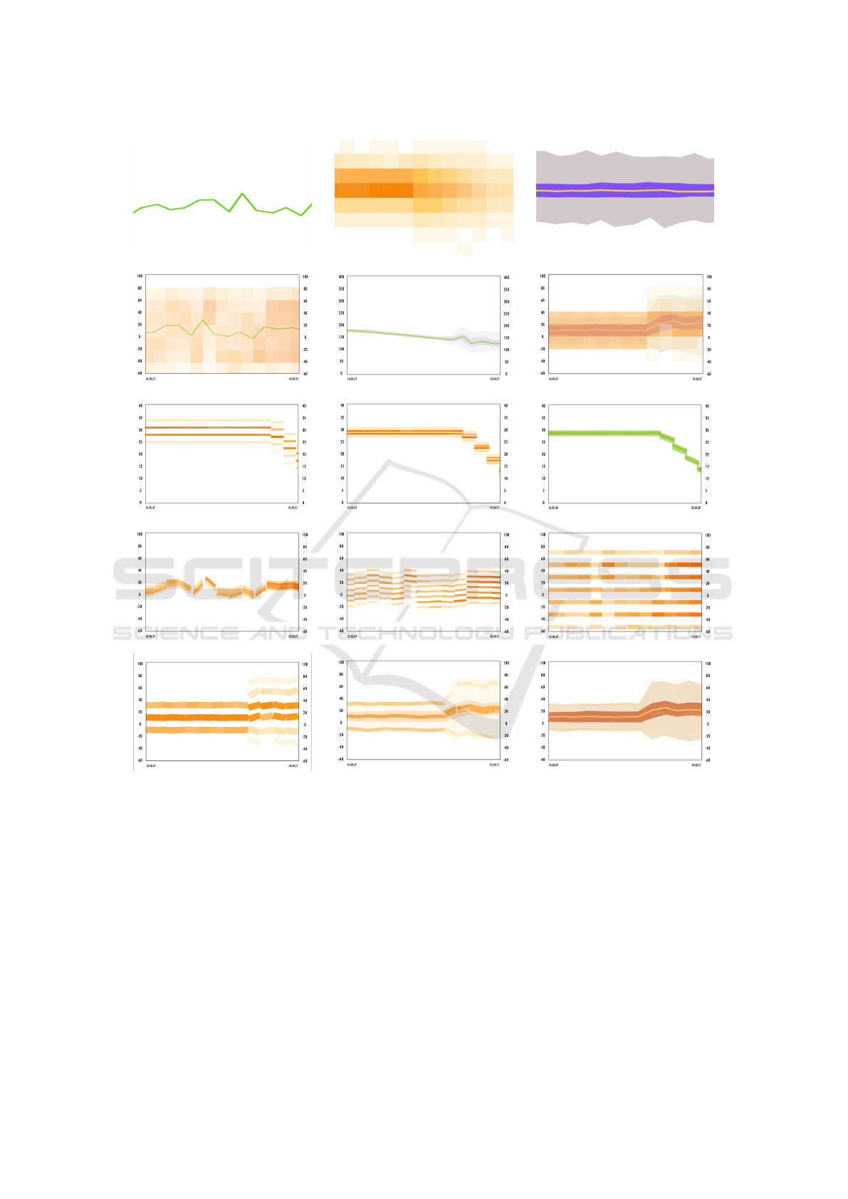
Figure 2: The first row shows the visual idioms we chose for our user study. The second row shows the Fade concept between
a Line chart and a Heat map, a Line chart and a Stream graph, and a Heat map and a Stream graph. The third row shows the
Shape concept between a Heat map and a Line chart at three different phases. The fourth row shows the Cardinality concept
used between a Line chart and a Heat map at three different phases. Finally, the fifth row shows the Position concept between
a Heat map and a Stream graph at three phases.
showed one transition per pairing. Therefore, each
participant only answered questions regarding one
specific transition for all six pairings. Given this ex-
perimental setup, we ended up with a mixed-subjects
design user study. Therefore, for each version of the
questionnaire, the transitions evaluated were unique.
Hence, we considered it as our between-subjects in-
dependent variable. Then, in each questionnaire, all
six pairings of visual idioms were tested. Conse-
quently, we considered it our within-subjects indepen-
dent variable. Finally, to ensure the order and content
of each questionnaire did not bias any participant, we
used the Latin Square design for both which transi-
tions were shown and in which order the videos were
presented.
3.3.2 Questionnaires
In the first part of the questionnaire, we asked par-
ticipants how familiarized they were with informa-
IVAPP 2022 - 13th International Conference on Information Visualization Theory and Applications
142

tion visualization. Then, regarding the accuracy, we
evaluated the percentage of correct responses by ask-
ing participants two groups of questions about each
video. The first group of questions would allow us
to understand how well participants could understand
the two visual idioms during the transition. First, we
asked if the dataset between visual idioms changed,
and the correct answer for this question was always
”No.” Second, we asked if people associated the tran-
sition itself with a data change. Again, the correct
answer was always the same (Yes) because the gen-
erated data had significant changes at specific times-
tamps. Then, the second group of questions would let
us know if people could understand which informa-
tion was conveyed by each visual idiom and how it
changed (when it did), according to standard metrics:
the mean, median, dispersion, minimum, maximum,
and flow.
3.3.3 Data sets
The data presented in each video was created using
a quantitative big data time-series generator. As we
said, our work’s goal was to understand how well our
animated transitions would convey the information
about data changes. Therefore, we used the genera-
tor to create data points with specific properties and
variations for participants to experience. For exam-
ple, it allowed us to choose if the data points would in-
crease, decrease, oscillate, or remain constant. Hence,
we could simulate specific scenarios for which certain
visual idioms are suitable to be used. For example, to
create data that would trigger a transition between a
line chart and a heat map, we had to generate data
whose flow would increase significantly at a certain
point. Furthermore, we ensured that the data changes
fabricated by the generator were noticeable, thus en-
suring that the difficulty in answering the questions
did not differ due to the data.
3.4 Participants
The questionnaires were answered using desktop
computers by 100 participants and distributed elec-
tronically via Google Forms balanced across seven
different versions. Among the participants, 39 were
male, 61 were female, and their ages ranged from 18
to 62. At least 81% of the participants had a B.Sc. de-
gree. In terms of frequency of analysis of data charts,
only 4% said they analyzed every day, while 22% say
they did so at least once a week and 27% at least once
a month. Fifty-four people said they had never ana-
lyzed data in real-time. The visual idiom most rec-
ognized by the participants was the Line chart, with
99%, and the least recognized was the Stream graph,
with 47%. In addition, 67% of participants recog-
nized the Heat map. Finally, while they answered
the questionnaires, participants did not know which
datasets were being fed into the visual idioms to en-
sure that knowledge did not bias the interpretation.
3.5 Results
Our results were interpreted in two phases. First, we
wanted to understand if using different transitions for
each set of concepts significantly impacted accuracy.
Then, which set of concepts was overall more accu-
rate. Since each question was either right or wrong,
and our study was a mixed design (within-subjects
and between-subjects variables), we used the chi-
square test of homogeneity with dichotomous vari-
ables. Overall, we found no statistically significant
difference (p < 0.05) between any transition inside
each pairing of visual idioms. Therefore, we con-
cluded that using a particular set of concepts did
not significantly impact accuracy. Likewise, vary-
ing minor details inside each set of concepts had
no significant impact on accuracy either.
The accuracy of each transition tested, for all pairs
of visual idioms, can be seen in figures 3, 4, and 5.
Each y-axis corresponds to the mean accuracy of the
questions. The higher the value, the higher percent-
age of correct answers. Figure 3 shows how well par-
ticipants understood that the dataset did not change
during the transitions. Then, figure 4 shows how well
participants understood that the transition emphasized
the data changes. Finally, figure 5 showed how well
they could understand how specific metrics varied.
At a glance, we can see that participants are usually
more accurate at answering questions regarding the
dataset used in the visualization, and they are inaccu-
rate mainly in how data metrics varied. It is also pos-
sible to see that most box plots do not contain many
scattered values. Finally, we can see that the concepts
used between the Heat Map and Stream Graph, Line
Chart and Stream Graph, and Stream Graph to Heat
Map resulted in higher accuracies for all groups of
questions.
Regarding the dataset perception, participants per-
formed worse when they saw transitions between
the Line Chart and the Heat Map, as no transition
achieved more than 70% accuracy (Fig. 3). However,
regarding the other pairings, most transitions resulted
in accuracy values higher than 70%. Then, regarding
how participants interpreted the transition (Fig. 4),
the transitions between the Heat Map and Line Chart
stand out as having the worse accuracy values by far.
Also, the majority of transitions achieved less than
70% accuracy. Finally, regarding how participants in-
Designing Animated Transitions for Dynamic Streaming Big Data
143
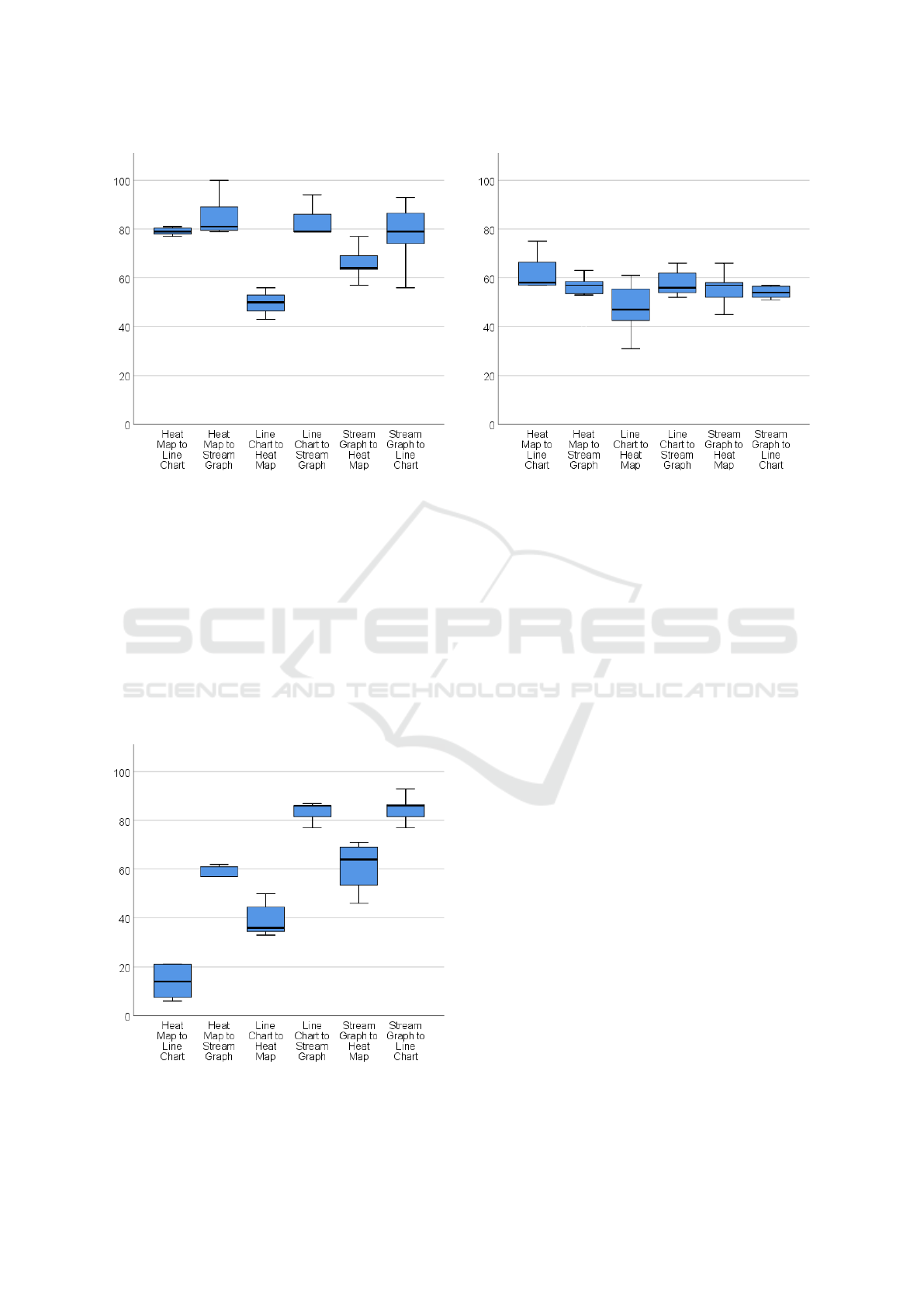
Figure 3: Accuracy for all questions regarding the dataset
changes between visual idioms.
terpreted the metrics asked, results were overall poor.
The majority of the transitions did not reach 60%.
3.5.1 Discussion
Most accuracy values were below our expectations.
The lack of statistically significant differences be-
tween transitions for each visual idiom pairing might
suggest that there is no difference between having or
not having any animated transition. However, this
might differ with a user sample more acquainted with
information visualization since more than half of our
Figure 4: Accuracy for all questions regarding the transi-
tions between visual idioms.
Figure 5: Accuracy for all questions regarding metrics vari-
ation between visual idioms.
participants (54) said they had never analyzed data in
real-time.
Furthermore, accuracy in most cases was below
70%. Since previous works have already shown that
animations improve understandability in visualiza-
tions (Robertson et al., 2008; Chalbi et al., 2019; Kim
et al., 2019), we were surprised not to achieve higher
accuracy levels.
Additionally, our concepts were based on the sev-
eral ways one visual idiom can be transformed into
another. However, these were not enough to achieve
high accuracy values, and it showed that it did not
allow us to design transitions significantly different
for each pairing. Then, regarding accuracy accord-
ing to the type of questions asked, we also noticed
that participants usually performed worse when trying
to perceive how some metrics varied, which means,
for example, people struggle to understand when the
flow increases by looking at transition. Fortunately,
the best results were regarding the dataset change de-
tection. Participants were most confident about the
dataset they perceived before, during, and after each
transition.
Overall, we argue that creating animated transi-
tions for Streaming Big Data is a challenging en-
deavor. Although we believe that our concept tree
for animated transitions could help design transitions
for specific data changes, it must be further improved.
Therefore, we hope future designers explore our con-
cepts tree further by adding/removing more concepts
or creating a new user study with participants fluent
in information visualization.
IVAPP 2022 - 13th International Conference on Information Visualization Theory and Applications
144

4 CONCLUSIONS
We designed a user study to understand which con-
cepts for animated transitions could significantly im-
pact people’s perception of data changes in Stream-
ing Big Data. First, We designed a concept tree
from which we crafted different animated transitions.
Then, we chose six pairings of visual idioms, each
tested with seven different transitions, including the
No Animation and simple Fade cases. Finally, we
created several online questionnaires to test how ac-
curately people can understand dataset changes, tran-
sitions, and metrics.
We concluded that our concept tree is not enough
to design effective transitions in Streaming Big Data.
Although some of our results show high accuracy val-
ues, they are not as high or consistent as one might
want to ensure a good perception of the information
conveyed. Also, there were no significant differences
between transitions. Our main conclusion is that con-
ceiving appropriate vertical transitions for streaming
big data that allow users to understand the changes
in incoming data and act accordingly is not an easy
endeavor and should be careful covered in future re-
search. In particular, we argue that a concept tree for
animation design is needed as a tool to design and cre-
ate animated transitions. However, it should be fur-
ther explored.
ACKNOWLEDGEMENTS
This work was partially supported by FCT through
projects PTDC/CCI-CIF/28939/2017, UIDB/50021/
2020, SFRH/BD/143496/2019 and POCI-01-0145-
FEDER-030740 – PTDC/CCICOM/30740/2017.
REFERENCES
Chalbi, A., Ritchie, J., Park, D., Choi, J., Roussel, N.,
Elmqvist, N., and Chevalier, F. (2019). Common
fate for animated transitions in visualization. IEEE
Transactions on Visualization and Computer Graph-
ics, pages 1–1.
Elmqvist, N., Dragicevic, P., and Fekete, J.-D. (2008).
Rolling the dice: Multidimensional visual exploration
using scatterplot matrix navigation. IEEE Trans-
actions on Visualization and Computer Graphics,
14(6):1539–1148.
Fischer, F., Mansmann, F., and Keim, D. A. (2012). Real-
time visual analytics for event data streams. In Pro-
ceedings of the 27th Annual ACM Symposium on Ap-
plied Computing - SAC '12. ACM Press.
Hao, M., Keim, D. A., Dayal, U., Oelke, D., and Tremblay,
C. (2008). Density displays for data stream monitor-
ing. Computer Graphics Forum, 27(3):895–902.
Hashimoto, Y. and Matsushita, R. (2012). Heat map scope
technique for stacked time-series data visualization.
In 2012 16th International Conference on Information
Visualisation. IEEE.
Huron, S., Vuillemot, R., and Fekete, J.-D. (2013). Visual
sedimentation. IEEE Transactions on Visualization
and Computer Graphics, 19(12):2446–2455.
Jin, X., Wah, B. W., Cheng, X., and Wang, Y. (2015). Sig-
nificance and challenges of big data research. Big
Data Research, 2(2):59–64.
Kim, Y., Correll, M., and Heer, J. (2019). Designing
animated transitions to convey aggregate operations.
Computer Graphics Forum, 38(3):541–551.
Kobayashi, H., Misue, K., and Tanaka, J. (2013). Col-
ored mosaic matrix: Visualization technique for high-
dimensional data. In 2013 17th International Confer-
ence on Information Visualisation. IEEE.
Krstajic, M. and Keim, D. A. (2013). Visualization of
streaming data: Observing change and context in in-
formation visualization techniques. In 2013 IEEE In-
ternational Conference on Big Data. IEEE.
Li, C., Baciu, G., and Han, Y. (2018). StreamMap:
Smooth dynamic visualization of high-density stream-
ing points. IEEE Transactions on Visualization and
Computer Graphics, 24(3):1381–1393.
Luo, Y., Qin, X., Tang, N., and Li, G. (2018). DeepEye:
Towards automatic data visualization. In 2018 IEEE
34th International Conference on Data Engineering
(ICDE). IEEE.
McLachlan, P., Munzner, T., Koutsofios, E., and North, S.
(2008). LiveRAC. In Proceeding of the twenty-sixth
annual CHI conference on Human factors in comput-
ing systems - CHI '08. ACM Press.
Pham, V. V. and Dang, T. (2018). MTDES: Multi-
dimensional temporal data exploration system. In
2018 IEEE Conference on Visual Analytics Science
and Technology (VAST). IEEE.
Pires, G., Mendes, D., and Goncalves, D. (2019). VisMil-
lion: A novel interactive visualization technique for
real-time big data. In 2019 International Conference
on Graphics and Interaction (ICGI). IEEE.
Robertson, G., Fernandez, R., Fisher, D., Lee, B., and
Stasko, J. (2008). Effectiveness of animation in trend
visualization. IEEE Transactions on Visualization and
Computer Graphics, 14(6):1325–1332.
Shanmugasundaram, M. and Irani, P. (2008). The effect of
animated transitions in zooming interfaces. In Pro-
ceedings of the working conference on Advanced vi-
sual interfaces - AVI '08. ACM Press.
Stopar, L., Skraba, P., Grobelnik, M., and Mladenic, D.
(2019). StreamStory: Exploring multivariate time se-
ries on multiple scales. IEEE Transactions on Visual-
ization and Computer Graphics, 25(4):1788–1802.
Traub, J., Steenbergen, N., Grulich, P., Rabl, T., and Markl,
V. (2017). I2: Interactive real-time visualization for
streaming data. In EDBT.
Wu, Y., Chen, Z., Sun, G., Xie, X., Cao, N., Liu, S., and Cui,
W. (2018). StreamExplorer: A multi-stage system
for visually exploring events in social streams. IEEE
Transactions on Visualization and Computer Graph-
ics, 24(10):2758–2772.
Designing Animated Transitions for Dynamic Streaming Big Data
145
