
From Linked Data Querying to Visual Search: Towards a Visualization
Pipeline for LOD Exploration
Aline Menin
1 a
, Catherine Faron
1 b
, Olivier Corby
1 c
, Carla Dal Sasso Freitas
2 d
,
Fabien Gandon
1 e
and Marco Winckler
1 f
1
Univ. C
ˆ
ote d’Azur, CNRS, Inria, Sophia Antipolis, France
2
Institute of Informatics, Federal University of Rio Grande do Sul, Porto Alegre, Brazil
Keywords:
Linked Data, Visualization Pipeline, Linked Data Visualization, RDF Visualization, Visual Exploratory
Search.
Abstract:
Over the recent years, Linked Open Data (LOD) has been increasingly used to support decision-making pro-
cesses in various application domains. For that purpose, an increasing interest in information visualization has
been observed in the literature as a suitable solution to communicate the knowledge described in LOD data
sources. Nonetheless, transforming raw LOD data into a graphical representation (the so-called visualization
pipeline) is not a straightforward process and often requires a set of operations to transform data into mean-
ingful visualizations that suit users’ needs. In this paper, we propose a LOD generic visualization pipeline
and discuss the implications of the internal operations (import → transform → map → render → interact)
for creating meaningful visualizations of LOD datasets. To demonstrate the feasibility of this generic visu-
alization pipeline, we implement it as the tool LDViz (Linked Data Visualizer). We demonstrate how LDViz
supports access to any SPARQL endpoint through multiple use cases, allowing the users to perform searches
with SPARQL queries and visualize the results using multiple visualization techniques.
1 INTRODUCTION
The publication of Linked Open Data (LOD) using
RDF (Resource Description Framework) datasets on
the Web provides valuable information to support
decision-making processes in diverse application do-
mains (Gandon, 2018). Nevertheless, the value of
these data depends on the capacity to find relevant in-
formation that describes the phenomenon embedded
in data. We can observe an increasing interest in us-
ing visual and interactive techniques to explore LOD
resources via multiple criteria and levels of abstrac-
tion by the Semantic Web community for accomplish-
ing three main goals: (i) to explore the relevant con-
cepts of an application domain via ontology represen-
tation; (ii) to inspect RDF Graphs (e.g., “for debug-
ging triplets”) (Antoniazzi and Viola, 2018); and (iii)
a
https://orcid.org/0000-0002-9345-3994
b
https://orcid.org/0000-0001-5959-5561
c
https://orcid.org/0000-0001-6610-0969
d
https://orcid.org/0000-0003-1986-8435
e
https://orcid.org/0000-0003-0543-1232
f
https://orcid.org/0000-0002-0756-6934
to analyze the instances based on their types/classes.
Contrariwise to typical visualizations, which uses
specific datasets whose structure and nature are
known, enabling one to easily define indicators and
visualization techniques that are suitable to support
the data exploration, visualizing linked data requires
a preceding RDF graph processing to retrieve suit-
able data that may originate from different endpoints.
Moreover, it may sometimes require combining data
from different endpoints, resulting in datasets that
may contain quality issues (e.g., missing data, in-
consistency) and which structure and nature are un-
known to the visualization. Although the design pro-
cess of every visualization tool follows a well-known
pipeline (i.e., import → transform → map → render
→ interact) (Card et al., 1999; Telea, 2014), we could
not find any definition of these stages and the issues
that arise from applying such visualization pipeline
for LOD exploration.
Particularly, a visualization pipeline for LOD
data should take into account the linked nature
of these datasets by leveraging/supporting/exploiting
these links, while being capable of processing and vi-
sualizing the data appropriately. This requires a high
Menin, A., Faron, C., Corby, O., Freitas, C., Gandon, F. and Winckler, M.
From Linked Data Querying to Visual Search: Towards a Visualization Pipeline for LOD Exploration.
DOI: 10.5220/0010654600003058
In Proceedings of the 17th International Conference on Web Information Systems and Technologies (WEBIST 2021), pages 53-64
ISBN: 978-989-758-536-4; ISSN: 2184-3252
Copyright
c
2021 by SCITEPRESS – Science and Technology Publications, Lda. All rights reserved
53

level of flexibility in every step of the pipeline, which
could be seen in the drafting of SPARQL queries in
a way that appropriately addresses the links in the
linked data, the possibility of tuning the parameters of
the graphic display and the associated interaction, and
the availability of multiple visualization techniques
that can help users see data according to diverse and
complementary viewpoints.
Contributions. The primary goal of this paper is
to introduce a LOD generic visualization pipeline.
Our goal is to present the function and expected out-
put of the different steps of the pipeline, and the
underlying issues, so the scientific community can
easily employ it to develop LOD visualization sys-
tems. As a proof of concept, we developed the Linked
Data Visualizer (LDViz). This visualization tool inte-
grates a SPARQL query management interface, a data
transformation engine, and a visualization interface to
support the automatic visualization of data extracted
from any SPARQL endpoint. We show how our im-
plementation allows any expert user to access the
SPARQL endpoint of their choice, perform searches
with SPARQL queries, and visualize the results via a
visualization interface, MGExplorer, designed to as-
sist the exploration of any multivariate network.
The remaining of this work is organized as fol-
lows. Section 2 summarizes previous contributions
for LOD visualization. Section 3 presents the pro-
posed generic visualization pipeline for LOD. Sec-
tion 4 presents the tool developed as a proof-of-
concept of the pipeline. Section 5 describes a set of
use case scenarios to demonstrate the feasibility and
generality of our approach. Section 6 discusses our
results and concludes the paper.
2 RELATED WORK
In this section, we present previous LOD visualiza-
tion solutions focusing on representing mainly three
aspects of RDF datasets: (i) OWL or RDF Schema;
(ii) the RDF graph; and (iii) custom datasets repre-
sented according to data types. Table 1 summarizes
previous works according to supported data format,
access methods, represented aspects of data, visual-
ization and interaction tools.
OWL/RDF Schema Visualization. Kremen et al.
(2018) represent the structure of RDF datasets and the
relationship with other datasets by using class/prop-
erties statistics, spatial and temporal information, and
a dataset summary. Similarly, Anutariya and Dangol
(2018) use a node-link diagram to visualize schema
information inferred via SPARQL queries using onto-
logical characteristics of the triples in the LOD data
sources.
RDF Graph Visualization. Aiming at simplifying
the exploration of large RDF graphs, previous works
support progressive visual exploration of LOD given
a resource or an RDF dataset as starting point (Jacksi
et al., 2018; Deligiannidis et al., 2007; De Vocht
et al., 2015). Using a node-link diagram and selec-
tion operations, the user can incrementally reveal/hide
neighboring resources to explore and visualize rel-
evant data of very large RDF graphs (Deligiannidis
et al., 2007), while discovering linked RDF graphs in
the Web (Jacksi et al., 2018), and inspecting informa-
tion and internal relations of data subsets (De Vocht
et al., 2015). Chawuthai and Takeda (2015) visualize
RDF graphs sparsified via graph simplification, which
removes redundant triples; triple ranking according
to topics interesting for the user; and graph filtering
through property selection. The goal is to interpret all
nodes and links as knowledge structures to keep only
interesting triples.
Frasincar et al. (2006) propose an RDF data for-
mat plugin for a general-purpose visual environment
for browsing and editing graph data, where users can
define new operations for data processing, visualiza-
tion, and interaction, and modify visual mapping by
changing the shape, size, and color of nodes and
edges. Likewise, Graziosi et al. (2018) provides a
user-friendly SPARQL query builder to support non-
programmers users in extracting data from the Web
and exploring it through a node-link diagram. The
nodes’ shape (circle, ellipse, polygon), color, border,
etc., can be modified via a customizable template for
the visualization of entities and properties.
Visualization per Datatype. To improve LOD visu-
alization by considering data characteristics, Brunetti
et al. (2013); Thellmann et al. (2015); Pe
˜
na et al.
(2016) analyze the RDF vocabulary of the input data
to visualize it accordingly, e.g., data containing prop-
erties such as xsd:date and ical:dtstart would
be visualized through timeline or calendar visual-
izations. The S-Paths visualization tool (Destandau
et al., 2021) supports the visualization of resources
sets based on semantic paths by identifying and rank-
ing a set of visualization techniques suitable to ex-
plore the data. Interaction allows to explore different
resources sets and/or use different visualization tech-
niques to get another perspective to the dataset via dif-
ferent semantic paths.
The Visualbox tool (Graves, 2013) generates
graph, temporal and geographical visualizations to
explore SPARQL result datasets; it also exports the
visualization in a format suitable for incorporation
in hypertextual documents. In a similar way, the
JavaScript wrapper proposed by Skjæveland (2012),
WEBIST 2021 - 17th International Conference on Web Information Systems and Technologies
54

Table 1: Summary of related work: publication reference, year, name (if provided), input data type, represented information,
data access, visualization type (C: comparison, CL: clustering, D: distribution, G: geographical, H: hierarchical, P: propor-
tional, PT: patterns, R: relationship, T: temporal, TT: text and table), and interaction operations ( C: chart customization, E:
chart export, F: data filtering, M: visual mapping, V: view operations).
Ref Year Tool Input Data Rep. Data Access Visualization Interaction
Destandau et al. (2021) 2020 S-Paths RDF Dataset Per Datatype RDF Dump C, G, H, P, PT C, F
Frasincar et al. (2006) 2018 N/A RDF Dataset RDF Graph RDF Dump H, PT, R C, F, M
Anutariya and Dangol (2018) 2018 VizLOD RDF Dataset
OWL/RDF
Schema
SPARQL /
RDF Dump
R F, V
Kremen et al. (2018) 2018
Dataset
Dashboard
RDF Dataset
OWL/RDF
Schema
RDF Dump R, TT F, V
Jacksi et al. (2018) 2018
LOD
Explorer
RDF Dataset RDF Graph JSONP R D, F
Graziosi et al. (2018) 2018 JLO/GIG
SPARQL
Result Sets
RDF Graph SPARQL CL, R C, F, M, V
Chawuthai and Takeda (2015) 2016 N/A RDF Dataset RDF Graph
SPARQL
construct
R C, F
Pe
˜
na et al. (2016) 2016 N/A
SPARQL
Result Sets
Per Datatype
SPARQL /
RDF Dump
C, G, P, R ?
Thellmann et al. (2015) 2015 LinkDaViz RDF Dataset Per Datatype RDF Dump C, D, G, P, T C, E, M, V
De Vocht et al. (2015) 2014
LOD/
VizSuite
RDF Dataset RDF Graph SPARQL R C, F
Graves (2013) 2013 VisualBox
SPARQL
Result Sets
Per Datatype SPARQL G, R, T E, F
Brunetti et al. (2013) 2012 LDVM
Non/RDF
Dataset
Per Datatype RDF Dump G, H, P F, M, V
Skjæveland (2012) 2012 Sgvizler
SPARQL
Result Sets
Per Datatype
SPARQL
select
C, D, G, H, R,
P, T
?
Deligiannidis et al. (2007) 2007 PGV RDF Dataset RDF Graph SPARQL R C, F, V
generates visualizations of SPARQL result sets via
HTML elements embedded with SPARQL SELECT
queries, which are rendered to contain the specified
visualization type on page load or function call.
Although a visualization pipeline is necessary to
build any visualization (Munzner, 2014), previous
works on LOD visualization do not describe how they
deal with the different steps of the pipeline, which
are often tuned to represent the results of a particular
query. Hence, we provide a description of every step
of the pipeline and ways of applying it to linked data
using multiple queries. Furthermore, the advantage
of our approach compared to existing solutions relies
on the flexibility that enables users to define meaning-
ful datasets via SPARQL SELECT queries applied to
any SPARQL endpoint, so that they can explore mul-
tiple aspects of RDF datasets and the LOD Cloud. It
also allows users to perform exploratory searches us-
ing various complementary visualization techniques
instantiated on demand according to the task at hand,
instead of a single visualization technique that repre-
sents the whole dataset, restraining the analysis to a
single view to the data.
3 LOD VISUALIZATION
PIPELINE
A visualization pipeline is a step-wise process of cre-
ating visual representations from data. It usually fol-
lows a data-driven approach as shown in Fig. 1 and
includes import, transform (optional), mapping, and
rendering steps. Additionally, the interaction step
allows the users to intervene in the data processing
chain according to their needs. Hereafter, we describe
a generic visualization pipeline and discuss the im-
plications and design challenges at each step for the
visualization of LOD datasets.
Import. This step refers to identifying triplestores
and queries that allow retrieving relevant data to sup-
port the resolution of domain-related tasks. For that,
users must know which endpoints are available and
which RDF vocabulary compose them. Data can be
extracted from endpoints via querying interfaces us-
ing SPARQL templates or SPARQL query builders
to create SPARQL queries interactively or via online
published RDF. Moreover, they might take advantage
of the linked data principles (dereferencing, “follow
you nose”) and semantic Web standards by using the
GRAPH and SERVICE SPARQL clauses to retrieve
From Linked Data Querying to Visual Search: Towards a Visualization Pipeline for LOD Exploration
55
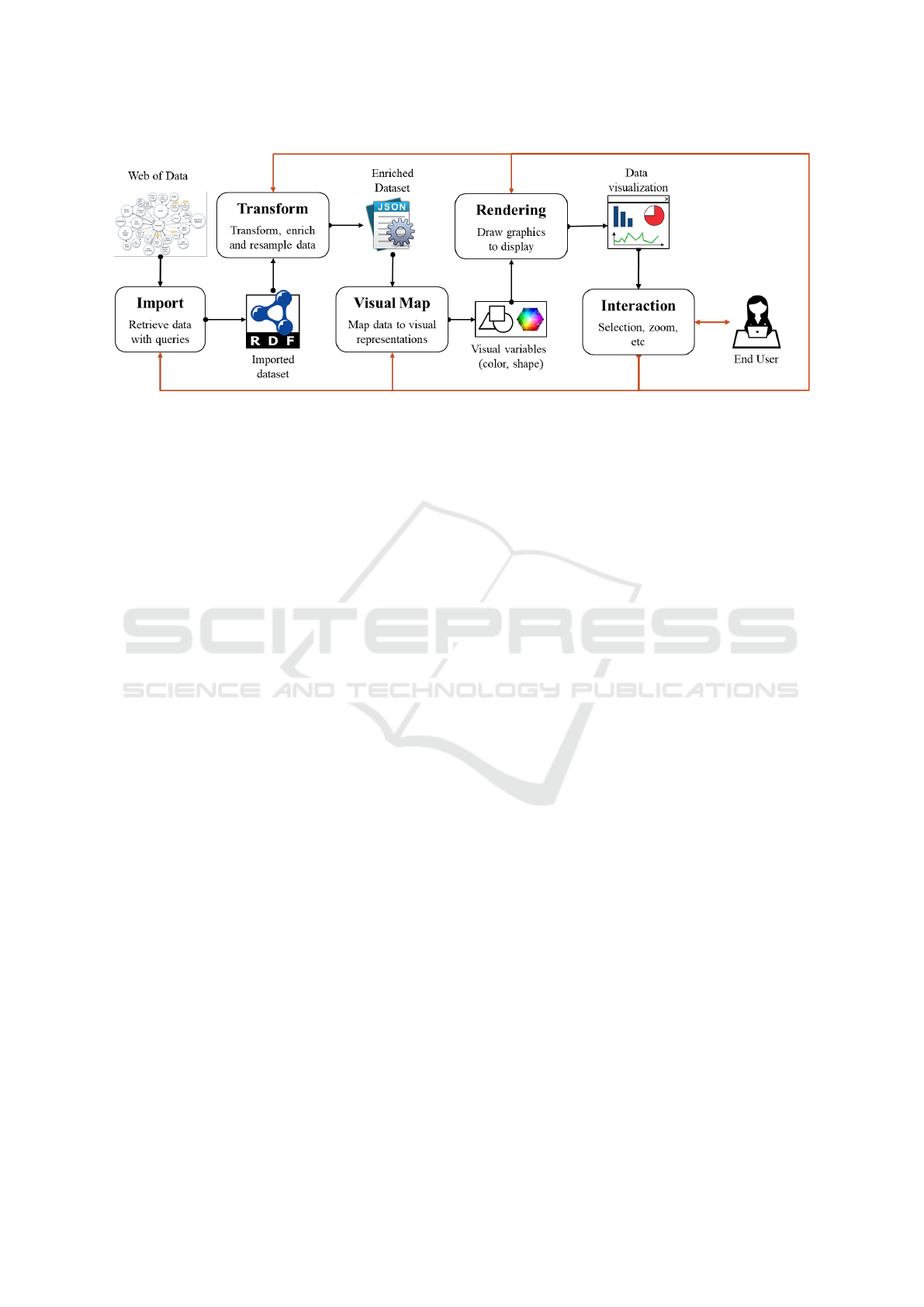
Figure 1: LOD generic visualization pipeline. Based on Telea (2014).
and combine data from different knowledge graphs
possibly in different endpoints.
Transform. This step deals with data quality is-
sues due to the data on the Web is often incom-
plete, redundant, and inconsistent. For that, opera-
tions like filter, enrich, re-sample, and calculate are
needed to transform the dataset according to what is
expected in the visualization. LOD connectivity can
be used to complete the dataset (e.g., by retrieving
data from different endpoints) or via disambiguation
algorithms (i.e., by determining the contradictions or
inconsistencies in the dataset). Existing solutions in
the literature often deliver visualizations based on the
data type (e.g., numeric, categorical, temporal, ge-
ographic, etc.), which provide little added value to
solve domain-related tasks. Thus, this step should in-
clude algorithms capable of deriving interesting indi-
cators to the application domain, ensuring the deliv-
ery of meaningful visualizations capable of support-
ing decision-making processes.
Visual Mapping. This step addresses the visual rep-
resentation of every transformed data via visualiza-
tion techniques capable of representing the relation-
ship between data items (e.g., hierarchy, grids, etc.)
and a meaningful mapping to visual variables (e.g.,
shape, color, etc.). One should also choose whether
and how to visualize the links within LOD data (e.g.
via graphs). The mapping can be performed as part of
the query setup (by associating SPARQL query vari-
ables to visual variables) or interactively on the user
interface. In any case, allowing the user to modify
the visual mapping is a suitable strategy to include se-
mantic meaning in the application domain (e.g., using
standard color codes in the domain).
Rendering. The goal here is to make the best use
of screen space to display data. The graph nature
of LOD implies that information can be retrieved via
alternative paths. Thus, a suitable visualization ap-
proach is the usage of multiple views that are synchro-
nized (via linking and brushing operations (Keim,
2002)) and (i) can be freely arranged on the display
or (ii) are placed in a tab-based interface where each
view is rendered in a separated window.
Interaction. Once the data is visually represented,
the user should be able to interrogate the data through
interactive operations (e.g., selection, pan and zoom,
linking and brushing, and text search). The connec-
tivity property of LOD also allows the dynamic en-
richment of the analysis by allowing the user to query
endpoints during the exploration phase. It is inter-
esting to notice that user interaction might affect any
previous steps in the visualization pipeline.
4 LINKED DATA VISUALIZER
In this section, we present the Linked Data Visualizer
(LDViz), an implementation of the proposed generic
visualization pipeline for LOD datasets based on web
technologies, i.e., JavaScript, the D3 (Data-Driven
Documents) library to create visualizations, and the
nodejs library to manage the linked data access server
that handles data retrieval through SPARQL queries.
LDViz covers the steps of the pipeline as follows.
Import. Data import is handled via SPARQL queries.
The generality of LDViz relies on the fact that users
can query any SPARQL endpoint as long as it can re-
turn result sets in a JSON format. We provide an in-
teractive interface where the user can test and debug
SPARQL queries or import predefined queries, which
they may modify at will.
Transform. Data transformation occurs in three
moments: at the definition of the SPARQL query,
which determines the information to be retrieved from
the SPARQL endpoint; at the transformation engine,
where the SPARQL results sets are cleaned and trans-
WEBIST 2021 - 17th International Conference on Web Information Systems and Technologies
56

formed into a suitable data model for the visualiza-
tion; and when the user filters the input dataset in one
view to explore it in another, which requires reshap-
ing the data to fit the visualization technique.
Visual Mapping. Visual mapping occurs in three
ways: by transforming the SPARQL results set in a
suitable format for visualization, by mapping the data
variables to the visual variables of each technique, and
by allowing users to tune certain variables, e.g., by
defining colors to represent them.
Rendering. This is handled by MGExplorer (Cava,
2017), a visualization interface to explore multidi-
mensional network data.
Interaction. Via the MGExplorer interface, we pro-
vide selection operations that enable the user to subset
the input data to be explored via different visualiza-
tion techniques, which present complementary views
to the data.
4.1 Data Model
The data model corresponds to a custom graph model
defined through a SPARQL query, which uses arbi-
trary query patterns on RDF graphs to generate the
edges ?s ?p ?o of the graph one wants to visual-
ize, where ?s and ?o represent the nodes of the graph
and ?p corresponds to labeled edges between them.
Listing 4 illustrates an example SPARQL query sup-
ported by LDViz. In this example query ?s and ?o
will be bound to actors and ?p to films. The result
of this SPARQL query will be used to build a visual-
ization of the social network of actors co-starring in
films. In addition to these three variables, the data
model allows three other reserved variables that serve
to describe the edges (?p) of the output graph visual-
ization: ?type, ?label, and ?date. Variable ?type
can be used to type the edges of the output graph
(e.g., in a graph where films connect actors, films
can be “typed” or classified by their genre). Due
to human’s perceptual and cognitive limits towards
visualizations, only a certain number of graphic el-
ements can be drawn on the screen. Thus, we al-
low the variable ?type to be bound to only four dif-
ferent values describing the edges. If the variable
?type is bound to more than four distinct values in
the SPARQL query result, the system automatically
determines the three more relevant ones based on the
number of bindings and considers the remaining val-
ues as the ”Other” category. The ?label variable is
intended to provide a description of edges in natural
language (e.g., the value of rdfs:label properties
describing resources). Finally, the ?date variable is
used to provide a visual representation of the distri-
bution of edges over time (e.g., if edges are films, it
could correspond to the release year).
4.2 SPARQL Query Management
Interface
The query management interface (Fig. 2) allows users
to test and debug SPARQL queries or import prede-
fined ones, which they can edit or clone according
to their needs. The interface expects an address for
the SPARQL endpoint of the targeted RDF dataset, a
name for the SPARQL query (optional), and the query
code itself. Note that the user can retrieve data from
more than one endpoint by leveraging the full strength
of the SPARQL language, including the SERVICE
clause – depending on the SPARQL implementation
available at the queried SPARQL endpoint. Action
buttons at the bottom (Fig. 2d) allow to visualize the
SPARQL query results using MGExplorer or export
them as a JSON file.
(a) {" no de ": { " f st ": { " col or ": " gr een "} ,
" snd ": { " co l or " : " o ran ge "} } ,
" s e r vic e s ": { " C or e se B r ows e r ": { " url ":
" h tt p : // co r es e . in ria . f r / srv / s er v ice / cov id ? ur i = "} } }
(b) se l ect * w her e { ? s ? p ? o
bi nd ( " fst " as ? st y le 1 ) bi nd (" sn d " as ? st y le2 ) }
Listing 1: Example of (a) GSS and (b) its usage in a
SPARQL query.
Each query is associated with a Graph Style
Sheet (GSS) that can be used to transform the de-
fault node-link diagram through a declarative specifi-
cation of visibility, layout, and styling rules (Pietriga,
2006). For doing so, the user defines the styling rules
as classes in a style sheet of reference (JSON format)
(e.g., Listing 1a) and bind them to dedicated vari-
ables in the SPARQL query (i.e. ?style1 to style
?s, ?style2 to style ?o, and ?style for both). This
information is then processed in the transformation
engine, which associates the style classes to the vi-
sual variables used in the visualization. Moreover,
the GSS supports a behavior feature that enables ex-
ploring data via an external service (e.g., the Corese
browser (Corby et al., 2012), which allows browsing
the original repository of open data) as long as an
URL is provided (see Listing 1a).
4.3 MGExplorer
In our approach, data visualization is provided via
MGExplorer (Menin et al., 2021), a tool that as-
sists the exploration of multidimensional and multi-
variate graphs. Its main advantage is a flexible ex-
ploratory process that combines multiple views to al-
low comparing (i) two or more different subsets of
From Linked Data Querying to Visual Search: Towards a Visualization Pipeline for LOD Exploration
57
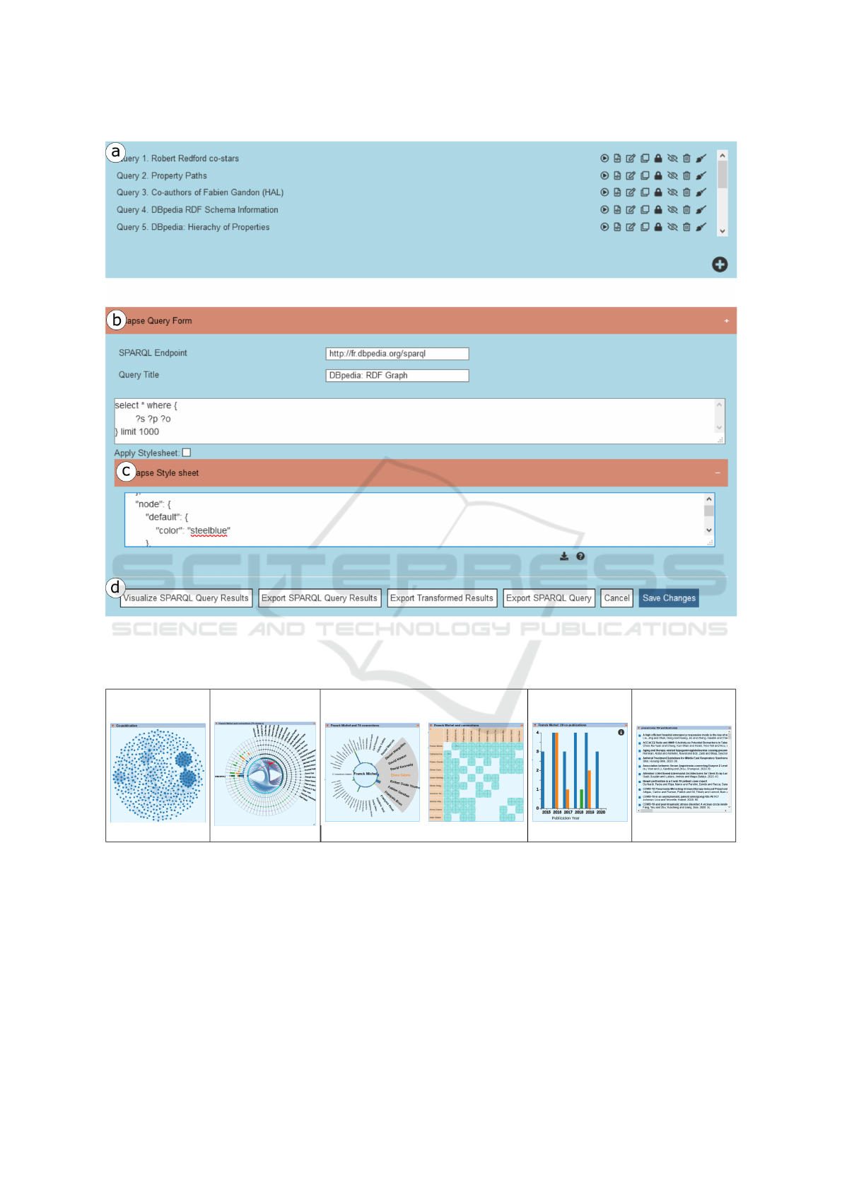
Figure 2: SPARQL Query Management Interface. (a) Listing of predefined queries. (b) The querying area. (c) The GSS
editing area. (d) Control buttons to visualize and export the results.
Table 2: Classification of visualization techniques available in MGExplorer according to the type of analysis they provide.
Node-link
Diagram
ClusterVis IRIS GlyphMatrix Bar chart Listing
network clusters pairwise distribution listing
data through a particular perspective generated by a
particular view, and (ii) multiple perspectives of the
same subset of data using several views. The views
can be dragged, allowing the user to rearrange the vi-
sualization space in meaningful ways to the task at
hand. They are connected via line segments to repre-
sent their dependencies and enable retracing the ex-
ploration path.
The bootstrapping process of MGExplorer con-
sists in displaying a node-link diagram of the relation-
ships within the dataset and a history panel, which are
both interactive and visible throughout the whole ex-
ploration process. Other views can be created, and the
history panel is progressively completed with prove-
nance information that indicates the dependencies be-
tween views in a hierarchical representation, which
allows for prompt recovering of the multiple analyti-
cal paths that emerge from a particular view. Further,
users can hide any of the currently displayed views,
which they may revisit later using the history panel,
WEBIST 2021 - 17th International Conference on Web Information Systems and Technologies
58

thus cleaning the display area in a way that help them
to focus on what is relevant to the task at hand. The in-
put data is the reference data for selection operations
throughout the whole exploratory process. The sys-
tem supports data and view selection, allowing users
to specify subsets of interest from the whole input
graph and suitable views to explore them. Upon the
element selection, the system filters the input dataset
accordingly, and the resulting subset undergoes a pro-
cess that transforms and maps it to the chosen visual-
ization technique. An exploration history records in-
formation regarding the selection operation, the data
subset, the chosen view, and the transformed data.
Table 2 summarizes the set of visualization tech-
niques available in MGExplorer. The Node-link
diagram shows nodes as items and edges between
them as relationships. This diagram is used to pro-
vide an overview of any network defined within the
dataset according to some criteria (e.g., keywords, co-
publications, etc.).
The ClusterVis (Cava et al., 2017) technique de-
picts clusters according to some relationship among
data items. It has a multi-ring layout, where the in-
nermost ring is formed by the data items (represented
by circles), and the remaining rings display the data
attributes (represented by rectangles). The items be-
longing to the same cluster are connected via curved
lines.
The IRIS technique allows isolating a data item
of interest (at the center) and showing all other data
items with which it has a specific relationship in a cir-
cular view (Cava et al., 2014). The data attributes of
the pairwise relationships are encoded by the height
and color of a bar placed between the item of interest
and each related item. The user can place any item
in the field of view center by clicking on it, switching
the focus of the IRIS.
The GlyphMatrix (Cava and Freitas, 2013) tech-
nique is based on a matrix where rows and columns
represent data items in a cluster, and the cells contain
glyphs encoding attributes that describe a pairwise re-
lationship. The default glyph is a star-plot-like shape,
with a variable number of axes used to encode values
of selected data attributes. By pointing a glyph in the
matrix, it is possible to enlarge the glyph to see the
data attributes’ details.
The Bar Chart technique shows the distribution
of data attributes’ value for an item or set of items.
For example, in one of our use case scenarios, the x-
axis encodes temporal information, while the y-axis
encodes the counting of co-publications. The data is
displayed as a single bar per time period or multiple
colored bars to represent categorical information of
attributes.
The Listing technique lists the items that form the
relationship between two or more nodes in the graph.
Each item of the list is linked to a descriptive web
page in the dataset, where the user can obtain more
information about it.
4.4 Transformation Engine
The transformation engine of LDViz consists of a
converter module from SPARQL JSON results to the
MGExplorer data model and a set of algorithms (i.e.,
mappers) that process subsets of data defined during
the exploratory process via visual querying operations
and map the resulting data to a particular visualization
technique, also interactively chosen by the user.
From SPARQL Results to MGExplorer Data
Model. The system receives the SPARQL JSON re-
sults set, which undergoes a transformation process
to extract an attributed graph, encoded in the JSON
format, that will serve as input data to MGExplorer.
Besides identifying the mandatory and optional vari-
ables from the dataset, the process also derives indica-
tors to describe the relationship between each pair of
nodes, such as the total count of items and the count
of items per type, when this information is provided.
MGExplorer Mappers. Every selection operation
triggers a transformation process that filters and trans-
forms the data and maps it to the selected visual-
ization technique via: the ClusterViz mapper, which
extracts clusters of nodes grouped according to the
existing links among them, e.g., in a co-authorship
network, the algorithm detects groups of authors co-
authoring the same publication(s); the IRIS mapper,
which extracts pairwise relationships between the se-
lected node and the other nodes in the subset; the
GlyphMatrix mapper, which extracts pairwise rela-
tionships by analyzing every possible combination of
pairs of nodes within the subset; the Bar chart map-
per, which extracts the distribution of items in the
subset according to a particular attribute (e.g., date);
and the Listing mapper, which extracts the list of links
in the graph and their descriptive information (if pro-
vided). Regardless of the resulting relationship type,
every mapper keeps information on the count and type
of items per relationship.
5 USE CASE SCENARIOS
In this section, we demonstrate the flexibility of LD-
Viz to accommodate and represent different aspects
of an RDF dataset via three case studies exploring
(1) the interactive visualization of an RDF graph and
its ontology, (2) the interactive visualization of RDF
From Linked Data Querying to Visual Search: Towards a Visualization Pipeline for LOD Exploration
59
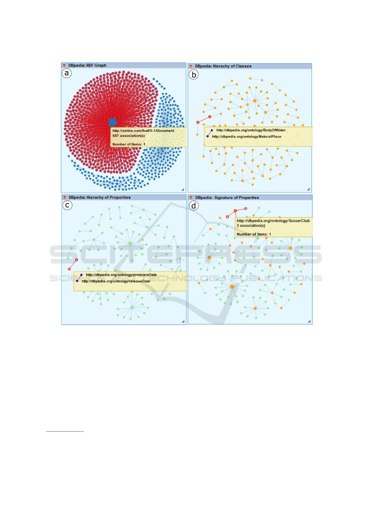
Figure 3: Node-link diagrams representing an extract of DBpedia’s (a) RDF graph, (b) class hierarchy, (c) property hierarchy,
and (d) signatures of properties linking classes (orange) and properties (light green).
graph summarizations, and (3) visual mining of RDF
graphs. Further, we show the generality of LD-
Viz by illustrating those case studies on two distinct
SPARQL endpoints giving access to the DBpedia
FR dataset
1
, which gathers about 400 million triples
describing the content generated in the Wikipedia
project, and the HAL dataset
2
, which gathers scientific
publications from the HAL open archive, a storage of
scholarly documents from all academic fields.
1
SPARQL endpoint: http://fr.dbpedia.org/sparql
2
SPARQL endpoint: http://sparql.archives-ouvertes.fr/
sparql.
Use Case 1: Exploring RDF Graphs and Their On-
tologies.
When working with the Semantic Web, a recurrent
task is to inspect the RDF graph and its ontology
for learning its content. In this use case, we con-
sider exploration tasks where the user wants to (1)
display the RDF graph with no particular goal in mind
and (2) get an idea of the ontology used in the RDF
graph. Thus, we generate four visualizations with the
SPARQL queries in Listing 2, which, although they
are applied to DBpedia, are generic enough to retrieve
information from any SPARQL endpoint.
Fig. 3a depicts the node-link diagram represent-
ing the 1000 first statements in the DBpedia graph,
WEBIST 2021 - 17th International Conference on Web Information Systems and Technologies
60
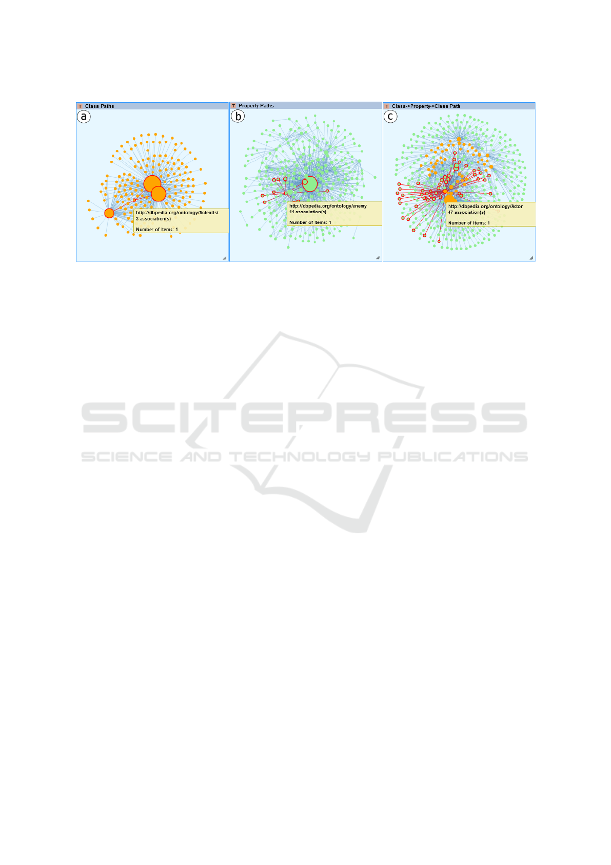
Figure 4: Node-link diagrams representing DBpedia’s (a) class paths, (b) property paths, and (c) paths of type class →
property → class.
where we can hover over the nodes to inspect re-
lated resources. Fig. 3b-d depicts the node-link di-
agrams representing the three typically explored as-
pects of an ontology: the class hierarchy, the prop-
erty hierarchy, and the signatures of properties that
connect properties to classes. Users can hover over
the nodes to inspect and navigate within hierarchies
and explore properties signatures by hovering over
nodes that represent either properties to inspect their
signature or classes to identify all the properties to
whose signatures the selected class belongs, e.g.,
dbo:SoccerClub is related to three properties. Be-
sides allowing users to define nodes and relationships
in meaningful ways for their exploration purposes,
GSS can be used to assign meaningful visual elements
to certain variables. For example, in Fig 3d, we use
color to distinguish property (light green) and class
nodes (orange), easing visual search and understand-
ing of relationships between nodes of different types.
(a) se l ect * w her e { ? s ? p ? o }
(b) se l ect * w her e { ? s ? p ? o
fi l te r (? p = rdf s : s u b Cla s s Of ) }
(c) se l ect * w her e { ? s ? p ? o
fi l te r (? p = rdf s : s u b P rope r t y Of ) }
(d) se l ect * w her e { ? s ? p ? o
fi l te r (? p = rdf s : d oma i n || ? p = r df s : r a ng e )
bi nd ( " fst " as ? st y le 1 ) bi nd (" sn d " as ? st y le2 ) }
Listing 2: SPARQL queries used in Use Case 1 to retrieve
an extract of DBpedia’s (a) RDF graph, (b) class hierarchy,
(c) property hierarchy, and (d) signature of properties.
Use Case 2: Exploring RDF Graph Summariza-
tions.
An RDF graph with millions of triples will generate
a huge and cluttered node-link diagram. Structural
RDF graph summarization addresses this issue by
providing indices or summaries of RDF graphs to ag-
gregate the triples in meaningful ways. Here we con-
sider the visualization of (i) existing paths between
classes of resources in an RDF graph, (ii) existing
property paths between the resources of the graph, or
(iii) paths showing the resource between classes and
properties. The resolution of these tasks is possible
via three visualizations generated with the SPARQL
queries in Listing 3. The resulting node-link dia-
grams (Fig. 4) show classes or properties instead of
resources of the RDF graph.
pr e fi x ldv : < h ttp : // l dv . fr / pa th / >
(a) se l ect di s tin c t ? s ? p ? o
wh ere { ? a ? p ? b . ? a a ? s . ? b a ? o }
(b) se l ect di s tin c t ? s ( ld v : as ? p ) ? o whe re {
?x ? s ? y . ? y ?o ? z . f il t er (? s != ? o )}
(c) se l ect di s tin c t ? s ( ld v : as ? p ) ? o whe re {
{? a ? b ? c . ? a a ? s . b ind ( ? b as ? o )} UNI O N
{? a ? b ? c . ? c a ? s . b ind ( ? b as ? o ) }}
Listing 3: SPARQL queries used in Use Case 2 to retrieve
(a) class paths, (b) property paths, and (c) paths of type class
→ property → class.
Use Case 3: Visual Mining of RDF Graphs.
p r e f i x dbo : < h t t p : / / d b p e d i a . o r g / o n t o l o g y />
p r e f i x dbp : < h t t p : / / d b p e d i a . o r g / p r o p e r t y />
s e l e c t ∗ w h e r e { ? x r d f s : l a b e l ” R o b e r t Re d f or d ”@en .
? p dbo : s t a r r i n g ? x , ? a1 , ? a2 ; r d f s : l a b e l ? l a b e l ;
dbp : r e l e a s e d ? d a t e ; dbp : g e n r e ? ty p e .
? a 1 r d f s : l a b e l ? s . ? a2 r d f s : l a b e l ? o .
f i l t e r ( ? a1 != ? a2 ) }
Listing 4: SPARQL query to retrieve Robert Redford’s co-
stars from DBpedia
Here we show how LDViz enables RDF graph mining
for exploring data describing a phenomenon of inter-
est: network relationship of people. Listing 4 shows
From Linked Data Querying to Visual Search: Towards a Visualization Pipeline for LOD Exploration
61
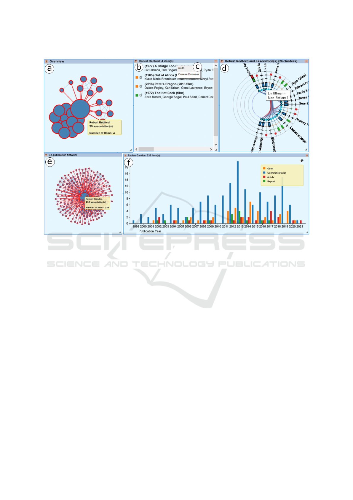
Figure 5: Visualizations used in Use Case 3 to explore Robert Redford’s co-stars (a-d) and Fabien Gandon’s co-authors (e-f).
the query used to retrieve the network of Robert Red-
ford’s from DBpedia, including the name of actors
(?s, ?o) that appear in a movie (?p) with Robert Red-
ford, and a description of movies with the title (?la-
bel), release date (?date), and genre (?type). We found
278 results, creating a network of 26 nodes (actors)
and 124 links (movies) shown in Fig. 5a. We see that
Redford has 25 co-stars across four movies where de-
tails are available at the Listing view (Fig. 5b). The
resources can be explored using the Corese browser
(Fig. 5c) or any other service enabled in the GSS.
The ClusterVis view (Fig. 5d) all Redford’s co-stars
grouped by movies.
p r e f i x d c:< h t t p : / / p u r l . or g / dc / t e r m s />
p r e f i x f o a f :< h t t p : / / xm l ns . com / f o a f / 0. 1 / >
p r e f i x h s c:< h t t p : / / d a t a . a r c h i v e s −o u v e r t e s . f r / sch ema/>
s e l e c t ∗ where { ? p dc : c r e a t o r ? x , ? x1 , ? x2 ;
dc : t y p e ? ty p e ; dc : t i t l e ? l a b e l ; dc : i s s u e d ? d a t e .
? x h s c : p e r s o n ? a . ? a f o a f : name ” F a b i e n Gandon ” .
? x1 hs c : p e r s o n ? a1 . ? a1 f o a f : name ? s .
? x2 hs c : p e r s o n ? a2 . ? a2 f o a f : name ? o .
f i l t e r ( ? x1 != ? x2 ) }
Listing 5: SPARQL query to retrieve Fabien Gandon’s co-
authors from HAL.
We use the SPARQL query in Listing 5 to retrieve
the co-authorship network of Fabien Gandon from
HAL, which results in 4680 triples. The correspond-
ing graph contains 237 nodes (authors) and 1160 links
(publications), which we visualize via the node-link
diagram in Fig. 5d. We observe that Fabien Gandon
has 238 co-authors via 239 publications. We further
explore their temporal distribution using the bar chart
(Fig. 5e), where we can observe that the most publi-
cations occurred between 2012 and 2014. The chart
also displays the publications’ types (i.e., conference
paper, article, report, other), showing that he mostly
published conference papers.
6 DISCUSSION AND
CONCLUSIONS
In this paper, we presented and discussed the impli-
cations of designing a generic visualization pipeline
for exploring LOD datasets. The proposed pipeline
covers different means of accessing LOD datasets; it
addresses various issues regarding data enrichment,
filtering, and reshaping. It supports diverse visualiza-
tion layouts (i.e., one or multiple view systems) and
WEBIST 2021 - 17th International Conference on Web Information Systems and Technologies
62

interactive operations that enable dynamic addition,
replacement and/or modification of the input dataset,
visualization techniques, and visual mapping. We
implemented the pipeline as a generic tool, LDViz,
for exploring and understanding the Semantic Web
of LOD. It provides access to any SPARQL endpoint
by allowing users to perform searches with SPARQL
queries and visualize the results via multiple visual-
ization techniques. We developed LDViz using web
technologies and made it available at (omitted for
blind review), ensuring accessibility by anyone.
LDViz allows the definition of custom subsets of
RDF data via SPARQL queries, which enables dif-
ferent ways of data exploration, such as: (i) inspect-
ing and debugging the RDF graph and its ontology,
(ii) exploring smaller RDF datasets via summariza-
tion to enable task resolution more efficiently by ex-
tracting meaningful information from data, and (iii)
exploring graph mining result sets. When creating
SPARQL queries, a great deal of time and effort is
spent in testing and debugging to ensure that the re-
sulting data is sufficient to accomplish the task at
hand. Thus, we provide a query management inter-
face where users can test and debug their queries,
and import predefined queries, which they may use
as templates to create new queries, simplifying the
querying process. Furthermore, LDViz includes an
interface where users without SPARQL knowledge
can explore the result sets of predefined queries. We
also provide a visualization interface to expert users
in Semantic Web whose goal is to inspect or dis-
cover RDF/LOD datasets, and users of a given appli-
cation domain whose goal is to analyze the data for
supporting decision-making processes. For the pur-
pose of strengthening the exploration capabilities, fu-
ture work includes the implementation of a system of
follow-up queries that allows one to import new data
on-the-fly into the exploration process by either using
predefined queries or creating new suitable queries.
We support exploration search via the MGEx-
plorer, a visualization tool for progressively explor-
ing multidimensional network data via multiple com-
plementary views. Users can select subsets of data
through visual queries and display the results in a
separate view that shows a different perspective to
the data. The multiple views can be hidden, revis-
ited, and arranged in the display area in meaningful
ways to support efficient data exploration while re-
ducing cognitive overhead and clutter-related prob-
lems. While our use cases showed the support of dif-
ferent exploratory tasks, most data on the Web rep-
resent real-world phenomena, which are intrinsically
spatio-temporal. Thus, future work includes expand-
ing the visualization techniques and interaction tools
to represent geospatial data.
The use case scenarios represent the resolution of
well-known use cases for RDF visualization, which
demonstrated the utility and feasibility of LDViz.
However, user-based evaluations are essential and
should be performed to determine the usability and
suitability of the approach. Thus, future work in-
cludes developing user-based evaluations to investi-
gate the usability of LDViz to assist the resolution of
these and other use cases by expert users in Semantic
Web, as well as to assist decision-making processes
via visual mining of RDF graphs, involving expert
users in diverse application domains.
ACKNOWLEDGEMENTS
We are grateful to Ricardo A. Cava, who provided us
with the first version of MGExplorer, which was de-
veloped as part of his Ph.D. thesis at the Federal Uni-
versity of Rio Grande do Sul. C.D.S. Freitas is funded
by the Brazilian funding agencies CNPq and CAPES
(Finance Code 001).
REFERENCES
Antoniazzi, F. and Viola, F. (2018). RDF graph visual-
ization tools: A survey. In 2018 23rd Conference
of Open Innovations Association (FRUCT), pages 25–
36. IEEE.
Anutariya, C. and Dangol, R. (2018). Vizlod: Schema ex-
traction and visualization of linked open data. In 2018
15th International Joint Conference on Computer Sci-
ence and Software Engineering (JCSSE), pages 1–6.
IEEE.
Brunetti, J. M., Auer, S., Garc
´
ıa, R., Kl
´
ımek, J., and
Ne
ˇ
cask
`
y, M. (2013). Formal linked data visualization
model. In Proceedings of International Conference on
Information Integration and Web-based Applications
& Services, pages 309–318.
Card, S. K., Mackinlay, J. D., and Shneiderman, B., editors
(1999). Readings in Information Visualization: Using
Vision to Think. Morgan Kaufmann Publishers Inc.,
San Francisco, CA, USA.
Cava, R. and Freitas, C. D. S. (2013). Glyphs in matrix
representation of graphs for displaying soccer games
results. In The 1st Workshop on Sports Data Visual-
ization. IEEE, volume 13, page 15.
Cava, R., Freitas, C. M., Barboni, E., Palanque, P., and
Winckler, M. (2014). Inside-in search: an alternative
for performing ancillary search tasks on the web. In
2014 9th Latin American Web Congress, pages 91–99.
IEEE.
Cava, R., Freitas, C. M. D. S., and Winckler, M. (2017).
Clustervis: visualizing nodes attributes in multivariate
From Linked Data Querying to Visual Search: Towards a Visualization Pipeline for LOD Exploration
63

graphs. In Proceedings of the Symposium on Applied
Computing, pages 174–179.
Cava, R. A. (2017). Heterogeneous approaches for inter-
active exploration of multivariate networks (ph.d. the-
sis). http://hdl.handle.net/10183/157522.
Chawuthai, R. and Takeda, H. (2015). Rdf graph visualiza-
tion by interpreting linked data as knowledge. In Joint
International Semantic Technology Conference, pages
23–39. Springer.
Corby, O., Gaignard, A., Faron-Zucker, C., and Montagnat,
J. (2012). KGRAM Versatile Data Graphs Querying
and Inference Engine. In Proc. IEEE/WIC/ACM In-
ternational Conference on Web Intelligence, Macau.
De Vocht, L., Dimou, A., Breuer, J., Van Compernolle, M.,
Verborgh, R., Mannens, E., Mechant, P., and Van de
Walle, R. (2015). A visual exploration workflow as
enabler for the exploitation of linked open data. In
IESD’14 Proceedings of the 3rd International Con-
ference on Intelligent Exploration of Semantic Data,
volume 1279, pages 30–41. CER-WS. org.
Deligiannidis, L., Kochut, K. J., and Sheth, A. P. (2007).
Rdf data exploration and visualization. In Proceedings
of the ACM first workshop on CyberInfrastructure: in-
formation management in eScience, pages 39–46.
Destandau, M., Appert, C., and Pietriga, E. (2021). S-paths:
Set-based visual exploration of linked data driven by
semantic paths. Semantic Web, 12(1):99–116.
Frasincar, F., Telea, A., and Houben, G.-J. (2006). Adapting
graph visualization techniques for the visualization of
rdf data. In Visualizing the semantic web, pages 154–
171. Springer.
Gandon, F. (2018). A Survey of the First 20 Years of Re-
search on Semantic Web and Linked Data. Revue des
Sciences et Technologies de l’Information.
Graves, A. (2013). Creation of visualizations based on
linked data. In Proceedings of the 3rd International
Conference on Web Intelligence, Mining and Seman-
tics, pages 1–12.
Graziosi, A., Di Iorio, A., Poggi, F., Peroni, S., and Bonini,
L. (2018). Customising lod views: a declarative ap-
proach. In Proceedings of the 33rd Annual ACM Sym-
posium on Applied Computing, pages 2185–2192.
Jacksi, K., Zeebaree, S. R., and Dimililer, N. (2018). Lod
explorer: Presenting the web of data. Int. J. Adv. Com-
put. Sci. Appl. IJACSA, 9(1).
Keim, D. A. (2002). Information visualization and visual
data mining. IEEE transactions on Visualization and
Computer Graphics, 8(1):1–8.
Kremen, P., Saeeda, L., and Blasko, M. (2018). Dataset
dashboard-a sparql endpoint explorer. In VOILA@
ISWC, pages 70–77.
Menin, A., Cava, R., Freitas, C. M. D. S., Corby, O., and
Winckler, M. (2021). Towards a Visual Approach for
Representing Analytical Provenance in Exploration
Processes. In 25th International Conference Informa-
tion Visualisation.
Munzner, T. (2014). Visualization analysis and design.
CRC press.
Pe
˜
na, O., Aguilera, U., and L
´
opez-de Ipi
˜
na, D. (2016).
Exploring lod through metadata extraction and data-
driven visualizations. Program.
Pietriga, E. (2006). Semantic web data visualization with
graph style sheets. In Proceedings of the 2006 ACM
symposium on Software visualization, pages 177–178.
Skjæveland, M. G. (2012). Sgvizler: A javascript wrapper
for easy visualization of sparql result sets. In Extended
Semantic Web Conference, pages 361–365. Springer.
Telea, A. C. (2014). Data visualization: principles and
practice. CRC Press.
Thellmann, K., Galkin, M., Orlandi, F., and Auer, S. (2015).
Linkdaviz–automatic binding of linked data to visual-
izations. In International Semantic Web Conference,
pages 147–162. Springer.
WEBIST 2021 - 17th International Conference on Web Information Systems and Technologies
64
