
A Website with an Activity based Traffic Indicator System as a
Warning Tool for the COVID-19 Pandemic
Justin Junsay, Aaron Joaquin Lebumfacil, Ivan George Tarun and William Emmanuel Yu
School of Science and Engineering, Ateneo de Manila University, Katipunan Avenue, Loyola Heights, Quezon City,
Philippines
Keywords: Big Data and the Web, Web Programming, Pandemic Management.
Abstract: This study describes an activity based traffic indicator system to provide information for the management of
the COVID-19 pandemic. The purpose of the indicator is to be able to discern what activities (e.g., grocery
shopping and sports) are dangerous, uncertain, or safe to do in the Philippines on a per-region basis through
a traffic light’s color of red, yellow, and green. The activity based traffic indicator system does this by utilizing
a social probability model based on the birthday paradox to determine the exposure risk which is the
probability of meeting someone infected (PoMSI). Additionally, a website called SANITTISE was created to
host the indicator system and also to display other pandemic related graphs. Furthermore, a user interface/user
experience (UI/UX) test was conducted through a survey to measure the effectiveness of the website created.
Regarding the results of the test, it was positive since all of the sections were well received in the survey. This
meant that the work done on the website appears substantial as the respondents were able to understand the
contents and purpose of the website and also effectively traverse the website and create deductions from the
information available on the website.
1 INTRODUCTION
In 2020, Shereen et al. stated that the world
experienced a pandemic due to a highly transmissible
and pathogenic viral infection, called COVID-19
(Shereen et al., 2020). Additionally, Çelik et al. said
that the zoonotic virus that caused the disease is called
SARS-CoV-2 (Çelik et al., 2020). As of April 2021,
according to the Philippines Department of Health
(DOH), the Philippines has a total case of more than
812,000 infected while more than 646,000 recovered
and more than 13,000 Filipinos died (DOH, 2021b).
Regarding information technology, there are already
data visualizations developed in the Philippines to
keep track of the local spread of COVID-19. An
example of which is the DOH COVID-19 tracker and
the Feasibility Analysis of Syndromic Surveillance
using Spatio-Temporal Epidemiological Modeler
(FASSSTER) website (DOH, 2021b; FASSSTER,
2020). These websites already present the relevant
information like the total cases and they are vital for
devising a response for the COVID-19 pandemic.
However, the problem here is that not everyone is
able to make sense of the current situation given the
information found in these websites. To be specific,
not everyone knows how to act appropriately nor
interpret the data once it is shown to them. Therefore,
this study aims to create an activity based traffic
indicator system for COVID-19. The purpose of the
indicator is to be able to discern what activities (e.g.,
grocery shopping and sports) are dangerous,
uncertain, or safe to do in the Philippines on a per-
region basis through a traffic light’s corresponding
red, yellow, and green colors. In the study titled
Activity based Traffic Indicator System for
Monitoring the COVID-19 Pandemic, the team
already established the calculations needed to be done
to indicate the risk of certain activities (Junsay et al.,
2021a). In the previous study, the probability model
used for the calculations was based on the birthday
paradox theory and the risk it estimates is the
exposure risk or the probability of meeting potential
COVID hosts in public places. Moreover, part of this
study is also to create a website to host the indicator
system. After that, a user interface/user experience
(UI/UX) test must be conducted to measure the
effectiveness of the indicator and other
statistics/graphs to be implemented on the website.
Since the scope of the study is only within the
Philippines, any pandemic related case information
used for the calculations of the indicator is limited to
the daily data drop of the DOH (DOH, 2021a). In
250
Junsay, J., Lebumfacil, A., Tarun, I. and Yu, W.
A Website with an Activity based Traffic Indicator System as a Warning Tool for the COVID-19 Pandemic.
DOI: 10.5220/0010648700003058
In Proceedings of the 17th International Conference on Web Information Systems and Technologies (WEBIST 2021), pages 250-256
ISBN: 978-989-758-536-4; ISSN: 2184-3252
Copyright
c
2021 by SCITEPRESS – Science and Technology Publications, Lda. All rights reserved

visualizing the risk of activities through a traffic
light’s color, the activity based traffic indicator
system would make it much easier for people to
understand the situation during the COVID-19
pandemic. Hopefully, the indicator should also help
in lowering potential infections.
2 METHODS
2.1 Components of the Traffic
Indicator
As mentioned in the team’s previous study, there are
a total of 10 activities for the indicator: exercise with
equipment, exercising without equipment, shopping
in a store, mall strolling, going to a concert, restaurant
dining, grocery shopping, riding a bus, riding a train,
and going to the office (Junsay et al., 2021a). In
addition, the exposure risk used for the activity based
traffic indicator was based on the modified birthday
paradox model established in the study titled COSRE:
Community Exposure Risk Estimator for the
COVID-19 Pandemic (Sun, 2020). Furthermore, the
team relabeled the exposure risk that the COSRE
model calculates into PoMSI or the probability of
meeting someone infected (Junsay et al., 2021a).
𝑃𝑟
(,,)
=1−
(
)
!
!
, if p≠0 and n≠0 and a≠0
(1)
𝑃𝑟
(,,)
=0, if p = 0 or n = 0 or a = 0
(2)
As seen on Equation 1 and Equation 2, the model
utilizes three parameters: [p, a, and n]. To summarize
the model, the first thing to do is to calculate the odds
of not meeting any infected person and subtract that
odds from 1 to get the probability of meeting at least
one infected person (Junsay et al., 2021a). In the
team’s previous study, it was already established that
p is equivalent to the total population of each of the
17 regions in the Philippines and a is equivalent to the
active cases per region which is the infected
population. The value of n is the occupant load, and
it is the number of people in a building or
establishment. Its formula is the square footage of an
area over the occupant load factor. If the venue has
fixed seating, then the occupant load is equivalent to
the seating capacity. Moreover, the team relied on
sample square footage areas and seating capacities
obtained on the Internet to be used as a component of
the occupant load for each activity.
Table 1: Activities’ Capacity Percentage and its Occupant
Load per Quarantine Type.
Activity ECQ MECQ GCQ MGCQ
No
Quarantine
Exercise w/
Equipment
B B
30%
6
50%
10
100%
19
Exercise w/o
Equipment
B B
30%
8
50%
12
100%
24
Sales (Retail
Stores)
B
50%
45
100%
90
100%
90
100%
90
Malls B
50%
1167
100%
2334
100%
2334
100%
2334
Restaurant
Dining
B B
30%
42
50%
70
100%
139
Concert B B B
50%
10000
100%
20000
Supermarket
50%
347
100%
694
100%
694
100%
694
100%
694
Bus B B
50%
23
50%
23
100%
45
Train B B
50%
591
50%
591
100%
1182
Office B
50%
61
100%
122
100%
122
100%
112
Legend: B = Banned
However, it is worth noting that the team in their
previous study did not consider the different
quarantine types established in the Philippines
(Junsay et al., 2021a). Essentially, the Philippines’
Inter-Agency Task Force for the Management of
Emerging Infectious Diseases (IATF) stated that
there are four community quarantine types: enhanced
community quarantine (ECQ), modified enhanced
community quarantine (MECQ), general community
quarantine (GCQ), and modified general community
quarantine (MGCQ) (IATF, 2020). In addition, ECQ
would be the most restrictive while MGCQ would be
the most lenient. Basically, not all activities can
operate in certain quarantine types since some
activities are riskier than the others. If an activity can
function, capacity must also be reduced depending on
the quarantine type. Therefore, the capacity
percentage of an activity per quarantine type
authorized by the Philippines’ Department of Trade
and Industry (DTI) and Department of Transportation
(DOTr) was applied to the initial calculations of n or
the occupant load (100% occupancy) (DTI, 2020;
DOTr, 2020a, 2020b). However, 100% occupancy
would still be included as an option for the indicator
so that the people would still have an idea what the
A Website with an Activity based Traffic Indicator System as a Warning Tool for the COVID-19 Pandemic
251
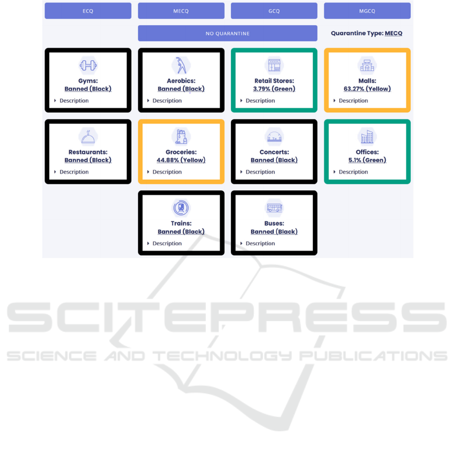
Figure 1: Activity Based Traffic Indicator (MECQ, NCR).
value of PoMSI would be if no quarantine were
imposed. It is worth noting that local government
units (LGUs) in the Philippines implement different
protocols and requirements for domestic travelers to
follow (Aguilar, 2021). For consistency, the
authorized statements of the departments mentioned
above were used as the basis for the activity
restrictions per quarantine type. Table 1 contains the
capacity percentage of an activity and its
corresponding occupant load per quarantine type. In
the table, the activity is marked as “banned” if it is not
allowed to operate. When applying the different
capacity percentage to the occupant loads, if the
output was a decimal number, it was rounded up to
the next largest whole number. This was done since it
is illogical to represent people with decimal numbers
when computing for n. It is also important that the risk
that the indicator system calculates must be classified
based on the riskiness of the activity. In the team’s
previous study, a risk level classification was already
devised (Junsay et al., 2021a). Basically, there are 3
risk levels: green (below 25%), yellow (25% to 75%),
and red (above 75%). For yellow, it has two sub levels
which is why the range of values is greater compared
to the other two colors. As the risk level increases,
more precautionary measures are needed to be done
when the exposure risk of an activity is greater.
2.2 SANITTISE Showcase
The created website has adopted the name
SANITTISE (Systematic Analysis of nCoV
Information Through Traffic Indicator Structured
Evaluations) out of preference for having a
convenient name that is easy to remember for the
public (Junsay et al., 2021b). The website includes a
Landing Screen that visitors would first see upon
viewing the website. The Landing Screen contains the
logo of the website, a quick description, and the top
header incorporating the primary navigation menu.
The section below this contains the Region Selection
portion of the website. This is where users can select
what region the activity based traffic indicator will
display further down the website. The website also
shows the legend for the traffic indicator and it is
displayed right after the Region Selection Screen. The
legend reflects the finalized risk level classification
which shows the necessary precautions that are
needed to be taken depending on the output of the
indicator. Next is the actual implementation of the
activity based traffic indicator. This comes after the
legend and it shows the ten activities along with their
respective PoMSI values and corresponding color
based on the legend. Each activity in the indicator is
accompanied by a short description which can be
toggled through a dropdown menu. The top portion of
the indicator contains buttons where users can select
WEBIST 2021 - 17th International Conference on Web Information Systems and Technologies
252
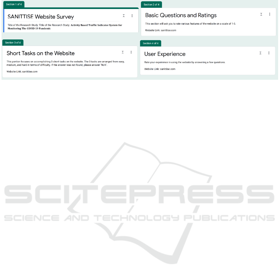
Figure 2: Sections of the Survey.
what quarantine type should be displayed, choosing
one will subsequently change the PoMSI values along
with which activities are allowed or banned. The
values shown in Figure 1 are the PoMSI values for
NCR when the quarantine type is set to MECQ. The
black bordered activities signify that an activity is
prohibited when that particular quarantine type is
being enforced. Below the indicator would be the
accompanying regional statistics graphs. These
graphs show the cases, deaths, and recoveries over
time for the selected region. They are fully interactive
with the ability to do panning, box zoom, mouse
wheel zoom, x-axis zoom, crosshairs, and hover
tooltips. There are two types of ranges that can be
displayed. One would be the entire duration of the
pandemic so far while the other range only depicts the
last seven days. Their corresponding headings exhibit
the total number of cases, deaths, or recoveries that
have occurred thus far. In general, these are the main
features of the SANITTISE website. As for the
mobile version, the website is responsive and can
handle varying screen sizes. The layout of the
elements change depending on the screen dimensions,
but the content remains the same overall. Lastly, the
website checks for new updates every three hours
since the DOH Data Drop is not updated at a regular
time each day (DOH, 2021a).
3 UI/UX TESTING
To gauge the usability and effectiveness of the
indicator, testing was done on the website. Hence, the
website must be tested by multiple people to find out
the improvements needed to be done and also to
identify what features should be retained.
Unmoderated testing was carried out since it entails
the participants to complete the test requirements at
their own convenience. Candidate participants were
contacted through online messaging sites (e.g.,
Facebook Messenger) to answer the survey. Since the
indicator is for the use of the public, healthy adults
(including university students) are the perfect
candidate participants since this categorization is still
broad enough to represent the public and they are the
only ones allowed to leave their houses during the
pandemic. Even though it is unmoderated, answering
the survey would take at least 15 minutes for it to be
completed. Additionally, the target number of
respondents for the survey is 20. After the participant
has finished answering the survey, the findings can be
recorded, and the personal data of the participant will
be stored for six months before deletion. Moreover,
the survey used to test the website was created
through Google Forms and it was split into four
sections (Junsay et al., 2021c). For the first section,
its purpose is to introduce the goal of the study and to
obtain the consent of the participants. The second
section of the survey contains questions that gauge
the first impression of the respondents regarding the
website. Basically, it was made to check whether they
find the interface of the website understandable and
appealing. In addition, this section and the fourth
section of the survey were inspired by some questions
found on the article titled 15 Website Survey
Questions to Customers in 2021 (Dossetto, 2021). For
the third section of the survey, it was created to test
the ease of using the website when the respondents
are given a certain scenario or a certain thing to look
at to measure the accessibility of the features of the
website. The fourth section of the survey was created
to ask the respondents regarding their thoughts about
the website after going through and using it. It also
asks them how likely they will be using the website
in the future and how likely they will be
recommending it to others. Lastly, the last part of the
survey asks the participants if they have comments
and suggestions that can help improve the website.
Responses for most of the questions in the survey are
limited to a 5-point scale except for the questions that
require typewritten responses from the respondents
A Website with an Activity based Traffic Indicator System as a Warning Tool for the COVID-19 Pandemic
253

(e.g., third section of the survey). The survey was
opened on February 10, 2021 and the final survey was
answered on March 5, 2021. The respondents
consisted of people with ages ranging from 18 to 50
years old. The study included 6 non-university
students.
4 RESULTS
Table 2: Survey Results for Section 2 (Basic Ratings and
Questions).
Question 1 2 3 4 5
How well do you understand what
SANITTISE does from its description?
0 0 3 11 8
How readable is the font used on the
website?
0 0 0 3 17
What would you rate the color scheme
of the website?
0 0 5 9 6
How clear is the distinction between the
colors of the traffic indicator system
(
red,
y
ellow, and
g
reen
)
?
0 0 1 6 13
How well are you able to understand the
information given on the website?
0 0 3 9 8
Without being told what to do, how well
are you able to use the website in
determining the risk of each activity in
each region?
0 0 3 7 10
Judging by appearances only, how
inclined are you to use the website again
in the future?
0 0 1 9 10
These are the results for the UI/UX testing done for
the study which is carried out through
asynchronous/unmoderated testing. For the first
impressions, which is the second section of the
survey, they looked promising with four out of seven
of the questions having a majority of a rating of 5
which was excellent. These questions had to do with
the font, distinction between the colors, and their
inclination to use the website again. Three out of the
seven questions had a rating of four out of five which
meant that the respondents felt more than unmoved
(3) but less than excellent (5). These questions had to
do with the understanding of the SANITTISE
website, the color scheme, the information shared on
the website, and the inclination to reuse the website
in the future. For the remaining questions, which
tackled the understanding of SANITTISE from its
description, the color scheme of the website, and the
ability to understand the information given on the
website, 4 and 5 were the majority chosen instead of
3 which leads the researchers to believe that the
website was taken in good favor.
Table 3: Survey Results for Section 2 (Short Tasks on the
Website).
Short Task Correct Wrong
(Easy) How many total recoveries from
COVID-19 are there in Region VII?
16 4
(Medium) What is the risk of meeting
someone with COVID-19 in the office
in NCR under no
q
uarantine?
19 1
(Hard) What activity is banned in
ARMM if the quarantine type is set to
“GCQ”?
20 0
For the results of the short tasks, which is the third
section of the survey, it showed different results on
the easy, medium, and hard tasks. In order to get these
results, the researchers had to check the date the
survey was answered and compared the answers of
the respondents to an SQL file where all the data of
the COVID cases were recorded. The task wherein
people blundered the most was the easy task (How
many Total Recoveries from COVID-19 are there in
Region VII?) only having 80% of the participants
getting the right answer. This most likely had to do
with the fact that the total recoveries on the website
was labeled as “200,000 Recoveries” for example and
does not include the word “Total” which the
respondents were probably trying to find specifically.
Therefore, the researchers changed the label of
confirmed cases/deaths/recoveries to daily cases/total
deaths/total recoveries and added a total count
amount right below the “daily” titles for clarity. For
the medium difficulty task (What is the risk of
meeting someone with COVID-19 in the office in
NCR under no quarantine?), 95% of the respondents
got the answer correct. Lastly, for the hard difficulty
task (What activity is banned in ARMM if the
quarantine type is set to "GCQ") 100% of the
respondents got it correct.
For the user experience results, which is the fourth
section of the survey, they were collected after the
short tasks were carried out. This meant that at the
time of taking these responses, the respondents have
had ample time to go through the website and
experience it firsthand. For seven out of the eight
questions on the user experience part of the survey, it
showed that the majority of the participants thought
that overall, using the website was a pleasant
experience. These questions had to do with the
confidence in using the website, the difficulty of
finding recovered cases, the difficulty of finding the
risk level of each activity, the difficulty of finding the
banned activities, the confidence in repeating the 3
tasks from the previous section, the likeliness to visit
the website again, and lastly, the likeliness of
WEBIST 2021 - 17th International Conference on Web Information Systems and Technologies
254

Table 4: Survey Results for Section 2 (User Experience).
Question 1 2 3 4 5
After completing the 3 tasks asked in
the previous section, how confident
are you now with using the website
to determine each risk of an activity
in each re
g
ion?
0 0 1 6 13
What was the difficulty of finding
the number of recovered cases for
each re
g
ion?
1 0 2 6 11
What was the difficulty of finding
the risk level of each activity for
each re
g
ion?
1 0 3 5 11
What was the difficulty of finding
banned activities, given a quarantine
type, for each region?
0 1 1 6 12
How confident are you in completing
the 3 previous tasks again if asked?
0 0 1 1 18
How likely are you to visit the
website again?
0 0 3 8 9
How likely are you to consult this
website in planning what activities to
do?
0 0 2 9 9
How likely are you to recommend
this website to other people?
0 0 0 5 15
recommending the website to other people. Although
it is believed that the website has been taken very
well, in a few of the questions there is one outlier who
believed that it was difficult to do some tasks on the
website. Upon further analysis, when compared to
their other answers on the questionnaire, it appears as
though the outlier misunderstood the question. This is
because when it came to answering the questions on
whether they would go back to using the website
again and when they were asked about their
confidence on completing the tasks again, the outlier
gave those questions high marks. Also, when it came
to the short task results, the outlier got every answer
correct (from easy to hard) which meant that it was
not impossible for them to use the website. This can
be seen as one of the disadvantages of unmoderated
and asynchronous testing as the participants are not
able to clear up misunderstandings with the
surveyors. For the last question, which tackled the
likeliness of the participants to consult the website on
what planning for activities, rather than having a
majority of responses on the highest rated option (5),
this question had a split tie between the two highest
rated options (4 and 5). This would mean that
although the respondents would not guarantee using
the website, most of the respondents believe that they
would return to the website to use it for planning their
activities.
5 CONCLUSIONS
The aim of this study was to create an activity based
traffic indicator system for managing the COVID-19
pandemic. The indicator created uses the COSRE
social probability model which calculates the
exposure risk or the probability of meeting someone
infected (PoMSI) (Sun, 2020). Basically, when the
value of PoMSI is high, the chances of meeting
someone infected with COVID-19 is also high.
Furthermore, part of this study was also to create a
website to host the indicator system and also test its
usability by conducting a UI/UX test through a
survey. With this, the created website was called
SANITTISE and it contains the activity based traffic
indicator which calculates PoMSI for all of the 17
regions in the Philippines. To accompany the
indicator, the website also contains regional statistics
and graphs which can normally be found in tracker
websites. The results of the UI/UX testing showed
positive results as all of the sections were well
received in the survey. This meant that the work done
on the website appears substantial as the respondents
were able to understand the purpose of the website
and also effectively traverse the website and create
deductions from the information available on the
website. Although it appears as though the website is
already in its final form, the survey showed the
researchers that there were some improvements that
could be done on the website. This was manifested
through changing some of the labels on the website as
well as adding support for the visually impaired on
the website. Overall, the aim of the study was
achieved with the creation of the activity based traffic
indicator being successful along with it being deemed
usable by the public.
6 LIMITATIONS AND
IMPROVEMENTS
Regarding the focus of the indicator, it is restricted to
an activity based traffic indicator system for COVID-
19. Since the indicator caters to one disease, the
indicator may only apply to the COVID-19 pandemic.
If used for other infectious disease pandemics, the
usability and effectiveness of the core functions of the
indicator depends on the similarities of potential
diseases to COVID-19. Next, the indicator is not
diagnostic nor medical, it is more of a visualization
tool. This means that the indicator is meant to aid in
public awareness to support pandemic management.
As the data is in aggregates, it is not meant to be the
A Website with an Activity based Traffic Indicator System as a Warning Tool for the COVID-19 Pandemic
255

only tool for pandemic-related decision making.
Hence, it cannot reflect individual cases. Third, it’s
also worth mentioning that this indicator is not meant
to replace existing visualizations of pandemic data
such as the DOH COVID-19 tracker (DOH, 2021b).
Tracker websites already present relevant data about
a specific infectious disease and the indicator of this
study gives insights or interpret these established data
instead so that it can be more readable or easily
understood supplemented by research on the safety of
particular activities. Lastly, the geographic scope of
the indicator encapsulates every region of the
Philippines. There is an indicator per region that
shows the selected region’s risks associated with
carrying out certain tasks while in the midst of a
pandemic.
As for potential improvements, existing COVID-
19 data used in the study was only limited to the
Philippines. With this, a possible improvement is to
create an activity based indicator system which can
be applied for more than one country. Facebook also
published a per municipality public dataset about how
people are responding to physical distancing
measures (Facebook, n.d.). The dataset has two
different metrics: the Change in Movement metric
(how much people are moving around) and the Stay
Put metric (the fraction of the population that appears
to stay within a small area surrounding their home for
an entire day). This may further be incorporated into
the calculations of the indicator system since it is
related to general movement of a population.
ACKNOWLEDGEMENTS
We would like to show our gratitude to Dr. William
Yu, our research advisor, for directing the flow of the
study. To the FASSSTER team and the Ateneo Center
for Computing Competency and Research (ACCRe),
thank you for creating and giving access to the
FASSSTER website. We would also like to give
thanks to the DOH’s Epidemiology Bureau for
creating and maintaining the COVID-19 data drop
used in the study.
REFERENCES
Aguilar, K. (2021, February 10). Gov’t to discuss
standardized travel requirements between LGUs.
Inquirer. https://newsinfo.inquirer.net/
Department of Health. (2021). COVID-19 data [Data file].
Retrieved from https://drive.google.com/drive/folders/
1ZPPcVU4M7T-dtRyUceb0pMAd8ickYf8o
Department of Health. (2021, April). COVID-19 tracker
Philippines. ncovtracker. https://ncovtracker.doh.gov.ph/
Department of Trade and Industry. (2020, October 2).
Memorandum circular no. 20-52. Official Gazette.
https://www.officialgazette.gov.ph/downloads/2020/0
9sep/20201002-MEMORANDUM-CIRCULAR-NO-
20-52-S-2020.pdf
Department of Transportation. (2020, April 30). DOTr
issues guidelines for road transport sector in areas
under GCQ. DOTr. https://dotr.gov.ph/
Department of Transportation. (2020, October 17). MRT,
LRT, PNR to gradually increase passenger capacity to
accommodate more commuters starting Monday.
DOTr. https://dotr.gov.ph/
Dossetto, F. (2021). The 15 best website survey questions
to ask customers in 2021. Hotjar.
https://www.hotjar.com/
Facebook. (n.d.). Movement Range Maps. Facebook Data
for Good. https://dataforgood.fb.com/tools/movement-
range-maps/
FASSSTER team. (2020). DOH FASSSTER COVID-19.
FASSSTER. https://fassster.ehealth.ph/covid19.
Inter-Agency Task Force for the Management of Emerging
Infectious Diseases. (2020, October 22). Omnibus
guidelines on the implementation of community
quarantine in the Philippines with amendments as of
October 22, 2020. Official Gazette.
https://www.officialgazette.gov.ph/downloads/2020/1
0oct/OMNIBUS-Guidelines-with-Amendments-as-of-
October-22-2020.pdf
Junsay, J., Lebumfacil, A., Tarun, I., & Yu, W. (2021).
Activity based traffic indicator system for monitoring
the COVID-19 pandemic. In Proceedings of the 23rd
International Conference on Enterprise Information
Systems (ICEIS 2021), 1, 183-191. https://doi.org/
10.5220/0010399201830191
Junsay, J., Lebumfacil, A., Tarun, I., & Yu, W. (2021).
SANITTISE COVID-19 Activity Indicator. SANITTISE
website. https://sanittise.com
Junsay, J., Lebumfacil, A., Tarun, I., & Yu, W. (2021, April
8). SANITTISE Website Survey. Google Drive.
https://drive.google.com/file/d/1mRw2LBQWZTUC
M9ogVmWabYg5l5cSEKjS/view?usp=sharing
Shereen, M. A., Khan, S., Kazmi, A., Bashi, N., &
Siddique, R. (2020). COVID-19 infection: Origin,
transmission, and characteristics of human
coronaviruses. Journal of Advanced Research, 24, 91–
98. https://doi.org/10.1016/j.jare.2020.03.005
Sun, Z. (2020, May 22). COSRE: Community exposure risk
estimator for the COVID-19 pandemic. arXiv.
https://arxiv.org/
Çelik, I., Saatçi, E., & Eyüboğ, A. F. (2020). Emerging and
reemerging respiratory viral infections up to Covid-19.
Turk J. Med Sci, 557–562. https://doi.org/10.3906/sag-
2004-126
WEBIST 2021 - 17th International Conference on Web Information Systems and Technologies
256
