
PlaceProfile: Employing Visual and Cluster Analysis to Profile Regions
based on Points of Interest
Rafael Mariano Christ
´
ofano, Wilson Est
´
ecio Marc
´
ılio J
´
unior
a
and Danilo Medeiros Eler
b
S
˜
ao Paulo State University (UNESP), Presidente Prudente/S
˜
ao Paulo, Brazil
Keywords:
Area Profiling, Smart Cities, Smart Mobility, POIs, Clustering, Visualization, Google Maps.
Abstract:
Understanding how commercial and social activities and points of interest are located in a city is essential to
plan efficient cities in smart mobility. Over the years, the growth of data sources from distinct online social
networks has enabled new perspectives to applications that provide mechanisms to aid in comprehension of
how people displaces between different regions within a city. To support enterprises and governments better
understand and compare distinct regions of a city, this work proposes a web application called PlaceProfile to
perform visual profiling of city areas based on iconographic visualization and to label areas based on cluster-
ing algorithms. The visualization results are overlayered on Google Maps to enrich the map layout and aid
analyst in understanding region profiling at a glance. Besides, PlaceProfile coordinates a radar chart with areas
selected by the user to enable detailed inspection of the frequency of categories of points of interest (POIs).
This linked views approach also supports clustering algorithms’ explainability by providing inspections of the
attributes used to compute similarities. We employed the proposed approach in a case study in the S
˜
ao Paulo
city, Brazil.
1 INTRODUCTION
Since the work of (Ravenstein, 1885), researchers
have been focused on understanding displacement
patterns to identify how people need to move in a re-
gion. With the growth of big cities, the increase in
population, society’s evolution, and technology inno-
vation, cities have become more diverse and complex
than ever. The world is increasingly interconnected.
Accordingly, the displacement of people to carry out
their daily activities has become a major challenge.
Therefore, creating solutions to improve mobility so
that people can move from one point to another in an
agile and safe way has been a challenge for local gov-
ernments to manage (D’Andrea et al., 2018). Thus,
city planning is closely related to human mobility in
an urban territory. As a result, this planning directly
influences the population’s access to services such as
hospitals, schools, parks, and events.
Urban mobility is related to the movement of peo-
ple and goods in a city, with the objective of de-
veloping economic and social activities in the ur-
ban areas, urban agglomerations and metropolitan re-
a
https://orcid.org/0000-0002-8580-2779
b
https://orcid.org/0000-0002-9493-145X
gions (Silva, 2014). In the past, to understand mobil-
ity and activities in a city, researchers collected sur-
vey data on small samples and low frequencies. Cur-
rently, information about activities in a region can be
extracted through data from collaborative social net-
works, in which users enter data on routes, trips, pur-
chases, points of interest, as well as the data acqui-
sition from Internet of Things (IoT) devices. With
this information, government officials, authorities and
entrepreneurs can understand the organization of re-
gions in a city as well as plan its development. For
example, it is possible to label and compare different
regions of a city according to the activities employed
in an area under analysis.
In the literature, several works present approaches
to analyse the urban mobility (Batty, 2009), (Clara-
munt et al., 2000), (Demissie et al., 2013), (Jiang
et al., 2012), and to label regions (Andrienko et al.,
2013), (Song and Miller, 2012), (D’Andrea et al.,
2018), (Jiang et al., 2012). Usually, those works use
machine learning techniques (i.e., classifier and clus-
tering) to deal with data acquired from geolocated
data of IoT devices, sensors, points of interest, online
posts, traffic information, and other data sources. To
improve the user analysis, information visualization
technique are employed to enhance map layouts and
506
Christófano, R., Marcílio Júnior, W. and Eler, D.
PlaceProfile: Employing Visual and Cluster Analysis to Profile Regions based on Points of Interest.
DOI: 10.5220/0010453405060514
In Proceedings of the 23rd International Conference on Enterprise Information Systems (ICEIS 2021) - Volume 1, pages 506-514
ISBN: 978-989-758-509-8
Copyright
c
2021 by SCITEPRESS – Science and Technology Publications, Lda. All rights reserved

present visualizations on the city maps. While cate-
gorizing city regions based on clustering techniques
can provide information about city patterns, such an
approach might hide important information due to ag-
gregation.
This paper presents a web-based application
called PlaceProfile to aid in profiling and character-
izing city areas based on visual analysis of points of
interest (POIs) of regions in a city. Given a set of POIs
and their categories, the proposed approach uses an
iconographic visualization to profile areas based on
the main categories of POIs, and employs clustering
techniques to label areas of a region based on the fre-
quency of the POIs present in each area. The icono-
graphic approach extends clustering analysis power
by showing how POIs in different city areas are re-
lated and showing the information details that could
be used to different clustering results. PlaceProfile
also presents a linked views strategy to coordinate the
map clustered areas with a radar chart visualization.
To augment the interpretability power of clustering
results, this coordination mechanism also provides a
way to explain the clustering results to aid analysts in
a detailed analysis by showing predominant POI ac-
tivities for each area. We provide a use case to demon-
strate how PlaceProfile can be employed to analyze
areas of S
˜
ao Paulo, Brazil.
Summarily, the main contribuitions of PlacePro-
file are:
• A iconographic visualization approach to show at
a glance the main activities of areas in a city;
• A coordination approach between the areas of in-
terest and a radar chart to aid in explainability of
clustering and profiling results.
The remaining of this manuscript is organized as fol-
lows: in Section 2, we review related works on ur-
ban mobility focusing on data mining visualization
approaches; in Section 3, we present our tool by de-
tailing all of the pipeline involving in data preparation
and visualization; a case study is presented in Sec-
tion 4; we conclude our work in Section 5.
2 RELATED WORKS
The first applications of visualization systems for the
analysis of urban mobility were based on the re-
sources of Geographic Information Systems (GIS)
and traditional visualization methods (bar and line
charts) with limited interaction capabilities (Clara-
munt et al., 2000). The advent of new technologies
for research and development of visual representa-
tions ( such as D3.js
1
and Google Maps API
2
) ac-
celerated the number of applications for knowledge
discovery considering data from Smart Cities (Sobral
et al., 2019).
Usually, human displacement is analysed from
various perspectives, such as vehicle traffic, people
movement dynamics, incidents, activities in regions
of a city, and daily patterns of human activities. In
the domain of applications for vehicle traffic analy-
sis, (Andrienko et al., 2013) proposed an application
of street diagrams with time-space to analyse urban
traffic congestion in the city of Helsinki, Finland. Us-
ing a flower visual metaphor, the authors used a rose
chart in which the segments of the circle represent
the hours of the day, and such segments represent the
number of traffic jams and the segment size represents
the time duration of the traffic jams.
Heat maps are usually employed to analyse vehi-
cle traffic, which are superimposed on a geographic
map of the region to be analysed, (Song and Miller,
2012), (Liu et al., 2013), (Pu et al., 2013). The use of
such a technique presents the user with the real per-
ception of the place with the highest incidence of ve-
hicle congestion.
In the domain of applications that analyse the dy-
namics of displacement of people, that is, what makes
a person or group of individuals move from point
A to point B, has concentrated on mandatory urban
points. For example, in the work of (Sagl et al., 2012),
researchers sought to better understand the typical
space-time patterns of collective human mobility on
the operational scale of a city and its periphery, so
that the work was able to reveal similarities and dif-
ferences in functional configuration of cities in terms
of mobility. In the work of (Demissie et al., 2013),
the researchers analysed data obtained by mobile tele-
phony, specifically, data known as call details record
(CDRs), to understand the process of downloading a
mobile call on the move, that is, when an active con-
nection is switched from one transmission tower to
another. The objective was to emphasize the neces-
sary points in the coverage of the tower signal, to de-
tect the points of cellular congestion and human mo-
bility patterns.
For applications that analyse traffic incidents, (Al-
bino et al., 2015) and (Pack et al., 2009) performed
analyses on incident data acquired by departments re-
sponsible for public administration. In (Pack et al.,
2009), the researchers developed an application that
offers an analysis of the data sets of transport inci-
dents. The tool offers the user an intuitive set of fea-
tures that includes data filtering, geospatial visualiza-
1
https://d3js.org/
2
https://cloud.google.com/maps-platform/
PlaceProfile: Employing Visual and Cluster Analysis to Profile Regions based on Points of Interest
507

tions, statistical classification functions and multidi-
mensional data exploration features.
In the domain of applications with the objective of
labelling the activities in regions of a city, (D’Andrea
et al., 2018) used data collected from various sources
to extract significant characteristics for identifying ac-
tivities in areas of a city. Moreover, other works have
tried to understand patterns from data to answer some
questions, such as ’What is the activity that the user is
performing based on her geographical position? and
’What is the purpose of her movement?’ (Xiong et al.,
2014), (Hung and Peng, 2011), (Paul et al., 2013). Al-
though these researchers raise a few important ques-
tions, these surveys are limited to identifying activ-
ities in specific locations and the data produced in
these works were not made available so that other sur-
veys could include data on mobility in order to under-
stand why people move.
And finally, applications that seek to identify
daily patterns of human activities in order to improve
transport logistics for school, work, leisure, among
other. (Jiang et al., 2012), for example, developed
a survey on the routes of residents in the Chicago
metropolitan area, to analyse the data collected, the
researchers used the Principal Component Analysis
(PCA) method and the clustering algorithm K-means,
in this work the researchers concluded that the tech-
niques were effective in analysing the correlation be-
tween the variables and in identifying similar groups
respectively. In their most recent work (Jiang et al.,
2017), the researchers used data produced by mobile
device, known as Call Detail Records (CDR) to exam-
ine the mobility patterns of anonymous individuals in
the metropolitan region of Singapore.
3 PLACEPROFILE:
UNDERSTANDING PATTERNS
BASED ON POINTS OF
INTEREST
Many complex data containing information about
places of interest in a city, cost of living, traffic, and
preferences are produced daily. Most data sources on
the web, in general, provide information about any
city or geographic region, while other data sources are
specific to a particular city (D’Andrea et al., 2018).
Understanding how this enormous amount of data can
be used and the analytical process can help decision-
makers.
This paper proposes a web application tool called
PlaceProfile, which uses information on points of in-
terest to profile and label areas of a city. PlacePro-
file enables visual metaphors and uses clustering algo-
rithms to support users to identify the main activities
of different regions of a city or metropolitan region.
Figure 1 shows the PlaceProfile’s architecture, which
consists of four functional components: Preparation,
Data Collect, Data Mining Analysis, and Visualiza-
tion.
The Preparation components (see Figure 1 (a))
consists of defining parameters that will be used for
the Data Collect step. Firstly, the user defines a re-
gion for analysis using the zooming feature – a fea-
ture inherited from Google Maps API. Then, cells of
the same size (in meters) are used to impose micro-
regions on top of the user-defined region. Notice that
such a process will result in a grid on top of the region
being analysed. Thus, cells (areas) with a smaller size
can be used if one wants a more fine-grained analysis.
The data about the user-defined region is collected
in the Data Collect step (see Figure 1 (b)) by using
Google Place API library. Table 1 shows an example
of the collected data for a region, where Type corre-
sponds to a classification assigned to a point of in-
terest with 130 possible values, and User Rating is
the evaluation assigned by users – the user rating goes
from 1 (bad) to 5 (good). Usually, the data is extracted
in batches, stored in a database, and later processed.
Table 1: Raw data collected from Google Places.
Description Sample value
ID ChIJfUjHo(...)
Name Museu Paulista
Geo. coordinates (-23.5855993, -46.6097431)
Type museum, establishment
User Rating 4.6
During the Data Collect process, the collected points
of interest (POIs) are visualized on the grid (as shown
in Figure 2) using red circles to encode the density
of POIs in each cell. The red points representing the
POIs are positioned in their respective geographical
location.
In the Data Mining Analysis step (see Figure 1
(c)), all of the 130 types of categories retrieved from
Google Places are grouped into eleven macro cate-
gories (D’Andrea et al., 2018), as show in Table 2,
enabling easier selection or deletion by users for lat-
ter analysis. For each cell, the number of macro
categories is retrieved to compute features (see Ta-
ble 3) for clustering algorithms and iconographic vi-
sualization. PlaceProfile allows clustering using k-
Means (MacQueen et al., 1967), c-Means (Dunn,
1973), and Agglomerative Clustering (Frigui and Kr-
ishnapuram, 1997).
ICEIS 2021 - 23rd International Conference on Enterprise Information Systems
508
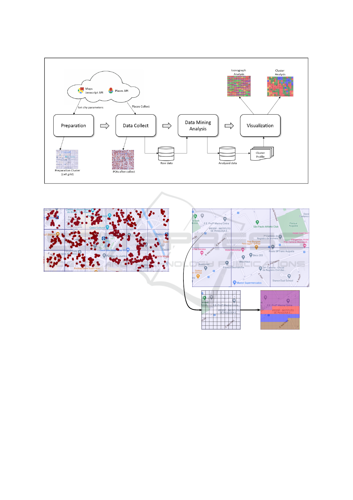
Figure 1: PlaceProfile consists of a web application visual data mining of points of interest. The main components of
PlaceProfile are Preparation, Data Collect, Data Mining Analysis, and Visualization.
Figure 2: PlaceProfile: The collected data (red dots) are
plotted on the grid in their respective cell overlaid on the
map.
Importantly, PlaceProfile allows the inclusion of
other features for later analysis, such as geographic
coordinates, a cell identifier, or cell location in the
grid. Besides that, users can discard cells with only a
few POIs to perform analysis using only informative
cells. Finally, the only required parameter is the num-
ber of clusters used to analyse the division imposed
by the clustering algorithm in the cells, that is, how
many k distinct areas on the data will be labeled to
create the profile for the user-defined region.
The data resulting from the mining process is
stored in a database to facilitate the definition of
different visualization strategies. For example, one
may use the processed data to create a visualization
approach that emphasizes the reasons that citizens
change location in a city of a metropolitan region.
In the Visualization step (see Figure 1 (d)), three
different strategies are used to represent the results of
the previous steps: (i) Iconograph Analysis, (ii) Clus-
(a)
(b)
Figure 3: Visualizing the most common macro categories.
Given a region divided into cells, we divide the cell space
using a grid (a) and color code the grid based on the propor-
tion of macro categories (b). Ordered from top to bottom,
the last color (brown) represents the remaining macro cate-
gories aggregated.
ter Analysis, and (iii) Radar Chart Analysis.
Figure 3 shows six cells (areas) in the central re-
gion of S
˜
ao Paulo before any analysis. To design the
Iconograph representation, each cell is divided into a
hundred equal parts (see Figure 3), which creates an
internal grid in the cell (a). Then, for each cell, the
three main macro categories are highlighted by re-
ceiving proportional visual space according to their
PlaceProfile: Employing Visual and Cluster Analysis to Profile Regions based on Points of Interest
509
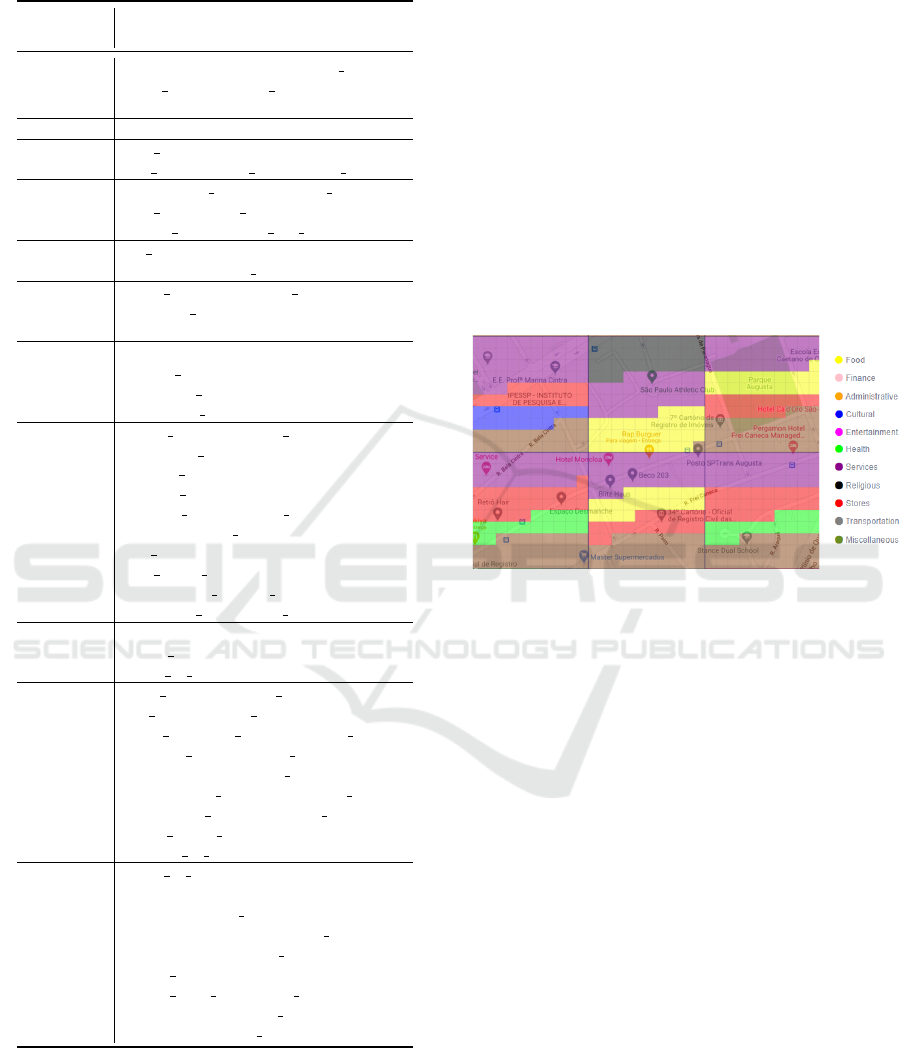
Table 2: Clustering Google Maps categories into macro cat-
egories (Macro Cat.).
Macro
Category Category from Google Maps
Food
bakery, bar, cafe, food, liquor store,
meal delivery, meal takeaway,
restaurant
Finance accounting, atm, bank, finance
Admin.
city hall, courthouse, embassy, police,
fire station, local government office
Transport.
airport, bus station, subway station,
taxi stand, train station,
transit station, light rail station
Cultural
art gallery, library, school,
university, movie theater, museum
Entert.
night club, amusement park,
bowling lley, campground, zoo,
aquarium, stadium, casino
Health
pharmacy, physiotherapist,
beauty salon, dentist, doctor,
gym, hair care, hospital,
veterinary care, health, spa
Services
travel agency, funeral home,
park, post office, parking,
roofing contractor, locksmith,
general contractor, lodging,
moving company, car repair,
electrician, car rental, laundry,
gas station, plumber, painter,
real estate agency, lawyer,
recreational vehicle park,
insurance agency, car wash
Religious
mosque, cemetery, church,
hindu temple, synagogue,
place of worship
Stores
shoe store, shopping mall,
pet store, bicycle store,
book store, car dealer, , movie rental
clothing store, jewelry store,
florist, store, furniture store,
convenience store, department store,
electronics store, hardware store,
home goods store, storage,
grocery or supermarket
Misc.
point of interest, establishment,
country, floor, intersection,
locality, natural feature, geocode,
colloquial, area, room, post box,
neighborhood, postal code,
postal town, political,
postal code prefix and suffix,
premise, route, street address,
subpremise, street number
occurrence in the cell (b). The most prominent POI
macro category appears at the top of the cell, then the
second highlighted macro category, the third macro
category highlighted comes next, and the fourth repre-
sents all the remaining macro categories aggregated.
The result of dividing cells according to their most
common macro category is shown in Figure 4 for the
six cells presented in Figure 3. Notice that each color
represents a macro category and the color occupation
in each cell represents the proportion of activities re-
lated to that macro category. Finally, the sum of all
the remaining macro categories is shown in propor-
tion and represented by the brown color. In this exam-
ple, the purple color represents the services macro cat-
egory, red is related to stores, yellow represents food,
green represents health, blue represents cultural, and
brown represents all other macro categories present in
the cell. The analyst can notice the categories that are
not predominant in each cell by looking at the legend
that describes each macro category employed in the
visualization.
Figure 4: Using colors to encode the most common macro
category in a cell. This region is particularly represented by
services and stores macro categories.
In the cluster analysis view, each cell is labeled with
a different color for each data group partitioned by
the clustering algorithm. Figure 5 shows the result of
cluster analysis on the same six cells highlighted in
Figure 3. Notice that five out of the six cells belong to
the same cluster (cells in red) and one cell has differ-
ent features (cell in green). The user can understand
the pattern adopted by the clustering algorithm to sep-
arate groups of data. We must highlight that the colors
in the cluster analysis do not relate to the colors used
for encoding the macro categories.
To complement the analysis of macro categories
and assist in the interpretation of clustering results,
PlaceProfile also uses a Radar Chart visualisation to
help users to perceive predominant activities for each
cell. Interactivity is present in this view, allowing the
user to select cells of interest to analyse and make
comparisons. Figure 6 shows the differences between
the two groups, the red cells stand out for macro cat-
egories of services and store activities while in the
green cell the highlight is for stores, services, and
health.
ICEIS 2021 - 23rd International Conference on Enterprise Information Systems
510
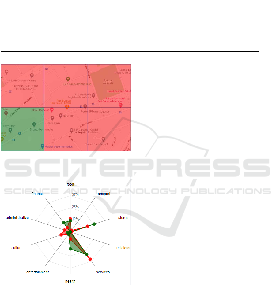
Table 3: The table illustrates a sample of the summary of the macro categories per cell: the count of the total of the 11
macro categories in each cell creates the attributes that will be passed as a parameter for the grouping algorithm and for the
iconographic analysis.
Macro categories Count
Cell Id GPS coordinates (lat, lng) Food Finance Administrative Transport Cultural
1 -23.532288, -46.671019 5 10 3 3 5
2 -23.532288, -46.668570 14 1 0 2 2
3 -23.532288, -46.666120 16 3 1 1 6
4 -23.532288, -46.663671 6 9 4 2 0
Figure 5: Clustering analysis. Based on the features re-
trieved during Data Collect step, cells are clustered to help
analysis based on similarity.
Figure 6: Radar Chart showing the proportion of macro cat-
egories for the two clusters presented in Figure 5. Although
very similar in services, stores, and food, these two cluster
differ in cultural, health, and finance macro categories.
Implementation. The PlaceProfile front-end was
developed using HTML5, the website was styled us-
ing the CSS3 language and Javascript was used to
perform the interactivity actions of the website. Be-
sides, Bootstrap (https://getbootstrap.com/) libraries
were used to optimise the styling process, JQuery
library (https://jquery.com/) for event handling and
interactivity with External APIs. On the PlacePro-
file backend, the language used was Python (https://
www.python.org/), along with Pandas (https://pandas.
pydata.org/) library for the cleaning process and raw
data mining and scikit-learn (https://scikit-learn.org/)
for the application of clustering algorithms. We used
Google Maps API for the construction of the visual-
izations, graph rendering, and maps.
4 RESULTS
To validate PlaceProfile, this section presents an anal-
ysis of POIs collected from the central region of S
˜
ao
Paulo city, Brazil. For this analysis, we defined cells
with a size of 250 × 250 meters, generating a grid
with 527 cells overlapping the region of interest. Af-
ter data collection, 27454 POIs were identified. We
removed the miscellaneous macro category since it is
not related to any other macro category, resulting in
ten macro-categories for analysis.
Figure 7 shows the most common macro cate-
gories for each cell in the region of interest. We can
see a lot of patterns in this region. Firstly, the eastern
region is represented by the most POIs categorized
by health (due to the amount of green in the cells).
Second, the northeast of the region shows macro cat-
egories related to stores (reddish cells). Finally, POIs
related to the food (in yellow) and services (in purple)
can be seen throughout the whole region, although
more concentrated in the center. Cells with POIs be-
low a minimum threshold (in this case, one) receive
black color.
Next, we proceed to analyze the similarity among
the POIs collected for this region with clustering
analysis. Using the same data and the same pre-
processing steps discussed above, we performed the
k-means clustering algorithm. Figure 8 (top) shows
the result of such clustering, where each color corre-
sponds to a different cluster. Notice that the clustering
result shows disconnected components in the visual
PlaceProfile: Employing Visual and Cluster Analysis to Profile Regions based on Points of Interest
511
Figure 7: Using PlaceProfile to get an overview of a region of a metropolitan region. We can see mainly a division between
POIs related to stores and POIs related to health. Black cells correspond to regions with number of POIs below a minimum
threshold.
Figure 8: Similarity analysis based on clustering results. Selected cells shows that blue cluster represents POIs related to store
macro category while red cluster represents POIs related to health and services macro categories.
Figure 9: Selecting different clusters to understand patterns of POIs. Cluster green seems to have POIs related to store and
services macro categories, while cluster yellow corresponds to POIs related to the macro category health.
ICEIS 2021 - 23rd International Conference on Enterprise Information Systems
512

representation since the k-means was performed in
a high dimensional space computed with the macro-
categories but without the GPS coordinates.
One of the problems of analysing the result of a
clustering algorithm is that information about which
features led to the clustering patterns is usually lost.To
explain how the information in the regions led to clus-
ters formation, a Radar Chart showing the propor-
tion of POIs in each region can be used through a
coordination mechanism. Figure 8 (bottom) shows
the Radar Chart encoding the proportion of POIs for
the red and blue cells selected and highlighted in the
grid visualization with thicker borders. Thus, we
can know how those selected cells belonging to the
blue cluster present a much higher proportion of POIs
related to the macro category store than any other,
whereas the cells selected from the red cluster present
POIs related to the services and health macro cate-
gories. Notice that this analysis is consistent with the
iconograph representation seen in Figure 7. That is,
while the blue cluster is related to the northeast region
of Figure 7 – cells with POIs highly related to macro
category store, the red cluster is consistent with the
cells showing POIs related to health and services in
the same figure.
Figure 9 shows the same clustering result but with
different selected cells. Using coordination between
the map and the Radar Chart to help on the cluster ex-
plainability. Using the Radar Chart, the cells from the
green cluster represent POIs related to the macro cat-
egories store and services. Notice that, these cells are
the ones located on the boundaries of the blue cluster
and the neighborhood of the area concentrated with
POIs of store macro category in Figure 7. Lastly, we
see from the Radar Chart that yellow cluster corre-
sponds to POIs related to health macro category. This
information is also perceived using the iconograph
representation of Figure 7.
In this case study, we showed how the Radar
Chart’s explainability mechanism could help users
understand the cluster formation based on the analy-
sis of the proportion of POIs in cells of clusters of in-
terest. Nevertheless, the iconographic approach also
provides analysis improvements since it encodes pat-
terns of cells presenting a similar proportion of POIs
with the same category. The iconographic approach
can provide an overview of data organization and de-
tails about POIs at the same time. Thus, the proposed
approach presents new mechanisms to improve the
cluster-based analysis.
5 CONCLUSION
In this paper, we present PlaceProfile, a web-based vi-
sualization tool to identify the profile of areas in cities
or metropolitan regions. PlaceProfile allows the def-
inition of regions, granularity of analysis, and other
parameters to assist in analyzing patterns based on
points of interest.
The main advantage of our tool consists of its abil-
ity to provide understanding about the areas being an-
alyzed. First, we augment clustering results by coor-
dinating a map with a Radar Chart that shows the pro-
portion of points of interest in selected cells. Thus,
users can get to know how these cells differentiate
or relate to contributing to cluster formation. Sec-
ond, our iconographic approach extends cluster analy-
sis by showing an overview and detailed information
simultaneously. On a higher level, users understand
the result and possible cluster formation by inspect-
ing the iconographic design’s color patterns. In a de-
tailed analysis, users inspect the proportion of points
of interest inside cluster cells. We show the analysis
power of these two approaches by inspecting a region
in S
˜
ao Paulo, Brazil.
The analysis and interaction mechanisms were
validated through a case study in a region of S
˜
ao
Paulo, Brazil. The approach helped us understand
how the points of interest are organized so that near
areas present similar categories. Moreover, the case
study also demonstrated how the two analysis strate-
gies (clustering and iconographic) are consistent.
We plan to accommodate mobility data to analyze
displacement patterns and recommend points of inter-
est according to the cluster and iconographic profiles
in future works.
ACKNOWLEDGMENTS
This work was supported by FAPESP (S
˜
ao Paulo Re-
search Foundation), grant number #2018/17881-3 and
#2018/25755-8.
REFERENCES
Albino, V., Berardi, U., and Dangelico, R. M. (2015). Smart
cities: Definitions, dimensions, performance, and ini-
tiatives. Journal of Urban Technology, 22(1):3–21.
Andrienko, G., Andrienko, N., Bak, P., Keim, D., and Wro-
bel, S. (2013). Visual analytics focusing on spatial
events. In Visual analytics of movement, pages 209–
251. Springer.
Batty, M. (2009). Cities as complex systems: Scaling, inter-
action, networks, dynamics and urban morphologies.
PlaceProfile: Employing Visual and Cluster Analysis to Profile Regions based on Points of Interest
513

Claramunt, C., Jiang, B., and Bargiela, A. (2000). A new
framework for the integration, analysis and visualisa-
tion of urban traffic data within geographic informa-
tion systems. Transportation Research Part C: Emerg-
ing Technologies, 8(1-6):167–184.
D’Andrea, E., Ducange, P., Loffreno, D., Marcelloni, F.,
and Zaccone, T. (2018). Smart profiling of city areas
based on web data. In 2018 IEEE International Con-
ference on Smart Computing (SMARTCOMP), pages
226–233.
Demissie, M. G., de Almeida Correia, G. H., and Bento, C.
(2013). Exploring cellular network handover informa-
tion for urban mobility analysis. Journal of Transport
Geography, 31:164–170.
Dunn, J. C. (1973). A fuzzy relative of the isodata process
and its use in detecting compact well-separated clus-
ters.
Frigui, H. and Krishnapuram, R. (1997). Clustering
by competitive agglomeration. Pattern recognition,
30(7):1109–1119.
Hung, C.-C. and Peng, W.-C. (2011). A regression-based
approach for mining user movement patterns from
random sample data. Data & Knowledge Engineer-
ing, 70(1):1–20.
Jiang, S., Ferreira, J., and Gonz
´
alez, M. C. (2012). Cluster-
ing daily patterns of human activities in the city. Data
Mining and Knowledge Discovery, 25(3):478–510.
Jiang, S., Ferreira, J., and Gonzalez, M. C. (2017). Activity-
based human mobility patterns inferred from mobile
phone data: A case study of singapore. IEEE Trans-
actions on Big Data, 3(2):208–219.
Liu, S., Pu, J., Luo, Q., Qu, H., Ni, L. M., and Krishnan, R.
(2013). Vait: A visual analytics system for metropoli-
tan transportation. IEEE Transactions on Intelligent
Transportation Systems, 14(4):1586–1596.
MacQueen, J. et al. (1967). Some methods for classification
and analysis of multivariate observations. In Proceed-
ings of the fifth Berkeley symposium on mathematical
statistics and probability, volume 1, pages 281–297.
Oakland, CA, USA.
Pack, M. L., Wongsuphasawat, K., VanDaniker, M., and
Filippova, D. (2009). Ice–visual analytics for trans-
portation incident datasets. In 2009 IEEE Interna-
tional Conference on Information Reuse & Integra-
tion, pages 200–205. IEEE.
Paul, A., Chen, B.-W., Bharanitharan, K., and Wang, J.-F.
(2013). Video search and indexing with reinforcement
agent for interactive multimedia services. ACM Trans-
actions on Embedded Computing Systems (TECS),
12(2):25.
Pu, J., Liu, S., Ding, Y., Qu, H., and Ni, L. (2013). T-
watcher: A new visual analytic system for effective
traffic surveillance. In 2013 IEEE 14th International
Conference on Mobile Data Management, volume 1,
pages 127–136. IEEE.
Ravenstein, E. G. (1885). The laws of migration. Journal
of the statistical society of London, 48(2):167–235.
Sagl, G., Loidl, M., and Beinat, E. (2012). A visual analyt-
ics approach for extracting spatio-temporal urban mo-
bility information from mobile network traffic. ISPRS
International Journal of Geo-Information, 1(3):256–
271.
Silva, E. (2014). Meio ambiente & mobilidade urbana.
S
´
erie Meio ambiente. Editora Senac S
˜
ao Paulo.
Sobral, T., Galv
˜
ao, T., and Borges, J. (2019). Visualization
of urban mobility data from intelligent transportation
systems. Sensors, 19(2).
Song, Y. and Miller, H. J. (2012). Exploring traffic
flow databases using space-time plots and data cubes.
Transportation, 39(2):215–234.
Xiong, H., Zhang, D., Zhang, D., Gauthier, V., Yang, K.,
and Becker, M. (2014). Mpaas: Mobility prediction
as a service in telecom cloud. Information Systems
Frontiers, 16(1):59–75.
ICEIS 2021 - 23rd International Conference on Enterprise Information Systems
514
