
Activity based Traffic Indicator System for Monitoring the
COVID-19 Pandemic
Justin Junsay, Aaron Joaquin Lebumfacil, Ivan George Tarun and William Emmanuel Yu
School of Science and Engineering, Ateneo de Manila University, Katipunan Avenue, Loyola Heights, Quezon City, Philippines
Keywords: Big Data, Data Science, Decision Support System, Pandemic Management.
Abstract: This study describes an activity based traffic indicator system to provide information for COVID-19
pandemic management. The activity based traffic indicator system does this by utilizing a social probability
model based on the birthday paradox to determine the exposure risk, the probability of meeting someone
infected (PoMSI). COVID-19 data, particularly the 7-day moving average of the daily growth rate of cases
(7-DMA of DGR) and cumulative confirmed cases of next week covering a period from April to September
2020, were then used to test PoMSI using Pearson correlation to verify whether it can be used as a factor for
the indicator. While there is no correlation for the 7-DMA of DGR, PoMSI is strongly correlated (0.671 to
0.996) with the cumulative confirmed cases and it can be said that as the cases continuously rise, the
probability of meeting someone COVID positive will also be higher. This shows that indicator not only
shows the current exposure risk of certain activities but it also has a predictive nature since it correlates to
cumulative confirmed cases of next week and can be used to anticipate the values of confirmed cumulative
cases. This information can then be used for pandemic management.
1 INTRODUCTION
One of the most recent viruses is the severe acute
respiratory syndrome coronavirus 2 or SARS-CoV-2.
Çelik et al. said that it is the zoonotic virus that causes
the disease called COVID-19 (Çelik et al., 2020).
Shereen et al. stated that COVID-19 is a highly
transmissible and pathogenic viral infection (Shereen
et al., 2020). As of November 2020, according to the
Philippines Department of Health (DOH), the country
has a total case of more than 416,000 infected while
more than 375,000 recovered and more than 8,000
Filipinos died (DOH, 2020c). Information technology
has a huge impact when it comes to handling
infectious disease pandemics because the success of a
nation’s health program depends on having rapid
access and exchange of information regarding the
disease (Fauci, 2001). For the Philippines, numerous
data visualizations regarding the local spread of the
virus have already been developed for COVID-19. An
example of which is the DOH COVID-19 tracker and
the Feasibility Analysis of Syndromic Surveillance
using Spatio-Temporal Epidemiological Modeler
(FASSSTER) website (DOH, 2020b; FASSSTER,
2020). These websites are already an ideal example of
how a monitoring website for infectious disease looks
like and it already presents the relevant statistics when
it comes to monitoring a pandemic. These systems are
good for planning and pandemic response. However,
data is not in the lens of activities that people do in
real life. Not everyone knows how to act
appropriately nor interpret the data once it is shown to
them.
Which is why this study, aims to create an activity
based traffic indicator system for COVID-19. The
goal is to be able to know what certain activities (e.g.,
grocery shopping, sports, mall shopping, etc.) are
safe, uncertain, or dangerous to do on a per-region
basis in the Philippines through a traffic light’s
corresponding green, yellow, and red colors. Part of
this study is to compile research that contains
potential factors for determining infection risk and
choose which one to be used for the indicator. The
chosen factor would then be validated using existing
COVID-19 data. Since the scope of the study is only
within the Philippines, pandemic related case
information would be limited to the daily data drop of
the DOH whose content will be a component for the
calculations of the indicator and also for the
validation of the indicator’s factor (DOH, 2020a). The
activity based traffic indicator system would relate the
data to everyday life so that it becomes much easier to
comprehend and understand on an individual level.
This hopefully leads to better educated decisions on
how to act accordingly and ultimately culminates in
lower potential infections.
Junsay, J., Lebumfacil, A., Tarun, I. and Yu, W.
Activity based Traffic Indicator System for Monitoring the COVID-19 Pandemic.
DOI: 10.5220/0010399201830191
In Proceedings of the 23rd International Conference on Enterprise Information Systems (ICEIS 2021) - Volume 1, pages 183-191
ISBN: 978-989-758-509-8
Copyright
c
2021 by SCITEPRESS – Science and Technology Publications, Lda. All rights reserved
183

2 LITERATURE REVIEW
2.1 Discarded Factors
This subsection contains different studies regarding
the exploration of the safeness or riskiness of
various activities. Numerous online academic
databases were scoured for studies that showcase a
potential factor for determining the risk of activities
during a pandemic. These factors were considered as
candidates for the activity based traffic indicator
system but were discarded due to the factor selection
process of the study. The factors found from the
studies in this section may not be used for the indi-
cator, but it does not mean that they were irrelevant.
Choosing the right factor depends on the context and
surely the other factors listed could be useful if used
for a different type of risk evaluation tool.
The efficacy of social distance and ventilation
effectiveness in preventing COVID-19 transmission
was a study that used distance and ventilation as a key
component to determine the risk of COVID-19
indoors (Sun and Zhai, 2020). The study claimed that
social distancing interacts tightly with ventilation and
ventilation indoors is a key factor in the spread of
respiratory infectious diseases. Therefore, the goal of
the study was to investigate the relationship between
social distancing (physical distance), minimum
ventilation rate, and the probability. A modified
Wells-Riley Model was used to get the projected
infection probability in the study. A Wells-Riley
model is a popular model used for predicting infection
risk. For the study, two new indices, the social
distance index (Pd) and ventilation index (Ez), were
added for the WR (Wells-Riley) model. Based on the
study the exposure time or the length of stay in a
setting, distance and ventilation have significant
effects on infection risk. A limitation of the study is
the fact that it only uses the droplet route of infection
and not considering direct contact. The modified WR
model that the study proposed was considered as a
factor because it can be used for numerous activities
as long as the standards for minimum ventilation and
air distribution effectiveness are known.
The American Institute of Architects (AIA)
wrote a document called Re-occupancy Assessment
Tool V3.0 (AIA, 2020). The purpose of the
document was to provide stakeholders a guide to
make buildings safe when reopening during the
pandemic. The document has various mitigation
measures for use during the COVID-19 pandemic.
The appendix section of the document contains a
section called “occupancy evaluation” and it
discusses how the occupant load factor of various
establishments is problematic when taking into
consideration the safe distance required to be
implemented, which is 6 ft. The area of a 6-foot
radius circle is 113.097 square feet and if it was used
as the social distancing measure, then any occupant
load factor below that is unsafe. The occupancy
evaluation found in the document was considered as a
factor for the activity based traffic indicator system
since it can be used to assess the safety of a particular
activity by determining the occupant load factor of the
establishment where that activity occurs.
Leclerc et al performed a study that explored
various indoor and outdoor settings where
transmission of COVID-19 occurred and happened in
clusters (Leclerc et al., 2020). In identifying which
settings have the most clusters, people would know
which areas need to have close surveillance or to be
closed down as the pandemic progresses. For the
research, a cluster was defined as 1st generation cases
that got infected and also transmitted the disease in
the same single setting and specific time. To achieve
the goal of the study, a systematic review of literature
that was related to the COVID-19 clusters was
conducted. Based on the results, households have the
most number of clusters and most clusters are from
indoor settings. A limitation of the study would be its
bias due to the methodology used to gather data
(compilation of scientific literature and media
reports). With the compiled literature, some
epidemiological data were not included. Furthermore,
attack rates cannot be estimated using the data
gathered in the study. The study was considered
because the researchers of this study thought the
methodology used in determining the number of
clusters per setting may be used in terms of knowing a
particular activity's total number of cases across all
clusters (Leclerc et al., 2020) in the Philippines.
The World Health Organization (WHO) wrote a
guideline titled Water, sanitation, hygiene, and waste
management for SARS-CoV-2, the virus that causes
COVID-19 (WHO, 2020b). The document contains
information regarding proper disinfection, hygiene
and the management of wastewater. There is a section
in the document about WASH (water, sanitation,
hygiene) in a health care setting. To summarize this
section, workers should always engage in frequent
hand hygiene / do regular disinfection / discard waste
properly / managing health care waste / discarding
dead bodies properly. The document also discusses
general information on hand hygiene for the public
like the ideal hand hygiene material used by the
public. Sanitation requirement for the public was
considered as a factor for the activity based traffic
indicator since it seems to be an effective qualitative
ICEIS 2021 - 23rd International Conference on Enterprise Information Systems
184

criterion to determine which activities are riskier than
others based on the number of precautions needed to
be done before participating. However, in the factor
selection process of the study, this factor was
discarded because it cannot be quantified.
2.2 Chosen Factor
This subsection contains the chosen factor for the
activity based traffic indicator system, the exposure
risk that dictates the probability of meeting someone
infected with COVID-19 in public. It was chosen as
a factor for the indicator since it passed the factor
selection process done in the study.
Sun performed a study titled COSRE: Community
Exposure Risk Estimator for the COVID-19
Pandemic and the goal of the study was to raise
awareness regarding the exposure risk of the activities
done in one’s daily life (Sun, 2020b). He developed a
probability model based on the birthday-paradox
model and it was implemented using a web-based
system called COSRE. Specifically, the risk it estima-
tes is the probability of people meeting potential
COVID-19 hosts in public places like grocery stores,
gyms, etc. The model utilizes 3 parameters: p, a, and
n. As stated, the output of the model is the probability
of meeting someone that has COVID-19. The variable
p is the total community population whether the
community defined is a country, region, city, etc. The
variable a would be the total number of potential
COVID-19 cases in the area and it excludes the ones
that already recovered or died. Variable n would be
the number of people in the businesses like gyms,
shopping centers, and restaurants. An experimentation
was done to get the county-level exposure risks of the
United States from April 1 to 15th of May (Sun,
2020b). The exposure risk was visualized using a map
of the United States with white to red markings
dictating the severity of the exposure risk in specific
communities. The model is ideal because the
parameters are all obtainable with the dataset on the
pandemic generally available. This study will aim to
adopt this model to use a more real time indicator that
is automatically generated. The researchers will then
compare the predicted exposure risk per activity per
area against actuals for verification.
3 METHODS
3.1 Activity Selection
To determine the activities to be indicated by the
monitoring system, the activities that impose a risk
to one’s health during the COVID-19 pandemic
must be identified first. The possible activities for
the indicator were based on the ranking of the safety
level of particular activities during this pandemic by
several sources (Mayo Clinic, 2020; The South
Dakota Department of Health, 2020; Doolittle,
2020). The activities to be used for the indicator
were then aligned with the categories of activities
defined in the Google Mobility Report (Google,
2020). For the activity based traffic indicator, it is
assumed that activities are to be done indoors
because outdoor scenarios do not have a substantial
amount of evidence to assess the risk of COVID-19
(Freeman and Eykebosh, 2020). Furthermore, the
activities chosen were based on how the activities
can also be applicable to other countries to make
them more nonexclusive. Overall, there are 10
activities chosen for the indicator. The activities
under retail and recreation are: exercise with
equipment, exercising without equipment, shopping
in a store, mall strolling, going to a concert, and
restaurant dining. For grocery and pharmacy:
grocery shopping was chosen. For transit: riding a
bus and a train was picked. And lastly, going to the
office is under the category of the workplace.
3.2 Factor Selection
What factors to include in the activity based traffic
indicator system were primarily based on qualitative
and quantitative related research about factors that
determine risk or safeness of carrying out certain
activities during a pandemic as seen in the Literature
Review section of the paper. All these factors were
then compiled into a spreadsheet. Once compiled, a
process of elimination was then conducted wherein
the ideal factor to be used for the indicator was
chosen. An ideal factor for the study has four
criteria. First, the factor chosen for the indicator can
represent the 10 activities selected for the study.
Second, the factor must be feasible in the sense that
updating the indicator should not be cumbersome or
in other words, it can be automated. Third, the factor
should be dynamic meaning that the value or the risk
that it indicates should change overtime. The fourth
and last criteria for the factor are that the risk it
dictates can be applicable for the 17 regions in the
Philippines. The methodology of the research paper,
where the factor was to be taken from, dictates the
process of data gathering and the various
components, and steps that make up the factor
candidate which was then used as a basis if the
particular factor met the criteria or not. If the factor
Activity based Traffic Indicator System for Monitoring the COVID-19 Pandemic
185
candidate did not meet the criteria mentioned above,
it was discarded from the pool of factors compiled.
There are 6 potential candidates as a factor for
the indicator and the first one is the probability of
infection via an aerosol transmission (Sun and Zhai,
2020). It was discarded since it cannot be applied
regionally, and it was not dynamic if it was to be
used as an indicator. It could be argued that
exposure time and distance within an establishment
can be dynamic but this would only be possible if
risk evaluation done for the study was through a
calculator, where the user manually inputs the
components and the calculator computes for the risk.
Therefore, the probability of infection for the 10
activities would have the same values for all the
regions and the same values through time. The
second factor is the occupant load factor (AIA,
2020). It was also discarded since it cannot also be
represented regionally, and it was also static. The
occupant load factor, when used alone, cannot
dynamically change unless other variables are used
with it. The third factor was the total number of
cases across all clusters per activity (Leclerc et al.,
2020). The factor was discarded since the
methodology used in the study requires the
researchers of this study to do a manual meta-
analysis of news sites and articles to get the clusters
which are not feasible. The fourth factor is sanitation
requirement, and it was also discarded since this
factor was static for the activities and cannot be
applied regionally (WHO, 2020b). In addition, this
qualitative factor cannot be quantified; that was why
it was discarded from the selection process. The last
factor is the exposure risk derived from the COSRE
model (Sun, 2020b). This factor was selected for our
indicator since it can be applied to any activity as
long as the occupancy of its venue can be
determined. Moreover, data gathering is feasible
since the infected population, which is the only
factor that changes, can be found in the DOH data
drop. It is essentially dynamic since the COSRE
model depends on the number of infected people in a
given time (Sun, 2020b). The model can also be
applicable per region as long as the total population
of the region can be determined.
3.3 Calculating the Risk
𝑃𝑟
(,,)
=1−
(
)
!
!
, if p≠0 and n≠0 and a≠0
(1)
𝑃𝑟
(,,)
=0, if p = 0 or n = 0 or a = 0
(2)
The factor for the activity-based traffic indicator is
the exposure risk from the COSRE social probability
model (Sun, 2020b). The exposure risk was derived
from a probability model based on the birthday-
paradox theory and the risk it estimates is the
probability of people meeting potential COVID
hosts in public places like grocery stores, gyms, etc.
For this study, the exposure risk associated with the
COSRE model is called the probability of meeting
someone infected (PoMSI). As seen on Equation 1
and Equation 2 (if 𝑃𝑟
(,,)
=0), the model utilizes
three parameters: 𝑝, 𝑎, and 𝑛. The idea is to first
calculate the odds of not meeting any infected
person and subtract that odds from 1 to get the
probability of meeting at least one infected patient in
that group of people (Sun, 2020a). This was done by
reusing the algorithm of the birthday paradox and
changing the option of a maximum number of days
(365) to the total population. The variable 𝑝 in the
COSRE model represents the total population and it
would then be subtracted to the total number of
potential COVID-19 cases in the area excluding
people that recovered and died, which is variable 𝑎,
to get the no-clash probability (Sun, 2020b).
Furthermore, in the original birthday paradox model,
n dictates the percentage at which at least two people
in the room have the same birthday (Geeks for
Geeks, 2020). For example, to get a probability of
50%, a room must have 23 people. The variable 𝑛 in
the COSRE model is the number of people in
businesses (Sun, 2020b). After all of that, PoMSI,
using the model, was determined when 1 is
subtracted from the probability to get the chance of
clash with COVID-19 hosts.
Table 1: Occupancy Per Activity.
Activity
100%
occupancy
50%
occupancy
Exercise w/
Equipment
19 10
Exercise w/o
Equipment
24 12
Sales (retail store)
90 45
Malls
2,334 1167
Restaurant Dining
139 70
Concert
20,000 10,000
Supermarket
694 347
Bus
45 23
Train
1,182 591
Office
122 61
ICEIS 2021 - 23rd International Conference on Enterprise Information Systems
186

For this study, the value of 𝑝 was the total
population per region (I, II, III, IV-A, IV-B, V, VI,
VII, VIII, IX, X, XI, XII, NCR, CAR, BARMM, and
CARAGA) in the Philippines (DOH, 2019). The
model assumes that everyone in the population has
the same chance of showing up in one store.
Additionally, the variable a is equivalent to the
active cases and it is the cumulative confirmed cases
without the people who already recovered or died:
Total Confirmed Cases - (Recovered + Deaths)
(FASSSTER, 2020). All types of patient statuses
(asymptomatic, mild, severe, and critical) that did
not die or recover were included in active cases. The
value of n is the occupant load, and it dictates the
number of people in a building. As stated by the
International Code Council (ICC) and its formula is
the square footage of an area over the occupant load
factor (ICC, 2015). Previously a candidate factor for
the indicator, the occupant load factor used per type
of establishment are standards defined in the
International Building Code (ICC, 2015). Moreover,
if the venue has fixed seating, then the occupant load
is equivalent to the seating capacity. Given the
limitations of the study, actual square footage areas
of buildings cannot be determined that is why the
researchers relied on sample square footage areas
found on the internet to be used as a component of
the occupant load for each establishment. The square
footage area from the sample programs defined by
the National Institute of Building Sciences (NIBS)
was used for exercise with equipment (free weight
room), exercise without equipment (fitness
instruction room), office space, and restaurants
(NIBS, 2019). The Minnesota Department of Public
Safety State Fire Marshal Division (MNDP-SSF)
was used as a reference for the square footage area
of a retail store and the occupant load was also based
on their calculations (MNDP-SSF, 2020). Also, the
Food Industry Association (FMI) was used as a
reference for the square footage area of a
supermarket and this was based on the median total
store size in square feet (FMI, 2018). The occupant
load calculation for malls was taken from a sample
calculation for a covered mall building (Geren,
2016). For seating capacity, the Philippines’ Mall of
Asia Arena’s (MOA) full house capacity was the
basis for the value used for concerts (MOA, 2014).
For the seating capacity of trains, the Department of
Transportation (DOTr) was the reference for the
capacity of the trains in the Philippines’ MRT Line 3
(DOTr, 2020). Lastly, the seating capacity of buses
was based on a standard bus with 4 seats per row
(Kosokubus, n.d.). Table 1 contains the occupant
load for all the activities contained in the indicator at
100% and 50% occupancy. When computing for
50% occupancy, if the output was a decimal number,
it was rounded up to the next largest whole number.
This was done since it makes no sense to represent
people with decimal numbers when computing for
occupancy. As seen on Listing 1, the Python code
for the modified birthday paradox model used to
compute PoMSI was already provided in a different
article supplementary to COSRE (Sun, 2020a).
However, the variables were changed for the study
to match the variables in the probability model (p, n,
a).
def covid_clash(p, a, n)
x = 1
for i in range(n):
x = x * ((p - a - i) / (p - i))
clashp = 1 - x
return round(clashp * 100, 2)
Listing 1: Python Code for Modified Birthday Paradox
Model.
3.4 Risk Level Classification
Table 2: Modified Risk Level Classification (red, yellow,
green).
Color PoMSI What to do
Red
75% and
above
Do not partake in the activity
Yellow
(1)
50% to
75%
Physical distancing
Avoiding touching surfaces
Non-medical mask
Gloves
Eye protectors
Yellow
(2)
25% to
50%
Physical distancing
Non-medical mask
Gloves
Green
25% and
below
Physical distancing
Non-medical Mask
Since the indicator must be a traffic indicator
system, the risk it outputs or calculates for every
activity must be classified based on how risky the
activity is. A proposed risk level classification
example for the indicator that is divided into four
levels can be found in the COSRE paper (Sun,
2020b). The greater the exposure risk for an activity,
the more precautionary measures need to be done
like wearing gloves and face shields. For all the risk
levels in the proposed model except 75% and above,
the use of a mask is required. Wearing masks for all
the levels can be backed up by the guideline on
Activity based Traffic Indicator System for Monitoring the COVID-19 Pandemic
187

mask use by WHO since the organization
recommended the use of a non-medical mask for all
the 10 activities selected for the indicator no matter
how safe or risky it is (WHO, 2020a). No protective
gear is needed for a risk level above 75% because
any activity at this range would be too risky since
the chances of meeting an infected person are high.
Therefore, people should not partake in a particular
activity with that kind of risk level. For the study,
since it is a traffic indicator like system, green,
yellow, and red would be used instead of a four-
level indicator. Essentially, the risk level of the
proposed example can still be retained which would
make the 2nd and 3rd levels become subcategories
of yellow. This would mean that the range of each
level, including the 1st and last one, would not
change and the precautionary measures for each
level would also be the same. Table 2 contains a
summary of the risk level classification used in the
study. To clarify, the original classification of risk
level proposed in the COSRE paper was only an
example and it is not verified using real exposure
data yet (Sun, 2020b). As mentioned in COSRE the
paper and up until now, real-world exposure data is
scarce due to the pandemic. These real-world
datasets are relatively sensitive and hard to retrieve
at present. Since there is access to Philippine case
data, this can be used to test the model in the
absence of actual exposure data.
3.5 Testing the Model
To check the validity and effectiveness of the chosen
factor, a correlation between the factor of the
indicator and COVID-19 data was done. To be
specific, the University of the West of England
(UWE) stated Pearson's correlation coefficient (r)
would be used to measure the strength of the
association between two variables (UWE, n.d.). The
correlation coefficient ranges from -1 to 1 and as r
goes towards 0, the relationship between the two
variables will be weaker. A perfect degree of
correlation has a value near ± 1 and as one variable
increases, the other variable also increases (if
positive) or decreases (if negative) (Statistics
Solutions, n.d.). Furthermore, a high degree
correlation has a coefficient value that lies between
± 0.50 and ± 1. A moderate degree of correlation has
a value that lies between ± 0.30 and ± 0.49.
Moreover, a low degree of correlation has a value
that lies below ± 0.29. The last degree of correlation
would be a coefficient value of 0 which does not
correlate. The data correlated to the computed
PoMSI per region are the 7-day moving average of
the daily growth rate of COVID-19 cases (7-DMA
of DGR) and the cumulative cases of COVID-19.
The formula for cumulative cases is just the sum of
all the cases for the specific region up to the specific
point in time indicated. Both types of data can be
derived from the dataset in the DOH data drop
(DOH, 2020a). The values for the 7-DMA of DGR
and cumulative cases are both the week after the
particular week chosen to compute PoMSI.
Moreover, since the 7-DMA of DGR is a single
value and only the cumulative cases of the 7th day
of the week were used which is also a single value,
PoMSI was computed using the 7-DMA of the
cumulative active cases of the week chosen. Python
(Google Colab) was used to extract data from the
DOH data drop CSV file and to compute the
necessary computations needed (active cases,
PoMSI, DGR, cumulative sum of cases, etc.). The
range of the data taken in the DOH dataset was from
April 1 to September 1. PoMSI was computed per
region based on April to August data from the DOH
data drop. The computations were done weekly and
August ended on the 6th day that was why the range
of the data used reached September 1. It is worth
noting that there are inconsistencies present in the
Data Drop like unstandardized region names,
nonuniform date formats, and missing recovery
dates. For the missing recovery dates, an
approximation of recovered cases was done. All
cases after 14 days that were not considered as dead
were tagged as recovered (DOH, 2020b). Rather
than using 100% occupancy, which is unlikely
during a pandemic, 50% occupancy was used to
better simulate physical distancing in an
establishment as seen in Table 1 and this type of
occupancy restriction is usually utilized during the
modified general community quarantine (MGCQ) in
which most businesses, that handles the activities
included in the indicator, can operate (Crismundo,
2020). The CSV file output of the Python code was
then imported to Google Sheets to do the correlation
attempts (vs. DGR and vs Cumulative Cases). To get
the Pearson's correlation coefficient (r), the Pearson
correlation formula was used in Google Sheets and
correlation was done per region and activity.
4 RESULTS AND DISCUSSION
As stated in the Methods section of the paper, the
correlation was done using the Pearson correlation
formula in Google Sheets. Based on the results of
the correlation process, the correlation coefficients
(r) of PoMSI (per region and activity) versus the
ICEIS 2021 - 23rd International Conference on Enterprise Information Systems
188
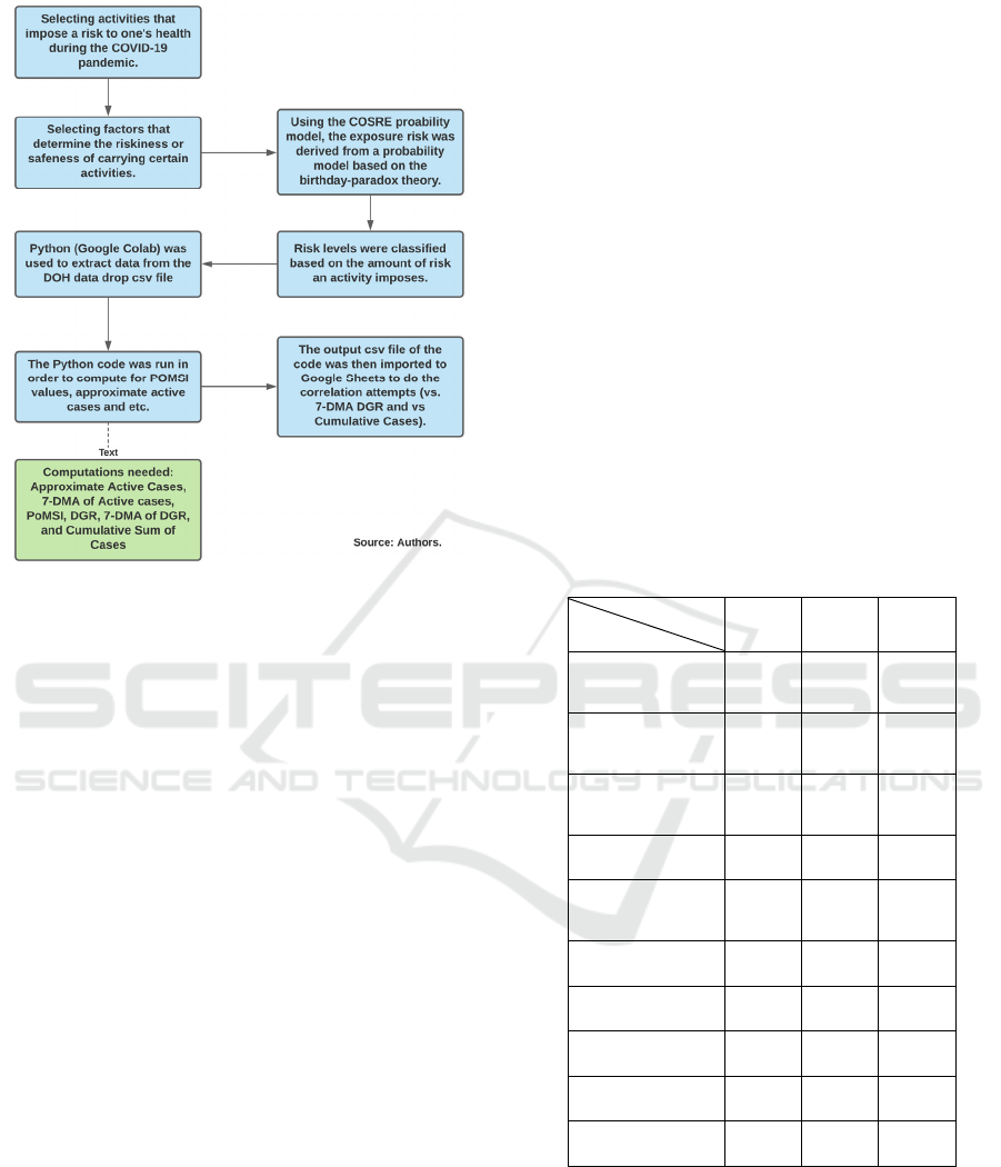
Figure 1: Summarized Flowchart of the Methodology.
7-DMA of DGR of next week were mostly low
ranging from -0.304 to 0.329 (without Region VII).
The correlation coefficient of 0.329 only applies to
Region IV-A’s PoMSI for a concert. Furthermore,
the correlation coefficient value of -0.304 applies to
the PoMSI of 9 out of the 10 activities in Region XI
(except for concert). Other than the ones mentioned,
the coefficients of the other activities per region
generally have a low degree of correlation. This
implies that PoMSI and DGR next week do not have
any relationship with each other. To add, the only
outlier of the correlation result is Region VII,
ranging from -0.756 to -0.598. For the correlation
coefficients (r) of PoMSI (per region and activity)
versus next week’s cumulative confirmed cases, the
range of values are from 0.671 to 0.996 and the
coefficients are positive. Table 3 contains the r
values of the three out of 17 regions in the
Philippines as a visual example of the results.
Regarding Region VII, the correlation is lower than
the other regions because the number of active cases,
which is a factor for PoMSI, dropped since July and
is constantly decreasing. The correlation of POMSI
to cumulative sum of cases is 97% (estimated for all
activities) from April until July but from July
onwards was -63%. When looking at another region,
for example Region VIII’s PoMSI, which still had a
correlation coefficient of 90% compared to the
cumulative sum of cases, even though the number of
active cases for PoMSI dropped around July it began
to increase again around August and dropped again
onwards. In general, the r values of Region 8 and
NCR are aligned with the other regions, since
PoMSI and the cumulative confirmed cases of the
following week have a high degree of correlation, it
can be said that as the cases continuously rise, the
probability of meeting someone COVID positive
will also be higher. This also shows that the activity
based indicator not only shows the current exposure
risk of certain activities but also has a predictive
nature and can be used to anticipate the values of
confirmed cumulative cases. There is a correlation
between PoMSI and cumulative cases while no
correlation between DGR is likely due to DGR
being derived from the cumulative sum of cases (as
the rate of change of the total amount of cases per
day) and active cases (which is a component for
PoMSI) being highly correlated with the running
total or daily cumulative sum of cases. This makes it
an ideal indicator.
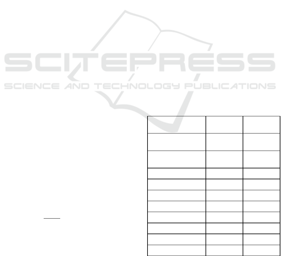
Table 3: PoMSI vs Next Week’s Cumsum Cases: Region
VII, Region VIII, and NCR only (r).
Activity
Region
VII VIII NCR
Exercise w/
Equipment
0.670 0.942 0.992
Exercise w/o
Equipment
0.670 0.942 0.992
Shopping
(retail store)
0.671 0.942 0.992
Malls
0.688 0.945 0.970
Restaurant
Dining
0.671 0.942 0.992
Concert
0.680 0.935 0.756
Supermarket
0.676 0.943 0.992
Bus
0.671 0.942 0.992
Train
0.673 0.943 0.993
Office
0.671 0.942 0.992
5 CONCLUSIONS
The aim of this study was to create an activity based
traffic indicator system for COVID-19. An indicator
was tested that utilizes the COSRE social probability
model to derive PoMSI (Sun, 2020b). The exposure
Activity based Traffic Indicator System for Monitoring the COVID-19 Pandemic
189
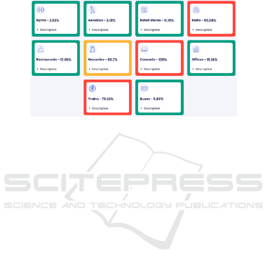
Figure 2: Example of an activity based indicator that shows the PoMSI values for all ten activities in a region for one day.
risk, which is PoMSI, is the probability of meeting a
COVID-19 host in public and as its value increases,
the chances of meeting an infected person also
increases. As seen in the Activity Selection section
of the paper, the exposure risk was computed for 10
activities: exercise with equipment, exercising
without equipment, shopping in a store, mall
strolling, going to a concert, restaurant dining,
grocery shopping, riding a bus, riding a train and
going to the office. In addition, the computations
were also done for all the regions in the Philippines,
Before, PoMSI was chosen, several factor
candidates were considered but were discarded
through the factor selection process. The chosen
factor, PoMSI, was verified through correlating it to
the cumulative confirmed cases in the Philippines
(from April to August) using Pearson correlation.
Based on the results, PoMSI is strongly correlated
(0.671 to 0.996) with the cumulative confirmed
cases. It can be said that as the cases continuously
rise, the probability of meeting someone COVID
positive will also be higher. Since there is a strong
correlation of PoMSI to the cumulative confirmed
cases of the next week, the indicator may also have a
predictive nature and may be used to anticipate the
values of confirmed cumulative cases per activity.
Since the indicator caters to COVID-19, the
usability of the indicator for other infectious diseases
will depend on their similarities with COVID-19. In
addition, existing COVID-19 data was only limited
to the Philippines for this study. For improvement,
the Google Mobility Report was used to define the
categories of the activities that were chosen for the
indicator, but mobility data was not used in the study
(Google, 2020). Therefore, the use of it might be an
extension for the study since mobility data can be
used to track generalized people movement. Overall,
the aim of the study was achieved with the viability
of PoMSI as a factor for the activity based traffic
indicator being validated.
ACKNOWLEDGEMENTS
We would like to thank Dr. William Yu for being
our research advisor and for directing the flow of the
study. We would also like to give thanks to the
FASSSTER team and the Ateneo Center for
Computing Competency and Research (ACCRe) for
creating and giving access to the FASSSTER
website. We would also like to thank the DOH’s
Epidemiology Bureau for creating and maintaining
the data drop used for the activity based traffic
indicator in the study. Lastly, we would also like to
give thanks to Kyle Bigcas for evaluating the paper
for mechanical and grammatical errors.
REFERENCES
American Institute of Architects. (2020, July). Re-
occupancy assessment tool v3.0. AIA.
http://content.aia.org/sites/default/files/2020-
08/ReOccupancy_Assessment_Tool_v3.pdf
Crismundo, K. (2020, June 9). Gyms, travel, leisure
businesses open at 50% capacity in MGCQ. PNA.
https://www.pna.gov.ph/
Department of Health. (2019, May). Population
projections by region, province, city/municipality and
barangay from 2020-2025*. DOH. https://www.
doh.gov.ph/
ICEIS 2021 - 23rd International Conference on Enterprise Information Systems
190

Department of Health. (2020). COVID-19 data [Data file].
Retrieved from https://drive.google.com/drive/
folders/1w_O-vweBFbqCgzgmCpux2F0HVB4P6ni2
Department of Health. (2020, July). DOH tags 38k
recoveries From Oplan Recovery. DOH
https://www.doh.gov.ph/
Department of Health. (2020, November). COVID-19
tracker Philippines. ncovtracker. https://ncovtracker.
doh.gov.ph/.
Department of Transportation. (2020, October 17). MRT,
LRT, PNR to gradually increase passenger capacity to
accommodate more commuters starting Monday.
DOTr. https://dotr.gov.ph/
FASSSTER team. (2020). DOH FASSSTER COVID-19.
FASSSTER. https://fassster.ehealth.ph/covid19.
Fauci, A. S. (2001). Infectious Diseases: Considerations
for the 21st Century. Clinical Infectious Diseases,
32(5), 675–685. https://doi.org/10.1086/319235
The Food Industry Association. (2018). Median total store
size – square feet. FMI. https://www.fmi.org/
Freeman, S., & Eykelbosh, A. (2020, April). COVID-19
and outdoor safety: Considerations for use of outdoor
recreational spaces prepared by. ResearchGate.
https://www.researchgate.net/publication/340721289_
COVID-19_and_outdoor_safety_Considerations_for_
use_of_outdoor_recreational_spaces_Prepared_by.
Geeks for Geeks. (2020, April 5). Birthday Paradox.
GeeksforGeeks. https://www.geeksforgeeks.org/
Geren, R. L. (2016). Step 8: Calculate occupant load.
Applying the Building Code, 99–105. https://doi.org/
10.1002/9781119149705.ch12
Google. (2020). COVID-19 community mobility report.
Google. https://www.google.com/covid19/mobility/.
International Code Council. (2015). Chapter 10 means of
egress. ICC. https://codes.iccsafe.org/
Kosokubus. What is a night bus? Highway bus seat types
and onboard features. Kosokubus. https://www.
kosokubus.com/
Leclerc, Q. J., Fuller, N. M., Knight, L. E., CMMID
COVID-19 Working Group, Funk, S., & Knight, G.
M. What settings have been linked to SARS-CoV-2
transmission clusters? Wellcome Open Research.
https://doi.org/10.12688/wellcomeopenres.15889.2
Mall of Asia Arena. (2014). Arena information. Mall of
Asia Arena. https://www.mallofasia-arena.com/.
Mayo Clinic. (2020, August 5). Stay safe, have fun during
the COVID-19 pandemic. Mayo Clinic. https://www.
mayoclinic.org/.
Minnesota Department of Public Safety State Fire Marshal
Division. (2020, May). Occupant load determination –
retail/business. MAT. https://mntownships.org/wp-
content/uploads/2020/05/State-Fire-Marshall-Room-
Occupancy-COVID-Info-sheet-Occ-Load-Retail.pdf
National Institute of Building Sciences. (2019, May).
Space types. WBDG. https://www.wbdg.org/
Shereen, M. A., Khan, S., Kazmi, A., Bashi, N., Siddique,
R. (2020). COVID-19 infection: Origin, transmission,
and characteristics of human coronaviruses.
Journal of
Advanced Research, 24, 91–98. https://doi.org/
10.1016/j.jare.2020.03.005
South Dakota Department of Health. (2020, July). Risk
Benefits: Consideration for social activities during
COVID-19. SDDOH. https://doh.sd.gov/documents/
COVID19/COVID_Risks_Benefits_SocialActivities.p
df
Statistics Solutions. Pearson's Correlation Coefficient.
Statistics Solutions. https://www.statisticssolutions.
com/
Sun, C., & Zhai, Z. (2020). The efficacy of social distance
and ventilation effectiveness in preventing COVID-19
transmission. Sustainable Cities and Society, 62.
https://doi.org/10.1016/j.scs.2020.102390
Sun, Z. (2020, March 27). What is the Chance of Meeting
a COVID-19 Infected Person in Grocery Stores?
Medium. https://medium.com/
Sun, Z. (2020, May 22). COSRE: Community exposure
risk estimator for the COVID-19 pandemic. arXiv.
https://arxiv.org/
Doolittle D. (2020, July). What's More Risky, Going to a
Bar or Opening the Mail? Texmed. https://www.tex
med.org/
University of the West of England. Pearson's Correlation
Coefficient. UWE Bristol. http://learntech.uwe.ac.uk/
World Health Organization. (2020, July). Water,
sanitation, hygiene, and waste management for SARS-
CoV-2, the virus that causes COVID-19. WHO.
https://apps.who.int/iris/bitstream/handle/10665/33356
0/WHO-2019-nCoV-IPC_WASH-2020.4-
eng.pdf?sequence=10&isAllowed=y
World Health Organization. (2020, June 5). Advice on the
Use of Masks in the Context of COVID-19: Interim
Guidance, 5 June 2020. WHO. https://apps.who.int/
iris/bitstream/handle/10665/332293/WHO-2019-nCo
v-IPC_Masks-2020.4-eng.pdf?sequence=1&isAllow
d=y
Çelik, I., Saatçi, E., & Eyüboğ, A. F. (2020). Emerging
and reemerging respiratory viral infections up to
Covid-19. Turk J. Med Sci, 557–562. https://doi.org/
10.3906/sag-2004-126.
Activity based Traffic Indicator System for Monitoring the COVID-19 Pandemic
191
