
Improving Statistical Reporting Data Explainability via Principal
Component Analysis
Shengkun Xie and Clare Chua-Chow
Global Management Studies, Ted Rogers School of Management, Ryerson University, Toronto, Canada
Keywords:
Explainable Data Analysis, Data Visualization, Principal Component Analysis, Size of Loss Frequency,
Business Analytics.
Abstract:
The study of high dimensional data for decision-making is rapidly growing since it often leads to more accu-
rate information that is needed to make reliable decision. To better understand the natural variation and the
pattern of statistical reporting data, visualization and interpretability of data have been an on-going challeng-
ing problem, mainly, in the area of complex statistical data analysis. In this work, we propose an approach of
dimension reduction and feature extraction using principal component analysis, in a novel way, for analyzing
the statistical reporting data of auto insurance. We investigate the functionality of loss relative frequency, to
the size-of-loss as well as the pattern and variability of extracted features, for a better understanding of the
nature of auto insurance loss data. The proposed method helps improve the data explainability and gives an
in-depth analysis of the overall pattern of the size-of-loss relative frequency. The findings in our study will
help the insurance regulators to make a better rate filling decision in the auto insurance that would benefit
both the insurers and their clients. It is also applicable to similar data analysis problems in other business
applications.
1 INTRODUCTION
The study of high dimensional data for decision-
making is rapidly growing since it often leads to more
accurate information, which is needed to make reli-
able decision. (Elgendy and Elragal, 2014; Goodman
and Flaxman, 2017; Hong et al., 2019). Also, global
businesses have entered a new era of decision mak-
ing using big data, and it has posed a new challenge
to most companies. Statistical analysis provides man-
agers with tools for making a better decision. How-
ever, it is always a challenge to pick a better tool to
analyze the data to give a better picture necessary to
make even smarter and better business decisions. In
insurance rate regulation, the statistical data report-
ing is a big data application. It involves many dis-
tributed computer systems to implement data collec-
tions and data summaries, regularly, and the amounts
of data collected are massive (Wickman, 1999). For
example, to study the loss behaviour by the forward
sortation area (FSA) in Ontario, Canada, around 10
Gigabytes of loss data were collected from all auto
insurance companies during the period from 2010 to
2012. Processing this significant amount of data to
extract useful information is extremely difficult and
required specific statistical approaches that can help
reduce the dimensionality and complexity of the data.
This is why the insurance regulators are focusing on
the analysis of statistical reporting, which contains
the aggregate loss information from the industry. On
the other hand, big data is not just about a large vol-
ume of data being collected; it also implies the high
level of complexity of the frequently updated data
(Lin et al., 2017; Bologa et al., 2013). In the regu-
lation process, insurance loss data is continuously be-
ing collected. The collected data are then further ag-
gregated and summarized using some necessary sta-
tistical measures such as count, total and mean. The
data organizations are separated by different factors
of interest. For instance, in statistical data report-
ing of large-loss analysis, claim counts and claim loss
amounts are reported by coverage, territory, accident
year and reporting year (McClenahan, 2014). These
data, which are organized as exhibits, are then used by
insurance regulators for a better understanding of the
insurance risk and uncertainty, through suitable sta-
tistical analysis, both quantitatively and qualitatively.
The obtained results from statistical analysis are used
as guidelines for decision-making of rate filing re-
views. Because of the need for understanding the na-
Xie, S. and Chua-Chow, C.
Improving Statistical Reporting Data Explainability via Principal Component Analysis.
DOI: 10.5220/0009805901850192
In Proceedings of the 9th International Conference on Data Science, Technology and Applications (DATA 2020), pages 185-192
ISBN: 978-989-758-440-4
Copyright
c
2020 by SCITEPRESS – Science and Technology Publications, Lda. All rights reserved
185

ture of the aggregated loss data, it calls for suitable
data analytics that can be used for processing statis-
tical data reporting. (Xie and Lawniczak, 2018; Xie,
2019).
As a multivariate statistical approach, the conven-
tional Principal Component Analysis (PCA) is often
used to reduce the dimension of multivariate data or
to reconstruct the multidimensional data matrix us-
ing only the selected PCs. However, within the PCA
approach, the functionality between the multivariate
data and other variables is not considered (Bakshi,
1998). Application using PCA may become problem-
atic when multivariate data are interconnected. From
the data visualization perspective, it could be mis-
leading if the frequency value at a given size-of-loss
interval is visualized without incorporating the size-
of-loss in the plot. In statistical data reporting, the
incurred losses are grouped as intervals. Each size-
of-loss interval is not even, and with the increase of
the incurred loss, the width of the intervals dramati-
cally increases. To overcome the potential mistakes
that can be caused by the visualization of loss data,
PCA is used to extract key information from the data
matrix so that the main pattern functionality between
the relative frequency and the size-of-loss can be vi-
sualized properly. By doing so, we significantly im-
prove data explainability. In this work, PCA is used
for both low-rank approximations and feature extrac-
tions, with the consideration of the functionality of
relative frequency values and the size-of-loss.
Our contribution to this research area is using
PCA in a novel way, to extract its key features of auto
insurance loss to improve the data visualization for a
better decision-making process. To our best knowl-
edge, the proposed method appears for the first time
in literature to consider the data explainability prob-
lem of statistical data reporting in insurance sector.
The proposed method helps to improve the data ex-
plainability as well as a better understanding of the
overall pattern of the size-of-loss relative frequency
at the industry level. Also, feature extraction by PCA
facilitates the understanding of loss count data vari-
ability, both the overall and the local behaviour, and
its natural functionality between the frequency values
and the size-of-loss. The analysis conducted in this
work illustrates the application of a suitable multi-
variate statistical approach to dimension reduction of
statistical data in auto insurance to have a higher data
interpretability. This paper is organized as follows.
In Section 2, the data and its collection are briefly in-
troduced. In Section 3, the proposed methods, includ-
ing feature extraction and low-rank approximation via
PCA, are discussed. In Section 4, analysis of auto in-
surance size-of-loss data and the summary of the main
results are presented. Finally, we conclude our find-
ings and provide further remarks in Section 5.
2 DATA
In this work, we focus on the study of the size-of-loss
relative frequency of auto insurance using datasets
from the Insurance Bureau of Canada (IBC), which
is a Canadian organization responsible for insurance
data collections and their statistical data reporting
problems in the area of property and casualty in-
surance. During the data collection process, insur-
ance companies report the loss information, includ-
ing the number of claims, number of exposures, loss
amounts, as well as other key information such as
territories of loss, coverages, driving records associ-
ated with loss, and accident years. These statistical
data are reported regularly (i.e., weekly, biweekly or
monthly). At the end of each half-year, the total claim
amounts and claim counts reported by all insurance
companies are aggregated by territories, coverages,
accident years, etc. The statistical data reporting is
then used for insurance rate regulation to ensure the
premiums charged by insurance companies are fair
and exact. The dataset used in this work consists of
summarized claim counts by different sizes of loss,
which are represented by a set of non-overlapping in-
tervals. The claim counts are aggregated by major
coverages, i.e. Bodily Injuries (BI) and Accident Ben-
efits (AB). Also, the data were summarized by differ-
ent accident years, by different report years and by
different territories, i.e. Urban (U) and Rural (R).
To carry out the study, we organize data by cov-
erages (AB and BI) and by territories (U and R). We
consider the data from different reporting years and
accident years as repeated observations. There are
two reporting years, 2013 and 2014, respectively. For
each reporting year, there is a set of rolling most re-
cent five years of data corresponding to five accident
years. Therefore, for this study, we have in total ten
years of observation. Also, since we have both Acci-
dent Benefits and Bodily Injuries as the coverage type
and Urban and Rural as the territory, we consider the
following four different combinations, Accident Ben-
efits and Urban ( ABU), Accident Benefits and Rural
(ABR), Bodily Injuries and Urban (BIU), and Bodily
Injuries and Rural (BIR). These data are then formed
into a data matrix with a 40 × 24 dimension, where
40 is the total number of observations, and 24 is the
number of total intervals of the size-of-loss.
DATA 2020 - 9th International Conference on Data Science, Technology and Applications
186

3 METHODS
3.1 Defining Size of Loss Relative
Frequency Distribution
Since the claim count data was pre-grouped, we must
first give a definition to the empirical size-of-loss rela-
tive frequency distribution based on the aggregate ob-
servations of claim counts. Let f (x) be the true size-
of-loss relative frequency distribution, where x ∈ R
+
is the ultimate loss. Ideally, to study the size-of-loss
relative frequency distribution function, we would ex-
pect to have a set of raw data pairs of loss frequency
values and the ultimate loss, so that we can estimate
the distribution function by some parametric mod-
elling approaches. However, in statistical data report-
ing, we are only able to analyze the grouped data be-
cause the raw data is usually not available to insur-
ance regulators. For the grouped data, the estimated
size-of-loss relative frequency distribution is defined
as follows
ˆ
f (x) =
C
i
∑
p
i=1
C
i
if x ∈ [l
i
, l
i+1
), (1)
where C
i
is the total claim counts associated with the
ith interval. [l
i
, l
i+1
) is the ith size-of-loss interval.
Note that, the function of
ˆ
f (x) is an empirical estimate
of its true size-of-loss relative frequency distribution.
In this work, we use the PCA approach to approxi-
mate the function f (x) by retaining only a small num-
ber of principal components. Since we have grouped
data, the function
ˆ
f (x) is replaced by a vector.
3.2 Feature Extraction by Principal
Component Analysis
Feature extraction is a dimension reduction method in
machine learning. It aims at extracting important and
key features from data so that further analysis can be
facilitated. Assume that we have n observations of
f (x), the function of f (x) is replaced by a p-variate
vector, denoted by Y
i
=[y
i1
, y
i2
, . . . y
ip
], where i=1,2,. . .,
n. Here n is the number of observations and p is the
number of variables, which corresponds to the num-
ber of size-of-loss intervals. These observation data
can be organized by the following n × p data matrix
Y = (Y
1
, Y
2
, . . . , Y
n
)
>
=
y
11
y
12
. . . y
1p
y
21
y
22
. . . y
2p
.
.
.
.
.
.
.
.
.
.
.
.
y
n1
y
n2
. . . y
np
,
where y
i j
corresponds to the observed relative fre-
quency value at the ith observation and the jth inter-
val. We assume that each column of Y is centred,
and we will explore both cases with and without scal-
ing on the data matrix Y. Using PCA, we map the
data matrix Y onto a low-dimensional data matrix Z,
which will be defined later. This mapping is achieved
by retaining only a selected number of components,
called principal components. These principal compo-
nents explain the majority of the data variation of the
underlying variables. Specifically, the first principal
component is the normalized linear combination of
variables that lead to the following form:
z
i1
= φ
11
y
i1
+ φ
21
y
i2
+ . . . , +φ
p1
y
ip
, i = 1, . . . , n, (2)
which has the maximum variance, subject to the
constraint
∑
p
j=1
φ
2
j1
= 1. The first principal com-
ponent loading vector φ
1
= [φ
11
, φ
21
, . . . , φ
p1
]
>
indi-
cates the direction in the principal component fea-
ture space, and the first principal component score
vector Z
1
= [z
i1
, . . . , z
n1
]
>
is the projected values of
Y onto the feature subspace φ
1
. The subsequent
principal components are obtained by following the
same step as the first principal component, which
maximizes the variance of the linear combination of
the underlying variables after removing the varia-
tion that has been explained by the previous compo-
nents and they are orthogonal to the previous princi-
pal components. Through this process, we can obtain
the principal component loading matrix, denoted by
φ=[φ
1
, φ
2
, . . . , φ
p
], and the principal component score
matrix, denoted by Z=[Z
1
, Z
2
, . . . , Z
p
]. Also, we have
Z=Yφ
>
. Once we compute these principal compo-
nents, we can reduce the dimension of our data by
solely focusing on the major principal components.
These low-dimensional projected feature vectors can
be visualized if the dimension is not higher than three.
If we retain only M principal components, then the
principal components scores matrix in the feature sub-
space is given as follows:
Z
∗
= [Z
1
, Z
2
, . . . , Z
M
] =
z
11
z
12
. . . z
1M
z
21
z
22
. . . z
2M
.
.
.
.
.
.
.
.
.
.
.
.
z
n1
z
n2
. . . z
nM
.
Note that, by retaining only M components, we can
reduce the dimension of data matrix Y from n × p to
n × M, where M p. This is how we improve the
data explainability using a feature domain, instead of
the original domain. Mapping data matrix Y onto a
feature matrix Z is referred to as feature extraction in
the machine learning literature (Khalid et al., 2014).
Improving Statistical Reporting Data Explainability via Principal Component Analysis
187
3.3 Low Rank Approximation of
Relative Frequency Distribution by
Principal Component Analysis
The relative frequency distribution is considered to be
a function of the size-of-loss, as shown in Equation
(1). By taking a linear combination of observations
with a suitable choice of weight values, one can ex-
tract the major patterns of the size-of-loss relative fre-
quency distribution. The extracted major pattern re-
flects the functionality between the relative frequency
value and the size-of-loss. This function approxima-
tion uses only M principal components to reconstruct
the data matrix Y. Reducing the dimension from p to
M to reconstruct the data matrix Y is called a low-rank
approximation of Y (Clarkson and Woodruff, 2017),
and it can be expressed as follows
Y ≈ Zφ
>
, (3)
where φ is the p × M loading matrix, and Z is the
n × M score matrix. When M = p, the data matrix is
fully restored by the score and loading matrices. An-
other common approach related to low rank approx-
imation is to find principal components through the
Singular Value Decomposition (SVD) of the data ma-
trix Y (Golub and Reinsch, 1971; Alter et al., 2000).
Mathematically, it means that the data matrix Y can
be decomposed into the following equation
Y = UΣV
>
, (4)
where U is an n × n unitary matrix, Σ is n × p diag-
onal matrix and V is a p × p unitary matrix. For a
given new observation Y with a dimension 1 × p , the
projected value becomes Y V, which is the feature ex-
traction using PCA discussed in section 3.2. If we use
only the first M eigenvectors, the dimension of the ex-
tracted feature vector is M.
On the other hand, based on Equation (4), we can
derive the spectral decomposition of Y
>
Y as shown
below in Equation (5)
Y
>
Y = VΣ
>
U
>
UΣV
>
, (5)
where Y
>
Y can be interpreted as the p × p sample
covariance matrix. Since U is an unitary matrix, we
have U
>
U= 1, which is an identity matrix. This im-
plies that
Y
>
Y = VΣ
>
ΣV
>
= (VΣ)(VΣ)
>
. (6)
This is a cholesky decomposition of YY
>
. Note that,
the following solution of Y solves the above Equation
Y
∗
= ΣV
>
. (7)
Using Equations (4) and (7), we can obtain Y = UY
∗
.
This result implies that any orthogonal decomposition
of Y
∗
will solve Equation (6). This is the reason why
the principal component is not unique.
Orignal ABU
0.00 0.08
L0 L3 L6 L9 L12 L15 L18 L21
Approximation ABU
0.00 0.08
Orignal ABR
0.00 0.15
L0 L3 L6 L9 L12 L15 L18 L21
Approximation ABR
0.00 0.15
Orignal BIU
0.00 0.20
L0 L3 L6 L9 L12 L15 L18 L21
Approximation BIU
0.00 0.20
Orignal BIR
0.0 0.3
L0 L3 L6 L9 L12 L15 L18 L21
Approximation BIR
0.0 0.3
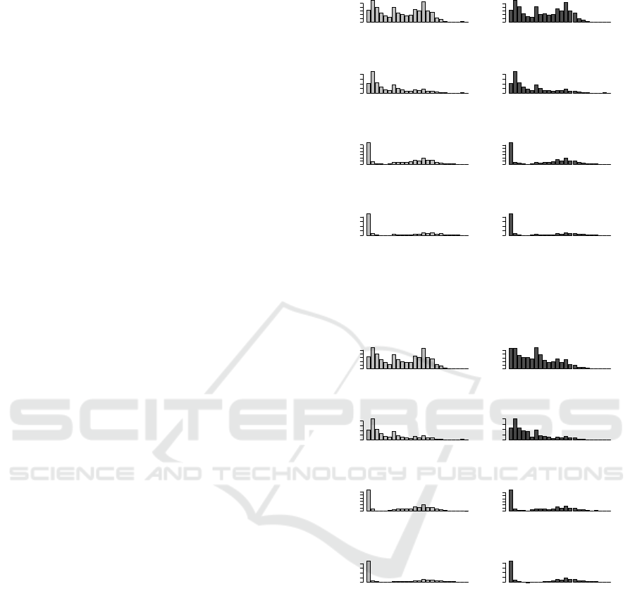
Figure 1: The barplots of loss relative frequency by differ-
ent combinations of major coverages and territories, before
and after reconstruction using the first five principal com-
ponents.
Orignal ABU
0.00 0.08
L0 L3 L6 L9 L12 L15 L18 L21
Approximation ABU
0.00 0.08
Orignal ABR
0.00 0.15
L0 L3 L6 L9 L12 L15 L18 L21
Approximation ABR
0.00 0.15
Orignal BIU
0.00 0.20
L0 L3 L6 L9 L12 L15 L18 L21
Approximation BIU
0.00 0.25
Orignal BIR
0.0 0.3
L0 L3 L6 L9 L12 L15 L18 L21
Approximation BIR
0.0 0.3
Figure 2: The barplots of loss relative frequency by differ-
ent combinations of major coverages and territories, before
and after reconstruction using only the first two principal
components.
4 RESULTS
First, we illustrate that the visualization of the size-of-
loss distribution could be misleading when the func-
tionality between relative frequency values and the
size-of-loss is not considered. Figures 1 and 2 show
the relative frequency values for all combinations of
major coverages and territories. It is mistaken if one
tries to comment on the shape of the distribution since
the intervals of the size-of-loss are not the same. The
DATA 2020 - 9th International Conference on Data Science, Technology and Applications
188
Table 1: Results of the first 6 PCs of loss relative frequency, including the standard deviation of principal component, the
proportion of variation explained by each principal component and the cumulative proportion of variation explained by the
first few PCs.
PC1 PC2 PC3 PC4 PC5 PC6
Standard deviation 3.8051 2.2667 1.2818 0.8789 0.7836 0.6426
Proportion of Variance 0.6033 0.2141 0.0684 0.0321 0.0255 0.0172
Cumulative Proportion 0.6033 0.8174 0.8858 0.9180 0.9436 0.9608
●
●
●
●
●
●
●
●
●
●
●
●
●
●
●
●
●
●
●
●
●
●
●
●
0 500000 1000000 1500000 2000000
0.00 0.02 0.04 0.06 0.08
AB−Ubran−2013 Report Year
Size of Loss
Frequency
●
●
●
●
●
●
●
●
●
●
●
●
●
●
●
●
●
●
●
●
●
●
●
●
●
●
●
●
●
●
●
●
●
●
●
●
●
●
●
●
●
●
●
● ●
●
●
●
●
●
●
●
●
●
●
●
●
●
●
●
●
●
●
●
●
●
●
●
●
●
●
●
●
●
●
●
●
●
●
●
●
●
●
●
●
●
●
●
●
●
●
●
●
●
●
●
●
●
●
●
●
AY2009
AY2010
AY2011
AY2012
AY2013
(a) ABU
●
●
●
●
●
●
●
●
●
●
●
●
●
●
●
●
●
●
●
●
●
●
●
●
0 500000 1000000 1500000 2000000
0.00 0.02 0.04 0.06 0.08 0.10
AB−Rural−2013 Report Year
Size of Loss
Frequency
●
●
●
●
●
●
●
●
●
●
●
●
●
●
●
●
●
●
●
●
●
●
●
●
●
●
●
●
●
●
●
●
●
●
●
●
●
●
●
●
●
●
●
●
●
●
●
●
●
●
●
●
●
●
●
●
●
●
●
●
●
●
●
●
●
●
●
●
●
●
●
●
●
●
●
●
●
●
●
●
●
●
●
●
●
●
●
●
●
●
●
●
●
●
●
●
●
●
●
●
●
AY2009
AY2010
AY2011
AY2012
AY2013
(b) ABR
●
●
●
●
●
●
●
●
●
●
●
●
●
●
●
●
●
●
●
●
●
●
●
●
0 500000 1000000 1500000 2000000
0.00 0.05 0.10 0.15
BI−Ubran−2013 Report Year
Size of Loss
Frequency
●
●
●
●
●
●
●
●
●
●
●
●
●
●
●
●
●
●
●
●
●
●
●
●
●
●
●
●
●
●
●
●
●
●
●
●
●
●
●
●
●
●
●
●
●
●
●
●
●
●
●
●
●
●
●
●
●
●
●
●
●
●
●
●
●
●
●
●
●
●
●
●
●
●
●
●
●
●
●
●
●
●
●
●
●
●
●
●
●
●
●
●
●
●
●
●
●
●
●
●
●
AY2009
AY2010
AY2011
AY2012
AY2013
(c) BIU
●
●
●
●
●
●
●
●
●
●
●
●
●
●
●
●
●
●
●
● ●
●
●
●
0 500000 1000000 1500000 2000000
0.00 0.05 0.10 0.15
BI−Rural−2013 Report Year
Size of Loss Level
Frequency
●
●
●
●
●
●
●
●
●
●
●
●
●
●
●
●
●
●
●
● ●
●
●
●
●
●
●
●
●
●
●
●
●
●
●
●
●
●
●
●
●
●
●
● ●
●
●
●
●
●
●
●
●
●
●
●
●
●
●
●
●
●
●
●
●
●
●
●
●
●
●
●
●
●
●
●
●
●
●
●
●
●
●
●
●
●
●
●
●
●
●
●
●
● ●
●
●
●
●
●
●
AY2009
AY2010
AY2011
AY2012
AY2013
(d) BIR
Figure 3: The loss relative frequency patterns for different
accident years and different combinations of coverage and
territory for 2013 reporting year, with respect to the size-of-
loss.
interval width is dramatically increased with the in-
crease of the size-of-loss. The shape of the distribu-
tion heavily depends on the size-of-loss. This result
implies that when visualizing the relative frequency
values, they must be presented with respect to the
size-of-loss. When this is the case, the tail of the dis-
tribution is much heavier as the bars located at right
side of the distribution are stretched out, and the bars
located at the left-hand side will be combined and be-
come more dominant than other size-of-loss. In addi-
tion, Figures 1 and 2 summarized the results using the
PCA to reconstruct the data matrix stated in Equation
(3). In Figure 1, five PCs were used, while in Figure
2, only two PCs were used. The results show the more
PCs used the better approximation of the original data
pattern. However, if only the major PCs were used,
one can observe a similar tendency of the loss relative
frequency within the same coverage, which leads to
a better data interpretability. In Figures 3 and 4, the
relative frequency values of different accident years
●
●
●
●
●
●
●
●
●
●
●
●
●
●
●
●
●
●
●
●
●
● ●
●
0 500000 1000000 1500000 2000000
0.00 0.05 0.10 0.15 0.20 0.25
AB−Ubran−2014 Report Year
Size of Loss
Frequency
●
●
●
●
●
●
●
●
●
●
●
●
●
●
●
●
●
●
●
●
●
●
●
●
●
●
●
●
●
●
●
●
●
●
●
●
●
●
●
●
●
●
●
●
●
●
●
●
●
●
●
●
●
●
●
●
●
●
●
●
●
●
●
●
●
●
●
●
●
● ●
●
●
●
●
●
●
●
●
●
●
●
●
●
●
●
●
●
●
●
●
●
●
●
●
●
●
●
●
●
●
AY2010
AY2011
AY2012
AY2013
AY2014
(a) ABU
●
●
●
●
●
●
●
●
●
●
●
●
●
●
●
●
●
●
●
●
●
● ●
●
0 500000 1000000 1500000 2000000
0.00 0.05 0.10 0.15 0.20 0.25
AB−Rural−2014 Report Year
Size of Loss
Frequency
●
●
●
●
●
●
●
●
●
●
●
●
●
●
●
●
●
●
●
● ●
●
●
●
●
●
●
●
●
●
●
●
●
●
●
●
●
●
●
●
●
●
●
●
●
●
●
●
●
●
●
●
●
●
●
●
●
●
●
●
●
●
●
●
●
●
●
●
●
●
●
●
●
●
●
●
●
●
●
●
●
●
●
●
●
●
●
●
●
●
●
●
●
●
●
●
●
●
●
●
●
AY2010
AY2011
AY2012
AY2013
AY2014
(b) ABR
●
●
●
●
●
●
●
●
●
●
●
●
●
●
●
●
●
●
●
●
●
●
●
●
0 500000 1000000 1500000 2000000
0.00 0.05 0.10 0.15
BI−Ubran−2014 Report Year
Size of Loss
Frequency
●
●
●
●
●
●
●
●
●
●
●
●
●
●
●
●
●
●
●
●
●
●
●
●
●
●
●
●
●
●
●
●
●
●
●
●
●
●
●
●
●
●
●
●
●
●
●
●
●
●
●
●
●
●
●
●
●
●
●
●
●
●
●
●
●
●
●
●
●
●
●
●
●
●
●
●
●
●
●
●
●
●
●
●
●
●
●
●
●
●
●
●
●
●
●
●
●
●
●
●
●
AY2010
AY2011
AY2012
AY2013
AY2014
(c) BIU
●
●
●
●
●
●
●
●
●
●
●
●
●
●
●
●
●
●
●
●
●
●
●
●
0 500000 1000000 1500000 2000000
0.00 0.05 0.10 0.15
BI−Rural−2014 Report Year
Size of Loss
Frequency
●
●
●
●
●
●
●
●
●
●
●
●
●
●
●
●
●
●
●
●
●
●
●
●
●
●
●
●
●
●
●
●
●
●
●
●
●
●
●
●
●
●
●
●
●
●
●
●
●
●
●
●
●
●
●
●
●
●
●
●
●
●
●
●
●
●
●
●
●
●
●
●
●
●
●
●
●
●
●
●
●
●
●
●
●
●
●
●
●
●
●
●
●
● ●
●
●
●
●
●
●
AY2010
AY2011
AY2012
AY2013
AY2014
(d) BIR
Figure 4: The loss relative frequency patterns for different
accident years and different combinations of coverage and
territory for 2014 reporting year, with respect to the size-of-
loss.
with respect to the size-of-loss for different combina-
tions of coverage and territory of the reporting years
of 2013 and 2014 are presented. The results shown in
Figures 3 and 4 are more interpretable as they show
clearly the similar loss patten for different accident
years.
The results shown in Figures 3 and 4 reveal that
the size-of-loss relative frequency values do not heav-
ily depend on the reporting years. The result implies
that the claim counts were mainly developed within
the accident year. We also observe that within the
same coverage, either AB or BI, the size-of-loss rela-
tive frequency appears to have high similarity among
different accident years. For both coverages, the
zero claim amount has the most dominant frequency.
This fact implies that many reported claims cause
zero loss, which may be due to the insurance de-
ductible. This result suggests that the loss amount
associated with zero size-of-loss is mainly due to the
expenses that occurred during the claim reporting pro-
Improving Statistical Reporting Data Explainability via Principal Component Analysis
189
●
●
●
●
●
●
●
●
●
●
●
●
●
●
●
●
●
●
●
●
●
●
●
●
0 500000 1000000 1500000 2000000
0.00 0.05 0.10 0.15
AB−Ubran−2013 Report Year
Size of Loss
Frequency
●
●
●
●
●
●
●
●
●
●
●
●
●
●
●
●
●
●
●
●
●
●
●
●
●
●
●
●
●
●
●
●
●
●
●
●
●
●
●
●
●
●
●
●
●
●
●
●
●
●
●
●
●
●
●
●
●
●
●
●
●
●
●
●
●
●
●
●
●
●
●
●
●
●
●
●
●
●
●
●
●
●
●
●
●
●
●
●
●
●
●
●
●
●
●
●
●
●
●
●
●
AY2009
AY2010
AY2011
AY2012
AY2013
(a) ABU
●
●
●
●
●
●
●
●
●
●
●
●
●
●
●
●
●
●
●
●
●
●
●
●
0 500000 1000000 1500000 2000000
0.00 0.05 0.10 0.15
AB−Rural−2013 Report Year
Size of Loss
Frequency
●
●
●
●
●
●
●
●
●
●
●
●
●
●
●
●
●
●
●
●
●
●
●
●
●
●
●
●
●
●
●
●
●
●
●
●
●
●
●
●
●
●
●
●
●
●
●
●
●
●
●
●
●
●
●
●
●
●
●
●
●
●
●
●
●
●
●
●
●
●
●
●
●
●
●
●
●
●
●
●
●
●
●
●
●
●
●
●
●
●
●
●
●
●
●
●
●
●
●
●
●
AY2009
AY2010
AY2011
AY2012
AY2013
(b) ABR
●
●
●
●
●
●
●
●
●
●
●
●
●
●
●
●
●
●
●
●
●
●
●
●
0 500000 1000000 1500000 2000000
0.00 0.05 0.10 0.15 0.20 0.25 0.30 0.35
BI−Ubran−2013 Report Year
Size of Loss
Frequency
●
●
●
●
●
●
●
●
●
●
●
●
●
●
●
●
●
●
●
●
●
●
●
●
●
●
●
●
●
●
●
●
●
●
●
●
●
●
●
●
●
●
●
●
●
●
●
●
●
●
●
●
●
●
●
●
●
●
●
●
●
●
●
●
●
●
●
●
●
●
●
●
●
●
●
●
●
●
●
●
●
●
●
●
●
●
●
●
●
●
●
●
●
●
●
●
●
●
●
●
●
AY2009
AY2010
AY2011
AY2012
AY2013
(c) BIU
●
●
●
●
●
●
●
●
●
●
●
●
●
●
●
●
●
●
●
●
●
●
●
●
0 500000 1000000 1500000 2000000
0.0 0.1 0.2 0.3 0.4
BI−Rural−2013 Report Year
Size of Loss
Frequency
●
●
●
●
●
●
●
●
●
●
●
●
●
●
●
●
●
●
●
●
●
●
●
●
●
●
●
●
●
●
●
●
●
●
●
●
●
●
●
●
●
●
●
●
●
●
●
●
●
●
●
●
●
●
●
●
●
●
●
●
●
●
●
●
●
●
●
●
●
●
●
●
●
●
●
●
●
●
●
●
●
●
●
●
●
●
●
●
●
●
●
●
●
●
●
●
●
●
●
●
●
AY2009
AY2010
AY2011
AY2012
AY2013
(d) BIR
Figure 5: The first principal component approximation of
loss relative frequency patterns of different accident years
and different combinations of coverage and territory for
2013 reporting year, with respect to the size-of-loss.
●
●
●
●
●
●
●
●
●
●
●
●
●
●
●
●
●
●
●
●
●
●
●
●
0 500000 1000000 1500000 2000000
0.00 0.05 0.10 0.15
AB−Ubran−2014 Report Year
Size of Loss Level
Frequency
●
●
●
●
●
●
●
●
●
●
●
●
●
●
●
●
●
●
●
●
●
●
●
●
●
●
●
●
●
●
●
●
●
●
●
●
●
●
●
●
●
●
●
●
●
●
●
●
●
●
●
●
●
●
●
●
●
●
●
●
●
●
●
●
●
●
●
●
●
●
●
●
●
●
●
●
●
●
●
●
●
●
●
●
●
●
●
●
●
●
●
●
●
●
●
●
●
●
●
●
●
AY2010
AY2011
AY2012
AY2013
AY2014
(a) ABU
●
●
●
●
●
●
●
●
●
●
●
●
●
●
●
●
●
●
●
●
●
●
●
●
0 500000 1000000 1500000 2000000
0.00 0.05 0.10 0.15
AB−Rural−2014 Report Year
Size of Loss
Frequency
●
●
●
●
●
●
●
●
●
●
●
●
●
●
●
●
●
●
●
●
●
●
●
●
●
●
●
●
●
●
●
●
●
●
●
●
●
●
●
●
●
●
●
●
●
●
●
●
●
●
●
●
●
●
●
●
●
●
●
●
●
●
●
●
●
●
●
●
●
●
●
●
●
●
●
●
●
●
●
●
●
●
●
●
●
●
●
●
●
●
●
●
●
●
●
●
●
●
●
●
●
AY2010
AY2011
AY2012
AY2013
AY2014
(b)ABR
●
●
●
●
●
●
●
●
●
●
●
●
●
●
●
●
●
●
●
●
●
●
●
●
0 500000 1000000 1500000 2000000
0.00 0.05 0.10 0.15 0.20 0.25 0.30 0.35
BI−Ubran−2014 Report Year
Size of Loss
Frequency
●
●
●
●
●
●
●
●
●
●
●
●
●
●
●
●
●
●
●
●
●
●
●
●
●
●
●
●
●
●
●
●
●
●
●
●
●
●
●
●
●
●
●
●
●
●
●
●
●
●
●
●
●
●
●
●
●
●
●
●
●
●
●
●
●
●
●
●
●
●
●
●
●
●
●
●
●
●
●
●
●
●
●
●
●
●
●
●
●
●
●
●
●
●
●
●
●
●
●
●
●
AY2010
AY2011
AY2012
AY2013
AY2014
(c) BIU
●
●
●
●
●
●
●
●
●
●
●
●
●
●
●
●
●
●
●
●
●
●
●
●
0 500000 1000000 1500000 2000000
0.0 0.1 0.2 0.3 0.4
BI−Rural−2014 Report Year
Size of Loss
Frequency
●
●
●
●
●
●
●
●
●
●
●
●
●
●
●
●
●
●
●
●
●
●
●
●
●
●
●
●
●
●
●
●
●
●
●
●
●
●
●
●
●
●
●
●
●
●
●
●
●
●
●
●
●
●
●
●
●
●
●
●
●
●
●
●
●
●
●
●
●
●
●
●
●
●
●
●
●
●
●
●
●
●
●
●
●
●
●
●
●
●
●
●
●
●
●
●
●
●
●
●
●
AY2010
AY2011
AY2012
AY2013
AY2014
(d) BIR
Figure 6: The first principal component approximation of
loss relative frequency patterns of different accident years
and different combinations of coverage and territory for
2014 reporting year, with respect to the size-of-loss.
cess. From the management perspective, reducing
the processing of claims with zero loss is necessary
●
●
●
●
●
●
●
●
●
●
Claim Counts Scree Plot
Variances
0.000 0.005 0.010 0.015 0.020 0.025 0.030 0.035
1 2 3 4 5 6 7 8 9 10
Figure 7: The Scree plot, which shows the distribution of
eigenvalues with respect to their principal components.
0e+00 1e+05 2e+05 3e+05 4e+05
−0.4 −0.2 0.0 0.2 0.4 0.6 0.8
Principal Component Vector Plot
Size of Loss
Harmonic
●
●
●
●
1st PC
2nd PC
3rd PC
4th PC
Figure 8: The plot of principal component loadings with
respect to the size-of-loss for the first four PCs.
for auto insurance companies to significantly reduce
the total expenses. On the other hand, in Figures 3
and 4, the overall pattern of AB coverage shows that
as the size-of-loss increases, the claim frequency de-
creases. For BI coverage, the overall pattern of loss
relative frequency shows that as the size-of-loss in-
creases, the claim frequency decreases first, then it
increases again. It reaches the local maximum at the
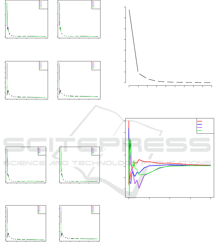
size-of-loss around $5,000 to $75,000. In Figures 5
and 6 show the approximation of size-of-loss relative
frequency using only the first PC to reconstruct the
data matrix. From these results, we observe that the
DATA 2020 - 9th International Conference on Data Science, Technology and Applications
190

●
●
●
●
●
●
●
●
●
●
●
●
●
●
●
●
●
●
●
●
●
●
●
●
●
●
●
●
●
●
●
●
●
●
●
●
●
●
●
●
−2.5
0.0
2.5
−4 0 4 8
PC1 (60.3% explained var.)
PC2 (21.4% explained var.)
● ● ● ●
ABR ABU BIR BIU
Figure 9: The extracted two dimensional features, which
are the first two principal components, with the input data
being scaled.
●
●
●
●
●
●
●
●
●
●
●
●
●
●
●
●
●
●
●
●
●
●
●
●
●
●
●
●
●
●
●
●
●
●
●
●
●
●
●
●
−0.1
0.0
0.1
−0.2 0.0 0.2
PC1 (81.5% explained var.)
PC2 (10.6% explained var.)
● ● ● ●
ABR ABU BIR BIU
Figure 10: The extracted two dimensional features, which
are the first two principal components, without the input
data being scaled.
overall relative frequency pattern was picked up by
the first PC, although there are some small differences
when comparing to the original observations shown
in Figures 3 and 4. The benefit of having these ma-
jor patterns recognized by the first PC is to enhance a
understanding of driving forces for insurance claims.
Coverages and Territories might share some common-
ality in claim frequency distribution.
Figure 7 displays the results of eigenvalues for
their principal components. From the results shown
in 7, we can see that the first four PCs can explain the
significant amount of data variation. These four PCs
have explained more than 95% of the total variation,
which can be seen from Table 1. In particular, the first
principal component and the second principal compo-
nents have explained about 60% and 21% of the total
variation, respectively. That is to say, the first two
PCs have been able to explain 81% of the total varia-
tion. In Figure 8, the harmonic pattern as a function
of the size-of-loss is displayed. The result shows that
the main harmonic patterns are significant only be-
tween zero and $250,000 as the harmonic approaches
to zero when the size-of-loss is greater than $250,000.
Also, this result implies that the primary insurance un-
certainty in terms of loss relative frequency is mainly
concentrated in between zero and $250,000. The fluc-
tuation of loss relative frequency from different acci-
dent years and different reporting years starts to be-
come small when an individual size-of-loss is higher
than $250,000. This result provides us with valuable
information on the estimate of the cut-off value of the
large size-of-loss, which is an important aspect that
leads to reinsurance or determination of the large size-
of-loss loading factor. On the other hand, the first two
principal component loading vectors, share a similar
functionality with respect to the size-of-loss. In con-
trast, the third and fourth principal component load-
ing behaves similarly and go in the opposite direction
from the first two PCs. This fact may suggest that dif-
ferent principal components could explain the diverse
nature of variation. To extract the major pattern of the
loss data is to see if there is anything in common, one
should focus on either the first or first two PCs.
Figures 9 and 10 show the extraction of two-
dimensional features, respectively, for both cases of
input data with and without scaling. In practice, It
is critical to see if there is an effect from the scaling
of the data because the variation of each underlying
variable may be different, because the separation of
extracted features may be affected by the scales of the
variables. Figure 9 shows the results with scaling be-
fore applying PCA. The result reveals that the two-
dimensional features can be separated by the type of
data with a slight overlapping part on AB coverage
(ABR and ABU). The BI coverage is well separated
by different territories. The result suggests that PCA
could form each type of claim count data into clusters,
which facilitates the understanding of their similari-
ties and differences. Furthermore, the extracted fea-
tures of the BI coverage appear to be more linear than
the features extracted from the AB coverage. This re-
sult implies that the extracted features of the BI cov-
erage are more correlated within the same territory.
Based on this result, we can further infer that the low-
rank approximation of original data enhance the level
of similarity within the same territory. This result co-
incides with the observation we found in both Figures
5 and 6, which suggests a high level of similarity of
relative frequency distribution among different com-
binations of territory. However, PCA can only capture
the similarity within the BI coverage, but not the AB
coverage. Similarly, Figure 10 displays the extracted
features from the first two PCs, using the input data
without scaling. We can observe that without scaling,
the separability of the extracted features is lower than
Improving Statistical Reporting Data Explainability via Principal Component Analysis
191

the one associated with the scaled input data. From
the result, we can conclude that it is crucial to scale
the data when using the PCA approach.
5 CONCLUDING REMARKS
Data visualization and data interpretability improve-
ment have been an on-going challenging problem in
the complex statistical analysis. Importantly our re-
search has shown that breaking down the grouped
data using PCA will give more detailed information
for the insurance regulators to make better decision.
In this work, we proposed PCA as feature extraction
and low-rank approximation methods, and we applied
it to the auto insurance size-of-loss data. We illustrate
that PCA is a suitable technique to improve data visu-
alization and the interpretability of data. First, we use
principal component analysis to extract data features
from the size-of-loss relative frequency distributions
for a better understanding of their natural fluctuation
and functionality to the size-of-loss. We also use PCA
to reconstruct the input data matrix so that the major
pattern of the size-of-loss relative frequency distribu-
tion can be obtained for data from a combination of
major coverages and territories. By doing these, we
capture the common functionality of data so that the
result can be used as a baseline of the size-of-loss rel-
ative frequency distribution. Our study shows that the
size-of-loss distributions share some common statis-
tical property within the same major coverage or the
same territory. It is necessary to further study this
commonality by relating the size-of-loss relative fre-
quency pattern to some potential risk factors, includ-
ing coverages, territories, accident years and report-
ing years. It is interesting to estimate these factor
effects and to test their statistical significance in the
future research.
REFERENCES
Alter, O., Brown, P. O., and Botstein, D. (2000). Singu-
lar value decomposition for genome-wide expression
data processing and modeling. Proceedings of the Na-
tional Academy of Sciences, 97(18):10101–10106.
Bakshi, B. R. (1998). Multiscale pca with application to
multivariate statistical process monitoring. AIChE
journal, 44(7):1596–1610.
Bologa, A.-R., Bologa, R., Florea, A., et al. (2013). Big
data and specific analysis methods for insurance fraud
detection. Database Systems Journal, 4(4):30–39.
Clarkson, K. L. and Woodruff, D. P. (2017). Low-rank
approximation and regression in input sparsity time.
Journal of the ACM (JACM), 63(6):54.
Elgendy, N. and Elragal, A. (2014). Big data analytics: a
literature review paper. In Industrial Conference on
Data Mining, pages 214–227. Springer.
Golub, G. H. and Reinsch, C. (1971). Singular value de-
composition and least squares solutions. In Linear Al-
gebra, pages 134–151. Springer.
Goodman, B. and Flaxman, S. (2017). European union reg-
ulations on algorithmic decision-making and a “right
to explanation”. AI Magazine, 38(3):50–57.
Hong, S., Hyoung Kim, S., Kim, Y., and Park, J. (2019).
Big data and government: Evidence of the role of
big data for smart cities. Big Data & Society,
6(1):2053951719842543.
Khalid, S., Khalil, T., and Nasreen, S. (2014). A survey of
feature selection and feature extraction techniques in
machine learning. In 2014 Science and Information
Conference, pages 372–378. IEEE.
Lin, W., Wu, Z., Lin, L., Wen, A., and Li, J. (2017). An
ensemble random forest algorithm for insurance big
data analysis. Ieee Access, 5:16568–16575.
McClenahan, C. L. (2014). Ratemaking. Wiley StatsRef:
Statistics Reference Online.
Wickman, A. E. (1999). Insurance data and intellectual
property issues. In CASUALTY ACTUARIAL SOCI-
ETY FORUM Winter 1999 Including the Ratemaking
Discussion Papers, page 309. Citeseer.
Xie, S. (2019). Defining geographical rating territories
in auto insurance regulation by spatially constrained
clustering. Risks, 7(2):42.
Xie, S. and Lawniczak, A. (2018). Estimating major risk
factor relativities in rate filings using generalized lin-
ear models. International Journal of Financial Stud-
ies, 6(4):84.
DATA 2020 - 9th International Conference on Data Science, Technology and Applications
192
