
Understanding the Use of Narrative Patterns by Novice Data Storytellers
Tom Blount
1
, Laura Koesten
2
, Yuchen Zhao
3
and Elena Simperl
2
1
University of Southampton, U.K.
2
King’s College London, U.K.
3
Imperial College London, U.K.
Keywords:
Data Story, Human-Data Interaction, Narrative Patterns, Data Visualisation.
Abstract:
Data stories are about communicating data, tailored to a specific audience, with a compelling narrative. Cre-
ating them requires a mix of data science and design skills, which can be difficult for beginners. Patterns
can help, as they provide tried-and-tested solutions to commonly occurring challenges. ‘Narrative patterns’
are a particular class of patterns that support data-storytellers in structuring the presentation of data within
their story, aiding them in effectively communicating with their audience. Our aim is to understand how such
patterns are applied in practice and identify ways they could be of greater use, especially for people new to the
field. To this end, we conduct a review of 67 data stories, created by both professional data storytellers and by
postgraduate university students studying data-science, to analyse their use of narrative patterns. Starting from
a collection of narrative patterns from the literature, we explore which patterns are used more often, either on
their own or in combination, and which ones beginners struggle with. From the findings we derive recommen-
dations on how to refine some of the less accessible patterns and for training and tool support, which would
allow wider audiences to articulate their data insights effectively.
1 INTRODUCTION
Data storytelling has become a top priority in many
professional roles. Major media outlets, including the
New York Times, the Wall Street Journal or Reuters
have set up data journalism teams to provide infor-
mation and analysis about the important issues of the
day, and publish their data stories via dedicated ac-
counts on social media. Brands have discovered info-
graphics and other visual renderings of data as a way
to boost traffic — for instance, to promote Narcos,
a show that tells the story of Pablo Escobar, Netflix
launched a data story that talks about the economy
of Columbian cocaine trade in a socially engaging
way.Scientists are increasingly mindful of the impact
of their work in a broader context and use data sto-
ries to inform and raise awareness of science-related
topics (Eccles et al., 2008; Kwan-Liu Ma et al., 2012).
In this paper, we follow Lee et al. (2015)’s def-
inition of ‘data stories’ as facts backed by data, vi-
sualisations, and/or, annotation, with meaningful nar-
ration. We distinguish stories from other forms of
data-related communication such as charts or dash-
boards, which tend to focus on the data and the means
to represent it visually. By contrast, data stories re-
quire their authors to take a broader, holistic view of
what they are trying to say, and outline the basic struc-
ture of their message before deciding on the visuals to
be rendered. Studies found them more intuitive and
engaging than less thought-through combinations of
charts and text (Gershon and Page, 2001). Interactiv-
ity creates a vast array of possibilities to engage with
the underlying data and tailor the storyline to the in-
terests of the reader (Kosara and Mackinlay, 2013).
Creating data stories requires a mix of data science
and design skills, which can be difficult for begin-
ners (Lee et al., 2015). Patterns can help, as they pro-
vide tried-and- tested solutions to commonly occur-
ring challenges. In this paper, we focus on a particu-
lar class of patterns called ‘narrative patterns’, which,
in a data context, describe the order and manner in
which the storyteller communicates the data to their
audience (Branston and Stafford, 2010; Bach et al.,
2018a).
Narrative patterns have been explored in depth in
literature and media studies (Branston and Stafford,
2010). Narrative guidance has shown to have a
positive effect on writing tasks (Kim and Monroy-
Hernandez, 2016). In a data context, such patterns
have emerged only recently Bach et al. (2018a) and
are not extensively supported by methodologies and
tools. Convinced of their utility, our aim with the
present study is to get a better understanding of how
patterns are applied in practice and identify ways they
128
Blount, T., Koesten, L., Zhao, Y. and Simperl, E.
Understanding the Use of Narrative Patterns by Novice Data Storytellers.
DOI: 10.5220/0010121601280138
In Proceedings of the 4th International Conference on Computer-Human Interaction Research and Applications (CHIRA 2020), pages 128-138
ISBN: 978-989-758-480-0
Copyright
c
2020 by SCITEPRESS – Science and Technology Publications, Lda. All rights reserved

could be of greater use, especially for people new to
the field. Our paper is organised according to the fol-
lowing research questions:
RQ1: Which patterns do storytellers prefer?
RQ2: Are certain patterns used in combination?
RQ3: Which patterns are not used correctly by
beginners?
RQ4: How do preferences differ between begin-
ners and experienced professionals?
Starting from the collection of 18 narrative pat-
terns proposed by Bach et al. (2018a), we analyse a
sample of 67 data stories at both ends of the expe-
rience spectrum: 43 stories created by data-science
students who have taken a data visualisation course,
and 24 award-winning stories. For the student stories,
we consider the reported usage of narrative patterns,
as well as the actual usage to identify patterns that
are popular with beginners, both on their own and in
combination, and those that beginners struggle with.
We compare them with the patterns found in the work
of rather experienced storytellers to get a sense of pat-
tern uptake and areas where more training and support
is needed for fledgling practitioners.
We propose recommendations on how to refine
some of the less accessible patterns from Bach et al.,
including new categories, support for additional data
manipulation features, and built-in interactive ele-
ments, which would increase their ease of use and al-
low wider audiences to articulate their data insights
more effectively.
2 RELATED WORK
We start with a brief overview of patterns and infor-
mation design, followed by an account of narrative
patterns that apply specifically to data stories, and
a review of tool support, following the classification
of genres and structures proposed by Segel and Heer
(2010).
2.1 Patterns and Information Design
Design patterns provide repeatable, reusable solutions
to recurring design problems in virtually any area of
design (Borchers, 2000). They help beginners by pro-
viding a common, accepted language that captures the
intent behind a design (Gamma et al., 2002). They
facilitate interdisciplinary work (Borchers, 2000) and
computer support (Budinsky et al., 1996). Closer to
our field, there is a huge body of literature in areas
such as software engineering (Gamma, 1995), user
interface design (Granlund et al., 2001), or ontology
design (Gangemi and Presutti, 2009) that defines, ap-
plies and assesses the use of patterns.
Information design has established approaches
and guidelines to choose the best medium and struc-
ture to communicate insights to a given audience.
This process involves different skill sets and levels
of complexity (Segel and Heer, 2010). Data visual-
isation recommends specific classes of charts and vi-
sual encoding to support specific types of cognitive
tasks (Ware, 2012) and warns against the effects of
misleading or ineffective charts when presenting data
to broad audiences (Kong et al., 2019).
When building a data story, the designer needs to
consider the main message and its intended audience,
structure the storyline and decide which media types
are best suited to support a particular part of the plot.
Breaking down this complex process into sub-tasks
is useful especially for beginners, and ultimately en-
ables the development of tools to support storytellers
in their work.
2.2 Narrative Patterns for Data Stories
There is extensive literature discussing the formalisa-
tion of storytelling for different genres (Branston and
Stafford, 2010; Reagan et al., 2016). Data stories, as a
relatively new form of media, follow their own regular
patterns to construct and communicate meaning, for
instance by organising charts into specific sequences
that are known to aid understanding and decision sup-
port. These patterns can be genre-specific (e.g. in-
stance data games) or apply more widely to specific
types of data (e.g. time series) or presentation modes
(e.g. slides) (Bach et al., 2018a). Bach et al. have in-
troduced design patterns for data comics, a data sto-
rytelling genre that is said to be more effective, en-
gaging, and easier to understand and recall than in-
fographics (Bach et al., 2018b; Wang et al., 2019).
Brehmer et al. (2017) have investigated timeline pat-
terns used in data stories. (Tang et al., 2019) have
explored how people transform a narrative into hand-
drawn storyline visualisations. Hullman et al. (2017)
have evaluated how people order charts in a sequence.
These studies have advanced the field and contributed
to our knowledge about how patterns are applied to
practice to construct the flow of data stories. Unlike
them, we focus on beginners, and explore their use
and understanding of a range of narrative patterns in
stories they designed on their own, on topics of their
choice, using relevant data.
Our paper refers to the collection of 18 narrative
patterns introduced by Bach et al. (2018a), which are
based on existing data stories in the literature and the
Understanding the Use of Narrative Patterns by Novice Data Storytellers
129

web. As shown in Table 1, they can be broadly cat-
egorised into the five (potentially overlapping) cate-
gories:
• Argumentation (Arg): reasoning systematically
to support messages and arguments.
• Flow (Flw): helping structure the sequence of
messages and arguments.
• Framing (Frm): the way facts and events in a
story are perceived and understood through narra-
tion.
• Emotion (Etn): enhancing readers’ ability to un-
derstand and share the feelings and experiences
important to the story.
• Engagement (Egm): the feeling of being part of
the story, of being connected to it and being in
control over the interaction with the story’s con-
tent.
2.3 Narrative Patterns in Storytelling
Tools
While multiple frameworks and tools for data story-
telling have been proposed (Cruz and Machado, 2011;
Kim et al., 2018; Gratzl et al., 2016; Bongshin Lee
et al., 2013; Satyanarayan and Heer, 2014; Amini
et al., 2017; Kim et al., 2019; Metoyer et al., 2018;
Hullman et al., 2013; Gao et al., 2014), only a few re-
cent ones implicitly support narrative patterns. Data-
Toon (Kim et al., 2019) and DataClips (Amini et al.,
2017) help build the flow of a data story. The auto-
matic transition function in DataToon analyses two
related charts and generates a visual transition be-
tween them, which helps the author to gradually re-
veal their differences. DataClips allows to adjust the
animation speed of stories. Other works support fram-
ing and emotion patterns — for instance, Zhao et al.
(2015) propose to use comic character to present data
stories, which breaks the ‘virtual wall’ between story
and reader. Metoyer et al. (2018) apply text process-
ing techniques to automatically extract key facts that
can help link data points with sports players, show-
ing the human element behind the data. Our study
systematically analysed the use of a range of narra-
tive patterns to provide recommendations about how
they could be made more accessible by beginners and
supported by tools (Kim et al., 2019).
3 METHODOLOGY
3.1 Participants
The participants in our study were students from a
12 week postgraduate data visualisation course with
both taught and lab components, which covered top-
ics such as human-data interaction, basic types of
charts, visual perception, misleading with charts, in-
teractivity, and storytelling. The lectures include dif-
ferent classes of patterns and best practices, includ-
ing the narrative patterns from Bach et al. (2018a).
The students were also introduced todata visualisation
tools and libraries (e.g. Tableau and D3.js), which
equipped them with the skills required to implement
a story. To aid the understanding of patterns, we pro-
vided ‘design cards’, which described each pattern
and how it could be used alongside a screenshot with
a real-world example and the link to access the exam-
ple online.
Conducting the study in the context of a data visu-
alisation course gave us access to a relatively homo-
geneous population, with known and comparable data
science and design skills, reducing the effects of vary-
ing skill levels in the understanding and application of
patterns.
3.2 Data
The participants created data stories with at least three
different charts, on a topic of their choice, using li-
braries and tools they felt most comfortable with, as
part of their final coursework. They were asked to
document their work, motivate the choice of charts
and structure of the story, and comment on which nar-
rative patterns they found useful. After discarding in-
complete reports, we were left with 43 data stories.
In addition, we collected 24 data stories created
by professional data storytellers from the Data Jour-
nalism Awards
1
between 2014 and 2019. To create
the sample, we examined the stories that were recip-
ients of an award during this time and included all
those that were accessible online at the time of writ-
ing. While we do not have an account of the patterns
the authors intended to use, we make the assump-
tion that they were capable of using patterns correctly
based on their professional qualifications.
3.3 Methods
Each of the 43 data stories authored by beginners
were accompanied by a self-reported account of the
1
https://datajournalismawards.org
CHIRA 2020 - 4th International Conference on Computer-Human Interaction Research and Applications
130

Table 1: Narrative design patterns and the categories they belong to Bach et al. (2018a).
Pattern name (acronym) Arg Flw Frm Etn Egm Description
Addressing the audience (addr) X X X Allowing the audience to become part of a narrative.
Breaking the 4th wall (wall) X X Subjects in a narrative unexpectedly addressing the audi-
ence.
Call for action (call) X Asking the audience to take actions to solve the issues pre-
sented in the narrative.
Compare (compare) X Showing multiple visualisations juxtaposed and highlight-
ing the difference between them.
Concretise (concretise) X X Transforming abstract concepts or numbers into solid and
known references.
Convention breaking (conv) X Breaking established graphical convention to convey sur-
prising information.
Defamiliarisation (defam) X Presenting known and familiar objects in an unexpected
way to make the audience to rethink in a different way.
Exploration (explore) X X Giving audience the freedom to actively interact with data.
Familiarisation (fam) X X Making the narrative more personal based on the knowl-
edge about the audience.
Gradual reveal (reveal) X X X Unfolding a narrative in a hierarchical way (e.g., different
granularity or subsets).
Humans-behind-the-dots (hu-
mans)
X Connecting the used data with the subjects (e.g., persons,
characters) behind the data.
Make-a-guess (guess) X X Asking the audience to take part in the narrative to find out
the conclusions.
Physical metaphor (metaphor) X Using direction and space in visualisations to convey dif-
ferent kinds of information.
Repetition (repeat) X X Using the same type of visualisations to present an effect
repeatedly through different data dimensions.
Rhetorical question (question) X X X X Presenting the argument of a narrative as a question.
Silent data (silent) X Emphasising the argument of a narrative by de-
emphasising or hiding some data.
Speed-up/slow-down (speed) X X X Using the speed of animations to show the change in the
intensity and urgency.
Users-find-themselves (users) X X Asking the audience to find out the conclusion of a narra-
tive by themselves.
narrative patterns applied. We reviewed these reports
manually to identify those that were more or less pop-
ular, either individually or in combination. We then
looked at each story to spot discrepancies between
self-reported and actual usage, which gave us an idea
of the patterns novices might struggle with. We used
the work of Bach et al. (2018a) as well as the con-
tent of the design cards and other course material the
students received as a frame of reference to ascer-
tain expected usage and deviations from it in prac-
tice. Finally, we compared the use of patterns between
novices and experts by analysing the set of 24 award-
winning stories regarding the narrative patterns they
applied.
4 RESULTS
We report the usage of individual patterns as well as
of pattern combinations within data stories and how
much the self-reported usage overlapped with actual
usage. Finally we discuss pattern usage by profes-
sional data storytellers and identify commonalities
and differences
As discussed in Section 2, the 18 patterns belong
to five categories: argumentation, flow, framing,
emotion, and engagement. We found that the stu-
dent participants (N = 43) chose patterns mostly in
the first two groups, specifically compare and ex-
plore, as well as pattern combinations from these
two groups. For most patterns, both popular and less
popular, we could identify discrepancies between re-
ported and actual usage, which suggest that additional
support may be needed or at issues with the patterns
themselves. Award-winning storytellers share pref-
erences with the less experienced participants, though
they also apply more advanced patterns which the stu-
dents found challenging.
4.1 Overall Usage
As shown in Figure 1, the median number of uniquely
used patterns per story was three, out of a set of 18.
Understanding the Use of Narrative Patterns by Novice Data Storytellers
131
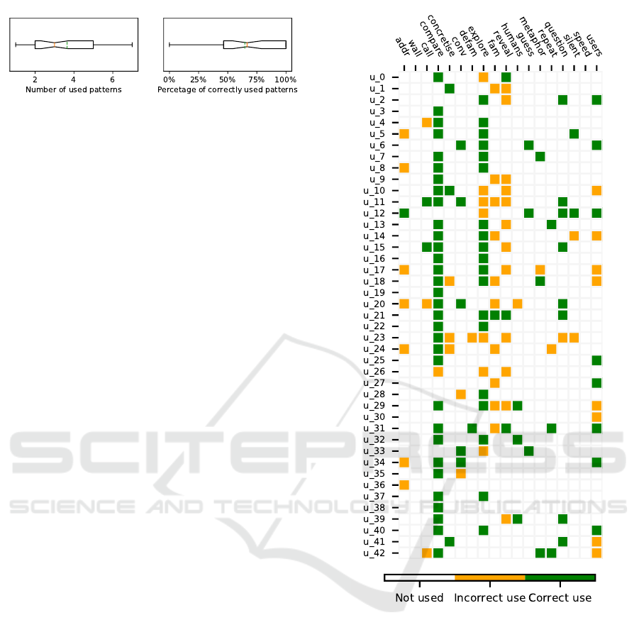
Figure 1: Distributions of the number of used patterns (left,
mean = 3.65, median = 3.00, standard deviation = 1.75)
reported by the participants and the percentage of cor-
rectly used patterns among all reported used patterns (right,
mean = 65%, median = 67%, standard deviation = 30%).
Notches indicate 95% confidence interval around median.
In addition, some patterns were not applied well: the
median share of correctly used patterns was 67%.
Figure 2 shows the detailed reported usage. Each
column in the heat map is a narrative design pattern
and each row is the reported usage from a participant.
A green coloured cell means that the actual usage of
the pattern matches the reported usage. An orange
coloured cell means that there is a discrepancy be-
tween them. The wall and speed pattern were not
reportedly used by anyone.
4.2 Preference of Narrative Patterns
Based on the overall usage, we further analysed the
participants’ preferences of each individual pattern, in
order to answer RQ1, i.e., which patterns are most
favoured. As shown in Figure 3, compare has the
highest usage (33), followed by explore (26). The
first helps making a point by showing differences in
the data, while the second is a means to structure the
flow of a story.
Reported usage of eight of the 18 patterns, mostly
from the framing and emotion categories, was
sparse, with 5 or less participants commenting on
them. These include: humans, metaphor, repeat,
silent, guess, and defam, while wall and speed were
not mentioned at all. The reasons for this are varied.
A pattern such as humans is relevant only when the
data is about people, which was not always the case
in our sample. Using repeat requires the authors to
find multiple dimensions in the data and to plot these
dimensions through the same type of visualisation to
build up an argument. Finally, guess asks for feed-
back from the audience, which makes the story more
complex to develop.
As noted earlier, wall and speed were not men-
tioned by any participants. The former requires the
presence of a narrator, who directly (and sometimes
unexpectedly) addresses the audience. This imposes a
particular authorial style on the narrative, which may
not be suitable for all media types, and less familiar
to students reading a data science degree. The speed
pattern can only be realised with the use of animations
Figure 2: Reported usage from 43 novice participants. Each
column represents a narrative pattern, each row represents a
participant.
or videos, which again are more complex to develop.
4.3 Preferred Pattern Combinations
To address RQ2, we examined which patterns were
most often mentioned in combination in the students’
reports.In line with the most popular patterns dis-
cussed earlier, the pair explore-compare achieved the
highest reported usage. As noted before, explore is
a flow pattern that helps a story unfold by allowing
the audience to freely engage with data. Compare
is about argumentation and juxtaposes two charts to
hint at differences and trends. This corresponds to
a design where the author does not dictate the order
CHIRA 2020 - 4th International Conference on Computer-Human Interaction Research and Applications
132
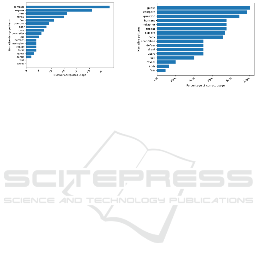
Figure 3: Beginners’ pattern preferences. Compare and ex-
plore have the highest number of usage. Wall and speed
were not used by any participants.
in which the reader would need to inspect the story,
but rather allows them to look around freely, while
placing directly related charts in proximity to each
other (Kanizsa, 1979). Another commonly used flow-
argumentation sequence was reveal-compare. The
students also reported applying a mix of different flow
patterns, such as reveal-explore, to build up their sto-
ries. Both reveal-compare and reveal-explore match
the Martini glass story model proposed by Segel and
Heer (2010), which uses a tight narrative flow (reveal)
at the beginning to set the stage and bring the main
points across and then allows the audience to freely
explore.
4.4 Usage Correctness
To answer RQ3, we investigated whether the novice
participants applied their reported narrative patterns
in their stories correctly. Figure 4 shows the percent-
age of correct usage of each pattern. Guess, com-
pare, and question achieved the highest scores. Some
of them, like compare are relatively easy to use and
were used extensively. Others, like guess and ques-
tion, were mentioned less often (as shown in Fig-
ure 3), but most of those who applied them, were able
to do so correctly.
In four cases (call, reveal, addr, and fam) less
than half of the participants applied them well, which
suggests challenges by beginners. To understand
these challenges, we reviewed the stories and iden-
tified common themes in the errors made.
The most persistent mistake when using call was
that participants did not communicate the kind of ac-
tion needed from the audience explicitly. In partic-
ipants’ reports, they expressed that the final conclu-
sions of their stories would make their audience think
about the situation and may change the audience’s be-
haviour. However, they did not explicitly built in a
‘call’ in their narratives, or the specific subsequent
Figure 4: Percentage of correct usage of patterns. Guess,
compare, and question have the highest percentage of cor-
rect usage. Wall and speed are not shown here, as they were
not reported by the participants.
action they desired their audience to take. Similarly,
some participants chose to use addr, but failed to talk
to their audience explicitly. Both cases could be tack-
led by specific guidance, or, as we will discuss later
on, through bespoke tool support with templates that
would explicitly require the designer to name the ‘call
for action’ or reach out to the audience or include best
practice examples.
Participants struggled with reveal, one of the most
popular patterns (as shown in Figure 3). We noticed
a mismatch between the linear structure several par-
ticipants used to connect different parts of their story
and the hierarchical model assumed by reveal. This
pattern requires the designer to first process the data
according to this hierarchy, which is in turn reflected
in the build-up of the story.
Although some participants tried to use fam to
bring their stories closer to their audience, many of
them failed to explicitly ask the audience to provide
additional information for personalisation. Instead,
the authors’ made their own assumptions about their
audience.
A second group of patterns, consisting of concre-
tise, defam, silent, and users, were only used cor-
rectly 50% of the time. A common issue for concre-
tise was that the participants failed to transform the
more general concepts they were trying to convey via
familiar references. Instead, they simply presented
the information in a chart (e.g., showing countries on
a map), but did not explicitly connect the abstract in-
formation with the frame of reference. In the case of
defam, which was mentioned only in a few reports,
the participants presented the data creatively, but the
choices they made were not a good fit for the data.
This suggests that introducing patterns may interfere
with best practice on the use of standard charts.
Understanding the Use of Narrative Patterns by Novice Data Storytellers
133
Some participants confused silent and compari-
son. For the former, they actually used comparison,
especially when the difference between the relevant
variables was obvious. No data was hidden or de-
emphasised. For users, the incorrect cases did not
explicitly encourage the audience to engage with the
story further. Neither did these make use of interac-
tive elements to facilitate this.
Issues with explore, the second most mentioned
pattern (Figure 3) were also caused by the lack of
interaction, as the authors did not embed interaction
in their stories to allow their audience to tailor their
story (by setting values, selecting and de-selecting
variables, or blending out some of the charts)
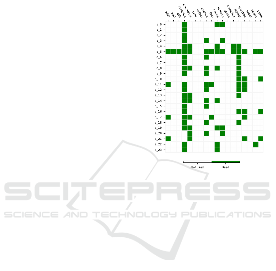
4.5 Pattern Usage by Professionals
We assume that the patterns used in the 24 award-
winning stories in our sample are the result of the au-
thors’ professional training and experience. As in the
stories created by data storytellers in training, com-
pare is the most used pattern (see Figure 5). This sup-
ports the general understanding that a data story, more
so than a chart or a dashboard, requires the author to
take a broader, holistic view of the message they try
to bring across, and structure the story to make con-
sistent, coherent arguments that support their claims.
Two other patterns, explore and reveal, were also
common, confirming their utility in building up the
flow of some of the most compelling stories in the
field.
However, there were also some differences. The
more experienced authors applied repeat and concre-
tise often (ranked 2nd and 4th respectively). As dis-
cussed earlier, concretise resorts to well known refer-
ences to bring complex concepts across, and the prob-
lematic cases failed to make this connection. The pat-
tern repeat involves different dimensions in the data
to substantiate the same argument. While using this
type of structure is a matter of choice, the pattern
proved less popular with the beginners. Only five of
them attempted to use it, though four of them did so
correctly. Conversely, following the taught compo-
nent of the course which included a session on narra-
tive patterns, the students successfully used some pat-
terns, such as conv, defam, guess, and silent, which
were not used in the award-winning stories. Therefore
we believe that providing training on narrative pat-
terns in an accessible way can make data storytellers
aware of the full spectrum of designs and lead to more
diverse stories.
In terms of pattern combinations, profession-
als also resort to flow-argumentation pairs such
as repeat-compare, explore-compare, and reveal-
Figure 5: Narrative pattern usage in award-winning stories.
Compare is the most used pattern by professional story-
tellers. Repeat and concretise are more used by profes-
sional storytellers than novice storytellers.
compare. They chose repeat more than explore to
serve the flow function in flow-argumentation com-
binations. Meanwhile, flow-flow combinations such
as repeat-explore and reveal-explore were among
the most used combinations by professionals.
5 DISCUSSION
We found clear preferences for applying some narra-
tive patterns, both individually and in combination, in
both groups of data storytellers. We also established
that beginners struggled with some of the patterns,
even when these were used extensively.
Patterns of flow and argumentation are the core
of a data stories, though experienced authors can han-
dle some of the more advanced patterns (for instance
those that require additional data or references, or in-
teractive elements) better than novices. We now dis-
cuss our recommendations for using narrative patterns
to help data storytellers with varying levels of ex-
perience and point to some core issues that need to
be addressed regarding patterns’ definition, tools, and
training.
CHIRA 2020 - 4th International Conference on Computer-Human Interaction Research and Applications
134

5.1 Supporting Popular Patterns
The primary use of narrative patterns is to assist the
creation of data stories (Bach et al., 2018a). In our
study, people were presented with the patterns in the
form of design cards. In real-world data storytelling
tools, such assistance could be embedded as function-
alities, including interactive elements that describe or
recommend useful patterns and assist with their ap-
plication. More advanced tools could use these pat-
terns as templates to help build up a story, and point to
their likely impact on particular audience. Guidance
could include data from empirical studies on improve-
ments in attention, understanding, memorability, en-
gagement etc.
Our results show that both beginners and very ad-
vanced authors preferred to use patterns for argu-
mentation and flow. Some tools have already started
to consider providing narrative support (Kim et al.,
2019). We welcome this and suggest recommending
users narrative patterns and pattern combinations at
different stages during the creative process. Recom-
mendations could depend on the ‘section’ of the story
being edited. For example, at the beginning of a story,
patterns such as question and fam are a good way to
make the audience engage with the content in a per-
sonalised manner, while call works well after stating
a conclusion. Refining this recommendation process
warrants further investigation into the factors that af-
fect author’s preferences and the impact of particular
patterns on the reader.
5.2 Errors in Usage and How to Fix
Them
One of our findings is that there are common discrep-
ancies between the reported usage and the actual us-
age of patterns by less experienced authors. For some
patterns such as compare, most of the participants
could use and identify them correctly. Most cases
where errors were made fall into one of three cate-
gories: pattern confusion, missing data, and miss-
ing interaction.
5.2.1 Pattern Confusion
Some patterns proved more difficult to apply than oth-
ers. For example, some participants failed to dis-
tinguish between addr and question. The distinc-
tion between the two is fairly subtle — according
to the framework by Bach et al. (2018a), both can
serve framing, emotion, and engagement. The latter
uses a specific way of inviting the audience to par-
ticipate in the narrative. We believe further studies
would be useful to understand whether this distinction
is needed in practice across professional roles with
different backgrounds and levels of expertise in infor-
mation design who need to communicate data in their
daily work.
5.2.2 Missing Data
Some patterns require additional data manipulation.
For example, reveal would benefit from functional-
ities that process the data at varying levels of gran-
ularity. Concretise needs authors to relate abstract
notions to known references to enhance comprehen-
sion. The known references, however, are not always
contained in the data used to create a story. One pos-
sible solution to address this is to recommend known
references based on the contextual information avail-
able. For example, Riederer et al. have proposed the
use of analogies to help people relate to numerical
data (Riederer et al., 2018).
5.2.3 Missing Interaction
Apart from additional data, many patterns would ben-
efit from interaction. For example, exploration as-
sumes the reader would tailor the story to their needs
or interests, for instance by choosing variables or
specifying values. Familiarisation is based on the
information that authors actively elicit from their au-
dience. Many of the problematic cases failed to build
in such necessary active interaction. Therefore, we
suggest that tools that want to use narrative patterns
as assistance need to consider providing the embed-
ded interaction together with the patterns, thereby en-
abling data storytellers to use the patterns more easily.
5.3 Support for Pattern Combinations
Our analysis revealed that some combinations of nar-
rative patterns were repeatedly used for purposes of
flow and argumentation. These include explore-
compare and reveal-compare for the less advanced
storytellers, and repeat-compare, explore-compare,
and reveal-compare for those more experienced.
We suggest that data visualisation tools should
consider support for structuring the flow of a story,
and link different parts of the ‘plot’ to argu-
ments. Existing models such as Kosara’s Claim-
Fact-Conclusion model (Kosara, 2017), could serve
as a starting point to template pattern combinations.
By these means, authors could be assisted in reusing
multiple patterns in a coherent way to create more
complex stories.
Understanding the Use of Narrative Patterns by Novice Data Storytellers
135

5.4 Training Novices to Use More
Complex Patterns
In our comparison between the stories created by
more or less advanced authors, we realised that pro-
fessionals preferred to use more complex patterns
(e.g., concretise and repeat) that required additional
data and interaction. These patterns were not gen-
erally used or handled well by novices, which sug-
gests the use of complex narrative patterns may re-
quire more formalised training.
However, we also found that some of the students
could use some patterns (e.g., silent and guess) that
were not used by the professionals. We believe that
providing narrative patterns as support in data story-
telling can encourage authors to use complex patterns.
More complex patterns could be supported with ad-
ditional examples and training material, to allow the
creation of richer, more compelling stories.
Apart from providing narrative patterns, demon-
strating examples of how they are applied (both cor-
rect and incorrect) would help novices adopt more
complex patterns in their stories and avoid possi-
ble mistakes. For example, many of the 24 award-
winning stories are good examples to show how to
use concretise and repeat. Thus, we suggest to ex-
tract narrative pattern usage as case studies to train
novice storytellers in addition to the design cards we
have used on the course.
5.5 Unexpected Effects
Although the provided narrative patterns helped the
participants with their story creation work, we noticed
some unexpected effects caused by the usage of cer-
tain patterns. For example, when some participants
used compare or repeat (meaning that they juxta-
posed multiple visualisations), the axes of different
visualisations were not normalised according to the
new overall range, which adds cognitive effort in un-
derstanding the visualisation.
Dimara et al. (2017) and Diakopoulos (2018)
both discuss the unintended effects which may re-
sult from anchoring charts to a narrative. For exam-
ple, charts connected by narrative patterns may sug-
gest an implied relationships between them, irrespec-
tive of whether one exists in reality. Thus whether,
and to what degree narrative patterns might cause bias
in peoples’ perception, should be further investigated
and, more importantly, can be made explicit to both
authors and audiences during pattern instruction or by
storytelling tools.
6 LIMITATIONS
In this paper, we analysed the usage of narrative pat-
terns in data stories by both novices and experienced
authors. Here we note the limitations of our study.
Our participants were all students from a
postgraduate-level data visualisation course. They
were taught the use of narrative patterns and their ad-
vantages for design. As such, they do not fully rep-
resent the general population of professionals who in-
creasingly have to use visual means to communicate
data to different audiences. However, they can be seen
as an approximation as we learned anecdotally that
the majority of them had not used or heard of narra-
tive patterns for data stories before their course.
Another limitation is the way we reviewed the 24
stories created by data journalists. For the students,
we had access to documentation which explicitly re-
ferred to the patterns they considered. RQ4 is by con-
trast based only on the stories themselves and we had
no information about how aware the authors were of
emerging patterns and their thinking process. Instead,
we assume that the authors, based on their skill sets,
are aware of best practice and, consciously or not, ap-
ply patterns such as those suggested by Bach et al.
(2018a), which draws upon experiences in data jour-
nalism. Further qualitative studies would be needed
to add context to the observed differences between the
two groups of storytellers and to understand if, why,
and how advanced authors choose to apply and mix
patterns. This would help refine the pattern collec-
tion, and the way the individual patterns are defined
and taught.
Furthermore, our analysis did not allow us to dif-
ferentiate between participants’ understanding of the
patterns and pattern uptake. Further work could in-
vestigate how patterns as well as pattern instructions
differ in their complexity and might so influence us-
age preferences. Similarly, future work could include
qualitative methods to understand potential barriers to
pattern usage by novices in more depth.
7 CONCLUSIONS
In this paper, we analysed the application and prefer-
ences of narrative patterns in the creation of data sto-
ries. Our results showed that there are preferred pat-
terns, both when using patterns individually as well as
in combination. We found discrepancies between re-
ported and actual usage for all narrative patterns. Pat-
terns that help with argumentation or flow are ap-
plied extensively, also in combination.
CHIRA 2020 - 4th International Conference on Computer-Human Interaction Research and Applications
136

Our findings suggest several methods of support-
ing the application of narrative patterns in data sto-
rytelling tools, and ways to further improve the ex-
isting patterns to increase their accessibility and ease
of use. We also highlight possible issues that need
to be addressed for a more comprehensive pattern up-
take by authors of data stories. We believe that our
findings are useful for developers of data storytelling
tools, who want to use narrative patterns as assistance
in their systems.
There are two key areas of future work to be un-
dertaken. Firstly, a deeper investigation into pattern-
usage by professionals may reveal more information
about the differences we noted, their overall process
in constructing stories, and they way in which they
conceptualise the patterns that they use. Secondly,
exploring how storytellers (and novices in particular)
can be supported when using these patterns, to mit-
igate the issues we have highlighted. This may be
achieved by directly integrating our recommendations
into visualisation and storytelling tools (such as Excel
or Tableau) to more clearly tutorialise the storycraft-
ing process, and to recommend more than just charts
based on a dataset: for example, relevant sequences
of charts, charts showing different levels of detail in
the data, or charts that prompt the user to add a value
or spot an outlier.
We believe that to advance the information de-
sign field we need a much better understanding of the
building blocks of data stories, and how they are used
in practical settings by both novices and profession-
als. Patterns are the basis on which data is commu-
nicated to the audience. Patterns go beyond single
chart selection and choice of visual encoding; patterns
guide authors in how to compose an engaging story.
ACKNOWLEDGEMENTS
This work was supported by the Data Stories project
(EPSRC EP/P025676/1) and the They Buy For You
project (EU Horizons 2020 #780247).
REFERENCES
Amini, F., Henry Riche, N., Lee, B., Monroy-Hernandez,
A., and Irani, P. (2017). Authoring Data-Driven
Videos with DataClips. IEEE Transactions on Visu-
alization and Computer Graphics, 23(1):501–510.
Bach, B., Stefaner, M., Boy, J., Drucker, S., Bartram, L.,
Wood, J., Ciuccarelli, P., Engelhardt, Y., Koeppen, U.,
and Tversky, B. (2018a). Narrative design patterns for
data-driven storytelling. In Data-Driven Storytelling,
pages 125–152. AK Peters/CRC Press.
Bach, B., Wang, Z., Farinella, M., Murray-Rust, D., and
Henry Riche, N. (2018b). Design patterns for data
comics. In Proceedings of the 2018 CHI Confer-
ence on Human Factors in Computing Systems, pages
38:1–38:12, New York, NY, USA. ACM.
Bongshin Lee, Kazi, R. H., and Smith, G. (2013). Sketch-
Story: Telling More Engaging Stories with Data
through Freeform Sketching. IEEE Transactions on
Visualization and Computer Graphics, 19(12):2416–
2425.
Borchers, J. O. (2000). A pattern approach to interaction de-
sign. In Proceedings of the 3rd Conference on Design-
ing Interactive Systems: Processes, Practices, Meth-
ods, and Techniques, DIS ’00, pages 369–378, New
York, NY, USA. ACM.
Branston, G. and Stafford, R. (2010). The Media Student’s
Book. Routledge.
Brehmer, M., Lee, B., Bach, B., Henry Riche, N., and Mun-
zner, T. (2017). Timelines Revisited: A Design Space
and Considerations for Expressive Storytelling. IEEE
Transactions on Visualization and Computer Graph-
ics, 23(9):2151–2164.
Budinsky, F. J., Finnie, M. A., Vlissides, J. M., and Yu,
P. S. (1996). Automatic code generation from design
patterns. IBM systems Journal, 35(2):151–171.
Cruz, P. and Machado, P. (2011). Generative Story-
telling for Information Visualization. IEEE Computer
Graphics and Applications, 31(2):80–85.
Diakopoulos, N. (2018). Ethics in data-driven visual story-
telling. In Data-Driven Storytelling, pages 233–248.
AK Peters/CRC Press.
Dimara, E., Bezerianos, A., and Dragicevic, P. (2017). Nar-
ratives in Crowdsourced Evaluation of Visualizations:
A Double-Edged Sword? In Proceedings of the 2017
CHI Conference on Human Factors in Computing Sys-
tems, pages 5475–5484, New York, NY, USA. ACM.
Eccles, R., Kapler, T., Harper, R., and Wright, W.
(2008). Stories in GeoTime. Information Visualiza-
tion, 7(1):3–17.
Gamma, E. (1995). Design Patterns: Elements of Reusable
Object-oriented Software. Pearson Education India.
Gamma, E., Helm, R., Johnson, R., and Vlissides, J. (2002).
Design patterns: Abstraction and reuse of object-
oriented design. In Software Pioneers: Contributions
to Software Engineering, pages 701–717. Springer
Berlin Heidelberg, Berlin, Heidelberg.
Gangemi, A. and Presutti, V. (2009). Ontology design pat-
terns. In Handbook on Ontologies, pages 221–243.
Springer.
Gao, T., Hullman, J., Adar, E., Hecht, B., and Diakopoulos,
N. (2014). Newsviews: An automated pipeline for
creating custom geovisualizations for news. In Pro-
ceedings of the SIGCHI Conference on Human Fac-
tors in Computing Systems, CHI ’14, pages 3005–
3014, New York, NY, USA. ACM.
Gershon, N. and Page, W. (2001). What Storytelling Can
Do for Information Visualization. Communications of
the ACM, 44(8):31–37.
Granlund,
˚
A., Lafreni
`
ere, D., and Carr, D. A. (2001). A
pattern-supported approach to the user interface de-
Understanding the Use of Narrative Patterns by Novice Data Storytellers
137

sign process. In International Conference on Human-
Computer Interaction: 05/08/2001-10/08/2001.
Gratzl, S., Lex, A., Gehlenborg, N., Cosgrove, N., and
Streit, M. (2016). From Visual Exploration to Story-
telling and Back Again. Computer Graphics Forum,
35(3):491–500.
Hullman, J., Diakopoulos, N., and Adar, E. (2013). Con-
textifier: Automatic Generation of Annotated Stock
Visualizations. In Proceedings of the SIGCHI Confer-
ence on Human Factors in Computing Systems, pages
2707–2716, New York, New York, USA. ACM.
Hullman, J., Kosara, R., and Lam, H. (2017). Finding a
Clear Path: Structuring Strategies for Visualization
Sequences. Computer Graphics Forum, 36(3):365–
375.
Kanizsa, G. (1979). Organization in vision: Essays on
Gestalt perception. Praeger Publishers.
Kim, J. and Monroy-Hernandez, A. (2016). Storia: Sum-
marizing social media content based on narrative the-
ory using crowdsourcing. In Proceedings of the 19th
ACM Conference on Computer-Supported Coopera-
tive Work & Social Computing, CSCW ’16, pages
1018–1027, New York, NY, USA. ACM.
Kim, N. W., Bach, B., Im, H., Schriber, S., Gross, M., and
Pfister, H. (2018). Visualizing Nonlinear Narratives
with Story Curves. IEEE Transactions on Visualiza-
tion and Computer Graphics, 24(1):595–604.
Kim, N. W., Henry Riche, N., Bach, B., Xu, G., Brehmer,
M., Hinckley, K., Pahud, M., Xia, H., McGuffin, M. J.,
and Pfister, H. (2019). DataToon: Drawing Dynamic
Network Comics With Pen + Touch Interaction. In
Proceedings of the 2019 CHI Conference on Human
Factors in Computing Systems, pages 105:1–105:12,
New York, New York, USA. ACM.
Kong, H.-K., Liu, Z., and Karahalios, K. (2019). Trust
and recall of information across varying degrees of
title-visualization misalignment. In Proceedings of
the 2019 CHI Conference on Human Factors in Com-
puting Systems, CHI ’19, pages 346:1–346:13, New
York, NY, USA. ACM.
Kosara, R. (2017). An Argument Structure for Data Sto-
ries. In Proceedings of the Eurographics/IEEE VGTC
Conference on Visualization: Short Papers, pages 31–
35, Goslar Germany, Germany. Eurographics Associ-
ation.
Kosara, R. and Mackinlay, J. (2013). Storytelling: The Next
Step for Visualization. Computer, 46(5):44–50.
Kwan-Liu Ma, Liao, I., Frazier, J., Hauser, H., and Kostis,
H.-N. (2012). Scientific Storytelling Using Visual-
ization. IEEE Computer Graphics and Applications,
32(1):12–19.
Lee, B., Henry Riche, N., Isenberg, P., and Carpendale, S.
(2015). More Than Telling a Story: Transforming
Data into Visually Shared Stories. IEEE Computer
Graphics and Applications, 35(5):84–90.
Metoyer, R., Zhi, Q., Janczuk, B., and Scheirer, W. (2018).
Coupling Story to Visualization: Using Textual Anal-
ysis As a Bridge Between Data and Interpretation. In
23rd International Conference on Intelligent User In-
terfaces, pages 503–507, New York, New York, USA.
ACM.
Reagan, A. J., Mitchell, L., Kiley, D., Danforth, C. M., and
Dodds, P. S. (2016). The emotional arcs of stories are
dominated by six basic shapes. EPJ Data Science,
5(1–12):31.
Riederer, C., Hofman, J. M., and Goldstein, D. G. (2018).
To Put That in Perspective: Generating Analogies
That Make Numbers Easier to Understand. In Pro-
ceedings of the 2018 CHI Conference on Human Fac-
tors in Computing Systems, pages 548:1–548:10, New
York, New York, USA. ACM.
Satyanarayan, A. and Heer, J. (2014). Authoring Narrative
Visualizations with Ellipsis. Computer Graphics Fo-
rum, 33(3):361–370.
Segel, E. and Heer, J. (2010). Narrative Visualization:
Telling Stories with Data. IEEE Transactions on Visu-
alization and Computer Graphics, 16(6):1139–1148.
Tang, T., Rubab, S., Lai, J., Cui, W., Yu, L., and Wu, Y.
(2019). iStoryline: Effective Convergence to Hand-
drawn Storylines. IEEE Transactions on Visualization
and Computer Graphics, 25(1):769–778.
Wang, Z., Wang, S., Farinella, M., Murray-Rust, D., Henry
Riche, N., and Bach, B. (2019). Comparing Effective-
ness and Engagement of Data Comics and Infograph-
ics. In Proceedings of the 2019 CHI Conference on
Human Factors in Computing Systems, pages 253:1–
253:12, New York, New York, USA. ACM.
Ware, C. (2012). Information Visualization: Perception for
Design. Elsevier.
Zhao, Z., Marr, R., and Elmqvist, N. (2015). Data Comics:
Sequential Art for Data-Driven Storytelling. Techni-
cal report.
CHIRA 2020 - 4th International Conference on Computer-Human Interaction Research and Applications
138
