
A Critical Discourse Analysis of Visual Identity the Luggage Label
Inns of the Dutch East Colonial Era
Baskoro Suryo Banindro, Arif Agung Suwasono, Prayanto Widyo Harsanto, and
Rikhana Widya Ardilla
Fakultas Seni Rupa, Institut Seni Indonesia Yogyakarta, Isi Yogyakarta, Jl. Parangtritis Km. 6,5, Sewon, Bantul, Indonesia
Keywords: luggage label inns, art prints, the colonial era, a critical discourse analysis.
Abstract: The proposed research aims to find out the meaning and function of symbols that are in the visual
identity of the luggage label inns of the Dutch East colonial era. The object contains elements in the
form of text and iconic architecture that is unique in it. The target to be achieved is collecting and
analysing the object of study, then the synthesis results will be used as the basic material for the
preparation of the historical graphic design reference book and the architecture. The method used in
this study is critical discourse analysis van Dijk's model, where the study of object research in addition
to the study of material objects, also be associated with a social context to understand certain goals and
practices, including the practice of power as a form of social practice, this causes a dialectic among
certain case events with the situations and social structures that shape them. Discourse it is also known
that practices have emerged for text dimension, social cognition, and social context that appears on
objects of the visual identity of luggage labels in the colonial era. The final results of this study illustrate
how the process of unification and modernity carried out by the Dutch East Indies colonial government
can be read through luggage label inns tourism promotion media and can be used as a marker of the
era.
1 INTRODUCTION
The 1930s, European and colonial private companies
in the Dutch East Indies had built several hotels in
several cities or rural areas, which still had natural
and exotic nature. As it is known that these activities
can be proven through a series of activities that lead
to this direction, among others, the colonial
government organized tourism activities which were
coordinated under the association of the office of the
Dutch East Indies Association known as Vereeniging
Toeristen Verkeer (VTV). The object of tourism
promotion is introducing lodging houses for travelers
from Europe or America who come especially on
Java.
This form of promotional media is very unique
because it is only manifested in a 5 to 7", piece of
pictorial printing paper, by attaching it to a tourist
luggage bag. The luggage label image itself contains
the object's visual identity of the hotel which is
supported by illustrations of lodging buildings, some
tilaof which describe the scenery around the hotel,
generally made by Dutch advertising agencies. The
formulation of the problem from this research is how
is the visual construction of tourism promotion of the
Dutch East Indies period through the visual idioms of
luggage label inn drawings.
2 STUDY OF LITERATURE
Architecture is the art of building plans for human
beings who intend to seek safety and comfort for the
well-being of their souls and bodies and to fulfill self-
satisfaction in creating beauty (Pamungkas, 1988).
The existence of architecture in Indonesia generally
consists of classic-traditional elements, vernacular
and contemporary new buildings.
Judging from the physical buildings that exist in
Java, the Dutch East Indies architecture at that time
found buildings that were influenced by the style of
Dutch Revival (The Dutch Colonial Style) others give
the term nieuwe bouwen, where the object was
adopted from architectural influences that developed
in mainland Europe in the early 19th century
(Hadinoto, 2010).
490
Banindro, B., Suwasono, A., Harsanto, P. and Ardilla, R.
A Critical Discourse Analysis of Visual Identity the Luggage Label Inns of the Dutch East Colonial Era.
DOI: 10.5220/0009432504900498
In Proceedings of the 1st International Conference on Interdisciplinary Arts and Humanities (ICONARTIES 2019), pages 490-498
ISBN: 978-989-758-450-3
Copyright
c
2020 by SCITEPRESS – Science and Technology Publications, Lda. All rights reserved

The modern European style was then, to later be
combined with traditional Indonesian elements
(Indische) which were adapted to Indonesia's tropical
climate, some Dutch architects and academics
developed a new discourse known as New Indies
architecture. This architecture was influenced by a
new generation of Dutch architects who attended
school in the Netherlands and introduced Modernism
in the Dutch East Indies. Some Dutch architects also
began experimenting with new materials in making
"Dutch Traditional Local" buildings with tropical
architecture. This gave rise to the emergence of
architecture from Traditionalists to Modernists in the
Dutch East Indies. (Tjahjono, 1998)
The architecture of hotel buildings in the Dutch
East Indies in 1924-1930, some of which absorbed the
Nieuwe Bouwen architectural style (cuboid and
straight roof). The style of Nieuwe Bouwen is
actually the term for the building style after the 1920s
which is a follower of the International Style school
(Handinoto, 1996), as Akihary revealed in his book
Architectuuren Stedebouw in Indonesia 1870-1940
(Akihary, 1988).
The style of art deco architecture that emerged in
the Dutch East Indies was formed by adopting and
absorbing local architecture, giving birth to a style not
found in Europe or the Dutch East Indies, which
eventually resulted in a new design and was known as
the colonial style of indies (Pratikno, 2014).Art deco
also developed in the depiction of visual objects in the
art of printing, one of which was developed by Dutch
graphic artist Jan Lavies in the 1930s. At that time the
printed works that appeared from technical visuals in
the form of blocks, some of which were in the form
of typical gradations. It can be seen from the coloring
that uses primary color blocks. Visual objects in
addition to describing architectural forms, as well as
other images that take local visual idioms, as
examples of classical archipelago buildings, colonial
infrastructure such as bridges and of course natural
scenery. The atmosphere created implies indies and
exotic expressions.
According to Barzun & Graff (1970) in his book
The Modern Researcher it is said that images as a
work of art are part of historical sources that are
grouped in the classification of notes or delivery
records of planned facts. Data obtained from the
transfer of material in the form of pictures or figures,
reproduction of prints, whether in the form of
ornaments, graphics or photography on printed
products, is an accurate source of data and invaluable
historical evidence. (Garraghan, 1957)
Luggage label images are one of the visual culture
products in the Dutch East Indies colonial period. the
general term used to refer to it is luggage label, which
is a small paper medium that is used by way of
sticking to the luggage of travelers so that the luggage
label image will always be seen by anyone who
identifies that person has come or stayed at the hotel
(Banindro, 2018).
3 RESEARCH METHODS
This research is a qualitative descriptive study with a
critical discourse analysis approach Teun A. van Dijk.
Analysis of Critical Discourse van Dijk's model has
operationally three spatial dimensions, namely text,
social cognition, and social context. (Haryatmoko,
2017). Basically, critical discourse analysis is a way
to further examine how social practices presented in
the media.
The core analysis of van Dijk's model is
elaborating on these three dimensions to produce
analysis that is not only based on text but also uses
social practices in it. In the first dimension of the text
dimension, this activity is used to emphasize a
particular theme in order to clarify and examine how
structure and discourse are used.
Social cognition serves to examine how the text is
produced, the basic core of social cognition is the
activity of individuals within the social sphere within
the framework of ideology because this will form the
norms, values, and principles which will be driven by
a group. The social context studies how a discourse
building is produced. Through this research, critical
discourse is expected to be able to dissect the meaning
behind the attributes of colonial period luggage label
images, review the artistic motives and objective
accuracy of the situation in his day.
4 CRITICAL DISCOURSE
ANALYSIS
Hotel des Indes text dimension, the hotel des Indes
luggage label image (Figure 1), is expressed in the
form of a 5" centered circle. The visualization
presents images of the hotel des Indes buildings in
white and blue, printed with the lithography
technique of art deco by Dutch printing artist Jan
Lavies in 1930. In the object, there is writing on the
name of the hotel, namely Hotel des Indes using
Batavia text, Java images and silhouettes Borobudur
temple with a Futura model typical of a European
A Critical Discourse Analysis of Visual Identity the Luggage Label Inns of the Dutch East Colonial Era
491
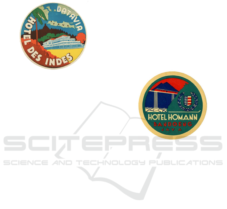
accent and a coconut tree silhouette as the upper left
frame of a luggage label picture.
Figure 1: Hotel des Indes luggage label, by Jan Lavies 1930.
Social cognition, Dutch Colonial, which was part
of the Dutch kingdom, wanted to show that as
invaders having the capital to build assets in the
Dutch East Indies, one of them was the "des Indes"
lodging. Dutch colonial saw the opportunity that local
commodities in the Indies such as Borobudur temple
and its tropical climate could be exploited through
tourism. For that, we need tourism promotion through
the media. Through the colors on the luggage label
drawings, the print artist wants to present a picture
that is beautiful, this can be seen from the shade of the
shade of the trees, the tropical atmosphere is shown
by the reddish yellow color. Art deco style is
presented to provide a new and modern way of
presenting the visualization of a promotion in the
media.
Social context, the name "des Indes" as a hotel
identity emerged at the suggestion of Douwes
Dekker, a Dutch political figure who had sympathy
for the struggle of the people of the Dutch East Indies
against the invaders (http://www.engelfriet.net). This
suggestion is in response to the "good ethical"
movement, which is a political movement to
reciprocating Dutch colonialism for colonial people
in the Indies. It is hoped that by giving this name it
could generate sympathy for both hard-line Dutch
people and to reduce the movement of anti-Dutch
colonialism sentiments.
Observing images on hotel architecture, Dutch
colonialism was an advanced and educated nation, the
hotel des Indes was built with a modern concept
which was also called the Nieuwe Bouwen
architecture, a form of architectural style that had not
existed before in the Indies. This is indicated by the
use of concrete as the main material, a flat roof, a
simple facade with hard horizontal lines,
generally white, geometric windows without
ornamentation, and a game of building masses that
are plastered by the existence of a tower. The towers
are generally not functional, only a vertical mass
formation that compensates for strong horizontal
lines on the building's appearance (Handinoto, 1996).
Homman Hotel text dimension, a Homman hotel
luggage label luggage label (Figure 2), printed with a
press technique, on a 5" striped paper designed by
printartist Jan Lavies in 1931. The drawing elements
include the white Hotel Homman textual, Bandoeng
text and arranged red Java text from top to bottom
with a symmetrical composition in the middle of the
field, all using the Nordstroms font. There is a
silhouette of a white railway bridge pole, a steam train
Figure 2: Hotel Homman luggage label, by Jan Lavies
1931.
with a series of orange carriages crossing it, on the
background of the field depicting a silhouette of high
mountain blue terrain, lush silhouettes of green trees,
stretches of white rice fields and symbols of hotel
organization Paste images were printed using the art
deco lithography technique.
Social cognition, reading the visual text of a
Homman hotel postcard, the hotel manager wanted to
illustrate the ease of access from Batavia to Bandoeng
with an orange steam train as a symbol of the Dutch
empire. This at the same time wanted to show how
the Dutch colonial meritorious in opening the
isolation of the Priangan areas with a rail network
with difficult terrain.
The picture of the mountain silhouette is blue, to
show the exotic nature of West Java, the color of the
blushing red sky to describe the long tropis climate.
The stretch of rice fields with green patches and trees
in the background symbolize the prosperity of the
fertile Sundanese landscape. The NITOUR symbol
(Nederlandsche Indische Touristen Bureau) is on
display to ensure that Homman hotels are experienced
and professional as organizers of the Dutch East
Indies hotel.
ICONARTIES 2019 - 1st International Conference on Interdisciplinary Arts and Humanities
492
Social context, at that time, Bandung was still an
under developed region, but the Dutch East Indies
colonial government had fallen in love with the city
of Bandung and later built the Batavia-Parahyangan
railway line on May 16, 1884. Next, from just a
stopover city, Bandung became a tourist destination
and even a place to live. Cisomang Bridge is the
highest railway bridge in the Netherlands East Indies
built at the foot of Mount Cipularang, 230 meters long
with a height of almost 100 meters from the bottom
of the Cisomang river.
The construction of the Cisomang bridge is the
peak of the "Ingenieurs werk grootsch" achievement
or great engineering work (De Indische Courant,
1932). "This bridge has the highest pillars in the
Netherlands and India, and the second highest pillar
in the world, (Pikiran Rakyat, 2018)", designed by
engineer Van Der Eb. Dutchman born in the Dutch
East Indies (Indonesia) who was a graduate of the
Bandung Technische Hooge school or now the
Bandung Institute of Technology (ITB). At that time
the Batavia-Bandung route became a favorite of
Dutch citizens. Mevrouw, Meneer, Noni, and the
Dutch master and other Europeans really enjoyed the
beautiful scenery and cool air that was passed by the
C 28 steam locomotive train, with a maximum speed
of 90 kilometers per hour. (Kunto, 1984).
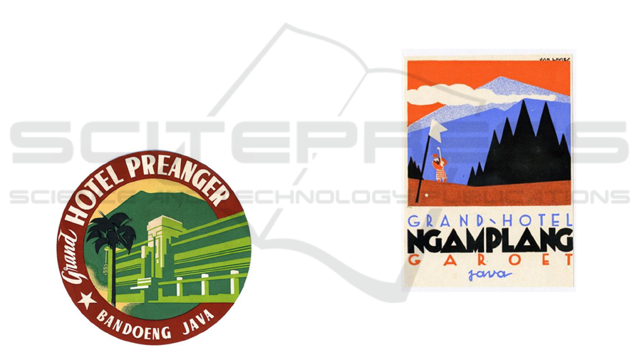
Figure 3: Grand Hotel Preanger luggage label, by Jan
Lavies 1931.
Grand Hotel Preanger text dimension, luggage
label (Figure 3), printed in an art deco style, was
designed by print artist Jan Lavies 1931, measuring
5". The drawing elements are composed of the words
Grand Hotel Preanger, with white colour text,
Bandoeng Java with white colour too using the
Prague Art Deco font on red colour background.
Luggage label present architectural images of hotels
with white Indisch Empire styles combined with
green. A tall, green the mountain appears on the
background of a picture of a hotel building, while the
silhouette of a green duotone-colored coconut tree is
drawn up in front of the hotel image.
Social cognition, Grand Hotel Preanger was built
as a symbol of the position of executives and
dignitaries, Preanger planters with the rise of coffee
plantation businesses, Dutch colonial officials and
rich communities. Only Dutch people can enter and
stay at this hotel and built as a bourgeois symbol of
Europeans.
Social context, Grand Hotel Preanger Bandung
Built in the style of the Indische Empire. This hotel is
the pride of the Dutch in the city of Bandung. The
hotel building underwent renovations and was
redesigned in 1929 by Charles Prosper Wolff
Schoemaker assisted by his former students,
Soekarno was the first President of the Republic of
Indonesia. Because of the touch of these two people,
this hotel is a pride for the people if they stay at the
Grand Hotel Preanger hotel. This style is part of a
modern art architectural style combined with local
architectural elements. (Beal, 2013).
Figure 4: Grand Hotel Ngamplang luggage label, by Jan
Lavies 1930.
Grand Hotel Ngamplang, text dimension
contained in the luggage label picture is the Grand
Hotel Garoet Ngamplang Java (Figure 4), printed
vertically in an art deco style measuring 3 x 4".
Designed by Jan Lavies Dutch printing artist in 1930.
Luggage label images contain visualizations of the
golf course with pictures of a golfer hitting the ball.
The blue silhouette, the white cloud and the silhouette
of the black pine tree dominate the field with the
background of the orange field focusing on the image
of the luggage label image.
The image details containing the Grand Hotel text
are blue, the Ngamplang text is black and the Garoet
text is orange and the Java text is blue, all using the
Herbie Art Deco font, at the bottom of the image area.
A Critical Discourse Analysis of Visual Identity the Luggage Label Inns of the Dutch East Colonial Era
493
The figure of the golfer is depicted wearing knee-
length pants, a pet hat, a tie, and an inner vest
swinging his golf stick and watching the direction of
running the ball to the hole. The hole itself is marked
with a white flagpole. On the background of the
drawing, illustrated by the light blue mountain
Malabar and the dark blue Cikuray mountain with
thin white clouds, it implies a high mountain.
Social cognition, this luggage label picture is
about to offer the luxury of a Ngamplang hotel that
many other hotels do not have, namely golf facilities.
The sky blushes to show the Dutch East Indies in the
tropics. The portrayal of a figure of golf symbolic of
the presence of western culture in the Indies, the
figure of a golf player of the time was depicted
wearing a suit, a vest equipped with a tie, a pet hat
and special shoes (https://bogor.pojoksatu.id), they
wanted to show the Dutch very classy, luxurious and
rich. The depiction of the orange colored golf course
is a sign of the colonial kingdom's significance.Social
Context The existence of the golf course at the
historic Ngamplang hotel has been around since
1912. The pioneer was a Dutch doctor named Denis
Gerard Mulder (https://en.gogolf.co.id). The golf
course located on the back of the hotel and on the foot
plateau of Mount Cikuray is very special, in the
editorial introduction, saying that the beauty of this
golf is the game "de royal and ancient game", also
enthusiastically played in other tropical regions in the
Indies colony Golf Magazine, 1937) Golf course
facilities covering 27 hectares, as well as the Dutch
meneer resort in Garut with its cool air, almost
approaching natural coolness in Switzerland. In
historical records, comedian Charlie Chaplin once
stayed and called Garut as Switzerland van Java or
Switzerland Java (Tribune, 2014).
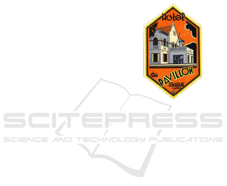
Hotel du Pavillon, text dimensionon the du
Pavillon hotel image (Figure 5), printed on a 4"
rhombic paper, composed of hotel writing at the top
of the field using black fonts, pictures of art deco
hotel buildings using blue duotone and text du
Pavillion in the middle and ends with Semarang text,
black Java uses fonts. Printed with lithography
techniques, the field of luggage label images is
dominated by orange as the basis of images, a
silhouette of trees and clouds and hotel figures with
black frame lines.
Social cognition, du Pavillon itself comes from
French which means "bridge". Visually, printed
artists present the depiction of modern colonial-style
modern hotels in Semarang in a perspective with frog
eyes, this is to illustrate the grandeur of the hotel
itself. The orange color is identical to the Dutch
kingdom, this is certainly to show the existence of
theDutch colonial in Semarang. The hotel du
Pavillion architecture describes modernity in the
Dutch East Indies. The city of Semarang became the
first city to implement building laws which required
the permission of local authority buildings in the
regulation (Tjahjono, 1998).
Figure 5: Hotel du Pavillon luggage label, by unknown
name and unknowing date.
Social context, the hotel du Papillon was
originally named de l'Europe Semarang, established
in 1873, by 1913 the hotel underwent a major
renovation, this was done to welcome guests who
would attend the Koloniale Tentoonstelling event in
1914, a colonial exhibition considered the biggest in
Asia Southeast at that time. (Widyamitra, 2015)
Through the paste image, it is clear how the shape,
style or style is presented.
The hotel architecture is made by combining
European style which can be seen from the shape of a
triangular pyramid-shaped upper wall and a sturdy
pillar supporting the balcony, a blend of tropical
nature that is applied to the wide and large windows.
A distinctive feature of this architectural style is that
there are rows of pillars or columns that soar upwards
and there are gevels and crowns above the front and
back porches. The style or style presented gives birth
to a new form of European-style Indishce architecture
- little Holland in Semarang.
Grand Hotel Dieng, text dimensionof the 3 x 4"
sized picture (Figure 6) is rectangular in shape,
printed with lithography technique designed by Firm
E. Fuhri & Co. Surabaya in 1930. The san serif Euro
Style letter element reads Grand Hotel Dieng
Wonosobo in black The picture.
ICONARTIES 2019 - 1st International Conference on Interdisciplinary Arts and Humanities
494
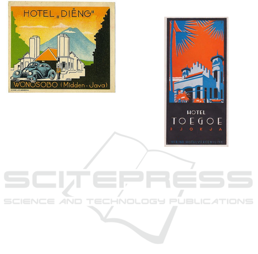
Figure 6: Grand Hotel Ngamplang luggage label, by Jan
Lavies 1930.
On the front shows an art deco-style hotel
building, there are pictures of native servants in a
typical hotel uniform. The supporting elements are
pictures of cars, silhouettes of two Hindu temples on
the left are green and right are black, the object ends
with a background image of Sumbing mountain.
Social cognition, the visualization of luggage
label is to bring a calm, cool, warm and friendly
atmosphere as well as imaged through a touch of
harmonious colors of primary color that dominates
this sticker. Through the visualization of luggage
label, the traveler community was assured of the
presence of hotel service and service transportation
facility with European standards in the interior of
Java. Pictures of cars in the foreground indicate
that modernity has become the main standard. The
depiction of temple silhouettes to show many ancient
sites in the region as well as being used as a
commodity of attraction for travelers.
Social context, JW Muthert is the founder of the
Grand Dieng hotel, this rich Dutchman built a hotel
after many people from Europe visited ancient sites
and the natural beauty of the cool city of Wonosobo,
in the end, the Grand Hotel Dieng was crowded with
tourists. The beauty of Dieng made Charlie Chaplin a
very famous silent film actor at that time to spend
time in Wonosobo and stay at the Grand Hotel Dieng.
Not only Chaplin but a number of other important
European people have also been guests at the hotel,
such as Princess Astrid from Belgium who had visited
twice, also King and Queen Rabibadhana from Siam,
now known as Thailand (Laksmi, 2017).
Hotel Toegoe Djogja, text dimensioni mplied in
the 3 x 5" sized picture (Figure 7) is the white Hotel
Toegoe writing, the red Djokja text and Nederland
Indische Veereniging Hotel text in blue colour with
Silent Movie letters, luggage labels end with black
colour frame.
Figure 7: Hotel Toegoe Djogja luggage label by Jan Lavies,
1930.
The illustration of the hotel building is depicted
with a decorative pattern of blue duotone nuances that
dominates the hotel paste. The print artist Jan Lavies
described the building as a frog eye perspective, so
the hotel building looked magnificent. The picture of
a red cabriolet car looks parked at the front of the
building, the silhouette of the blue nipah leaf midrib
and the sky blushes into the upper frame of the image
area.
Social cognition, this visualization of luggage
label drawings was designed by print artists to
describe the atmosphere of Djokja as the warm and
peaceful center of the Hadiningrat Sultan's Palace.
The modernity of the hotel was built through the
depiction of a luxurious 1930s cabriolet car, bright air
and solar heat imaged through the blushing of the sky
and the tropical plants of the genus Palmae, Nipah.
Black as a background and a frame of luggage label
images presents an elegant impression of the grandeur
of the hotel itself.
Social context, hotel buildings patterned with
Dutch Revival are part of the art deco spirit that gave
birth to the Indies colonial style, built in 1927. During
the colonial period, the Toegoe Hotel was a transit for
Dutch officials traveling between Surabaya and
Batavia by train. The hotel's architecture looks
saddle-roofed, its facade is firm and prominent
soaring to cover the roof. Above the top of the
building, there are short tiered columns placed
A Critical Discourse Analysis of Visual Identity the Luggage Label Inns of the Dutch East Colonial Era
495
symmetrically. The other two towers beside it are a
distinguishing feature between the main building and
the clamp reinforcing the art deco of its time.
Bouvenlicht or boven window at the top of a curved
door, this is decorated with colorful stained glass
ornaments, becoming one of the characteristics of the
tropical Indies building.
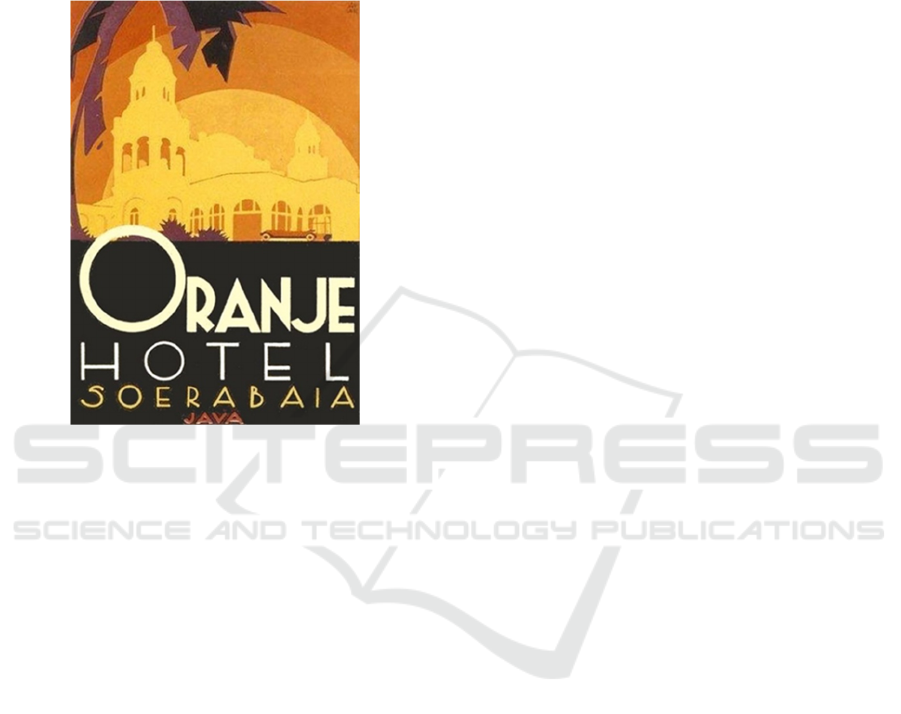
Figure 8: Hotel Oranje luggage label by Jan Lavies, 1930.
Hotel Oranje, text dimensionin a 4 x 7" luggage
label image (Figure 8) consists of the Oranje Hotel
Soerabaja writing colored alloy yellow, white and
orange using the Facets NF font, red Java writing. The
hotel building is visualized in monochrome shades of
yellow, the sky is depicted by an orange, orange, and
yellow curve gradation. In front of the hotel is a
picture of a cabriolet car parked in orange. The black
and gray silhouette of the trees adorns the upper right
side of the luggage label image.
Social cognition, through the luggage label
images of the Oranje Hotel, print artist Jan Lavies
wants to bring the warm hospitality of Surabaya to
the edge of the island of Java. The grandeur of the
Dutch face hotel is portrayed glamorously with
classic art nouveau-style hotel facades and minarets.
As a general luxury hotel, transportation facilities are
the mainstay of lodging, the depiction of open
cabriolet cars shows that hotel services are very
classy in attracting prospective travelers.
Social context, colonial Indies style Art Nouveau
hotel, built in 1911. The name Oranje is pinned to the
name of the hotel by owner Lucas Martin Sarkies,
taking the name of the Dutch hero, Willem van
Oranje. In 1936, Prince Leopold III and Princess
Astrid of Belgium and famous film star Charlie
Chaplin who was accompanied by his wife, actress
Paulette Goddard, and Joseph Conrad, a British-
Polish blooded novelist stopped at this hotel.
5 RESULTS
Art Deco is a symbol of efficient modern life and a
graceful lifestyle (Arief, 1999). The Art Deco style is
a style that uses historical and traditional ornaments,
so that Art Deco can be regarded as a style that has
local content. Every country that accepts Art Deco
style always develops it individually. Art Deco in a
place will be different from Art Deco in another
place, but overall they have the same spirit of
openness to something new, so that Art Deco works
are almost always innovative and experimental
(Kompas, 2010).
Modern in the context of the adoption of western
cultural architecture into the Dutch East Indies,
interpreted as colonial revivalism is daring to be
different and new, appear more attractive than others
and not ancient all of which is manifested by the
choice of striking colors, unusual proportions,
material that new and decorative. The results of this
work are almost always innovative and experimental.
The development of Art Deco could not be separated
from the influence of the situation and conditions of
the era, were at that time in Europe there was an
ongoing industrial revolution, the public was
fascinated by the presence of inventions and
technology that developed rapidly.
Indies style is the term for all cultural products in
the late Dutch East Indies colonialism applied to the
design of architectural buildings. The molded art deco
style appears with a flexible, neat, and artistic contour
line forming objects combined with flat colors and
tends to block by the hand press printing process. This
style became the mainstream of visualization of the
design of printed designs in the early 20th century.
The style of indies was a mixture of modern design
styles that developed in Europe in the 19th to early
20th centuries (such as Victorian style, Art Deco,
Plaque, Art Nouveau) with exoticism Indonesian
traditional art pioneered by Dutch artists or graphic
designers (from visual documentation of the VOC era
to professional advertising designers brought in by
ANETA advertising companies) (Riyanto, 2005).
6 CONCLUSIONS
The modern aesthetic style of promotional design
during the reign of the Dutch East Indies, in general,
ICONARTIES 2019 - 1st International Conference on Interdisciplinary Arts and Humanities
496

is the absorption of European aesthetic styles that are
implemented through lifestyles, especially the choice
of objects. Even though it is still limited in big cities,
this phenomenon shows the openness of the culture
of the people in the archipelago to absorb new cultural
trends and the tendency to absorb modern images.
(Sachari, 2010)
The graphic design style of the Indies developed
in the colonial period of the Dutch East Indies and
experienced the peak of its artistic development in the
1930s. The design style developed by Dutch graphic
designers is a combination of modern design styles
that developed in Europe in the early 20th century
with visual art which is a product of local culture.
(Arif, 1999) As a final conclusion, from the analysis
of artifacts in a work, a hotel architectural drawing in
the Dutch East Indies colonial period reflects the style
of a zeitgeist era which can be read from formal
elements such as images, sizes, visual styles, colors,
printing techniques, and others.
The development of the use of promotional
luggage label at that time was a way of introducing
the colonial to offer eastern Indian exoticato
European and American travelers. According to
Sunjayadi in his book discussing the history of
tourism in the Dutch East Indies, the promotion of
tourism coordinated by the Dutch East Indies tourism
association Vereeniging Toeristenverkeer (VTV),
was one of the steps taken to represent colonial
colonies. (Sunjayadi, 2007)
The description of indies architecture is a
reflection of moderism strengthening the modernist
ethos by combining indigenous architectural
elements so as to create a distinctive Indonesian
modern architecture, a search for new architectural
styles, a style that represents the Dutch Indies cultural
identity. The spirit of the era will also be seen in the
visualization display. There are luggage label images
that are not only appearing as objects of visual
language, not merely the result of contemplation of
graphic designers but at the same time showing their
ability to appreciate and present the factual conditions
of their time in visual works general is the absorption
of the European aesthetic style which is implemented
through the depiction of the architecture of the hotel,
even though it is still limited to large cities, this
phenomenon shows the openness of the culture of the
people in the archipelago to absorb new cultural
trends and their existence into the tendency to absorb
modern images. (Sachari, 2007).
The final object of graphic works that use the
hotel's architectural icons, has given birth to a
monumental, nostalgic, and valuable historical and
historical documentation. Hotel architectural luggage
label images, which by contemporary times are more
closely labeled as icons, are capable of being a marker
of a city's locality. The product of luggage label
drawings of his time has now ended its task as a
promotional media running, now it has become a rare
item and commodities that are traded solely in the
name of economic value.
The application of visual forms of hotel
architecture is not only a marker and an imprinted era
but also as a form of artistic responsibility of artists
who are critical and able to bring insight as a marker
of changing times. The power of civilization through
the art of printing luggage label has
marked visual culture, which is now better known
as the Indis Graphic style.
REFERENCES
Akihary, H, (1988). Architecture En Stedebouw In
Indonesie1870-1940. De Walburg Pers.
Arief, AS,. (1999). Tinjaun Desain Dari Revolusi Insdustri
Hingga Postmodern. Jakarta, Universitas
Tarumanagara
Banindro, BS, (2018). Kapita Selekta Desain. Yogyakarta,
BP ISI Yogyakarta.
Barzun & Graff, (1970). The Modern Researcher. New
York, Harcourt, Brace & World.
Beal, G. (2013). Island Style: Tropical Dream Houses in
Indonesia. Tuttle Publishing.
Garraghan, G J., SJ., (1957). A Guide to Historical Method.
New York, Fordham University Press.
Haryatmoko, (2017). Critical Discourse Analysis
(AnalisisWacanaKritis). Jakarta, Rajawali Pers.
Handinoto, (1996). Perkembangan Kota dan Arsitektur
Kolonial Belanda di Surabaya (1870-1940).
Yogyakarta, Penerbit Andi.
Hadinoto, (2010). Arsitektur dan Kota-kota di Jawa pada
Masa Kolonial. Yogyakarta, Graha Ilmu.
Kunto, H., (1984). Wajah Bandung Tempo Doeloe.
Bandung, Penerbit Granesia.
Pratikno,P., (2014). Arsitektur Bastar; Arsitek Belanda
Mencari Arsitektur Indonesia. Yogyakarta, Kanisius.
Sachari, A., (2007). Budaya Visual Indonesia. Jakarta,
Erlangga.
Sunjayadi, A., (2007). Vereeniging Toeristen Verkeer
Batavia. Jakarta, FIB Universitas Indonesia.
Soekiman, Dj., (2000). Kebudayaan Indis Dan Gaya Hidup
Masyarakat Pendukungnya Di Jawa (Abad XVII-Medio
Abad XX). Yogyakarta, Bentang Budaya.
Tjahjono, G. ed. (1998). Architecture Indonesian
Heritage. Singapore, Archipelago Press.
Tim Perumus, (1998). Ensiklopedi Indonesia.Jakarta, Delta
Pamungkas.
Riyanto, B., Juli 2005. Gaya Indies: Gaya Desain Grafis
Indonesoa Tempo Doeloe. Journal Nirmana, UK Petra.
De Indische Courant, 27 Februari 1932
A Critical Discourse Analysis of Visual Identity the Luggage Label Inns of the Dutch East Colonial Era
497

Golf Magazine, Tahun 1e No. 8, Tanggal 15 Oktober 1937.
https://www.engelfriet.net/Alie/Hans/desindes.htm
https://www.pikiran-rakyat.com/jawa-barat/2018langhub-
jembatan-cisomang-lama-431345
https://www.bogor.pojoksatu.id/baca/lapangan-golf-
legendaris.
https://www.en.gogolf.co.id/gogolf-news/lapangan-golf-
ngamplang, 13 Maret 2018.
https://www.jabar.tribunnews.com/2014/02/06/dari-
ngamplang-garut-terlihat-ibarat-swiss
https://www.widyamitra.net/sejarah/hotel-du-pavillon-sisi-
lain-sejarah-hotel-dibya-puri/
https://www.laksmi/koleksibu.com/hotel-di-wonosobo-ini-
pernah-dikunjungi-charlie-chaplin/
https://www.nasional.kompas.com/read/2010/Hotel.Majap
ahit.Surabaya.Art.Deco.Bersejarah.
APPENDIX
ANETA : Algemeen Nieuwsen Telegraaf Agent
NITOUR: Nederlandche Indische Touristen Bureau
ITB : Bandung Institute of Technology
VTV : Vereeniging Toeristen Verkeer
VOC : Vereenigde Oostindische Compagnie
DEI : Dutch East Indies
ACD : Analysis of Critical Discourse.
ICONARTIES 2019 - 1st International Conference on Interdisciplinary Arts and Humanities
498
