
Real-time Operational Dashboards for Facilitating Transparency in
Supply Chain Management: Some Considerations
Siv Merethe Magnus
1 a
and Amit Rudra
b
Curtin University, School of Management, Kent Street, Perth, Australia
Keywords: Real-time Data, Intuitive Dashboard, Cognition, Supply Chain.
Abstract: The real-time sharing of data has created a unique opportunity to design software applications for the purpose
of improving operations in a supply chain (SC) - both horizontally and vertically. As a result of these
developments, dashboards have been designed to facilitate transparency - providing a better overview of a
specific operation. In this paper, we outline our research to show that most of the operational dashboard
designs are data driven but only a very few of them are designed from a user’s perspective. Further, not many
in their design process tap into the benefits of building a dashboard based on the principles of cognition. We
argue that building dashboards based on how our brain is wired will result in enhancing the decision-making
processes for a Supply Chain.
1 INTRODUCTION
For the past two decades, the introduction and use of
the Internet and various software applications have
radically changed the working environment and
possibilities in a supply chain. This has resulted in a
re-design of the supply chain to meet the various
needs of different stakeholders. Information sharing
platforms and real-time data connectedness have
made it possible for the different members in a Supply
Chain to capitalize on the information and its
accuracy. However, in spite of real-time access to
vast databases of information there is still room for
improvement in creating better software applications
and tools with the goal of increasing the transparency
and user friendliness which will enable personnel to
work more efficiently in the supply chain
management (SCM) process (Chopra and Meindl,
2013). Today, the needed information is available but
is not always extracted and displayed in a manner
conducive to the user for a quick overview of
resources available (Records and Shimbo, 2010). Of
course, various limitations and restrictions dictate
availability of storage of spare inventory for example
on offshore oilrigs. Due to the very limited storage
capacity on offshore rigs inventory planning and
a
https://orcid.org/0000-0002-9125-1483
b
https://orcid.org/0000-0001-9992-0154
“warehousing” are critical factors. However, there is
an opportunity to capitalize on the real-time data
capabilities that IT can provide today. The movement
of goods and delivery of services in the supply chain
are a major part of the operational day-to-day tasks of
an operations manager and his/her team. In the North
Sea, the operations on a rig run 24 hours a day and
365 days a year. Currently, there is a huge potential
to improve the supply chain in terms of inventory and
logistics handling to become more transparent,
efficient and sustainable by tapping into the potential
of exploiting accessible real-time data and IT
capabilities in order to create a more seamless and
dynamic flow of information integrating the members
in the supply chain. For example, in oil and gas
drilling operations, an operational and customized
dashboard can give the user a timely overview of real-
time logistics. In this research, we focus on this aspect
of dashboard and argue that there is a need for more
research into this aspect of cognition as related to
operational dashboards.
The rest of the paper is organized as follows.
Section 2 presents the background literature, while
research methodology is explained in Section 3. In
Section 4, we present data collection process. Section
5 presents our analysis and findings. We conclude our
research in Section 6.
Magnus, S. and Rudra, A.
Real-time Operational Dashboards for Facilitating Transparency in Supply Chain Management: Some Considerations.
DOI: 10.5220/0007721304330443
In Proceedings of the 21st International Conference on Enterprise Information Systems (ICEIS 2019), pages 433-443
ISBN: 978-989-758-372-8
Copyright
c
2019 by SCITEPRESS – Science and Technology Publications, Lda. All rights reserved
433
2 BACKGROUND LITERATURE
To date, many businesses face the challenge of having
numerous information systems within their own
company and their strategic supply chain partners
share the same predicament, namely their internal
systems are not integrated in such a manner that it
gives them easy access to real-time data (Chopra and
Meindl, 2013, Flynn et al., 2010). The potential for
creating new real-time information platforms to
ensure flow upstream and downstream in the supply
chain, will result in a higher optimized visibility and
accurate information. This will decrease the
uncertainty and need for counter measures to mitigate
slack due to inadequate and wrong information,
resulting in less manpower and buffers in the SC,
saving time, money and resources. Good cooperation
through information-sharing platforms is a win-win
for all parties involved. The purpose of the study is to
research and potentially discover the gap between
theory and practice in terms of the availability of a
dashboard that is user-friendly. If the potential gap is
found, use the findings for further research to build a
model dashboard for operational purpose. Numerous
dashboards are in use for logistics and SCM purposes
in the oil and gas industry. The objective of this
research is to examine potential gap of the utility of
such dashboards, used for monitoring and retrieval of
information.
The scope of the research will be limited to
investigating the field of IT for dashboards that are
already in use for logistics purposes via secondary
data such as peer articles books and professional
journals and databases, Google Scholar, and Google
Grey Web. Principally, we shall use bibliometrics as
our research methodology.
2.1 Supply Chain
The main objectives of supply chain management are
to maintain a high level of customer satisfaction,
minimize costs, and improve the flexibility of system
controllers. It is important to understand the role that
information availability plays in a supply chain. In
this regard, it can be viewed as a flow. For example,
Figure 1 shows the flow in a global environment,
showing the demand flow, which results in
forecasting for products and services, information
flow and processes linked with these flows and
financial resources. The customary business
functions starting with marketing, sales, research and
development, forecasting derived from sales
expectations lead to the purchasing of raw materials,
production and logistics utilized through information
systems.
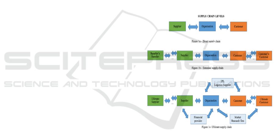
In Figure 1, supply chain levels can be interpreted
in a historical context depicting the development on
how the SCM has changed. Figure 1b shows a closed
supply chain and it was handled by vendor took care
of all aspects of the SC itself. However, further down
the line the need for extended supply chain was more
stakeholders were added on, but still in a closed SC.
The ultimate supply chain (Figure 1c) structure
represents the global supply chain scenario today.
Being highly complex and challenging to manage for
the partners involved. One of the advantages is that a
third-party financial provider is involved and shares
the risk. The organizational structure has an outside
logistics (3PL) company that executes the logistics,
serving the two companies and an external marketing
company that provides information about the crucial
customers. Figure 1c, represents the structure of how
oil and gas companies manage the supply chain.
Figure 1: Supply chain in a globalized contest. [Adapted
from Mentzer (2001, 5)].
2.2 Administration of Logistic Tasks
According to Stadtler (2015) “Inter-organizational
collaboration is a necessity for an effective supply
chain”. Today, many companies still face the
challenge of having several information systems
within their own company, resulting in not having
fully integrated real-time data information flow. This
is due to systems having been developed over time
and not always being adaptable to the new generation
of technology and integration of in-house data. In
addition, in an extended supply chain, partners in the
company may also have their own variations and lack
of data flow (Simchi-Levi et al., 2008). The rapid
ICEIS 2019 - 21st International Conference on Enterprise Information Systems
434

development of new technologies creates an
opportunity for supply chain strategies to change the
process cycle in supply chain and become more
integrated, resulting in increased interaction between
the stakeholders. Information, facilitated through
information platforms, is shared among the supply
chain partners. This will result in higher transparency
and reduce the uncertainty and bullwhip effect
occurring in the supply chain (Kvie, 2015).
According to Pereira (2009), the source of
inefficiencies in a supply chain is information that is
wrong, lacking or inaccurate. These scenarios
represent a considerable challenge for supply chain
management. Therefore, accurate and timely
information is immensely important (Verissimo
Pereira, 2009). To mitigate the challenge of lacking
visibility in the supply chain, the typical
countermeasure would be to have more staff and
increased inventory, resulting in higher overall costs.
Gartner analyst, Art Mesher, developed in the 1990s
the concept of 3 Vs of supply chain: visibility,
velocity and variability, and claims that a higher
visibility throughout the supply chain will lead to
velocity (higher speed in quantity) and will reduce the
variability factors (Wilhjelm, 2013).
The importance of sharing information has
increased significantly and can be considered as
another set of dynamics and layer in SCM (Stadtler,
2015). However, one approach in optimizing the
visibility of information can be to form a closer
relationship with the transport companies and
suppliers through information systems that are
tailored to accommodate the needs of the members
across the supply chain and share information
(Frazelle, 2002). The information sharing in
collaboration with partners and customers also faces
challenges because of the high complexity of the
supply chain integrations in global networks due to
multiple layers of partners, and IT challenges due to
the vast diversity of software and hardware (Stank et
al., 2015).
2.3 Dashboard: Interactive Design
To date it seems that both academia and the industry
have not sufficiently taken into consideration the user
friendliness aspect of the dashboards they are
developing (Sharp, 2006). Presthus and Canales
(2015) found that dashboard design has mostly been
data-driven. The dashboard should be designed based
on cognitive psychology. However, it seems that few
designers have focused on the visual perception and
eye tracking that occurs when dashboards are viewed.
2.4 Human: Computer Interaction
The human–computer interaction model is a
simplification of the process and stages of the
interaction that will take place between the user and
the machine/product. The purpose for such a model is
to give the creators (designers) a better in-depth
understanding of how the dynamics are in “dialogue”
with “software” (human behavior), and to test the user
friendliness and level of integration.
Prior to the design phase, it is important that the
developers factor in human behavior, cognition, and
emotions. The human perception/cognition refers to
our everyday thought processes such as recollection,
reflection, absorbing knowledge, daydreaming,
seeing and observing, making decisions, reading and
writing (Sharp, 2006). Some of the processes are
more or less automatic and do not demand a lot of
conscious thinking - they flow effortlessly through
the human mind. Comparing and contrasting, making
decisions, and doing tasks that require specific skills
trigger creativity which leads to new ideas (Sharp,
2006).
2.5 The Design Process
The design process has the following dimensions:
Visceral Design: the visual physical appearance of
the product and aesthetics such as colours and layout.
Behavioural Design: research has shown that the
choice of correct aesthetics will influence the users’
perception of usability and how the product “feels”
while being used (Bonnardel et al., 2011).
Reflective Design: is the opinion that the user has of
the product and whether the user felt positive or
negative about the experience of using it (Bonnardel
et al., 2011).
However, more factors need to be considered in
the process of creating a dynamically good dashboard
such as the graphic design and also the use of colours
and the impact of these on the human emotions and
aesthetics. According to the research of (Bonnardel et
al. 2011), there is a direct correlation between the
choice of colours and willingness to spend more time
on the web page when navigating through the
internet. The appeal, layout, aesthetics and colour
determine within seconds whether the user will
continue navigating the company’s web pages
(Bonnardel et al., 2011).
Real-time Operational Dashboards for Facilitating Transparency in Supply Chain Management: Some Considerations
435
2.6 Cognition Processes Implemented
in the Design of Dashboards
In the entire process in designing the intuitive
dashboard should be including the cognition
processes to optimize and capitalize on how the brain
are wired. This will in return create a tool for the end
user, which will be properly customized and
perceived easy and logically deductive.
3 RESEARCH METHODOLOGY
The research objective was to search for written
material about logistics dashboards designed for
operational purposes that are user-friendly and built
intuitively based on how the human brain is wired. In
this research, we investigate whether there is a gap
between academia and the business world in relation
to the design and actual implementation of
dashboards. Moreover, it is sought to use the findings
for further research to build a dashboard model. The
scope of the research will be limited to investigating
the field of IT for dashboards that are already in use
for logistics purposes via secondary data such as peer
articles books and professional journals and
databases, and Google Scholar. Hence, the
methodology for the study will be bibliometric, which
has the capability to canvas millions of records,
through the use of database tools, such as Scopus and
Web of Science.
Limitations of this Study
Due to the limitation of time and the size of the study,
it can only be used as a suggestion to further develop
potential improvements for real-time operational
dashboards in logistics.
4 DATA COLLECTION
In addition to regular searches on the internet, we
searched university catalogues, various books on
supply chain management and dashboard design,
peer-reviewed articles from academia and research
institutions, white papers presented at conferences,
newspapers and relevant industry journals. The
choice of databases, fell on Web of Science and
Scopus used by universities because of their size and
global span. Scopus is the largest peer-review
database in the world with 69 million records and
Web of Science has over 90 million records
(Wikipedia 2017). The “in text strings” should be
identical for both databases to ensure validity and
accuracy. “In text string” refers to the free text area
where the researchers type in, for example, key words
or phrases or topics. Using this secondary data
bibliometrics was used to enumerate through the
reports generated via the “in text string”. However, in
the planned “in text string” for dashboard design,
more keywords were added in the second search
limited to “dashboard design” and only publications
which contained those two keywords was to appear,
the (..) will command the search to only show articles
which have “dashboard design” in their content. In
this context, drilldown is a term that indicates a
deeper search of the gathered information, by
prompting the search engine to go deeper into the
information retrieved from Scopus and Web of
Science.
After searching for the most appropriate
keywords, bibliometrics analysis of “in text string”
search yielded the following:
(1) “visualization” AND “dashboard” AND “real
time”; all records were for 2006-2017. This generates
a broad search for the keywords in the databases, and
was also meant to exclude any irrelevant areas of
research or industry. The time span was set to a
decade with the purpose of investigating the research
developments that have occurred in the field.
(2) “dashboard design”, all records are for the period
2006-2017. Further, in the analysis the following
table structure has been used in the drill down in the
data from the generated database report using the
facilities of Web of Science and Scopus drill down
possibilities. In both databases, you can “pick” new
search words within the generated reports. Here after
supply chain one level down (level 2) Logistic was
tapped in and next level Oil and Gas (level 3). This
structure has been followed through the research.
When referring to findings this structure will be
presented.
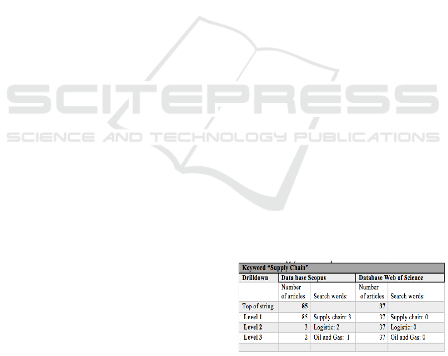
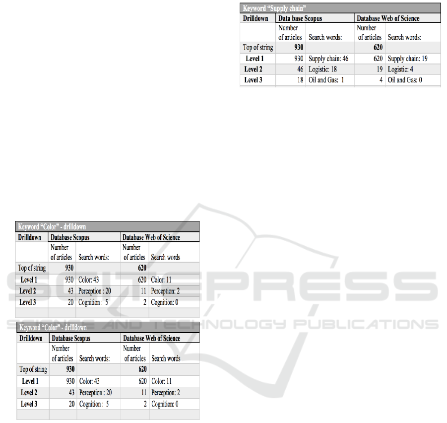
Table 1: Search “supply chain” in Scopus and Web of
Science 2006-17.
ICEIS 2019 - 21st International Conference on Enterprise Information Systems
436

5 FINDINGS AND ANALYSIS
With regard to the number of articles in both databases
using the search string “visualization” and “dashboard
and “real time”, very little has been written over the
past decade on the topic of dashboards with only 37
articles retrieved from Web of Science and 85 articles
in Scopus, spread over at 10-year period. (Process
Model 1). This represents an average of only 11
publications per year. With regard to the research
areas, science and engineering are predominantly the
main contributors. Educational institutions appear with
only four relevant articles in Web of Science. For the
source of the publications, such as conferences, the
result for Scopus is 69.1% and for Web of Science,
62%. With regard to peer reviews, the results indicate
that articles from academia in Web of Science account
for 39% and for Scopus, 28.6%. This shows evidence
of the traditional gap between academic theory and
business practice; in the research field, these are not
aligned.
First Process Model
The search in Scopus on the string resulted in 85
matches and the same string in Web of Science yielded
37 hits (Process Model 1). Taking into consideration
the huge number in these two of the databases, the
results shows a low number of matches of the chosen
search keywords, indicates that the information about
development and research have not been published in
the public media. So, further analysis was performed
on the data available. The first step was to investigate
the number of publications in both databases according
to each year within the specified ten-year range.
Web of Science did not have any publications
between 2006-2010 and in 2014, and Scopus for the
same period showed no publications in 2006 and only
five hits between 2007-2010. A mere total of five
articles in both databases indicate that the area attracted
little interest from researchers in academia and from
the business world.
Despite the small amount of data retrieved from
Web of Science. The generated data, shows a steady
yearly increase in the number of publications, and a
drop in 2017 although this is likely to increase by the
end of the year. With regard to Scopus data depicted
the last three years (2015-17) shows a significant surge
in publications. An increase is seen in the number of
articles (122 in total) in both databases. However, the
results of the keyword search are low, given that they
represent a decade of publications. The next step was
to analyze the research areas/fields to which the articles
derive from. In Web of Science, the retrieved results of
37 publications shows 17 publications from computer
science, followed by engineering with 10 publications
and educational research with 4 publications,
representing the three major fields of contributors.
Scopus has 85 publications, contributed by:
computer science with 48 (56 %) publications,
followed by engineering with 37 (44%). In Web of
Science, of the 37 publications, computer science
accounted for 17 (46%) and engineering for 10 (27%).
In both databases, the top two contributors are the
fields of computer science and engineering. This may
be explained by the fact that these two disciplines
would be the ones involved with dashboards, real-time
data and visualization.
Having established the research areas pertaining to
the publications, the next question is: Where were the
texts published? The analysis shows for 2006-2017, of
the 85 articles from Scopus, 65.5 % were conference
papers, 3.6 % were conference reviews, 2.4% were
from books and 28.6% were from published articles. In
the 37 articles sourced from Web of Science, 61%
derive from conferences and 39% from published
articles.
Analyzing the data shows that the majority of the
research papers are (white paper level) from
conferences (Web of Science 61% and Scopus 69.1%).
Moreover, there is prima facie evidence of a classic
gap between research and practice. In Scopus, only
28.6% are peer reviewed articles and in Web of
Science, 39%. Academia is not following the
development of dashboards, visualization and real-
time. In addition, only 2.4% of the sources in the
Scopus database are published books, and %0 in Web
of Science. In industry, managers need solutions to
help with everyday operational activities. Hence, there
is a need to work towards solutions to fix current
problems, or to propose better alternatives to increase
business efficiency and decrease costs. The findings
presented in tables pertaining to the in-text searches of
Scopus and Web of Science using keywords
“visualization”, “data visualization”, “real time data”,
“cognition”, “eye tracking”, “color”, “supply chain or
logistics”, will be discussed below. Starting with
“visualization” the search of a total (930+620) 1550
publications produced 350 hits (22.6%). This result is
small when taking into consideration that the
visualization process is an essential element of the
dashboard design process. Further, in the search using
keyword “real time data” (236+114) from the 350
drilldown source, the hits were 82 (23.5%) in total from
visualization search and for a further keyword
“cognition” (61+21) 82, the total hit was 11
publications.
With regard to real-time data and cognition, the
data analysis shows that only a small percentage of
1550 articles factor in cognition in their research or
Real-time Operational Dashboards for Facilitating Transparency in Supply Chain Management: Some Considerations
437

when designing or building dashboards. Further data
collection on keyword data visualization (Table 3)
produced a total hit of 287 (18.6%) from a total of 1550
publications, which is a low figure with regard to
dashboard design process. Also, the data analysis
showed (199+88) that for 287, for the keyword “real-
time data”, the result was 80 (28%) publications. In the
last search for the keyword “cognition” there was a
total of 11 (14%) publications. Based on the results, the
conclusion drawn is that in research so far, the
elements of visualization and cognition are not
factored in to a large degree during the design and
construction of dashboards. For the next keyword
analysis “real-time data” from a total of 1550
publications, there were 233 (15%) hits. This indicates
that 233 out of 1550 publications on dashboard designs
() included real- time data.
A further level down from “real-time data” the
keyword “supply chain” OR “logistics” produced 40
(11+23) (17%), and the last step used to check the
presence of “oil and gas” produced only one
publication. In the supply chain and logistics context,
the research shows that at this point, only 17% of real-
time data in this drilldown relates to the field. With
regard to the search using the keyword “cognition”
(Table 4), of 1550 publications, the total was (57+4) 61
publications (4%), indicating a very low representation
of cognition concepts used in dashboard design. With
regard to the next search using “supply chain or
logistics” as the keywords, (57+4) 61, the results were,
11 articles, and further one level down “Oil and Gas”
search produced four articles. The results of the
cognition search show a very low level of published
research in this area, considering that the data search
covers over a decade of articles globally. The next step
is related to the cognition process and how the brain
processes information. Eye tracking is a visual cortex
activity. The following results for the search using
keyword “eye tracking” are: of 1550 publications,
there were 34 articles (2%) on eye tracking; further
drilldown from the eye tracking results for a
“perception” search produced a total of 11 articles and
further drilldown found six articles with the keyword
“cognition”. Part of the cognition process is also how
the brain processes colors and color coding. Hence, the
next keyword search was “color”. The analysis shows:
Out of 1550 publications, the search produced (43+11)
54 (3.5%). in the next search using the keyword
“perception” yielded a total of 22 articles and the
keyword “cognition” resulted in five articles.
The findings to date in the key word search
regarding brain wiring show that only a small
percentage of designers consider designing dashboards
based upon the capability and limitations of the human
brain and how it is wired. It is evident that there is a
gap between academia (universities) and practitioners
(businesses). When a theory or process coming from
academia is deployed by an organization, quite often,
it does not work. The theory practice gap between the
management researcher and the practitioners is due to
the fact that they are looking at a process or system
from different perspectives. The practitioners are in an
environment where theories are put into actual
practice, and where the focus is to obtain knowledge
that employees and management can utilize in their
daily operations. Business researchers have a different
perspective in that they are examining theories in the
field, seeking to gain more knowledge from a more
intellectual stance by posing critical questions. The
methodological imperative is also different. For the
researcher, everything is executed according to a strict
methodology and scientific methods. For the
practitioners, it is an ongoing process imbedded in their
everyday business activity and their aim is to solve the
challenges and problems they face and fix it.
On the topic of dashboards with only 37 articles
retrieved from Web of Science and 85 articles in
Scopus, spread over at 10-year period. This represents
an average of only 11 publications per year. With
regard to the research areas, science and engineering
are predominantly the main contributors. Educational
institutions appear with only four relevant articles in
Web of Science. For the source of the publications,
such as conferences, the result for Scopus is 69.1% and
for Web of Science, 62%. With regard to peer reviews,
the results indicate that articles from academia in Web
of Science account for 39% and for Scopus, 28.6%.
This shows evidence of the traditional gap between
academic theory and business practice; in the research
field, these are not aligned. The next step in the
research process is to analyze the data generated by the
search of Web of Science and Scopus, to find what has
been published in the area of supply chain and logistics
with regard to real-time dashboards. The purpose of the
analysis is to determine and further mitigate the
aforementioned gap between research and practical
application. The following keywords, “supply chain”,
“visualization”, “real time data”, “dashboard” were
used for the text search of relevant material in the
reports generated from Scopus and Web of Science.
(Process Model 1). Drilldown search in collected data
reports from databases Scopus (85 hits) and Web of
Science (37 hits), searching in text “visualization”
“dashboard” and “real time”.
As shown in Table 1, further drilldown using the
keyword “supply chain” shows that out of 85 Scopus
publications, only three were found in the area of
supply chain and logistics, and two for oil and gas. The
ICEIS 2019 - 21st International Conference on Enterprise Information Systems
438
same drilldown was performed in Web of Science,
returning 0 for all categories. In both databases
comprising a total of 122 hits, the three and one
publications respectively are an extremely low number
given that the data was collected for a one-decade time
span. The next keywords to be used for the text search
were “visualization”, “real time data” and “cognition”.
The results from the drilldown show for the 85 Scopus
publications, real-time data totals 77 and cognition, 9.
In Web of Science, 37 (level 1) mention visualization,
33 consider real-time data (level 2), and cognition had
only article (level 3).
The topic of dashboards with only 37 articles
retrieved from Web of Science and 85 articles in
Scopus, spread over at 10-year period. This represents
an average of only 11 publications per year. With
regard to the research areas, science and engineering
are predominantly the main contributors. Educational
institutions appear with only four relevant articles in
Web of Science. For the source of the publications,
such as conferences, the result for Scopus is 69.1% and
for Web of Science, 62%. With regard to peer reviews,
the results indicate that articles from academia in Web
of Science account for 39% and for Scopus, 28.6%.
This shows evidence of the traditional gap between
academic theory and business practice; in the research
field, these are not aligned.
The next step in the research process is to analyze
the data generated by the search of Web of Science and
Scopus, to find what has been published in the area of
supply chain and logistics with regard to real-time
dashboards. The purpose of the analysis is to determine
and further mitigate the aforementioned gap between
research and practical application. The following
keywords, “supply chain”, “visualization”, “real time
data”, “dashboard” were used for the text search of
relevant material in the reports generated from Scopus
and Web of Science. (Process Model 1). Drilldown
search in collected data reports from databases Scopus
(85 hits) and Web of Science (37 hits), searching in text
“visualization” “dashboard” and “real time”.
As shown in Table 1, further drilldown using the
keyword “supply chain” shows that out of 85 Scopus
publications, only three were found in the area of
supply chain and logistics, and two for oil and gas. The
same drilldown was performed in Web of Science,
returning 0 for all categories. In both databases
comprising a total of 122 hits, the three and one
publications respectively are an extremely low number
given that the data was collected for a one-decade time
span. The next keywords to be used for the text search
were “visualization”, “real time data” and “cognition”.
The results from the drilldown show for the 85 Scopus
publications, real-time data totals 77 and cognition, 9.
In Web of Science, 37 (level 1) mention visualization,
33 consider real-time data (level 2), and cognition had
only article (level 3).
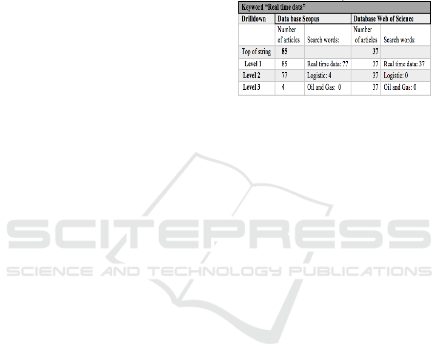
Table 2: Results of “Real-time data” search in Scopus and
Web of Science 2006-2017.
The findings of over 100 publications (77+33)
(level 2) on real-time data, presented in Table 2 above,
validate the prima facie evidence that the visualization
element is a factor in real-time data research and
processes. However, only 10% of the 100 publications
show that the cognition theory, based on how the brain
perceives patterns, has been applied when designing
dashboards. Further investigation into “real-time data”
in connection with logistics in the oil and gas industry
in the visualization drilldown produced the following
results. The results of the search using “real time data”
as the keyword. In Scopus, 77 out of 85 (91%)
considered ‘real-time” data; four articles were the
result of searching for “logistics”, and “oil and gas”
retrieved 0. In Web of Science the same drilldown
shows 37 of 37 in the search for “real time data”,
“logistics” zero (0) and “oil and gas” zero (0).
Scopus analysis shows, 85 for the search of
“dashboard”, and further drilldown produced three
(3.5%) for “supply chain” publications and zero (0) for
“oil and gas”. In Web of Science 37 publications
contained the keyword “dashboard”, but “supply
chain” and “oil and gas” returned a result of zero. The
same method was applied when searching for
dashboards in relation to supply chain, logistics, and oil
and gas. In Web of Science the top of string (37) list
was applied in each search for “supply chain”,
“logistic” and “oil and gas” to support the claim that
little has been done with regard to supply chain
dashboards related to logistics in oil and gas.
Preliminary Summary
It can be observed from the above search results that
the outcome of the in text string search of Scopus and
Web of Science indicate a significant trend, viz. there
has been an increase number of publications in
searched topic from 2015-2017. Further, the research
publications over the past decade have been mainly
contributed by computer science (64), engineering
(47). As prima facie evidence, a theoretical practice
Real-time Operational Dashboards for Facilitating Transparency in Supply Chain Management: Some Considerations
439

gap has been found between academia and the business
world since the research stemming from conferences
accounts for a majority of 61% in Web of Science, and
69.1% in Scopus. Peer review publications in Scopus
account for 28.6%, and 39% in Web of Science.
Academia and the business world are not in sync.
We now recap the findings from the drilldown into
respective data reports from Scopus and Web of
Science, generated through in-text searches using
keywords. Table1 shows the search results using the
keyword "supply chain" for the period 2006-2017. In
both databases, only three publications were found for
this period. This indicates very low research activity in
the field, for no apparent reason. Table 3 shows the
search results using the keyword "visualization" for the
period 2006-2017. The results indicate that the
research field of visualization is a significant element
in real-time data research, although 22 (26.84%)
publications did not consider real-time data. The search
results using the keyword "real-time data" for the
period 2006-2017. The hit on real time data was high
in the reports, returning114 out of a total search of 122.
However, with regard to logistics, there were only four
publications. The last keyword search in process model
1. The drilldown was for the keyword "dashboard" for
the period 2006-2017. There was a 100% hit on the
search in both data reports but, consistently, “supply
chain” hits were very low at only three, and logistics a
mere two.
Second Process Model
To assess the development in the research and
performance of dashboard design over the past decade,
in the analysis referring to publications, the results
from 930 articles shows a noteworthy increase in the
number of publications from 2012 to 2017, with a total
of 682 (73.3%) publications, compared with only 248
(26.7%) publications for 2006-2011. In the analysis
results of 620 articles shows the same trend: an
increase from 2012-2017 to a total of 499 (80.4 %)
publications, compared with 121 (19.6%) publications
from 2006-2011.
Both databases show the same trend with regard to
an increase in the number of publications from 2012-
2017. Adding up the reports in the two databases, there
have been 1181 publications in total over the last five
years, compared with 369 publications for 2006-2011.
These statistics indicate that the implementation of
dashboards within the business world has increased
and this trend is likely to continue in the future. The
analysis of the data from the two databases shows the
results of the search for written texts and the category
to which each belongs.
Out of 930 publications found in the Scopus
database, conference papers account for 507
publications, (i.e. 58.6%, comprised of conference
papers and conference reviews) and 313 (33.7%)
publications are articles. Thirty three (3.5%)
publications were book chapters.
Further, it shows that out of 620 publications found
in the Web of Science database, conference papers
account for 317 publications (i.e. 51.2%), and 292
(47.7%) are articles. Six (1%) publications were book
chapters.
The analysis of data acquired from Scopus. It
confirms the theory- practice gap between, academia
and conference (white paper level) is 24.9% comparing
the findings, the same gap is only 3.5% which indicates
only a small difference between academia and
conference papers these results are evidence of prima
facie. The large difference in results may be due to the
different population of the database reports with 310
more hits on Scopus using the keyword in the text
search. Having determined the categories of each text
type, the, next step will be to analyze the research area
segmentation.
Regarding the 930 publications the contributing
fields can be summarized as follows: computer science
(the largest) – 461 (49.6%); engineering - 318 (34%);
medicine – 135 (14.5%); social science – 117 (12.6%);
mathematics – 110 (11.9%); and business management
– 97 (6%). Out of 930 publications, the largest research
categories derive from computer science, 461
publications (49,6 %) is the area which has the most
publications followed by engineering 318 publications
(34%), Medicine 135 publication (14,5%) social
science 117 publications (12,6%), Math 110
publications (11,9%) and business management 97
publications (6%). Further analysis of the data shows:
computer science has 227 (36.6%) publications,
engineering -181 publications (29.2%); educational
research - 50 (8%), business economics - 48 (7.7%) are
the business economics.
To summarize the findings so far, with regard to
publications for 2006-2017, shows a much larger
population than the search on “visualization”
dashboard and real time which had 122 publications 85
in Scopus and 37 in Web of Science. In the new search
of the databases, over 1550 publications were found,
930 in Scopus and 620 in Web of Science. The total
number of publications found by the searches of the
two databases was 1687.
With regard to the number of publications per year
in both text searches, there was a substantial increase
in publications in both Scopus and Web of Science. As
discussed earlier, there was a significant increase in the
number of publications from 2012 to 2017 with a total
of 682 publications compared with 248 publications
from 2006 to 2011. Further study shows the same
ICEIS 2019 - 21st International Conference on Enterprise Information Systems
440
trend: 121 (19.6%) publications from 2006 to 2011,
increasing to a total of 499 (80.4 %) for 2012 to 2017.
The majority of publications comprise conference
papers and proceedings, followed by articles. Further
analysis shows: (Scopus data analysis), the gap
between academia and conference (white paper level)
are 24.9%, in comparison with data from Web of
Science the gap is 3.5% which indicates only a small
difference between academia and conference paper
level. It is difficult to know why there is such a large
difference in the size of the gaps in Scopus and Web of
Science. It may be due to the numbers of relevant
articles in the databases. The next step was to identify
the major contributors to the written documentation
found in the databases. The results for both Scopus and
Web of Science showed that the majority of
contributors are from the field of computer science,
followed by engineering.
The next step is to drilldown in the Scopus and
Web of Science databases to search for texts containing
“dashboard design”. The procedure is identical to the
drilldown process for “visualization”, “dashboard” and
“real time”. The choice of drilldown key words for
further data collection as mentioned before was
carefully chosen, with the purpose of investigating the
areas concerned with the design of dashboards. The
keywords are the same as those discussed in the
literature review chapter. The purpose is to analyze
dashboard design in terms of visualization and, real-
time time data, and to determine how many researchers
and designers apply knowledge of cognition, eye
tracking and color when designing dashboards. Using
the keywords, the results of the drilldown were 930
publications for Scopus and 620 for Web of Science.
Drilldown search in collected data reports from
databases Scopus (930 hits) and Web of Science (620
hits), searching in text “dashboard design”.
Out of 930 publications “visualization” appeared in
236 articles (level 1); further drilldown using the
keyword “real time data” generated 61 (level 2)
articles. When determining how many of the real-time
data dashboards were based on “cognition”, the result
of the search was 10 articles (level 3). Of the 620 Web
of Science publications, there were 114 articles for
“visualization” (level 1), 21 articles for “real time data”
(level 2), and further drilldown found 1 articles related
to “cognition” (level 3). The next search was
conducted using “data visualization” to determine how
many of the 1550 publications contained the term. The
results are given in the table below. For “real time data”
(level 2), and further drilldown found 1 articles related
to “cognition” (level 3). The next search was
conducted using “data visualization” to determine how
many of the 1550 publications contained the term. The
results are given in the table below.
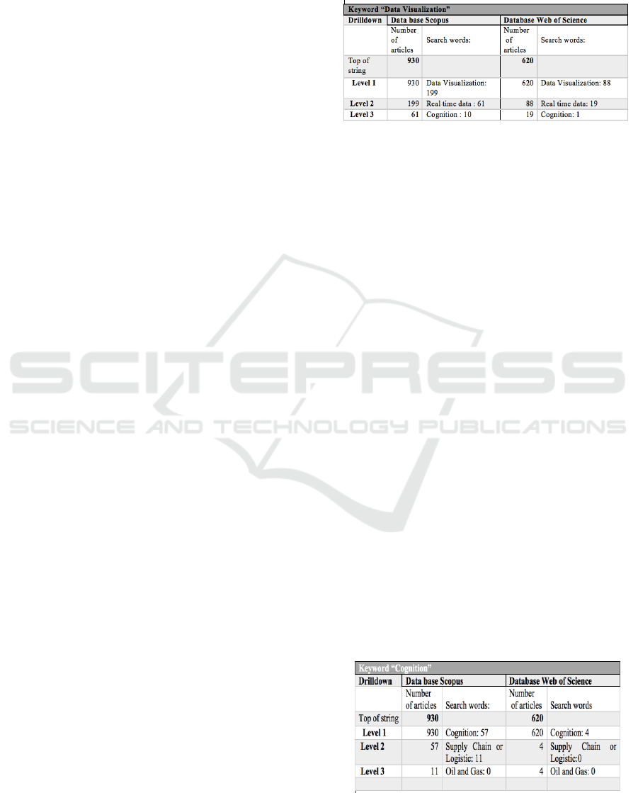
Table 3: Results of “Data Visualisation” search in Scopus
and Web of Science 2006-2017.
In Table 3 above, out of 930 publications in
Scopus, the keyword “data visualization” yielded 199
(21.4%) articles (level 1), and further drilldown using
the keyword “real time data” found 61 articles (level
2), and further drilldown showed a result of 10 for
“cognition” (level 3). Out of 620 Web of Science
publications the keyword “data visualization”
retrieved 88 articles (level 1), and further drilldown
using keyword “real time data” produced 19 articles
(level 2) and for “cognition” one article (level 3). To
ensure that the real-time data aspect was covered,
another search using the keyword “real-time data”
was generated, to search for publications in supply or
logistics. The results of the data search in Scopus
were: 160 articles using keyword “real-time data”
(level 1), 11 publications for keyword ‘supply chain”
or “logistics” (level 2) and only one was found for “oil
and gas” (level 3). The same drilldown was done in
Web of Science. Out of 620 publications, the
keyword “real- time data” had 73 hits (level 1); the
keyword “supply chain” or “logistics” yielded 23
(level 2), and keyword “oil and gas” had 0 hits (level
3). In the next keyword drilldown with regard to
cognition in both databases, the purpose is to check
how many of the 1550 publications on dashboards,
consider the cognition process in relation to
dashboards and, further, specifically focus on supply
chain or logistics in relation to the gas and oil
industry. The results are given in the table below.
Table 4: Results of “Cognition” search in Scopus and Web
of Science 2006-2017.
Real-time Operational Dashboards for Facilitating Transparency in Supply Chain Management: Some Considerations
441
For the “cognition” keyword drilldown, out of 930
publications in Scopus, 57 articles were found (level 1)
and further drilldown using keyword “supply chain” or
“logistics” found 11 articles (level 2), and for “oil and
gas” there was a zero result (level 3). In Web of Science
out of 620 publications, “cognition” yielded four
articles (level 1), further drilldown produced no articles
at levels 2 and 3. An additional step is the search for
“eye tracking” which is part of the brain’s cognition
process. The results of the keyword search are
discussed below. In the keyword search on color, the
results are as follows, in Scopus 930, resulted in 43
articles (level 1), further drilldown on keyword
“perception” 20 articles (level 2) and “cognition” 5
articles (level 3). Identical drilldown on keywords in
620 Web of Science publications resulted in 11 articles
for “color” (level 1), “perception” had two articles
(level 2) and “cognition” had zero (0) articles (level 3).
Table 5: Results of “Color” search in Scopus and Web of
Science 2006-2017.
The analysis shows in table 6: the following
results after in-text drilldown, firstly in 930 Scopus
publications, keyword “supply chain” has 46 articles
(level 1) and further drilldown “logistic” yielded 18
articles (level 2), and “oil and gas” one article (level
3). Identical process in keyword drilldown was
performed in Web of Science and keyword “supply
chain” produced 19 articles (level 1), “logistic” 4
articles (level 2) and “oil and gas” produced 0 (level
3).
The findings presented in tables pertaining to the
in-text searches of Scopus and Web of Science using
keywords “visualization”, “data visualization”, “real
time data”, “cognition”, “eye tracking”, “color”,
Table 6: Search “supply chain” in Scopus and Web of
Science 2006-17.
supply chain or logistics”, will be discussed below.
Starting with “visualization” the search of a total
(930+620) 1550 publications produced 350 hits
(22.6%). This result is small when taking into
consideration that the visualization process is an
essential element of the dashboard design process.
Further, in the search using keyword “real time data”
(236+114) from the 350 drilldown source, the hits
were 82 (23.5%) in total from visualization search
and for a further keyword “cognition” (61+21) 82, the
total hit was 11 publications.
With regard to real-time data and cognition, the
data analysis shows that only a small percentage of
1550 articles factor in cognition in their research or
when designing or building dashboards. Further data
collection on keyword data visualization (Table 3)
produced a total hit of 287 (18.6%) from a total of
1550 publications, which is a low figure with regard
to dashboard design process. Also, the data analysis
showed (199+88) that for 287, for the keyword “real-
time data”, the result was 80 (28%) publications. In
the last search for the keyword “cognition” there was
a total of 11 (14%) publications. Based on the results,
the conclusion drawn is that in research so far, the
elements of visualization and cognition are not
factored in to a large degree during the design and
construction of dashboards. For the next keyword
analysis “real-time data” from a total of 1550
publications, there were 233 (15%) hits. This
indicates that 233 out of 1550 publications on
dashboard designs () included real- time data.
A further level down from “real-time data” the
keyword “supply chain” OR “logistics” produced 40
(11+23) (17%), and the last step used to check the
presence of “oil and gas” produced only one
publication. In the supply chain and logistics context,
the research shows that at this point, only 17% of real-
time data in this drilldown relates to the field. With
regard to the search using the keyword “cognition”
(Table 4), of 1550 publications, the total was (57+4)
61 publications (4%), indicating a very low
representation of cognition concepts used in
dashboard design. With regard to the next search
using “supply chain or logistics” as the keywords,
ICEIS 2019 - 21st International Conference on Enterprise Information Systems
442

(57+4) 61, the results were, 11 articles, and further
one level down “Oil and Gas” search produced four
articles. The results of the cognition search show a
very low level of published research in this area,
considering that the data search covers over a decade
of articles globally. The next step is related to the
cognition process and how the brain processes
information. Eye tracking is a visual cortex activity.
The following results for the search using keyword
“eye tracking” are: of 1550 publications, there were
34 articles (2%) on eye tracking; further drilldown
from the eye tracking results for a “perception” search
produced a total of 11 articles and further drilldown
found six articles with the keyword “cognition”. Part
of the cognition process is also how the brain
processes colors and color coding. Hence, the next
keyword search was “color”. The analysis shows: Out
of 1550 publications, the search produced (43+11) 54
(3.5%). in the next search using the keyword
“perception” yielded a total of 22 articles and the
keyword “cognition” resulted in five articles.
The findings to date in the key word search
regarding brain wiring show that only a small
percentage of designers consider designing
dashboards based upon the capability and limitations
of the human brain and how it is wired. It is evident
that there is a gap between academia (universities)
and practitioners (businesses). When a theory or
process coming from academia is deployed by an
organization, quite often, it does not work. The theory
practice gap between the management researcher and
the practitioners is due to the fact that they are looking
at a process or system from different perspectives.
The practitioners are in an environment where
theories are put into actual practice, and where the
focus is to obtain knowledge that employees and
management can utilize in their daily operations.
Business researchers have a different perspective in
that they are examining theories in the field, seeking
to gain more knowledge from a more intellectual
stance by posing critical questions.
6 CONCLUSION
Based on the data analysed the representation of
articles in relation to dashboards real-time data,
shows the results are extremely low in the context of
supply chain, logistic and oil and gas. This shows
evidence prima facie, a gap between academia and
the practitioners. With regard to brain wiring to date,
shows that only a small percentage of the retrieved
articles, factor in and apply the benefits of designing
dashboards based upon the capability and limitations
of the human brain and how it is wired, the same
evidence of prima facie in relation to theoretical
practice gap, between academia and practitioners
which use the dashboard in their daily operations.
Also, a low number of book chapters on the search
was detected, is evidence prima facie, theoretical
practice gap between the industry and academia.
REFERENCES
Bonnardel, N., Piolat, A., Le Bigot, L. 2011. The impact of
colour on Website appeal and users’ cognitive processes.
Displays, 32, 69-80.
Chopra, S., Meindl, P. 2013. Supply chain management :
strategy, planning, and operation Upper Saddle River,
N.J., Upper Saddle River, N.J. : Pearson Upper Saddle
River, N.J. Pearson.
Flynn, B. B., Huo, B., Zhao, X. 2010. The impact of supply
chain integration on performance: A contingency and
configuration approach. Journal of operations
management, 28, 58-71.
Frazelle, E. 2002. Supply chain strategy : the logistics of
supply chain management / Edward Frazelle, New York,
N.Y.
New York, New York, N.Y. : McGraw-Hill Education LLC.
Kvie, M. S. 2015. Requirements for a logistics information
system in the oil and gas industry-A case study for Statoil.
Høgskolen i Molde-Vitenskapelig høgskole i logistikk.
Records, L. R., Shimbo, D. T. Petroleum enterprise
intelligence in the digital oil field. SPE Intelligent
Energy Conference and Exhibition, 2010. Society of
Petroleum Engineers.
Sharp, H. 2006. Interaction design : beyond human-computer
interaction / Helen Sharp, Yvonne Rogers and Jenny
Preece, Hoboken, NJ, Hoboken, NJ : Wiley.
Simchi-Levi, D., Kaminsky, P., Simchi-Levi, E. 2008.
Designing and managing the supply chain : concepts,
strategies, and case studies / David Simchi-Levi, Philip
Kaminsky, Edith Simchi-Levi, Boston, MA, Boston, MA
: McGraw-Hill/Irwin.
Stadtler, H. 2015. Supply chain management: An overview.
Supply chain management and advanced planning. 5th
ed.: Springer.
Stank, T., Autry, C., Daugherty, P., Closs, D. 2015.
Reimagining the 10 megatrends that will revolutionize
supply chain logistics. Transportation Journal, 54, 7-32.
Verissimo Pereira, J. 2009. SD-DES model: a new approach
for implementing an e-supply chain. Journal of
Modelling in Management, 4, 134-148.
Wilhjelm, R. 2013. Revisiting the 3Vs of Supply Chain:
Visibility, Variation and Velocity. Supply Chain Digest.
Supply chain digest.
Real-time Operational Dashboards for Facilitating Transparency in Supply Chain Management: Some Considerations
443
