
CrimeVis: An Interactive Visualization System for Analyzing Crime
Data in the State of Rio de Janeiro
Luiz Jos
´
e Schirmer Silva
1
, Sonia Fiol Gonz
´
ales
1
, Cassio F. P. Almeida
1,2
, Simone D. J. Barbosa
1
and H
´
elio Lopes
1
1
Departamento de Inform
´
atica, Pontif
´
ıcia Universidade Cat
´
olica do Rio de Janeiro,
Rua Marqu
ˆ
es de S
˜
ao Vicente 225, 22451-900, Rio de Janeiro, RJ, Brazil
2
Escola Nacional de Ci
ˆ
encias Estat
´
ısticas - ENCE, IBGE, Rua Andr
´
e Cavalc
ˆ
anti 106, 20231-050, Rio de Janeiro, RJ, Brazil
Keywords:
Interactive Visualization, Decision Support, Criminal Data, Socieconomic Data.
Abstract:
This paper presents an interactive graphic visualization system for analyzing criminal data in the State of
Rio de Janeiro, provided by the Public Safety Institute of Rio de Janeiro. The system comprises a set of
integrated tools for visualizing and analyzing statistical data on crimes, which makes it possible to extract and
infer relevant information regarding government policies on public safety and their effects. The tools allow us
to visualize multidimensional data, spatiotemporal data, and multivariate data in an integrated manner using
brushing and linking techniques. The paper also presents a case study to evaluate the set of tools we developed.
1 INTRODUCTION
As its cities and their populations have grown, so has
violence increased in Brazil. In Rio de Janeiro, we
observe that the large social and financial inequali-
ties, as well as the regional distribution of the popu-
lation, strongly influence criminal data. The number
of crimes – especially the violent ones – increases ev-
ery year. Containing that increase and ensuring bet-
ter quality of life have become major concerns of the
government and of public safety institutions (Mon-
teiro and Rocha, 2013). Defining efficient public poli-
cies is a challenge for any government, and devising
strategies for combating criminality directly affects
the majority of the vulnerable population.
When thinking about public policy, we need to
face challenges and seize opportunities in dealing
with ‘Big Data‘ (Power, 2014). There is limited room
for making experiments, so we need to devise ways
to analyze heterogeneous, multi-source data to help
make sense of the current situation and the historical
trends that led to it, so we can better support public
policy decision makers in conceiving, planning, and
continuously monitoring of the programs deployed.
This paper describes an interactive visualization
tool developed to support researchers and public pol-
icy makers in analyzing the criminal data of Rio de
Janeiro. We illustrate its usage to evaluate data pro-
vided by the state’s Public Safety Institute (ISP-RJ,
Instituto de Seguranc¸a P
´
ublica). In total, we ana-
lyzed statistical data of 138 police districts over 12
years.The data obtained were also analyzed together
with socioeconomic data collected and made avail-
able by IBGE, the Brazilian Institute of Geography
and Statistics (IBGE, 2011).
To allow researchers and public policy makers
to analyze hypotheses and evaluate the government
safety policies, we developed CrimeVis to use geo-
referenced and statistical data provided by both ISP-
RJ and IBGE. CrimeVis provides a set of data explo-
ration tools for discovering patterns and correlations
between the analyzed data sets. The main contribu-
tions of this work are:
1. Visual analysis of n-dimensional criminal data,
making it possible to contrast them with socioeco-
nomic variables and relate them to the distribution
of the population of Rio de Janeiro.
2. A set of tools for the analysis of public safety poli-
cies adopted during a certain period of time, and
the relation between criminal data and the social
and economic distribution of the population.
This paper is organized as follows. Section 2 presents
some theoretical background. Section 3 details the
developed tool suite. In Section 4, we present the re-
sults of a user study conducted with people from a
variety of educational backgrounds. Finally, in Sec-
tion 5 we discuss the importance of those results and
Silva, L., González, S., Almeida, C., Barbosa, S. and Lopes, H.
CrimeVis: An Interactive Visualization System for Analyzing Crime Data in the State of Rio de Janeiro.
DOI: 10.5220/0006258701930200
In Proceedings of the 19th International Conference on Enterprise Information Systems (ICEIS 2017) - Volume 1, pages 193-200
ISBN: 978-989-758-247-9
Copyright © 2017 by SCITEPRESS – Science and Technology Publications, Lda. All rights reserved
193

their potential impact on state public safety policies.
2 THEORETICAL BACKGROUND
In Rio de Janeiro, police districts are distributed in
138 DPs throughout the state. The state government
makes those data available to the population through
ISP-RJ (ISP-RJ, 2013). The data we investigated
span a period from 2003 to 2015. The crimes are
counted as follows: for crimes against the individual
(i.e., homicides, lesions, and threats), they consider
the number of victims; for gun seizures, the number
of guns; for other crimes against property (i.e., rob-
beries and thefts), the number of cases, regardless of
the number of victims in each case. As the data are
georeferenced, we can also generate statistics accord-
ing to the population distribution.
Evaluating and quantifying the impact of violence
on the population of Rio de Janeiro present several
challenges. Understanding the problem is difficult
because some data are inconsistent or unrelated, so
the relation between robberies, homicides, and the so-
cioeconimic distribution of the population is unclear.
Violence naturally varies very much both geograph-
ically and over time. Moreover, it matters whether
a person lives either in a conflict territory, at its sur-
roundings, or at a five kilometer radius from its epi-
center (Monteiro and Rocha, 2013). The official crim-
inal data of Rio de Janeiro are aggregated by city re-
gions: they do not allow us to identify either the pre-
cise location of violence epicenters or the population
of each region. Combining criminal data with socioe-
conomic characteristics can help to explore hypothe-
ses about how criminality evolves and how it relates to
social inequalities. However, no government agency
holds all the data necessary for a comprehensive anal-
ysis. To circumvent this problem, criminal data can
be contrasted with socioeconomic data related to the
region associated to each DP. Those data, obtained
by the Brazilian 2010 census (IBGE, 2011), include
information on the population ethnicity and income,
as well as a classification of regions considered sub-
normal, i.e., which lack essential public services and
have irregularly constructed buildings. This way, not
only can we analyze criminal data as indicators of
public safety policies, but also visualize the available
socioeconomic data, which can suggest possible pat-
terns and relations among the data.
2.1 Statistical Data Analysis
The knowledge discovery process requires direct dia-
logue with a domain specialist (de Melo et al., 2015),
in order to decide which questions are relevant and
need support in answering. To help discover patterns
with practical meanings for the user. Different clus-
tering algorithms can be used and evaluated. Algo-
rithms such as k-means and k-medoids (Kaufman and
Rousseeuw, 2009) can be used to identify homoge-
neous groups distributed in the observed source, so
we can evaluate n-dimensional data sets to uncover
possible patterns and correlations. Although those al-
gorithms subdivide the data set efficiently, they do not
consider spatial data, i.e., the geographic distribution
of the records. In the context of criminal data anal-
ysis, this is quite limiting. Conversely, the SKATER
(Spatial K’luster Analysis by Tree Edge Removal) al-
gorithm (Assunc¸
˜
ao et al., 2006) partitions a data set
according to the spatial distribution of the data. An-
other relevant algorithm for data analysis is Multidi-
mensional Scaling (MDS) (Lee et al., 2014). With a
large number of variables, it is very difficult to dis-
cover relevant characteristics of how similar objects
are to each other, unless the data can be represented
in a small number of dimensions. MDS is a set of
techniques for analyzing objects in a data set by re-
ducing their dimensionality. The similarity measure
is usually related to a distance matrix. This technique
makes it easy to analyze the distance (i.e., dissimi-
larity) between specific objects and helps to identify
outliers in clusters.
To help make sense of multidimensional data, dif-
ferent visualization techniques are useful, such as the
parallel coordinates chart can be used. It allows vi-
sualizing multidimensional data through parallel axes
in a 2D chart (Palmas et al., 2014)(Zhou et al., 2008),
where each axis represents an attribute, and a polyline
representing an object intersects each axis at its corre-
sponding attribute value. For instance, in the case of
criminal data visualization, each line represents a po-
lice station, intercepting each axis at its corresponding
attribute values. It is thus possible to analyze informa-
tion of n attributes in a single chart.
Parallel coordinate charts have some limitations,
however. Even with an average-sized data set, it may
suffer from overplotting, making it difficult to identify
characteristics, trends or patterns. Moreover, as the
axes do not have a fixed order, finding a good order re-
quires heuristics and experimentation. One way to al-
leviate this issue is to use the aforementioned cluster-
ing algorithms to visually group the objects, instead of
visualizing each item in the data set separately (Hein-
rich and Weiskopf, 2013)(Johansson et al., 2005). In
this paper we describe some adopted in CrimeVis for
this problem.
Data sets that include temporal data are ubiqui-
tous and notoriously difficult to visualize efficiently,
ICEIS 2017 - 19th International Conference on Enterprise Information Systems
194

especially when they have several dimensions besides
time (Bach et al., 2014), as is the case of the crimi-
nal data in our investigation. To solve this problem
we can decompose the problem into each time step
of recorded data, and represent time in an additional
axis, in a 3D parallel chart.
Parallel coordinates chart can be a powerful tool
when coupled with traditional visualization meth-
ods, such as scatterplots and time series. The syn-
chronous use of multiple views can allow interac-
tive exploration across them, through the techniques
of ”brushing and linking” (Heer and Shneiderman,
2012), where the selection of an attribute in one view
is used to highlight different aspects of the same ob-
ject in another view. The coordinated use of various
views can provide a rich strategy for a domain experts
to analyze patterns in a chart and their projection onto
another one.
2.2 Related Work
We conducted a comparative study of recent solutions
both for the criminal domain and for analyzing sta-
tistical data. To use the application efficiently, users
should be able to easily answer questions about the
data, discover interesting patterns, and identify errors
in the data (Heer and Shneiderman, 2012). A con-
textualized analysis made by domain experts can as-
sign meaning to trends, clusters, and outliers identi-
fied in the data set under investigation. In the lit-
erature, we find several software for the analysis of
statistical data, be they criminal, meteorological, or
electoral funding data, for example. Chainey et al.
(Chainey et al., 2008) used the Hotspot Mapping tech-
nique to analyze spatial characteristics of criminality.
Their system maps criminal data according to where
the crimes occurred using a geographic information
system (GIS), which allows the analyst to identify
patterns and trends for the analyzed areas. Although
the system is efficient with respect to the distribu-
tion of crime occurrences as related to the population
distribution, it does not consider any socioeconomic
characteristics of the area.
Arietta et al. (Arietta et al., 2014) present a
method for automatically identifying and validating
predictive relationships between the visual appear-
ance of a city and its non-visual attributes (e.g. crime
statistics, housing prices, population density etc.).
They combined Support Vector Regression with Data
Mining techniques. Since each city attribute is asso-
ciated with a location (latitude, longitude), they typi-
cally visualize them as thematic maps. In our system,
thematic maps are also used to visualize the distribu-
tion of an attribute over the DPs.
Similar to our approach, Crime in Chicago
(Rougeux et al., 2012) is a data visualization web tool
to explore crime trends in Chicago’s 50 wards, allow-
ing users to compare crime levels over the years and
across city wards. However, it does not consider so-
cioeconomic attributes, nor
the effects of public polices over neighboring regions.
In the next section we describe CrimeVis, the vi-
sualization system we developed to overcome the lim-
itations we identified in the tools described here.
3 CrimeVis
We developed CrimeVis to help researchers explore
criminal data made available publicly by the state
government at the ISP-RJ web site. The socioeco-
nomic data are also public and made available by
IBGE (IBGE, 2011). From the latter, we considered
as relevant attributes education, ethnicity, and family
income. We integrated both data sets in a database for
CrimeVis to support a wide range of analyses.
CrimeVis was designed as an interactive graphi-
cal system which integrates several widely used sta-
tistical analysis methods and clustering techniques to
visualize criminal data.The tool architecture is ex-
tensible, so it is possible to add new forms of vi-
sualization and data analysis. Different from the
aforementioned tools, CrimeVis combines different
visualization techniques, presenting diverse data syn-
chronously across different views. It allows domain
experts to make a deeper analysis of the datasets,
considering their correlations and inconsistencies be-
tween them, facilitating the identification of patterns.
All data are loaded on demand; therefore, our system
is free from CPU and memory-intensive processes.
CrimeVis involved prototyping cycles with evalu-
ation with criminality experts. To satisfy their needs,
CrimeVis was iteratively refined according to their
feedback. Figure 1 shows its initial screen.
With CrimeVis, we can analyze patterns of crimi-
nal distribution over a certain period of time, as well
as their social implications. Experts can also answer
complex questions, such as:
Q1. What locations can be considered concentrations
of certain types of crime?
Q2. How have criminality rates evolved over time?
And what is their relation with social character-
istics of the population, if any?
Q3. How can we subdivide the state areas according
to socioeconomic and criminality criteria?
Q4. What are the practical effects of the policy of
deploying Pacifying Police Units (Unidades de
CrimeVis: An Interactive Visualization System for Analyzing Crime Data in the State of Rio de Janeiro
195

Pol
´
ıcia Pacificadora - UPPs)?
Q5. Are there any inconsistencies in the data made
available by the government?
Figure 1: Initial screen of CrimeVis.
In the next section we describe the software in detail,
discussing the forms of interaction and how we can
answer each of these questions.
3.1 Overview
CrimeVis initially presents users with two views (Fig-
ure 1): a parallel coordinates chart, in which each line
represents the information of a DP; and a map with
the geographic distribution of the DPs, which can be
used to answer Q1.
The initial screen of CrimeVis gives an overview
of how criminality evolved over a given time period
(in our current data set, from 2003 to 2015). There
we can analyze the evolution of criminality rates in
the state and the corresponding socioeconomic data
(Q2). At the right-hand side panel, users can change
the time period to analyze as they wish.
CrimeVis offers various views on demand, such
as: time series chart, MDS projection, scatterplot, and
3D parallel coordinates chart. All the views are syn-
chronized, i.e., the user selections in one view are re-
flected in all the others. This way, it is easier to iden-
tify correlations in the data and filter specific infor-
mation simply by clicking on the attributes of one of
the charts and observing how these data are projected
on the others. For example, an attribute such as homi-
cides or scholarship can be added to or removed from
the visualization and all the views are modified on-
the-fly. CrimeVis allows users to select data manually
or by region, as well as group by crime rate or socioe-
conomic data. Users can load customized data, using
results generated by R scripts in a preprocessing step.
It is also possible to group the data set in clusters
to present them visually. CrimeVis offers three clus-
tering techniques: k-medoids, SKATER, and a com-
bination of MDS and k-medoids. When visualizing
a set of data that considers homicides, thefts, miss-
ing persons, and population income, we can group the
data according to all the attributes (Q3) together or to
each one separately. By knowing in which group each
DP is located, we can analyze properties specific to
each group, as well as outliers and anomalies (Q5) in
the input data.
CrimeVis allows us to explore multivariate spatio-
temporal data sets and to quickly investigate hypothe-
ses and patterns. The next section describes the clus-
tering techniques implemented in CrimeVis.
3.2 Data Clustering
The three strategies for data clustering in CrimeVis –
k-medoids, SKATER, and MDS+k-medoids – help us
to answer some of the questions, Q3 in particular.
In K-medoids (Kaufman and Rousseeuw, 2009)
(Hartigan and Wong, 1979), we have used the Eu-
clidean distance as a measure of dissimilarity between
the chosen attributes. The first step is to choose the
number of clusters. By estimating an optimum aver-
age silhouette width and using the Calinski-Harabasz
index in the K-medoids algorithm, through some ex-
perimentation we have concluded that, for the data set
in question, an adequate number of clusters is five.
The SKATER algorithm (Assunc¸
˜
ao et al., 2006)
subdivides the data using both the attributes and the
geographic distribution. SKATER constructs a spa-
tially contiguous graph and then creates a minimum
spanning tree based on the pairwise dissimilarities be-
tween the nodes. That tree is pruned and we create a
subset of new clusters. As result, we have a dataset
containing clusters with regions that are adjacent to
each other and having similar crime rates.
Finally, CrimeVis allows combining the MDS and
the k-medoids algorithms. MDS aims to project the
data in an n-dimensional space so that the distances
between the data points remain approximately the
same (Lee et al., 2014). The algorithm processes a
distance (or dissimilarity) matrix between every data
pair and searches for a projection that minimizes the
cost function. To cluster the data, we modified the k-
medoids algorithm to consider not only the attributes
of each object, but also the output values of MDS con-
taining an associated weight.
CrimeVis offers the three clustering strategies de-
scribed in this section, combined with charts to help
users to extract relevant patterns.
3.3 Visualization and Inspection
The visualization module provides a set of graphi-
cal tools which include 2D and 3D parallel coordi-
nates charts, scatterplots, time series, and MDS pro-
jections. All views are synchronized to express the se-
ICEIS 2017 - 19th International Conference on Enterprise Information Systems
196

lected subset of objects and attributes of the data set,
in which user actions in a view affect all the others.
The parallel coordinates chart became the central
visualization tool in CrimeVis. It organizes several
data attributes as parallel axes next to one another on
a plane, providing an overview of the relations be-
tween different attributes. Through this visualization,
criminality data can be related to socioeconomic data,
achieving the goal of answering important questions
posed by most researchers in the subject, such as ”Is
there a relation between schooling and crime rates?”
Because traditional parallel coordinates chart may
make it difficult to identify some characteristics due
to the juxtaposition of the polylines, we replaced the
polylines with B
´
ezier curves. In line with (Heinrich
et al., 2011), the control points of each curve are in-
fluenced by each cluster’s centroid, obtained by one
of the three aforementioned strategies, as well as by
the points in which each curve intercepts each axis.
To build a curve between two adjacent axes x
i
and
x
i+1
, we inserted an imaginary central axis between
axes x
i
and x
i+1
and calculated point C
i
as the cluster
centroid that would intercept this axis. This point at-
tracts the curves of the corresponding cluster. Auxil-
iary axes are also added to smooth the curve drawing
at a distance d of each axis. Figure 2 compares the
two charts: one with clustered B
´
ezier curves (on the
left), and a traditional one (on the right).
CrimeVis also provides a 3D parallel coordinates
chart, which is a straightforward extension of the tra-
ditional 2D chart and has the same basic interaction
techniques. Each parallel axis of the original chart is
extended in a third dimension, forming a plane that
represents a 2D scatterplot relating two properties A
and B.For cluster analysis, the 2D chart, even when
using B
´
ezier curves, may still obscure relevant char-
acteristics of the data, as in some instances we have
investigated. Thus, the 3D chart aims to support the
identification of relevant details that would not be eas-
ily noticed in the 2D chart. For each scatterplot, the
values in Z represent an attribute chosen by the user,
and in the Y axis the values are maintained from the
original chart. Figure 3 presents the proposed 3D
chart, in which the geographic distribution of DPs
in the state is chosen for the Z axis. Given the geo-
graphic location of each DP, they were sorted accord-
ing to the following groups: Baixada Fluminense, In-
terior, Grande Niter
´
oi, and Capital (Q3). The user can
filter data by clicking on either a specific set of lines or
a single line. Some degree of transparency is applied
to the lines that were not selected so as to highlight
the data of interest to the user.
Thematic maps can also be used to visualize the
geographic distribution of a certain variable in a par-
ticular period of time, allowing us to answer Q2.
Users can select groups of DP by pressing shift and
clicking on multiple objects or brushing, can hover
over them with the cursor to display their correspond-
ing information in another view, and can zoom in on
a specified area. CrimeVis can also show a time lapse
animation to visualize how crime evolved over time.
Figure 1 presents a map of homicides in year 2014.
CrimeVis provides three more charts: scatterplot,
time series, and MDS projection. The MDS projec-
tion is nothing more than a scatterplot in which it
is possible to see the data distribution according to
the MDS algorithm and its combination with the k-
medoids algorithm for clustering. Figure 4 presents
the MDS chart. Through this visualization, we can
easily identify outliers, such as a point of cluster 2
(in blue) that seems to be far away from most of the
points belonging to its own group in the Y axis.
CrimeVis offers interactive filters through which
the user can select a set of objects and observe its
correspondence in another synchronized view. Other
selections can be made through a set of options pre-
sented in the user actions panel, such as the year, area,
and attributes shown in each view. Each filter opera-
tion modifies the views on-the-fly. For instance, when
selecting a set of lines in a parallel coordinates chart,
the corresponding DPs are also selected in the map of
DPs and in every other active view.
4 EVALUATION AND
DISCUSSION
We conducted a preliminary study to evaluate
CrimeVis and the strategies supported for analyzing
the data. The first fully functional prototype was eval-
uated by a group of 24 people, comprising 12 under-
graduate students of different areas, 4 researchers in
the area of criminality, and 8 scientific visualization
experts. Among the participants, 1 is an expert in
statistics, 3 in the field of humanities (1 of whom is
an expert on criminology), and 8 are professional ex-
perts in computer science and scientific visualization.
No introduction was given of the system for this test.
A set of tasks was given for the users to answer by
interacting freely with CrimeVis, and their answers
were later evaluated. The following sections report
on the evaluation study and its results.
A preliminary study focused on users who do re-
search in public safety. We have conducted an anal-
ysis of the visualization tools, as well as their usabil-
ity. The study collected data through a 7-point Lik-
ert scale questionnaire (1 = completely disagree to 7
= completely agree) for a set of seven tasks related to
CrimeVis: An Interactive Visualization System for Analyzing Crime Data in the State of Rio de Janeiro
197
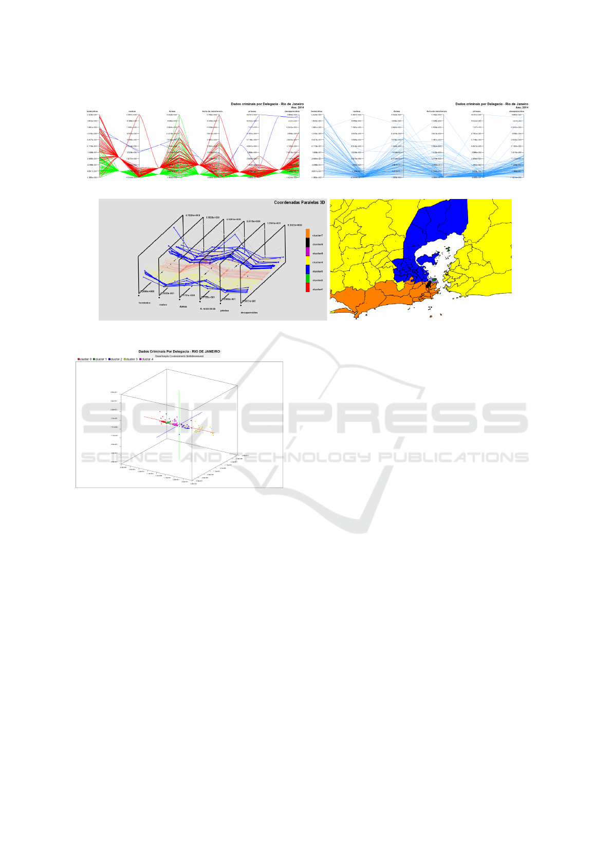
Figure 2: Clusters in parallel coordinates.
Figure 3: 3D parallel coordinates and their relation with the spatial distribution.
Figure 4: Multidimensional Scaling tool in the CrimeVis.
questions Q1 to Q5. After performing each task, users
were asked to provide their opinion about the ease of
use and usefulness of CrimeVis.
In general, we obtained a positive result in the
questionnaire, especially with respect to ease of use
and interactivity with approximately 70% positive re-
sponses. The main goal of CrimeVis, to support the
analysis of patterns and the understanding of the vi-
sualizations, was the main point investigated. As ex-
pected, the negative feedback was related to the lack
of information on the techniques used and the lack
of a tutorial. Besides, the 3D parallel coordinates
chart was considered in some cases as redundant, be-
cause in most cases the original 2D parallel coordi-
nates chart allowed users to answer the question posed
by the task.
Study participants commented on the efficiency
of the data selection techniques and the combination
of interactive visualization with clustering algorithms.
Some of them highlighted this as a strong point of
CrimeVis when compared to other systems. More-
over, according to the study, CrimeVis achieved the
purpose of making it efficient to discover patterns and
correlations in the studied data, which allowed re-
searchers to answer questions such as the ones posed
in Section 3.
The preliminary evaluation of CrimeVis suggests
that the set of tools have achieved its purpose to sup-
port researchers on public safety. Most of the eval-
uated components were deemed easy to understand,
with the exception of a few particular issues. Regard-
ing the interactive controls, the level of understand-
ing was high for the configuration controls (75% of
positive responses) and the selection controls (80%
positive). Five users considered the cluster visualiza-
tion in parallel coordinates plot 2D and 3D difficult
to analyze in certain situations, in which there is jux-
taposition of lines, even when they are replaced by
B
´
ezier curves. In addition, one researcher says that
he would need some training in order to easily inter-
pret the chart and to find an organization of the axes
that would reveal data attributes more clearly.
Four users reported difficulties to select or follow
specific DPs when analyzing the parallel coordinates
chart with clustering. One user reported that it is dif-
ficult to select and visualize a single DP in the MDS
plot when the plot shows a large number of points.
Another user said that some training is necessary to
use and understand all features of the system. Re-
garding data selection, two users reported that some
legends and information on the data could be clearer.
Despite the reported problems, CrimeVis was well
ICEIS 2017 - 19th International Conference on Enterprise Information Systems
198
accepted by the users, being considered by four spe-
cialists as a strong tool to support research.
4.1 Results
In this section we describe some discoveries in
the data made by public safety researchers using
CrimeVis. These discoveries are related to the Pacify-
ing Police Units (UPPs) program created by the State
of Rio de Janeiro. It is well known that the UPPs had a
large influence on the criminal activity in recent years.
Since the beginning of this program in 2008, the state
government has created 37 UPPs in the city of Rio
de Janeiro. To better analyze the effect of UPPs, the
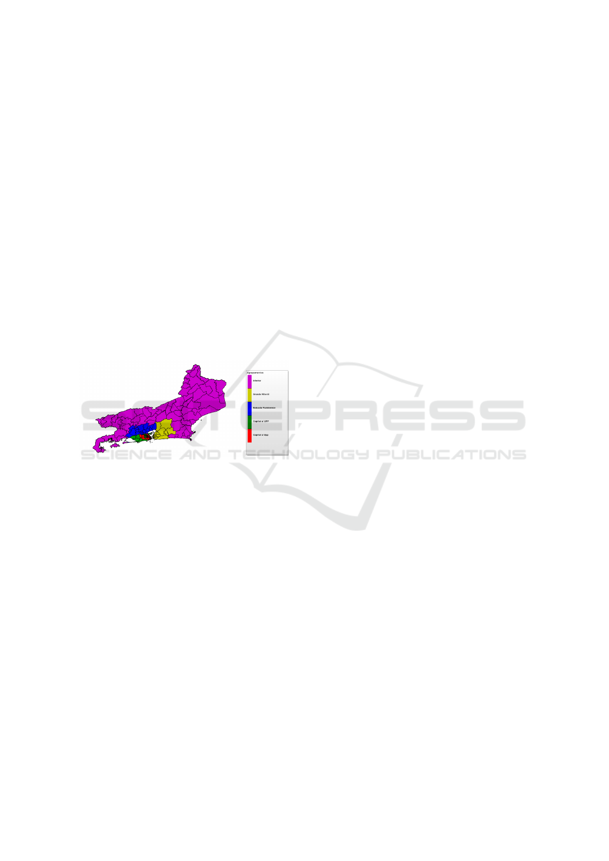
researchers divided the set of DPs into groups repre-
senting the sub-regions of the State (Q3), as shown in
Figure 5. Within the State capital (i.e., the city of Rio
de Janeiro, henceforth ‘Rio’), we find two groups: the
DPs which received at least one UPP (in red), and the
DPs without UPPs (in green). The other groups are:
Baixada Fluminense (in blue); Grande Niter
´
oi (in yel-
low); and the Interior of the State (in purple).
Figure 5: Subregions of the State of Rio de Janeiro.
For the analysis, the researchers considered violent
mortality crimes in each group. Violent mortality
comprises crimes of body injury followed by death,
such as homicides, larceny, and police killings. The
study shows that,from 2003 to 2007, crime rates do
not differ much from each other in different regions.
For homicides, they noticed a higher occurrence in
Baixada Fluminense (Q1) in every year. They also
noticed that, from 2008 to 2014, the violent mortal-
ity rates increased, and a major differentiation can be
noted in the behavior of regions, where Baixada Flu-
minense is the more prominent at the end of 2014.
In that region, in 2012, the homicide rates are more
concentrated, and there is a small decrease on aver-
age. Analyzing how crime rates have evolved over
time (Q2), we notice that in 2014 the violent mortality
rates are still concentrated, but with higher values. In
general, violent deaths increased in this region from
2012 to 2014.
The first UPP was deployed in December 2008. In
2014, there were 37 UPPs in Rio, covering over 200
communities and an estimated population of 562,691
inhabitants. The expansion of the program raised sev-
eral criticisms questioning its effectiveness in reduc-
ing criminality. In 2015, the Public Safety Institute
(ISP) published a report which showed a decrease in
criminality within the UPPs. However, it did not ex-
amine the neighboring areas of those DPs which re-
ceived UPPs. A program of that nature may influence
criminality in the surrounding areas as well, and thus
deserves deeper evaluation. The researchers noticed
that in 2008 the regions in Rio with and the neigh-
boring regions without UPPs had similar crime rates.
In 2012, the rates are reduced in two regions, show-
ing that the UPPs may have influenced the areas of
Rio which had not received a UPP. However, at the
end of 2014, these two regions no longer had simi-
lar behavior. Researchers noticed that, in the regions
without a UPP, there is a larger spread of crime rate
when compared to the regions with a UPP. In the re-
gions with UPPs, homicide rates split into two groups:
those with lower rates correspond mostly to DPs in
the South of Rio, whereas higher rates are found in
DPs in the Northern and Western areas of Rio. The
data show that the program has failed to curb crime
overall. While we have had regions with lower crime
rates, there was a significant increase in the Western
parts of Rio and in the Baixada Fluminense from the
year 2012 on. The practical effect of the installation
of UPPs was the spread of crime (Q4).
We found some inconsistencies in the data an-
alyzed (Q5). Analyzing the cluster quality of the
groups for each clustering algorithm used, we con-
cluded that in some cases it is difficult to identify
clusters. To assess the quality of the clustering, we
adopted the silhouette width and the Dunn index (for
which higher values are better; 1 being the best pos-
sible value). Considering 3, 5, 7, and 10 clusters, the
average silhouette width varied from 0.3 to 0.41 for
all techniques and the Dunn index from 0.08 to 0.37.
These values can be related to identified outliers
in the data, such as DP1. DP1 is located in the central
area of Rio, covering part of the central region and
the island of Paquet
´
a; it has high rates of homicide
and police murders as shown in Figure 6. This region
has a large floating population without a significant
amount of residents, considering that it is a predomi-
nantly business and commerce area. By analyzing the
data, we can conclude that this region has the high-
est criminal rates given its small number of residents
and the large floating population, considering that the
rates are calculated by the occurrences of crime per
100 thousand inhabitants. But this is not sufficient
to explain why these rates are so much higher than
in other DPs, considering the gravity of these kinds
of crimes. Further studies are needed to understand
CrimeVis: An Interactive Visualization System for Analyzing Crime Data in the State of Rio de Janeiro
199
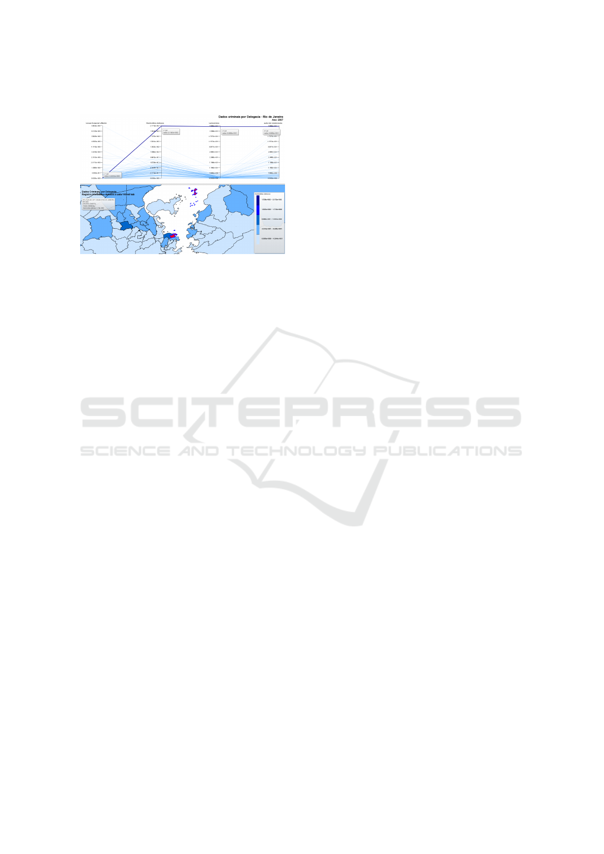
criminal behavior in this region.
Figure 6: Crime rates of the DP1 and their location.
5 CONCLUSION
CrimeVis offers a set of tools to support researchers
on public safety. The overview provided by the tool
allows users to easily discover patterns and analyze
trends in the data being investigated. The software
is still undergoing testing to be deployed and widely
used by researchers in the field. Our preliminary stud-
ies showed that CrimeVis is efficient when it is nec-
essary to analyze a data set for a specific time period.
The users could easily establish relations between the
data and identify trends and patterns through interac-
tive analysis of the data. Moreover, the brushing and
linking technique allows us to select and filter infor-
mations more easily, being a powerful technique to
answer questions relevant to how the relation between
different data attributes. With CrimeVis, we can ana-
lyze not only groups, but also individual areas using
the map of DPs, in which it is possible to interpret the
evolution of a certain attribute over time.
REFERENCES
Arietta, S. M., Efros, A. A., Ramamoorthi, R., and
Agrawala, M. (2014). City forensics: Using visual
elements to predict non-visual city attributes. Visu-
alization and Computer Graphics, IEEE Transactions
on, 20(12):2624–2633.
Assunc¸
˜
ao, R. M., Neves, M. C., C
ˆ
amara, G., and
da Costa Freitas, C. (2006). Efficient regionalization
techniques for socio-economic geographical units us-
ing minimum spanning trees. International Journal of
Geographical Information Science, 20(7):797–811.
Bach, B., Dragicevic, P., Archambault, D., Hurter, C., and
Carpendale, S. (2014). A review of temporal data vi-
sualizations based on space-time cube operations. In
Eurographics conference on visualization.
Chainey, S., Tompson, L., and Uhlig, S. (2008). The utility
of hotspot mapping for predicting spatial patterns of
crime. Security Journal, 21(1):4–28.
de Melo, B. M., Guimaraes, J. L., de Castro, A. S., San-
tos, C. A., Nascimento, D. M., and Del Pino Lino, A.
(2015). Criminal data mining: A case studyin crim-
inal observatory tapaj
´
os. In Information Systems and
Technologies (CISTI), 2015 10th Iberian Conference
on, pages 1–6. IEEE.
Hartigan, J. A. and Wong, M. A. (1979). Algorithm as 136:
A k-means clustering algorithm. Applied statistics,
pages 100–108.
Heer, J. and Shneiderman, B. (2012). Interactive dynam-
ics for visual analysis. Proceedings of the 26th ACM
Conference on Hypertext and Social Media, 10(2):30.
Heinrich, J., Luo, Y., Kirkpatrick, A. E., Zhang, H.,
and Weiskopf, D. (2011). Evaluation of a bundling
technique for parallel coordinates. arXiv preprint
arXiv:1109.6073.
Heinrich, J. and Weiskopf, D. (2013). State of the art of par-
allel coordinates. STAR Proceedings of Eurographics,
2013:95–116.
IBGE (2011). Censo demogr
´
afico 2010: Caracter
´
ısticas da
populac¸
˜
ao e dos domic
´
ılios: resultados do universo.
IBGE: Indicadores Sociais.
ISP-RJ (2013). Notas metod
´
ologicas do instituto de
seguranc¸a p
´
ublica do rio de janeiro.
Johansson, J., Ljung, P., Jern, M., and Cooper, M. (2005).
Revealing structure within clustered parallel coordi-
nates displays. In Information Visualization, 2005.
INFOVIS 2005. IEEE Symposium on, pages 125–132.
IEEE.
Kaufman, L. and Rousseeuw, P. J. (2009). Finding groups
in data: an introduction to cluster analysis, volume
344. John Wiley & Sons.
Lee, J. H., McDonnell, K. T., Zelenyuk, A., Imre, D., and
Mueller, K. (2014). A structure-based distance met-
ric for high-dimensional space exploration with mul-
tidimensional scaling. Visualization and Computer
Graphics, IEEE Transactions on, 20(3):351–364.
Monteiro, J. and Rocha, R. (2013). Tr
´
afico de drogas e
desempenho escolar no rio de janeiro. IBRE - Notas
t
´
ecnicas.
Palmas, G., Bachynskyi, M., Oulasvirta, A., Seidel, H. P.,
and Weinkauf, T. (2014). An edge-bundling layout
for interactive parallel coordinates. In Visualization
Symposium (PacificVis), 2014 IEEE Pacific, pages 57–
64. IEEE.
Power, D. J. (2014). Using ‘Big Data’ for analytics
and decision support. Journal of Decision Systems,
23(2):222–228.
Rougeux, N., Pry, C., Eder, D., Baker, Paul, B. J., and Velez,
J. P. (2012). Crime in chicago: An interactive analysis
of crime in chicago’s 50 wards.
Zhou, H., Yuan, X., Qu, H., Cui, W., and Chen, B. (2008).
Visual clustering in parallel coordinates. In Computer
Graphics Forum, volume 27, pages 1047–1054. Wiley
Online Library.
ICEIS 2017 - 19th International Conference on Enterprise Information Systems
200
