
MonAT: A Visual Web-based Tool to Profile Health Data Quality
Monica Noselli
1
, Dan Mason
2
, Mohammed A. Mohammed
2,3
and Roy A. Ruddle
1
1
Department of Computing, University of Leeds, EC Stoner Building, LS2 9JT, Leeds, U.K.
2
Bradford Institute for Health Research, Bradford Royal Infirmary, Bradford, U.K.
3
Department of Research, University of Bradford, Bradford, U.K.
Keywords:
Data Quality, Visualization, Health Data, Longitudinal Data.
Abstract:
Electronic Health Records (EHRs) are an important asset for clinical research and decision making, but the
utility of EHR data depends on its quality. In health, quality is typically investigated by using statistical
methods to profile data. To complement established methods, we developed a web-based visualisation tool
called MonAT Web Application (MonAT) for profiling the completeness and correctness of EHR. The tool
was evaluated by four researchers using anthropometric data from the Born in Bradford Project (BiB Project),
and this highlighted three advantages. The first was to understand how missingness varied across variables,
and especially to do this for subsets of records. The second was to investigate whether certain variables for
groups of records were sufficiently complete to be used in subsequent analysis. The third was to portray
longitudinally the records for a given person, to improve outlier identification.
1 INTRODUCTION
Clinical patient data are stored digitally in EHRs and
contains a wide range of information. These data
are becoming a powerful resource for secondary uses
such as investigating and developing decision support
systems (Coorevits et al., 2013). Clinical research
results and decisions depend on the quality of EHR
data.
There are three different aspects of data quality as-
sessment: Data profiling defines issues in data quality,
Data wrangling prepares the data for further inves-
tigation by transforming it into a required structure,
and Data cleansing analyses and corrects the data
(Gschwandtner et al., 2014). This paper focuses on
data profiling, for which most health researchers typ-
ically adopt a statistically driven workflow and make
little use of interactive data visualization.
The aim of our research is to provide new methods
for profiling health data. This paper describes the de-
sign and formative evaluation of a new interactive vi-
sualization tool called MonAT, which provides users
with rich functionality for data profiling, leveraging
human cognitive capabilities.
2 RELATED RESEARCH
New frameworks and tools have been created to
define and assess data quality (Stausberg et al.,
2015). A new framework to assess health data qual-
ity (Weiskopf and Weng, 2013) provides a definition
of data quality in five dimensions: completeness, cor-
rectness, concordance, plausibility and currency. In
a related work (Weiskopf et al., 2013), the authors
demonstrated that the completeness depends on the
type of tasks. Moreover, completeness and correct-
ness are considered the important dimensions to as-
sess first since the others depend on the quality of
these (Dungey et al., 2014).
A data quality ontology has been defined (Johnson
et al., 2015) based on the above data quality definition
(Weiskopf and Weng, 2013). The ontology describes
concepts and measures of data quality (Table 1 and 2).
Another aspect of the completeness is the Miss-
ing Data Mechanisms (Rubin, 1976). Data are miss-
ing for several reasons. Understanding the reasons for
missingness is important for evaluating the rest of the
data and for generating accurate results (Nakagawa
and Freckleton, 2008), (Farhangfar et al., 2008).
Visualization techniques are powerful tools for
knowledge discovery. In the work (West et al., 2014),
the authors state that “EHR data are complicated by
missing values, inaccurate data entry, and mixed data
26
Noselli M., Mason D., Mohammed M. and Ruddle R.
MonAT: A Visual Web-based Tool to Profile Health Data Quality.
DOI: 10.5220/0006114200260034
In Proceedings of the 10th International Joint Conference on Biomedical Engineering Systems and Technologies (BIOSTEC 2017), pages 26-34
ISBN: 978-989-758-213-4
Copyright
c
2017 by SCITEPRESS – Science and Technology Publications, Lda. All rights reserved

Table 1: Concept and Description of (Johnson et al., 2015)’s ontology for Completeness Dimension.
Concept Description
a DomainCoverage Data represents Domain Concepts
b DomainComplete Presence or absence of expected information
c RepresentationComplete Data is not missed without consider the Domain
d Sufficiency Longitudinal data is sufficient to investigate a given Task
e Relevance Data complies the Domain and is sufficient to investigate a given Task
f TaskCoverage Variables used to investigate a given Task appears in the data
g Flexibility Data is sufficient to investigate different Tasks
Table 2: Concept and Description of (Johnson et al., 2015)’s ontology for Correctness Dimension.
Concept Description
h RepresentationIntegrity Data is not corrupted, no data entry errors
i Reliability The data can be used because it is correct
l RepresentationCorrectness The data is complete and accurate
types that must be considered in developing visual-
ization techniques” and “users wants to see both cate-
gorical and numerical data when interactively explor-
ing the data, and they like to look at the detail in the
record”.
There is a huge amount of data quality investiga-
tions specifically in health care and medical research
(Stausberg et al., 2015) but tackling data quality as-
sessment with a visual analytic perspective is quite
novel (Kohlhammer et al., 2011).
Two examples of visual analytic tools are Time-
Cleanser (Gschwandtner et al., 2014) and Profiler
(Kandel et al., 2012). TimeCleanser is a visual analyt-
ics system that helps to clean time-oriented data. Pro-
filer adopts visualization and statistical analysis for
data quality assessment. The cleansing job is driven
by summaries and automated detection of anomalies
and then visualizes and interacts with the results.
MonAT aims to help experts detect and flag com-
pleteness and correctness data quality issues by pro-
viding interactive and connected visualizations.
We designed MonAT to cater to the (Weiskopf and
Weng, 2013)’s data quality definitions and consider-
ing the (Johnson et al., 2015)’s ontology (Table 1 and
Table 2). MonAT offers a visualization that can help
to classify the data in the (Rubin, 1976)’s categories
and considers the longitudinal characteristic of health
data.
3 BORN IN BRADFORD
Born in Bradford (BiB) is a longitudinal multi-ethnic
birth cohort study aiming to examine the impact of
environmental, psychological and genetic factors on
maternal and child health and wellbeing (Raynor,
2008). Bradford is a city in the North of England
with high levels of socio-economic deprivation and
ethnic diversity. Women were recruited at the Brad-
ford Royal Infirmary at 26-28 weeks gestation. The
full BiB cohort recruited 12,453 women comprising
13,776 pregnancies between 2007 and 2010 and the
cohort is broadly characteristic of the city’s maternal
population. The mothers and children are followed
up longitudinally through direct surveys and linkage
to routine healthcare records. Ethical approval for the
data collection was granted by the Bradford Research
Ethics Committee (Ref 07/H1302/112).
We obtained access to a subset of the BiB chil-
dren’s growth variables (Wright et al., 2013) in two
flat files. The first file contains 500 records with chil-
dren’s raw observations (Table 3). There are 360
children. The greatest number of records per child
is 21. The greatest number of height observations
per child is 3. The greatest number of weight obser-
vations per child is 20. On average, there are 0.51
height observations and 1.38 weight observations per
child. The second file contains the same informa-
tion cleaned by statisticians following an established
cleansing method (see Section 3.1).
3.1 Data Cleansing Process
We met several times with BiB statisticians. The
aim of the meetings was to understand their cleans-
ing method, detect deficiencies, and establish require-
ments for our tool.
The BiB method uses STATA and goes through
the following steps to clean height and weight vari-
ables:
• Implausible values. Weight observations greater
than 25kgs are removed.
MonAT: A Visual Web-based Tool to Profile Health Data Quality
27

Table 3: Variables in the anthropometric data set that was used to evaluate MonAT.
Variables
Name Type Description #Categories
ChildID Encoding Child’s ID to identify longitudinal data 360
age Numerical (Integer) Child’s age calculate in days
weight Numerical (Float) Child’s weight calculated in kilograms
height Numerical (Float) Child’s height calculated in centimeter
gender Categorical Child’s sex 2
eth0ethall
Categorical Child’s ethnicity category
22
eth0eth9gp 9
eth0ethgrp 6
ethgrp4 4
eth0eth3gp 3
source Categorical Information about the data provenance 3
• Outliers. Data are divided by baby’s sex and
mother’s ethnicity group. Four Standard Devia-
tion (4SD) from mean is calculated separately for
the groups over intervals of two months. Values
greater than +4SD and smaller than -4SD are con-
sidered as outliers and deleted from the data set.
• Negative Increment. Weight and height observa-
tions are checked by comparing two consecutive
numerical observations and deleting the second
observation if it does not follow certain criteria.
Weight observations are also compared with the
subsequent measurement. Weight values between
the first two weeks of age with a drop of more than
10% and weight and height values with a drop of
more than 5% in the other intervals are removed.
• Plot. Any further outlier is analyzed by plotting
weight and height against age by sex and the three
ethnicity categories.
• Combine height and weight observations. An-
other plot shows weight against height to check
for further outliers.
• Ponderal Index (a ratio of a person’s height to
weight) is calculated and plotted against age by
sex and ethnicity to check for further outliers.
3.2 Limitations
Our analysis highlighted three key limitations in the
BiB data cleansing process. First, the process does
not consider missing data at all, which prevents feed-
back being given to data providers and places the onus
for investigating missingness solely on the users of
BiB data.
Second, the process only cleans a subset of the
variables that are in a given data set. For example,
BiB only cleaned the weight and height variables in
the anthropometric dataset. There may also be data
quality issues with the age and ethnicity variables. An
assumption that underlies categorical variables such
as ethnicity is that they do not change over the time.
However, a child’s ethnicity may not be present for
each data record, or ethnicity may be recorded dif-
ferently over time, indicating that some data are not
consistent.
Third, numerical longitudinal variables (weight
and height, in the case of the anthropometric data set)
are only cleaned in a pair-wise fashion, rather as a
whole. The sequence of points in a plot defines the
overall weight (or height) profile of a child. Inspec-
tion of individual points in the context of the chil-
dren’s overall profile can help researchers to identify
outliers. Such profiles are even more useful for inves-
tigating negative increments, because a visual check
can identify which point is suspicious rather than al-
ways assuming that the second observation in a pair
is wrong, as is the case with the current BiB process.
4 MonAT
This section list the requirements and describes the
design and implementation of novel visualization
tool, MonAT, which allows researchers to profile data
by combining basic computations and human cogni-
tive capabilities.
4.1 Requirements
Based on the limitations discussed in 3.2, we identify
two key requirements for our tool.
Profiling Completeness. A normal statistical ap-
proach to deal with missingness is to remove records
containing missing data. However, this can lead to bi-
ased results. Missing data profiling (Table 1) can help
HEALTHINF 2017 - 10th International Conference on Health Informatics
28
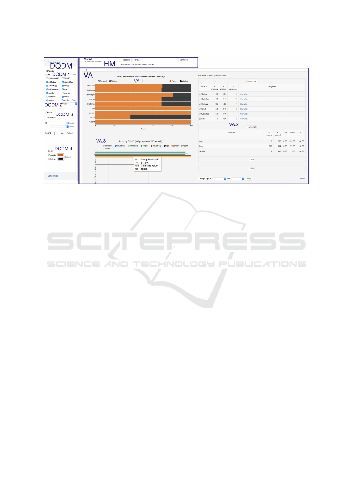
Figure 1: Screen shot showing the three main areas of MonAT. The Horizontal Menu (HM) is on the top. The Data Quality
Dimension Menu (DQDM) on the left shows the Completeness sub-menu expanded. It contains the four filters: the List
of Variables Filter (DQDM.1), the Group Filter (DQDM.2), the Chart Filter (DQDM.3), and the Color Filter (DQDM.4).
The Visualization Area (VA) in the middle-right-bottom shows Present-Missing Overview bar chart (VA.1), Tables overview
(VA.2), and Grouped Present-Missing Data (VA.3).
to mitigate bias when researchers are defining data in-
clusion criteria.
Profiling Correctness. Abnormal observations can
lead to misleading findings. Outliers can occur in cat-
egorical variables due to erroneous free input text or
data processing errors. In numeric variables outliers
can be due to mistyping, measurement errors, or data
processing errors. When observations are related to
each other, longitudinal data profiling can improve
outlier identification.
Other, general requirements were as follows.
First, a tabular view showing summary statistics (e.g.,
minimum, maximun and mean of numerical obser-
vations, and the number of categories in categorical
variables) is important to provide an overview of data.
Second, MonAT needs to be accessible to researchers
without specialist knowledge of statistical tools and
programming languages (e.g., STATA and R). Third,
the interface should be user friendly and intuitive, and
support workflows that are easy to learn and follow.
Fourth, researchers should find that MonAT provides
added value for data profiling.
4.2 Design and Implementation
MonAT is a web-base tool implemented using Django
Rest Framework, AngularJS, and Krispo’s nvd3 (D3)
reusable charts.
The architecture of MonAT follows the concepts
of Single Page Application (SAP) and Model View
Control (MVC). MonAT web interface (Figure 1) is
divided into three main areas: the Horizontal Menu
(HM), the Data Quality Dimension Menu (DQDM),
and the Visualization Area (VA).
The HM contains a function to select a local flat
file. Statistical information and some additional vari-
ables for managing page layout are automatically cal-
culated.
This menu stores the data in local memory in
JSON format object. The type of variable (numer-
ical, categorical, index or date), number of present
and missed observations per each variable are pre-
calculated and stored in the JSON object. For numeri-
cal variables, minimum, mean, and maximum are cal-
culated. For categorical variables, a list of categories
is created. The scope of all this information is the
root: the variables can be accessed from every com-
ponent. Some additional variables are added with a
root scope to allow flexible layouts to be created.
The DQDM is a dynamic menu that maps the di-
mensions of data quality (Weiskopf and Weng, 2013)
to sub-menus. The application automatically creates
this menu when user upload a file. Currently there are
two sub-menus - one for ‘Completeness’ and one for
‘Correctness’.
The VA is the core of MonAT, and where it shows
visualization and tabular output in response to users’
interactions. We designed different VA components
for profiling completeness and correctness.
MonAT: A Visual Web-based Tool to Profile Health Data Quality
29
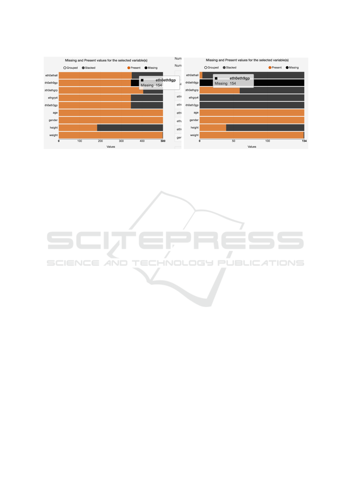
(a) (b)
Figure 2: The Present-Missing Overview bar chart, showing the number of present and missing observations (orange and
black bars, respectively) for nine variables. The plots show missingness for: (a) all 500 records in the data set, and (b) the 154
records where the ‘eth0eth9grp variable is missing (selected by clicking on the black bar for that variable in (a)).
4.2.1 Completeness
Interactions with the Completeness DQDM creates
VA components to explore different levels of missing-
ness (Table 1).
The checkbox List of Variables Filter (Figure 1 -
DQDM.1) represents the Domain of the data (Table
1.a). It allows users to understand what tasks can be
answered with the set of variables (Table 1.f).
Interactions with the checkbox list create a
Present-Missing Overview (Figure 1 - VA.1), and Ta-
bles Overview (Figure 1 - VA.2).
The Present-Missing Overview, a grouped/stacked
interactive bar chart, shows missing and present val-
ues, calculated over all the entries (Table 1.b). It al-
lows analysis of data quantity (Table 1.c and Figure
2).
The Tables Overview shows four tables, one for
each type of variable (numerical, categorical, index,
and date) with the number of present and missing ob-
servations, categories and statistical information.
The Group Filter (Figure 1 - DQDM.2) is a drop-
down menu for selecting a variable to group the data.
It creates the Grouped Present-Missing Data (Figure
1 - VA.3), a grouped bar chart, which shows infor-
mation about number of groups that miss variables
selected in the List of Variables Filter (Figure 1 -
DQDM.1). The y axis represents the number of miss-
ing observations and the bar length represents a vari-
able. Each barsize represents the number of groups
missing a variable. It is useful for inclusion criteria
giving information of sufficiency and relevant obser-
vations (Table 1.b and 1.e).
The Chart Filter (Figure 1 - DQDM.3) is a combi-
nation of two drop-down menu allowing selection of
two numerical variables that create a plot (Figure 3.a).
The two variables are respectively the x and y axes of
the plot. The filter automatically creates a contextual
menu (Figure 3.b), a series of checkboxes that allows
users to visualize Data in Context and Distributions.
The Data in Context (Figure 3.a) can be analyzed
to evaluate sufficiency, task coverage and variable
flexibility (Table 1.d, 1.f, and 1.g) by interacting with
the contextual menu (Figure 3.b) and Logic Function
Filter (3.c).
The Logic Function Filter allows investigation of
variables’ missingness with ‘AND’ and ‘OR’ opera-
tions.
The Distribution (Figure 3.d and 3.e) shows the
number of missing values of selected variable, in re-
spect of the two axes of the scatterplot to investigate
correlation of missingness between variables. It can
be used to evaluate the Missing Data Mechanisms.
4.2.2 Correctness
Users may analyze correctness by interacting with
the Correctness DQDM. The set of filters is similar
to the Completeness DQDM, but the VA components
change.
Interactions with the Distribution Filter, a check-
box list of variables, shows a boxplot for each selected
variable, allowing users to detect outliers for numeri-
cal values (points above or below the upper and lower
whiskers) (Table 2.h and 2.i).
The Chart Filter creates a Data in Context view
to let users detect outliers and analyze negative incre-
ment on longitudinal data. It helps to analyze correct-
ness and suitability of the data for a given task (Table
2.i and Table 2.l). It can also be used to spot variation
HEALTHINF 2017 - 10th International Conference on Health Informatics
30
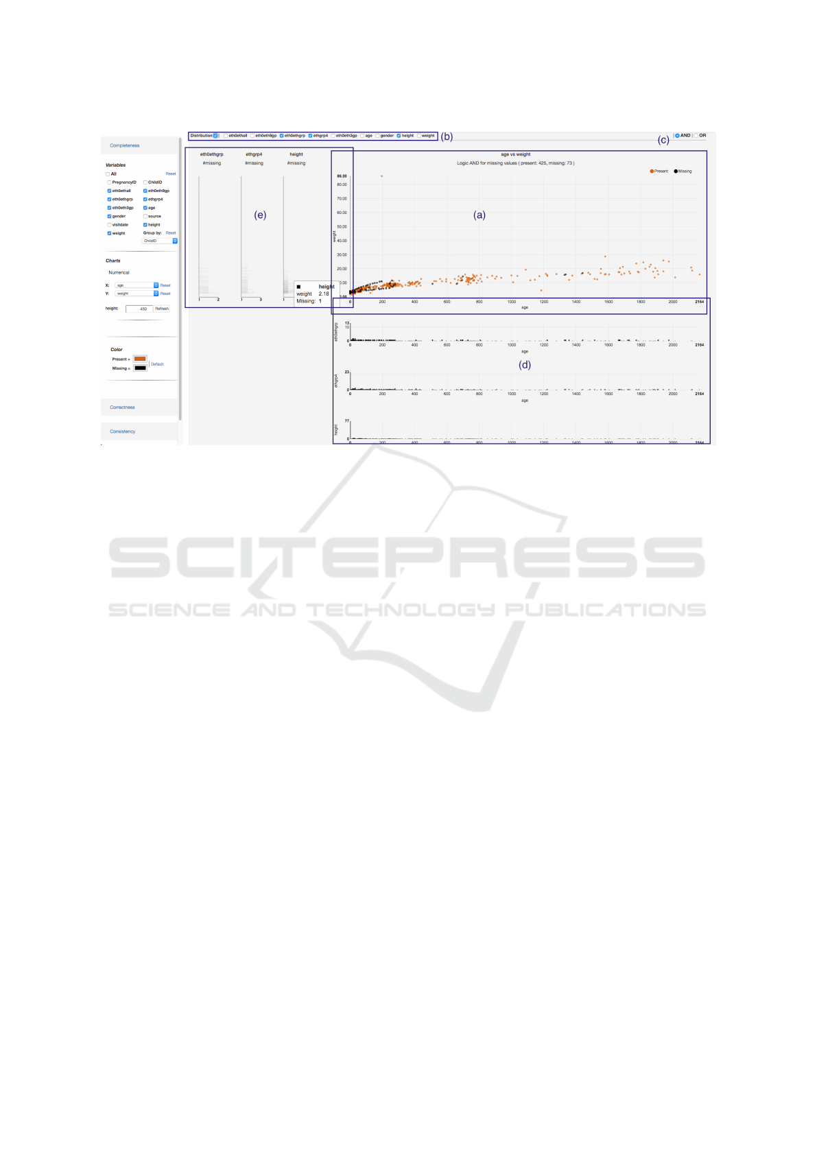
Figure 3: The VA shows Data in Context. A contextual menu (b) allows show missing and present observations of selected
variables (eth0thgrp, ethgrp4, and height) in the age against weight scatterplot (a) with an AND operation (Logic Function
Filter c). The contextual menu also contains a check box button to show/hide Distributions (d, e) of the selected variables.
in categories (i.e., variation of ethnicity category for a
given child) (Table 2.h).
5 MonAT EVALUATION
This section describes a formative evaluation of
MonAT, using the BiB Project anthropometric data
set. We carried out a formative evaluation to list a
minimum set of functions that end-users would bene-
fit while using the tool.
The aims of the evaluation were to assess the value
of MonAT’s existing functionality for investigating
data completeness and correctness, and to identify im-
portant additional functionality for the tool.
5.1 Method
This section presents information on recruited partic-
ipants, materials and procedure for the evaluation.
5.1.1 Participants
We recruited four participants aged between 28 and
51. One of them had worked at the Bradford Institute
for Health Research (BIHR) for two years and was
knowledgeable about the BiB Data Collection (BiB
DC). Two of them were post-doctoral researchers,
with experience of visual analytics and data analysis,
respectively. The fourth participant was a PhD stu-
dent with experience in data analysis.
5.1.2 Materials
A set of exercises were created with the aim to high-
light issues in the tool and identify new functions for
the release version of MonAT. The exercises tested
the main functions of Completeness (4.2.1) and Cor-
rectness (4.2.2) dimensions. Examples of the Visual-
ization Components are shown in Figures 1 and 3.
5.1.3 Procedure
At the start of the evaluation, participants were given
an information sheet about the aims of the evaluation,
a description of the data set, and a brief description
of the MonAT functionality. Then participants were
asked to think aloud while they completed some data
completeness and correctness exercises. If they were
uncertain about anything, participants were encour-
aged to ask the experimenter questions during the ex-
ercises. At the end of the exercises the experimenter
conducted a semi-structured interview to gain further
feedback about MonAT and identify additional func-
tionality that participants thought would be beneficial.
The first set of exercises required the use of
MonAT to investigate the completeness functionality.
Participants started by selecting a subset of vari-
ables listed in the completeness DQDM and eval-
uated the Present-Missing Overview and the Tables
MonAT: A Visual Web-based Tool to Profile Health Data Quality
31
Overview. Then, they used the Group Filter to inves-
tigate missingness in the groups.
The next steps were to plot a chart, select some
variables in the Contextual Menu and evaluate the
differences between visualizing values in logic AND
and logic OR. Finally, they visualized the Distribution
charts.
The second set of exercises focused on the cor-
rectness functionality. Participants interacted with the
Correctness DQDM to dynamically create the visual-
izations and detect outliers.
5.2 Results
Overall, participants were impressed by the novel ca-
pabilities of MonAT. This section reports participants
main comments and suggestions.
Participants found the Present-Missing Overview
(Figure 1 VA.1) useful for understanding how miss-
ingness varied across variables, and especially having
the possibility to select a subset of the records. For ex-
ample, the chart shows that there is a similar amount
of missing data for the ethnicity variables (first five
black bars). By selecting one of these bars, the par-
ticipant can explore that similarity, and an example is
shown in Figure 2. Participants preferred stacked bars
for that rather than grouped bars.
The participants liked the Tables Overview (Fig-
ure 1 VA.2). However they recommended that it was
shown in a separate panel to leave the focus on the
visual chart.
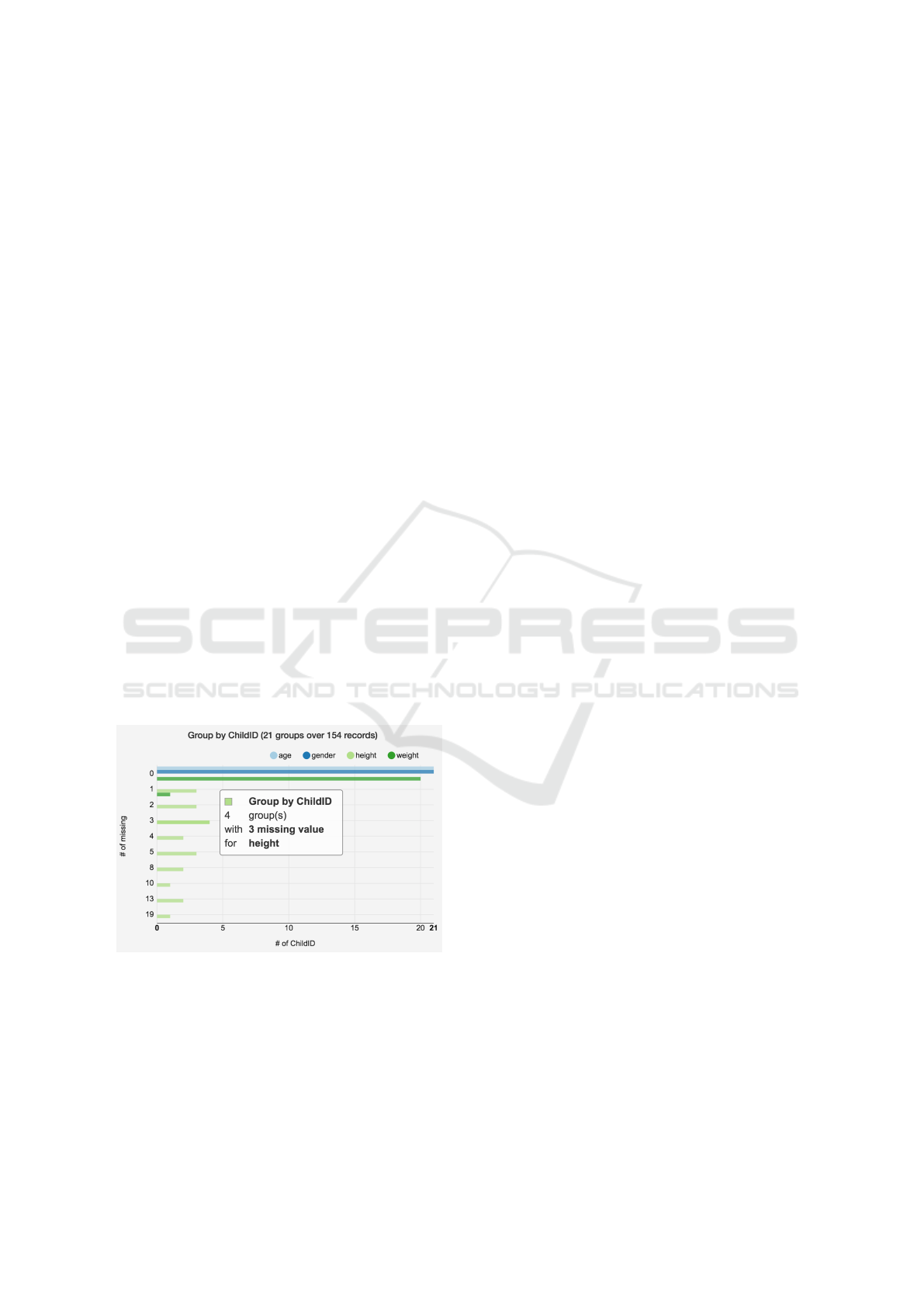
Figure 4: The x axis shows the number of groups hav-
ing missing data for selected variables (age, gender, height,
weight). In this example there are 21 children (groups) over
154 records. The y axis shows the number of missing values
per variable. In this example, there are four children miss-
ing exactly three observations for the height. A mouse over
on bar displays a tooltip that shows related information.
The Grouped Present-Missing Data (Figure 1
VA.3 and Figure 4) shows the number of miss-
ing observations for selected variables (in this case
eth0eth9gp and height), grouped by the value of an-
other variable (in this case ‘childID’). Participants ini-
tially found it difficult to understand the meaning of
this visualization but, once they did, they considered
it to be useful for investigating whether groups had
sufficient values for a given task (Table 1.d and 1.e).
Participants suggested being able to interact with
bars in the Grouped Present-Missing Data (as it is
for the Present-Missing Overview) to show frequency
distributions of missing values. They also said they
would like to be able to select more than one group.
For example to include in the further analysis groups
having no missing values or not more than one value
missed for a given variable.
The scatterplot (Figures 3) shows missing and
present Data in Context. The contextual menu (at
the top of the Figure 3) allows users to include vari-
ables in the scatterplot. Participants found it useful to
visualize how categorical missing observations relate
to the scatterplot variables. For example (Figure 3a)
the three selected variables (eth0ethgr, ethgrp4 and
height) shown in AND, present missing data mostly
in early children days (from 0 to 300). Participants
considered it useful to be able to ‘AND’ or ‘OR’ the
selected variables, and suggested that ‘XOR’ (only
one of the selected variables is missing) would also
be useful.
Participants made a number of other comments,
which were as follows. The Distributions that are
shown in the bar charts of Figure 3 are difficult to see,
which could be addressed by binning the data to re-
duce the number of bars that are drawn.
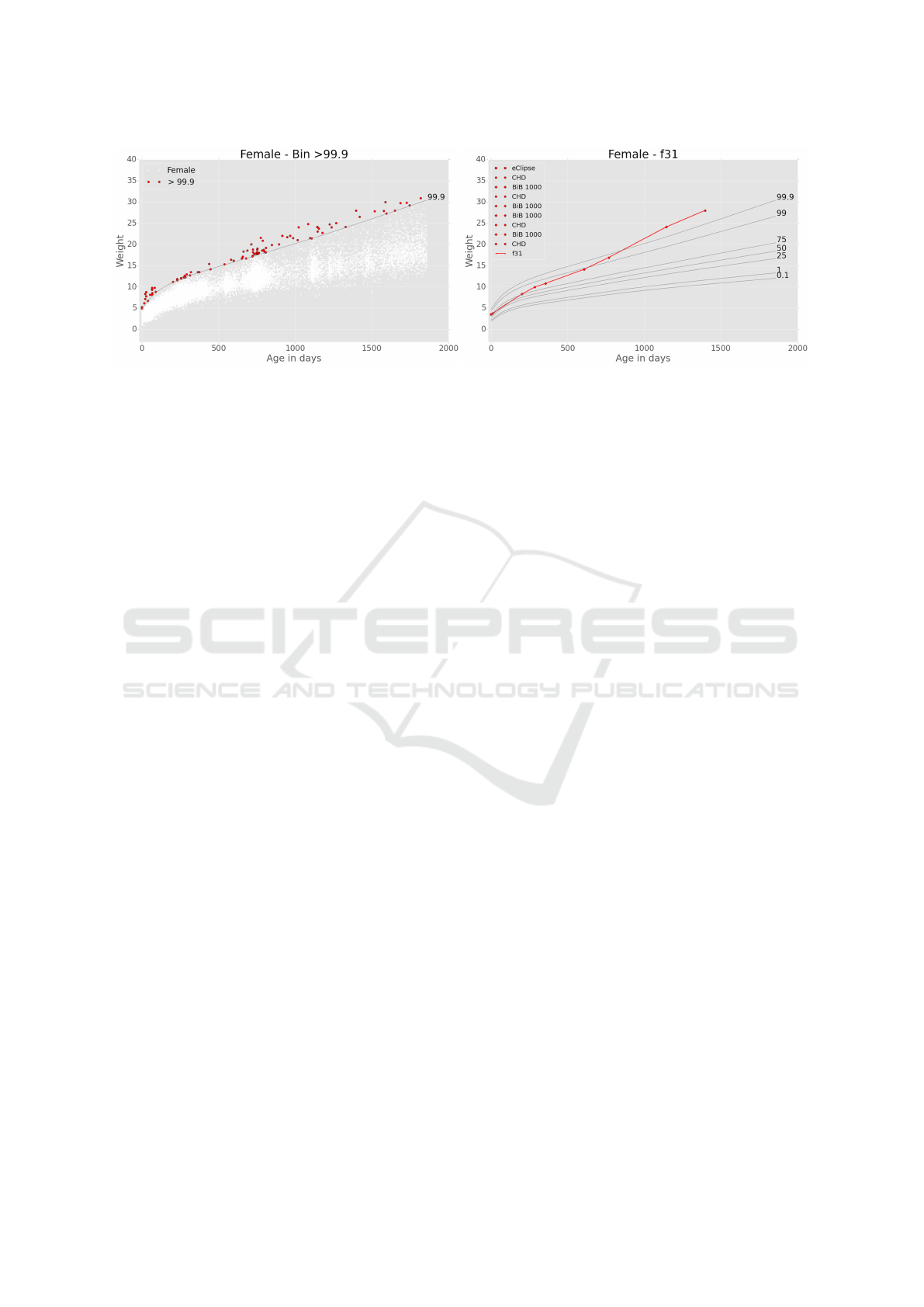
Referring to the correctness exercises, the scatter-
plot and the scatterplot with lines (Figure 5) show
Data in Context to reveal outliers. Investigating the
data as single points may lead to some of them being
defined as outliers because they lie above the 99.9th
percentile (Figure 5a). However, a longitudinal visu-
alization indicates that some of those points are cor-
rect because they are from a single child and follow
a reasonable curve (Figure 5b). Participants found
these scatterplots useful to visualize the longitudinal
data to explore correctness. However, to improve the
legibility of a plot they suggested the use of bins to
visualize a subset of the data. The number of groups
(children) should be low to avoid confusion. More-
over, the longitudinal groups should be smartly se-
lected to avoid overlaps in the visualization.
Overall, participants found MonAT useful for pro-
filing the quality of the data. They suggested adding
‘print’ and ‘download’ function for each visualiza-
tion, so the visualizations can be easily included in
presentations and reports. Moreover, the tool can be
HEALTHINF 2017 - 10th International Conference on Health Informatics
32
(a) (b)
Figure 5: Data in Context for outlier identification, showing: (a) all of the height data for female children (the red points lie
above the 99.9th percentile), and (b) the height profile of a single child (the red line and points).
used to create a subset of data set that satisfies inclu-
sion criteria for further investigations.
6 CONCLUSIONS
This paper describes the design and formative eval-
uation of a novel tool called MonAT for visual data
profiling. The tool was developed in conjunction with
researchers from the BiB Project, and designed to ad-
dress limitations in the statistical data profiling meth-
ods that are commonly used with EHR.
MonAT involves automatic and human analysis to
compute the complex task of profiling different di-
mensions of data quality of medical data. The tool
is novel in providing multiple and connected inter-
active visualizations to investigate completeness and
correctness in longitudinal data such as EHRs. It an-
swers the need of profiling data for different tasks and
different dimensions of data quality.
The tool was positively received, and provided
three advantages as a complement to statistical meth-
ods. These were to understand how missingness var-
ied across variables, investigate whether certain vari-
ables were sufficiently complete to be used in subse-
quent analysis, and improve outlier identification.
A revised version of MonAT is being developed
and will be deployed for use in the BiB Project. Fur-
ther functionality is planned, to combine interactive
visualisation with a data mining capability.
ACKNOWLEDGEMENTS
Born in Bradford (BiB) is only possible because of
the enthusiasm and commitment of the Children and
Parents in BiB. We are grateful to all the participants,
health professionals and researchers who have made
BiB happen.
We gratefully acknowledge the contribution of
TPP and the TPP ResearchOne team in completing
study participant matching to GP primary care records
and in providing ongoing informatics support.
This research was funded by the Bradford Institute
for Health Research.
REFERENCES
Coorevits, P., Sundgren, M., Klein, G. O., Bahr, A., Claer-
hout, B., Daniel, C., Dugas, M., Dupont, D., Schmidt,
A., Singleton, P., De Moor, G., and Kalra, D. (2013).
Electronic Health Records: New Opportunities for
Clinical Research. Journal of Internal Medicine,
274:547–560.
Dungey, S., Beloff, N., Puri, S., Boggon, R., Williams, T.,
and Rosemary, A. (2014). A Pragmatic Approach for
Measuring Data Quality in Primary Care Databases.
In Biomedical and Health Informatics (BHI), 2014
IEEE-EMBS International Conference on, pages 797–
800.
Farhangfar, A., Kurgan, L., and Dy, J. (2008). Impact of
Imputation of Missing Values on Classification Error
for Discrete Data. Pattern Recognition, 41(12):3692–
3705.
Gschwandtner, T., Aigner, W., Miksch, S., G
¨
artner, J.,
Kriglstein, S., Pohl, M., and Suchy, N. (2014). Time-
cleanser: A visual analytics approach for data cleans-
ing of time-oriented data. In Proceedings of the 14th
international conference on knowledge technologies
and data-driven business, page 18. ACM.
MonAT: A Visual Web-based Tool to Profile Health Data Quality
33

Johnson, S. G., Speedie, S., Simon, G., Kumar, V., and
Westra, B. L. (2015). A Data Quality Ontology for
the Secondary Use of EHR Data. AMIA 2015 Annual
Symposium Proceedings, pages 1937–1946.
Kandel, S., Parikh, R., Paepcke, A., Hellerstein, J. M.,
and Heer, J. (2012). Profiler : Integrated Statisti-
cal Analysis and Visualization for Data Quality As-
sessment. Proceedings of Advanced Visual Interfaces,
AVI, pages 547–554.
Kohlhammer, J., Keim, D., Pohl, M., Santucci, G., and An-
drienko, G. (2011). Solving Problems With Visual
Analytics. In Procedia Computer Science, volume 7,
pages 117–120.
Nakagawa, S. and Freckleton, R. P. (2008). Missing Inac-
tion: the Dangers of Ignoring Missing Data. Trends in
Ecology and Evolution, 23(11):592–596.
Raynor, P. (2008). Born in Bradford, a Cohort Study of
Babies Born in Bradford, and their Parents: Protocol
for the Recruitment Phase. BMC public health, 8:327.
Rubin, D. B. (1976). Inference and Missing Data.
Biometrika, 63:581–592.
Stausberg, J., Nasseh, D., and Nonnemacher, M. (2015).
Measuring Data Quality: A Review of the Literature
between 2005 and 2013. Studies in health technology
and informatics, 210:712–6.
Weiskopf, N. G., Hripcsak, G., Swaminathan, S., and Weng,
C. (2013). Defining and Measuring Completeness of
Electronic Health Records for Secondary Use. Jour-
nal of Biomedical Informatics, 46:830–836.
Weiskopf, N. G. and Weng, C. (2013). Methods and Di-
mensions of Electronic Health Record Data Quality
Assessment: Enabling Reuse for Clinical Research.
Journal of the American Medical Informatics Associ-
ation : JAMIA, 20:144–51.
West, V. L., Borland, D., and Hammond, W. E. (2014).
Innovative Information Visualization of Electronic
Health Record Data: a Systematic Review. Journal
of the American Medical Informatics Association :
JAMIA, pages 1–7.
Wright, J., Small, N., Raynor, P., Tuffnell, D., Bhopal, R.,
Cameron, N., Fairley, L., A Lawlor, D., Parslow, R.,
Petherick, E. S., Pickett, K. E., Waiblinger, D., and
West, J. (2013). Cohort profile: The Born in Brad-
ford Multi-Ethnic Family Cohort Study. International
Journal of Epidemiology, 42:978–991.
HEALTHINF 2017 - 10th International Conference on Health Informatics
34
